fmp - end of year show submission boards
DESCRIPTION
FMP - End of Year Show Submission BoardsTRANSCRIPT
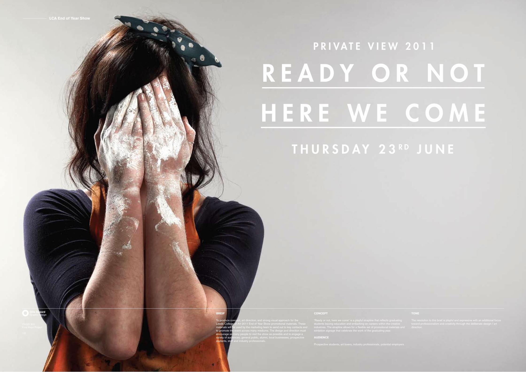
BREIF
To produce concept, art direction, and strong visual approach for the Leeds College of Art 2011 End of Year Show promotional materials. These materials will be used by the marketing team to send out to key contacts and to promote the event across many mediums. The design and direction must encourage as many people to visit the show as possible and to engage a variety of audiences; general public, alumni, local businesses, prospective students, staff and industry professionals.
CONCEPT
‘Ready or not, here we come’ is a playful strapline that reflects graduating students leaving education and embarking on careers within the creative industries. The strapline allows for a flexible set of promotional materials and exhibition signage that celebrate the work of the graduating year.
AUDIENCE
Prospective students, art lovers, industry professionals, potential employers.
TONE
The resolution to this brief is playful and expressive with an additional focus toward professionalism and creativity through the deliberate design / art direction.
LCA End of Year Show
OUGD 303Final Major Project
1/8
Ollie SawardGraphic Design
LCA End of Year Show
OUGD 303Final Major Project
2/8
Ollie SawardGraphic Design
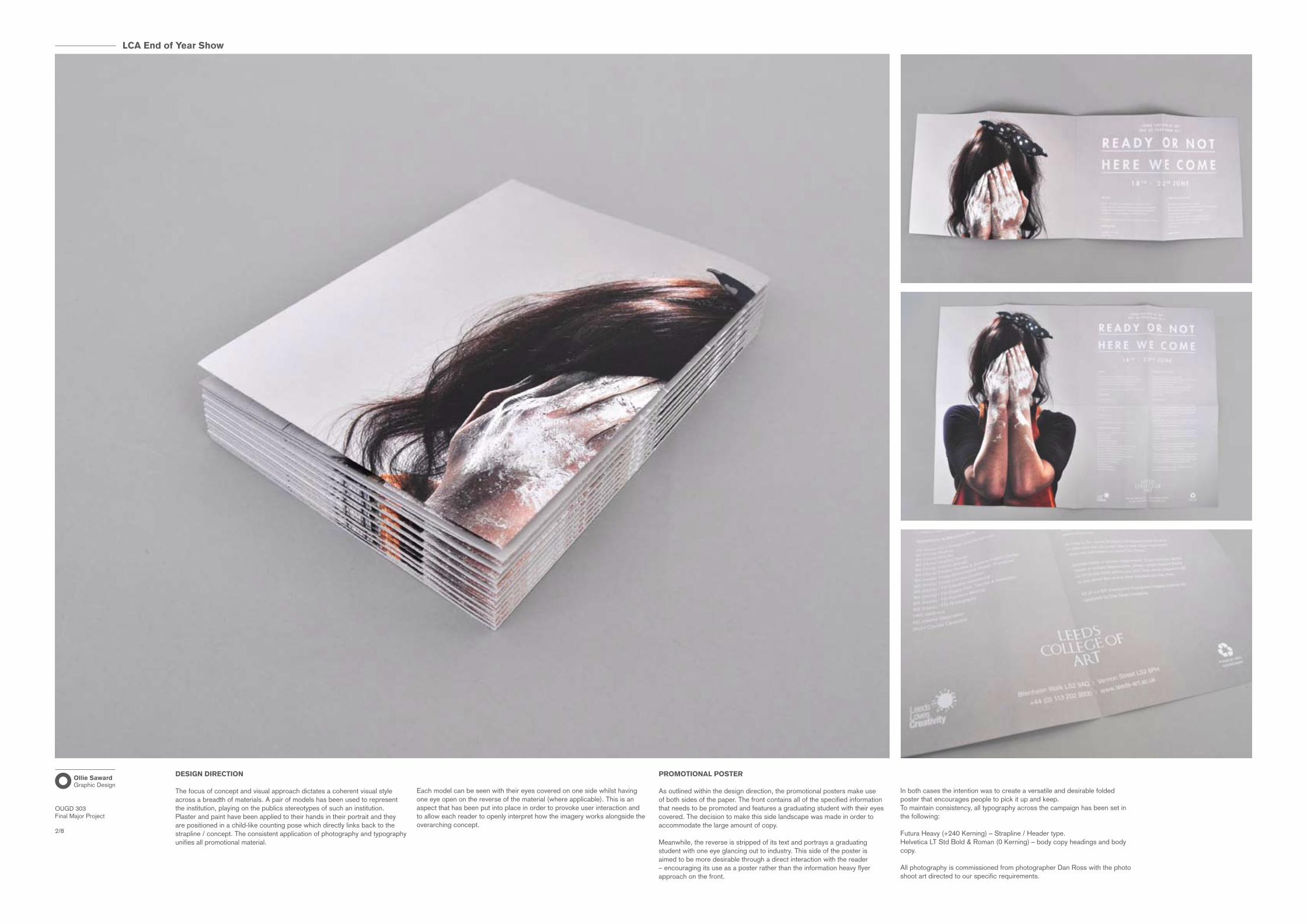
DESIGN DIRECTION
The focus of concept and visual approach dictates a coherent visual style across a breadth of materials. A pair of models has been used to represent the institution, playing on the publics stereotypes of such an institution. Plaster and paint have been applied to their hands in their portrait and they are positioned in a child-like counting pose which directly links back to the strapline / concept. The consistent application of photography and typography unifies all promotional material.
PROMOTIONAL POSTER
As outlined within the design direction, the promotional posters make use of both sides of the paper. The front contains all of the specified information that needs to be promoted and features a graduating student with their eyes covered. The decision to make this side landscape was made in order to accommodate the large amount of copy.
Meanwhile, the reverse is stripped of its text and portrays a graduating student with one eye glancing out to industry. This side of the poster is aimed to be more desirable through a direct interaction with the reader – encouraging its use as a poster rather than the information heavy flyer approach on the front.
In both cases the intention was to create a versatile and desirable folded poster that encourages people to pick it up and keep.To maintain consistency, all typography across the campaign has been set in the following:
Futura Heavy (+240 Kerning) – Strapline / Header type.Helvetica LT Std Bold & Roman (0 Kerning) – body copy headings and body copy.
All photography is commissioned from photographer Dan Ross with the photo shoot art directed to our specific requirements.
Each model can be seen with their eyes covered on one side whilst having one eye open on the reverse of the material (where applicable). This is an aspect that has been put into place in order to provoke user interaction and to allow each reader to openly interpret how the imagery works alongside the overarching concept.

LCA End of Year Show
OUGD 303Final Major Project
3/8
Ollie SawardGraphic Design
PRIVATE VIEW INVITATION
The private view invitation is conceptually coherent with the promotional poster – employing the two-sided interaction to engage the recipient. The front contains immediately necessary information with the reverse including secondary information relating to the private view.
Two invites have been produced using each model to maintain the variety found throughout the rest of the campaign; the intention of which aims to create a talking point amongst recipients and professionals within the creative industries. These Invites will be sent out paired with the folded promotional poster.
The invite is printed onto 350 gsm uncoated recycled card with a white gloss foil on the front for added prestige – providing the recipients with a sense of exclusivity.
LCA End of Year Show
OUGD 303Final Major Project
4/8
Ollie SawardGraphic Design
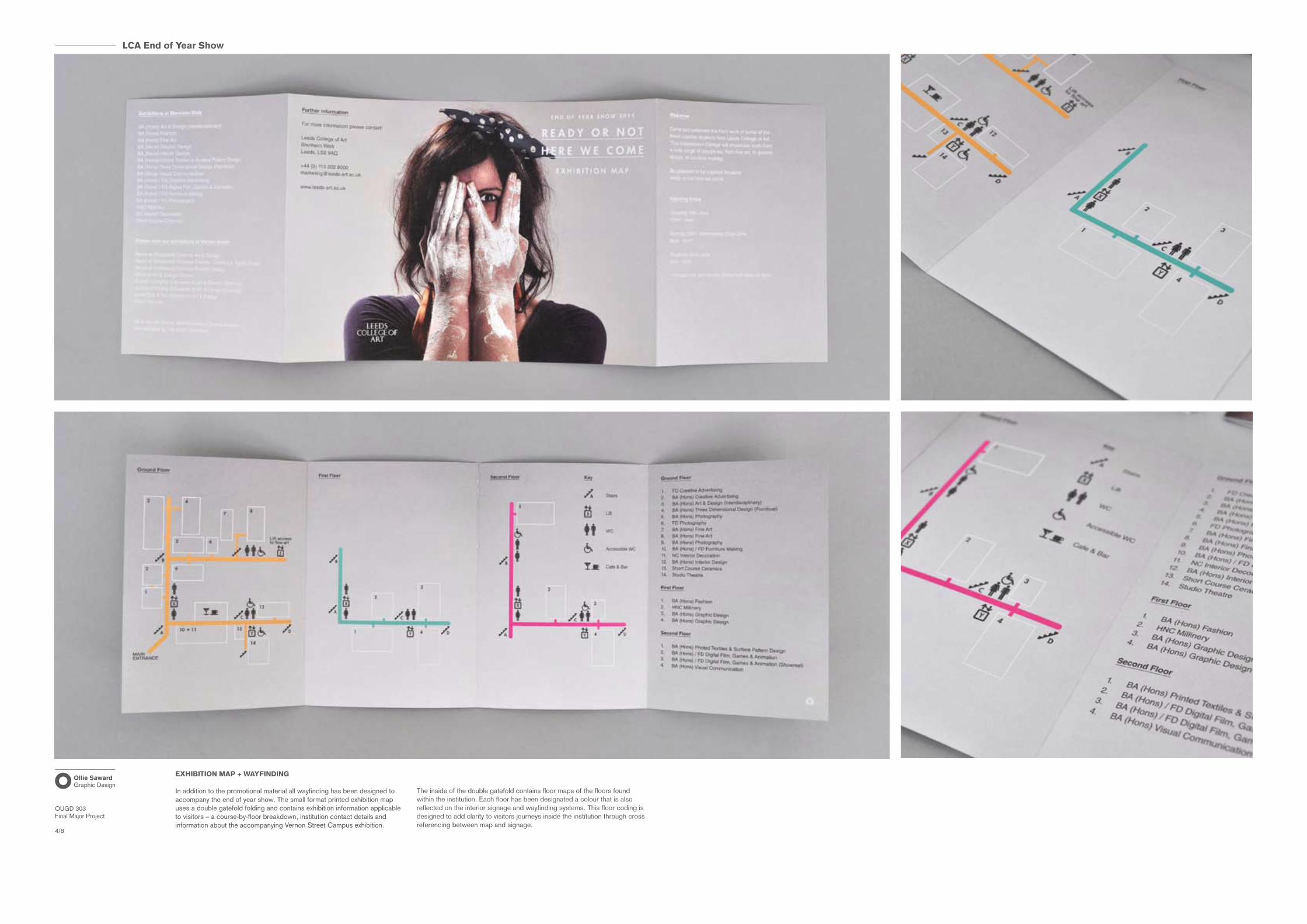
EXHIBITION MAP + WAYFINDING
In addition to the promotional material all wayfinding has been designed to accompany the end of year show. The small format printed exhibition map uses a double gatefold folding and contains exhibition information applicable to visitors – a course-by-floor breakdown, institution contact details and information about the accompanying Vernon Street Campus exhibition.
The inside of the double gatefold contains floor maps of the floors found within the institution. Each floor has been designated a colour that is also reflected on the interior signage and wayfinding systems. This floor coding is designed to add clarity to visitors journeys inside the institution through cross referencing between map and signage.
LCA End of Year Show
OUGD 303Final Major Project
5/8
Ollie SawardGraphic Design
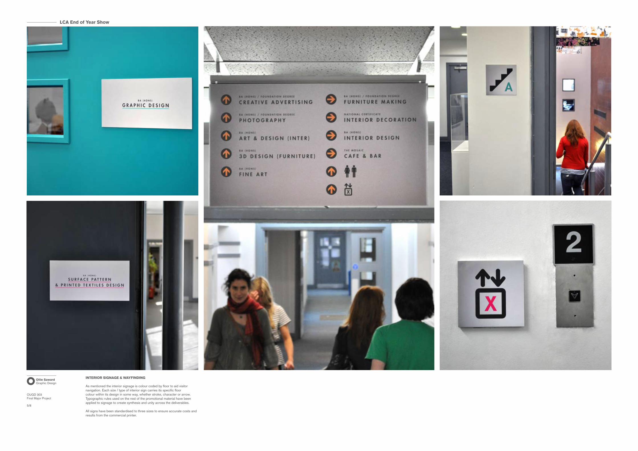
INTERIOR SIGNAGE & WAYFINDING
As mentioned the interior signage is colour coded by floor to aid visitor navigation. Each size / type of interior sign carries its specific floor colour within its design in some way, whether stroke, character or arrow. Typographic rules used on the rest of the promotional material have been applied to signage to create synthesis and unity across the deliverables.
All signs have been standardised to three sizes to ensure accurate costs and results from the commercial printer.
LCA End of Year Show
OUGD 303Final Major Project
6/8
Ollie SawardGraphic Design
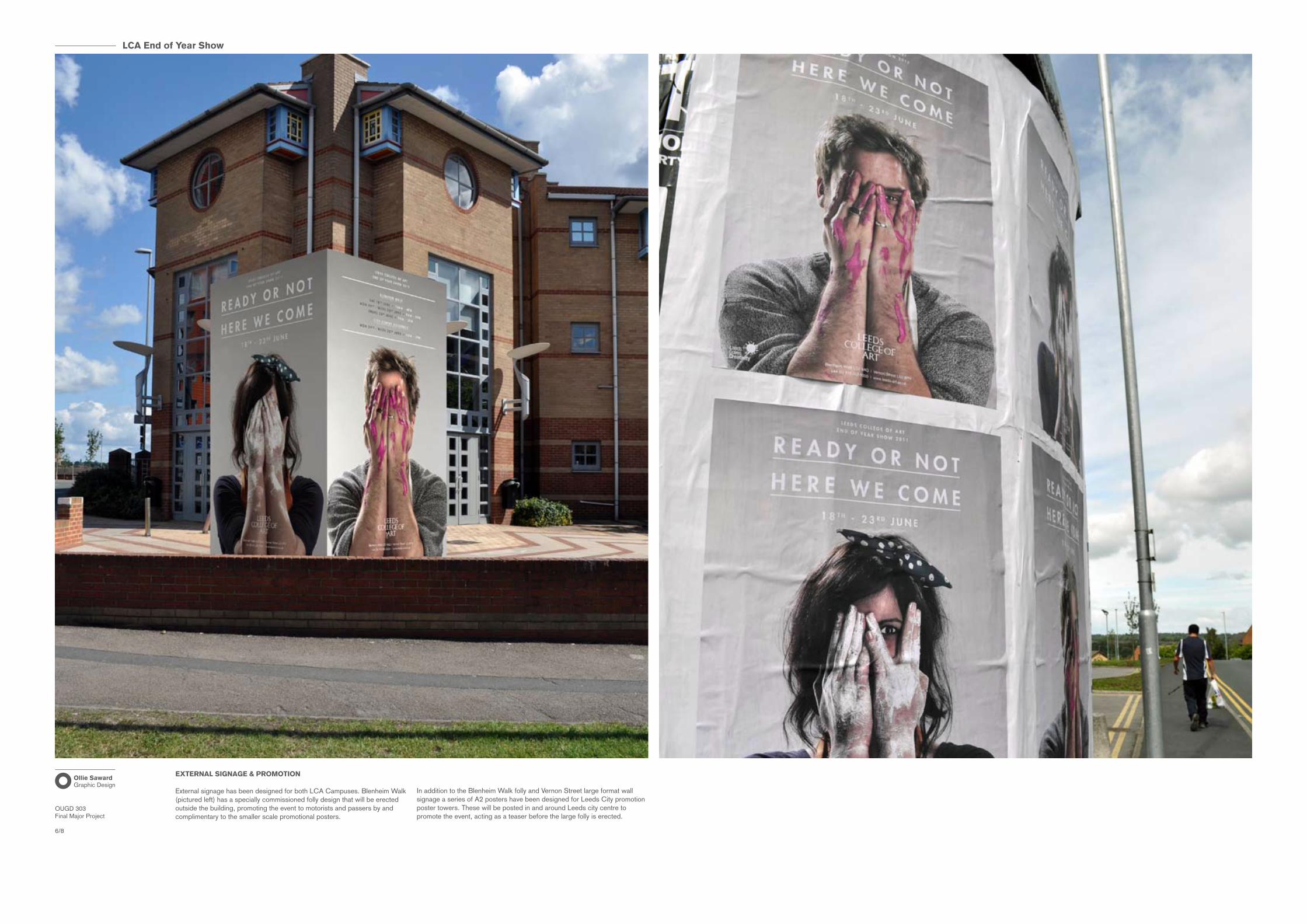
EXTERNAL SIGNAGE & PROMOTION
External signage has been designed for both LCA Campuses. Blenheim Walk (pictured left) has a specially commissioned folly design that will be erected outside the building, promoting the event to motorists and passers by and complimentary to the smaller scale promotional posters.
In addition to the Blenheim Walk folly and Vernon Street large format wall signage a series of A2 posters have been designed for Leeds City promotion poster towers. These will be posted in and around Leeds city centre to promote the event, acting as a teaser before the large folly is erected.

LCA End of Year Show
OUGD 303Final Major Project
7/8
Ollie SawardGraphic Design
PRESS ADS
A number of press ads have been designed to feature in printed publications relevant to the institution. Each one is essentially a one-off job and has been designed to reflect the visual approach of the promotional campaign whilst obeying the different formats of the different publications.
Above, full page Grafik Magazine image.
LCA End of Year Show
OUGD 303Final Major Project
8/8
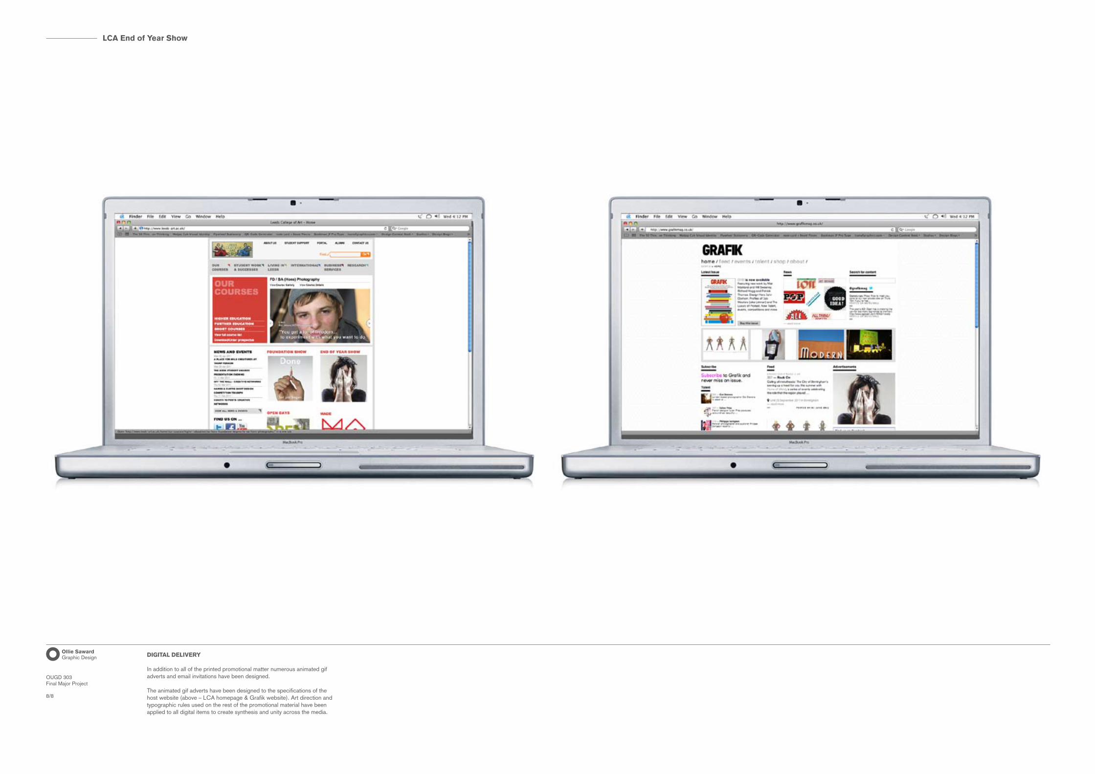
Ollie SawardGraphic Design DIGITAL DELIVERY
In addition to all of the printed promotional matter numerous animated gif adverts and email invitations have been designed.
The animated gif adverts have been designed to the specifications of the host website (above – LCA homepage & Grafik website). Art direction and typographic rules used on the rest of the promotional material have been applied to all digital items to create synthesis and unity across the media.