typo magazine
DESCRIPTION
Typography magazine.TRANSCRIPT

TyPOmagazine
MARIAN BANTJES
stefansagmeister
claude garamond
karelmartens


INNHOLD 02
SAGMEISTER03/04
CLAUDE GARAMOND07/08
KAREL MARTENS
MARIAN BANTJES
05/06
09/10
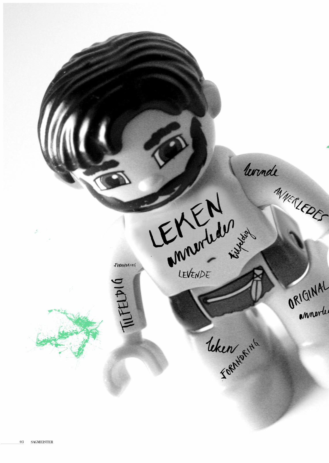
SAGMEISTER03

SAGMEISTER 04
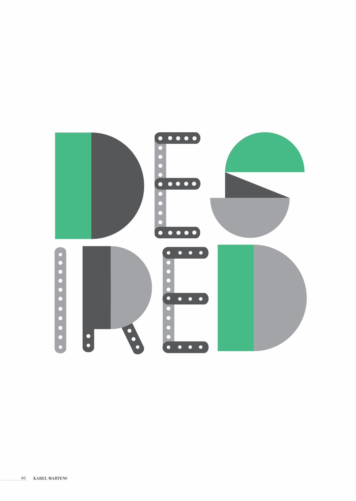
KAREL MARTENS05

The work of Karel Martens occupies an intriguing place in
the present European art-and-design landscape. Martens
can be placed in the tradition of Dutch modernism – in the
line of figures such as Piet Zwart, H.N. Werkman, Willem
Sandberg. Yet he maintains some distance from the
main developments of our time: from both the practices
of routinized modernism and of the facile reactions
against this. His work is both personal and experimental.
At the same time, it is publicly answerable. Over the now 50 years of his practice,
Martens has been prolific as a designer of books. He
has also made contributions in a wide range of design
commissions, including stamps, coins, signs on
b u i l d i n g s . I n t i m a t e l y connected with this design
work has been his practice
as an artist. This started with geometric constructions.
Karel Martens is a Dutch designer and teacher. After
training at the school of art in Arnhem, he has worked
as a freelance graphic designer, specializing in
typography. Alongside this, he has always made free (non-
commissioned) graphic and three-dimensional work. His
design work ranges widely, from postage stamps, to
books, to signs on buildings. All this work is documented
and celebrated in the books Karel Martens: drukwerk /
printed matter and Karel Martens: counterpr int . Martens has taught graphic
design since 1977. His first appointment was at the
school of art at Arnhem (until 1994). He was then
attached to the Jan van Eyck Academie in Maastricht
(1994–9). From 1997 he has been a visiting lecturer
i n t h e g r a p h i c d e s i g n
department at the School of Art, Yale University.
KAREL MARTENS 06
social structure
The work of Karel Martens occupies an intriguing place in
the present European art-and-design landscape. Martens
can be placed in the tradition of Dutch modernism – in the
line of figures such as Piet Zwart, H.N. Werkman, Willem
Sandberg. Yet he maintains some distance from the
main developments of our time: from both the practices
of routinized modernism and of the facile reactions
against this. His work is both personal and experimental.
At the same time, it is publicly answerable. Over the now 50 years of his practice,
Martens has been prolific as a designer of books. He
has also made contributions in a wide range of design
commissions, including stamps, coins, signs on
b u i l d i n g s . I n t i m a t e l y
connected with this design work has been his practice
as an artist. This started with geometric constructions.
Karel Martens is a Dutch designer and teacher. After
training at the school of art in Arnhem, he has worked
as a freelance graphic designer, specializing in
typography. Alongside this, he has always made free (non-
commissioned) graphic and three-dimensional work. His
design work ranges widely, from postage stamps, to
books, to signs on buildings. All this work is documented
and celebrated in the books Karel Martens: drukwerk /
printed matter and Karel Martens: counterpr int . Martens has taught graphic
design since 1977. His first appointment was at the
school of art at Arnhem (until 1994). He was then
attached to the Jan van Eyck Academie in Maastricht
(1994–9). From 1997 he has
been a visiting lecturer i n t h e g r a p h i c d e s i g n
department at the School of Art, Yale University.
social structure

Claude Garamond was a French publisher from Paris. He was one of the leading type designers of his time, and is credited with the introduction of the apostrophe, the accent and the cedilla to the French language. Several contemporary typefaces, including those currently known as Garamond, Granjon, and Sabon, reflect his influence.
Garamond was an apprentice of Simon de Colines; later, he was an assistant to Geoffroy Tory, whose interests in humanist typography and the ancient Greek capital letterforms, or majuscules, may have informed Garamond’s later work.
Old Schoolg
CLAUDE GARAMOND07

g

MARIAN BANTJES09

Marian Bantjes was born in 1963 and is a Canadian designer, artist, illustrator, typographer and writer. Bantjes started working in the field of visual communication in 1983. She become internationally known for. Describing herself as a Graphic Artist, working primarily with custom type and ornament.
MARIAN BANTJES 10

KILDER11
Grafisk design: Eli Renate Bye JohansenFoto: Eli Renate Bye Johansen
Kilder:Sagmeister:http://www.goodreads.com/quotes/483752-it-is-very-important-to-embrace-failure-and-to-doKarel Martens: http://www.hyphenpress.co.uk/authors/karel_martensClaude Garamond:http://en.wikipedia.org/wiki/Claude_GaramondMarian Bantjes: http://en.wikipedia.org/wiki/Marian_Bantjes


Eli Renate Bye Johansen, Grafisk Design 2.1 A, Høst 2012