creating an effective mobile user experience
TRANSCRIPT

WHITEPAPER
Creating an Effective Mobile User ExperienceExecutive SummaryThe key to success in the mobile industry is creating intuitive user experiences that fulfill the specific lifestyle needs of the targeted end user. The most efficient way to accomplish this is by employing a user-centered design approach that incorporates ethnographic-based research and usability testing cycles into the mobile authoring process. Best practices for this method include the use of open standards, simplified interface and iterative development cycles. Using authoring tools like Adobe GoLive CS2 support open standards and provide mobile toolkits to help streamline the development of mobile services, applications and content.
Key Questions1. What critical cultural trends and technological variables must be factored into the
design of mobile products, services and content?
2. How can device manufacturers, carriers, designers and developers most effectively define their target market’s needs and desires?
3. How can designers best gather user feedback during product development and integrate it into each stage of the process?
4. What tools and best practices are available for mobile designers and developers to facilitate and streamline the mobile authoring process?
Key Findings➤ Mobile development continues to migrate towards integrated platform authoring
based on open standards. The concept of open standards affects all aspects of the mobile experience, from the processor and operating system to carriers, devices, applications and content.
➤ Customer inquiry, usability testing and expert reviews during the development process are critical to insure that results appeal to the targeted market segment. The creation of an effective mobile brand follows a user-centered design methodology that begins with specific targeting of the audience, platform and device. The workflow must also incorporate iterative cycles of usability testing into the development cycle.
➤ For mobile designers, integrated toolkits such as the Adobe Mobile Creative Suite 2 that include onboard emulation, and third party emulators and mobile software solutions designed with GoLive CS2, streamline the development process.
TABLE OF CONTENTS1 Executive Summary
2 Introduction
3 Content and Services
7 Mobile Technology Overview
11 The Importance of Open Standards
13 The Future
15 Technological Summary
16 Creating an Effective Mobile User Experi-ence
28 Case Studies
30 Conclusion: It’s a big, wide, wireless world
2
Using Adobe GoLive to Create a Effective Mobile Experience
IntroductionIn today’s rapidly expanding mobile marketplace, carrier, platform and hardware technolo-gies are evolving at an ever-accelerating pace. Wireless companies and developers are typically put in the position of either chasing developing trends or taking the costly risk of launching new products and services that may never catch on. How can mobile designers, developers and content providers create effective mobile user experiences with the speed and accuracy required to succeed in the market?
The answer lies in adopting a user-centered approach to mobile authoring that focuses as much on the needs of specific consumer lifestyles as on technical considerations. The purpose of this paper is to outline best practices for gathering user feedback and incorporating it into the development of mobile products, services and content.
The first part of this paper will present the necessary background for a discussion of mobile design methodology by identifying the current technological and cultural variables that must be reconciled in order to produce an effective user experience. Beginning with Mobile Content and Services, the structure of the consumer market is explored, identifying the types of content and services that are currently available. Followed by, Mobile Technology Overview, which addresses the underlying technical components of the mobile user experience will be addressed. User interfaces, authoring platforms, operating systems and networks will be examined, along with how the development of each component is affecting the industry.
The second part of this paper, starting with Creating an Effective Mobile User Experience, introduces a user-centered approach to wireless product and service development. It details the audience research methodologies and best practices recommended for creating intuitive and effective mobile user experiences. The approach includes using ethnographic-based research and usability studies that facilitate iterative feedback cycles, and authoring with open standards technology. Integrated development environments (IDE’s) such as the Adobe Creative Suite 2 are explored in detail along with specific examples and case studies highlighting new mobile features available in GoLive CS2.
While the wireless market has largely been dependent on the experimentation of the youth culture (especially in Asia) and the early adopters, the next wave of mobile success is dependent on creating sustainable brands, products and services that offer real value. By employing the methods explained in this paper, mobile pioneers can design with greater confidence and stay ahead of the market’s ever-changing curves.
Who is this paper for? This paper is targeted at creative professionals in both web and mobile industries; corporate communicators and content providers looking to publish and market in the web space; and developers and technologists currently in and migrating to the mobile communications space. This paper contains state-of-the-art information helpful to newcomers or industry veterans looking for an update. This paper does not include detailed technical instructions. It does, however, present a solid roadmap and process to follow for user-centered mobile design.
“Future revenue growth comes from creating relevant content and services for their lifestyles rather than evolving feature led technology.”
–Mobile Youth (2004)
3
Using Adobe GoLive to Create a Effective Mobile Experience
Mobile Content and ServicesOn the way home from work aft er a late-night shift , Toshio Kobata checks the Mogi locator on his mobile phone. A Mogi icon on a map of Tokyo indicates that a rare virtual quest object—in this case, a small creature that “hunts only at night”, is located only a few hundred meters away from his subway stop. Toshio uses his locator to “track” the creature, navigating his way to the position indicated on his map. When he reaches the location, the icon on map changes color, and a signal is sent to the mobiles and PCs of other Mogi collectors to indicate that the item has been picked up. Toshi continues home with a sense of accomplishment; later that week, he will meet with a few friends to trade Mogi items and perhaps fi nally complete his set.
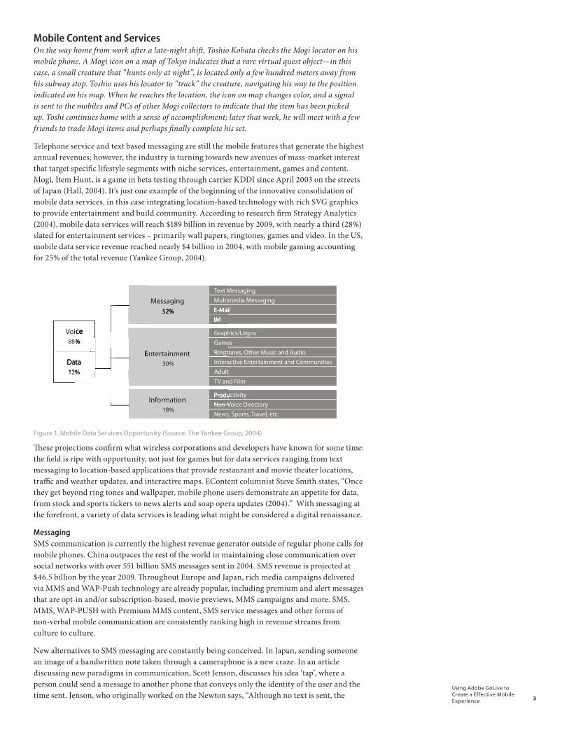
Telephone service and text based messaging are still the mobile features that generate the highest annual revenues; however, the industry is turning towards new avenues of mass-market interest that target specifi c lifestyle segments with niche services, entertainment, games and content. Mogi, Item Hunt, is a game in beta testing through carrier KDDI since April 2003 on the streets of Japan (Hall, 2004). It’s just one example of the beginning of the innovative consolidation of mobile data services, in this case integrating location-based technology with rich SVG graphics to provide entertainment and build community. According to research fi rm Strategy Analytics (2004), mobile data services will reach $189 billion in revenue by 2009, with nearly a third (28%) slated for entertainment services – primarily wall papers, ringtones, games and video. In the US, mobile data service revenue reached nearly $4 billion in 2004, with mobile gaming accounting for 25% of the total revenue (Yankee Group, 2004).
�������
�������
��������
�������������
��������������
��������������������
������
��
������������
�������������������
��������������������������
��� ������
��
������������
�������������������
�����������������
��������������
�����
��������������������������������
�����������������������������������������
�����
�����������
���������������
���
�������
�������������
��������������
Figure 1. Mobile Data Services Opportunity (Source: The Yankee Group, 2004)
Th ese projections confi rm what wireless corporations and developers have known for some time: the fi eld is ripe with opportunity, not just for games but for data services ranging from text messaging to location-based applications that provide restaurant and movie theater locations, traffi c and weather updates, and interactive maps. EContent columnist Steve Smith states, “Once they get beyond ring tones and wallpaper, mobile phone users demonstrate an appetite for data, from stock and sports tickers to news alerts and soap opera updates (2004).” With messaging at the forefront, a variety of data services is leading what might be considered a digital renaissance.
Messaging SMS communication is currently the highest revenue generator outside of regular phone calls for mobile phones. China outpaces the rest of the world in maintaining close communication over social networks with over 551 billion SMS messages sent in 2004. SMS revenue is projected at $46.5 billion by the year 2009. Th roughout Europe and Japan, rich media campaigns delivered via MMS and WAP-Push technology are already popular, including premium and alert messages that are opt-in and/or subscription-based, movie previews, MMS campaigns and more. SMS, MMS, WAP-PUSH with Premium MMS content, SMS service messages and other forms of non-verbal mobile communication are consistently ranking high in revenue streams from culture to culture.
New alternatives to SMS messaging are constantly being conceived. In Japan, sending someone an image of a handwritten note taken through a cameraphone is a new craze. In an article discussing new paradigms in communication, Scott Jenson, discusses his idea ‘tap’, where a person could send a message to another phone that conveys only the identity of the user and the time sent. Jenson, who originally worked on the Newton says, “Although no text is sent, the
4
Using Adobe GoLive to Create a Effective Mobile Experience
message isn’t really empty of content as it has a sender and an arrival time, both of which can have meaning depending on social context (Jenson, quoted in Rheingold, 2004).”
➤ SMS (Short Message Service) is the earliest and most widespread messaging technology used globally. These text-only messages are limited to 160 characters and are popular especially in Asia as a form of social networking and communication.
➤ MMS (Multimedia Message Service) contains combinations of graphics, sound and text to create a true multimedia experience. Although limited in size to approximately 30 KB, these messages rely on a high-speed network and in some countries are cost-prohibitive as carriers are charging per kilobyte.
➤ WAP-PUSH (Wireless Application Protocol) is a formatted SMS message that uses text to direct end users to a web page where they can download graphics, sound or media. The result is similar to a MMS message, however its costs are on the same par with SMS and it runs on low bandwidth carrier speeds. This messaging protocol is quickly replacing MMS.
➤ Premium Services are used for paid content or subscription-based content delivered using SMS, MMS or WAP-PUSH technology. Premium SMS has been the most successful, as it can send “blast” alerts such as stock quotes, game scores and soap opera updates. Voting and polls are also popular. Easy billing using premium delivery methods allows for purchasing of downloadable content, including ringtones, MP3s and eventually streaming video.
➤ Secret SMS (or service SMS) are special SMS messages that can be sent as anonymous content and device commands, which can be used to trigger RSS feeds or pre-downloaded SVG-T content, such as a breaking news, sports and entertainment information.
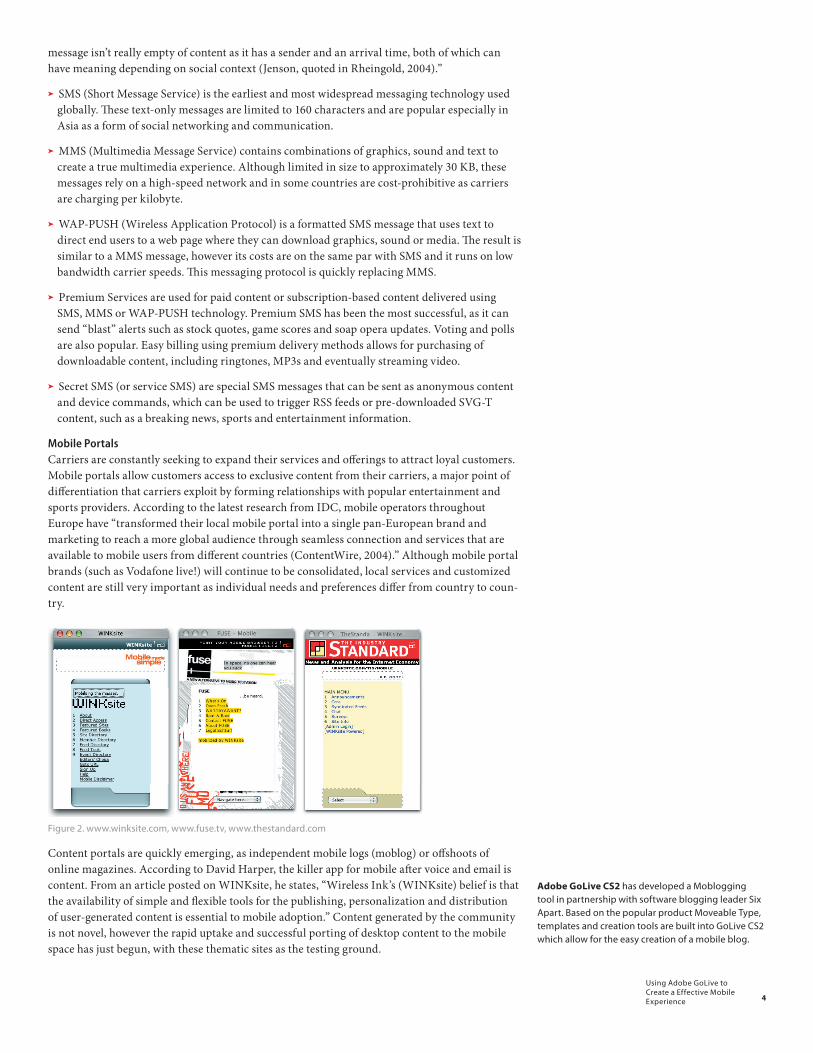
Mobile PortalsCarriers are constantly seeking to expand their services and offerings to attract loyal customers. Mobile portals allow customers access to exclusive content from their carriers, a major point of differentiation that carriers exploit by forming relationships with popular entertainment and sports providers. According to the latest research from IDC, mobile operators throughout Europe have “transformed their local mobile portal into a single pan-European brand and marketing to reach a more global audience through seamless connection and services that are available to mobile users from different countries (ContentWire, 2004).” Although mobile portal brands (such as Vodafone live!) will continue to be consolidated, local services and customized content are still very important as individual needs and preferences differ from country to coun-try.
Figure 2. www.winksite.com, www.fuse.tv, www.thestandard.com
Content portals are quickly emerging, as independent mobile logs (moblog) or offshoots of online magazines. According to David Harper, the killer app for mobile after voice and email is content. From an article posted on WINKsite, he states, “Wireless Ink’s (WINKsite) belief is that the availability of simple and flexible tools for the publishing, personalization and distribution of user-generated content is essential to mobile adoption.” Content generated by the community is not novel, however the rapid uptake and successful porting of desktop content to the mobile space has just begun, with these thematic sites as the testing ground.
Adobe GoLive CS2 has developed a Moblogging tool in partnership with software blogging leader Six Apart. Based on the popular product Moveable Type, templates and creation tools are built into GoLive CS2 which allow for the easy creation of a mobile blog.

5
Using Adobe GoLive to Create a Effective Mobile Experience
Location-Based ServicesIn the UK, shoppers can now access near real-time real estate information by entering a few short codes into their mobile phones. Wireless messages are sent with information and photos of available real estate in their local area. The service is based on SEMP™ technology (Smart Engine Mobile Platform) created by Artificial Life, Inc. based in Hong Kong along with Intel-ligent Property Ltd. based in the UK (Artificial Life, Inc., 2004). Services like this will soon be cropping up in various markets worldwide. Japanese-based Cybird is trying a new service that allows subscribers to download information directly from digital television by pointing their phone to the television screen. The service uses GPS technology to allow receivers to download information (such as special discounts or locations) specific to their geographical area (Yahoo! IndiaNews: Technology, 2004).
Figure 3. – this diagram is FPO, need updated info
In March of 2003, Vodafone Japan introduced the “Loco Guide” allowing Japanese subscribers to access location-specific content on transportation, restaurants, banks, hospitals and other services. Services using SVG-Tiny to create vector based maps and graphics are already used throughout Japan and Asia. The GPS system of the mobile device is a natural locator, using it to help locate stores, gas stations and addresses. Child tracking systems are finally reaching mainstream audiences like the China’s new “Qin Zi Tong” service that uses GPS positioning to track a child’s whereabouts in Beijing (Textually.org, 2004). Location-based services have been the buzz for quite a few years, rolling out alongside the promise of high-bandwidth (3G); how-ever, consumer uptake on actual services has been very slow on a mass-market, global scale.
Gaming With mobile gaming revenue topping $1 billion globally in 2004 and projected at $6.4 billion annually by the end of the decade, there has never been a better time to enter the mobile gaming market (Yahoo! News, 2004). Several factors are merging to make gaming an enticing oppor-tunity for developers and businesses worldwide. The widespread penetration of mobile devices to a diverse audience has brought a range of mass market ‘players’ to the table, not just the commuters or the youth market of the early 90’s. The Yankee Group (2004) announced last year that 58% of mobile gamers were women, opting to play skill based games such as solitaire and Tetris rather than ‘shoot em’ up’ games.
With an average of $3 - $10 million and 2-4 years to design and develop a polished PC-based multi-platform game, independent mobile developers can launch a new game and experiment with different formats and themes for a much lower cost, and even more importantly, within a shorter timeframe. Exciting advances in technology such as Java 3D or J2R266 (scalable 2-D vector graphics) allow for more compelling gaming content on mobile devices. Handsets such as a new model from LG Electronics are also rapidly improving to allow for faster chips and larger liquid crystal display screens.
Music and Video Services Full-fidelity (also called true tone) music downloads, as opposed to single-channel polyphonic ringtones, are quickly arriving in the mobile sector. Expandable handset memory and faster consumer-accessible high bandwidth (3G) networks have allowed for a number of services to launch in Europe alone. European high-fidelity music services such as 02, Vodafone, T-Mobile and Telefonica Moviles Espana continue to grow (Rosenblatt, 2004), however Tele Sonora of Finland has a new streaming music service called StreamMan that offers a complete service much like PC-based Rhapsody or Napster. The service offers on-demand streaming music, along with radio-like music channels and other downloads. The service is driven by BeepScience’s Digital Rights Management (DRM) technology supporting the Open Mobile Alliance’s (OMA) DRM 2.0 standard, and works Symbian-based operating systems.
6
Using Adobe GoLive to Create a Effective Mobile Experience
Higher resolution, flat screen backlit display is one of the newer technologies being released this year. Paired with the 3G networks that are already mainstream in Asia and launching now in Europe, the flat screen backlit display is an exciting innovation that will enable the next generation of video content services and offerings for the mobile user. Mobile video is also going mainstream starting with UK-based MX Telecom’s concept for dial-in streaming video where a subscriber dials a 5-digit code and high-quality video streams to the phone, paid for by the service.
Digital Rights Management (DRM)Digital rights encompass most of the ringtones, games, video clips and wallpaper graphics available for downloading today. As content providers and large entertainment brands move into packaged offerings, such as customized MP3s, video downloads and customized service offerings promoting the release of upcoming movies, digital rights manage-ment gets more complex and costly. The Open Mobile Alliance (OMA) is helping to manage compliance and security issues by creating a new standard called OMA DRM 2.0. This standard allows for encrypted downloading and legal transferring of media and is an embedded technology being offered to 3G carriers through third party solutions to confirm compliance.

7
Using Adobe GoLive to Create a Effective Mobile Experience
Mobile Technology OverviewTh e growth of the mobile industry is inseparable from the growth of technology. One mobile year seems to equals ten Internet years, with new standards, emerging technologies and de-vices being released on a near-monthly basis. Th e mobile user experience relies on a fusion of interrelated technical components, and the technology upon which each of them is based advances independently from the others.
Th e following section will provide a basic outline of the technical components that underlie the mobile user experience, and the key developments and variables that are shaping the future of the industry. Th is overview begins with the two components that make up the most basic framework of the mobile phone and its technical functionality: the handset and the operating system. Next web-based and application-based authoring are described, followed by a descrip-tion of network/carrier variables. Th e last area in the Technology Overview will briefl y cover one of the most pressing issues in mobile technology today: open standards. All together, these sections provide a working technical foundation and an overview of the development and design options available in the mobile world today.
�����������������������
�������������������
���������������������������
����������������
�����������������
����������������������
Figure 4. The Layers of Technology in the Mobile Industry
User Interface – Mass Market and Smart Handset typesTh ere are two broad classifi cations of handsets within the mobile industry: mass market feature handsets and smartphones. Th ough the exact defi nition of the smartphone has not been agreed upon within the industry, generally mass market handsets feature Real Time Operating Systems (or RTOS) and smartphones feature mostly Symbian, Linux and BREW Operating Systems, which allow for numerous applications to be added. Smartphone is a name originally coined by Microsoft when the company released their Pocket PC line and is now used as a general term for this category of phones. For the purposes of this paper, smartphones are those authored on Symbian, Palm and Windows Mobile Operating Systems.
Technically, the only true distinguishing factor between a smartphone and a mass market handset is the capability of its operating system. Smartphone operating systems work like regular desktop computers with two-way synchronisation of data and ability to add OS-based applications without restriction (Canalys, 2004 ). In moderate contrast, mass market handsets run on a Real Time Operating System (RTOS) which also allow data synchronization to take
�����������������������
��������������������������������������������������������
8
Using Adobe GoLive to Create a Effective Mobile Experience
place, however the OS-system is limited and applications cannot be added without restriction (Canalys, 2004)
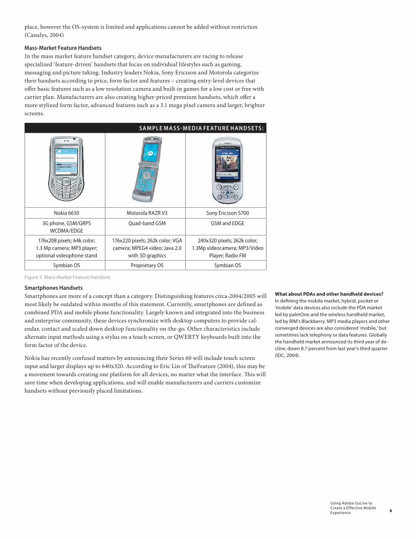
Mass-Market Feature HandsetsIn the mass market feature handset category, device manufacturers are racing to release specialized ‘feature-driven’ handsets that focus on individual lifestyles such as gaming, messaging and picture taking. Industry leaders Nokia, Sony Ericsson and Motorola categorize their handsets according to price, form factor and features – creating entry-level devices that offer basic features such as a low resolution camera and built-in games for a low cost or free with carrier plan. Manufacturers are also creating higher-priced premium handsets, which offer a more stylized form factor, advanced features such as a 3.1 mega pixel camera and larger, brighter screens.
SA M PL E M A SS - M E D I A FE AT U R E H A N D S E T S :
Nokia 6630 Motorola RAZR V3 Sony Ericsson S700
3G phone, GSM/GRPS WCDMA/EDGE
Quad-band GSM GSM and EDGE
176x208 pixels; 64k color; 1.3 Mp camera; MP3 player; optional videophone stand
176x220 pixels; 262k color; VGA camera; MPEG4 video; Java 2.0
with 3D graphics
240x320 pixels; 262k color; 1.3Mp videocamera; MP3/Video
Player; Radio FM
Symbian OS Proprietary OS Symbian OS
Figure 5. Mass-Market Feature Handsets
Smartphones HandsetsSmartphones are more of a concept than a category. Distinguishing features circa-2004/2005 will most likely be outdated within months of this statement. Currently, smartphones are defined as combined PDA and mobile phone functionality. Largely known and integrated into the business and enterprise community, these devices synchronize with desktop computers to provide cal-endar, contact and scaled down desktop functionality on-the-go. Other characteristics include alternate input methods using a stylus on a touch screen, or QWERTY keyboards built into the form factor of the device.
Nokia has recently confused matters by announcing their Series 60 will include touch screen input and larger displays up to 640x320. According to Eric Lin of TheFeature (2004), this may be a movement towards creating one platform for all devices, no matter what the interface. This will save time when developing applications, and will enable manufacturers and carriers customize handsets without previously placed limitations.
What about PDAs and other handheld devices? In defining the mobile market, hybrid, pocket or ‘mobile’ data devices also include the PDA market led by palmOne and the wireless handheld market, led by RIM’s Blackberry. MP3 media players and other converged devices are also considered ‘mobile,’ but sometimes lack telephony or data features. Globally the handheld market announced its third year of de-cline, down 8.7 percent from last year’s third quarter (IDC, 2004).
9
Using Adobe GoLive to Create a Effective Mobile Experience
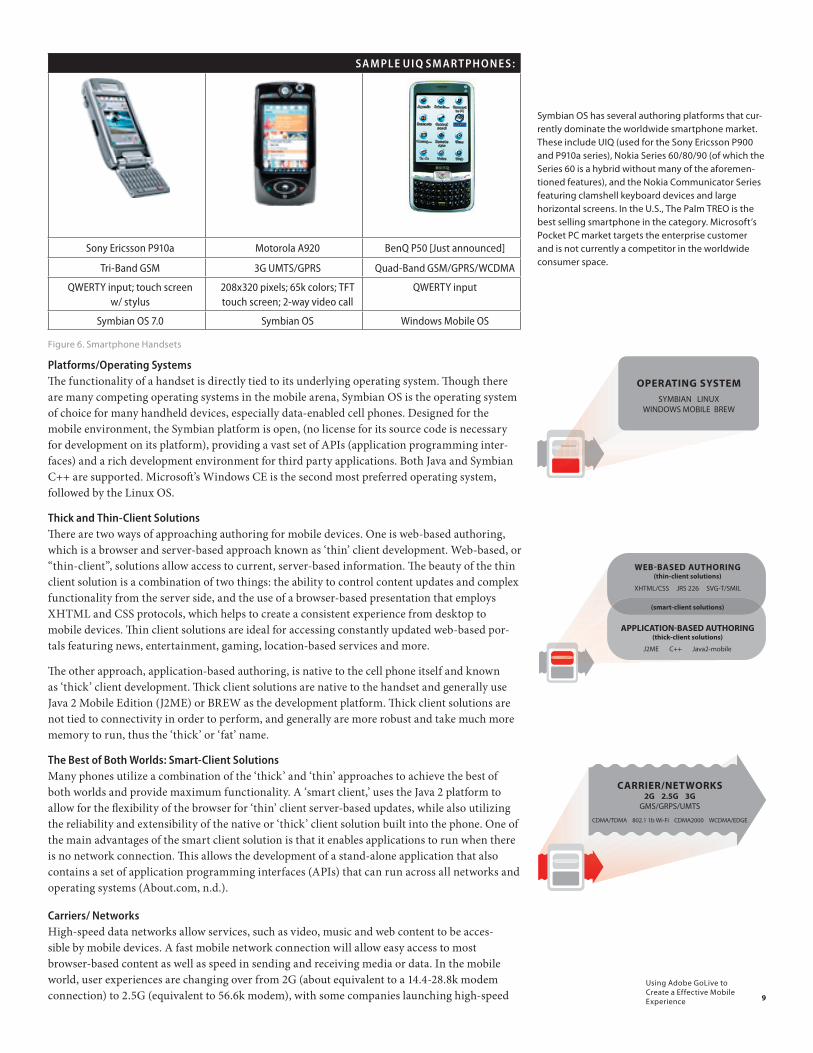
SA M PLE U I Q SM AR TPH O N E S :
Sony Ericsson P910a Motorola A920 BenQ P50 [Just announced]
Tri-Band GSM 3G UMTS/GPRS Quad-Band GSM/GPRS/WCDMA
QWERTY input; touch screen w/ stylus
208x320 pixels; 65k colors; TFT touch screen; 2-way video call
QWERTY input
Symbian OS 7.0 Symbian OS Windows Mobile OS
Figure 6. Smartphone Handsets
Platforms/Operating SystemsTh e functionality of a handset is directly tied to its underlying operating system. Th ough there are many competing operating systems in the mobile arena, Symbian OS is the operating system of choice for many handheld devices, especially data-enabled cell phones. Designed for the mobile environment, the Symbian platform is open, (no license for its source code is necessary for development on its platform), providing a vast set of APIs (application programming inter-faces) and a rich development environment for third party applications. Both Java and Symbian C++ are supported. Microsoft ’s Windows CE is the second most preferred operating system, followed by the Linux OS.
Thick and Thin-Client SolutionsTh ere are two ways of approaching authoring for mobile devices. One is web-based authoring, which is a browser and server-based approach known as ‘thin’ client development. Web-based, or “thin-client”, solutions allow access to current, server-based information. Th e beauty of the thin client solution is a combination of two things: the ability to control content updates and complex functionality from the server side, and the use of a browser-based presentation that employs XHTML and CSS protocols, which helps to create a consistent experience from desktop to mobile devices. Th in client solutions are ideal for accessing constantly updated web-based por-tals featuring news, entertainment, gaming, location-based services and more.
Th e other approach, application-based authoring, is native to the cell phone itself and known as ‘thick’ client development. Th ick client solutions are native to the handset and generally use Java 2 Mobile Edition (J2ME) or BREW as the development platform. Th ick client solutions are not tied to connectivity in order to perform, and generally are more robust and take much more memory to run, thus the ‘thick’ or ‘fat’ name.
The Best of Both Worlds: Smart-Client SolutionsMany phones utilize a combination of the ‘thick’ and ‘thin’ approaches to achieve the best of both worlds and provide maximum functionality. A ‘smart client,’ uses the Java 2 platform to allow for the fl exibility of the browser for ‘thin’ client server-based updates, while also utilizing the reliability and extensibility of the native or ‘thick’ client solution built into the phone. One of the main advantages of the smart client solution is that it enables applications to run when there is no network connection. Th is allows the development of a stand-alone application that also contains a set of application programming interfaces (APIs) that can run across all networks and operating systems (About.com, n.d.).
Carriers/ NetworksHigh-speed data networks allow services, such as video, music and web content to be acces-sible by mobile devices. A fast mobile network connection will allow easy access to most browser-based content as well as speed in sending and receiving media or data. In the mobile world, user experiences are changing over from 2G (about equivalent to a 14.4-28.8k modem connection) to 2.5G (equivalent to 56.6k modem), with some companies launching high-speed
��������������������������������
�������������
�����������������������������������������������������
������������������������������������������
���������������������������������������������������
���������������������������������
������������������������������������
������������������������
Symbian OS has several authoring platforms that cur-rently dominate the worldwide smartphone market. These include UIQ (used for the Sony Ericsson P900 and P910a series), Nokia Series 60/80/90 (of which the Series 60 is a hybrid without many of the aforemen-tioned features), and the Nokia Communicator Series featuring clamshell keyboard devices and large horizontal screens. In the U.S., The Palm TREO is the best selling smartphone in the category. Microsoft’s Pocket PC market targets the enterprise customer and is not currently a competitor in the worldwide consumer space.
����������������������������������
��������������������
10
Using Adobe GoLive to Create a Effective Mobile Experience
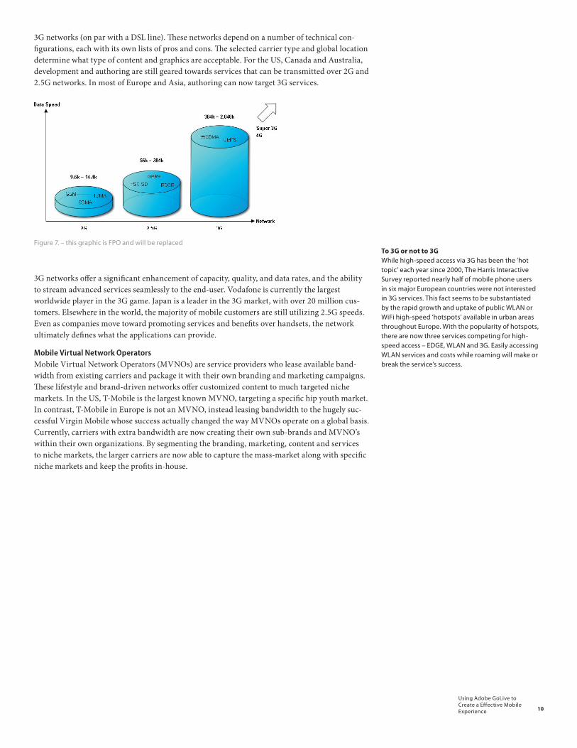
3G networks (on par with a DSL line). These networks depend on a number of technical con-figurations, each with its own lists of pros and cons. The selected carrier type and global location determine what type of content and graphics are acceptable. For the US, Canada and Australia, development and authoring are still geared towards services that can be transmitted over 2G and 2.5G networks. In most of Europe and Asia, authoring can now target 3G services.
Figure 7. – this graphic is FPO and will be replaced
3G networks offer a significant enhancement of capacity, quality, and data rates, and the ability to stream advanced services seamlessly to the end-user. Vodafone is currently the largest worldwide player in the 3G game. Japan is a leader in the 3G market, with over 20 million cus-tomers. Elsewhere in the world, the majority of mobile customers are still utilizing 2.5G speeds. Even as companies move toward promoting services and benefits over handsets, the network ultimately defines what the applications can provide.
Mobile Virtual Network Operators Mobile Virtual Network Operators (MVNOs) are service providers who lease available band-width from existing carriers and package it with their own branding and marketing campaigns. These lifestyle and brand-driven networks offer customized content to much targeted niche markets. In the US, T-Mobile is the largest known MVNO, targeting a specific hip youth market. In contrast, T-Mobile in Europe is not an MVNO, instead leasing bandwidth to the hugely suc-cessful Virgin Mobile whose success actually changed the way MVNOs operate on a global basis. Currently, carriers with extra bandwidth are now creating their own sub-brands and MVNO’s within their own organizations. By segmenting the branding, marketing, content and services to niche markets, the larger carriers are now able to capture the mass-market along with specific niche markets and keep the profits in-house.
To 3G or not to 3G While high-speed access via 3G has been the ‘hot topic’ each year since 2000, The Harris Interactive Survey reported nearly half of mobile phone users in six major European countries were not interested in 3G services. This fact seems to be substantiated by the rapid growth and uptake of public WLAN or WiFi high-speed ‘hotspots’ available in urban areas throughout Europe. With the popularity of hotspots, there are now three services competing for high-speed access – EDGE, WLAN and 3G. Easily accessing WLAN services and costs while roaming will make or break the service’s success.
11
Using Adobe GoLive to Create a Effective Mobile Experience
The Importance of Open StandardsMobile developers have been racing against each other to bring increasingly complex and innovative products and services to market, many using their own unique design standards. As a result, there has been a technological fragmentation within the industry at multiple levels. This adversely affects both developers and consumers of mobile products and services. Mobile developers and designers are reported to spend 20 percent of their time developing, testing and debugging their applications and interfaces, and 80 percent of their time adapting the application for multiple handsets and carriers (Jupiter Research, 2004). The resulting effect on costs and time to market are dramatic and pose a problem for small companies attempting to en-ter the mobile industry in particular. After release, end product compatibility problems confuse and discourage potential users. The development of industry-wide open standards for operating systems, authoring languages and component-based APIs largely alleviate the problems result-ing from fragmentation.
Application-Based Open StandardsApplication compatibility across a diverse spectrum of available devices is another major hurdle facing developers who make the jump into the mobile industry. Understanding the nuances of the devices, the limitations of the hardware environment and networks, as well as the spe-cial considerations of the end user all contribute to a high learning curve. When developing applications, Java is the primary open source authoring language. Its flexible component-based architecture allows for faster development and deployment. Nokia and Vodafone have recently announced an initiative to simplify mobile Java standards to help ensure application compatibility across multi-vendor mobile devices (MobileDevelopment Advisor, 2004).
The Symbian OS environment, formed by Ericsson, Nokia, Motorola and Psion in 1998, is the most favored system in the open standards developer community and the de factor standard for mobile authoring. Symbian OS allows for a flexible, modular authoring system designed around APIs.
Web-Based Open StandardsOne of the greatest challenges in the industry is designing web experiences that are accessible regardless of whether the user is browsing on a personal computer or a mobile device. When creating web-based content, language protocols XHTML and CSS set standards for open sourced coding structure and help to create a consistent experience from desktop to mobile devices. Standards-compliant Scalable Vector Graphics (SVG-Tiny) is the standard protocol for complex vector-based graphics and animation and is usually combined with Synchronized Multimedia Integration Language (SMIL) to create timed presentations combining graphics, text and imagery in a true multi-media fashion.
The following are the four major mobile open standards language protocols that are currently supported by the W3C and OMA for mobile authoring.
➤ XHTML (eXtensible HyperText Markup Language) is the official web markup standard, replacing HTML and Wireless Application Protocol (WAP 1.0) for mobile devices. XHTML is compliant with XML to support specific tags and structure. Variations such as XHTML basic and XHTML mobile profile are used extensively in combination with CSS to control web-based presentation, structure and layout.
➤ CSS (Cascading Style Sheets) controls many of the visual elements on a web page, including font sizes, colors and formatting. Stylesheets are also used to control presentation and layout in conjunction with XHTML for both web and mobile web content. Variations include CSS2, CSS-basic and
➤ SVG-Tiny (Scalable Vector Graphics) is the standard for interactive and dynamic vector based graphics and animation on mobile devices. Based on XML, SVG-T allows for 2D graphics to be displayed and/or manipulated. Currently, SVG-Tiny is supported by all mobile browsers including Opera, Access, Openwave and Obigo.
Already a familiar tool for web designers, Adobe Go-Live CS2 supports all of the major mobile open stan-dards, including XHTML, CSS, SMIL and SVG-Tiny. The good news is Adobe GoLive CS2 has the capability to test and validate code for each of the major standards as well as supporting visual CSS authoring.
According to the book Open Gardens (2004) “open” means “openness of access for the customer, allowing access to any content from any mobile device; open-ness of platforms and operating systems for develop-ers when creating mobile applications; and royalty free distribution of source code.”
The Open Mobile Alliance (OMA) http://www.openmobilealliance.org, the World Wide Web Con-sortium (W3C) http://www.w3c.org along with the 3rd Generation Partnership Project (3GPP) http://www.3gpp.org are the main collaborators providing specifications for standards for mobile development. 3GPP maintains standards bodies in each of the major countries for high speed connection, with a focus on interoperability between vendors, carriers and platforms.
12
Using Adobe GoLive to Create a Effective Mobile Experience
➤ SMIL (Synchronized Multimedia Integration Language) uses XML to create a timeline describing how graphics, text and sound should be displayed or how they will play together in a sequence. SMIL was developed by REAL when they realized there was a way to add anima-tion and synchronize sound and images without having actual video. SMIL allows for multiple versions (playing on different bandwidths) as well as multiple languages to be displayed. MMS is a stripped down version of SMIL, with very similar capabilities.
13
Using Adobe GoLive to Create a Effective Mobile Experience
The FutureMoving to 3G and Beyond – The Wireless WorldWith most of the world moving from 2G to 2.5G or 3G, the mobile market has developed sub-stantially, particularly with the take off of 3G networks in Europe and in North America, follow-ing similar moves by Japan and Korea .
The development of the next round of high-speed wireless data services is already underway. 4G is touted as having the ability to access different network standards with the same device and a higher level of bandwidth .) But even before 4G has been standardized, another new consortium of carriers involving 26 of the world’s largest telecom players has signed the ‘Super 3G’ agree-ment. Predicted to be 10 times faster than 3G, Super 3G will facilitate television-quality video for video games, movies and more . As newer and faster data-based mobile services enter the wire-less market, the demand for higher capacity will define the underlying technology.
Upcoming Trends High-speed data access, Wi-Fi functionality, high-quality video cameras, and broadcast TV are just some of the future functionalities that will soon be available to cell phone users. The Federal Communications Commission (FCC) is reviewing the ban of cell phones on commercial planes – this might lead to a wider use of text messaging rather than voice-calls, in the manner of the Japanese. 70% of cell phones in the world will have digital television chips for cell phones in the next two or three years. Already, “Mobisodes” – one minute videos for mobile phones – of the television series “24” are being developed by Vodaphone. This may soon be a viable form of entertainment provided to people who are waiting to fill gaps in their time – such as when they are waiting at the subway or in line. While the use of mobile phones will become more wide-spread, new etiquette will evolve regarding the use of cell phones in public places. It might well be a small world. GPS systems and global roaming will break down borders, and long-distance, along with international calls will cease to be a cost-issue through integrated VOIP technology. Area codes will no longer be location-specific. Mobile devices will take the form of more personal items, like the clothes we wear or accessories.
Location Based ServicesInformation, tracking, alerting, and navigation services are some of the location based services (LBD) that are already available to cell phone users. GPS systems help lost travelers by telling them where they are and how to get where they are going. According to FCC rules, by 2005, carriers must be able to pinpoint a 911 caller’s location to within 50 to 300 meters. In the future, advertisers may be able to harness this feature to alert shoppers to sales and stores of interest as they pass by.
14
Using Adobe GoLive to Create a Effective Mobile Experience
Mobile phones, by the very virtue of being ubiquitous, are indispensable tools for information distribution during times of natural disasters. Network operators may soon offer location based services that will let the mobile handset be used as an early warning device in future emergencies.
Micro-payments and McommerceCell phones pack so many features already; it is no wonder that they are also turning into mobile wallets. The future will see cell phones used as the primary way to purchase digital content or railway-passes to full virtual shopping with a few clicks. If currently, the cell phone is the one thing other than the wallet that you don’t leave the house without, soon it may just be the only thing you don’t leave the house without. By 2006, Ovum – a research firm, projects wireless commerce could reach $37 billion. Mobile payment is projected to grow at the cost of credit card payments. “We’ll hear ‘Will this be a credit card transaction or just a mobile transaction? (need date & source for this)”, says John Strand, CEO of Copenhagen, Denmark-based Strand Consult.
The Youth Market Will Determine The Future The one common denominator that transcends all cultural and technological barriers is the current and future predominance of the youth market in the wireless industry. Already, the mobile youth market generates more than a quarter of worldwide wireless revenue and will account for nearly 30% of subscribers by 2008 (In-Stat/MDR – don’t know the source here). The U.S. controls mobile youth spending with nearly 44.9 million teens spending nearly $400 annually on mobile hardware, peripherals, services and downloadable content. (Mobile Youth, 2004). China is number three with 19.8 million, however teenage mobile subscribers average only a tenth of the spending power of the U.S. teen market. As this market is highly influenced by social networks and peer groups, devices have been shown to be both a fashion statement and a symbol of independence and will continue to serve these functions. Two of the most successful revenue generators, SMS (Short Messaging Service) and ringtones were the result of early youth experimentation, which is an example of how this market segment drives the global market. With their ready acceptance of text voting and hunger for downloadable music and games, mobile youth continue to be a growing revenue source that cannot be denied.
Youth are not only the predictor of cell phone usage but also the future users with the ability to change the mobile landscape. Researchers predict that teenagers will comprise the fastest growing market for wireless voice and data services over the next few years. Cheskin (2001), a market research group, interviewed over 1,000 respondents between ages 13 and 24, and predicted the following trends in the wireless youth market:
➤ Wireless devices will be defined by their ability to provide social connectivity and entertainment.
➤ Teens and young adults will build relationships via wireless devices.
➤ Wireless entertainment and information applications will become favored “gap-fillers”.
➤ The most successful wireless devices will converge the function of multiple devices.
➤ Entertainment will drive the development of wireless cross-platform content.
The nature of content and services offered determine the adoption of the cellphone as a ubiquitous tool. Local culture and traditions also determine the content as well as use of mobile devices in non-traditional and novel ways. For network operators, the move to faster, interoperable carrier technologies will propel the mobile revolution into the future. The move to standards-based design will reap rich dividends in this evolving industry where many things are still up in the air. As for the mobile user, the future only promises to get better – with better service and more functionality integrated into mobile devices, it will be a personal productivity tool, social networking tool and a source of contextual information.
The Killer AppWith the success of SMS as the main form of com-munication and revenue outside of voice calls, mobile carriers, handset manufacturers and content provid-ers are madly looking to find the next application that appeals to all segments of the global market, or “killer app”. Many companies are approaching the problem as one would approach a dart game blindfolded - throwing randomly at a target with lack of clear vision and hoping something will ‘stick’. There is no reasonable alternative to combining market research with product and service development, and the de-signers and developers who recognize this will have the edge on the competition as the market develops.

15
Using Adobe GoLive to Create a Effective Mobile Experience
Technological SummaryThe areas discussed in this section show that there are several key technological variables to be considered when designing and developing mobile products for the end user. Issues of network interoperability and device incompatibility affect the ability of mobile phones to communicate with each other. Designers must consider handset type and the operating system in order to create optimal web- and application-based experiences on individual devices. Content provid-ers need to consider network speeds as they offer downloadable video, games and marketing messages to specific target audiences. Each technological layer of the mobile experience comes with its own benefits and restrictions and must be taken into consideration with regards to how it affects the end product and most importantly the end user.
The technical landscape – vast and complex – forms the framework and structure for the successful development of mobile content, services and applications. By establishing a clear foundation, mobile designers and developers are able to create a mobile experience that merges technology and culture into a seamless, positive end-user experience.
16
Using Adobe GoLive to Create a Effective Mobile Experience
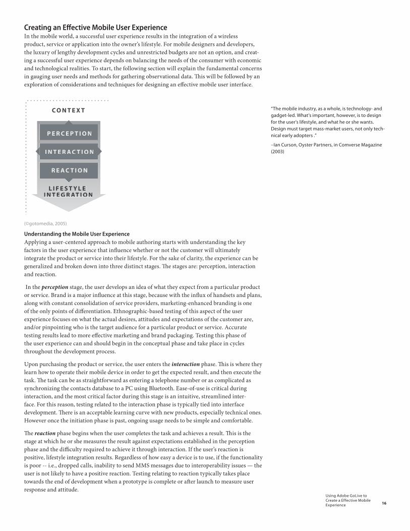
Creating an Eff ective Mobile User ExperienceIn the mobile world, a successful user experience results in the integration of a wireless product, service or application into the owner’s lifestyle. For mobile designers and developers, the luxury of lengthy development cycles and unrestricted budgets are not an option, and creat-ing a successful user experience depends on balancing the needs of the consumer with economic and technological realities. To start, the following section will explain the fundamental concerns in gauging user needs and methods for gathering observational data. Th is will be followed by an exploration of considerations and techniques for designing an eff ective mobile user interface.
������� ���
�������� ���
����� ���
� � ������� ��������� ���
�������
(©gotomedia, 2005)
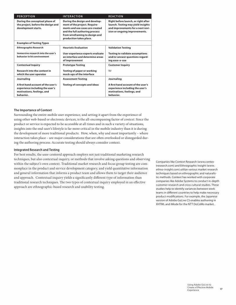
Understanding the Mobile User ExperienceApplying a user-centered approach to mobile authoring starts with understanding the key factors in the user experience that infl uence whether or not the customer will ultimately integrate the product or service into their lifestyle. For the sake of clarity, the experience can be generalized and broken down into three distinct stages. Th e stages are: perception, interaction and reaction.
In the perception stage, the user develops an idea of what they expect from a particular product or service. Brand is a major infl uence at this stage, because with the infl ux of handsets and plans, along with constant consolidation of service providers, marketing-enhanced branding is one of the only points of diff erentiation. Ethnographic-based testing of this aspect of the user experience focuses on what the actual desires, attitudes and expectations of the customer are, and/or pinpointing who is the target audience for a particular product or service. Accurate testing results lead to more eff ective marketing and brand packaging. Testing this phase of the user experience can and should begin in the conceptual phase and take place in cycles throughout the development process.
Upon purchasing the product or service, the user enters the interaction phase. Th is is where they learn how to operate their mobile device in order to get the expected result, and then execute the task. Th e task can be as straightforward as entering a telephone number or as complicated as synchronizing the contacts database to a PC using Bluetooth. Ease-of-use is critical during interaction, and the most critical factor during this stage is an intuitive, streamlined inter-face. For this reason, testing related to the interaction phase is typically tied into interface development. Th ere is an acceptable learning curve with new products, especially technical ones. However once the initiation phase is past, ongoing usage needs to be simple and comfortable.
Th e reaction phase begins when the user completes the task and achieves a result. Th is is the stage at which he or she measures the result against expectations established in the perception phase and the diffi culty required to achieve it through interaction. If the user’s reaction is positive, lifestyle integration results. Regardless of how easy a device is to use, if the functionality is poor -- i.e., dropped calls, inability to send MMS messages due to interoperability issues — the user is not likely to have a positive reaction. Testing relating to reaction typically takes place towards the end of development when a prototype is complete or aft er launch to measure user response and attitude.
“The mobile industry, as a whole, is technology- and gadget-led. What’s important, however, is to design for the user’s lifestyle, and what he or she wants. Design must target mass-market users, not only tech-nical early adopters .”
–Ian Curson, Oyster Partners, in Comverse Magazine (2003)
17
Using Adobe GoLive to Create a Effective Mobile Experience
P E R C E P T I O N I N T E R AC T I O N R E AC T I O N
During the conceptual phase of the project, before the design and development starts.
During the design and develop-ment of the project. Require-ments and use cases are created and the full authoring process from wireframing to design and production takes place.
Right before launch, or right after launch. Testing may yield insights and improvements for a next revi-sion or ongoing improvements.
Examples of Testing Types
Ethnographic Research
Immersive research into the user’s behavior in his environment
Heuristic Evaluation
User experience experts evaluate an interface and determine areas of improvement
Validation Testing
Testing to validate assumptions and/or answer questions regard-ing ease-o-use
Contextual Inquiry
Research into the context in which the user operates
Prototype Testing
Testing of paper or working mock-ups of the interface
Customer Inquiry
?//
Journaling
A first hand account of the user’s experience including the user’s motivations, feelings, and behavior.
Assessment Testing
Testing of concepts and ideas
Journaling
A first hand account of the user’s experience including the user’s motivations, feelings, and behavior.
The Importance of ContextSurrounding the entire mobile user experience, and setting it apart from the experience of using other web-based or electronic devices, is the all-encompassing factor of context. Since the product or service is expected to be accessible at all times and in such a variety of situations, insights into the end-user’s lifestyle is far more critical in the mobile industry than it is during the development of more traditional products. How, when, why and most importantly – where interaction takes place – are major considerations that are often overlooked or disregarded dur-ing the authoring process. Accurate testing should always consider context.
Integrated Research and TestingFor best results, the user-centered approach employs not just traditional marketing research techniques, but also contextual inquiry, or methods that involve asking questions and observing within the subject’s own context. Traditional market research and focus group testing are com-monplace in the product and service development category, and yield quantitative information and general information that informs a product team and allows them to target their audience and approach. Contextual inquiry yields a significantly different type of information than traditional research techniques. The two types of contextual inquiry employed in an effective approach are ethnographic-based research and usability testing.
Companies like Context Research (www.contex-tresearch.com) and Ethnographic Insight (www.ethno-insight.com) utilize various market research techniques based on ethnographic and naturalis-tic methods. Context has worked with corporate companies like Adobe Systems to conduct in-depth customer research and cross cultural studies. These studies help to identify variances between work teams in different countries to help make necessary product modifications. For example, the Japanese version of Adobe GoLive CS enables authoring in XHTML and iMode for the NTT DoCoMo market.

18
Using Adobe GoLive to Create a Effective Mobile Experience
Figure x. an example of a standard development cycle with iterrative testing – this diagram is FPO, need updated info
Ethnographic-based ResearchEthnographic-based research is immersive, one-on-one observation in a subject’s own environment. Also called ‘naturalistic’ research, this method pinpoints emerging global trends by studying firsthand how users incorporate products and services into their daily lives. It is a powerful alternative to traditional marketing analysis, which studies only patterns and percentages rather than identifying the attitudes and motivators behind the data. While this type of study once took months to years to complete, the pace of the mobile industry has influenced ‘rapid ethnography’ studies. These studies compress the period to a matter of weeks by employing multiple teams concurrently conducting observation and inquiry in multiple countries or locations.
Rapid ethnography is an effective method of contextual inquiry as it results in a balance of both rigor and relevance in data capture and analysis. It is characterized by small teams of multi-dis-ciplinary experts, working collaboratively to observe, collect insights and data and determine relevance to the product or service they are working on. The research is usually conducted in a matter of weeks, instead of months.
A study performed by Context-Based Research Group called The Mobiles (2002) explored the use of rapid ethnography techniques to study the attitudes and behaviors related to the wireless world. The objective was to establish the evolution of the mobile lifestyle, drawn from various cultures and age groups. This study examined three audience segments divided by age, across seven global locations for one week each. Context’s anthropologists recruited144 participants and employed a three-part “deep dive” methodology, described as follows :
“First, the researcher conducted an in-depth interview with the participants to establish their life context and general attitudes about wireless devices. Next, each participant completed a five-day device usage diary, in which they recorded the length, content and context of every use of their mobile device as well as keep a photographic record. Lastly, the participants chose one of the five
Ethnography as applied to market research involves a “A descriptive, qualitative research methodology for studying the customer in relation to his or her environment. Researchers spend time in the field ob-serving customers and their environment to acquire a deep understanding of the lifestyles or cultures as a basis for better understanding their needs and problems (Product Development and Management Association, 2004).”
19
Using Adobe GoLive to Create a Effective Mobile Experience
days for a ‘device deprivation exercise’ during which time they could not use any of their wireless devices. The researcher met with the participant to debrief them after each exercise.. . . The study revealed a shift in human consciousness as wireless integration altered behavior, attitudes and etiquette around the world (Context-Based Research Group, 2002, pxx).”
The study explored several key themes, including the changing nature of community and relationships. Studies such as this yield insights not possible without immersion into the attitudes and behaviors of the participants’ lives. Rapid ethnography is one method of contextual research that can be applied quickly and at a fairly low cost to help inform the conceptual development of new products and services.
Usability TestingComplimentary to ethnographic-based research is usability testing, based on human factors engineering to test the literal ‘ease-of-use’ of a product based on task-oriented testing and observation. Under this method, one participant at a time is asked to perform certain tasks in an effort to measure the product’s ease-of-use, task time, and the user’s perception of the experi-ence. Usability testing can be done formally, in a usability lab with video cameras, or informally, with paper mock-ups of an application or Web site. Developers make changes to the application or site based on the findings of the usability tests.
Traditional usability testing draws from the field of human factors, an engineering-based evaluation system set in a laboratory setting. Characteristics of usability tests are that they are designed to be one-on-one (one participant and one moderator/evaluator) and to be task-oriented. One variation of testing involves heuristic analysis, also known as expert reviews, in which specialists in the field of human factors engineering or cognitive psychology conduct product walk-throughs using their own systems of system analysis and feedback. When conducting expert reviews, it is often helpful to have two to three experts walk through the prod-uct, discuss the issues and come up with mutual recommendations for improvement.
There are always more reasons to test not than to test. Many companies think that by conducting focus groups or gathering marketing data, they are conducting usability tests. This is not the case. Usability testing involves one-on-one task oriented tests that measure ease-of-use. This type of testing provides insight on how minor changes on an interface, outside of the engineering mindset and environment, can be made simpler, thus raising the odds of user adop-tion.
Mobile Testing ConsiderationsTesting for usability on mobile devices is a layered proposition. Besides testing for ease-of-use, other factors such as learnability, reliability, efficiency and likeability are also measured. For mobile devices specificity, predictability and expectations also set parameters for testing. Creating the proper context for testing is challenging, as mobile devices are generally used while on the move, and often while doing other things, such as walking or driving a car. Other factors such as culture, aptitude and personal mobile history (how many mobile phones have you owned, how long have you been with one carrier, etc.) also affect the interaction.
There are a number of issues surrounding usability testing for mobile devices. Usability tests rely on establishing real-world scenarios for participants to mimic in formal lab settings, informal office settings and sometimes in the participant’s own environment. Testing for mobile devices is challenging due to the number of scenarios surrounding the use of the device, the number of phone types available and the demographics and psychographics of the participants themselves.
Screening for ParticipantsDue to greatly varying audience segments, and the number of handheld devices and types of tasks being performed on a regular basis, it is important to screen and recruit test participants in as targeted a manner as possible for both user type and handset type. Participant screening for mobile devices rely on a lot more than general demographics such as age and occupation. Understanding lifestyle habits, mobile phone history and current phone usage helps to establish the characteristics of the targeted audience.
Most mobile devices are second or third generation, meaning the user has replaced his or her handset once or twice already, and is generally aware of the device type category and general functionality. When moving into a new phone category (for instance, moving from a Sony
Usability testing is a method by which users of a product are asked to perform certain tasks in an effort to measure the product’s ease-of-use, task time, and the user’s perception of the experience. Usability testing can be done formally, in a usability lab with video cameras, or informally, with paper mock-ups of an application or Web site. Changes are made to the application or site based on the findings of the usability tests.
20
Using Adobe GoLive to Create a Effective Mobile Experience
Ericsson T16 series to a Sony Ericsson P910a smartphone), novices or new users are the target audience. Clearly defining the needs of the end users and their goals is part of the test plan.
Test Plan CreationAccording to Idean Research’s principal Jaakko Villa (specializing in user experience and testing on mobile devices) the development of a test plan should view the goal from three perspectives. The first is user motivation – forced or voluntary, internal or external. The second is use-context, making sure testing takes place in as natural a situation as possible. The third perspective notes user actions, with an understanding of what the user is trying to accomplish and how.
Conducting the TestReplicating actual context and situation is important when conducting a mobile usability test. The moderator needs to understand that generally mobile phones will be used while multitasking -- which means while walking, driving, and even conducting another task on the same device concurrently. Replicating this experience in a natural setting is moderately difficult. First, the participant is asked to stand, since sitting and completing a single function on a device is very rarely done.
Mobile AuthoringMoving into the creation of the user interface takes additional considerations in navigation, screen layout, architecture and more. Standards-based authoring allows the end result to transpose across multiple browsers and platforms – however code ‘tweaking’ to fit the specific nuances of each mobile browser type still need to be conducted. Tools such as Adobe GoLive CS2 integrate the most current standards in visual CSS authoring, along syntax validation and automatic code completion to allow for faster and more compliant, accurate code.
Currently, authoring for small screens is a bit of a challenge. Each device manufacturer and carrier has exclusive relationships with individual browsers – seemingly randomly enabling and disabling specific features. The result is a very fragmented authoring platform. A multitude of devices with varying operating platforms, screen sizes and navigational ‘soft-keys’ have created the need to author for one or two specific devices as the target, and then ‘port’ the experience to other devices with as much accuracy as possible.
For mobile designers, this has meant specialization. Most designers work in-house for carriers, service providers or handset manufacturers. Their mobile authoring is targeted and specific. Simplified menu options specifically developed for small screens are only part of the adjustments made for mobile users. Navigation, graphic display and multiple text input methods (along with touch screens) created for specific handsets need to be taken into consideration when creating applications, downloadable content and services for the mobile web.
The Mobile DesignerMobile designers are the bridge between the end user and the engineering community. Unlike the web or mainstream design world, mobile designers cannot be simply visually or brand-ori-ented. It is mandatory to keep up to date on the latest technologies and handsets, maintain client and company education, and articulate the importance of authoring for one platform or another. Mobile designers need to be conceptual, understand the importance of brand, and yet maintain a close eye on the usability and end users’ specific needs.
Although tools and standards information are available to the design and development community at large, it is important for individual designers to keep up with the latest updates through developer lists and proactive education. Much like those developers who mastered the quest for web standards, there are communities of mobile developers who have worked out the various tweaks and solutions to cross-platform authoring issues. Keeping up with published standards available through various developer sites and the W3C are a solid start, but even these sites are not as up to date as lists and forums.
The Mobile User Interface As mobile devices become smaller and more compact, the amount of information they need to convey increases. The convergence of functions and constant addition of features create layers of complexity in mobile user interfaces. Unlike the desktop web environment, the mobile web has an entirely different set of user requirements to consider. Mobile designers and developers need to understand how to create the best user experience possible under these constraints. The following are a few key areas to consider when creating user interfaces for mobile devices.
The importance of open standards authoring. Open standards helps to create a better user experience by supporting structured markup. Using GoLiveCS2 assures updated and validated code syntax and structure through active partnerships with worldwide carriers and manufacturers such as NTT DoCoMo, Openwave, Nokia and more. Ensuring industry compliance is one step towards creating a more consistent user experience across browsers, platforms and devices.
GoLiveCS2 SDK Most developers in the mobile space target specific authoring platforms and integrated developer environments (IDEs). For the mobile developer, ‘smart client’ authoring when creating applications is the most versatile and efficient way of creating a mobile application today, using the already known authoring languages (Java and C++). Using the smart client solution, the mobile developer needs to consider the web-based front end of the interface, and the nuances of creating for mobile browsing on various screen sizes and resolutions. The GoLiveCS2 Standard Developer’s Kit (SDK) outlines many of the necessary tools and techniques available through a standards-based easy front end authoring system. Drag and drop functionality and a pre-built compo-nent based system for CSS allows for easy authoring of front-end interfaces.
21
Using Adobe GoLive to Create a Effective Mobile Experience
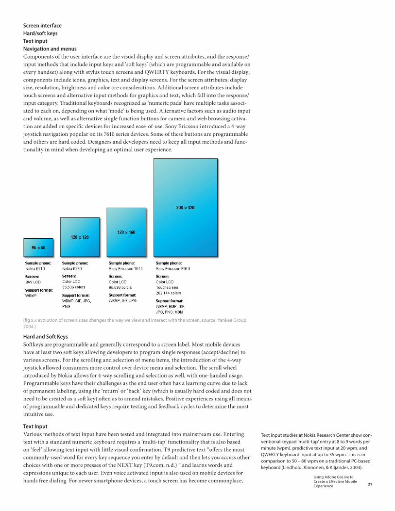
Screen interfaceHard/soft keysText inputNavigation and menusComponents of the user interface are the visual display and screen attributes, and the response/input methods that include input keys and ‘soft keys’ (which are programmable and available on every handset) along with stylus touch screens and QWERTY keyboards. For the visual display; components include icons, graphics, text and display screens. For the screen attributes; display size, resolution, brightness and color are considerations. Additional screen attributes include touch screens and alternative input methods for graphics and text, which fall into the response/input category. Traditional keyboards recognized as ‘numeric pads’ have multiple tasks associ-ated to each on, depending on what ‘mode’ is being used. Alternative factors such as audio input and volume, as well as alternative single function buttons for camera and web browsing activa-tion are added on specific devices for increased ease-of-use. Sony Ericsson introduced a 4-way joystick navigation popular on its 7610 series devices. Some of these buttons are programmable and others are hard coded. Designers and developers need to keep all input methods and func-tionality in mind when developing an optimal user experience.
[fig x.x evolution of screen sizes changes the way we view and interact with the screen. source: Yankee Group 2004.]
Hard and Soft KeysSoftkeys are programmable and generally correspond to a screen label. Most mobile devices have at least two soft keys allowing developers to program single responses (accept/decline) to various screens. For the scrolling and selection of menu items, the introduction of the 4-way joystick allowed consumers more control over device menu and selection. The scroll wheel introduced by Nokia allows for 4-way scrolling and selection as well, with one-handed usage. Programmable keys have their challenges as the end user often has a learning curve due to lack of permanent labeling, using the ‘return’ or ‘back’ key (which is usually hard coded and does not need to be created as a soft key) often as to amend mistakes. Positive experiences using all means of programmable and dedicated keys require testing and feedback cycles to determine the most intuitive use.
Text InputVarious methods of text input have been tested and integrated into mainstream use. Entering text with a standard numeric keyboard requires a ‘multi-tap’ functionality that is also based on ‘feel’ allowing text input with little visual confirmation. T9 predictive text “offers the most commonly-used word for every key sequence you enter by default and then lets you access other choices with one or more presses of the NEXT key (T9.com, n.d.) ” and learns words and expressions unique to each user. Even voice activated input is also used on mobile devices for hands free dialing. For newer smartphone devices, a touch screen has become commonplace,
Text input studies at Nokia Research Center show con-ventional keypad ‘multi-tap’ entry at 8 to 9 words per minute (wpm), predictive text input at 20 wpm, and QWERTY keyboard input at up to 35 wpm. This is in comparison to 50 – 80 wpm on a traditional PC-based keyboard (Lindhold, Kinnonen, & Kiljander, 2003).
22
Using Adobe GoLive to Create a Effective Mobile Experience
with stylus or QWERTY keyboard options. For mobile designers, it is important to keep input when requested very short, and specific URLs should be as limited in characters as possible.
Navigation and Menus
Traditional desktop environments and rules surrounding navigation do not translate to small screen devices, especially web browsing from mobile phones. Instead of having “no more than five to seven” menu items displayed on one screen in the web environment, it is suggested to have as many as 30 links, making it easy for mobile users to scroll and make decisions from the top level. Nokia Research states:
“We are often asked about the optimal number of links on a navigational page. The old usability rule has been 7 (+/- 2) items in a menu, but it seems this is not the best rule with links on a WAP page. In most cases, it is better to have 12 links on a page and a site hierarchy of 3 levels than 7 links on a page and 4 hierarchical levels. Actually up to 30 links can be shown on a page, provided that they are tightly bound together and they can be listed in a logical order (Roto, 2003)..”
Mobile user interfaces should contain relevant and clearly labeled links and should avoid navigation down several levels. Little Springs Design recommends against using breadcrumb navigation, noting breadcrumb navigation “adds visual clutter and extra clicks in the mobile environment (Ballard, 2004).” There are many more details to consider when creating menu systems, naming and labeling, as well as content. Keeping the navigation and ‘navitorial copy’ (descriptive text) as clear and action-oriented as possible will help simplify and direct the end user towards task completion.
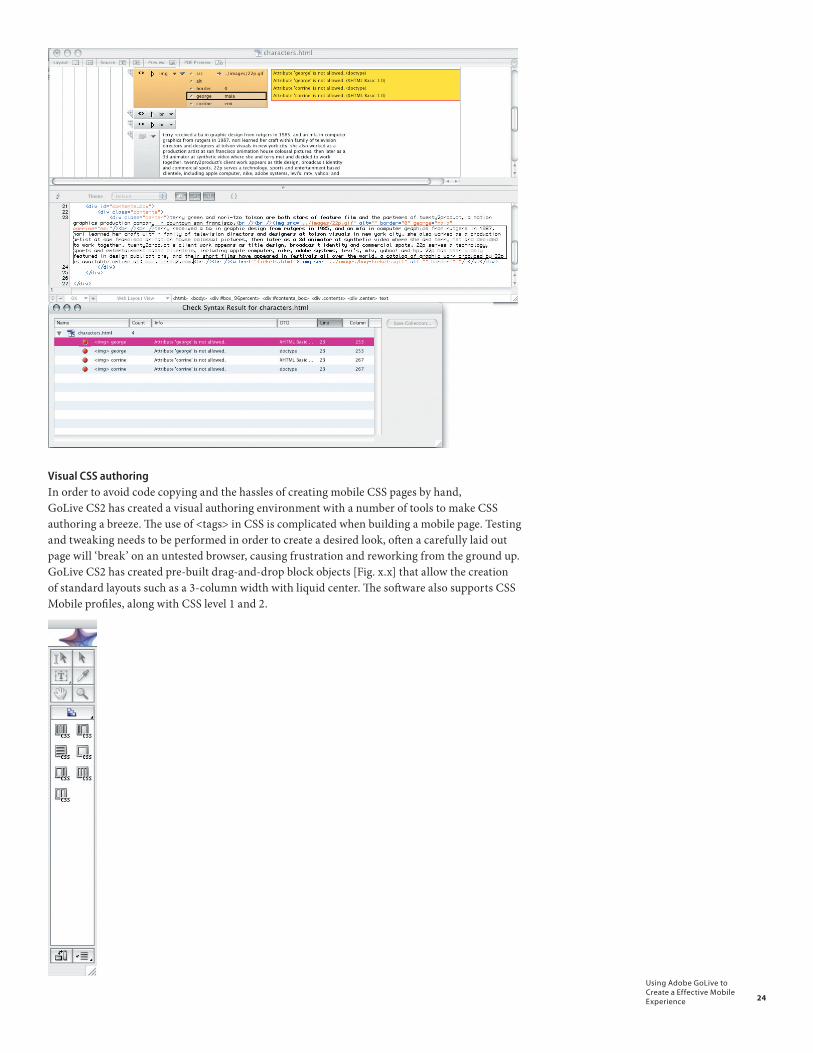
Coding/FormattingWhen creating a mobile profile from a conventional website, the site’s source code should be examined using GoLive CS2 by a designer who is fluent in CSS and XHTML to determine if significant recoding will need to take place. For example, mobile browsers do not support <span> tags inside <div> tags. For text formatting, the paragraph <p> tag is sometimes ignored and several break <br> tags need to be used instead. These are examples of some of the common inconsistencies that occur when viewing a site from a mobile browser. Designers often need to experiment and read up on known ‘workarounds’ for common positioning and formatting issues through community list serv sites or threaded discussions.
If these elements are considered when starting to convert a site from a desktop to a mobile profile, the chances of creating a positive user experience is much greater.
[SCREENSHOT OF SELECTED PREFERENCES – NOTE CURRENTLY MOBILE IS NOT SELECTED BECAUSE OPTIONS ARE LIMITED.]
Adobe GoLive CS2’s mobile authoring environment supports standard-based authoring with tools designed to utilize CSS, XHTML, SMIL, SVG-Tiny, MPEG-4 and 3GPP. Adobe has partnered with mobile industry leaders such as Nokia, Sony Ericsson, Opera, Access, Open-wave, Apple, DoCoMo, Six Apart and Inktivo and (formerly ZoomOn) and others to provide integrated tools and adherence to the latest standards supported by the W3C (World Wide Web Consortium) and the OMA (Open Mobile Alliance). To highlight the robust capabilities avail-able in GoLive CS2, several key product features and their workflow considerations are outlined below.
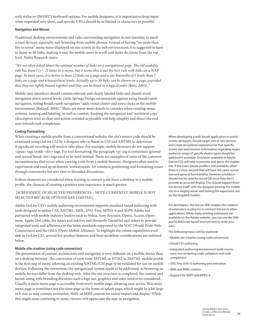
Mobile site creation (using code conversion)The presentation of content, architecture and navigation is very different on a mobile device than on a desktop browser. The conversion of code from XHTML or HTML to XHTML-mobile profile is the first step of many, allowing an existing XHTML/CSS page to be validated for use on mobile devices. Following the conversion, the navigational system needs to be addressed, as browsing on mobile devices differ from the desktop web. After the site structure is completed, the content and layout, along with branding decisions such a logo use, graphics and color need to be considered. Usually, a main menu page is accessible from every mobile page, allowing easy access. This main menu page is sometimes not the same page as the home or splash page, which might be a bit large in k-size or may contain animation, SMIL or MMS content for initial impact and display. While this might seem confusing to some, viewers will appreciate the ease in navigation.
When developing a web-based application or portal screen, designers should target one or two devices and create an optimal experience for that specific screen size and browser. Information regarding target audience usage of specific device types should be gathered if available. Emulators available in Adobe GoLive CS2 will help to preview and demo the mobile site. If the exact phone profile is not available, often there is a close second that will have the same screen size and general functionality. However emulators should not be used for actual QA since they don’t provide an accurate display. This should happen from the device itself, with the designer posting the mobile site to a staging server and testing the experience out on the targeted models.
For developers, the GoLive SDK enables the creation of extensions or plug ins to connect GoLive to other applications. While many existing extensions are available on the Adobe website, you can use the XML and ECMAScript-based environment to write your own.
The following topics will be explored:
• Mobile site creation (using code conversion)
• Visual CSS authoring
• Integrated authoring environment (with source view, live rendering, code validation and code completion)
• SVG-Tiny (SVG-t) authoring and animation
• SMIL and MMS creation
• Support for 3GPP and MPEG-4
23
Using Adobe GoLive to Create a Effective Mobile Experience
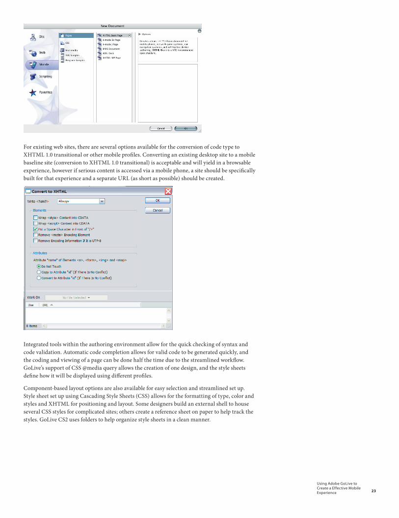
For existing web sites, there are several options available for the conversion of code type to XHTML 1.0 transitional or other mobile profiles. Converting an existing desktop site to a mobile baseline site (conversion to XHTML 1.0 transitional) is acceptable and will yield in a browsable experience, however if serious content is accessed via a mobile phone, a site should be specifically built for that experience and a separate URL (as short as possible) should be created.
Integrated tools within the authoring environment allow for the quick checking of syntax and code validation. Automatic code completion allows for valid code to be generated quickly, and the coding and viewing of a page can be done half the time due to the streamlined workflow. GoLive’s support of CSS @media query allows the creation of one design, and the style sheets define how it will be displayed using different profiles.
Component-based layout options are also available for easy selection and streamlined set up. Style sheet set up using Cascading Style Sheets (CSS) allows for the formatting of type, color and styles and XHTML for positioning and layout. Some designers build an external shell to house several CSS styles for complicated sites; others create a reference sheet on paper to help track the styles. GoLive CS2 uses folders to help organize style sheets in a clean manner.
24
Using Adobe GoLive to Create a Effective Mobile Experience
Visual CSS authoring In order to avoid code copying and the hassles of creating mobile CSS pages by hand, GoLive CS2 has created a visual authoring environment with a number of tools to make CSS authoring a breeze. The use of <tags> in CSS is complicated when building a mobile page. Testing and tweaking needs to be performed in order to create a desired look, often a carefully laid out page will ‘break’ on an untested browser, causing frustration and reworking from the ground up. GoLive CS2 has created pre-built drag-and-drop block objects [Fig. x.x] that allow the creation of standard layouts such as a 3-column width with liquid center. The software also supports CSS Mobile profiles, along with CSS level 1 and 2.
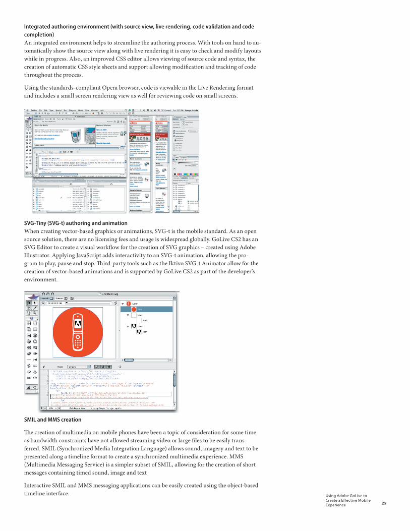
25
Using Adobe GoLive to Create a Effective Mobile Experience
Integrated authoring environment (with source view, live rendering, code validation and code completion)An integrated environment helps to streamline the authoring process. With tools on hand to au-tomatically show the source view along with live rendering it is easy to check and modify layouts while in progress. Also, an improved CSS editor allows viewing of source code and syntax, the creation of automatic CSS style sheets and support allowing modification and tracking of code throughout the process.
Using the standards-compliant Opera browser, code is viewable in the Live Rendering format and includes a small screen rendering view as well for reviewing code on small screens.
SVG-Tiny (SVG-t) authoring and animation When creating vector-based graphics or animations, SVG-t is the mobile standard. As an open source solution, there are no licensing fees and usage is widespread globally. GoLive CS2 has an SVG Editor to create a visual workflow for the creation of SVG graphics – created using Adobe Illustrator. Applying JavaScript adds interactivity to an SVG-t animation, allowing the pro-gram to play, pause and stop. Third-party tools such as the Iktivo SVG-t Animator allow for the creation of vector-based animations and is supported by GoLive CS2 as part of the developer’s environment.
SMIL and MMS creation
The creation of multimedia on mobile phones have been a topic of consideration for some time as bandwidth constraints have not allowed streaming video or large files to be easily trans-ferred. SMIL (Synchronized Media Integration Language) allows sound, imagery and text to be presented along a timeline format to create a synchronized multimedia experience. MMS (Multimedia Messaging Service) is a simpler subset of SMIL, allowing for the creation of short messages containing timed sound, image and text
Interactive SMIL and MMS messaging applications can be easily created using the object-based timeline interface.
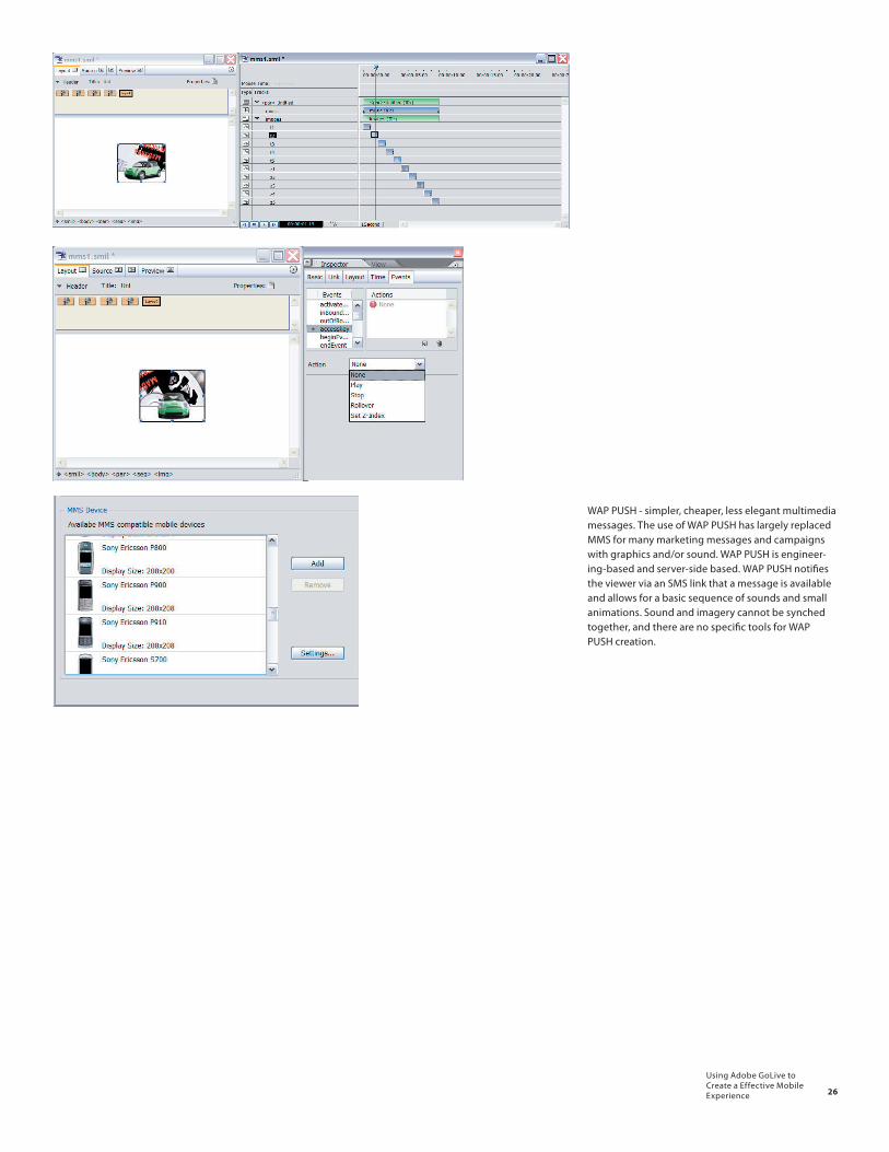
26
Using Adobe GoLive to Create a Effective Mobile Experience
WAP PUSH - simpler, cheaper, less elegant multimedia messages. The use of WAP PUSH has largely replaced MMS for many marketing messages and campaigns with graphics and/or sound. WAP PUSH is engineer-ing-based and server-side based. WAP PUSH notifies the viewer via an SMS link that a message is available and allows for a basic sequence of sounds and small animations. Sound and imagery cannot be synched together, and there are no specific tools for WAP PUSH creation.
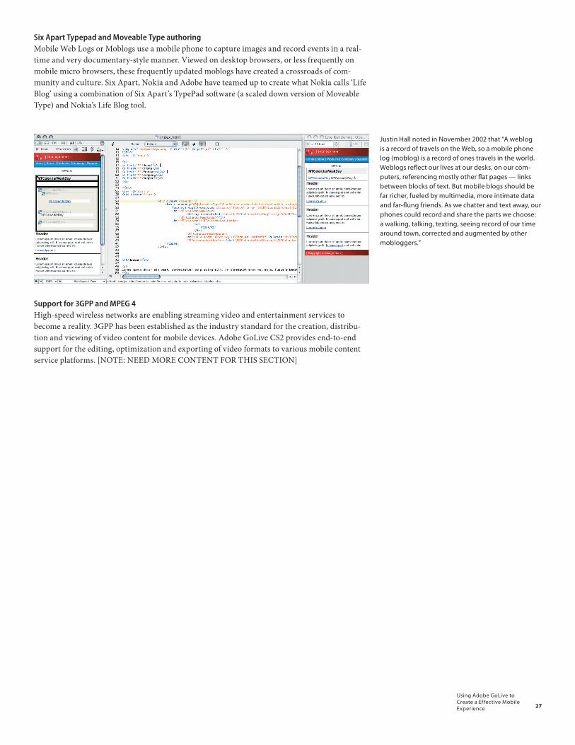
27
Using Adobe GoLive to Create a Effective Mobile Experience
Six Apart Typepad and Moveable Type authoringMobile Web Logs or Moblogs use a mobile phone to capture images and record events in a real-time and very documentary-style manner. Viewed on desktop browsers, or less frequently on mobile micro browsers, these frequently updated moblogs have created a crossroads of com-munity and culture. Six Apart, Nokia and Adobe have teamed up to create what Nokia calls ‘Life Blog’ using a combination of Six Apart’s TypePad software (a scaled down version of Moveable Type) and Nokia’s Life Blog tool.
Support for 3GPP and MPEG 4High-speed wireless networks are enabling streaming video and entertainment services to become a reality. 3GPP has been established as the industry standard for the creation, distribu-tion and viewing of video content for mobile devices. Adobe GoLive CS2 provides end-to-end support for the editing, optimization and exporting of video formats to various mobile content service platforms. [NOTE: NEED MORE CONTENT FOR THIS SECTION]
Justin Hall noted in November 2002 that “A weblog is a record of travels on the Web, so a mobile phone log (moblog) is a record of ones travels in the world. Weblogs reflect our lives at our desks, on our com-puters, referencing mostly other flat pages — links between blocks of text. But mobile blogs should be far richer, fueled by multimedia, more intimate data and far-flung friends. As we chatter and text away, our phones could record and share the parts we choose: a walking, talking, texting, seeing record of our time around town, corrected and augmented by other mobloggers.”
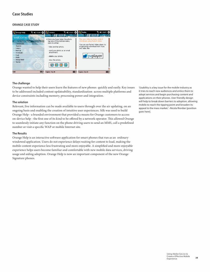
28
Using Adobe GoLive to Create a Effective Mobile Experience
Case Studies
ORANGE CASE STUDY
The challengeOrange wanted to help their users learn the features of new phones quickly and easily. Key issues to be addressed included content updateability, standardization across multiple platforms and device constraints including memory, processing power and integration.
The solution Relevant, live information can be made available to users through over the air updating, on an ongoing basis and enabling the creation of intuitive user experiences. Silk was used to build Orange Help - a branded environment that provided a means for Orange customers to access on-device help - the first one of its kind to be offered by a network operator. This allowed Orange to seamlessly initiate any function on the phone driving users to send an MMS, call a predefined number or visit a specific WAP or mobile Internet site.
The ResultsOrange Help is an interactive software application for smart phones that run as an ordinary windowed application. Users do not experience delays waiting for content to load, making the mobile content experience less frustrating and more enjoyable. A simplified and more enjoyable experience helps users become familiar and comfortable with new mobile data services, driving usage and aiding adoption. Orange Help is now an important component of the new Orange Signature phones.
‘Usability is a key issue for the mobile industry as it tries to reach new audiences and entice them to adopt services and begin purchasing content and applications on their phones. User friendly design will help to break down barriers to adoption, allowing mobile to reach the tipping point and broaden its appeal to the mass market.’ -Nicola Riordan [position goes here].
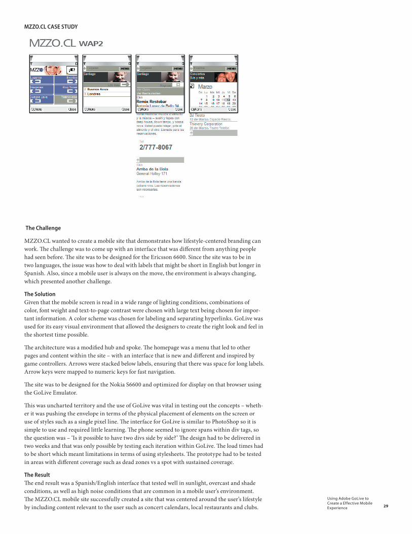
29
Using Adobe GoLive to Create a Effective Mobile Experience
MZZO.CL CASE STUDY
The Challenge
MZZO.CL wanted to create a mobile site that demonstrates how lifestyle-centered branding can work. The challenge was to come up with an interface that was different from anything people had seen before. The site was to be designed for the Ericsson 6600. Since the site was to be in two languages, the issue was how to deal with labels that might be short in English but longer in Spanish. Also, since a mobile user is always on the move, the environment is always changing, which presented another challenge.
The SolutionGiven that the mobile screen is read in a wide range of lighting conditions, combinations of color, font weight and text-to-page contrast were chosen with large text being chosen for impor-tant information. A color scheme was chosen for labeling and separating hyperlinks. GoLive was used for its easy visual environment that allowed the designers to create the right look and feel in the shortest time possible.
The architecture was a modified hub and spoke. The homepage was a menu that led to other pages and content within the site – with an interface that is new and different and inspired by game controllers. Arrows were stacked below labels, ensuring that there was space for long labels. Arrow keys were mapped to numeric keys for fast navigation.
The site was to be designed for the Nokia S6600 and optimized for display on that browser using the GoLive Emulator.
This was uncharted territory and the use of GoLive was vital in testing out the concepts – wheth-er it was pushing the envelope in terms of the physical placement of elements on the screen or use of styles such as a single pixel line. The interface for GoLive is similar to PhotoShop so it is simple to use and required little learning. The phone seemed to ignore spans within div tags, so the question was – ‘Is it possible to have two divs side by side?’ The design had to be delivered in two weeks and that was only possible by testing each iteration within GoLive. The load times had to be short which meant limitations in terms of using stylesheets. The prototype had to be tested in areas with different coverage such as dead zones vs a spot with sustained coverage.
The ResultThe end result was a Spanish/English interface that tested well in sunlight, overcast and shade conditions, as well as high noise conditions that are common in a mobile user’s environment. The MZZO.CL mobile site successfully created a site that was centered around the user’s lifestyle by including content relevant to the user such as concert calendars, local restaurants and clubs.

30
Using Adobe GoLive to Create a Effective Mobile Experience
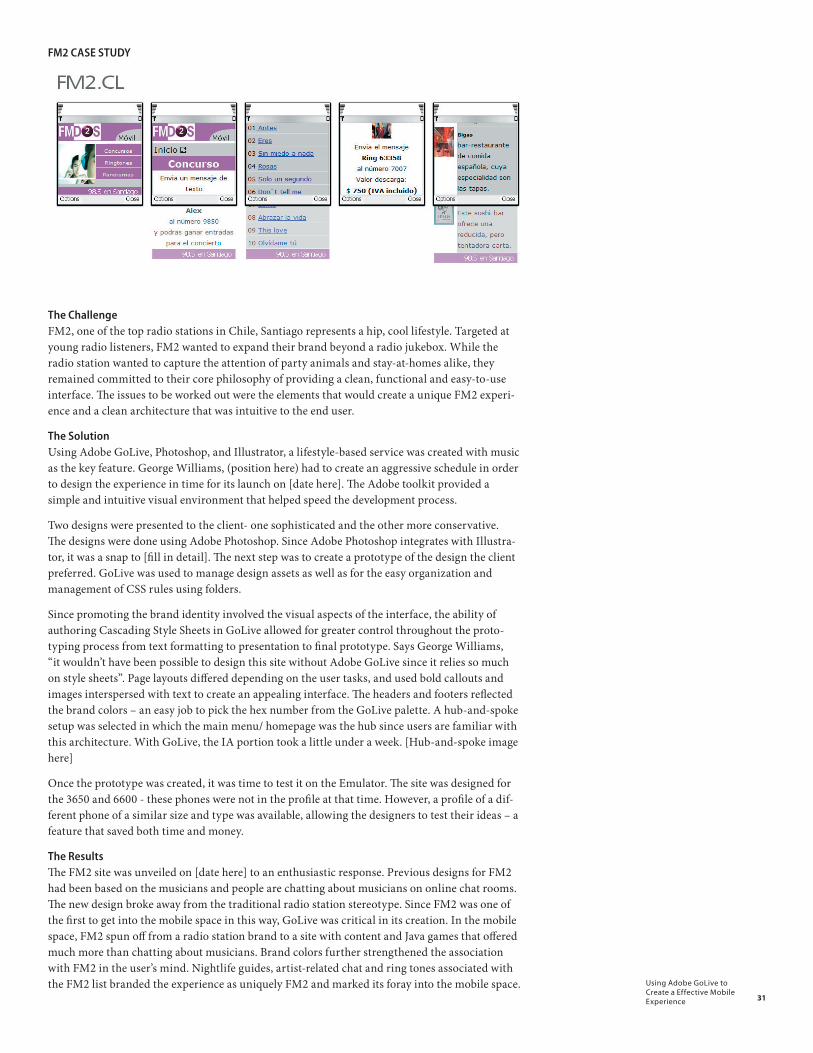
31
Using Adobe GoLive to Create a Effective Mobile Experience
FM2 CASE STUDY
The ChallengeFM2, one of the top radio stations in Chile, Santiago represents a hip, cool lifestyle. Targeted at young radio listeners, FM2 wanted to expand their brand beyond a radio jukebox. While the radio station wanted to capture the attention of party animals and stay-at-homes alike, they remained committed to their core philosophy of providing a clean, functional and easy-to-use interface. The issues to be worked out were the elements that would create a unique FM2 experi-ence and a clean architecture that was intuitive to the end user.
The SolutionUsing Adobe GoLive, Photoshop, and Illustrator, a lifestyle-based service was created with music as the key feature. George Williams, (position here) had to create an aggressive schedule in order to design the experience in time for its launch on [date here]. The Adobe toolkit provided a simple and intuitive visual environment that helped speed the development process.
Two designs were presented to the client- one sophisticated and the other more conservative. The designs were done using Adobe Photoshop. Since Adobe Photoshop integrates with Illustra-tor, it was a snap to [fill in detail]. The next step was to create a prototype of the design the client preferred. GoLive was used to manage design assets as well as for the easy organization and management of CSS rules using folders.
Since promoting the brand identity involved the visual aspects of the interface, the ability of authoring Cascading Style Sheets in GoLive allowed for greater control throughout the proto-typing process from text formatting to presentation to final prototype. Says George Williams, “it wouldn’t have been possible to design this site without Adobe GoLive since it relies so much on style sheets”. Page layouts differed depending on the user tasks, and used bold callouts and images interspersed with text to create an appealing interface. The headers and footers reflected the brand colors – an easy job to pick the hex number from the GoLive palette. A hub-and-spoke setup was selected in which the main menu/ homepage was the hub since users are familiar with this architecture. With GoLive, the IA portion took a little under a week. [Hub-and-spoke image here]
Once the prototype was created, it was time to test it on the Emulator. The site was designed for the 3650 and 6600 - these phones were not in the profile at that time. However, a profile of a dif-ferent phone of a similar size and type was available, allowing the designers to test their ideas – a feature that saved both time and money.
The ResultsThe FM2 site was unveiled on [date here] to an enthusiastic response. Previous designs for FM2 had been based on the musicians and people are chatting about musicians on online chat rooms. The new design broke away from the traditional radio station stereotype. Since FM2 was one of the first to get into the mobile space in this way, GoLive was critical in its creation. In the mobile space, FM2 spun off from a radio station brand to a site with content and Java games that offered much more than chatting about musicians. Brand colors further strengthened the association with FM2 in the user’s mind. Nightlife guides, artist-related chat and ring tones associated with the FM2 list branded the experience as uniquely FM2 and marked its foray into the mobile space.
32
Using Adobe GoLive to Create a Effective Mobile Experience
Conclusion: It’s a big, wide, wireless worldTechnological convergence, increased connectivity and consumer expectations are merging to create a landscape of opportunity for the next generation of mobile content, services and applica-tions. Success and adoption are dependent on creating usable and useful experiences -- posi-tive interactions that are integrated into an individual’s actual lifestyle. Emerging technologies providing streaming video and interactive 3D graphics for gaming and entertainment raise the level of interaction and usage to a new level, increasing the complexity of interfaces and height-ening challenges to interface designers and usability professionals. Television will soon be added to the list of convergent devices, which already include cell phones, MP3 players, video and still cameras, gameboys and personal computers.
Creating a usable interface for this next generation of mobile devices will require the forma-tion of multidisciplinary teams -- visual designers, technologists, ethnographers and usability specialists working together in close collaboration. As the feature sets, menu items and function-ality of mobile products and services become more complex, the techniques required to create effective end-user experiences will become more disciplined and focused. Iterative design cycles along with contextual inquiry and usability testing are already standard practices for product development, however still not established methods within the visual interface design commu-nity. Product and interface disciplines need to mix, and a new working style established in order to meet the rigorous deadlines and pace.
And where do open standards fit in? Organizations such as the OMA and W3C strive to create interoperability across platforms, carriers and devices. By creating standards for the develop-ment community and adhering to the rules created, services and applications can be built and deployed in an efficient and reliable manner. From the high level operators working with the ‘big picture’ to determine the trends that shape our future to the detail-oriented coder working to make a single pixel line display consistently across Opera and Access browsers – the goal is the same. To create a seamless experience that creates value for the end user which in turn will yield value to the marketplace as a whole.
33
Using Adobe GoLive to Create a Effective Mobile Experience
Tool & Inspirationhttp://winksite.com
- interest site. basically it’s a free template for mobile site which you can easily create a mobile site by using their online tools. note that is also has a large amount of mobile site samples.
Online Magazinehttp://www.brainheartmagazine.com/
- information about wireless technology implemented in real life
News & Articleshttp://www.thefeature.com/
- news and articles about mobile technology. also has a online community group
http://techdigestuk.typepad.com/mobile_digest/
- news, reviews, and opinions on mobile phones & services
http://www.winbeta.org/index.php?action=news&catid=3
- latest mobile news and reviews
http://www.mobiletracker.net/
- cell phone news and reviews
http://mobilemediajapan.com/
- mobile news in Japan
Blog & Misc.http://www.textually.org/
- news on text and multimedia messaging
http://wireless.weblogsinc.com/
- industry mobile news
http://www.moconews.net/
- mobile content news
http://mobile.kaywa.com/
- mobile technology
34
Using Adobe GoLive to Create a Effective Mobile Experience
References: (for end of document or appendix or whatever)
About.com. (n.d.) Exploring mobile applications technology. Retrieved December 30, 2004, from http://logistics.about.com/library/weekly/uc110102b.htm.
Artificial Life, Inc. (2004, November 7). Artificial Life, Inc. Announces Mobile Real Estate Service in UK. Press Release. Retrieved December 5, 2004, from http://www.mysan.de/international/article5285.html.
Cheskin. (2004, November 4). Study highlights eight trends defining the future of wireless. Press Release. Retrieved January 4, 2004, from http://www.cheskin.com/p/pr.asp?mlid=32&prid=9.
Hall, J. (2004, April 1). Mogi second generation gaming” TheFeature. Retrieved December 30, 2004, from http://www.thefeature.com/article?articleid=100501&ref=5038803.
Jaokar, A. & Fish, T. (2004). Open gardens: The innovator’s guide to the mobile data industry. [Electronic Book]. Re-trieved December 30, 2004, from www.opengardens.com.
Jupiter Research (2003). Next-generation handsets: Increase APRU with improved handset and software design. Darien, CT: Jupiter Research.
Lin, E. (2004, November 3). Nokia has announced that it will expand Series 60 to include pen input and larger screens on the same day it launches a Series 90 device that has all these features. The Feature. Retrieved December 15, 2005, from http://www.thefeature.com/article?articleid=101203&ref=5100421.
Mobile companies aim for unified mobile JAVA services architecture: New specifications to help ensure portability of mobile Java applications, MobileDevelopment Advisor, 38, (2004, September), http://doc.advisor.com/doc/14661. (Ac-cessed December 16, 2004).
MobileYouth 2004, Your Guide to Successfully Developing and Marketing Mobile Products and Service to the Youth in 37 Countries.
Wireless World Forum, 2004
Pearce, J. (2003, May 13). Mobile industry looks ahead to 4G, ZDNet Australia. Retrieved January 9, 2005, from
http://insight.zdnet.co.uk/hardware/chips/0,39020436,2134645,00.htm)
Rheingold, H. (2004, July 28). Why mobile services fail. TheFeature. Retrieved December 1, 2004, from http://www.thefeature.com/article?articleid=100902&sh=tap&ref=5033424.
Rosenblatt, B (2004, December 30). 2004 year in review: Online content services. DRM Watch. Retrieved December 31, 2004, from http://www.drmwatch.com/ocr/article.php/3453041.
Smith, S. (2004, November 29). The revenue streams of 2005. E-Content Magazine. Retrieved December 15, 2004, from http://www.econtentmag.com/Articles/ArticleReader.aspx?ArticleID=7358&ContextSubtypeID=8.
Strategy Analytics. (2004, August 17). Strategy Analytics say cellular data services outperforming expectations as content downloads boost growth towards $19 billion. Press Release. Retrieved January 10, 2005, at http://www.strateg-yanalytics.com/press/PR00130.htm
Textually.org (2004, December 14). Beijing Mobile’s new service lets parents track children. Retrieved December 30, 2004, from http://www.textually.org/textually/archives/006392.htm.
Western European mobile portal big market. (2004, June 4). ContentWire. Retrieved November 24, 2004, from http://www.content-wire.com/FreshPicks/Index.cfm?ccs=86&cs=2977.
Yahoo! India News: Technology. (2004, May 14). PluggedIn: Japan sees future in phones that give directions. Retrieved December 28, 2004, from http://in.tech.yahoo.com/040504/137/2cwji.html.
Yahoo! News. (2004, October 28). Mobile phone gaming tops $1 billion in ’04. Retrieved December 30, 2004, from http://216.239.57.104/search?q=cache:DUD6dHNFQKUJ:games.bkbsolutions.com/index.php%3Fmodule%3Dshortnews%26func%3Dredir%26url_id%3D98+reuters+%22screen+digest%22+mobile&hl=en.
Yankee Group. (2004, December 27). So far, so good for wireless data in 2004. Retrieved December 30, 2004, from http://www.3gnewsroom.com/3g_news/dec_04/news_5341.shtml
Western European mobile portal big market. (2004, June 4). ContentWire. Retrieved November 24, 2004, from http://www.content-wire.com/FreshPicks/Index.cfm?ccs=86&cs=2977.
Yahoo! India News: Technology. (2004, May 14). PluggedIn: Japan sees future in phones that give directions. Retrieved December 28, 2004, from http://in.tech.yahoo.com/040504/137/2cwji.html.
Yahoo! News. (2004, October 28). Mobile phone gaming tops $1 billion in ’04. Retrieved December 30, 2004, from http://216.239.57.104/search?q=cache:DUD6dHNFQKUJ:games.bkbsolutions.com/index.php%3Fmodule%3Dshortnews%26func%3Dredir%26url_id%3D98+reuters+%22screen+digest%22+mobile&hl=en.
Yankee Group. (2004, December 27). So far, so good for wireless data in 2004. Retrieved December 30, 2004, from http://www.3gnewsroom.com/3g_news/dec_04/news_5341.shtml.