analysis of air pollution and social deprivation - defra, uk · pdf fileanalysis of air...
TRANSCRIPT

Analysis of Air Pollution andSocial Deprivation
A report produced for Department of the Environment,Transport and the Regions, The Scottish Executive,The National Assembly for Wales and Department ofEnvironment for Northern Ireland
Katie KingJohn Stedman
December 2000


Analysis of Air Pollution andSocial Deprivation
A report produced for Department of the Environment,Transport and the Regions, The Scottish Executive,The National Assembly for Wales and Department ofEnvironment for Northern Ireland
Katie KingJohn Stedman
December 2000

AEA Technology ii
Title Analysis of Air Pollution and Social Deprivation
Customer Department of the Environment, Transport and the Regions, TheScottish Executive, The National Assembly for Wales andDepartment of Environment for Northern Ireland
Customer reference EPG 1/3/146
Confidentiality,copyright andreproduction
File reference p:\deprivation\social deprivation report v5.doc
Report number AEAT/R/ENV/0241/Issue3
Report status Final
AEA TechnologyE5 CulhamAbingdonOxfordshireOX14 3ED
Telephone 01235 463715Facsimile 01235 463574
AEA Technology is the trading name of AEA Technology plcAEA Technology is certificated to BS EN ISO9001:(1994)
Name Signature Date
Author Katie KingJohn Stedman
Reviewed by John Stedman
Approved by John Stedman

AEA Technology iii
Executive Summary
Modelling work undertaken as part of the review of the Air Quality Strategy for England,Scotland, Wales and Northern Ireland (AQS) has shown that there are likely to be somelocations where the objectives for NO2 and PM10 are exceeded. For NO2, the annual averageobjective is expected to be achieved at all background locations, except inner London, and atmost roadside locations by 2005. However, the national modelling identified a number of majorurban road links where concentrations at the roadside may exceed the objective. For PM10, the40ugm-3 objective is not expected to be exceeded anywhere except possibly at the roadside onvery busy roads in central London. The 24-hour limit value may be exceeded in the centre ofLondon and at roadsides of busy roads in other city centres.
Given the geographical variation in predicted exceedances, there is a potential for some sectorsof society to be differentially impacted by air pollution. For this reason this study analyses thespatial relationship between air quality and social deprivation and the extent to which policieswhich seek to improve air quality will bring disproportionate benefits to the more vulnerablemembers of society.
Five locations have been considered in the pilot study: Greater London, Birmingham, Glasgow,Belfast and Port Talbot. The air quality and social deprivation data sets are compared by using aGeographic Information System to overlay the two maps and to obtain an air concentration datapoint for each point or zone for which social deprivation data are available. The resulting sets ofdata pairs are then analysed using scatter plots and ‘banded averaging’ to examine for anycorrelation.
The following general conclusions are drawn from the pilot area analysis.• There is tentative evidence for a general positive correlation between background air
pollution (NO2 and PM10) and deprivation index in London, Belfast and Birmingham but inGlasgow there is an inverse relationship.
• Port Talbot also shows a weak negative correlation for PM10, using PM10 concentration datathat include a contribution from local point sources.
• A similar positive relationship is found between social deprivation and NO2 concentrationsat the roadside and background locations in London, but in Glasgow the roadside NO2
analysis did not show a relationship with social deprivation.• Variation in spatial scale is shown to have little influence on the results (Wards compared
with Enumeration Districts).• Analysis of the possible confounding factor of population density shows that there is a
possible over estimate of PM10 emissions in some cites but that this is unlikely to haveinfluenced the final results.
• Air quality maps are also compared with social class data. This analysis does not show apattern. Although this could imply little relationship between air pollution and socialdeprivation, it is more probably because the social class indicator (based on genericoccupation classes) is a poor proxy of real socio-economic conditions.
As a result of these conclusions for London, Belfast and Birmingham, it is likely that carefullytargeted policies to reduce air pollution concentrations in areas where they are highest couldimpact marginally more beneficially in the more deprived communities, and therefore movesome way to reducing this apparent inequity. In the case of Glasgow, further analysis is requiredto more fully explain the pattern found.

AEA Technology iv

AEA Technology v
Contents
1 Introduction 11.1 BACKGROUND 11.2 STUDY OBJECTIVE 2
2 Data Sources 32.1 INDICES OF SOCIAL DEPRIVATION 32.2 OTHER INDICATORS OF DEPRIVATION 6
3 Geographical Analysis 73.1 PILOT AREAS 73.2 COMBINATION OF DATA SOURCES 7
4 Statistical Analysis 114.1 ANALYSIS OF DEPRIVATION VERSES BACKGROUND NO2 AND PM10 114.2 COMPARISON WITH IMPROVEMENTS IN AIR QUALITY 154.3 ANALYSIS OF COMPONENT PARTS OF DEPRIVATION INDEX 164.4 ANALYSIS OF DEPRIVATION VERSES ROADSIDE NO2 184.5 COMPARISON BETWEEN ED AND WARD LEVEL INDICES 194.6 ANALYSIS OF SOCIAL CLASS DATA 204.7 ANALYSIS OF STATISTICAL SIGNIFICANCE 214.8 POSSIBLE CONFOUNDING FACTOR OF POPULATION DENSITY 22
5 Conclusions 23
6 References 24
Annex 1 Results for each Pilot Area 26
Annex 2 Specific Deprivation Indicators 36
Annex 3 Roadside Results 40
Annex 4 Analysis of Statistical Significance 42
Annex 5 Confounding factor of population density 44


AEA Technology 1
1 Introduction
1.1 BACKGROUND
The UK Government and devolved administrations are taking active measures to improve airquality through the Air Quality Strategy for England, Scotland, Wales and Northern Ireland(AQS) (DETR et al 2000). This Strategy defines Air Quality Standards and Objectives for eightpollutants and identifies their major sources. The AQS gives the following objectives fornitrogen dioxide (NO2) to be achieved by the end of 2005 and for PM10 by the end of 2004:
• NO2 Annual mean: The annual mean must not exceed 40 µgm-3
• NO2 hourly mean: 200 µgm-3 not to be exceeded more than 18 times a year
• PM10 Annual mean: The annual mean must not exceed 40 µgm-3
• PM10 24 hour mean: 50 µgm-3 not to be exceeded more than 35 times a year.
The more stringent objective is expected to be the annual mean for NO2 whereas for PM10 it isthe 24 hour mean.
The PM10 objectives relate to PM10 in gravimetric measurement units, which are assumed to be1.3 times those in TEOM (Tapered Element Oscillating Microbalance) units (APEG 1999). AsPM10 has been mapped based on measurements made using TEOM instruments the conversionto gravimetric units has been done prior to the analysis described in this report.
The national modelling of roadside NO2 concentrations (Stedman et al, 1998), carried out insupport of the AQS, indicated that policies currently in place or to take effect before 2005 willlead to the annual average objective being achieved at all background locations, except innerLondon, and at most roadside locations by 2005. However, the national modelling identified anumber of major urban road links where concentrations at the roadside may exceed theobjective.
For PM10, the 40ugm-3 objective is not expected to be exceeded anywhere except possibly atthe roadside on very busy roads in central London. The 24-hour limit value may be exceededin the centre of London and at roadsides of busy roads in other city centres.
Given the geographical variation in predicted exceedances, there is a potential for some sectorsof society to be differentially impacted by air pollution. For this reason this study seeks toanalyse the spatial relationship between air quality and social deprivation.
In order to fully assess whether there is any inequity causing more deprived communities to beexposed to higher levels of air pollution than less deprived communities, the analysis wouldideally be undertaken at a detailed community level close to the zones of high air pollution, e.g.along road links. However, the deprivation data are not available at a sufficient level of detail toallow this. Therefore the analysis has been undertaken at the finest spatial resolution for whichdeprivation data are available.

AEA Technology 2
1.2 STUDY OBJECTIVE
The broad objective of this study is to examine the distributional effects of air pollution in theUK to inform the following issues:
• the links between the environment and inequality and, in particular, on whetherenvironmental problems impact most heavily on the most vulnerable;
• the extent to which policies which seek to improve air quality will bring disproportionatebenefits to the more vulnerable members of society.
This report describes a pilot study of the relationship between social deprivation and air qualityin both 1997 and the predicted reference case in 2004/5 (including policies up to April 2000)and therefore the latter objective can be analysed to some extent. Further work could beundertaken to consider the impact of future policies once more data become available.

AEA Technology 3
2 Data Sources
2.1 INDICES OF SOCIAL DEPRIVATION
Different indices of social deprivation are used in the different regions of the UK. A summary isprovided in Table 1.
An important difference between these indices is the geographical nature of the data, especiallyits spatial resolution. The smallest geographical unit on which the census data are collected isthe Enumeration District (ED). This is the area that one census enumerator can cover on theday of the census, to collect completed surveys from each household. It is typically about 150households and is therefore much smaller in urban areas than in rural areas. The Ward is thenext geographical unit in the hierarchy, covering roughly 50 EDs. All census data areaggregated first to ED level to prevent any breach of confidentiality. The map in Figure 1shows the sizes of EDs and Wards.
Postcode sectors are used in Scotland. These are areas that include all addresses with the samepostcode except for the last two digits, e.g. all addresses with OX14 3__.
Figure 1 Comparison of ED and Ward Census units

AEA Technology 4
As a result of the different methods used to compile these Indices, they are not directlycomparable across regional boundaries. This study does not draw conclusions comparing therelationships between air pollution and deprivation between these regions other than on ageneric basis.
Table 1 Summary of data available on Social Deprivation indices
Region IndexDate
Description Sources * SmallestSpatialresolution
Number ofindicatorsat this level
England 1998 Only 1991 Census data wereused to derive the ED levelindex. Other data werecombined at a Ward level.
1991 Census ED 5
2000 The new Index of MultipleDeprivation is based on a varietyof domains: income,employment, health anddisability, housing, educationand geographical access.
Variousincluding: ONS,DSS, DfEE andothers
Ward 6 domainseach with avariety ofindicators
Scotland 1998 A combination of census dataand non-census (SMRs,unemployment, low birthweights, insurance weightings,education participation andincome support recipients). Itwas developed to prioritise urbanregeneration.
1991 Census,Scottish Office,NOMIS, DSS,Survey of HighStreet insurers
Postcodesector
6
Wales 1994 1991 Census data plus StandardMortality Rates.
1991 Census Ward 8
2000 Index of Multiple Deprivationsimilar to that for England.
Variousincluding: ONS,DSS, UCAS,Welsh Assemblyand others
Electoraldivision
6 domainseach with avariety ofindicators
NorthernIreland
1994 ED level data all from 1991Census. Other data added atWard and District levels fromDHSS, DoENI and so on.
1991 Census,DHSS,DoE(NI),DENI, DED
ED 9
* Data sources: ONS Office of National Statistics; DSS Department of Social Security; DfEE Department for Education and Employment;UCAS University and Colleges Admissions Service; DED Department of Economic Development (Northern Ireland); DENI Department ofEducation (Northern Ireland); NOMIS National Online Manpower Information System.
The methodology for compiling each index is similar: with the indicators normalised thensummed together. In some cases a weighting is applied to each indicator to reflect itsimportance in relation to deprivation. In all cases a zero score reflects average social conditionsand increasing scores reflect increasing deprivation. In all but the Northern Ireland index,scores below zero are disregarded because these represent below average deprivation. As a resultof the variations in data sources and methods of compilation, the Index scores are not directlycomparable.
AEA Technology 5
2.1.1 England
In England the 1991 Index of Local Conditions was revised in 1998 and renamed the Index ofDeprivation (DETR 1998). There are three spatial scales at which this Index is available – localauthority district, ward and enumeration district (ED). The Ward and ED indices use thefollowing indicators:
• Unemployment,• Children in low earning households,• Households with no car,• Households lacking basic amenities,• Overcrowded households,• 17 year olds no longer in full time education (only at Ward level).
Data for the individual indicators have also been used in this study.
The new Index of Multiple Deprivation (IMD) 2000 was published in August 2000 (DETR2000). The data from the new index were not available at the time that this analysis was carriedout. The study therefore used the 1998 Index at the ward level, allowing easy update of theanalysis using the 2000 Index in future.
2.1.2 Wales
In Wales, the National Assembly for Wales use an Index of Socio-Economic Conditions. TheIndex is calculated for every electoral ward in Wales. It is based upon the following indicators:
• Unemployment,• The economically active population,• Low socio-economic groups in the population,• Population loss in the 20 to 59 years age group,• The permanently sick in the population,• Overcrowding in housing,• Basic housing amenities,• Standard Mortality Rate.
A new Index roughly equivalent to the IMD 2000 in England has recently been published forWales, but not in time for inclusion in this study. The new data will also be incorporated intoany further work on this issue (National Assembly for Wales, 2000)
2.1.3 Scotland
In Scotland a revised Area Deprivation Index has been produced on a postcode sector basisusing a variety of data sources including the 1991 Census (Gibb et al 1998). The six indicatorsused are as follows:
• Overcrowding,• Education participation,• Unemployment,• Income support claims,• Standardised mortality rate,• Home contents insurance.
The 1998 Index is an update of a previous index, which was based wholly on the 1991 censususing Enumeration Districts as the basic geographic unit. The change to postcode sectors
AEA Technology 6
reflects the difference in availability of alternative sources of data. This change has howevercaused a mismatch of geographies for analytical purposes because the postcode sectors do notnecessarily coincide with local authority boundaries.
The Scottish index is relevant only for urban areas, as deprivation issues in rural areas aredifferent, such as arising from remoteness, transport costs, accessibility and low income.
2.1.4 Northern Ireland
In Northern Ireland a similar system to that in England is used (Robson et al 1994).
There are 9 indicators at ED scale:• Pensioners lacking central heating,• Residents lacking bath, shower or WC,• Households lacking a link to public sewers,• Households living at 1.0+ persons per room,• Households with no car,• Children in households with no economically-active adult or with a single
adult in part-time employment,• Children in flats or non-permanent accommodation,• Persons aged 18-24 with no qualifications,• Unemployed economically active persons.
A new index similar to those for England and Wales is expected in early 2001.
2.2 OTHER INDICATORS OF DEPRIVATION
Alternative sources of socio-economic data have also been investigated. Marketing databases,such as the Lifestyle Census by Claritas, can provide information on household income bypostcode sector. These databases have been derived from consumer surveys on a self-selectingbasis. Therefore they are not guaranteed to represent an accurate cross section of the populationand the data are not easily verified. The data are also very costly. For these reasons thehousehold income data have not been included in this analysis.
Social class is an indicator of income based on generic occupation categories. Census data onnumbers of people in the various social classes in each Ward are available from the 1991 Census.These data have also been analysed in this study to provide a comparison with the Indicesdescribed above. The proportion of the population in Social Classes IV (Partly skilledoccupations) and V (Unskilled occupations) was used as the metric for this analysis. The datahave been analysed for the pilot areas in England in the same way as the other indicators.

AEA Technology 7
3 Geographical Analysis
3.1 PILOT AREAS
Five locations have been chosen for analysis in the pilot study:• Greater London (all London boroughs)• Birmingham City district• Glasgow City district• Belfast and surrounding districts (North Down, Carrickfergus, Newtownabbey, Lisburn and
Castlereagh)• Neath Port Talbot district
These areas were chosen because they include locations most likely to include exceedances ofthe air quality objective for NO2 and PM10 and to include locations in each of the parts of theUK.
The maps of social deprivation have been combined with maps of air quality, both for 1997,using the then most up to date Emissions Inventory data (1997), and for the predicted referencesituation in 2005, which includes current policies up to April 2000 (Stedman and Bush, inprep). Both NO2 and PM10 have been analysed.
The Port Talbot pilot study has considered PM10 concentrations from point sources as well asbackground emissions, in order to provide a more realistic picture of actual population exposuregiven the importance of the steel works’ impact on the local air quality (Rudd et al, 2000)
3.2 COMBINATION OF DATA SOURCES
As a result of the Deprivation Indices being available in different formats for the differentregions of the UK, different methods are required for analysis. In general, the air quality andsocial deprivation data sets are compared by using a Geographic Information System to overlaythe two maps and to obtain an air concentration data point for each point or zone for whichsocial deprivation data are available. The resulting sets of data pairs are then analysed usingscatter plots and ‘banded averaging’ (see below) to examine for any correlation.
3.2.1 Analysis at Enumeration District (ED) level
In Northern Ireland the data are available at ED level so this can be analysed using the mappedair concentration levels at the centre points of these EDs. In urban areas where the EDs aresmall this provides a good indication of the air concentration predicted for the area that the EDcovers, but in rural areas it does not provide an average concentration across the ED as theremay be more than one 1km grid square (for which air concentrations are estimated) within theED. However, it is the urban areas that are of interest in this study so this issue is not consideredimportant for this analysis. The map in Figure 2 shows the ED levels data for the Belfast areaand the NO2 concentration data. This illustrates the variation in ED density between urban andrural areas.

AEA Technology 8
Figure 2 Map showing overlay of NO2 concentrations by 1km grid square and ED levelDeprivation Index
3.2.2 Analysis at Ward and Postcode sector level
Data for England and Wales have been analysed at Ward level. Data for Scotland have beenanalysed at Postcode Sector level. The postcode sector boundaries available are low resolution,i.e. highly generalised, but it is considered that owing to the uncertainties in the air qualitymapping this generalisation does not cause problems for this study.
For both wards and postcode sectors the spatial units are defined by polygons. An average airconcentration was calculated for each polygon to provide data pairs for analysis. Figure 3 showsthe correspondence between the size of Wards in London and the 1km grid of NO2
concentrations.
ED data are also available for England for the 1998 Index. Therefore, for the Birmingham pilotarea some analysis has been done using these data for comparison with the ward level analysis.However, the bulk of the analysis for London and Birmingham has been undertaken usingWard level data in order that it can be easily updated with the new index (Ward level).

AEA Technology 9
Figure 3 Wards in London and NO2 concentrations
Figure 4 Deprivation Index in London by Ward
AEA Technology 10
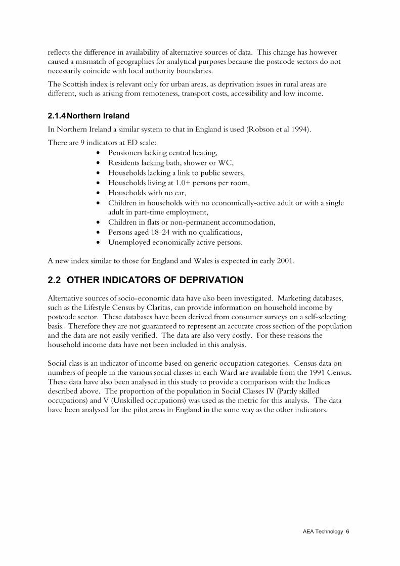
Roadside analysis
Roadside concentrations of NO2 have also been compared with the Scottish Deprivation Indexin Glasgow and the DETR Index in London, by correlating the concentration on each roadlink against the Deprivation Index for the ward and postcode area through which that linkpasses. This analysis is illustrated in Figure 5.
Figure 5 Glasgow: Roadside NO2 in 2005 and Social Deprivation by Postcode Sector

AEA Technology 11
4 Statistical Analysis
The data output from the geographical analysis have been analysed in a number of differentways:
1. Correlation of full index scores with background PM10 and NO2 concentrations for 1997and 2004/5 using scatter plots and banded averages.
2. Correlation of individual components of the English Deprivation Index with air pollutionconcentrations as above.
3. Comparison between ED and Ward level scores in Birmingham to assess the impact ofspatial resolution
4. Correlation between roadside concentrations and deprivation score (in Glasgow andLondon).
5. Correlation with the predicted change in air concentrations between 1997 and 2004/56. Statistical significance tests.
4.1 ANALYSIS OF DEPRIVATION VERSES BACKGROUND NO2 ANDPM10
A selection of the results are presented here for London and Birmingham. To avoid includingtoo many charts within the main part of the report, results for all study areas are presented inAnnex 1 for detailed comparisons.
Figure 6 and Figure 7 show the raw data pairs for London for first 1997 PM10 and then 1997NO2 against the 1998 Index of Local Deprivation. These plots show a fairly wide scatter, butindicate a weak spatial correlation between air pollution and deprivation. Trendlines have beenadded to these plots to give an indication of the correlation.
Figure 8 shows the result of the ‘banded averaging’ process - the average air concentrationsfound across all wards with Deprivation Indices within certain bands, e.g. between 1 and 2.The count of wards within each band is also shown on the chart. It provides a useful summaryof these scatter plots and shows that although there is a lot of variation in the data, there is ageneral increase in air concentration with increasing deprivation.
In general, the patterns for NO2 and PM10 are similar because higher concentrations of thesepollutants tend to be in the same places. The spread is wider for NO2 because of the widerrange of pollution concentrations that exists.
The following scatter plots also show the relevant air quality monitoring station and the value ofthe deprivation index for the area in which they are located. Monitoring sites that are withinwards with Index scores of zero (i.e. less than average deprivation) are not plotted (Eltham andSutton). The data are generally consistent with the mapped air concentrations, providing auseful check on these results.

AEA Technology 12
Figure 6 London PM10 1997 compared with the Deprivation Index
0
5
10
15
20
25
30
35
40
0 2 4 6 8 10 12 14 16 18
Deprivation Index
PM10 1997 Monitoring sites Linear (PM10 1997)
BrentN. Kensington
Bloomsbury
Bexley
Figure 7 London NO2 1997 compared with the Deprivation Index
0
10
20
30
40
50
60
70
80
0 2 4 6 8 10 12 14 16 18
Deprivation Index
NO2 1997 Monitoring sites Linear (NO2 1997)
Brent
Southwark
N. Kensington
Bloomsbury
West London
Bexley
London Bridge Place

AEA Technology 13
Figure 8 London: Average pollution concentrations in Deprivation Score ranges
0
10
20
30
40
50
60
0-1 1-2 2-3 3-4 4-5 5-6 6-7 7-8 8-9 9-10 10-11 11-12 12-13 13-14 14-15 15-16
Deprivation score range
0
100
200
300
400
Count ofWards
NO2 1997
NO2 2005
PM10 1997
PM10 2004
The data for London can be compared with that for the other pilot areas. Figure 9 and Figure10 show the banded averages for all areas for PM10 and NO2 respectively. The deprivationscores are not directly comparable because of the different methods of compilation, i.e. it is notvalid to conclude that Belfast is less deprived than the other areas, but the patterns of the curvesshown are comparable.
The NO2 curves are more variable than those for PM10. The increase in deprivation withincreasing air pollution is clearer for London and Belfast. For Glasgow the opposite pattern isevident, with a slight decrease in air concentration with increasing deprivation. This is likely tobe owing to a different geography of deprivation in Glasgow compared with the other cities,possibly because of large peripheral housing estates built as part of city centre slum clearanceschemes. Figure 5 shows the geographical distribution of deprivation in Glasgow, with generallyhigher levels in the outer part of the city and lower levels in the inner city.
Birmingham is more variable than those for London, Belfast and Glasgow overall possiblybecause the analysis includes fewer data points than for these areas.
Port Talbot shows little relationship between either NO2 or PM10 and social deprivation, butthere are few data points in this series. Generally the levels of air pollution are lower here thanin the other study areas because unlike other study areas this is not a city location. PM10
concentrations are closer to those in the other study areas than NO2, partly reflecting thecontribution from industrial emissions in this area.

AEA Technology 14
Figure 9 Average 1997 PM10 levels by deprivation score range
0
5
10
15
20
25
30
35
40
Deprivation score range
Glasgow Birmingham London Belfast Port Talbot
Figure 10 Average 1997 NO2 levels by deprivation score range
0
10
20
30
40
50
60
Deprivation score range
Glasgow Birmingham London Belfast Port Talbot

AEA Technology 15
4.2 COMPARISON WITH IMPROVEMENTS IN AIR QUALITY
A further comparison can be made relating to the second objective for this study: analysis of theextent to which policies which seek to improve air quality will bring disproportionate benefitsto the more vulnerable members of society. Figure 11 and Figure 12 below show thereductions in air concentration of PM10 and NO2 respectively in London at each of the pointssampled in the analysis discussed so far.
The figures show positive correlations, i.e. those points where there are the largest decreases inair concentrations the deprivation tends to be highest also. This therefore provides positiveevidence that future policies could help to reduce the apparent inequity in exposure to airpollution found in some locations by this study.
Figure 11 London PM10 reductions between 1997 and 2004
0
1
2
3
4
5
6
7
8
0 2 4 6 8 10 12 14 16 18
Deprivation Index
Figure 12 London NO2 reductions between 1997 and 2005
0
2
4
6
8
10
12
14
16
18
0 2 4 6 8 10 12 14 16 18
Deprivation Index

AEA Technology 16
4.3 ANALYSIS OF COMPONENT PARTS OF DEPRIVATION INDEX
Further analysis has been undertaken using the individual indicators within the DETR Index ofDeprivation. The indicators included in the index are as follows:
• Unemployment,• Children in low earning households,• Households with no car,• Households lacking basic amenities,• Overcrowded households,• 17 year olds no longer in full time education.
In compiling the 1998 Index for England, the overall score for a ward is the sum of the scoresfor each of the above indicators, not including any where the score is less than zero. A zerovalue represents an England-wide average score for the indicator. The exclusion of negativevalues prevents a lowering of the overall score for that ward. However, for the purpose of thecurrent analysis it is useful to consider the whole pattern covering wards where deprivation islower than average and above average. The graphs below therefore show the full range of thespecific indicator in question.
The indicators that gave the strongest patterns were ‘Households with No Car’, a proxymeasure for household income, and ‘Unemployment’. There was no correlation with ‘17 yearolds not in education’. The plots are shown in Figure 13, Figure 14 and Figure 15 below. Thetrend lines added to the scatter graphs are third order polynomials as these gave the best fit.Annex 2 contains charts showing each of the individual indicators compared with NO2
concentrations in London. Similar patterns are found in the data for PM10 as for NO2.
Figure 13 London 1997 NO2 verses Households with No Car
0
10
20
30
40
50
60
70
80
-4 -3 -2 -1 0 1 2 3 4
Specific indicator score (No car)

AEA Technology 17
Figure 14 London 1997 Average NO2 verses ‘No Car’ score ranges
0
10
20
30
40
50
60
No car score range
0
50
100
150
200
250
300
350
400
450
500
Count
NO2 1997
NO2 2005
PM10 1997
PM10 2004
Figure 15 London 1997 PM10 verses unemployment
0
5
10
15
20
25
30
35
40
-3 -2 -1 0 1 2 3 4
Specific indicator score (Unemployment)

AEA Technology 18
4.4 ANALYSIS OF DEPRIVATION VERSES ROADSIDE NO2
For each ward through which a major road passes, the roadside NO2 concentration estimatedfor that link is plotted against the level of deprivation in the ward. Figure 16 and Figure 17show the results of this analysis for London. They show a similar pattern to those concerningbackground concentrations (Figure 7 and Figure 8) with a general increase in NO2
concentration with increasing deprivation. However, in Glasgow, as in the case of thebackground concentrations, this pattern is not seen (see charts in Annex 3).
Figure 16 Roadside NO2 by deprivation score in London
0
20
40
60
80
100
120
140
160
0 2 4 6 8 10 12 14 16 18
Deprivation Score
Roadside NO2 1997 Monitoring sites
Southwark
Haringey
Tower Hamlets
Camden
Marylebone RoadCromwell Road 2
Sutton
Hounslow
A3 Roadside
The highest levels for roadside NO2 shown on this graph are along very major roads, such as theA40 and, in the case of Glasgow, the M8 (see Annex 3). However, previous analysis ofpotential exposure to these high roadside concentrations has shown that many of the busiestroads in cities have few people living close to them (King et al 1999). It has not been possible aspart of the current analysis to identify only those roadside locations where there are houses closeby.

AEA Technology 19
Figure 17 Average roadside NO2 by Deprivation score range in London
0
10
20
30
40
50
60
70
80
1 2 3 4 5 6 7 8 9 10 11 12 13 14 15 16
Deprivation score range
0
50
100
150
200
250
300
350
400
Count
NO2 1997
4.5 COMPARISON BETWEEN ED AND WARD LEVEL INDICES
As a further check on the effect of spatial resolution, a comparison has been made betweenWard and ED level analysis for Birmingham. However, the data at these two differentgeographical scales are not directly comparable because of the inclusion of an additionalindicator at Ward level (17 year olds not in education), resulting in higher overall scores for thewards. The graphs below show that the relationship is similar at ED and Ward level.
Figure 18 Birmingham Ward level data - PM10 1997
0
5
10
15
20
25
30
35
40
0 2 4 6 8 10 12 14 16 18
Deprivation Index

AEA Technology 20
Figure 19 Birmingham ED level data - PM10 1997
0
5
10
15
20
25
30
35
40
0 2 4 6 8 10 12
Deprivation Index
4.6 ANALYSIS OF SOCIAL CLASS DATA
Figure 20 and Figure 21 show that there is no trend in the data for social class. The correlationcoefficient for this data set is 0.11. This is probably explained by the fact that social class is abroad classification and is dependent solely on employment information. It therefore does notaccurately reflect local social conditions. The Deprivation Indices will better reflect the truegeographical variations in social conditions, by taking account of many more variables.
Figure 20 Comparison of social class score and background NO2 in London
0
10
20
30
40
50
60
70
80
0 5 10 15 20 25 30 35 40
% unskilled in the workforce
NO2 1997 Monitoring sites
West London
Eltham
Sutton
Bloomsbury
London Bridge Place
Bexley
Southwark
Brent
N. Kensington

AEA Technology 21
Figure 21 Average NO2 concentrations by social class score range in London
0
10
20
30
40
50
60
Range of % of unskilled workers
0
50
100
150
200
Count
NO2 1997
NO2 2005
4.7 ANALYSIS OF STATISTICAL SIGNIFICANCE
Table 2 shows the correlation coefficients for each of the pairs of data for the London pilot area.The correlation coefficient is a measure of the degree of linear association between two variablesand can take values between –1 and +1. A correlation coefficient close to zero implies a lack ofassociation while a coefficient close to one implies a close and positive correlation. Correlationcoefficients, however, do not say anything about causality.
Table 2 Correlation coefficients for the London pilot area
r PM10 1997 PM10 2004 NO2 1997 NO2 2005 NO2 change(1997-2005)
PM10 change(1997-2004)
1998 Index Score 0.441 0.445 0.355 0.372 0.258 0.407Unemployed 0.561 0.581 0.458 0.472 0.247 0.372Over-crowded 0.531 0.547 0.516 0.525 0.333 0.352Lacking amenities 0.511 0.532 0.474 0.476 0.339 0.334Low earning 0.533 0.547 0.430 0.448 0.211 0.369No car 0.690 0.704 0.605 0.621 0.420 0.56317yrs not in education 0.002 -0.004 -0.069 -0.057 -0.245 -0.115
Those with the five highest values are highlighted. As shown earlier, the indicators ofdeprivation that are best correlated with air pollution are ‘Unemployment’ and ‘No car’. Thecoefficients relating to change in pollution over time are lower in general than those related tothe specific current and future concentrations.
Tables for the other pilot areas are provided in Annex 4, with a simple analysis of statisticalsignificance. In Birmingham and Belfast similar patterns to that in London have been observedwith almost all correlations being significant (p = 0.01). Correlation coefficient values aregenerally higher in Birmingham than in London and lower in Belfast. In Belfast the indicator

AEA Technology 22
that did not show a significant correlation was ‘Non permanent accommodation’. The ‘Nosewerage’ indicator showed a negative correlation, but this has a very skewed distribution, withvery few high values.
In Glasgow all correlation coefficients were negative, but only significant for PM10 1997, PM10
2004 and NO2 2005 (p = 0.05). The results for Port Talbot are also all negative coefficientsexcept for PM10 change from 1997-2004, but show little correlation. The coefficients aresignificant for only PM10 1997 and PM10 2004 (p = 0.05). The Port Talbot data set was small(n = 31).
4.8 POSSIBLE CONFOUNDING FACTOR OF POPULATIONDENSITY
A potential confounding factor in this analysis is that of population density. This factor is usedin emissions modelling to map emissions from domestic and some other sectors for which betterdata sets of geographical distribution are not available. This emission mapping is used as aninput to the background air concentration mapping.
The social deprivation indices also use measures of population density, for example overcrowded housing, and this may introduce a confounding factor. This issue is dealt with in moredetail in Appendix 5.
The analysis shows that for PM10 the largest possible over-estimates of PM10 are in London,Birmingham and Glasgow and consequently a possible overestimate of modelled PM10
concentrations. This could have resulted in a more positive correlation between airconcentration and social deprivation. However, the overall results show a negative correlationbetween these variables in Glasgow and therefore it is reasonable to conclude that thisconfounding factor does not have a dominant influence on the final results. Additionally, recentuncertainty analysis as shown that small variations in the emissions inventory do not havesignificant impacts on the modelled PM10 emissions in comparison with other, more uncertain,model inputs (King and Stedman 2000).

AEA Technology 23
5 Conclusions
The following general conclusions can be drawn from the pilot area analysis:• There is tentative evidence for a general positive correlation between background air
pollution (NO2 and PM10) and deprivation index in London, Belfast and Birmingham but inGlasgow there is an inverse relationship.
• Port Talbot also shows a weak negative correlation for PM10, using PM10 concentration datathat include a contribution from local point sources.
• A similar positive relationship is found between social deprivation and NO2 concentrationsat the roadside and background locations in London, but in Glasgow the roadside NO2
analysis did not show a relationship with social deprivation.• Variation in spatial scale is shown to have little influence on the results (Wards compared
with Enumeration Districts).• Analysis of the possible confounding factor of population density shows that there is a
possible over estimate of PM10 emissions in some cites but that this is unlikely to haveinfluenced the final results.
• Air quality maps are also compared with social class data. This analysis does not show apattern. Although this could imply little relationship between air pollution and socialdeprivation, it is more probably because the social class indicator (based on genericoccupation classes) is a poor proxy of real socio-economic conditions.
As a result of these conclusions for London, Belfast and Birmingham, it is likely that carefullytargeted policies to reduce air pollution concentrations in areas where they are highest couldimpact marginally more beneficially in the more deprived communities, and therefore movesome way to reducing this apparent inequity. In the case of Glasgow, further analysis is requiredto more fully explain the pattern found.

AEA Technology 24
6 References
APEG (1999) Source Apportionment of Airborne Particulate Matter in the UK, DETR.
DETR (1998) 1998 Index of Local Deprivation, DETR.
DETR (2000) Indices of Deprivation 2000, Regeneration Research Summary Number 31, 2000.
DETR et al (2000) The Air Quality Strategy for England, Scotland, Wales and Northern Ireland,Department of the Environment, Transport and the Regions, The Scottish Office, TheWelsh Office, Department of the Environment Northern Ireland. The StationaryOffice, August 1999.
Gibb, K., Kearbs, A., Keoghan, M., Mackay, D. and Turok, I. (1998) Revising the Scottish AreaDeprivation Index, Volume 1, Scottish Office Central Research Unit.
King, K., Stedman, J.R. and Goodwin, R.(1999) Pilot Study of Exposure of Households to RoadsideNO2, AEA Technology, AEAT-5624.
King, K. and Stedman, J.R. (2000) Site specific uncertainty analysis - @RISK modelling, AEATechnology (In preparation).
National Assembly for Wales (2000) The Welsh Index of Multiple Deprivation,http://www.wales.gov.uk/statisticswales/walesinfigures/social/deprivation/intro_e.htm
Robson, B., Bradford, M and Deas (1994) Relative Deprivation in Northern Ireland, PlanningPolicy and Research Unit, Occasional Paper No 28, Government Statistics Publication,Northern Ireland.
Rudd, H.J., Vincent, K.J., Stedman, J.R. and Marlowe, I.T. (2000) The costs of reducing PM10
and NO2 emissions in the UK, AEA Technology, AEAT/ENV/R/0342.
Stedman, J.R. and Bush, T. (In preparation) Mapping of NO2 and PM10 in the UK for Article 5Assessment. AEA Technology.

AEA Technology 25
Annexes
CONTENTS
Annex 1 Results for each Pilot AreaAnnex 2 Specific Deprivation IndicatorsAnnex 3 Roadside ResultsAnnex 4 Analysis of Statistical SignificanceAnnex 5 Confounding factor of population density

AEA Technology 26
Annex 1 Results for each Pilot AreaLONDON
Figure 22 London PM10 1997
0
5
10
15
20
25
30
35
40
0 2 4 6 8 10 12 14 16 18
Deprivation Index
PM10 1997 Monitoring sites Linear (PM10 1997)
BrentN. Kensington
Bloomsbury
Bexley
Figure 23 London NO2 1997
0
10
20
30
40
50
60
70
80
0 2 4 6 8 10 12 14 16 18
Deprivation Index
NO2 1997 Monitoring sites Linear (NO2 1997)
Brent
Southwark
N. Kensington
Bloomsbury
West London
Bexley
London Bridge Place

AEA Technology 27
Figure 24 London Average pollution concentrations in Deprivation Score ranges
0
10
20
30
40
50
60
0-1 1-2 2-3 3-4 4-5 5-6 6-7 7-8 8-9 9-10 10-11 11-12 12-13 13-14 14-15 15-16
Deprivation score range
0
100
200
300
400
Count ofWards
NO2 1997
NO2 2005
PM10 1997
PM10 2004

AEA Technology 28
BIRMINGHAM
Figure 25 Birmingham PM10 1997
0
5
10
15
20
25
30
35
40
0 2 4 6 8 10 12 14 16 18
Deprivation Index
PM10 1997 Monitoring sites Linear (PM10 1997)
BirminghamEast
BirminghamCentre
Figure 26 Birmingham NO2 1997
0.0
10.0
20.0
30.0
40.0
50.0
60.0
70.0
0 2 4 6 8 10 12 14 16 18
Deprivation Index
PM10 1997 Monitoring sites Linear (PM10 1997)
BirminghamCentre
BirminghamEast

AEA Technology 29
Figure 27 Birmingham Average pollution concentrations in Deprivation Score ranges
0
10
20
30
40
50
60
0-1 1-2 2-3 3-4 4-5 8-9 9-10 10-11 11-12 12-13 13-14 14-15 15-16 16-17 17-18
Deprivation score range
Count
NO2 1997
NO2 2005
PM10 1997
PM10 2004

AEA Technology 30
BELFAST
Figure 28 Belfast PM10 1997
0
5
10
15
20
25
30
35
-20 -15 -10 -5 0 5 10 15 20
NI Deprivation Index
PM10 1997 Monitoring site
Belfast Centre
Figure 29 Belfast NO2 1997
0
5
10
15
20
25
30
35
40
45
-20 -15 -10 -5 0 5 10 15 20
NI Deprivation Index
NO2 1997 Monitoring site
Belfast Centre

AEA Technology 31
Figure 30 Belfast Average pollution concentrations in Deprivation Score ranges
0
5
10
15
20
25
30
35
Deprivation Index range
0
100
200
300
400
Count
PM10 1997
PM10 2004
NO2 1997
NO2 2005

AEA Technology 32
GLASGOW
Figure 31 Glasgow PM10 1997
0
5
10
15
20
25
30
35
0 2 4 6 8 10 12 14 16 18
Deprivation Index
PM10 1997 Monitoring sites Linear (PM10 1997)
Glasgow Centre
Figure 32 Glasgow NO2 1997
0
10
20
30
40
50
60
70
0 2 4 6 8 10 12 14 16 18
Deprivation Index
NO2 1997 Monitoring sites Linear (NO2 1997)
Glasgow City Chambers
Glasgow Centre

AEA Technology 33
Figure 33 Glasgow Average pollution concentrations in Deprivation Score ranges
0
10
20
30
40
50
60
4-5 5-6 6-7 7-8 8-9 9-10 10-11 11-12 12-13 13-14 14-15 15-16 16-17
Range of Deprivation Index Values
Count
NO2 1997
NO2 2005
PM10 1997
PM10 2004

AEA Technology 34
PORT TALBOT
Figure 34 Port Talbot PM10 1997
0
5
10
15
20
25
30
35
40
0 2 4 6 8 10 12
Deprivation index
PM10 1997 Monitoring site Linear (PM10 1997)
Port Talbot
Figure 35 Port Talbot NO2 1997
0
5
10
15
20
25
30
35
40
0 2 4 6 8 10 12
Deprivation Index
NO2 1997 Monitoring site
Port Talbot

AEA Technology 35
Figure 36 Port Talbot Average pollution concentrations in Deprivation Score ranges
0
5
10
15
20
25
1-2 2-3 3-4 4-5 5-6 6-7 7-8 8-9 9-10
Deprivation Score Range
Ward Count
NO2 1997
NO2 2005
PM10 1997
PM10 2004
AEA Technology 36
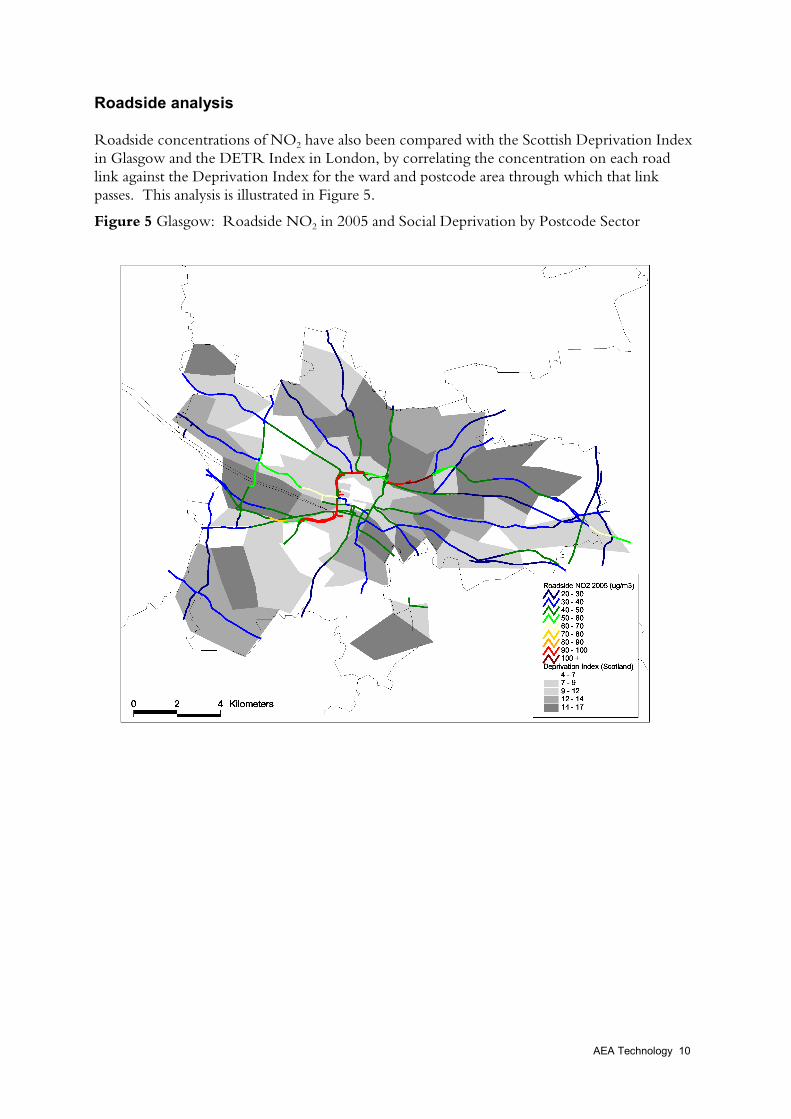
Annex 2 Specific Deprivation IndicatorsThe following graphs are all for Wards in London.
Figure 37 NO2 concentration by ‘No Car’ deprivation indicator
0
10
20
30
40
50
60
70
80
-4 -3 -2 -1 0 1 2 3 4
Specific indicator score (No car)
Figure 38 NO2 concentration by ‘Overcrowding’ deprivation indicator
0
10
20
30
40
50
60
70
80
-3 -2 -1 0 1 2 3 4 5
Specific indicator score (Over crowding)

AEA Technology 37
Figure 39 NO2 concentration by ‘17yr olds not in education’ deprivation indicator
0
10
20
30
40
50
60
70
80
-2.5 -2 -1.5 -1 -0.5 0 0.5 1 1.5 2
Specific indicator score (17yrs not in education)
Figure 40 NO2 concentration by ‘Unemployment’ deprivation indicator
0
10
20
30
40
50
60
70
80
-3 -2 -1 0 1 2 3 4
Specific indicator score (Unemployed)

AEA Technology 38
Figure 41 NO2 concentration by ‘Lacking amenities’ deprivation indicator
0
10
20
30
40
50
60
70
80
-3 -2 -1 0 1 2 3 4
Specific indicator score (Lacking amenities)
Figure 42 NO2 concentration by ‘Low earning’ deprivation indicator
0
10
20
30
40
50
60
70
80
-3 -2 -1 0 1 2 3 4
Specific indicator score (Low earning)

AEA Technology 39

AEA Technology 40
Annex 3 Roadside ResultsLONDON
Figure 43 Roadside NO2 by deprivation score in London
0
20
40
60
80
100
120
140
160
0 2 4 6 8 10 12 14 16 18
Deprivation Score
Roadside NO2 1997 Monitoring sites
Southwark
Haringey
Tower Hamlets
Camden
Marylebone RoadCromwell Road 2
Sutton
Hounslow
A3 Roadside
Figure 44 Average roadside NO2 by Deprivation score range in London
0
10
20
30
40
50
60
70
80
1 2 3 4 5 6 7 8 9 10 11 12 13 14 15 16
Deprivation score range
0
50
100
150
200
250
300
350
400
Count
NO2 1997

AEA Technology 41
GLASGOW
Figure 45 Roadside NO2 by deprivation score in Glasgow
0
20
40
60
80
100
120
140
160
180
200
0 2 4 6 8 10 12 14 16 18
Deprivation Index
Roadside NO2 1997 Monitoring sites
GlasgowRoadside
Figure 46 Average roadside NO2 by Deprivation score range in Glasgow
0
10
20
30
40
50
60
70
80
90
4 5 6 7 8 9 10 11 12 13 14 15 16
Deprivation score range
0
20
40
60
80
100
120
140
160
180
200
Count
NO2 1997

AEA Technology 42
Annex 4 Analysis of StatisticalSignificance
Testing for statistical significance can be illustrated using the London data set as an example.Using the statistical test for independence the critical value for r in a sample this size (n = 770) is0.09 (p=0.01). Therefore the values for r must exceed this critical value in order that thecoefficient can be considered significant with a probability of 0.99. Therefore nearly all of thecorrelation coefficients below are significant (shown in bold), the exceptions being those for thedeprivation indicator ‘17 year olds not in education’.
London (n =770; critical r =0.09)
r PM10 1997 PM10 2004 NO2 1997 NO2 2005 NO2 change PM10 change1998 Index Score 0.441 0.445 0.355 0.372 0.258 0.407Unemployed 0.561 0.581 0.458 0.472 0.247 0.372Over-crowded 0.531 0.547 0.516 0.525 0.333 0.352Lacking amenities 0.511 0.532 0.474 0.476 0.339 0.334Low earning 0.533 0.547 0.430 0.448 0.211 0.369No car 0.690 0.704 0.605 0.621 0.420 0.56317yrs not in education 0.002 -0.004 -0.069 -0.057 -0.245 -0.115Figures in bold are significant (p=0.01), those underlined show the five with the highest correlation coefficients
The results for the other study areas are shown below.
Birmingham (n=39; critical r = 0.405, p = 0.01)
r PM10 1997 PM10 2004 NO2 1997 NO2 2005 NO2 change PM10 change1998 Index Score 0.625 0.638 0.578 0.619 0.591 0.470Unemployed 0.567 0.583 0.523 0.570 0.529 0.406Over-crowded 0.689 0.711 0.632 0.679 0.638 0.508Lacking amenities 0.605 0.624 0.540 0.583 0.560 0.432Low earning 0.459 0.476 0.419 0.465 0.422 0.312No car 0.513 0.534 0.481 0.518 0.466 0.38617yrs not in education 0.191 0.198 0.196 0.168 0.175 0.235Figures in bold are significant (p=0.01), those underlined show the five with the highest correlation coefficients

AEA Technology 43
Belfast (n = 1221; critical r = 0.075, p = 0.01)
r PM10 1997 PM10 2004 NO2 1997 NO2 2005 NO2 change PM10 changeINDEX 0.431 0.430 0.419 0.433 0.260 0.434Lacking bath etc 0.289 0.287 0.290 0.306 0.149 0.293No sewerage -0.419 -0.419 -0.421 -0.405 -0.405 -0.419High density 0.243 0.244 0.274 0.290 0.133 0.243No car 0.552 0.551 0.529 0.534 0.387 0.554Low income 0.417 0.417 0.409 0.410 0.312 0.419Non perm accom 0.075 0.075 0.081 0.071 0.110 0.077No qualifications 0.340 0.340 0.314 0.320 0.216 0.341Unemployed 0.488 0.487 0.477 0.491 0.303 0.489Pensioners with no CH 0.142 0.141 0.131 0.145 0.033 0.145Figures in bold are significant (p=0.01), those underlined show the five with the highest correlation coefficients
Glasgow (n=91; critical r = 0.205, p = 0.05) n.b. lower level of significance
PM10 1997 PM10 2004 NO2 1997 NO2 2005 NO2 change PM10 changer -0.220 -0.229 -0.197 -0.229 -0.103 -0.201Figures in bold are significant (p=0.05)
Port Talbot (n=31, critical r =0.301, p = 0.05) n.b. lower level of significance
PM10 1997 PM10 2004 NO2 1997 NO2 2005 NO2 change PM10 changer -0.308 -0.394 -0.238 -0.195 -0.290 0.301Figures in bold are significant (p=0.05)

AEA Technology 44
Annex 5 Confounding factor ofpopulation density
A potential confounding factor in this analysis is that of population density. This factor is usedin emissions modelling to map emissions from domestic and some other sectors for which betterdata sets of geographical distribution are not available. This emission mapping is used as aninput to the background air concentration mapping.
The social deprivation indices also use measures of population density, for example overcrowded housing, and this may introduce a confounding factor. However, because it is clearthat there is a causal link between population density, domestic heating emissions and airconcentration, this confounding is only an issue if the emission mapping is inaccurate for othersources, for which the emissions should not be dependent on population density. That is, ifexcess emissions are mapped in areas of high population density, an overestimate in the airpollution mapping may cause unreliable results in this comparison between social deprivationand air quality.
Analysis of the emissions maps has shown that there is considerable variation between theemissions patterns in the areas considered in this study. Table 3 provides data on the proportionof area source emissions (i.e. not including point sources, which are not used in the backgroundair pollution mapping) that are mapped using population density. These are divided intodomestic sectors and non-domestic sectors. The latter are mapped using population because abetter map is not available and therefore population density is used as a surrogate measure.
Table 3 Contribution of domestic and other sectors to emissions mapped by population density
Area sourcetotal (t)
Domestic (t) Non-domesticsector mappedby population (t)
Percent totalnon-domestic
PM10Belfast 2272 1520 64 3Birmingham 732 119 91 12Glasgow 426 70 54 13London 4914 853 648 13Port Talbot 236 69 13 6
NOxBelfast 8561 792 205 2Birmingham 9899 1192 295 3Glasgow 6764 706 174 3London 68655 8447 2089 3Port Talbot 3111 171 42 1
The main reason for the variations in PM10 emissions between the different areas is domesticfuel type. More coal is burnt in Belfast and Port Talbot, and hence the domestic emissions are ahigher proportion of the total in these areas, with consequently less from other sectors. In thecase of NOx, there is little variation between locations in the percent of total non-domesticemissions mapped using population.

AEA Technology 45
The table shows that up to 13% of area sources of PM10 and 3% of NOx which are not directlyrelated to emissions from the domestic sector are mapped using population density. Sectorsmapped in this way include construction, some industrial processes for which location data arenot available, military aircraft and landfill. This does not mean to say that the emissions in theseareas are too high by 13 or 3 %, because, for many of the sectors concerned, emissions areconcentrated in urban areas. But there may be some over estimation of emissions wherepopulation densities are high.
In conclusion, the analysis shows that for PM10 the largest possible over-estimates of PM10 are inLondon, Birmingham and Glasgow and consequently a possible overestimate of modelled PM10
concentrations. This could have resulted in a more positive correlation between airconcentration and social deprivation. However, the overall results show a negative correlationbetween these variables in Glasgow and therefore it is reasonable to conclude that thisconfounding factor does not have a dominant influence on the final results. Additionally, recentuncertainty analysis as shown that small variations in the emissions inventory do not havesignificant impacts on the modelled PM10 emissions in comparison with other, more uncertain,model inputs (King and Stedman 2000).

AEA Technology 46