price indexes, inequality, and the measurement of world …deaton/downloads/presiden… · ·...
TRANSCRIPT
Price indexes, inequality, and the measurement of world poverty
Angus Deaton, Princeton University
January 17th, 2010
ABSTRACT
I discuss the measurement of world poverty and inequality, with particular attention to the role of PPP price indexes from the International Comparison Project. Global inequality increased with the latest revision of the ICP, and this reduced the global poverty line relative to the US dollar. The recent large increase of nearly half a billion globally poor people came from an inappropriate updating of the global poverty line, not from the ICP revisions. Even so, PPP comparisons between widely different countries rest on weak theoretical and foundations. I argue for wider use of self-reports from international monitoring surveys, and for a global poverty line that is truly denominated in US dollars.
Presidential Address, American Economic Association, Atlanta, January 2010. I am grateful to Olivier Dupriez, Alan Heston and Sam Schulhofer-Wohl who have collaborated with me on related work, to them and to Erwin Diewert, Yuri Dikhanov, D. S. Prasada-Rao, and Fred Vogel who have over the years taught me about international price comparisons, as well as the Development Economics Data Group at the World Bank for supplying me with data and for their patience and help with my questions. I also thank Tony Atkinson, Tim Besley, Jean Drèze, Esther Duflo, Branko Milanovic, François Bourguignon, Anne Case, Olivier Dupriez, Bill Easterly, Alan Heston and Martin Ravallion for comments on early drafts. The views expressed here are my own.
1
This lecture is about comparing living standards across countries, and using those
comparisons to count the number of poor people in the world. If we ask people whether they
consider themselves to be poor, or how much money someone would need to get by in their
community, they appear to have little difficulty in replying. Beyond the local level, many
countries, including the United States, regularly publish national counts of the number of
people in poverty, and while these numbers and the procedures for calculating them are
contested and debated, the estimates typically carry sufficient legitimacy to support policy,
see Connie Citro and Robert Michael (1995) for the history in the US, and Rebecca Blank and
Mark Greenburg (2008) for a recent proposal for reform. But once we try to calculate the
number of poor people in the world, matters are more complicated. The World Bank’s global
poverty count, which started with Montek Ahluwalia, Nicholas Carter and Hollis Chenery
(1979), and which became the dollar-a-day count in the World Development Report 1990, was
incorporated into international policymaking and discussion via the Millennium Development
Goals (MDGs)—the first of which is to “halve, between 1990 and 2015, the proportion of
people whose income is less than $1 a day.” This global count, which the World Bank
defines and monitors, has an apparent transparency that helps account for its rhetorical
success: it is simply the number of people in the world who live on less than a dollar a day,
with the relevant dollar adjusted for international differences in prices. But this transparency
and simplicity is more apparent than real. There are many complexities beneath the surface,
and these are the subject matter of this paper, particularly the calculation of the global line and
the adjustment for international differences in prices using purchasing power parity exchange
rates. Price adjustment is also important for other purposes, such as the construction of
databases such as the Penn World Table, which underpins almost all of economists’ empirical
2
understanding of the process of economic growth, as well as for the measurement of global
income inequality, which is another of my main concerns.
One goal of this paper is to understand why almost half a billion people were moved into
poverty at the time of the revision of the purchasing power parity exchange rates in the 2005
round of the International Comparison Project (ICP). This same revision also increased global
income inequality, widening the apparent distance between poor and rich countries. I shall
argue that the increase in poverty had little to do with the ICP, and much to do with an
inappropriate increase in the global poverty line. The causes of the increase in inequality are
harder to pinpoint, but my investigations lead to skepticism about our ability to make precise
comparisons of living standards between widely different countries such as poor countries in
Africa and rich countries in the OECD.
In spite of the attention that they receive, global poverty and inequality measures are
arguably of limited interest. Within nations, the procedures for calculating poverty are
routinely debated by the public, the press, legislators, academics, and expert committees, and
this democratic discussion legitimizes the use of the counts in support of programs of
transfers and redistribution. Between nations where there is no supranational authority,
poverty counts have no direct redistributive role, and there is little democratic debate by
citizens, with discussion largely left to international organizations such as the United Nations
and the World Bank, and to non-governmental organizations that focus on international
poverty. These organizations regularly use the global counts as arguments for foreign aid and
for their own activities, and the data have often been effective in mobilizing giving for
poverty alleviation. They may also influence the global strategy of the World Bank,
emphasizing some regions or countries as the expense of others. It is less clear that the counts
3
have any direct relevance for those included in them, given that national policymaking and the
country operations of the World Bank depend on local, not global poverty measures. Global
poverty and global inequality measures have a central place in a cosmopolitan vision of the
world, in which international organizations such as the UN and the World Bank are somehow
supposed to fulfill the redistributive role of the missing global government, see for example
Thomas Pogge (2002) or Peter Singer (2002). For those who do not accept the cosmopolitan
vision as morally compelling or descriptively accurate, such measures are less relevant, John
Rawls (1999), Thomas Nagel (2005), Leif Wenar (2006).
The paper is organized as follows. Section I explains how the dollar a day poverty
numbers are calculated and how they depend on purchasing power parity exchange rates. It
shows that poverty measures are sensitive to the PPPs used in their construction, and
establishes the basic facts and puzzles to be addressed, particularly the increases in poverty
and inequality associated with the latest ICP revision. Section II is somewhat more technical
and can be skipped without losing the thread of the main argument. It discusses the
components of the construction of PPPs that are particularly important for measuring world
poverty and inequality, as well as how PPP indexes need to be reweighted for use in poverty
measurement. It argues, by reference to my related work with Olivier Dupriez (2009), that the
reweighting, although a clear conceptual improvement, matters less than might be thought.
Section IIII returns to the main argument and is concerned with the definition of the global
poverty line: I discuss ways of constructing the line based on the international price indexes
and the national poverty lines of poor countries. As is always the case with poverty lines, how
the poverty line is updated with respect to new information deserves as much or more
attention than how its original value is set. I argue that the updating procedure in current use
4
is incorrect, that it can result in reductions in national poverty causing increases in global
poverty, and that this explains why the global poverty counts increased so much in the latest
revision. Paradoxically, one of the main reasons that India (and the rest of the world) became
poorer was because India had grown less poor. I argue for a definition of the line, and an
updating method, that is substantially different from those currently in use, and that preserves
a better continuity with previous estimates.
Section IV, which is again somewhat more technical, is an enquiry into the international
price indexes themselves, with a focus on the factors that affect global inequality. It starts
from the question of how to price comparable goods in different countries and whether the
ever more precise specification of goods by the ICP has had the effect of making poor
countries poorer relative to rich countries, widening our estimates of international inequality,
and causing the global poverty line to increase in dollar terms at a rate that is markedly slower
than the rate of inflation in the US. More generally, I discuss the special difficulties of making
comparisons between countries whose relative prices and patterns of consumption are very
different, for example between Japan and Kenya, or Britain and Cameroon. Such comparisons
are required if we are to make multilateral price index numbers for the world as a whole, and I
use data from the 2005 ICP to investigate their credibility. My analysis shows that these
comparisons rest on weak theoretical foundations and are fragile in practice.
Section V returns to the main argument and looks briefly at a monitoring system based on
asking people about their lives are going; I use data from the Gallup World Poll which
collects an annual sample of all the people of the world. Section VI concludes, and speculates
on the global system of income and poverty statistics as a whole. I argue that we should be
less ambitious and more skeptical in using the international data, particularly when comparing
5
poor and rich countries. I also make recommendations for improvements in the way the
poverty counts are calculated, for example by bringing closer together the rhetoric and the
reality of the dollar a day poverty line. I also argue that while changes in the poverty line
affect the levels of global poverty more than they affect its rate of change, the levels are
themselves important for the international debate.
I. Global poverty and global inequality
Many countries have their own national poverty lines and poverty headcounts. One candidate
measure for an international count would use those national numbers, and add them up over
all countries. The 2008 annual poverty line in the United States was $21,834 for a family of
two adults and two children, or $14.96 per person per day; 13.2 percent of Americans live
below this line. India in 2004–05 had two poverty lines, one for rural households of 11.71
rupees per person per day, and one for urban households of 17.71 rupees; at the 2005 PPP
exchange rates, these lines are $0.80 and $1.21 per person per day (about a third of that at
market exchange rates), and 27.5 percent of the Indian population lives below them. If we
take the view that poverty is relative to prevailing living standards in the society in which
people live, these headcount ratios might be taken to be comparable. Yet the global poverty
counts aim to measure absolute poverty, and to count those who are destitute by a common
global standard which might be supposed to include all of the locally poor Indians, and none
of the locally poor Americans. By this view, we might take one or the other Indian lines, and
use PPP exchange rates to convert it to other currencies, and then sum the total number of
people in the world who live on less than the local purchasing power equivalent of the Indian
line. The pioneering paper by Ahluwalia, Carter, and Chenery (1979) used a global line based
on the Indian poverty line, but since World Bank (1990) the global line has been an average
6
of the international dollar value of local lines of a number of poor countries. Exactly which
average is a matter of some importance, as is whether the average is better than the original
Indian only line, and I shall return to both issues.
Table 1 presents the key numbers. The first three columns, taken from the World Bank’s
(2008b) poverty supplement to the World Development Indicators, show the latest estimates
for 1981 (which is as far back as these estimates go), 1993, and 2005. These are based on the
latest version of the “dollar-a-day” global poverty line, which is $1.25 per person per day in
2005 international dollars, and show the well-known reduction in the global headcount ratio,
from 51.9 percent of the world’s population in 1981 to 25.2 percent in 2005. In spite of
growth in the world’s population, the number of people in this kind of poverty has fallen by
more than half a billion in the last quarter century. Much of this success comes from China, in
the East Asia and Pacific region. The headcount ratio in sub-Saharan Africa has fallen only
slowly, and there are 176 million more Africans in poverty in 2005 than in 1981. South Asia,
dominated by India, is part success and part failure, and the Bank—and the government of
India—estimate that, in spite of a falling headcount ratio, there has been a small increase in
the numbers of Indians in poverty since 1981, in spite of India’s relatively rapid growth in per
capita GDP in recent years, and its relatively slow rate of population growth. The overall
improvement in global poverty and the broad regional structure of that improvement show up
in all versions of the counts. Even so, it is worth noting that these counts are based entirely on
household survey data, and that there are often major discrepancies in growth rates between
the survey data and the national accounts so that the counts in Table 1 may understate the rate
of poverty reduction, see Deaton (2005).
7
The last three columns in Table 1 look at three different sets of headcount ratios for 1993.
The International Comparison Program has updated its estimates of PPP exchange rates on an
irregular basis, with each round a substantial improvement on the previous one; the last three
benchmarking exercises were in 1985, 1993, and 2005 with a particularly marked increase in
consistency and coverage between the last two. The World Bank uses these estimates to
update its global poverty line—defined as the average PPP poverty line for a group of the
world’s poorest countries—and to revise the conversions of that line into local currencies. The
original poverty line of $1.01 in 1985 PPP ($370 per year, in World Bank, 1990, Figure 2.1
and Table 2.1) rose to $1.08 in 1993 international dollars, and to $1.25 in 2005 international
dollars. By contrast, the US CPI rose by 34 percent from 1985 to 1993 and a further 35
percent from 1993 to 2005; this divergence is driven by fact that ICP revisions move price
levels upward in poor countries relative to rich countries, so that poor country poverty lines
are worth less in US dollars.
The revision from 1985 to 1993 had relatively little effect on the global count, but made
sub-Saharan Africa appear to be much poorer, and Latin America appear to be much less
poor. Indeed, it is the 1993 revision that “established” sub-Saharan Africa as the region with
the highest headcount ratio, a fact that has dominated subsequent discussions of world
poverty; prior to revision, the measured prevalence of poverty in South Asia was substantially
higher than in sub-Saharan Africa. At the time of that revision, I commented that “changes of
this size risk swamping real changes, and it seems impossible to make statements about
changes in world poverty when the ground underneath one’s feet is changing in this way,”
Deaton (2001). The 2005 revision shifts the ground even more. The global count for 1993
jumps by almost half a billion people, the headcount ratio for East Asia doubles, there are
8
substantial increases in Africa and South Asia, and a large reduction in Latin America. The
Table shows these numbers for 1993, for which there are estimates using three sets of PPPs,
but there are similar large upward revisions for more recent years; for example, Shaohua Chen
and Martin Ravallion (2010, Table 2) estimate that for 2005, there were 1,377 million poor
people using the latest method. In an earlier version of the paper, they reported that the
number would have been 931 million using the methods in use prior to the latest ICP revision.
The size of the earthquakes seems to be increasing.
Let me emphasize that the general trends in the left-hand side of Table 1 reappear
whichever PPPs and poverty lines are used. The shifting of the ground refers only to the level
of global poverty, and to its regional distribution. Provided we are prepared to ignore the fact
that each new set of estimates makes the world look like a very different place, the global
trends are relatively secure, although I shall enter some qualifications in Section VI. Given the
clear improvement in the successive ICPs, I would certainly not advocate the retention of
outdated and flawed data, and indeed the ICP is far from the only source of uncertainty in the
world poverty measures, which depend on the timeliness, availability, coverage, design, and
quality of national household surveys, national consumer price indexes, and national
accounts. Yet the size of each set of revisions, and the reasonable presumption that future
rounds of the ICP will change the picture yet again, raises the question of whether the poverty
monitoring system is accurate enough and stable enough to be useful in monitoring progress
and for identifying countries and regions where deprivation is greatest.
The ICP revision in 2005 was associated with a substantial increase in the World Bank’s
measure of global poverty. The World Bank’s poverty supplement to the World Development
Indicators writes “The new poverty line maintains the same standard for extreme poverty—
9
the poverty line typical of the poorest countries of the world—but updates it using the latest
information on the cost of living in developing countries. The new data change our view of
poverty in the world. There are more poor people,” World Bank (2008b, page 1.) The Chief
Economist of the World Bank commented “the sobering news—that poverty is more
pervasive than we thought—means that we should redouble our efforts, especially in sub-
Saharan Africa.”
Global income inequality also changed with the revision to the ICP. Branko Milanovic
(2009), using household survey data, has estimated that the Gini coefficient of income
inequality over all the citizens of the world rose from 0.65 to 0.70 as a result of the revision.
Figure 1 provides another way of looking at the change and shows population weighted
inequality across countries using per capita GDP in PPP dollars as the income measure, what
Milanovic calls “Concept 2” inequality, see also Sudhir Anand and Paul Segal (2008). The
figure shows the Gini coefficient of population weighted per capita national income
inequality, and this would be the global Gini if incomes were equally distributed within
countries and the national accounts data and PPP indexes were correct. For a complete
accounting of international income inequality across households, within country inequality
must also be allowed for although, given the conflict between national accounts and survey
data, with incomes in the latter often growing more slowly, it is not obvious how to do so.
Milanovic uses only survey data, and finds little change in world inequality in recent decades;
procedures that use NAS data, coupled with distributional data from household surveys, find
that inequality is declining, see for example Maxim Pinkovskiy and Xavier Sala-i-Martin
(2009) for a recent example: neither procedure by itself is credible, see again Anand and
Segal (2008) for a discussion of how little we know. For my purposes here, I note that
10
inequality between countries has dominated the total in recent history, see Francois
Bourguignon and Christian Morrison (1998), and within country inequality is not affected by
the choice of PPPs—at least if we ignore regional price differences within countries—and so
is not my topic here. The graphs in Figure 1 are falling over time in large part because the per
capita national incomes of the world’s largest countries, India and China, have been growing
very rapidly and moving from the bottom of the world income distribution towards its middle.
The top two graphs in the figure show the two time series using World Bank PPP data
before and after the 2005 revision of the ICP. The bottom two graphs use data from the Penn
World Table (PWT), and compare version 5.6, which used PPPs referenced on 1985, with
version 6.2, which uses PPPs referenced on 1993. This second pair of graphs is chosen to
illustrate the 1993 revision to the ICP, which is the one immediately prior to the latest 2005
revision. The Penn World Table uses a different type of PPP than does the data from the
World Bank, Geary-Khamis rather than EKS—which tends to understate the level of global
inequality because of Gershenkron or substitution bias, see for example Steve Dowrick and
Muhammad Akmal (2005). PWT also uses different rules for updating between benchmark
years, and exercises more freedom than does the World Bank in editing growth rates from
country national data, e.g. from China; there are no published World Bank data on a 1985
basis. In consequence, the 1993 inequality numbers from the PWT are not identical to the
World Bank estimates, but for my purposes, they are close enough, and follow a similar trend.
The main point to note is that the revision from 1985 to 1993, like the later revision from
1993 to 2005, moved measured inequality upwards. In fact, the revisions are about the same
on both occasions, about 5 percentage points to the Gini coefficient; using Anthony
Atkinson’s (2003) useful metric, a substantive (as opposed to statistical) offsetting decrease in
11
the Gini coefficient could be accomplished by each country contributing 5 percent of its per
capita GDP into a common pool which is then equally distributed among all countries, a
proposal that dwarfs even the most ambitious programs for international aid
The World Development Indicators did not provide data on aggregate household
consumption in international dollars prior to 2008, so it is not possible to replicate Figure 1
for per capita consumption. However, World Bank (2008b, pp. 23–5) lists old and new PPPs
for household final consumption expenditure in 2005 for 118 countries, and I have used these
to calculate the concept two measure of the Gini coefficient for consumption. Here too the
revision from old to new PPPs led to a substantial increase in measured inequality, with the
per capita consumption Gini rising from 0.48 to 0.56.
For my analysis here, it is the widening of measured inequality that is the key effect of
the 2005 revision of the ICP. On average, rich nations and poor nations moved further apart.
Judged from the rich world, the poor world is poorer than we thought, but judged from the
poor world, the rich world is richer than we thought; the two statements are equivalent, and
the difference depends on nothing more than the choice of numeraire. As we shall see, the
revision to the ICP, in and of itself, had little effect on the world poverty count.
II. The construction of international purchasing power parity exchange rates
In order to understand why the ICP might have an effect on our perceptions of global poverty
and inequality, we need to understand something about how it works. This section provides a
brief account of relevant issues based on Deaton and Alan Heston (2010); comprehensive
accounts of the 2005 round are contained in World Bank (2008a), and in the handbooks on the
ICP website at the World Bank.
12
The latest round of the ICP constructed purchasing power parity price indexes for 146
participating countries for 2005. I focus for the moment on the indexes for household
consumption that enter into the global poverty calculations. Consumption is divided into 110
“basic headings,” such as rice, bread, clothing, furniture and furnishings, and each basic
heading is represented by a list of precisely specified items that lie within it. It is these items
that are actually priced by the ICP investigators. The basic headings are the same for all
countries, but the detailed lists are different for different regions of the world, of which there
were six in 2005; this structure means that the same items are not priced in all 146 countries.
For example, fresh mud crabs and fresh squid appear in the Asian list in the fish basic
heading, while in Africa, we have Nile perch, catfish, kapenta, and bonga, along with many
other fishes. At a first stage, the prices for the detailed lists are aggregated up to give regional
“parities” (price indexes or PPPs) for each basic heading. These are in the units of a regional
numeraire, e.g. Hong Kong for the Asia/Pacific region, and are the price indexes, with Hong
Kong as unity, for each basic heading in each country in Asia/Pacific. For example, fish in
Bangladesh is 4.90 taka per Hong Kong dollar, and 4.64 Sri Lankan rupees per Hong Kong
dollar in Sri Lanka, while the corresponding figures for gasoline are 2.55 and 3.17. These
parities are commodity-specific PPP exchange rates, and there is one for each basic heading in
consumption. At a second stage, these parities for basic headings are averaged to give an
overall PPP for the country. An important distinction between the first and second stage is
that at the latter, the averaging can use expenditures from the national accounts statistics
(NAS) to weight together the parities from each basic heading in relation to the amount spent
on each. At the first stage, within the basic headings, there are no NAS expenditure data, and
aggregation up to the parities for the basic headings must be done without weights.
13
The procedures outlined above yield a system of PPP exchange rates for each region of
the world, with a different numeraire country in each, not a single global system with a single
numeraire currency such as the US. In the 2005 ICP, the “gluing together” of the regions was
accomplished using a third stage, the “ring,” in which 18 strategically chosen countries, at
least two per region, were asked to price a new, common detailed list of more than 1,100
items. Those prices were then used to link the regions.
Beyond this general outline, I now develop some of the details that I shall need to
understand the implications for the measurement of poverty and inequality. At the first,
detailed, stage, the ICP collects prices in each country c in region r for basic head i so that
there might be 1,.. rj N items in the basic heading (varieties of fish in the fish basic
heading). We can then run a set of country-product dummy (CPD) regressions, one for each
basic heading separately by region, of the form
ln cr cr cr crij i j ijp (1)
in which each price is regressed on a set of commodity (basic heading) and country
dummies—with country 1 omitted—so that the parity in region r for basic heading i (with
country 1 as numeraire) is given by
exp( )cr cri ip (2)
where the suffix 1r identifies the numeraire country in region r. If every country in the region
prices everything in the regional list, (2) would be a geometric mean of prices in the basic
heading for country c. But not everyone has fresh (or even smoked) bonga in their local
market, so that CPD regression works when geometric means would not. Effectively, (1) “fills
in” missing values for items whose prices cannot be found, even to the extent of delivering a
14
comparison of two countries neither of which consumed any item purchased in the other,
provided that the items appear together in one or more other countries.
Another problematic issue here is that smoked bonga (or indeed Kellogg’s cornflakes, a
more important example) may be available, but is rarely eaten in country c, so that it is only
stocked in specialty shops at very high prices. On the one hand, the ICP wants to specify
goods very precisely (the actual specification in the African list is “smoked bonga, in simple
wrapping, open product presentation, a piece of approximately 200 grams”) so that we are
sure we are matching like with like (and not matching a bonga just any smoked fish) while, on
the other, it wants to avoid comparing commonly consumed items with non-representative,
rarely consumed, and expensive ones. To try to handle this tension, the ICP asked
enumerators to grade the local representativity of each good on a three point scale, with the
intent of down-weighting unrepresentative items. A similar system was successfully operated
in Europe in 2005, but the rankings from the other regions were not useable, so no correction
was made for high prices of possibly unrepresentative goods.
When we move from parities for basic headings to PPPs for countries, the prices for each
basic heading from (3) are combined with expenditures from the national accounts statistics of
each country. In the first instance, this is done for each region separately. The theory here is a
multilateral extension of standard bilateral price index formulas in which Fisher ideal indexes
for each pair of countries are adjusted so as give a transitive set of international prices
indexes, or PPPs, see Deaton and Heston (2010) for an account. The Fisher indexes
underlying the multilateral PPPs are “superlative” indexes, Erwin Diewert (1976), which
means that there exists a suitably general set of preferences for which they are exact cost-of-
living index numbers. Because the index uses weights from both countries, rather than just
15
one or the other, the use of the Fisher index limits the effects that would result from weighting
one country’s prices by expenditure patterns that come from a country or countries with very
different relative prices and consumption patterns; if countries had identical tastes, these
effects would be the familiar substitution or Gershenkron biases.
The third and final stage of the ICP brings the regions together into a single set of basic
heading and country parities for the world as a whole with everything expressed in the
currency of a single numeraire country, the US. This is done by pricing a new common “ring”
list of more than 1,100 items in each of 18 countries, Brazil, Chile, Cameroon, Egypt, Estonia,
UK, Hong Kong, Jordan, Japan, Kenya, Sri Lanka, Malaysia, Oman, Philippines, Senegal,
Slovenia, South Africa, and Zambia. As suggested by Diewert (2008), these detailed ring
prices were used in a modified version of the CPD regression (1)
ln lncr cr r j crij i i i ijp p (3)
where crijp is the ring price for item j in basic head i in country c in region r, cr
ip is the
previously established regional parity for basic head i, from (3), and the right hand side
variables are regional and item dummies. Intuitively, each item price in the ring, ,crijp the
price of shrimp (j) in the fish basic heading (i) in ring country c in region r, is converted to the
region numeraire currency (e.g. Hong Kong dollars for Asia/Pacific) using the previously
established within-region parity for fish, icrp from (2). The regression (3) then picks out the
regional log price level for fish, ,ri e.g. in Hong-Kong dollars per global numeraire, which is
the numeraire of the OECD-Eurostat region, the US dollar. We then have a set of all-region
parities for each basic heading, exp( )ri , which are unity for the numeraire region (OECD-
Eurostat). These “prices,” together with the regional aggregates of expenditures on each basic
16
head expressed in regional numeraire currency, are used in a global multilateral aggregation
to give regional PPPs, one index for each region, that allow the within-region PPPs to be
scaled up to global PPPs.
Four specific aspects of this ICP construction are of concern here. First, the absence of
weights within basic headings, including the lack of representativity weights, may result in
basic headings being priced using high-priced unrepresentative goods that are rarely
consumed in some countries. This is a particular concern for the ring, where identical goods
are being matched across very different countries. Second, when country PPPs are constructed
from the prices of basic headings, the ICP uses expenditure weights from the national
accounts. These weights are appropriate for national income accounting purposes, but do not
reflect the consumption patterns of people who are poor by global standards. Third, the
joining of the regions using the ring information is based on region-wide “super” PPPs in
which, for example, there is a price level for Africa or Asia/Pacific relative to the OECD.
Measurement errors, or conceptual problems in these indexes—I think of these as “tectonic”
price indexes—and play an important role in determining global inequality. Fourth is an issue
to which I shall return only briefly, which is an urban bias in price collection in some
countries, particularly large countries such as China.
The second issue, reweighting for poverty, has been investigated by Deaton and Dupriez
(2009) who compute a new set of PPPs for the countries in the poverty counts, using the price
data from the 2005 ICP, but reweighting by the expenditure patterns of people near the global
poverty line in each country. Their main result is that the poverty-weighted PPPs, or P4s are
very close to the usual PPPs, or P3s. Indeed, the main difference between the indexes comes,
not from the reweighting, but because the P4s use household survey data—the only source of
17
information on the expenditure patterns of the poor—rather than national accounts (NAS)
data, and because there are inconsistencies between the two sources. The insensitivity to
reweighting may seem surprising given that patterns of consumption for the global poor are
very different from the plutocratic patterns of consumption in the national accounts. But that
by itself is not enough to generate a difference in the price index or the PPP. Between any pair
of countries, the substitution of poverty-line for NAS budget shares will only change the price
index between them if the change in budget shares induced by movement down the income
distribution is systematically correlated across goods with the price relatives in the two
countries. This would happen if we were calculating a price index for a pair of countries, one
rich, with low food share and low relative prices of food, and a poor country, with high food
share and high relative prices for food (much of food is traded), where the move from a
plutocratic to poverty weighting will increase the price level in the poor relative to the rich
country. Among a group of countries, all of whom are relatively poor, this effect is typically
not pronounced. In effect, although their patterns of demand are different, international
comparisons of poor households give much the same result as international comparisons of
middle income households.
III. Poverty lines and poverty counts
Most of the increase in the world poverty count with the revision in the ICP can be attributed
to two main factors only one of which, the treatment of housing rental, is directly attributable
to the ICP itself. Much more important was an increase in the global poverty line. Although
the procedure that the Bank used to calculate the global line is the same as previously, the line
itself has been increased. Both of the factors are of general interest. The treatment of housing
is a major concern for virtually all price index work and will be so for future rounds of the
18
ICP. The procedure for calculating the global poverty line will also determine the future path
of the global count, and in particular how the global line changes as countries get richer. I deal
with each issue in turn, starting with the least important.
A. Actual and imputed rent for housing
Housing rental, including imputed rental for owner occupiers, is a difficult (“comparison
resistant”) area for the ICP, see Deaton and Heston (2010). For the African and Asian regions,
the 2005 ICP had to fall back on an imputation. Because the ICP is primarily focused on
obtaining “volume” measures of GDP in international currency, it was decided to impute
rental by assuming that, for countries in Asia and Africa, the volume of rental was a fixed
proportion of GDP. This is a neutral imputation because, unlike other possibilities, it does not
disturb the ratios of GDP across countries. However, what is neutral for quantities is not
neutral for prices. The parity for the rental basic heading is derived as the ratio of
expenditures on rental (which comes from each country’s national accounts) divided by the
assumed quantity, which is taken by the imputation to be proportional to GDP. For countries
that make little or no allowance for owner-occupier rentals in their national accounts, this
“imputed” parity will be very low. Table 2 shows the parity for housing rentals relative to the
overall parity for consumption for the 15 poor countries whose national poverty lines in
international currency are averaged to give the $1.25 global poverty line. I also show India
and China for comparison; we do not know that these are correct, but it is reasonable for a
non-tradable stock like housing to be cheaper than the average consumption item in those
countries.
Several of the rental parities in the 15 countries in Table 2 are too low to be credible. For
Ghana, the rental parity is less than five percent of the overall parity, it is 11 percent in
19
Gambia, and 12 percent in Tajikistan. In nine of the fifteen countries, the rental parity is less
than a half of the overall parity. If we are concerned with the parities and the overall PPP for
consumption, rather than with volumes, a neutral assumption would have been one in which
the parity for rental was taken to be the same as an average over all consumption, and this can
be accomplished by dropping the category and recalculating the PPPs. This raises the PPPs
(local currency to US dollars) in Africa and Asia, and more precisely raises the PPPs relative
to India of countries in Table 2 whose rental parities are less than 0.602, and relative to China
of those whose rental parities are less than 0.832. The Indian or Chinese equivalent of the
local poverty lines of those countries are reduced by an increase in their PPPs, which reduces
the headcount rates in India and China, and because they are so large, reduces the global
poverty count. This (alternative) neutral treatment of housing rental reduces the 2005 poverty
count by more than 100 million people.
It should be noted that the treatment of housing is not an error in the ICP, which is
focused on producing reasonable estimates of GDP rather than prices or poverty, but it turns
into a problem when we move to poverty measurement. The PPPs from the ICP for several of
the 15 poverty reference countries are too high, and a failure to make a correction inflates the
global poverty count by more than 100 million.
B. Setting the global poverty line
Since 1990, the global poverty line has been set by taking the national poverty lines of a
group of the poorest countries in the world, converting them to international dollars using
PPPs from the ICP, and taking a simple average. Bringing in more countries is arguably an
improvement over using India alone, as in Ahluwalia, Carter, and Chenery (1979), though as
these authors argue, the Indian line has been continually debated in a way that is not the case
20
for many other countries in the average. Either way, the aim is to find a line that represents
absolute poverty, and the idea is that poverty lines in the poorest countries are a reasonable
estimate of what that might be. This idea is further supported by the relationship between the
PPP value of national poverty lines and the PPP value of per capita GDP or consumption;
national poverty lines do not vary much with levels of living in the poorest countries, but
beyond some cutoff—where relative poverty begins to matter as well as absolute poverty—
national poverty lines rise with the average level of living, see Ravallion, Gaurav Datt, and
Dominique van de Walle (1991), Ravallion (1992) and Atkinson and Bourguignon (2000).
This relationship is shown in Figure 2, using data on poverty lines and per capita expenditure
levels (from household surveys), assembled by Ravallion, Chen, and Prem Sangraula (2009),
who use them to define the current $1.25 a day poverty line. Their procedure is to define a
cutoff, shown as the line AA in Figure 2, below which poverty lines do not decline further,
and to compute the global line as the simple average of the poverty lines to the left of AA—
which are the poverty lines for the first 15 countries listed in Table 2. This leads to $1.25 per
person per day in 2005 international dollars.
Until the most recent revision, the 1990 line was updated using the same group of
reference countries, so that revisions to the global line, for example from $1.01 to $1.08 in
Table 1, came entirely from revisions in the ICP, from the 1985 benchmark to the 1993
benchmark. In the latest revision, Ravallion, Chen, and Sangraula collected an important new
data set of national poverty lines, updated not only the conversion factors from the 2005
revision of the ICP, but also the group of reference countries whose poverty lines go into the
global line. One consequence of the change was that India’s recent economic growth allowed
21
it to graduate from the poverty-line reference group, so that India’s poverty line no longer
contributes to the global line. This updating has unfortunate and unintended consequences.
I illustrate the argument using Figure 2 and by focusing on two of the marked countries,
India (population in 2005 1.1 billion) and tiny Guinea-Bissau (population in 2005 1.6
million). The line PP shows the $38 a month global line ($1.25 a day.) India’s poverty line is
a good deal lower than the global line and Guinea-Bissau’s a good deal higher. Note that,
although there are round to round revisions in the PPPs used to establish the international
value of these local lines, the relative position of the lines depends on the domestic procedure
that is used to set the national lines in local currency. Over time, as country incomes change,
either in reality, or through measurement error, some countries will move across the cutoff
line AA. Consider first India, which has a low poverty line relative to its living standards, and
suppose that India has recently moved across the line from left to right. At the point where it
is just on the line, there will be an upward discontinuity in the global poverty line as India
drops out of the average, and a corresponding upward discontinuity in the global poverty
count, much—but not all—of it from India. Not only is there a discontinuity, but in this
particular example, the change is of the wrong sign, with a small increase in Indian incomes
causing a large increase in Indian and other countries’ poverty counts. In effect, India and the
world have become poorer because India has become richer! Turn now to Guinea-Bissau, and
suppose that it becomes richer—through an increase in the world price of cashews, or only
apparently so through measurement error—so that it moves across the line AA from left to
right. Because Guinea-Bissau has a high poverty line, the global poverty line will decrease, as
will global poverty, and this effect turns out to be rather more than 20 times the population of
Guinea-Bissau. These problems would not occur if the relationship in Figure 1 were exact,
22
rather than a scatter. With a scatter, the updating procedure violates monotonicity, that if
poverty falls in any country included in the counts, and increases nowhere else, global poverty
should fall. The current procedure does not satisfy that basic requirement. Nor does it satisfy
the property that global poverty should fall by no more than the fall in poverty in individual
countries.
An alternative procedure for deriving the global line is to average the available national
lines for all of the countries in the counts. This runs the risk of including poverty lines that are
too high to be plausible as minimum subsistence requirements, but this can be dealt with by
weighting each line by the number of poor people in the country so that, the Indian line—
currently excluded from the computation of the $1.25 line—receives around a third of the
total weight. At the same time, very little weight is assigned to tiny countries like Guinea-
Bissau, whose national poverty lines or estimated PPPs are thereby prevented from having
large effects on the global poverty count by bringing millions of Indians and Chinese in and
out of the counts. Without endorsing the quality of the national accounts of large poor
countries such as India and China—around which there has been much debate—it is surely
unwise to place great weight on the quality of the data from at least some of the countries in
Table 2.
Tables 3 and 4 show a range of calculations for the global poverty lines and the
associated counts; these are extracted from Deaton and Dupriez (2009). The first figure in
Table 3, 19.49 rupees per person per day, is the $1.25 poverty line converted to Indian rupees
at the ICP Indian rupee to $ consumption PPP of 15.60. (It should be noted that this is
considerably higher than the government of India’s own lines for 2004–5, which are 11.77
rupees per day for rural and 17.77 rupees per day for urban.) If we exclude Guinea-Bissau,
23
which in the absence of household survey data cannot be included in the poverty-weighted
PPP calculations, but use otherwise identical procedures, the line falls only slightly to R19.06
or $1.22. If the ICP numbers are replaced by PPPs calculated in a one-step multilateral
calculation using the ICP raw data, but not its regional aggregation procedure, the line falls to
R18.98. There is a further drop to R18.05 once we exclude three basic headings that are not
covered by household surveys, FISIM (financial intermediation services indirectly measured
by the profits of banks and insurance companies), prostitution, and actual and implicit rental
for housing. This drop is largely driven by housing rental, and by replacing the neutral volume
assumption by the neutral price assumption, as discussed above. Once we switch to surveys as
the source for the aggregate weights, but still hold with P3s, and with the unweighted average
of 14 poverty lines, the line falls to R17.81. The second row shows the effects of moving to
poverty-weighted PPPs, first retaining the unweighted 14 country averaging, and second with
50 country poverty-weighted averaging. The first step, replacing the P3s with P4s, leaves the
line within the range established in the first row, but the second step, which brings in the
Indian and Chinese poverty lines, shows a marked reduction in the global line, to R16.04
which, not surprisingly, lies within the range of the Indian official rural and urban lines.
Table 4 shows the implications of the different lines for the global poverty counts. Given
that the US is not, and cannot be, included in the P4 indexes, there is no US to rupee P4 to
convert international rupees to international dollars. Instead, DD (2009, Table 13) calculate
“star” PPPs comparing the US with each of the countries they use, with each country’s
currency first converted into international rupees using the P4s. Star PPPs are computed one
country at a time, and are Fisher price indexes between each country and the US, with poverty
line weights for the 62 countries, and the national accounts weights for the US, the idea being
24
to compare market consumption in the US—the consumption of the rich-world audience to
whom the global counts are directed—with the consumption of those near the global line in
each country. It turns out that these star rates do not vary much from country to country, so
DD use an average to convert the rupee lines back to dollars. Table 4 again starts with the
official calculation, somewhat updated from World Bank (2008b), and Table 1, with a global
poverty line of $1.25 in 2005 international $ and a global count of 1,319 million. The next
row shows the global line and counts using P4s and averaging lines over 14 countries; the
global line is R18.97 or $1.064 and the global count falls to 1,164 million. As we have seen in
the step by step calculations in Table 3, the main reason for the drop of 155 million in the
poverty count is the change in the treatment of housing. The final row again uses P4s, but now
with poverty-count weighted averages of 50 national lines. In this final calculation, the global
line falls to R16.04 or $0.922, and the global count to 874 million, two-thirds of the number
with which we started, and only 57 million less than would have been estimated using the
methods in place before the revision of the ICP.
These calculations show that, provided we use a sensible method for setting the global
line, neither the wider collection of poverty lines nor the ICP revision has generated any great
need to revise our estimates of the prevalence of global poverty. The belief that the new ICP
makes the world poorer comes from missing the fact that the updating procedure had
increased the global line, and then attributing the increase in poverty to the ICP revision on
the mistaken belief that the dollar-a-day line is actually denominated in dollars. I shall argue
below that denominating the global line in dollars would be a good idea, but as long as it is an
average of poor country lines, an ICP revision that makes the US look richer relative to those
lines can have no effect on the global poverty counts.
25
As we saw in Section I, the ICP revision did indeed make the world look more unequal,
and it reduced the size of poorer economies relative to richer economies. In that sense, judged
from a rich country standpoint, the “developing world” does indeed appear to be poorer.
However, global poverty is measured relative to standards set in the poor countries
themselves, so that the apparent expansion of inequality cannot, and does not, increase the
global poverty count. The count is invariant to any inequality expanding uniform downward
rescaling of the international dollar value of consumption in countries in the count relative to
the excluded rich countries. Because the expansion in inequality comes about through
increases in the measured price levels in poor countries relative to rich countries, this shows
up in the poverty calculations through a real decrease in the global poverty line. The $1.08 in
1993 prices, which would have been $1.46 in 2005 prices if it had been indexed for the US
CPI, is in fact only 92 cents in Table 4. This is a measure of the extent to which the ICP has
revised upwards the price levels in poor relative to rich countries, which is the issue to which
I now turn.
V. Quality and inequality around the world
Understanding why the ICP has increased measured global inequality is more difficult than
understanding why measured poverty has changed. Several different factors are at work, and
it is not always clear how to assess the contribution of each. Any change from the 1993 ICP
involves not only the new procedures, but also the old ones, many of which—especially the
linking of the regions—are known to have been ad hoc and unsatisfactory. I shall focus on the
2005 round, and discuss and quantify the effects of several aspects of the way the indexes
were constructed.
26
Figure 3 shows the revisions to the PPPs in relation to country living standards; it
displays the ratio of new to old GDP PPPs for 2005 taken from the 2008 and 2007 World
Development Indicators, respectively. A similar graph for the consumption PPPs is given in
Ravallion Chen and Sangraula (2009, Figure 4.) Figure 3 shows a strong negative relationship
between the upward revision in the PPP for GDP, on the vertical axis, and log GDP per capita
on the horizontal axis, which implies that the GDP per capita in international dollars tended to
be revised downward in poor countries relative to rich countries, which is why inequality
increased. (The negative relationship would be even steeper using the old estimates of per
capita GDP, according to which the poorest countries were richer than shown.) Relative to the
rich countries, poor countries became poorer; this does not affect global poverty given that
global poverty is assessed by poor world standards—but it does increase the estimate of
global inequality (and reduce the value of the global poverty line below its value if updated by
the US CPI.) The figure also shows that the largest revisions are in Africa and Asia; the
average ratios of new to old are 1.42 for Africa and 1.33 for Asia-Pacific. The largest seven
revisions are in Africa, and there are 18 African countries in the top 25, the others being
Cambodia, Nepal, Bangladesh, Philippines, China, Tonga, and Fiji, all except Tonga (which
was not benchmarked in the 2005 ICP, but was imputed) are in the Asia-Pacific region. Since
Africa and Asia were linked to the other regions using regional PPPs—one for each region—
calculated from the ring using Diewert’s method—these regional PPPs are a natural point of
investigation for investigating the increase in inequality. By the same token, measures of
world inequality are sensitive to these regional PPPs; for example, if the revision to the
regional PPPs for Africa and Asia-Pacific had been half their actual size, so that the ratios
were 1.21 and 1.165 rather than 1.42 and 1.33, half the difference in the standard deviation of
27
logs in per capita GDP would disappear. Without the upward revisions to the African and
Asia-Pacific PPPs, there would have been no increase in measured inequality.
A. Country coverage, imputations, and inequality
The 2005 ICP has price data for 146 countries, many of which were imputed in earlier rounds,
either by comparison with countries at similar level of development, or by updating old data,
or some combination of the two. For countries without benchmarks, the PPP correction factor,
the ratio of PPP to exchange rates, is imputed from a regression of the logarithm of the
correction factor on the logarithm of per capita GDP at market prices. (Other variables are
also included, see Changqing Sun and Eric Swanson (2009) and Deaton and Heston (2010)
for more details.) These imputations target the logarithm of PPP, or equivalently the logarithm
of per capita GDP in international dollars, and deliver unbiased estimates in ideal conditions.
However, the imputed values will have less cross-country variations than the unobserved true
values. If ln yp is the logarithm of the price of GDP—the ratio of the PPP to the average
exchange rate—the regression for imputation in its simplest form is
0 1ln lny Ap y (4)
where Ay is per capita GDP in US $ converted at market exchange rates; using the World
Development Indicators, 1 is typically estimated to be around 0.25. Imputed per capita GDP
in international prices is
0 1ˆ ˆˆln (1 ) lnI Ay y (5)
Compared with the actual ln Iy , (5) introduces variance through the estimation of the
parameters, an effect that is likely to be small, but removes variance because the variance of
is not included in the imputation. Over successive rounds of the ICP, as fewer PPPs are
28
imputed, and more actually measured, measured inequality will rise. The variance of
estimated from (5) using the pre-revision 2005 data (and including the imputations) is 0.084,
which needs to be multiplied by the change in the fraction of covered countries (about 0.25)
before it is compared with the increase in the actual variance of log GDP in 2005 of 0.370. So
the reduction in the share of countries imputed cannot explain more than a small part of the
increase in measured inequality.
B. Comparisons between rich and poor countries in the ring
The most important question for international comparisons of prices is how to make useful
comparisons across widely different countries, in different regions of the world, with different
levels of per capita GDP, and with different patterns of consumption and relative prices. The
regional structure of successive ICPs means that this issue is most serious when the regions
are linked because, in spite of there being a good deal of heterogeneity within some regions,
e.g. Hong Kong and Nepal are both in Asia-Pacific in 2005, the widest disparities are across
regions. To investigate this further, we need to look in some detail at the operation of the
“ring” in the 2005 ICP, the collection of a more than a 1,000 precisely specified identical
items in eighteen countries distributed over the regions.
Past rounds of the ICP have been criticized for not comparing like with like; a cotton
shirt, a pair of sandals, or brain surgery in Cameroon or Senegal are plausibly of lower quality
than the same items in Japan or Hong Kong, so that comparing the prices of such loosely
defined items may overstate living standards in poor countries relative to rich. In the 2005
round, the ring list, like the regional lists, used precisely specified definitions of goods and
services in order to avoid quality mismatching, and this is cited as an important reason for the
differentially large increase in the PPPs of poor countries, World Bank (2008b, p. 1),
29
Ravallion, Chen, and Sangraula (2009, p. 178). We can see how this works by looking at the
18 ring countries as a group, and calculating a set of PPPs for them using the standard
methodology, the CPD regressions (1) and (2) to get parities for each basic heading, followed
by aggregation to multilateral PPPs for those 18 countries alone. Because the US is not a ring
country, I select the UK as base, and calculate the “price level” of consumption goods and
services included in the ring list for each of the ring countries relative to the UK; this is
defined as the ratio of the PPP in local currency per pound sterling divided by the market
exchange rate of local currency per pound sterling. Numbers less than one indicate that a
British tourist would find the value of converted pounds worth more than in Britain.
The log price levels are plotted against the logarithm of per capita GDP in Figure 4 which
shows that Cameroon, Kenya, Senegal and Zambia are outliers in having high price levels
relative to their levels of per capita GDP; the regression line is fitted to the other 14 ring
countries, and is close to the comparable regression (4) estimated for all countries in the 2005
ICP. More generally, the PPPs and price levels for the poorest countries are higher when
calculated from the ring alone than they are in the ICP itself, where the ring prices work only
through the overall regional PPPs. Particularly notable is Cameroon, where the price level
from the ring alone, 0.673, is higher than Estonia and almost as high as Hong Kong; indeed, if
the ring calculations are done using geometric mean price indexes instead of the CPD in (1),
the price level in Cameroon is higher than the price level in Hong Kong, an implausible result
given the relative levels of GDP in the two countries.
The immediate concern with these high price levels is that, in the attempt to match goods
precisely across such diverse countries, the ICP may be pricing high-end “western” goods in
poor African countries where, if they can be found at all, are only available in a few specialty
30
stores in the main city. The specifications in the list make this seem plausible. For example,
among the items successfully priced in Cameroon were (a) frozen shrimp (Fish basic heading:
90-120 shrimp per kilo, pre-packed, peeled), (b) Bordeaux red wine (Wine basic heading:
Bordeaux supérieur, with state certification of origin and quality, alcohol content 11-13%,
vintage 2003 or 2004, with region and wine farmer listed), (c) a frontloading washing
machine (Major household appliances whether electric or not basic heading: capacity 6 kg,
energy efficiency class A, Electronic program selection, free selectable temperature, spin
speed up to 1200 rpm, medium cluster well-known brand such as Whirlpool,) and (d) Brand:
Peugeot/ Model: 407 Berline/ Edition: Petrol 2.0 liter 16v 140 CV/ Type: Saloon/ sedan/
Engine: 1997 cc; kW/ bhp: 103/ 138/ Doors: 4/ Gears: Manual/ 5/ Standard equipment of
basic edition:/ ABS: Yes/ Air condition: Yes/ Automatic climate control: Y.
Listing such specifications is not the same thing as establishing that they are responsible
for overstating prices or price levels in some poor countries, let alone that they are responsible
for overstating measured income inequality in the world. One way to look more deeply is to
examine the bilateral price indexes that go into the multilateral indexes. In this context, the
Törnqvist index, which can be decomposed into the contributions from each good, is more
useful than the Fisher index, which it closely approximates. The log of the bilateral Törnqvist
index for country c with country 1 as base is
11
1
ln 0.5 ( ) lncN
c c nT n n
n n
pP s s
p
(6)
so that we have
11
1 1
0 0.5 ( ) ln lncN N
c c cnn n T n
n nn
ps s P
p
(7)
31
cn is a measure of how much good n moves the overall index above or below the mean. Table
5 shows the largest positive and negative values for the four outlying African countries in
Figure 4.
The most influential basic headings are mostly those that would be expected. Passenger
air travel and automobiles are traded goods and, like telephone services, are heavily taxed in
much of Africa. Conversely, services—restaurant meals, hairdressing, and domestic service—
are relatively cheap, as are locally grown foods like fresh vegetables. Precise quality matching
may contribute to the high prices—for example in the specification of automobiles, and it
probably does so in the “other cereals” basic heading (in Table 5 in Kenya, but also important
in other countries), which contains a number of items (Frosted flakes, Kellogg’s cornflakes,
self-rising flour) that may not be representative of African consumption. But Table 5
identifies a different issue that is probably more important, which is that the PPP of a country
can be strongly affected by the prices of an item that has little consumption in that country.
Air travel accounts for between 0.28 (Kenya) and 0.89 (Cameroon) percent of total
consumption in these four countries, and somewhat more in the part of consumption covered
by the ring prices, but superlative indexes use weights from both base and comparison
countries so that, when these countries are compared with Britain, the high relative price of air
travel—in Cameroon more than 11 times higher than the average Cameroon to British price
ratio—is weighted by the average of the Cameroon and British share. In consequence, air
travel raises the overall (pairwise Törnqvist) price level by 4.2 percent. With Törnqvist
indexes, this can happen even when the national accounts report no consumption on the
item—see catering services in Zambia in Table 5. The Fisher index is not defined in this case,
32
but the same general phenomenon occurs, with the budget share from the comparison rich
country powering up the price level of a rarely consumed commodity in the poor country.
At this point, it is necessary to ask what these indexes are trying to do, why it is a good
idea to match goods so precisely, and why these sharply different budget shares are such a
problem. On the latter, the theorems underlying superlative indexes, that they provide good
approximations to general cost-of-living indexes, require identical homothetic tastes. In that
case, the budget shares would be the same in all countries up to price effects, and the second
problem would not occur. When tastes are identical but not homothetic, the superlative index
approximates the cost of living for a level of living intermediate between the base and the
comparison which, when we are comparing Cameroon or Zambia, with Britain or Japan, is
not obviously helpful.
The precise matching of quality is also without clear theoretical foundation, though it
certainly provides an answer to the question that it asks, which is what is the average price
difference for identical items in the two countries. From a welfare perspective, this may not be
the answer that we want. Consider, for example, an imaginary broad basic heading called
“cereals,” among which there is a staple food in all countries, with some countries choosing
wheat, some rice, some maize, and so on. Suppose too, as is broadly true in fact, that the
calorie and nutritive content of a kilo is the same, no matter which cereal we choose. In
“wheat” countries, rice is rare and expensive, and vice versa. To fix ideas, suppose that a kilo
of rice is four times the price of a kilo of wheat in a wheat country. Without weights within
the basic heading, the price of cereals from a geometric mean index will be twice the price of
wheat, even though almost all consumption is of wheat. For welfare purposes, the price of
cereals is better represented by the minimum price in the basic heading, not its geometric
33
mean. Such a procedure might be feasible for foods, where we could plausibly summarize the
function of the good by its calorie content, but for other goods is infeasible for the same
reason that quality adjustment is so hard in general, that without a “simple repackaging”
interpretation of quality differences, Franklin Fisher and Karl Shell (1971)—which is what we
can do for the wheat and rice example—there is no non-controversial way of quality-
correcting price differences. Matching identical goods does not do the job if those goods are
used in different ways in different countries, and the problem is intractable without some way
of mapping (widely different) goods into common functionings.
C. Tectonic regional PPPs
In practice, Table 5 overstates the influence of individual basic headings on the actual PPPs;
pairwise price indexes are not multilateral price indexes and, beyond that, the ICP uses the
ring prices, not country by country, but through equation (3), which averages by region the
ratios of the ring basic heading prices to the within-region basic heading prices, so that high
prices in one country can be offset by low prices elsewhere. Nor does the ring include items
that cannot be priced directly, including rental prices of housing. The ICP office makes
available the regional price indexes for each basic heading, calculated from (3) for ring items,
and by various imputations and use of “reference” prices for the other items, so that I can
repeat Table 5 for the bilateral price indexes for consumption between Africa and the OECD,
and Asia and the OECD. In their adjusted multilateral form, these regional PPPs are the
numbers that are used to scale up the within-region PPPs, and are obviously important for
measuring inequality, because they move whole areas of the world up or down in concert.
Table 6, which is in the same format as Table 5, shows the influential basic heads for Africa
and for Asia-Pacific relative to the OECD, again using the Törnqvist to illustrate.

34
Not surprisingly, some of the same goods in Table 5 reappear in Table 6, because their
prices are high throughout Africa, but several of the basic headings not included in the ring
play a large part in shaping the regional PPPs. Perhaps most worrying is the role of actual and
imputed rentals of housing, which is bottom of the African list, reducing the African to OECD
price level by 4.2 percent, but top of the Asia-Pacific list, raising the Asia-Pacific to OECD
price level by 5.9 percent. As we have already seen, these housing parities are imputations,
and the low figure for Africa comes from the fact that several African countries do not impute
rents in their national accounts. The various medical services that also appear at the bottom of
the list are almost certainly genuinely cheap, but the quality question again arises because
these services are not precisely matched as in the ring list. While precise matching is not the
answer, neither is the assumption that the same medical procedure is of the same quality in
Zambia and Britain. Pharmaceuticals, which are priced in the ring using precise specifications
(Acetaminophen, Acetylsaicylic acid, Aciclovir, Amitriptyline, Amoxicillin, Artesunate,
Atenolol, and so on through the alphabet, with international, national, and generic brands for
each), would have shown up in Table 5 given a few more rows, and like passenger travel by
air, have a tiny budget share in Africa—although not in Asia—so that their contribution to the
regional PPP is being driven by the share in the OECD, not the share in Africa. That
pharmaceuticals and motor cars are more or less offset by housing in Africa hardly builds
confidence in the numbers, though it is hard to see any evidence in Table 6 that would support
the idea that prices in Africa are systematically overstated. The large influence of housing in
Asia seems much harder to justify.
Table 6 does not deliver any obvious culprit whose adjustment would have a large effect
on global consumption inequality, though it does demonstrate the fragility of the estimates.

35
For example, if we were to scale up all countries in Asia-Pacific by 5.9 percent—
corresponding to the assumption that the rental parity is the same as in the OECD—the
population weighted international (Concept 2) Gini coefficient falls from 0.543 to 0.537, a
substantial shift, but small relative to the change between the two rounds of the ICP. A 5.9
percent boost to all countries in the African region delivers even less, reducing the Gini from
0.543 to 0.542. However, when we assess the overall uncertainty about inequality, there are a
number of other factors that need to be taken into account, particularly concerning China and
India. China collected only urban or peri-urban prices, and Deaton and Heston (2010) argue
that it would be reasonable to increase Chinese GDP by 10 percent on these grounds alone;
indeed, both the World Bank’s most recent poverty calculations, and those by Deaton and
Dupriez make a similar correction. There is a conceptually similar, although smaller, urban
bias in the prices collected in India. It also turns out that if we replace the ICP calculations by
a single global multilateral calculation using the basic heading prices from the ICP, both
Indian and Chinese GDP are increased by six percent. If we make a rough correction for all of
these issues, raising Asia/Pacific and Africa by 5.9 percent, then China by 20 percent (urban
bias plus single bias from regional calculation), and India by 15 percent (same reasons as
China), the Gini coefficient falls from 0.543 to 0.524. These calculations are for GDP; some
of the corrections would have smaller effects for consumption, and some larger.
The calculation in which all the corrections are done independently probably overstates
the uncertainty about the Gini coefficient, although I find it hard to feel confident about even
that. Yet earlier work by Albert Berry, Bourguignon, and Morrison (1983) also showed that
Gini coefficients were quite insensitive to choice of international prices, so it is possible that
the large change in measured inequality in the 2005 round does not come from any deficiency
36
in the latest ICP. Yet the uncertainties in Table 6 are disconcerting, particularly because they
move whole continents, as are the theoretical and empirical uncertainties about quality
correction and weighting that emerge from both Tables 5 and 6. What is disconcerting is not
the inability to find a cause or group of causes for the increase in measured inequality, but
rather the sense that all of the intercontinental comparisons are fragile, and can easily be
disturbed by factors that we do not know how to handle.
V. Why don’t we just ask people?
I now return to the main theme, the question of poverty measurement. My investigation of the
ICP has shown that there are a number of ICP related questions about the poverty counts. But
uncertainty about PPPs is not the only source of sensitivity in poverty measures. The national
poverty lines are treated as precise cut-offs, but the discussions that lead to them could
sometimes be better characterized as specifying only a range of answers. At least some of the
poverty lines from the poorest countries owe little to well-informed local democratic
discussions, but are set using standard technical rules based on the expenditure levels at which
households typically meet expert-specified nutritional norms. Such lines have many
conceptual problems, for example if people do less heavy labor as they become better off,
they may need fewer calories, which would lead to an increase in a poverty line defined as the
level of expenditure at which fixed “calorie needs” are met, and thus to an apparent increase
in poverty, exactly contrary to the true state of affairs, see Deaton and Jean Drèze (2009) for a
discussion of the Indian case, and Government of India (2009) which has recently explicitly
repudiated the calorie basis for its poverty lines. At the same time, small changes in lines can
have large effects on the counts when there is a large fraction of the population near the line;
37
more generally, it is hard to justify treating people so differently whether or not they happen
to fall on one or the other side of a largely arbitrary line.
Poverty counts can also be very sensitive to survey design. Given a global line, the
contribution of a country to the world count is the number of people whose household per
capita expenditure lies below the local value of the line, a number that is estimated from
household surveys. Yet some surveys collect data on income, not on consumption, most
countries do not have regular annual surveys, and in many cases, surveys change over time in
ways that make the counts non-comparable, for example by being collected in different parts
of the year, collecting different lists of goods, or covering different selections of the
population. There are long-standing questions about the ability of household surveys to
capture consumption or income, even to the extent of showing an increase in poverty when
the opposite is true, N. S. Jodha (1988). Survey means are often inconsistent with comparable
means from the national accounts, and although there are certainly errors in both, there is
widespread skepticism about the accuracy of the survey distributions with growing concerns
in some countries about item and respondent non-response. Another example comes from the
Indian National Sample Survey which, in the late 1990s, experimented with a 7-day recall
period for food and some other items in place of the 30-day period that had long been their
standard. This change resulted in sharp increase in the reported monthly flow of expenditure,
enough to remove more than 175 million Indians from the national poverty count; the effect
would have been larger still if the poverty line had been mechanically reset using the standard
nutritional approach, Deaton (2001, pp 139–41). Yet recall periods are far from standard
across countries, so that we should regard global poverty estimates as very rough, and not be
surprised by classification errors involving hundreds of millions of people.
38
The survey based counts cannot satisfy another demand, which is for annual monitoring
of world poverty. The World Bank updates its global poverty counts by scaling up the latest
survey distributions by growth factors taken from the NAS, but the inconsistencies between
survey and NAS growth rates in many countries means that such estimates are potentially
subject to substantial revisions when the new survey data are collected, and it is unclear
whether such estimates provide any new information beyond the consumption and income
data in the NAS which are themselves of uneven quality and timeliness. Yet international
organizations and NGOs regularly make claims about the effects on world poverty and on
world hunger of current events—most recently the rise in food prices and the financial crisis;
these claims are essentially extrapolations using evidence whose pertinence can reasonably be
questioned.
Given all of the problems, it is worth returning to the idea that people themselves seem to
have a very good idea of whether or not they are poor. Indeed, the poverty lines set by
politicians and bureaucrats are often informed by community ideas of what is needed to get
by, even if they are often subsequently justified by more “scientific” supports. There is also a
long and distinguished tradition, based on the work of Bernard van Praag (1968), of turning
self-reports about income adequacy into poverty lines, see Theo Goedhart, Victor Halberstadt,
Arie Kapteyn, and van Praag (1997) who developed the procedure, which has been used
among others by Klaas de Vos and Thesia Garner (1991) to compare the US and Holland, and
extended by Menno Pradhan and Ravallion (2000) to compare Jamaica and Nepal. So there is
something to be said for directly asking people around the world how their lives are going,
whether they have enough, or whether they are in financial difficulty, and in cases where there
are reliable income data, turning those reports into poverty lines. There are two immediate
39
concerns with such measures in the current context. One is adaptation or the use of relative
standards, so that people in rich countries might report outcomes that are much the same as
people who are objectively much worse off. This is a serious concern, but it is subject to
empirical enquiry, at least in part. The second concern is practical, how and by whom such
data might be collected. There currently exist a number of potentially usable international data
sets that collect data on various aspects of wellbeing, such as the Eurobarometer, or the World
Values Survey. But neither of these has global coverage, and the global data in the World
Values Survey is not available every year nor does it always use nationally representative
samples. These deficiencies have been recently addressed by the Gallup organization, which
has been running the Gallup World Poll annually since 2006.
The World Poll (WP) aims to collect uniform data every year from a random sample of
all of the people of the world. To this end, the WP has posed the same set of questions to
randomly selected national samples of adults from 154 countries; in most cases, the sample
sizes are around 1,000 individuals, with a few countries larger and a few countries smaller.
Not all countries are surveyed in every year; there were 130 in 2006, 101 in 2007, 125 in
2008, and 72 (with data processed at the time of writing) in 2009. There are 87 countries that
were present in all of the first three years and 50 (so far) in all four. Several of the questions
address individual wellbeing, and those that I examine here are as follows: (a) the “ladder”
question, which asks people to imagine a ladder whose bottom rung, 0, represents the worst
possible life for you, and whose top rung, 10, represents the best possible life for you, and to
report on which rung they stand at the present time; (b) Have there been times in the past
twelve months when you did not have enough money to buy food that you or your family
needed? (yes/no); (c) Which one of these phrases comes closest to your own feelings about
40
your household’s income these days? Living comfortably on present income, Getting by on
present income, Finding it difficult on present income, or Finding it very difficult on present
income; (d) Are you satisfied or dissatisfied with your standard of living, all of the things that
you can buy and do? The WP also has a single income question, but it is frequently missing,
and not too much weight should be placed on the non-missing values so, rather than calculate
poverty lines, I work with the questions directly. It should be noted that the fact that the
questions are identical in all countries does not imply that they are not interpreted differently
in different countries.
In Deaton (2008), I used the 2006 data to show that there was a close, and approximately
linear, relationship between the national average value of the ladder and the logarithm of per
capita GDP in international dollars, and Betsy Stevenson and Justin Wolfers (2008)
subsequently showed that the relationship also holds within countries using the WP income
data. These studies show that it is not true that there is (complete) cross-national adaptation of
ladder scores; poorer countries, and poorer people, have lower ladder scores so that, for
example, the range of national average scores extends from 8.0, 7.8, and 8.0 in Denmark from
2006 to 2008, to 2.8 in Togo, 3.0 in Sierra Leone, and 3.2 in Zimbabwe, all in 2008. The
Danish mean is almost three standard deviations above each of these three African means.
The relationship between average ladder and the logarithm of per capita GDP in the 2006 data
is also present in the 2007 and 2008 rounds. A lack of (at least complete) adaptation also
characterizes the other measures. Figure 5 shows a scatter plot of the log of per capita GDP
against the fraction of respondents who reported that they were dissatisfied with their standard
of living; the lightly-shaded circles are for 2006, the darker circles for 2007, and the very dark
circles are for 2008. Table 7 shows the correlations with the log of per capita GDP and the
41
various measures in each year for which they are available and, in the bottom panel, the
correlations between growth of per capita GDP and the changes in the measures.
All of the self-reported measures are strongly correlated with log income in levels, which
demonstrates that there is either no adaptation or that adaptation is sufficiently limited so that
these measures are usefully correlated with standard objective measures of living standards.
Changes in self-reported measures are essentially uncorrelated with changes in the log of per
capita GDP, year by year or, for the three measures where we have them, over the two year
period from 2006 to 2008. This could be interpreted as evidence that the self-reported
measures are invalid, and the lack of correlation between changes in the ladder and changes in
income is consistent with adaptation in life-evaluation over time (though not apparently over
space) as first found by Richard Easterlin (1974). Clearly our three years of data are
insufficient to settle the Easterlin hypothesis one way or the other. Both per capita GDP and
the Gallup measures are subject to sampling and non-sampling errors, so once again we will
need larger and longer-term changes to give a clearer picture. It is also not clear how well-
correlated with income we would either expect or want these measures to be. Indeed, if these
measures were perfectly correlated with average income, they would not be useful; we are
attempting to measure something other than income, something that holds out the hope of
measuring the living standards near the bottom of the distribution around the world.
On the supposition that the Gallup measures provide a useful indication of how people
see their own lives, I conclude by using them to document changes in perceptions from 2006
to 2009 an exercise that, at the least, illustrates the possibility for real time global monitoring.
In order to use the incomplete 2009 data, and to allow for the fact that not all countries are
included in every year, I estimate a population-weighted year and country model in which the
42
national average of each indicator is regressed on a set of country dummies and a set of year
dummies, with national population as weights. I do this for the whole world, and for each of
the standard World Bank regions of the world; the average predictions for each year then
serve as the measures of living standards in the aggregate under consideration. The results are
shown in Table 8. For the world as a whole—which given the population weights, is heavily
influenced by India and China—2007 was a better year than 2006; in 2008, more households
reported being in difficulty, and being dissatisfied with their living standards, and these
reports were worse still in 2009. The number without enough money for food continued to fall
into 2008, but like the difficulty and dissatisfaction measures, was worse in 2009 than in
2008. This pattern varies somewhat over the other two regions, with South Asia resembling
the world as a whole, and sub-Saharan Africa looking uniformly worse, with 2008 worse than
2007 and 2009 worse still. Without any other measures, I have no way of cross-checking
these numbers, but they are certainly not transparently incorrect. They agree with the poverty
rankings in placing sub-Saharan Africa in a worse position than South Asia on all measures,
and they are consistent with negative effects of increases in world food prices in 2007–08,
further exacerbated by the effects of the financial crisis of 2008–09. These effects appear to
have been more severe in Africa than in South Asia.
VI. Conclusion
Particularly in my discussion of international inequality, I emphasized the difficulties of
making comparisons of real income between countries, especially countries with very
different relative prices and economic structures. The difficulties here may be more than
practical ones, and perhaps we are aiming too high when we try to construct a real income
scale on which every country in the world can be placed. For example if we look at price
43
indexes for domestic absorption in the US and Tajikistan, the ratio of the Laspeyres to the
Paasche index is 9.6, Deaton and Heston (2010, Table 2). This is the same as saying that the
ratio of US to Tajik domestic absorption is 9.6 times as large when measured in US prices as
it is when measured in Tajik prices. The use of superlative multilateral price index “solves”
this discrepancy, essentially by splitting the (log) difference, but the meaning of such averages
is obscure, as we have seen. None of this challenges the usefulness of comparisons between
similar countries, such as between the US and Canada, or the members of the OECD. The
comparison between the US and Tajikistan is perhaps of limited interest, but that is not true of
the US and China or the US and India, where the Laspeyres to Paasche ratios are “only” 1.66
and 1.61. In 1949, Richard Stone wrote “Why do we want to compare the United States with,
say, India or China? What possible interest is there in it? Everybody knows that one country
is, in economic terms, very rich and another country very poor; does it matter whether the
factor is thirty or fifty or what?” and goes on to conclude that “I do not expect a very rapid
resolution of the intellectual problems of making welfare comparisons between widely
different communities.” While Stone certainly did not anticipate the major developments in
the ICP over the last 60 years, his words may have been prophetic, though he would probably
have been well satisfied with the range of 1.66 or 1.61 to 1 that we get for India and China.
Yet even these margins of uncertainty ignore the other problems of the ICP, such as the
treatment of housing, of the productivity of government services, of urban bias in pricing, and
the question of what we are doing when we match specifications so carefully.
More formally than Stone, but along the same lines, Amartya Sen (1973, 1976) has
suggested that we not try to make complete orderings between countries, let alone compute
the ratio-scale real income numbers on which poverty and inequality comparisons rest.
44
Instead, he argued for establishing the partial orderings that can be obtained from pairwise
comparisons of countries, establishing that one is richer than the other, or cannot be ranked,
using the value of each countries commodity vector at the other country’s prices. This is a line
of research that could usefully be reopened using the data from the ICP.
At the same time, it is clear that PPP comparisons between broadly similar countries, for
example within regions, are on relatively firm ground, and may be sufficient to support cross-
country regressions within subsets of the world, if not for all countries pooled together. PPPs
for the poorer countries in Africa or in Asia may be good enough to support global poverty
counts, at least provided the uncertainties are recognized. Probably the most urgent area for
the poverty counts is not the ICP, but the improvement in the consistency and timeliness of
household surveys, and the upgrading of national accounts. We have come a long way since
Simon Kuznets (1955) apologized in his Presidential Address to the Association for “the
meagerness of reliable information presented,” but there is still much to be done. It is also
clear that more use should be made of monitoring surveys, such as the Gallup World Poll, at
least as supplementary information, and that the UN and the World Bank would do well to use
them in their assessment of progress towards targets such as the Millennium Development
Goals.
What about the poverty count that has been a running theme of this lecture? I have shown
that the recent 50 percent increase in the counts had very little to do with revisions to the ICP,
and nothing at all to do with the fact that the ICP made the developing world as a whole
uniformly poorer relative to the rich world. With no change in the global poverty line, or with
a more appropriate updating method, there would have been no sharp discontinuity in the
counts. It is possible to argue that the upward revision in levels is unimportant, provided that
45
the downward trend in poverty remains the same, but I do not believe that this is the case.
Because there are nearly 200 million Indians who live between $1.00 and $1.25 a day, the
increase in the line adds many more Indians to the counts than it adds Africans. Although the
prevalence of poverty remains higher in sub-Saharan Africa, the relative “Indianization” of
poverty (or rather “re-Indianization” of poverty, see Table 1) is likely to change the terms of
the aid debate. Indeed, the proportional rate of poverty decline in India is lower with the
higher baseline, so India is no longer on target to meet the first Millennium Development
Goal, Himanshu (2008), Chen and Ravallion (2010). More generally, the number of poor
people in the world is widely quoted in public debate, so that arbitrary—and poorly
understood—changes undermine any usefulness that these numbers might otherwise have
had.
How should the global poverty line be set in the future? There are two quite different
approaches, depending on whether we take our standard from the poor world, as in the current
count, or from the rich world, which is my own preference. In the former, the global line is
linked to national lines of poor countries, but given its claims to be an absolute standard, it
should not move upwards as countries become richer. One simple possibility would be to use
the current Indian line in rupees, or at least a population-weighted average of its rural and
urban lines as was done in the first global counts by Ahluwalia, Carter and Chenery (1979). If
India revises its poverty line upwards as it gets richer, as has recently been proposed on
different grounds by a Government of India Expert Group (2009), the world line should
continue to be the original Indian line, and the world count would simply be the number of
people in the world living below the poverty line set in India when a large fraction of its
population was destitute. If the Indo-centric approach is not acceptable, the world poverty line
46
could remain, as now, an average of poverty lines from poor countries although, once again,
those poverty lines need not and should not be changed over time; this is what was done until
the current revision. There will still be changes in the global line as successive ICP revisions
change the relative PPPs of poor countries, something that cannot be avoided.
The alternative procedure would be to make the global poverty line in fact what it is
widely perceived to be, one international dollar per person a day. Whatever its origins, it
would in future be updated by the US CPI only, so the global line would be a dollar in 2005
prices. If this rule had been in place, the 2005 revision, by making developing countries
poorer relative to the US, would indeed have made the “developing world” appear to be
poorer, and would have avoided much confusion about what had actually happened, not least
the confusion within the World Bank itself. Since the dollar a day counts are used almost
entirely by rich world NGOs and international organizations, denominating the poverty line in
dollars (or perhaps Euros) would better match the measure to its intended audience.
REFERENCES
Ahluwalia, Montek S., Nicholas G. Carter, and Hollis B. Chenery, 1979, “Growth and poverty in developing countries,” Journal of Development Economics, 6, 299–341.
Anand, Sudhir, and Paul Segal, 2008, “What do we know about global income inequality?” Journal of Economic Literature, 46:1, 57–94.
Atkinson, Anthony B., 2003, “Income inequality in OECD countries: data and explanations,” CESIfo Economic Studies, 49:4, 479–513.
Atkinson, Anthony B., and François Bourguignon, 2000, “Poverty and inclusion from a world perspective,” in H. De la Largentaye, P. –A. Muet, J. –F. Richard, and J. E. Stiglitz, eds., Governance, equity, and global markets, Paris. La Documentation Française.
Berry Albert, François Bourguignon, and Christian Morrison, 1983, “The level of world inequality: how much can one say?” Review of Income and Wealth, 29:3, 217–41.
Blank, Rebecca M., and Mark H. Greenburg, 2008, “Improving the measurement of poverty,” Brookings Institution, The Hamilton Project, DP 2008-17.
Bourguignon, François and Christian Morrison, 2002, “Inequality among world citizens, 1820-1992,” American Economic Review, 92, 727–44.
47
Chen, Shaohua, and Martin Ravallion, 2000, “How did the world’s poorest fare in the 1990s?” World Bank Policy Research Working Paper 2409, Washington, DC. (Aug.) http://www-wds.worldbank.org/external/default/WDSContentServer/IW3P/IB/2000/08/26/000094946_00081406502730/Rendered/PDF/multi_page.pdf
Chen, Shaohua, and Martin Ravallion, 2010, “The developing world is poorer than we thought, but no less successful in the fight against poverty,” Quarterly Journal of Economics, forthcoming.
Citro, Connie F., and Robert T. Michael, 1995. Measuring poverty: a new approach, Washington, DC, National Academy Press.
De Vos, Klaas, and Thesia I. Garner, 1991, “An evaluation of subjective poverty definitions: comparing results from the U.S. and the Netherlands,” Review of Income and Wealth, 37:3, 267–85.
Deaton, Angus, 2001, “Counting the world’s poor: problems and possible solutions,” World Bank research Observer, 16:2, 125–47.
Deaton, Angus, 2005, “Measuring poverty in a growing world (or measuring growth in a poor world), Review of Economics and Statistics, 87:1, 1–19.
Deaton, Angus, 2008, “Income, health, and wellbeing around the world: evidence from the Gallup World Poll,” Journal of Economic Perspectives, 22:2, 53–72.
Deaton, Angus, and Olivier Dupriez, 2009, “Purchasing power parity exchange rates for the global poor,” Research Program in Development Studies, Princeton. http://www.princeton.edu/~deaton/downloads/Purchasing_power_parity_exchange_rates_for_global_poor_Nov11.pdf
Deaton, Angus, and Jean Drèze, 2009, “Food and nutrition in India: facts and interpretations,” Economic and Political Weekly, 44:7, 42–65.
Deaton, Angus, and Alan Heston, 2010, “Understanding PPPs and PPP-based national accounts,” American Economic Journal: Macroeconomics, forthcoming.
Diewert, W. Erwin, 1976, “Exact and superlative index numbers,” Journal of Econometrics, 4(2), 115–45.
Diewert, W. Erwin, 2008, “New methodology for linking the regions,” Dept. of Economics, University of British Columbia (September.) Available at http://www.econ.ubc.ca/diewert/dp0807.pdf
Dowrick, Steve, and Muhammad Akmal, 2005, “Contradictory trends in global income inequality: a tale of two biases,” Review of Income and Wealth, 51:2, 201–29.
Easterlin, Richard, 1974, “Does economic growth improve the human lot? Some empirical evidence,” in Paul A. David and Melivin W. Reder, eds., Nations and households in economic growth: essays in honor of Moses Abramovitz, New York. Academic Press.
Fisher, Franklin, and Karl Shell, 1971, “Taste and quality change in the pure theory of the true cost-of-living index,” in Zvi Griliches, ed., Price indexes and quality change, Cambridge. Harvard University Press.
Gini, Corrado, 1924, “Quelques considerations au sujet de la construction des nombres indices des prix et des questions analogues,” Metron, 4, 3–162.
Goedhart, Theo, Victor Halberstadt, Arie Kapteyn, and Bernard van Praag, 1977, “The poverty line: concept and measurement,” Journal of Human Resources, 12:4, 503–20.
Government of India, 2009, Report of the expert group to review the methodology for estimation of poverty, Delhi. Planning Commission.
48
Himanshu, 2008, “What are these new poverty estimates and what do they imply?” Economic and Political Weekly, October 25, 38–43.
Jodha, N.S., 1988, “Poverty debate in India: a minority view,” Economic and Political Weekly, 23:45–7, 2421–25, 2427–28.
Kuznets, Simon, 1955, “Economic growth and income inequality,” American Economic Review, 45:1, 1–28.
Milanovic, Branko, 2009, “Global inequality recalculated: the effect of new 2005 PPP estimates on global inequality,” World Bank Policy Research Working Paper No. 5061. (Sep.) http://papers.ssrn.com/sol3/papers.cfm?abstract_id=1478814 (Downloaded, Jan. 10, 2010.)
Nagel, Thomas, 2005, “The problem of global justice,” Philosophy and Public Affairs, 33:2, 113–47.
Pinkovskiy, Maxim, and Xavier Sala-i-Martin, 2009, “Parametric distributions of the world distribution of income,” NBER Working Paper No. 15433, Cambridge, MA. NBER (Oct.)
Pogge, Thomas W., 2002, World poverty and human rights: cosmopolitan responsibilities and reforms, Cambridge Ma. Polity Press.
Pradhan, Menno, and Martin Ravallion, 2000, “Measuring poverty using qualitative perceptions of consumption adequacy,” Review of Economics and Statistics, 82:3, 462–71.
Ravallion, Martin, 1992, Poverty comparisons, Living Standards Measurement Study Working Paper No. 88, Washington, DC. World Bank. (Feb.)
Ravallion, Martin, Shaohua Chen, and Prem Sangraula, 2009, “Dollar a day revisited,” World Bank Economic Review, 23:2, 163–84.
Ravallion, Martin, Gaurav Datt and Dominique van de Walle, 1991, “Quantifying absolute poverty in the developing world,” Review of Income and Wealth, 37:4, 345–61.
Ravallion, Martin, and Shaohua Chen, 1997, “What can new survey data tell us about recent changes in distribution and poverty?” World Bank Economic Review, 11:2, 357–82.
Rawls, John, 1999, The law of peoples, Cambridge, MA. Harvard University Press. Sen, Amartya K., 1973, On economic inequality, Oxford. Clarendon Press. Sen, Amartya, K, 1976, “Real national income,” Review of Economic Studies, 43:1, 19–39. Singer, Peter, 2002, One world: the ethics of globalization, New Haven, CT. Yale University
Press. Stevenson, Betsey, and Justin Wolfers, 2008, “Economic growth and subjective wellbeing:
reassessing the Easterlin paradox,” Brookings Papers on Economic Activity, (Spring) 1–102.
Stone, J. Richard N., 1949, in Milton Gilbert, Colin Clark, Richard Stone, François Perroux, et al., “The measurement of national wealth: discussion,” Econometrica, 17, Supplement, Report of the Washington Meeting, 255–72.
Sun, Changqing and Eric Swanson, 2009, “Estimation of PPPs for non-benchmark economies for the 2005 ICP round,” ICP Bulletin, 6:1, 20–3.
Van Praag, Bernard M. S., 1968, Individual welfare functions and consumer behavior, Amsterdam. North-Holland.
Wenar, Leif, 2006, “Why Rawls is not a cosmopolitan egalitarian,” in Rex Martin and David Reidy, eds., Rawls’ Law of Peoples: a realistic Utopia? Oxford. Blackwell, 2006.
World Bank, 1990, World Development Report 1990, Poverty. Washington DC. Oxford World Bank, 2008a, Global purchasing power parities and real expenditures: 2005
international comparison program, Washington, DC. The World Bank.
49
World Bank, 2008b, Poverty data: a supplement to the World Development Indicators 2008, Washington, DC. The World Bank.
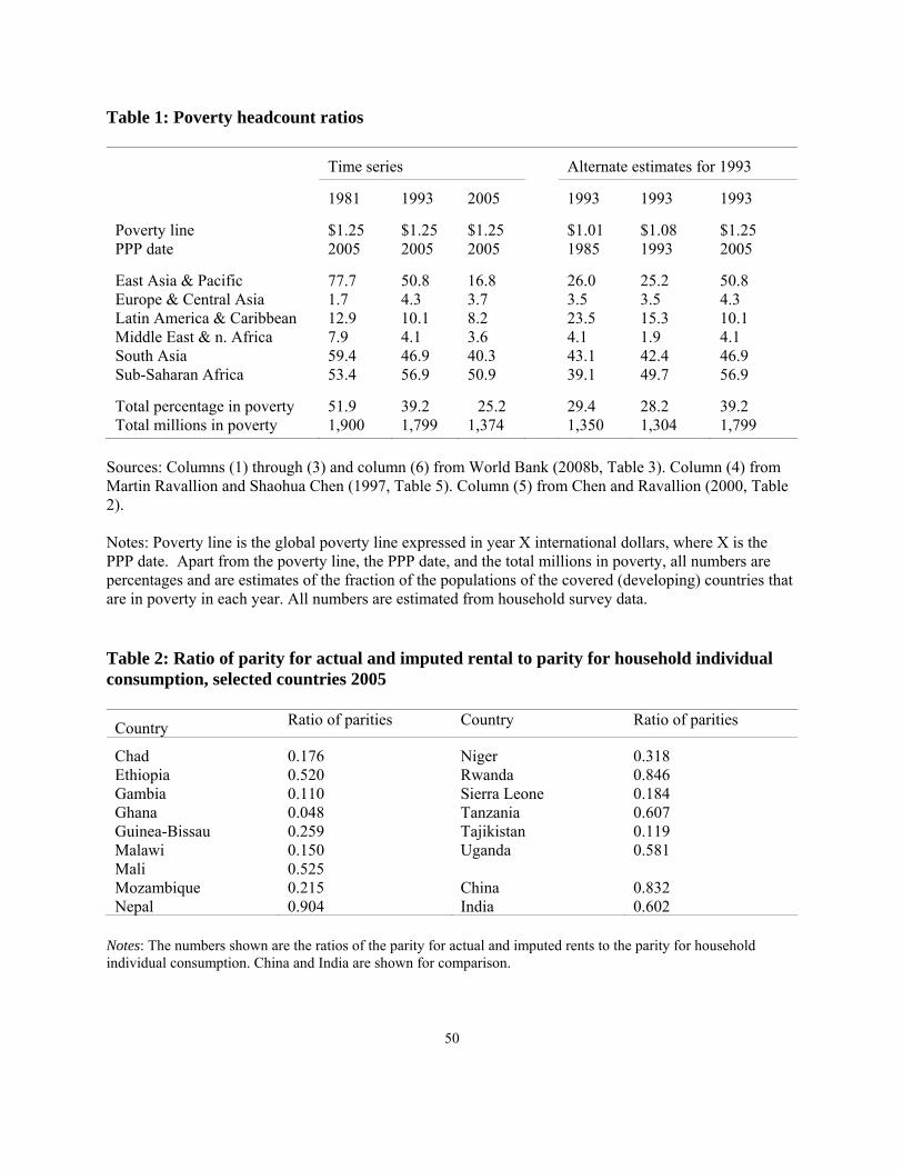
50
Table 1: Poverty headcount ratios
Time series Alternate estimates for 1993
1981 1993 2005 1993 1993 1993
Poverty line PPP date
$1.25 2005
$1.25 2005
$1.25 2005
$1.01 1985
$1.08 1993
$1.25 2005
East Asia & Pacific Europe & Central Asia Latin America & Caribbean Middle East & n. Africa South Asia Sub-Saharan Africa
77.7 1.7 12.9 7.9 59.4 53.4
50.8 4.3 10.1 4.1 46.9 56.9
16.8 3.7 8.2 3.6 40.3 50.9
26.0 3.5 23.5 4.1 43.1 39.1
25.2 3.5 15.3 1.9 42.4 49.7
50.8 4.3 10.1 4.1 46.9 56.9
Total percentage in poverty Total millions in poverty
51.9 1,900
39.2 1,799
25.2 1,374
29.4 1,350
28.2 1,304
39.2 1,799
Sources: Columns (1) through (3) and column (6) from World Bank (2008b, Table 3). Column (4) from Martin Ravallion and Shaohua Chen (1997, Table 5). Column (5) from Chen and Ravallion (2000, Table 2). Notes: Poverty line is the global poverty line expressed in year X international dollars, where X is the PPP date. Apart from the poverty line, the PPP date, and the total millions in poverty, all numbers are percentages and are estimates of the fraction of the populations of the covered (developing) countries that are in poverty in each year. All numbers are estimated from household survey data. Table 2: Ratio of parity for actual and imputed rental to parity for household individual consumption, selected countries 2005
Country Ratio of parities Country Ratio of parities
Chad Ethiopia Gambia Ghana Guinea-Bissau Malawi Mali Mozambique Nepal
0.176 0.520 0.110 0.048 0.259 0.150 0.525 0.215 0.904
Niger Rwanda Sierra Leone Tanzania Tajikistan Uganda China India
0.318 0.846 0.184 0.607 0.119 0.581 0.832 0.602
Notes: The numbers shown are the ratios of the parity for actual and imputed rents to the parity for household individual consumption. China and India are shown for comparison.

51
Table 3: Global poverty lines in world rupees per person per day
P3 Indexes: Plutocratic Purchasing Power Parities using unweighted mean of 14 poorest countries as international poverty line
Source for weights ICP: NAS NAS 105 NAS 102 Surveys
ICP/Chen-Ravallion Fisher
19.49 --
-- 18.98
-- 18.05
-- 17.81
P4 Indexes: Poverty weighted Purchasing Power Parities
Poverty line selection Unweighted mean of 14
Weighted mean of 50
Fisher 18.31 16.04 Notes: The first number in the top panel, 19.49, is the Bank’s global poverty line of $38 a month ($1.25 a day) converted into Indian rupees using the conversion factor of 15.602 which is the PPP for household individual consumption for India relative to the US taken from the final report. If we calculate this number directly, using the poverty lines of the 15 poorest countries, converted to international dollars using their PPPs for household individual consumption, and taking an unweighted average, we get 1.24 international dollars or 19.34 world rupees. If we exclude Guinea-Bissau from the 15 poorest countries, so as to make the calculations comparable with our own calculations for which we do not have a survey for Guinea-Bissau, we get 1.22 international dollars or 19.06 world rupees. The column headed NAS 105 shows the simple average of poverty lines converted at the PPP for household individual consumption on a NAS basis directly calculated using a one step multilateral set of indexes, and using all 105 basic heads. The column headed NAS 102 is the same as NAS 105, but with three basic heads dropped: FISIM, prostitution, and actual and imputed household rents. The column labeled surveys also uses 102 basic heads, and also uses an aggregate PPP, but uses surveys to estimate aggregate expenditures instead of the national accounts. The bottom panel shows three sets of poverty lines that use P4s (bandwidth 0.5) for conversion to international rupees; in all cases, the global poverty line is calculated simultaneously with the P4s. In the first column, the global line is calculated as the simple average of the 14 poorest country poverty lines at the final estimates of the P4s. The second column uses poverty lines from 50 countries, and weighted by the number of poor in each country at the final global poverty line. See Deaton and Dupriez (2009) for details of calculations. Source: Adapted from Deaton and Dupriez (2009, Table 11.)
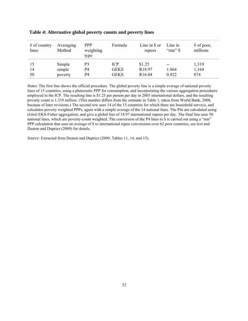
52
Table 4: Alternative global poverty counts and poverty lines
# of country lines
Averaging Method
PPP weighting type
Formula Line in $ or rupees
Line in “star” $
# of poor, millions
15 14 50
Simple simple poverty
P3 P4 P4
ICP GEKS GEKS
$1.25 R18.97 R16.04
-- 1.064 0.922
1,319 1,164 874
Notes: The first line shows the official procedure. The global poverty line is a simple average of national poverty lines of 15 countries, using a plutocratic PPP for consumption, and incorporating the various aggregation procedures employed in the ICP. The resulting line is $1.25 per person per day in 2005 international dollars, and the resulting poverty count is 1,319 million. (This number differs from the estimate in Table 1, taken from World Bank, 2008, because of later revisions.) The second row uses 14 of the 15 countries for which there are household surveys, and calculates poverty weighted PPPs, again with a simple average of the 14 national lines. The P4s are calculated using (Gini) EKS-Fisher aggregation, and give a global line of 18.97 international rupees per day. The final line uses 50 national lines, which are poverty-count weighted. The conversion of the P4 lines to $ is carried out using a “star” PPP calculation that uses an average of $ to international rupee conversions over 62 poor countries, see text and Deaton and Dupriez (2009) for details. Source: Extracted from Deaton and Dupriez (2009, Tables 11, 14, and 15).
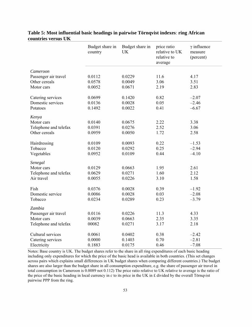
53
Table 5: Most influential basic headings in pairwise Törnqvist indexes: ring African countries versus UK
Budget share in country
Budget share in UK
price ratio relative to UK relative to average
γ influence measure (percent)
Cameroon Passenger air travel Other cereals Motor cars Catering services Domestic services Potatoes
0.0112 0.0578 0.0052 0.0699 0.0136 0.1492
0.0229 0.0049 0.0671 0.1420 0.0028 0.0022
11.6 3.06 2.19 0.82 0.05 0.41
4.17 3.51 2.83 ‒2.07 ‒2.46 ‒6.67
Kenya Motor cars Telephone and telefax Other cereals Hairdressing Tobacco Vegetables
0.0140 0.0391 0.0959 0.0109 0.0120 0.0952
0.0675 0.0276 0.0050 0.0093 0.0292 0.0109
2.22 2.52 1.72 0.22 0.25 0.44
3.38 3.06 2.58 ‒1.53 ‒2.94 ‒4.10
Senegal Motor cars Telephone and telefax Air travel Fish Domestic service Tobacco
0.0129 0.0629 0.0055 0.0376 0.0086 0.0234
0.0663 0.0271 0.0226 0.0028 0.0028 0.0289
1.95 1.60 3.10 0.39 0.03 0.23
2.61 2.12 1.58 ‒1.92 ‒2.08 ‒3.79
Zambia Passenger air travel Motor cars Telephone and telefax Cultural services Catering services Electricity
0.0116 0.0039 00082 0.0061 0.0000 0.1883
0.0226 0.0663 0.0271 0.0402 0.1403 0.0175
11.3 2.35 3.17 0.38 0.70 0.46
4.33 3.35 2.18 ‒2.42 ‒2.81 ‒7.08
Notes: Base country is UK. The budget shares refer to the share in all ring expenditures of each basic heading including only expenditures for which the price of the basic head is available in both countries. (This set changes across pairs which explains small differences in UK budget shares when comparing different countries.) The budget shares are also larger than the budget share in all consumption expenditure, e.g. the share of passenger air travel in total consumption in Cameroon is 0.0089 not 0.112) The price ratio relative to UK relative to average is the ratio of the price of the basic heading in local currency in c to its price in the UK in £ divided by the overall Törnqvist pairwise PPP from the ring.
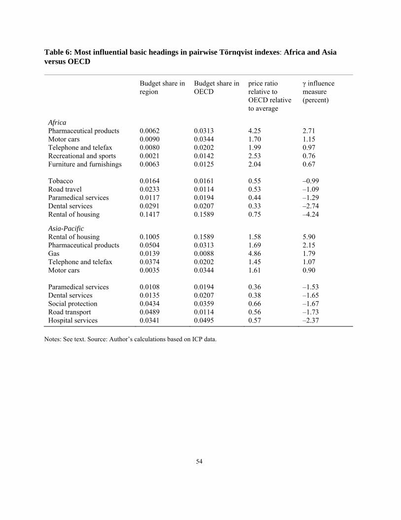
54
Table 6: Most influential basic headings in pairwise Törnqvist indexes: Africa and Asia versus OECD
Budget share in region
Budget share in OECD
price ratio relative to OECD relative to average
γ influence measure (percent)
Africa Pharmaceutical products Motor cars Telephone and telefax Recreational and sports Furniture and furnishings Tobacco Road travel Paramedical services Dental services Rental of housing
0.0062 0.0090 0.0080 0.0021 0.0063 0.0164 0.0233 0.0117 0.0291 0.1417
0.0313 0.0344 0.0202 0.0142 0.0125 0.0161 0.0114 0.0194 0.0207 0.1589
4.25 1.70 1.99 2.53 2.04 0.55 0.53 0.44 0.33 0.75
2.71 1.15 0.97 0.76 0.67 ‒0.99 ‒1.09 ‒1.29 ‒2.74 ‒4.24
Asia-Pacific Rental of housing Pharmaceutical products Gas Telephone and telefax Motor cars Paramedical services Dental services Social protection Road transport Hospital services
0.1005 0.0504 0.0139 0.0374 0.0035 0.0108 0.0135 0.0434 0.0489 0.0341
0.1589 0.0313 0.0088 0.0202 0.0344 0.0194 0.0207 0.0359 0.0114 0.0495
1.58 1.69 4.86 1.45 1.61 0.36 0.38 0.66 0.56 0.57
5.90 2.15 1.79 1.07 0.90 ‒1.53 ‒1.65 ‒1.67 ‒1.73 ‒2.37
Notes: See text. Source: Author’s calculations based on ICP data.

55
Table 7: Correlations between log GDP per capita and well-being measures from the Gallup World Poll
Levels 2006 2007 2008
Ladder No money for food Living standard poor Difficult or v. difficult to get by Very difficult to get by
0.820 ‒0.800 ‒0.631 -- --
0.812 ‒0.762 ‒0.576 ‒0.654 ‒0.632
0.831 ‒0.760 ‒0.642 ‒0.768 ‒0.730
Changes 2007‒2006 2008‒2007 2008‒2006
Ladder No money for food Living standard poor Difficult or v. difficult to get by Very difficult to get by
0.058 0.239 0.046 -- --
‒0.044 ‒0.001 0.004 ‒0.068 ‒0.031
0.049 0.107 0.004 -- --
Table 8: Global and regional tracking of living standards, 2006 to 2009 (Average scores for ladder, percentages of the population for other measures)
2006 (base)
2007 2008 2009
World Ladder No money for food Living standards poor In difficulty
5.33 32.5 37.9 --
5.42 26.3 36.4 39.3
5.36 24.9 38.2 40.5
5.43 29.0 38.6 43.1
Sub-Saharan Africa Ladder No money for food Living standards poor In difficulty
4.25 55.0 61.4 --
4.60 50.8 58.8 58.3
4.56 56.3 62.3 60.3
4.57 56.8 62.6 67.6
South Asia Ladder No money for food Living standards poor In difficulty
5.18 33.3 36.0 --
5.02 26.0 35.1 54.7
5.01 23.6 38.6 55.4
5.29 28.4 43.0 58.7
Notes: Except for “In difficulty” for which the base year is 2007, the population weighted global average for 2006 is given in the first column. For “in difficulty” the second column shows the global average for 2007. All columns are the predicted values of a population weighted factor regression in which the relevant measure is regressed on a set of year and country dummies. The World regressions are run for all countries pooled, while the regional regressions pool data over all countries in the region. The ladder on a scale from 0 to 10. The other measures are changes in percentages.
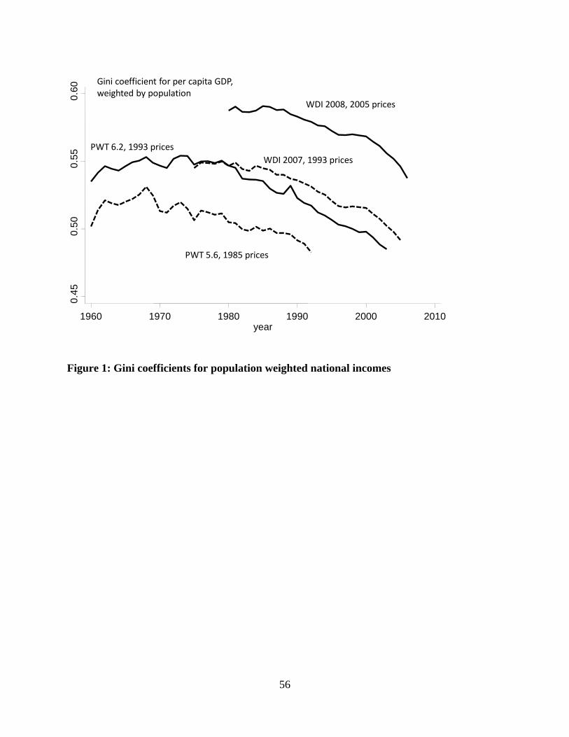
56
0.4
50
.50
0.5
50
.60
1960 1970 1980 1990 2000 2010year
WDI 2008, 2005 prices
WDI 2007, 1993 prices
PWT 5.6, 1985 prices
PWT 6.2, 1993 prices
Gini coefficient for per capita GDP, weighted by population
Figure 1: Gini coefficients for population weighted national incomes
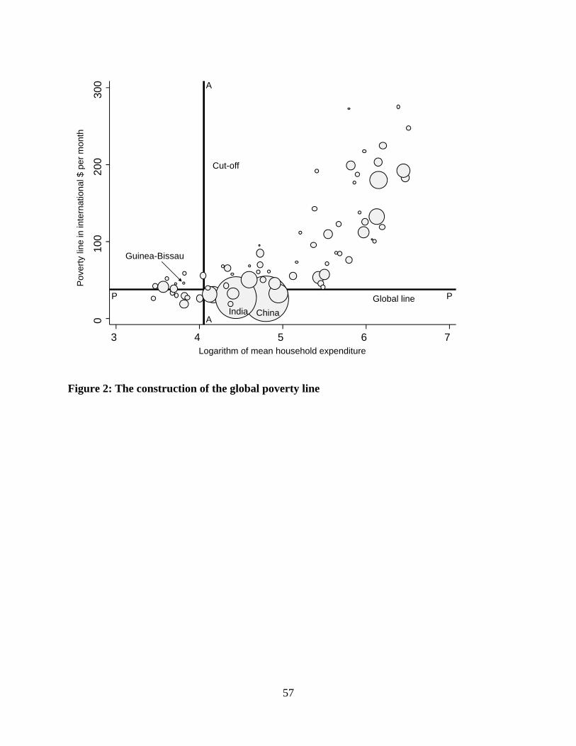
57
010
02
0030
0
3 4 5 6 7
Pov
erty
line
in in
tern
atio
nal $
pe
r m
onth
Logarithm of mean household expenditure
India
A
A
P PGlobal line
Cut-off
Guinea-Bissau
China
Figure 2: The construction of the global poverty line
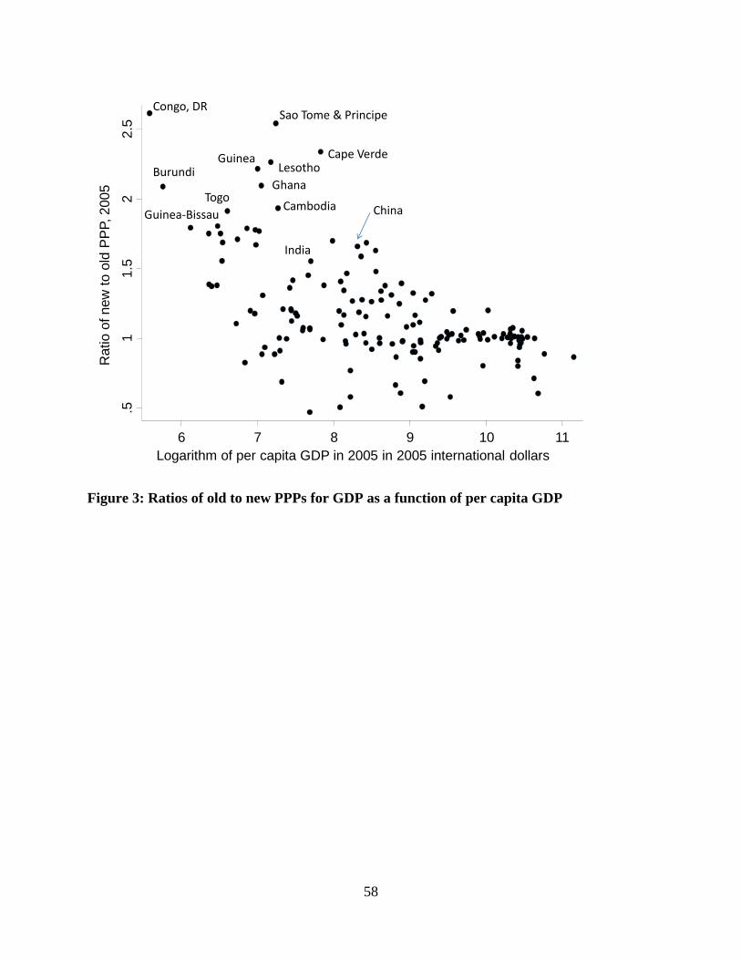
58
.51
1.5
22.
5
Rat
io o
f new
to
old
PP
P, 2
005
6 7 8 9 10 11Logarithm of per capita GDP in 2005 in 2005 international dollars
Congo, DRSao Tome & Principe
Burundi
Cape VerdeLesotho
Guinea
GhanaTogo
CambodiaGuinea‐Bissau China
India
Figure 3: Ratios of old to new PPPs for GDP as a function of per capita GDP
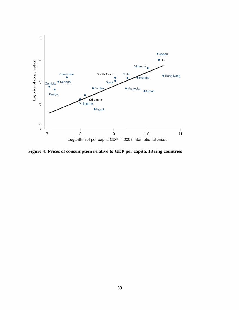
59
Brazil
ChileCameroon
Egypt
Estonia
UK
Hong Kong
Jordan
Japan
Kenya
Sri Lanka
MalaysiaOman
Philippines
Senegal
Slovenia
South Africa
Zambia
-1.5
-1-.
50
.5
7 8 9 10 11Logarithm of per capita GDP in 2005 international prices
Log price of consumption
Figure 4: Prices of consumption relative to GDP per capita, 18 ring countries
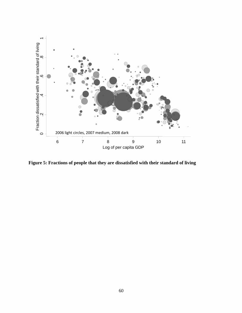
60
0.2
.4.6
.81
Fra
ctio
n d
issa
tisfie
dw
ith t
he
ir s
tan
da
rd o
f liv
ing
6 7 8 9 10 11Log of per capita GDP
2006 light circles, 2007 medium, 2008 dark
Figure 5: Fractions of people that they are dissatisfied with their standard of living