official exhibit booklet - places & spaces
TRANSCRIPT

Official Exhibit Booklet

Places & Spaces: Mapping Science | 2scimaps.org
IntroductionContact Information 3Exhibit Goals 4Advisory Board 5
The Exhibit On Display 6
Overview of Exhibit Maps 71st Iteration (2005): The Power of Maps 82nd Iteration (2006): The Power of Reference Systems 93rd Iteration (2007): The Power of Forecasts 104th Iteration (2008): Science Maps for Economic Decision Makers 115th Iteration (2009): Science Maps for Science Policy Makers 126th Iteration (2010): Science Maps for Scholars 137th Iteration (2011): Science Maps as Visual Interfaces to Digital Libraries 148th Iteration (2012): Science Maps for Kids 15
Additional Exhibit ElementsWorldProcessor Globes 16Illuminated Diagrams 16Inside the Metropolitan Museum Poster 17The Fundamental Interconnectedness of All Things [Dynamic Format] 17Gapminder Card Game 18Hands-on Science Maps for Kids 18Exhibit Video 18
Exhibit Display Options 19Physical Exhibit 20Poster Exhibit 21Maps Only 22Digital Display 23
LogisticsTechnical Specifications 24Unpacking and Setup 25List of Insurable Items 26
Table of Contents

Places & Spaces: Mapping Science | 3scimaps.org
Contact Information
Mailing Address:Cyberinfrastructure for Network Science CenterIndiana UniversitySchool of Information & Library ScienceHerman B. Wells Library1320 East 10th StreetBloomington, IN 47405, USA
Website:scimaps.org
Contacts:If you are interested in hosting the exhibit or if you would like to receive more information, please contact the curators of the exhibit:
Dr. Katy BörnerVictor H. Yngve Professor of Information ScienceCyberinfrastructure for Network Science CenterSchool of Library and Information Science, Indiana UniversityWells Library 021, 1320 East 10th Street, Bloomington, IN 47405, USAE-mail: [email protected] | Phone: (812) 855-3256 | Fax: (812) 855-6166
Todd Theriault Places & Spaces Exhibit CuratorCyberinfrastructure for Network Science CenterSchool of Library and Information Science, Indiana UniversityWells Library 022, 1320 East 10th Street, Bloomington, IN 47405, USAE-mail: [email protected] | Phone: (812) 856-7034 | Fax: (812) 855-6166

Places & Spaces: Mapping Science | 4scimaps.org
For centuries, cartographic maps of earth and water have guided human exploration. They have marked the border between the known and the unknown, firing the imagi-nation and fueling the desire for new knowledge and new experiences. Over time, geographic maps have become more accurate and more sophisticated, but the thirst for discovery, along with the need for maps to guide our travels, remains undiminished.
Today, our opportunities for discovery reside less in phys-ical places than in abstract spaces. The sea of information is one such space, and it is ever growing, ever changing. Search engines can retrieve facts from this ocean of data, but they cannot answer larger questions about the sea-scape as a whole: How big is this ocean? How can we navigate to useful islands of knowledge? How is knowl-edge interlinked on a global scale? In which areas is it worth investing time, effort, and resources?
Drawing from across cultures and across scholarly dis-ciplines, the Places & Spaces: Mapping Science exhibit demonstrates the power of maps to address these vital questions about the contours and content of human knowledge. Created by leading figures in the natural, physical, and social sciences, scientometrics, visual arts, social and science policymaking, and the humanities, the maps in Places & Spaces allow us to better grasp the abstract contexts, relationships, and dynamism of human systems and collective intelligence. Individually and as a whole, the maps of Places & Spaces allow data to tell stories which both the scientist and the layperson can understand and appreciate.
Iterations of the exhibit have traced the evolution of sci-ence maps, featuring the best examples of knowledge
domain mapping, novel location-based cartographies, data visualizations, and science-inspired art works. Along the way, Places & Spaces has featured histori-cally significant firsts in science mapping, including the first map of science, “The Structure of Science” (Boyack and Klavans 2005), the first “Wikipedia Map of Science” (Herr, Holloway, et al. 2009), and the first “Clickstream Map of Science” (Johan Bollen, et al. 2009). The exhibit has also brought to life the history and evolution of data visualization with Charles Joseph Minard’s landmark “Napoleon’s March to Moscow” (1869), Wattenberg and Viegas’ “History Flow Visualization of the Wikipedia Entry on Abortion” (2006), the SENSEable City Lab’s “Mobile Landscapes: Using Location Data from Cell Phones for Urban Analysis” (Williams, Ratti, et al. 2006), and the con-cept map “Death and Taxes” (Bachman 2009).
Visitors to the exhibit are surprised to see their own field of research from a new perspective. They are interested in learning more about the data and techniques that went into creating these maps, and their comments on the dif-ferent metaphors that might be used to map the structure and evolution of science are invaluable for the design of more efficient visualizations.
Exhibit Goals

Places & Spaces: Mapping Science | 5scimaps.org
The maps that make up the Places & Spaces exhibit are chosen annually in a process that begins with a call for maps that corresponds to a particular theme or addresses the concerns of a particular audience. Then, the team of international reviewers and exhibit advisors shown below work with the Indiana University exhibit team (comprised of two curators and paid staff) to select the most stunning and innovative maps from those submitted. The Indiana University exhibit team benefits greatly from the expert input it receives from this international advisory board.
Gary Berg-CrossCo-Principal Investigator of the NSF-sponsored SOCoP-INTEROP Project
Donna J. Cox, MFA, Ph.D.Director of the Advanced Visualization Laboratory (AVL) at the National Center for Supercomputing Applications and Director of the Illinois eDreamInstitute at the University of Illinois at Urbana-Champaign
Marjorie M.K. HlavaPresident, Chairman and founder of Access Innovations, Inc. and the founding Chair of the SLA Taxonomy Division
Bob BishopChairman and founder of BBWORLD Consulting Services Sàrl and President of the ICES Foundation
Bonnie DeVarcoMedia X Distinguished Visiting Scholar at Stanford University
Peter A. HookLaw librarian and doctoral student at the School of Library and Information Science at Indiana University, Bloomington, Indiana
Kevin W. BoyackPresident of SciTech Strategies, Inc.
Sara Irina FabrikantAssociate Professor of Geography and head of the Geographic Information Visualization and Analysis (GIVA) group at the GIScience Center, University of Zürich, Switzerland
Manuel LimaSenior UX Design Lead at Microsoft Bing, Fellow of the Royal Society of the Arts, and founder of VisualComplexity.com
André SkupinAssociate Professor of Geography at San Diego State University, California
Stephen UzzoVice President of Science and Technology for the New York Hall of Science and faculty member of the New York Institute of Technology Graduate School of Education
Lev ManovichProfessor, The Graduate Center, City University of New York Director, Software Studies Lab (big data, digital humanities, visualization)
Eric RodenbeckFounder and Creative Director of Stamen and member of the Board of Directors of the Kenneth Rainin Foundation
Caroline WagnerWolf Chair at the John Glenn School of Public Affairs and North American Editor of the Science & Public Policy journal
Carlo RattiArchitect, Engineer, and Director of the SENSEable City Lab at the Massachusetts Institute of Technology
Deborah MacPhersonSpecifications and research at Cannon Design, technical standards development for Building Information Modeling (BIM), and Projects Director for the nonprofit organization Accuracy & Aesthetics
Benjamin WiederkehrFounding Partner and Managing Director of Interactive Things, a user experience design and information visualization studio in Zürich, Switzerland
Moritz StefanerFreelance designer on the crossroads of data visualization, information aesthetics, and user interface design in Germany
Advisory Board

Places & Spaces: Mapping Science | 6scimaps.org
The Exhibit On Display
National Academy of Sciences – Washington, D.C.Jan 1 – Jun 1, 2013
University of North Texas – Denton, TexasSep 30, 2011 – Jan 24, 2012
Northeastern University – Boston, MassachusettsFeb 1 – March 30, 2012
North Carolina State University – Raleigh, NCOct 14 – 27, 2013
Since its debut in 2005, Places & Spaces has appeared at some of the world’s most renowned institutes of knowledge and learning, like the National Academy of Sciences, Stanford University, the Chinese Academy of Sciences, University College Dublin, and many more (see scimaps.org/exhibitions for a complete list of venues).
While the exhibit is at its best when displayed as a cohesive whole in a continuous space, it has also been presented to great effect as smaller conceptual units in separate (but not too distant) spaces. We can discuss with you the arrangements that best suit your situation in order to arrive at the perfect communion between exhibit and venue.
Contact us at [email protected] today to begin the process of bringing Places & Spaces to your own valuable institution.
Scan this code or visit scimaps.org/exhibitions to see a list of all past and
present exhibit venues

Places & Spaces: Mapping Science | 7scimaps.org
Overview of Exhibit Maps
1st Iteration (2005)The Power of Maps
6th Iteration (2010)Science Maps for Scholars
3rd Iteration (2007)The Power of Forecasts
8th Iteration (2012)Science Maps for Kids
2nd Iteration (2006)The Power of
Reference Systems
7th Iteration (2011)Science Maps as Visual
Interfaces to Digital Libraries
4th Iteration (2008)Science Maps for
Economic Decision Makers
9th Iteration (2013)Science Maps Showing Trends and Dynamics
5th Iteration (2009)Science Maps for
Science Policy Makers
10th Iteration (2014)Science Mapping Frontiers
Are you interested in seeing science from above? Curious to see what impact one single person or invention can have? Keen to find pockets of innovation? Desperate for better tools to manage the information flood? Or are you simply fascinated by maps?
This science exhibit is meant to inspire cross-disciplinary discussion on how best to track and communicate human activity and scientific progress on a global scale. It has two components: the physical part supports the close inspection of high quality reproductions of maps for display at conferences and education centers; the online counterpart at scimaps.org provides zoomable versions of every map and details about its creator(s), along with detailed explanations of how these maps work. It also has the schedule of physical showings. The exhibit is a 10-year effort. Each year, 10 new maps are added, which will result in 100 maps total in 2014.
Scan this code or visit scimaps.org/exhibit_info to see detailed versions
of all exhibit maps

Places & Spaces: Mapping Science | 8scimaps.org
1st Iteration (2005): The Power of Maps The first iteration of this exhibit aims to show the power of maps to help understand, navigate, and manage both physical places and abstract knowledge spaces.
The first maps of our planet were neither complete nor entirely accurate. Yet, they were invaluable for navigation, explo-ration, and communication. They helped explorers avoid monsters and find promising lands. Maps of science developed today are not perfectly precise either since they are generated based on only a small portion of humanity’s scholarly knowledge. The generation of comprehensive and accurate maps requires the proper interlinkage of multilingual, multidis-ciplinary, and multimedia scholarly knowledge.
Note that each of the six early maps of science displayed uses a different metaphor. What metaphor is most effective in designing a visual index of humanity’s knowledge and expertise?
I.1 Cosmographia World Map, by Claudius Ptolemy ULM, GERMANY, 1482 Courtesy of the James Ford Bell Library, University of Minnesota, Minneapolis, MN
I.2 Nova Anglia, Novvm Belgivm et Virginia, by Johannes Janssonius AMSTERDAM, HOLLAND, 1642 Courtesy of the Library of Congress, Geography and Map Division, Washington, D.C.
I.3 A New Map of the Whole World with the Trade Winds According to the Latest and Most Exact Observations, by Herman Moll LONDON, ENGLAND, 1736 Courtesy of the David Rumsey Map Collection, Cartography Associates, San Francisco, CA
I.4 Napoleon’s March to Moscow, by Charles Joseph Minard PARIS, FRANCE, 1869 Courtesy of Edward Tufte, Graphics Press, Cheshire, CT
I.5 1996 Map of Science: A Network Representation of the 43 Fourth-Level Clusters Based on Data from the 1996 Science Citation Index, by Henry G. Small PHILADELPHIA, PA, 1999 Courtesy of Henry Small, Thomson Reuters
I.6 Ph.D. Thesis Map, by Keith V. Nesbitt NEWCASTLE, AUSTRALIA, 2004 Courtesy of IEEE and Keith V. Nesbitt, Charles Sturt University, Australia © 2004 IEEE
I.7 Timeline of 60 Years of Anthrax Research Literature, by Steven A. Morris STILLWATER, OK, 2005 Courtesy of Steven A. Morris, Oklahoma State University
I.8 Treemap View of 2004 Usenet Returnees, by Marc Smith and Danyel Fisher REDMOND, WA, 2005 Courtesy of the Community Technologies Group, Microsoft Research
I.9 In Terms of Geography, by André Skupin NEW ORLEANS, LA, 2005 Courtesy of André Skupin, San Diego State University
I.10 The Structure of Science, by Kevin W. Boyack and Richard Klavans ALBUQUERQUE, NM & BERWYN, PA, 2005 Courtesy of Kevin W. Boyack, Sandia National Laboratories and Richard Klavans, SciTech Strategies, Inc.

Places & Spaces: Mapping Science | 9scimaps.org
2nd Iteration (2006): The Power of Reference Systems The second iteration aims to inspire discussion about a common reference system for all of humanity’s scholarly knowledge.
Throughout history, scientists have struggled to reach agreement upon standardized reference systems for their respective fields of research. The results include the electromagnetic spectrum, the periodic table of elements, geographic projections, and the celestial reference systems, all of which appear in this iteration. These standards are invaluable for indexing, storing, accessing, and managing scientific data efficiently.
Shown in comparison are six potential reference systems for scholarly knowledge. Each reference system—from the one-dimensional timeline, to the geospatial system, to the semantic system—could be used to identify the location of an author, paper, patent, or grant. This would highlight the dynamics of an author’s, institution’s, or country’s contributions or the impact of a particular work.
II.1 U.S. Frequency Allocations Chart, by the National Telecommunications and Information Administration WASHINGTON, DC, 2003 Courtesy of the Office of Spectrum Management
II.2 Visual Periodic Table of the Elements, by Murray Robertson and John Emsley LONDON, UK, 2005 Courtesy of the Royal Society of Chemistry. Images © Murray Robertson 1999–2006
II.3 Cartographica Extraordinaire: The Historical Map Transformed, by David Rumsey and Edith M. Punt SAN FRANCISCO, CA, MONTREAL & NOVA SCOTIA, CANADA, 2004 Courtesy of ESRI Press. Copyright © 2004 David Rumsey, ESRI, DigitalGlobe, Inc., MassGIS. All rights reserved.
II.4 Sky Chart of New York City in April 2006, by Roger W. Sinnott and The Interactive Factory CAMBRIDGE, MA, 2006 Courtesy of Sky & Telescope
II.5 HistCite™ Visualization of DNA Development, by Eugene Garfield, Elisha F. Hardy, Katy Börner, Ludmila Pollock, and Jan Witkowski PHILADELPHIA, PA, BLOOMINGTON, IN & NEW YORK, NY, 2006 Courtesy of Eugene Garfield, Thomson Reuters, Indiana University, and Cold Spring Harbor Laboratory
II.6 History Flow Visualization of the Wikipedia Entry on “Abortion,” by Martin Wattenberg and Fernanda B. Viégas CAMBRIDGE, MA, 2006 Courtesy of Martin Wattenberg, Fernanda B. Viégas, and IBM Research
II.7 TextArc Visualization of The History of Science, by W. Bradford PaleyNEW YORK, NY, 2006 Courtesy of W. Bradford Paley
II.8 Taxonomy Visualization of Patent Data, by Katy Börner, Elisha F. Hardy, Bruce W. Herr II, Todd M. Holloway, and W. Bradford PaleyBLOOMINGTON, IN & NEW YORK, NY, 2006 Courtesy of Indiana University and W. Bradford Paley
II.9 Map of Scientific Paradigms, by Kevin W. Boyack and Richard Klavans ALBUQUERQUE, NM & BERWYN, PA, 2006 Courtesy of Kevin W. Boyack, Sandia National Laboratories and Richard Klavans, SciTech Strategies, Inc.
II.10 WorldProcessor: Zones of Invention–Patterns of Patents, by Ingo Günther NEW YORK, NY, 2006 Courtesy of Ingo Günther

Places & Spaces: Mapping Science | 10scimaps.org
3rd Iteration (2007): The Power of Forecasts The third iteration compares and contrasts maps of seismic hazards, resource depletion, economic models, and epidemic fore-casts with maps forecasting the structure and evolution of science.
Real-time weather forecasts are served by the National Oceanic and Atmospheric Administration (NOAA) and the National Aeronautics and Space Administration (NASA). Computational models of the movements of tectonic plates help reduce losses due to earthquakes, volcanic activity, or tsunamis. Economic models let us simulate either catastrophic or sustainable futures for humanity. Epidemic models allow us to understand how interconnected we all are and how actions far away affect us right here.
Daily science and technology forecasts would show science maps with overlays of top experts, institutions, countries, major activity bursts, or emerging research frontiers augmenting our knowledge and decision-making capabilities. Given the impor-tance of such forecasts, one might question why they are not available on TV, in the press, or online.
III.1 Tectonic Movements and Earthquake Hazard Predictions, by Michael W. Hamburger, Chuck Meertens, and Elisha F. Hardy BLOOMINGTON, IN & BOULDER, CO, 2007 Courtesy of Indiana University and UNAVCO Consortium
III.2 The Oil Age: World Oil Production 1859 to 2050, by Rob Bracken, Dave Menninger, Michael Poremba, and Richard Katz SAN FRANCISCO, CA, 2006 Courtesy of San Francisco Informatics
III.3 Impact of Air Travel on Global Spread of Infectious Diseases, by Vittoria Colizza, Alessandro Vespignani, and Elisha F. Hardy BLOOMINGTON, IN, 2007 Courtesy of Indiana University
III.4 [./logicaland] Participative Global Simulation, by Michael Aschauer, Maia Gusberti, Nik Thoenen, and Sepp Deinhofer VIENNA, AUSTRIA, 2002 Courtesy of Michael Aschauer, Maia Gusberti, Nik Thoenen, in collaboration with Sepp Deinhofer; www.re-p.org
III.5 Science & Technology Outlook: 2005-2055, by Marina Gorbis, Jean Hagan, Alex Soojung-Kim Pang, and David Pescovitz PALO ALTO, CA, 2006 Courtesy of The Institute for the Future
III.6 113 Years of Physical Review, by Bruce W. Herr II, Russell J. Duhon, Elisha F. Hardy, Shashikant Penumarthy, and Katy Börner BLOOMINGTON, IN, 2006 Courtesy of Indiana University
III.7 Mapping the Universe: Space, Time, and Discovery!, by Chaomei Chen, Jian Zhang, Lisa Kershner, Michael S. Vogeley, J. Richard Gott III, and Mario Juric PHILADELPHIA, PA & PRINCETON, NJ, 2007 Courtesy of Drexel University and Princeton University
III.8 Science-Related Wikipedian Activity, by Bruce W. Herr II, Todd M. Holloway, Elisha F. Hardy, Kevin W. Boyack, and Katy BörnerBLOOMINGTON, IN & ALBUQUERQUE, NM, 2007 Courtesy of Indiana University
III.9 Maps of Science: Forecasting Large Trends in Science, by Richard Klavans and Kevin W. Boyack BERWYN, PA & ALBUQUERQUE, NM, 2007 Courtesy of Richard Klavans, SciTech Strategies, Inc.
III.10 Hypothetical Model of the Evolution and Structure of Science, by Daniel Zeller NEW YORK, NY, 2007 Courtesy of Daniel Zeller

Places & Spaces: Mapping Science | 11scimaps.org
IV.1 Europe Raw Cotton Imports in 1858, 1864 and 1865, by Charles Joseph Minard PARIS, FRANCE, 1866 Courtesy of the Library of Congress, Geography and Maps Division
IV.2 Shrinking of Our Planet, by R. Buckminster Fuller and John McHale CARBONDALE, IL, 1965 Courtesy of The Estate of R. Buckminster Fuller
IV.3 Tracing of Key Events in the Development of the Video Tape Recorder, by George Benn and Francis Narin CHICAGO, IL, 1968 Courtesy of the IIT Research Institute
IV.4 World Finance Corporation, Miami, Florida, ca. 1970-79 (6th Version), by Mark Lombardi NEW YORK, NY, 1999 Courtesy of Pierogi Gallery
IV.5 Examining the Evolution and Distribution of Patent Classifications, by Daniel O. Kutz, Katy Börner, and Elisha F. Hardy BLOOMINGTON, IN, 2004 Courtesy of Indiana University
IV.6 Ecological Footprint, by Danny Dorling, Mark E. J. Newman, Graham Allsopp, Anna Barford, Ben Wheeler, John Pritchard, and David Dorling SHEFFIELD, UK & ANN ARBOR, MI, 2006 Courtesy of Universities of Sheffield and Michigan
IV.7 The Product Space, by César A. Hidalgo, Bailey Klinger, Albert-László Barabási, and Ricardo Hausmann BOSTON, MA, 2007 Courtesy of Harvard Kennedy School, Northeastern University & the University of Notre Dame
IV.8 4D™. The Structured Visual Approach to Business-Issue Resolution, by John Caswell, Hazel Tiffany, and Ian Francis MAYFAIR, UK, 2008 Courtesy of Group Partners
IV.9 The Scientific Roots of Technology, by Kevin W. Boyack and Richard Klavans BERWYN, PA & ALBUQUERQUE, NM, 2007 Courtesy of Richard Klavans, SciTech Strategies, Inc.
IV.10 A Global Projection of Subjective Well-Being, by Adrian White & the National Geographic EarthPulse Team WASHINGTON, D.C., 2008 Courtesy of National Geographic
4th Iteration (2008): Science Maps for Economic Decision-Makers This is the first of six iterations that explore the utility of science maps for different stakeholders. The maps presented here meet the needs of economic decision-makers. They answer questions such as: What is the impact of war on global trade flows? How do accelerating communication and transportation speeds impact our lives? What events and time lags occur from basic research to product sale? What are the (social) networks behind illicit deals and laundered money? What intel-lectual property space is claimed by whom, and what growth is expected? What is the ecological footprint of a country, and how sustainable is it? How does the “product space” determine the economic development of nations? What are the best ways to empower strategy formation and value creation in organizations? How are publications linked to patents in differ-ent areas of science? What factors impact the happiness of citizens, and which countries experience the most happiness?

Places & Spaces: Mapping Science | 12scimaps.org
V.1 Science and Society in Equilibrium, by Joseph P. Martino HOLLOMAN AIR FORCE BASE, NM, 1969 Reprinted with permission from AAAS
V.2 Networks of Scientific Communications, by Georgiy G. Dumenton MOSCOW, RUSSIA, 1987 Courtesy of the RAN Institute for the History of Science, Russian Academy of Sciences
V.3 Realigning the Boston Traffic Separation Scheme to Reduce the Risk of Ship Strike to Right and Other Baleen Whales, by David N. Wiley, Michael A. Thompson, and Richard Merrick
SCITUATE, MA & WOODS HOLE, MA, 2006 Courtesy of the National Oceanic and Atmospheric Administration
V.4 Mobile Landscapes: Using Location Data from Cell Phones for Urban Analysis, by Sarah Williams, Carlo Ratti, and Riccardo Maria Pulselli CAMBRIDGE, MA, 2006 Courtesy of SENSEable City Laboratory, MIT
V.5 Death and Taxes 2009, by Jess Bachman ONTARIO, CANADA, 2009 Courtesy of http://www.wallstats.com
V.6 Chemical R&D Powers the U.S. Innovation Engine, by the Council for Chemical Research WASHINGTON, D.C., 2009 Courtesy of Council for Chemical Research
V.7 A Topic Map of NIH Grants 2007, by Bruce W. Herr II, Gully Burns, David Newman, and Edmund Talley BLOOMINGTON, IN, 2009 Courtesy of ChalkLabs, Indiana University & Information Sciences Institute, University of California, Irvine
V.8 A Clickstream Map of Science, by Johan Bollen, Herbert Van de Sompel, Aric Hagberg, Luís M. A. Bettencourt, Ryan Chute, Marko A. Rodriguez, and Lyudmila Balakireva LOS ALAMOS, NM, 2008 Courtesy of Los Alamos National Laboratory
V.9 U.S. Vulnerabilities in Science, by Kevin W. Boyack and Richard Klavans ALBUQUERQUE, NM & BERWYN, PA, 2008 Courtesy of SciTech Strategies, Inc.
V.10 The Millennium Development Goals Map, by the World Bank and National Geographic WASHINGTON, D.C., 2006 Courtesy of the World Bank and National Geographic
5th Iteration (2008): Science Maps for Economic Decision-Makers This iteration shows science maps for science policy-makers as well as citizens interested in understanding national priori-ties, spending, and achievements. Featured are two early maps, two maps of observation and sensor data, and six maps of scholarly data. The maps communicate: The steady increase of scientists in the total population, versus a decline of R&D investment as a fraction of GNP; Categories for evaluating and comparing evolving scientific collaboration; Needed changes in the Boston Traffic Separation Scheme to reduce the risk of ships striking whales; Urban mobility patterns to improve the design and management of cities; The U.S. federal discretionary budget; Return on investment for U.S. chemistry R&D, including a timeline and investment cycles; Funding portfolios of the National Institutes of Health; The structure of science based on download (rather than publication) activity; Research leadership of the U.S. compared with the top-12 competi-tive nations; Progress towards the Millennium Development Goals to be achieved by 2015.

Places & Spaces: Mapping Science | 13scimaps.org
VI.1 Tree of Life, by Peer Bork, Francesca Ciccarelli, Chris Creevey, Berend Snel, and Christian von Mering HEIDELBERG, GERMANY, 2006 Courtesy of European Molecular Biology Laboratory
VI.2 The Human Connectome, by Patric Hagmann and Olaf Sporns LAUSANNE, SWITZERLAND & BLOOMINGTON, IN, 2008 Courtesy of Little, Brown and Company, Patric Hagmann, and Olaf Sporns
VI.3 Diseasome: The Human Disease Network, by Mathieu Bastian and Sebastien Heymann
PARIS, FRANCE, 2009 Courtesy of INIST-CNRS and Linkfluence
VI.4 Human Speechome Project, by George Shaw, Philip James DeCamp, and Deb Roy CAMBRIDGE, MA, 2010 Courtesy of Cognitive Machines Group, MIT Media Lab
VI.5 Mapping the Archive: Prix Ars Electronica, by Dietmar Offenhuber, Moritz Stefaner, Evelyn Münster, Jaume Nualart, and Gerhard Dirmoser LINZ, AUSTRIA, 2008 Courtesy of Ludwig Boltzmann Institute for Media.Art.Research. and Ars Electronica
VI.6 Knowledge Cartography, by Marco Quaggiotto MILANO, ITALY, 2008 Courtesy of INDACO Department, Politecnico di Milano, Italy and Complex Networks and Systems Group, ISI Foundation, Turin, Italy
VI.7 Literary Empires: Mapping Temporal and Spatial Settings of Victorian Poetry, by John A. Walsh, Devin Becker, Bradford Demarest, Jonathan Tweedy, Theodora Michaelidou, and Laura Pence
BLOOMINGTON, IN, 2010 Courtesy of Indiana University, with content provided by the David Rumsey Historical Map Collection
VI.8 The Emergence of Nanoscience & Technology, by Loet Leydesdorff AMSTERDAM, THE NETHERLANDS, 2010 Courtesy of Loet Leydesdorff, Thomas Schank, and the Journal of the American Society for Information Science and Technology
VI.9 Weaving the Fabric of Science, by Richard Klavans and Kevin W. Boyack, SciTech Strategies, Inc. ALBUQUERQUE, NM & BERWYN, PA, 2010 Courtesy of Kevin W. Boyack and Richard Klavans, SciTech Strategies, Inc.
VI.10 U.S. Job Market: Where are the Academic Jobs?, by Angela M. Zoss and Katy Börner BLOOMINGTON, IN, 2010 Courtesy of Indiana University
6th Iteration (2010): Science Maps for Scholars This iteration explores the utility of science maps for scholars and answers questions such as: Who are our ancestors, and how are we related to other species? How do human brain regions interlink and impact our thoughts and behaviors? What drugs target what diseases, and how do disease phenotypes interact? How do children learn language in complex social environments, and how can language disorders be treated? What communities and interdisciplinary connections exist across the field of media art? How are scholars linked to texts, people, projects, events, their relationships, as well as personal comments? Which literary writers used what temporal and spatial settings in Victorian poetry? How do multiple scientific specialties merge to form a new area of science? How do scientists weave the fabric of science via collaborations and citations? Where are the academic jobs?

Places & Spaces: Mapping Science | 14scimaps.org
VII.1 Mondothèque. Multimedia Desk in a Global Internet, by Paul OtletBRUSSELS, BELGIUM, 1936/37 Courtesy of Mundaneum, Mons, Belgium
VII.2 A Chart Illustrating Some of the Relations between the Branches of Natural Science and Technology, by H.J.T. EllinghamLONDON, UK, 1948 Courtesy of The Royal Society
VII.3 Visualizing Bible Cross-References, by Chris Harrison and Christoph RömhildPITTSBURGH, PA, 2008 Courtesy of Chris Harrison and Christoph Römhild
VII.4 Finding Research Literature on Autism, by Rex RobisonBETHESDA, MD, 2009 Courtesy of the National Institutes of Health Library
VII.5 Design vs. Emergence: Visualization of Knowledge Orders, by Alkim Almila Akdag Salah, Cheng Gao, Krzysztof Suchecki, and Andrea ScharnhorstAMSTERDAM, THE NETHERLANDS, 2011 Courtesy of The Knowledge Space Lab, Royal Netherlands Academy of Arts and Sciences
VII.6 Scientific Collaborations between World Cities, by Olivier H. BeauchesneMONTRÉAL, CANADA, 2012 Courtesy of Science-Metrix, Inc.
VII.7 The Census of Antique Works of Art and Architecture Known in the Renaissance, 1947-2005, by Maximilian SchichBOSTON, MA, 2011 Courtesy of Maximilian Schich
VII.8 Seeing Standards: A Visualization of the Metadata Universe, by Devin Becker and Jenn RileyBLOOMINGTON, IN, 2009-2010 Courtesy of University of North Carolina at Chapel Hill and University of Idaho
VII.9 MACE Classification Taxonomy, by Moritz StefanerPOTSDAM, GERMANY, 2011 Courtesy of Moritz Stefaner
VII.10 History of Science Fiction, by Ward ShelleyBROOKLYN, NY, 2011 Courtesy of Ward Shelley Studio
7th Iteration (2011): Science Maps as Visual Interfaces to Digital Libraries This iteration explores the utility of science maps as visual interfaces to digital libraries to support the selection, navigation, management, and usage of resources by communicating: Early visions of a multimedia work station and the Internet. A hand-drawn map of natural sciences and technology with overlays of different index and abstracting services. A visualiza-tion of textual cross-references in the Bible. Differences in the coverage and search functionality of four major publication databases and their impact on search result sets. A comparison of Wikipedia’s category structure and the Universal Decimal Classification. Expert locations and worldwide scientific collaboration patterns. The complete structure and inter-linkage of different data types from a scholarly database to judge data quality and coverage. An overview of key metadata standards in the cultural heritage sector to assist planners with the selection and implementation of these standards. The hierarchical structure of over 2,800 terms for tagging digital resources in architecture in different languages. The history of science fiction rendered as graphical chronology.

Places & Spaces: Mapping Science | 15scimaps.org
VIII.1 Geologic Time Spiral: A Path to the Past, by Joseph Graham, William Newman, and John StacyRESTON, VA, 2008 Courtesy of U.S. Geological Survey
VIII.2 Movie Narrative Charts (Comic #657), by Randall MunroeSOMERVILLE, MA, 2009 Courtesy of xkcd.com
VIII.3 Metropolitan Museum of Art Family Map, by Masha Turchinsky and John KerschbaumNEW YORK, NY, 2008 Courtesy of the Metropolitan Museum of Art
VIII.4 Left vs. Right Political Spectrum, by David McCandless and Stefanie PosavecLONDON, UK, 2009 Courtesy of Information is Beautiful
VIII.5 Gapminder World Map, by Mattias LindgrenSTOCKHOLM, SWEDEN, 2010 Courtesy of Gapminder Foundation, http://www.gapminder.org
VIII.6 Knowledge Web, by James Burke, Patrick McKercher, and Michael J. StamperSAN JOSE, CA and BLOOMINGTON, IN, 2012 Courtesy of the James Burke Institute
VIII.7 Manga Universe, by Lev Manovich and Jay ChowSAN DIEGO, CA, 2012 Courtesy of Software Studies Initiative, UCSD
VIII.8 The Fundamental Interconnectedness of All Things, by Matthew Richardson, Judith Kamalski, Sarah Huggett, and Andrew PlumeOXFORD, UK & AMSTERDAM, THE NETHERLANDS, 2012 Courtesy of Elsevier Ltd
VIII.9 Language Communities of Twitter, by Eric FischerOAKLAND, CA, 2012 Courtesy of Eric Fischer
VIII.10 Khan Academy Library Overview, by Benjamin Wiederkehr and Jérôme CukierZÜRICH, SWITZERLAND, 2012 Courtesy of Interactive Things
8th Iteration (2012): Science Maps for Kids This iteration features science maps designed for children aged 5-14. The maps communicate: 4.5 billion years of Earth’s evolution and the life forms that inhabit it. Fifty years of space exploration comprising nearly 200 missions from 1958 to 2008. A floor plan of The Metropolitan Museum of Art that shows a subset of its two million works of art spanning five thousand years of world culture. The political spectrum via a comparison of different stances on society and culture, family relationships, adulthood, and beliefs. The interplay of life expectancy and income per person for each country. How inven-tions and inventors are embedded in a vast web of human knowledge. Stylistic variations among 1,074,790 manga pages in 883 distinct series from Japan, Korea, and China. The fundamental interconnectedness of science and stories of how animals and accidents help discovery. The impact of language on human networks and communication patterns. The topi-cal composition and length of over 3,000 educational videos and their usage by students around the globe.
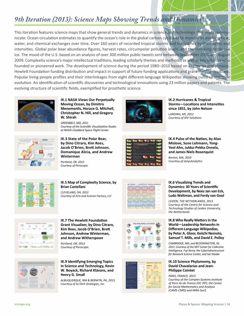
Places & Spaces: Mapping Science | 16scimaps.org
IX.1 NASA Views Our Perpetually Moving Ocean, by Dimitris Menemenlis, Horace G. Mitchell, Christopher N. Hill, and Gregory W. ShirahGREENBELT, MD, 2011 Courtesy of the Scientific Visualization Studio at NASA’s Goddard Space Flight Center
IX.2 Hurricanes & Tropical Storms—Locations and Intensities since 1851, by John NelsonLANSING, MI, 2012 Courtesy of IDV Solutions
IX.3 State of the Polar Bear, by Dino Citraro, Kim Rees, Jacob O’Brien, Brett Johnson, Domanique Alicia, and Andrew WintermanPortland, OR, 2013 Courtesy of Periscopic
IX.4 Pulse of the Nation, by Alan Mislove, Sune Lehmann, Yong-Yeol Ahn, Jukka-Pekka Onnela, and James Niels RosenquistBoston, MA, 2010 Courtesy of JanysAnalytics
IX.5 Map of Complexity Science, by Brian CastellaniCLEVELAND, OH, 2013 Courtesy of Arts and Science Factory, LLC
IX.6 Visualizing Trends and Dynamics: 30 Years of Scientific Development, by Nees Jan van Eck, Ludo Waltman, and Ferdy van GoolLEIDEN, THE NETHERLANDS, 2013 Courtesy of the Centre for Science and Technology Studies of Leiden University, the Netherlands
IX.7 The Hewlett Foundation Grant Visualizer, by Dino Citraro, Kim Rees, Jacob O’Brien, Brett Johnson, Andrew Winterman, and Andrew WitherspoonPortland, OR, 2013 Courtesy of Periscopic
IX.8 Who Really Matters in the World—Leadership Networks in Different-Language Wikipedias, by Peter A. Gloor, Keiichi Nemoto, Samuel T. Mills, and David E. PolleyCAMBRIDGE, MA, and BLOOMINGTON, IN, 2013. Courtesy of the MIT Center for Collective Intelligence, Fuji Xerox, the Cyberinfrastructure for Network Science Center, and Sar Haidar
IX.9 Identifying Emerging Topics in Science and Technology, Kevin W. Boyack, Richard Klavans, and Henry G. SmallALBUQUERQUE, NM & BERWYN, PA, 2013 Courtesy of SciTech Strategies, Inc.
IX.10 Science Phylomemy, by David Chavalarias and Jean-Philippe CointetPARIS, FRANCE, 2013 Courtesy of the Complex Systems Institute of Paris Ile-de-France (ISC-PIF), the Center for Social Mathematics and Analysis (CAMS-CNRS) and INRA-SenS.
9th Iteration (2013): Science Maps Showing Trends and Dynamics This iteration features science maps that show general trends and dynamics in science and technology. The maps commu-nicate: Ocean circulation estimates to quantify the ocean’s role in the global carbon cycle and to monitor its evolving heat, water, and chemical exchanges over time. Over 160 years of recorded tropical storms and hurricanes by their paths and intensities. Global polar bear abundance figures, harvest rates, circumpolar pollution levels, and the shrinking Arctic sea ice. The mood of the U.S. based on an analysis of over 300 million public tweets sent between September 2006 and August 2009. Complexity science’s major intellectual traditions, leading scholarly themes and methods, as well as key scholars who founded or pioneered work. The development of science during the period 1980–2010 based on key terms and phrases. Hewlett Foundation funding distribution and impact in support of future funding applications and grant-making decisions. Popular living people profiles and their interlinkages from eight different-language Wikipedias showing cultures and their evolution. An identification of scientific discoveries and technological innovations using 23 million papers and patents. The evolving structure of scientific fields, exemplified for prosthetic science.

Places & Spaces: Mapping Science | 17scimaps.org
Additional Elements
WorldProcessor GlobesAlso included in the exhibit are three WorldProcessor Globes: 1) Foreign US Patent Holders (#294); 2) Patterns of Patents & Zones of Invention (#286); and 3) Shape of Science (all shown in Figure 17.1 below). Over the last 15 years, sculptor and media artist Ingo Günther has mapped social, scientific, political, and economic data on globes as navigational guides in a globalized world. Using data from the U.S. Patent and Trademark Office, this globe represents half of all patents in the United States—namely those registered to foreign holders. Countries with more than 1,000 patents registered in the U.S. are indicated by name, with the point size of the representative text scaled according to the square root of the total num-ber of U.S. patents held. If the total number of domestically held U.S. patents were indicated according to this logic, the entire surface of the globe would be covered. To explore other Worldprocessor globes, visit worldprocessor.org.
Illuminated Diagram DisplayIlluminated Diagrams (ID) add the flexibility of an interactive program to the incredibly high data density of a printed map. This technique is generally useful when there is too much pertinent data to be displayed on a screen but the data is relatively stable. The computer can direct the eye to what’s important by using projectors as smart spotlights, animating stories in the static data (such as the spread of an idea’s influence), giving a radar-like “grand tour” of science, or highlight-ing query results (as when you touch the lectern) with an overlay of moving light. The ID lets visitors select major inventors and scientists and indicates their physical location on a map of our planet and their scientific contributions on a map of all of science. See a demo video at cns.iu.edu/videos

Places & Spaces: Mapping Science | 18scimaps.org
Additional Elements
Inside the Museum: The Metropolitan Museum of Art, by John Kerschbaum NEW YORK, NY, 2008 Courtesy of the Metropolitan Museum of Art
Do you like Where’s Waldo? If you do, then you’ll love this complement to the Metropolitan Museum of Art Family Map floor plan map in this exhibit! Illustrator John Kerschbaum and the Met’s Senior Publishing and Creative Manager Masha Turchinsky created this Inside the Museum map that emphasizes the vastness of the Metropolitan’s holdings and spaces. It is intentionally jam-packed with approximately 3,000 illustrations of objects, which were researched, sketched, and drawn over a period of three years. The illustrated poster conveys the endless oppor-tunities to discover and connect the treasures of the Museum. A scavenger hunt game in the border offers fun clues that remind visitors that art rewards close looking. Can you find the elephant with a clock on its back? Do you see the dog, dressed like a man, barking at an old black cat? Where is William, the MET’s unofficial mascot? Compile your score and look up your rating. Finally, plan your trip well and come back often to put the “art” in “smart.”
The Fundamental Interconnectedness of All Things [dynamic format], by Matthew Richardson, Judith Kamalski, Sarah Huggett, and Andrew Plume OXFORD, UK & AMSTERDAM, THE NETHERLANDS, 2012 Courtesy of Elsevier Ltd
How can we fully explore different disciplinary per-spectives? This dynamic version of The Fundamental Interconnectedness of All Things, also developed by biblio-metrics specialists Matthew Richardson, Judith Kamalski, Sarah Huggett, and Andrew Plume, allows you to forge your own path through the interconnected domains of knowl-edge. The map positions 19,562 journals according to their citation relationships using a journal–journal citation matrix from Elsevier’s Scopus database. Journal nodes are colored using a simplified version of the Scopus journal classification system, and journals in any given subject can be seen to cluster together. The network was laid out using the Force Atlas 2 algorithm in Gephi 0.8 beta, which draws related journals towards one another in the map until a balanced state is achieved. Any area can be selected by clicking on the map or label to find out more about it. Themed stories above and below the map show what we can learn from animals and the importance of accidents for discovery. The scientific fields these stories illustrate are highlighted on the map and show how multiple areas of knowledge can be relevant to a particular topic—and how collaboration across subjects can help to drive new knowledge.

Places & Spaces: Mapping Science | 19scimaps.org
Exhibit Video
A video of the New York Public Library (NYPL) exhibit was recorded that features a walk-through of the exhibit, as well as interviews with major map makers. The video comes with the exhibit and is available for sale at: scimaps.org/exhibit_info/video.
An enhanced podcast of the exhibit is linked from scimaps.org/host (select “Audio-Visual Tour” from the left-hand menu). It is meant to provide a guided tour of the NYPL exhibit.
Additional Elements
Gapminder Card GameAbout the Sorting Game: Students are given a number of “country cards.” They are asked to group/arrange the cards in a way that they think reflect the gaps in the world today. Afterwards they compare their arrangement with the “Gapminder World Map” graph.
Key messages of the exercise: This exercise helps stu-dents think about the gaps in the world today and helps challenge preconceived ideas about how the contem-porary world looks. The exercise can also be used to stimulate an interest in using statistics to understand the world.
Download the game at www.gapminder.org/downloads/card-game.
Hands-On Science Maps for KidsThese maps invite children to see, explore, and understand science from above. One map shows our world and the places where science gets done. The other shows major areas of science and their complex interrelationships. Both maps also appear in the Illuminated Diagram display, seen above. Drawings by Fileve Palmer were added to make different continents as well as different areas of science more tangible. Children, and adults alike, are invited to help solve the “puzzle” by sliding major scientists, inven-tors, and inventions into their proper places. Start by selecting either of the two maps. Decide if you want to place famous people or major inventions first. Turn the map over when you are done and start again. Look for the many hints hidden in the drawings to find the perfect place for each puzzle piece. At the exhibit, pick up one of the handouts and make your very own map of science.

Places & Spaces: Mapping Science | 20scimaps.org
The exhibit can be displayed in four different setups (see details on the following pages). The Physical Exhibit is a traveling exhibit which stays at your venue for a set period of time; the Maps-Only Exhibit allows you to select high-quality exhibit maps to keep permanently; the Poster Exhibit offers smaller size poster versions of the exhibit to keep permanently; and the Digital Exhibit is a high-resolution slideshow of all exhibit maps that can be customized to fit your space.
Physical Exhibit Maps-Only Exhibit
Digital ExhibitPoster Exhibit
Exhibit Hosting Options
Depending on the exhibit space, some or all of the items listed below should be considered in conjunction with the exhibit:
• Opening reception • Speaker series • Press releases • Advertising posters or banners • Work station to access exhibit website • Television with DVD player to play the exhibit video

Places & Spaces: Mapping Science | 21scimaps.org
Contains: » Full-size maps at 30x24 inches each
» 90 Individually printed maps & labels
» 9 Compare & Contrast labels
» 1 Customized Intro Panel
» Archival ink prints, mounted on foamcore
» Additional elements & labels
Setup Requirements: » 520 feet of wall space
» 350 square feet of floor space
» Hardware to hang maps on walls
Estimated Total Cost (less shipping):
$10,000* for iteration debut
$8,000* for non-iteration debut
*Please contact us for a custom quote. Cost varies due to the size of the crates and the location of your venue.
Physical Exhibit

Places & Spaces: Mapping Science | 22scimaps.org
Contains: » Your choice of any of 90 individually printed maps at 30x24 inches each
» Fine-print labels on maps
» Archival ink prints
Cost Per Map:
$250*
*Cost varies depending on the number of maps and the location of your venue.
Maps-Only Exhibit

Places & Spaces: Mapping Science | 23scimaps.org
Contains: » 18 posters, each 60-70” x 36” (two per iteration)
» Glossy paper prints
Setup Requirements: » 160 feet of wall space
» Local host hangs posters
Total Cost:
$950*
*Plus shipping, which varies based on the location of your venue.
Poster Exhibit

Places & Spaces: Mapping Science | 24scimaps.org
Contains: » Slideshow of 90 maps custom-sized to fit your space
or
» Pre-sized slideshow of maps without descriptions
Setup Requirements: » High-resolution media wall or high-quality projector and minimum 10’ x 8’ of light-colored wall space
» Local host handles deployment of files
Total Cost:
$500 for standard slideshow
$1000 for customized slideshow
Digital Display

Places & Spaces: Mapping Science | 25scimaps.org
Museum quality maps are printed on premium luster paper in a size of 30 inches (76.2 cm) x 24 inches (60.96 cm) and mounted on foam core (see typical layout of a set of 10 maps below). Maps can be ordered online at scimaps.org/flat/store.
The WorldProcessor Globes have a diameter of 12 inches (30.48 cm) and a height of 5 feet (1.53 m). This invites the ‘spinning’ of the globes by visitors (see Figure 23.4 below).
The Illuminated Diagrams (ID) are comprised of two high-resolution prints on cling paper that is then attached to two LCD screens (see Figure 9 on page 7). The LCD screens must be rented on-site, and cling prints must be attached. A touch screen lec-tern allows a user to interact with the LCDs (see Figure 23.3 below). The LCDs and lectern are run by 3 Mac Minis (provided by us).
The Hands-on Science Maps for Kids should be displayed on a table. They are 18 inches (45.72 cm) tall, 12 inches (30.48 cm) deep and about 33 inches (83.82 cm) wide (see Figure 23.2 below).
The exhibit is complete with an introductory panel that typically needs to be recreated for each venue, as it also lists the chang-ing set of (local) sponsors. Additionally, there are didactic panels (one per iteration) and labels for all elements of the exhibit. Map panels and labels are mounted on foam core. If needed, we can adapt the map labels to your venue (at an extra cost).
Technical Specifications
Figure 23.1
Figure 23.2 Figure 23.3 Figure 23.4

Places & Spaces: Mapping Science | 26scimaps.org
Crate 1 Dimensions: 50” x 44” x 42” (127cm x 112cm x 107cm) Weight: 310 Lbs (141 Kg)
Contents: 1 Touch panel podium 2 Children’s Maps 24 Map Labels 22 Hanging cleats for Maps
Crate #2 Dimensions: 60” x 57” x 31” (152cm x 145cm x 79cm) Weight: 375 Lbs (171 Kg)
Contents: 3 WorldProcessor Globes 3 Globe Labels
Crate #3 Dimensions: 72” x 36” x 30” (183cm x 91cm x 76cm) Weight: 280 Lbs (127 Kg)
Contents: 20 Maps 4 Map Labels
Crates #4-8 (identical) Dimensions: 45⅜ x 35” x 34¼ Weight: 82 lbs (38 kg) each
Contents: 10 Maps Labels Cleats
Crate #7 Dimensions: 45⅜” x 35” x 34¼” Weight: 120 lbs (54 kg)
Contents: 10 Maps Labels Cleats 3 Mac Minis
Crate #8 Dimensions: 45⅜” x 35” x 34¼” Weight: 120 lbs (54 kg)
Contents: 10 Maps Labels Cleats 3 Mac Minis
Approximate Total Crate Weight: 1500 lbs (682 kg)
Unpacking and Set-Up (for Physical Exhibit Only)
Needed Materials for Exhibit Set-Up
» Hammer (depending upon wall material)
» Velcro (depending upon wall material)
» Cordless drill
» Tape measure
» Level (laser if possible)
» Screws or nails
» Wall mount blocks
Itemized List of Exhibit Contents
» 1 Introduction Panel
» 90 Wall Mounted Maps
» 9 Compare and Contrast Panels
» 3 WorldProcessor Globes
» 2 Hands-on Science Maps for Kids
» 2 Illuminated Display Maps
» 3 Mac Minis
» 1 Customized Lectern (with touch screen)
» 97 Map Labels
» 1 Video (DVD)
» 1 Guest Book

Places & Spaces: Mapping Science | 27scimaps.org
Total Cost of Insurable Items: $45,693
Insurable components of the 90 maps: $21,918
Item Cost Per Item Number of Items Total Cost
Maps $200 90 $18,000
Introduction Panel $300 1 $300
Compare & Contrast Panel $150 9 $1350
Map Label $25 90 $2,250
Exhibit Video (DVD) $18 1 $18
Insurable components of WorldProcessor Globes by contributing artist Ingo Günther: $15,075
Item Cost Per Item Number of Items Total Cost
WorldProcessor Globe $5,000 3 $15,000
Globe Label $25 3 $75
Insurable components of Illuminated Diagram displays by contributing artist W. Bradford Paley: $4,650
Item Cost Per Item Number of Items Total Cost
ID Map on Cling Paper $100 2 $200
ID Map Label $25 2 $50
Mac Mini $800 3 $2,400
Customized Lectern with Touch Screen; Embedded Viewsonic VP201b monitor, s/n: A21034301217; Em-bedded MicroTouch touch screen, s/n: 587449
Replacement value approx. $1,500
3 $1,500
Miscellaneous Cables Replacement value approx. $500
$500
Insurable components of the Hands-on Science Maps for Kids: $4,050
Item Cost Per Item Number of Items Total Cost
Map $2,000 2 $4,000
Map Label $25 2 $50
List of Insurable Items