lo4 2nd pitch bass magazine
TRANSCRIPT

OCR – Level 3 Cambridge Introductory Diploma in Media
Unit 13: Planning and Pitching a Print based Media Product
P1 Evidence
Name: Jessica MonkCandidate Number: 4102
Center Name: St. Andrew’s Catholic SchoolCenter Number: 64135

Proposal Riff Magazine
Here is the proposal I created for Riff magazine it explains the; magazines intended target audience, the genre which the magazine will be, the content which will feature within the magazine and
frequency of the magazine

Proposal Bass Magazine
Here is the proposal I created for Riff magazine it explains the; magazines intended target audience, the genre which the magazine will be, the content which will feature within the magazine and
frequency of the magazine

Connotations behind the MastheadsI chose the masthead ‘Riff’ as I felt that this best portrayed my magazines indie genre. This also makes the reader think of a particular famous guitar riff. I chose ‘Lemon/Milk’ to be my final masthead font from three potential fonts I had selected which were, ‘Lemon/Milk’, ‘Maxxii Serif’ and ‘Mangosteen’. I felt this font best complimented my masthead text, as the lettering was simple but effective. I also felt that the faded red gradient fell nicely upon the letters.
I chose the masthead ‘Bass’ as my Survey Monkey results showed that Bass was the second most popular masthead name behind Riff. I selected the font ‘Pincoyablack’ as I felt it best suited my masthead. The bold lettering was hard hitting and eye-catching. The capital letters were easy to identify and fitted nicely on the front cover. However I also had three other fonts to choose from which were; ‘Pincoyablack’, ‘Cosmik Orchestra’ and ‘Prizma’

Sample Materials

Hand Drawn Drafts

Like Q Magazine my masthead will be in the top left hand corner of
the front cover. I will also be sticking to the red and white
colour scheme, however my unlike Q my text will be red and my
shape will be white.
My main headline will be positioned near the bottom of the page, this is a feature which I will be replicating from my front cover of inspiration. However I will be using red white with a black drop
shadow instead of plain white.
There will be a Puff Promotion in the top right hand corner, this will include white text on a shiny gold
background. This will make the puff promotion an eye catching feature and draw the readers attention. This is a
feature Q Magazine don’t use very often.
My cover lines will be positioned down the left hand side of the front
cover, instead of using both black and red text I have chosen to use
plain red with a black drop shadow. This will give my magazine a ‘Retro’
‘Rock N Roll’ feel.
I have chosen to position my main image to the right and will
manipulate it so it fits the width of the front cover.
At the bottom right-hand side of the front cover readers will notice a barcode containing the date when the magazine
was released, their official web address and convergence such
as; Facebook and Twitter.
My strapline of “Like Music To Your Ears” will be positioned
below my masthead. The font I will be using will be the same as
my interview text, and again I will be sticking to the red and white
colour scheme.
Front Cover Riff Magazine

Like Q I will be keeping my stand first across the top of the page, this will introduce the reader to who is being interviewed. The main text will be in the colour red and use the font ‘Roboto’ which is the same as
my interview, however the name of the main star will be ‘Lemon Milk’ which is the same as my masthead.
My drop capital will be a red letter O in the same
font as my masthead, positioned at the top of
the left page. This will be significantly larger than my stand first and pull
quote.
You can see my pull quote will be placed across the middle of
the left page, I will be using the font ‘Orator’
which is different to my masthead and stand first. The text will be red with a thin drop
shadow behind.My three text columns will wrap around my
pull quote, the font I will be using is ‘Roboto’. Instead of sticking to my red and
white colour scheme my text will be black. I have chosen his is the most common colour
for magazine interviews.
On the right page there will also be three text
columns, to hold the last section of my interview which didn’t fit on the
left page.
At the bottom of the right page I will include a quote from my interview,
just like my pull quote the font again will be ‘Orator’ with a thin black drop
shadow behind.
As for images I will be using two medium
close up shots, of the main star. Each will
contain a red border with a small caption
underneath, describing the image.
Double-Page Spread Riff Magazine

Unlike Q my masthead will be across the top of the front cover. I will including both elements of the
colour scheme by having orange text with a black drop shadow. The
letters ‘Bass’ will be in capitals.
My strapline ‘Feel the Bass’ will be down the side of the
masthead. The font I have chosen to use is the same as my interview. the text colour
will also be black like the stroke effect on my masthead.
My cover lines will be positioned down the right
hand side of the front cover, which is different to my idea
for Riff magazine. i have chosen to use the same font
as my masthead. The two colours of the text will be
orange and black.
In the top right corner will be a pentagon shape, which holds a puff
promotion. The colour of the pentagon will be the same as the masthead which is; orange and
black. The bright colours will capture the readers attention and keep them
interested.
I have chosen to position my main image in the middle of the front cover, this will be a full body image. The main headline will appear either side
of the image.
My barcode will be positioned at the bottom right hand corner of
the front cover. The white square will contain the barcode, the date of the magazine, and social media
links. The web address can be found with the puff promotion.
The main headline will be split into two sections and positioned
near the bottom of the page either side of the main image.
The font will be the same as the masthead, however I wont be
using a colour instead I will overlay a fire pattern using
Photoshop.
Front Cover Bass Magazine

My stand first will be positioned at the top of the left page. This
will introduce the main star, and give a brief explanation of what the article is about.
My drop capital will be the letter O. the
font will be the same as my masthead, and
the colour will be orange.
Here you can see that my three text columns will
be positioned in the middle of the left page.
My image will be a location shot,
positioned in the middle of the
right page. Each image will have an
orange stroke effect round the
outside.
Quote from the interview My quote from the interview will be positioned at the top of the right page. The text will
be a different font to my masthead and cover lines. The colours I have chosen will replicate the ones which my masthead uses (orange text with a black drop shadow)
My pull quote will positioned at the bottom of the page, like my quote from the interview, the text again will be orange
with a back drop shadow.
Double-Page Spread Riff Magazine
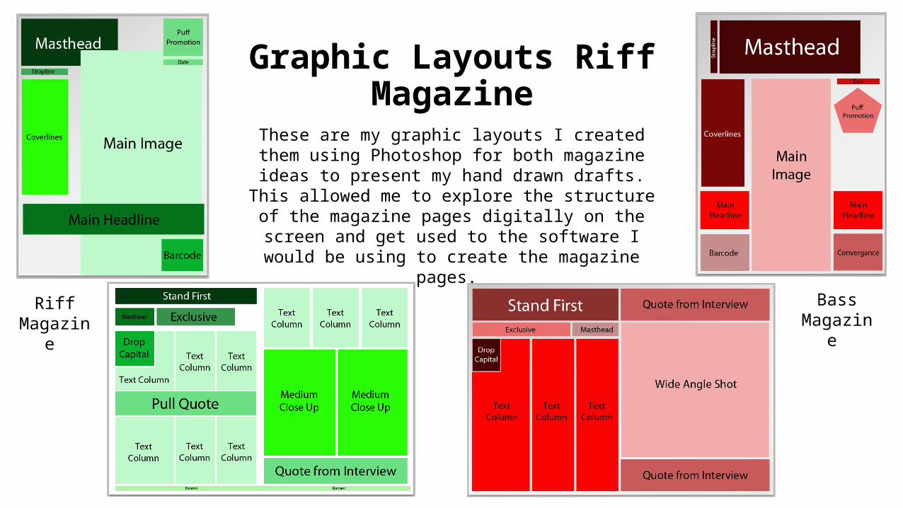
Graphic Layouts Riff Magazine
These are my graphic layouts I created them using Photoshop for both magazine ideas to present my hand
drawn drafts. This allowed me to explore the structure of the magazine pages digitally on the screen and get used to
the software I would be using to create the magazine pages.
Riff Magazine
BassMagazine
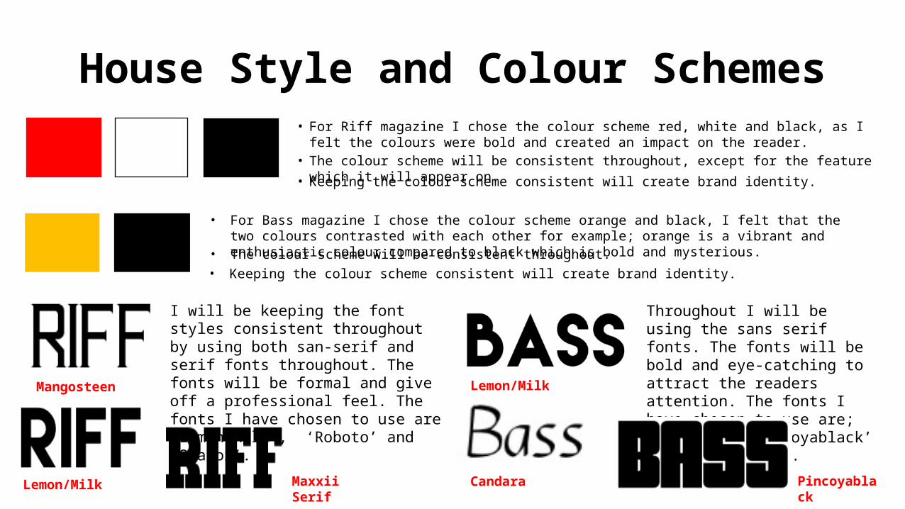
House Style and Colour Schemes
• For Riff magazine I chose the colour scheme red, white and black, as I felt the colours were bold and created an impact on the reader.
• For Bass magazine I chose the colour scheme orange and black, I felt that the two colours contrasted with each other for example; orange is a vibrant and enthusiastic colour compared to black which is bold and mysterious.
Mangosteen
Lemon/Milk Maxxii Serif
• Keeping the colour scheme consistent will create brand identity.
• The colour scheme will be consistent throughout, except for the feature which it will appear on.
• Keeping the colour scheme consistent will create brand identity. • The colour scheme will be consistent throughout.
Throughout I will be using the sans serif fonts. The fonts will be bold and eye-catching to attract the readers attention. The fonts I have chosen to use are; ‘Candara’, ‘Pincoyablack’ and ‘Lemon/Milk’.
I will be keeping the font styles consistent throughout by using both san-serif and serif fonts throughout. The fonts will be formal and give off a professional feel. The fonts I have chosen to use are ‘Lemon/Milk’, ‘Roboto’ and ‘Orator’.
Pincoyablack Candara
Lemon/Milk

PHOTOSHOP SAMPLE
MATERIALS
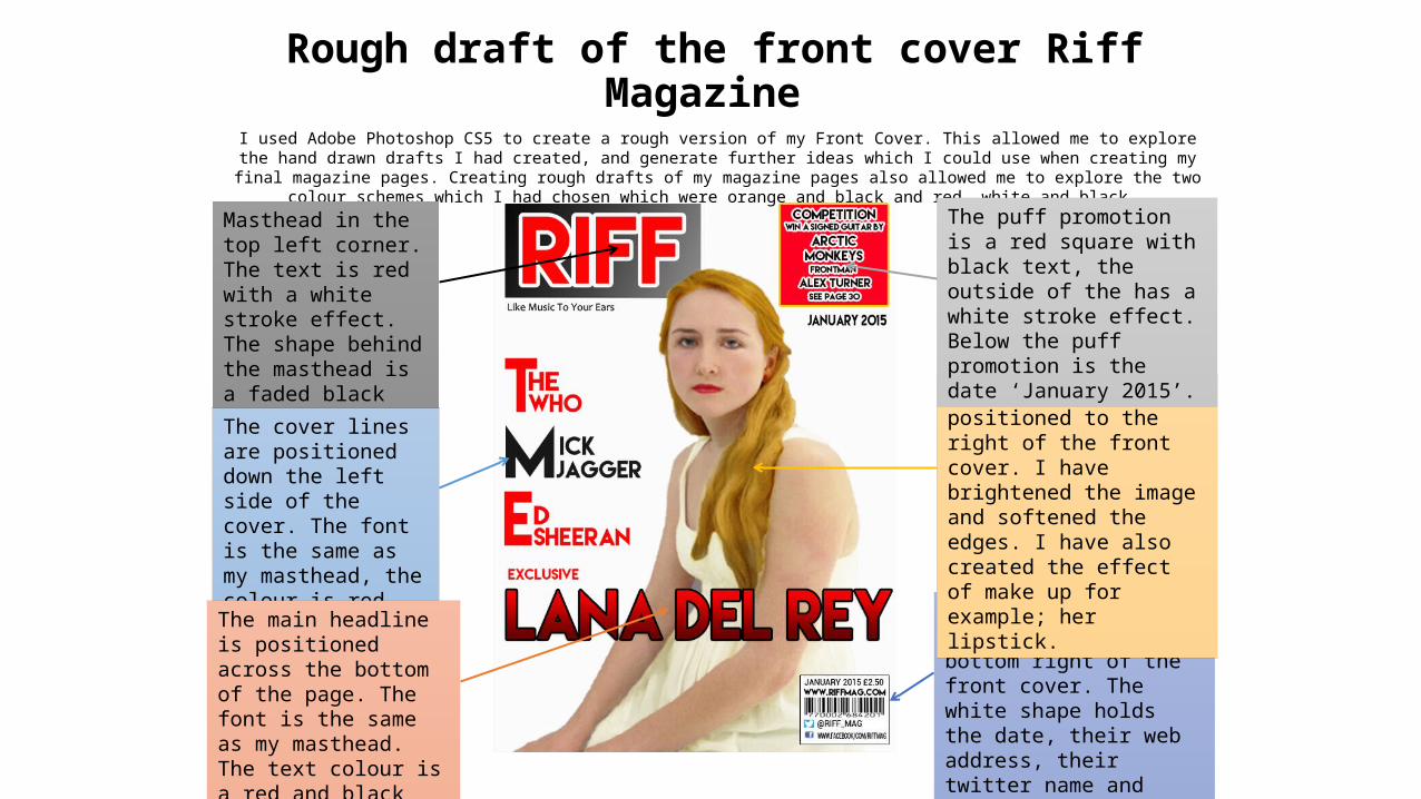
Rough draft of the front cover Riff Magazine I used Adobe Photoshop CS5 to create a rough version of my Front Cover. This allowed me to explore the hand drawn drafts I had created, and
generate further ideas which I could use when creating my final magazine pages. Creating rough drafts of my magazine pages also allowed me to explore the two colour schemes which I had chosen which were orange and black and red, white and black.
Masthead in the top left corner. The text is red with a white stroke effect. The shape behind the masthead is a faded black gradient.
The cover lines are positioned down the left side of the cover. The font is the same as my masthead, the colour is red and black.
The main headline is positioned across the bottom of the page. The font is the same as my masthead. The text colour is a red and black gradient.
The barcode is positioned at the bottom right of the front cover. The white shape holds the date, their web address, their twitter name and their Facebook name.
The main image is positioned to the right of the front cover. I have brightened the image and softened the edges. I have also created the effect of make up for example; her lipstick.
The puff promotion is a red square with black text, the outside of the has a white stroke effect. Below the puff promotion is the date ‘January 2015’.

The stand first is positioned at the top of the left page. The text is the same font as the masthead, the colour of the text is red with a black stroke effect.
The drop capital is positioned at the top of the left page, the font is the same as the masthead. The colour of the text is orange.
The three text columns are positioned either side of the pull quote. The text will be black in the font ‘Robot’.
The banner will be positioned at the bottom of the page, the colour will be red. This will hold the page number and a small image of the masthead.
The two images will me medium close ups positioned below the pull quote. I have brightened the image and softened the edges. I have also created the effect of lipstick on her mouth.
The pull quote is positioned above the 2 images, the font again is the text ‘Robot’. The colour of the font is red with a black drop shadow.
Rough draft of the Double-Page Spread Riff Magazine

Rough draft of the Front Cover Riff Magazine I used Adobe Photoshop CS5 to create rough versions of my Front Cover. This allowed me to explore the hand drawn drafts I had created, and
generate further ideas which I could use when creating my final magazine pages. Creating rough drafts of my magazine pages also allowed me to explore the colour scheme I had chosen which was orange and black.
Masthead is positioned across the top of the front cover. The text is bold and the colour is orange, the strapline is down the left side.
The cover lines are positioned down the right side of the cover. The font is the same as my masthead, the colour is orange and black.
The main headline is split into two sections and positioned across the middle of the page. The text has a
fire pattern overlaid.
The barcode is positioned at the bottom right of the front cover. The white shape holds the date, their web address, their twitter name and their Facebook name. I have also included a small image of their masthead.
The main image is positioned in the middle of the cover, I have changed her hair colour and created the effect of make up on her face. I have also brightened the image and softened the edges to look realistic.
The puff promotion is an orange circle with a black
stroke effect. The text is black with a white stroke
effect.
The convergence is positioned at the bottom left of the cover.
You can see the magazines Facebook name, Twitter name
and Instagram next. Next to these are there logos.

The drop capital will be the same font as the masthead, the txt colour will be bright orange.
The three text columns will be positioned on the left page, the first columns will wrap around the drop capital. The text will be black in the font ‘Candara’
The quote from the interview will be positioned beneath the location shot. The text will be in the font ‘Candara’. The colour will be orange with a black stroke effect.
The image will be a location shot, positioned beneath the pull quote. I will brighten the image and soften the edges. I will also change the colour of the clothing in the image, and change the colour of her hair.
The pull quote will be positioned above the location shot. The text will be in the font ‘Candara’. The colour will be orange with a black stroke effect
The stand first will be positioned above the interview, the font I have chosen to use is the same as my masthead. The text will be orange with a black stroke effect.
Rough draft of the Double-Page Spread Bass Magazine

Target Audience Socio-EconomicsAccording to Socio-Economics readers of Bass magazine will fall into audience category E as they are aged between 14-19. People who fall in this demographic are typically a younger demographics for example students. Which will be common throughout Bass readers.
Hartley‘sAccording to Hartley’s seven subjecives the intended age group of readers for Bass magazine is 14-19, and the intended gender is males. The ethnicity of a typical Bass reader will be White British as the theme of British indie rock stereotypes that indie is targeted at British people, however their ethnicity may differ depending on what their music tastes are. KatzAccording to ‘Kats Uses and Gratification theory’ Bass magazine is intended to; Inform and Educate the reader: As the typical reader will be of a younger demographic for example a student, Bass magazine will need to provide the reader with lots of information to educate the reader. The information will need to be entertaining and detailed to keep the reader engaged throughout. Entertain: Bass magazine is also intended to entertain the reader away from their studies, therefore I will need to created my magazine with lots of interesting articles and posters to keep the reader entertained throughout. MaslowAccording to Maslow’s Hierarchy of needs readers of Bass magazine will fall into the category of; Self-Actualization: As readers of Bass magazine will be of a younger demographic they may aspire to be like one of the stars featured within the magazine, therefore self-actualization will help them to realise their potential as a person.
PsychographicsReaders of Bass magazine would fall into the category ‘Explorers’. ‘Explorers’ are typically a younger demographic, which my target audience fall into. Explorers seek information which I will need to provide in my magazine. Readers could also potentially fall into the category ‘Strugglers’. ‘Strugglers’ are also a younger demographic in particular students.

I have included an about section which states; the name of the magazine, when it will be released, their web address, and a longer description which states where the reader can purchase the magazine, the main star to feature in the first issue and the price.
Marketing I have used the masthead of my magazine for both the profile picture and cover photo for my page. This will allow the reader to easily identify my magazine.
By using photographs of my masthead I have also included elements of my colour scheme which is ‘orange and black’
I have created a Facebook Page back in December 2014 to Market my magazine.

Pre-Production ProcessDate of publication: The first step of the production process is to decide the date of the publication; this requires the magazine company to select the date when they want their magazine to be released. Schedule: Once the company has selected the publication date they must then plan a schedule around the chosen date. Choose the main star to feature in the magazine.Arrange the interview for the magazine and plan 10-15 questions to ask the star.
Production-ProcessProduction Editorial Plan: Create an editorial plan to decide the topics which will be feature in the magazine.Budget Plan: Create a budget plan based around the money put aside for producing the magazine. Select the content: The content must be selected for example smaller interviews which will feature in the magazine. Advertisements: The advertisements must be chosen checking to see that they are age appropriate and fit the magazines indie genre. Interview with Lana Del Rey: The interview must now take place, and be word-processed on the computer. Sub editing: Once the content has been gathered it must be sub-edited, usually this is done by a sub-editor employed within the production company. There are 5 main target areas which sub-editors cover including; checking the accuracy of the facts, spell checking, grammar and punctuation, the house style, and the page layout.
Post Production Process Magazine layout/structure: Using Photoshop create the structure of the magazine. Adjust the blue gridlines to set the correct dimensions on each page. Photography Plan: Create a photography plan for the test photography. Arrive before the designated time and prepare the location, then take the test images.Photography Plan: Create a photography plan for the official shootArrive before the designated time and prepare the location, then take the final images. Insert the content: Onto the pages insert the content once it has been sub editedImages: Using Photoshop edit the final images, making sure they look professional and realistic. Then insert the images onto the correct pages. Proofreading: Proofreading can only be done once sub-editing has finished, requiring the editor to print out a copy of the magazine, which he or she will read through correcting mistakes as they go.
The Production Process

Magazine Growth
• Job SalariesEditor: £20,684
• Associate Media Director: £15,575• Photo Editor: £14,628• Music Manger: £25,682
• To send out 11 job advertisements with company Recruitment Genius it would cost £2,009.
Costs
For the first year the total cost for editorial salaries will be £121,967.
Income
After the first year my Magazine Advertising Income will be £251,000
• To advertise on social media it will cost be £84 a year.
• To distribute 10,000 magazines the cost is £31,000. • To distribute 30,000 magazines the cost will be £ 95,700.