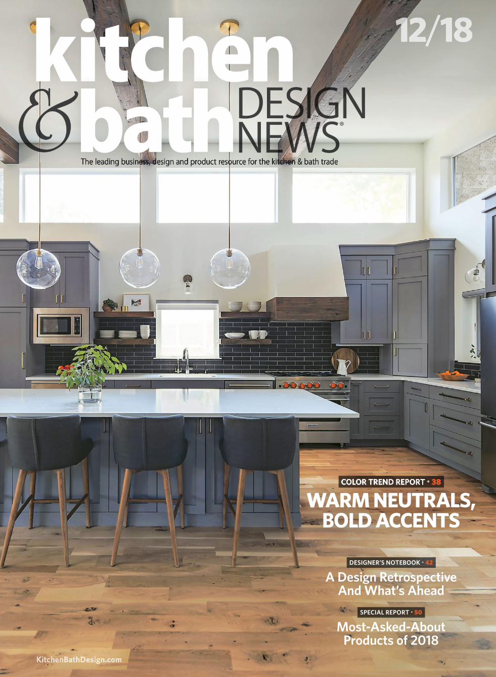
kbdn 12/18 issue / 2018 color trend report
TRANSCRIPT
Most-Asked-AboutProducts of 2018
A Design RetrospectiveAnd What’s Ahead
SPECIAL REPORT • 50
DESIGNER’S NOTEBOOK • 42
KitchenBathDesign.com
12/18
The leading business, design and product resource for the kitchen & bath trade
COLOR TREND REPORT • 38
WARM NEUTRALS, BOLD ACCENTS
Softer whites and grays are teaming with light woods to provide the ideal backdrop for
2019’s rich shades, including bright yellows, terracottas and deep greens.BY ANITA SHAW
Warming Trends
he interest in stark minimalism, Scandinavian style and
cool tones may finally be waning when it comes to kitchen
and bath design. In their place, warmer neutrals, rich and
bold hues and nature-inspired colors are pushing their way to
the forefront for 2019, according to industry experts.
“We’ve had a good run of white and gray interiors, but I
think kitchens and baths will warm up and get natural and
lively in 2019,” reports Laura Medicus, owner/principal, Laura
Medicus Interiors in Denver, CO. “I think the minimalism
trend has ended and it’s swinging back toward interiors with
more color, varied shapes and patterns.”
While she believes that people will still love bold pops of
color, tones will get warmer and be paired with wood tones
and more pattern. “We will see more collected, interesting
rooms with strong hues that are bold, but nuanced, with
shades such as hunter green, coral, teal, pink and mustard
yellow,” she offers.
The increasing interest in color is being credited, in part,
to the internet and social media. “We see so many feeds and
beautiful images on Instagram that people are immediately
confident,” notes Sue Wadden, director of color marketing,
The Sherwin-Williams Co. in Cleveland, OH. “I think that
Pinterest, Houzz and all those online inspiration sources have
really changed the game when it comes to color. People are
really willing to take a risk, more than they’ve ever been
before.”
WHITE, GRAY AND MORE
With all the talk of color, the truth is that white will always be a
staple for the kitchen. Whether it’s the clean and fresh feeling
it evokes, its ability to work with other colors, or because it is
a safe choice for those taking on a remodel, white isn’t going
away any time soon.
What is changing, however, are the tones of white that are
coming into play. Clean, crisp whites that are the perfect foil
for a warm, bright color, and warm whites that lean a little
taupe are the newest players.
“We are seeing a lot of white still, because people are bring-
ing a lot of color into their furnishings, and we’re seeing a lot
more bright colors coming back,” notes Dee Schlotter, senior
color marketing manager, PPG Olympic and PPG Paints in
Pittsburgh, PA. “White kind of stabilizes that whole effect.”
Certain spaces lend themselves to a neutral backdrop,
allowing different pops of color to be brought in, according to
Andrea Magno, color and design expert, Benjamin Moore in
Montvale, NJ. Neutral tones such as Cloud White, a warmer
white, or even Metropolitan, Benjamin Moore’s 2019 Color of
the Year, can help create a balance with deeper colors being
brought into the kitchen such as navy, charcoal or dark green.
“These deep tones are really great for painting millwork and
cabinetry because they’re classic colors that are going to be rel-
evant for a good amount of time, but they’re still a little more
interesting,” she notes.
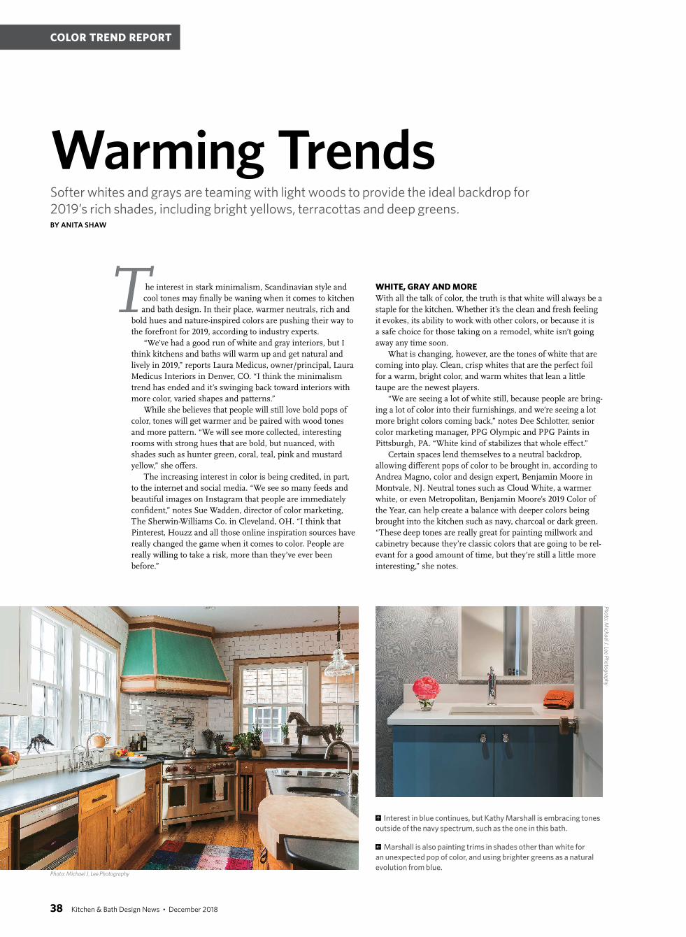
Interest in blue continues, but Kathy Marshall is embracing tones
outside of the navy spectrum, such as the one in this bath.
Marshall is also painting trims in shades other than white for
an unexpected pop of color, and using brighter greens as a natural
evolution from blue.
T
Ph
oto
: Mich
ael J. Lee P
ho
tog
rap
hy
Photo: Michael J. Lee Photography
38 Kitchen & Bath Design News • December 2018
COLOR TREND REPORT

Metropolitan AF690 is a changeable gray that works
well on its own or with other materials or other colors,
according to Magno. This ability to react is important for
any gray tone coming up, because gray fatigue is begin-
ning to set in.
“I hope gray is going away,” notes Kathy Marshall, princi-
pal, Kathy Marshall Design in Wenham, MA. “If somebody
really wants gray, I try to make sure the kitchen is accented
with color, because if you don’t do that, the kitchen looks very
trendy. I also try to go with a warmer gray as opposed to a
really blue gray – something that has a little bit more taupe in
it, or more red, to make it feel warmer.”
“Gray is going to continue but be warmed with brown,
and that is going to lead to some new browns entering the
market,” adds Mark Woodman, Mark Woodman design+color
llc and president of the Color Marketing Group in Alexandria,
VA. “Subtle sepia-type browns will offer an always popular
vintage edge, but also move grays to a new level, warming
them” and leading the way to brown tones.
Wadden also notes the reemergence of brown tones. “The
mid-century warm walnuts, sort of mid-toned woods, are col-
ors that are going to be important next year,” she believes.
Dent stresses that people are definitely retreating from the
white kitchen and returning to woods. “They want really pretty
woods,” she observes. “Walnut tends to be a high choice here,
as well as rift oak.”
“People are definitely going toward white oak in a very nat-
ural, organic look. Often I’m seeing it or liking it in the island
and then maybe accented somewhere else on the project,”
adds Marshall.
“With wood tones, it’s definitely weathered and light, but
distressed – that whole barnwood thing – with a raw edge or
live-edge look,” confirms Wadden.
BRIGHT AND BEAUTIFUL
One of the appeals of white, gray and light, natural woods is
their ability to offer support to brighter hues. These tones set
the stage for the latest crop of colorful scene stealers.
Benjamin Moore notes that its 2019 Color of the Year, Metropoli-
tan AF-690, is a modern gray that reacts well with light and colors.
The increasing popularity of warmer neutrals, brown tones and
terracotta shades are reflected in the 2019 Color of the Year from
Sherwin-Williams – Cavern Clay.
White kitchens
are giving way to
really pretty woods
such as walnut and
rift-cut oak, along
with textured lami-
nates, according to
Gail Monica Dent,
who designed this
modern kitchen
space.Ph
oto
: Jo
hn
Wilb
an
ks, J
oh
n G
. Wilb
an
ks P
ho
tog
rap
hy
Ph
oto
: Co
urt
esy
of B
enja
min
Mo
ore
Photo: Courtesy of Sherwin-Williams
December 2018 • KitchenBathDesign.com 39

“We see bold color choices pushing forward into the sunset
range of hues, such as deeper brick reds, terracotta oranges
and golden yellows,” says Sara McLean, color expert and stylist,
Dunn-Edwards in Los Angeles, CA. The Dunn-Edwards 2019
Color of the Year, Spice of Life, is in keeping with this trend,
providing a mix of deep brick red blended with terracotta and
yellow undertones.
Sherwin-Williams also chose a terracotta hue – Cavern Clay
– as its 2019 Color of the Year. “I think this is going to be an
important color, whether it’s painted on cabinets or painted on
walls,” Wadden comments.
One bright that is expected to continue its popularity in
the kitchen going forward is red. “Vibrant, clean reds are great
for kitchens because they stimulate the appetite,” reports
Schlotter. “They’re convivial colors that are very happy and just
welcoming colors for the kitchen.”
“In the Pacific Northwest, the pops of color tend to be in
the reds and the greens, because blue doesn’t translate well
with our UV color range,” notes Gail Monica Dent, founder/
principal, Provanti Designs in Bellevue, WA. “Everything tends
to be warm colors, because we’re so cool and gray here.”
GREEN SWEEP
Bold choices aren’t reserved for the bright colors, however.
Deep, rich shades are also garnering attention for everything
from cabinets and countertops to trim and tile.
“Dark colors, blacks, charcoals and navy blue will be super
important in 2019 and 2020, as well as deep dark greens,”
reports Wadden. “We kind of fell back in love with green the
last couple of seasons.” It’s associated with life and growth and
is organic and natural, “so it’s a great counterbalance to the
starkness of gray.
“And, it’s exploding in the kitchen and bath,” she contin-
ues. “Those rich colors are really a way to balance out where
we’ve been and bring in something new. So paint navy cab-
inets in the kitchen, and then pair them with warm metals
“There are rainbow brights that offer moments of color joy.
They play a role of introducing a bit of happy into the designed
space,” notes Woodman. “Of these colors, bright yellow is the
one to watch. It has already emerged in fashion and is hailed
as the color of Generation Z, so attention is going to be paid.
It is energetic, fearless and always fresh, just what we need in
murky times.”
“Yellow has always been gorgeous in a kitchen,” adds
Marshall. “A lot of the old English country kitchens were that
Georgian yellow. I think people are definitely trending back
toward that.”
Leanne Ford of
HGTV’s ‘Restored
by the Fords’
television show
used PPG’s 2019
Color of the Year –
Nightwatch, a rich
green – in a recent
project.
Warmer whites, reclaimed wood and an
injection of color in the backsplash make a
statement in this kitchen designed by Laura
Medicus, which also features a contrasting
blue on the island.
Medicus notes that baths will see an
explosion of color, such as pink, green,
yellow, dark blue and orange, as shown on
the vanity in this design.
Ph
oto
: S
ara
Yo
de
r
Photo: Sara Yoder
Photo: Reid Rolls
40 Kitchen & Bath Design News • December 2018
COLOR TREND REPORT
“For metals, gold and copper continue to push for-
ward,” notes McLean. “The trend toward warm colors
includes these metals.”
“For large appliances, two of the exciting new introduc-
tions are matte black and matte white. They offer a simple
color in an exciting new look,” states Woodman. “Beyond that,
if budget allows, a single piece in color is moving forward. It
could be a red range, or pale blue refrigerator. They tend to be
the go-tos for adding a large bit of appliance color.”
There are so many product options and so many colors
available, and today’s homeowners are definitely trying them
on for size. ▪
such as copper and gold. The look is really modern and
fresh and brand new.”
Julien Chapuis, CEO, Ressource Americas in New York,
NY agrees. “Saturated, dark and warm green colors have been
in high demand for several of our projects next year, as well as
certain variations of burgundy red.”
“Green is going to have a large presence,” concurs
Woodman. “It started already in 2018 and will expand with an
entire produce department of greens. From yellow influences
that are lighter, to dark greens influenced with blue or black,
to toned greens with a touch of gray. They will have a natural
edge, as green tends to have, but the variation in values and
undertones will give these greens a new perspective.”
“Navy blue kitchens are still really popular, and I think that
will start to translate into hunter green kitchens and other
shades of dark green,” notes Medicus. “I think we’ll see more
and more kitchen islands that are a lively, unexpected color
and more two-toned kitchens, especially with natural wood and
other natural materials in an effort to warm up the kitchen.”
PPG’s Color of the Year, Nightwatch, is a dark green with
a little undertone of blue for a touch of luxury. “We’ve seen
people wanting that kind of quiet and connection to nature,
so that really dark green is very restorative – the color is the
feeling you get when you’re in deep nature,” Schlotter reports.
KITCHEN SPECIFICS
To go with the warming trend in colors, finishes are going
distinctively matte. From paint to cabinets to appliances to
faucets, there is less shine for a softer appeal.
In addition to natural wood cabinets, wood countertops
continue their upward trend. “People want to warm up their
spaces, and wood and natural stone are intuitive ways to ac-
complish that,” states Medicus.
“I’m seeing a lot more wood countertops,” agrees Dent.
“And stone is becoming more popular as folks are beginning
to tire of quartz patterns. There is a feeling that quartz pat-
terns will not be as timeless as an interesting stone pattern.
“With regard to faucets and hardware, I’m having success
with black matte, and I’m having success with certain gold
mattes – not the brass that we all grew up with in the 1960s,
but the newer gold mattes,” she adds. “It adds a pop of color
and richness to a kitchen and dresses it up.”
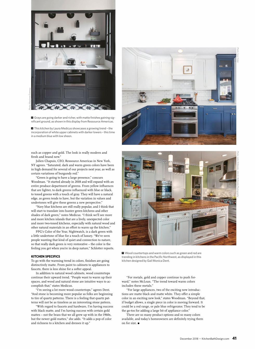
Grays are going darker and richer, with matte finishes gaining sig-
nificant ground, as shown in this display from Ressource Americas.
This kitchen by Laura Medicus showcases a growing trend – the
incorporation of white upper cabinets with darker lowers – this time
in a medium blue with low sheen.
Wood countertops and warm colors such as green and red are
trending in kitchens in the Pacific Northwest, as displayed in this
kitchen designed by Gail Monica Dent.
Ph
oto
: Sa
ra Y
od
erP
ho
to: Jo
hn
Wilb
an
ks, Joh
n G
. Wilb
an
ks Ph
oto
gra
ph
y
Ph
oto
: Ma
ria
nn
e E
ven
no
u
December 2018 • KitchenBathDesign.com 41