factset: building graphs - babson college
TRANSCRIPT

FactSet: Building Graphs
Created by: Tyson Corner '22

Building Graphs with FactSet
1) If you have FactSet on your laptop open up excel on your laptop otherwise you can use any of the Cutler Center Terminals and open excel
2) Click on the FactSet button on the ribbon
3) Click on the bars with a blue trend line above the Active Graph function
4) There are many options for types of charts and metrics that can be used. We will start with
indexed price.
5) Click on “Price.”
6) To index an individual ticker against a benchmark, double click “Indexed Price (with Target
Volume -Optional.”

7) In the “Target” section put the company name or ticker that you are interested in. For this
example the target will be Facebook (FB)

8) After selecting a target, you can then compare the target to peers, a group of stocks, or relevant
benchmarks. For this example we will compare Facebook (FB) to the other FAANG stocks (compare them to Apple, Amazon, Netflix, and Google). To put in a comparison ticker go to
the “Comparables” field and start inputting tickers (APPL, AMZN, NFLX, GOOGL).
9) To insert additional “Comparables” simply highlight and delete the ticker name in the
“Comparables” section and begin typing a new ticker, FactSet will hold on to the old tickers data unless you choose to exclude it later.
10) Once you have all the “Comparables” you want in you can click the down arrow key by
“Comparables” to see whether or not you want to remove any. To remove simply click the "x" by the ticker in the drop down.
To remove a
name.

11) Next you'll want to select a date range. Go to the “Period” section and select YTD for year-to-date return
12) Next is “Frequency”. Daily is the default “Frequency” metric and it is usually good, but if you
want monthly or yearly depending on your return analysis timeframe click the down arrow by daily and select a different “Frequency.”
13) Click “Ok” at the bottom right and a graph will be created in Excel.

14) This graph is the base graph that FactSet spits out and it is not very appealing to the eyes, luckily
edits are easy. To start, double click your graph, then right click your graph and click “Format.”
15) The other option is to left click once on your graph, select the drop down arrow by the Active
Graph symbol, and select “Format Active Graph.”

16) Once you are in formatting mode, the fastest way to format an Active Graph is to click on the
sections you want to format. To start click on the background of your graph and uncheck
“Show Fill Color” and “Show Line Color,” then click “Apply” and the gray grid will go away.
17) Next, let’s change the line colors so that they are all clearly different from each other. Click on a
trend line and you will be taken to that section of formatting. Hover over trend lines to see which ticker they correspond to and pick the Facebook trend line. The first option will be color. It will say “Automatic” next to it. Click the drop down menu, select “More…” and pick a color or enter a custom RGB code. I chose the lighter blue.
18) Once you select or input a color, select “OK” and then press “Apply”
19) Next change the width so that the lines are a little clearer, with five lines I suggest the median width, which is the fourth width option.

20) Click on the width and click “Apply,” your graph should look like the one below now.
21) Do this to every trend line.

22) You also have the option of changing the text and layout of the x and y axis. Again to format,
simply click on the axis. Start with the X axis which is in months. Once in select the labels
section and change the font to Times New Roman and the Font Size to 14. Click “OK” and
“Apply.”
23) Do the same thing to the Y axis. Your new graph should look similar to the one below.

24) You can also change the title of the graph by clicking on the top title. Let’s change the title to
“FAANG Comparison” and put it in the middle of the chart. To do this delete the text that appears in the “Left” section. Then write “FAANG Comparison” in the “Center” section. You can also change the font type and size. Let's make it Times New Roman, size 18. Click “Apply.”
25) Additionally, you can change the position and size of the companies’ names. Let’s put the names
in the middle and make them Times New Roman size 14. To do this highlight the bottom where
all of the companies’ names are.
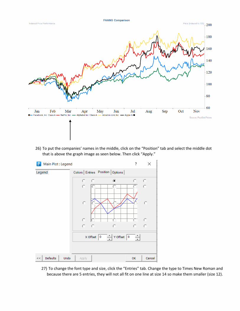
26) To put the companies’ names in the middle, click on the “Position” tab and select the middle dot
that is above the graph image as seen below. Then click “Apply.”
27) To change the font type and size, click the “Entries” tab. Change the type to Times New Roman and
because there are 5 entries, they will not all fit on one line at size 14 so make them smaller (size 12).

28) Your graph should now look like this.
You can remove the subtitle and footer by selecting them and unchecking the “Show Footer”
section and hitting “Apply”. The footer is indicated by the blue arrow below. Click on the subtitle
and uncheck “Show Subtitle 1” and hit “Apply.” The subtitle is indicated by the black arrow.

29) Your final product will look something like this.
30) Compare this to the original