expert guide color & quality - heidelberger … guide color & quality. 3 content 1 light and...
TRANSCRIPT
Expert Guide
Color & Quality
3
Content
1 Light and Color
1.1 Light is Color 4
1.2 Seeing Color 6
1.3 Color Mixing 7
1.4 Color Systems 10
2 Color in Print
2.1 Ink Film Thickness 12
2.2 Tonal Value 13
2.3 Relative Print Contrast 19
2.4 Color Balance / Image Synthesis 19
2.5 Ink Trapping and Color Sequence 22
2.6 Color Control Bars 24
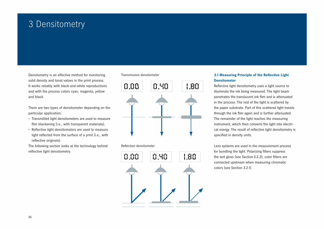
3 Densitometry
3.1 Measuring Principle of the Reflective
Light Densitometer 26
3.2 Densitometer Filters 27
3.3 Densitometric Values 29
3.4 Measurement 30
3.5 Evaluation 32
3.6 Limits of Densitometry 34
4 Colorimetry
4.1 Measuring Color 36
4.2 Standard Color Values 37
4.3 Standard Illuminants 37
4.4 Standard Observer /
Spectral Value Functions 38
4.5 Evaluation with Spectrophotometer 39
4.6 Equispaced Differences in Color Tone 40
4.7 The Lab Color Model 41
4.8 Munsell 47
5 Use of Colorimetry
5.1 Spectrophotometry 48
5.2 Color Control Bars 50
5.3 Color Control with Heidelberg 51
5.4 Standardization of Printing 55
5.5 Benefits of Colorimetry
for Offset Printing 58
Glossary 59
4
1 Light and Color
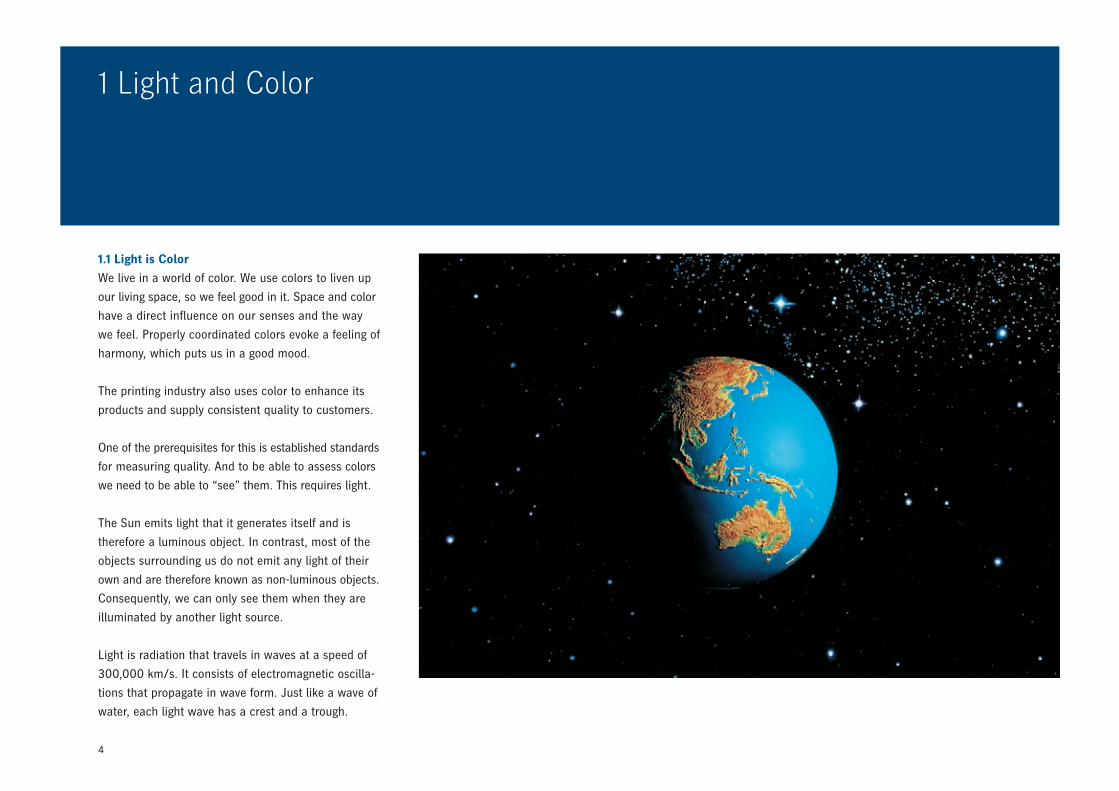
1.1 Light is Color
We live in a world of color. We use colors to liven up
our living space, so we feel good in it. Space and color
have a direct influence on our senses and the way
we feel. Properly coordinated colors evoke a feeling of
harmony, which puts us in a good mood.
The printing industry also uses color to enhance its
products and supply consistent quality to customers.
One of the prerequisites for this is established standards
for measuring quality. And to be able to assess colors
we need to be able to “see” them. This requires light.
The Sun emits light that it generates itself and is
therefore a luminous object. In contrast, most of the
objects surrounding us do not emit any light of their
own and are therefore known as non-luminous objects.
Consequently, we can only see them when they are
illuminated by another light source.
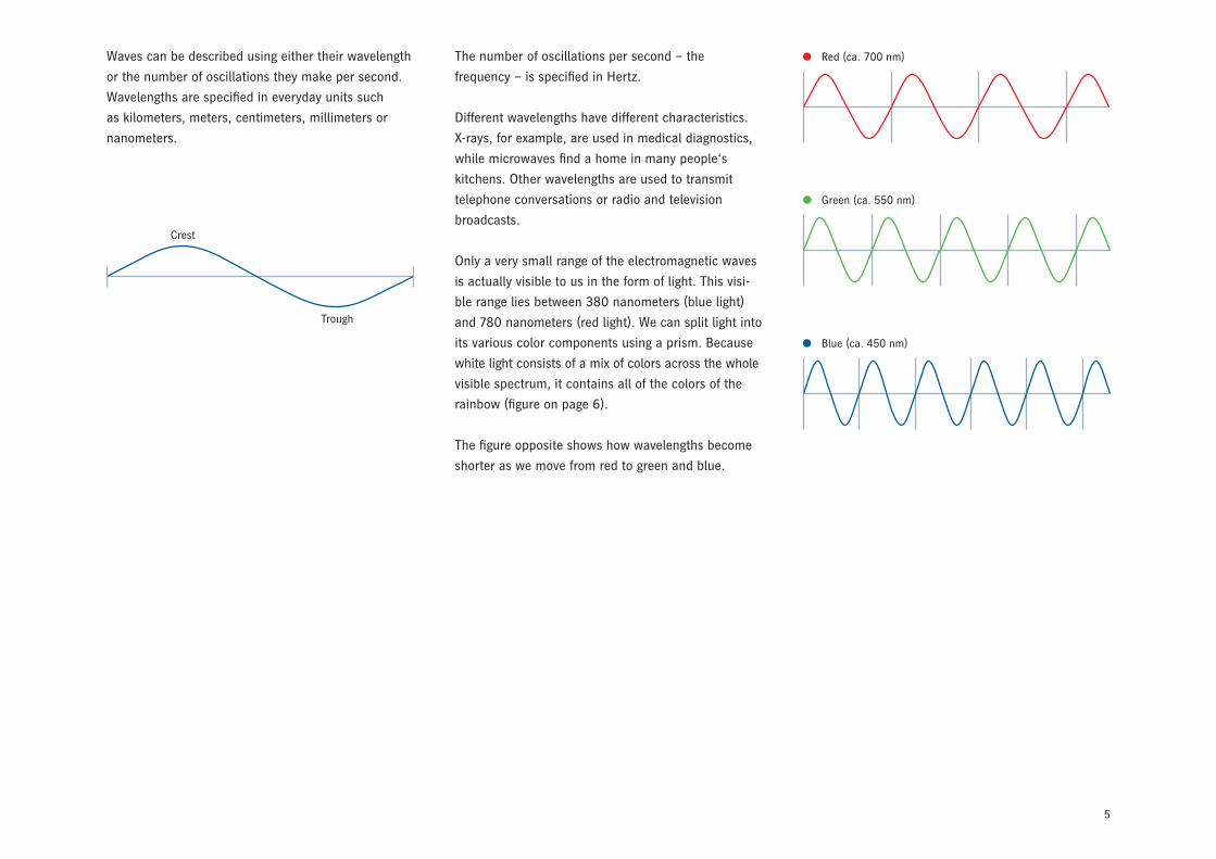
Light is radiation that travels in waves at a speed of
300,000 km/s. It consists of electromagnetic oscilla-
tions that propagate in wave form. Just like a wave of
water, each light wave has a crest and a trough.
5
Waves can be described using either their wavelength
or the number of oscillations they make per second.
Wavelengths are specified in everyday units such
as kilometers, meters, centimeters, millimeters or
nanometers.
The number of oscillations per second – the
frequency – is specified in Hertz.
Different wavelengths have different characteristics.
X-rays, for example, are used in medical diagnostics,
while microwaves find a home in many people‘s
kitchens. Other wavelengths are used to transmit
telephone conversations or radio and television
broadcasts.
Only a very small range of the electromagnetic waves
is actually visible to us in the form of light. This visi-
ble range lies between 380 nanometers (blue light)
and 780 nanometers (red light). We can split light into
its various color components using a prism. Because
white light consists of a mix of colors across the whole
visible spectrum, it contains all of the colors of the
rainbow (figure on page 6).
The figure opposite shows how wavelengths become
shorter as we move from red to green and blue.
Red (ca. 700 nm)
Green (ca. 550 nm)
Blue (ca. 450 nm)
Crest
Trough
6
1.2 Seeing Color
Colors only become “visible” when light is applied –
but why is this so?
Color is not a property of an object in the same way
as its shape. However, bodies have the ability to swal-
low (absorb) or reject (reflect) light of specific wave-
lengths. We can only see the colors that correspond
to the reflected wavelengths. When white light strikes
an object, one of the following scenarios occurs:
• All light is absorbed. In this case, we see the object
as black.
• All light is reflected. In this case, the object appears
white.
• All light passes through the object. In this case,
the color of the light does not change. The object,
e.g. glass, is entirely transparent.
• Part of the light is absorbed, the rest is reflected.
We see a color whose tone depends on which
wavelengths are reflected and which are absorbed.
This applies in particular to printed matter.
• Part of the light is absorbed, the rest is transmitted
(passes through). We see a color whose tone depends
on which wavelengths are absorbed and which are
transmitted. Part of the light is reflected, the rest is
transmitted. The color of both the reflected and the
transmitted light changes.
The question of which of these scenarios occurs de-
pends on the properties of the illuminated object.
The light reflected or transmitted by an object is
received by our eyes and converted into nerve signals
that trigger the color sensation in our brains.
400 500 600 700
1 pm 1 nm 1 μm 1 mm 1 m 1 kmGa
mm
a ra
ys
X-ra
ys
UV Mic
row
aves
IR Rada
r
TV Radi
o
Broa
dcas
tVH
F, S
W, M
W, L
W
Wavelength
nm
7
The retina in our eyes consists of light-sensitive cells.
There are two types of cells – rods and cones. The
rods distinguish between light and dark and the cones
respond to different colors. Three different types of
cones are responsible for different wavelength ranges.
Some respond to light in a wavelength of 400 to
500 nanometers and are therefore sensitive to blue.
Others “see” in the green range, and a third type is
primarily sensitive to red light.
This structure with its different cells makes the
human eye so sensitive that we can identify and
distinguish several million different colors.
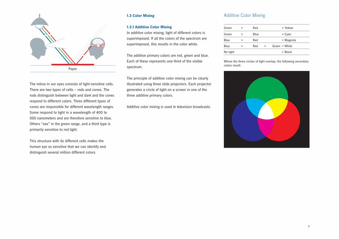
1.3 Color Mixing
1.3.1 Additive Color Mixing
In additive color mixing, light of different colors is
superimposed. If all the colors of the spectrum are
superimposed, this results in the color white.
The additive primary colors are red, green and blue.
Each of these represents one-third of the visible
spectrum.
The principle of additive color mixing can be clearly
illustrated using three slide projectors. Each projector
generates a circle of light on a screen in one of the
three additive primary colors.
Additive color mixing is used in television broadcasts.
Additive Color Mixing
Green + Red = Yellow
Green + Blue = Cyan
Blue + Red = Magenta
Blue + Red + Green = White
No light = Black
Paper
Where the three circles of light overlap, the following secondary colors result:
8
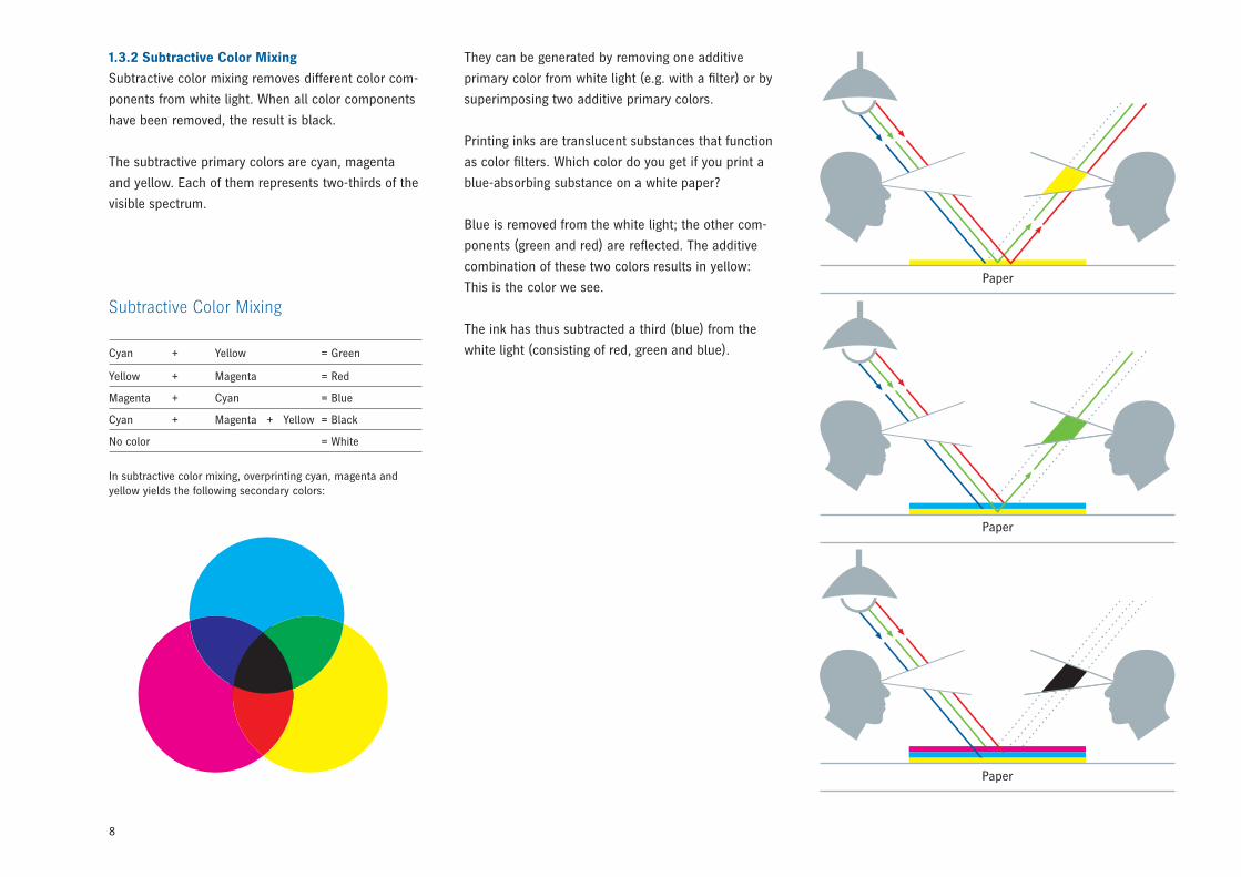
1.3.2 Subtractive Color Mixing
Subtractive color mixing removes different color com-
ponents from white light. When all color components
have been removed, the result is black.
The subtractive primary colors are cyan, magenta
and yellow. Each of them represents two-thirds of the
visible spectrum.
In subtractive color mixing, overprinting cyan, magenta and yellow yields the following secondary colors:
Subtractive Color Mixing
Cyan + Yellow = Green
Yellow + Magenta = Red
Magenta + Cyan = Blue
Cyan + Magenta + Yellow = Black
No color = White
They can be generated by removing one additive
primary color from white light (e.g. with a filter) or by
superimposing two additive primary colors.
Printing inks are translucent substances that function
as color filters. Which color do you get if you print a
blue-absorbing substance on a white paper?
Blue is removed from the white light; the other com-
ponents (green and red) are reflected. The additive
combination of these two colors results in yellow:
This is the color we see.
The ink has thus subtracted a third (blue) from the
white light (consisting of red, green and blue).
Paper
Paper
Paper
9
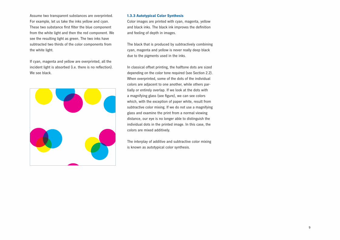
Assume two transparent substances are overprinted.
For example, let us take the inks yellow and cyan.
These two substance first filter the blue component
from the white light and then the red component. We
see the resulting light as green. The two inks have
subtracted two thirds of the color components from
the white light.
If cyan, magenta and yellow are overprinted, all the
incident light is absorbed (i.e. there is no reflection).
We see black.
1.3.3 Autotypical Color Synthesis
Color images are printed with cyan, magenta, yellow
and black inks. The black ink improves the definition
and feeling of depth in images.
The black that is produced by subtractively combining
cyan, magenta and yellow is never really deep black
due to the pigments used in the inks.
In classical offset printing, the halftone dots are sized
depending on the color tone required (see Section 2.2).
When overprinted, some of the dots of the individual
colors are adjacent to one another, while others par-
tially or entirely overlap. If we look at the dots with
a magnifying glass (see figure), we can see colors
which, with the exception of paper white, result from
subtractive color mixing. If we do not use a magnifying
glass and examine the print from a normal viewing
distance, our eye is no longer able to distinguish the
individual dots in the printed image. In this case, the
colors are mixed additively.
The interplay of additive and subtractive color mixing
is known as autotypical color synthesis.

10
All of these systems use samples or specimens to
show the individual color tones and assign names to
them. However, they are never exhaustive and are
rarely suitable for making calculations. As we have
seen, the way we see color depends on the stimulus
status of the red-, green- and blue-sensitive receptors
in our eyes. Three numerical values are therefore
required to unambiguously describe all possible colors.
Using such a system, we could describe green, for
example, as follows:
green = 0 × red + 1 × green + 0 × blue
or even shorter:
G = 0 × R + 1 × G + 0 × B.
If we imagine that the primary colors are the axes
of a three-dimensional system of coordinates, what
we get is a color space.
Many experts have studied color systems and
developed various ideas of how a color space is
to be structured. Each of these color spaces has
advantages and disadvantages.
1.4 Color Systems
Everyone perceives colors differently. If different people
were to describe color tones, the results of these
descriptions would differ very widely. However, printers
require standardized criteria for assessment purposes
if they are to be able to describe colors. For this
purpose, different assessment systems have been
created. A number of ink manufacturers create books
of samples and give the colors designations such as
Novavit 4F 434.
Others use color swatches such as HKS and Pantone.
Another useful tool is the color circle, which can
consist of 6, 12, 24 or more parts.
11
0.8
0.7
490
0.6
0.5
0.4
0.3
0.2
0.1
0.0
0.0 0.1 0.2 0.3 0.4 0.5 0.6 0.7
y
x
520
530
540
550
560
570
580
590
600610
620650
400-380450470
480
700-800
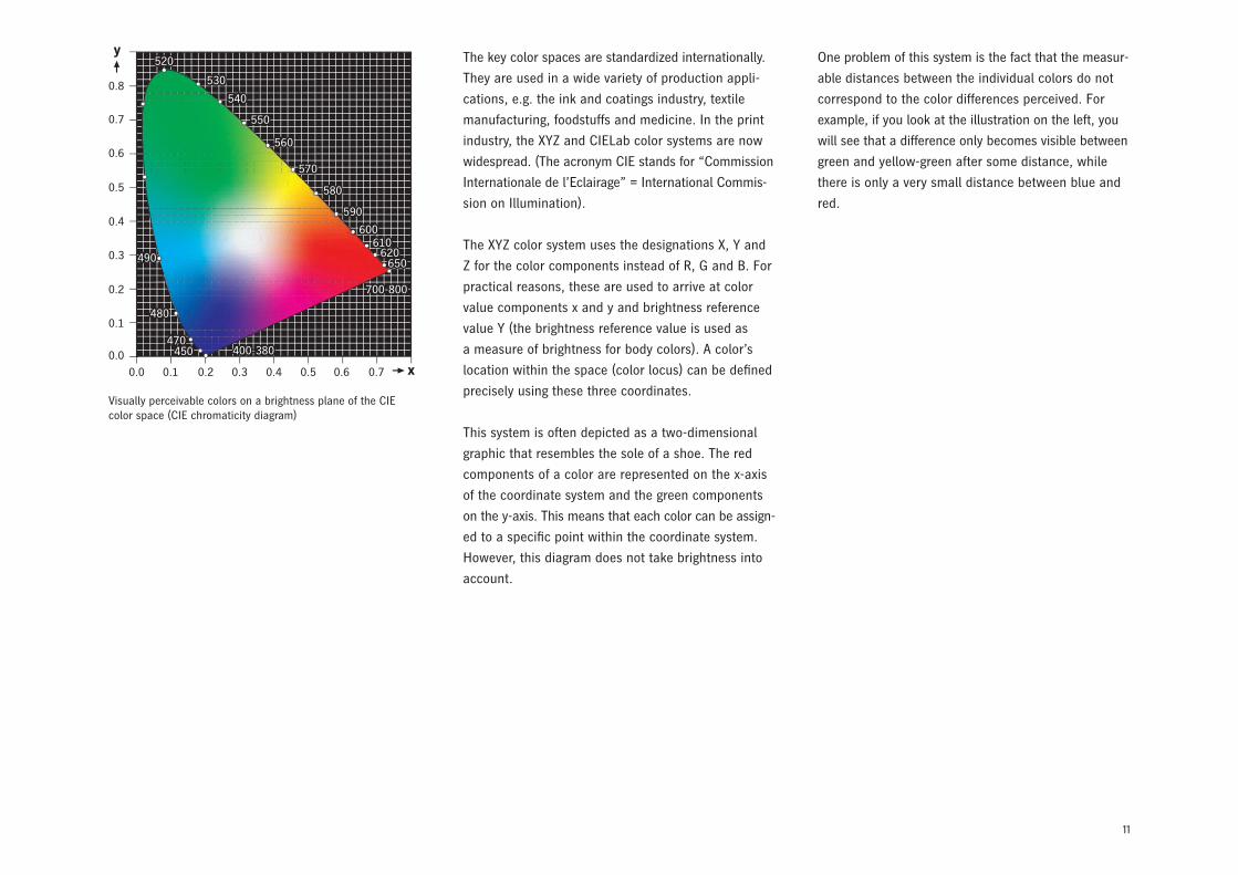
Visually perceivable colors on a brightness plane of the CIE color space (CIE chromaticity diagram)
The key color spaces are standardized internationally.
They are used in a wide variety of production appli-
cations, e.g. the ink and coatings industry, textile
manufacturing, foodstuffs and medicine. In the print
industry, the XYZ and CIELab color systems are now
widespread. (The acronym CIE stands for “Commission
Internationale de l’Eclairage” = International Commis-
sion on Illumination).
The XYZ color system uses the designations X, Y and
Z for the color components instead of R, G and B. For
practical reasons, these are used to arrive at color
value components x and y and brightness reference
value Y (the brightness reference value is used as
a measure of brightness for body colors). A color’s
location within the space (color locus) can be defined
precisely using these three coordinates.
This system is often depicted as a two-dimensional
graphic that resembles the sole of a shoe. The red
components of a color are represented on the x-axis
of the coordinate system and the green components
on the y-axis. This means that each color can be assign-
ed to a specific point within the coordinate system.
However, this diagram does not take brightness into
account.
One problem of this system is the fact that the measur-
able distances between the individual colors do not
correspond to the color differences perceived. For
example, if you look at the illustration on the left, you
will see that a difference only becomes visible between
green and yellow-green after some distance, while
there is only a very small distance between blue and
red.
12
2 Color in Print
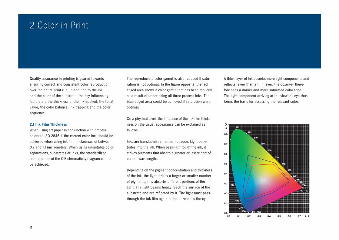
The reproducible color gamut is also reduced if satu-
ration is not optimal. In the figure opposite, the red
edged area shows a color gamut that has been reduced
as a result of underinking all three process inks. The
blue edged area could be achieved if saturation were
optimal.
On a physical level, the influence of the ink film thick-
ness on the visual appearance can be explained as
follows:
Inks are translucent rather than opaque. Light pene-
trates into the ink. When passing through the ink, it
strikes pigments that absorb a greater or lesser part of
certain wavelengths.
Depending on the pigment concentration and thickness
of the ink, the light strikes a larger or smaller number
of pigments; this absorbs different portions of the
light. The light beams finally reach the surface of the
substrate and are reflected by it. The light must pass
through the ink film again before it reaches the eye.
Quality assurance in printing is geared towards
ensuring correct and consistent color reproduction
over the entire print run. In addition to the ink
and the color of the substrate, the key influencing
factors are the thickness of the ink applied, the tonal
value, the color balance, ink trapping and the color
sequence.
2.1 Ink Film Thickness
When using art paper in conjunction with process
colors to ISO 2846-1, the correct color loci should be
achieved when using ink film thicknesses of between
0.7 and 1.1 micrometers. When using unsuitable color
separations, substrates or inks, the standardized
corner points of the CIE chromaticity diagram cannot
be achieved.
A thick layer of ink absorbs more light components and
reflects fewer than a thin layer; the observer there-
fore sees a darker and more saturated color tone.
The light component arriving at the viewer’s eye thus
forms the basis for assessing the relevant color.
13
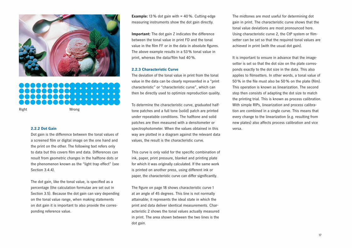
2.2 Tonal Value
The tonal value is the key factor – other than the ink
– affecting the visual appearance of a color nuance. In
reference to a film or digital image file, the tonal value
is the proportion of an area covered by halftone dots.
Brighter colors have smaller tonal values. To reproduce
different color nuances, classical halftone printing
with constant screen ruling (aka screen frequency)
uses halftone dots whose size depends on the tonal
value required.
With frequency-modulated screening, on the other
hand, the halftone dots are of identical size but the
distances between them differ. Tonal values are usu-
ally specified as a percentage.
2.2.1 Changes in Tonal Value
When transferring a halftone dot from film to sub-
strate via the plate and blanket, the geometric half-
tone dot size and thus the tonal value can change as
a result of various factors.
The process-related changes in tonal value (see Sec-
tion 2.2.3) can be compensated for in prepress.
Changes to tonal values caused by printing problems
are unpredictable. Particular attention therefore
needs to be paid to these in the print process. The
most important are:
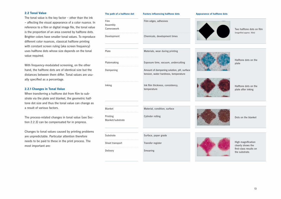
The path of a halftone dot Factors influencing halftone dots Appearance of halftone dots
FilmAssemblyCamerawork
Development
Film edges, adhesives
Chemicals, development times
Plate
Platemaking
Dampening
Inking
Materials, wear during printing
Exposure time, vacuum, undercutting
Amount of dampening solution, pH, surface tension, water hardness, temperature
Ink film thickness, consistency, temperature
Blanket
PrintingBlanket/substrate
Material, condition, surface
Cylinder rolling
Substrate
Sheet transport
Delivery
Surface, paper grade
Transfer register
Smearing
Two halftone dots on film(magnified approx. 150x)
Halftone dots on the plate
Halftone dots on the plate after inking
Dots on the blanket
High magnification clearly shows the first-class results on the substrate.
14
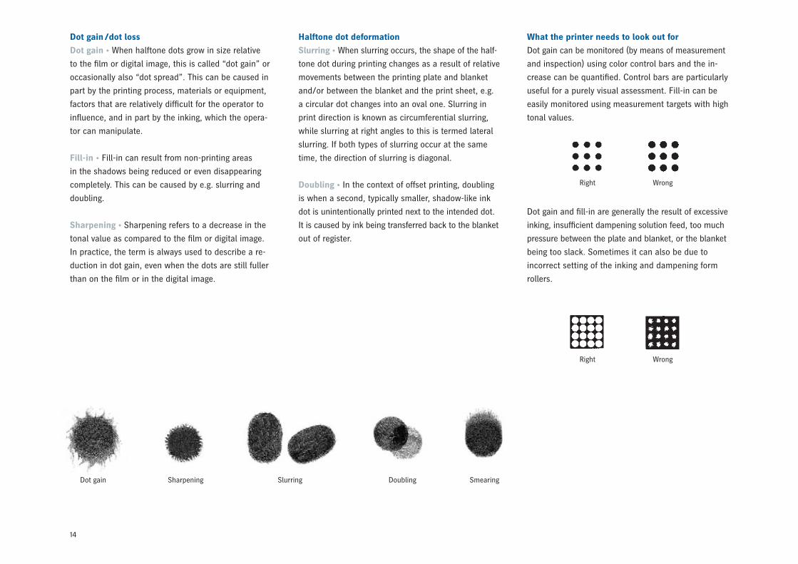
Dot gain /dot loss
Dot gain • When halftone dots grow in size relative
to the film or digital image, this is called “dot gain” or
occasionally also “dot spread”. This can be caused in
part by the printing process, materials or equipment,
factors that are relatively difficult for the operator to
influence, and in part by the inking, which the opera-
tor can manipulate.
Fill-in • Fill-in can result from non-printing areas
in the shadows being reduced or even disappearing
completely. This can be caused by e.g. slurring and
doubling.
Sharpening • Sharpening refers to a decrease in the
tonal value as compared to the film or digital image.
In practice, the term is always used to describe a re-
duction in dot gain, even when the dots are still fuller
than on the film or in the digital image.
Halftone dot deformation
Slurring • When slurring occurs, the shape of the half-
tone dot during printing changes as a result of relative
movements between the printing plate and blanket
and/or between the blanket and the print sheet, e.g.
a circular dot changes into an oval one. Slurring in
print direction is known as circumferential slurring,
while slurring at right angles to this is termed lateral
slurring. If both types of slurring occur at the same
time, the direction of slurring is diagonal.
Doubling • In the context of offset printing, doubling
is when a second, typically smaller, shadow-like ink
dot is unintentionally printed next to the intended dot.
It is caused by ink being transferred back to the blanket
out of register.
Dot gain Sharpening Slurring Doubling Smearing
What the printer needs to look out for
Dot gain can be monitored (by means of measurement
and inspection) using color control bars and the in-
crease can be quantified. Control bars are particularly
useful for a purely visual assessment. Fill-in can be
easily monitored using measurement targets with high
tonal values.
Dot gain and fill-in are generally the result of excessive
inking, insufficient dampening solution feed, too much
pressure between the plate and blanket, or the blanket
being too slack. Sometimes it can also be due to
incorrect setting of the inking and dampening form
rollers.
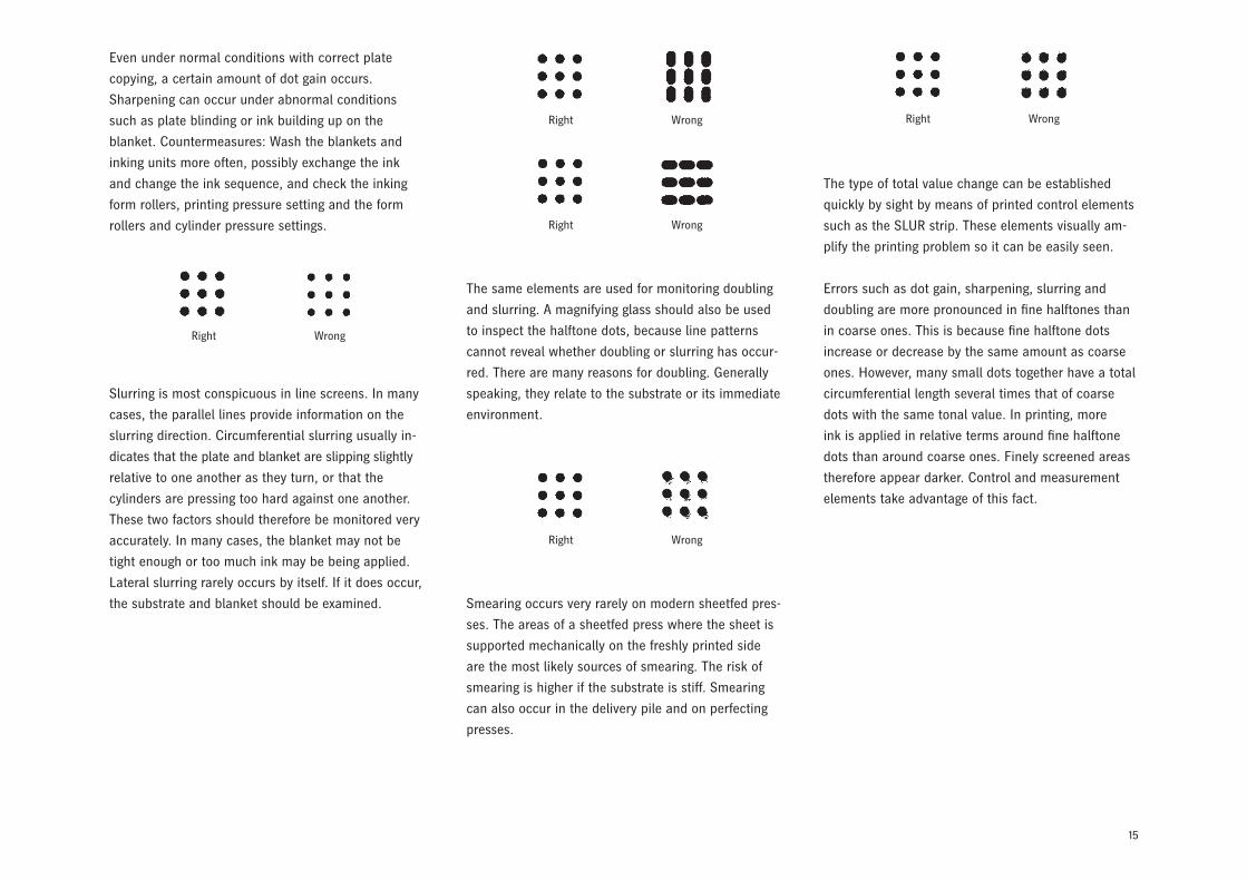
Right
Right
Wrong
Wrong
15
Slurring is most conspicuous in line screens. In many
cases, the parallel lines provide information on the
slurring direction. Circumferential slurring usually in-
dicates that the plate and blanket are slipping slightly
relative to one another as they turn, or that the
cylinders are pressing too hard against one another.
These two factors should therefore be monitored very
accurately. In many cases, the blanket may not be
tight enough or too much ink may be being applied.
Lateral slurring rarely occurs by itself. If it does occur,
the substrate and blanket should be examined.
The same elements are used for monitoring doubling
and slurring. A magnifying glass should also be used
to inspect the halftone dots, because line patterns
cannot reveal whether doubling or slurring has occur-
red. There are many reasons for doubling. Generally
speaking, they relate to the substrate or its immediate
environment.
Smearing occurs very rarely on modern sheetfed pres-
ses. The areas of a sheetfed press where the sheet is
supported mechanically on the freshly printed side
are the most likely sources of smearing. The risk of
smearing is higher if the substrate is stiff. Smearing
can also occur in the delivery pile and on perfecting
presses.
The type of total value change can be established
quickly by sight by means of printed control elements
such as the SLUR strip. These elements visually am-
plify the printing problem so it can be easily seen.
Errors such as dot gain, sharpening, slurring and
doubling are more pronounced in fine halftones than
in coarse ones. This is because fine halftone dots
increase or decrease by the same amount as coarse
ones. However, many small dots together have a total
circumferential length several times that of coarse
dots with the same tonal value. In printing, more
ink is applied in relative terms around fine halftone
dots than around coarse ones. Finely screened areas
therefore appear darker. Control and measurement
elements take advantage of this fact.
Right
Right
Right
Right
Right
Wrong
Wrong
Wrong
Wrong
Wrong
Even under normal conditions with correct plate
copying, a certain amount of dot gain occurs.
Sharpening can occur under abnormal conditions
such as plate blinding or ink building up on the
blanket. Countermeasures: Wash the blankets and
inking units more often, possibly exchange the ink
and change the ink sequence, and check the inking
form rollers, printing pressure setting and the form
rollers and cylinder pressure settings.
16
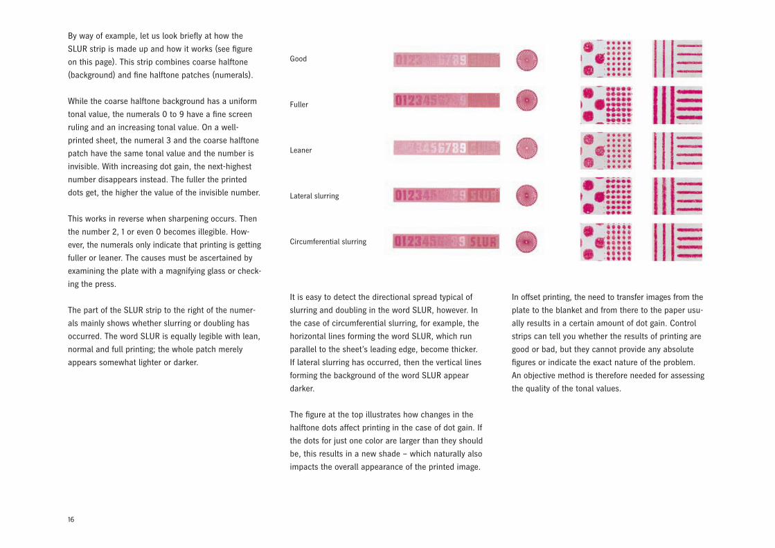
By way of example, let us look briefly at how the
SLUR strip is made up and how it works (see figure
on this page). This strip combines coarse halftone
(background) and fine halftone patches (numerals).
While the coarse halftone background has a uniform
tonal value, the numerals 0 to 9 have a fine screen
ruling and an increasing tonal value. On a well-
printed sheet, the numeral 3 and the coarse halftone
patch have the same tonal value and the number is
invisible. With increasing dot gain, the next-highest
number disappears instead. The fuller the printed
dots get, the higher the value of the invisible number.
This works in reverse when sharpening occurs. Then
the number 2, 1 or even 0 becomes illegible. How-
ever, the numerals only indicate that printing is getting
fuller or leaner. The causes must be ascertained by
examining the plate with a magnifying glass or check-
ing the press.
The part of the SLUR strip to the right of the numer-
als mainly shows whether slurring or doubling has
occurred. The word SLUR is equally legible with lean,
normal and full printing; the whole patch merely
appears somewhat lighter or darker.
Good
Fuller
Leaner
Lateral slurring
Circumferential slurring
It is easy to detect the directional spread typical of
slurring and doubling in the word SLUR, however. In
the case of circumferential slurring, for example, the
horizontal lines forming the word SLUR, which run
parallel to the sheet’s leading edge, become thicker.
If lateral slurring has occurred, then the vertical lines
forming the background of the word SLUR appear
darker.
The figure at the top illustrates how changes in the
halftone dots affect printing in the case of dot gain. If
the dots for just one color are larger than they should
be, this results in a new shade – which naturally also
impacts the overall appearance of the printed image.
In offset printing, the need to transfer images from the
plate to the blanket and from there to the paper usu-
ally results in a certain amount of dot gain. Control
strips can tell you whether the results of printing are
good or bad, but they cannot provide any absolute
figures or indicate the exact nature of the problem.
An objective method is therefore needed for assessing
the quality of the tonal values.
17
Right Wrong
2.2.2 Dot Gain
Dot gain is the difference between the tonal values of
a screened film or digital image on the one hand and
the print on the other. The following text refers only
to data but this covers film and data. Differences can
result from geometric changes in the halftone dots or
the phenomenon known as the “light trap effect” (see
Section 3.4.4).
The dot gain, like the tonal value, is specified as a
percentage (the calculation formulae are set out in
Section 3.5). Because the dot gain can vary depending
on the tonal value range, when making statements
on dot gain it is important to also provide the corres-
ponding reference value.
Example: 13 % dot gain with = 40 %. Cutting-edge
measuring instruments show the dot gain directly.
Important: The dot gain Z indicates the difference
between the tonal value in print FD and the tonal
value in the film FF or in the data in absolute figures.
The above example results in a 53 % tonal value in
print, whereas the data/film had 40 %.
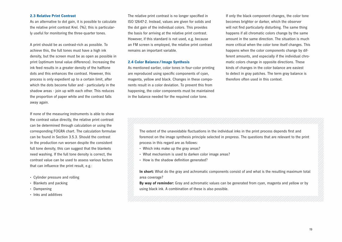
2.2.3 Characteristic Curve
The deviation of the tonal value in print from the tonal
value in the data can be clearly represented in a “print
characteristic” or “characteristic curve”, which can
then be directly used to optimize reproduction quality.
To determine the characteristic curve, graduated half-
tone patches and a full tone (solid) patch are printed
under repeatable conditions. The halftone and solid
patches are then measured with a densitometer or
spectrophotometer. When the values obtained in this
way are plotted in a diagram against the relevant data
values, the result is the characteristic curve.
This curve is only valid for the specific combination of
ink, paper, print pressure, blanket and printing plate
for which it was originally calculated. If the same work
is printed on another press, using different ink or
paper, the characteristic curve can differ significantly.
The figure on page 18 shows characteristic curve 1
at an angle of 45 degrees. This line is not normally
attainable; it represents the ideal state in which the
print and data deliver identical measurements. Char-
acteristic 2 shows the tonal values actually measured
in print. The area shown between the two lines is the
dot gain.
The midtones are most useful for determining dot
gain in print. The characteristic curve shows that the
tonal value deviations are most pronounced here.
Using characteristic curve 2, the CtP system or film-
setter can be set so that the required tonal values are
achieved in print (with the usual dot gain).
It is important to ensure in advance that the image-
setter is set so that the dot size on the plate corres-
ponds exactly to the dot size in the data. This also
applies to filmsetters. In other words, a tonal value of
50 % in the file must also be 50 % on the plate (film).
This operation is known as linearization. The second
step then consists of adapting the dot size to match
the printing trial. This is known as process calibration.
With simple RIPs, linearization and process calibra-
tion are combined in a single curve. This means that
every change to the linearization (e.g. resulting from
new plates) also affects process calibration and vice
versa.
18
50
0
–50
0 15 50 85 100
Nominal % Process % Meas. % Calibr. %
0.0 0.0 0.0 0.0
5.0 6.72 9.83 3.4
10.0 13.37 19.35 6.79
20.0 26.69 34.25 14.74
30.0 40.01 47.44 24.23
40.0 53.0 59.39 34.58
50.0 64.3 71.35 44.03
60.0 74.19 91.31 52.62
70.0 83.4 88.15 62.67
80.0 90.7 93.48 74.51
90.0 95.68 97.05 84.54
95.0 97.9 99.38 89.62
100.0 100.0 100.0 100.0
The Heidelberg Prinect workflow keeps both these
calibrations separate from each other.
If conventional plate copy and CtP are used side by
side, it is only possible to adapt the CtP to the results
of the conventional plate copy. If plate copy is re-
placed by CtP, process calibration must be performed.
Plates that are imaged linearly will always change
the print result. This is because changes to the dots
in the plate copy are no longer an issue (leaner dots
with positive copy, fuller dots for negative copy).
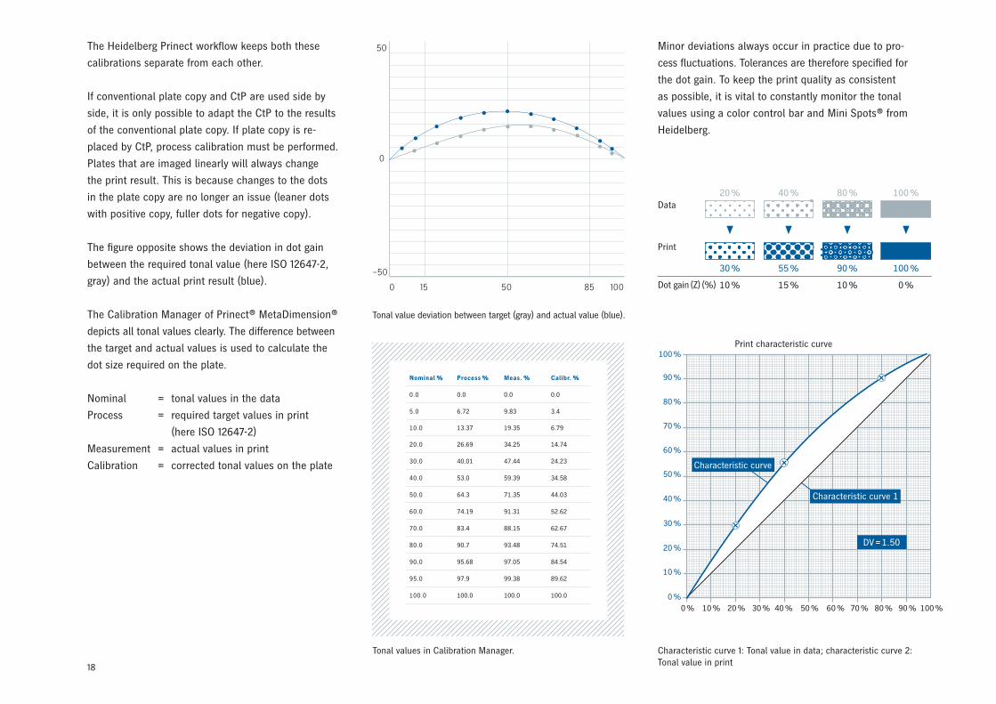
The figure opposite shows the deviation in dot gain
between the required tonal value (here ISO 12647-2,
gray) and the actual print result (blue).
The Calibration Manager of Prinect® MetaDimension®
depicts all tonal values clearly. The difference between
the target and actual values is used to calculate the
dot size required on the plate.
Nominal = tonal values in the data
Process = required target values in print
(here ISO 12647-2)
Measurement = actual values in print
Calibration = corrected tonal values on the plate
Minor deviations always occur in practice due to pro-
cess fluctuations. Tolerances are therefore specified for
the dot gain. To keep the print quality as consistent
as possible, it is vital to constantly monitor the tonal
values using a color control bar and Mini Spots® from
Heidelberg.
100 %
90 %
80 %
70 %
60 %
50 %
40 %
30 %
20 %
10 %
0 %0 % 10 % 20 % 30 % 40 % 50 % 60 % 70 % 80 % 90 % 100 %
Print characteristic curve
Data
20 %
30 %
10 %
40 %
55 %
15 %
80 %
90 %
10 %
100 %
100 %
0 %Dot gain (Z) (%)
Tonal values in Calibration Manager.
Tonal value deviation between target (gray) and actual value (blue).
Characteristic curve 1: Tonal value in data; characteristic curve 2: Tonal value in print
Characteristic curve
Characteristic curve 1
DV = 1.50
19
2.3 Relative Print Contrast
As an alternative to dot gain, it is possible to calculate
the relative print contrast Krel. (%); this is particular-
ly useful for monitoring the three-quarter tones.
A print should be as contrast-rich as possible. To
achieve this, the full tones must have a high ink
density, but the screen must be as open as possible in
print (optimum tonal value difference). Increasing the
ink feed results in a greater density of the halftone
dots and this enhances the contrast. However, this
process is only expedient up to a certain limit, after
which the dots become fuller and - particularly in the
shadow areas - join up with each other. This reduces
the proportion of paper white and the contrast falls
away again.
If none of the measuring instruments is able to show
the contrast value directly, the relative print contrast
can be determined through calculation or using the
corresponding FOGRA chart. The calculation formulae
can be found in Section 3.5.3. Should the contrast
in the production run worsen despite the consistent
full tone density, this can suggest that the blankets
need washing. If the full tone density is correct, the
contrast value can be used to assess various factors
that can influence the print result, e.g.:
• Cylinder pressure and rolling
• Blankets and packing
• Dampening
• Inks and additives
The relative print contrast is no longer specified in
ISO 12647-2. Instead, values are given for solids and
the dot gain of the individual colors. This provides
the basis for arriving at the relative print contrast.
However, if this standard is not used, e.g. because
an FM screen is employed, the relative print contrast
remains an important variable.
2.4 Color Balance / Image Synthesis
As mentioned earlier, color tones in four-color printing
are reproduced using specific components of cyan,
magenta, yellow and black. Changes in these compo-
nents result in a color deviation. To prevent this from
happening, the color components must be maintained
in the balance needed for the required color tone.
The extent of the unavoidable fluctuations in the individual inks in the print process depends first and
foremost on the image synthesis principle selected in prepress. The questions that are relevant to the print
process in this regard are as follows:
• Which inks make up the gray areas?
• What mechanism is used to darken color image areas?
• How is the shadow definition generated?
In short: What do the gray and achromatic components consist of and what is the resulting maximum total
area coverage?
By way of reminder: Gray and achromatic values can be generated from cyan, magenta and yellow or by
using black ink. A combination of these is also possible.
If only the black component changes, the color tone
becomes brighter or darker, which the observer
will not find particularly disturbing. The same thing
happens if all chromatic colors change by the same
amount in the same direction. The situation is much
more critical when the color tone itself changes. This
happens when the color components change by dif-
ferent amounts, and especially if the individual chro-
matic colors change in opposite directions. These
kinds of changes in the color balance are easiest
to detect in gray patches. The term gray balance is
therefore often used in this context.
20
The chromatic synthesis results in a high total area
coverage, which could theoretically amount to 400 %.
Such totals would not allow any sensible color balance
in practice. The neutral gray tones in particular would
tend to result in color casts in various directions. But
there would also be a negative impact on ink trapping,
drying behavior, powder consumption and even the
postpress stage.
2.4.2 Achromatic Synthesis
Unlike chromatic synthesis, achromatic synthesis
essentially involves replacing all achromatic compo-
nents with the color black in multicolor print images.
Neutral tones therefore consist solely of the color
black, while black is also used for shadow definition
and to darken chromatic tones. All color tones consist
of a maximum of two chromatic colors plus black.
This makes the color balance more stable.
In theory, the brown from Section 2.4.1 is made up of
the following when working with achromatic synthe-
sis: 0 % C + 20 % M + 30 % Y + 70 % K. However,
as the figure shows, merely replacing an achromatic
shade produced with CMY by black does not yield an
identical color.
This is primarily due to the shortcomings of actual
printing inks. To obtain truly similar results, it is
necessary to modify the proportions, e.g. to 62 % M,
80 % Y and 67 % K. The achromatic synthesis corres-
ponds to 100 % GCR (Section 2.4.6).
100 %
50 %
0 %C M Y K
100 %
50 %
0 %C M Y K
2.4.1 Chromatic Synthesis
With chromatic synthesis, all achromatic values es-
sentially consist of subsets of the chromatic inks cyan
(C), magenta (M) and yellow (Y), i.e. all gray image
areas, all tertiary tones, and the shadow definition
contain the three chromatic inks. Black (K) is only
used to support the image shadows and to enhance
the shadow definition (skeleton black).
The brown shown in the illustration is formed from
70 % cyan, 80 % magenta, 90 % yellow and 0 %
black using chromatic synthesis. The total area co-
verage is therefore 240 %.
The effect of the color components can be seen
opposite. The brown consists of an achromatic, gray
component and a chromatic component.
According to ISO 12647-2, 70 % cyan, 60 % magenta
and 60 % yellow should produce gray when overprint-
ed. Only the remaining 20 % magenta and 30 % yel-
low form the light brown component. This becomes
dark brown with the addition of the gray component.
+ + + =70 % C 80 % M 90 % Y 0 % K 240 % C
100 %
50 %
0 %C M Y K
21
2.4.3 Achromatic Synthesis with Under Color
Addition (UCA)
Process black by itself does not always provide suf-
ficient definition in the darker portion of the gray axis.
When this is the case, this range and, to a lesser ex-
tent, the neighboring chromatic tones can be enhan-
ced by adding an achromatic component of CMY. UCA
depends in particular on the combination of substrate
and ink. The illustration opposite illustrates UCA to
neutrally enhance the image shadows.
2.4.5 Chromatic Synthesis with Gray Stabilization
Gray tones generated with chromatic synthesis are
difficult to keep balanced in the print process. Color
casts readily occur, but can be counteracted by
means of gray stabilization. Achromatic components
generated with C + M + Y are partially or entirely
replaced along the entire gray axis and to a lesser
extent in the neighboring color ranges – i.e., not just
at the darker end of the gray axis like with UCR – by
an equivalent amount of black. This is known as “long
black” in practice.
2.4.6 Chromatic Synthesis with Gray Component
Replacement (GCR)
Gray Component Replacement involves using achro-
matic process black to replace CMY components
neutralizing to gray in both chromatic and neutral
image areas. GCR can be used for all intermediate
stages between chromatic and achromatic synthesis
in all image areas – and is not, like UCR, UCA and
gray stabilization, limited to the gray areas. Gray
Component Replacement is sometimes also referred
to as complementary color reduction.
The brown from Sections 2.4.1 and 2.4.3, for example,
could theoretically be built up as follows using GCR:
As with achromatic synthesis (Section 2.4.2), the colors
obtained with the two methods are not identical if
black is merely substituted for part of the achromatic
CMY without adjusting the chromatic component as
well. Similar colors are achieved with, for example,
49 % C + 70 % M + 80 % Y + 30 % K.
This has a positive effect on ink trapping, drying and
color balance.
2.4.4 Chromatic Synthesis with Under Color
Removal (UCR)
The highest area coverages result from using chromatic
synthesis for the neutral three-quarter tones all the
way to black. This drawback is offset by Under Color
Removal. The achromatic component made up of CMY
is reduced in the neutral shadows and in the neigh-
boring chromatic tones, while the amount of process
black is increased. In the example opposite, the initial
area coverage consisting of 98 % cyan + 86 % magenta
+ 87 % yellow + 84 % black = 355 % is reduced by
78 % to 68 % cyan + 56 % magenta + 57 % yellow +
96 % black = 277 % by UCR.
100 %
50 %
0 %C M Y K
+ + + =0 % C 20 % M 30 % Y 70 % K 120 %
100 %
50 %
0 %C M Y K
22
2.4.7 Five-, Six- and Seven-Color Printing
The modern four-color process ensures high-quality
image reproduction. However, with some originals
and when extremely high quality is needed, it can be
necessary to use special color separations. The repro-
ducible range of colors can be extended by using ad-
ditional colors (in addition to the four primary colors)
or special process colors. The values measured for a
seven-color print are plotted in the CIE chromaticity
diagram in the figure above.
The hexagon on the inside shows the color gamut re-
producible with the process colors cyan, magenta and
yellow (as measured). The surrounding dodecagon
shows the extended color gamut obtained using the
additional colors green (G), red (R) and blue (B).
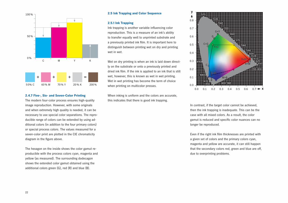
2.5 Ink Trapping and Color Sequence
2.5.1 Ink Trapping
Ink trapping is another variable influencing color
reproduction. This is a measure of an ink’s ability
to transfer equally well to unprinted substrate and
a previously printed ink film. It is important here to
distinguish between printing wet on dry and printing
wet in wet.
Wet on dry printing is when an ink is laid down direct-
ly on the substrate or onto a previously printed and
dried ink film. If the ink is applied to an ink that is still
wet, however, this is known as wet in wet printing.
Wet in wet printing has become the term of choice
when printing on multicolor presses.
When inking is uniform and the colors are accurate,
this indicates that there is good ink trapping.
0.8
0.7
490
0.6
0.5
700-800
0.4
0.3
0.2
0.1
0.0
0.0 0.1 0.2 0.3 0.4 0.5 0.6 0.7
y
x
520
530
540
550
560
570
580
590600
610620
650
400-380450470
480
G+Y
G
C+G
C
BM+B
R+MR
Y+R
In contrast, if the target color cannot be achieved,
then the ink trapping is inadequate. This can be the
case with all mixed colors. As a result, the color
gamut is reduced and specific color nuances can no
longer be reproduced.
Even if the right ink film thicknesses are printed with
a given set of colors and the primary colors cyan,
magenta and yellow are accurate, it can still happen
that the secondary colors red, green and blue are off,
due to overprinting problems.
+ + + =5 0% C 60 % M 70 % Y 20 % K 200 %
100 %
50 %
0 %C M Y K
23
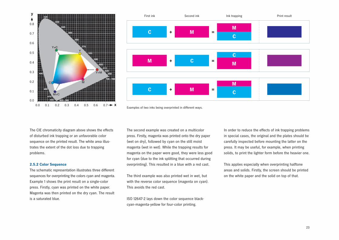
The CIE chromaticity diagram above shows the effects
of disturbed ink trapping or an unfavorable color
sequence on the printed result. The white area illus-
trates the extent of the dot loss due to trapping
problems.
2.5.2 Color Sequence
The schematic representation illustrates three different
sequences for overprinting the colors cyan and magenta.
Example 1 shows the print result on a single-color
press. Firstly, cyan was printed on the white paper.
Magenta was then printed on the dry cyan. The result
is a saturated blue.
The second example was created on a multicolor
press. Firstly, magenta was printed onto the dry paper
(wet on dry), followed by cyan on the still moist
magenta (wet in wet). While the trapping results for
magenta on the paper were good, they were less good
for cyan (due to the ink splitting that occurred during
overprinting). This resulted in a blue with a red cast.
The third example was also printed wet in wet, but
with the reverse color sequence (magenta on cyan).
This avoids the red cast.
ISO 12647-2 lays down the color sequence black-
cyan-magenta-yellow for four-color printing.
In order to reduce the effects of ink trapping problems
in special cases, the original and the plates should be
carefully inspected before mounting the latter on the
press. It may be useful, for example, when printing
solids, to print the lighter form before the heavier one.
This applies especially when overprinting halftone
areas and solids. Firstly, the screen should be printed
on the white paper and the solid on top of that.
First ink Second ink Ink trapping Print result
C MM
C+ =
CMC
M+ =
C MM
C+ =
Examples of two inks being overprinted in different ways.
0.8
0.7
0.6
0.5
0.4
0.3
0.2
0.1
0.0
0.0 0.1 0.2 0.3 0.4 0.5 0.6 0.7
y
x
24
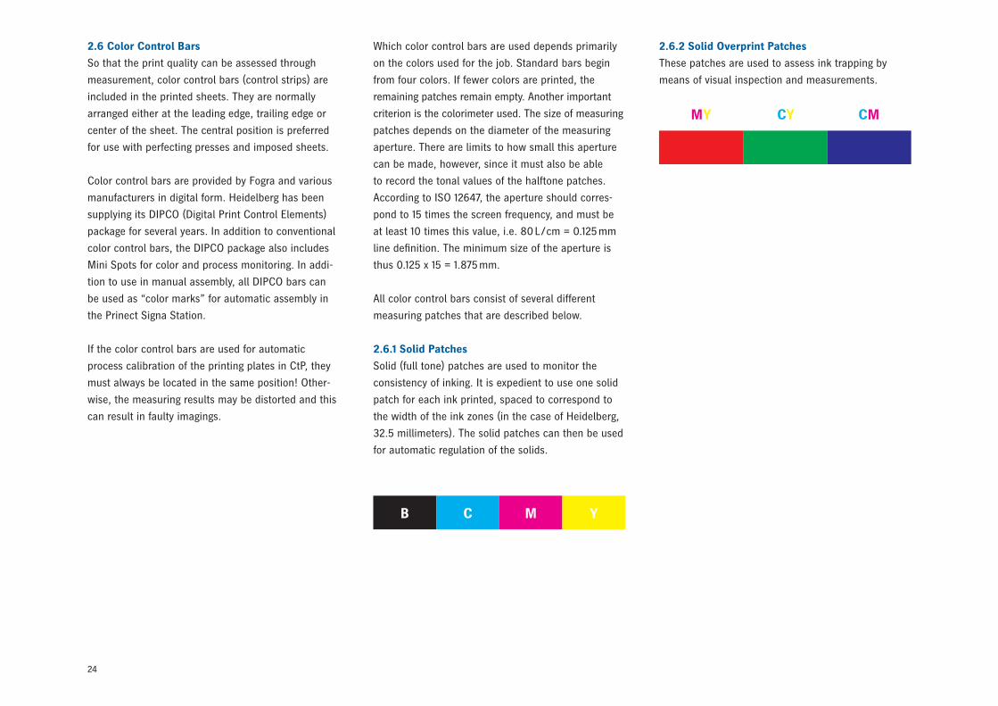
2.6 Color Control Bars
So that the print quality can be assessed through
measurement, color control bars (control strips) are
included in the printed sheets. They are normally
arranged either at the leading edge, trailing edge or
center of the sheet. The central position is preferred
for use with perfecting presses and imposed sheets.
Color control bars are provided by Fogra and various
manufacturers in digital form. Heidelberg has been
supplying its DIPCO (Digital Print Control Elements)
package for several years. In addition to conventional
color control bars, the DIPCO package also includes
Mini Spots for color and process monitoring. In addi-
tion to use in manual assembly, all DIPCO bars can
be used as “color marks” for automatic assembly in
the Prinect Signa Station.
If the color control bars are used for automatic
process calibration of the printing plates in CtP, they
must always be located in the same position! Other-
wise, the measuring results may be distorted and this
can result in faulty imagings.
Which color control bars are used depends primarily
on the colors used for the job. Standard bars begin
from four colors. If fewer colors are printed, the
remaining patches remain empty. Another important
criterion is the colorimeter used. The size of measuring
patches depends on the diameter of the measuring
aperture. There are limits to how small this aperture
can be made, however, since it must also be able
to record the tonal values of the halftone patches.
According to ISO 12647, the aperture should corres-
pond to 15 times the screen frequency, and must be
at least 10 times this value, i.e. 80 L / cm = 0.125 mm
line definition. The minimum size of the aperture is
thus 0.125 x 15 = 1.875 mm.
All color control bars consist of several different
measuring patches that are described below.
2.6.1 Solid Patches
Solid (full tone) patches are used to monitor the
consistency of inking. It is expedient to use one solid
patch for each ink printed, spaced to correspond to
the width of the ink zones (in the case of Heidelberg,
32.5 millimeters). The solid patches can then be used
for automatic regulation of the solids.
2.6.2 Solid Overprint Patches
These patches are used to assess ink trapping by
means of visual inspection and measurements.
B C M Y
MY CY CM
25
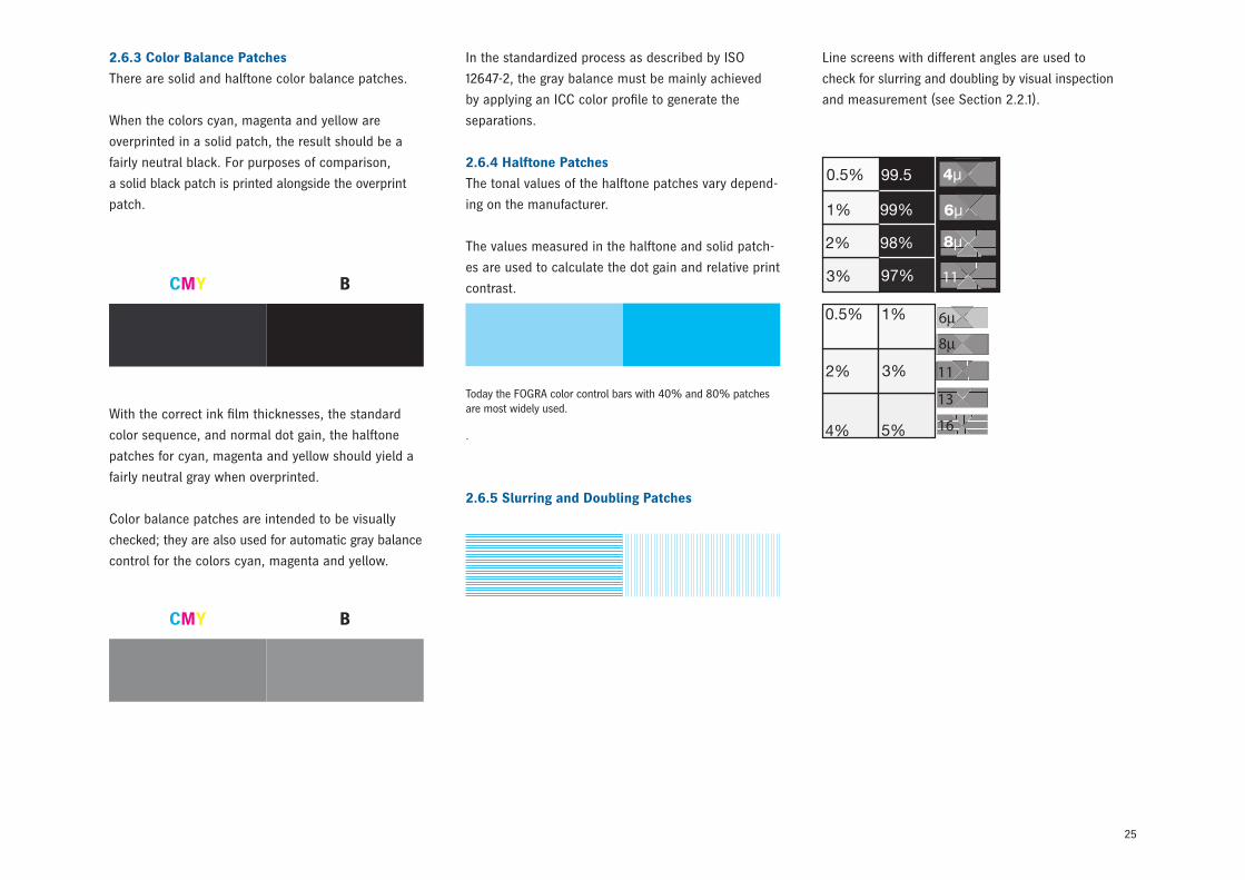
In the standardized process as described by ISO
12647-2, the gray balance must be mainly achieved
by applying an ICC color profile to generate the
separations.
2.6.4 Halftone Patches
The tonal values of the halftone patches vary depend-
ing on the manufacturer.
The values measured in the halftone and solid patch-
es are used to calculate the dot gain and relative print
contrast.
2.6.5 Slurring and Doubling Patches
Line screens with different angles are used to
check for slurring and doubling by visual inspection
and measurement (see Section 2.2.1).
Today the FOGRA color control bars with 40% and 80% patches are most widely used.
.
2.6.3 Color Balance Patches
There are solid and halftone color balance patches.
When the colors cyan, magenta and yellow are
overprinted in a solid patch, the result should be a
fairly neutral black. For purposes of comparison,
a solid black patch is printed alongside the overprint
patch.
With the correct ink film thicknesses, the standard
color sequence, and normal dot gain, the halftone
patches for cyan, magenta and yellow should yield a
fairly neutral gray when overprinted.
Color balance patches are intended to be visually
checked; they are also used for automatic gray balance
control for the colors cyan, magenta and yellow.
CMY B
CMY B
26
3.1 Measuring Principle of the Reflective Light
Densitometer
Reflective light densitometry uses a light source to
illuminate the ink being measured. The light beam
penetrates the translucent ink film and is attenuated
in the process. The rest of the light is scattered by
the paper substrate. Part of this scattered light travels
through the ink film again and is further attenuated.
The remainder of the light reaches the measuring
instrument, which then converts the light into electri-
cal energy. The result of reflective light densitometry is
specified in density units.
Lens systems are used in the measurement process
for bundling the light. Polarizing filters suppress
the wet gloss (see Section 3.2.2); color filters are
connected upstream when measuring chromatic
colors (see Section 3.2.1).
3 Densitometry
Densitometry is an effective method for monitoring
solid density and tonal values in the print process.
It works reliably with black-and-white reproductions
and with the process colors cyan, magenta, yellow
and black.
There are two types of densitometer depending on the
particular application:
• Transmitted light densitometers are used to measure
film blackening (i.e., with transparent materials).
• Reflective light densitometers are used to measure
light reflected from the surface of a print (i.e., with
reflective originals).
The following section looks at the technology behind
reflective light densitometry.
Transmission densitometer
Reflection densitometer
27
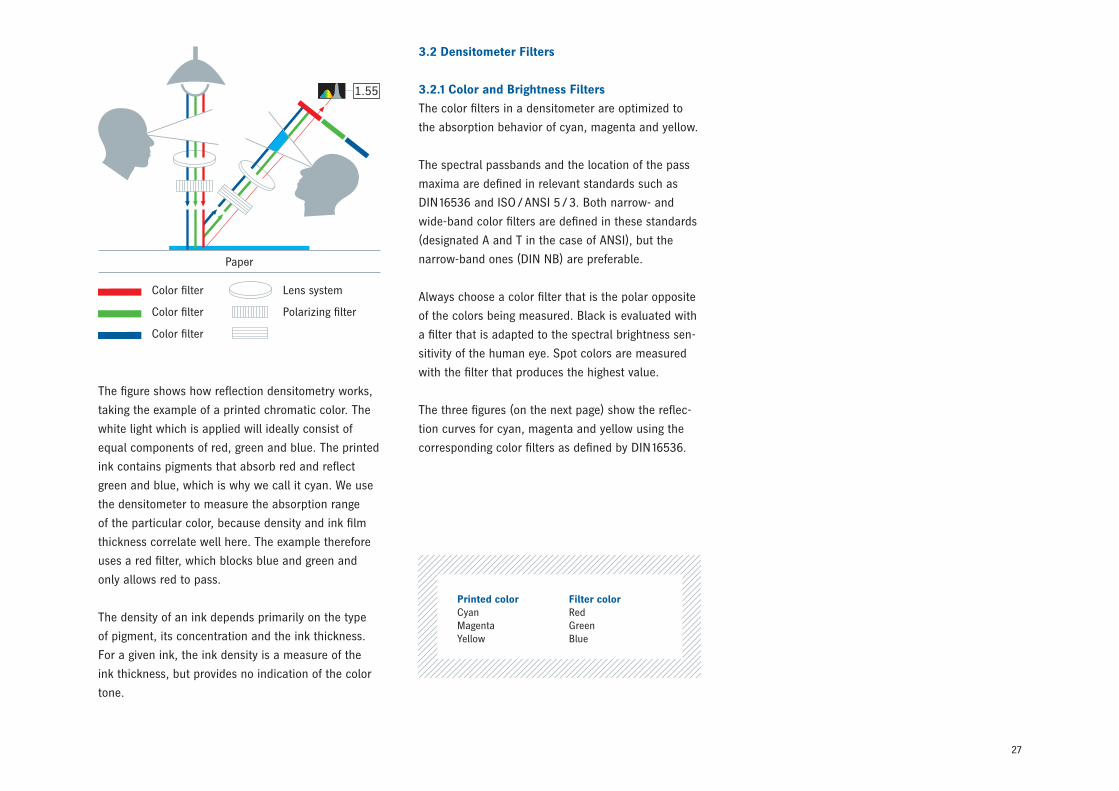
The figure shows how reflection densitometry works,
taking the example of a printed chromatic color. The
white light which is applied will ideally consist of
equal components of red, green and blue. The printed
ink contains pigments that absorb red and reflect
green and blue, which is why we call it cyan. We use
the densitometer to measure the absorption range
of the particular color, because density and ink film
thickness correlate well here. The example therefore
uses a red filter, which blocks blue and green and
only allows red to pass.
The density of an ink depends primarily on the type
of pigment, its concentration and the ink thickness.
For a given ink, the ink density is a measure of the
ink thickness, but provides no indication of the color
tone.
3.2 Densitometer Filters
3.2.1 Color and Brightness Filters
The color filters in a densitometer are optimized to
the absorption behavior of cyan, magenta and yellow.
The spectral passbands and the location of the pass
maxima are defined in relevant standards such as
DIN 16536 and ISO / ANSI 5 / 3. Both narrow- and
wide-band color filters are defined in these standards
(designated A and T in the case of ANSI), but the
narrow-band ones (DIN NB) are preferable.
Always choose a color filter that is the polar opposite
of the colors being measured. Black is evaluated with
a filter that is adapted to the spectral brightness sen-
sitivity of the human eye. Spot colors are measured
with the filter that produces the highest value.
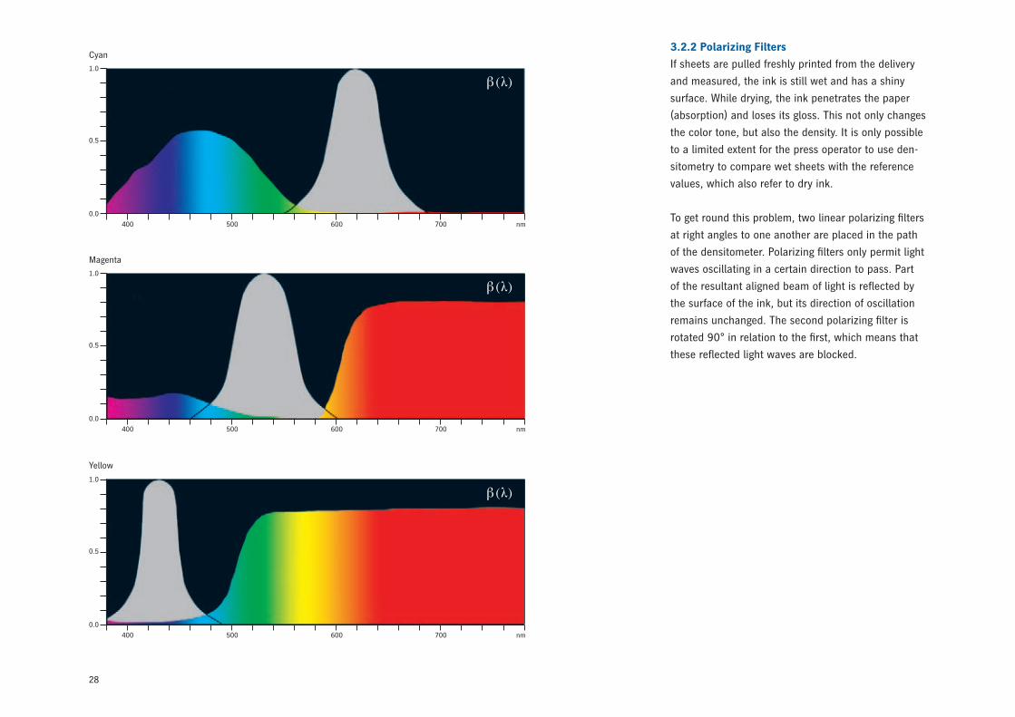
The three figures (on the next page) show the reflec-
tion curves for cyan, magenta and yellow using the
corresponding color filters as defined by DIN 16536.
Paper
Lens system
Polarizing filter
Color filter
Color filter
Color filter
Printed colorCyanMagentaYellow
Filter colorRedGreenBlue
1.55
28
3.2.2 Polarizing Filters
If sheets are pulled freshly printed from the delivery
and measured, the ink is still wet and has a shiny
surface. While drying, the ink penetrates the paper
(absorption) and loses its gloss. This not only changes
the color tone, but also the density. It is only possible
to a limited extent for the press operator to use den-
sitometry to compare wet sheets with the reference
values, which also refer to dry ink.
To get round this problem, two linear polarizing filters
at right angles to one another are placed in the path
of the densitometer. Polarizing filters only permit light
waves oscillating in a certain direction to pass. Part
of the resultant aligned beam of light is reflected by
the surface of the ink, but its direction of oscillation
remains unchanged. The second polarizing filter is
rotated 90° in relation to the first, which means that
these reflected light waves are blocked.
1.0
0.5
0.0
400 500 600 700 nm
β(λ)
Cyan
1.0
0.5
0.0
400 500 600 700 nm
β(λ)
Magenta
1.0
0.5
0.0
400 500 600 700 nm
β(λ)
Yellow
29
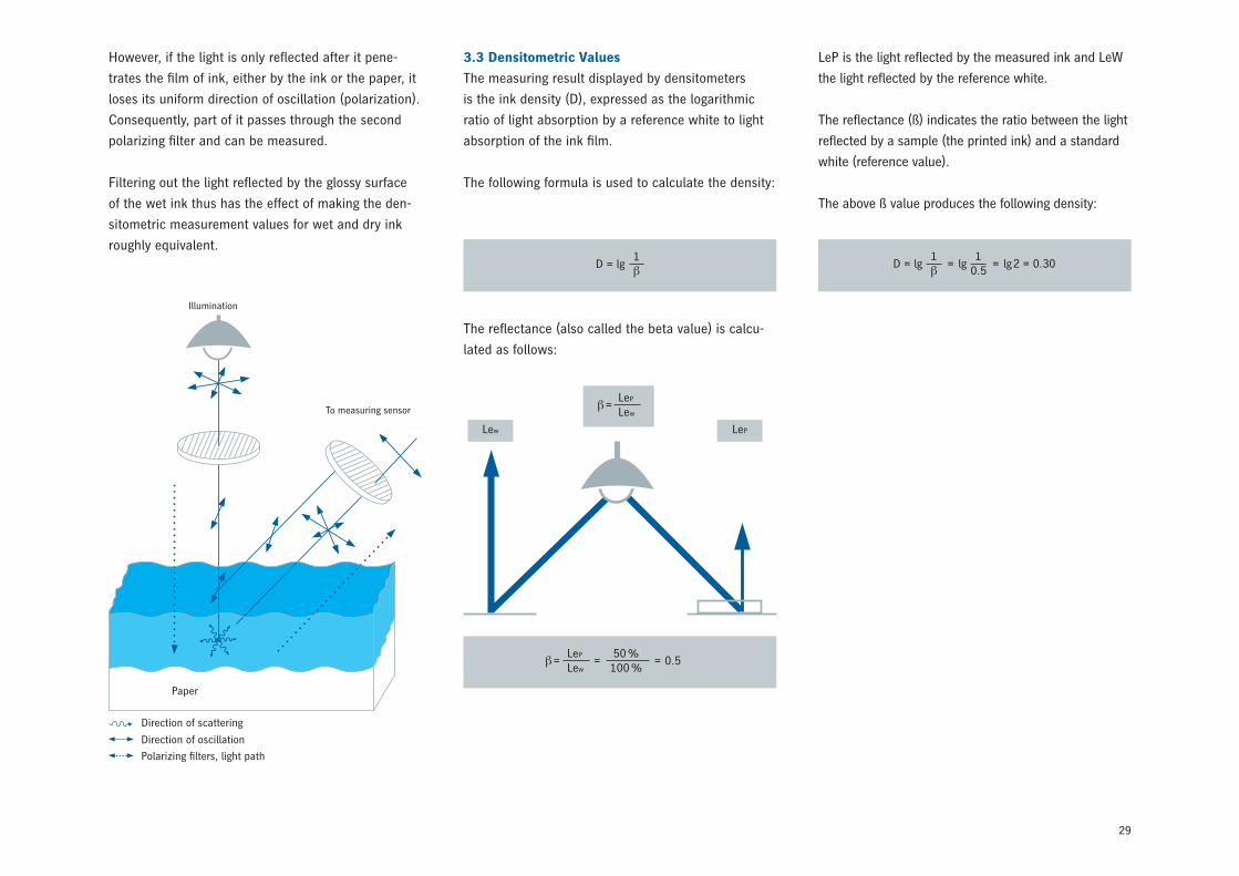
LeP is the light reflected by the measured ink and LeW
the light reflected by the reference white.
The reflectance (ß) indicates the ratio between the light
reflected by a sample (the printed ink) and a standard
white (reference value).
The above ß value produces the following density:
The reflectance (also called the beta value) is calcu-
lated as follows:
D =1βlg D =
1βlg = =
10.5
lg lg 2 = 0.30
However, if the light is only reflected after it pene-
trates the film of ink, either by the ink or the paper, it
loses its uniform direction of oscillation (polarization).
Consequently, part of it passes through the second
polarizing filter and can be measured.
Filtering out the light reflected by the glossy surface
of the wet ink thus has the effect of making the den-
sitometric measurement values for wet and dry ink
roughly equivalent.
3.3 Densitometric Values
The measuring result displayed by densitometers
is the ink density (D), expressed as the logarithmic
ratio of light absorption by a reference white to light
absorption of the ink film.
The following formula is used to calculate the density:
Direction of scattering
Direction of oscillation
Polarizing filters, light path
Illumination
To measuring sensor
Paper
β=LeP
Lew=
50 %100 %
= 0.5
Lew
β=LeP
Lew
LeP
30
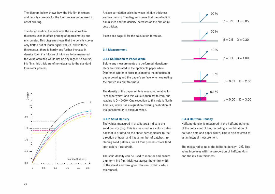
The diagram below shows how the ink film thickness
and density correlate for the four process colors used in
offset printing.
The dotted vertical line indicates the usual ink film
thickness used in offset printing of approximately one
micrometer. This diagram shows that the density curves
only flatten out at much higher values. Above these
thicknesses, there is hardly any further increase in
density. Even if a full can of ink were to be measured,
the value obtained would not be any higher. Of course,
ink films this thick are of no relevance to the standard
four-color process.
0.0
0 0.5 1.0 1.5 2.0 μm
0.5
1.0
1.5
2.0
Ink film thickness
Den
sity
B
CMY
A close correlation exists between ink film thickness
and ink density. The diagram shows that the reflection
diminishes and the density increases as the film of ink
gets thicker.
Please see page 31 for the calculation formulas.
3.4 Measurement
3.4.1 Calibration to Paper White
Before any measurements are performed, densitom-
eters are calibrated to the applicable paper white
(reference white) in order to eliminate the influence of
paper coloring and the paper‘s surface when evaluating
the printed ink film thickness.
The density of the paper white is measured relative to
“absolute white” and this value is then set to zero (the
reading is D = 0.00). One exception to this rule is North
America, which has a regulation covering calibration of
the densitometer to absolute white.
3.4.2 Solid Density
The values measured in a solid area indicate the
solid density (DV). This is measured in a color control
bar that is printed on the sheet perpendicular to the
direction of travel and has a number of patches, in-
cluding solid patches, for all four process colors (and
spot colors if required).
The solid density can be used to monitor and ensure
a uniform ink film thickness across the entire width
of the sheet and throughout the run (within certain
tolerances).
3.4.3 Halftone Density
Halftone density is measured in the halftone patches
of the color control bar, recording a combination of
halftone dots and paper white. This is also referred to
as an integral measurement.
The measured value is the halftone density (DR). This
value increases with the proportion of halftone dots
and the ink film thickness.
31
3.4.4 Optically Effective Area Coverage
(Tonal Value)
When using densitometry to measure halftone images,
it is not the geometric area coverage (the percentage
of the patch’s surface covered by halftone dots) that
is measured, but rather the “optically effective area
coverage”.
The difference between geometrical and optically
effective area coverage is that, regardless of whether
they are assessed by a visual check or measured with
a densitometer, part of the light shining on the sheet
penetrates the paper in the blank areas between the
halftone dots, and part of what is reflected strikes the
back of the dots and is absorbed by them.
This effect is known as “light trapping”. It makes the
halftone dots appear larger than they actually are. The
optically effective area coverage thus consists of the
geometrical area coverage plus the optical magnifica-
tion effect. Paper
32
3.5.4 Ink Trapping
Ink trapping is calculated from the densities mea-
sured in single-color solid and two- and three-color
overprint patches, taking into account the color
sequence.
The ink trapping calculated using the following
formulas indicates what percentage of a color is
overprinted on another. It is compared with the
color applied first, the trapping of which is assumed
to be 100 %.
3.5.4.1 Overprinting Two Colors
With this type of printing
D1 + 2 is the density of the two overprinted colors
D1 is the density of the first-down color and
D2 is the density of the second-down color.
N.B.: All density values must be measured using the
color filter that is diametrically opposite the second
color.
3.5.4.2 Overprinting Three Colors
With this type of printing
D1 + 2 + 3 is the density of all three overprinted colors
and
D3 is the density of the last-down color.
N.B.: All density values must be measured using the
color filter that is diametrically opposite the last-down
color.
The formulas given here are also used by all Heidelberg
color measuring and control systems. Other methods
also exist for determining ink trapping. All of the
methods are controversial and, consequently, the
results produced should not be taken too seriously.
They are, however, useful for comparing press runs
(and in particular for comparing sheets pulled from
the same run). The higher the FA value, the better the
ink trapping.
3.5 Evaluation
The values measured for the solids and halftones
can be used to calculate tonal value, dot gain
and contrast – provided the densitometer has first
been calibrated to paper white.
3.5.1 Tonal Value
The printed tonal value (FD) can be determined
from the measured solid and halftone densities
(DV and DR) as follows using the Murray-Davies
equation:
3.5.2 Dot Gain
The dot gain (Z) is the difference between the mea-
sured printed tonal value (FD) and the known tonal
value in the film (FF) or data.
3.5.3 Relative Print Contrast
The relative print contrast is also calculated from
the measured solid density (DV) and the halftone
density (DR). The DR value is best measured in the
three-quarter tones.
FD (%) =1–10–DR
1–10–DV · 100
F3 (%) =21
D1+2+3 –D1+2
D3· 100
F2 (%) =1
D1+2 –D1
D2· 100
Z (%) = FD– FF
Krel. (%) =DV – DR
DV· 100
33
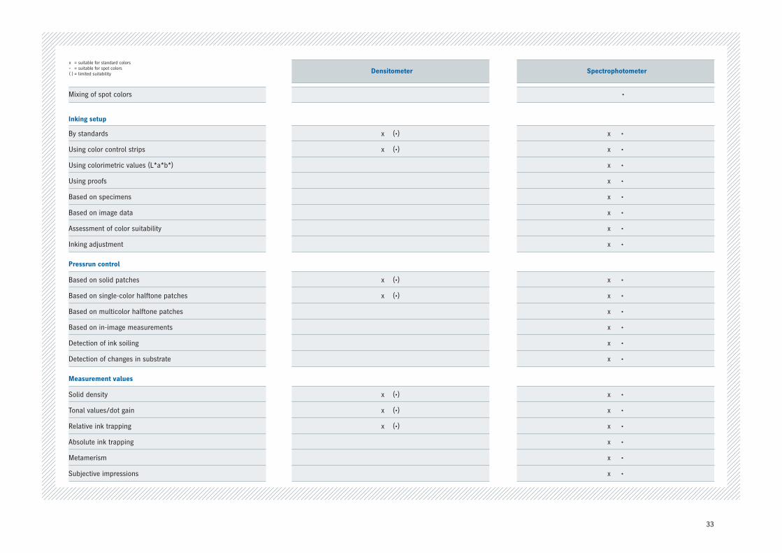
Densitometer Spectrophotometer
Mixing of spot colors •
Inking setup
By standards x(•) x•
Using color control strips x(•) x•
Using colorimetric values (L*a*b*) x•
Using proofs x•
Based on specimens x•
Based on image data x•
Assessment of color suitability x•
Inking adjustment x•
Pressrun control
Based on solid patches x(•) x•
Based on single-color halftone patches x(•) x•
Based on multicolor halftone patches x•
Based on in-image measurements x•
Detection of ink soiling x•
Detection of changes in substrate x•
Measurement values
Solid density x(•) x•
Tonal values/dot gain x(•) x•
Relative ink trapping x(•) x•
Absolute ink trapping x•
Metamerism x•
Subjective impressions x•
x = suitable for standard colors• =suitableforspotcolors( ) = limited suitability
34
3.6 Limits of Densitometry
Densitometers work in a similar way to the method
used to create color separations, with filters geared
specifically to the four process colors. They provide a
relative measure of the ink film thickness, but do not
reveal anything that directly correlates with human
color perception.
Consequently, they are of limited use. The table on
page 33 shows their typical applications as compared
to spectrophotometers.
One major constraint on densitometry is that the
same ink densities do not necessarily create the same
visual impression. This is always the case when the
colorants being compared differ, which is why proofs,
test prints on different paper and /or with different
ink than will be used in the production run, or other
samples cannot serve as reliable references for setting
the inking.
Being restricted to the three color filters – red, green
and blue – is also significant. As soon as color sets
comprising more than the four process colors come
into play, problems arise when measuring the addition-
al colors. No filters that work in the absorption range
of such colors are defined for them, resulting in ink
density and dot gain values that provide insufficient
information.
The use of densitometers also proves problematic for
regulating inking based on multicolor halftone patches
(e.g. gray patches). Measuring a gray patch with all
three color filters produces different ink densities than
when measuring each color in isolation.
Each of the three colors makes a more or less sub-
stantial contribution to all ink densities.
This is because the process colors are not genuinely
pure primary colors with each representing two-
thirds of the spectrum and therefore also absorb light
in other wavelengths. Densitometers are useful for
monitoring quality in press runs using the four-color
process, but they are only of limited use in all other
applications.
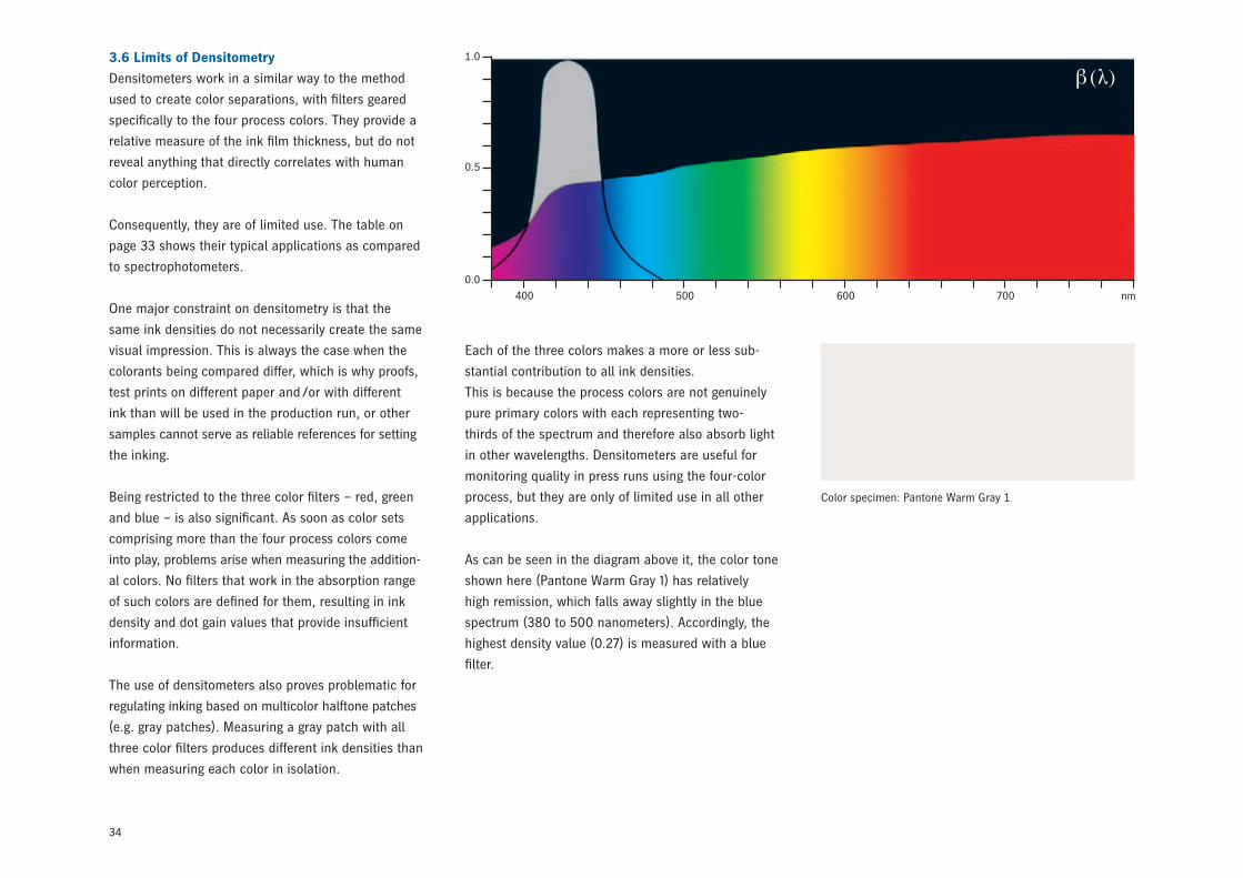
As can be seen in the diagram above it, the color tone
shown here (Pantone Warm Gray 1) has relatively
high remission, which falls away slightly in the blue
spectrum (380 to 500 nanometers). Accordingly, the
highest density value (0.27) is measured with a blue
filter.
1.0
0.5
0.0
400 500 600 700 nm
β(λ)
Color specimen: Pantone Warm Gray 1
35
The spot colors HKS 8 and HKS 65 in the second and
third examples have radically different tones. This is
also evident in their remission curves. However, both
colors have the greatest absorption in the blue spectrum
(380 to 500 nanometers), which means that once
again the highest density value (1.60 in each case) is
measured with the blue filter. This demonstrates the
fact that density values measured with the same color
filter in no way yield the same color tones.
Density (blue filter) = 1.60
L* = 62.0
a* = 61.4
b* = 72.4
Density (blue filter) = 1.60
L* = 58.7
a* = -58.8
b* = 59.7
1.0
0.5
0.0
400 500 600 700 nm
β(λ)
Color specimen HKS 8
Color specimen HKS 65
1.0
0.5
0.0
400 500 600 700 nm
β(λ)
Only colorimetric measurements can tell us something
about a color’s appearance.
36
4 Colorimetry
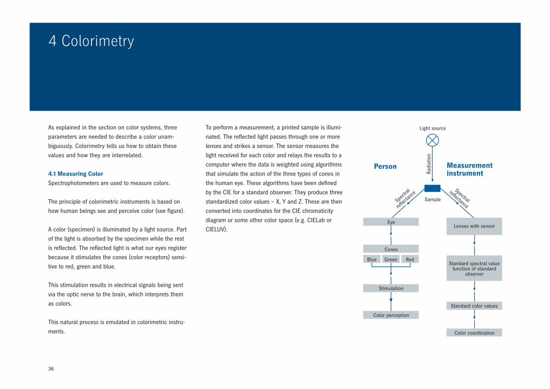
To perform a measurement, a printed sample is illumi-
nated. The reflected light passes through one or more
lenses and strikes a sensor. The sensor measures the
light received for each color and relays the results to a
computer where the data is weighted using algorithms
that simulate the action of the three types of cones in
the human eye. These algorithms have been defined
by the CIE for a standard observer. They produce three
standardized color values – X, Y and Z. These are then
converted into coordinates for the CIE chromaticity
diagram or some other color space (e.g. CIELab or
CIELUV).
As explained in the section on color systems, three
parameters are needed to describe a color unam-
biguously. Colorimetry tells us how to obtain these
values and how they are interrelated.
4.1 Measuring Color
Spectrophotometers are used to measure colors.
The principle of colorimetric instruments is based on
how human beings see and perceive color (see figure).
A color (specimen) is illuminated by a light source. Part
of the light is absorbed by the specimen while the rest
is reflected. The reflected light is what our eyes register
because it stimulates the cones (color receptors) sensi-
tive to red, green and blue.
This stimulation results in electrical signals being sent
via the optic nerve to the brain, which interprets them
as colors.
This natural process is emulated in colorimetric instru-
ments.
Light source
Sample
Eye
Cones
Blue Green Red
Stimulation
Color perception
Lenses with sensor
Standard spectral value function of standard
observer
Standard color values
Color coordination
Spec
tral
reflec
tance
Spectral
reflectance
Person Measurement instrumentRa
diat
ion
37
3.0
2.5
2.0
1.5
1.0
0.5
0.0400 500 600 700 nm
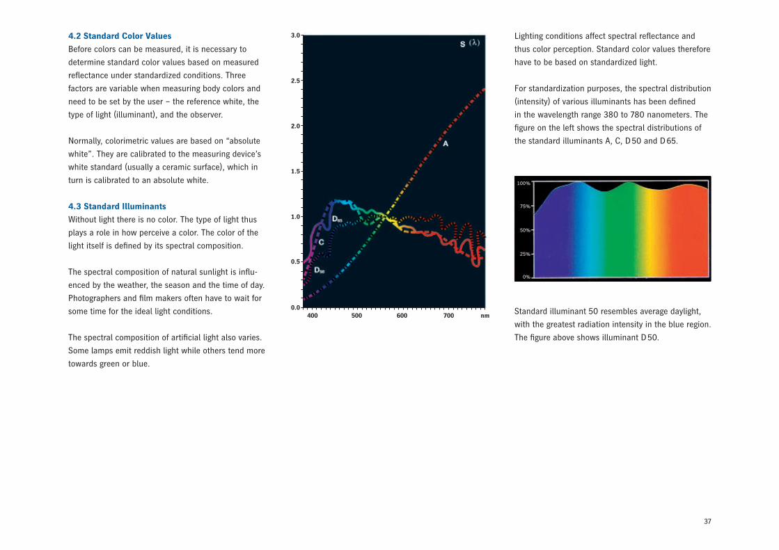
Lighting conditions affect spectral reflectance and
thus color perception. Standard color values therefore
have to be based on standardized light.
For standardization purposes, the spectral distribution
(intensity) of various illuminants has been defined
in the wavelength range 380 to 780 nanometers. The
figure on the left shows the spectral distributions of
the standard illuminants A, C, D 50 and D 65.
Standard illuminant 50 resembles average daylight,
with the greatest radiation intensity in the blue region.
The figure above shows illuminant D 50.
4.2 Standard Color Values
Before colors can be measured, it is necessary to
determine standard color values based on measured
reflectance under standardized conditions. Three
factors are variable when measuring body colors and
need to be set by the user – the reference white, the
type of light (illuminant), and the observer.
Normally, colorimetric values are based on “absolute
white”. They are calibrated to the measuring device’s
white standard (usually a ceramic surface), which in
turn is calibrated to an absolute white.
4.3 Standard Illuminants
Without light there is no color. The type of light thus
plays a role in how perceive a color. The color of the
light itself is defined by its spectral composition.
The spectral composition of natural sunlight is influ-
enced by the weather, the season and the time of day.
Photographers and film makers often have to wait for
some time for the ideal light conditions.
The spectral composition of artificial light also varies.
Some lamps emit reddish light while others tend more
towards green or blue.
100%
75%
50%
25%
0%
38
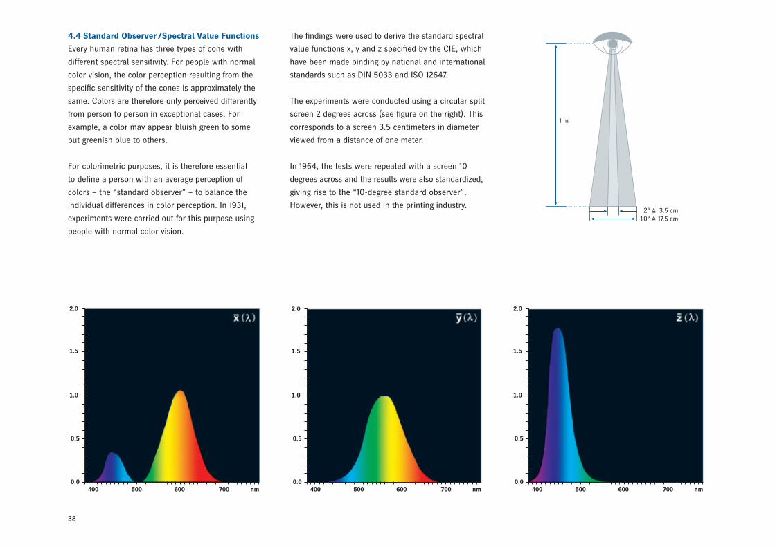
4.4 Standard Observer /Spectral Value Functions
Every human retina has three types of cone with
different spectral sensitivity. For people with normal
color vision, the color perception resulting from the
specific sensitivity of the cones is approximately the
same. Colors are therefore only perceived differently
from person to person in exceptional cases. For
example, a color may appear bluish green to some
but greenish blue to others.
For colorimetric purposes, it is therefore essential
to define a person with an average perception of
colors – the “standard observer” – to balance the
individual differences in color perception. In 1931,
experiments were carried out for this purpose using
people with normal color vision.
2° 3.5 cm 10° 17.5 cm
1 m
2.0
1.5
1.0
0.5
0.0400 500 600 700 nm
2.0
1.5
1.0
0.5
0.0400 500 600 700 nm
2.0
1.5
1.0
0.5
0.0400 500 600 700 nm
The findings were used to derive the standard spectral
value functions x, y and z specified by the CIE, which
have been made binding by national and international
standards such as DIN 5033 and ISO 12647.
The experiments were conducted using a circular split
screen 2 degrees across (see figure on the right). This
corresponds to a screen 3.5 centimeters in diameter
viewed from a distance of one meter.
In 1964, the tests were repeated with a screen 10
degrees across and the results were also standardized,
giving rise to the “10-degree standard observer”.
However, this is not used in the printing industry.
39
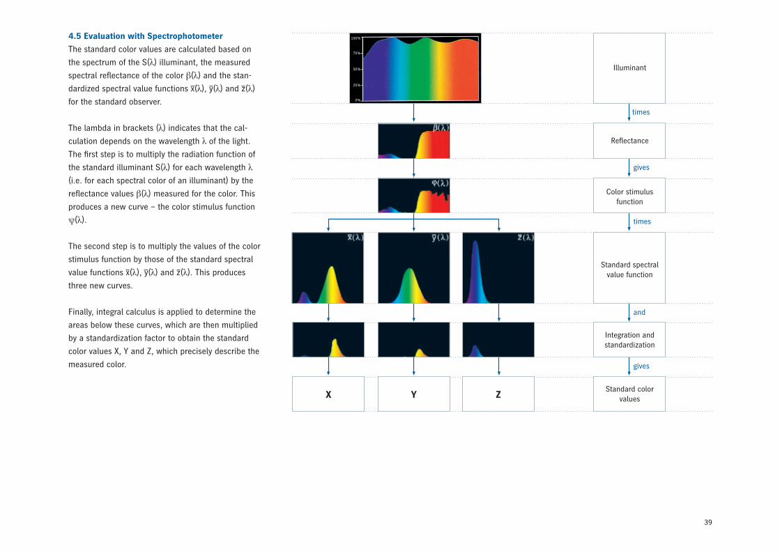
4.5 Evaluation with Spectrophotometer
The standard color values are calculated based on
the spectrum of the S(λ) illuminant, the measured
spectral reflectance of the color β(λ) and the stan-
dardized spectral value functions x(λ), y(λ) and z(λ)
for the standard observer.
The lambda in brackets (λ) indicates that the cal-
culation depends on the wavelength λ of the light.
The first step is to multiply the radiation function of
the standard illuminant S(λ) for each wavelength λ
(i.e. for each spectral color of an illuminant) by the
reflectance values β(λ) measured for the color. This
produces a new curve – the color stimulus function
ψ(λ).
The second step is to multiply the values of the color
stimulus function by those of the standard spectral
value functions x(λ), y(λ) and z(λ). This produces
three new curves.
Finally, integral calculus is applied to determine the
areas below these curves, which are then multiplied
by a standardization factor to obtain the standard
color values X, Y and Z, which precisely describe the
measured color.
X Y Z
Illuminant
Reflectance
Color stimulus function
Standard spectral value function
Integration and standardization
Standard colorvalues
times
gives
times
and
gives
100%
75%
50%
25%
0%
40
0.8
0.7
490
0.6
0.5
700-800
0.4
0.3
0.2
0.1
0.0
0.0 0.1 0.2 0.3 0.4 0.5 0.6 0.7
y
x
520
530
540
550
560
570
580
590
600610
620650
400-380450470
480
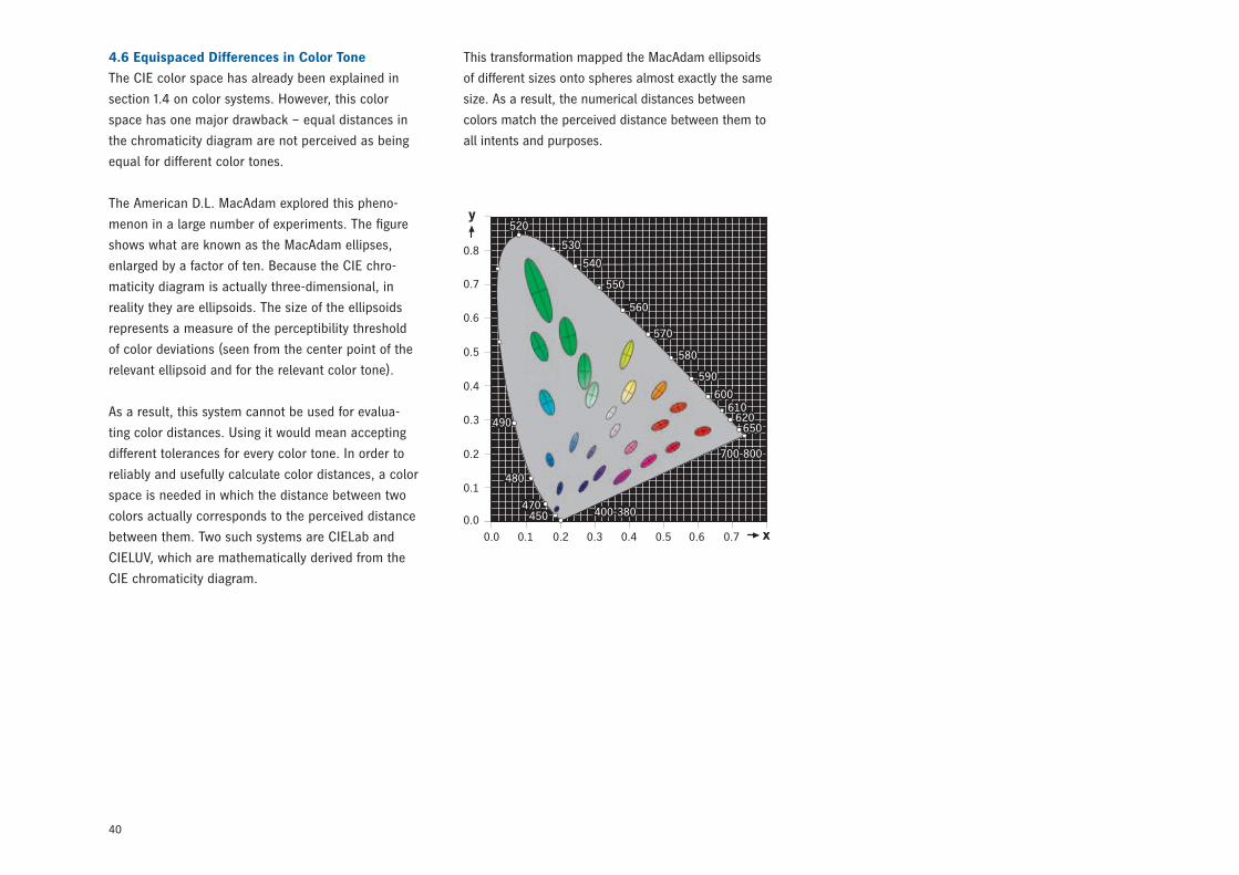
This transformation mapped the MacAdam ellipsoids
of different sizes onto spheres almost exactly the same
size. As a result, the numerical distances between
colors match the perceived distance between them to
all intents and purposes.
4.6 Equispaced Differences in Color Tone
The CIE color space has already been explained in
section 1.4 on color systems. However, this color
space has one major drawback – equal distances in
the chromaticity diagram are not perceived as being
equal for different color tones.
The American D.L. MacAdam explored this pheno-
menon in a large number of experiments. The figure
shows what are known as the MacAdam ellipses,
enlarged by a factor of ten. Because the CIE chro-
maticity diagram is actually three-dimensional, in
reality they are ellipsoids. The size of the ellipsoids
represents a measure of the perceptibility threshold
of color deviations (seen from the center point of the
relevant ellipsoid and for the relevant color tone).
As a result, this system cannot be used for evalua-
ting color distances. Using it would mean accepting
different tolerances for every color tone. In order to
reliably and usefully calculate color distances, a color
space is needed in which the distance between two
colors actually corresponds to the perceived distance
between them. Two such systems are CIELab and
CIELUV, which are mathematically derived from the
CIE chromaticity diagram.
41
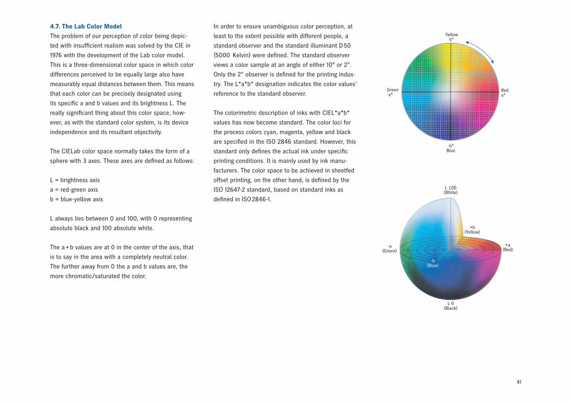
4.7. The Lab Color Model
The problem of our perception of color being depic-
ted with insufficient realism was solved by the CIE in
1976 with the development of the Lab color model.
This is a three-dimensional color space in which color
differences perceived to be equally large also have
measurably equal distances between them. This means
that each color can be precisely designated using
its specific a and b values and its brightness L. The
really significant thing about this color space, how-
ever, as with the standard color system, is its device
independence and its resultant objectivity.
The CIELab color space normally takes the form of a
sphere with 3 axes. These axes are defined as follows:
L = brightness axis
a = red-green axis
b = blue-yellow axis
L always lies between 0 and 100, with 0 representing
absolute black and 100 absolute white.
The a + b values are at 0 in the center of the axis, that
is to say in the area with a completely neutral color.
The further away from 0 the a and b values are, the
more chromatic/saturated the color.
In order to ensure unambiguous color perception, at
least to the extent possible with different people, a
standard observer and the standard illuminant D 50
(5000 Kelvin) were defined. The standard observer
views a color sample at an angle of either 10° or 2°.
Only the 2° observer is defined for the printing indus-
try. The L*a*b* designation indicates the color values’
reference to the standard observer.
The colorimetric description of inks with CIEL*a*b*
values has now become standard. The color loci for
the process colors cyan, magenta, yellow and black
are specified in the ISO 2846 standard. However, this
standard only defines the actual ink under specific
printing conditions. It is mainly used by ink manu-
facturers. The color space to be achieved in sheetfed
offset printing, on the other hand, is defined by the
ISO 12647-2 standard, based on standard inks as
defined in ISO 2846-1.
L 100(White)
L 0(Black)
+a(Red)
+b(Yellow)
-a(Green)
-b(Blue)
Yellowb*
-b*Blue
Green-a*
Reda*
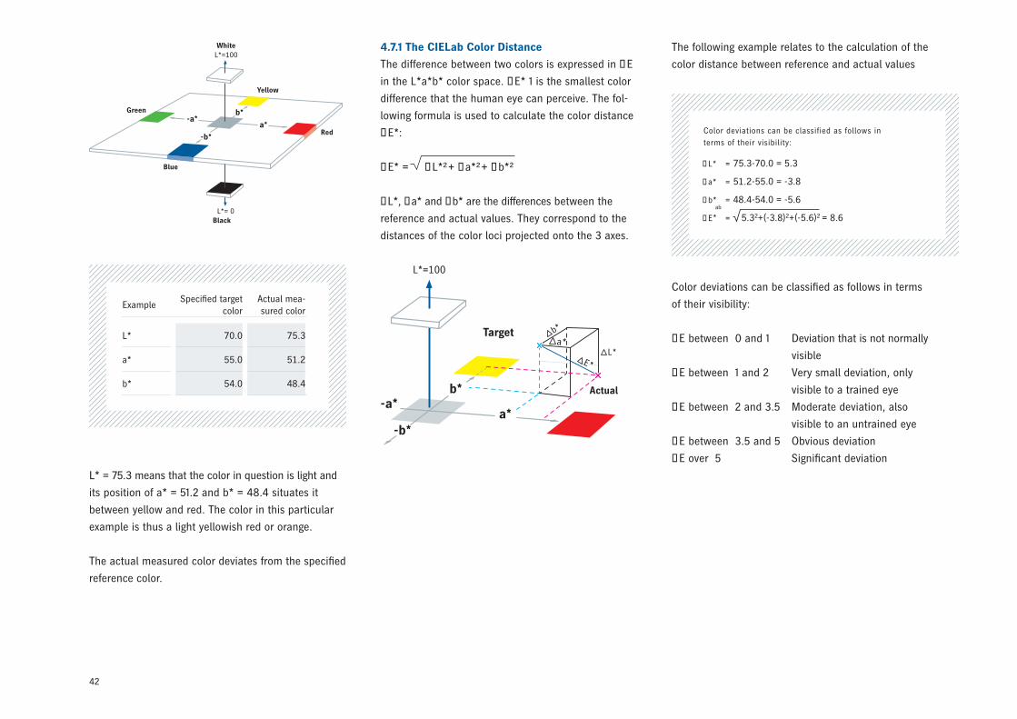
42
ExampleSpecified target
color Actual mea-sured color
L* 70.0 75.3
a* 55.0 51.2
b* 54.0 48.4
Color deviations can be classified as follows in terms
of their visibility:
ΔE between 0 and 1 Deviation that is not normally
visible
ΔE between 1 and 2 Very small deviation, only
visible to a trained eye
ΔE between 2 and 3.5 Moderate deviation, also
visible to an untrained eye
ΔE between 3.5 and 5 Obvious deviation
ΔE over 5 Significant deviation
L*=100
a*
b*
-b*
-a*Green
Red
Yellow
White
L*= 0Black
Blue
L*=100
a*
b*
-b*
-a*
a*
E*L*
Target
Actual
b*
4.7.1 The CIELab Color Distance
The difference between two colors is expressed in ∆E
in the L*a*b* color space. ΔE* 1 is the smallest color
difference that the human eye can perceive. The fol-
lowing formula is used to calculate the color distance
∆E*:
ΔE* = ΔL*²+ Δa*²+ Δb*²
∆L*, ∆a* and ∆b* are the differences between the
reference and actual values. They correspond to the
distances of the color loci projected onto the 3 axes.
The following example relates to the calculation of the
color distance between reference and actual values
L* = 75.3 means that the color in question is light and
its position of a* = 51.2 and b* = 48.4 situates it
between yellow and red. The color in this particular
example is thus a light yellowish red or orange.
The actual measured color deviates from the specified
reference color.
Color deviations can be classified as follows in terms of their visibility:
ΔL* = 75.3-70.0 = 5.3
Δa* = 51.2-55.0 = -3.8
Δb* = 48.4-54.0 = -5.6
ΔE* = 5.32+(-3.8)2+(-5.6)2 = 8.6ab
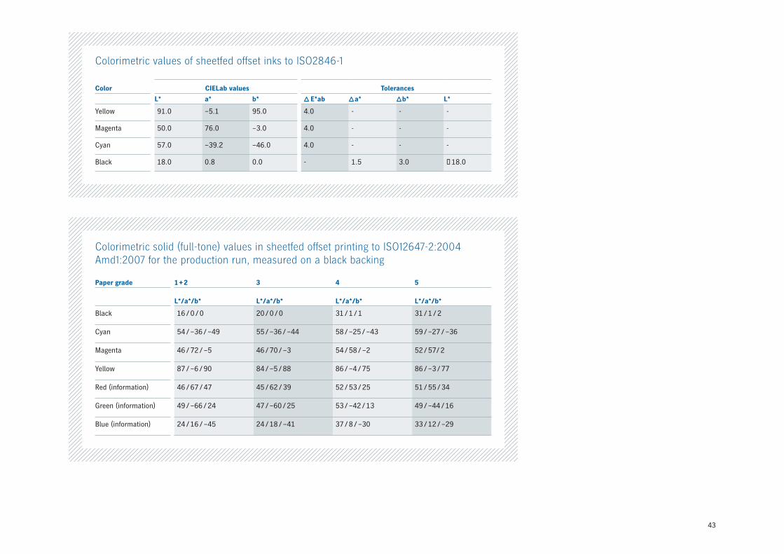
43
Colorimetric solid (full-tone) values in sheetfed offset printing to ISO12647-2:2004 Amd1:2007 for the production run, measured on a black backing
Paper grade 1 + 2 3 4 5
L*/a*/b* L*/a*/b* L*/a*/b* L*/a*/b*
Black 16 / 0 / 0 20 / 0 / 0 31 / 1 / 1 31 / 1 / 2
Cyan 54 / –36 / –49 55 / –36 / –44 58 / –25 / –43 59 / –27 / –36
Magenta 46 / 72 / –5 46 / 70 / –3 54 / 58 / –2 52 / 57/ 2
Yellow 87 / –6 / 90 84 / –5 / 88 86 / –4 / 75 86 / –3 / 77
Red (information) 46 / 67 / 47 45 / 62 / 39 52 / 53 / 25 51 / 55 / 34
Green (information) 49 / –66 / 24 47 / –60 / 25 53 / –42 / 13 49 / –44 / 16
Blue (information) 24 / 16 / –45 24 / 18 / –41 37 / 8 / –30 33 / 12 / –29
Colorimetric values of sheetfed offset inks to ISO2846-1
Color CIELab values Tolerances
L* a* b* E*ab a* b* L*
Yellow 91.0 –5.1 95.0 4.0 - - -
Magenta 50.0 76.0 –3.0 4.0 - - -
Cyan 57.0 –39.2 –46.0 4.0 - - -
Black 18.0 0.8 0.0 - 1.5 3.0 ≤ 18.0
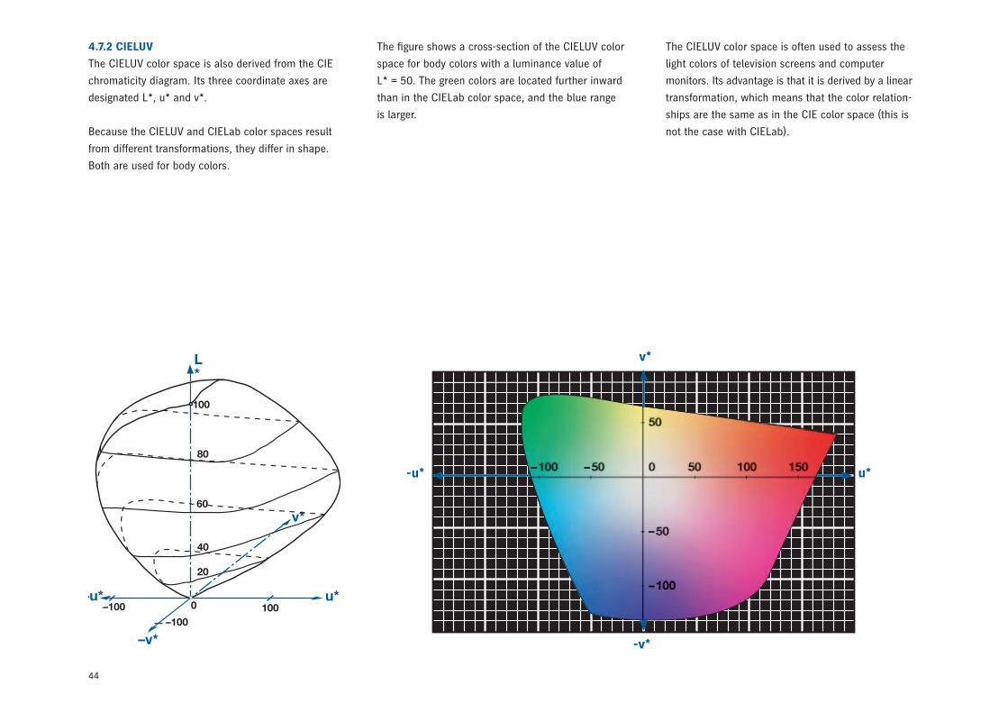
44
The figure shows a cross-section of the CIELUV color
space for body colors with a luminance value of
L* = 50. The green colors are located further inward
than in the CIELab color space, and the blue range
is larger.
The CIELUV color space is often used to assess the
light colors of television screens and computer
monitors. Its advantage is that it is derived by a linear
transformation, which means that the color relation-
ships are the same as in the CIE color space (this is
not the case with CIELab).
4.7.2 CIELUV
The CIELUV color space is also derived from the CIE
chromaticity diagram. Its three coordinate axes are
designated L*, u* and v*.
Because the CIELUV and CIELab color spaces result
from different transformations, they differ in shape.
Both are used for body colors.
-u* u*
-v*
v*
45
4.7.4 CMC
CMC, a system for evaluating color distances based
on the CIELab color space, was developed in Britain
in 1988 by the Colour Measurement Committee of
the Society of Dyers and Colourists (CMC). Unlike
CIELab or CIELUV, it describes how well differences in
color are accepted by an observer, not how they are
perceived.
It addresses the fact that, generally speaking, color
fluctuations near the lightness axis are perceived as
much more irritating than deviations in more saturated
colors. Similarly, fluctuations in chroma (saturation)
are accepted more readily than fluctuations in the hue
angle.
The figure on page 46 illustrates application of the
CMC principle to assess color distances in the CIELab
color space. Each ellipse shows colors with acceptable
deviations around the target locus based on the CMC
formula.
4.7.3 CIELCH
CIELCH refers to the use of the cylindrical coordinates
C (chroma, as a distance from the center) and h (hue,
as an angle) instead of Cartesian coordinates a*, b*
and/or u*, v* in the CIELab or CIELUV color space. In
other words, it is not a color space in its own right.
The calculations involved correspond to those in
CIELUV.
Yellowb*
-b*Blue
Green-a*
a*Red
100
90
80
70
60
50
40
30
20
10
0
L*Actual color: L* = 75.3
C* = 70.5
h* = 43.4°
The lightness L* remains unchanged.
The chroma C*ab is calculated
with C*ab = √a*2 + b*2.
The hue angle h*ab is calculated from
h*ab= arctan ( ).b*a*
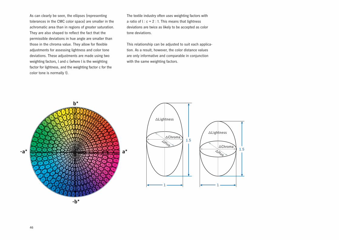
46
As can clearly be seen, the ellipses (representing
tolerances in the CMC color space) are smaller in the
achromatic area than in regions of greater saturation.
They are also shaped to reflect the fact that the
permissible deviations in hue angle are smaller than
those in the chroma value. They allow for flexible
adjustments for assessing lightness and color tone
deviations. These adjustments are made using two
weighting factors, l and c (where l is the weighting
factor for lightness, and the weighting factor c for the
color tone is normally 1).
b*
-b*
-a* a*
1 1
1.5
1.5Chroma
Hue
Lightness
ChromaHue
Lightness
The textile industry often uses weighting factors with
a ratio of l : c = 2 : 1. This means that lightness
deviations are twice as likely to be accepted as color
tone deviations.
This relationship can be adjusted to suit each applica-
tion. As a result, however, the color distance values
are only informative and comparable in conjunction
with the same weighting factors.
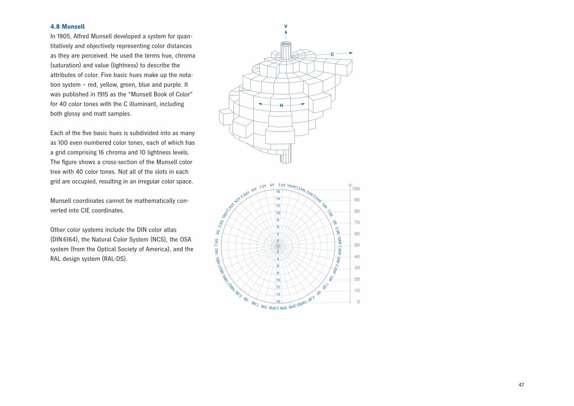
47
4.8 Munsell
In 1905, Alfred Munsell developed a system for quan-
titatively and objectively representing color distances
as they are perceived. He used the terms hue, chroma
(saturation) and value (lightness) to describe the
attributes of color. Five basic hues make up the nota-
tion system – red, yellow, green, blue and purple. It
was published in 1915 as the “Munsell Book of Color”
for 40 color tones with the C illuminant, including
both glossy and matt samples.
Each of the five basic hues is subdivided into as many
as 100 even-numbered color tones, each of which has
a grid comprising 16 chroma and 10 lightness levels.
The figure shows a cross-section of the Munsell color
tree with 40 color tones. Not all of the slots in each
grid are occupied, resulting in an irregular color space.
Munsell coordinates cannot be mathematically con-
verted into CIE coordinates.
Other color systems include the DIN color atlas
(DIN 6164), the Natural Color System (NCS), the OSA
system (from the Optical Society of America), and the
RAL design system (RAL-DS).
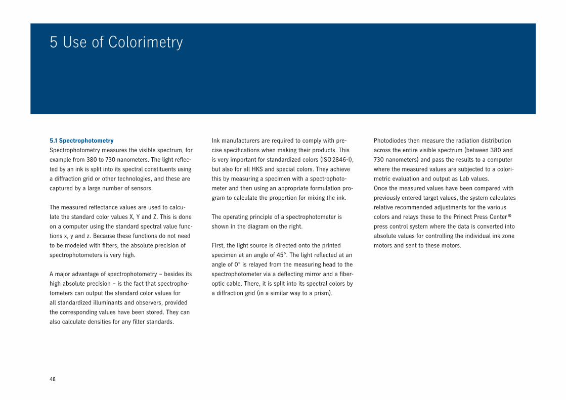
48
5.1 Spectrophotometry
Spectrophotometry measures the visible spectrum, for
example from 380 to 730 nanometers. The light reflec-
ted by an ink is split into its spectral constituents using
a diffraction grid or other technologies, and these are
captured by a large number of sensors.
The measured reflectance values are used to calcu-
late the standard color values X, Y and Z. This is done
on a computer using the standard spectral value func-
tions x, y and z. Because these functions do not need
to be modeled with filters, the absolute precision of
spectrophotometers is very high.
A major advantage of spectrophotometry – besides its
high absolute precision – is the fact that spectropho-
tometers can output the standard color values for
all standardized illuminants and observers, provided
the corresponding values have been stored. They can
also calculate densities for any filter standards.
5 Use of Colorimetry
Ink manufacturers are required to comply with pre-
cise specifications when making their products. This
is very important for standardized colors (ISO 2846-1),
but also for all HKS and special colors. They achieve
this by measuring a specimen with a spectrophoto-
meter and then using an appropriate formulation pro-
gram to calculate the proportion for mixing the ink.
The operating principle of a spectrophotometer is
shown in the diagram on the right.
First, the light source is directed onto the printed
specimen at an angle of 45°. The light reflected at an
angle of 0° is relayed from the measuring head to the
spectrophotometer via a deflecting mirror and a fiber-
optic cable. There, it is split into its spectral colors by
a diffraction grid (in a similar way to a prism).
Photodiodes then measure the radiation distribution
across the entire visible spectrum (between 380 and
730 nanometers) and pass the results to a computer
where the measured values are subjected to a colori-
metric evaluation and output as Lab values.
Once the measured values have been compared with
previously entered target values, the system calculates
relative recommended adjustments for the various
colors and relays these to the Prinect Press Center ®
press control system where the data is converted into
absolute values for controlling the individual ink zone
motors and sent to these motors.
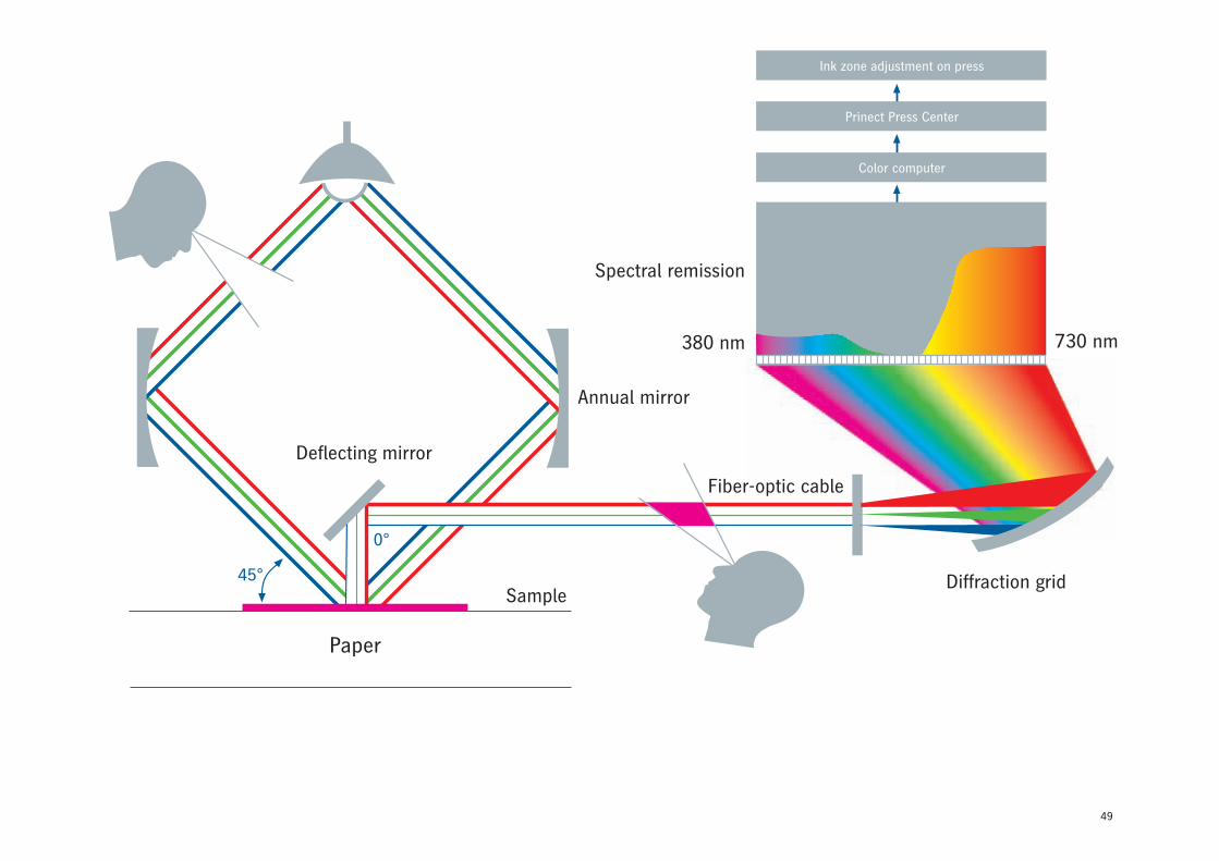
49
Paper
45°
Color computer
Prinect Press Center
Ink zone adjustment on press
380 nm 730 nm
Spectral remission
Annual mirror
Sample
Fiber-optic cable
Deflecting mirror
Diffraction grid
0°
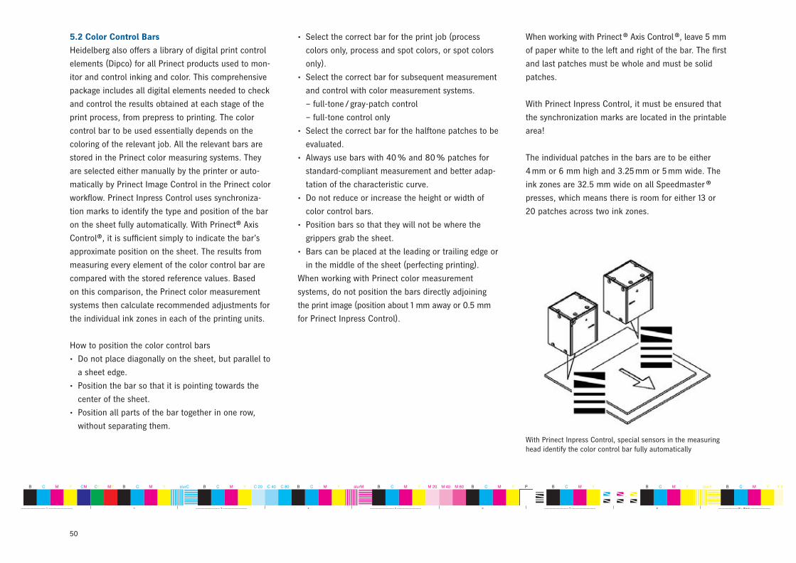
50
--------------------------- 1 --------------------------- 2 --------------------------- 3 --------------------------- 4 --------------------------- 5 --------------------------- 6 --------------------------- 7 --------------------------- 8 ---------------------- B = Black ---------------------- 10 ---------------------- C = Cyan ---------------------- 12 ------------------- M = Magenta ------------------- 14 --------------------- Y = Yellow --------------------- 16 -------------------------- 17 -------------------------- 18 -------------------------- 19 -------------------------- 20 -------------------------- 21 -------------------------- 22 -------------------------- 23 --------------------------
Prinect CS-4iFormat 74 Dipco 3.0e (pdf) © 2007 Heidelberger Druckmaschinen AGB C M Y CM CY MY B C M Y slurC B C M Y C 20 C 40 C 80 B C M Y slurM B C M Y M 20 M 40 M 80 B C M Y P B C M Y B C M Y slurY B C M Y Y 20 Y 40 Y 80 B C M Y slurB B M Y C 20 C 40 C 80 B C M Y slurC B C M Y M 20 M 40 M 80 B C M Y P B C M Y B C M Y slurM B C M Y Y 20 Y 40 Y 80 B C M Y slurY B C M Y B 20 B 40 B 80 B C M Y slurB B C M Y
5.2 Color Control Bars
Heidelberg also offers a library of digital print control
elements (Dipco) for all Prinect products used to mon-
itor and control inking and color. This comprehensive
package includes all digital elements needed to check
and control the results obtained at each stage of the
print process, from prepress to printing. The color
control bar to be used essentially depends on the
coloring of the relevant job. All the relevant bars are
stored in the Prinect color measuring systems. They
are selected either manually by the printer or auto-
matically by Prinect Image Control in the Prinect color
workflow. Prinect Inpress Control uses synchroniza-
tion marks to identify the type and position of the bar
on the sheet fully automatically. With Prinect® Axis
Control®, it is sufficient simply to indicate the bar’s
approximate position on the sheet. The results from
measuring every element of the color control bar are
compared with the stored reference values. Based
on this comparison, the Prinect color measurement
systems then calculate recommended adjustments for
the individual ink zones in each of the printing units.
How to position the color control bars
• Do not place diagonally on the sheet, but parallel to
a sheet edge.
• Position the bar so that it is pointing towards the
center of the sheet.
• Position all parts of the bar together in one row,
without separating them.
• Select the correct bar for the print job (process
colors only, process and spot colors, or spot colors
only).
• Select the correct bar for subsequent measurement
and control with color measurement systems.
– full-tone / gray-patch control
– full-tone control only
• Select the correct bar for the halftone patches to be
evaluated.
• Always use bars with 40 % and 80 % patches for
standard-compliant measurement and better adap-
tation of the characteristic curve.
• Do not reduce or increase the height or width of
color control bars.
• Position bars so that they will not be where the
grippers grab the sheet.
• Bars can be placed at the leading or trailing edge or
in the middle of the sheet (perfecting printing).
When working with Prinect color measurement
systems, do not position the bars directly adjoining
the print image (position about 1 mm away or 0.5 mm
for Prinect Inpress Control).
With Prinect Inpress Control, special sensors in the measuring head identify the color control bar fully automatically
When working with Prinect ® Axis Control ®, leave 5 mm
of paper white to the left and right of the bar. The first
and last patches must be whole and must be solid
patches.
With Prinect Inpress Control, it must be ensured that
the synchronization marks are located in the printable
area!
The individual patches in the bars are to be either
4 mm or 6 mm high and 3.25 mm or 5 mm wide. The
ink zones are 32.5 mm wide on all Speedmaster ®
presses, which means there is room for either 13 or
20 patches across two ink zones.
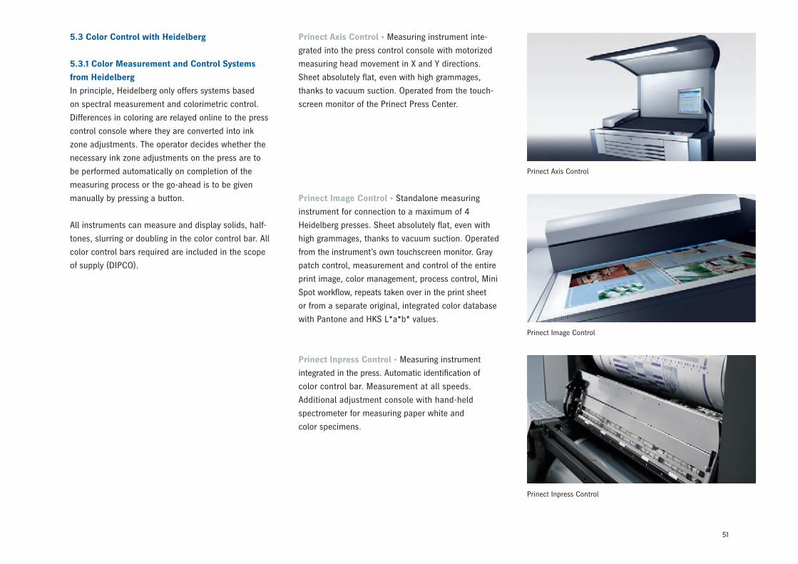
51
5.3 Color Control with Heidelberg
5.3.1 Color Measurement and Control Systems
from Heidelberg
In principle, Heidelberg only offers systems based
on spectral measurement and colorimetric control.
Differences in coloring are relayed online to the press
control console where they are converted into ink
zone adjustments. The operator decides whether the
necessary ink zone adjustments on the press are to
be performed automatically on completion of the
measuring process or the go-ahead is to be given
manually by pressing a button.
All instruments can measure and display solids, half-
tones, slurring or doubling in the color control bar. All
color control bars required are included in the scope
of supply (DIPCO).
Prinect Axis Control • Measuring instrument inte-
grated into the press control console with motorized
measuring head movement in X and Y directions.
Sheet absolutely flat, even with high grammages,
thanks to vacuum suction. Operated from the touch-
screen monitor of the Prinect Press Center.
Prinect Image Control • Standalone measuring
instrument for connection to a maximum of 4
Heidelberg presses. Sheet absolutely flat, even with
high grammages, thanks to vacuum suction. Operated
from the instrument’s own touchscreen monitor. Gray
patch control, measurement and control of the entire
print image, color management, process control, Mini
Spot workflow, repeats taken over in the print sheet
or from a separate original, integrated color database
with Pantone and HKS L*a*b* values.
Prinect Inpress Control • Measuring instrument
integrated in the press. Automatic identification of
color control bar. Measurement at all speeds.
Additional adjustment console with hand-held
spectrometer for measuring paper white and
color specimens.
Prinect Axis Control
Prinect Image Control
Prinect Inpress Control
52
5.3.3 Prerequisites for Measurement
and Control on Printing Presses
Before looking at how different measurement systems
work, it is important to describe the most important
prerequisites that must be met to ensure reliable
measurement and control. The focus is on presetting
the ink keys and priming the ink train. How the inking
is preset depends mainly on the job’s area coverage
values and the material parameters (characteristic
curves stored in the press control system). Ideally,
area coverage values are ascertained using CIP4-PPF
data from prepress that is transferred to the press
either online or using a storage medium. The point of
presetting the ink zones is to get the colors as close
as possible to the target values right from the start.
The ink keys and ink stripe widths are set appropri-
ately in every zone of each inking unit in line with the
anticipated ink consumption. In order to determine
the appropriate settings, the characteristic curves
are applied to convert the area coverage values into
presetting values. A frequently underestimated factor
is priming of the ink train. Before the first sheet is
printed, the amount of ink is introduced into the ink
train that will later be applied during the production
run under stable conditions. If inking is set well to
begin with, there’s no need to adjust it subsequent-
ly. When starting to print, the steps described here
determine the point at which color measurement and
control can begin.
5.3.2 Colorimetric Control Methods
Heidelberg color measurement and control systems
offer a choice of 3 different control modes:
• Colorimetric based on full-tone (solid) patches
• Colorimetric based on gray patches *
• Colorimetric based on in-image measurements **
Originally, only two colorimetric control modes were
available – full-tone control using a color control bar
(for process and spot colors), and gray-patch control
using an autotypical gray patch (CMY) and additional
solid and halftone patches for the chromatic colors.
Heidelberg has added a third mode that is based on
measurement of the print image itself. Heidelberg
Prinect Image Control is the world’s first system
that is able to measure the entire printed image and
control the ink zones on the basis of the data
obtained. It is ideal for making sure that the sold
product measures up.
All three control modes use colorimetric reference
values. In other words, the objective is a perfect color
match between the press and reference sheets. The
colorimetric approach underlying color measurement
systems from Heidelberg means that a technology
is used that emulates the color perceptions of the
human eye to minimize the detectible color discrep-
ancies between the OK sheet and the press sheets.
* Not with Prinect Inpress Control** Only with Prinect Image Control
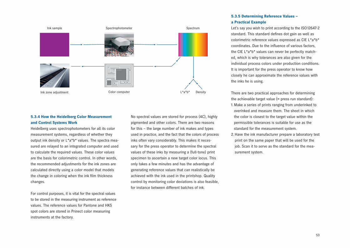
53
89223109
33329989223109
DensityL*a*b*Ink zone adjustment Color computer
Spectrophotometer SpectrumInk sample
No spectral values are stored for process (4C), highly
pigmented and other colors. There are two reasons
for this – the large number of ink makes and types
used in practice, and the fact that the colors of process
inks often vary considerably. This makes it neces-
sary for the press operator to determine the spectral
values of these inks by measuring a (full-tone) print
specimen to ascertain a new target color locus. This
only takes a few minutes and has the advantage of
generating reference values that can realistically be
achieved with the ink used in the printshop. Quality
control by monitoring color deviations is also feasible,
for instance between different batches of ink.
5.3.5 Determining Reference Values –
a Practical Example
Let’s say you wish to print according to the ISO 12647-2
standard. This standard defines dot gain as well as
colorimetric reference values expressed as CIE L*a*b*
coordinates. Due to the influence of various factors,
the CIE L*a*b* values can never be perfectly match-
ed, which is why tolerances are also given for the
individual process colors under production conditions.
It is important for the press operator to know how
closely he can approximate the reference values with
the inks he is using.
There are two practical approaches for determining
the achievable target value (= press run standard):
1. Make a series of prints ranging from underinked to
overinked and measure them. The sheet in which
the color is closest to the target value within the
permissible tolerances is suitable for use as the
standard for the measurement system.
2. Have the ink manufacturer prepare a laboratory test
print on the same paper that will be used for the
job. Scan it to serve as the standard for the mea-
surement system.
5.3.4 How the Heidelberg Color Measurement
and Control Systems Work
Heidelberg uses spectrophotometers for all its color
measurement systems, regardless of whether they
output ink density or L*a*b* values. The spectra mea-
sured are relayed to an integrated computer and used
to calculate the required values. These color values
are the basis for colorimetric control. In other words,
the recommended adjustments for the ink zones are
calculated directly using a color model that models
the change in coloring when the ink film thickness
changes.
For control purposes, it is vital for the spectral values
to be stored in the measuring instrument as reference
values. The reference values for Pantone and HKS
spot colors are stored in Prinect color measuring
instruments at the factory.

54
this is not the job of colorimetry. That is what the
color model is for. It can be used to work out how the
color changes if, for example, the ink film thickness
is increased by 5 percent. If the film thickness on the
paper is changed, its visual appearance naturally also
changes. Imagine a series of prints ranging from very
light inking to full saturation within the CIE L*a*b*
color space. They lie along a line that varies not
only in terms of lightness, but also in its position on
the a and b planes. This is called a color line. When
using full-tone control, the achievable color tones are
fixed by the ink‘s pigmentation and the paper used.
The color model can be used to calculate which film
thickness comes closest to producing the target value,
and where the target value is located within the color
space.
5.3.7 How Colorimetry Helps
In practice, this means that the operator sees at a
glance whether or not he can achieve the required
color results. If all parameters of the print process
are optimally coordinated, he can expect to achieve
them. If the printing conditions change, for instance
due to blackening of the chromatic colors in the
press run, the colors can deviate significantly from
the targets. Colorimetry can then be a major help by
revealing whether the required color results can still
be achieved within the specified tolerances under
these conditions, or whether it is necessary to take
steps such as washing the inking rollers. When using
a different type of ink, the color measurement system
also shows, right from the very first pull, whether or
not the achievable color is within the tolerances. This
can be the case when working with a different make
or type of ink and a previously stored reference value.
Different batches of the same type of ink may also
enable you to achieve the CIE L*a*b* value, but with
different densities. If you only printed based on the re-
ference densities, the visual appearance of the prints
could subsequently be different. This is one reason
why the ISO standard does not provide any reference
densities.
5.3.6 Inline Measurement and Control
After the target values have been determined, mea-
surement of the press run can begin. The first sheet
pulled provides the first actual measured values,
which should not be too far from the target values.
The objective now is to adjust the ink zones and thus
the ink film thicknesses to achieve the target values
as quickly as possible.
This approach may seem simple at first, but it is
based on a complex color model that describes how
changes in the ink film thickness affect the color of
the ink used. Colorimetry by itself can only tell us
where the color achieved so far is located within the
color space (the actual measured value) and where
we need to get it to (the target or reference value).
What it doesn‘t tell us is how to accomplish this. But
Spectralreference values
Spectral color measurement
ColorimetrySimulation of the
print process
SpektraleFarbmessung
SimulationDruckprozess
SpektraleSollwerte
Farbmetrik
Umrechnung ∆E in Regelsignale*
Farbabweichung
∆L*
∆E
∆a*
∆b*
(Farbmodell wird bei jedem Auftrag neu berechnet)
SteuersignaleFarbschichtdickenänderung CMYK
imCP2000 Center*Patent von Heidelberg
L*a*b*+ -
Sensitivitäts-matrix
Regelalgorithmus
Sensitivitymatrix
Control algorithm
+ - L*a*b*
Color deviationControl signalsChange in ink film thickness for CMYK
(Color model is recalculated for each print job)
Colorimetric reference values
Colorimetric actual values
Conversion of color deviations into recommended adjustments for ink zones and in-print control
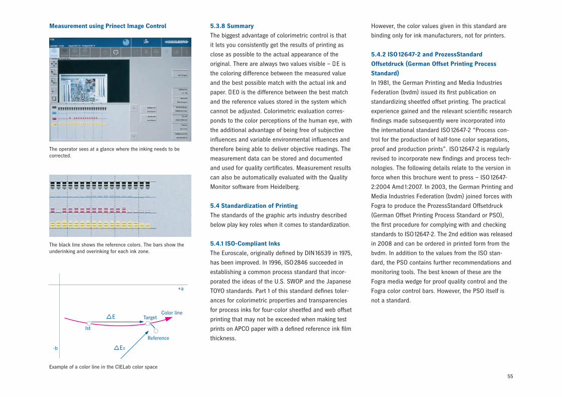
55
5.3.8 Summary
The biggest advantage of colorimetric control is that
it lets you consistently get the results of printing as
close as possible to the actual appearance of the
original. There are always two values visible – ∆E is
the coloring difference between the measured value
and the best possible match with the actual ink and
paper. ΔE0 is the difference between the best match
and the reference values stored in the system which
cannot be adjusted. Colorimetric evaluation corres-
ponds to the color perceptions of the human eye, with
the additional advantage of being free of subjective
influences and variable environmental influences and
therefore being able to deliver objective readings. The
measurement data can be stored and documented
and used for quality certificates. Measurement results
can also be automatically evaluated with the Quality
Monitor software from Heidelberg.
5.4 Standardization of Printing
The standards of the graphic arts industry described
below play key roles when it comes to standardization.
5.4.1 ISO-Compliant Inks
The Euroscale, originally defined by DIN 16539 in 1975,
has been improved. In 1996, ISO 2846 succeeded in
establishing a common process standard that incor-
porated the ideas of the U.S. SWOP and the Japanese
TOYO standards. Part 1 of this standard defines toler-
ances for colorimetric properties and transparencies
for process inks for four-color sheetfed and web offset
printing that may not be exceeded when making test
prints on APCO paper with a defined reference ink film
thickness.
However, the color values given in this standard are
binding only for ink manufacturers, not for printers.
5.4.2 ISO 12647-2 and ProzessStandard
Offsetdruck (German Offset Printing Process
Standard)
In 1981, the German Printing and Media Industries
Federation (bvdm) issued its first publication on
standardizing sheetfed offset printing. The practical
experience gained and the relevant scientific research
findings made subsequently were incorporated into
the international standard ISO 12647-2 “Process con-
trol for the production of half-tone color separations,
proof and production prints”. ISO 12647-2 is regularly
revised to incorporate new findings and process tech-
nologies. The following details relate to the version in
force when this brochure went to press – ISO 12647-
2:2004 Amd 1:2007. In 2003, the German Printing and
Media Industries Federation (bvdm) joined forces with
Fogra to produce the ProzessStandard Offsetdruck
(German Offset Printing Process Standard or PSO),
the first procedure for complying with and checking
standards to ISO 12647-2. The 2nd edition was released
in 2008 and can be ordered in printed form from the
bvdm. In addition to the values from the ISO stan-
dard, the PSO contains further recommendations and
monitoring tools. The best known of these are the
Fogra media wedge for proof quality control and the
Fogra color control bars. However, the PSO itself is
not a standard.
The operator sees at a glance where the inking needs to be corrected.
The black line shows the reference colors. The bars show the underinking and overinking for each ink zone.
Example of a color line in the CIELab color space
Measurement using Prinect Image Control
Color line
-b
Ist
Target
Reference
E
E0
+a
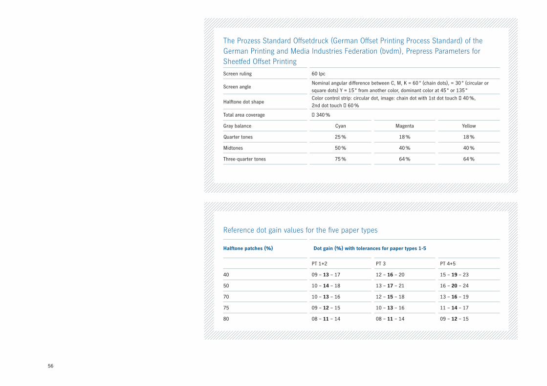
56
The Prozess Standard Offsetdruck (German Offset Printing Process Standard) of the German Printing and Media Industries Federation (bvdm), Prepress Parameters for Sheetfed Offset Printing
Screen ruling 60 lpc
Screen angle Nominal angular difference between C, M, K = 60 ° (chain dots), = 30 ° (circular or square dots) Y = 15 ° from another color, dominant color at 45 ° or 135 °
Halftone dot shapeColor control strip: circular dot, image: chain dot with 1st dot touch ≥ 40 %, 2nd dot touch ≤ 60 %
Total area coverage ≤ 340 %
Gray balance Cyan Magenta Yellow
Quarter tones 25 % 18 % 18 %
Midtones 50 % 40 % 40 %
Three-quarter tones 75 % 64 % 64 %
Reference dot gain values for the five paper types
Halftone patches (%) Dot gain (%) with tolerances for paper types 1-5
PT 1+2 PT 3 PT 4+5
40 09 – 13 – 17 12 – 16 – 20 15 – 19 – 23
50 10 – 14 – 18 13 – 17 – 21 16 – 20 – 24
70 10 – 13 – 16 12 – 15 – 18 13 – 16 – 19
75 09 – 12 – 15 10 – 13 – 16 11 – 14 – 17
80 08 – 11 – 14 08 – 11 – 14 09 – 12 – 15
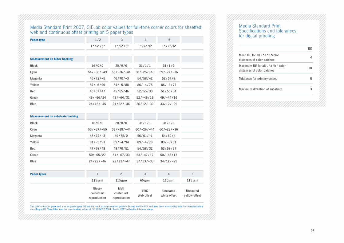
57
Media Standard PrintSpecifications and tolerances for digital proofing
ΔE
Mean ΔE for all L * a * b *color distances of color patches
4
Maximum ΔE for all L * a * b * colordistances of color patches
10
Tolerance for primary colors 5
Maximum deviation of substrate 3
Media Standard Print 2007, CIELab color values for full-tone corner colors for sheetfed, web and continuous offset printing on 5 paper types
Paper type 1 / 2 3 4 5
L* / a* / b* L* / a* / b* L* / a* / b* L* / a* / b*
Measurement on black backing
Black 16 / 0 / 0 20 / 0 / 0 31 / 1 / 1 31 / 1 / 2
Cyan 54 / –36 / –49 55 / –36 / –44 58 / –25 / –43 59 /–27 / –36
Magenta 46 / 72 / –5 46 / 70 / –3 54 / 58 / –2 52 / 57 / 2
Yellow 87 / –6 / 90 84 / –5 / 88 86 / –4 / 75 86 / –3 / 77
Red 46 / 67 / 47 45 / 65 / 46 52 / 55 / 30 51 / 55 / 34
Green 49 / –66 / 24 48 / –64 / 31 52 / –46 / 16 49 / –44 / 16
Blue 24 / 16 / –45 21 / 22 / –46 36 / 12 / –32 33 / 12 / –29
Measurement on substrate backing
Black 16 / 0 / 0 20 / 0 / 0 31 / 1 / 1 31 / 1 /3
Cyan 55 / –37 / –50 58 / –38 / –44 60 / –26 / –44 60 /–28 / –36
Magenta 48 / 74 / –3 49 / 75/ 0 56 / 61 / –1 54 / 60 / 4
Yellow 91 / –5 / 93 89 / –4 / 94 89 / –4 / 78 89 / –3 / 81
Red 47 / 68 / 48 49 / 70 / 51 54 / 58 / 32 53 / 58 / 37
Green 50 / –65 / 27 51 / –67 / 33 53 / –47 / 17 50 / –46 / 17
Blue 24 / 22 / –46 22 / 23 / –47 37 / 13 / –33 34 / 12 / –29
Paper types 1 2 3 4 5
115 gsm 115 gsm 65 gsm 115 gsm 115 gsm
Glossycoated art
reproduction
Mattcoated art
reproduction
LWCWeb offset
Uncoatedwhite offset
Uncoatedyellow offset
The color values for green and blue for paper types 1/2 are the result of numerous test prints in Europe and the U.S. and have been incorporated into the characterization data (Fogra 39). They differ from the non-standard values of ISO 12647-2:2004 | Amd1: 2007 within the tolerance range.
58
5.5. Benefits of Colorimetry for Offset Printing
To sum up, here is an overview of the main advan-
tages that colorimetry offers for offset printing:
• The measurement values match the visual percep-
tion of the colors very closely.
• Colorimetry is a process-independent color evalua-
tion method that can be used throughout the print
process from prepress and all kind of proofs to final
quality control of finished products.
• Colorimetric reference values can also be expressed
as figures. A link to prepress is possible.
• Colorimetric reference values can be taken from
specimens.
• Colorimetry is the only way to ensure objective
evaluation.
• Colorimetry enables image-relevant color control
(for instance using gray patches) without calibration
of individual colors or stored conversion tables.
• All colors, including very light spot colors, can be
controlled correctly and reliably with colorimetry.
• Dot gain is precisely captured by spectral measure-
ment, including for spot colors.
• Control of the production run is more reliable
because changes in the substrate, ink soiling and
metamerism can be captured and taken into
account.
• Halftone printing with more than four colors can
also be controlled correctly.
• Print quality can be described and documented
more effectively. There is a measure of color devia-
tion that is independent of color tone – ∆E.
• Colorimetry enables the printing industry to get in
sync with all other industries in which color plays
an important role.
• Densitometry, for example to determine dot gain, is
an integral part of spectral color measurement.
• Image fragments can also be compared with origi-
nals.
5.4.3 The Media Standard Print
(MedienStandard Druck)
The Media Standard Print (MedienStandard Druck)
first appeared in 2004 on the initiative of the German
Printing and Media Industries Federation (bvdm). In
addition to technical guidelines for digital data for
printing, based on ISO 12647, it defines specifications
and tolerances for digital contract proofs. This estab-
lishes a set of rules for agencies, prepress studios and
printing companies, providing a basis for improving
communication and optimizing workflows. The fifth,
revised edition of the Media Standard Print was issued
in 2007. It primarily establishes the following rules:
• A proof must simulate one of the five reference
print conditions defined by the ProzessStandard
Offsetdruck (German Offset Printing Process Stan-
dard).
• A proof must include a line of text indicating the file
name, the output date, and the color management
settings used.
• A UGRA / FOGRA media wedge must be included.
• The conditions for measurement and evaluation
must be defined.
59
Color management
Method / system for coordinating the individual units
and presses involved in the workflow from color image
processing to finished print result. Color management
is used to ensure correct color reproduction from
input to output, for example on printing presses.
Densitometer
A density measuring device. Reflective densitometers
are used for printing purposes. To determine the
density, the result of a white measurement is set in
relation to the measurement of the required color
area. > Density
Density
The degree to which an ink layer is impermeable to
light. On a theoretical level, this is the relationship
between a measurement on unprinted paper and a
measurement on printed paper.
Dot gain
Optical and mechanical process conditions result in
halftone dots printed on paper being larger than the
value defined in the data. The difference between the
effective optical area coverage and the area coverage
of the data is measured. > Area coverage
Ink fading
Term for the decline in the thickness of the ink film in
the circumferential direction in offset printing.
Ink film thickness / ink level
The physical thickness of the ink applied. The ink
thickness essentially determines the density value of
a color area.
Metameric colors
Colors with different spectra that look the same under
a given illuminant and different under other illuminants.
This is also known as metamerism.
Mini Spots
Small print control elements that can be located
anywhere on standard production jobs thanks to the
limited amount of space they take up. The measure-
ment values are then evaluated using the Quality
Monitor and process or profile adjustments are made
using the Calibration Tool or the Profile Tool from the
Prinect Color Toolbox if necessary.
Actual value
The value actually measured for a specimen.
> Reference value
Area coverage
The ratio of the area covered (with image elements)
to the total area. The area coverage is generally
specified as a percentage. A distinction is made in
print between the effective area coverage calculated
from optical measurements and the geometric area
coverage calculated from area measurements.
Characteristic curve
The graphical representation of the relationship be-
tween the tonal values of prepress products, generally
halftone data (tonal values), and the associated tonal
values in print. > Dot gain
Color distance ∆E
∆E describes the color distance between two colors
and can be calculated as the distance of the L*a*b*
values between two colors.
Glossary
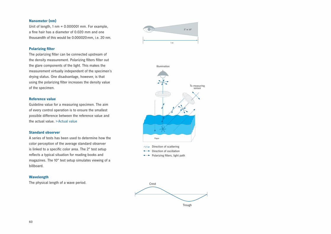
60
Nanometer (nm)
Unit of length, 1 nm = 0.000001 mm. For example,
a fine hair has a diameter of 0.020 mm and one
thousandth of this would be 0.000020 mm, i.e. 20 nm.
Polarizing filter
The polarizing filter can be connected upstream of
the density measurement. Polarizing filters filter out
the glare components of the light. This makes the
measurement virtually independent of the specimen’s
drying status. One disadvantage, however, is that
using the polarizing filter increases the density value
of the specimen.
Reference value
Guideline value for a measuring specimen. The aim
of every control operation is to ensure the smallest
possible difference between the reference value and
the actual value. > Actual value
Standard observer
A series of tests has been used to determine how the
color perception of the average standard observer
is linked to a specific color area. The 2° test setup
reflects a typical situation for reading books and
magazines. The 10° test setup simulates viewing of a
billboard.
Wavelength
The physical length of a wave period.
2° or 10°
1 m
Illumination
To measuring sensor
Crest
Trough
Paper
Direction of scattering
Direction of oscillation
Polarizing filters, light path

00.
990.
048
0/0
2 en
Heidelberger Druckmaschinen AGKurfuersten-Anlage 52 – 60 69115 Heidelberg Germany Phone +49 6221 92 – 00 Fax +49 6221 92 – 6999 www.heidelberg.com
Publishing informationPrinted in: 11/08Photographs: Heidelberger Druckmaschinen AGPrinting plates: SuprasetterPress: SpeedmasterFinishing: StahlfolderFonts: HeidelbergGothicMl Printed in GermanyCopyright © Heidelberger Druckmaschinen AG, 2008
Trademarks Heidelberg, the Heidelberg logo, Prinect, Axis Control, MetaDimension, Mini Spots, Signa Station and Speedmaster are registered trademarks of Heidelberger Druckmaschinen AG in the U.S. and other countries. All other trademarks are the property of their respective owners.
Subject to technical modifications and other changes without notice.