do's and don'ts on your campaign website
TRANSCRIPT

Do's and Don'ts on Your Campaign Website
Henri Makembe, localpolitechs.com
Isaac Salazar, mddems.org
Maureen Higgins, mddems.org

Overview• Introduction
• Do's
• Don'ts
• Sample Websites
• Q/A

Why your website matters• 24% of Americans learn
about campaigns online
• 55% of American adults get news or information about political candidates online
• 1 in 3 forward political content to friends

Do's

1. Design for lowest Common denominator• Most visitors do NOT use current browser
version. Be Backward Compatible
• Design your pages for 1024x768
• Test (connection speed), Test (browsers), Test (user flow).

2. Focus on Content• Be short, sweet and to the point
• Make it easy to scan your website. Use H tags & Bullets, Bold important words
• Good content is good SEO
• Write for the web & Keep it fresh
• Promote your content

3. Have Prominent Action Buttons• Contribute, volunteer,
register to vote, links to social networks ABOVE the fold
• Give user elements interactivity right away
• Established baseline for ladder of engagement

4. Prominent E-mail Capture
• Email signup must be visible and obvious
• Keep the from simple of short -E-mail sign up form is NOT volunteer form
• Use cookie-based splash pages

5. Use Cascading Style Sheets (CSS) • Creates consistent
formatting across site
• Easier to maintain
• Easier to deal with browsers' quirks
• Increases load speed

Don'ts

1. Flash or Flash Intros• Difficult to maintain
• Not present on all machines & requires download
• Not backwards compatible
• Does NOT work on mobile devices
• Use JQuery instead

2. Long paragraphs/welcome letters• Average time spent on the website is
less than 120 sec.
• Most visitors only read content 'above the fold'
• Long letters take up valuable real estate on your site
• Use short paragraphs, bullets & links

3. Music / Sounds• Increases page size
• Does NOT echo message
• Detracts from User experience
• Lacks professionalism
• When using video, disable auto-play

4. Gimmicks or Overdo widgets• Blink/Scrolling text
• Pops-ups windows
• Automatic window resizing
• page counters
• Distract visitors from Message

5. Leave it to your kid/nephew
• Lack of campaign experience
• Lack of knowledge of affordable solutions
• Design best practices
• Use professionals or freelancers with proven portfolio
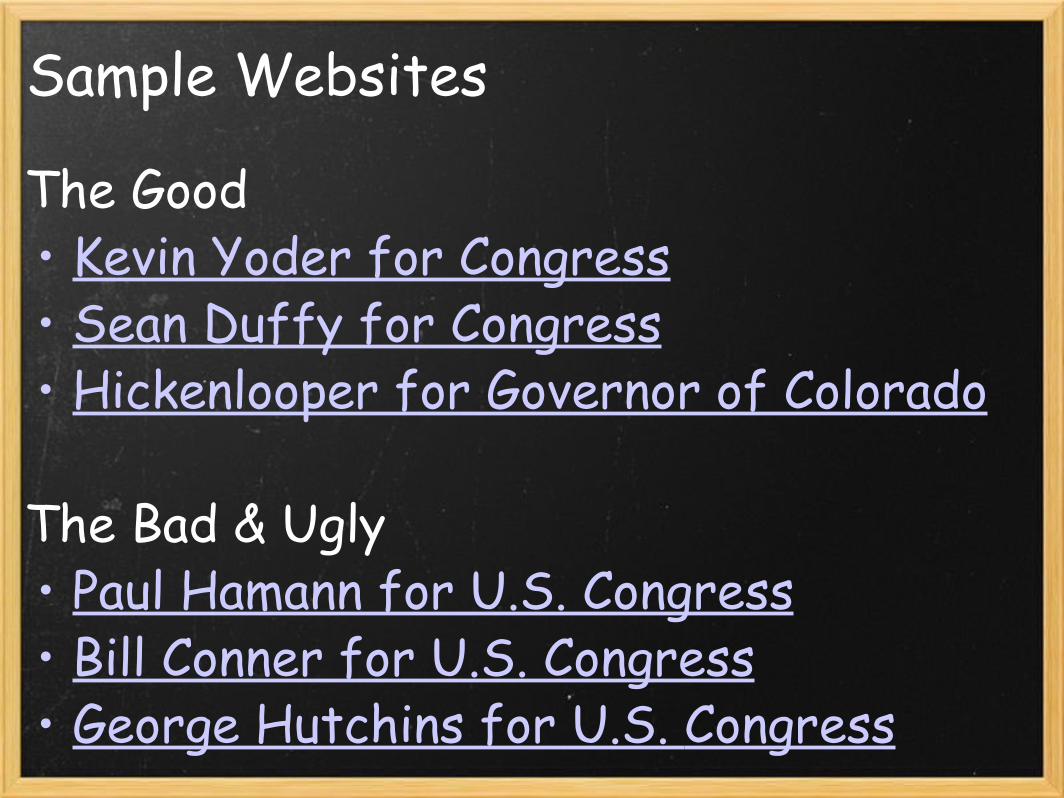
Sample Websites
The Good• Kevin Yoder for Congress• Sean Duffy for Congress• Hickenlooper for Governor of Colorado
The Bad & Ugly• Paul Hamann for U.S. Congress• Bill Conner for U.S. Congress• George Hutchins for U.S. Congress

The Good

Kevin Yoder for Congress

Sean Duffy for Congress

Hickenlooper for Colorado

The Bad & The Ugly
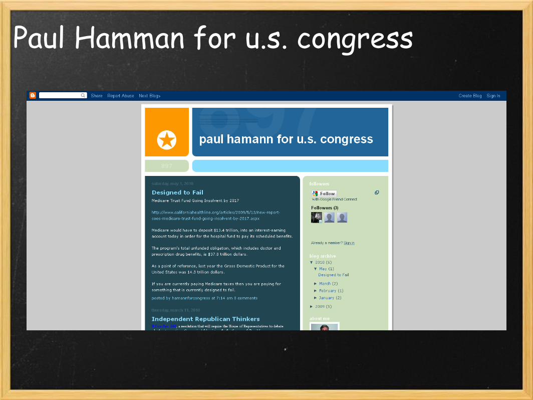
Paul Hamman for u.s. congress

Bill Conner for U.S. Congress

George Hutchins for U.S. Congress

RESOURCES• http://www.w3schools.com
• Web Writing: http://www.useit.com/papers/webwriting/
• Design: http://www.killersites.com/
• http:// www.localpolitechs.com
• http://www.epolitics.com
• http://freelanceswitch.com OR http://www.elance.com

Q&A