what makes museum labels legible?
TRANSCRIPT

36/2 1993
What Makes Museum Labels Legible?
LISA F. WOLF AND JEFFREY K. SMITH
Museum labels carry information that curators consider essential to the understanding and appreciation of objects. To viewers, the importance of labels ranges from “essential information” to “of casual interest.” From the standpoints of both groups, labels- regardless of their content-ought to be legible to all.
Does size of type determine legibility? Contrast between letters and background? Type face? Do visitors really care about reading labels of objects in an art museum anyway? The answers to all: somewhat, yes, no, it doesn’t really matter, it matters very much.
Both common sense and legislation dictate that labels be read- able to all visitors, including those with handicaps.*
The Metropolitan Museum of Art is developing a manual in- tended as a guide to generating labels legible to the broadest pos- sible range of visitors. To provide empirical support for it, the museum undertook the study reported here.
BACKGROUND
Little research exists on legibility for the elderly or for persons with impaired vision-those visitors who are likely to have most difficulty in reading labels. Burt (1959) and Poulton (1969) found that older persons prefer larger type and higher levels of illumina- tion than do their juniors. Smith (1979) argued that legibility in- volves not only the size of the type but the eye’s distance from it. The size of the type and one’s distance from the type form the
Lisa F . Wolf is a consultant in the Office of Research and Evaluation at The Metropolitan Museum of Art. Jeffrey K . Smith is professor, Department of Ed- ucational Psychology, at Rutgers, The State University of New Jersey, and head of the Office of Research and Evaluation at The Metropolitan Museum of Art. * Section 504 of the Federal Rehabilitation Act of 1973 requires that any program or activity receiving federal assistance be accessible to individuals with handicapping conditions.
95

CURATOR
angle of the type that hits the eye. In our study, we found this angle to be very important in legibility. Vanderplas and Vanderplas (1980) also found that older adults (60 to 83 years of age) preferred larger type and a serif type face as well.
Low-vision persons on average need to be 10 times closer than able-sighted persons to read road signs under ideal conditions, ac- cording to a study done for the U.S. Department of Education in 1986.* The finding is consistent with Smith’s-the angle of the type that hits the eye is critical for legibility.
The Toledo Museum of Art (1984) developed general recommen- dations for labels that cover letter spacing, type size in relation to installation, and treatment of margins.
Although these studies provide insight, many practical issues remain unexamined. The current study examines the relative im- portance of type face, type size, contrast, spacing between lines, lighting, and installation height as these factors influence legibility for those visitors who might be expected to have the most difficulty in reading labels-lderly and/or low-vision viewers-the rationale being that labels satisfactory to this group will improve readability for all viewers.
METHOD
A total of 121 volunteers took part in the study, which was con- ducted in the museum’s Uris Center for Education. Participants were either (a) low-vision (corrected vision from 20/40 to 20/200, self-reported or determined by a vision test given at the site); (b) elderly (age 65 or over); (c) low-visiodelderly; or (d) members of the museum’s curatorial staff. Low-vision visitors were identified through their association with the National Association for the Visually Handicapped. Elderly visitors were solicited from senior groups who regularly visit the museum. One of the first findings of the data analysis was that these four groups did not differ signifi- cantly in their ratings of the legibility of the labels, so they were combined into a single group for all subsequent analyses.
Fifty labels with varying design parameters but identical copy were generated. The copy was the label for “A Bridge over a Pool of Water Lilies,” by Claude Monet (Figure 1). The type size ranged from 14 to 30 points, and five type faces were used (Figure 2).
* The Architectural and Transportation Barriers Compliance Board (ATBCB) (Contract Number 300-83- 0186) study, “Information Systems for Low Vision Persons.”
96

36/2 1993
Claude Monet French. 1840-1926
A Bridge over a Pool of Water Lilies 1 3 1 on canvas Signed and dated (lower right): Claude Monet/9O
In 1899-1900 Monet painted a series of at least seventeen views of the footbridge over the pond in his garden at Giverny. Thirteen were included in an exhibition of his work at the Durand-Rue1 Gallery in 1900.
The arched bridge was probably modeled on a bridge depicted in one of the many Japanese prints that Monet collected.
Bequest of Mrs, H. 0. Havemeyer, 1929 H. 0. Havemeyer Collection 29.100.1 13
Figure 1 . This copy was used for all tests. The actual label is no longer on view, as the gallery in which it was hung is being reinstalled.
14 pt New Century Schoolbook 14 pt Helvetica
18 pt Centaur
faces used in the studies in all of the sizes ana- lyzed. (A point is 1l72nd of an inch.)
30 pt Sabon
The study was conducted in three phases:
I . Demographic Information-A questionnaire asked subjects for demographic information as well as art background, frequency of visiting the museum, and their use of labels in the museum.
97

CURATOR
2. The Interaction Study-The purpose was to determine wheth- er certain factors interacted in influencing legibility-type size and contrast between letters and background, for example.
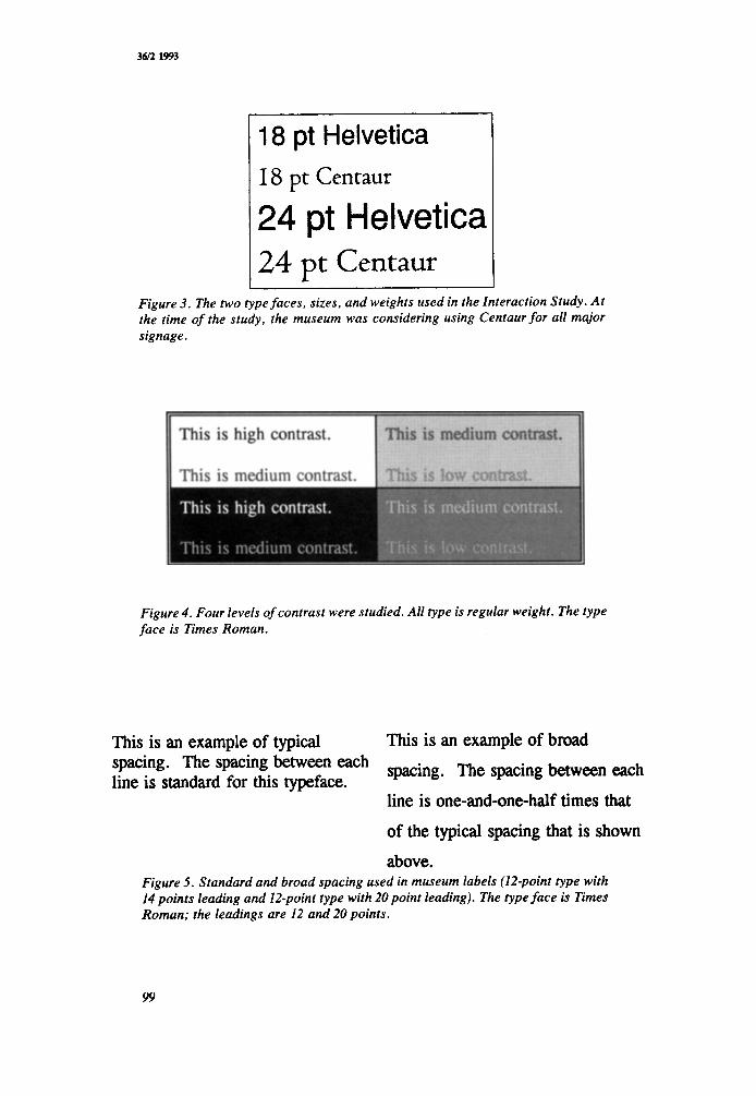
All subjects participated in the Interaction Study. Sixteen labels, eight in Helvetica and eight in Centaur, were used. Labels were produced in two sizes-I8 and 24 points (Figure 3). Two levels each of contrast (Figure 4) and spacing (Figure 5) were studied. The labels were presented at two different heights and in two dif- ferent levels of lighting-5 foot-candles and 15 foot-candles. The installation heights were 60” and 6 6 (Figure 6).
The design of the Interaction Study allowed us to look at each one of the six factors studied in combination with the other factors. Thus, we could ask questions such as the following:
0 Does level of contrast have the same effect on smaller type as
0 Does the height of the installation have the same effect on
0 Does type size (18 points vs. 24 points) have the same effect on
it has on larger type?
regular spacing as on broad spacing?
Centaur type as it does on Helvetica?
3. The Three Focused Studies-There were three additional and more focused studies in which some, but not all, of the subjects participated. Time limitations and fatigue prevented all subjects from participating in all studies.
0 The Contrast Study. Sixteen labels at eight levels of contrast for two type sizes, 24 and 30 points, were studied.
0 The Type-Face Study. Ten labels in five type faces in two sizes, 18 and 24 points, were studied.
0 The Case- and Floor-Lube1 Study. Ten case and floor labels were studied. Case labels were presented in 14, 18, and 24 points, both in angled and flat positions. Floor labels were studied in similar fashion, in 24 and 30 points.
The parings-For all four studies, participants rated each label on four criteria: (1) legibility, (2) easy or tiring to read, (3) aesthetic appeal, and (4) overall rating. Rating was on a scale of 1 to 10, with one the lowest and 10 the highest. We instructed respondents to give a rating of a 1 or 2 if the label was “completely illegible,” moving up to a 5 or 6 if it was “readable,” and up to a 9 or 10 if it was “very clear.” All 10 ratings were available to subjects.
One of our first findings (and surprises) was that there was very little difference in the four different rating scales, so the legibility
98
36t2 1993
18 pt Helvetica I8 pt Centaur
24 pt Helvetica 24 pt Centaur
Figure 3. The two type faces, sizes, and weights used in the Interaction Study. At the time of the study, the museum was considering using Centaur for all major signage.
Figure 4. Four levels of contrast were studied. All type is regular weight. The type face is Times Roman.
This is an example of typical This is an example of broad
line is one-and-one-half times that
of the typical spacing that is shown above.
Figure 5. Standard and broad spacing used in museum labels (12-point type with 14 points leading and 12-point type with 20point leading). The type face is Times Roman; the leadings are 12 and 20 points.
99

CURATOR
1 2 3 4 5 6 7 8
01111111 =~
9 10 11 12 13 14 15 16 I Figure 6 . The 16 labels were displayed at two different heights. The center space between rows was at 6U and at 6 6 . On the 6 0 installation, the top row was at 6 6 , the bottom row at 5 4 . On the 6 6 installation, the top row was at 72”, the bottom row at 6 0 .
rating was used for all analyses. We have found that visitors tend to be generous in their ratings, so we encouraged participants to be frank and honest. Allowing for some residual generosity and wish- ing to err on the conservative side if at all, we considered any label with a mean rating of 6 or higher to be “satisfactory.”
RESULTS
An important consideration became apparent during the studies and helps to clarify the results. Almost all low-vision and many elderly visitors got very close to the labels (within six inches, sometimes closer). Several used their hands to follow the lines. In our sample, almost all of the females and many of the male older adults were under 5’5”. Thus, labels displayed above six feet (as in crowded exhibitions) are problematical.
The results of our research are presented here by the elements in the studies-type face, contrast, spacing, etc., rather than by the statistical designs we employed.* All elements were included in the Interaction Study (Figure 7).
* All of the statistical analyses involved repeated measures analyses of variance. Where statistical sig- nificance is reported, it is based on the multivariate Wilk’s lambda and with a probability value set to .01.)
100

36/2 1993
Average Ratings 10
8
6
4 -
2-
0
6.4
1 LoiTyp Lo/Broad HiiTyp Hi/Broad
Helvetica
r 4.9 4.7 l l n
6.5 6 n
LoiTyp LolBroad HiiTyp HVBroad
Centaur
18-point type size 0 24-point type size
1-2 = Completely illegible 5-8 = Readable 9-1 0 = Very Clear
Figure 7. Results of the Interaction Study showing mean ratings of legibility, factoring in spacing (TyplBrood), contrast (LolHi), type face , and type size.
Means and standard deviations for all labels used in all studies are presented in Table 1 (page 106).
Type Size-Size was the single most important element in deter- mining legibility; in all four studies, increases in type size produced the largest increases in preference. Our four studies covered type ranging from 14 to 30 points. We looked at type size in the Inter- action Study and in the three additional studies. Each label com- bined factors that influenced its legibility: type size, type face, contrast, spacing, lighting, and installation. Therefore, there is no one number for the legibility of type of any given size. To illustrate: How legible would a label written in 18-point type be? Well, it would depend on the type face, contrast, height of installation, etc. In the Interaction Study, the mean rating for 18-point type was 4.8 and for 24-point type was 6.5 (Figure 7). The mean ratings for the additional studies are shown in Table 2 (page 107).
101
CURATOR
Although we cannot answer “How legible is 18-point type?” without having a host of other information, we can provide a fairly good answer to “How much more legible is 18-point type than 14-point type?” Legibility goes up rather dramatically as type size increases. If we combine information across studies, the median ratings are as follows: 14-point type was rated 5.3; 18-point, 6.0; 24-point, 6.8; 30-point, 7.4.
We can also answer “If I make everything else optimal, will an 18-point type size be legible?” The answer is “Yes”; four of the labels at 18 points had ratings of 6.0 or higher. They were all high contrast with type faces of Helvetica, Times Roman, New Century Schoolbook, and Sabon. To see what combinations of factors made a label more or less legible, see Table 1 (page 106).
Type Face-The type-face results were very different from the type-size results. Only one (Centaur) was poorly received. In the Interaction Study, Helvetica had an overall mean of 6.6; the mean for Centaur was 4.6. In the type-face study, however, four of the five type faces received fairly high ratings (Figure 8).
Although Helvetica held up as the most legible type face in combination with other elements, serif type faces clearly seem to be quite legible. Centaur’s lower-case letters are quite small in comparison to its upper-case letters, making the type face appear to be only about two-thirds the size of other faces. It is probably reasonable to conclude that dissatisfaction with Centaur was prob- ably the result of participants’ feeling that the type was too small rather than that the type face was not legible.
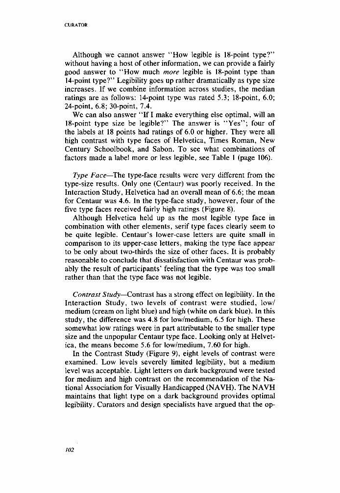
Contrast Study-Contrast has a strong effect on legibility. In the Interaction Study, two levels of contrast were studied, low/ medium (cream on light blue) and high (white on dark blue). In this study, the difference was 4.8 for low/medium, 6.5 for high. These somewhat low ratings were in part attributable to the smaller type size and the unpopular Centaur type face. Looking only at Helvet- ica, the means become 5.6 for low/medium, 7.60 for high.
In the Contrast Study (Figure 9), eight levels of contrast were examined. Low levels severely limited legibility, but a medium level was acceptable. Light letters on dark background were tested for medium and high contrast on the recommendation of the Na- tional Association for Visually Handicapped (NAVH). The NAVH maintains that light type on a dark background provides optimal legibility. Curators and design specialists have argued that the op-
102

36l2 1993
Average Ratings -
8.7
~
8.6 8.3 8.1
6.8
Helvetica Times Roman New Cent.Sch. Sabon Centaur
18-point type size 24-point type size
1-2 = Completely Illegible 5-6 = Readable 9-10 = Vsly Clear
Figure 8. Results of the Type-Face Study showing mean ratings of legibility.
posite is true. Our data indicated that legibility is almost identical for the two conditions (mean for light on dark, 7.1; for dark on light, 7.0.)
Spacing Between Lines-In the Interaction Study, the mean rat- ing overall for standard spacing was 5.6 and for broad, 5.7. It would seem from this that spacing did not have an effect on legibility. However, spacing did have a substantial effect when considered in combination with installation height. There were two rows of labels in this study (Figure 6) and two levels of installation height. This resulted in four possible heights of labels, 54”, 60’, 66, and 72”.
In the lower positions (roughly eye level for this sample), stan- dard spacing (mean, 6.6) was more legible than broad (mean, 5.8). However, when labels were above eye level, broad spacing (mean, 5.6) was substantially more legible than standard (mean, 4.5). Stan- dard may have been preferable to broad at eye level because it more closely approximates normal reading-books, magazines,
103

CURATOR
Lo: Blue on Lt. Gray
Med: Cream on Gray
Med: Gray on Cream
Hi: White on Cinnamon
Hi: Cinnamon on White
V. Hi: Wh. on Dk. BI.
V.Hi: Black on Wh.
0 2 4 6 a 10
Average Ratings
24-point type size 30-point type size
1-2 = Completely illegible 5-6 = Readable 9-1 0 = Very Clear Figure 9. Results of the Contrast Study showing mean ratings of legibility.
etc. The preference for broad spacing at higher installations is probably attributable to most subjects’ need to look upward at a fairly severe angle. This compresses the angle of the label that hits the eye and reduces legibility (Smith, 1979). Broad spacing may bring the spacing back closer to standard.
Installation-Two installation conditions were examined in the Interaction Study: (1) Wall labels were at four different heights. Mean levels are 54”’ 6.2; 60”, 6.5; 66”, 5.5; 72”, 4.9. These results suggest that people prefer labels at their eye level; if not at eye level, they would prefer them a little lower rather than a little higher. When the labels were above 72”, ratings fell off fairly dra- matically. Of course, eye level means different things to different people, What is comfortable for a 5-foot individual may not be comfortable at all to a 6-foot individual with a back problem that precludes bending. However, for this population, lower is better in most instances.
104
36l2 1993
8 -
6 -
4 -
2 -
0 -
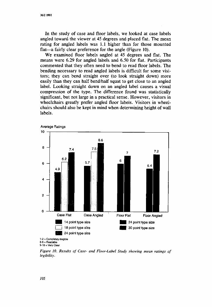
In the study of case and floor labels, we looked at case labels angled toward the viewer at 45 degrees and placed flat. The mean rating for angled labels was 1.1 higher than for those mounted flat-a fairly clear preference for the angle (Figure 10).
We examined floor labels angled at 45 degrees and flat. The means were 6.29 for angled labels and 6.50 for flat. Participants commented that they often need to bend to read floor labels. The bending necessary to read angled labels is difficult for some visi- tors; they can bend straight over (to look straight down) more easily than they can half bend/half squat to get close to an angled label. Looking straight down on an angled label causes a visual compression of the type. The difference found was statistically significant, but not large in a practical sense. However, visitors in wheelchairs greatly prefer angled floor labeis. Visitors in wheel- chairs should also be kept in mind when determining height of wall labels.
Average Ratings 10
8.6
7.4 7
1 Case Flat Case Angled ' Floor Flat Floor Angled
14 point type size 0 18 point type size
24 point type size
24 point type size 30 point type size
1-2 =Completely illegible 5-6 = Readable 9-10 = Vely Clear
Figure 10. Results of Case- and Floor-Label Study showing mean ratings of legibility.
CURATOR
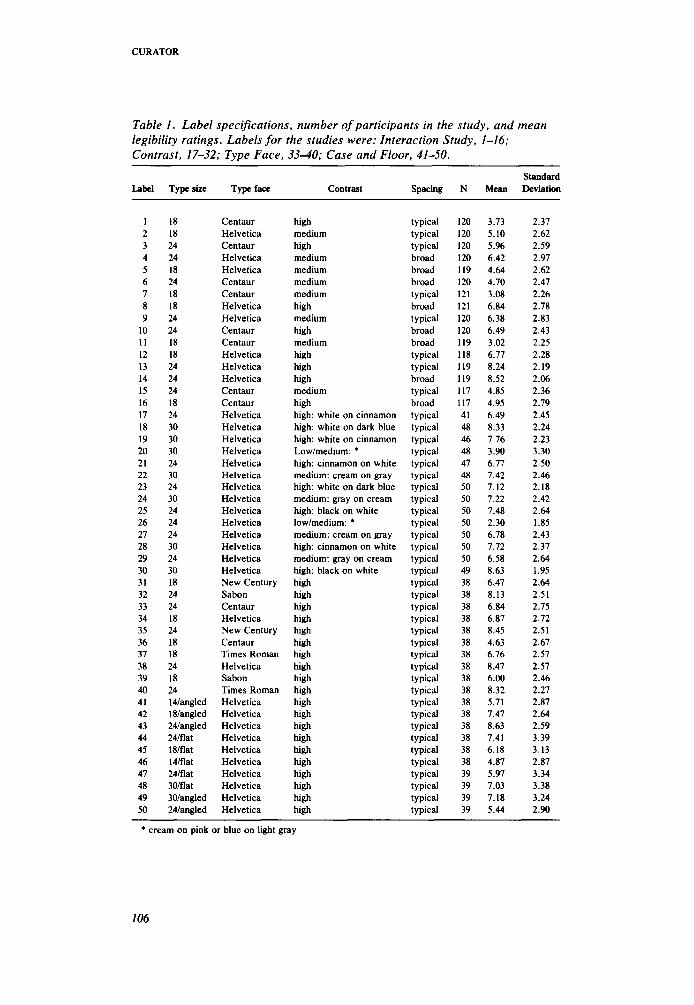
Table 1 . Label specifications, number of participants in the study, and mean legibility ratings. Labels for the studies were: Interaction Study, 1-16; Contrast, 17-32; Type Face, 3340; Case and Floor, 41-50.
Standard Label Typesize Typeface Contrast Spacing N Mean Deviation
1 2 3 4 5 6 7 8 9
10 11 12 13 14 15 16 17 18 19 20 21 22 23 24 25 26 27 28 29 30 31 32 33 34 35 36 37 38 39 40 41 42 43 44 45 46 47 48 49 50
18 18 24 24 18 24 18 18 24 24 18 18 24 24 24 18 24 30 30 30 24 30 24 30 24 24 24 30 24 30 18 24 24 18 24 18 18 24 18 24 I4langled 18langled 24langled 24lflat 18lflat l4lflat 24lflat 3Olflat 30langled 24langled
Centaur Helvetica Centaur Helvetica Helvetica Centaur Centaur Helvetica Helvetica Centaur Centaur Helvetica Helvetica Helvetica Centaur Centaur Helvetica Helvetica Helvetica Helvetica Helvetica Helvetica Helvetica Helvetica Helvetica Helvetica Helvetica Helvetica Helvetica Helvetica New Century Sabon Centaur Helvetica New Century Centaur Times Roman Helvetica Sabon Times Roman Helvetica Helvetica Helvetica Helvetica Helvetica Helvetica Helvetica Helvetica Helvetica Helvetica
high medium high medium medium medium medium high medium high medium high high high medium high high: white on cinnamon high: white on dark blue high: white on cinnamon Lowhnedium: * high: cinnamon on white medium: cream on gray high: white on dark blue medium: gray on cream high: black on white lowlmedium: * medium: cream on gray high: cinnamon on white medium: gray on cream high: black on white high high high high high high high high high high high high high high high high high high high high
typical typical typical broad broad broad typical broad typical broad broad typical typical broad typical broad typical typical typical typical typical typical typical typical typical typical typical typical typical typical typical typical typical typical typical typical typical typical typical typical typical typical typical typical typical typical typical typical typical typical
120 120 120 120 119 120 121 121 120 120 119 118 I19 119 117 117 41 48 46 48 47 48 50 50 50 50 50 50 50 49 38 38 38 38 38 38 38 38 38 38 38 38 38 38 38 38 39 39 39 39
3.73 5.10 5.% 6.42 4.64 4.70 3.08 6.84 6.38 6.49 3.02 6.77 8.24 8.52 4.85 4.95 6.49 8.33 7.76 3.90 6.77 7.42 7.12 1.22 7.48 2.30 6.78 7.72 6.58 8.63 6.47 8.13 6.84 6.87 8.45 4.63 6.76 8.47 6.00 8.32 5.71 1.47 8.63 7.41 6.18 4.87 5.97 7.03 7.18 5.44
2.37 2.62 2.59 2.97 2.62 2.47 2.26 2.78 2.83 2.43 2.25 2.28 2.19 2.06 2.36 2.79 2.45 2.24 2.23 3.30 2.50 2.46 2.18 2.42 2.64 1.85 2.43 2.37 2.64 1.95 2.64 2.51 2.75 2.72 2.51 2.67 2.57 2.57 2.46 2.27 2.87 2.64 2.59 3.39 3.13 2.87 3.34 3.38 3.24 2.90
_____ _____
* cream on pink or blue on light gray
106
3f32 1993
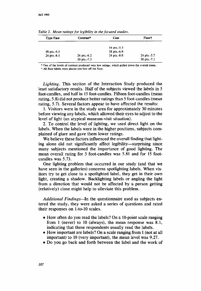
Table 2 . Mean ratings for legibility in the focused studies. Type Face Contrast* CaSe Floor?
14 pt~.-5.3 18 pts.d.1 18 pts.-6.9 24 pts.-8.1 24 pts.-6.2 24 pts.-8.0 24 pts.-5.7
30 pt~.-7.3 30 pts.-7.1
* One of the levels of contrast produced very low ratings, which pulled down the overall mean. t All floor labels were placed one foot off the floor.
Lighting. This section of the Interaction Study produced the least satisfactory results. Half of the subjects viewed the labels in 5 foot-candles, and half in 15 foot-candles. Fifteen foot-candles (mean rating, 5.8) did not produce better ratings than 5 foot-candles (mean rating, 5.7). Several factors appear to have affected the results:
1. Visitors were in the study area for approximately 30 minutes before viewing any labels, which allowed their eyes to adjust to the level of light (an atypical museum-visit situation).
2. To control the level of lighting, we used direct light on the labels. When the labels were in the higher positions, subjects com- plained of glare and gave them lower ratings.
We believe these factors influenced the overall finding that light- ing alone did not significantly affect legibility-surprising since many subjects mentioned the importance of good lighting. The mean overall rating for 5 foot-candles was 5.81 and for 15 foot- candles was 5.73.
One lighting problem that occurred in our study (and that we have seen in the galleries) concerns spotlighting labels. When vis- itors try to get close to a spotlighted label, they get in their own light, creating a shadow. Backlighting labels or angling the light from a direction that would not be affected by a person getting (relatively) close might help to alleviate this problem.
Additional Findings-In the questionnaire used as subjects en- tered the study, they were asked a series of questions and rated their responses on 1-to-10 scales.
0 How often do you read the labels? On a 10-point scale ranging from 1 (never) to 10 (always), the mean response was 8.1, indicating that these respondents usually read the labels.
0 How important are labels? On a scale ranging from 1 (not at all important) to 10 (very important), the mean level was 9.27.
0 Do you go back and forth between the label and the work of
107
CURATOR
art? On a scale ranging from 1 (never) to 10 (always), the mean level was 6.3.
Thus, these visitors read the labels often, believe they are very important, and go back and forth between the label and the work of art with a moderate degree of frequency.
DISCUSSION
The sample consisted of persons with low vision, elderly persons, and the museum’s curators. The most critical elements for this audience are the ability to get close to the label, type size, and contrast. The basic findings of the research were:
1. All four groups of subjects rated the labels fairly similarly with respect to legibility, suggesting a level of generalizability in the results. Also, although persons with low vision have more diffi- culty in reading labels than those with normal vision, generally speaking, what is more legible to a person with low vision is also more legible to a person with normal vision.
2. Visitors with vision impairment strongly prefer to get close to labels. This is greatly facilitated by putting labels at the eye level of most visitors.
3. Type size and contrast appear to be the most important ele- ments in the legibility of the labels we studied. In our study, type face and spacing appeared to be less important.
4. Spacing and height of placement interact so that labels placed above eye level are more legible with broad spacing, but when placed at or below eye level, typical spacing is preferred.
5. Reverse printing did not appear to affect legibility. 6. Visitors report that reading the labels is an important compo-
nent of looking at art. Limitations to the study need to be pointed out. First, our efforts
to investigate the effects of lighting on legibility were not effective. Even though we tried to vary lighting systematically, eyes adjust to the level of light available, and problems with glare vary according to the labels’ and the individuals’ heights. (The influence of lighting is complex and probably merits a study directly addressing the issue.)
Secondly, the studies were executed in a controlled setting as opposed to in situ. We conducted a partial replication of them in the museum’s European Paintings Galleries and the American Wing and found results similar to those reported here. However, labels could not be controlled for content, light, or color schemes
108
36l2 1993
of the labels. Notwithstanding, none of the results from looking at roughly 50 labels in those galleries contradicts what we have reported.
The implications of these studies are clear. The factors that in- fluence label legibility stand out both in nature and magnitude.
What needs to be added to this equation is the setting. Labels of black on white with very large letters, although legible, may dis- tract from the art on display. Or in an exhibit of small objects in a case, they may simply be impractical.
However, the data indicate that trade-offs are possible. For ex- ample, an 18-point Helvetica high-contrast label rivaled some 30- point medium-contrast labels in legibility. For example, in Table 1, compare labels 8 and 24. Also, at some point, one must realize that legibility for low-vision visitors may not be possible in gallery la- bels, and some other means of communication may be necessary. In exhibitions of light-sensitive etchings, which must be kept at 5 foot-candles, audio guides or brochures in large type may be de- sirable. Our respondents reported carrying magnifying glasses and flashlights when they visit the museum.
While engaged in the study, we had the opportunity to discuss visiting art museums with many of the visually impaired partici- pants. Two points were of special interest to us. Visual impairment has not caused any of them to change their viewing habits with respect to what they look at in the museum. We thought that prob- lems with vision might lead people to favor larger, less visually complex works of art (large sculpture, more modern art), but ac- cording to our subjects, they do not. More generally, we had thought that visual impairments might cause visitors to stay away from art museums out of frustration in viewing art. It would be difficult to overemphasize how wrong we were in this perception. Visitors with low vision are acutely aware of the benefits of sight. Museum visits allow these individuals to use the vision they have to its fullest advantage.
We may draw two conclusions from this study. First, legibility is legibility-average-age, normally-sighted curatorial staff had the same responses as did visually-impaired and elderly visitors. So institutions that set out to increase accessibility for special popu- lations (e.g., visually impaired) end up by increasing accessibility for all audiences.
Secondly, some factors that would seem to be important-type face and reverse printing-are not strongly related to legibility; others, seemingly less important-installation height and the abil- ity to get close to the label-show a much stronger influence on legibility. And in this study, type size outweighed all other consid-
109
CURATOR
erations in determining overall legibility. These results reinforce the benefits of obtaining empirical data from controlled studies to separate opinion from fact in matters of design and perception.
REFERENCES
Architectural and Transportation Barriers Compliance Board. (1986). Information Systems for Low Vision Persons. U.S. Department of Education Contract Number 300-83-0186. Washington, DC.
Burt, C. (1959). A Psychological Study of Typography. Cambridge, UK: Cam- bridge University Press.
Poulton, E. C. (1969). “Skimming Lists of Food Ingredients Printed in Different Sizes.” Journal of Applied Psychology 53: 55-58.
Smith, S. L. (1979). “Letter Size and Legibility.” Human Factors 21: 661470. The Metropolitan Museum of Art. (1989). Working Draft: Standards Manual for
Labeling and Signage in The Metropolitan Museum of Art. New York, NY: The Metropolitan Museum of Art.
The Toledo Museum of Art. (1984). Report on Labeling at the Toledo Museum of Art. Toledo, OH. The Toledo Museum of Art.
Vanderplas, J. M., and Vanderplas, J. H. (1980). “Some Factors Affecting Leg- ibility of Printed Materials for Older Adults.” Perceptual and Motor Skills 50: 923-932.
110