what is a picture - connecting repositories · 8.2 irving biederman, ‘recoverable’ and...
TRANSCRIPT


What is a Picture?


What is a Picture?Depiction, Realism, Abstraction
Michael NewallUniversity of Kent, UK

© Michael Newall 2011
All rights reserved. No reproduction, copy or transmission of this publication may be made without written permission.
No portion of this publication may be reproduced, copied or transmitted save with written permission or in accordance with the provisions of the Copyright, Designs and Patents Act 1988, or under the terms of any licence permitting limited copying issued by the Copyright Licensing Agency, Saffron House, 6-10 Kirby Street, London EC1N 8TS.
Any person who does any unauthorized act in relation to this publication may be liable to criminal prosecution and civil claims for damages.
The author has asserted his right to be identified as the author of this work in accordance with the Copyright, Designs and Patents Act 1988.
First published 2011 byPALGRAVE MACMILLAN
Palgrave Macmillan in the UK is an imprint of Macmillan Publishers Limited,registered in England, company number 785998, of Houndmills, Basingstoke, Hampshire RG21 6XS.
Palgrave Macmillan in the US is a division of St Martin’s Press LLC, 175 Fifth Avenue, New York, NY 10010.
Palgrave Macmillan is the global academic imprint of the above companies and has companies and representatives throughout the world.
Palgrave® and Macmillan® are registered trademarks in the United States,the United Kingdom, Europe and other countries.
ISBN: 978–0–230–27655–0 hardback
This book is printed on paper suitable for recycling and made from fully managed and sustained forest sources. Logging, pulping and manufacturing processes are expected to conform to the environmental regulations of the country of origin.
A catalogue record for this book is available from the British Library.
A catalog record for this book is available from the Library of Congress.
10 9 8 7 6 5 4 3 2 120 19 18 17 16 15 14 13 12 11
Printed and bound in Great Britain byCPI Antony Rowe, Chippenham and Eastbourne

v
Contents
List of Figures vi
Acknowledgements viii
Introduction 1
1 Convention 9
2 Seeing and the Experience of Pictures 19
3 A Theory of Depiction 42
4 Resemblance 66
5 Transparency and Resemblance 95
6 Realism 114
7 Varieties of Realism 135
8 Abstraction 172
Notes 199
Index 229

vi
Figures
3.1 Akiyoshi Kitaoka, Fish, 2003 504.1 Occlusion shape 714.2 Drawing after Georges Seurat, Seated Nude: Study for
Une Baignade, 1883, National Galleries of Scotland, Edinburgh 81
4.3 Doric column 844.4 Drawing after details of (from left to right) Still-Life with
Eggs and Game (detail), from the House of Julia Felix, Pompeii, first century AD, Museo Nazionale, Naples; Still Life with Water-Fowl and Flask of Water (detail), from Herculaneum, first century AD, Naples Archaeological Museum; Bowls of Fruit and Amphora (detail), from the House of Julia Felix, Pompeii, first century AD, Museo Nazionale, Naples 88
4.5 Akiyoshi Kitaoka, Fish, 2003 915.1 Drawing after René Magritte, La Condition Humaine, 1934,
National Gallery of Art, Washington DC 965.2 Adam Friedrich Oeser, The Sacrifice of Iphigenia, etching,
1755 997.1 Marginal distortions in a linear perspectival construction
of a row of equally thick columns 1437.2 Fragment of a wall decoration in stucco and paint from
Boscoreale, overlaid with the ‘vanishing-axis’ schema, first century AD, Museo Nazionali, Naples 144
7.3 Drawing after wall painting from Boscoreale, first century AD, Metropolitan Museum, New York 145
7.4 Drawing after a detail of Jean Metzinger, Cubist Composition (Landscape), 1912, Fogg Art Museum, Harvard University, Cambridge, Massachusetts 152
7.5 Drawing after Jean Baptiste Siméon Chardin, A Bowl of Plums, c. 1728, The Phillips Collection, Washington DC 156
7.6 Drawing after Georges Braque, The Round Table, 1929, The Phillips Collection, Washington DC 158
8.1 Drawing after Wassily Kandinsky, Black Relationship (Schwarze Beziehung), watercolour and ink on paper, 1924, Museum of Modern Art, New York 173

Figures vii
8.2 Irving Biederman, ‘Recoverable’ and ‘non-recoverable’ volumetric form 179
8.3 Cylinder and block with three-pronged vertices indicated 1848.4 Drawing after Pablo Picasso, Girl with a Mandolin
(Fanny Tellier), 1910, Museum of Modern Art, New York 1868.5 Drawing after Pablo Picasso, The Guitar Player, 1910,
Musée National d’Art Moderne, Centre Georges Pompidou, Paris 187
8.6 Detail of Figure 8.5 with T vertex deleted 1898.7 Transparency in planes and diffuse bodies 193
viii
Acknowledgements
Many people have helped me in writing this book, by commenting on parts of the text, and supporting its development in more practical ways. I am especially grateful to George Couvalis, Alan Lee, Richard Woodfield, Ted Cohen, Catharine Abell, Dominic Lopes, John Hyman, Jonathan Friday, Hans Maes, Jennifer McMahon, Luke Bowering, and an anonymous referee for Palgrave Macmillan. Each has given valuable advice at critical moments in the book’s development. Those flaws that remain are wholly my own.
I am grateful to the University of Kent for allowing me a term of study leave to work on the manuscript in 2007, and the Arts and Humanities Research Board, which funded another term of writing in 2008 through their Research Leave Scheme. The Nordic Artists Centre in Dale, Norway, and its then Director Elisabet Gunnarsdottir provided a wonderful environment in which to work during the summer of 2007, as did the Experimental Art Foundation, Adelaide, Australia for a few months in 2008.
Parts of this book have appeared elsewhere, and I would like to thank the editors and publishers of these journals for permission to use these materials here. Chapter 2 incorporates ‘Pictorial Experience and Seeing’, The British Journal of Aesthetics, 49, 2009, 129–141. Parts of Chapter 4 first appeared in ‘Pictures, Colour and Resemblance’, The Philosophical Quarterly, 56, 2006, 587–595, and ‘Pictorial Resemblance’, Journal of Aesthetics and Art Criticism, 68, 2010, 91–103. Chapter 5 is a revised ver-sion of ‘A Restriction for Pictures and Some Consequences for a Theory of Depiction’, The Journal of Aesthetics and Art Criticism, 61 (4), 2004, 181–194.
I thank Akiyoshi Kitaoka and Irving Biederman for generously allow-ing me to use their images in this book. The Beinecke Rare Book and Manuscript Library at Yale University has allowed me to reproduce Oeser’s etching from a slide of the frontispiece of its copy of Winckelmann’s Gedanken über die Nachahmung der griechischen Werke in der Malerei und Bildhauerkunst, and I appreciate its enlightened and unu-sual policy regarding permissions. I am grateful for John Newall’s help with other images, especially Figure 4.4 which he drew. The other fig-ures are my own work, mostly drawn after existing artworks.

Introduction
1
1. Depiction and seeing
Although philosophers as diverse as Plato, Descartes and Peirce have remarked on it, depiction has only become the topic of sustained philo-sophical attention in its own right in the past few decades.1 This interest developed following the publication of art historian E. H. Gombrich’s Art and Illusion in 1960.2 Gombrich’s ideas stimulated philosophers, notably Richard Wollheim and Nelson Goodman, who responded with distinc-tive views of their own.3 Since then there has been a stream of papers on the topic, and there is a growing collection of philosophical mono-graphs that take depiction as their subject. The relatively brief period over which this scholarship has developed and the substantial attention the topic is now receiving might inspire an optimistic thought: that the problems of depiction – of what a picture is and how depiction works – are ones that could be solved to (relatively speaking) general satisfaction in the not so distant future. In fact I do not think this is an unlikely prospect. There is nothing like a consensus yet – indeed there are many competing positions – but I believe developments in this direction have occurred. A new attempt to solve these problems, as I intend to present, will need to take these developments into account. Before identifying these advances, and sketching my own approach, it will help to define my objects of interest – pictures and depiction – and outline the major kinds of theory that have been developed to explain them.
What, then, do I mean by ‘picture’? A picture is a kind of repre-sentation; that is, it arouses in the viewer the thought of some other, typically absent, item – the picture’s subject matter.4 Of course, many things besides pictures represent – words, sentences, maps, diagrams, codes, sculptures, insignia, and so on. Pictures, however, exhibit a
2 What is a Picture?
distinctive kind of representation – one that is a feature of all pictures and pictures alone.5 I call this depiction. Depiction, provided we are sighted, is an utterly familiar phenomenon. Jan van Eyck’s The Arnolfini Portrait (1434, National Gallery, London) depicts Giovanni Arnolfini and his wife standing in a domestic interior, Hokusai’s The Great Wave at Kanagawa (c. 1830–1832, woodblock print, Metropolitan Museum of Art, New York) depicts a wave breaking in front of Mount Fuji, and Braque’s The Round Table (1929, Phillips Collection, Washington DC) depicts objects set on a table. Roughly speaking, a representation is a picture of X only if it is a surface capable of occasioning a visual experi-ence as of X. So, van Eyck’s painting occasions a visual experience as of the Arnolfinis; Hokusai’s print, a visual experience as of a wave; and the Braque, a visual experience as of a table set with objects. This is not in itself a theory of depiction, for there is much argument over the nature of this visual experience, and whether or not it is essential to depiction, but it is enough to at least roughly distinguish between representations that are pictures and those that are not. Contrast these pictures with a written or verbal description of their subjects. The description may well tell us many of the same things we can ascertain from the picture – but it does so without occasioning a visual experience as of its subject matter.6
While it has always been acknowledged that depiction is a distinct kind of representation, there are now many different accounts of just how depiction works. We may identify five major explanatory mod-els which have predominated in the literature, into which most exist-ing accounts fit: (1) Resemblance theories hold that pictures depict in virtue of resembling their subject matter. Resemblance theories have a long tradition extending well beyond the modern scholarship on depic-tion; Plato and Peirce are among the most notable of their proponents.7 (2) Conventionalism, as developed by Goodman, holds that depiction shares with language a basis in conventional rules, but is set aside from language by a distinctive structure.8 (3) Experience-based theories, such as Gombrich’s ‘illusion’ theory, and Wollheim’s ‘seeing-in’ account, claim that pictures depict in virtue of occasioning a particular kind of visual experience.9 (4) Recognition theories of the sort suggested by Flint Schier and developed by Dominic Lopes explain depiction in terms of a picture’s capacity to engage appropriate visual recognitional abilities as being essential to pictures.10 (5) What I call ‘mixed’ theories, which combine various aspects of the above explanatory models, are defended by Robert Hopkins and John Hyman, who in different ways combine an experience-based account with a resemblance view, as well

Introduction 3
as John Kulvicki, who combines claims associated with conventional-ism with a resemblance view.11
As I have mentioned, among this scholarship, developments have occurred that are, to my mind, indications of progress. Two I think are especially notable and welcome. First, one general kind of theory, conventionalism, has, after thorough examination been broadly dis-counted.12 This is not widely appreciated in the broader humanities. In particular, art history and theory often align themselves with con-ventionalism.13 Still, philosophy’s turn away from conventionalism is a decisive one, and to my mind correct. I will say something of the consequences this has for art history and theory shortly.
Second, among remaining views, mixed theories are increasingly prevalent. There is good reason for this, for resemblance, experience-based and recognition views, so I shall argue, each give genuine insights into the nature of depiction, but on their own are unable to give a fully adequate theory of depiction. Of course, the precise nature of these insights will be a matter of contention, but we can readily appreciate that each of these views contains an intuitively attractive idea. In the case of the resemblance view it is the idea that pictures often do resem-ble their subject matter in specifiable ways, and these resemblances play a role in the depiction of that subject matter. It is surely no coincidence, for instance, that a red pigment is the best way for a painter to depict an apple as being red. With experience-based theories it is the idea – already mentioned – that understanding pictures involves undergoing some kind of a visual experience as of their subject matter. In the case of recognition theories, it is an idea suggested by a modern, scientific conception of vision. This conception of vision holds that seeing is a process mediated by a complex array of physical mechanisms that are part of the visual system, and of whose operation we may not be conscious. The idea this suggests is that pictures engage mechanisms – recognitional abilities – of the visual system which are also engaged by their subject matter. Gombrich, without developing a theory on these lines, articulated this thought when he described picture-making as the ‘forging of master keys for opening the mysterious locks of our senses to which only nature herself originally held the key’.14
Accommodating each of these insights is a challenging task. First, each needs to be stated in a way that is supportable in itself. That is, claims about the nature of pictorial resemblance, experience and rec-ognition must be presented and defended. Current mixed theories, so I shall argue, fall short in this respect, making the wrong claims about resemblance and experience. Second, these claims will need to relate to

4 What is a Picture?
one another in an appropriate way. Principally, they must together con-tribute to an adequate account of depiction. But it is also worth remark-ing that in the process we will want to do justice to a feature that we might call the simplicity of depiction. By this I mean that understanding pictures seems, for the most part, immediate, irresistible and natural. It seems right that depiction should attract a correspondingly simple explanation. Each of the views to be combined, whatever its other mer-its and flaws, drew some of its appeal as a standalone theory from its simplicity – a picture, it tells us, is a resemblance, or can give rise to an illusion, or occasions recognition, and so on. We will want a successful mixed theory to have something of this quality, to itself exhibit a kind of simplicity, by uniting the views it combines under a single concept.
That is precisely what I intend to do. The concept that I use to draw together these views is that of seeing. My understanding of seeing is informed by cognitive science, but remains in its basic formulation close to the everyday understanding of it. Seeing is always of things – objects, properties and kinds. Seeing X, as I intend it, is a process involving three causally related items: stimulation of the visual system, conse-quent engagement of the ability to recognize X, and, arising from that, the experience of seeing X. When seeing X occurs in X’s absence, as in illusions and visual misrecognition, I call it non-veridical seeing.15 At the heart of my theory lies the claim that understanding a picture is such a phenomenon – it involves non-veridically seeing the depicted subject matter. I thus believe that the major condition a surface must satisfy to be a picture is that it be capable of triggering an instance of non-veridical seeing.
In developing this theory, perhaps the most serious objection I will face is this: that such an account fails to acknowledge that seeing pic-tures is in important ways different to seeing their subject matter. Most notably, seeing pictures typically involves an experience of the picture surface, which is somehow integrated with the experience of seeing the subject matter. I believe that this can be given a compelling response. Partly this will involve a phenomenological analysis of pictorial experi-ence that shows that it can be understood in terms of experiences of seeing. The other part of this response will show that those features of pictorial experience that have in the past been thought to distinguish it from ordinary seeing are in fact features of ordinary seeing. I will draw extensively from philosophy of mind and perceptual psychology the science of vision in order to make this point.
It will be partly clear already how my theory allows the exist-ing explanatory models to give insights into the nature of depiction.

Introduction 5
Recognition and experience are causally related elements in the process of seeing, as I understand it. With experience-based theorists, I accept that the experience of pictures – involving the non-veridical experience of seeing their subject matter on my account – distinguishes them from other kinds of representation. Equally, I accept the recognition theorist’s claim that pictures engage visual recognitional abilities engaged by their subject matter. It is recognitional processes that give rise to visual expe-rience, so one cannot have the latter without the former. Recognition goes some way to explaining how pictorial experience occurs, and, we shall see, allows us to account for the structure of pictorial experience. How then is resemblance incorporated into this account? The visual system has developed in part to recognize similarities in its environ-ment; it follows that crafting resemblances of various kinds will often be an effective way of engaging recognitional abilities. So we will find that pictures often – though not always – resemble their subject matter in what I call ‘viewer-independent’ respects. We will also find that it is the construction of our recognitional abilities that determines what kinds of resemblance are salient to depiction, and so in what respects pictures tend to resemble their subject matter.
The theory I present is thus intended to accommodate, relate and refine insights about depiction that earlier theories had wrongly placed in competition with one another, and it will do so using a concept – seeing – that both has a natural appeal as explanation and, I shall argue, forms a sound basis for a theory of depiction.
2. Realism and abstraction
The second part of this study explores consequences of this theory for the further analysis of pictures. In particular it looks at two qualities of pictures: realism and abstraction. Pictorial realism, or simply realism as I will usually call it, is, like depiction, a familiar but difficult to define quality. It is a quality of lifelikeness or verisimilitude that has in differ-ent forms been an aim of artists from van Eyck, Leonardo and Vermeer to the Impressionists and Seurat. It is also a characteristic feature of photography.
Realism poses a range of questions that can be addressed at a philo-sophical level. Foremost among these is: what makes a realistic picture realistic? What, for example, makes van Eyck’s Arnolfini Portrait more realistic than a Byzantine painting? One kind of response, which I shall reject, holds that realism is culturally relative. That is, we find a pic-ture realistic when we are habituated to its manner of picture-making.16

6 What is a Picture?
So, we find the Arnolfini Portrait realistic because we are habituated to Western pictures of this kind, but find the Byzantine painting lacking in realism because we lack habituation to these kinds of pictures. The other major kind of response to this question is the type of approach known as an ‘information’ theory. My own position shares some central ideas with these, but also differs from existing accounts in important respects. Information theories hold that a picture’s realism depends on the information it conveys via depiction.17 For example, on a basic account, the more information a picture conveys in this way, the more realistic it is likely to be.18 For such theories, a picture’s realism thus depends on the properties it depicts its subject matter as having (since it is by depicting properties that a picture conveys information about its subject matter). My account endorses this idea, and drawing on my theory of depiction, makes a further claim: that realism will depend on the capacity of a picture to occasion the seeing of those properties. Like existing information theories, this recognizes the fact that realis-tic pictures do tend to convey more visually discernible information about their subject matter than other pictures. It also acknowledges and clarifies the idea that the experience of seeing a realistic picture of X somehow involves a fuller or richer experience as of X than that of a less realistic picture of X. This is something that information theories, to their detriment, fail to do.
Another problem posed by realism is that it appears in a variety of forms. The realism of van Eyck, for example, is very different to the realism of the Impressionists, in spite of their apparently common aim. I account for this by allowing that different varieties of realism depict their subject matter as having different kinds of properties. So, van Eyck’s pictures are especially attentive to details of form and tex-ture, while an Impressionist painting tends to neglect these in favour of attending to evanescent effects of atmosphere and light.
A further, related, question I address is whether there exists an opti-mally realistic method of depiction. Some writers, such as Gombrich, think that a perspectivally based realism is such an optimal method. This view also seems implicit in more recent writers, notably Hyman. The development of realistic picture-making on this view can be seen as a progression towards some kind of perspectivally based realism, beyond which no further significant development is possible.19 These ideas seem to me quite wrong, and I will spend some time refuting them in detail. I argue that perspective-based realism is not an optimally realistic method of depiction, nor can any method be so described. Instead, there exists a range of methods that are ‘incommensurable’

Introduction 7
and ‘ incompatible’ in their realism. They are incommensurable in the sense that they are realistic in different ways, depicting different kinds of properties; and they are incompatible in that they resist combina-tion into a method able to depict all those kinds of properties. This will show that the development of realistic methods cannot take the form of an unequivocal progression except for brief periods. Instead, the real-istic tradition produces competing methods of realism that often can-not be judged more realistic than one another per se. I support these conclusions with an extensive examination of particular methods of depiction, from Renaissance perspective and Ancient Greco-Roman techniques of spatial representation, to Pointillism and Cubism.
An interesting consequence of my theory of depiction is that its scope is broader than ordinarily thought: it can also be used to shed light on abstraction in painting and other two-dimensional media. Unlike my interest in realism, my concern with abstraction has little precedent in the literature on depiction. It might be thought that there is a good reason for this. Abstraction – at least pure abstraction such as that of Mondrian, Malevich and Kandinsky, is often thought to depict nothing at all – instead presenting only actual configurations of painted shape and colour. But as we shall see, this is not so. While abstract painting does not depict people, landscapes, still-life arrangements, and so on, it does occasion the non-veridical experience of seeing other items, often planar and linear forms in a shallow spatial arrangement. Wollheim is the one philosopher to have recognized this (he devotes a page to the idea in Painting as an Art), but we will find that it is something also widely recognized by artists and critics of abstract art, such as Clement Greenberg and Michael Fried.20
This is the most speculative part of my study. Its central argument uses Irving Biederman’s theory of volumetric form perception, or ‘object recognition’ as he calls it.21 (I make use of this theory elsewhere in this book too, but here my position depends on it more extensively.) While this theory currently has wide support in vision science, it is more con-troversial than the other theories regarding vision that I use. My pro-posal is that abstract painting can occasion the non-veridical seeing of a wide range of properties, but that it always excludes the recognition of volumetric form. This means that abstraction can be thought of as frustrating the mechanisms of volumetric form perception proposed by Biederman. Examining Analytic Cubism, I argue that the develop-ment of abstraction did indeed involve the progressive disabling of these mechanisms. This analysis will help us to give a description of the distinctive quality of the space depicted in abstract painting. ‘Abstract

8 What is a Picture?
space’ we will find, has a shallow spatiality derived only from relations such as overlapping and transparency. I conclude by discussing how the relative constancy of this kind of space in abstract painting should not be considered an artistic limitation, but supports a surprising diversity of meaning.
3. Structure of the book
The book is laid out as follows. Chapter 1 is brief, and examines and criticizes the conventionalist view of depiction. Conventionalism is not well regarded in the philosophy of art, but I think it worth present-ing the reasons for its rejection. As I have mentioned, other disciplines concerned with the analysis of images, especially art history and art theory, often have a more positive view of conventionalism, and readers versed in these disciplines will reasonably want to know why I take a dim view of it. Chapter 2 presents my account of pictorial experience, and lays the groundwork for Chapter 3, which presents the theory of depiction I have outlined above. Chapter 4 gives my account of the role of resemblance in depiction. Chapter 5 completes my examination of depiction by looking at a little-remarked-on phenomenon which I call transparency, and exploring its consequences for a theory of depiction. Chapter 6 presents my account of pictorial realism, and Chapter 7 argues for the further conclusions about realism outlined above, via an examination of variety of methods of depiction. Finally, Chapter 8 sets out my views on abstraction.

1Convention
9
This chapter argues that conventionalism, the idea that convention has a significant role in determining the content of pictures, is miscon-ceived. I focus particularly on Goodman’s theory because it is the most carefully worked out conventionalist account in the literature and has had significant influence in aesthetics and visual art theory.1 Section 1 distinguishes between a range of relatively uncontroversial conven-tions that often play a role in depiction, but do not play a significant role in determining the content of pictures, and the conventionalism of Goodman, which claims that convention is central to depiction. Or as Goodman puts it, ‘that for a picture to represent an object, it must be a symbol for it’.2 In Section 2, I lay out two arguments made against conventionalist theories of depiction generally. Sections 3 and 4 treat the specific details of Goodman’s theory of depiction.
1. Conventions and conventionalism
Following David Lewis, I understand a convention to be a solution to a co-ordination problem.3 Co-ordination problems admit multiple solu-tions; any solution, however, must be accepted by the entire community that experiences that problem if it is to be effective. That is, the solution to a co-ordination problem involves the agreement of the community to co-ordinate their collective behaviour in one way or another. What is critical in solving such a problem is the co-ordination of the com-munity’s behaviour, rather than the behaviour itself. Lewis gives as an example that of a co-ordination problem of a community determining which side of the road vehicles drive on. There are two practical solu-tions to this problem – vehicles may drive on either the left or the right. The actual choice of left or right is an arbitrary one – left is as good
10 What is a Picture?
as right – provided that the entire community co-ordinates its behav-iour. Thus, driving on the left is a convention in certain countries, and driving on the right is a convention in others. Words and symbols are conventional representations, for any configuration of syllables may be used as a word and any inscription may be used as a symbol, provided that a community of users agrees on the particular use.4 It is a conven-tion, for instance, that the English word ‘dog’ is used to represent a dog. We could if we wished, provided that the community of language-users to which we belonged agreed, use a quite different word to represent dogs. Those who use other languages, of course, do. In French, a differ-ent convention exists, and chien is used to represent a dog; in German, hund is used for the same purpose; and so on.
Conventionalism holds that, like words and symbols, pictures depict their subject matter in virtue of conventions. Goodman, in Languages of Art, comes to this conclusion by reasoning that since resemblance theories are untenable, depiction must be a culturally imposed relation. That is, it must be a convention.5 ‘The plain fact,’ writes Goodman, ‘is that for a picture to represent an object, it must be a symbol for it’.6
Conventions, we will find, do play some role in depiction. Conventionalism, however, maintains that like words and symbols, depiction is entirely a matter of convention; this, we shall see, is false. I turn now to a common motivation for conventionalism. This, I argue, does not in fact entail conventionalism, although it does draw attention to a range of conventions used in picture-making. Gombrich, in the first pages of Art and Illusion, asks why it is that cultures have developed so many different ways of depicting the same things. Why does almost every culture and every historical period give rise to its own recogniz-ably distinct pictorial style?7 Part of his answer is that every culture has different rules and formulas for making pictures; and it is the variations between these rules and formulas that are responsible for the variations of pictorial style between cultures. Goodman takes this, and other simi-lar remarks of Gombrich’s, to be evidence in favour of conventionalism.8 And certainly, it is easy to understand how it might be taken this way: every pictorial style, it might be argued, that depicts a certain subject – say a human body – in a different way presents an equally successful, equivalent solution to what Lewis might call the co-ordination prob-lem of depicting the human body. Thus, it might be concluded, each different style is based on conventions. But this would be an oversim-plification of the situation. Two factors, in particular, are elided here. First, many such pictures will not be equivalent depictions – that is, while they may depict the same subject matter, they will depict it as
Convention 11
having different properties. An Egyptian painting of a human figure might depict the true proportions of limbs and body; a painting by Caravaggio will depict light and shadowed regions of the body, and so on. Some styles are able to depict certain types of properties and others are not. So far as two styles depict subject matter as having dif-ferent types of properties, they do not solve the same problems, and it is possible that these ‘problems’ are not co-ordination problems at all. Accordingly, they cannot, on this basis, be judged conventional. To take one example, the use of a relatively dark tone to depict shadow and a relatively light tone to depict the surface of an illuminated body does not appear to be a solution to a co-ordination problem, and so is unlikely to be a convention, for it is hard to imagine what else could be used to depict shadow and light.9
Second, conventions do make an appearance in Gombrich’s ‘styles’, but not in such a way as to justify conventionalism. To develop the previous example, there are many different media and techniques with which suitably dark and light tones can be generated. With a pen or pencil one may hatch, cross-hatch, stipple or use many other tech-niques; using paint one can apply translucent glazes, apply an opaque layer of paint, alla prima or impasto, apply a divisionist mixture, and so on. These different media and techniques provide solutions to the co-ordination problem of generating tone, and so they should be regarded as conventions. But as I have noted above, the use of tone itself to depict shadow is not conventional. Much the same may be said of the use of other colour properties, including hue and saturation, in pictures. Like tones, there are many ways of generating areas of particular hues and saturations, yet there are restrictions on the use of these properties – one cannot depict an apple as red by using a saturated blue colour. Similarly, the techniques for distinguishing a shape on a picture’s surface are con-ventional. One may delimit a shape by tracing it with a line, by vary-ing its tone or colour relative to the ground, and so on. But there are restrictions on the type of shapes that can be used to depict any given thing – the sun may be depicted using a circle, but not a square.10 This conventional aspect of the techniques and methods of depiction does not entail conventionalism, and so it is wrong to infer conventionalism from the wide range of pictorial styles and techniques.
2. Objections to conventionalism
In this section, I look at two arguments that attack conventional-ism directly. Both criticize conventionalism for its failure to explain

12 What is a Picture?
particular facts about depiction. The first of these is a feature usually called ‘natural generativity’, although Wollheim, we will see, calls it ‘transfer’. The second is the apparent ability of members of ‘pictorially innocent’ cultures to interpret pictures.
Wollheim neatly outlines the first objection. Conventionalism, he writes,
cannot account for the fact of transfer. By the term ‘transfer’ I mean, for instance, that, if I can recognize a picture of a cat, and I know what a dog looks like, then I can be expected to recognize a picture of a dog, but on the Semiotic [i.e. conventionalist] view this ought to be baffling. It should be as baffling as if, knowing that the French word ‘chat’ means cat, and knowing what dogs look like, I should, on hearing it, be able to understand what the word ‘chien’ means.11
Schier calls this characteristic of depiction ‘natural generativity’.12 He provides a more general formulation of the phenomenon than Wollheim, observing that once one has developed a minimal pictorial competence – which Schier believes may be gained once one has been exposed to and understood just a single picture – ‘you should then be able to interpret novel [pictures] ... given only that you can recognise the object or state of affairs depicted’.13 According to conventionalism, this should not be so. Because conventions are arbitrary rules, knowing one cannot shed light on any others. Schier’s claim may be over- ambitious in specifying such minimal conditions for pictorial competence, but Wollheim’s is surely correct – for we are able to understand pictures of things we have not seen before, given that we are able to recognize them in life. We do not need to learn what particular pictures, or types of pictures, signify in the way we learn the meanings of words that that we have not encountered before. Conventionalism is thus unable to explain natural generativity.
Conventionalists could reply using the following strategy, which Goodman’s account, discussed below, suggests, and which Hopkins has explicitly described.14 The strategy supposes that rather than there being a multitude of different conventions that must be learned in order to understand pictures – one convention for every visible item we can depict – there are only a few general conventions that need to be learned. These general conventions would govern the depiction of types of properties, such as local colour, three-dimensional shape, rela-tive size, and illumination and shadow. To take one example, a conven-tion might rule that illuminated surfaces be depicted using light tones,
Convention 13
and surfaces in shade be depicted using dark tones. The existence of such conventions seems unlikely, for as I have already said, it is hard to imagine a system in which illuminated surfaces are depicted using dark tones and shadow is depicted with light tones. Moreover, it is telling that no culture appears to have developed such a convention. I will dis-cuss and criticize one such proposed convention, that relates to relative size, when I discuss the details of Goodman’s account of depiction.
Supporters of conventionalism often claim to draw support from art history and anthropology by citing instances in which members of other cultures have trouble interpreting pictures from Western cul-tures. An individual who has lived in a culture with different pictorial systems to ours, they suggest, will be unable to understand our pictures because they depend on conventions unknown to them. Often, cases concerning ‘pictorially innocent’ cultures – traditional tribal cultures with no tradition of picture-making – encountered for the first time by Westerners are cited in support of this claim. The tribespeople are pre-sented with photographs, drawings or other Western pictures, but fail to understand them as depicting their subject matter.
While such arguments are appealing, they tend to be based on selec-tive anecdotal evidence. Jesse Prinz, in a useful article on this subject, observes that there has in fact been a great deal of variation in the results of anthropological research regarding the reactions of pictori-ally innocent people to pictures.15 He notes that while some researchers have found that the pictorially innocent are unable to interpret pictures at all, others have found that their subjects easily understand pictures, and will sometimes even mistake the picture for the thing it depicts. Others again, have found that the pictorially innocent are able to inter-pret some pictures more readily than others (photographs of human faces, for instance, were understood, while photographs depicting mov-ing figures were not).16
Prinz focuses on the more recent, and, he believes, more credible, work of a group of anthropologists, led by E. S. Muldrow, W. F. Muldrow and J. B. Deregowski, who have conducted experiments with the Me’en, an Ethiopian tribe which has been isolated from Western influences and is – or was until the arrival of Muldrow et al. – pictorially inno-cent.17 The team of anthropologists, Prinz writes,
showed the Me’en a series of three representational drawings printed on coarse fabric. The first two were depictions of animals with which the Me’en were very familiar (a buck and a leopard ...) When asked to identify what they saw, [the] Me’en ... interpreted these pictures with

14 What is a Picture?
remarkable success. With the exception of a couple of subjects who were probably intimidated by the testing situation, all those tested were able to accurately identify the objects in the pictures.18
Provided the Me’en really were pictorially innocent, this result is strong evidence against conventionalism. If pictures are simply sym-bols, as conventionalists hold, they should have been just as mysterious to the (non-English-speaking) Me’en as the words ‘buck’ and ‘leopard’ presented in a similar context.19
Prinz’s conclusion is bolstered by the results of experiments performed on another pictorially innocent group: young infants. It has long been thought that young babies do not need to learn how to understand cer-tain pictures, such as simple pictures of faces. R. L. Gregory mentions an experiment by R. L. Fantz in which very young infants’ eye movements (one of the few movements they are able to control) are used as an index of their interest in an object. Babies spent substantially longer looking at schematic pictures of faces than they did at abstract designs.20 So far as such results are an indication of pictorial understanding, they are further evidence against conventionalism.
3. Goodman’s theory of depiction
In this final section I discuss how Goodman elaborates his theory beyond the simple proposal – discussed and criticized earlier – that pictures are symbols. The further proposals of Goodman’s that I look at here are not intended to address the problems raised in Section 2, but are motivated by another problem. The account given there tells us what it is that depiction has in common with those representations we typically think of as symbolic or language-like, but it does not tell us what distinguishes depiction from them. Here I discuss and criticize Goodman’s resolution of this problem.
Depiction, according to Goodman, differs from other types of rep-resentation such as language in three important respects. Systems of depiction are ‘syntactically dense’, ‘semantically dense’ and ‘relatively replete’. Syntactic and semantic density serve to distinguish a range of systems of representation, including graphs, maps, diagrams and mod-els as well as pictures, from language-like representation. Depiction, on Goodman’s account, is further distinguished from these ‘iconic’ sys-tems by the trait of relative repleteness.
A system of representation is syntactically dense if it ‘provides for infinitely many characters so ordered that between each two there is a

Convention 15
third’.21 Consequently, any variation in a content-bearing feature of a representation, even an incremental one, effectively gives rise to a dis-tinct character – a distinct syntactic type. A system of representation is also semantically dense if each such change produces a corresponding variation in the representation’s content.22 Language does not satisfy these conditions – one may vary the way a word appears in a great many ways (word, word, word) without changing its syntactic type (it remains an instance of the same word), or its denoted meaning. Pictorial modes of representation, on the whole, are syntactically and semantically dense. If I draw a head in profile, each point on my drawing plays a role in determining the syntactic type, and determining the content of picture. If I were to rework the drawing’s outline, even just changing it slightly, then it would both belong to a new syntactic type, and alter the drawing’s content.
A system of representation is relatively replete if many features of its representations are content-bearing.23 Representations such as graphs, maps, diagrams and models tend to lack relative repleteness. A diagram, for instance is usually not relatively replete, since only a very limited number of a diagram’s properties typically bear on its content. Goodman notes, ‘[t]he only relevant features of the diagram are the ordinate and abscissa of each of the points the line passes through. The thickness of the line, its color and intensity, the absolute size of the diagram, etc., do not matter’.24 Pictures, however, are relatively replete. Almost any visually discernible property of a mark an artist makes could bear on a picture’s content. Goodman uses the example of an artist’s sketch: ‘Any thickening or thinning of the line, its color, its contrast with the back-ground, its size, even the qualities of the paper – none of these is ruled out, none can be ignored’.25
Goodman’s characterization of a system of depiction as syntactically and semantically dense and relatively replete is elegant and ingenious. Nevertheless, it has its limitations. Christopher Peacocke has noted that certain representations that clearly are not pictures are nevertheless products of syntactically dense and replete systems of representation. The particular counter-example he gives has been adapted by Robert Hopkins, and Schier also gives a similar counter-example.26 Hopkins, perhaps, puts it best:
We might use a graph to track the temperature of a quantity of colourless gas over time. With time elapsed along the x-axis, vari-ous features of the plotted line might feed, in a weighted manner, into the temperature represented. These features might include the

16 What is a Picture?
line’s height against the y-axis, its thickness, its hue, its saturation, its brightness, and so on. The graph would be a symbol in a system which is both syntactically and semantically dense and relatively replete. Yet ... it would not depict anything.27
The graph, in this counter-example, despite being syntactically and semantically dense and relatively replete, remains a graph. These fea-tures do not in themselves suffice to distinguish pictures from other kinds of representations. Now, it should be noted that this is not really to contradict Goodman, for he nowhere claims that he is giving a com-plete theory of depiction – that is, furnishing necessary and sufficient conditions for a something to be a picture. Rather, he claims only to give necessary conditions for picturehood.
It turns out, though, that even this claim is not supportable. One of these features, syntactic density, is not a necessary condition for depic-tion. Digital pictures, such as the pixelated images of the television and computer screen, woven or embroidered pictures, such as tapestries and needlepoints, and mosaics are made up of discrete ‘units’ of colour. These systems of depiction allow for only a finite amount of characters in any given area, and so cannot be syntactically dense.
4. Convention or resemblance?
A final concern about Goodman’s theory arises from the question of how syntax and semantics are related, for while Goodman presumably intended this to be determined by convention, these features of his account also seem to be consistent with – and indeed suggest – another sort of relation. Explaining syntactic density, he writes,
[c]onsider ... some pictures in the traditional Western system of rep-resentation: the first of a man standing erect at a given distance; the second, to the same scale, is of a shorter man at the same distance. The second image will be shorter than the first. A third image in this series will be of intermediate height; a fourth, intermediate between the third and second; and so on. According to the representational system, any difference in height among these images constitutes a difference in height of the man represented.28
According to this system of depiction ‘any difference in height among these images constitutes a difference in height of the man represented’. That is, the images and their referents resemble one another with respect

Convention 17
to relative height. Here, it is not convention that determines content, but resemblance. Should this be a problem for Goodman? He could perhaps escape from accusations of surreptitiously presenting a resem-blance theory by saying that it only applies to some systems of represen-tation, and then only by a conventional stipulation. But Goodman is well known for his explicit rejection of resemblance theories, which he makes at the outset of Languages of Art, and it seems unlikely he would have wanted to re-admit resemblance as having any role in determining a picture’s content.29 I think this passage should thus be seen as a telling slip, one that shows that it will prove hard to identify particular con-ventions that could determine the content of actual pictures, without introducing some non-conventional factor.
John Kulvicki, in a recent account of depiction inspired by Goodman, has drawn attention to the fact that there is nothing inconsistent in introducing resemblance alongside features such as syntactic and semantic density, and relative repleteness, in much this way. While endorsing, with qualifications and additions, this part Goodman’s analysis, he argues that Goodman was wrong to reject resemblance as having a place in a theory of depiction, and goes on to develop a theory that adapts these ideas of Goodman’s, while also giving resemblance a role.30
I will say more about Kulvicki’s account later, but here I want to point out that whatever its virtues or drawbacks, this approach should not be counted a conventionalist theory. Once resemblance is given a role in determining content, as I have argued it is in the system Goodman describes, the system is no longer a solution to a co-ordination prob-lem. That is to say, establishing meaning is no longer a matter of co-ordinating responses. If we were to stipulate that the shorter image be used to represent the taller man, and represent him as taller, this could only work at the level of symbolic representation. We are not generally capable of having a visual experience as of a taller man, in the pres-ence of an image which itself is shorter relative to other elements in the picture.31 So the system cannot serve to depict relative height. As I said at the outset, a convention is a solution to a co-ordination problem, so depiction on this kind of account is no longer a matter of conventional representation. Rather it is mediated principally by resemblance, and so should be understood as a resemblance theory.
What then of the features that Goodman claims distinguish depic-tion? They do not intrinsically involve convention; indeed, once resem-blance is introduced they can be readily understood as consequences of resemblance. Syntactic and semantic density, for example, reflect a

18 What is a Picture?
comparable density in the subject matter of pictures. Any point on an object can be considered to have a particular spatial position and a par-ticular colour, and between any two such points there will always be a third such point. It is scarcely surprising that someone intending to craft a faithful resemblance of an object will often do so in a way that allows these continuous variations in objects’ surfaces to be reproduced and given significance. That is to say, the use of a syntactically and semanti-cally dense system is an expected outcome of the picture- maker’s effort to reproduce the continuous variations of the subject matter itself. A similar account can be given of relative repleteness. If the picture-maker wants to achieve a maximal resemblance, they will likely work their medium in such a way that many aspects that can support a resem-blance to the subject matter will do so. So, to use Goodman’s words, ‘[a]ny thickening or thinning of the line, its color, its contrast with the background, its size, even the qualities of the paper’, all may be pressed into service in crafting a resemblance.
This approach should therefore not be seen as a way of rescuing a con-ventionalist theory, but rather a new way of developing a resemblance theory. I will discuss resemblance theories in general in Chapter 4, and return to Kulvicki’s account again in Chapter 5.

2Seeing and the Experience of Pictures
19
This chapter begins the presentation of my own theory of depiction. As I said in the Introduction, my theory is a kind of mixed theory, in that it incorporates insights about experience, recognition and resemblance. The main point I argue here is that understanding a picture of X involves non-veridically seeing X. This proposal, we shall find, incorporates two of these insights, those regarding experience and recognition. My major focus here will be on experience; I will have more to say about recogni-tion in the next chapter where I argue that non-veridical seeing is prefer-able to both experience and recognition as an explanation of depiction.
The first three sections examine the concepts of seeing and non- veridical seeing. There we will find that my proposal depends in large part on a slightly different and lesser claim, that understanding a picture of X involves the non-veridical experience of seeing X. This is an account of pictorial expe-rience – it characterizes the experience that pictures give rise to when we understand them – and as such it directly competes with other accounts of pictorial experience. Sections 4 and 5 consider two such competitors: that featured in E. H. Gombrich’s illusion theory, and Wollheim’s account of it as seeing-in. Both have significant drawbacks, but they also have useful things to teach us. Sections 6 through 9 put the case for my account of pic-torial experience as the non-veridical experience of seeing. Sections 10 and 11 consider two broader questions about pictures and experience: whether pictorial experience is always visual, and whether understanding pictures must always involve experience. In both cases I argue in the affirmative. That will clear the way for me to conclude my argument.1
1. Seeing
I understand seeing to be intentional; that is, to see is to see some-thing, some object X, or some kind or property X instantiated in

20 What is a Picture?
an object. Seeing X is a process that includes the following causally related items:
(i) stimulation of the visual system, (ii) a consequent engagement of the subject’s ability to visually recog-
nize X and(iii) a consequent visual experience of X by the subject.2
The visual system includes the eyes, the optic nerves and the parts of the brain involved in vision. Ordinarily, in what I shall call veridical seeing, light reflected from something, X, projects through the sub-ject’s pupil, and stimulates the retina. Signals from the retina are sent through the optic nerve to be processed by the various parts of the brain devoted to vision. If the subject is to see X, this processing must involve the engagement of the subject’s ability to visually recognize X. A visual recognitional ability is primarily established through visual perception, and allows the subject to visually identify objects, kinds or properties as ones previously encountered.3 One way of thinking of this, proposed by the philosopher Mohan Matthen, is to consider visual recognition as a matter of the visual system classifying stimuli into groups. Where stimuli are classified into the same group, they are recognized as being of the same class (i.e. as being a particular object, kind of item or property).4
Recognition in turn gives rise to a certain conscious state in the sub-ject, a visual experience of X. As Matthen puts it, this is ‘the consciously available record of sensory classification’.5 Matthen points out that expe-rience should not be thought of as a side-effect – an epiphenomenon – of recognition; rather, it plays an important part in human cognition. Experience is ‘the normal means by which an observer ... gains access to the results of sensory classification for the formation of beliefs’.6 That is, visual experience plays a functional role in seeing, enabling visual information to contribute to the larger economy of the human mind.
2. Non-veridical seeing
It will be clear that on my definition seeing includes both veridical and non-veridical seeing. Intuitively, this distinction seems clear. Veridical seeing is seeing as we ordinarily know it, whereas non-veridical seeing is that which occurs in visual hallucinations, dreams, visual imagin-ings, illusions, and visually mistaking one object for another. However, expressing this distinction, as David Lewis has shown, requires some

Seeing and the Experience of Pictures 21
care.7 Since this distinction is logical, it is not enough to say, for exam-ple, that veridical seeing depends on a causal link between seeing X and X itself, of the kind outlined above. For what if the subject happened to see X when they were presented with not just X, but any visual stimulus at all? When the subject is presented with X, it still initiates a causal chain culminating in the experience of seeing X, so it seems to satisfy the call for a causal link. However, since the subject’s visual system is constituted so that it responds to any stimulus in this way, this is hardly veridical seeing. Following Lewis, I define seeing X as veridi-cal if and only if X is present before the subject’s eyes, and seeing X is counterfactually dependent on the presence of X before the subject’s eyes. The relation of counterfactual dependence means that seeing X is dependent on X’s presence before the subject’s eyes and, if X was not so present (if, e.g., X was to be obscured or removed from the subject’s field of vision), then seeing X would not occur. It follows that seeing X is non-veridical just in case X is not present before the subject’s eyes, or, if X is present, when this relation of counterfactual dependence does not hold.8
I make a further distinction between two types of non-veridical see-ing. In the first, there is some item, not X, present before the subject’s eyes on which the non-veridical seeing of X counterfactually depends. Seeing X is thus dependent on the presence of some other item, let us call it Y, before the subject’s eyes, such that if Y were not so present (if, e.g., it was obscured or removed from the subject’s field of vision) then seeing X would not occur. This is what happens when we visually mis-take Y for X, or when we are subject to an illusion. I will be arguing that understanding pictures involves this kind of non-veridical seeing. In the second kind, which will not concern me, the recognition of X does not have a counterfactual dependence on the presence of anything in the viewer’s visual field. Typically, in such cases, the visual system receives stimulation from elsewhere in the brain. This encompasses visual hal-lucinations, items seen in dreams and visual imaginings.9
3. Recognition and experience
It will be important in what follows to carefully distinguish visual recognition and visual experience. Since visual experience is the con-scious record of the information processing that constitutes recogni-tion, it follows that experience of X cannot occur without recognizing X. However, this does not mean that they are the same thing, or that one is simply an aspect of the other. While experience never occurs

22 What is a Picture?
without recognition, recognition can, and does, occur without experi-ence. Matthen sets this point out clearly by examining three examples in which the recognition and experience are dissociated. As this will prove a crucial point for me, in this chapter and the next, I will discuss them with some care.
The first example is blindsight. Blindsight is a neurological condition in which individuals lack visual awareness of objects occupying part of their visual field, yet are able to make use of information derived from that part of their visual field about those objects. Blindsighted subjects report that they have no visual experience of such objects. Yet when asked to respond to a question relating to an object lying in that part of the visual field, or simply asked to guess what that object is, they will often do so with success. Blindsighted subjects’ visual recog-nitional abilities are operative, and they have some kind of access to the information these abilities yield, but this occurs without having experience of this information. Visual recognition here occurs without visual experience.10
The second example is the phenomenon of ‘visual masking’ or ‘meta-contrast’. Unlike blindsight, metacontrast does not rely on any abnor-mality of the visual system; anyone with normal vision will be subject to it. Metacontrast is observed when a subject is presented first with one visual stimulus, rapidly followed by a stimulus of complementary shape – say a circle followed by an annulus. The subject will be visually aware of only the second shape, the annulus, and fail to visually experi-ence the first shape. In this way, the second shape ‘masks’ awareness of the first. However, similar to blindsight, the subject can still have access to information about the masked object. Given a range of options, and asked to guess which is the masked object, the subject is able to select correctly the initial stimulus. Again, this is evidence that recognition can occur without experience.11
Matthen’s third example is found in the perceptual systems of sim-ple animals. We assume that the neural anatomy of very simple ani-mals – Matthen uses the example of the Californian Sea Hare, Aplysia californica, a sea slug with 20,000 neurons – is not sufficient to support consciousness. Yet the Californian Sea Hare has functional perceptual systems that allow it to recognize and respond to features in its environ-ment.12 Vision, it should be added, does not appear to be one of the Sea Hare’s perceptual systems. While they do have simple eyes, their visual systems do not suffice for recognition, only responding to changes in the general intensity of light. Instead, they rely on smell and touch to recognize objects.13 A better example in the case of vision might be the

Seeing and the Experience of Pictures 23
fruit-fly, Drosophila melanogaster, which has around 200,000 neurons (still a minute brain compared to a human’s 100 billion or so neurons). The fruit-fly is unlikely to support what we would regard as conscious-ness, yet its ability to negotiate its environment in flight shows that it is able to visually recognize things.14 The fruit-fly may therefore be a further example of visual recognition without experience.15
Note that there is an asymmetry in the relationship between recog-nition and experience. Experience requires recognition – since it is a record of recognition – but recognition can occur without being regis-tered by experience. This asymmetry sets the course of my argument, for if I can show that understanding a picture of X involves the experi-ence of seeing X, it will follow that it also involves the recognition of X. Once both these claims are established, it will be easy to establish the other conditions required to show that understanding a picture of X involves non-veridically seeing X.
However, the claim that understanding a picture of X involves the experience of seeing X will require substantial argument. Partly this is because philosophers have given contrary accounts of our experience of pictures. Partly it is because our experience of pictures usually var-ies markedly from our experience of their subject matter. I turn to this task, and these problems, below.
4. Pictorial experience as illusion ...
The idea that our experience of pictures is directly comparable to our experience of that which they depict has been raised in the past. Most notably, Gombrich proposed that pictures ‘trigger ... non-veridical visual experiences’.16 However, he more often spoke of ‘illusion’, a term with different implications. Since Gombrich’s views first became subject to criticism by philosophers, such ideas have widely been thought unvi-able. In particular, Gombrich has been criticized for failing to note that depiction is in important ways unlike seeing. Philosophers who have followed Gombrich in focusing on the nature of pictorial experience have as a result characterized pictorial experience as differing from see-ing in various ways. I will argue that these characterizations are, in various ways, flawed, and that Gombrich is right to directly compare pictorial experience to that of seeing, although not always to illusion.
It is worth mentioning the role these writers give to pictorial expe-rience. They claim that a picture depicts its subject matter wholly or partly in virtue of its capacity to give rise to a particular kind of visual experience that places the picture viewer in a relation to the picture’s

24 What is a Picture?
subject matter. On these accounts the viewer understands the picture as depicting its subject matter wholly or partly in virtue of the picture giving rise to such an experience. I call such theories ‘experience-based’ theories of depiction. I will assess the prospects for using pictorial expe-rience as the basis of a theory of depiction in Chapter 3; for now I limit my attention to pictorial experience.
The theory of depiction usually attributed to Gombrich is extrapo-lated from the account of pictorial experience he gives at the beginning of Art and Illusion.17 This ‘illusion theory’ claims that a picture depicts its subject matter because it generates, in the viewer, a visual experience that under the right conditions is apt to deceive the viewer into believ-ing the subject matter is actually present. The trouble with this theory is its claim that pictures can deceive us in this way. Many pictures can-not under any conditions prompt an illusory experience of their subject matter. Our visual experience of an Impressionist painting, for instance, will always involve a visual awareness of its brushwork.
Gombrich attempts to overcome this problem by proposing that our experience of pictures has a dual character: it alternates between an experience of seeing the picture’s subject matter that on its own is apt to give rise to an illusion, and a perception of the medium from which the picture is made.18 He proposes that when looking at a picture we may at first have an experience that could form the basis of an illu-sion of the subject matter, but this experience typically gives way to an awareness of the actual physical qualities of the picture – the quali-ties of the picture’s painted, printed or drawn surface. As we continue to look at a picture we may switch back and forth between these two experiences. To introduce this idea, Gombrich recounts an anecdote of Kenneth Clark’s:
Looking at a great Velázquez, he wanted to observe what went on when the brush strokes and dabs of pigment on the canvas trans-formed themselves into a vision of transfigured reality as he stepped back. But try as he might, stepping backward and forward, he could never hold both visions at the same time ... 19
As Clark steps back, he has a visual experience of the subject matter, and as he steps forward, and the separate marks of the brush come into view, sees the flat surface of the canvas for what it is: ‘strokes and dabs of pigment on the canvas’.
Wollheim has pointed out that this account of pictorial experience is still inaccurate.20 For in looking at a picture we are very rarely disposed

Seeing and the Experience of Pictures 25
to believe we are looking at the thing depicted, rather than at a picture. Typically, we remain simultaneously visually aware of the picture’s physical constitution as a flat surface throughout our viewing of the picture. In the case of paintings, we usually remain aware of features such as brushstrokes, glossy varnish and other distinctive features of technique and materials. Whatever Clark and Gombrich may say, there seems little evidence that pictorial experience in general involves alter-nation of our awareness between pictorial content and form.21
5. ... and as seeing-in
With this shortcoming of the illusion theory in mind, Wollheim pro-posed that pictorial experience is instead best described as ‘seeing-in’.22 When we understand a picture, he held, we see the picture’s subject in the picture; hence, ‘seeing-in’. Seeing-in is distinguished by a feature Wollheim called ‘twofoldness’. ‘[W]hen seeing-in occurs’, he wrote, ‘two things happen: I am visually aware of the surface I look at, and I dis-cern something standing out in front of, or (in certain cases) receding behind something else’.23 Thus, a viewer looking at a picture under-goes a ‘twofold’ experience: on one hand, he or she is visually aware of the flat, painted, printed or drawn surface of the picture; on the other, he or she discerns the subject matter of the picture, and discerns it as being a three-dimensional thing, standing (typically) out from a back-ground, or in front of other depicted objects. Wollheim called the first of these aspects of seeing-in the ‘recognitional’ aspect (not to be con-fused with my use of the term), and the second the ‘configurational’ aspect. Wollheim presented seeing-in as an advance on the illusion theory since it acknowledges the twofold character of pictorial experi-ence: while we have a visual experience of the subject matter, we tend to simultaneously remain aware of the picture’s paintedness, flatness and other properties of the picture’s medium.24
A serious objection has been directed against Wollheim’s descrip-tion of pictorial experience as seeing-in. Martin Kelly has noted that trompe l’oeil paintings actually preclude seeing-in in those instances where they give rise to an illusion.25 Trompe l’oeil is a genre of paint-ing, typically still-life, intended to ‘trick the eye’, to trick the viewer into thinking, if only for a moment, that what they have before them is not a picture but the depicted subject matter itself. The experience of seeing-in, as I have discussed, is distinguished by its twofold char-acter – it involves a simultaneous visual awareness of the picture’s surface and of the picture’s referent. But the experience of trompe l’oeil

26 What is a Picture?
does not have this twofold character. The viewer is unaware of the pic-ture’s surface; he or she is aware only of the (illusory) presence of the referent. In such cases, depiction occurs without seeing-in. There is another kind of counter-example too. Some pictures, like trompe l’oeil, are often experienced without any visual awareness of the painted sur-face, but unlike trompe l’oeil, are not intended to trick us into believ-ing we are in the actual presence of the subject matter, and do not do so. Early Netherlandish painting provides instances of such pictures, van Eyck’s The Arnolfini Portrait being one of the most famous and most effective in this respect. One might be tempted to dismiss such a counter- example out of hand, for we are unused to such effects in our culture: even the most exacting print reproduction does not repro-duce it. Beside the general techniques of realistic painting, two quali-ties contribute to this effect. First, van Eyck avoids laying down any trace of brushwork that would be visible to the naked eye. Second, the details he depicts are so fine that they can be beyond the resolution of the naked eye, and well beyond the resolution of print reproduction, except when a substantially magnified view is presented. The modern viewer, trained to attend to technique as much as subject matter, looks into a painting such as this expecting to see some trace of the brush, some element of facture, but can only make out ever finer levels of detail of the objects depicted.26
Wollheim, foreseeing objections along this line, claimed that trompe l’oeil paintings are not in fact pictures at all – they do not depict. ‘[Some] paintings are non-representational ... because they do not invoke, indeed they repel, attention to the marked surface. Trompe l’oeil paintings are surely in this category’.27 However, Wollheim’s solution is inadequate. It requires that trompe l’oeil, and, as we have seen, many other paintings as well, are not pictures. And that is too high a price to pay to preserve an account of pictorial experience.
6. Pictorial experience as the experience of seeing
We have seen that the descriptions of pictorial experience considered above are each, in different ways, inadequate. Before presenting my own, it will be useful to bring together the positive conclusions that can be gathered from my criticisms. These can be summed up as fol-lows. First, pictorial experience can, and in most cases does, involve seeing-in. Second, it can involve the visual awareness of the subject matter, without an awareness of the picture surface. It may do this either as an illusion, as in the case of trompe l’oeil, or without, as in The

Seeing and the Experience of Pictures 27
Arnolfini Portrait. Between them these three descriptions apply to all examples of pictorial experience.28
At this point we might conclude that the most that can be said about pictorial experience is that it involves one or other of these experi-ences, but that these different kinds of pictorial experience share no common feature.29 This, I think, would be unwarranted. Against this view, I now argue that all these kinds of pictorial experience involve the non- veridical experience of seeing the subject matter. In the case of most pictures, this experience is accompanied by the experience of see-ing the flat configurations of shape and colour, and other features such as brushstrokes, that characterize the picture’s surface. Here pictorial experience may be further characterized as seeing-in. In other cases, such as trompe l’oeil or The Arnolfini Portrait, the experience of seeing the picture’s subject matter is not accompanied by a visual awareness of the picture’s surface. I think it will already be clear that the experience of seeing characterizes instances of pictorial experience that involve visual awareness of the subject matter without a simultaneous visual awareness of the picture surface, for they do not differ from the veridi-cal experience of seeing in terms of visual experience per se; it is only factors extrinsic to experience that set them apart: their non-veridical-ity, and in cases such as The Arnolfini Portrait, the belief that that experi-ence is indeed non-veridical.
Now, it might be thought that there is a problem here. Non-veridical seeing, it could be objected, entails illusion or misrecognition, and this does not occur with The Arnolfini Portrait. Fleshed out a little, this line of thought would run as follows. If we simply have a non-veridical expe-rience of seeing X, it is impossible to distinguish this, qua experience, from an experience of actually seeing X. Thus, if the latter results in a belief that we see X, it is reasonable to expect the former to do so, or at least to dispose us to do so, too. If this is right, then non-veridical seeing is identical to illusion, and cannot give rise to non-illusory picto-rial experiences, such as that we have viewing The Arnolfini Portrait (or, indeed, that involved in seeing-in). The first thing to note here is that reflection on our experience of paintings such as The Arnolfini Portrait shows that it is indeed possible to have an experience as of seeing some-thing without believing we actually see it. So there is no doubt that this line of argument is wrong: it misunderstands the relationship between seeing and belief fixation. But how then can we conceive this relation-ship? I think the right approach is found in a modular theory of mind. It is widely accepted that the visual system is modular: certain parts of the brain are devoted solely to processing visual information.30 Modular

28 What is a Picture?
theories of mind provide a useful resource to draw on here. These hold that separate modules – neurologically hardwired mechanisms that are function specific – exist for separate cognitive faculties such as visual recognition, language, and so on. On Jerry Fodor’s influential theory, once modules have processed this input, it is processed by non-modular cognitive systems that ‘subserve the fixation of belief’.31 More recent accounts, such as Peter Carruthers’ massive modularity theory, hold that belief generation is also a modular process.32 In either case, on the basis of inputs that activate various modules, we develop beliefs regard-ing the cause of those inputs. The modules themselves are information-ally encapsulated: they process inputs independently of one another, so that information from one does not affect the processes of others. This means that the input analysis produced by various modules may be inconsistent, as it is with some optical illusions. For example, in the case of the Müller–Lyer illusion, if we measure with a ruler the ‘shafts’ of the two arrow figures we find they are the same length, while judging by visual perception alone, we will usually conclude that one is longer than the other.33 On Fodor’s account, this inconsistency of input analy-sis is resolved by higher-level, non-modular systems. These mechanisms would allow us to develop a consistent belief, by discounting the input analysis of one module as the product of non-veridical perception.
Such a proposal is complicated by the fact that vision does not prove to be informationally encapsulated in a straightforward way. In par-ticular, it is well established that vision is cognitively penetrable – information from our beliefs influences what we see in a range of ways. To take a familiar example, we may stare at a tree trunk with a camou-flaged moth on it for some time without seeing it. Only when some-one mentions its presence do we become visually aware of the insect. Another familiar example occurs when we have been given a verbal or written description of an individual previously unknown to us. Here a new belief (that X has certain distinctive, visually discernible proper-ties) can give us the ability to visually recognize something (X) that we were not able to visually recognize before. Such examples make it more difficult to maintain that seeing is a process that occurs independently of belief formation in the cases I need it to. For while the Müller–Lyer illusion may be impenetrable, other kinds of seeing are cognitively pen-etrable, and it might be that these include the non-veridical seeing that I attribute to pictorial experience.34
Recent work in cognitive science suggests that this difficulty may be surmountable. One possible way of tackling it is found in a pro-posal developed by Zenon Pylyshyn, which draws on a range of results

Seeing and the Experience of Pictures 29
in perceptual psychology. He holds that a particular stage of vision – ‘early’ vision – is cognitively impenetrable.35 Early vision involves the processing of ‘specifically visual’ properties of a scene, including outline shape, colour, textures and properties as complex as volu-metric form.36 In this sense it is an important part of what we ordi-narily regard as vision as a whole. Pylyshyn holds that penetration, where it does occur, happens either prior to early vision, or following it. Noticing the moth is an example of the first kind of penetration: when we are told of the moth’s presence we adjust our attention to the scene accordingly, raising our chances of seeing it. Visually recogniz-ing an individual from a description is an example of the latter kind of penetration. It involves matching the description with the properties that early vision processes.37
Pylyshyn’s proposal is controversial, so I do not want to tie myself to it.38 However, my position does require that something like it is cor-rect: that some parts of visual processing are cognitively impenetrable. Would such a limited impenetrability suffice to support my position? It will, so far as the penetrability of vision corresponds with the respects in which depiction is cognitively penetrable – that is, with the ways in which beliefs can influence what pictures can occasion visual experi-ences of. Without committing to a particular account of the cognitive impenetrability of vision, there is little point in developing a detailed account of the impenetrability of depiction here. Still, it is worth not-ing that the examples of impenetrability I have mentioned have equiv-alents in depiction. Like the moth on the tree trunk, pictures often depict things that we do not notice until their presence is mentioned to us. And just as in life we may visually recognize someone when armed with a description of them, so a description of the sitter may allow us to identify a portrait’s subject.
Let us assume that vision is cognitively impenetrable in the way I require. We can now understand how our perception of a picture such as The Arnolfini Portrait can be considered as another example of incon-sistency of input analysis. On one hand we have an experience of see-ing the subject matter. On the other, there are contextual cues that also allow us to realize that the painting is just that, a painting: the painting’s frame, its place on the wall in the National Gallery, the dis-tinctive parallax effects as we move about it, the fact that we recognize its subject matter as that of the famous Arnolfini Portrait, and so on. As with the Müller–Lyer illusion, these inconsistent inputs are resolved at the level of belief fixation, where we discount the first input as non- veridical. Such modular accounts thus allow us to understand how

30 What is a Picture?
seeing need not be believing. The experience of seeing thus can be, but need not be, illusion.
7. Analysing seeing-in
I now argue that seeing-in, too, involves non-veridical seeing. The cru-cial challenge to this claim lies in a detail of Wollheim’s account of the phenomenology of seeing-in: his insistence that seeing-in is phenom-enologically irreducible to seeing. Speaking of an example that involves seeing the figure of a boy in the marks on a wall, he claims,
We get lost once we start comparing the phenomenology of our per-ception of the boy when we see him in the wall, or our perception of the wall when we see the boy in it, with that of our perception of boy or wall seen face-to-face. Such a comparison seems easy enough to take on, but it proves impossible to carry out. The particular com-plexity that one kind of experience has and the other lacks makes their phenomenology incommensurate.39
There is, I think, good reason to doubt this. Pictorial seeing-in, I pro-pose, involves the veridical experience of seeing the picture surface, and the non-veridical experience of seeing the depicted subject.40 The first, despite what Wollheim says, is obvious and uncontentious: seeing a picture partly involves the experience of seeing its surface, for we do in fact see its surface. The second point is a matter of contention, for it is not immediately obvious that seeing X in Y involves the experience of non-veridically seeing X. This is the point I now argue.
Wollheim has made us used to the idea that we are capable of seeing things in pictures, and other flat surfaces. But the reverse is also true: we are capable of seeing flat surfaces in three-dimensional objects. That may sound an odd idea, but it is one that painters, especially, are famil-iar with. In looking at their subject matter, painters are often taught, or, by a process of their own, come to see it as a picture. Looking at their subject, they see in it the two-dimensional shapes they will draw on their canvas, and the colours of the pigments that they need to apply to create their intended effect. Moreover, they may see scumbled areas of paint in roughly textured subject matter, blurred areas of ink or water-colour in a dark cloud, broad brushstrokes in reflections on water, and so on. Such an ability to see-in is no doubt often of use in picture-making, and many art teachers have encouraged it. For instance, the common technique of attending to negative shapes essentially involves

Seeing and the Experience of Pictures 31
seeing flat shapes in the subject matter, and reproducing them on paper or canvas. Similarly, the technique of looking at subjects through a view-finder is in part intended to encourage seeing the framed subject as a picture.
For the most part, we do not see the world about us in this way, but the fact that we are capable of doing so raises the possibility of a useful comparison. Say we see a picture’s subject matter, Y, in the flat, marked surface of the picture, X. We will also be capable of seeing X, the pic-ture, in Y, the subject matter. How will these two experiences compare? Take the following example, where X is Paul Cézanne’s painting Mont Sainte-Victoire (1904–1906, Philadelphia Museum of Art) and Y is the landscape it depicts, viewed from the point Cézanne painted it. The art historian John Rewald has taken a photograph from this position, which can be used in place of the landscape itself to demonstrate the points made below.41
Looking at the painting, we see the mountain in it: we remain visu-ally aware of the painting’s patchwork of brushstrokes, and we see the mountain in this as if behind pale veils of atmosphere. Standing in front of the mountain itself, and without ever losing visual awareness of that fact, we can, with a little effort, see-in it Cézanne’s painting. That is, we can see-in the scene a flat surface on which is inscribed the characteristic features of Cézanne’s composition, the colours of his pig-ments, and, in the rough geology of the Mont, the faceted, patchwork quality of his brushstrokes.
Now, when we say we see the picture in the landscape, the implica-tion is that we do not merely see-in it the two-dimensional design of the picture; at the same time we are visually aware that this picture we are seeing-in depicts that landscape. It might be objected that this is not so, that we just see-in the picture’s design, colours, and brushwork in the mountain view, and that is the end of the matter. But that would be untrue: the surface we see-in does not seem to us an abstract paint-ing; it is unmistakably a painting of the mountain view. Thus, it seems seeing-in must figure twice in our account of this experience. That is, we see the design of a Cézanne in our view of the mountain, and we see in that design the view of the mountain.
It is here that we come to appreciate that seeing-in must be further analysable, for when we consider the actual nature of this experience it is clear that it does not have this order of complexity. As I have said, we are visually aware of the seen-in painting as depicting the mountain; but at the same time, we do not have a double awareness of the moun-tain. Rather, our experience of the actual mountain exists in a relation

32 What is a Picture?
to our experience of the seen-in picture surface that also allows it to function as the experience of the seen-in landscape. How could this be? The puzzle is easily solved if we accept that seeing Y in X involves the experience of seeing X and the experience of seeing Y. For if, on top of this, Y is a pattern in which we can see X, this adds nothing to our overall experience; it simply reiterates the fact that we see X. I believe seeing Y in X therefore does involve the experiences of seeing X and Y – typically, the veridical experience of seeing X and non-veridical experience of seeing Y.42
8. Some objections considered
It is important to note that I do not mean that the experience Cézanne’s painting occasions of seeing the mountain is identical with the expe-rience of actually seeing the mountain. In general, the non-veridical experience of seeing X, occasioned by a picture, may well differ from our experience of actually seeing X. This often happens when we see X as having fewer kinds of properties than we would actually see it as hav-ing. For example, a schematic outline picture might allow us only to see X as having a certain kind of general shape standing out from a ground. A black and white picture will allow us to see X as having light and dark tones, being illuminated and shaded in certain ways, but it will not allow us to see X as having properties of hue. An Impressionist paint-ing, or a painting such as Cézanne’s Mont Sainte-Victoire, will allow us to see its subject as having all those properties, but will not allow us to see it as having any kind of fine details. As I have said, when we consider seeing Cézanne’s painting in the landscape, and then consider seeing the landscape in the seen-in painting, we find that the original, actual, experience of the landscape is the only experience of the landscape that we have. But this experience is not identical to that we would expect the seen-in painting to occasion. Rather, it exceeds that experience; it includes the experience of seeing the properties of the landscape we would expect to be included in our experience of the painting, and it also includes the experience of those fine details of the landscape that we see in life. Thus, when we see the painting in the landscape, and ask ourselves about the nature of the experience we might have seeing the landscape in that painting, we may be slightly disconcerted by the fact that there is already a more vivid experience of the landscape present, that does not simply coincide with, but matches and exceeds the expe-rience of the landscape that we would expect to have in front of the actual painting.

Seeing and the Experience of Pictures 33
This raises another question. How is it, given that our experience of seeing X that is occasioned by a picture might only in some respects be like our experience of actually seeing X, that it can be an experience of seeing X at all? This will not seem so strange when we consider that we often have an experience of seeing the same object under different aspects. That is, actually seeing an object is often like other instances of actually seeing it only in some respects. For instance, seen in daylight and at close quarters we will be able to see an object as having many of its visually discernible properties. But when we see an object at night, we cannot see its hues. At a distance, through fog or otherwise blurry vision, we cannot make out details of its shape. Through a screen of foliage, or among a moving crowd, we might see only certain parts of the object. In all these situations we are often still able to see that this is the same object (although we might not do so as reliably as we would in more forgiving conditions). This is a capacity that can be understood as characteristic of our visual systems, for it allows seeing, and so the experience of seeing, under adverse viewing conditions (night, fog, when glimpsed, etc.), sacrificing a degree of accuracy in the interests of efficiency.43 The non-veridical experience is in this respect just like the veridical experience: it can involve the experience of seeing X as having many of the visually discernible properties it in fact has, or it can involve the experience of seeing X as having relatively few of those properties.
Another kind of concern is this: my proposal that seeing Y in X involves the experience of seeing X and seeing Y might be thought to sit uncomfortably with the way we ordinarily think about seeing. We might be concerned that this would imply that the subject believes (absurdly) that both X and Y are at once present to our gaze. This worry can be quickly dismissed, for we have already seen that a modular account of mind allows that non-veridically seeing Y need not imply belief in it. Two contradictory inputs, X and Y, occur, but this contradic-tion is resolved at the level of belief fixation, where the non-veridical input, Y is discounted.
This response does not entirely banish the concern that there is some-thing awkward in the notion of seeing both X and Y in the way I have described. My account requires that we have an experience of seeing X and of Y, simultaneously, such that one appears in front of the other. Each part of X, the picture surface, will be seen as either in front of or behind the part of Y that it depicts. Each such part of the picture surface will appear to precisely overlap, or to be overlapped by, what it depicts. They do so, though, without appearing to obscure, or be obscured by,

34 What is a Picture?
the subject matter. So, in seeing Y in X (taking the case now where we see X as in front of Y) we will see the various parts of X as precisely over-lapping the parts of Y they depict without obscuring those parts of Y. The concern here is that seeing things as overlapping typically involves a reduced visual awareness of the overlapped item – it appears obscured or occluded. This, however, is not the case in my account of seeing-in.
First, I would stress that however odd it may seem, my description of the twofold phenomenology of seeing-in is accurate. In the case of the Cézanne, we have an experience of seeing the brushstrokes as marks on a flat proximate surface, and also, in them, a faraway landscape that is not at all obscured by them. Second, this phenomenology is not unique to seeing-in. Far from being a disreputable notion, twofoldness, as I have described it, is recognized as a feature of another kind of visual experience: the perception of transparency.
The perception of transparency involves the seeing of one body through another transparent or translucent one. Like seeing-in, percep-tual transparency is twofold in the sense that it involves simultane-ously seeing two objects as overlapping without the overlapped object being obscured. The phenomenology of transparency, and the condi-tions under which it is perceived, have been well studied.44 It is gener-ally accepted that the perception of transparency does involve the kind of twofoldness I describe: ‘At the retina, each location can have only one value of luminance or colour. When transparency is perceived, however, different surface qualities can be redistributed to two or more apparently superimposed layers’.45 A transparent pane of red glass over-lapping a blue object will, at the point of overlap, transmit light that we would ordinarily perceive as violet. In the context of the percep-tion of transparency, the phenomenal components of violet – red and blue – are ‘redistributed’, the red to the transparent pane and the blue to the object seen through it. That is to say, rather than simply seeing a violet area where they overlap, we will have a more complex, and phenomenologically distinct experience: an awareness of a blue surface seen through a transparent red layer. Such redistribution can apply to properties of ‘texture and motion, as well as colour or brightness’.46
It should be noted that there are also differences between the phe-nomenology of seeing-in and transparency. For example, picture sur-faces are not typically perceived as transparent. We are, for instance, visually aware of the Cézanne’s surface as made up of opaque, rather than transparent, brushstrokes. Another difference is that seeing-in does not simply involve one visual awareness ‘overlaid’ with another, in the manner of two transparent surfaces superimposed. Rather, particular
Seeing and the Experience of Pictures 35
parts of the subject matter, say various features in the case of a por-trait – the eyes, nose, mouth, hair, etc. – are seen in particular parts of the picture – in particular shapes, brushstrokes, areas of colour, and so on. But this does not detract from the fact that both seeing-in and the perception of transparency are twofold. The perception of transparency thus shows that visual experience can present the kind of twofoldness as I have attributed to seeing-in.
9. A modular basis for seeing-in?
Reflection on the nature of our visual experience is enough to show us that twofoldness as I have described it is a feature of seeing-in. But while this conclusion is secure, we may still want to ask how the visual system can be structured so that it supports such twofold experiences. The response I sketch here appeals to the modularity of the visual sys-tem. Just as the visual system can be considered a module, so the visual system is itself comprised of various modules. ‘The human brain’, neu-robiologist Semir Zeki states, ‘handles different attributes of the visual scene in different, geographically distinct, subdivisions ... vision is therefore organised along a parallel, modular system’.47 This modular-ity provides a structure that we might plausibly expect to allow twofold visual experiences. Such a structure, to take a simple hypothesis, might allow an object, X, to engage not one, but two sets of recognitional abilities located in parallel modules, so generating experiences of both X and Y, the experience of Y (as noted above) being later discounted at the level of belief fixation.
How might this in fact be realized? It is difficult to say without ven-turing into speculation, as this aspect of picture perception has not had a great deal of scientific attention. Matthen has proposed an account of the processes underlying seeing-in’s phenomenology, which is along these lines, although for reasons I mention below it is not a completely satisfactory response.48 Matthen bases his account on the widely accepted idea that there are two kinds of vision – the vision of visual perception, and the vision of that guides our bodily movements.49 The former, which he calls descriptive vision, involves the conscious visual awareness we have of our physical environment, and plays the major role in the recognition of objects. The latter, motion-guiding vision, mediates our physical interaction with those objects. Motion-guiding vision is held to be unconscious, or largely so.50 These two kinds of vision are processed largely independently, in different parts of the brain; descriptive vision is the product of the ventral stream of visual

36 What is a Picture?
processing and motion-guiding vision is the product of the dorsal stream of visual processing. Matthen argues that these two kinds of vision give seeing-in its distinctive phenomenological character. Ordinarily, in see-ing an object, both streams are actively trained on that object. But in the case of pictures matters are more complex. The attention of the two streams is divided: the ventral stream is active in our experience of the picture’s subject matter, but the dorsal stream is active in our percep-tion of the picture’s surface. Our descriptive vision responds as if to the actual subject matter, but our motion-guiding vision does not; it responds only to the picture’s flat surface. In support of this, Matthen points out that ‘when one reaches to [a] picture in order to touch the [depicted] figures, motion-guiding vision reacts to the lines themselves, not to what they depict’.51 Now, while we are largely unconscious of motion-guiding vision, Matthen suggests that it makes itself felt in ‘the feeling of presence in our visual experience of real things’.52 That is, motion-guiding vision is responsible for our sense of physical proxim-ity to objects, of being bodily present in a scene so that one can move within it and physically interact with it. It is this, Matthen proposes, that our visual experience of depicted objects lacks.
In proposing a parallel modular account of picture perception, Matthen’s account does precisely what I ask for. Unfortunately, for my purposes, there is also a difficulty with it. As it stands, Matthen’s account implies that descriptive vision is inactive in our perception of the picture surface, but I don’t think this is right. To reiterate Wollheim, we can have a visual awareness of details of a painting’s brushwork and facture at the same time as we see-in its subject matter. This is certainly so in the case of Cézanne’s Mont Sainte-Victoire, and much Impressionist, Post-Impressionist and Expressionist painting besides. So while Matthen’s analysis might otherwise be defensible, we are still left with the problem of finding a further parallel modular process, within the processes of descriptive vision (i.e. in the ventral stream of visual processing).
10. Non-visual pictorial experience?
We are almost ready to conclude that pictorial experience always involves the non-veridical experience of seeing the picture’s subject matter. But before doing so, there is a final issue to consider. Most phi-losophers have assumed that pictorial experience is visual in nature, only arguing over the precise nature of this experience, as we have seen above. However, one, Lopes, has argued that pictorial experience
Seeing and the Experience of Pictures 37
need not be visual; he thinks that this experience may instead be tactile.53 This section discusses his claim and gives my reasons for rejecting it.
Lopes bases his claim on the fact that blind individuals, given pictures in which drawn lines are raised so that they can be detected by touch, can identify the subject matter with great success. We might expect the blind to have a facility for interpreting simple outline drawings of this kind, for feeling the outline such a picture traces is analogous to feeling the profile or cross-section of an object. But the blind also show an abil-ity to interpret pictures that use perspective, a feature often regarded as exclusively pictorial. Unlike outline drawings, perspective pictures do not reliably preserve actual proportions of their subject matter. Instead objects are drawn so that their parts diminish in size the more distant they are from a point of view. In making a perspective drawing of a view down a straight road, for example, the width of the road decreases as it recedes, the lines indicating the edges of the road converging towards a point on the horizon.
The effectiveness of perspective as a method of depiction is usually attributed to the fact that a perspectival image is constructed so that it transmits the same array of light to a point of view (the pupil) as does the depicted scene. Part of perspective’s effectiveness thus rests on the fact that vision literally has a point of view – the eye, or more specifi-cally, the pupil, through which light must pass to be admitted to the eye. In projecting the same array of light to this point, picture and sub-ject matter stimulate the retina in the same way, so generating the same (or an appropriately similar) perceptual effect in the viewer.
Blind individuals, having no vision – we might readily conclude – have no point of view. On this line of thought, it is therefore hard to understand how they could make sense of a perspective picture, and surprising that they in fact do. However, Lopes explains that there is reason for thinking that tactile experience can have what we may regard as a point of view, and that this can explain this facility for interpreting perspective pictures. He asks us to consider the following example:
Were a blind man standing at the Place de la Concorde asked to trace with his hands each side of the Champs Elysées to the Arc de Triomphe, he would start with arms stretched apart and then gradu-ally bring them together until they met. His arms would converge as they point to more distant objects. Unless he can do so, he does not know in which direction to walk in order to reach various boutiques, restaurants and bars located along the street.54

38 What is a Picture?
A tactile perspective picture may therefore make sense to a blind indi-vidual, since it records the direction one would have to move to in order to touch the depicted parts of a scene. A street drawn with converg-ing lines records the direction of the sides of the road (and the various establishments that line it) as it proceeds into the distance. The ‘point of view’ for such tactile pictures is not the eye, but the body itself, or some part of it.55
I am happy to accept that blind individuals have the capacity to deter-mine the content of raised-line perspective pictures in this way. However, I do not hold that this amounts to understanding them. My position here accords with our everyday intuitions about pictures, that understand-ing them involves visual experience. Even after considering the above account, we feel that there is something missing from a tactile experience of a picture, and we resist the thought that we should simply consider this as another way of understanding pictures. What does tactile experi-ence of pictures lack that is, on this everyday conception, crucial to their understanding? Put simply, I think that it is does not involve the visual experience of the subject matter. A visual experience and a tactile experi-ence may be experiences of the same thing and even the same properties, but they are qualitatively different. One involves the experience of visual properties – colour and tone (and keep in mind that even the marks mak-ing up the sparest line drawing will have such properties) – the other involves the experience of tactile properties.
I defend this conception of pictorial experience in the following way. While, as I have said, I accept Lopes’s argument that ‘perspectival per-ception is not unique to vision’,56 I want to resist his subsequent claim that pictorial experience is not intrinsically visual. Lopes proceeds from the first point to the second by assuming that for a mode of representa-tion to be a mode of picturing, it is enough that it has (or can have) this perspectival character. It is here that his argument can be overcome, by granting that perspective is not exclusive to pictures.
Thus, rather than granting that pictures can sometimes be under-stood tactilely, we should make an ‘extra-pictorial’ account of the ability to interpret raised-line pictures. That is, we should allow that there exists a separate mode of representation in which tactile experi-ence plays the same role as does the experience of seeing in depiction. Understanding a representation in this tactile mode will involve hav-ing an experience of touching the subject matter of the representation. Such tactile representations are not prevalent in our culture – possibly because the development or utility of this mode is somehow limited, or possibly because it has simply not been exploited as it could be. But in

Seeing and the Experience of Pictures 39
any case, understanding representations in this mode remains a pos-sibility for anyone with a sense of touch.57 Now, I don’t want to say that the raised-line drawings that Lopes discusses are such tactile repre-sentations, for they are presumably not intended as such: they are just pictures in which the lines have been embossed. However, since vision and touch share a perspectival character, a tactile representation of a scene X could accord with the laws of perspective much as a picture of X could. That is, the tactile representation could effectively represent X by tracing, in tactilely discernible form, the same shapes that a pic-ture would trace in line, tone and colour. And that allows us to under-stand how a picture, in which the lines are raised to make them tactilely discernible, can have its subject matter identified by touch alone. The unsighted individual interprets the picture as they would a tactile rep-resentation, and since touch, like vision, has perspectival qualities, we can see how they can determine the picture’s content, without under-standing the picture.
11. Depiction without experience?
Pictorial experience, we can now conclude, involves the non-veridical experience of seeing the picture’s subject matter. It might be thought that it follows straightforwardly that understanding pictures always involves this experience. But here we face a further hurdle that must be carefully dealt with. This involves a phenomenon I have touched on already: blindsight. Just as blindsighted individuals are able to visually derive information about objects without visually experiencing those objects, so they can visually derive information about a picture’s con-tent without having an experience of seeing the subject matter.
Matthen discusses an experiment concerning blindsight which uses pictures as stimuli, and so inadvertently gives us an insight into picto-rial blindsight:
[A] blindsighted patient was shown two pictures of identical houses, one of which was on fire, but with the flames occurring wholly in a ‘blind’ part of her visual field, i.e. a part in which she had no phe-nomenal experience. ‘When asked which house she would prefer to live in she retorted that it was a silly question, because they were the same, but nevertheless she reliably chose the house not on fire’. Since the houses were schematic cartoons, much as would be drawn by a child in kindergarten, there was no reason to like one and dislike the other – except for the fact that one was shown burning.58

40 What is a Picture?
The blindsighted individual thus has access to information that has been processed by the visual system, but without having a correspond-ing experience. Is this a counter-example to the claim that understand-ing a picture must involve pictorial experience?
Put this way, I expect intuitions will be torn. Do we want to say that the blindsighted individual understands these pictures? Her ability to visually extract information about the pictures’ content and make appropriate judgements on that basis (about the relative desirability of the depicted houses as places to live) inclines us to say yes. At the same time her failure to be aware of that content inclines us to say no.
This mirrors our attitudes to blindsight generally. Is blindsight a form of seeing? Yes, we are likely to say, thinking of the ability of blindsighted people to visually extract information. No, we will likely answer, when we consider their lack of visual awareness. The analysis I have given of seeing gives us a way out of this dilemma. My account of seeing does not simply allow us a choice of classifying blindsight as seeing or not seeing. It gives us a third option in the concept of visual recognition, which it acknowledges as part of the process of seeing, but without being sufficient for seeing. This is where blind-sight comfortably sits. Blindsight, then, is not seeing, but as an exam-ple of visual recognition, it is part of the process of seeing. Thus we can resist describing blindsight as seeing in the full sense (blindsight, after all, involves a form of blindness), without dissociating it entirely from seeing. A similar analysis can be made of pictorial blindsight. Like blindsight generally, pictorial blindsight involves visual recogni-tion without visual experience. That is, it involves part of the process of seeing, but no more than that – it is not a complete instance of seeing.
So, does understanding a picture always involve the experience of seeing? Yes, we may say, it does; but with the proviso that we allow that pictorial understanding also involves the processes of visual recogni-tion. For if we allow this, we arrive at what I think is an intuitively acceptable position: that pictorial blindsight satisfies the conditions for understanding pictures in part, but not in full.
12. Conclusion
Understanding a picture thus does involve the experience of seeing its subject matter, X. We may now recall the point made in Section 3, that visual experience of an item requires visual recognition of that item. It will be clear that the experience of X and the recognition on which

Seeing and the Experience of Pictures 41
it depends will be part of a causal chain that begins with a stimulus, which is not X but the picture, Y. That casual chain will be counterfac-tually dependent on the presence of Y before the subject’s eyes (i.e. to say, it will be broken if Y is removed). This satisfies the conditions I set out for non-veridically seeing X. Understanding a picture of X, I con-clude, therefore involves non-veridically seeing X.

42
3A Theory of Depiction
This chapter presents my theory of depiction. The first part proposes that a theory of depiction should be based on the claim that pictures occa-sion non-veridical seeing of their subject matter, and argues that such a theory is to be preferred over recognition and experience-based theories. The second part completes my theory by giving an account of the ‘stand-ard of correctness’, which sorts those instances of non- veridical seeing that establish pictorial meaning from those that do not.
1. Developing a theory of depiction
The previous chapter established that understanding pictures involves non-veridically seeing their subject matter. So we can begin by identify-ing this necessary condition for depiction:
X depicts Y only if X can occasion non-veridical seeing of Y.
As I discussed there, depiction also often involves a simultaneous visual awareness of the picture’s surface; but since it does not invariably do so, this should not appear in a definition of depiction.
From this condition, we can get a sense of how a theory of depic-tion can be developed. In particular, it is clear that non-veridical seeing does not in itself give us the resources to define depiction. First, this is because the capacity to occasion non-veridical seeing is not exclusive to pictures. We will, for example, want to exclude from our definition non-pictorial illusions, as when a stick half-submerged in water appears bent; examples of ‘mis-seeing’, when, for example, one sees a familiar face in a crowd, before a second look reveals it as that of a stranger; and non-pictorial seeing-in, when items are seen in clouds, stains, inkblots

A Theory of Depiction 43
and so on.1 Second, there are instances where pictures occasion the non-veridical seeing of things that are not the picture’s subject matter. This occurs, for example, when I see the face of a friend in a Pontormo portrait, or if I misinterpret an artist’s shading as depicting a figure’s tan rather than the figure’s modelled form.
I will want to exclude all of these instances of non-veridical seeing from my definition of depiction. Many instances of non-pictorial illusion, mis-seeing and seeing-in are excluded by simply pointing out that a picture must be a surface. Note, I do not specify a flat surface, for I do not want to exclude pictures on shaped surfaces, such as a painting on a vaulted ceiling. Nor do I want to exclude paintings with heavily impasted brushwork. How then can the remainder – non-veridical seeing occasioned by non-pictorial sur-faces, and inappropriate pictorial interpretations – be excluded? Wollheim provides a strategy for solving this problem, that arises in the context of his, and others’ theories.2 He holds that the picture-maker’s intention sets a standard of correctness for understanding pictures. Applying this in the context of my own theory, accidental stains and the like, that lend them-selves to non-veridical seeing, would thus not be pictures because there is no intention against which the non-veridical seeing they occasion can be judged. Inappropriate pictorial interpretations would be excluded because the non-veridical seeing they involve does not accord with the maker’s intention.3 This solution, we shall see, has problems. Most notably, it does not apply to photographs, and this will motivate me to develop a different account to Wollheim’s. So for now I will limit myself to saying that we shall need a condition that stipulates a standard of correctness of inter-pretation that sorts those instances of non-veridical seeing that establish pictorial meaning from instances of non-veridical seeing that do not. My theory of depiction will thus hold that:
(1) A surface, X, depicts Y if and only if (i) X can occasion non- veridical seeing of Y, and (ii) this non-veridical seeing accords with an appro-priate standard of correctness.
The final part of this chapter will give an account of the standard of correctness. Now I turn to two challenges that face the first condition of this theory.
2. Two challenges
These challenges emerge from the following thought. It could be sug-gested that rather than using non-veridical seeing to explain depiction,
44 What is a Picture?
it might suffice to use one element of non-veridical seeing to explain depiction. In the previous chapter I defined seeing X (whether veridi-cal or non-veridical) as a process involving three related elements: (i) stimulation of the visual system, (ii) engagement of the subject’s ability to visually recognize X, and (iii) a visual experience of X, which is the experience of seeing X. Since both (ii) and (iii) involve intentional states that have X as their object, both might in their own right be proposed as a potential basis for a theory of depiction. A theory of the first kind would be founded on the claim that it is non-veridical visual recogni-tion of Y that is fundamental. This will be an example of a recognition theory. A theory of the second kind would hold that it is X’s capacity to occasion a non-veridical experience of seeing Y that is fundamental to depiction. This will be an example of an experience-based theory. I will argue that each of these two theories will be deficient. In the process we shall uncover flaws that all recognition and experience-based theories have, and we shall see why seeing in toto is to be preferred as the basis for a theory of depiction.
3. A recognition theory?
A recognition theory, along the lines I have suggested, would have the following form:
(2) A surface, X, depicts Y if and only if (i) X can occasion non- veridical visual recognition of Y, and (ii) this non-veridical recognition accords with an appropriate standard of correctness.4
This simply substitutes mention of recognition for seeing. It is consist-ent with and close to the most carefully worked out recognition theory, that developed by Lopes. Lopes’s claim, that ‘viewers interpret pictures by recognizing their subjects in the aspects they present’, is close to that articulated in the first condition given above.5 Lopes fills out the second condition in a different way to Wollheim. He holds that recog-nition must be based on information that is embodied in the picture, and derived from its subject matter.6 I will save an examination of this account of the standard of correctness until later.
Here my focus is on the first condition provided by a recognition theory. I have already touched on why this will be an inadequate replacement for that given in (1). In Chapter 2, we found that visu-ally recognizing X is not sufficient for seeing X. This conclusion was supported by Matthen’s three examples of visual recognition without

A Theory of Depiction 45
experience: blindsight, metacontrast and the visual processes of very simple animals. As Matthen argued, these show that recognition of X can occur without generating a visual experience of X. On the defini-tion of seeing I have given, which requires both recognition and experi-ence, recognizing X thus does not necessarily entail seeing X.
In principle, there is no reason to think that the visual recognition occasioned by pictures is different in this respect from visual recogni-tion in general. That is, pictures too may be capable of eliciting non-veridical recognition that does not culminate in experience. This would mean that the recognition theory described in (2) would not be viable. But we will want to strengthen this argument with some actual exam-ples. That, however, is not straightforward, for experience, or lack of it, is ordinarily the way we identify whether or not we have recognized something. The counter-examples I will present will have to overcome this problem. Nor are Matthen’s examples as helpful as we might like here. Metacontrast is not a pictorial phenomenon, and very simple organisms do not understand pictures. Blindsight, however, is worth considering here, and as it is a phenomenon also touched on by Lopes it is a good place to begin our search.7
As we saw in Chapter 2, experiments on blindsight have inadvert-ently demonstrated that blindsight is also a pictorial phenomenon. That is, blindsighted subjects show an ability to accurately identify the subject matter of pictures without having any visual experience of those pictures. Lopes holds that blindsighted individuals can genuinely understand pictures, and suggests that there are two ways in which this might occur. First, they might do so without having any kind of picto-rial experience. I rejected this idea at the end of Chapter 2, so I will not consider it further here. Second, he suggests that blindsighted individu-als might in fact have a visual experience of the subject matter that is unconscious rather than conscious. Although I do not want to commit myself to this proposal, I am happy to entertain it. It is consistent with my theory, on one condition: that I allow that the experience of seeing can be unconscious. In general, I consider pictorial experience to be conscious, but I see no reason to exclude the possibility that in some cases it might be unconscious. This proposal about blindsight presents two problems for my theory. One, it would rule out what would other-wise be a counter-example to recognition theories. Two, it comes with a suggestion that recognition always generates experience (conscious or unconscious). This is the more serious threat, for if this were so, my the-ory would be reducible to a recognition theory. I am not especially con-cerned by the first of these problems, as will present others shortly, and

46 What is a Picture?
so will not need to rely on blindsight. If it happens that there are good empirical reasons to think that the blindsighted have unconscious vis-ual experiences, I would be happy to lose this possible counter- example. The second problem needs more careful attention, as it threatens the idea that any counter-examples can exist, and we will want to know how the counter-examples I introduce shortly will resist this threat.
Lopes suggests (although does not commit himself to) the idea that recognition in blindsight, and perhaps more generally, can give rise to unconscious experience:
Somebody who is capable of discriminations as fine-grained as those made by normal perceivers but who nevertheless denies having expe-riences might best be described as having experiences inaccessible to consciousness. An ability to look at, or in the direction of, American Gothic and to describe it as representing, in a flattened naïve style, a red-faced man, a chinless woman in a print dress, and a four-pronged pitchfork with an ash handle is strong evidence for pictorial experi-ence. Ultimately, the plausibility of this position depends on a more mature conception of the role of experience in explanations of per-ception, belief, and action.8
I do not propose to develop such a ‘mature conception’ here, but it is worth considering some general lines on which such an account of experience could be developed. One way to do this would be to enter-tain the idea, proposed by Matthen, that it is through experience that information is made available to the processes of belief formation.9 This would imply that blindsight does indeed involve unconscious experi-ence, for it does provide information that can form the basis for belief formation. However, this position would still not necessarily entail that all recognition necessitates experience. It would only guarantee expe-rience so far as recognition is made available to belief formation, and there is reason to think that this does not always occur.
Why is this? A modular account of vision allows that different parts of the visual system are responsible for the recognition of different kinds of features. This model allows the possibility that recognitions can occur without being made available to belief formation. Some feature is recognized, but for one reason or another, it is lost to belief formation and thus experience. On the face of it this may sound an inefficient way to conceive of the visual system – why should it go to the trouble of recognizing some feature only for that recognition to be lost before it can become the basis for belief formation? I suggest that

A Theory of Depiction 47
there are two general reasons why this may occur. First, there may exist mechanisms in the visual system that as part, or as a by-product, of their functions, discard certain recognitions that are not, or not likely to be, salient to higher-level recognition. This is the case with connec-tionist models of recognition, which are widely thought to play a role in a range of visual recognition processes.10 A module can be thought of as recognizing certain patterns, such as patterns of light and dark distinc-tive of particular faces, particular kinds of forms, etc. A connectionist network is structured in a way that makes it capable of recreating an entire pattern when only a partial pattern is input. Previous exposure to the partial pattern strengthens certain connections between units that make up the network, and these give certain kinds of inputs, those that are more likely to contribute to an accurate and quick recognition of the pattern, more significance. At the same time, other connections are weakened, reducing the significance of other kinds of input. In this way, inputs that accord with the entire pattern will be heavily weighted and contribute to recognition. In the process, inputs that deviate from this pattern – those that may be the result of noise or minor changes of point of view – will be discarded.
A connectionist model of recognition thus allows that recognitions can be lost before becoming available to belief formation to his pro-posal. I will consider two potential objections. First, it might be asked whether the outputs of individual modules are indeed recognitions. On the account I have given this concern can be quickly dismissed, for as I described in Chapter 2, recognition involves the classifying of stimuli into groups. As an information processing task it is to be expected that it is divided between modules devoted to the processing of certain kinds of features. I follow Matthen in this account. Lopes, it might be pointed out, characterizes recognition in a slightly different way: ‘[a] creature possesses a recognitional ability when, on the basis of perceptual encounters with objects, it assembles dossiers of information enabling it to identify those objects as ones previously encountered’.11 This suggests that we might consider only those outputs that play a direct role in this kind of identification as recognitions. But his com-ments elsewhere imply that like Matthen and myself he understands it as a matter of information processing, and so it seems fair to inter-pret this statement as presenting a necessary condition for recognition, rather than a sufficient condition.12
The second potential objection asks whether the discarded recogni-tions are preserved elsewhere in the process of vision, and so emerge through a different route into experience. My position here is that

48 What is a Picture?
while they may be preserved in this way, they need not be. Think, for example, of our experience of facial misrecognition: A glimpsed face in a crowd may seem that of a friend, but on a second glance it can appear transformed, quite unlike that friend in ways that we simply did not see before. The recognitions involved in the first glance, we might suppose, discard information in a way that does not allow it to emerge into experience at all. We only become aware of information that has been discarded when on the second glance it makes its way into consciousness.
It is more difficult to identify pictorial examples of this kind of information loss, for we usually do not class glimpses and glances as appropriate experiences of pictures, especially artworks. Rather, they are typically made to be carefully scrutinized. This means that recogni-tions discarded during a glimpse are likely to emerge into conscious-ness on a more prolonged viewing. Still, I think pictorial examples of this kind of loss can be found. Consider the example of a picture, such as a computer display, made up of pixels. From close up we are visu-ally aware of its pixelation. From a distance, we have no awareness of the pixelation; either the light blurs, or the retina does not register the fine pattern of light the pixelation presents. In between these distances things are more complex. We are aware of only some pixelation. As we move back, the last pixelation to disappear from our awareness is along diagonal boundaries of high contrast.
Now, since some pixels are clearly visible, it means that the failure to experience the others is not due to blurring of these pixels, for if blurring occurs, it will affect all pixels equally. Rather it seems that all the pixelation is recognized at the early ‘image’ level of visual process-ing, but that most of it is discarded where higher-level recognitions are developed.13 We can get a sense of why some recognitions of pixela-tion could be retained and others discarded by considering the role of contrast in edge recognition. Edge recognition is one of the earli-est stages of visual processing, and it relies mostly on the detection of discontinuities in the detection of brightness, that is, contrast.14 Recognitions that are not preserved in the process may be discarded as insignificant ‘noise’. In pixelated images, the visual system recognizes edges corresponding to those of the subject matter. These, however, do not follow the boundaries of individual pixels in a stepped pat-tern; instead the visual system infers edges that typically cut across individual pixels, so we can recognize smoothly curved and tilted edges. It is not the contrasts between pixel boundaries on which these recognitions are based, but the broader disposition of tonal contrast

A Theory of Depiction 49
over the picture surface.15 Generally, then, the divisions between indi-vidual pixels do not exhibit the contrasts in relation to one another that serve to establish edge recognition, and so recognitions of these tend to be discarded early in visual processing. So rather than seeing the edges of pixels, we see the edges of the depicted subject matter. We become aware of pixelation only when a strong tonal contrast occurs along a diagonal line of pixels. Here we recognize the jagged diagonal as an edge on the basis of its strong contrast, and on account of this it is not discarded as are others, but makes its way into higher-level recognitions and consciousness.
I now turn to the second general reason why recognition may not emerge into experience: instances in which recognition instead feeds into some other kind of cognition that does not involve belief for-mation. This is the case with recognition involved in motor-guiding vision. As I mentioned in Chapter 2, motor-guiding vision does not involve experience. This is rarely noticed, because the information processed by our ‘descriptive’ vision, which does involve experience, ordinarily accords with that processed by motor-guiding vision. A well-known exception occurs in a certain class of illusions involving the misperception of spatial properties. The Müller–Lyer illusion is one of the most carefully investigated of these in this respect.16 In the Müller–Lyer illusion, we see the shaft of one of the arrow figures as longer than the other. But while the illusion affects descriptive vision, it does not appear to affect motor-guiding vision so strongly, for exper-imental subjects asked to grasp models of these figures have little trou-ble in doing so.
I think we can identify a pictorial example along these lines too. Consider psychologist Akiyoshi Kitaoki’s schematic picture of fish placed head to tail (Figure 3.1). The fish are depicted as having bodies that taper towards their tails. However the shapes used to depict the wedge-like bodies of the fish are in fact rectangles; their sides are all straight lines parallel to one another. The impression that these shapes taper is a strong one, and it may be necessary to take a ruler to the pic-ture to demonstrate to oneself that that the lines are indeed parallel.
Kitaoka exploits the cafe wall illusion, so named because it was first noticed in a tiled cafe wall.17 The grey tone of the lines indicating the fish’s sides is crucial to generating this effect. Richard Gregory and Priscilla Heard, who analyse the illusion, describe how it arises from the phenomenon of border locking.18 Across narrow areas of intermedi-ate tone, bright tones ‘lock’, appearing to extend into the intermediately toned area. Gregory and Heard suggest that border locking ordinarily
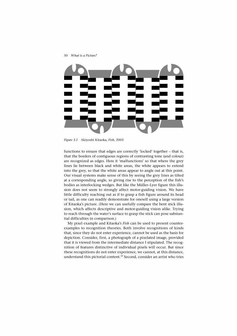
50 What is a Picture?
functions to ensure that edges are correctly ‘locked’ together – that is, that the borders of contiguous regions of contrasting tone (and colour) are recognized as edges. Here it ‘malfunctions’ so that where the grey lines lie between black and white areas, the white appears to extend into the grey, so that the white areas appear to angle out at this point. Our visual systems make sense of this by seeing the grey lines as tilted at a corresponding angle, so giving rise to the perception of the fish’s bodies as interlocking wedges. But like the Müller–Lyer figure this illu-sion does not seem to strongly affect motor-guiding vision. We have little difficulty reaching out as if to grasp a fish figure around its head or tail, as one can readily demonstrate for oneself using a large version of Kitaoka’s picture. (Here we can usefully compare the bent stick illu-sion, which affects descriptive and motor-guiding vision alike. Trying to reach through the water’s surface to grasp the stick can pose substan-tial difficulties in comparison.)
My pixel example and Kitaoka’s Fish can be used to present counter-examples to recognition theories. Both involve recognitions of kinds that, since they do not enter experience, cannot be used as the basis for depiction. Consider, first, a photograph of a pixelated image, provided that it is viewed from the intermediate distance I stipulated. The recog-nition of features distinctive of individual pixels will occur. But since these recognitions do not enter experience, we cannot, at this distance, understand this pictorial content.19 Second, consider an artist who tries
Figure 3.1 Akiyoshi Kitaoka, Fish, 2003

A Theory of Depiction 51
to use the configuration of the cafe wall illusion to depict not wedge-shaped objects, as does Kitaoka, but rectangular objects. The recogni-tion of parallel lines will occur in motor-guiding vision, but as they do not emerge into experience we cannot see them as being parallel, and so they cannot depict objects as being rectangular.20 At best the con-figuration could be used to depict rectangular objects that are subject to the cafe wall illusion.21 But that, as we have seen, is not to experience an object as rectangular, but as wedge-shaped. So again we have an instance in which recognition occurs without presenting a basis for a corresponding depiction.
How could a recognition theorist respond to these counter- examples? Assuming he accepts them, he would have to stipulate that only cer-tain kinds of visual recognition can give rise to depiction. He could agree with me, and say that it is those that give rise to experience. Or he could take another approach, finding another way of describing those recognitions that give rise to depiction. With Matthen’s pro-posal in mind, he might stipulate that it is recognition’s contribution to belief formation that qualifies it as a basis for depiction. But belief formation – or any other stipulation on recognition – will only help here so far as it identifies just those recognitions that give rise to expe-rience. How well belief formation or another stipulation on recogni-tion will do this job need not concern us here. It is enough for my purposes to point out that any such approach implicitly acknowledges the role that I have proposed experience plays in depiction. As such it would move decisively away from recognition theories as I have con-sidered them in this section.
4. An experience-based theory?
Recognition is thus an inadequate basis on its own for a theory of depiction. What, then, about an experience-based theory? An experience-based theory along the lines suggested in Section 2 will take the following form:
(3) A surface, X, depicts Y if and only if (i) X can occasion the non- veridical experience of seeing Y, and (ii) this non-veridical experi-ence of seeing accords with an appropriate standard of correctness.
It will be clear that such a theory will resist the kinds of counter-examples I discussed in the previous section. Since it holds that experience is necessary to pictorial understanding, all instances of

52 What is a Picture?
recognition without experience will be excluded as instances of picto-rial understanding.
Indeed, (1) and (3) will present necessary and sufficient conditions for depiction with equal effectiveness. As I discussed in Chapter 2, see-ing occurs if and only if visual experience occurs, so (1) and (3) are equivalent in terms of what they pick out as pictures. On that basis, (3) might be considered a pared-down version of (1), and should even be considered superior by the standards of Occam’s razor. However, while we will want a theory of depiction to provide necessary and suffi-cient conditions for being a picture, there is another requirement that I believe we should also ask such a theory to satisfy. A theory of depiction should not only give an account of what things are and are not pictures; I believe it should also give an account of how depiction works. That is, it should tell us, in general terms, how surfaces marked in particular ways come to be understood as depicting particular things. Experience-based theories, we shall see, including that of Wollheim, fail to satisfy this demand. Their response is that it is properly a concern for other dis-ciplines; however, I will argue that it is integral to developing a philo-sophical understanding of depiction.
In order to appreciate why this is so, it will be useful to consider C. S. Peirce’s general account of representation.22 For Peirce, representation of any kind involves three elements. The first is the subject matter or referent. The second is the representation-bearer – in the case of depic-tion, the picture itself. The third element is the interpretant, the men-tal state, involving a thought of the referent, that the apprehension of the representation-bearer is capable of occasioning in, in the case of depiction, the viewer. The generation of the interpretant can thus be considered the purpose of representation for Peirce. This aspect of Peirce’s theory is entirely consistent with experience-based theories: the picture-maker aims, says Wollheim, ‘to produce a certain experience in the mind of the spectator’.23
For Peirce, these three elements must relate to one another in the following way. First, the representation-bearer must bear an appropri-ate relation to the referent, taking on particular physical properties or forms, if the referent is to be represented. Second, the interpreter – the viewer, in the case of pictures – must relate to these properties or forms in an appropriate way in order to generate the interpretant. Third, the interpretant must relate appropriately to the referent, that is to say, its intentional content must include the referent.
Peirce represented this triadic relation using a triangular diagram. It visually illustrates how the triadic relation of representation depends

A Theory of Depiction 53
on the three dyadic relations described above – here indicated by the triangle’s sides.
Representation-bearer
InterpretantReferent
In the case of pictures, we can transcribe it like this:
Picture
InterpretantSubject matter
Experience-based theories are clear about one these relations: the rela-tion between subject matter and interpretant. These are related by pic-torial experience, for this experience (provided it meets an appropriate standard of correctness) is the interpretant – a mental state (or more precisely here, a perceptual state) which is of the subject matter.
But experience-based theories say very little about the other two rela-tions. They merely tell us that a picture needs to relate to the referent in such a way that it can generate the necessary experience in the viewer, and the viewer needs to relate to the picture in such a way that it can reliably generate that experience. I use Peirce’s theory here to show as vividly as I can this shortcoming, but there is no need to be committed to this theory in order to appreciate the problem. The point is simply that while experience-based theories might successfully give necessary and

54 What is a Picture?
sufficient conditions for depiction, they do not tell us how depiction works: how an object can be capable of occasioning the relevant experience in us, and how we must relate to the object in order for this to occur.
One reason we may want to answer this question emerges from our strong intuitions that there are constraints on what configurations of shape and colour can be used to generate this experience. For example, if we want to depict a red apple, there are certain shapes and colours (rounded shapes and reddish colours) that are well suited to this task (as I would put it, they are apt to occasion an experience of seeing such an apple), while others are not. Wollheim’s response to such challenges was dismissive: ‘I doubt that anything significant can be said about exactly what a surface must be like for it to have this effect [to trigger seeing-in]’.24 I think Wollheim was wrong about this. For one thing, such an attitude requires a certainty that psychological, physiological and art historical results will be able to fill in these explanatory gaps. But what if it turns out that they cannot do this? That would be a deadly blow to a theory: whatever its logical recommendations, it would show its conception of depiction to be impossible to realize. I am not say-ing that we should be doing science or some other non-philosophical discipline in order to fill these explanatory gaps. Indeed, the science of the visual system is not sufficiently advanced to fully provide the expla-nations that we would ask of it in this regard. But we should give an account of how these explanations can be made in general terms, and we should have a sense of how at least some particular details of this general account might be plausibly filled in. To pass over what other disciplines can teach us in this respect would smack of hubris – and perhaps be tempting fate.25
I believe the concept of non-veridical seeing provides the framework necessary to fill the explanatory gaps left by an experience-based the-ory. Just as the process of seeing, from stimulation through recogni-tion and experience, explains our visual experiences, so this process also explains pictorial experience. Pictorial experience, as I argued in Chapter 2, involves a non-veridical experience of seeing the subject matter, and this experience is the outcome of the process of seeing. Thus my theory explains how pictures come to depict their subject matter in the following way. Pictures, much like any other object of sight, stimulate the visual system; but a picture differs from most other objects of sight in that, provided the viewer understands it, it engages their ability to non-veridically recognize its subject matter and thereby occasions a non-veridical experience of the subject matter. (It may also engage abilities to recognize, and occasion experience of, the picture

A Theory of Depiction 55
surface qua surface – but as I have said, it need not do so.) That tells us a large part of the general relationship between picture and interpretant. For now we can only say a little about the relation between subject mat-ter and picture. That is, the shapes and colours of a picture’s surface are constrained by our capacity to non-veridically recognize and thereby experience their subject matter. But we shall find later, in Chapters 4, 7 and 8, that this general principle can be filled in using our knowledge of particular features of the visual system to show why a range of strategies used by picture-makers are successful. There we shall see that such an account gives a structure in which we may readily develop explanations of why certain shapes and colours and configurations of marks are par-ticularly suitable for depicting various objects and properties.
A theory based on non-veridical seeing thus combines the strengths of experience-based and recognition-based accounts, avoiding the weak-nesses of each. It responds to the problems posed by using recognition to define the basis of depiction by using experience for that purpose; and where experience-based theories fail to explain how pictures work, it draws on the processes of seeing, from stimulation through to recog-nition and then experience, to present a framework with which this can be explained. As I have stressed, my account accomplishes this because seeing incorporates both experience and recognition. It will also be clear that for this reason, my account is no ad hoc combination of theo-ries, for the concept of seeing I have used is close to both our natural language use of the term, and the way it is understood by science.
5. The standard of correctness
I now turn to the second condition in my theory, that it is not enough for a surface to occasion the non- veridical seeing of something for it to depict that thing, but that this seeing must accord with a standard of correctness. What is this standard, or what sets it? We have already seen why such a standard is needed, and I have touched on one potential solution to this problem: Wollheim’s proposal that the picture-maker’s intention sets the standard of correctness. Although there is scepticism about Wollheim’s solution (which I argue below is in one respect jus-tified), other writers have adapted this claim about intention in the context of their own theories.26 There is only one other substantially different account of a standard of correctness: Lopes’s account, which has so far received little attention. He holds that correct interpretation involves correct identification of the source of information embodied in the picture, and so it is this source that sets the standard of correctness. I

56 What is a Picture?
will have criticisms to make of both accounts. The account that I present in their stead will seem, at first, to be not an especially neat one by com-parison. I hold that there are two different standards of interpretation for two different types of pictures. Hand-made, ‘manugraphic’ pictures, such as paintings, drawings and traditional prints, have the standard of correctness set by the maker’s intention.27 Photographs, and other photo-based pictures, have their standard of correctness set by a casual relation. In developing this account I will spend some time explaining just why such a ‘split’ account is called for, and we shall ultimately find that both standards can be understood as unified by a single principle close to that described by Lopes.
Let us begin with manugraphic depiction. For a manugraphic pic-ture to depict something, it is not enough that it prompts us to non- veridically see that thing; our non-veridical seeing must also accord with the intention of the picture-maker. A chance stain on a wall, then, is not a manugraphic picture, despite the fact that it may prompt us to non-veridically see some object or other, for there is no standard of correctness for it to accord with. The Pontormo portrait that occasions a seeing of my friend does not depict my friend because that does not accord with the painter’s intention. It depicts the Florentine nobleman Y not only because it occasions non-veridical seeing of this person, but because the painter intended it to do so.
Such an account faces certain challenges. Let us consider first a com-plaint made by Lopes, which he directs at Wollheim, but that could equally be made here. Lopes claims that pictures with ‘primary’ and ‘sec-ondary’ subject matter are a counter-example to such a standard of cor-rectness.28 He uses Rembrandt’s painting Bathsheba Reading King David’s Letter (1654, Louvre, Paris) to illustrate this point. It is widely thought that Rembrandt used his companion Hendrickje Stoffels as his model for Bathsheba. The painting thus depicts both Bathsheba (since we have an appropriate visual experience of the (perhaps fictional or fictional-ized) biblical heroine, and Rembrandt intends his audience to have this experience) and Stoffels (since we have an appropriate visual experience of Rembrandt’s mistress, the picture being a recognizable portrait, and presumably Rembrandt meant his audience to have this experience). So far, so good for an intention account. However, Lopes has it that mat-ters are more complex than this: the painting is primarily identified as of Bathsheba and secondarily as of Stoffels. Bathsheba is first and foremost a picture of Bathsheba; it is only secondarily a portrait of Stoffels. Lopes claims that intention gives us no way to differentiate between Bathsheba, being the primary subject matter, and Stoffels being secondary.

A Theory of Depiction 57
The first thing I would say about this is that the intention condition is not meant to distinguish between these kinds of depiction – it just allows us to distinguish things that are depictions of Y from those that are not. So this proposed counter-example is not an especially compel-ling one. Still, it is fair to ask that the intention condition should be compatible with a distinction between primary and secondary subject matter. This it is: I suggest we consider subject matter primary if its depiction depends on the depiction of a model. In such circumstances the model will then be the picture’s secondary subject matter. So Bathsheba is primary because her depiction depends on the depiction of the model, Stoffels, in virtue of this relation, is the secondary subject matter.29
Let us consider a more difficult problem, again making use of Rembrandt’s Bathsheba. A number of medical researchers have proposed that Bathsheba provides evidence that Stoffels was suffering from a med-ical condition affecting her left breast at the time she acted as model for this painting. It has been proposed that this condition is breast cancer, tuberculous mastitis or lactation mastitis, among other possibilities.30 Say we were to accept the first of these hypotheses: that Stoffels had breast cancer. We assume that Rembrandt was not aware that the shape of her breast when she modelled was a symptom of the cancer, for he would hardly have depicted this telling shape if he knew just what it indicated, and even if he would have intentionally depicted Stoffels with a tumour (as some artists of unflinching realism might), he would not have intentionally depicted the future wife of King David with this condition. On the face of it this appears to be a counter-example to the intention standard: Rembrandt seems unwittingly – that is to say, unin-tentionally – to have depicted Stoffels’ breast cancer.
My position here is that the tumour is not in fact depicted in these circumstances. Instead it is a shape that happens to be distinctive of a breast cancer tumour, rather than the breast cancer itself, that Rembrandt depicts. Depicting such a distinctive shape poses my account no prob-lem, for one does not have to realize that such a shape is distinctive of cancer (or indeed anything else) in order to intend the viewer to non-veridically see that shape.31
There is a point of view from which this reply might seem inade-quate. If we conceive of Rembrandt as simply depicting what is before his eyes it may well follow that he does indeed depict Stoffels’ cancer. The writers who have made these kinds of diagnoses implicitly view Rembrandt in this way, as a faithful documenter of what is visible to him. Such a view is in obvious respects naive (and it is fair to criticize

58 What is a Picture?
these diagnoses on this account). It presents the artist as a passive receptor of Stoffels’ image, rather than active, making decisions about narrative, style and technique, what and what not to represent, and responding to earlier traditions of picture-making (his Bathsheba, for example, is of a physical type familiar in Northern European art from the Renaissance). A painter of Rembrandt’s abilities can paint from the imagination, or from memory, or from some other painting. He will elide details, or depict details that are not there. Textures of fabric and flesh, including the various irregularities of their surfaces that give a sense of truth to life, may be quickly and efficiently produced through techniques applied without reference to a model.
My point here is that because of this, Rembrandt’s painting (and manugraphic pictures generally) cannot be considered reliable con-duits of information that the picture-maker does not intend to convey. This does not rule out the possibility that Stoffels may have had breast cancer, and that Rembrandt unwittingly recorded its distinctive shape. That is, Rembrandt’s painting may be a conduit of this information. But because of the general unreliability of manugraphic pictures in this respect, we are left in doubt over this point. These medical researchers I have mentioned have interpreted Rembrandt’s painting as one would a photograph, rather than as a manugraphic picture. The crucial differ-ence here is that where manugraphic pictures are not reliable conduits of information in these circumstances, photographs are. This is an implicit part of our everyday understanding of pictures. Say one had to trust a doctor to make a diagnosis on the basis of either photographs taken by somebody without a medical background, or drawings of an artist, also without a medical background. The choice would be straightforward: the artist, whatever her other virtues, is not trusted to convey the rel-evant information, while the photograph is considered much more reli-able. I think this also tells us something about how the intention comes to be the standard of correctness for manugraphic pictures. We believe that manugraphic pictures are reliable conduits of information that the picture-maker intends to convey (provided they are skilled enough to fabricate a surface that can occasion an appropriate non-veridical see-ing), but we do not tend to believe that they reliably convey information that the picture-maker does not intend to convey.32 Accordingly, when we consider manugraphic pictures, we discount possible meanings that we do not believe that the maker can have intended.
While intention does provide the standard of correctness for manu-graphic pictures, this is not a matter of logical necessity. We can, for instance, imagine a situation in which manugraphic pictures operate

A Theory of Depiction 59
according to a different standard of correctness. Imagine a community in which painters put their images to a popular vote in order to deter-mine their meaning. Voters would be required to consider the various items that they find that each picture surface can occasion a non- veridical seeing of, and then choose one of these and write its name on a ballot. The picture’s subject matter is then the item with the most votes. As I say, such a standard of correctness is no doubt possible, but it is significant that we cannot furnish any actual counter-examples along these lines. The reason for this is not especially obscure. A pri-mary function of manugraphic pictures is communicative: to com-municate the intended meaning of the maker (and often by proxy the intended meanings of others, such as patrons). This, we have seen, is what manugraphic pictures are fitted to do. To do away with a standard of correctness based on intention would be to make pictures much less useful to us. Understandably, this function is something that no culture that makes use of images appears to have sacrificed. The maker’s inten-tion as a standard of correctness is thus something like a convention. It is not a convention in David Lewis’s sense, for the choice is not an arbitrary one; rather, it is a condition of pictures’ communicative func-tion. We tacitly agree that the maker’s intention provides the standard of correctness, because the alternative would be to lose this function.
As I have indicated, photographs and other photo-based pictures are subject to a different standard of correctness. Many of us are familiar with taking a snapshot only to be disappointed to find that the result-ant photograph depicts something that we didn’t intend it to – a relative whose head unexpectedly bobs up in frame just as the picture is taken, a passer-by unnoticed at the time, and so on. Consider too that the camera operator need not even intend to take a photograph in order for it to be produced. An accidental fumble can be enough to set in train a process that results in a photograph. Such a photograph is nevertheless as much a picture as any other photograph. Provided it is in focus, it will typically depict whatever the camera happened to be pointed at, at the time of its operation.
It has been argued that photographs are subject to the intention con-dition; but this seems to me wrong. Robert Hopkins has argued this in the context of his theory.33 He holds that the camera’s designer intends it to depict whatever it is pointed at, whenever it is operated cor-rectly, regardless of whether the operation is intentional or accidental. Although he does not mention it, he could claim support from Louis Daguerre’s patent. The English patent of the daguerreotype calls it ‘a new ... method of obtaining the spontaneous reproduction of all the

60 What is a Picture?
images received in the focus of the Camera Obscura’.34 Still, it seems a lot to ask of one individual’s intention (or the intentions of a handful of individuals, if one takes the position that it is particular camera designs, and designers that are relevant here) that they provide the standard of correct interpretation for all photographs. How could this standard be universally understood – cross-culturally, and by adults and chil-dren – when only scholars are familiar with the wording of Daguerre’s patent, and when other patents and instruction manuals are even more poorly read? Indeed, say that Daguerre (or subsequent camera design-ers) had not in fact intended this, but only intended that photography be a useful method to depict things that the camera’s operator intends to depict. I do not think we would now understand accidental photo-graphic images any differently.
What then does set the standard for correct interpretation for photo-graphic pictures?
Hopkins is close to the mark in thinking that the standard of cor-rectness for a photograph is what is present before the camera when the photograph is taken. But as we have seen, it is not the intention of a designer that ensures this standard. What then does establish this as the standard of correctness?
Photographs are made by relatively simple optical, mechanical and chemical processes. As a consequence of this, a photograph’s depictive content is counterfactually dependent on what is present before the camera. A photograph of X indicates that X was present before the cam-era, and if X had not been so present, then the photograph would not depict it. This is why photographs are reliable conduits of information about what is present before the camera. It is also for this reason that the major use of photographs and other photo-based pictures is not, like manugraphic pictures, communicative of a maker’s intended meaning. Rather their major use is documentary: they reliably inform us about actual states of affairs. For us to make full use of this documentary func-tion, a different standard of correctness is required to other pictures. Thus, the standard of correctness is not set by the maker’s intention but rather the presence of the subject matter before the camera when the photograph was taken. Again, this is something like a convention, for we can imagine cases in which it could be rejected. We can, for instance, imagine a society that made the standard of correctness for photographs the same as for other pictures: the maker’s (that is the pho-tographer’s) intention. We might imagine that photographers there take photographs at random, then file each photograph away according to what it occasions seeing of. When the photographer wishes to depict

A Theory of Depiction 61
an X, they pull a photograph out of the relevant file and present it for exhibition, titling it X, at which point it becomes a picture of X. Note there is no need for the photograph’s source to be X; it might be X, but might also be some other item – a suitably shaped cloud or stain on a wall – so long as it is capable of occasioning the non-veridical seeing of X. Like my previous example, it is no coincidence that I have to resort to imagination to make this point. Such a use of photographs would ignore the fact that by virtue of being reliable conduits of information about objects in front of the camera, photographs are well fitted to function as documents. Thus we find that wherever photographic pic-tures are used, it is the photographed item that provides the standard of correctness, for if it did not, it would render photographs substantially less useful to us than they actually are.35 Adopting this standard of cor-rectness is a condition for taking advantage of that function to which they are best suited.
I thus define manugraphic and photographic pictures as follows:
A manugraphically produced surface, X, depicts Y if and only if (i) X can occasion non-veridical seeing of Y, and (ii) the picture-maker intends X to occasion a non-veridical seeing of Y.
A photographically produced surface, X, depicts Y if and only if (i) X can occasion non-veridical seeing of Y, and (ii) this non-veridical see-ing of Y is causally and counterfactually dependent on Y’s presence before the camera.
6. Sources of information
As my talk of pictures conveying information about their subject mat-ter implies, I believe pictures can be considered conduits of informa-tion about their subject matter, and that, with some qualifications, the source of this information is the subject matter itself. This idea suggests another way of formulating the standard of correctness, although we will find it is equivalent to that I have just presented. Lopes, whose work inspires this analysis, makes a different inference about the standard of correctness, which I shall criticize.
How can pictures be understood as conduits of information about their subject matter? In the case of photographic pictures, this will be obvious. Being a photograph of X is causally and counter-factually dependent on the presence of X before the camera. A chain of causation and counterfactual dependence leads from photograph to its subject matter, and clearly here, the subject matter itself is the source of the

62 What is a Picture?
information embodied in the photograph. For manugraphic pictures, the situation is more complex. I have described above how the depictive content of such pictures is dependent on the maker’s intention. When the picture-maker’s intentions are documentary, the depicted item will be the source of information. Here the causal chain that links picture and subject matter is more complex than that linking a photograph to its subject matter, but it ensures counterfactual dependence in the same way. More difficult are the following kinds of cases. First, those in which non-documentary details are introduced into an otherwise documentary picture, such as a portrait that flatters its sitter by giv-ing them an improved complexion, or a landscape that adds a tree to improve the composition. Second are pictures of subject matter that is the invention of the picture-maker, such as the fantastical paintings of Dalí and Hieronymus Bosch. Third are pictures of fictional things invented by others, such as Honoré Daumier’s illustrations to Cervantes’ Don Quixote. Note that the troublesome feature of each these kinds of subject matter is its fictional nature. Neither Daumier’s interpretation of Don Quixote, nor Bosch’s and Dalí’s personal fictions, nor the fic-tional objects or properties depicted in the portrait or landscape, can be traced back to a source as a documentary picture can.
These can be dealt with using a two-part strategy. One part proposes that depictions of fictional objects can be traced back to make-believe sources of information about those objects. The other part gives an account of how properties in pictures of fictional things can traced back to actual sources. I start with the account of properties. A fic-tional thing, since it does not exist, cannot be a source of information. However, the properties that it is depicted as having do have sources. These sources might be actual things, as when an artist drawing Don Quixote uses an actual suit of armour as a model for that of the fictional knight, or when Bosch contrives his demons out of human and animal parts. But they need not be so. Picture-makers can depict these features, and many others besides, without recourse to actual things. Here we have to conceive of a source in a different way, and I suggest we do so as follows. Recognitional abilities typically have their origin in expo-sure to the things they recognize. As Lopes points out in his discussion of recognitional abilities, ‘[a] creature possesses a recognitional ability when, on the basis of perceptual encounters with objects, it assembles dossiers of information enabling it to identify those objects as ones previously encountered’.36 When a painter, working without a docu-mentary source, depicts some object as having property X, he draws on his ability to recognize X, by finding a configuration of marks that

A Theory of Depiction 63
engages that ability. The depiction of the object as X is thus depend-ent on the application of the painter’s ability to recognize X, which is in turn dependent on the presence of this property in the objects that played a role in establishing this recognitional ability.37
We can see now how the individual properties that a fictional object is depicted as having can be tracked back to their sources, but we also need to say how the object depicted as instantiating those properties is connected to a source. Here I accept Lopes’s account.38 He proposes that pictures of non-existent objects find their sources in collections of information that are make-believedly true of the non-existent object. So, while Don Quixote never existed, a source of information about him does exist: the collection of information, make-believedly true of him, assembled by Cervantes in his novel, Don Quixote.39 Picture-makers themselves can establish fictional figures, or figures with fictional attributes, by entering into a pretence that a collection of information they have assembled is make-believedly true of such a figure. So Dalí and Bosch invite the viewer into a pretence that certain beings exist with the various fantastical attributes they depict. A similar account can be given of the portraitist or landscape painter who fictionalizes her subject matter in certain respects. She adds to an existing collec-tion of grounded information further information that is only make-believedly true of her subject matter. In these ways, fictional depiction is casually and counterfactually dependent on collections of informa-tion that are make-believedly true.
I have now sketched an account of how pictures are conduits for information deriving from their subject matter. This suggests a differ-ent route to specifying the standard of correctness to that I described in the previous section. This route is taken by Lopes, who proposes that the standard of correctness is set by the information source: ‘[a] viewer understands a picture ... only if her attempt at identifying its source is well grounded – if what she identifies as its source is in fact its source’.40 While I accept that the information pictures embody depends on sources in the way described above, I do not agree with Lopes that identifying information sources always suffices to identify the picture’s subject matter. This is because some pictures embody information that derives from sources that are not the picture’s subject matter. We have already touched on one such case. Suppose that Hendrickje Stoffels did have breast cancer, and that Rembrandt’s Bathsheba happens to record its distinctive shape. We would then have an instance in which infor-mation (that Stoffels had cancer) is embodied in a picture and can be traced back to a source (the cancer itself). But, as I have discussed, the
64 What is a Picture?
cancer is not depicted by the painting. Now it may well be that Stoffels did not have cancer, and that the much discussed shape of the left breast should not be explained in this way. But this does not affect my train of argument here, for there surely will be some pictures that do unintentionally convey information in this way.
Another kind of counter-example to Lopes’s proposal is found where a model is used to depict some other subject, say, a mythological or legendary figure, but where the resultant picture does not depict the model themselves. (This contrasts with Rembrandt’s Bathsheba which we have considered as both a picture of the biblical heroine and the sitter.) Michelangelo’s paintings of biblical figures and prophets on the Sistine Chapel ceiling, for example, are based on drawings made from live models. These models, however, are not depicted in Michelangelo’s fresco; only the biblical figures and prophets are depicted. This point is made especially clear in a figure such as the Libyan Sybil. The pre-liminary drawings on which the Sybil’s figure are based depict a male model (Studies for the Libyan Sybil, red chalk, Metropolitan Museum of Art, New York, 1508–1512), but it would be absurd to say that this model is depicted in the painting. Nevertheless, it is likely that we can see the physiognomy of the model in the painting of the Sybil, and if so, we can trace the information available in this way back, through the drawing, to the model himself. It might be objected that I cannot say that the model is a source of information, since I earlier said that manu-graphic picture-making is an unreliable conduit of information when the picture-maker does not intend that information to be conveyed. That is so generally speaking, but as I mentioned earlier, this does not contradict the fact that individual manugraphic pictures may convey unintended information about their source, as Bathsheba possibly does, and as the painting of the Libyan Sybil probably does.41 So again, even if I am wrong about this particular example (say, if Michelangelo’s draw-ing was in fact of an imaginary subject), there will certainly be pictures that do convey information in this way.
A picture’s information sources are thus not always identical with its subject matter. While Lopes’s account of the standard of correct-ness is therefore not adequate, the analysis of the previous section suggests a way in which these counter-examples may be overcome. The counter-examples I have discussed both involve information conveyed by means that, generally speaking, is unreliable. As I have described, manugraphic techniques do not reliably convey information that the picture-maker does not intend to convey. So whether or not they do in fact convey that information, they do not depict it. Where

A Theory of Depiction 65
photography, as a reliable conveyer of such information, would depict Stoffels’ tumour and Michelangelo’s model, manugraphic techniques do not. The counter-examples can thus be overcome by stipulating that a picture’s method of manufacture should reliably convey information about its subject matter.
In conjunction with (1), this yields the following account:
A manufactured surface, X, depicts Y if and only if (i) X can occasion non-veridical seeing of Y, and (ii) X’s method of manufacture reliably conveys information about Y in this way.42
This definition of depiction proves equivalent to those presented in the previous section. In the case of manugraphic surfaces, the method of manufacture reliably conveys only that information which the maker intends to convey, and in the case of photographs, the method of man-ufacture reliably conveys only information about the object in front of the camera. Like the definitions of the previous section, this definition is not logically satisfactory, for it depends on tacit agreement that the standard of correctness is determined by the meanings that pictures are fittest to convey, that is, those they can reliably convey. It is logically possible that these could be ignored, and others imposed. But as I have said, this is something that no community of picture-makers has done, or could find it advantageous to do, since it would involve sacrificing a large part of pictures’ usefulness.

66
4Resemblance
Do pictures resemble the things they represent? And if so, in what respects do they do so? These questions have been urgent ones for philosophers studying depiction partly because they hold important consequences for resemblance theories. Resemblance theories, as I treat them here, hold that pictures depict in virtue of resembling their sub-ject matter. John Hyman and John V. Kulvicki both make this claim in their (otherwise very different) theories of depiction, and a range of other philosophers have supported, and continue to argue for, theories of this kind.1 This cannot be true unless resemblances between pictures and their subject matter exist, and so resemblance theorists have sought to identify resemblances on which depiction could depend, while their detractors have often denied the existence of such resemblances.
My approach varies from these. I argue that pictures ordinarily resemble their subject matter, but they do not do so necessarily. I argue this in two general ways. First, by identifying and analysing respects in which pictures resemble their subject matter, I show that the character of these resemblances depends on the constitution of our visual recog-nitional abilities. So resemblances in these respects cannot be regarded as necessary for depiction. Second, I argue that there exist instances of depiction that occur in the absence of any salient resemblance. These instances of ‘depiction without resemblance’ are exceptions to the pic-torial resemblances I identify, and they show that resemblance of any kind is not necessary for depiction. These too find their explanation in facts about our visual recognitional abilities.
I shall begin by clarifying the notion of resemblance and briefly dis-cussing resemblance theories. I then discuss Hyman’s account of the respects of pictorial resemblance. This is the most extensive and care-fully considered of those currently available, and is a useful foil for

Resemblance 67
my own account. The remainder of the chapter is split into two parts. The first argues my position with regard to depiction of colour proper-ties, and the second with respect to the depiction of form. I argue that Hyman’s account of pictorial resemblance is wrong in both cases, and develop alternative accounts of pictorial resemblance with respect to colour and shape. I then present my arguments that neither these, nor any resemblances, are necessary for depiction. I conclude by explain-ing how my position supports a theory such as my own, rather than a resemblance theory.
1. Kinds of resemblance
I will call all theories that hold that a viewer-independent resemblance between a picture and its referent is necessary for depiction resemblance theories. I will say what I mean by ‘viewer-independent resemblance’ in a moment; first though, I should note that definition of a resem-blance theory is broader than is traditionally made, for it encompasses a range of sophisticated, ‘post-Goodman’, theories, including Hyman’s and Kulvicki’s, which see other conditions as also being necessary for depiction. Hyman, for instance, holds that it is necessary for pictures to resemble their subject matter in certain respects, but also understands experience as having a crucial role.
Viewer-independent resemblances involve an identity in some respects – a sharing of viewer-independent properties. These include intrinsic shape, such as geometrical shape. Certain non-intrinsic prop-erties are also defined as viewer-independent, provided they can be defined without reference to a viewer. Occlusion shape, which I discuss below, is one such property. The shape an object occludes is not an intrinsic property, for it depends on how it is positioned relative to a particular viewpoint X. But neither is it viewer-dependent, for it can be specified without reference to a particular viewer (it is the solid angle the object subtends at X). Viewer-independent resemblance is close to the everyday meaning of the term ‘resemblance’, and it is this that resemblance theorists employ. Below, where I speak of ‘resemblance’, I mean viewer-independent resemblance.
We can also talk about viewer-dependent resemblance. This is resem-blance with respect to viewer-dependent properties. It involves a shar-ing of the ability to generate the same or a similar response in the viewer. This response might be a particular experience on the part of the viewer, or the engagement of a particular recognitional ability. I should stress that to call viewer-dependent resemblances ‘resemblances’

68 What is a Picture?
at all might be misleading, for they only describe a shared relation with a viewer. While it may also be that the presence of some viewer- dependent resemblances indicates the presence of a viewer-independ-ent resemblance, this is not a matter of logical necessity. For this reason I do not call theories that propose a viewer-dependent resemblance alone resemblance theories. My own theory is of this type, as are all experience-based and recognition theories.
I should add some remarks about colour here. There is disagree-ment over whether colour is viewer-independent or viewer-dependent property. I speak of colour and colour properties as if they are viewer- independent. I do this partly because resemblance theorists tend to speak of colour in this way, and partly because this may be justified so far as an object’s colour, for a ‘standard’ physiologically and psycho-logically normal viewer, is determined by the reflective or transmissive dispositions of its surface and its illumination. However, ascriptions of colour properties cannot usually be substituted for ascriptions of reflec-tive properties and the conditions of illumination. There are other factors, such as contrast effects and colour constancy, that influence colour perception. The influence of such effects on colour perception can perhaps be bypassed by using a more selective definition of the colour properties, such as both Hyman and I make.
2. Resemblance theories
Resemblance theories are the oldest of the general kinds of approaches to explaining depiction. Plato gave an example of such a theory in his dialogue, Cratylus.2 Peirce also endorsed such a theory. For him, depiction was an example of what he called ‘iconic’ representation, which also includes diagrammatic and sculptural representation. ‘The icon’, Peirce wrote, ‘represents its object by virtue of resembling it’.3 Simple theories of this kind have been discredited, most famously by Goodman in the first pages of Languages of Art. Goodman used a range of counter-examples to show that resemblance was not sufficient to establish depiction. This was perhaps the most difficult of them:
A Constable painting of Marlborough Castle is more like any other painting than it is like the Castle, yet it represents the Castle and not another picture – not even the closest copy.4
Resemblance theorists now typically overcome this using two gen-eral strategies: first, they will carefully specify the respects in which

Resemblance 69
pictures resemble their subject matter. This will solve the first part of the counter-example, for while Constable’s picture is very much like other paintings in being a flat, rectangular surface, constituted of paint and linen, and rather unlike three-dimensional, stoney Marlborough Castle, the resemblance theorist can point out that these are not the salient respects of resemblance. Instead, it will be some resemblance of shape and colour that counts here. That leaves the case of the copy of Constable’s painting, which will have the same shape and colour prop-erties as the original. This is dealt with by introducing further neces-sary conditions. These tend to be along the lines of those I discussed in the second part of Chapter 3, which I introduced in response to similar problems. For example, the resemblance theorist could claim that it is resemblance to X with respect to certain properties of colour and form, together with an appropriately disambiguating intention on behalf of the maker, that suffices to establish depiction of X.5
Although they held something of a spell over the literature on depic-tion for many years, I do not want to dwell further on Goodman’s counter-examples, as it is now widely accepted that they can be over-come. Recent theories that make resemblance claims, while learn-ing from Goodman’s criticisms, tend to be concerned with different matters. Two of the major accounts that have recently emerged – the theories developed by Hyman and Hopkins – are mixed theories in the sense I described in the Introduction. Both Hyman and Hopkins combine the kind of claims earlier made individually by resemblance and experience-based theories. I will be more interested in their claims about pictorial resemblance, but before going on I should say something about how experience and resemblance is be paired in their theories. While Hyman and Hopkins understand resemblance to be important to depiction, they also give experience a crucial role. According to Hyman, ‘the experience of looking at a picture is the only decisive test of what it depicts’.6 For Hopkins, ‘depiction involves a special visual experience in the part of the viewer’.7 They explain the ability of a picture to occa-sion the experience of the subject matter by the fact that the picture resembles the subject matter. The introduction of resemblance can thus be thought of as a response to the inability of ‘pure’ experience-based theories, such as Wollheim’s, to explain how pictorial experience is gen-erated, as I described in the previous chapter.
Hyman’s theory is an example of a resemblance theory, as I define it, for he sees resemblance as a necessary condition for depiction. Hopkins’ theory, though, is not. For Hopkins, it is only the experience of resem-blance that is necessary, and his theory allows that this experience

70 What is a Picture?
might occur in the absence of resemblance. For this reason I leave Hopkins’ theory aside in later sections of this chapter. But before going on, I will say a little more about Hopkins’ ‘experienced resemblance’ theory, and my reservations about it.
Hyman does not pursue a definition of pictorial experience – he calls it a ‘will-o’-the-wisp’.8 Hopkins however, believes there is something distinctive about the pictorial experience these resemblances occasion. He proposes that pictures resemble their subject matter with respect to outline shape, which I will say more about shortly. These resemblances, Hopkins holds, ‘form part of the content of that experience’.9 That is, the viewer experiences the picture as resembling its subject matter with respect to outline shape.
I allow that we often do experience resemblance with respect to out-line shape, but I do not think that it can play the role in a theory of depiction that Hopkins asks of it. As will become apparent shortly, out-line shapes correspond to the shapes recognized at early levels in visual processing (those represented at the ‘primal sketch’ stage). Hopkins’ account assumes that we have awareness of the information at, or from, this stage. I am happy to accept that this is often so. We certainly have such an awareness when we see that a tilted circle has an elliptical shape, or that a view down a straight road presents a wedge or triangle shape. However, as my account of information loss in visual processing suggests, it might equally be that recognitions of outline shape do not always emerge into consciousness. The difficulty some can experience in trying to draw in perspective (which basically involves reproducing outline shapes) suggests that this is so. This thought is supported by the account of seeing and pictorial seeing I have presented in the previous two chapters. On this account, the processing at the primal sketch stage is an indispensable part of pictorial understanding, just as it is an indis-pensible part of seeing as we know it. But understanding pictures, like seeing objects, does not depend on experiencing the shapes represented at that stage. It is experience at the latter stage, where an object (and not, or not merely, its outline shape) is represented, that establishes the depiction of that object.10
3. Occlusion shape and aperture colour
Turning back now to resemblance, Hyman claims that pictures resem-ble their subject matter with respect to the properties of occlusion shape and aperture colour. (Hopkins has a similar position to Hyman’s, pro-posing resemblance with respect to a related property, outline shape; but

Resemblance 71
as I have mentioned, I will focus on Hyman’s account here).11 I examine the concept of occlusion shape first. Pictures use configurations of two dimensional shapes (usually delimited by lines or variations in tone or colour) to depict three-dimensional forms. For a resemblance theorist, this poses a question: what is the salient resemblance between the two-dimensional shapes on the picture’s surface, and the three-dimensional forms they depict? We might simply say ‘shape’, but this response only elides the differences between the two-dimensional shapes on the pic-ture’s surface and the depicted forms; it identifies no common, shared property. Responding to this problem, Hyman proposes occlusion shape as a respect of resemblance.
An object’s occlusion shape is the solid angle that the object sub-tends at the point occupied by the viewer’s eye.12 This can be seen in Figure 4.1, which shows a spherical object, X, and the two-dimensional figure, F, that would be used to depict it in a perspective view from point V. One may see that X and F subtend the same solid angle at V, and so, seen from V will have the same occlusion shape.
An easy way to grasp what occlusion shape is, is to take a pane of glass and place it between oneself and the object in question. One then looks through the glass at the object and traces the object’s outline on the glass. The resultant outline, from that point of view, will have the same occlusion shape as the traced object. If this outlined shape were to be filled in with an opaque material such as paint, provided one’s point of view had not moved, it would precisely occlude the outlined object.13
Figure 4.1 Occlusion shape

72 What is a Picture?
Hyman proposes that for a picture to depict an object, X, it is neces-sary that the particular part of the surface which depicts the object has the same occlusion shape as X. Hyman calls this the ‘occlusion shape principle’.14
Now to Hyman’s account of colour resemblance.15 Many (although of course not all) pictures employ colour to convey part of their depictive content. A painter, for example, will typically use red paint to depict an apple as being red, and shadowed areas of subject matter are typically depicted as such by using dark-toned colours. Largely following com-mon usage, I call pictures that employ colour to convey depictive con-tent ‘colour pictures’. I say ‘largely’ because following colour science, I include tone or ‘brightness’ as a colour property, where common usage may not.
Hyman’s reasons for introducing the notion of aperture colour are similar to those that prompt him to introduce occlusion shape. He begins by considering some problems encountered in trying to formu-late simple accounts of colour resemblance. Perhaps the simplest inter-pretation we can give resemblance theories as they apply to colour will stipulate that picture and subject matter share local or surface colour. Two objects share surface colour if, when placed side by side, and under any illumination, they prove indiscriminable on the basis of colour. Two samples of paint from the same pot will thus share the same sur-face colour. However, this cannot be the sense in which every colour picture’s colours resemble those of its subject matter, for it does not take into account the effects of shadows, reflections, surface texture, aerial perspective, and other factors that can change our perception of an object’s local colour. Pictures that depict these properties will not share their referent’s local colours: depicting a shadowed area, for instance, typically requires the picture-maker to use a darker colour than that which corresponds to the subject matter’s local colour.
Hyman proposes that while some simple colour pictures do share local colours with their subject matter, others must share other kinds of colour properties – properties that are non-intrinsic but still viewer-independent.16 In particular, he thinks, ‘when shading is used, the aper-ture colours of the various parts of a painting’s surface are the same as the aperture colours of the various surface colours they depict, as long as the painting is suitably lit’.17 ‘Aperture colour’ is a term used to describe a colour as it appears through a reduction screen – a device that isolates colour from environmental features that can influence our per-ception of it, such as ambient light and the contrast effects generated by adjacent areas of differing colour. A reduction screen may be as simple

Resemblance 73
as a dark grey card with a hole cut into it, through which the viewer may inspect particular colours. Thus, Hyman proposes, an area of a colour picture’s surface which depicts a particular part of its subject will resemble that part of its subject in terms of aperture colour, provided the picture is viewed under ‘normal’ conditions – such as conventional gallery lighting. Hyman calls this the ‘aperture colour principle’.
The viewer-independent character of occlusion shape and aperture colour might not immediately be obvious, but Hyman’s analysis makes this clear. The particular occlusion shapes and aperture colours an object (whether subject matter or picture) displays to a spectator will vary with the spectator’s point of view. As one moves about an object, the occlusion shapes and aperture colours that it presents to us are liable to change. That however, does not make these properties viewer-dependent. The spectator’s point of view coincides with an actual point, and it is only this geometrical point, V in Figure 4.1, that is needed to determine an object’s occlusion shapes and aperture colours. Specifically, the object’s occlusion shape is the solid angle it subtends at V. The object’s aperture colours are the colours of those rays of light that reflect from the object and intersect at V. That is, they are the colours one would see the object as having were one to inspect it through a reduction screen from V.
Certainly, aspects of shape and colour play an important role in depic-tion. But why should it be occlusion shape and aperture colour? Hyman’s idea is that two objects with the same occlusion shapes and aperture colours will cause the eye to receive the same stimulus, so explaining the similarity of our response. Since light travels in straight lines, the lines projected from an object to the pupil of a viewer – in Figure 4.1 the lines projected from the sphere, X, to V – will correspond to rays of light reflecting from the object and projecting into the viewer’s eye. Similarly, the lines projected from the two-dimensional figure, F, to V will correspond to rays of light reflecting from the two-dimensional fig-ure to the viewer’s eye. In either case the light rays reflecting from the solid body or the two-dimensional figure will deliver the same pattern of light to the eye. The stimulation is thus the same, whether caused by the presence of the solid body or the two-dimensional figure.
4. Criticizing the aperture colour principle
In developing my own account of pictorial resemblance, I first treat resemblances with respect to colour properties. Colour resemblance, we shall find, turns out to be easier to reliably analyse than those of shape. I begin by arguing that the aperture colour principle does not

74 What is a Picture?
accurately identify the colour properties that pictures actually do share with their subject matter. This will help me identify colour properties that pictures do share with their subject matter. I will then argue that these resemblances are not necessary for depiction, but contingent on further factors – the constitution of our recognitional abilities – and that it is these rather than resemblance that should contribute to the basic terms in which a theory of depiction is cast. I will go on to argue that there exist instances of depiction of colour properties without any corresponding resemblance. These will cement my case that resem-blance is not necessary for depicting colour properties.
It may at first seem that there is a clear flaw with the aperture colour principle. Most colour pictures, even viewed under normal conditions, do not reproduce the aperture colours of their subject matter. Take a picture of an apple, which is coloured using a single flat red, as it might be on a shop sign. This colour – straight out of the sign painter’s tin – need not match an aperture colour of a real apple for the viewer to recognize the sign as depicting the apple as red.
Hyman has a response to such examples. He makes a distinction between ‘internal’ and ‘external’ subject matter. The internal sub-ject matter is that which the picture occasions an experience of, and external subject matter is the actual object from which the picture was painted. Hyman intends his claims about resemblance to apply to a picture’s internal subject matter. They might also apply to the external subject matter, but only in so far as the picture represents that external subject matter faithfully. So it will not concern him that the aperture colours of the shop sign do not correspond to any real apple. Rather, he claims, they correspond to the colours of the apple that the sign occa-sions an experience of.18
To a degree Hyman is right. There are many instances in which pictures misrepresent their subject matter.19 But I think he misjudges the extent to which pictures fail to preserve the aperture colours of their external subject matter when no misrepresentation or stylization is intended by the picture-maker. Consider pictures approaching the quality of a colour photograph or a van Eyck painting, for it is in these cases that one would expect the aperture colour principle to be most plausible. Even in such cases, the aperture colour principle will usually not be satisfied. Lopes, arguing against a position similar to Hyman’s, points out that in most periods of realistic picture-making, the media available to picture-makers have been capable of reproducing only part of the wide range of colours we experience in life.20 As the nineteenth-century physicist Hermann von Helmholtz made clear, it is impossible

Resemblance 75
to recreate in a painting, exhibited under conventional gallery lighting, the brightness of many colours that appear in nature. Even the bright-est of non-luminous pigments cannot match the brightness of surfaces illuminated by direct sunlight. Helmholtz estimated that, ‘[w]ith strong overhead light, or strong light from a cloudy sky, the brightest white on a picture probably has one twentieth of the intensity of white directly lighted by the sun; generally it has only one fortieth, or even less’.21 Helmholtz also noted that painters’ pigments can be dull compared to the saturated colours of the items they depict.22 For example, some hues, such as purple, were very difficult to come by in a highly saturated form until the later nineteenth century, when new chemical processes made the colour accessible to painters such as the Impressionists. The colours available to a painter – the painter’s ‘palette’ – will thus vary according to the media the painter uses, and can be thought of as occupying a particular, limited ‘colour space’ within the complete range of colours that a standard viewer is able to discriminate in life. Any palette will reproduce only part of this complete range.
Now, keeping these limitations in mind, if the internal subject mat-ter shares these aperture colours as Hyman claims, the experience of the internal subject will often involve experience of properties that the external subject does not in fact have. So, on his account, for exam-ple, an Impressionist painting of a sunlit landscape should produce an experience of a dark landscape. Of course, this is not really how we experience such pictures – we do not typically see a painting of a sunny landscape, or a photograph of the same, as gloomy and dark. Rather, our experience is non-committal on the question of absolute bright-ness, much as the experience of a black and white photograph’s subject matter is non-committal about hue. Yet the aperture colour principle requires that we do see it in this way. It implies that many pictures whose aperture colours do not (and as in this case cannot) match the aperture colours of the external subject will generate pictorial experi-ence that fails substantially to correspond to the external subject matter. And this is often not our experience of pictures. So we find that even when no misrepresentation or stylization is intended by the picture-maker, Hyman’s aperture colour principle often cannot hold.
5. Two new colour principles
Tellingly, most painters do not even try to match the precise colours they use directly against those of their subject matter. More important is the achievement of an appropriate relation between the colours in the

76 What is a Picture?
picture – one that matches the relation of colours the subject matter presents. For instance, say a painter makes a realistic picture of an orange placed on a red cloth. Say too, that the colour of the fruit is brighter than that of the cloth; and that both colours are highly saturated. Now, rather than using the orange and red aperture colours of the subject matter to make a picture, the painter can use a range of colours, provided rela-tions of brightness, hue and saturation are maintained. Say the painter starts by depicting the cloth – he or she can use almost any colour that we recognize as red to depict the cloth – but when the painter comes to depict the orange, he or she will use a colour with a brightness, hue and saturation that bears an appropriate relation to this red. The hue will be recognizably orange of course – but if the red was a relatively ‘warm’ orangey red, then the fruit will be painted using a relatively yellowish orange, maintaining the contrast in hue found in the subject matter. The relative brightnesses found in the subject matter will also be maintained in the picture – the painter will ensure that whatever the brightness of the red used to depict the cloth, the orange colour used to depict the fruit will be brighter. Similarly, relative saturations found in the subject mat-ter will be maintained in the picture – the painter can use a duller red to depict the highly saturated red of the cloth, but since the colours of the cloth and fruit have a similar saturation, the painter will then use a cor-respondingly dull orange to depict the fruit.
Here it is the relations between a picture’s colours that are judged against the subject matter, rather than the precise colours. Lopes, with the limitations of the painter’s palette in mind, suggests that this state of affairs has a measure of generality:
if the colours [hues] and contrasts [brightnesses] available in a physi-cal palette are to represent environmental colours and contrasts, the colour space of the palette must be treated as a transform of visual colour space [the complete range of colours a standard viewer is able to discern in life]. For instance, since the ratio of light to dark pos-sible in a painting is as a rule much smaller than that experienced in the scene it represents, a contrast in the latter must be depicted by a projection onto a contrast in the former. Moreover, the projection is usually non-linear: pictures are pretty dark objects, so represented dark will be closer to visual dark than represented white is to visual white. The same is true of saturation contrasts.23
In short, Lopes proposes that realistic colour pictures typically reproduce the relations between the brightnesses, hues and saturations of their

Resemblance 77
subject matter, rather than reproducing the brightnesses, hues and satu-rations themselves. With Hyman’s aperture colour principle in mind, I will call this successor the ‘relative colour properties principle’.24
Before going on, a qualification is needed to this new principle, for the realistic picture-maker’s use of hue in fact proves more restricted than Lopes’s account suggests. While the realistic painter may maintain relative hue, this is not in itself enough to produce a realistic effect of colour in a colour picture. For example, while the preservation of rela-tive hue coincides with a realistic effect in the example I gave above, fol-lowing this rule does not always suffice to produce that effect. For while the hue pair of orangey red and yellowish orange have the same relation of hue as the red and orange of the subject matter they depict, so do hue pairs such as orange and yellow, yellow and green, green and blue, and so on – all these pairs are adjacent hues on the colour circle. However, unlike orangey red and yellowish orange, these other hue pairs cannot be used to depict the subject matter – green and blue hues cannot be used to make a colour picture of red and orange items.
So, in addition to maintaining relative hue, realistic picture-makers also tend to keep the following rule: while not preserving particular hues, realistic colour pictures do preserve a ‘similar’ hue. That is, rather than reproducing the exact hue of his subject matter, the painter may use a hue that a standard viewer may still recognize as being somewhat of the subject matter’s hue. A red surface, for instance, could be depicted using the range of hues we recognize as ‘somewhat red’ or ‘reddish’: roughly, the range of hues from reddish orange, through the red proper of the subject matter, to reddish purples.25 If the painter deviates too far from the hue of the subject matter, so that a standard viewer cannot rec-ognize it as reddish, then the painter will have failed to make a truthful depiction of the subject matter. I will call this rule that requires the realistic painter to use similar hues to those of his or her subject matter the ‘similar hue principle’.
6. Resemblance ...
Lopes argues that the foregoing considerations count against resem-blance theories because they show there is no sharing of colours such as the aperture colour principle describes. But the resemblance theorist might now be thought to have an avenue of recourse to this objection – for while the aperture colour principle is false, the two new principles can be interpreted as identifying respects in which a colour picture resembles its subject matter. Moreover, these respects will be properties

78 What is a Picture?
of aperture colour, and relations between aperture colours. The relative colour properties principle holds that the brightnesses, hues and satu-rations of a colour picture preserve the relative brightnesses, hues and saturations of its subject matter. Thus a realistic colour picture, on this account, does share colour properties with its subject matter – it shares relations of brightness, of hue, and of saturation. The resemblance theo-rist can therefore claim, justifiably I think, that these are respects in which realistic colour pictures resemble their subject matter. The similar hue principle can likewise be understood as establishing a resemblance between picture and subject matter. A picture that accords with this principle will resemble its subject matter in respect of having a colour that is somewhat of the subject matter’s hue – so if the subject matter is red in hue, the picture will resemble it in respect of being reddish.
It may be objected that these principles only apply in the case of certain realistic pictures, and not to pictures generally. These resem-blances, therefore, would not characterize depiction in general. This is perfectly true – many pictures do not satisfy these principles and do not exhibit these resemblances. However, I would counter that the great majority of colour pictures will satisfy some of these principles.26 In particular, I think they will satisfy either (i) the similar hue princi-ple, or (ii) the relative colour properties principle’s stipulation for rela-tive brightness. For example, a child’s painting will satisfy the similar hue principle. Grass will be painted using some kind of green paint, if not the green of the grass; the sun with yellow paint that may or may not match the yellow of the sun, and so on. A ‘black and white’ draw-ing, which uses tone to depict dark surfaces or shadowed areas, still preserves relative brightness – bright colours (of surfaces which are either intensely illuminated, or that have a bright local colour, such as white or yellow) will be depicted using a relatively bright colour, while less bright colours (of surfaces that are not intensely illuminated or have a dark local colour, such as black or purple) will be depicted using relatively dark colours.27
7. ... but no resemblance theory
Here we have genuine viewer-independent resemblances between col-our pictures and their subject matter. However, I also believe that these resemblances do not support a resemblance theory. This discovery of these viewer-independent resemblances might seem, on the face of it, to be evidence in favour of a resemblance theory. But such a conclusion, I shall argue, is not justified. The most simple resemblance theories

Resemblance 79
propose resemblances of shape and colour. We have seen that in the case of colour, this claim requires much elaboration and qualification before it can be defended. Now, the more complex this claim becomes, the more the claim loses the intuitive quality that, in part, first made it attractive. Such simple resemblance views draw much support from our intuitions that certain pictures, for example, have very ‘lifelike’ col-ours. Now we find that it is not the colours of the subject matter that are reproduced, at least not in any straightforward fashion, but com-paratively arcane colour properties such as relative brightness and simi-lar hue. As a result, one is inclined to wonder why it is that depiction depends on the particular types of resemblance that have been posited.
An analysis of our visual recognitional abilities as they relate to colour suggests some answers. Here I shall sketch accounts of the efficacy of the similar hue principle, and the relative colour properties principle as it applies to brightness.28 Our visual recognitional abilities have evolved to be able to recognize things under a wide variety of conditions. For example, under different lighting conditions, an item’s colour proper-ties can vary in a range of ways. This variability makes the precise colour properties of a thing under any single illumination unreliable indica-tors of its identity under different conditions of illumination. Similarity of hue and relative brightness give a more useful basis on which visual recognition can be made, for these properties are preserved under a wide range of conditions. If the brightness of the illumination under which an object is seen is reduced, it reduces correspondingly the abso-lute brightnesses of that object’s colours, but tends to preserve the rela-tive brightnesses of those colours. If one colour is brighter than another, this relation will typically be preserved regardless of their light source’s dimming or brightening.
Hue is affected by a range of factors, of which changing light condi-tions are among the most common. This happens in circumstances in which the hue of the illuminating light varies – for example, when the illuminating light is itself coloured, as in the case of orange firelight or twilight. More often, an object’s hue is affected by the hue of the light reflected from its surroundings. In a forest, for instance, some of the light that illuminates an object will have a green hue, being reflected from the green foliage. Unlike the extreme changes a colour’s brightness can undergo in changing conditions of illumination, the effects on hue tend to be more limited. For instance, a yellow surface will still usually appear yellow, albeit tinged with another colour. In an orange twilight it will appear tinged with orange; in the forest it will appear a greenish yellow. While hue is rarely constant, a surface’s hue nevertheless tends
80 What is a Picture?
to vary within limits. Vision scientists Kathy Mullen and Frederick Kingdom make similar observations:
The most dramatic changes in natural lighting occur as a result of the diurnal cycle where the intensity of sunlight illumination can vary over a range of 10 log units. The spectral content of sunlight also varies to some extent, for example when measured under a blue sky, clouds, a red sunset or the canopy of a rain forest. This variation is due to the different absorbance properties of atmospheres, or due to absorbance or reflectance by surfaces. The differences however will be small.29
Similarity of hue and relative brightness, unlike precise colour proper-ties, are preserved under many conditions, and so give a comparatively reliable basis for recognition. For this reason, the human visual system has evolved so that it is particularly sensitive to these properties, giving them a more important role in recognition than precise colour proper-ties. Thus, reproducing an object’s relative brightness and similarity of hue suffices to generate what we regard as a truthful, and indeed, real-istic colouring in pictures.
The phenomenon of colour constancy plays a further role in restrict-ing the variation of hue we perceive in objects. Colour constancy is the tendency of the visual system to compensate for changes in an object’s colour properties as conditions of illumination vary. For example, in the morning, sunlight tends to be bluish, while in the evening it has an orange cast. Thus, one might expect a white shirt to look bluish early in the day and orange later on. However, we do not usually notice such changes in hue: the shirt simply looks white, just as a tree maintains a fairly constant green, fire engines look red, and so on.30
These analyses show that certain of the properties preserved by the principles I have described are determined by characteristics of the human visual system. This allows us to see that it is not a matter of logical necessity that a colour picture resembles its subject matter in the respects described earlier. Instead, the role these resemblances play in depiction is contingent on facts about the viewer’s visual system. If the standard human visual system was constituted differently – which logically it could be – we would be sensitive to different colour proper-ties, and in order to be effective, our colour pictures would likely have to resemble their subject matter in these respects instead. For example, say we were able to perceive ultraviolet light, as can some bird species; presumably our realistic colour pictures would be made to preserve the reflective properties of subject matter at the ultraviolet level. Similarly,

Resemblance 81
if we lacked the capacity to distinguish red and green, as, for instance, do dogs (and some colourblind people), the preservation of these hues would be a matter of indifference to us. The resemblances I describe in the previous section are therefore not necessary for depiction; they are contingent on characteristics of our visual systems.
8. Depiction without resemblance: depiction of subjective effects
I now show that some instances of depiction of colour properties are unsupported by resemblance of any kind. I will consider two general kinds of example. The first involves the depiction of subjective effects; the second involves the use of subjective effects in depiction. The most notable examples of the first kind are found in the Pointillist paint-ings of Georges Seurat. One of Seurat’s aims was to depict the subjec-tive effect of simultaneous contrast. This is most readily seen in the ‘haloes’ of contrasting colour and tone with which he silhouettes fig-ures in his paintings and drawings (Figure 4.2). Simultaneous contrast
Figure 4.2 Drawing after Georges Seurat, Seated Nude: Study for Une Baignade, 1883, National Galleries of Scotland, Edinburgh

82 What is a Picture?
occurs when areas of differing tone or areas of differing hue are placed so that their edges touch. In such cases the perception of each tone or hue, around the edge where they meet, is heightened. When a dark tone is placed next to a light tone, the dark tone appears darker than it otherwise would, and the light tone appears brighter than it otherwise would. Similarly, when differing hues are placed next to one another, they appear more different in hue than they in fact are. Orange placed next to grey will make the grey appear bluish, for example.31 As I have said, Seurat depicted this effect by heightening the contrasts of hue and tone around the edges of the objects he depicts.32
It has on occasion been said that Seurat’s depiction of simultaneous contrast stems from a misunderstanding of the phenomenon.33 This line of thought points out that if two colours are placed side by side on a canvas, they can be expected to generate the same effect of simultane-ous contrast they would produce if they appeared in nature. Thus, to reproduce the effect of simultaneous contrast between, say, an object and the background against which it appears, it should suffice to repro-duce the local colours of the object and the background, for once these colours are reproduced on the canvas, their proximity will generate a simultaneous contrast identical to that produced by the subject matter.
Such arguments are not convincing, and have not convinced art his-torians. John Gage and Georges Roque have observed that a plausible rationale does exist for the depiction of simultaneous contrast, and was available to Seurat and his contemporaries in Helmholtz’s well-known essay, ‘The Relation of Optics to Painting’.34 We have already seen that Helmholtz pointed out that it is impossible to recreate in a painting the brightness of many colours that appear in nature. But since contrast effects are ‘produced more strongly by bright light and brilliantly satu-rated colors than by faint light and duller colors’, Helmholtz suggests a way of partially overcoming this:
an artist [who] wishes to reproduce as strikingly as possible, with the pigments at his command, the impression which real objects pro-duce ... must indicate with paint the contrasts which the real objects naturally display ... If the colours in a painting were as strong and bril-liant as those of actual objects, the contrasts which appear in reality would appear automatically in a painting. Here ... subjective visual phenomena must be introduced objectively into a painting, since the colours and light intensities in it are different from reality.35
The depiction of contrast effects can therefore compensate for the inabil-ity of painting to reproduce the bright and saturated colours of a sunlit

Resemblance 83
scene. Bright and saturated colours generate strong contrast effects, and while the brightness and saturation of these colours may not be repro-ducible in a painting, the hues of their associated contrast effects can be reproduced. Helmholtz gives a number of examples that make it clear he includes the depiction of simultaneous contrast, giving examples of contrast with respect to both brightness and hue: ‘painters and drafts-men generally make a plain, uniformly lighted surface brighter where it meets a dark object and darker where it meets a light one. You will find that uniformly grey surfaces are given a yellowish tint at the edge where there is a background of blue and a rose-red tint where there is green’.36 Helmholtz was writing before Seurat depicted the effects he describes, and his remarks are a useful reminder that while Seurat’s paintings are the most prominent examples of depicting these effects, many artists before him had more subtly incorporated them into their pictures. One prominent example that Helmholtz may have had in mind are those paintings by Velázquez in which his subjects appear against a blank ground with the dark edges of their bodies clearly ‘haloed’, such as The Buffoon Sebastian de Morra (c. 1646, Museo Nacional del Prado, Madrid) and Juan de Pareja (1650, Metropolitan Museum of Art, New York).
Now, considering Seurat’s, and others’, use of painted-in haloes to depict simultaneous contrast, we may challenge the resemblance theo-rist to find a resemblance between picture and referent on which this depiction depends. Clearly, we will find nothing corresponding to aper-ture colours of the painted-in halo in the referent’s aperture colours, for in the later case it is a subjective, viewer-dependent effect. Indeed, for the same reason there can be no viewer-independent resemblance whatsoever between the painted-in halo and the referent. Nor can there be a resemblance between the painted halo that depicts this effect and the features in life that give rise to it, for in life the perceived halo is a response of our visual system to the intense illumination and satu-rated colours which, as we have seen, painting is unable to reproduce. In short, there is no resemblance on which this instance of depiction depends.
9. Depiction without resemblance: use of subjective effects in depiction
Figure 4.3 depicts the uppermost part of a Doric column. The verti-cal bands of tone on the shaft that depict its fluting are each a single, homogenous tone; a fact that can be readily confirmed by looking at each area of tone separately through a reduction screen. However, due to simultaneous contrast of tone, the bands of tone appear darker on

84 What is a Picture?
the sides where they abut a lighter band, and lighter where they abut a darker band. This subjective effect allows the picture to depict a feature of the column that it otherwise would not. On account of this effect each section of fluting is depicted as having one edge in shadow, and one more brightly illuminated; that is to say, each section is depicted as being a concave surface.37
Again there can be no viewer-independent resemblance on which this depends. The concave facets of an actual column are perceived as such because they are shaded on one edge and more brightly illuminated on the other. Here, the simultaneous contrast, used to depict the variations in illumination and thus the concavity, is a subjective effect. Nor can a salient resemblance be found between concave fluting, and the features of the figure that generate the effect, for while the former are recog-nized as concave by distinctive variations in shade and illumination, the later are simply stripes of single, undifferentiated shades.
The final counter-example I consider uses colour, and although I have made such a picture, a description will have to suffice here.38 Consider a picture of red apples against a background of green foliage. However, rather than using red pigment or light to depict the apples as red, the areas depicting the apples are in fact grey or slightly green (which can be confirmed by viewing these areas through a reduction screen). The depiction of the apples as red depends on simultaneous contrast of
Figure 4.3 Doric column
Resemblance 85
hue: because a bright green is used to depict the surrounding foliage, the patches that depict the apples appear to have a distinct red tinge, an effect that allows the viewer to see red apples in the picture surface and so allows the picture to depict the apples as red.
The situation is much the same as the previous example. The depic-tion of the apples as red cannot depend on a viewer-independent resem-blance, because simultaneous contrast is a subjective effect. Nor can a salient resemblance be found between the hue of the depicted apples and the hue of the areas of the picture that depict them, for as we can see using the reduction screen, these areas are not in fact red or in any degree reddish.
Before going on I want to consider a possible objection. It might be asked whether the flat bands of tone really do depict the fluting as con-cave, and whether the neutrally hued patches really do depict the apples as red. In particular, it might be objected that the interpretation of the fluting as concave, and the apples as red, involves a misinterpretation of these pictures. On this account, the pictures are properly seen as, and really depict, a column whose shaft is comprised of flat planes, not concave flutes, and neutrally hued apples, rather than red apples. After all, a real shaft faced with flat planes will produce the same subjective effect, and could readily be mistaken for a fluted column, and neutrally hued apples, seen amid an abundance of bright green foliage, could be mistaken for riper fruit. Moreover, normative systems of depiction, such as photography, will not rely on these effects. They will depict the fluting using light and dark tones, and the red surface of apples using red pigments. A critic might say that it is significant that a photo-graph of a column that has flat facets will feature flat bands of colour, as does Figure 4.3, and a photograph of neutrally hued apples amid bright green leaves will feature the same hues as does my picture of apples. If we happen to interpret such a photograph as depicting a fluted column, or red apples, we would clearly be mistaken.
Despite this objection, I maintain that these pictures do depict the fluting as concave, and apples as red. Here I draw on the conclusions I arrived at in the previous chapter about standards of correct interpre-tation. I argued there that for a manugraphic picture to depict X, it is necessary that it can occasion an experience of X, and that the picture-maker intends this experience to be occasioned. Despite part of it being computer generated, Figure 4.3 is a manugraphic picture. For the pic-ture of apples, the situation is slightly more complicated, for the version I have made happens to be a digitally manipulated photograph. In my manipulated photograph the tonal values remain the same of those in

86 What is a Picture?
the original, untouched photograph. However, all the hues are altered by the application in Photoshop, of a green filter, making the greens more green, and reducing the reds to shades of grey, or pale green. Here just the depicted hues are the result of manugraphic processes, since they have been subjected to manipulation in a way that no longer ensures their counterfactual dependence on the photographed apples. Other depicted properties remain photographic, as their counterfactual dependence on the actual apples is preserved. Now, as we have seen, we are quite capable of having a visual experience of concave fluting and red apples in front of my pictures. And it will be equally clear that the maker of these pictures intended viewers to have this experience – since this maker was myself. It is simply beside the point that this is an unusual way of depicting the column’s fluting or an apple’s colour, that photography and other forms of picture-making would depict this in a different way, and even that these pictures can occasion seeing of other features, such as flat facets or neutrally hued apples. If bands of flat tone can reliably occasion the seeing of fluting, or neutrally hued patches can reliably occasion the seeing of redness, that opens the way for a manugraphic picture-maker to use this to depictive ends.
10. Criticizing the occlusion shape principle
We earlier saw that the particular colour resemblances that characterize colour pictures are contingent on facts about our recognitional abili-ties, and we have now found that no colour resemblance of any kind is necessarily required to establish depiction of colour properties. Below I present a similar train of arguments regarding resemblances with respect to shape. While we will see that comparable conclusions can be reached, it will prove more difficult to determine general respects of resemblance regarding shape, since the recognitional abilities involved in perception of shape and volumetric objects are more complex than those involved in colour perception.
As with the aperture colour principle, it may seem that there are straightforward counter-examples to the occlusion shape principle. While it will apply to perspective pictures and ordinary photographs that preserve occlusion shapes, it may appear that other pictures do not preserve the occlusion shapes of their subject matter. Prior to the inven-tion of perspective in Europe, and at most times in cultures outside Europe, occlusion shapes have not been preserved in pictures. But as with aperture colour, Hyman has a reply to this. He agrees that occlu-sion shape is not preserved in the case of these pictures’ external subject

Resemblance 87
matter – but it is preserved in the case of their internal subject mat-ter. That is, the occlusion shape principle applies to the things pictures occasion a visual experience of.
Again an awkward conclusion follows from this reply, for it implies that a non-perspectival picture will occasion an experience of its sub-ject matter as having the spatial properties associated with the occlu-sion shapes used to depict it, rather than having the spatial properties associated with its actual occlusion shape. That is, it will occasion an experience of a distorted version of its subject matter. This might be an acceptable conclusion in the case of intentional pictorial misrepresenta-tion, such as caricature.39 But where misrepresentation is not intended it is less plausible, for it implies that every such picture produced without the benefits of perspective techniques will occasion experiences that differ from those intended by the picture-maker. On this account, every picture made before the invention of perspective is in various respects a failure, for the experiences of seeing that they occasion fail to match the intentions of the picture-makers.
We can make two responses to this. The first I have already made in respect to colour.
There I pointed out that pictorial experience can be non-committal with respect to certain kinds of properties. One kind of spatial prop-erty to which this is an attractive response is detail. When, say, an Impressionist painter eschews the intricate occlusion shapes that would depict a van Eyck-like level of detail, it does not mean that he occa-sions an experience of his subject matter as lacking detail. A viewer habituated to this way of picture-making will have an experience of the subject matter that is non-committal about detail at that level (much as we veridically have such experiences when our vision is blurry, in conditions of low illumination, and so on). A viewer unfamiliar with Impressionism might experience the subject matter’s surface as lacking detail, but that only serves to remind us that most pictures can support experiences that vary from that intended by the picture-maker.
I will not dwell on this response, for while I think it is likely to apply to many features that picture-makers are unconcerned about depicting, the second response is more radical, and so far as I can determine has no counterpart in terms of colour. It points out that a form’s occlusion shape is not the only two-dimensional shape that can occasion experi-ences of that form: other kinds of resemblances can be used for this purpose. I shall focus on one example, the depiction in Greco-Roman painting of tilted circles. Perspective stipulates that tilted circles are depicted using ellipses (since a circle viewed from an angle occludes an

88 What is a Picture?
elliptical shape). Greco-Roman painting typically uses another shape for this purpose, one I call a ‘pointed ellipse’.40 In Figure 4.4, pointed ellipses are used to depict the dish of eggs in the image on the left, the flask in the centre image, and the glass bowl’s rim in the image on the right. Even taking into account the loose brushwork of some of these painters, it is clear that none of these rims is depicted using an ellipse. Rather, they use a pointed ellipse – an upper and a lower curve that meet in pointed vertices. Usually these vertices are slightly rounded, and the upper curve projects further from the horizontal axis than does the lower curve.
Now, it is true that we can see these pictures as depicting distorted rims. Indeed, coming to these pictures for the first time it may be hard not to see them this way – the vessels themselves can seem to have a pointed elliptical cross-section rather than a circular one. But I think we have to acknowledge that the Ancient Greeks and Romans did not see them this way. How can we know this? The Greco-Roman tradi-tion of realism is a long and continuous one. Its major advances had mostly been established in Greece by the fourth century BC, about four hundred years before the examples I am discussing were produced. Moreover, much as in European painting from the Renaissance to the nineteenth century, realism, faithful depiction, and even illusion were highly prized by artists and audiences alike.41 It is reasonable to think that if there was any general awareness of the deficiency of the pointed ellipse schema, it would have been redressed somewhere during this history. The Greeks and Romans would hardly have put up with such
Figure 4.4 Drawing after details of (from left to right) Still-Life with Eggs and Game (detail), from the House of Julia Felix, Pompeii, first century AD, Museo Nazionale, Naples; Still Life with Water-Fowl and Flask of Water (detail), from Herculaneum, first century AD, Naples Archaeological Museum; Bowls of Fruit and Amphora (detail), from the House of Julia Felix, Pompeii, first century AD, Museo Nazionale, Naples

Resemblance 89
a prevalent (and readily fixed, or hidden) flaw in pictures that aimed at realism – and so, I think we must acknowledge that this was no flaw at all. That is, Ancient audiences were able to see circular rims in these pictures.
Another factor that makes me think this conclusion is right is that in working with these images I have found that the sense of distortion does indeed wane and disappear after studying them for some time. This accords with other anecdotal reports of introduction to novel sys-tems of depiction. In particular, those unused to perspective pictures can report an analogous effect, until they become habituated to them. Gombrich’s quotation of Yoshio Markino, a London-based Japanese art-ist writing early in the twentieth century, makes this point well.
When I got a book of the drawing lessons at my grammar school there was a drawing of a square box in the correct perspective. My father saw it and said, ‘What? This box is surely not square, it seems to me very much crooked.’ About nine years later he was looking at the same book and he called me and said. ‘How strange it is! You know I used to think this square box looked crooked, but now I see this is perfectly right.’42
The point I draw here is that having the correct experience in front of a picture does not necessarily happen automatically if it is in an unfa-miliar style. Note that this position does not entail a return to con-ventionalism. It shows only that we sometimes require habituation to new systems of depiction before we can fully understand them. There still exist constraints on the configuration of marks that can occasion a particular experience. These constraints are not as restrictive as those stipulated by the occlusion shape principle, but they still exist. There are, for instance, many shapes that surely cannot be used to depict a circular rim (rectangles, triangles, and so on). I will return to Markino’s remarks in Chapter 6, when I examine the issues of habituation and its relation on realism in more depth.
The question now arises of what these constraints are, and why depiction is so constrained. To answer these questions, we shall again need to consider recognitional mechanisms that mediate visual per-ception. In this case, it is the mechanisms governing the recognition of volumetric form that will concern us. I shall make use of Irving Biederman’s theory of volumetric form perception.43 I will treat this theory in more depth in Chapter 8; here it will suffice to introduce a few salient details.

90 What is a Picture?
We have already seen examples of how recognition is based not on the entire array of light entering the eye, but on salient features of that array. In the case of the perception of volumetric form, recognition is based primarily on certain features of the edge information encoded by the primal sketch. Not all features of this edge information are made use of in recognition, only those that are ‘non-accidental’: those that, over a variety of viewpoints, tend to be reliable (although not infallible) indexes of real spatial relations. It is combinations of these that form the grounds for recognition of simple three-dimensional forms such as cylinders, blocks, wedges and spheres.
The case that concerns us is that of the cylinder (including variant forms with a circular cross-section, such as a dish- or bowl-shape). Biederman proposes that the visible circular ‘top’ of a cylinder is indi-cated in the primal sketch by a figure, symmetrical around two axes, comprised of curved edges coterminating in Y vertices on the long axis.44 An ellipse, of course, satisfies these constraints, as one would expect. But what is of interest here is that other shapes – in particular pointed ellipses – also do so. The particular curvature that distinguishes a true ellipse from a pointed ellipse is not taken into consideration on Biederman’s account. Indeed, he stresses that the recognition process cannot ‘be dependent on absolute judgements of quantitative detail’ as such judgements would be slow and unreliable.45 ‘For example, distin-guishing among just several levels of the degree of curvature ... typically requires more than that required for the identification of the object itself.’46
If Beiderman’s account is right, it would give us an explanation of why Greco-Roman still-lifes do successfully depict the rims of bowls, dishes and other vessels as circular. For while the pointed ellipse and true ellipse produce different patterns of light on the retina, and so generate correspondingly different primal sketch representations, the ensuing process in which recognition of volumetric form occurs is not sensitive to these differences, and so recognizes both as tilted circles.
This analysis in terms of recognitional abilities implies that while occlusion shape need not be preserved, particular features of occlusion shape will be preserved. In our example, to depict a rim as a tilted cir-cle a picture must preserve the following properties of the rim’s occlu-sion shape: the properties of being a figure comprised of an upper and lower curve, each curving out from, and roughly symmetrical around, an axis. As will now be clear, these properties may be instantiated by a pointed ellipse, as in the Greco-Roman pictures I have discussed, just as well as the true ellipse perspective demands.

Resemblance 91
Assuming Biederman’s theory is correct, we have identified another viewer-independent respect of resemblance. Further analysis could be made in the same vein, using Biederman’s theory to identify a range of resemblances between pictures and other forms. But again this does not support a resemblance theory. Such resemblances will only be relevant because our visual system is sensitive to resemblances in those respects. If our recognitional abilities were sensitive to different features, then picture-makers would need to preserve different features in order to depict their subject matter. We can certainly imagine a visual system in which recognition is responsive to all features of occlusion shape, so that pictures must reproduce an object’s occlusion shape precisely if they are to successfully depict that object.47 Thus, if resemblances with respect to shape can be found, like those with respect to colour, they will not be necessary for depiction; rather, their role in depiction will be determined by the constitution of the human visual system.
11. Depiction without resemblance: depiction of form
As I have said, much as with colour, we can also identify instances of depiction of form that do not depend on any viewer-independent resem-blance. I will mention only one example here, though it will be clear that more can be found or devised. This is Kitaoka’s Fish, (Figure 4.5) which I have discussed already, in Chapter 3.
Figure 4.5 Akiyoshi Kitaoka, Fish, 2003

92 What is a Picture?
As we saw there, this picture uses a subjective effect, the cafe wall illusion, to depict spatial properties. The shapes depicting the bodies of the fish are in fact rectangles, but we see them as wedges. Kitaoka exploits this effect to depict the fish’s bodies as tapering towards their tails. This is a counter-example to the occlusion shape principle which stipulates that we need to use wedge shapes to depict the tapered bodies of the fish (assuming the fish’s bodies are depicted as lying parallel to the picture plane, as they are here).
Moreover (unlike the Greco-Roman pointed ellipses) we will be una-ble to identify any viewer-independent features shared by the occlusion shapes of the picture and the depicted fish on which this instance of depiction could depend. It might be objected that as with the examples of Greco-Roman painting I discussed, some salient common features might yet be identified. But this is false. The depicted edges of the fish tilt, but the lines that depict those edges do not. Could verticality share some feature of orientation with an angle somewhat off the vertical? It can rightly be pointed out that these two orientations are more like one another than vertical is like horizontal, for instance – so do they not share something? Of course they do, but what they share is merely extension along a particular dimension – let us call it y. The vertical line extends across y only, while the tilted line also extends across a perpen-dicular dimension, x. But extension across y is not the critical feature of Kitaoka’s picture that effects misrecognition of the lines in the building as tilted. For as we have seen in the account of the cafe wall illusion, it is the particular configuration of shapes, tones, and lines that gives rise to the effect.48 There is then no resemblance on which this instance of depiction could depend.
One could readily construct a wide range of similar counter-examples using other optical illusions that involve a misperception of shape or relative size.49 But this example is enough to establish my conclusion – that there are instances of depiction of spatial properties that do not depend on viewer-independent resemblance.
12. Conclusion
To conclude, we have found that while pictures often do not share their occlusion shapes and aperture colours with their subject matter, we can for the most part expect properties of a subject’s occlusion shapes and aperture colours to be preserved. The particular properties they share are determined not wholly by the geometry of vision (which determines the relevance of occlusion shape and aperture colour), but also by the

Resemblance 93
processes of visual recognition that underlie seeing in the rest of the visual system. These processes determines which features of occlusion shape and aperture colour are relevant to recognition and seeing, and thus determine which properties typically need to be preserved by a depiction. While I have only touched upon the relevant recognitional processes, I hope I have said enough to show that it is the processes of visual recognition that hold the key to resolving questions about the particular nature of pictorial resemblances.
As I have argued, these particular resemblances are therefore not necessary for depiction; rather, they are contingent on characteristics of our visual systems. If our visual processing happened to be sensitive to different properties of occlusion shape and aperture colour, then pictorial resemblances would differ correspondingly. It follows that we should prefer theories of depiction that, rather than affirming that pictures depict their subject matter partly in virtue of sharing cer-tain colour properties, hold that these pictures depict partly in vir-tue of engaging visual recognitional abilities engaged by their subject matter.
This conclusion is further supported by the examples of depiction without resemblance. For while we have seen that most instances of depiction will involve resemblance, it is clear from these examples that not all do. Not only is resemblance dependent on recognition, but rec-ognition may also occur in the absence of resemblance. Again this tells us that resemblance should not play a part in a definition of depiction; rather we should accept that recognition instead forms a necessary con-dition for depiction. That, as I have described in Chapters 2 and 3, is a claim central to my theory.
It might be wondered at this point why it is that if resemblance the-ories are false, pictures still in many respects resemble their subject matter. The examples of depiction without resemblance that I have pre-sented are no doubt unusual instances of depiction – usually picture-makers use a red hue to depict a red subject, darker tones to depict darker areas, lighter tones to depict illumination, and so on. An answer can be found when we consider our recognitional abilities as a product of evolution. One of the general, evolutionarily advantageous purposes these abilities have evolved to meet is the recognition of viewer-inde-pendent resemblances in our environment. It can obviously be useful to be able to recognize objects as having certain familiar properties or being of some familiar kind. It is for this reason that our visual sys-tems are so responsive to viewer-independent resemblances. However, because our recognitional abilities are fallible – that is to say, because

94 What is a Picture?
misrecognition can occur – we should not be surprised that they can sometimes be engaged by objects without these resemblances. Thus we can appreciate why, despite the fact that pictures do not necessarily resemble their subject matter, fashioning viewer-independent resem-blances is still a relatively straightforward, effective and thus popular strategy for making pictures.

95
5Transparency and Resemblance
This chapter examines a distinctive characteristic of depiction and argues that it supports my theory of depiction. I call this characteristic pictorial transparency, although as we shall see it is not so much the effect of transparency I will be concerned with, as the conditions that give rise to it.1 Transparency is of interest here because it poses a par-ticular explanatory challenge. As a general feature of depiction it is rea-sonable to ask that a theory of depiction should be able to explain it. But we shall that only theories that propose a resemblance between picture and subject matter are able to do this. Kulvicki and I have explored this phenomenon independently. Kulvicki arrives at the conclusion that transparency is proof of pictorial resemblance of the kind I rejected in the previous chapter.2 This, we will find, overlooks the fact that trans-parency may equally be evidence of viewer-dependent resemblances. So transparency will prove to support a broader range of theories of depiction than he admits. In particular, I will show, it supports my own theory of depiction.
1. Pictorial transparency
Pictures regularly depict other pictures. Paintings or drawings of gal-leries, studios and other interiors, for instance, often depict pictures hanging on walls or propped on easels. Like pictures of other things, pictures of pictures depict their subject matter as having a range of visu-ally discernible properties. For example, a picture may be depicted as framed or unframed, as having a particular configuration of shapes, tones and colours on its surface, as depicting particular subject matter, as composed of one media or another, as being made according to one technique or another, and so on.

96 What is a Picture?
I think, however, that in certain circumstances there is a restriction to the properties that a picture can be depicted as having. Consider René Magritte’s painting La Condition Humaine (1934, National Gallery of Art, Washington) (Figure 5.1). This picture depicts a landscape painting on an easel, which stands in front of a window, the easel placed so that the painting occludes precisely that part of the view from the window that it depicts. Despite its high overall effect of realism, La Condition Humaine strikingly fails to depict the landscape painting as having a range of visually discernible properties that, if we were to see such a painting in life, we would easily visually discern. These properties include the tex-ture, size, shape and direction of brushstrokes, evidence of the use of a particular medium or a particular technique, the texture of the canvas and even the flatness of the picture’s surface.3 I suggest that the only physical property of the painting’s surface that Magritte does depict is its particular configuration of two-dimensional shape, tone and col-our. Certainly, these are the only physical properties we can definitely
Figure 5.1 Drawing after René Magritte, La Condition Humaine, 1934, National Gallery of Art, Washington DC

Transparency and Resemblance 97
attribute to the landscape painting’s surface by examining the area of La Condition Humaine that depicts the painting’s surface.4 It is this pecu-liar restriction on the properties the painting is depicted as having that gives rise to an impression of transparency – the sense that the surface of the picture has become transparent, and one looks through it to the subject matter. Indeed, Magritte has contrived La Condition Humaine in a way that draws attention to this effect. The depicted painting is positioned so that it occludes precisely that part of the view from the window that it depicts. But for the line of bare canvas on the depicted painting’s side, the transition as one’s eye follows the path from the ‘real’ landscape across to the depicted landscape of the painting on the easel would occur seamlessly. The transition is unmarked by any aware-ness of the ‘real’ landscape – the air, trees and earth – giving way to the textural properties of the paint, evidence of a painter’s technique or the flatness of the canvas on which the landscape is depicted.
There is an apparent coincidence here that I want to draw atten-tion to. The properties that the landscape painting is depicted as hav-ing – the particular configuration of two-dimensional shape, tone and colour – are also among the properties of La Condition Humaine that bear on its content. La Condition Humaine uses shape, tone and colour to depict its subject matter, and the area of La Condition Humaine that depicts the landscape painting uses a particular configuration of shape, tone and colour – a configuration that proves to be precisely the same as that which it depicts the landscape as having. La Condition Humaine thus conforms with the following restriction, which I shall call ‘R’:
A picture, X, that depicts a picture, Y, will only depict those physi-cal properties of Y’s surface that are among X’s content-bearing properties.
R thus has it that X’s depiction of Y suffices to produce the effect of Y’s transparency. A range of other pictures, we shall shortly find, conform with this restriction. Indeed, we will see that with two qualifications it can be understood as a general restriction, applying to all pictures that depict pictures.
Before going on, it will be helpful to say more about content-bearing properties, since as well as figuring in R, they will play a role later in my argument. I understand a picture’s content to be the identity of the depicted subject matter, and the properties the subject matter is depicted as having. A picture’s content-bearing properties are the prop-erties of a picture’s surface that play a role in determining its content.

98 What is a Picture?
Changing a picture’s content-bearing properties in a visually discrimi-nable way will thus change the content of the picture. For example, if the configuration of two-dimensional shape, tone and colour of La Condition Humaine’s surface were altered in such a way, then the con-tent of the painting would be affected. If the outline of one of the whit-ish shapes that depict the clouds in La Condition Humaine were altered, so a particular property of the depicted cloud – its shape – would be altered. If the colour used to depict the cloud were changed – dark-ened, for instance – so the cloud would be depicted as darker. However, changes to any other properties of La Condition Humaine’s surface, such as the texture of its brushwork, the size and shape of brushstrokes – so far as they may be varied without altering La Condition Humaine’s configuration of shape, tone and colour – would not change its con-tent. Note too that the shape of a picture’s surface is also not typically a content- bearing property. While most pictures have a flat surface, some pictures, such as those painted on church domes, and the pano-ramas popular in the eighteenth and nineteenth centuries, do not. If La Condition Humaine were transferred to such a surface, its pictorial content would not change.
2. A first condition for transparency
Many other pictures of pictures conform with R. Other highly realis-tic pictures, such as the self-portraits of Bartholomé Esteban Murillo (Self-Portrait, c. 1670–1673, National Gallery, London), Gerard Dou (Self-Portrait, c. 1640–1650, Rijksmuseum, Amsterdam) and William Hogarth (The Painter and his Pug, 1745, Tate, London) – all of which actually depict not the artists themselves, but paintings that depict the artists – also conform with R. Much of what I have said about La Condition Humaine can also be said of these paintings. Certain less realistic pic-tures – pictures made using other media, and other styles – conform with R too. Adam Friedrich Oeser’s etching The Sacrifice of Iphigenia (1755) (Figure 5.2), and Guy Bara’s sequence of three cartoon panels reproduced by Gombrich in Art and Illusion, are examples of such pic-tures. 5 Oeser’s etching does not in fact depict the sacrifice of Iphigenia, described by Euripides in his play Iphigenia in Aulis, but rather depicts the Ancient Greek painter Timanthes painting his famous picture of that subject. Much as in La Condition Humaine, the area of Oeser’s etch-ing that depicts Timanthes’ painting uses the same configuration of shape and tone that it depicts the painting as having. Oeser does not depict the painting’s surface as having any other physical properties,

Transparency and Resemblance 99
including colour, the texture of brushstrokes, or traces of the use of specific techniques, and so his etching conforms with R. Bara’s car-toon depicts a character painting a picture of an angry-looking ape; the painting appears complete in the second and third panels. The areas of the panels that depict the completed painting use precisely the same configuration of shape, tone and colour that they depict the painting as having. The content-bearing properties of Bara’s drawings are restricted to the shapes he outlines with his pen, and so examining the parts of Bara’s drawings that depict the painting of the ape, we find that it is only the shapes painted on the canvas that are depicted. Properties including tone, colour and texture, which are not among the content-bearing properties of Bara’s drawing, are not depicted. Bara’s sequence thus conforms with R, too.
Many pictures of pictures, however, do not conform with R. Some pictures, for instance, do depict textural properties of pictures, or depict evidence of a particular technique’s use. Glenn Brown’s pictures of Frank Auerbach’s paintings do both. Brown, a contemporary English painter, uses a meticulous, photorealistic technique to great effect in his depictions of Auerbach’s heavily impasted paintings, such as The
Figure 5.2 Adam Friedrich Oeser, The Sacrifice of Iphigenia, etching, 1755 (fron-tispiece to Johann Joachim Winckelmann, Gedanken über die Nachahmung der griechischen Werke in der Malerei und Bildhauerkunst, Dresden and Leipzig: Im Verlag der Waltherischen Handlung, 1756, Beinecke Rare Book and Manuscript Library, Yale University)

100 What is a Picture?
Day the World Turned Auerbach (1992, private collection). Brown pains-takingly depicts the textural qualities of Auerbach’s individual brush-strokes by modelling them like any other three-dimensional forms, using tone. The raised parts of the brushstroke, which are most strongly illuminated, are depicted using lighter tones, and the less prominent parts of the brushstroke, which fall into relative shadow, are depicted using darker tones. Brown thus depicts physical properties of Auerbach’s paintings that are not among the content-bearing properties Brown’s pictures employ. That is, Brown depicts the texture of Auerbach’s paint-ings, yet does so without using texture himself – as in La Condition Humaine, Brown uses only shape, tone and colour to depict his subject matter. So Brown’s paintings do not accord with R. Another example of a picture that does not conform with R is Pieter Saenredam’s paint-ing of a church interior, Interior of the Buurkerk, Utrecht (1644, National Gallery, London). Saenredam depicts, on the church’s wall in the fore-ground, a crudely drawn child’s graffito. The graffito itself depicts a horse, mounted, comically, by four riders. Saenredam’s depiction of this graffito fails to accord with R because it depicts properties distinctive of the graffito’s technique. In particular, it depicts the thick awkward lines that are distinctive of the heavy, clumsy movements of the child who drew it, yet it does so using only shape, tone and colour.
What distinguishes pictures of pictures that do conform with R from those that do not? One criterion, which I think is crucial in the case considered above, is this: R holds only if
X’s content-bearing properties are among the type employed by the system of depiction used to make Y.
I will call this condition ‘C1’. We have seen that certain properties of pictures are content-bearing. C1 introduces a further idea that needs some explanation: that pictures are made using ‘systems’ of depiction, I define a system of depiction as a practice that determines the prop-erties of a picture’s surface that bear on its content. For instance, one system may employ only shape as a content-bearing property, and pic-tures made according to that system use only shape to convey content. Bara’s cartoon can be understood as using a system of this sort. Oeser’s etching can then be understood as employing a system that uses shape and tone to convey content, and La Condition Humaine as employing a system that uses shape, tone and colour to convey content.
A particular system of depiction is distinguished by the type of properties it determines to be content-bearing. Note that a variety of

Transparency and Resemblance 101
techniques of picture-making may thus accord with the same system, since these different techniques often manipulate the same type of content-bearing properties to the same depictive ends. For instance, a particular configuration of tone, which conveys a particular con-tent, can be generated and manipulated using a range of techniques or methods, including hatching, cross-hatching, stippling, by applying strokes of comparatively dark oil or acrylic paint to a picture’s surface, or by applying a translucent wash of ink or watercolour paint to a pic-ture’s surface. Any of these methods may be used to render tone. So it is tone, rather than any other intrinsic properties of cross-hatching, stippling, dark paint, and so on, that is the content-bearing property in this case. Similarly, shape may be delimited in a number of ways. It can be marked out with a line, or by a sharp transition between tones, colours or textures. Particular colours, too, may be generated using a range of techniques. They may be made by mixing pigments, by glaz-ing or washing one colour over another, by using pointillist techniques that rely on ‘optical fusion’, or by other methods. Thus it is shape and colour, rather than any other intrinsic properties of these techniques, that are content-bearing.
La Condition Humaine accords with C1. The depicted painting is made using a system that employs shape, tone and colour to depict its subject matter, and we have already seen that the content-bearing properties of La Condition Humaine are a particular configuration of two-dimensional shape, tone and colour. La Condition Humaine’s content-bearing proper-ties are thus among the type employed by the system of depiction used to make the depicted painting.6
The situation in the case of Oeser’s and Bara’s pictures is similar. Oeser’s etching’s content-bearing properties are a particular configura-tion of shape and tone, which Oeser manipulates using techniques of line drawing and hatching. The painting Oeser depicts is presumably painted in colour and finely detailed in a manner the eighteenth cen-tury thought appropriate to the Ancient Greeks. The painting thus is made according to a system that uses shape and tone to the same depic-tive ends as Oeser does in his etching (albeit using different techniques) and adds to this the use of colour to depict colour properties, and the use of a finer register of tones to depict subtle variations in illumination and tonal values of coloured surfaces. The etching’s content-bearing properties are thus among the type employed by the system of depic-tion used to make the depicted painting.
Bara’s panels also satisfy C1. Bara uses a particular configuration of two-dimensional shape, made using a technique of line drawing, to

102 What is a Picture?
depict the surface of the painting. The painting of the ape too, is clearly made using a system that employs shape to depict its subject matter. The content-bearing properties of the panels are thus among the type employed by the system used to make the depicted painting. Note that, like the painting Oeser depicts, the painting depicted by Bara may not only use shape to convey content, but may well make use of colour and tone too. (The fearful reaction of the cartoon painter in the final panel perhaps implies his techniques are rather more realistic than Bara’s.)
La Condition Humaine, Oeser’s etching and Bara’s cartoon all accord with C1. What of Brown’s and Saenredam’s pictures, which do not accord with R? These fail to satisfy C1, for certain of their content- bearing properties are not among the type of content-bearing proper-ties used by the pictures they depict. Brown’s picture uses a finer register of tones and more details of shape to depict Auerbach’s brushwork than Auerbach himself uses. Saenredam’s picture uses colour, tone and many more properties of shape than does the child’s drawing it depicts.
On this examination, C1 provides a serviceable criterion to distin-guish between the pictures by Magritte, Oeser and Bara, which conform with R, and the pictures by Brown and Saenredam, which do not.
3. Potential counter-examples considered
For ease of reference, I shall call the conjunction of R and C1, ‘R1’. I have discussed a few examples of pictures that accord with R1. Now I want to suggest an argument to more fully support this proposal. I think I can best do this by showing the difficulty of overcoming this restriction – that is, showing the difficulty of making a picture that would provide a counter-example to R1.
I will begin by considering how a painter could refine a picture in a way that would allow him or her to depict physical properties of a painting’s surface beyond two-dimensional shape, tone and colour – the type of properties that bear on many pictures’ content. We have seen that paint texture is often prominent among the non-content-bearing properties of a painting’s surface, so I will focus on how a painter could attempt to make a picture that could depict the texture of another pic-ture’s surface, without contravening C1.
One way a painter can depict fine details such as texture is to use a fine technique. Broad brushstrokes will typically not allow a painter to depict small properties such as the details of texture. For this reason, the characteristic details and textures of wood-grain, fur, hair and skin can be difficult to depict with a broad brush. Using a finer brush, and

Transparency and Resemblance 103
applying correspondingly finer individual brushstrokes, these textures are readily depicted. If one uses a fine enough brush, even individual hairs and the pores on skin can be depicted. Brown, as I mentioned above, uses just such a meticulous technique to depict the thick impasto of Auerbach’s paintings. He depicts the texture of Auerbach’s brush-work through the use of tone, modelling as he would any other three- dimensional form. We have just seen that Brown’s paintings do not contravene R1 because they do not satisfy C1. But could such a strat-egy, of using finer brushstrokes to depict smaller properties, be used to overcome R1? That is, could a meticulously detailed picture successfully depict the textural properties of another picture, and satisfy C1?
I do not think any such method can be developed. Brown’s brush-strokes are much smaller than Auerbach’s and it is this fact that allows him to depict the characteristic properties of Auerbach’s brushwork. To depict the properties of any one of Auerbach’s brushstrokes – the varying tones and shapes of the stroke’s shadows, illuminated areas and highlights – Brown needs to apply a number of brushstrokes himself. In order to satisfy C1, the content-bearing properties of Brown’s paint-ing would need to be among the type of properties that bear on the content of Auerbach’s painting. However, this is not the case. Where Auerbach uses a single broad stroke to delimit a shape, Brown uses many smaller strokes, and so is able to intentionally include many more particular details, all of which may convey content, within a similar shape. Where Auerbach uses a single broad stroke to lay down an area of tone or colour. Brown again uses many smaller strokes, and so is able to manipulate within the same area a range of particular tonal and colour variations, which again bear content. Both Brown and Auerbach use shape, tone and colour to depict their subject matter; but Brown, in virtue of using finer brushstrokes, is able to manipulate finer variations of shape, tone and colour to convey content than is Auerbach. Brown’s system thus makes use of a wider range of content-bearing properties than does Auerbach’s. So in this case C1 is not satisfied: not all the content- bearing properties of Brown’s picture are among the type of content-bearing properties employed by Auerbach’s system.
But what if Brown were depicting a painting that used smaller brush-strokes than Auerbach’s to depict its subject matter? This will not help. So long as Brown’s brushstrokes remain larger than those he depicts, the problem remains – Brown will continue to apply a number of smaller content-bearing brushstrokes in order to depict textural properties of any one of Auerbach’s brushstrokes. What then if Brown depicted a painting that used the same size brushstrokes Brown himself uses? Since

104 What is a Picture?
Brown needs to apply a number of variously toned brushstrokes him-self to depict the properties of any one of the brushstrokes he depicts, it follows that the smaller the brushstrokes Brown depicts, the fewer brushstrokes he will be able to apply in order to depict it, and the fewer properties of each brushstroke he will be able to depict in this way. This reaches a necessary limit when the brushstrokes Brown is depicting are as small as Brown’s own. At this point, Brown cannot depict any of the textural properties of the brushstrokes using the shading techniques that were so effective in depicting Auerbach’s brushwork, since for each single brushstroke he is trying to depict, he can use no more than a single brushstroke to represent it. At this point, it will be impossible to depict the brushstroke’s three-dimensional properties using shading techniques, for one needs a minimum of two brushstrokes to model a form using light and shade – one stroke to depict the lighter, illu-minated area, and a second to depict the darker, shaded area. C1 may now be satisfied – the content-bearing properties of Brown’s painting may now be among the type of content-bearing properties used by the depicted painting’s system. But this comes at the expense of conform-ing with R – for no paint texture is depicted. So even using a system that determines that the finest variations in shape, tone and colour bear on content, it will not be possible to depict textural properties of a painting if the depiction is to satisfy C1.
Perhaps, it might be suggested, a painter could devise a different way of depicting brushstrokes, which would allow him or her to overcome R1. Rather than attempting to model the brushstrokes he or she wishes to depict in light and shade, the painter could enlist texture itself as a content-bearing property. That is, to depict a brushstroke of a particu-lar texture, the painter could apply to the canvas a brushstroke with the same texture, recreating the textural properties of the depicted brushstroke.
A picture that accords with this system will only satisfy C1 if it depicts a picture that itself employs texture to bear content. But con-sider what would happen if this new system was itself used to depict a painting that also used texture to bear content. The brushstrokes of the resultant painting would reproduce the textures of the brush-strokes of the depicted painting, and so depict its brushstrokes as hav-ing those textures. But since the depicted painting also uses the same content- bearing properties, the textures of its brushstrokes will also bear content. (They will, presumably, reproduce the surface textures of the depicted painting’s subject matter.) Thus, although the method does depict the texture of the painting’s brushstrokes, it will still fail

Transparency and Resemblance 105
to depict any of the picture’s non-content-bearing properties, and so fail to overcome R.7
Finally, consider an even more extreme case – perhaps the most extreme case – in which exactitude in depiction might be attempted. Consider a painting that is presented as its own depiction – as a depic-tion of itself.8 An artist, for instance, could exhibit a painting titled Picture of Painting no. 12, and that same painting could be listed as no. 12 in the accompanying catalogue. Picture of Painting no. 12 then might be taken to depict itself, and since Picture of Painting no. 12 and paint-ing no. 12 are identical, Picture of Painting no. 12 would then function as a scrupulous depiction of itself, perfect in every respect. That is, each property of Picture of Painting no. 12 would depict painting no. 12 as hav-ing just that property. The colours and details of the paintwork would depict the paintwork of painting no. 12 as having just those properties; the tiniest detail of each individual brush mark, even the texture of the canvas of Picture of Painting no. 12 would serve to depict painting no. 12 as having those same properties, and so on. In this manner, such a pic-ture might depict itself as having all the properties it does in fact have. Such a picture would satisfy C1 – its content-bearing properties must be among the type of content-bearing properties used by the depicted picture, for the properties are one and the same. But would it overcome R? No. For every detail and property of a picture – every spot of paint, thread of canvas, and so on – to depict itself, it is necessary that each of these details is content-bearing. So since, in the case of Picture of Painting no. 12, every property of the picture is content-bearing, it follows that there are no non-content-bearing properties to depict. Even this most extreme case of pictorial exactitude would thus fail to violate R.
4. A second condition for transparency
On this basis, R1 appears a plausible claim. However, a revision is needed, for there are certain types of pictures that prove exceptions to R1. I will mention these now, and make a qualification to R accordingly.
(i) Pictures that depict pictures as viewed under uneven illumination may provide counter-examples to R1.
Sometimes a picture is seen in uneven illumination, so that a shadow falls across its surface. A painter, if he or she is to depict a picture under these conditions, usually uses tone to depict such a shadow cast across the picture’s surface. This can effectively serve to depict the picture

106 What is a Picture?
surface on which it falls as being flat. This example contravenes R, since flatness is a property of the depicted painting that does not bear on the depicting picture’s content. Since tone is used to depict this shadow, C1 will be satisfied provided that tone is among the type of properties that bear on the content of the depicted picture. Thus, the painting of the unevenly illuminated picture may give a counter-example to R1.
(ii) Pictures that depict pictures as viewed from an inappropriately oblique angle may provide counter-examples to R1.
Consider a picture that uses a system of depiction that accords with or incorporates linear perspective to depict a painting viewed from an oblique angle. Flat surfaces and flat shapes, when viewed obliquely, appear foreshortened in a distinctive way, appearing thinner than they would from a frontal point of view. A picture made in perspective depicts this foreshortening, and since this type of foreshortening is distinctive of flat surfaces and shapes, it will effectively depict an obliquely viewed picture as flat. Since flatness is a property of the depicting picture that does not bear on its content, this example contravenes R. C1, too, can be satisfied by such an example. Suppose that the depicted painting is made according to the same system as the picture that depicts it. The two pictures, because they are made using the same system, will have the same type of content-bearing properties. Thus, we have another counter-example to R1.
(iii) Pictures that depict visibly damaged pictures may provide counter-examples to R1.
Consider a picture that depicts another picture that is damaged – its surface, say, has been crumpled or folded. Suppose too that both pictures accord with the same system, which uses shape and tone to depict three-dimensional form and the effects of illumination. C1 will therefore be satisfied, since both pictures’ content-bearing prop-erties will be of the same type. However, since tone can be used to depict shadows cast by folds and creases in paper, and the shapes of the depicted picture’s surface can be distorted to depict crumpling, it is a straightforward task using such a system to depict the creased or crumpled picture as having a creased or crumpled surface. Creases, crumples and folds are not among the type of properties that bear on the depicted drawing’s content, so such a picture provides a further counter-example to R1.9
Transparency and Resemblance 107
Now, each of these counter-examples to R1 involves a real or appar-ent distortion of the content-bearing properties of the depicted picture (darkening, foreshortening or otherwise distorting them) in a way dis-tinctive of the particular conditions that pertain to the depicted picture (being subject to uneven lighting, obliquely viewed or having under-gone damage such as crumpling or folding10). With this in mind, I will qualify R1 in the following way: R1 holds if:
X depicts Y as viewed under conditions such that no real or apparent distortion of Y’s content-bearing properties occurs.11
I will call this condition ‘C2’. Together, I propose that C1 and C2 form a sufficient condition for R. That is:
A picture, X, that depicts a picture, Y, will depict only those physical properties of Y’s surface that are among X’s content-bearing proper-ties if and only if (i) X’s content-bearing properties are among the type employed by the system of depiction used to make Y, and (ii) X depicts Y as viewed under conditions such that no real or apparent distortion of Y’s content-bearing properties occurs.
I will call this proposal ‘R2’. R2 thus sets out the conditions for picto-rial transparency. That is, X’s depiction of Y produces the effect of Y’s transparency if and only if C1 and C2 both hold.12
5. Explaining transparency
Transparency, we have seen, is a general feature of depiction. We can therefore reasonably expect a theory of depiction to explain why this is so. The following sections argue that the phenomenon of pictorial transparency supports theories of depiction that propose that pictures resemble their subject matter with respect to their content- bearing properties. These properties may be either viewer-independent or viewer-dependent. I shall show that such theories are able to explain transparency, while other theories of depiction are unable to do so.
Resemblance theories, we saw in Chapter 4, claim that pictures’ con-tent is determined by their sharing viewer-independent properties with their subject matter. Other theories, including my own, hold that pictures resemble their subject matter with respect to viewer-dependent proper-ties. As I mentioned in Chapter 4, such viewer-dependent resemblances do not necessarily entail the presence of an actual view- dependent

108 What is a Picture?
resemblance, and it might be thought misleading to call them resem-blances at all. What they amount to is a capacity to occasion a similar response on the part of the viewer. Drawing on the account of seeing given in Chapter 2, similarity of response may be understood in three general ways. First, it may be understood as involving an engagement of overlapping visual recognitional abilities. A recognition account, which proposes that pictures engage visual recognitional abilities also engaged by their subject matter, allows this kind of resemblance. Second, simi-larity of response may be understood as involving similar visual expe-riences. Some experience-based theories, such as Gombrich’s illusion theory, can be understood as allowing such a resemblance.13 Finally, similarity of response may be understood as involving both engagement of common recognitional abilities and occasioning of similar experi-ences. My own theory occupies this category. It holds that pictures and their subject matter engage common visual recognitional abilities, and it also allows a resemblance in terms of experience, for both experiences of picture and subject matter involve seeing the subject matter (either non-veridically or veridically).
Other theories reject pictorial resemblance, viewer-independent or viewer-dependent, as having any role in content determination. Conventionalism is the most obvious among these. ‘A picture,’ writes Goodman, the best known proponent of such a theory, ‘to represent an object, must be a symbol for it ... no degree of resemblance is sufficient to establish ... reference. Nor is resemblance necessary for reference’.14
While some experience-based theories, such as Gombrich’s, will allow viewer-dependent resemblance, not all do. Wollheim’s comment, quoted earlier, makes clear his rejection of viewer-independent resem-blance: ‘I doubt that anything significant can be said about exactly what a surface must be like for it to have this effect [to trigger seeing-in]’.15 He also rejects the claim that viewer-dependent resemblance plays a role in content determination. Wollheim holds that any experi-ence of resemblance that a viewer reports between picture and subject matter is a resemblance between the seen-in subject matter and the actual subject matter. Thus any impression of resemblance supervenes on depiction, rather than explains it.16 Nor, as I discussed in Chapter 2, does Wollheim believe that seeing X in Y can be analysed in a way that discloses that it shares features with seeing X: ‘[t]he particular complex-ity that one kind of experience has and the other lacks makes their phenomenology incommensurate’.17
Before treating theories that allow a resemblance of some kind, I want to spell out why other kinds of theories fail to explain transparency. I
Transparency and Resemblance 109
begin with conventionalism. We saw in Chapter 1 that conventional-ist accounts of depiction propose that, like language, a picture depicts its subject matter in virtue of conventions that relate the picture to its subject matter, and that are understood and accepted by a community of picture-makers and viewers. Conventionalist theories of representa-tion imply that in principle we need have little trouble making repre-sentations of any thing or any property of any thing. To represent an object or property, it is enough that a convention exists that assigns the object or property a name or symbol distinguishable from other names and symbols.18 Similar statements to R applied to natural languages – for instance, that words or phrases that refer to other words or phrases are unable to represent certain of their properties – are thus easily and regularly overcome. Natural languages have conventions that allow ref-erence to all properties of inscribed or spoken words, including those that do not bear on content. For example, I can talk about properties of a printed or spoken word such as its font, the colour of the ink in which it is printed, the accent in which it is uttered, and so on. It therefore seems unlikely that a conventionalist account of depiction will be able to explain R, for as with language, a conventionalist account implies that there ought to be no limit to what properties an object may be depicted as having. All that is needed for any property to be depicted is that a convention exists, or is developed, that assigns the property a pictorial symbol – perhaps some configuration of shape, tone and colour – distinguishable from other such symbols. In short, if depiction was conventional we could expect it to have the resources to overcome R2; as it cannot, it provides a further reason to reject conventionalism.
One objection a conventionalist may make is that there is a rule – a convention – that is common to all the methods of depiction I have looked at and that governs the depiction of pictures. The rule would determine that, under the conditions described in R2, a picture, X, which depicts another picture, Y, which in turn depicts subject mat-ter, S, is made simply by using X’s system to depict S, in that part of X that depicts Y’s surface. Thus, to depict the surface of another picture, a picture-maker simply lays down the same content-bearing properties that he or she would use to depict that other picture’s subject matter. However, there is a problem with this proposal. Since the Renaissance, many European painters have been fascinated by the problems of depicting texture. So it seems highly likely that, if it were possible to overcome R2, an alternative convention would have been developed at some time that would have allowed these artists to depict proper-ties such as a painting’s surface texture. No such alternative convention

110 What is a Picture?
appears to have been developed, so it remains unlikely that transpar-ency can be explained by conventionalism.
Experience-based theories that do not allow some kind of resemblance are also unable to explain transparency. I take Wollheim’s theory as a representative example. As we have seen, Wollheim holds that nothing ‘significant’ can be said about the properties that bear on a picture’s content; according to his theory it is only the experience that pictures occasion that is distinctive of depiction, and this is ‘incommensurate’ with ordinary visual experience. R2 limits the properties a picture can be depicted as having under certain conditions. Thus, any theory that proposes to explain R2 will need to provide some fact that stipulates or limits the content-bearing features of a picture in some way. But Wollheim allows us no general constraints on the marks on a surface that occasion seeing-in, and so his theory thus lacks the resources to explain R2. For the same reason, all experience-based theories that deny something general can be said about the relation of a picture’s surface to its subject matter, will be unable to explain R2. As I have said, explaining R2 calls for just such a general fact limiting X’s content-bearing properties. Any experience-based theory that denies that some-thing general may be said about what kind of properties a surface needs in order to depict, will thus be unable to explain R2.
How then do theories that allow resemblance – viewer- independent or viewer-dependent – explain transparency? These theories all stip-ulate or imply that the properties – again, viewer-independent or viewer-dependent – that a picture shares with its subject matter must be visually distinctive of the subject matter in some way – that is, that these shared properties be properties in virtue of which we are able to recognize the subject matter or distinguish it from other objects.19 Now, suppose a picture, X, depicts another picture, Y, and Y in turn depicts some non-pictorial subject matter, S. According to the theo-ries I have mentioned in this section, Y’s content-bearing properties will reproduce properties of S, and X’s content-bearing properties, in turn, will reproduce properties of Y. Suppose, too, that pictures X and Y conform with C1. That is, the content-bearing properties of X are among the type of properties that bear on Y’s content. It follows that X’s content-bearing properties only reproduce properties from among Y’s content-bearing properties.
Given this, what content regarding Y’s physical properties may we expect X to convey? Certainly, X’s content-bearing properties will be distinctive of those content-bearing properties of Y that are among the type of properties that bear on X’s content – for they reproduce those

Transparency and Resemblance 111
properties exactly. La Condition Humaine, for instance, reproduces the configuration of shape, tone and colour on the depicted canvas, and in so doing depicts these properties as well.20
Will X’s content-bearing properties be distinctive of any other of Y’s physical properties? In general, no. In Section 2, I showed that a picture’s content-bearing properties are not generally distinctive of a picture’s non-content-bearing properties, such as the particular medium a pic-ture uses, or the use of particular techniques. Mostly, particular content-bearing properties – particular colours and shapes, for instance – can be generated or manipulated using a variety of media and techniques. There are, as was seen in Section 4, exceptions to this rule. Some config-urations of content-bearing properties – or more precisely, distortions of these properties – are distinctive of particular types of media. They may be distorted in a way distinctive of a foreshortened flat surface, an unevenly lit flat surface, or a damaged surface that may be crumpled or folded, for instance, in a way distinctive of paper. But these cases are excluded from consideration here by C2, which stipulates that X depicts Y as viewed under conditions such that no real or apparent distortion of Y’s content-bearing properties occurs. As was seen in Section 4, it is these types of distortions of a picture’s content-bearing properties that are distinctive of flat surfaces that are subject to uneven lighting or oblique viewing or have undergone damage.
Thus, given C1 and C2, the content-bearing properties of X are only distinctive of those physical properties of Y’s surface that are among the type of properties that bear on X’s content – in the case of La Condition Humaine, the configuration of shape, tone and colour on the depicted canvas. As I have mentioned, according to the theories I am consider-ing here, for a picture to depict its subject matter as having a particular property, a part of it must resemble that property in some distinctive respect. From this, R follows: that is, X will depict only those physical properties of Y’s surface that are among the properties that bear on X’s content.
6. Transparency as evidence of viewer-dependent resemblance
Kulvicki, I have mentioned, gives a comparable account of trans-parency.21 However, he holds that transparency indicates viewer- independent resemblance only. As I have said, this is not necessarily the case; it can also indicate viewer-dependent resemblance. I now explain why this is so.

112 What is a Picture?
Following a line of argument similar to my own, Kulvicki concludes that ‘transparency entails that a picture of a picture is similar to its object with respect to many of its SRPs’.22 SRPs are a picture’s semantically rel-evant properties – what I have called content-bearing features. Kulvicki stresses that these similarities are viewer-independent resemblances. ‘The problem of pictorial mimesis as framed here concerns genuine, systematic similarities between pictures and their objects’.23 He is care-ful to distinguish these from viewer-dependent resemblances involving objects that are ‘apparently similar or experienced as similar’.24
However, Kulvicki overlooks the fact that the argument will also go through when applied to viewer-dependent resemblances. Two implica-tions of introducing viewer-independent resemblance should be noted, regarding content-determining properties and systems. It will be use-ful to consider some of the examples of depiction without resemblance from the previous chapter, since they conspicuously fail to preserve viewer-independent resemblances. In the foregoing sections, I have tended to discuss content-determining properties as if they are viewer-independent, giving examples such as colour properties, shape, levels of detail, and so on. Theories that propose a viewer-dependent resem-blance will have a more complex understanding of content-determining properties. They acknowledge that properties such as colour and shape do play an important role determining content, but that these prop-erties do so in virtue of themselves having further, viewer-dependent properties – the ability to occasion certain responses in the viewer. It is these abilities that are the content-determining properties on a theory that proposes viewer-dependent resemblance. For example, the part of a picture’s surface that, being painted with red pigment, reflects light of a corresponding wavelength, can depict things as red; and equally so can the particular configuration of hues present in the picture of apples discussed in the previous chapter. In this case the content-determining property is (to use the terminology of my theory) the ability to occa-sion seeing of the subject matter as red. Similarly, a wedge shape can depict a tapering solid form, but equally so can the rectangular shapes in Kitaoki’s picture of fish (Figure 4.5). Here the content-determining property is the ability to occasion seeing of the subject matter as having a tapering body.
Earlier, I defined a system of depiction as a practice that determines the properties of a picture’s surface that bear on its content. Our under-standing of systems will need a corresponding interpretation in terms of viewer-dependent properties. That is, we will need to understand systems as determining the effects properties must have in order to be

Transparency and Resemblance 113
content-bearing. On my theory these effects are the non-veridical see-ing of the subject matter as having some kind or kinds of property, P. To take an example, say P includes the colour property of redness. The system in question will stipulate that the capacity to occasion non-veridical seeing of the subject matter as red suffices for a property to be content-bearing. As I said in Section 2, systems are indifferent to how this effect is generated – this remains the business of particular tech-niques. So this same system will be instantiated whenever some such technique is used – whether it involves (to use the options previously mentioned) the application of red pigment, or the application of grey pigment surrounded by green such that the grey will appear red. It will now be easy to see how the core of the argument of the previous sec-tion can be repeated. Say we make a picture, Y, of red apples using the first of these techniques, then make a picture, X, of Y using the second technique. Y will be a conventional picture of apples made using red pigment, and X will paint the apples using grey pigment, but surround-ing them with bright green, as in my picture discussed in the previous chapter. By virtue of its red pigment, Y will share with the apples the ability to prompt the seeing of the apples as red, and by virtue of subjec-tive contrast, X will also share the same ability.25 From there the argu-ment will run much as it did in the previous section. Despite Kulvicki’s claim, transparency thus supports viewer-dependent and independent resemblances equally.

114
6Realism
The aim of this chapter is to develop a theory of realism – that is, to give an account of what it is to be realistic picture. In developing my position I examine four existing general approaches to understanding realism. I briefly look at resemblance and illusion accounts, which I reject, before turning to habituation and information theories. We will see that habituation is often needed to experience a picture’s realism, but that it does not suffice to establish realism – something more is required. The information that pictures convey is linked in important ways to their realism, but information alone cannot tell the full story about realism, for it cannot explain its experiential character, that is, the particular experience of lifelikeness that realistic pictures give rise to. Again, something more is required. The theory I develop balances habituation and information with an account of the experience of real-ism that draws on my theory of pictorial experience.
1. Preliminaries
‘Realism’ has a complicated range of meanings, even within the visual arts. The meaning I intend is that which popular usage has perhaps made most familiar. I begin with a rough definition that will suffice to indicate what I have in mind. I earlier observed that we have an intuition that all pictures, in comparison to certain other kinds of representation, such as language and symbols, present a likeness of their subject matter.1 Pictures arouse this intuition to varying degrees, that is, some occasion a more vivid visual experience of their subject matter than others. The more a picture does so, the greater realism we tend to attribute to it.
Realism in this sense is found in the works of painters such as van Eyck, Leonardo, Velázquez, the Impressionists, and indeed the vast majority

Realism 115
of post-Renaissance and pre-Modernist painting. It is also found in Ancient Greco-Roman painting, some examples of Chinese painting, and some modern and more recent picture-making, such as the work of Salvador Dalí and Lucian Freud, as well as in photo-based media. These examples contrast with pictures such as Ancient Egyptian wall paint-ings, traditional Aboriginal paintings and children’s drawings, which lack realism. Realism, then, is primarily a property of pictures, but by implication realism is also a property of systems, styles and techniques of depiction. These are said to be realistic or not realistic, depending on the realism or lack of realism of the pictures they produce.
I should stress that I make no judgement about the value of realism, nor do I mean to imply that the pursuit of realism is the dominant or determining factor in most art history.2 Nevertheless, realism has been a goal of certain traditions of picture-making, notably during the Renaissance, as recorded by Giorgio Vasari, and in Ancient Greece, as described by Pliny the Elder. Vasari and Pliny describe the develop-ment of painting as in part a development in realism. In both cases this takes place in incremental steps over generations of artists, until what the writers regard as an optimal state of realism is achieved. Ancient Greek painting, so Pliny relates, began with the marking of outlines.3 Then came painters who ‘were at that stage not using any colour, yet already adding lines here and there to the interior of the outlines’.4 Monochromatic colour was introduced by Ecphantus of Corinth, who was ‘said to have been the first to daub these drawings with a pigment made of powdered earthenware’.5 Later came the discovery of ‘light and shade’ and ‘shine’ – presumably the highlights that result from the reflection of light on an object’s surface.6 Pliny ultimately credits Apollodorus of Athens (a painter of the late fifth century BC) as ‘the first artist to give realistic presentation of objects’.7 So, according to Pliny, each stage of Ancient Greek painting incorporates earlier advancements, until a high degree of realism is achieved. Vasari, on whom Pliny was an important influence, gives a similar kind of account of the devel-opment of Renaissance painting. Cimabue improves upon the realism of his Byzantine forebears; Giotto, Cimabue’s pupil, introduces further improvements; Masaccio increases the realism of his pictures through the use of linear perspective; and so on, until in the High Renaissance painters such as Leonardo da Vinci perfect the means of realistic depic-tion.8 We may question the details of these accounts, but there is little question that they do give us a roughly accurate record of development of one aspect of these traditions of picture-making. Renaissance paint-ing does become more realistic as the early Renaissance proceeds into

116 What is a Picture?
the High Renaissance, and archaeology supports Pliny’s general claims about the chronology of the various techniques that contributed to the Ancient Greeks’ realism.
Note that realism, as I am concerned with it, does not imply the exist-ence of its subject matter. Thus pictures of imaginary and fantastic things can exhibit realism. Indeed, the most fantastic scenes are often depicted realistically. Dalí’s Surrealist paintings, depicting bizarre meta-morphoses and improbable configurations of objects, provide a good example of this. And if a realistic picture’s subject matter does exist, it need not depict it accurately. So Hubert Robert’s painting The Maison Carrée at Nîmes (1787, Musée du Louvre, Paris), which depicts three Roman monuments from the French town, is no less realistic for the fact that the buildings are in fact dispersed around the town, and not next door to one another, as he depicts them. Nor will the realism of a portrait suffer from the fact that it depicts its sitter as thinner than they are in life.9 Because a picture’s truthfulness is also often described as ‘realism’, to avoid confusion I distinguish it with a separate name. I use the term ‘verism’ for this purpose.10
I will support the following propositions, often held by information theorists:
A picture’s realism is analysable in terms of its realism with respect to visually discernible properties.
A picture is realistic with respect to such a property, P, just in case it depicts its subject matter as having P.
Realism, or realism simpliciter – a term I will sometimes use to distin-guish it from realism with respect to properties – is thus the product of the depiction of properties.11 Roughly speaking, the more visually dis-cernible properties a picture’s subject matter is depicted as having, the more realistic that picture will be. We will find that while in some cases one can make unequivocal judgements of relative realism – finding one picture more or less realistic than another – in many instances pictures are ‘differently’ realistic. My account also understands all pictures to have some realism, for all pictures, however simple or schematic, depict their subject matter as having some visually discernible properties.
I explain the experiential character of realism by drawing on the account of pictorial experience developed in Chapter 2. So, I propose,
The experience of realism with respect to P involves non-veridically seeing the picture’s subject matter as having P.

Realism 117
Roughly speaking again, the more realistic a picture is, the more proper-ties we can see its subject matter as having.
Before going on, I should note that there are some further theories purporting to explain realism which I will not discuss in the main body of this text. These focus on other properties of pictures and representa-tions, rather than realism as I intend it, or verism. Norman Bryson and Wollheim present discussions that are in their own way deeply insight-ful, but that end up describing rather different characteristics of pic-tures than that I am concerned with. Since these writers’ arguments are thus not directly relevant to my discussion, it will suffice to note a brief discussion of their accounts.12
2. Resemblance and illusion theories of realism
I will deal with these theories of realism quickly – especially resem-blance – as I do not think that they contribute greatly towards under-standing realism, or, where they do, their insights are more usefully put by other approaches.
The resemblance theory of realism is found in Plato, where it is inte-grated with his account of depiction. It holds that a picture’s realism corresponds with the degree to which it reproduces the colours and shapes of its subject matter. In the dialogue Cratylus, Plato has Socrates observe, ‘someone who presents all of them [the colours and shapes of the subject matter], present[s] a fine painting or likeness, while someone who adds some or leaves some out, though he still produces a painting or likeness, produces a bad one’.13 It is relatively clear here that the refer-ence to ‘a fine painting or likeness’ and a ‘bad one’ refers to a painting’s realism.14 In Ancient Greece, since at least the fifth century BC, realism in painting was highly valued – although Plato himself, famously, did not favour it.15
Like the resemblance theory of depiction, this takes our intuitions of a picture’s likeness to its subject matter at face value: the more real-istic a picture is, the more like its subject it is. Objections I raised to resemblance theories in Chapter 4 also stand against this theory of real-ism. In particular, if pictures do not always resemble what they depict, degrees of resemblance cannot reliably indicate degrees of realism. Before moving on, it is worth noting that resemblance accounts tend to be consistent with information theories, and the insights that I think resemblance theories do have to offer are not exclusive to them, but are features of information theories more generally. For instance, the idea that realism is dependent on the depiction of properties – a likely

118 What is a Picture?
implication of any resemblance theory of realism – is a feature of most information theories.16
The illusion theory of realism holds that a picture with a high degree of realism occasions a visual illusion of its subject matter. Note that this differs from the illusion theory of depiction, discussed in Chapter 2, which holds that all pictures arouse illusion. This theory of realism is found in Pliny, whose account of the development of ancient realism culminates in the famous anecdote, concerning the rivalry between two painters of the generation succeeding Apollodorus. ‘Parrhasius,’ writes Pliny,
... entered into a competition with Zeuxis, who produced a picture of grapes so successfully represented that the birds flew up ... Parrhasius himself produced such a realistic picture of a curtain that Zeuxis, proud of the verdict of the birds, requested that the curtain should now be drawn and the picture displayed; and when he realized his mistake, with a modesty that did him honour he yielded up the prize, saying that whereas he had deceived the birds, Parrhasius had deceived him, an artist.17
This fanciful anecdote is one of many in Pliny that has animals and people responding to pictures and sculptures as if they were in the pres-ence of the subject matter itself. Vasari, to a lesser degree, adopted this form of praise, almost certainly influenced by Pliny.18
I see two major problems with this theory. First, few pictures, even those we tend to call highly realistic, produce an illusion. Elimination of twofoldness of pictorial experience is a condition of illusion, but not all artists aspiring to realism try to achieve this – the Impressionists are a notable example. Even among realistic paintings that do elimi-nate twofoldness, an illusion is not always generated. Van Eyck’s The Arnolfini Portrait, as I described in Chapter 2, is a good example – nobody is inclined to mistake it for its subject matter.
Second, the illusion theory leaves no way to distinguish the experi-ence of more realistic pictures from that of less realistic pictures, or to distinguish the experiences of pictures that are realistic in differ-ent respects. A black and white photograph, for instance, will usually be judged less realistic than a colour photograph since the black and white picture is not realistic with respect to colour. The illusion theory is unable to distinguish between this variation in realism, as it describes the experience of both photographs as illusion, and unlike realism, the

Realism 119
experience of illusion admits no degrees. While a picture may appear more or less realistic, or realistic in one respect or another, one either experiences an illusion, or the illusion fails and one does not. No expe-rience of illusion is ‘more illusory’ than any other. The illusion theory thus lacks the resources to explain realism.19
3. Realism as habituation
Nelson Goodman is the major philosophical proponent of the habitua-tion theory.20 ‘That a picture looks like nature,’ he writes, ‘often means only that it looks the way nature is usually painted’.21 In other words, the impression of realism is the result of our habituation to a particular way of picture-making. Thus the types of depiction with which we are most familiar, principally photographs and perspective-based paintings and drawings, are those which seem most realistic to us. But to someone unfamiliar with these kinds of pictures, they will not seem realistic. So too, those kinds of picture-making unfamiliar to us, particularly those of other cultures, will seem less realistic to us, but to a member of a culture familiar with that tradition of picture-making, they will seem realistic.
It seems to me that the habituation theory draws its most compel-ling motivation from a certain kind of cross-cultural encounter. Take this example, from psychoanalyst Anton Ehrenzweig, writing in the 1960s:
When I was a young boy I was asked by my father to guide a Japanese lawyer round the sights of my native Vienna. At that time nearly half a century ago, the media of mass communication, books, periodical, films, had not yet brought about the present diffusion of aesthetic sensibilities around the world. The Japanese gentleman, though highly educated, was quite unfamiliar with Western art. We soon became good friends, and I concluded that all traditional European art seemed highly stylized and decorative to him. I also showed him around a conventional show of contemporary post-Impressionistic art and this too impressed him as stylized. I was puzzled. It dawned on me that only Japanese art could be realistic to him, in spite – or rather because – of its conventional schema that distorts every single line. Apparently once the Japanese spectator has become attuned to the secret regularity ruling the linear flow of this persistent distor-tion, he can discount it.22
120 What is a Picture?
And this one, which I quoted earlier, from the Japanese painter Yoshio Markino.
When I got a book of the drawing lessons at my grammar school there was a drawing of a square box in the correct perspective. My father saw it and said, ‘What? This box is surely not square, it seems to me very much crooked.’ About nine years later he was looking at the same book and he called me and said, ‘How strange it is! You know I used to think this square box looked crooked, but now I see this is perfectly right.’23
It will be obvious how this kind of insight into the cross-cultural per-ception of pictures suggests the habituation theory. Habituation is here a condition for the experience of realism – Ehrenzweig’s friend lacks this in the case of European pictures, and Markino’s father comes to acquire it. So it is inferred that habituation is constitutive of realism.
But there are problems with making this inference. First, not all unfa-miliar ways of picture-making elicit this response in every instance.
As Lopes has pointed out, there are well-known instances in which pictures made according to unfamiliar styles can appear more realis-tic than those according with a familiar style.24 In these cases, a pic-ture’s realism comes as a revelation to its audience, rather than being the product of habituation over time. Renaissance audiences quickly recognized the advances in realism made by artists of the time, such as Giotto and Masaccio. Writers were quick to praise painters for the heightened realism of their works, patrons were keen to own paintings which demonstrated new advances in realism, and artists adopted these new methods as they were developed. None of these audiences, so far as we are aware, had to wait for habituation to occur before recognizing these new developments as realistic. The reception of other innovations in realism in the West seems to sit between these two kinds of exam-ples, requiring a brief process of habituation, or habituation among only some of the audience. Such cases proliferate during the nineteenth century. One is Constable’s ‘snow’ – a term for his copious use of white highlights in his late landscapes. Another is the Impressionists’ ‘indi-gomania’ – a reference to their use of blue and violet, particularly in depicting shadows.25 There are thus a range of degrees of habituation required for the experience of realism, from ‘slow-dawning’ realism at one extreme, to ‘revelatory’ realism at the other, with examples such as the nineteenth-century reception of Constable and the Impressionists somewhere in the middle.26

Realism 121
These examples show that there are some instances in which habitu-ation is not necessary for some viewers to experience a new kind of pic-ture to be realistic. Another problem for the habituation theory is that since we can become habituated to any way of picture-making, it holds that all pictures are potentially realistic. But this is simply not true. For instance, we readily distinguish systems or styles as more or less realistic, despite being equally familiar with them. Professional art his-torians routinely make such judgements, usually under circumstances where they are deeply familiar with the relevant styles and systems. We also do this ourselves. Despite our familiarity with them, cartoons and drawings in children’s books are usually less realistic in their appearance to us than photographic and perspective-based pictures. Moreover, in many cases where we judge pictures less realistic, this is in accord with the picture-maker’s intentions. As I have said, achieving a high degree of realism in picture-making is culturally specific to Renaissance and Post-Renaissance European art, Ancient Greece and Rome, as well as, to lesser degrees, a few other cultures. Indeed even within those cultures, artists and movements have at times consciously and pointedly rejected realism in their picture-making. The most familiar of these are the early Modernists, such as the Post-Impressionists, Fauvists and Cubists, who made pictures with identifiable subject matter, but spurned a realistic style.
For these reasons the habituation theory is inadequate. But we must also grant that habituation plays some role in determining experiences of realism. How are we to do this while rejecting the habituation theory? I suggest we do so by taking it to be a necessary condition for a picture of Y to be realistic that we are able to find it a realistic picture of Y. That is, it can be realistic only if, subject to whatever habituation may be appropriate, a standard viewer is able to find it realistic.27 This criterion allows that habituation may be necessary for understanding a picture’s realism, but also acknowledges that, contrary to what the habituation theorist may say, highly realistic pictures remain the exception judging from a historical and global perspective. I will return to the topic of habituation at the end of this chapter, where I will be in a position to shed further light on it.
4. Realism, properties and depiction
Before examining information theories, I will introduce some parts of my account that overlap with these approaches. We have seen that real-ism is not an all or nothing matter; it comes in degrees. Some pictures

122 What is a Picture?
are more realistic than others. Two pictures, made according to differ-ent systems, styles or techniques, can often be ranked according to their realism. So a colour photograph is more realistic than a black and white photograph, and an Ancient Egyptian tomb painting is less realistic than a Renaissance painting. It is possible to construct scales of realism in this manner. To borrow Vasari’s example: Cimabue’s paintings are more realistic than those of his Byzantine forebears, Giotto’s paintings are more realistic than those of Cimabue; Masaccio’s are more realistic than Giotto’s, and so on.
How are we to understand these differences in realism? As I said ear-lier, pictures of the same subject matter which have differing degrees of realism arouse differing intuitions of likeness. What does it mean in this context to say that one picture seems more or less like its subject matter than another? It means, I suggest, that a picture with a higher degree of realism arouses intuitions of likeness with respect to certain visually discernible properties while the picture with a lower degree of realism fails to arouse these intuitions of likeness. A colour photo-graph has a greater sense of likeness to its subject matter than does a black and white photograph of the same scene, because it arouses a sense of likeness with respect to the subject matter’s colour properties, where the black and white photograph does not. Masaccio’s paintings, on account of their novel use of shade, arouse a sense of likeness with respect to properties of illumination and shadow, and volumetric form, which Giotto’s paintings do not, or do so to a lesser degree.28 In each case, where one picture is more realistic than another, we can consult our experience of the picture and specify this difference in terms of the sense of likeness with respect to certain properties that one arouses and the other does not. Thus, in addition to talking of realism – that is, realism simpliciter – we will talk about a further kind of realism: realism with respect to properties. So, the colour photograph is realistic with respect to colour properties, while the black and white photograph is not, and Masaccio’s paintings are realistic with respect to volumetric properties, while Giotto’s are not. Note that in all such cases these prop-erties will be, at least in principle, visually discernible.29
In these cases we can make unequivocal judgements about realism. The colour photograph is realistic with respect to all the properties that the black and white photograph is realistic with respect to (properties of form, space, texture and so on) – and it is also realistic with respect to colour properties. So we are comfortable judging it more realistic than the black and white photograph. A similar claim may be made for Masaccio’s paintings. In terms of realism, they mark an unequivocal

Realism 123
advance on Giotto, for they add realism with respect to volumetric properties, without sacrificing any of Giotto’s realism.
This analysis of realism in terms of realism with respect to proper-ties implies that there are not only degrees of realism, but also non-hierarchical differences in realism. In such cases, one picture is realistic with respect to property P but not Q, and another with respect to prop-erty Q but not P. Compare, for instance, a Renaissance print with an Impressionist painting. Assuming one is habituated to both, it seems absurd to rank either the realism of the fine detail of the monochrome print above or below the realism that arises from the colour of an Impressionist work. Rather, the pictures are realistic with respect to dif-ferent kinds of properties.
I will say more to defend this analysis shortly. Here I want to intro-duce a further feature that brings my account close to information the-ories. If we ask what realism with respect to a property, P, amounts to, a straightforward response is that it arises just when P is depicted. That is, a picture is realistic with respect to P if and only if it depicts P. This is supported by the examples considered so far. The colour photograph is realistic with respect to various colour properties, and it does indeed depict its subject matter as having just those properties, where the black and white photograph does not – that is, it is non-committal on ques-tions of the colours of the objects it depicts. Similarly for the Masaccio – it is realistic with respect to volumetric properties, and depicts its subject matter as having them, while the Giotto is non-committal about these properties. I think it will be clear that all pictures that are realistic with respect to P must depict P. That is, one cannot make a picture that is realistic with respect to P without depicting P. The converse claim, that all pictures that depict P must be realistic with respect to P, is less obvi-ous, but I believe it is true, and will argue in its support shortly.
5. Realism with respect to properties
Information theories have been developed in various forms by writ-ers including Gombrich, Crispin Sartwell, Schier, Lopes and Catharine Abell.30 On this basis, it is fair to say that they are the most popular approach to explaining realism. Generally, information theories hold that a picture’s realism depends on the information it conveys. Different writers develop and qualify this claim in different ways.
Before getting on to these, I will attend to a well-known objection to information theories, due to Goodman. ‘Realistic and unrealistic pic-tures may be equally informative’, he says, so, ‘informational yield is no

124 What is a Picture?
test of realism’.31 He asks us to consider two pictures, one in perspective and with realistic colouring, the other of the same scene, but made using reverse perspective and the complementary colours of those of the first picture. These two pictures, Goodman points out, convey the same information, but the former is realistic, while the latter is not. Information theorists answer this by replying that in order to contrib-ute to realism, the information a picture conveys must be conveyed by depiction. The first picture does this, while the second does not. This involves claiming that reverse perspective and complementary colour-ing are not means of depiction, but rather, are interpreted as symbols. By my theory of depiction, this seems right. Where the first picture occasions a seeing of the subject matter with its correct forms and col-ours, the second picture does not: at best, we will see only a distorted, mis-coloured version of the subject matter. In order to extract the cor-rect information, the second picture must be ‘decoded’ using a key: diverging lines may indicate receding parallel edges, red will indicate green, and so on. Lines, shapes and colours must all be interpreted sym-bolically rather than pictorially.
This agrees with the account I have developed so far. That is,
A picture, X, is realistic with respect to property P if and only if X depicts its subject matter as having P.
Some have found this claim too simple. Flint Schier, in particular, presents a more complex version. Schier calls realism as I intend it ‘ realism2’, in order to distinguish it from verism, which he calls ‘ realism1’. Like me, Schier understands realism to be analysable as realism relative to particular properties, but he defines this as follows:
[a picture] S is realistic2 with respect to feature F when S depicts [sub-ject matter] O, F is a potential visually recognisable feature of O, and (i) S either depicts O as F, (ii) depicts O as lacking F (by depicting O as having some G incompatible with O’s having F), or (iii) S depicts O as having some property H which makes it impossible to tell whether O is F or not.32
Schier’s definition is thus similar to mine, but he thinks there are two further conditions under which a picture can be realistic with respect to a property, which do not involve the depiction of that property. I think he is wrong about this. According to clause (ii), a picture is realistic with respect to a property if it depicts its subject matter as having some other,

Realism 125
incompatible property, and so depicts it as lacking the initial property. Any example will do, but consider this one. Say an object is depicted as square. That precludes it being round, and so we can say it depicts it as lacking roundness. Does that make the depiction realistic with respect to roundness? It does not. Realism with respect to a property tends to give rise to an intuition of likeness regarding that property. But a pic-ture of a square object which depicts it as square will not give rise to a sense of likeness in respect of roundness.
Clause (iii) holds that a picture that depicts its subject matter as hav-ing some property that precludes us being able tell whether or not the subject matter has some other property will be realistic with respect to that other property. Again, any example will suffice to show the problem with this claim. A portrait will be non-committal about many visually discernible properties of its subject matter because they are occluded from the point of view from which the subject is depicted (presuming it is made in standard perspective). For instance, we cannot tell what the sitter’s back is like, or precisely what lies behind them. Clause (iii) thus holds that the picture is realistic with respect to all the features that could possibly be occluded by the sitter. Clearly, though, the portrait will not tend to give rise to a sense of likeness in respect of these things. It is only those features that a subject is depicted as having which arouse a corresponding sense of likeness.
So Schier is wrong to introduce these clauses. But what motivated him to complicate his account in this way? Presumably he was respond-ing to a thought about the realism of a system, style or technique of depiction. (For brevity I will speak of only systems from here on, but my remarks can be applied to styles and techniques also.) Say a system is realistic with respect to redness. Some of the pictures it produces will depict their subject matter as red – pictures of fire engines, red apples, and so on. But some pictures it produces will not do so. Instead, some will depict it as lacking the property of redness – say, when an object is depicted as some other colour rather than red. And some might depict subject matter in such a way that the question of its redness is not, or not fully, determinable – as when it is depicted as partially occluded. Schier, it seems, had systems of depiction in mind in drawing up his definition.
This is a good point to begin discussing the issue of the realism of sys-tems. As I said earlier, realism is primarily a property of pictures, but by implication we may also consider realism a property of systems. Realism of systems then derives from the realism of the pictures they produce. How well would Schier’s definition apply, as it seems he intended it, to

126 What is a Picture?
systems? Schier’s definition can be readily adapted to this purpose by replacing talk of pictures with systems. It would claim that:
a system is realistic with respect to P if and only if the pictures it produces either (i) depict the subject matter as having P, (ii) depict it as lacking P (in virtue of depicting it as having some property incom-patible with P), or (iii) depict it as having some other property which makes it impossible to tell whether or not it has P.
The motivating idea, which Schier leaves unstated, is that a system is realistic with respect to P just in case it is committal with respect to P. Being committal with respect to P means the system informs us whether or not the subject matter has P – it tells us either that the sub-ject matter has P, or that it does not. Clauses (i), (ii), and (iii) can thus be thought of as a description of the different ways in which a system can be committal.
Clause (i) is obviously correct. Clause (ii) needs a minor revision, for a picture does not always have to depict its subject matter as not hav-ing P by depicting it as having some property incompatible with P. A colour picture of a red apple depicts it as lacking the property of yellow-ness. But this is not because red is incompatible with yellow. It is widely accepted in vision science that red and yellow are phenomenologically compatible – a reddish yellow (or yellowish red) is orange.33 The red that we consider pure red is that which lacks any component of yellow or blue (which would make it a bluish red – that is, purple). So without detracting from the fact that the picture depicts the apple as red, it could also depict it as yellow (that is to say, it would depict it as orange). That shows the clause should be simplified to stipulate only that the subject matter be depicted as lacking P, for while in some cases this can be done in virtue of depicting it as having a property incompatible with P, this need not be the case. It might be objected that pure red is incom-patible with yellow, but pure red is experienced in the absence of other hues, so pure red is an experience of redness without any component of yellow (or other hues). To say that yellow is incompatible with pure red is therefore not to say that one property is incompatible with another, but only gives the trivial fact that one property is incompatible with the absence of that same property (that yellowness is incompatible with a lack of yellowness).
Clause (iii) should simply be excluded. Let us focus on examples involving occlusion. Presumably Schier’s thought would be that a picture depicting its subject matter as partially occluded will be non- committal
Realism 127
with respect to the properties of the occluded parts of the subject mat-ter. To put it another way, if that subject matter were not depicted as occluded, then the picture would be committal about P. In doing so, Schier treats these instances of non-commitment as, in a sense, excep-tional instance of commitment. Other cases of non-commitment – what Lopes has called ‘inexplicit’ non-commitment – occur where the system does not go into questions about whether its subject matter has P or does not have P.34 This occurs, for example, in black and white photography’s failure to inform us about its subject matter’s hues, or in Impressionist paintings’ failure to tell us about details of their subject matter. However, Schier is wrong to include (iii) as an example of com-mitment, for (iii) describes a kind of non-commitment. A picture will be non-committal about the properties of the parts of an object it depicts as occluded. I therefore agree with Lopes, who says that there are just two kinds of non-commitment: inexplicit, where the question of whether the subject matter does or does not have P is not gone into, and explicit, which includes those examples Schier included in (iii), where the sub-ject matter is depicted as having some property that makes it impossible to tell whether the subject matter has P or not.35
6. Realism simpliciter
Summing up my positive claims so far:
A picture is realistic with respect to a property, P, if and only if it depicts its subject matter as having P.
A system of depiction is realistic with respect to P if and only if it is committal about P – that is, its pictures depict their subject matter as either having P or not having P.
Information theorists agree that realism with respect to properties con-tributes to realism simpliciter, but they give various accounts of exactly how this occurs. I now evaluate three such accounts, presented by Schier, Sartwell and Lopes, and lay out my own account of realism simpliciter.
Schier gives a simple account (recall that he terms realism as I intend it ‘realism2’): ‘S1 is more realistic2 than S2 if it is realistic with respect to more features than S2’.36 So, one picture is more realistic than another just when it conveys more information about its subject matter than does the other picture. Say a picture depicts its subject matter, Y, as hav-ing properties, P, and a second picture depicts Y as having properties P

128 What is a Picture?
plus a further group of properties, Q. This formula then tells us that the second is more realistic than the first. Both pictures are realistic with respect to properties P, but the second is realistic with respect to further properties, Q. This conclusion is an appealing one. It is supported by examples such as Pliny’s and Vasari’s accounts where the depiction of more properties results in higher realism. Pliny, in particular, speaks of how painters began by depicting a limited range of visually discernible properties, progressively adding to their repertoire the ability to depict a wider and wider range of such properties.
But trouble comes when we compare the realism of a picture that depicts Y as having properties P and Q and a second picture that depicts Y as having properties P and R, where Q and R are mutually exclusive groups of properties.37 Here, on Schier’s account, realism is taken to depend on whether Q or R is the larger group of properties. However, counting properties is not a straightforward matter. What, for example, should we classify as a single property? Being a circular shape might initially appear to be a single property, but does it also involve other properties that should be counted separately – having extension, being two-dimensional, being curved, being a conic section? Detail poses this problem too. If a subject is depicted as hairy, is its hairiness a single property, or should each depicted hair be counted separately?
Clearly, simply counting properties offers no solution to this problem. One possible way past this – which has occurred in different forms to a number of writers – lies in the idea that the depiction of certain kinds of properties bears on realism, while the depiction of other kinds of prop-erties does not, or is not so important for the realistic effect. So, this line of thinking goes, depicting subject matter as having a determinate shape, and having properties such as shadow and illumination, seems important to realism, while depicting many details, such as individual hairs, seems less important. I will dispute this shortly, but first I want to look at how two writers, Crispin Sartwell and Lopes, have played out this idea.
Sartwell proposes that the properties that are salient to realism are so because they promote visual recognition of the subject matter – that is, they are recognitionally relevant. The more such properties a pic-ture depicts, the more readily we will recognize it, and the more real-istic it will be. Thus, for Sartwell realism is ‘that quality of a depiction which allows the viewer to recognize quickly and easily what it is a picture of’.38 It is clear that the depiction of properties plays a role in recognition of a picture’s subject matter. For instance, in order to depict most subject matter (which involves recognizing that subject matter, on

Realism 129
Sartwell’s view), it must be depicted as having a certain form. Colour is less important to the depiction of objects, but it can help us distinguish certain kinds of objects – lemons from limes, and so on. Now, while depiction of certain properties is important for the recognition of sub-ject matter, the connection of the depiction of recognitionally relevant properties to the realistic depiction of subject matter is less sure. Greater detail, for example, while adding to realism, might not make recogni-tion easier. A portrait of Y that depicts great detail – individual hairs, texture of skin and fabric, and so on – will be more realistic, but not necessarily promote recognition of Y in virtue of this. Another level of detail does not necessarily make Y, per se, more recognizable.39 And as Lopes has pointed out, studies have shown that it can actually make Y less recognizable. Line drawings and simply drawn caricatures, it turns out, are often more quickly recognized than more realistic pictures.40
I now turn to Lopes’s approach. Rather than focusing on recogni-tional relevance, Lopes proposes that the contribution of information to realism depends on its use to the viewer. Realism ‘reflects appropri-ate informativeness within a context of use’.41 So, ‘[Haida] split style pictures, ukiyo-o prints, technical drawings, Orthodox icons, and Dutch church interiors are realistic in certain contexts of use because they belong to systems which convey information required in those con-texts’.42 Viewers will find other kinds of pictures that are not appropri-ately informative to them as lacking realism, and those which are only partially successful in catering to their informational interests realistic to a corresponding degree. Lopes gives the following examples of the informational content that he thinks can give rise to realism:
In technical drawing, for instance, pictures serve to convey informa-tion useful for building things, so a system of perspective is used which represents receding edges as ‘true lengths’. In Orthodox iconography, pictures are used to convey information about the relative theological importance of depicted figured whose size corresponds not to location in a projected space but to location in divine hierarchy. Since Haida pictures of animals serve an heraldic function and must be readily identifiable, they belong to a system which conveys essential species specific features. Similarly, we should resist the temptation to dismiss children’s drawings as simply unskilled, for their pictures educate them about their surroundings in crucial respects.43
Two things concern me here. First, in one of these examples – Orthodox iconography, where relative figure size corresponds to relative theological
130 What is a Picture?
importance – the relevant information is not conveyed by depiction. This is an instance of symbolic representation, not depiction. As such we should not expect this aspect of a picture to give rise to any sense of likeness. Second, and more serious, is the implication that any picture – provided it can convey appropriate information of some kind – will be realistic to a spectator with appropriate informational concerns. Much like the habituation theory, this contradicts the account of realism I endorsed at the beginning of this chapter, that sees realism as an excep-tion rather than the rule in historical terms. As I said there, most cul-tures and periods are not concerned with achieving realistic effects. So, icon painting, to take one example, is not especially realistic to its view-ers, nor is it intended to be. Neither, for that matter, are any of Lopes’s other examples. Such pictures no doubt do convey, via depiction, infor-mation to their intended audience, but they are not especially realistic even in the eyes of that audience.
Both Sartwell’s and Lopes’s approaches to identifying information relevant to realism fail. There is, moreover, good reason to think that all such efforts will fail.44 Recall the problem cases I mentioned earlier in reference to Schier’s account: Compare a picture depicting Y as having properties P and Q, and another picture depicting Y as having proper-ties P and R, where Q and R are mutually exclusive groups of properties. If we consider any such example, we will be unable to rank their realism. Take the example of the Renaissance print and a sketchy Impressionist painting. We might feel optimistic about ranking the realism of these two pictures initially, but so far as we come to genuinely understand each of these pictures, we will be forced to reassess this. However viv-idly the detail of the print serves to ‘bring the subject matter before us’, it still lacks the realism with respect to colour of the painting, however perfunctory its rendering or simple the colour relationships may be. And this is something no addition of detail, no matter how much it enhances the print’s realism, can possibly remedy. Similarly, however vividly lifelike the effect of the Impressionist painting, it will still lack the realism with respect to detail of the print, and this is something no further depiction of colour relationships can make up for. These differ-ent respects of realism are incommensurable; they simply cannot be quantified, qua realism, in relation to one another. We should therefore resist the temptation to try to justify one or other kinds of properties as especially salient to realism, for all information, provided it is conveyed via depiction, contributes to realism, and does so qualitatively, in a way that cannot be measured against the contribution of any other different piece of information. 45

Realism 131
That said, we might value realism with respect to some properties more than others, much as the Impressionists choose realism with respect to colour properties over realism with respect to detail, but this is not because one is more realistic than the other, but because for some extrinsic reason we are interested in realism of one kind rather than another. This may be because we are interested in information of a corresponding kind, as the Impressionists – interested in light and atmosphere – were. Or it may be for other reasons. The system and its associated style may bring with them certain ideological connotations that we value or disdain, or they may have certain aesthetic character-istics we prize or avoid.
7. The experience of realism
That covers the contribution of information to realism. I now want to complete my theory by giving an account of the experience of realism. Recall a problem mentioned earlier: The claims I have made assume that realism with respect to a property, P, occurs just in case P is depicted. While it is obvious that realism with respect to P requires that P be depicted, it is not immediately clear why depiction of P implies realism with respect to P. Why should we expect that depiction of properties necessarily contributes to realism?
The account of pictorial experience I developed in Chapter 2 gives an answer to this. There I argued that understanding a depiction of an item involves the non-veridical experience of seeing that item. In the case of properties, the depiction of an object as having a property, P, involves the non-veridical experience of seeing that subject matter, and seeing it as having P. The depiction of properties thus involves the non-veridical experience of seeing those properties. I propose that it is simply the non-veridical experience of seeing P that constitutes the experience of realism with respect to P.
On this account, the experience of realism of a black and white pho-tograph is distinguished from that of a colour photograph of the same subject matter by the properties we experience the subject matter as having. In the case of the colour photograph we experience it as having certain hues, while in the case of the black and white photograph we do not experience its hues. Similarly, a picture that is realistic on account of its high degree of detail allows us to non-veridically see the subject matter as having, say, a very precise form, details of texture and so on, while a picture lacking such detail does not. The experience of realism simpliciter involves the experience of seeing the subject matter as having

132 What is a Picture?
a range of visually discernible properties, which other pictures – those we judge less realistic – fail to occasion.
My account allows us to explain the intuition that realistic pictures are more like their subject matter than other pictures. The experience of realism is indeed like that of seeing the actual object in many respects, for it involves the non-veridical experience of seeing the object as hav-ing many of its visually discernible properties. And the more of these properties it depicts the object as having – and so the more properties we see it as having – the more it is like the experience of seeing its sub-ject face to face.46 My account thus explains the intuitions of likeness and degrees of likeness that realism occasions. It does so at the level of experience, without introducing problematic commitments to resem-blance between the picture and subject matter.
I now consider three potential objections to my account. These mirror objections to my general account of pictorial experience which I exam-ined in Chapter 2. First, it might be objected that non-veridically seeing subject matter as having a property, P, must entail a false belief that an object having P is before one’s eyes. The implication here is that non- veridical seeing of properties cannot be anything other than illusion. That also, as we saw in Chapter 2, is false. Perception and belief fixation are separate processes. Seeing P – veridically or otherwise – need not imply a belief that P is actually present. Second, it could be objected that my account precludes twofoldness, but, as I showed in Chapter 2, this is not so. There I showed that experiences of picture surface and subject matter are compatible. We are capable of simultaneously seeing a paint-ing’s surface and non-veridically seeing its subject matter in the same part of the visual field – an experience familiar from the paintings of the Impressionists, Titian and many others. Third, it could be objected that having an experience of seeing a picture’s subject matter involves an experience of seeing that subject matter having not merely some but all of its visually discernible properties. This would mean it would not be possible to have an experience as of seeing the subject matter and only seeing some of its visually discernible properties. This objection misun-derstands pictorial experience and the experience of seeing in general. As I discussed in Chapter 2, even actually seeing an object does not usually involve seeing that object as having all its visually discernible properties. For instance, when we see an object at night, we cannot see its colours, or through fog or otherwise blurry vision, we cannot make out details of shape. This applies to pictorial experiences too. A picture typically occasions a non-veridical experience of seeing only a selection of its subject matter’s visually discernible properties. The non-veridical

Realism 133
experience of seeing an object is in this respect not fundamentally dif-ferent from the experience of actually seeing an object.
8. Seeing ‘perfectly right’
I conclude this chapter by saying something more about the habitua-tion to pictorial systems, for the analysis I have made of realism allows us to throw more light on this now. Recall the examples of unhabitu-ated perception of pictures considered earlier, in which early twentieth-century Japanese viewers initially found Western pictures showed their subject matter as distorted. Here what has occurred is a partial misun-derstanding of the picture, which derives from a partial mis-seeing of the subject matter. These unhabituated viewers still non-veridically see the subject matter, but they see it as having certain spatial properties not intended by the picture-maker. That is, rather than seeing its correct form, they see it as distorted (cuboid objects will perhaps appear as if unnaturally tapering into wedge-like forms). As I have already men-tioned, we are capable of making the same kind of error looking at a painting by Giotto, in which we can see unnaturally flattened, planar forms. And I have described in Chapter 4 how we can make this error in looking at the depiction of tilted circles in Ancient Greco-Roman painting.
What has occurred in these cases is a misinterpretation of the pic-ture, in the sense that the viewer has seen features not intended by the picture-maker. It may be that the viewer nevertheless can divine the maker’s intention – perhaps through familiarity with the kind of subject matter depicted, or perhaps by having some knowledge of the generic ways in which properties are depicted in this system, and read-ing these features of the picture as kinds of symbols for the things they depict. Or the viewer might fail to realize their mis-seeing as an error, and go on to make a full-blown misinterpretation, ascribing an inten-tion to the maker that they did not have.
The particular mis-seeings that occur are not only a product of unfa-miliarity with the system; in these examples they are also a product of familiarity with the viewer’s ‘standard’ system. We typically oper-ate from the standpoint of a post-Renaissance, or photographic, sys-tem of picture-making. That is, we see the picture as if it is made using the techniques of post-Renaissance painting. If we are interpreting a picture made by an artist using these techniques, we might well be correct to see flattened figures. Certainly, if an artist trained in these techniques were to make a picture of flattened figures, they could look

134 What is a Picture?
much like those of Giotto’s paintings. Similarly, the traditional Japanese viewer will see pictures as if they were painted by a traditional Japanese picture-maker. If the viewer was looking at a picture made by a tradi-tional Japanese picture-maker, they might well be right to see distorted forms. For if such a painter were to choose to make a picture of, say, a particular arrangement of wedge-like objects, it could conceivably come out looking like a perspective picture of cuboid objects.
Habituation, we saw earlier, is sometimes necessary in order to prop-erly experience a picture as realistic. We can now add that in such cases we become habituated to a system just when its pictures reliably (though not necessarily infallibly) occasion an experience of their subject mat-ter, including its properties, that accords with the appropriate standard of correctness I described in Chapter 3. We have here an account of what it is to be habituated to a system, but it should also be kept in mind that more remains to be said about habituation as a psychological proc-ess. The remark Markino records his father as making is worth repeat-ing here: ‘How strange it is! You know I used to think this square box looked crooked, but now I see this is perfectly right’. The psychological mechanism that can facilitate such a transformation in our visual expe-rience from crooked to straight remains as mysterious to us as it was to Markino’s father.

7Varieties of Realism
135
This chapter looks deeper into the nature of realism by examining a range of methods developed and used with the aim of achieving and enhanc-ing realism. It approaches this topic by asking whether any such method can be regarded as optimally realistic – and in particular, whether the methods associated with perspective form such an optimal method. It has often been said, by art historians and philosophers alike, that per-spective, in combination with associated principles of colouring laid out in general terms during the Renaissance, provides such a method. I argue that this position is wrong. There is no optimal method, based on per-spective or otherwise. Rather, there is a plurality of methods that are realistic in different ways and whose depictive capabilities are incompat-ible with perspectival techniques. First I show that the theory of realism given in Chapter 6, counter to what I call linear accounts of realism, suggests just this. The major part of the chapter supports this by analys-ing a variety of methods developed and used with the aim of achieving and enhancing realism, that vary from perspective-based realism. I look at the use of facture to depictive ends by painters such as Rembrandt and Courbet, I make a further examination of Greco-Roman methods of spatial depiction, and examine the depiction of multiple viewpoints in Cubism. I finish by discussing two methods of depicting colour prop-erties that differ from those associated with perspective: pre- and early Renaissance use of gold leaf to depict gold, and the divisionist use of col-our to depict contrast effects, a topic I touched on in Chapter 4.
1. Methods of depiction
The concept of a method is close to that of a system, as I defined it in Chapter 5, but is intended to better track picture-makers’ actual

136 What is a Picture?
practices. I individuate methods according to two criteria. The first is the kind of visually discernible properties they depict their subject mat-ter as having – local colour, three-dimensional form, texture, and so on. The second is the kinds of configuration of marks and colours they use to depict those properties.1 So, for instance, the method we might call ‘tonal modelling’ uses the physical modulation of tone to depict three-dimensional form. Like a system, a method should be distinguished from styles and techniques. This method of tonal modelling is common to various styles (it is, e.g., a common feature of European painting styles from Renaissance classicism through to Impressionism) and to various techniques (tone can be rendered in a range of media and applied in a range of ways). While I will sometimes use the term ‘method’ to desig-nate the complete group of ways of picture-making that are used in a given picture, I will more often use it to designate components of such methods when those components better lend themselves to the twofold analysis mentioned above. Thus, the method I call perspective-based realism can also be thought of as comprised of two component methods which I will discuss separately: linear perspective, a method that uses shape to depict spatial properties; and a method of colouring, which determines the colours and tones to be used to depict properties includ-ing illumination and local colour.
In this chapter I will talk about equivalent methods, incommensura-ble methods and incompatible methods. I define them as follows:
A method, M1, is equivalent to another method, M2, if and only if, for any subject matter, S, M1 and M2 depict S as having the same properties.
A method, M1, is incommensurable with another method, M2, if and only if, for any subject matter, S, M1 depicts S as having properties that M2 does not depict S as having.
A method, M1, is incompatible with another method, M2, if and only if, for any subject matter S, there can be no method that depicts S as having the properties that both M1 and M2 would depict S as having.
In addition, I will set conditions for a method to be optimally realis-tic. For brevity I will sometimes call such a hypothetical method ‘opti-mal’. On the account of realism I have given in the previous chapter, an optimally realistic method would produce pictures such that each pic-ture will depict its subject matter as having all the visually discernible

Varieties of Realism 137
properties it is possible for a picture to depict that subject matter as hav-ing. If the method does not do this it cannot be optimal, for it means that incommensurable methods exist or are possible that depict proper-ties that the purportedly optimal method does not.
This leaves open the question of whether an optimal method can exist. While in Chapter 6 I gave examples of incommensurable methods – such as Impressionist painting and Renaissance print- making, that are incommensurable in their realism on account of depicting different properties of their subject matter – I did not discuss whether they are incompatible or compatible. In this example it is reasonable to think that the latter is the case. That is, the features of colour that make Impressionist painting realistic in one way, and those of detail which make Renaissance print-making realistic in another, could be combined in a single picture made according to a method that combines the abil-ity to depict the properties of colour and detail. That is, the two kinds of realism could be compatible in a single method. But is this the case for all methods? I will argue that it is not.
It will be apparent that there is a close link between optimality and compatibility. If all methods are compatible with one another, an opti-mal method will exist, for the depictive abilities of each can be com-bined into a single method. If there are any incompatible methods, there can be no optimal method; instead we will have to grant that the best solutions to the challenge of making a realistic picture are simply different kinds of realism produced by incommensurable methods. So, showing that there exist incompatible methods will suffice to show that there is no optimal method.
2. An optimal realism?
There are two general reasons often given in support of the claim that perspective-based realism is optimally realistic. The first emerges from a particular interpretation made of the Western realistic tradition in the history of art. I call this interpretation the ‘linear’ account of the realis-tic tradition. This holds that methods of picture-making, so far as their makers are concerned with realism, develop towards perspectival real-ism. Once that state is reached, no further substantial development in realism can occur. This account has its roots in the writings of Pliny and Vasari, and in more recent times Gombrich has been its most sophisti-cated proponent. The view is also encouraged by a range of factors in contemporary culture, including the prevalence of photographs, which accord with perspective. Gombrich introduces the linear view in Art

138 What is a Picture?
and Illusion, while simultaneously distancing himself from some of its cruder aspects, by quoting a bald formulation by Roger Fry:
From one point of view the whole history of art may be summed up as the history of the gradual discovery of appearances ... it has taken from Neolithic times till the nineteenth century to perfect this dis-covery. European art from the time of Giotto progressed more or less continuously in this direction, in which the discovery of linear perspective marks an important stage, whilst the full exploration of atmospheric colour and colour perspective had to await the work of the French Impressionists.2
Gombrich notes that this is overly generalized, but grants it has value: ‘however we interpret the facts, it remains true that all representations can be somehow arranged along a scale which extends from the sche-matic to the impressionist’.3 For Gombrich the realistic tradition is a linear progression that begins with schematic depictions, and then pro-ceeds with the development of increasingly realistic methods, until it finally culminates with the development of an unsurpassably realistic means of depiction. (At one point Gombrich speaks of its ‘perfection’.4) Here, with Fry, Gombrich appears to place Impressionism at the acme of realism’s development; but other passages in Art and Illusion suggest that he means this loosely. Elsewhere Gombrich speaks of trompe l’oeil as his ideal of realism. ‘In the course of time, artists have in fact suc-ceeded in simulating one after the other of these clues on which we mainly rely in stationary one-eyed vision, and the result is that mas-tery of trompe l’oeil illusion in which painting beat photography by a few generations’.5 Gombrich mentions in this context the paintings of Henri Fantin-Latour, a contemporary of the French Impressionists, whose works another writer likens to tinted photographs.6 Moreover, with Fry, Gombrich stresses that Renaissance perspective plays an indis-pensable part in this method.7
The other major reason for thinking that perspective-based realism is optimal is found in Alberti’s ‘pyramid proof’. This idea has been revis-ited recently by Hyman and Hopkins.8 As we have seen, Hyman and Hopkins hold that pictures resemble their subject matter with respect to occlusion shape and outline shape, respectively. Pictures that preserve these qualities accord with perspective, for they will, to use Alberti’s ter-minology, reproduce the cross-section of the visual pyramid – the solid formed by the rays of light reflected from the surface of a visible object to the eye of the viewer. For these writers, a perspective-based method

Varieties of Realism 139
is optimally realistic because all other methods aiming at realism fail to fully exploit the fact that the things pictures occasion a visual experi-ence of have the occlusion or outline shapes the picture presents.9
In effect, this position grounds the optimal realism of perspective on Alberti’s ‘pyramid proof’. The ‘proof’, as we saw in Chapter 4, is based on an analysis of the geometry of human vision, and argues that prop-erly viewed, picture and subject matter will deliver the same configu-ration of light rays to the eye just in case the picture reproduces the visual pyramid (or occlusion shape or outline shape) associated with its subject matter. For these writers, perspective thus guarantees optimal realism because it ensures the picture delivers the same visual stimulus as its subject matter.
3. A non-linear art history
The pyramid proof is subject to a range of problems. It fails to acknowl-edge that we usually see not from a single fixed point, but from two mobile points. Nor are pictures usually viewed precisely from the view-point the pyramid proof assumes, yet their realism often fares no worse for that. We also found in Chapter 4 that pictures can fail in various ways to reproduce the cross-section of the subject matter’s visual pyra-mid, yet can still depict that subject matter, and depict it as having all the properties a perspective-based picture can depict it as having. In particular, Greco-Roman painting depicts tilted circles just as well as perspective, despite using a ‘pointed ellipse’ rather than the true ellipse perspective stipulates. This comes close to the claim I want make in this chapter, for this ancient method of drawing tilted circles is equiva-lent to the perspectival method for treating the same subject matter. A non-perspectival method may thus be equivalent to perspective, at least in its depiction of particular kinds of subject matter. This does not attack the claim that perspective-based realism is an optimal method – but this example, with others I discussed, suggests that perspective, if it is optimal, is not uniquely so, but shares its optimality with other methods.10
The linear account of the realist tradition is also a doubtful justi-fication for the optimality of perspective-based realism. More recent art historians, concerned with its conception of artists as overridingly occupied with the goal of realism, its associated Eurocentricism, and its selective attention to particular artists and episodes even within the European history of art, tend to be critical of the linear account.11 Here, I want to give another reason, arising from my own accounts of

140 What is a Picture?
depiction and realism, for doubting the linear account. My theory of depiction holds that a picture takes on visually discernible properties that serve to engage the same recognitional abilities as those proper-ties they depict. Now, the properties a picture uses to depict its subject matter are generally different from those it depicts. Picture and subject matter, it has been seen, do not necessarily share properties, and even where they do share properties, in instantiating these a picture will also take on ‘medium specific’ properties its subject matter does not have, such as evidence of the use of a particular medium or technique. Generally then, a method depicts a property, P, in virtue of instantiat-ing some other visually discernible properties, Q, which its subject mat-ter does not have. It follows that there will be a limit to the properties a method may depict its subject matter as having: a method that depicts P cannot depict any property, P*, which would be depicted in virtue of instan-tiating a property that is incompatible with Q. In other words, while the properties P and P* are logically and physically compatible, for they are both instantiated in the picture’s subject matter – there is no guarantee that the properties used to depict P and P* are physically compatible.12
This holds a consequence for the realistic tradition, for it allows the possibility – counter to linear accounts of realism’s development – that realism may develop along a range of diverging courses, resulting in the development of various methods that are incommensurable – that is, realistic in different respects – and also incompatible, resisting com-bination into a single method that would allow a picture to be made that is realistic in all these respects. In order to show this, I make use of another idea of Gombrich’s – his account of the process by which realism develops. On this account, increasingly realistic methods of depiction (Gombrich speaks of ‘schemata’) develop by picture-makers making revisions to existing ‘standard’ methods. These revised meth-ods are ‘tested’ against the picture-makers’ perceptions of their subject matter, and those that ‘match’ them, as Gombrich puts it – those that are found to be more realistic in some respect – are retained, becoming new standard methods, while those that do not are discarded. Picture-makers then revise the new standard methods, and the process begins anew.13 On Gombrich’s account such a process results in a linear pro-gression; but if one accepts the limit I have just described, this appears unlikely. Say that at some point during the process Gombrich describes, picture-makers develop two revisions to a standard method, such that each revision, in different ways, provides an improved ‘match’ to the picture-makers’ perceptions – each improves on the realism of the cur-rent standard method in some different respect. In this case, according
Varieties of Realism 141
to the limit proposed above, it may be that the two revised methods are incompatible, and so a choice has to be made between incorporating one or other of these revisions into the standard method. In such cases, we might expect the development of realistic depiction to branch into two methods, incommensurable and incompatible with one another.14
Now, I do not want to say that the realistic tradition never develops in a linear fashion, for there is nothing in this account to say that it cannot do that at certain times. Indeed, many methods for depicting different kinds of properties clearly are compatible: methods for depict-ing colour, texture, aspects of form, and so on can often be readily com-bined into a single method. What my line of argument suggests is that, if the realistic tradition develops according to the ‘making and match-ing’ process Gombrich describes, incompatible methods may ‘branch off’ from the main body of this development.
This chapter argues that this is what has happened. As I have said, finding such methods – incommensurable with and incompatible with perspective-based realism – will show that neither perspective-based realism, nor any other method, can be regarded as optimally real-istic. I will establish that these methods are incommensurable with perspective-based realism by describing the types of properties that each method depicts its subject matter as having (that is to say, the respects in which the method is realistic). We will also want to see that these methods are, so far as can be known, incompatible with perspec-tive-based realism. Because of the possibility of equivalent methods, this is a hard to establish decisively, but in each case (when it is not obvious) I will show that the particular kinds of marks, configurations and colours that bear content in that method are incompatible with those of perspective-based realism.
4. Perspective-based realism
In order to establish the basis for comparison, something needs to be said about perspective-based realism and perspective. As I have men-tioned, perspective-based realism can itself be thought of as comprised of two methods: perspective, which I sometimes call Renaissance per-spective to distinguish it from Greco-Roman or ancient perspective, which I discuss below; and an equally influential method of colour-ing. Both proceed from a simple formula of Alberti’s: that a painting should reproduce the shapes and colours of a cross-section of the visual pyramid.15 As I have said, this formula was vividly caught in a simple idea of Leonardo’s. Leonardo suggested that students place a pane of

142 What is a Picture?
glass between themselves and the subject matter they wish to depict. Viewing the subject matter with a single stationary eye through the interposed glass, the student traces the outlines of the subject matter on the pane of glass, so outlining a cross-section of the visual pyramid, and yielding a picture in perspective.16 The same could in principle be done for colour – the student could (perhaps with difficulty) apply colours and tones to match precisely those they obscure, so producing a picture which, provided he does not move his eye, will be visually indistin-guishable from the subject matter it obscures.
I will save my discussion of the depiction of colour properties, includ-ing their treatment under perspective-based realism, until the last part of this chapter. Here I will focus on perspective itself. We have already seen that its efficacy cannot be fully explained by its reproduction of the visual pyramid, for there are instances where a picture fails to do so, yet still works. Nevertheless, the concept of the visual pyramid is of help in understanding the depictive scope of perspective. A perspective picture conveys only the information we can detect looking at the sub-ject matter from the fixed, single viewpoint coincident with the apex of the visual pyramid. It follows that a perspective picture can depict – and is realistic with respect to – properties of an object that would be visually discernible in looking at the actual object from a single, static point of view. This formula is roughly right: what we are visually aware of in a perspective picture is roughly what we would be aware of in a scene viewed through a peephole. Everything inaccessible to our sight from our static viewpoint – the backs of objects, anything occluded by another object – remains undepicted; while visually discernible spatial properties in a line of sight from the viewpoint can, for the most part, be depicted.17
I say ‘roughly’ and ‘for the most part’, because there are some excep-tions to this, which stem from the fact that we move about pictures. I have in mind marginal distortions, of which the so-called ‘column paradox’, analysed by Leonardo and Piero della Francesca, is the best known.18 According to perspective, a row of columns that runs per-pendicular to the viewer’s line of sight should be depicted so that the columns take up progressively wider sections of the canvas the farther away they are from the viewer. This can be seen in Figure 7.1. Provided the viewer of the picture occupies the position in front of the picture corresponding to O, AB, CD and EF will occupy the angles α, β and δ respectively, and they will appear in ‘correct’ perspective. However, if the viewer moves from this position, it will be apparent to him or her that AB and EF are wider than CD, giving an effect counter to the usual

Varieties of Realism 143
realism of perspective, in which the outer columns appear thicker than the central column. Perspective, in this case, fails to depict the relative widths of the columns.
5. Ancient perspective
‘Ancient perspective’, which I introduced in Chapter 4, is a method used by Ancient Greco-Roman painters. Unlike perspective, which in Alberti’s account depicts every kind of subject matter according to a general formula, ancient perspective has particular schematic solutions for the depiction of various kinds of objects and properties. We have examined one such solution to the problem of depicting tilted circles, and we will consider another such schema shortly. These schema are for the most part independent of one another, allowing individual schema to be revised without requiring others to be revised also.19
We have already seen, from the example of the depiction of tilted circles, that ancient perspective is a method distinct from Renaissance perspective, which is nevertheless capable of achieving some compara-ble depictive effects. Here I look at another feature of ancient perspec-tive, that again differs appreciably from Renaissance perspective. This is the ‘vanishing-axis’ principle, which Panofsky describes in Perspective as Symbolic Form.20 According to this method, lines parallel to the viewer’s
Figure 7.1 Marginal distortions in a linear perspectival construction of a row of equally thick columns (α = δ < β, but AB = EF > CD. After Panofsky (1991), p. 79, fig. 9)

144 What is a Picture?
line of sight are drawn so that they ‘weakly’ converge to a vertical line – the ‘vanishing-axis’. This contrasts with the ‘stronger’ convergence of Renaissance perspective, in which such lines converge to a single point – the ‘vanishing point’. Figure 7.2 shows the use of the vanishing-axis schema in a picture of a simple architectural setting.
The vanishing-axis principle is of interest here because, unlike the pointed-ellipse schema’s depiction of tilted circles, it is not equiva-lent to its Renaissance perspective counterpart – what we can call the ‘vanishing-point’ principle. Clearly, the vanishing-axis schema allows the depiction of many spatial properties Renaissance perspective depicts – that is, visually discernible properties that can be seen from a single point of view. It also appears that there are certain spatial proper-ties which it can depict, that Renaissance perspective cannot. The easi-est way to see how this may be is to consider the vanishing-axis as made up of a number of vanishing points, such that the parallel lines on each horizontal plane of space have their own vanishing point along the axis – the higher the lines, the higher up on the axis will be their vanish-ing point. One possible motivation for the use of this line of vanishing points, and a helpful one to consider in this case, is that it corresponds to the viewer’s own changing viewpoint. As the viewer looks upwards, so the vanishing point of that part of the picture they are inspecting ‘shifts’ upwards too. This effect mimics what occurs in life when the
Figure 7.2 Fragment of a wall decoration in stucco and paint from Boscoreale, overlaid with the ‘vanishing-axis’ schema, first century AD, Museo Nazionali, Naples (After Panofsky (1991), p. 157, plate 1)

Varieties of Realism 145
viewer look upwards – as one looks up, the head tilts, elevating the eyes, and the vanishing point of lines parallel to one’s line of sight shifts upwards, level with one’s eyes. Under these conditions one can often see things that one cannot see from a static viewpoint. For instance, if a viewer is looking at a nearby wall, and tilts their head upwards, they will be able to see more of what lies behind the wall than they could with their head kept level. Those things previously occluded by the top of the wall will become visible. Perhaps the Greco-Roman painters con-sidered this motivation – mimicking the changing view as one looks up and down – in developing the vanishing-axis schema; perhaps they did not. Whatever the case, the schema does depict the spatial proper-ties the viewer perceives undertaking these actions. Figure 7.3 shows a section of a painted architectural decoration from Boscoreale, near Pompeii, made according to the vanishing-axis schema. If the receding colonnades visible above the walls converged to the same point as the lower architectural features, such as the bases of the columns, much of what is currently visible of them would be obscured behind the walls.
Figure 7.3 Drawing after wall painting from Boscoreale, first century AD, Metropolitan Museum, New York

146 What is a Picture?
Ancient perspective can thus depict things that Renaissance perspec-tive does not: views that cannot be seen in their entirety from a sin-gle, static point. However, it should be noted that the vanishing-axis schema also limits ancient perspective’s ability to depict certain other spatial properties. While the use of the vanishing-axis principle allowed Greco-Roman painters to depict shallow spaces, it did not allow these painters to make depictions of deep spaces. If the space to be depicted is shallow, the vanishing-axis principle works well. The shallow depth of classical facades, alcoves and niches, as well as the shallow spaces of interiors, are all highly amenable to this treatment. In Figure 7.2, one can see that only the edges of the vanishing-axis schema are used in depicting this shallow alcove, producing a realistic effect. However, if the schema is used to depict architecture extending any deeper into space, the resultant foreshortening will be much less convincing. Greco-Roman painters appear to have accommodated the limitations of the vanishing-axis schema by avoiding the depiction of any subject, or views of that subject, that would explicitly show up these limitations. For the most part, this was done with such success that the modern viewer, looking at these paintings, does not immediately notice these elisions. The Greco-Roman tradition developed an ingenious array of devices that mask or fill the views the vanishing-axis schema was unable to treat. Buildings, when depicted obliquely, have their lower portions obscured from view by walls, drapes and other devices placed conveniently in the foreground, as in Figure 7.3, and views down streets and corridors appear to be avoided altogether.
Ancient perspective, then, considered in toto, is not equivalent to Renaissance perspective, rather, the two methods are incommensura-ble. That is, while there is clearly a great overlap between the spatial properties the two methods depict, Ancient perspective is able to depict certain things Renaissance perspective cannot, and Renaissance per-spective is able to depict certain things ancient perspective cannot. Moreover, it seems likely that these two methods are also incompatible. How, after all, could their depictive scopes be combined? A more radical incorporation of multiple views seems the only way, combining both vanishing-axis and vanishing-point. But multiple views, we will find shortly, involve further trade-offs.
6. Facture and depiction
A picture’s facture is the physical properties that afford evidence of its making. In oil painting, it is found especially in the texture of

Varieties of Realism 147
brushwork. The idea that facture can play a positive role in depicting form is little discussed, but the practice itself appears to be common in post-Renaissance oil painting. I discuss examples of the depictive uses to which facture is put, before showing how it is incompatible with perspective-based realism.
The realist tradition associated with the Renaissance tended to avoid visible facture, making brushstrokes flat and smooth – blending one into the other so that the physical surface of paint, beyond presenting a particular configuration of shapes and colours, would obtrude as little as possible. Other painters, beginning with the Venetians, and most notably Titian, did not share this aim; nor did many subsequent painters, including many artists of the seventeenth century, includ-ing Rubens, Rembrandt, Hals and Velázquez, and later, painters such as Courbet, the Impressionists and Cézanne. Among other things, they make a show of virtuosity; they play with and highlight what Wollheim calls the ‘twofoldness’ of pictorial experience in their pic-tures; and they react against the ‘smoothness’ and finish of Classicism and, later, academicism.21 The depictive use I am interested in differs from these, although is by no means exclusive of them. Rembrandt’s Slaughtered Ox (1655, Musée du Louvre, Paris) provides a good example of this depictive use of textured paint. A thick impasto evokes the corporeal presence of the animal carcass. Rembrandt’s loaded brush follows the lines of the ribs and the grain of the muscle, laying down a thick, ridged scumble, which serves to vividly depict the various ridges of the bones and the fibrousness of the animal’s muscle and sinew. A later example is Gustave Courbet’s The Trout (1872, Kunsthaus, Zürich). This painting depicts a trout resting on the river-bank where it was presumably caught. The area of the painting that depicts the trout’s back is thickly stippled with glistening dots and freckles of paint. While the darker marks depict the skin’s speckling, the lighter marks depict the texture of its scales. The soft, pale underbelly is depicted with delicate, feathered brushstrokes, blended into one another. The fins are painted with soft but forceful strokes that run in the direction of their ribbing. The bank on which the fish lies is treated coarsely by comparison. An ochreous yellow, with a thick gluey consistency, is stroked, dabbed and scumbled over an already dense deposit of darker earth tones, suggesting the texture of the sandy, stony bank. The larger stones are depicted with discrete strokes and dabs of yellow, and the grainy texture of smaller stones is registered in the irregular deposit left by Courbet’s lightly dragged brush. It is clear that facture plays a depictive role here, contributing to our experience of seeing the trout

148 What is a Picture?
and its environment, heightening our visual awareness of their physi-cal presence in space. The same is true of Rembrandt’s work.
Of course, paintings such as Slaughtered Ox and The Trout also use two-dimensional shape and colour to depict their subject matter much as many other pictures do. But facture provides something extra: its presence supplements the depictive work done by shape and colour, contributing to our visual awareness of the subject. The effects of tex-tured brushstrokes, while working in concert with shape, colour and tone, are irreducible to the effects shape and colour alone would pro-duce. Tone, we should note here, provides a widely used method of its own for depicting texture. Tone can be manipulated to depict the pat-tern of shadows a texture casts on its surface – the areas of the sur-face in shadow are depicted using a darker tone than the unshadowed areas. However, simply depicting the subject matter’s texture by tonal modelling does not usually recreate the depictive effect of textured brushstrokes. Facture is often used together with the tonal method of depicting texture, as it is in The Trout, and so it is possible to confuse the effects of real texture and depicted texture. But consider a picture of a similar trout in a similar position, presenting the same properties of two-dimensional shape and colour, but without any texture, much as a colour photograph of a trout would be. The configuration of shapes and colours it presents would be identical to Courbet’s The Trout, but much of the sense of physical presence in space would be lost.
What kinds of properties does this use of facture depict? One idea that may be initially appealing is that the texture of the paint depicts the texture of the subject matter. On this account the visible facture would be a sort of sculptural representation – a three-dimensional recreation in paint – of the subject matter’s texture. However, for this kind of paint-ing to be effective, the texture of the paint need not be, and usually is not, much like the texture of the surface it depicts. Texturally, Courbet’s paint is not much like the smooth skin of the trout – it retains many of the properties characteristic of oil paint and of the brush’s imprint – it is, recognizably, paint. Similarly, the face in a late Rembrandt portrait may be painted with a thick, roughly textured impasto, but the flesh of the sitter will be comparatively smooth.
There is another way we can explain the effectiveness of facture. Neurobiologist James R. Bergen has observed that the perception of texture plays two important roles in the visual perception of forms: ‘[a]lthough we are not generally very aware of it, we use texture information to help unify surfaces and to distinguish objects from background’.22 Similarity of texture helps us recognize a continuous

Varieties of Realism 149
surface, while a marked variation of texture helps us recognize a dis-continuity between surfaces – a figure and a ground. Painters such as Courbet and Rembrandt, I suggest, manipulate the texture of paint to exploit the recognitional abilities Bergen describes. Thus, an area painted with a single texture, or exhibiting only subtle gradations in texture – like the area of The Trout depicting the body of the fish – aids the depiction of a single, continuous surface. On the other hand, an abrupt change in texture aids the depiction of a figure–ground rela-tion, as does the variation in texture between the part of the picture depicting the fish’s tail and that depicting the ground on which it rests.23 Rather like colours, it is not the precise texture that counts so much as the relations between areas of texture.
I therefore suggest that pictures such as The Trout use facture to depict textural properties, especially relations between textures, and by this means indicate the presence of continuous surfaces, and the presence of discontinuous surfaces that stand out against a ground. They depict these properties by exploiting our ability to recognize these properties in life on the basis of textural properties. Note that facture here does not depict different kinds of properties from those perspective-based real-ism depicts, for texture, continuity and discontinuity are also depicted in the later method. But facture does give more scope in depicting tex-tural properties. For example, bright white objects, such as the belly of Courbet’s fish, and the fat of Rembrandt’s ox can be depicted as such, and also depicted as textured using facture. Painters who instead model these textures using tone will sacrifice this dazzling whiteness. It is this, I suggest, that accounts for the enhanced realism of these paintings.
Now, it might seem that this method is compatible with perspective-based realism, but this is not so. There are two reasons for this. First, a visibly textured picture surface is incompatible with the flat surface required to achieve the convincing depiction of deep space to which per-spective-based realism typically aspires. The use of obtrusive and large marks tends to ‘flatten’ pictures – that is, it tends to make the depicted space seem shallower than it otherwise would. I suggest this occurs because texture tends to prompt recognition of a proximate physical surface. This use of texture is incommensurable with perspective-based realism which, partly through the use of smooth, relatively untextured surfaces, is able to avoid this reaction in the viewer, and so more effec-tively depict deep space.24 Certain of Constable’s paintings provide good examples of how the use of texture counters the depiction of depth. The effect is most pronounced when seen in life, rather than photographic reproduction, which tends to diminish the textural qualities of the

150 What is a Picture?
painting. Constable’s Hadleigh Castle, The Mouth of the Thames – Morning after a Stormy Night (1829, Yale Center for British Art, New Haven), for example, depicts a view to the horizon, but its painterliness makes this depiction of deep space slightly less compelling than less painterly pic-tures, such as those of Claude Lorraine, can give. This is not simply a deficiency, but a trade-off in terms of realism, for while counteracting the impression of depth, the textural qualities of Constable’s painting act in the way described above. By ‘unifying’ surfaces – as does the thick impasto depicting the ruined castle’s walls – and depicting fig-ure–ground relations throughout the picture, the brushwork gives an impression of almost sculptural relief.
A second point of incompatibility between this use of facture and perspective-based realism stems from the fact that the painterly brush-work used to depict textural properties makes it hard, sometimes impossi-ble, to retain the clearly delineated outlines favoured by the Renaissance. Visible facture, in short, tends to make outlines imprecise. The art histo-rian Heinrich Wölfflin makes this point in reference to the painterly style of Frans Hals, a contemporary of Rembrandt’s. Comparing a typically painterly portrait of Hals’ with paintings of the Renaissance, he notes, ‘the old form lines [that is, precisely drawn outlines of Renaissance paint-ers such as Albrecht Dürer] are destroyed. No single stroke can be taken literally. The nose twitches, the mouth quivers, the eyes twinkle’.25 Thus while Hals’ picture, like Constable’s, may gain in realism in one respect, it loses it in another, for its painterliness makes it impossible to depict fine details of form – they are, literally, brushed over. The depictive trade-off is minor, though real. Compared to van Eyck’s and Dürer’s clearly out-lined forms which depict a myriad of details, Hals’ and Rembrandt’s out-lines lack realism – they do not depict many fine details of form. But the peculiarly corporeal sense of a body in space that Hals’ and Rembrandt’s brushwork evokes is largely absent in van Eyck and Dürer, unmatched by the flatter, self-effacing brushwork of the earlier painters.
In summary, the depictive use of facture is incommensurable and incompatible with perspective-based realism, for the former’s painter-liness is incompatible with the latter’s depiction of depth and detail. Note, however, that neither Rembrandt, Hals nor Constable simply abandon perspective-based realism. Rather, they make a compromise, trading it for painterly effects at only those points where such a trade is necessary. These painters depict most of the properties that perceptive-based-realism would depict; they sacrifice only the depiction of those properties of deep space and accurate detail that are incompatible with their painterly methods.

Varieties of Realism 151
7. Multiple views
I now turn to some more recent instances of depiction of multiple views, of which Cubist painting provides the most prominent example. But before I go on, one may ask why I am talking of Cubism at all in the context of pictorial realism. Cubism is often taken as an exemplary case of an anti-realist movement that, in the wake of the realism of movements such as Impressionism, produced pictures with an inten-tionally low degree realism. Despite strong intuitions most will have that Cubist paintings are not realistic, I am obliged to address Cubism for the following reason. Certain Cubist painters – although by no means all – intended their pictures to depict multiple points of view of their subject matter. On this ‘multiple viewpoints account’ of Cubism, Cubist paintings are comprised of components, each of which depicts the subject matter, or a part of the subject matter, from a single point of view. The entire picture, on this account, thus depicts the subject matter from various different points of view. These different points of view are usually understood to correspond to a series of points of view a viewer would occupy as he or she moves about the subject matter. This incorporation of multiple views to make a single picture is most often associated with the minor strain of Analytic Cubism practised and pro-moted by Albert Gleizes, Jean Metzinger and André Lhote around 1909 to 1912. Mark Roskill, in his book on Cubism, notes that:
[t]he basic claim here, as expressed by Metzinger in his August 1911 article ‘Cubism and Tradition’ and restated in his and Gleizes’s book [Du Cubisme (1912)] is that movement around the object allows the painter to ‘seize it from several successive aspects’ (or appearances) which, when ‘fused together into a single image, reconstitute it in time.’ In [poet and theorist] Olivier-Hourcade’s more practical expli-cation, worded to accompany an illustration of a Gleizes still life, ‘if Gleizes, and I could say the same of Lhote, had to depict a book presented horizontally, he would also show one face of its cover and one of its sides’ ...26
Metzinger’s Cubist Composition (Landscape) (1912, Fogg Art Museum, Cambridge, Massachusetts) (Figure 7.4) is a good example of such a Cubist picture – it depicts multiple views of a single house – its roof is depicted from above, and we see two sides depicted from two further points of view. It should be noted that during this period, the best-known Cubist painters, Pablo Picasso and Georges Braque, did not

152 What is a Picture?
depict views corresponding with a viewer’s movement around their subject matter in any systematic way. Nevertheless, as Roskill observes, their Analytic Cubist works do depict parts of their subject matter from multiple points of view:
It is of course true that in Picasso’s and Braque’s works of 1920–1912 different parts of the same object – the rim of a glass or carafe or a cup ... and its stem or base, the sides of a die – are shown from implied viewpoints that are incompatible with one another; but not in such a fashion as to imply a ‘free mobile perspective’ (in Metzinger’s words of 1910), which is that of a spectator in motion around the objects. Rather the individual ‘aspects’ or ‘attributes’ (as Picasso and Braque later came to call them) are increasingly stressed in separation or isolation from one another ...27
We can therefore identify two streams of Analytic Cubism that satisfy the multiple viewpoints account of Cubism – first, that associated with
Figure 7.4 Drawing after a detail of Jean Metzinger, Cubist Composition (Land-scape), 1912, Fogg Art Museum, Harvard University, Cambridge, Massachusetts

Varieties of Realism 153
Metzinger and Gleizes, which attempts to use multiple views to ‘recon-stitute the subject matter in time’, and second, that associated with Picasso and Braque, in which the depicted views tend to be ‘separated and isolated from one another’.
Now, I argued in Chapter 6 that a picture is realistic with respect to a particular property if and only if it depicts its subject matter as having that property. This, however, entails that Cubist paintings that accord with the multiple viewpoints account are realistic in respects that other pictures, that do not depict multiple viewpoints, are not. For example, Metzinger’s picture of a house depicts parts of it from three different viewpoints, while a picture made according to perspective could depict the house from only a single point of view. According to my account of realism, Metzinger’s Cubist picture is realistic with respect to three views, while the perspective picture can only be so with respect to a sin-gle view. Thus, if the multiple viewpoint account of Cubism is correct in the case of at least some Cubist paintings, which it appears to be, my account of realism entails that these paintings are realistic in ways that other pictures, including highly perspective pictures, are not. How can this result be squared with the strong intuitions that Cubist paintings are not realistic?
I think we should accept that these Cubist paintings are indeed real-istic with respect to multiple views, while a perspective picture is not. However, in depicting these multiple views, the Cubist picture sacri-fices the depiction of many other visually discernible properties of the subject matter – most importantly, perhaps, the depiction of the spatial relations between its parts. As Roskill observes, Picasso’s and Braque’s Analytic Cubist pictures clearly do not depict these spatial relations – nor do they intend to. The situation with Metzinger and Gleizes’ Cubism is more complex. They presumably intend to depict the temporal rela-tions between the depicted views, and perhaps also the spatial relations between the parts of the subject matter depicted in each view. On the whole, they are unsuccessful in both these projects. Most would agree that Metzinger’s depiction of the house gives little sense of a moving viewpoint around his subject matter, nor does it tend to depict spatial relations between the house’s parts – for example, one is inclined to see-in the picture a building with two perpendicular wings, as much as the cottage one may presume it depicts. Film, it should be noted, achieves precisely these aims successfully – and its success is a very stark contrast to Metzinger and Gleizes’ failure to achieve their stated aims.
In short, for static pictures, realism with respect to multiple views comes at the expense of realism in other respects. But equally, the idea
154 What is a Picture?
that Cubist pictures wholly fail to achieve a degree of realism needs some revision: Cubist pictures that accord with the multiple viewpoints account are in fact realistic in respects other pictures are not, but as we have seen, this comes at the cost of realism in other respects, and I sug-gest it is Cubist pictures’ conspicuous lack of realism in these respects that we respond to in classifying them as unrealistic. This analysis gives some general parameters for the depictive scope of this kind of Cubism; I now want to finesse this account by looking at a more successful exam-ple of Cubist ‘realism’ than that provided by Metzinger.
The example I use is a later painting by Braque; by the end of the account I hope it will be clear that similar accounts are applicable to some other Cubist paintings as well, including many of Picasso’s later works. I will also argue that Braque’s depiction of multiple viewpoints can be seen as part of a longer tradition of post-Renaissance painting which has made fruitful use of multiple viewpoints for realistic ends. These painters are located in a post-Renaissance tradition of painting I call ‘intimist’, and it is this, I suggest, that provided the concerns that motivate the depiction of multiple views in these painters’ works, and provided the compositional technique from which the depiction of multiple views, as seen in Braque, in part developed.
Let me begin by examining this ‘originary’ compositional technique. This technique makes use of what I call ‘planar composition’. A picture with a planar composition is composed so that it depicts its subject matter in a ‘planar view’: as turned to face the viewer, so that its vis-ible surfaces approach or occupy planes parallel, or close to parallel, to the picture plane. A number of post-Renaissance painters, includ-ing Rembrandt and Vermeer, appear to make use of this compositional practice to increase what I call the ‘intimist’ qualities of their works. As will be seen, such a practice can be understood as a precursor of the depiction of multiple views by painters such as Jean Baptiste Siméon Chardin, Paul Cézanne and Braque.
In addition to the use I have in mind, planar compositions have been used in a number of other ways. I take the term ‘planar’ from Wölfflin, who saw this type of composition primarily as a defining feature of Classical and Renaissance compositions. Wölfflin described the Classical composition as ‘frontal’, ‘planimetric’ or as according with a ‘plane style’ or ‘plane type’. The planar composition, he writes, ‘orders the picture[‘s subject matter] in strata parallel to the picture plane’, a definition that will serve well here.28 Wölfflin saw planar compositions as generating expressive qualities often thought to be typical of Classical art, giving ‘the impression of wealth simplified to the greatest repose and explicitness’.

Varieties of Realism 155
However, the use of planar composition that I am concerned with here is rather different to Wölfflin’s.29 Consider Rembrandt’s The Jewish Bride (c. 1666, Rijksmuseum, Amsterdam). Like Wölfflin’s examples of Classicism, this too makes use of a planar composition, but to a different kind of end. The two depicted figures, of the ‘bride’ and her partner, are turned toward the viewer, forming an almost wall-like plane that fills most of the picture. This effect is emphasized by the fabric of their clothing that is depicted falling in flattish, broad planes parallel to the picture’s surface. Where other painters might have introduced more modelling into features such as the ‘bride’s’ dress and her partner’s upper sleeve and cape, by more deliberately depicting the folds and movements of the fabric using light and shade, Rembrandt depicts the fabric as compara-tively flat, taking up a strata-like space in the immediate foreground of the picture. It is true there is something of a Classical calm and simplic-ity to this picture, as there is to much of Rembrandt’s late work which has this planar quality (The Return of the Prodigal Son (1665–1669, State Hermitage Museum, St Petersburg), is another example). But Rembrandt also achieves another striking effect with these planar compositions. In The Jewish Bride the fabrics are depicted as if placed directly before us, so that they are depicted as displayed not only to vision, but as if available to the viewer’s touch. Textures of these surfaces are also depicted which might otherwise be lost if the subject matter was depicted as viewed from a greater distance, or at an oblique angle.
Generally, a planar composition allows a painter to depict a particu-lar sort of view of his or her subject matter, a close view in which the details of the subject matter’s surface are depicted as visually and tac-tilely available to the viewer. Such compositions can give the viewer a sense of a close physical presence of the subject matter that other depictions may not occasion so strongly. Partly supervenient on this depictive value is an expressive or affective value, which I have already touched on in The Jewish Bride. The painting has an intimate quality, a restrained sensuousness, which develops partly from this depiction of a close physical presence and Rembrandt’s attention to the depiction of texture. By ‘intimism’, then, I mean this concern with depicting proper-ties of subject matter that are distinctive of a close physical, ‘intimate’ visual relation with it. The subject is typically depicted as physically very close to the viewer, often within touching distance, and emphasis is often placed on the depiction of textures. Still-life and other domestic subjects are the intimist subject matter par excellence, and the intimist use of planar composition can be seen in the work of many other Dutch painters – Vermeer being a prominent example.30

156 What is a Picture?
The introduction of multiple views into some examples of post- Renaissance European painting can be understood as developing from the technique of planar composition, and as being motivated by intimist concerns. Consider Chardin’s still-life painting, A Bowl of Plums (c. 1728, Phillips Collection, Washington DC) (Figure 7.5). This appears to be an early post-Renaissance example of an intimist picture in which multi-ple views are depicted. The rim of the bowl holding the plums seems ‘pulled down’, slightly opening up the ellipse of the bowl, as if presenting the fruit to the viewer. The ‘pulled down’ rim is not consistent with the perspective of the rest of the picture – compare it, for instance, with the thinner ellipse traced by the base of the jug in the foreground. Chardin appears to have fused two separate perspectives of the subject matter into the single picture: mostly we look across at the items on the table, see-ing them almost in profile, but the inside of the bowl is depicted as if the viewer is looking down into it. The interior of the bowl and its con-tents appear as if tilted slightly towards the picture plane, relative to the rest of the picture’s subject matter. Similarly to the technique of planar
Figure 7.5 Drawing after Jean Baptiste Siméon Chardin, A Bowl of Plums, c. 1728, The Phillips Collection, Washington DC

Varieties of Realism 157
composition, this serves to depict the bowl’s contents as more visually and tactilely available to the viewer. However, rather than arranging his subject matter to achieve a planar composition and enhance the intimist qualities of his painting, Chardin arranges distinct planar views of parts of his subject matter. Chardin thus achieves a similar aim to painters such as Rembrandt. It may be added that the depiction of multiple pla-nar views allows the depiction of another aspect distinctive of ‘intimate’ experience – the movement of the viewer’s point of view as he or she shifts attention from one object, surface or texture, to another. In this case it is the simple act of moving slightly to look down into the bowl that is perhaps depicted by Chardin.
Cézanne, in a painting such as Ginger Pot with Pomegranate and Pears (1890–1893, Phillips Collection, Washington DC), goes further than Chardin in incorporating separate planar views into a single compo-sition. The shallow space in which Cézanne sets his subject matter is backed by a plain blue wall parallel to the picture plane. The surface of the table top appears as if tipped towards the picture plane (so that the pears appear almost in danger of rolling off), and, as with the fabric in The Jewish Bride, the cloths here are draped so that they fall in flat planes parallel to the picture plane. As with Chardin’s bowl, the rim of the pot is ‘tipped up’ so that the viewer can see into it, and in so doing Cézanne has replaced the thin ellipse prescribed by perspective at this angle, with a substantially wider and freely drawn oval shape. The depiction of multiple planar views is perhaps taken to its farthest degree in the work of Braque. A late still-life by Braque, The Round Table (1929, Phillips Collection, Washington DC) (Figure 7.6), exemplifies this. In this picture almost every surface has its own viewpoint, so that each seems tilted or pressed up against the picture plane. Most of the objects (and in some cases, parts of the objects) on the table are depicted in planar views, as if to maximize their visual and tactile availability to the viewer. Braque himself explained his abandonment of Renaissance perspective in favour of the depiction of multiple views in terms of his preference for intimism: ‘It [perspective] forces the objects in a picture to disappear away from the beholder instead of bringing them within his reach, as painting should’.31
Comparing Braque’s painting with Metzinger’s Cubist Composition (Landscape), I think it is clear that Braque’s is more successful in its real-ism – in particular, Braque’s painting more effectively gives the impres-sion of moving around the subject matter – this, I suggest, is partly because the planar views Braque depicts are those one sees in relatively quick succession in looking at such subject matter, while the views
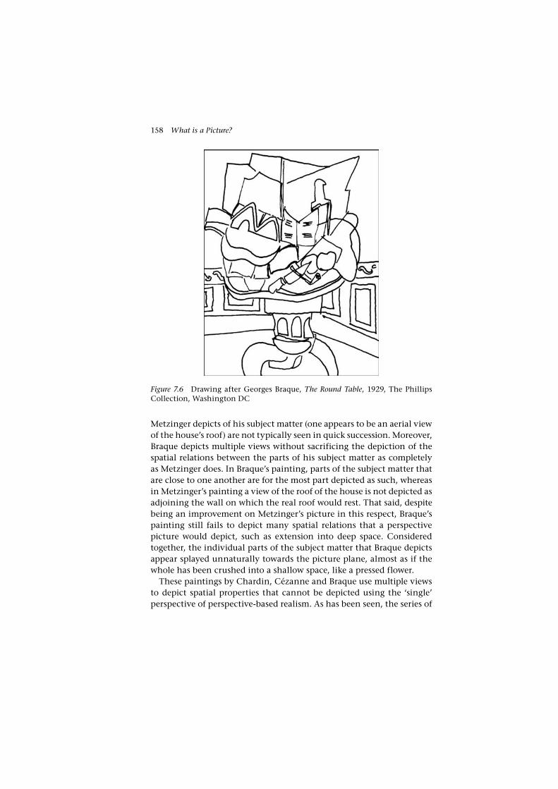
158 What is a Picture?
Metzinger depicts of his subject matter (one appears to be an aerial view of the house’s roof) are not typically seen in quick succession. Moreover, Braque depicts multiple views without sacrificing the depiction of the spatial relations between the parts of his subject matter as completely as Metzinger does. In Braque’s painting, parts of the subject matter that are close to one another are for the most part depicted as such, whereas in Metzinger’s painting a view of the roof of the house is not depicted as adjoining the wall on which the real roof would rest. That said, despite being an improvement on Metzinger’s picture in this respect, Braque’s painting still fails to depict many spatial relations that a perspective picture would depict, such as extension into deep space. Considered together, the individual parts of the subject matter that Braque depicts appear splayed unnaturally towards the picture plane, almost as if the whole has been crushed into a shallow space, like a pressed flower.
These paintings by Chardin, Cézanne and Braque use multiple views to depict spatial properties that cannot be depicted using the ‘single’ perspective of perspective-based realism. As has been seen, the series of
Figure 7.6 Drawing after Georges Braque, The Round Table, 1929, The Phillips Collection, Washington DC
Varieties of Realism 159
planar views depicted in these pictures mimics the shifting viewpoint of the ‘intimate’ spectator – one who has what can broadly be character-ized as a close visual and potentially tactile relationship to the subject matter. In respect of depicting these distinctive views, these pictures are realistic in ways unavailable to pictures made according to perspective-based realism.
It will now be quite clear that the depiction of multiple views is incompatible with perspective-based realism. The depiction of multi-ple views precludes the depiction of the spatial relations of an object’s parts, and vice versa. One can depict subject matter from a single point of view – as does perspective – or one can depict subject matter from multiple points of view – as have the painters discussed here. One can-not, however, do both.
8. Albertian colouring
I now turn to methods for depicting colour properties. Perspective-based realism, we have seen, incorporates such a method, and I argue below that other methods of depicting colour are incommensurable and incompatible with it. I call perspective-based realism’s method of colouring ‘Albertian colouring’, for its basic principle, as I have said, was set out by Alberti. Alberti held that the painter should reproduce the colours of the rays that make up the cross-section of the visual pyramid. This idea, we saw in Chapter 4, is reflected in the recent proposal of Hyman’s, that pictures reproduce aperture colours presented by their subject matter.32
It is also a theoretical ideal – impractical and, as should be clear from my discussion in Chapter 4, in some respects unattainable. There I mentioned Helmholtz’s observation that it is impossible to recreate in a painting the brightness of many colours that appear in nature. Even the brightest of non-luminous pigments, he found, will not recreate the intense colours of surfaces illuminated by direct sunlight. Of neces-sity then, painters often fail to reproduce the brightness of the colours they depict, and the same, I also found, is true of certain other precise colour properties. In practice, painters working in the tradition inaugu-rated by Alberti, dominant from the sixteenth century through to the nineteenth century in Europe, tend to use other principles, preserving features such as relations between colours rather than precise colours. For instance, rather than reproducing exact brightnesses, painters tend to reproduce relations of brightness. This has implications for the depic-tive scope of Albertian colouring. On Alberti’s account we would expect

160 What is a Picture?
a perspective-based picture to depict all the colour properties one could discern looking from a single, static point of view at the depicted scene. However, on this qualified view of how Albertian colouring works, some of these properties will not be, and in some cases cannot be, reproduced. Usually, that means they cannot be seen, and so on my account cannot be depicted. For instance, if a landscape painting depicts a sunny sky, it will not depict all of its colour properties. It will likely reproduce, and so depict, the relations of brightness – sky to clouds to landscape – but it will not reproduce, and so depict, its brightness.33
9. The depiction of gold surfaces using gold leaf
The method of colouring I have discussed above is very effective in its realism, but it does not depict all colour properties that can be depicted. Consider the pre- and early Renaissance practice of depicting gilt sur-faces using gold leaf. This simple method, while in certain respects infe-rior to Albertian colouring, is in other respects superior to it. While this practice is usually not associated with the realist tradition in painting, there are instances during the early Renaissance, before Albertian col-ouring became the norm, where it appears to be used with a realis-tic effect in mind. The Wilton Diptych (c. 1395–1399, National Gallery, London) is a prominent example.
At the end of his discussion of the use of colour in On Painting, Alberti criticizes painters who, following a Byzantine tradition, used real gold, applied to the picture surface in the form of gold leaf, to depict gilt objects, or objects made of gold. ‘There are some,’ he writes,
who use much gold in their istoria. They think it gives majesty. I do not praise it. Even though one should paint Virgil’s Dido whose quiver was of gold, her golden hair knotted with gold, and her purple robe girdled with pure gold, the reins of the horse and everything of gold, I should not wish gold to be used, for there is more admira-tion and praise for the painter who imitates the rays of gold with colours.34
Rather than using gold leaf, Alberti suggested the painter should use only ‘colours’, non-metallic pigments such as yellows and browns, to depict gold. The reason for this can readily be appreciated if we consider the task of Alberti’s painter to be the reproduction of the configuration of colours visible from some precise point of view. Such a configuration will be related to the subject matter’s reflective properties. A metallic

Varieties of Realism 161
surface, such as gold, reflects light not diffusely, as do most objects, but like a mirror, so that if one looks closely, the images of its surroundings can be seen in its surface. A metallic object relies for its particular reflec-tive properties on its three-dimensional shape – thus a flat area of gold leaf will not have the same reflective properties, and so will not present the same configuration of colours as a three-dimensional gilt object. A three-dimensional gilt object will reflect much of its surrounding tones, taking on darker tones where it reflects the darker parts of its surround-ings, lighter tones where it reflects brighter elements of its surround-ings, and bright highlights where it reflects a source of light. A flat area of metal, however, is likely to produce a quite different effect. ‘We see in a plane panel with a gold ground’, writes Alberti, ‘that some planes shine where they ought to be dark and are dark where they ought to be light’.35 Such a panel appears very different to the gilt object it depicts, in that it reflects a different area of its environment, and it fails to give these reflections the curving distortions characteristic, particularly, of rounded metallic objects. Using gold leaf will thus not allow the painter to reproduce the distinctive shapes of these reflections.
The basis of Alberti’s objection to the use of gold in painting appears in the last sentence of the block quotation. Rather than speaking of a ‘painter who imitates gold’ he speaks of a ‘painter who imitates rays of gold’. If it were the gold itself that was to be imitated, Alberti would have had difficulty maintaining his position – for what could be a more suitable medium to imitate gold than gold? By speaking of ‘rays of gold’ as the object of imitation (by which he meant the colours of the rays of light which run between the golden object’s surface and the eye of the viewer) Alberti shifted attention towards the depiction of those proper-ties his method depicts (just those properties that are visually discern-ible from some precise point of view) and away from the depiction of other visually discernible properties.36
While the realism of the paintings Alberti criticized was no doubt hampered in the way he describes by the use of gold leaf, it is also true that these pictures do successfully depict visually discernible properties of gold objects. For instance, we see the depicted gilt objects in a paint-ing such as The Wilton Diptych as having many of the properties the gold leaf used to depict them does in fact have, properties that are visually discernible from a range of points of view, such as the bright, soft lustre of gold and its changing reflective properties as one moves around it. Of course, the painting depicts these properties in virtue of instanti-ating them. Incorporating gold, these paintings generally engage our ability to recognize gold (if not a three-dimensional gold object) more

162 What is a Picture?
strongly than an Albertian painting of the same subject does. The phas-ing out of gold leaf in Italian painting during the fifteenth century might thus be seen not as an unequivocal advancement in realism, but as involving another trade-off. The capacity to reproduce certain visually discernible properties of gold objects – particularly distinctive metallic qualities that are discerned in full as the viewer moves about them – was forgone in favour of the new capacity to reproduce aspects of their reflective properties that engaged the viewer’s ability to recog-nize three- dimensional shape.
While the Albertian method of colouring is realistic in many respects, it should not be seen as straightforwardly superior in its realism to other methods. Another method, we have now seen, can serve to depict colour properties that Albertian colouring does not depict. These two meth-ods are thus incommensurable, and, it will be clear, incompatible. The reflective surface, on which the effectiveness of the gold leaf depends, precludes the use of relatively matt pigments, on which Albertian col-ouring is founded.
10. Divisionism and optical mixture
Divisionism refers to the application of colour as intermingled dots, dabs, strokes or points of contrasting hue and tone, as opposed to the smooth, homogenous, blended application of colour that usually char-acterizes the techniques of Albertian colouring. Divisionism, as I intend it here, moreover attributes to this ‘divided’ colour an ability to depict the effects of bright colours superior to Albertian colouring. I argue that divisionism allows painters to depict subjective contrast effects – that is, simultaneous and successive contrasts – which are characteristic of brightly illuminated scenes, but which Albertian colouring does not depict. This idea has already been introduced in Chapter 4, where I dis-cussed Seurat’s depiction of simultaneous contrast. Seurat’s Pointillism, in which divided colour is applied using a complex method of intri-cate dotting, is usually taken to be the highest development of divi-sionism in painting. Nevertheless, it should be noted that the practice of divisionism pre-dates Pointillism. Certain of the Impressionists, in particular Claude Monet in his late work, make use of divided colour. Divided colour was also employed by earlier painters, including Eugène Delacroix and Peter Paul Rubens, perhaps the earliest painter whose use of it is documented.37 The Pointillist theorization of divisionism might thus be seen as an attempt to develop and rationalize a pre-existing practice. The fact that Pointillist theory is, as will be seen, misconceived

Varieties of Realism 163
in some respects, should not prejudice us against the practice of divi-sionism per se.
Here I will maintain my focus on Seurat, broadening it to examine also his depiction of successive contrast. I will also further examine the depictive value of divisionist technique. In particular, I will ask what benefit there is in depicting contrasts using divided colour, rather than smoothly painting them in, as we have seen Velázquez do.
First I need to clear up an enduring misconception about division-ism: that it can recreate the brightness of depicted scenes. This miscon-ception was propounded by the Pointillists themselves. They aimed to attain a realism superior to that afforded by Albertian colouring, which like Helmholtz, they recognized did not depict colours with their true brightness. In the divisionism of certain of the Impressionists, such as Monet, they believed they found a means to depict this brightness, but they also believed Impressionist depiction of colour could be made more effective and accurate by rigorously systematizing it, and founding it on a scientific basis – in particular on the work of scientists such as Michel Eugène Chevreul. Thus, the Pointillists developed an elaborate divisionist technique, and an accompanying theoretical justification for preferring the use of this divisionism to the traditional techniques of Albertian colouring. The Pointillist theory of Seurat is represented in the writings of Félix Fénéon, who acted as a spokesperson for the Pointillists, and in particular, for Seurat.38 Fénéon claims that divi-sionism can be superior in its realism to Albertian colouring because the optical mixture of divided colour provides a more effective way of reproducing a colour’s brightness than traditional, pigmentary meth-ods of mixing colour. Rather than using a pigmentary mixture – mix-ing paints on the palette – Seurat placed small dots of divided, highly saturated colour in combinations which according to Fénéon, provided the viewer stood back an appropriate distance, would optically mix, accurately reproducing for the viewer the colour of the painter’s subject matter. Attending to a small section of Seurat’s painting La Grande Jatte (1886, Art Institute of Chicago), depicting a patch of grass of uniform colour, Fénéon describes how the dots in that section reproduce ‘all the single elements that make up the [patch of grass’s] color’.39 Most of the dots reproduce the grass’s local colour: green. A few orange spots reproduce the colour of sunlight, ‘the only slightly perceptible action of the sun’.40 Dots of purple reproduce what Fénéon calls the ‘normal irradiation of complementaries’, presumably successive contrast.41 Dots of cyan blue reproduce the effects of simultaneous contrast with a neighbouring, more brightly illuminated patch of grass. ‘These colors,’

164 What is a Picture?
Fénéon writes, ‘in isolation from each other on the canvas, recombine on the retina. One has, therefore, not a mixture of colored matter (pig-ments) but a mixture of colored light’.42 As I have said, Fénéon claims that optical mixture of divided colour provides a more effective way of reproducing a subject’s colour, particularly its intensity, than pig-mentary mixture: ‘the luminosity of an optical mixture is always much greater than that of a pigmentary mixture’.43 Divisionism, according to Fénéon, therefore provides painting with the means to more accurately reproduce the effects of bright sunlight and brightly lit surfaces.
As a number of writers, including Meyer Schapiro, Georges Roque and Alan Lee, have made clear, the brightness of optical mixture is not supe-rior to that which may be achieved by pigmentary mixture.44 Fénéon based his claim on the work of the American physicist Ogden Rood. ‘[T]he luminosity of an optical mixture is always much greater than that of a pigmentary mixture, as shown by the numerous equations for luminosity established by Rood’.45 Fénéon gives some of Rood’s equa-tions, the result of Rood’s experiments with Maxwell discs, showing that an optical mixture is always brighter than a pigmentary mixture of the same colours. Maxwell discs provide an alternative but equiva-lent means of obtaining optical mixtures of colours to divisionism. A Maxwell disc is divided into differently coloured sections; when the disc is spun very quickly, instead of perceiving the separate colours, the viewer perceives a single uniform colour – the optical mixture of the component colours. A spinning red and green disc, for instance, yields a uniform dull yellow tone. In the most extreme cases, where what we may call the optical complementaries (yellow and indigo blue, orange and cyan blue, red and blue-green, purple and green, etc.) are mixed in this way, they yield a hueless grey.46
Fénéon’s error likely stems in part from a confusion between opti-cal mixture of coloured pigments and the optical mixture of coloured lights. If two spots of projected light are overlapped, the overlap will be brighter than either of the individual lights. The overlap of red and green beams of lights, for instance, gives a brighter colour, a uniform yellow. When complementaries are superimposed, they yield a brighter, white light. In general the brightness of two superimposed spots of lights is equal to the sum of the brightness of the individual lights. By contrast, optical mixture produced by the rotation of a Maxwell disc – or by divisionism – only generates a brightness equal to the average of its components. Red and green yields a dull yellow tone or brown, and the mixture of optical complementaries in this way yields not white, but grey. For this reason, where optical mixture does occur in divisionist

Varieties of Realism 165
paintings, the result is often dull, or – because white is added to the components to alleviate this problem – lacking in saturation compared to conventional colouring.
11. Depicting contrast effects
So, the Pointillist justification of the technique as better reproduc-ing the actual brightness of colours is flawed. Nevertheless, a case can be made that divisionism allows certain effects of bright colours to be reproduced. In particular, it allows contrast effects to be depicted. I have already begun to give an account of this as it applies to simultaneous contrast in Chapter 4. Like simultaneous contrast, successive contrast is the product of physiological processes. These were earlier thought to occur within the eye, but are now understood to be neurophysiologi-cal. Simultaneous contrast is experienced when areas of differing tone (an area of dark tone and an area of light tone) or areas of differing hue are placed so their borders meet. Around this border the perception of each tone or hue is heightened. Successive contrast is a somewhat similar effect, sometimes described as ‘negative after-images’. Successive contrast can be seen when after viewing a stimulus the viewer turns his or her eyes towards a lighted, white surface. In comparison to the white surface against which they are seen, successive contrast has a hue which is the optical complementary of the original stimulus. For exam-ple, viewing a red object will produce a contrast that, when the eyes are subsequently turned to view a white ground, is bluish green. When the surface against which successive contrast is seen is not white (when it overlaps the stimulus, for example) the colour of the contrast mixes additively with that of the surface.
As I have mentioned, Fénéon describes the depiction of both simulta-neous and successive contrasts in Seurat’s paintings. Successive contrast is depicted by interspersing areas of colour with dots of a complemen-tary hue, simulating the effects of negative after-images. Simultaneous contrast is depicted principally by painting ‘haloes’ of dots around the objects depicted; these haloes contrast with the object in both bright-ness and hue. Fénéon, as has been seen, describes Seurat as depicting simultaneous contrast on a patch of shaded lawn in La Grande Jatte: ‘a cyanic blue, induced by the proximity of a plot of grass in the sun, is built up toward the line of demarcation [between the shaded and sunlit areas] and diminishes progressively away from it’.47 Successive contrast is depicted on the same patch of lawn using dots of purple, the optical complementary of green.

166 What is a Picture?
We saw in Chapter 4 that it has been argued that the depiction of simultaneous contrast stems from a misunderstanding of the phenom-enon. The same objection could just as well be made to the depiction of successive contrast. That is to say, a picture that accurately reproduces the colours of its subject matter can be expected to generate the same con-trast effects – both simultaneous and successive – as the colours would in life. As I have said, a plausible rationale, available to the Pointillists, does in fact exist for the depiction of contrast effects, and this applies to both simultaneous and successive contrast. As contrast effects are ‘pro-duced more strongly by bright light and brilliantly saturated colors than by faint light and duller colours’, Helmholtz directs that,
an artist [who] wishes to reproduce as strikingly as possible, with the pigments at his command, the impression which real objects pro-duce ... must indicate with paint the contrasts which the real objects naturally display. ... If the colours in a painting were as strong and brilliant as those of actual objects, the contrasts which appear in reality would appear automatically in a painting. Here ... subjective visual phenomena must be introduced objectively into a paint-ing, since the colours and light intensities in it are different from reality.48
Thus, depicting contrast effects can compensate for the inability of painting (using pigmentary or optical mixture) to reproduce the bright and saturated colours of a sunlit scene. We have already seen Helmholtz’s examples of the depiction of simultaneous contrast. He also gives examples of successive contrast that, he suggests, the painter may be expected to depict: ‘[w]here the sun’s rays, passing through the green, leafy shade of trees, strike against the ground, they appear to the eye – fatigued by looking at the predominant green – of a rose-red tint. Reddish-yellow candlelight, on the other hand, appears blue in the daylight entering a room through a small slit’.49
12. The depictive value of divisionism
There remains a question regarding Seurat’s depiction of contrast effects. Clearly, Seurat paints in contrast effects, and as has been seen, there is a plausible rationale, described by Helmholtz, that justifies their depic-tion. What remains to be seen is the positive role divisionism plays in this depiction, that is, why it is that divisionism is better able to depict contrast effects than traditional methods of pigmentary mixture. This

Varieties of Realism 167
is an urgent question, since from foregoing the discussion it would be easy to conclude that the reverse is in fact the case – that pigmentary mixture is better able to depict contrast effects than divisionism. So why use divided colour at all? What are its benefits? It is clear now that optical mixture per se does not provide the answer. We have seen that it is no better than pigmentary mixture, and in some cases, where Seurat attempts to reproduce subtractive colour mixtures using the additive optical mixture, it can be a hindrance. The answer lies, I suggest, in understanding divisionist colour as forming not a complete optical mixture, but only a partial optical mixture, in which the components remain perceptible.
It is apparent that at longer distances, Seurat’s dots do not completely fuse into a homogenous colour. From across a gallery, variously coloured specks remain perceptible. Partly, this is due to the relatively large size of the dots employed, and partly to their uneven distribution.50 Equally, at closer distances, a measure of optical mixture can be observed, although here the perception of the components dominates. Partial mixture is the rule rather than the exception in the experience of Pointillist paintings: the product of the optical mix is perceptible, albeit dully, while the com-ponents simultaneously remain perceptible as a generalized multicol-oured speckling. As the viewer steps back and forth the degree of mixture may alter, but the components remain perceptible to some degree.
It has been suggested by a number of writers that the perception of complementary colours in a partial optical mixture produces a ‘vibra-tion’ which reproduces qualities of bright light. Robert L. Herbert, for example, holds that complete optical mixture was not the Pointillist’s goal, and does not occur in their paintings. Instead, he suggests:
it is towards this optical mixture that the eye struggles. In so doing, an active vibration takes place in which the separate colors are seen in a stimulating shimmer. It is this stimulating vibration ... which recapitulates the intensity of real light dancing and sparkling over varied surfaces.51
Fénéon was in fact the first to draw attention to this quality in Seurat’s work (apparently ignoring that its perception was incompatible with a complete optical mixture). In his account of La Grande Jatte, he notes that:
[t]he atmosphere is transparent and singularly vibrant; the surface seems to oscillate. Perhaps this sensation ... may be explained by
168 What is a Picture?
Dove’s theory: the retina, prepared for the distinct ray of light to act upon it, perceives in very rapid alternation both the separate ele-ments of colour and their resultant mixture.52
Fénéon refers to German physicist Heinrich Wilhelm Dove’s theory of lustre. By ‘lustre’, Lee points out, Dove meant a slightly different phenomenon to that observed by Fénéon: a feature of the stereoscopic perception of complementary colours, known today as binocular rivalry.53 The phenomenon described by Fénéon is usefully explained by Lee:
Contrasting colours have different refrangibilities, hence a surface pattern of bright pure red and green, for example, can never be focussed clearly on the surface of the retina. The accommodation mechanism of the eye tends to jump back and forth between two equally unsatisfactory focus points; when the red dots are in focus the green dots are out of focus, and vice versa. This gives rise to a somewhat uncomfortable flickering or vibrating feeling in our eyes, which is quite distinctive. It is accompanied by subtle changes in our visual impression of the focus of the pattern.54
Lee goes on to conclude that this phenomenon cannot contribute to the realism of Pointillist painting, but I think this is wrong. Lee makes his conclusion on the basis of two arguments. The first claims that the effect will be seen only rarely in Pointillist paintings: ‘only on those few isolated areas’ that feature interspersed dots of complementary, or near complementary, hues.55 However, Lee is wrong to think that only a few areas of Pointillist canvases feature dots of complementary, or near com-plementary, hues. As Fénéon says, Seurat did indeed intersperse dots of complementaries throughout much of La Grande Jatte to depict succes-sive contrast. Most of the other Pointillists followed a similar practice. Lee’s second argument claims that this optical effect is very different from any optical effects experienced in front of the type of subjects the Pointillists might depict, and so cannot be used to any realistic end. ‘[B]ecause the sensation is so peculiar it does not have any natural associa-tions with our everyday experience of landscapes, or any other of the subjects represented in Seurat’s paintings’.56
But this, too, is untrue. Two features of this optical phenomenon, in particular, reproduce features of simultaneous contrast. First is the tendency of the complementary components to come into focus alter-nately; one can only focus on one component then the other, not on

Varieties of Realism 169
both at once. This alternation of focus between the components that depict the object and its contrast effect reproduces what is often a dis-tinctive feature of simultaneous contrasts – the sometimes uncomforta-ble ‘vibrating’ alternation of focus between an object and its contrasting ground, which may appear as flashes of light or colour overlapping, sometimes only momentarily, the edges of the object and the ground against which it is seen. The second pertinent feature of this optical phenomenon is the appearance of one component ‘floating’ in front of the other. The ‘floating’ effect can also be seen in successive contrasts, for these are often experienced as ‘overlaying’ the original stimulus.
I shall take one example from Seurat’s painting to illustrate this account. In Seurat’s small Eiffel Tower (1890, Fine Arts Museum of San Francisco) the sky is painted using blue dots. Throughout, the blue is interspersed with orange, presumably a successive contrast. These inter-spersed complementaries generate an alternating focus, the viewer’s focus flickering back and forth between the skeins of blue and orange dots. The groups of blue and orange dots seem to float one over the other – although this effect is also due to variations of tone as well as hue. Such effects are evident over the surface of the entire picture, which is covered with interspersed dots of complementary hues. Thus Seurat reproduces both the characteristic alternating focus between stimulus and after-image, and the after-image’s appearance of floating in front of the stimulus.
Such an account also allows us to make sense of other instances of divisionism. Monet, from the 1880s, developed a divisionist technique, overpainting his works with intricate scumbles of complementary col-ours. Virginia Spate, in her book on the artist, suggests that his divided colour mimics the optical effects of after-images that the viewer is sub-ject to in direct sunlight, and analyses Monet’s use of this technique in his later work.57 Writing of Stack of Wheat, Sunset (1891, Museum of Fine Arts, Boston) she notes Monet intersperses the orange-red of an after-image with a complementary dark blue-green in the shadowed, lower portion of the stack, ‘so that it ... starts to vibrate’.58 This perhaps generates even more successfully than in Seurat’s work the ‘vibrating’ alternating focus between the after-image and its stimulus. The appear-ance of an after-image seeming to floating in front of its stimulus is reproduced most clearly in another painting from Monet’s ‘haystack’ series, Grainstack, Sun in the Mist (1891, Minneapolis Institute of Arts). The area of ground shadowed by the stack is painted largely with inter-spersed strokes of dark orange, depicting the shadow, and a greenish blue, which depicts its after-image, and appears, as one focuses on it,

170 What is a Picture?
to come forward from its orange ground. Spate observes that the stack casts a ‘shadow which floats between it and the ground’.59
To bring this discussion of divisionism to a close, we have seen that Albertian colouring and divisionism are incommensurable methods, for the latter depicts properties the former does not. It will be appar-ent too that they are incompatible. The individual units that make up a divisionist field of colour – the individual dots in the case of Seurat’s painting – in themselves do not typically attribute particular colour properties to the part of the surface they depict. It is only in concert with other divisionist dots or strokes that a unit of colour comes to have depictive content. Moreover, the size and visibility of the Pointillists’ dots of paint result in further limitations of the type I described above, regarding facture. In many cases the divisionist units of colour are too large to depict small details of form. In Seurat’s Young Woman Powdering Herself (c. 1888–1890, Courtauld Gallery, London) one cannot answer questions about the precise colour and form of many of the woman’s features. For instance, we cannot tell where the reddish pigmentation of the woman’s lower lip begins and ends, or what precise shape her lower lip forms. These features are not depicted in Seurat’s painting, and it is clear that they cannot be, for Seurat’s field of coloured dots is not fine enough to resolve these details. If they were made any finer, the depic-tive advantages of the method would be lost. Divisionism, by its nature, cannot accommodate the detail that Albertian colouring can. The two methods are therefore incompatible.
13. Conclusion
We have surveyed a range of examples of methods that are incommen-surable and incompatible with perspective-based realism. So we may conclude that perspective-based realism is not an optimal method – nor can any method be considered optimal.
This shows too that the linear account of the realistic tradition is wrong. As I suggested earlier, the realistic tradition presents a range of branching methods. The choice between Albertian colouring and the use of gold leaf is a choice between different kinds of realism, just as were the choices artists made between Albertian colouring and Pointillism, between facture and aspects of perspective-based realism, and even between strains of Cubism and perspective. In none of these cases can the choice be made on the basis of one being more realistic simpliciter than another. These choices must therefore be made because realism in one respect is valued over realism in another. There are many reasons

Varieties of Realism 171
why one or other kind of realism may be valued, but in each case it will reflect the values, concerns and outlooks of those who made the choice – the picture-makers, and to various degrees, their audiences. To fully understand the meaning of a particular kind of realism, one must understand the significance it has to these makers and audiences. That brings us beyond the scope of my investigation in this chapter, for if we take up this project, we will no longer be concerned with depiction per se, but rather with the meanings that supervene upon depicted content. It brings us, in short, from philosophy to art history.

172
8Abstraction
Abstraction in painting, drawing and other two-dimensional media is often popularly understood as involving an absence of depiction.1 On this view, an abstract painting is thought to be one that does not depict anything: its shapes, colours and marks do not, and are not meant to, occasion a visual experience of anything beyond themselves. This idea is wrong, or rather, not quite right. Of course, abstract paintings do not depict objects, the concrete particulars – people, landscapes, inanimate objects, and so on – that non-abstract pictures depict. But when we look at abstract paintings, we do not simply see the shapes, colours and marks that are actually there on the painting’s surface. We tend to see some marks, shapes and colours as in front of others – and this is regard-less of whether they are painted one over the top of the other. Shapes can seem to be overlapping or transparent. They may appear illumi-nated or shadowed (not necessarily implying a consistent light source) in ways that in fact they are not. The kind of space abstract paintings depict is a correspondingly shallow, planimetric one, for the spatial relations implied above, articulated by features such as parallelism to the picture plane, overlapping and transparency alone, involve only a shallow sense of space. Wassily Kandinsky’s painting Black Relationship (1924, Museum of Modern Art, New York) (Figure 8.1) is an example in which all these relations seem to appear. Overlapping, transparency, illumination, shadowing and the space they imply are not present in the actual painting, but the painting nevertheless occasions the experi-ence of seeing them. It is thus my contention that abstract paintings depict these things. I should say that I do not mean to imply that every abstract painting has depictive content, for there will be some, such as the flat monochromes of Yves Klein, that do not. But we shall see that this kind of analysis can be made of most abstract painting.2

Abstraction 173
This is not a new idea. It is one Wollheim outlines in Painting as an Art, and it notably appears in the work of Clement Greenberg and Michael Fried, two major mid-century theorists of abstraction.
This chapter begins by looking at how these writers address the topic, before giving a general account of what abstract paintings can depict. I go on to argue that understanding the depictive content of abstract painting involves non-veridical seeing without the recognition of volu-metric form. Irving Biederman has developed an influential account of how volumetric forms are recognized by the visual system, which I touched on earlier, in Chapter 4. Here I propose that abstract paintings
Figure 8.1 Drawing after Wassily Kandinsky, Black Relationship (Schwarze Beziehung), watercolour and ink on paper, 1924, Museum of Modern Art, New York

174 What is a Picture?
can engage any visual recognitional abilities, but frustrate the specific abilities described by Biederman. I test this idea by making an analysis of Analytic Cubism, which is widely regarded as an important transi-tion toward abstraction. Although it retains a kind of residual depic-tion, it pioneers the distinctive space of abstraction by purging itself of the depiction of volumetric form. I show that Analytic Cubism does this using strategies that disable the specific processes described by Biederman. After thus treating one of abstraction’s points of origin, I turn to one of its end points in Modern painting, the work of the colour field painter Jules Olitski. I consider Olitski’s work because it is of a kind that initially appears resistant to my analysis. But I show that Olitski’s evenly toned fields of sprayed colour do have a depictive content, and, as with other abstract painting, this can be explained by the way they engage recognitional abilities not involving volumetric form recogni-tion. I conclude with a discussion of the diversity of symbolic meanings that the space depicted in abstract paintings – abstract space as I call it – can bear. Here, I want to show that while there is a constancy to the depictive content of abstraction, the meanings that supervene on this are nevertheless diverse.
1. Depth in abstract painting
In the philosophy of art, Wollheim has broached the idea that abstract painting has depictive content. ‘Abstract art,’ he writes, ‘tends to be an art that is at once representational and abstract. Most abstract paintings display images: or, to put it another way, the experience we are required to have in front of them is certainly one that involves attention to the marked surface but it is also one that involves an awareness of depth’.3 As an example, he gives Hans Hoffman’s abstract painting Pompeii (1959, Tate Gallery, London). ‘[M]anifestly this painting requires that we see some planes of colour in front of other planes, or that we see something in its surface. And this is true despite the fact that we shall be able to say only in the most general terms what it is that we see in the surface’.4 In general, for Wollheim, abstract paintings are distinguished from non-abstract paintings by how we conceptualize those things we see in them. With non-abstract painting ‘we use “boy”, “dancer”, “torso” ’, that is, ‘figurative concepts’. With abstract painting we use ‘ “irregular solid”, “sphere”, “space” ... ’, that is, ‘abstract concepts’.5
The idea that abstract painting has depictive content also has a pres-ence in art theory. Clement Greenberg is well known for his talk of ‘flatness’ as being the object of Modernist painting. This implies a lack

Abstraction 175
of any depictive content – no sense of depth, or any other properties that are not actually instantiated by the painting’s surface. But this was not his meaning. Indeed, his position shares much with Wollheim’s. In his most famous essay, ‘Modernist Painting’, from 1960, he explains himself:
[I]n plotting out the rationale of Modernist painting I have had to simplify and exaggerate. The flatness towards which Modernist painting orients itself can never be an absolute flatness. The height-ened sensitivity of the picture plane may no longer permit sculptural illusion or trompe l’oeil, but it does and must permit optical illusion. The first mark made on a canvas destroys its literal and utter flatness, and the result of the marks made on it by an artist like Mondrian is still a kind of illusion that suggests a kind of third dimension. Only now it is a strictly pictorial, strictly optical third dimension. The Old Masters created an illusion of space in depth that one could imag-ine oneself walking into, but the analogous illusion created by the Modernist painter can only be seen into; can be travelled through, literally or figuratively, only with the eye.6
What sets abstract painting aside from non-abstract painting on Greenberg’s account is the purely optical nature of our experience of the space it depicts. Abstract painting elicits ‘purely optical experi-ence as against optical experience modified or revised by tactile asso-ciations’.7 For Greenberg, visual experience as we normally encounter it is conditioned by our tactile experiences. When we see an object, our visual experience of it is bound up with tactile associations. This occurs when we see depictions of objects too – our visual experience of the depicted subject matter is conditioned by tactile associations. The development of abstraction, for Greenberg, involves the progres-sive elimination of tactile experience, which involves the elimination of figurative subject-matter. So, for Greenberg, the space depicted by the Old Masters is largely a tactile space. Manet and the Impressionists came to give more attention to the optical features of vision, and less to its tactile components. Abstraction in which figurative subject matter is dispensed with, further pushes this balance in favour of the optical.
Now, for Greenberg, as well as Michael Fried, another major post-war theorist of abstraction, all abstraction is not equal in this respect. Most abstraction, of the kind I discuss (Kandinsky’s work, for instance), does not divorce itself entirely from tactile associations. Planes and lines floating in space still have a sculptural quality, and so elicit some

176 What is a Picture?
tactile sensation.8 Only a handful of painters, according to Greenberg and Fried, do present us with a purely optical experience of space. These are the colour-field painters, including Morris Louis, Kenneth Noland and Jules Olitski, championed by Greenberg and Fried in the 1960s. The colour-field works of these painters still produce a perception of depth, according to Greenberg and Fried, but now it is a purely optical experience. According to Fried, this perception arises from ‘perceiving nuances, fluctuations, and properties of colour alone, which together create the ... illusion of a space addressed exclusively to eyesight’.9 This kind of space is sometimes described as ‘aerial’ or ‘atmospheric’. I will return to the kind of depth perception involved here in discussing Olitski’s work.
An implication of Greenberg and Fried’s analysis is that it is only the colour-field painters that produce truly abstract painting; all other forms of what we ordinarily call abstraction are impure to various degrees. Greenberg and Fried thus find a much smaller group of paintings to be genuinely abstract than does Wollheim.
2. What abstract paintings depict
My account of abstraction’s depictive scope is more restricted than Wollheim’s, but less exclusive than Fried’s. With regard to Wollheim, and this is crucial for what follows, I reject the idea that abstract paint-ings depict volumetric forms. There is an art historical basis for this claim, for the mature work of the first generation of great abstract paint-ers, Kandinsky, Malevich and Mondrian, avoids volumetric form. There is also a kind of genetic reason for it, for Analytic Cubism aimed to ‘decompose’ such forms, and the following generation of abstract paint-ers in various ways used Cubism as a jumping-off point onto abstrac-tion.10 It is worth considering that an abstract painter who decided to represent volumetric forms would find herself returned to many of the old representational problems the Cubists had rejected. Her work would involve, probably, the use of perspective, tonal modelling and so on – the only difference being that she would be painting compositions of generic volumetric forms rather than objects that populate the real world.11
Greenberg and Fried’s concept of pure opticality is too exclusive. It is an obvious concern that it rejects the work of Kandinsky, Malevich and Mondrian, as well as most other painters we would ordinarily term ‘abstract’. Moreover, the concept of pure opticality, as Greenberg and Fried intend it, is hard to maintain. The concept has already attracted

Abstraction 177
much criticism in the past.12 This is not the place to mount an extended attack of it, but it can readily be seen that current ideas of vision do not support Greenberg and Fried. As I have discussed earlier, in Chapter 2, vision is a capacity that has evolved in part for the purpose of recogni-tion. Vision is thus intrinsically of things – objects, properties and kinds. The visual system is structured to detect features – edges, colour, texture that are relevant for recognition, and if Biederman’s ‘geon theory’ of recognition is right, it is also structured to identify volumetric forms.13 Briefly then, there is no such thing as pure opticality as Greenberg and Fried intend it. And since vision is intrinsically representational in these ways, a revised version of the concept that takes this into account will not help in defining the depictive scope of abstraction, which, as I have said, excludes volumetric form.
My account of the depictive scope of abstraction involves two condi-tions. Depiction, in general, may be of objects, kinds and properties. My first condition stipulates that abstraction depicts only kinds and prop-erties. This follows simply from the observation that abstract paintings do not depict objects. They do not depict people, animals, scenery or anything else that concretely exists or could so exist. Note that this excludes semi-abstract pictures, which are intended to occasion an experience, however residual, of some object. It also excludes actual or possible objects that look like abstract paintings. If I make a model of overlapping rectilinear coloured shapes and make a painting of it, it might well come out looking like a Malevich – but so far as it depicts this model, it will not be abstract. Rather, a red square of paint in a Mondrian or Malevich does not depict any particular actual or possible red square; it depicts a kind (the square) and a property (redness). These, of course, can be instantiated in an object, as they are in many actual red squares in the world, as they are in the model I spoke of above, and as they are in the surface of Mondrian’s and Malevich’s paintings.
Second, we will want to know which kinds and properties abstract paintings depict. Such a distinction must be made, for there are many kinds and properties that cannot be depicted in an abstract painting. Vitruvian Man, the ideally proportioned human figure described by Vitruvius, is a kind rather than an object. However, Leonardo’s famous drawing of Vitruvian Man is not an abstract picture. Nor are many of the properties that Leonardo depicts Vitruvian Man as having, espe-cially properties of volumetric form, those that are depicted in abstract painting. What kinds and properties, then, do abstract paintings depict? In general, abstract paintings can depict two-dimensional shapes, and lines and marks, provided they are depicted as parallel, or close to

178 What is a Picture?
parallel, to the picture plane. This is a good characterization of our perception of the grids and shapes in Mondrian’s paintings, the lines and shapes in Kandinsky’s abstracts, the apparently floating, weightless rectilinear shapes in Malevich’s Suprematist compositions, and the net-works of overlapping marks that characterize various kinds of gestural abstraction from Willem de Kooning to Jackson Pollock. The kinds depicted are just those shapes, lines and marks that can be exemplified in a painted surface. What then of properties? The depicted shapes, lines and marks are distinguished from those actual instantiated because we non-veridically see the former as having spatial, physical and colour properties that the latter do not have. So, as I have said, shapes may be depicted as overlapping one another, as being opaque, translucent or transparent, as having textural properties they do not in fact have, as being illuminated or shadowed, and so on. Lines, as we have seen, may also appear to have spatial properties, appearing, for example, as wiry forms in space. Marks may seem to float in space, loosely connected, one over or underneath another, or interpenetrating. In short, the prop-erties depicted are not those exemplified in a two-dimensional surface, but other properties that the kinds exemplified in a two-dimensional painted surface can take on.
This second condition invites an analysis in terms of a feature of vision discussed in Chapter 4. There, I proposed that many pictures engage the volumetric form recognition abilities described by Biederman.14 Abstract paintings, I now propose, frustrate this ability to recognize volumetric form, while engaging various other visual recognition abilities.15
Since visual awareness of volumetric form is such a conspicuous part of ordinary vision, it might first be asked whether it is even possible to have visual experience without recognition of volumetric form. This, I think, can quickly be confirmed. Biederman himself presents images intended to resist volumetric form recognition, and our experience of these can be a guide to what we can expect of seeing without such recognition. The lower picture in Figure 8.2 is one such image. Both pictures depict a view through a screen through which can be seen parts of a torch, which in terms of volumetric forms can be considered as constituted of cylindrical components. In the upper picture, despite the masking of the screen, we have an experience of seeing the volu-metric shape of the torch behind the screen. In the lower picture, we are not apt to have an experience of seeing volumetric form behind the screen. Instead we have an awareness through the apertures in the screen of edges bounding planar forms that seem set in a shallow space roughly parallel to the screen. Both images present similar amounts of

Abstraction 179
Figure 8.2 Irving Biederman, ‘Recoverable’ and ‘non-recoverable’ volumetric form (from Biederman (1987), p. 143, fig. 26; p. 142, fig. 25)

180 What is a Picture?
contour, but where the contours visible in the upper image are salient to recognition of volumetric form, those visible in the lower image are not. Biederman, as we shall see shortly, is concerned with identifying the aspects of contour that are salient to volumetric form recognition. Here, I want to draw attention to the fact that the experience of seeing without volumetric form recognition that we find in Biederman’s image is one we are already familiar with in abstract painting.16
3. Cubism and depiction
My motive in discussing Cubism is twofold. First, as I have said, Cubism is a crucial movement in the development of abstract painting, for while it is never entirely abstract itself, it makes important advances that help open up abstraction as a possibility for the subsequent gen-eration of European painters. I will say something about just what this involved below. Second, on some accounts of Cubism, the frustration of volumetric form recognition is a central strategy of Cubist picture-making. Before getting on to this, which will be my major concern in discussing Cubism, it is necessary to make some general remarks about Cubism and depiction.
In this chapter I will focus especially on Analytic Cubism, as it illus-trates my case best, but the same points can often be made about later forms of Cubism. Analytic Cubism is different in its aims from the Cubism of Metzinger and Gleizes, which I discussed in the previous chapter. That is, it should not be understood as depicting a collection of multiple views, or an attempt to depict ‘duration’. I also reject the semi-otic account of Analytic Cubism, which sees it as discovering the sup-posedly conventional character of depiction.17 I prefer the approach to Analytic Cubism that sees it as a destructive process, a ‘desperate revolt against illusion’, to use Gombrich’s phrase.18 It is, though, not depiction in toto that is progressively done away with, but only the depiction of volumetric form. An advanced example of Analytic Cubism, such as Picasso’s The Guitar Player (1910, Musée National d’Art Moderne, Centre Georges Pompidou, Paris) (Figure 8.5) shows almost no suggestion of volumetric form; instead we are presented with a collection of geomet-ric planar forms.19 The planes may appear folded, as if the edge of a volumetric form, or they may remain a single plane – convex or entirely flat. They usually appear flattish and planar, and tend to appear pressed against the picture plane. Often, they fade off on one or two sides – either into nothing, as if becoming transparent, then disappearing, revealing the ground behind.

Abstraction 181
Note too that the The Guitar Player still depicts a guitar player, but only in a residual sense. It is more apt to say that it has the appearance of having once been a picture of a guitar player, but that Picasso’s short-circuiting of the means of depiction has left it as the ghost of such a picture. In frustrating the viewer’s experience of volumetric form, the painting almost loses its identity as a picture of a guitar player. But Picasso lets just enough outline and detail remain (the curve of the gui-tar, the angles and proportions of the guitarist’s body, arms and head) for the attentive viewer to support a minimal experience of seeing the guitarist. It is often said that the forms of Analytic Cubism are ambigu-ous, since in looking at them, we tend to alternate between different interpretations of the same configurations of marks. Figure–ground relationships in particular are said to reverse in this way.20 I am inclined to think that this ambiguity is exaggerated. Given opaque and translu-cent sheets of paper, and a pair of scissors, I think it likely one could make a fairly good model of what The Guitar Player depicts, simply by arranging forms in appropriate overlapping relations.
On my account, Cubism is thus a crucial step towards abstraction in that it satisfies one of the two conditions I gave for abstraction. That is, it restricts itself to depicting planar items, albeit with a wide range of visually discernible properties. In this it pioneers the distinctive space of abstraction. It does not satisfy the other condition, for in its residual depiction of guitar players, still-lifes and the like, it retains the depic-tion of actual or possible things. But it will be obvious that the step that needed to be taken here was small – and it was so taken within a few years by a number of artists – Franti!ek Kupka, as early as 1911, being perhaps the first.21
I now return to my main concern regarding Cubism: its frustration of volumetric form recognition. Both Gombrich and Greenberg recognize this as a central strategy of Cubism. ‘Art and Illusion,’ writes Greenberg, ‘contains ... a small-seeming perception that is worth three quarters of what I have read elsewhere about Cubism: [Gombrich] points out, namely, that in order to “prevent a coherent image of reality destroy-ing the pattern in the plane”, Braque would make the devices of three-dimensional illusion that he used cancel one another out’.22 In Art and Illusion, Gombrich expands on this, saying, ‘[i]t is a point of Cubism, I believe, that we are constantly teased and tempted into [trying out various interpretations] but that each hypothesis we assume will be knocked out by a contradiction elsewhere, so that our interpretation can never come to rest and our “imitative faculty” will be kept busy as long as we join the game’.23

182 What is a Picture?
There is much that is worthy in Gombrich’s analysis. The presence of contradictory information is indeed an important feature of Cubism. But does it always suffice to frustrate the recognition of volumetric form? Of one example, Georges Braque’s Still Life: The Table (1928, National Gallery of Art, Washington DC), he writes, ‘[p]erhaps the most telling of these contradictions is Braque’s treatment of light. There are black patches on the apples where [an earlier painter would have] painted highlights’.24 Now while such an intervention on the part of the art-ist diminishes the sense of volumetric presence, it does not destroy it. Indeed, a line drawing of a volumetric form, provided its lines remain visible, will often depict that form regardless of how it is superimposed with light, shade and texture.
Even if we confine ourselves to considering the information that a line drawing can provide, this need not be consistent with a possible volumetric form in order to generate a depiction of volumetric form. I have in mind here line drawings that depict impossible objects such as the Penrose triangle. These accord precisely with Gombrich’s descrip-tion of what Cubism does – fusing contradictory information into a single image – but without destroying a sense of volumetric form, and attaining the planimetric quality of Cubism.25
Gombrich’s account thus does not show us just how Cubism frustrates the recognition of volumetric form. How then does Cubism accomplish this? I propose that rather than thinking of information provided by Cubism as incompatible with the appearance of volumetric forms, we should think of it as incompatible with what the visual system requires to recognize volumetric form. The two things are not quite the same, as the counter-examples show. The question then arises of what features are indispensable to volumetric form recognition, and under what con-ditions this recognition can be frustrated. Exactly these questions have been addressed in some detail by Biederman’s theory, to which I now turn.26
4. Recognizing volumetric form
Biederman observes that our visual abilities of volumetric form recog-nition evolved so that they can operate quickly, so we can recognize objects from novel viewpoints, and in sub-optimal conditions – where an object is only partially visible, where its appearance may have altered since it was last seen, or where it is a new instance of a familiar kind.27 These constraints mean that recognition cannot be based on processing the entire array of light that enters the eye, for this would take too long
Abstraction 183
to be efficient. Instead the visual system operates by picking out, at an early stage of visual processing, particular features of the array that are salient to recognizing volumetric forms.
Biederman proposes that the salient features are features of objects’ edges. The visual system extracts information about edges on the basis of discontinuities in brightness, hue and texture. This is incorporated in a representation called the ‘primal sketch’, which encodes informa-tion that corresponds to a line drawing of the edges of the scene regis-tered by the retina. Now, certain properties of these represented edges are ‘non-accidental’ in that they tend to reliably (although not infal-libly) indicate the presence of actual, three-dimensional, spatial rela-tions. Among these properties are collinearity, ‘if there is a straight line in the image ... the visual system infers that the edge producing that line in the three-dimensional world is also straight’; curvilinearity, ‘[s]moothly curved elements in the image ... are similarly inferred to arise from smoothly curved features in the three-dimensional world’; sym-metry, ‘if the image is symmetrical ... we assume that the object project-ing that image is also symmetrical’; and parallelism and cotermination, ‘[w]hen edges in the image are parallel or coterminate we assume that the real-world edges are parallel or coterminate, respectively.’28
Biederman proposes that these non-accidental properties form the basis for the recognition of three-dimensional forms. Different com-binations of these properties determine various ‘geons’ – simple volu-metric forms, such as cylinders, blocks and wedges, whose volumes are determined by a cross-section moving along an axis.29 More complex volumetric forms can then be modelled by conjunctions of these geons. Biederman notes that four attributes are sufficient to determine a par-ticular geon. ‘Three of the attributes describe characteristics of the cross section: its shape, symmetry, and constancy of size as it is swept along the axis. The fourth attribute describes the shape of the axis’.30
These attributes must be determined by the presence of non- accidental features, and Biederman proposes that this can occur in the following way:
the values of the four generalized cone attributes can be directly detected as contrastive differences in non-accidental properties: straight versus curved, symmetrical versus asymmetrical, parallel versus nonparallel (and if nonparallel, whether there is a point of maximal convexity). Cross-section edges and curvature of the axis are distinguishable by collinearity or curvilinearity. The constant versus expanded size of the cross section would be detectable through

184 What is a Picture?
parallelism; a constant cross-section would produce a generalized cone with parallel sides (as with a cylinder or brick); an expanded cross section would produce edges that were not parallel (as with a cone or wedge). A cross section that expanded and then contracted would produce an ellipsoid with nonparallel sides and extrema of positive curvature (as with a lemon).31
Importantly for the analysis I will develop in the following section, a pre-condition must be satisfied if all this is to occur: the lines in the ‘two-dimensional image’, from which these attributes are drawn, must also be related to one another in a particular way. Those lines that indicate the geon’s planar face, corresponding in shape to its cross-section, will relate in a certain way to the shaft, so that the lines indicating face and shaft coterminate in distinctive three-pronged vertices. Cotermination of three lines at a single point is a non-accidental feature of geons in general, and one which, Biederman notes, planar forms tend to lack. ‘Vertices composed of three segments ... are important determinants as to whether a given component is volumetric or planar. Planar compo-nents ... lack three-pronged vertices’.32 For instance, a block, as it appears in Figure 8.3, displays four three-pronged vertices (at a, b, c and d). The cylinder shows two three-pronged vertices, where the edges of its shaft forms tangents to the curve of the cross-section (at a and b).
The presence of these vertices is non-accidental since they are pre-served from most (although not all) viewpoints. It will also be apparent that they have a degree of ‘noise’ resistance, for much of the contour of the two-dimensional image that corresponds to the pattern of light on the retina can be obscured without obscuring these vertices. So,
Figure 8.3 Cylinder and block with three-pronged vertices indicated

Abstraction 185
Biederman proposes, the visual system depends in part on the detec-tion of three-pronged vertices in order to develop geon representations. It is thus a precondition of geon-recognition that three-pronged verti-ces, of the kinds described, be present in the two-dimensional image. He supports this proposal with a series of experiments in which subjects are asked to identify the subject matter of line drawings of volumetric objects which have had parts of their contours deleted. Drawings in which all vertices are retained but other contours are deleted tend to remain recognizable. Drawings in which vertices are wholly or partially deleted, but most other contours are left intact, are much more difficult to recognize, and may be completely unrecognizable. Figure 8.2 shows images used in a variant of this experiment, where rather than contours simply being deleted, they are depicted as obscured by a screen. The presence of vertices is enough to establish recognition in the top image, and their absence in the lower image frustrates recognition, despite the presence of ample contours.
5. Frustrating volumetric form recognition
As I have said, Analytic Cubism achieves much the same ends as Biederman’s diagrams, depicting edges (and various other properties, illumination and shadow, texture and transparency) without achieving volumetric form recognition. I now intend to show that there is an over-lap in the means that Analytic Cubism and Biederman use to frustrate volumetric form recognition. In particular Cubism also erases or leaves out three-pronged vertices of the kind described above. It also uses ver-tices to counteract or override the recognition of volumetric form.
Before describing how this occurs, it is worth mentioning how dif-ficult it can be for an artist trained in traditional figurative methods, as Picasso and Braque were, to frustrate recognition of volumetric form, without entirely effacing the image. As Biederman’s experiments show, partly erasing or obscuring a drawing’s contours is no guarantee of frus-trating such recognition. Nor, we may add, will distortion of the drawing generally suffice. As we have seen in Chapter 4, the Greco-Roman use of a pointed ellipse to draw a tilted circle can be considered a distortion of a perspective picture, as well a distortion of the image correspond-ing to the pattern of light on the retina. But it can nevertheless serve to trigger recognition of the cross-section of a cylinder. A range of other distortions can also be expected not to interfere with volumetric form recognition. As we have seen, recognition of a geon’s attributes is based on ‘contrastive differences in non-accidental properties: straight versus

186 What is a Picture?
curved, symmetrical versus asymmetrical, parallel versus non-parallel’. These ‘contrastive differences’ can weather many variations of precise values. In addition, traditional figurative picture-making techniques themselves work against the frustration of volumetric form recogni-tion, for they are at a fundamental level concerned with the depiction of volumetric form. Part of the value of perspective, for instance, is that it gives a reliable formula for depicting the volumetric form of a wide variety of items.
Frustrating recognition of volumetric form therefore requires specific strategies beyond visual noise or distortion, and to achieve this, tradi-tional picture-making techniques must themselves be more radically altered. This is in part what Analytic Cubism accomplishes. Take Picasso’s Girl with Mandolin (Fanny Tellier) from the Spring of 1910 (Figure 8.4), an early work of Analytic Cubism. The figure’s forms are mostly reduced to planes in shallow space, but some volumetric elements remain. To the left of her body a number of arrow- and Y-shaped three-prong vertices define the corners of volumetric, cuboid forms, the planes of which fade
Figure 8.4 Drawing after Pablo Picasso, Girl with a Mandolin (Fanny Tellier), 1910, Museum of Modern Art, New York

Abstraction 187
off into nothingness. The mandolin player’s right shoulder also has a volumetric quality. The arc that depends from the tip of the shoulder seems to define the curved edge of part of a cylindrical form.33 Above it lies a flat plane, and below, roughly perpendicular to it, runs a curved surface. Crucial to this depictive content is the arrow-shaped vertex at the shoulder’s tip. Placing a finger over this part of the picture makes its volumetric quality much less compelling. Picasso appears to have tried various methods of negating this volumetric appearance. The lines that define the upper and right edges of the flat plane do not meet, and their tone implies a continuity with the planar form of the mandolin player’s neck and head. The lines that define the vertex at the shoulder’s tip cross over one another, continuing on into empty space. Finally, the curved surface is interrupted with configurations of line and tone. But all this is to little avail; the volumetric reading he has already estab-lished is not negated by these strategies.
Picasso’s The Guitar Player, from the summer of 1910 (Figure 8.5), shows a further development towards the negation of volumetric form.
Figure 8.5 Drawing after Pablo Picasso, The Guitar Player, 1910, Musée National d’Art Moderne, Centre Georges Pompidou, Paris

188 What is a Picture?
There are, first, fewer three-pronged vertices in this painting. There remain many shapes, and partial shapes, that could depict the face of a geon, and many pairs or triples of lines, especially parallel lines, that could indicate a shaft, but face and shaft are rarely related with three-segment vertices, that is, in a way that could permit processing as geons.
Second, where three-segment vertices are present, their volumetric effects are overridden or counteracted more effectively than in the ear-lier painting. For instance, the form most easily read as the musician’s right shoulder in The Guitar Player is drawn using a configuration of lines similar to that in the Girl with a Mandolin. An arrow-shaped vertex indicates the tip of the shoulder, and a line curves down from this, ter-minating in another arrow vertex. In Girl with a Mandolin, such a curve indicates the roughly perpendicular meeting of curved shaft and flat plane; but in The Guitar Player this volumetric effect does not occur, or does not occur so strongly. Instead the outlined parts appear as if pressed against the picture plane, the curved section perhaps overlap-ping the straight sections, rather than receding into space.34
How has Picasso more effectively frustrated recognition of volumetric form in the later painting? A crucial difference in this painting is the line that depends from the middle of the curve, forming a T-shaped vertex, dividing what we would otherwise see as the continuous curve of the cylinder shaft in two. It is, moreover, the presence of this T vertex that frustrates recognition. This can be seen below, in an altered detail of the painting in which the line has been erased (Figure 8.6) – restoring the volumetric quality of the configuration of lines.
With the T vertex the entire configuration becomes harder to experi-ence as volumetric form, and instead is more readily seen as a roughly flat configuration of planes.35 Why is this? Biederman suggests that T vertices ‘are important for determining occlusion and thus segmenta-tion ... in that the edge forming the (normally) vertical segment of the T cannot be closer to the viewer than the segment forming the top of the T. By this account, the T vertex might have a somewhat different status than the Y [and] arrow ... vertices, in that the T’s primary role would be in segmentation, rather than in establishing the identity of the volume’.36 The T vertex thus identifies not volumetric form, but an overlap of two forms, that may or may not have volumetric properties. It is this latter interpretation, as overlapping – and in this case flat – forms, that wins out over the volumetric interpretation we would make in the absence of the T vertex, and so effectively negates the volumetric reading the configuration would otherwise elicit.

Abstraction 189
It seems that Picasso recognized the success of this solution to what had been a difficult problem, for the same strategy is used at a number of points in other works of his from this time, such as the drawing, Standing Female Nude (charcoal on paper, 1910, Metropolitan Museum of Art, New York), which features a number of arcs intersected by lines in this way.
6. Jules Olitski and transparency
We have seen how Analytic Cubism makes a crucial step towards abstraction by developing methods of picture-making that frustrate rec-ognition of volumetric form. This account could be further extended to the paintings of true abstractionists such as Malevich, Kandinsky and Mondrian, and then on to the work of Abstract Expressionists such as Pollock and de Kooning. It would describe the depictive content of each, and show how this depends not on recognition of volumetric form, but on perception of properties of planar forms, lines or other marks that occupy a shallow space. For instance, Malevich, Mondrian and Kandinsky (as can be seen in Figure 8.1) conceive their subject matter
Figure 8.6 Detail of Figure 8.5 with T vertex deleted

190 What is a Picture?
from the outset as planar constructions of overlapping shapes of the kinds I have described. This gives a straightforward way of avoiding the suggestion of volumetric form. It accords with Biederman’s account too: lines and edges terminate in T vertices, that can indicate overlapping, but rarely terminate in the arrow and Y vertices.
If what I have said so far is right, fleshing out such accounts would be a relatively straightforward exercise; so rather than doing this, I focus on just one painter who lies at the end of the Modernist tradition of abstrac-tion, the American colour-field painter Jules Olitski. Olitski is of inter-est because his paintings are of a kind that might at first seem to resist the analysis I have developed. They are an emptied-out kind of abstrac-tion in which all suggestion of planes and lines floating in space is dis-pensed with. Greenberg and Fried pressed for this development because it did away with elements that they believed elicited a tactile awareness of space, which to them made previous abstraction up to and includ-ing Pollock impure. These qualities are difficult to avoid when using traditional painting techniques. A brushstroke on canvas, for instance, immediately reads as a figure on ground. Greenberg and Fried therefore supported the colour-field painting of Morris Louis and Kenneth Noland, who stained their canvases, infusing the surface with paint, so suppos-edly doing away with any sense of form, however flat or attenuated, in space. They also championed Olitski, whom they judged to achieve a similar effect in a different way.37 Olitski, from the mid-1960s, used spray guns to apply his paint. Instant Loveland (1968, Tate, London) – a vast painting, six and a half metres in width – is an imposing example of his spray gun work. Spraying paint allowed Olitski to create fields of evenly toned colour that obviated conventional painterly facture, and so seemed to avoid any figure–ground relation. It is worth noting that the spray paintings do not lend themselves to reproduction, and unfortunately, most of the qualities I discuss below are lost in photographic images. Fried’s description of Olitski’s methods is therefore useful:
Olitski’s spray technique could hardly be simpler. He lays a length of unprimed and unsized canvas on the floor and sprays into it acrylic paint of different colours from as many as three spray guns pow-ered by an electric air compressor ... By the time he stops working, often with two spray guns simultaneously, the raw canvas itself is no longer visible, except in rare cases towards the edges. In some cases the surface of the canvas consists of small flecks of different colours which, depending on the wetness of the surface at the moment they were sprayed on, are distinct or slightly blurred or almost dissolved

Abstraction 191
into adjacent flecks, and depending on the size of the droplets in a given burst of spray, fluctuate in size from extremely fine points to larger though still minute splashes or beads of pigment. In other paintings the droplets seem to have flowed into one another com-pletely and there are no flecks at all.38
In light of the reduced character of these paintings, it is must first be asked whether they are amenable to the analysis I give of abstraction; that is whether his works have any depictive content at all, and, if so, what recognitional processes this content could depend upon. We do not have to look far to confirm that Olitski’s paintings are understood to have depictive content. Both Greenberg and Fried describe Olitski’s fields of colour as giving rise to a perception of depth. Fried writes,
It is as though Olitski has found himself working in another dimen-sion from that of lateral extension. Or as though he has discovered in spraying another direction for colour to take – not out but in. It is, finally, as though by atomizing colour Olitski has atomized, even disintegrated, the picture surface as well. Depending partly on the colours used and partly on facture, the spray paintings establish to different degrees an illusion of depth whose power and richness are without precedent in ... recent modernist art.39
Greenberg finds that Olitski’s characteristic sprayed surface,
contrives an illusion of depth that somehow extrudes all suggestions of depth back to the picture’s surface; it is as if that surface, in all its literalness, were enlarged to contain a world of colour and light differentiations impossible to flatness but which yet manage to not violate flatness.40
I do not want to dwell on the relation between the perception of pic-ture surface and the non-veridical perception of depth, which Fried and Greenberg account for in different ways.41 Here I want to focus on, and account for, the perception of depth that Olitski’s surfaces elicit.
The perception of depth is clearly of importance to both writers. It is on this that, as Fried says, the ‘power and richness’ of Olitski’s paint-ing supervenes. A flat surface, qua surface, will presumably not achieve this. There is, I think, a small problem here. Greenberg’s and Fried’s way of talking suggests that the depicted space is space in which nothing is visibly present. But the idea that empty space can be depicted is odd, for

192 What is a Picture?
it is not clear that space can be seen independently of seeing things in space. Consider the perception of the night sky without stars, or a patch of clear, brilliant blue at the sky’s zenith. Both lack the appearance of spatiality that they have when we see stars, clouds, aeroplanes and so on, in them. Nor, of course, can perspective be applied to empty space, for it is a method of depicting things in space, even if these things be only chequerboard patterns or grids.
Actually looking at Olitski’s paintings clarifies matters, for in their presence it is apparent that they depict more than empty space. They depict something like coloured mists or hazes that blend one into the other. This, I should say, is not a novel observation. Steinberg, for instance, remarks on Olitski’s ‘atmospheric effects’, as do many other critics of the time.42 Olitski himself said he wanted his paintings to look like ‘nothing but some colours sprayed into the air and staying there’.43 I therefore suggest that the perception of the spatiality of Olitski’s sprayed colours depends on the perception of them as trans-parent, diffuse bodies. Our experience is of seeing through one colour to another and so having an awareness of space that is analogous to seeing through transparent curtains or films. The intrinsically spatial character of the perception of transparency is made explicit in Fabio Metelli’s seminal paper on the topic: ‘the perception of transparency [is] seeing surfaces behind a transparent medium or object’ (my italics).44 Scientists recognize that physical transparency is not a necessary condi-tion for the perception of transparency.45 To take a simple example of the kind often given in the scientific literature, the configuration at the top of Figure 8.7 is readily perceived as two overlapping transparent planes. Now, it is not necessary that a medium be perceived as planar (or a volumetric object), in order to be perceived as transparent. So, in the lower image, the edges are substantially diffused, so there is little suggestion of planes. The effects of transparency and spatiality, how-ever, are retained. That is to say, we are left with the impression of two overlapping or interpenetrating screens of transparent mist or haze – an effect similar to Olitski’s sprayed fields. In this way, we can identify what Olitski’s fields depict – a transparent misty medium – and account for the sense of spatiality that Fried and Greenberg remark on.46
7. Meaning in abstract painting
I want to end this chapter by saying something about its consequences for the meaning of abstract painting. By ‘meaning’ I do not intend the depictive content of abstraction, which has already been a focus of

Abstraction 193
the chapter. Rather, I intend the further content that abstract paint-ing may have. There is a variety of types of meaning that could be discussed here.
For example, it could be argued that the space that abstract paint-ing depicts must be taken into account to properly explain its aesthetic qualities, such as beauty or sublimity. Or a case could be made that abstract painting’s ability to express mental states and attitudes depends in some ways on this depicted space. However, trying to do these things raises the risk of suggesting that abstraction is an art form inherently limited in the value it can have as art; that properly understood it has a single kind of value, or is capable of just a few kinds of value (beauty, sublimity and expression in these examples). For this reason, I do not want to take any of these routes.47 Instead, I want to show that the spatiality of abstract painting can bear a diverse, indeed, a potentially unlimited range of meanings.
Figure 8.7 Transparency in planes and diffuse bodies

194 What is a Picture?
I am therefore concerned with a kind of symbolic meaning.48 This meaning is typically intended, at some level, by the artist, and under-stood, at some level, by a community of viewers. As is sometimes the case, these communities do not always acknowledge the symbolic char-acter of this representation; that is, they may believe that the meaning they attribute to abstraction arises naturally or otherwise inevitably. It will be clear in the examples below that such beliefs, where they occur, are mistaken, and that what is at stake is a kind of symbolic representation.
At the most general level, the space of abstraction is an apt bearer for these meanings, because it is a space other to that of our everyday expe-rience. On one hand, it excludes all the physical bodies that are part of that experience. On the other, the planes, lines and strokes of paint that do inhabit it appear to be ruled by different laws to those of gravity and mechanics. They seem as if they could move and interact more freely within this space, according to some alternative, pictorial mechanics. At the most general level, what this space symbolizes in each of the examples I give is a mode of being that varies from that associated with the experience of the everyday material world.49 I will give three exam-ples, but I do not doubt that this list could be expanded. The first is the abstraction of Kandinsky, the second is action painting as described by Harold Rosenberg, and the third is a postmodern, impure abstraction, as seen in the paintings of Michel Majerus.
Kandinsky, according to art historians Charles Harrison and Paul Wood, believed that ‘there is a qualitative hierarchy in human experi-ence ... that works of art are united by their possession of an essential expressive or ‘spiritual’ value; and that this value is a function of art’s autonomy with respect to naturalistic appearances’.50 Kandinsky held that human life has a spiritual component that we must strive to fully realize, and the closer art comes to abstraction, the better able it is to address this spiritual aspect of being. For Kandinsky, colour, released from the descriptive demands of traditional figuration, was the primary means by which this would be accomplished. As he explained in his major theoretical work, ‘Concerning the Spiritual in Art’, ‘colour is a means of exerting a direct influence upon the soul. Colour is the key-board. The eye is the hammer. The soul is the piano, with its many strings. The artist is the hand that purposefully sets the soul vibrating by means of this or that key.’51
In light of what I have said about abstraction’s depictive content, it will not be especially surprising to find that Kandinsky was happy to accept that his abstract painting produced an impression of depth.

Abstraction 195
However, his explanation of how this impression arises differs mark-edly from mine. He held that the quality of depth in his paintings arose from spiritual, or ‘inner’ qualities of colour. Colours, he claimed, advance or recede according to their ‘inner weight’. ‘By this means,’ he says, ‘I avoided the element of flatness in painting, which can eas-ily lead ... to the ornamental. The difference between the inner planes gave my pictures a depth that more than compensated for the earlier, perspective depth’.52 Kandinsky thus acknowledges the kind of space I describe abstract paintings as depicting, but attributes it to a very dif-ferent cause.
Here I want to draw attention to the way such an outlook under-stands the space of abstract painting as a spiritual one. It is a space established and articulated by what Kandinsky sees as the spiritual qualities of colour. Those things that appear within the space, and their implied movement through it, are all of a spiritual nature in his eyes. As I say, Kandinsky would have refused the description of this spiritual quality as symbolic. But, unable to accept his metaphysical worldview, we must understand his abstract space (Figure 8.1) as symbolizing a spiritual realm.
My second example is action painting. The term was coined by the critic Harold Rosenberg in the early 1950s, and applied to the work of a range of American abstract painters, including Pollock, de Kooning and Franz Kline.53 According to Rosenberg, the action painter expresses him or herself through the act of painting. (Action painting, it should be said, was typically a male province – and the macho figure of the action painter is now something of a cliché). The painter’s gesture – the application of paint to canvas – and its supposed expressive content – mental states or attitudes of the painter – were thus crucial to under-standing this mode of abstraction. Rosenberg saw action painting as a response to the cultural and political conditions that arose in the wake of the Second World War. He held that ‘the forms of Western cul-ture, including its art forms, have permanently collapsed ... while they may still be repeated, the forms of Western art are no longer capable of arousing deep feelings or affecting experiences’.54 Neither the old ideas that animated Kandinsky’s abstraction, nor political programmes, such as those that supported Social Realism in America in the 1930s, could therefore provide a basis for contemporary art. Instead, Rosenberg held that meaning must come from artists themselves. This art would be ‘inseparable from the biography of the artist’; it was ‘of the same metaphysical substance as the artist’s existence’.55 So the viewer of this kind of painting would have to be alert to evidence in it of the artist’s

196 What is a Picture?
self-expression: ‘Since the painter has become an actor, the spectator has to think in a vocabulary of action: its inception, duration, direc-tion – psychic state, concentration and relaxation of the will, passivity, alert waiting. He must become a connoisseur of the gradations between the automatic, the spontaneous, the evoked’.56 Looking at a work by de Kooning, Rosenberg’s archetypal action painter, we can see how a painting could be understood in this way. The artist’s movements are apparent in the fat brushstrokes, and we can readily imagine that the qualities we apprehend in them – forcefulness, decisiveness, delicacy, tentativeness, and so on – are an index of the artist’s character.
Abstraction, Rosenberg believed, was a prerequisite for this kind of expression. Traditional figuration ‘had to go so that nothing would get in the way of the act of painting ... What matters always is the revelation contained in the act.’57 Here the space of abstraction that I have described becomes an appropriate forum for the action painter to express him or herself, for it is an appropriately accommodating space for the action painter’s expansive subjectivity. Rosenberg’s descriptions make it clear that the action painter’s gestures are made not only on the canvas sur-face, but in a depicted space. For example, he describes a huge painting by Norman Bluhm, Santa Fe (1967), as ‘a composition consisting of two movements – a wide, overhead curved stroke of cherry red and a nether swing of black – confronting each other in an explosion of Action paint-ing splatters’.58 The implication is that the curved strokes arc through a space akin to the sky; and an ‘explosion’, of course, is something that can only occur in three dimensions. Here then, the space of abstract painting takes on another symbolic meaning. It is understood by artist and audience as a space reserved for the self, a space that acquires mean-ing through the existential dramas that are played out in it.
My final example comes from contemporary art. I call it an ‘impure’ abstraction, for while it depicts a characteristically abstract space, it does not respect the prohibition on the depiction of things that exist or that could exist. A range of painters make work of this kind, includ-ing Fiona Rae, David Reed and Michel Majerus. Majerus’s painting Fries (2001, Tate Gallery, London) is a good example of what I have in mind. He takes a characteristically abstract space, occupied by action painting strokes and splatters, and inserts into it a diverse group of pop-cultural elements painted in a flat pop-art style. There is a piece of fast-food packaging, an op-art influenced design, the pixellated ‘trash can’ icon from an old Macintosh desktop, and the legend, floating in or out of the composition in the lower left, ‘every surfer needs a clean break’. Each of these things either has a flatness which allows it to hover within the

Abstraction 197
abstract space as a plane, or produces a localized impression of volumet-ric depth (the op design and the trash icon), which does not excessively disturb the abstract space in which it sits.
What kind of a space is this? It is hardly a spiritual space. Nor, despite the splattered paint, is it the preserve of the ego. It is set apart from these by the presence within it of the signs of popular culture, that seem to exist in an easy interplay with the brushstrokes and splatters. Each, pressed forward to the picture plane, seems available, mobile. There is a sense that anything could be introduced into this space (and, we might add, that any of its current occupants could just as easily be consigned to the trash).
In these features Majerus’s space mirrors qualities often associated with postmodernity. By postmodernity I do not mean the theories of postmodernism (though it perhaps mirrors qualities of these too), but rather a general state of contemporary culture and life in the West, and increasingly in other parts of the world. Thanks to communications, computing and transport technologies it can seem that every kind of commodity and every kind of interaction is available to us, overcom-ing old barriers of space and time. Concomitant with this, aspects of personal identity, especially in youth culture, seem increasingly provi-sional, mediated by changing permutations of pop- and high cultural signs. The space of abstraction, opened up to pop culture as it is in Majerus’s painting, thus becomes an appropriate symbolic medium for the apparent mobility, availability and provisionality that characterizes postmodernity.
As I have said, these qualities of postmodernity are facilitated by technology, especially communications and computing technolo-gies. The abstract space of Majerus and similar painters can thus also be seen as having a technological character, for just as technology facilitates these qualities, so the postmodern ‘impure’ abstract space presents its contents in a constellation of mobility and availability. This is something that has been recognized by artists and critics. The painter, Shirley Kaneda, talking about her work in an interview with David Carrier, says,
I would like the paintings to function like a hypertext, in that each image of the painting, with its own specific qualities of surface, structure or colour, links it to other areas in which each acts as a commentary on the other ... this notion of linkage between similar and diverse bits of information seems to be the real content of the digital as a universal medium.59

198 What is a Picture?
The art critic Jeremy Gilbert-Rolfe has a similar view. For him the space of abstraction ‘is now the sign of an invisible and ubiquitous technologi-cal presence’.60 Majerus appears to recognize this too. After all, the trash icon, positioned in the lower right-hand corner of his canvas, playfully invites us to consider the painting as a Macintosh desktop.61
8. Conclusion
While the space of abstract painting remains fairly constant in its nature, constrained by the nature of our visual system, the meanings of abstract painting are diverse. Although these meanings may depend on the character of abstract space, as they do in the examples I have con-sidered, they are not set by the nature of that space. They vary, respon-sive to the needs and concerns of different times and cultures. For this reason I do not doubt that a longer catalogue could be compiled of the symbolic meanings borne by abstract space. And since the space of abstract painting, qua space, has been relatively well explored during the past century, it may well be in this responsiveness that the best hope for the ongoing vitality of abstract painting, pure or otherwise, lies.

Notes
199
Introduction
1. Plato, Cratylus, in Plato (1997), Plato: Complete Works, ed. J. M. Cooper (Indianapolis: Hackett); R. Descartes Optics, in R. Descartes (1985), The Philosophical Writings of Descartes (Cambridge: Cambridge University Press), vol. 1, pp. 165–166. C. S. Peirce (1982–2000), Writings of Charles S. Peirce: A Chronological Edition, ed. Max H. Fisch (Bloomington: Indiana University Press). Peirce touches on pictures at many points in his discussions of signs; see for instance, vol. 5, p. 379.
2. E. H. Gombrich (1960), Art and Illusion: A Study in the Psychology of Pictorial Representation (London: Phaidon Press).
3. R. Wollheim (1968), Art and its Objects (New York: Harper & Rowe) pp. 12–21; R. Wollheim (1980), Art and its Objects, 2nd edn (Cambridge: Cambridge University Press), supplementary essay 5; R. Wollheim (1987), Painting as an Art (Princeton: Princeton University Press); N. Goodman (1968), Languages of Art: An Approach to a Theory of Symbols (Indianapolis: Bobbs-Merrill Co.).
4. I follow Peirce’s account of representation here. (C. S. Peirce (1960), Collected Papers of Charles Sanders Peirce, ed. C. Hartshorne and P. Weiss (Cambridge, Mass.: The Belknap Press of Harvard University Press), vol. 2, p. 135.)
5. ‘Pictures’ here includes photographs and other photo-based still images. I think abstract paintings and drawings are also pictures, and shall say more about this shortly.
6. This does not mean that pictures cannot also represent symbolically. For example, a dove depicted in a Renaissance painting may symbolize the Holy Spirit. This symbolism, while supervening on depiction, is not itself depic-tion. Another painting of a dove (say someone’s pet) may have no symbolic content, but is no less a picture for that.
7. Plato, Cratylus, in Plato (1997); Peirce (1982–2000), vol. 5, p. 379. 8. Goodman (1968). 9. Gombrich (1960), Wollheim (1987).10. F. Schier (1986), Deeper Into Pictures (Cambridge: Cambridge University Press);
D. M. Lopes (1996), Understanding Pictures (Oxford: Oxford University Press).11. R. Hopkins (1998), Picture, Image and Experience: A Philosophical Inquiry
(Cambridge: Cambridge University Press); J. Hyman (2006), The Objective Eye: Color, Form and Reality in the Theory of Art (Chicago: University of Chicago Press); J. V. Kulvicki (2006), On Images: Their Structure and Content (Oxford: Oxford University Press).
12. Kulvicki’s account will initially appear a sole exception to this, but we will see (in Chapter 1) that he abandons a tenet that is crucial to conventional-ism as ordinarily understood.
13. Norman Bryson influentially sets out a conventionalist position for art history. (N. Bryson (1983), Vision and Painting: The Logic of the Gaze (New Haven: Yale University Press).)

200 Notes
14. Gombrich, (1960), p. 304.15. From here on I usually dispense with talk of ‘experience as of an item’ in
referring to non-veridical, or potentially non-veridical experiences, and instead talk simply of ‘experience of an item’, by which I include veridical and non-veridical experiences of seeing the item.
16. Goodman (1968), pp. 34–39.17. Some notable examples are Schier (1986), pp. 162–178; D. M. Lopes, ‘Pictorial
Realism’ (1995), The Journal of Aesthetics and Art Criticism, 53, 277–285; Hyman (2006), ch. 9.
18. Schier (1986), pp. 162–178.19. Gombrich (1960), pp. 246–247. I will discuss how Hyman’s position implies
a similar view in Chapter 7.20. Wollheim (1987), p. 62.21. I. Biederman (1987), ‘Recognition-by-Components: A Theory of Human
Image Understanding’, Psychological Review, 94, 115–147.
1 Convention
1. For Goodman’s impact in visual art theory, see, for instance, W. J. T. Mitchell (1986), Iconology: Image, Text, Ideology (Chicago: University of Chicago Press), and J. Elkins (1999), The Domain of Images (Ithaca: Cornell University Press).
2. Goodman (1968), p. 5. 3. D. Lewis (1969), Convention: A Philosophical Study (Cambridge, Mass.: Harvard
University Press). 4. And provided that the configuration of syllables or inscription chosen is
distinguishable from other symbols used by the community. 5. I consider Goodman’s arguments against resemblance theories in Chapter 4.
Goodman fails to consider other ‘natural’ relations beyond resemblance; I consider such relations in Chapters 2 and 3.
6. Goodman (1968), p. 5. 7. This is Gombrich’s well-known ‘riddle of style’. Gombrich (1960, pp. 3–4.) 8. Goodman (1968), p. 7. 9. It might be objected that some pictures do use light tones to depict shadows
and dark tones to depict illuminated areas. But such images (photographic negatives fall into this class), while they may effectively convey information about which areas of the subject matter are lit and which are shadowed, do not depict these properties, for they do not give rise to a visual experience of them. This is a point I return to in Chapter 6.
10. I will have much to say about these restrictions in Chapter 4.11. Wollheim (1987), p. 77.12. Schier (1986), pp. 43–55.13. Schier (1986), p. 43. Schier cites anthropological studies in support of this
claim, including J. B. Deregowski (1980), Illusions, Patterns and Pictures: A Cross-Cultural Perspective (London: Academic Press).
14. Goodman (1968), p. 228; R. Hopkins (1997), ‘El Greco’s Eyesight: Interpreting Pictures and the Psychology of Vision’, The Philosophical Quarterly, 47, 441–458. Hopkins, however, does not think this strategy plausible; he introduces it in order to make a point against Schier’s par-ticular theory of depiction.

Notes 201
15. J. Prinz (1993) ‘Toward a Cognitive Theory of Pictorial Representation’, The University of Chicago Philosophy Project (online), http://csmaclab-www.uchicago.edu/philosophyProject/picture/picture.html.
16. Even before we consider the variability of their results, such experiments raise serious methodological issues. How does one determine if a culture is pictorially innocent? How does the anthropologist interpret the responses of his subjects – particularly when language and cultural differences are already so great? How can any of these results be open to scrutiny when the experiments are, in a very real sense, unrepeatable? Their subjects, after all, can only be pictorially innocent once, and genuinely pictorially inno-cent peoples, if they still exist at all, must be in increasingly short supply. Prinz makes note of such difficulties: ‘[r]egrettably, many of these observa-tions have been made under less than ideal experimental conditions’. Prinz (1993, unpag.)
17. Prinz (1993), unpag.18. Prinz (1993), unpag.19. Prinz goes on:
It is interesting to note that their (the Me’en’s) identifications never came immediately. They usually recognized particular elements of an image (a tail, a foot, horns, etc.) before piecing together the whole. A third picture shown to the Me’en depicted a hunting scene with pictorial depth cues (rela-tive size and overlapping) In this case, decipherment proved more difficult. The Me’en ... were unable to detect pictorial depth. (Prinz (1993), unpag.)
The Me’en thus did find interpretation of pictures harder than we do. But it should be kept in mind that the fact that any of these pictures are under-stood by the Me’en is inexplicable to conventionalism.
20. R. L. Gregory (1966), Eye and Brain: The Psychology of Seeing (London: Weidenfeld & Nicolson), pp. 200–202. Gregory cites R. L. Fantz (1961), ‘The Origin of Form Perception’, Scientific American, 204 (5), 66–72.
21. Goodman (1968), p. 136.22. Goodman (1968), p. 226.23. Goodman (1968), p. 229–230.24. Goodman (1968), p. 229.25. Goodman (1968), p. 229.26. C. Peacocke (1987), ‘Depiction’, Philosophical Review, 96, 383–410, at p. 405;
Hopkins (1998), p. 14; Schier (1986, pp. 30–31).27. Hopkins (1998), p. 14.28. Goodman (1968), p. 226.29. Goodman (1968), pp. 3–5. I discuss Goodman’s arguments against resem-
blance theories in Chapter 4.30. Kulvicki (2006), especially ch. 1 and 2.31. Exceptions occur in more complex systems that allow proportional diminu-
tion and foreshortening.
2 Seeing and the Experience of Pictures
1. There is one important account of pictorial experience that I do not consider here. This is Robert Hopkins’ account of it as ‘experienced resemblance’. I save this until Chapter 4, where I discuss pictorial resemblance.

202 Notes
2. My account of seeing is partly inspired by M. Matthen (2005), Seeing, Doing and Knowing: A Philosophical Theory of Sense Perception (Oxford: Clarendon Press), ch. 1.
3. I adapt this definition from Lopes (1996), p. 137. As Lopes puts it there, ‘[a] creature possesses a recognition ability when, on the basis of perceptual encounters with objects, it assembles dossiers of information enabling it to identify those objects as ones previously encountered’. Lopes is in turn inspired by Gareth Evans (1982), The Varieties of Reference, ed. J. McDowell (Oxford: Oxford University Press), ch. 8.
4. Matthen (2005), p. 25. 5. Matthen (2005), p. 25. 6. Matthen (2005), p. 27, original italics. Matthen also entertains the idea that
experience may be an indispensable part of human cognition: ‘it may well be that some mental functions can only be exercised through conscious awareness’ (p. 27, original italics).
7. D. Lewis (1988), ‘Veridical Hallucination and Prosthetic Vision’, in J. Dancy (ed.) Perceptual Knowledge (Oxford: Oxford University Press).
8. Lewis (1988), p. 87. 9. It also includes examples of non-veridical seeing of the kind discussed by
Lewis, which depend on non-standard operation of the visual system.10. Matthen (2005), p. 25. Matthen draws on L. Weiskrantz (1997), Consciousness
Lost and Found: A Neuropsychological Exploration (Oxford: Oxford University Press); and A. J. Marcel (1998), ‘Blindsight and Shape Perception: Deficit of Visual Consciousness or of Visual Function’, Brain, 121, 1565–1588.
11. Matthen (2005), pp. 25–26. Matthen draws on A. J. Marcel (1983), ‘Conscious and Unconscious Perception: Experiments on Visual Masking and Word Recognition’, Cognitive Psychology, 15, 197–237; and Marcel (1983), ‘Conscious and Unconscious Perception: An Approach to the Relations between Phenomenal Experience and Perceptual Processes’, Cognitive Psychology, 15, 238–300.
12. Matthen (2005), p. 26.13. W. B. Rudman (2005), ‘Comment on Eyes of Aplysia California by B.W.’,
[Message in] Sea Slug Forum, Australian Museum, Sydney, 22 April, www.seaslugforum.net.
14. B. van Swinderen (2005), ‘The Remote Roots of Consciousness in Fruit-Fly Selective Attention?’, BioEssays, 27, 321–330, at p. 321.
15. On my definition, none of these examples fully qualify as instances of see-ing. The blindsighted subject does not see objects in their visual field. When subject to metacontrast, one does not see the initial stimulus; and the fruit-fly, despite having a functioning visual system, may not see at all. Put this baldly, intuitions will be torn over whether these are or are not instances of seeing. On one hand they seem much like seeing. But at the same time it is clear that these examples are not what we normally think of as seeing. My definition needs defence here, for if we were to decide that these exam-ples should be included in the category of seeing, then experience would become an optional extra stage in the process. This is a conclusion I want to resist. I would point out that my account of seeing does not simply exclude these examples, for it does not present a choice between seeing and not seeing. The concept of visual recognition as an element of seeing gives us a

Notes 203
third option in which these examples comfortably sit. It allows us to do jus-tice to the substantial information processing involved in these examples, while still distinguishing them from seeing proper. This allows us to resist describing these examples as seeing in the full sense of the word (blindsight after all involves a form of blindness, metacontrast too involves a kind of perceptual failure, and a simple organism will presumably be even more limited in its perceptual abilities), without dissociating them entirely from the realms of the sighted. I will return to this analysis in the final section of this chapter.
16. E. H. Gombrich, (1982) ‘Mirror and Map’, in E. H. Gombrich The Image and the Eye: Further Studies in the Psychology of Pictorial Representation (Oxford: Phaidon Press), p. 180. John Hyman has drawn attention to the fact that Descartes was the first to make a claim along these lines. Hyman, (2006, pp. 60–61); Descartes, Optics, in Descartes, (1985, pp. 165–166.)
17. Gombrich (1960), pp. 3–6.18. Gombrich (1960), p. 5.19. K. Clark (1957), ‘Six Great Pictures: 3: Las Meninas by Velázquez’, The Sunday
Times, 2 June, p. 9, cited in Gombrich (1960, p. 5).20. R. Wollheim (1973), ‘Reflections on Art and Illusion’, in Wollheim, On Art
and the Mind (Cambridge, Mass.: Harvard University Press).21. While Wollheim’s argument has been influential, more can be said in
favour of the illusion theory. Richard Woodfield, in particular, has defended Gombrich against Wollheim in a way that brings Gombrich close to the account I develop below. (R. Woodfield (1988), ‘Peetz and Wollheim on Gombrich’s Illusions: A Note’, The British Journal of Aesthetics, 28, 278–280.)
22. Wollheim refined his theory over a number of years. He first presented it in Wollheim (1968, pp. 12–21), where, following Ludwig Wittgenstein he described pictorial experience as ‘seeing-as’. (L. Wittgenstein (1997), Philosophical Investigations, ed. and trans. G. E. M. Anscombe (Oxford: Basil Blackwell) pp. 193–208.) In Wollheim (1980), supplementary essay 5, he amended and developed aspects of the theory, replacing ‘seeing-as’ with ‘seeing-in’. An extended account of this redeveloped theory is also found in Wollheim (1987, pp. 46–77). It is this most recent account that I consider here.
23. Wollheim (1987), p. 46.24. Kendall Walton presents a theory of depiction which can be understood as
further elucidating Wollheim’s notion of seeing-in (K. Walton (1990), Mimesis as Make-Believe: On the Foundations of the Representational Arts (Cambridge, Mass.: Harvard University Press).) Walton holds that when we understand a picture, we use the picture as a sort of ‘prop’ upon which we exercise our visual imagination, such that when we see the picture, that experience make-believedly counts as seeing the picture’s subject. Wollheim’s seeing-in is thus understood by Walton as an act of the imagination. When we see something in a picture, we are imagining seeing that thing, but simultane-ously we are aware of the ‘prop’s’ – that is, the picture’s – actual properties. I think this characterization of seeing-in as make-believe seeing is prob-lematic. Make-believe, as normally understood, typically involves a con-scious effort – a suspension of disbelief which may be withheld – which does not typically occur in pictorial experience. If a child comes across a hobby
204 Notes
horse, he may or may not choose to ‘make-believe’ that it is a real horse. In contrast, pictorial understanding is typically irresistible; one cannot nor-mally look at a picture and choose not to understand it.
25. M. Kelly (1991), ‘Richard Wollheim’s “Seeing-In” and “Representation” ’, in N. Bryson, M. A. Holly and K. Moxey (eds) Visual Theory (Cambridge: Polity), p. 161.
26. I thank Richard Woodfield for drawing my attention to counter-examples of this kind.
27. Wollheim (1987), p. 62.28. We might also separately list a pictorial experience that alternates between
visual awareness of surface and subject matter, as described by Gombrich. However, since this involves an awareness of the subject matter without an awareness of the picture surface (plus an awareness of the picture surface without an awareness of the subject matter), it is already implicitly covered by my account.
29. Lopes endorses a conclusion of this kind (1996, pp. 50–51.)30. See, for instance, S. Zeki (1999), Inner Vision: An Exploration of Art and the
Brain (Oxford: Oxford University Press), ch. 7.31. J. A. Fodor (1983), The Modularity of Mind: An Essay on Faculty Psychology
(Cambridge, Mass.: MIT Press), pp. 119–120.32. P. Carruthers (2006), The Architecture of the Mind: Massive Modularity and the
Flexibility of Thought (Oxford: Oxford University Press).33. For the Müller–Lyer figure and a discussion of the Müller–Lyer illusion see
Gregory (1966, pp. 136–137, 140–160).34. Indeed considered diachronically, even the Müller–Lyer illusion may not
be impenetrable. Environmental conditioning has been shown to mark-edly influence subjects’ susceptibility to the illusion. (R. N. McCauley and J. Henrich (2006), ‘Susceptibility to the Müller–Lyer Illusion, Theory-Neutral Observation, and the Diachronic Penetrability of the Visual Input System’, Philosophical Psychology, 19, 1–23.)
35. Z. Pylyshyn (1999), ‘Is Vision Continuous With Cognition? The Case for Cognitive Impenetrability of Visual Perception’, Behavioural and Brain Sciences, 22, 341–365.
36. Pylyshyn (1999), p. 343.37. Pylyshyn (1999), p. 344.38. See the commentaries in Behavioural and Brain Sciences following Pylyshyn
(1999), pp. 366–401.39. Wollheim (1987), pp. 46–47.40. John Hyman makes a similar statement about this passage: ‘the boy looks like
a boy, and the marks on the surface of the wall look like marks that depict a boy. So ... it seems to me as if I were seeing a boy’ Hyman (2006, p. 142). However, while I think Hyman is right, this position also requires argument in its support. While I hope the point is intuitively attractive, Wollheim’s contrary opinion shows that it cannot be regarded as self-evident.
41. Rewald’s photograph, which also demonstrates that Cézanne was largely faith-ful to the scene before him, is reproduced in Pavel Mochotka (1996), Cézanne: Landscape into Art (New Haven: Yale University Press), p. 116, fig. 90.
42. The atypical example, of course, is that I have just considered: where we see Y in X, and then are apt to see X in Y, the second instance of seeing-in

Notes 205
involves the veridical experience of seeing X and non-veridical experience of seeing Y.
43. Lopes has made the same point about recognitional abilities, on which, as I have said, the experience of seeing depends (1996, pp. 136–140). It should be added that our capacity for seeing on the basis of relatively minimal information promotes non-veridical seeing. We can, e.g. sometimes visually mistake – ‘mis-see’ – a stranger for someone we know under adverse viewing conditions.
44. F. Metelli (1974), ‘The Perception of Tranparency’, Scientific American, 230(4), 90–98. Metelli points out that the presence of physical transparency is nei-ther necessary nor sufficient for the perception of transparency (p. 90).
45. T. Watanabe and P. Cavanagh (1992), ‘Surface Decomposition Accompanying the Perception of Transparency’, Spatial Vision, 7(2), 95–111, at p. 95.
46. Watanabe and Cavanagh (1992), p. 95.47. Zeki (1999), pp. 58–59; see also ch. 7, ‘The Modularity of Vision’. Such
accounts are standard in textbooks. See e.g. M. J. Tovée (1996), An Introduction to the Visual System (Cambridge: Cambridge University Press), particularly ch. 4.
48. Matthen (2005), pp. 306–317.49. See, e.g. M. A. Goodale and A. D. Milner (1992), ‘Separate Visual Pathways
for Perception and Action’, Trends in Neurosciences, 15, 20–25.50. Note that because of this it will not suffice for seeing on the definition given
in Section 1.51. Matthen (2005), p. 311.52. Matthen (2005), p. 313.53. D. M. Lopes (1997), ‘Art Media and the Sense Modalities: Tactile Pictures’,
The Philosophical Quarterly, 47, 425–440. Lopes draws on the work of psy-chologist, J. M. Kennedy and his collaborators. See, e.g. J. M. Kennedy and N. Fox (1977), ‘Pictures to See and Pictures to Touch’, in D. Perkins and B. Leondar (eds) The Arts and Cognition (London: Johns Hopkins University Press).
54. Lopes (1997), p. 437.55. There are various options here; but in Lopes’s example the point of view
will be the area of the upper body, from which the arms pivot. It might be objected that this is not a point of view, but an area of view (see R. Hopkins (2000), ‘Touching Pictures’, The British Journal of Aesthetics, 40, 149–167, at pp. 156–159.) for this objection. However, unless the subject matter is very close, this will not result in a substantial variation from perspectival geom-etry. For example, if the man in Lopes’s example where to make the same gestures with pencils in each hand on a surface placed between him and the scene, the resultant marks would be very similar to a picture made exact-ingly according to linear perspective.
56. Lopes (1997), p. 437.57. Reproduction of actual textures will not be necessary in representations in
this mode; indication of continuity and discontinuity is more important. See my discussion of texture in Chapter 7.
58. Matthen (2005), p. 25. Matthen draws on Weiskrantz, whom he quotes in the middle of this passage (Weiskrantz (1997), pp. 24–25). The experiment was conducted by John Marshall and Peter Halligan.

206 Notes
3 A Theory of Depiction
1. I do not mention hallucinations, dreams and visual imaginings here. At the beginning of the previous chapter, I stipulated that I would not be concerned with those kinds of non-veridical seeing, but only with cases in which there is some item, not X, present before the subject’s eyes on which the non-veridical seeing of X counterfactually depends. So hallucinations, dreams and visual imaginings do not need to be excluded by the introduc-tion of further conditions.
2. Wollheim (1987), pp. 48–51. The problem arises in Hopkins’ and Lopes’s theories. Wollheim’s strategy has proved popular, and is adopted, with an amendment, by Hopkins. Lopes, we shall see, has another solution.
3. Wollheim’s theory can thus be phrased as follows: X depicts Y if and only if (i) we can see Y in X, and (ii) X’s maker intends Y to be seen in X.
4. Both conditions substitute talk of visual recognition for seeing. I will focus on the aptness of the first condition, but note that there may also be a ques-tion about the aptness of the substitution in the second condition.
5. Lopes (1996), p. 144. For Lopes, an aspect often equates to the information visually available from an object from a particular point of view. More pre-cisely, it identifies the kinds of properties that the picture does (and does not) depict (pp. 119–124).
6. Lopes presents his full theory as it applies to objects in the following form: ‘a picture basically portrays an object x under pictorial aspect A if and only if it embodies information from x on the basis of which someone who has a recognition capacity for x and who is able to recognize pictures under the dimensions of variation to which A belongs is able to recognize x’ Lopes (1996, p. 153). Lopes gives a slightly different but essentially similar account of the depiction of properties and kinds (pp. 152–153).
7. Lopes (1996), pp. 176–177. 8. Lopes (1996), p. 177. 9. Matthen (2005), p. 27. I quoted Matthen earlier on this point in Chapter 2,
Section 1. As will be seen below (and as I already touched on in Chapter 2, Section 9), the same is not true for action.
10. I draw my account of connectionist models of visual recognition from V. Bruce, P. R. Green and M. A. Georgeson (1996), Visual Perception: Physiology, Psychology, and Ecology, 3rd edn (Hove: Psychology Press), ch. 10. Two examples of applications given by Bruce et al. are a connection-ist account of Beiderman’s theory of volumetric form recognition (J. E. Hummel and I. Biederman (1992), ‘Dynamic Binding in a Neural Network for Shape Recognition’, Psychological Review, vol. 99, 480–517.), and a model-ling of facial recognition (T. Kohonen, E. Oja and P. Lehtio (1981), ‘Storage and Processing of Information in Distributed Associative Memory Systems’, in G. E. Hinton and J. A. Anderson (eds), Parallel Models of Associative Memory (Hillsdale, New Jersey: Lawrence Erlbaum Associates Inc.).)
11. Lopes (1996), p. 137.12. See, for instance, Lopes (1996), pp. 151–152, 162–165.13. The pattern of light is registered in the first stage of visual processing, which
vision scientists call the ‘image’. This representation simply encodes ‘a two-dimensional array of light intensity values’ Bruce et al. (1996, p. 77). A second

Notes 207
stage, the ‘primal sketch’, identifies certain features of the image that are salient to higher-level recognition, notably in this case, significant changes in intensity, which are distinctive of edges. (Bruce et al. (1996), pp. 76–83. Bruce et al. draw on D. Marr (1982), Vision: A Computational Investigation into the Human Representation and Processing of Visual Information (San Francisco: W. H. Freeman & Co.).)
14. Bruce et al. (1996), pp. 76–83.15. The process may be similar to that of border locking, which I describe
below.16. S. Aglioti, J. F. X. deSouza and M. A. Goodale (1995), ‘Size-Contrast Illusions
Deceive the Eye but Not the Hand’, Current Biology, 5, 679–685. For the Müller–Lyer illusion see E. Rivera, L. Vila, J. Barbe, E. Daprati and M. Gentilucci (1997), ‘Grasping an Illusion’, Neuropsychologica, 35, 1577–1582. This idea was introduced by Aglioti et al. (1995).
17. R. L. Gregory (1973), ‘The Confounded Eye’, in R. L. Gregory and E. H. Gombrich (eds), Illusion in Nature and Art (London: Duckworth).
18. R. L. Gregory and P. Heard (1979), ‘Border Locking and the Café Wall Illusion’, Perception, 8, 365–380.
19. Of course, if we reduce the viewing distance of the photograph, the recogni-tion of individual pixels will emerge into experience, and on this basis we will rightly say that the photograph does depict those pixels.
20. This assumes that the objects in question are depicted as parallel to the picture plane, like Kitaoka’s fish.
21. The distinction here is akin to that between depicting a red apple (which a black and white photograph can accomplish), and depicting an apple as red (which cannot be accomplished by a black and white photograph).
22. Peirce (1960), vol. 2, p. 135. This is not his theory of iconic representation, a resemblance theory, which I reject in relation to pictures.
23. Wollheim (1987), p. 44.24. Wollheim (1987), p. 46.25. It should also be said that experience-based theories are unusual among the-
ories of depiction in that they alone fail to give a general account of these constraints on pictorial experience. A recognition view can explain them by saying that the shapes and colours on a picture’s surface must be capable of engaging visual recognitional abilities that would be engaged by the picture’s subject matter. Those who hold that pictures resemble their subject matter can attempt to explain them by saying that a picture must resemble its subject matter in certain respects if it is to generate the requisite pictorial experience. Even conventionalists might be able to argue that the conditions for picto-rial experience are found in some combination of conventionally determined stipulations, structural features specific to depiction, and the habituation of the viewer to particular representational systems. I have already rejected con-ventionalism (in Chapter 1) and recognition theories, and I will dispute the crucial claim of resemblance theories – that pictures always depict in virtue of resembling their subject matter – in Chapter 4. The approach I outline below overlaps substantially with the recognition account’s solution to the problem.
26. I discuss Hopkins’ adaptation of this claim below.27. I draw the term ‘manugraphic’ from Jonathan Friday (J. Friday (2002),
Aesthetics and Photography (Aldershot: Ashgate Press).)

208 Notes
28. Lopes (1996), pp. 164–165.29. This distinction is inspired by Lopes’s own account, which he frames in
terms of information Lopes (1996, p. 164).30. The diagnosis of breast cancer is proposed in P. A. Braithwaite and D. Shugg
(1983), ‘Rembrandt’s Bathsheba: The Dark Shadow of the Left Breast’, Annals of the Royal College of Surgeons of England, 65, 337–338. The diagnosis of tuberculous mastitis is supported by R. G. Bourne (2000), ‘Did Rembrandt’s Bathsheba Really Have Breast Cancer?’, Australian and New Zealand Journal of Surgery, 70, 231–232. A case for lactation mastitis is made by S. Hayakawa, H. Masuda and N. Nemoto (2006), ‘Rembrandt’s Bathsheba: Possible Lactation Mastitis Following Unsuccessful Pregnancy’, Medical Hypotheses, 66, 1240–1242.
31. Other problem cases can be treated with a similar analysis. Consider this, posed by Lopes:
Imagine that an artist intends to represent a and, believing a is b, makes a picture embodying information only from and recognizable only as of b, While the resulting picture successfully realizes the artist’s pictorial intention with regard to b, it fails to manifest and successfully realize his communicative intentions to represent a. (Lopes (1996), p. 167)
What Lopes doesn’t mention is that the artist surely intends to depict an object with properties distinctive of b (even though he thinks them distinc-tive of a). He therefore is likely to succeed in depicting his subject matter as having properties distinctive of b.
32. The medical researchers I have mentioned are exceptions. But I think they too would acknowledge this. No doubt, if they were dealing with a live patient, they would prefer to work from photographs, rather than a Rembrandt.
33. Hopkins (1998), pp. 71–73.34. L. Daguerre (1839), English patent of the daguerreotype, (my italics).35. Of course photographers often do intend to depict the things their pho-
tographs depict, but I would say that realizing this intention depends on having those actual things as the photograph’s source. That is, the photo-graphic standard of correctness must be satisfied, for the photographer’s intention to be realized.
36. Lopes (1996), p. 137.37. A recognitional ability may have instead been formed by a picture or
description, but in such cases the flow of information will still have its ori-gin in a picture-maker or describer who has been perceptually exposed to the property itself.
38. Lopes (1996), ch. 10, especially pp. 203–208.39. Lopes models his account of fictive depiction on Evans’ (1982) treatment
of linguistic fiction. The concept of make-believe is drawn from Kendall Walton (see, for instance, Walton (1990).)
40. Lopes (1996), p. 159.41. Note that this probability still compares poorly with the certainty of a pho-
tograph.42. Reference to a manufactured surface also excludes potential counter-
examples of images formed by reliable natural processes, such as certain fos-sils, and some naturally occurring prints, such as handprints and footprints.
Notes 209
Compare Lopes’s definition above (n. 116) which is also susceptible to these counter-examples.
4 Resemblance
1. J. Hyman (1999), ‘Pictorial Art and Visual Experience’, The British Journal of Aesthetics, 40, 21–45, and Hyman (2006); Kulvicki (2006). Two other recent supporters of resemblance theories are C. Abell (2009), ‘Canny Resemblance’, Philosophical Review, 118, 183–223, and B. Blumson (2009), ‘Defining Depiction’, The British Journal of Aesthetics, 49, 143–157. Hopkins’ account is not a resemblance theory on the definition I give; I address Hopkins’s theory below.
2. Plato (1997). 3. Peirce (1982–2000), vol. 5, p. 379. His view of photographic pictures is more
complex. He held that photographic pictures were indexes, but that they also resembled their subject matter (as icons do) in virtue of the casual link to their subject matter. (Peirce (1960), vol. 2, p. 159.)
4. Goodman (1968), p. 5. 5. For some defences of resemblance theories against Goodman’s objections
see J. W. Manns (1971), ‘Representation, Relativism and Resemblance’, The British Journal of Aesthetics, 11, 281–287; K. Neander (1987), ‘Pictorial Representation: A Matter of Resemblance’, The British Journal of Aesthetics, 27, 213–226; D. Arrell (1987), ‘What Goodman Should Have Said About Representation’, The Journal of Aesthetics and Art Criticism, 46, 41–49; C. Files (1996), ‘Goodman’s Rejection of Resemblance’, The British Journal of Aesthetics, 36, 398–412; T. Skillen (1996), ‘Passing Likeness’, Philosophical Papers, 25, pp. 73–93; and R. R. Dipert (1996), ‘Reflections on Iconicity, Representation, and Resemblance: Peirce’s Theory of Signs, Goodman on Resemblance, and Modern Philosophies of Language and Mind’, Synthese, 106, 373–397.
6. Hyman (1999), p. 44. 7. Hopkins (1998), p. 15. 8. Hyman (2006), p. 143. 9. Hopkins (1998), p. 79.10. Kulvicki raises a similar doubt about Hopkins’ theory Kulvicki (2006, p.
204).11. Hyman also proposes a third respect of resemblance – occlusion size – which
I leave out of my discussion Hyman (2006, pp. 98–99).12. Hyman (2006), pp. 75–99. See also Hyman (1999), pp. 24–29, and J. Hyman
(1989), The Imitation of Nature (Oxford: Basil Blackwell) ch. 3.13. The idea of using a plane of glass to determine outline shape derives from
advice Leonardo da Vinci gives to painters. (Leonardo (1956), Treatise on Painting, trans. A. P. McMahon (Princeton: Princeton University Press), vol. 1, p. 65.)
14. Hopkins’ account differs only slightly from Hyman’s, in that while occlu-sion shape is a solid angle, Hopkins’ outline shape is a two-dimensional cross-section of that solid angle Hopkins (1998, pp. 53–70); see p. 63, n. 13 for Hopkins’ comments on his account’s relation to Hyman’s. Hyman’s

210 Notes
and Hopkins’ ideas bear comparison with those of the Renaissance theo-rist, Leon Battista Alberti, who taught that pictures should share geometri-cally similar ‘visual pyramids’ with their referents (L. B. Alberti (1956), On Painting, trans. J. R. Spencer (London: Routledge & Kegan Paul), pp. 47–54). In geometric terms, Hyman’s ‘occlusion shape’ – a solid angle – corresponds to Alberti’s ‘visual pyramid’.
15. Hyman (2006), pp. 99–104, and Hyman (1999), pp. 29–33. Hopkins gives a more rudimentary treatment of colour resemblance Hopkins (1998, pp. 84–88).
16. Hyman (2006), p. 111.17. Hyman (2006), pp. 101–102.18. Hyman (1999), p. 25; Hyman (2006), pp. 71, 80, 99, 100. See also Hyman
(2007), ‘Depicting Colours: Reply to Newall’, The Philosophical Quarterly, 57, 674–678. This is a response to arguments I present in Sections 4–7 of this chapter, which first appeared in M. Newall (2006), ‘Pictures, Colour and Resemblance’, The Philosophical Quarterly, 56, 587–595.
19. Unless I state otherwise, when I speak of a picture’s subject matter, I mean its external subject, and assume that the picture does not misrepresent it.
20. Lopes (1999), ‘Pictorial Color: Aesthetics and Cognitive Science’, Philosophical Psychology, vol. 12, 415–428, at pp. 420–421.
21. H. von Helmholtz (1971), ‘The Relation of Optics to Painting’, in R. Kahl (ed.) Selected Writings of Hermann von Helmholtz, (Middletown, Conn.: Wesleyman University Press), p. 308. Helmholtz was writing before galleries were lit with electric lighting, but normal electric illumination is still much less intense than direct sunlight.
22. Helmholtz (1971), p. 319.23. Lopes (1999), p. 421.24. This principle, and the similar hues principle, which I describe below, will
apply to aperture colours only, for the same reasons outlined in the previous section. To simplify the following discussion, I will take this for granted.
25. Note the implication that objects can resemble one another in virtue of their hues resembling one another – red and orangey red, say, both being ‘reddish’.
Crispin Sartwell gives such an analysis of similarity in terms of resemblance. (C. Sartwell (1991), ‘Natural Generativity and Imitation’, The British Journal of Aesthetics, 31, 59–60.) As Sartwell notes, the analysis depends on the claim that properties, as well as objects, can have properties.
26. Highly realistic pictures will tend to accord with more of these principles. Note that the instances of depiction of colour properties without resem-blance that I discuss below are exceptions to these principles.
27. Again, Hyman might object that these examples reproduce the full aperture colours of their internal subject matter, but I think they are more likely to occasion experiences of seeing their subject matter that are non-committal about full aperture colour.
28. The efficacy of the relative colour properties principle as it applies to satura-tion and hue is, I suggest, likely to admit an explanation similar to that I give for its application to brightness.
29. K. T. Mullen and F. A. A. Kingdom (1991), ‘Colour Contrast in Form Perception’, in P. Gouras (ed.), The Perception of Colour (Boca Raton, Fla.: CRC Press), p. 198.

Notes 211
30. See P. Brou, T. R. Sciascia, L. Linden and L. Letvin (1986), ‘The Colors of Things’, Scientific American, 255 (3), 84–91.
31. M. E. Chevreul (1872), The Principles of Harmony and Contrast of Colours, and Their Applications to the Arts, trans. C. Martel (London: Bell & Daldy). Peter Gouras discusses the neurophysiological basis of simultaneous con-trast in P. Gouras (1991), ‘Cortical Mechanisms of Colour’, in P. Gouras The Perception of Colour (Boca Raton, Fla.: CRC Press).
32. Seurat’s use of dots and optical mixture plays an important role in his sys-tem of depiction, but for our purposes it can be set aside here. I will discuss it in Chapter 7.
33. A. Lee (1987), ‘Seurat and Science’, Art History, 10, 203–26, at p. 218.34. Helmholtz (1971); J. Gage (1999), ‘Seurat’s Silence’, Colour and Meaning: Art,
Science and Symbolism (London: Thames & Hudson), p. 221; G. Roque (1996) ‘Chevreul and Impressionism: A Reappraisal’, Art Bulletin, 78, 26–39, at p. 38.
35. Helmholtz (1971), p. 221. In what may appear to be a contradiction of this passage, earlier in ‘The Relation of Optics to Painting’ Helmholtz mentions ‘Chevreul’s simultaneous contrast’ which is, unlike successive contrast, ‘independent of the movements of the eyes’, and should not be depicted since the colour changes associated with it ‘do not produce any differences between a painting and reality’ (p. 317). Helmholtz’s analysis of simultane-ous contrast was complex; he identified what he believed were two different phenomena by that name. (H. von Helmholtz (1962), Physiological Optics, ed. J. P. C. Southall (New York: Dover), vol. 2, pp. 265–269.) Chevreul, how-ever, does not make such a distinction.
36. Helmholtz (1971), p. 221.37. Psychologists may recognize the shaft as the column as made up of Mach
bands. My use of this effect to depictive ends was inspired by Josef Albers, who likened it to the fluting of a Doric column. (J. Albers (1975), Interaction of Color, revised edn (New Haven and London: Yale University Press), p. 57.)
38. The picture is included in the electronic version of M. Newall (2010), ‘Pictorial Resemblance’, The Journal of Aesthetics and Art Criticism, 68, 91–103.
39. Hopkins has in similar position to Hyman here, but focuses on the exam-ple of caricature Hopkins (1998, ch. 5). Caricatures, as he puts it, exhibit a ‘resemblance to the ... [subject] as it is depicted as being’ (p. 104, original italics).
40. There are exceptions to this. For example, in the painting of the abduction of Persephone, from the Tomb of Persephone in Vergina (late fourth century BC) the wheels of Hades’ chariot are painted using shapes closer to ellipses. Some scholars, among whom John White is prominent example, have also argued that perspective was developed in ancient times. (J. White (1972), The Birth and Rebirth of Pictorial Space (New York: Harper & Row).) White’s evidence is slight; for instance, he presents only a single example of the use of a vanishing point to support his position. I discuss spatial representation in Greco-Roman painting further in Chapter 7.
41. Aside from the artworks themselves, the major documentary evidence for this claim is found in Pliny the Elder (1952) Natural History, trans. H. Rackham (London: William Heinemann), books 35–36, which collects its art historical data from a range of older sources.

212 Notes
42. Gombrich (1960), p. 227. Gombrich quotes Y. Markino (1912), When I was a Child (Boston, New York and London: Houghton Mifflin), pp. 272–274.
43. Biederman (1987). As I mentioned in the Introduction, this theory is rela-tively well regarded in the scientific literature on vision, but it is more con-troversial than others I discuss.
44. Biederman (1987), p. 120 and p. 121, fig. 5. In the case of a cylinder, ‘[t]he termi-nation of one segment in the curved Y is tangent to the other segment’ (p. 120).
45. Biederman (1987), p. 117.46. Biederman (1987), p. 117.47. Such a system, Biederman would point out, would sacrifice speed for accu-
racy, and so would be an unlikely outcome of evolution.48. At most the extension along y of the lines in the picture can explain how
the picture depicts the sides of the fish as extending along y. This, however, is trivial.
49. The Ponzo, Zollner, Ebbinghausen and Müller–Lyer illusions, and the Fraser Spiral, to mention some well-known examples, could all lend themselves to such treatment. David Topper explains how Rubens uses a subjective effect related to the Poggendorff illusion to depict the ladder in his Descent from the Cross (c. 1611–1614, Cathedral of Our Lady, Antwerp). (D. R. Topper (1984), ‘The Poggendorff Illusion in Descent from the Cross by Rubens’, Perception, 13, 655–658.)
5 Transparency and Resemblance
1. This use of the term differs from various other existing uses in both ordi-nary language and philosophy.
2. Kulvicki (2006), ch. 3. I have adopted the term ‘transparency’ from Kulvicki. He first discussed these issues in J. V. Kulvicki (2003), ‘Image Structure’, The Journal of Aesthetics and Art Criticism, 61, 323–340. This chapter draws on M. Newall (2003), ‘A Restriction for Pictures and Some Consequences for a Theory of Depiction’, The Journal of Aesthetics and Art Criticism, 61, 381–394.
3. It may be objected that in La Condition Humaine brushstrokes are depicted on the surface of the depicted painting in the following way. Since the part of La Condition Humaine that depicts the painting’s surface is made up of Magritte’s brushstrokes, these strokes could serve to depict the brushstrokes of the depicted painting – attributing to the depicted brushstrokes the same size, shape and texture as the real brushstrokes. I do not think this objec-tion is convincing. The real brushstrokes cover Magritte’s entire painting, and just as they have no special significance there (the texture of the stroke is not used to depict the texture of any other depicted object) we are not inclined to understand them as depicting the brushstrokes of the depicted painting. Note that this is not to say that texture can never bear on pictorial content, only that it does not in the case of this painting.
4. The only other thing that can be said about the landscape painting’s surface is that it has particular content – it depicts a landscape. I will not treat rep-resentation as a physical property of objects; although it is clear that a pic-ture’s content will be determined, partly at least, by certain of the picture’s physical properties.

Notes 213
5. Gombrich (1960), p. 289, fig. 279. 6. Note that the landscape painting’s system may also use types of content-
bearing properties that La Condition Humaine does not possess. For instance, it could be made using a more ‘photo-realistic’ system that makes use of sub-tle types of shape, tone and colour properties to depict fine ‘photographic’ details of a type that Magritte’s less refined technique does not depict. Certainly, if Magritte had intended La Condition Humaine to depict such a photo-realistic painting, we would not expect La Condition Humaine to look any different to how it now appears, for in accord with R, La Condition Humaine fails to depict just those details that would distinguish such a photo-realistic picture from a picture made according to the system that Magritte himself uses.
7. Note, too, that the system would fail to recreate any textural details that would distinguish the depicted picture from that picture’s subject mat-ter, for the method would reproduce only those textural details that the depicted painting in turn reproduced from that subject matter.
8. I am inclined to doubt such an object actually would be a picture. My theory requires that a picture can occasion a non-veridical seeing of its subject, and Picture of Painting no. 12 will not do this. While it does indeed occasion the seeing of painting no. 12, this is a veridical, rather than non-veridical, seeing. I can draw support from Plato here, who also doubted that pictures can depict themselves. He suggested that an exact replica of an object cannot ‘exactly resemble the thing it names’, or it will no longer represent it, but simply be another instance of it (Plato, Cratylus, in Plato (1997), pp. 146–148 (430–432).
9. I have not considered ripped, torn, burnt and otherwise damaged pictures here. Although properties typical of such damage – torn edges, holes, burns to a picture’s surface, and so on – are often readily depicted without contra-vening C1, I suggest that these properties are not properties of a picture’s surface but results of the destruction of a picture’s surface.
10. It may be objected that in some cases only a non-content-bearing part of a picture’s surface is damaged (e.g. when only the edge of the paper on which a drawing is made is folded or crumpled, leaving the parts of the paper that have been drawn on undamaged) and that this damage can be depicted. In such cases, I suggest it is not really the depiction that is damaged, only the surface on which it is made.
11. This supposes that there are prescribed conditions for ‘correctly’ perceiv-ing a picture’s content-bearing properties. Such a correct perception occurs when a picture is viewed undamaged, without glare, evenly illuminated and front on.
12. For some further discussion of this restriction, see J. Dilworth (2005), ‘Resemblance, Restriction and Content-Bearing Features’, The Journal of Aesthetics and Art Criticism, 63, 67–70, and M. Newall (2005), ‘Picturing Pictures: Reply to Dilworth’, The Journal of Aesthetics and Art Criticism, 63, 70–73.
13. Hopkins’ theory also fits in this category.14. Goodman (1968), p. 5, original italics.15. Wollheim (1987), p. 46.16. Wollheim (1987), p. 76, n. 20.17. Wollheim (1987), pp. 46–47.

214 Notes
18. As a nominalist, Goodman would balk at the use of the term ‘property’. He instead speaks of objects exemplifying corresponding predicates Goodman (1968, pp. 52–57). There is no deep reason why one could not substitute Goodman’s nomenclature throughout this section, as the varying ontolo-gies that underlie this variation in terms do not bear on these arguments. I retain ‘property’ here only for consistency.
19. We may presume all the theories that ground depiction in recognition take this view, since our ability to recognize an object depends on the presence of such distinctive properties. Hyman and Hopkins, I imagine, would grant that ‘occlusion’ and ‘outline’ shape are for us distinctive properties of objects.
20. Note that these properties will also be distinctive of S – since the content-bearing properties of Y reproduce properties of S, it follows that the content-bearing properties of X also indirectly reproduce properties of S. Thus in La Condition Humaine we readily recognize the subject matter of the depicted painting.
21. Kulvicki agrees that we are talking about the same phenomenon. Kulvicki (2006, p. 52.) He defines transparency as follows. ‘A representational system S is transparent just in case for any token representation, R, in S, any represen-tation of R in S is of the same syntactic type as R’ (p. 53). Representations are of the same syntactic type if they have the same content-bearing properties. Kulvicki thus makes a similar claim to R1 (and later also makes an allowance for oblique viewing of pictures (pp. 55–56)). He has it that transparency is a feature of depictive systems of representation, and all such systems, are either transparent (linear perceptive is Kulvicki’s example) or ‘close enough to being transparent’ (p. 64). Digital pictures (made up of pixels) and blurry pictures are examples of pictures made according to such systems. Kulvicki’s thought – taking the example of blurry pictures – is that a photograph X of a photograph Y will not always have the same content-bearing properties (i.e. be of the same syntactic type). In particular, if the camera used is in each case poorly focused, Y will be blurry, and will be even more blurry. While Kulvicki spends some time discussing these kinds of examples (pp. 64–78), it seems to me they are readily dealt with by understanding them not as systems of depiction, but as techniques imperfectly realizing such a system. Each application of the technique thus results in a progressive degradation of the picture’s content-bearing properties.
22. Kulvicki (2006), p. 82. For his argument connecting transparency and resemblance, see ch. 4, esp. pp. 91–92.
23. Kulvicki (2006), p. 82.24. Kulvicki (2006), p. 82.25. Note, if the use of these techniques is reversed, Y will be like the picture of
apples, and X a conventional colour picture. This does not change the out-come; again Y will preserve the apple’s ability to prompt the seeing of the apples as red, as will X.
6 Realism
1. We have seen, in Chapter 4, that this intuition is in certain important respects false, but I am not concerned with its truth or falsity here, just the fact of the intuition itself.

Notes 215
2. This is a position that Gombrich, notoriously, took. See Gombrich (1960) and especially his still popular survey of the history of art (1953), The Story of Art (London: Phaidon Press).
3. Pliny (1952), vol. 9, p. 271 (35. 15). 4. Pliny (1952), vol. 9, p. 273 (35. 16). 5. Pliny (1952), vol. 9, p. 273 (35. 16). 6. Pliny (1952), vol. 9, p. 283 (35. 29). 7. Pliny (1952), vol. 9, p. 307 (35. 60). 8. G. Vasari (1996), Lives of the Painters, Sculptors and Architects, 2nd edn, trans.
Gaston de Vere (London: Everyman’s Library). 9. The realism of these pictures can best be expressed using a counterfactual
statement: that is, if their subject matter existed, or existed as it is depicted, these pictures would bear an apparent likeness to that subject matter.
10. While this distinction is well recognized, not all writers acknowledge it. Some define realism as involving both realism in my sense and verism. Thus Catharine Abell judges that ‘drawings that misrepresent their objects are not realistic however detailed they may be’, and Kulvicki finds Dalí’s paint-ings, ‘rather unrealistic’. (C. Abell (2007), ‘Pictorial Realism’, Australasian Journal of Philosophy, 85(1), 1–17, at p. 2; Kulvicki (2006), p. 236.) I avoid this path, for, as Dalí’s paintings show, realism in my sense and verism are not deeply related phenomena. Hyman has a somewhat different attitude, for he is driven to attribute the lifelike effect of realism to verism. He holds that all pictures are realistic in the sense I intend, since they reproduce exactly the occlusion shapes and aperture colours of their internal subject matter. So he explains the effect of realism in terms of how the internal subject cor-responds with the external subject Hyman (2006, ch. 9). Verism seems to me a relatively straightforward property to define. Adopting a correspond-ence account, a verist picture of X can be defined as one that depicts X as having only properties it does in fact have. If one chooses to define realism as involving both realism in my sense and verism, an appropriate definition can readily be found to be conjoining definitions of realism in my sense and verism. Vasari and Pliny would have opted for a definition of realism that excludes verism (Pliny, especially, describes approvingly the depiction of all sorts of fantastic subjects), but there is an art historical precedent for seeing verism as integral to realism. This stems from the mid-nineteenth-century movement of Realism, whose most famous proponent is Gustave Courbet. Courbet, like all other European painters of his time, painted realistically in the sense I mean, but he also espoused verism; that is, he spurned mytholog-ical and religious subject matter in favour of actual subject matter and social situations. His depictions of rural workers’ daily life were concerned with showing human and social reality, and aimed to reform society. Courbet’s use of the term marks its introduction into art theory, but popular use has broadened its meaning to favour that which I use, especially in twentieth-century debates about abstraction, where ‘realism’ came to signify qualities rejected by abstraction. Before the nineteenth century, artists and writers spoke of ‘imitation’ to indicate realism as I intend it.
11. The term is taken from Schier (1986), p. 176, n. 26.12. For Bryson’s account see N. Bryson (1983), Vision and Painting: The Logic of the
Gaze (New Haven: Yale University Press), particularly pp. 61–77. He proposes that the ‘effect of the real’ consists in a specialized relationship between

216 Notes
denotation and connotation, where connotation so confirms and substanti-ates denotation that the later appears to rise to a level of truth’ (p. 62, original italics). By denotation Bryson means a well-established and unequivocal symbolism. A denoted meaning thus accords with some established iconog-raphy. Connotation is by comparison a less sure relation, unfixed by any established iconography. Connoted meanings go beyond those stipulated by an iconography, and have an associative, subjective character. Because connotation is superfluous to a picture’s publicly prescribed meaning, and because connotations are often hard won and personal to us, we are more apt to accept connoted meanings as reliable indicators of truth. Bryson writes: ‘[s]ince the elusive [connoted] meanings are hard to draw out of the image, and seem to engage the viewer in a private act of investigation far more intimate and personally determined than the public activity of iconographic recognition ... , they are valued over those meanings which the image places on display; because they are understood as superflux, as details unrequired by the image’s civic or official project, the logic of suspicion lowers its guard and accords to the elusive meanings the status of proof’ (p. 64–65). While I think Bryson’s observations about the way connotation operates are astute, they are misapplied to realism. The phenomenon is bet-ter observed, for instance, in many examples of typography. Consider the word ‘BANK’, printed in Times New Roman capitals. The word, of course, denotes a financial institution, a bank. The font in which it is printed con-notes a range of qualities, including tradition, continuity and stability – all qualities considered desirable in a bank. The qualities the font connotes thus can serve to underwrite in the reader’s mind the credibility of the bank. The use of connotation in this way is a powerful design tool. A sign featuring the inscription ‘BANK’ is more likely to inspire customers’ confidence than the sans serif, italicized inscription, ‘BANK’, which connotes a very different set of qualities, such as modernity, change and dynamism, that sit poorly with the impression a bank is likely to want to project. Connotation, in this example, operates in just the way Bryson describes – it confirms and substantiates denoted meaning. But it is equally clear that there is nothing realistic, or even pictorial, in this example. The use of connotation to con-firm and substantiate denoted meaning does not generate realism. For Wollheim’s account of realism (which he calls naturalism) see Wollheim (1987), pp. 72–75. He proposes that realism is the result of what he calls a ‘reciprocity’ or ‘match’ between the recognitional and configura-tional aspects of seeing-in. ‘[T]he naturalistic effect’, Wollheim writes,
comes about through a reciprocity, a particular kind of reciprocity, between the two aspects of visual experience that we have in front of those pictures we therefore think of as naturalistic ... There is no formula for this reciprocity, which is what we should expect, and this is why the naturalistic effect has to be rediscovered for each age: more specifically, for each change in subject-matter, and for each change in technique. The very imprecision of the word ‘reciprocity’ is a good thing if it allows us to keep the improvisatory nature of naturalism to the fore. (p. 73)
Wollheim perceives such a reciprocity in a diverse range of pictures, includ-ing the finely detailed work of early Netherlandish painter Rogier van der Weyden, the icy classicism of sixteenth century Mannerist Agnolo Bronzino,

Notes 217
the eighteenth-century painterly bravura of portraitist George Romney, the Impressionism of Claude Monet, and the Modernism of Pablo Picasso – the example Wollheim uses is Portrait of Dora Marr (1937, Musée National Picasso, Paris), painted by Picasso in a style partly derived from his earlier Cubist periods (p. 75). What does Wollheim mean here by ‘reciprocity’? He does not identify the salient reciprocity in any of the pictures he mentions (nor does he provide examples in which reciprocity does not occur), and so his account remains somewhat obscure. However, he does make clear that among features which can contribute to one half of this reciprocal relation are an awareness of brushwork, and also ‘contour, modulation, punch mark, aerial perspective, fineness of detail, as well as, for that matter, smoothness of surface or invis-ibility of brushwork’ (p. 75). In Romney’s portrait Major-General Sir Archibald Campbell (1790–1792, National Gallery of Art, Washington DC), which Wollheim uses as an illustration to his text, long, ridged brushstrokes serve to depict the tassels and braiding on the sitter’s uniform. Possibly this pro-vides an example of Wollheim’s ‘reciprocity’ or ‘match’, for our awareness of these painterly units does provide an appropriate match to our awareness of the tassels and braiding they depict. However, I do not believe that Wollheim’s account explains realism. If my interpretation of his account is correct, Wollheim describes some-thing closer to the phenomenon Monroe Beardsley has called ‘fusion’. (Monroe Beardsley (1958), Aesthetics: Problems in the Philosophy of Criticism (New York: Harcourt, Bryce & World), pp. 299–309.) In any case, it is clear from the examples Wollheim gives that he is not talking about realism as I understand it. He calls the pictures of each of the painters mentioned above ‘equally naturalistic’, yet on the usual understanding of the term this is not so (p. 75). To begin with the clearest example, Picasso’s por-trait of Dora Maar is not what most would regard as a realistic picture. Certainly it is not naturalistic in its depiction of form and colour. (It could be argued that each of Maar’s features – her nose, her eyes, her mouth, etc. – is depicted relatively realistically; but in any case, the spatial rela-tions between these features are not depicted realistically.) Other pictures Wollheim uses as examples also are not equally realistic. Van der Weyden’s Portrait of a Lady (c. 1460, National Gallery of Art, Washington DC) is realistic with respect to a range of very fine details, such as those of the subject’s finely wrought gold belt buckle, whereas Romney’s portrait is not – his broad strokes do not register fine details, such as those of the medal depicted on Sir Archibald’s chest. In turn, Romney’s picture is more realistic with respect to subtle surface properties, such as the reflective gleam of the medal, whereas Van der Weyden’s portrait is not – the belt buckle, for instance, appears to have none of the glinting, bright reflec-tions that Romney depicts.
13. Plato, Cratylus, in Plato (1997), p. 147 (431).14. Although it is possible that Plato also, or instead, refers to verism.15. Plato, Republic, in Plato (1997), pp. 1201–1203 (X 596–598).16. Sartwell offers a sophisticated resemblance theory of realism, but for these
reasons I consider it below, with information theories. Sartwell leaves open the question of whether the resemblances that feature in his theory

218 Notes
are viewer-dependent or viewer-independent. (C. Sartwell (1994), ‘What Pictorial Realism Is’, British Journal of Aesthetics, 34, 2–12.)
17. Pliny (1952), vol. 9, pp. 309, 311 (35. 64–66). Pliny assembled the Natural History from a range of earlier, lost sources. It is likely that the passages relat-ing to specific technical developments quoted earlier are from a different ancient source to this passage and other Plinian anecdotes describing the purportedly illusory effects of Ancient Greek art.
18. See, e.g. a passage in which Giotto tricks his master, Cimabue, with a trompe l’oeil Vasari (1996, vol. 1, p. 117). Gombrich might be considered the major modern proponent of the illusion theory of realism, judging from those pas-sages where he speaks of trompe l’oeil as the acme of realism Gombrich (1960, p. 233). However, he acknowledges that even here, the resultant illusion is in practice restricted. ‘Illusion’ here implies only that:
in certain circumstances we would be unable to disprove that a trompe l’oeil is real – unless, that is, we could apply some movement test either by touching it or by shifting our position. Take a painting such as Fantin-Latour’s Still Life in Washington. One could probably imagine an arrangement of two boxes with peepholes, one of which would show the painting, another a reconstruction of the motif. Under suitable light-ing conditions, it might then become hard to decide which of the two peepholes opens on the painting, which on a real table with flowers and fruit. (p. 233)
19. Related to this problem is a further potential difficulty: the apparent incom-patibility with the illusion theory of depiction. As I have said, the illusion theory of depiction holds that all pictures generate an illusion of their sub-ject matter; but the illusion theory of realism holds that this is something many picture-makers fail to achieve. This is only a problem if the two theo-ries are held together, which they perhaps are by Gombrich.
20. Goodman (1968), pp. 34–39.21. Goodman (1968), p. 39. It is worth noting that the habituation theory
is a good match for Goodman’s conventionalist account of depiction. Conventionalism denies that resemblance, whether viewer-dependent or independent, has a role in depiction. Goodman is therefore unable to appeal to actual similarity or similarity of experience in explaining the sense of likeness that characterizes realism.
22. A. Ehrenzweig (1970), The Hidden Order of Art: A Study in the Psychology of Artistic Imagination (London: Paladin), pp. 24–25.
23. Gombrich (1960), p. 227.24. D. M. Lopes (1995), ‘Pictorial Realism’, The Journal of Aesthetics and Art
Criticism, 53, 277–285, at p. 280.25. For Constable’s ‘snow’, see Gombrich (1960), p. 327; Constable himself used
this term to describe the effect of his sketches. (C. R. Leslie (1951), Memoirs of the Life of John Constable Composed Chiefly of his Letters, ed. Jonathan Mayne (London: Phaidon Press), p. 240.) For the Impressionists’ ‘indigomania’, see M. Kemp (1990), The Science of Art: Optical Themes in Western Art from Brunelleschi to Seurat (New Haven: Yale University Press), p. 311.
26. The terms ‘slow-dawning’ and ‘revelatory’ are Lopes’s. (D. M. Lopes (2006), ‘The Special and General Theory of Realism: Reply to Abell, Armstrong, and McMahon’, Contemporary Aesthetics, 4, contempaesthetics.org.)

Notes 219
27. It may be asked why we cannot instead say that all pictures that suitably habituated viewers find realistic, are realistic. This is because certain pictures can falsely be experienced as realistic. Take, e.g. a black and white drawing or photograph of a zebra. A viewer might under certain circumstances mistake this for a colour picture of the same subject matter. They would, then, mis-take it for – and experience it as – a more realistic picture than it in fact is.
28. As I discussed in Chapter 4, there is some tendency for the modern viewer to interpret Giotto’s paintings as depicting volumetric properties, or more specifically, the lack of these properties. That is, the modern viewer can see an array of flattened forms existing in a shallow space in these paintings. That, no doubt, is to misunderstand them, just as it is wrong to see black and white pictures as depicting a black and white world. Rather, Giotto was non-committal about these properties.
29. In principle, because as well as properties that are ordinarily visually dis-cernible, it includes properties that can only be discerned when vision is assisted – by microscopes and telescopes for instance.
30. Gombrich (1960), ch. 4; Schier (1986), pp. 162–178; Sartwell (1994); Lopes (1995); Abell (2007). Sartwell presents his account as a resemblance theory, but as I have said, it is consistent with the positive claims of information theories, and it will be useful to consider it here.
31. Goodman (1968), pp. 35–36.32. Schier (1986), p. 176.33. E. Hering (1964), Outlines of a Theory of the Light Sense, trans. L. M. Hurvich
and D. Jameson (Cambridge, Mass.: Harvard University Press); L. M. Hurvich and D. Jameson (1957), ‘An Opponent Process Theory of Colour Vision’, Psychological Review, 64, 384–404.
34. Lopes (1995), p. 281.35. Lopes (1995), p. 281.36. Schier (1986), p. 176, n. 26.37. I assume that any two pictures of an object will depict it as having some
common properties, P.38. Sartwell (1994), p. 2. Sartwell calls this a ‘rough’ definition, later proposing
that, ‘a picture is realistic to the extent that its visually discernible, variable properties overlap with the recognitionally relevant properties of its object’ (p. 8). As I have mentioned, he presents his account as a kind of resemblance view of realism, but that need not concern us here.
39. It might be said that depicting some detail is recognitionally relevant because it would serve to distinguish the subject from one that does not have that detail. But that would make the category of recognitionally rel-evant properties useless, for on this basis it would necessarily include every visual property of the subject.
40. Lopes (1995), p. 285, n. 5. One study cited by Lopes is G. Davies, H. Ellis and J. Shepherd (1978), ‘Face Recognition Accuracy as a Function of Mode of Representation’, Journal of Applied Psychology, 63, 180–187.
41. Lopes (1995), p. 282.42. Lopes (1995), p. 283.43. Lopes (1995), p. 283.44. Abell has developed another informational approach that in some ways
improves on Lopes’s. She stresses more carefully that information must be

220 Notes
conveyed by depiction, and she gives realism a more limited extension, not-ing that ‘only information about how an object would look were one to see it is relevant to realism’, a view Lopes would likely resist Abell (2007, p. 13). Similarly to Lopes, she proposes that the contribution of information to realism depends on its ‘relevance’ to the viewer. Relevance ‘depends on [the viewer’s] cognitive environment: the set of assumptions that are manifest to her, since this determines which cognitive effect the information will have. An individual’s cognitive environment is a product of her physical environ-ment and of her cognitive abilities’ (p. 12). Abell holds that relevance varies most notably between cultures. Like Sartwell’s and Lopes’s, theories, and all others that see the depiction of certain visually discernible properties as especially salient to realism, this is vulnerable to the objection I make below.
45. Another possibility for distinguishing between instances of realism simplic-iter is set out by Alon Chasid. He holds that the lack of perceived, non- content determining properties, which he calls ‘vacant’ properties, contribute to a picture’s realism simpliciter: ‘A picture is more realistic than another just in case it has fewer perceptually distinguished vacant features’. (A. Chasid (2007), ‘Content-Free Pictorial Realism’, Philosophical Studies, 135, 375–405, at p. 395.) His criterion for realism is closely related to mine, for the presence of more perceptible non-content-determining properties on a picture’s sur-face will often be inversely related to the range of properties it does depict its subject matter as having. However, Chasid’s approach has very differ-ent implications. In particular it characterizes the phenomenology of real-ism in a different way. For him the realism of an Impressionist painting is disturbed by our perception of its wealth of non-content-determining brushwork features, and on that account will be straightforwardly less real-istic than a painting by van Eyck that reduces perceptible non-content-determining properties to a minimum. As I have said, I disagree with this approach, which tends to equate a high degree of realism with illusionism, or something like it.
46. Or, in the case of imaginary or misrepresented subject matter, the more it would be like that experience, if its subject matter were it to exist or if the subject matter was such that the picture was an accurate depiction of it.
7 Varieties of Realism
1. Systems, in effect, are distinguished by the first but not always the second of these criteria. A system is distinguished by the kind of properties that it determines are content-bearing. We found at the end of Chapter 5 that these were also the kind of properties that pictures made according to the system were depicted as having. Methods can therefore be thought of as ways of applying systems, by identifying the kind of marks and colours used to depict the properties stipulated by the system, if the system does not do that itself (which it will if it determines viewer-independent properties to be content-bearing, but not if it determines viewer-dependent properties to be content-bearing).
2. R. Fry (1934), Reflections on British Painting (London: Faber), pp. 134–135; quoted in Gombrich (1960), p. 246.

Notes 221
3. Gombrich (1960), p. 247. 4. Gombrich (1960), p. 236. 5. Gombrich (1960), p. 233. It is at points such as these that he implies the illu-
sion theory of realism discussed in the previous chapter. 6. F. Novotny (1960), Painting and Sculpture in Europe, 1780–1880, trans. R. H.
Boothroyd (Harmondsworth: Penguin), pp. 187–188. It should be noted that Fantin-Latour’s paintings are not ideal examples of trompe l’oeil. While his still-lifes and portraits fit this category best, his pictures of classical subjects are quite painterly in appearance.
7. See particularly Gombrich (1960), ch. 8; and E. H. Gombrich (1972), ‘The ‘What’ and the ‘How’: Perspective Representation and the Phenomenal World’, in R. S. Rudner and I. Scheffler (eds), Logic and Art: Essays in Honor of Nelson Goodman (Indianapolis: Bobbs-Merrill Co.), pp. 129–149.
8. See my discussion of Hyman’s and Hopkins’ accounts of pictorial resem-blance in Chapter 4.
9. But note that they will be obliged to unpack realism as a kind of verism, which I discuss in Chapter 6.
10. I do not mean to imply that Greco-Roman perspective in toto and Renaissance perspective are equivalent methods; we shall see shortly that they are not.
11. For a survey of these issues, see J. Elkins (2002), Stories of Art (New York: Routledge).
12. Note, Q may vary. It may be that an equivalent method depicts P using not, say, one particular property, Q1, but some other particular property, Q2. If that exhausts the possibilities of equivalent methods for the depic-tion of P (which it may not), Q would then be defined as the disjunction of Q1 and Q2. The existence or discovery of equivalent methods may thus open up unsuspected possibilities for compatibility; however the possibili-ties for the development of such methods are no doubt limited. It is also worth observing that there are some kinds of subject matter that are not subject to this limit, for they can be depicted without instantiating a prop-erty, Q. For example, it may be possible to depict certain two-dimensional, painted objects – a street sign, or a painting, for instance – by instantiating only those properties such an object does in fact have. In depicting a street sign, a painter will apply paint to a flat surface, instantiating properties the sign (being flat and painted) itself has. Such cases, which involve depicting objects that are themselves picture-like, are clearly unusual and so do not affect my main claim. Note too that this limit differs from a more obvious limit to pictorial realism: that in virtue of certain intrinsic physical features of a picture’s media – such as its flatness, the relatively low brightness of its colours, and its static character – a picture typically cannot depict every visually discernible property of its subject matter.
13. Gombrich (1960), ch. 2.14. Note that incompatibility will be a matter of empirical fact rather than logi-
cal necessity. It will depend on two general factors. One factor is the char-acteristics of our visual method – in particular, the capacity of our various recognitional abilities to be engaged by various configurations of marks. The other is the physical properties of pictures and pictorial media that determine what combinations of those configurations can be instantiated in a single picture.

222 Notes
15. Alberti (1956), pp. 43–59. Note that perspective is not applied uniformly throughout the Renaissance. Elkins has argued that painters of the Early Renaissance, including Paolo Uccello, who conducted much research into the perspective, depicted individual objects from separate points of view, rather than depicting the entire space shown in the picture from a single point of view (J. Elkins (1994), The Poetics of Perspective (Ithaca: Cornell University Press), particularly ch. 2). In such paintings, the space the depicted objects inhabit is thus not subject to perspective, only the objects themselves are ‘in perspective’ – and each in a perspective of its own. The idea that perspective was something applicable to space in general, rather than simply the objects that occupy it, only became generally accepted later.
16. Leonardo (1956), vol. 1, p. 65.17. Gombrich (1972) stresses this point – he calls it the ‘eye-witness principle’.18. Erwin Panofsky gives a good discussion of this ‘paradox’. (E. Panofsky
(1991), Perspective as Symbolic Form, trans. C. S. Wood (New York: Zone), p. 32, n. 8.) Other marginal distortions are discussed in M. H. Pirenne (1970), Optics, Painting and Photography (Cambridge: Cambridge University Press) pp. 124–132.
19. So, for ancient perspective the problem of marginal distortions does not arise. It retains an effective rule popular in many picture-making traditions: if columns (or indeed any other objects of the same size and shape) are to be depicted as lying in a plane parallel to the picture plane, they will be depicted using shapes the same in size and proportions. In Figure 7.3, the areas that depict the columns are the same in size and proportions.
20. Panofsky (1991), pp. 37–40.21. In modern painting the visible brushstroke developed still more mean-
ings. To the expressionist sensibility brushstrokes expressed emotion and feeling, and signified authorial presence and honesty. To some twentieth-century painters, brushstrokes were the bearers of ‘formal’ properties, and foregrounded the material properties they saw as essential to painting. (This final position is associated particularly with the theorist Clement Greenberg.)
22. J. R. Bergen (1991), ‘Theories of Visual Texture Perception’, in D. Regan (ed.), Spatial Vision (Boca Raton, Fla.: CRC Press), p. 114. Bergen touches on the subject of pictorial realism, noting that ‘[t]hose attempting to create realis-tic ... images ... have learned that without texture, objects, however perfect in other respects, do not look real’ (p. 114).
23. Note that in order for this use of facture to be effective, it is necessary that the viewer attend in an appropriate manner to the textural quality of the paint. Sometimes this requires conscious effort; a viewer used to ‘looking through’ the painted surface of brushstrokes as if through a window can be liable to misinterpret the textured paint as having, say, an expressive value. This is an easy error to make on first seeing the paintings of the con-temporary English artists, Lucian Freud, Frank Auerbach and Leon Kossoff, whose painterly techniques can usefully be understood in the terms I have described above.
24. John Willats has made a similar analysis: ‘The surfaces of pictures intended to provide an illusion are invariably smooth, and the marks blend into each other imperceptibly ... The eye is not tempted to linger on the surface of the

Notes 223
picture, but looks through it to the depicted scene. If, on the other hand, the surface marks are obtrusive, they draw attention to the picture surface.’ (J. Willats (1997), Art and Representation: New Principles in the Analysis of Pictures (Princeton: Princeton University Press), p. 222.)
25. H. Wölfflin (1950), Principles of Art History: The Problem of the Development of Style in Later Art, 7th edn, trans. M. D. Hottinger (New York: Dover), p. 44. Wölfflin noticed an exchange of the ‘linear’ for the ‘painterly’ in the move-ment from Renaissance to Baroque painting (see particularly ch. 1). In con-trast to my interest in depiction, Wölfflin’s interests are largely formalist; he has little interest in the depictive value of painterly features of brushwork. Note that where he does comment on the depictive value of the painterly style, his opinions contrast with my own. In reference to Hals’ portrait, he writes, ‘[t]he rough furrowed surfaces have lost any possibility of compari-son with life. They ... are not meant to appeal to the senses as tangible’ (p. 44). I think the reverse is the case.
26. M. Roskill (1985), The Interpretation of Cubism (Philadelphia: Art Alliance Press), p. 31.
27. Roskill (1985), p. 33.28. Wölfflin (1950), p. 73.29. Wölfflin (1950), p. 73. Other writers have also drawn attention to planar com-
position and attributed to it further functions of painting. Clement Greenberg has seen in them a flatness that prefigured and precipitated high Modernism (see, e.g. ‘Modernist Painting’ (1960), reprinted in C. Greenberg (1993), Modernism with a Vengeance, 1957–1969, ed. John O’Brian (London: University of Chicago Press), and Michael Fried has recently drawn attention to issues of ‘facing’ in the work of Courbet and Manet (M. Fried (1990), Courbet’s Realism (Chicago: University of Chicago Press); M. Fried (1996), Manet’s Modernism, or, The Face of Painting in the 1860s (Chicago: University of Chicago Press).
30. In art history ‘Intimism’ is used in another sense, to indicate the paintings of Pierre Bonnard and Edouard Vuillard, painters who are often described as having worked in a late Impressionist style, but who usually depicted domes-tic interiors, rather than the landscapes associated with Impressionism. Both Bonnard’s and Vuillard’s work can also be described as ‘intimist’ in the sense I use the word.
31. Georges Braque (1957), ‘Metamorphosis and Mystery’ in J. Richardson (ed.) (1964) Georges Braque: An American Tribute (New York: Public Education Association), unpag.
32. Hyman’s aperture colour principle, however, is descriptive – Hyman believes it true of all pictures – while Alberti’s method of colouring is prescriptive – it provides rules for making pictures in accord with his ideas of what a good picture should be.
33. We may have the impression that we do, but this is the effect of apprehend-ing the relations of brightness, not brightness itself.
34. Alberti (1956), p. 85. ‘Istoria’ is generally translated into English as ‘history paintings’. It is a genre of painting which principally depicts religious and mythological subjects.
35. Alberti (1956), p. 85.36. Alberti refused to enter into the contemporary debate as to whether vision
was intromissive or extromissive Alberti (1956, p. 46). Strictly speaking,

224 Notes
then, it is not appropriate to describe rays of light in Alberti’s account as reflecting from an object into the eye – hence my more ambiguous descrip-tion of rays as ‘connecting’ object and eye.
37. Kemp (1990), pp. 276–278.38. F. Fénéon (1987), ‘The Impressionists in 1886’, trans. J. C. Taylor, in J. C.
Taylor (ed.) Nineteenth-Century Theories of Art (Berkeley: University of California Press). Seurat’s only first-hand account of his method is found in the ‘Letter to Maurice Beaubourg’ (28 August 1890), reprinted in J. Rewald (1986), Studies in Post-Impressionism (London: Thames & Hudson), pp. 166–167. This is brief, but accords with Fénéon’s earlier, longer account.
39. Fénéon (1987), p. 481.40. Fénéon (1987), p. 481.41. Fénéon (1987), p. 481.42. Fénéon (1987), p. 481.43. Fénéon (1987), p. 481.44. M. Schapiro (1978), ‘Seurat’ in M. Schapiro Modern Art: 19th & 20th Centuries,
New York: George Braziller; Roque (1996); Lee (1987).45. Fénéon (1987), p. 481.46. These complementaries differ from the pairs usually given in practical art
instruction (i.e. yellow and purple, orange and blue, and red and green). The optical complementaries strengthen one another maximally. O. Rood (1881), Théorie Scientifique des Couleurs et leurs Applications à l’Art et à l’Industrie (Paris: Germer Baillière) presents these optical complementaries and is cited by Fénéon (1987), p. 481, n. 2. Seurat copied a colour circle featuring them from Rood’s book Kemp (1990, p. 314, pl. 544).
47. Fénéon (1987), p. 481.48. Helmholtz (1971), p. 221.49. Helmholtz (1971), p. 221. Helmholtz believed successive contrast was the
result of a ‘fatiguing’ of the retinal cells.50. Lee gives a good analysis of this Lee (1987, p. 215).51. R. L. Herbert (1968), Neo-Impressionism (New York: Solomon R. Guggenheim
Foundation), p. 19. See also W. I. Homer (1964), Seurat and the Science of Painting (Cambridge, Mass.: MIT Press), pp. 142–143.
52. Fénéon (1987), p. 482.53. Lee (1987), p. 216.54. Lee (1987), p. 216.55. Lee (1987), p. 216.56. Lee (1987), p. 216.57. Virginia Spate (1992), The Colour of Time: Claude Monet (London: Thames &
Hudson), p. 213.58. Spate (1992), p. 213.59. Spate (1992), p. 213, original italics.
8 Abstraction
1. In this chapter I will talk of ‘abstract painting’, but what I say is meant to be applicable to abstraction in all two-dimensional media.
2. Let me quickly dismiss one possible objection. In Chapter 4, I argued that manugraphic picture-makers always intend that their pictures give rise to

Notes 225
an experience of their subject matter, but it might be thought that abstract painters do not always intend the effects. This, I think, is wrong. As will become clear in the final section of this chapter, there has been an aware-ness of these effects from abstraction’s earliest days, and even where these effects may occur by chance (as in accidental splattering), they are retained because they are valued by the painter.
3. Wollheim (1987), p. 62. 4. Wollheim (1987), p. 62. 5. Wollheim (1987), p. 62. 6. C. Greenberg (1993), Modernism with a Vengeance, 1957–1969, of The Collected
Essays and Criticism, ed. John O’Brian (Chicago and London: University of Chicago Press), vol. 4, p. 90. Michael Fried holds a similar position, although their ideas are by no means identical (M. Fried (1998), Art and Objecthood: Essays and Reviews (Chicago and London: University of Chicago Press). Critics opposed to the ‘formalism’ of Greenberg and Fried have also acknowledged the spatiality of abstract painting. See, especially, L. Steinberg (1972), ‘Other Criteria’, in L. Steinberg Other Criteria: Confrontations with Twentieth-Century Art (New York: Oxford University Press), pp. 70–71.
7. Greenberg (1993), p. 89. 8. Fried points out that Kandinsky’s line in his early work tends to be seen as
residual outline, ‘as the last trace of a natural object that has been dissolved away by the forces at work in the pictorial field’. In his late paintings, it is seen as a wiry form: ‘it possesses the quality of an object in its own right: not merely as line, but as a kind of thing, like a branch or bolt of lightning, seen in a more or less illusionistic space’ Fried (1998, p. 225).
9. Fried (1998), p. 233. For Greenberg and Fried, there is no abstract painting that does not elicit a perception of depth. Paintings (such as monochrome panels) that do not elicit any such experience do not pose a threat to this definition, as they can be assigned to a different kind of visual art form, such as Minimalism.
10. Kandinsky is an exception; his early abstraction developed directly out of Post-Impressionism.
11. Needless to say, some painters did experiment with this way of working. A number of the painters associated with Orphic Cubism, including Fernand Léger, Marcel Duchamp and Francis Picabia briefly came close to such a ‘volumetric abstraction’.
12. Steinberg has mounted perhaps the most effective attack on the concept Steinberg (1972, pp. 68–77).
13. It could be countered that the blind who have had their sight restored, and new infants, cannot identify these things. But this does not indicate that their vision is ‘pure’; rather, it is not fully developed. Capacities that are innate need not be present from birth or in those whose development has been restricted in some way.
14. Biederman (1987).15. Biederman speaks of recognition of ‘objects’ rather than ‘volumetric forms’.
I use the latter term in order to avoid confusion with my different use of ‘object’ in this section.
16. I see no reason why seeing without volumetric form recognition need be exclusive to pictures. Two kinds of object which seem sometimes to frustrate

226 Notes
volumetric form recognition are clouds and foliage, especially viewed in certain lights. Asked to model in clay the general forms that either takes in such cases is a most difficult task. I don’t think this is due to the indistinct-ness of these bodies, or a surfeit of detail, so much as a failure to have any visual awareness of the volumetric forms involved. Landscape painters tend to acknowledge this in depicting clouds as overlapping scales. The foliage Cézanne paints in his late landscapes (Forest Interior, c. 1898–1899, Fine Arts Museums of San Francisco, is an example) also fails to resolve into volumet-ric form, registering instead as plane-like, transparent areas of colour float-ing in front of one another.
17. This account is ably criticized in R. Wollheim (1989), ‘The Moment of Cubism Revisited’, Modern Painters, Winter, 26–31.
18. Gombrich (1960), p. 238.19. It is perhaps worth saying that there are no complete cubes, and few volu-
metric forms, depicted in the Cubism of Picasso and Braque – in this sense the term is a misnomer.
20. See, e.g. R. Rosenblum (2001), Cubism and Twentieth-Century Art (New York: Abrams), p. 43.
21. Kupka’s abstraction and his relationship to Cubism is discussed in C. Green (1980), ‘Cubism and the Possibility of Abstract Art’, Towards a New Art: Essays on the Background to Abstract Art 1910–1920 (London: Tate Gallery), especially pp. 173–177.
22. Greenberg (1993), p. 257. Greenberg quotes from Gombrich (1960), p. 238.23. Gombrich (1960), p. 240.24. Gombrich (1960), pp. 238–239.25. Such images are ordinarily reported as being experienced as impossible
volumetric form, but one might well reject the idea that we can have such ‘impossible’ experiences. (Although not all philosophers do so; see, for exam-ple, C. Mortensen (1997), ‘Peeking at the Impossible’, Notre Dame Journal of Formal Logic, 38, 527–534, and the website of the research group he leads at the University of Adelaide (hss.adelaide.edu.au/philosophy/ inconsistent-images/). Rather, it would be some other experience, which we tend to mis-take for an experience of impossible form. I do not want to speculate on the precise nature of such an experience, but I think any plausible account of it will still involve an experience of seeing volumetric form or forms of some kind. Regardless of whether it is an experience of something possible or impossible, it is an experience of volumetric form.
26. Biederman’s theory is applied to Cubism in a different way in P. Smith (2003), ‘How a Cubist Painting Holds Together’ in J. Gaiger and P. Wood (eds) Art of the Twentieth Century: A Reader (New Haven and London: Yale University Press).
27. Biederman (1987), pp. 117, 121.28. Biederman (1987), p. 119.29. Biederman (1987), p. 118. ‘Geon’ is a contraction of ‘geometrical ion’.30. Biederman (1987), p. 121.31. Biederman (1987), pp. 121–122.32. Biederman (1987), pp. 120–121. There are exceptions. A sphere is a volumetric
form, but lacks three-pronged vertices, and a piece of wire may be bent and soldered so that it has three-pronged vertices, but lies in a single plane.

Notes 227
33. Being a part of a cylinder, this is not a whole geon. Biederman suggests that such forms are processed first according to the relevant geon descriptions, and the ‘sectioning’ of the form is part of a later process: ‘A volume can have a cross-section with edges that are both curved and straight, as would result when a cylinder is sectioned in half along its length, producing a semicircular cross-section. The conjecture is that in such cases the default cross-section is the curved one, with the straight edges interpreted as slices off the curve, in schema-plus-correction representation’ (Biederman (1987), p. 123).
34. There is scope for ambiguity here. A friend points out that it seems to him to show a quarter-disc overhanging a pair of upright pipe-like forms. But this does not affect my point, that the interpretation of this part of the picture as a single cylindrical form is frustrated.
35. T-shaped vertices occur in Girl with a Mandolin, but they do not have this effect. Instead, they are readily seen as cuts, drawn-on lines or slight folds to the curved surface.
36. Biederman (1987), p. 120.37. Critical opinions of Olitski’s work have tended to be polarized. According to
Greenberg, ‘Olitski has turned out what I don’t hesitate to call masterpieces in every stage of his career’ Greenberg (1993, p. 229). For Lucy Lippard, Olitski’s brand of colour field painting is ‘visual Muzak’. (L. R. Lippard (1971), Changing: Essays in Art Criticism (New York: Dutton), p. 201, n. 1) The truth, of course, is likely to lie somewhere between these two extremes of opinion.
38. Fried (1998), pp. 133–134.39. Fried (1998), pp. 134–135, original italics.40. Greenberg (1993), p. 230.41. I have given my own account of the general relation between visual aware-
ness of picture surface and awareness of subject-matter in Chapter 2.42. Steinberg (1972), p. 71.43. Quoted in I. Chilvers (2004), The Oxford Dictionary of Art, 3rd edn (Oxford:
Oxford University Press), p. 510.44. Metelli (1974), p. 92 (my italics). Olitski’s paintings may also elicit the percep-
tion of transparent textures, as well as colours. Thus we might see in some of his sprayed fields, through a texture of loosely sprayed droplets, a texture of finely and densely sprayed droplets beneath. (Transparent textures are discussed by T. Watanabe and P. Cavanagh (1996), ‘Texture Laciness: The Texture Equivalent of Transparency?’, Perception, 25, 293–303.)
45. Metelli (1974), p. 91.46. The lines of colour that Olitski partially framed his fields with may also play
a role in this effect. Often their hues are complementary to those of Olitski’s fields. In these cases, they subjectively heighten the saturation of those hues at the field’s border, creating further variation of hue in the field, and so increasing the opportunities for transparency perception.
47. Nevertheless, I do think these remain important avenues of inquiry. J. A. McMahon (2006), Aesthetics and Material Beauty: Aesthetics Naturalized (New York and Oxford: Routledge) proceeds some distance in this direction, pro-posing that interactions between visual recognitional abilities contribute to the perception of beauty.

228 Notes
48. This symbolic meaning, we will see, is determined by a more complex rela-tion than, say, the convention that connects a word with its referent. It may be best considered akin to metaphorical meaning, for as I describe below, the bearer is an ‘apt’ one for the meaning.
49. I do not mean to imply that all abstract painting will be amenable to such analysis.
50. C. Harrison and P. Wood, Introduction to Wassily Kandinsky (1992), ‘Concerning the Spiritual in Art’, in C. Harrison and P. Wood Art in Theory 1990–1990: An Anthology of Changing Ideas (Oxford: Blackwell), p. 86.
51. W. Kandinsky, (1994) ‘On the Spiritual in Art’, in K. Lindsay and P. Vergo (eds) Kandinsky: Complete Writings on Art (Cambridge, Mass.: Da Capo Press) p. 160.
52. W. Kandinsky (1994), ‘Cologne Lecture’, in Lindsay and Vergo (eds), p. 397.53. H. Rosenberg (1962), ‘The American Action Painters’, in H. Rosenberg The
Tradition of the New (London: Thames & Hudson).54. H. Rosenberg (1969), ‘The Concept of Action in Painting’, in H. Rosenberg
Artworks and Packages (New York: Horizon Press), p. 215.55. Rosenberg (1962), ‘The American Action Painters’, in Rosenberg, pp. 27, 28.56. Rosenberg (1962), ‘The American Action Painters’, in Rosenberg, p. 29.57. Rosenberg (1962), ‘The American Action Painters’, in Rosenberg, pp. 26–27.58. H. Rosenberg (1969), ‘Big’, in Rosenberg, p. 119.59. J. Gilbert-Rolfe (1999), Beauty and the Contemporary Sublime (New York:
Allworth Press), p. 62. (Gilbert-Rolfe quotes from D. Carrier (1998), ‘Shirley Kaneda interviewed by David Carrier’, Shirley Kaneda (New York: Richard Feigen Gallery), pp. 13–14.) Kaneda, it should be said, does not include pop or figurative components in her work; her paintings mix different abstract styles.
60. Gilbert-Rolfe (1999), p. 111. Gilbert-Rolfe, who has made an extensive study of the relation between recent abstraction and technology, says blankness more generally is apt to have this significance in contemporary culture.
61. I am indebted to Maria Bilske’s writing on Majerus’s Fries for drawing my attention to this analysis of contemporary painting. She writes, ‘An out-dated computer trashcan icon in the corner suggests a new idea of pictorial space, different to the flatness of abstraction or Pop, the space of the compu-ter screen or desktop where there is no set hierarchy. It also jokingly suggests that elements could be “thrown out”, replaced or rearranged’ (Maria Bilske (2004), ‘Michel Majerus, Fries’, www. tate.org.uk/collection/).

Index
229
Abell, Catharine, 123, 209, 215, 218, 219, 220
Aboriginal painting, 115Abstract Expressionism, 178, 189; see
also action paintingaction painting, 195–196Aglioti, S., 207Albers, Josef, 211Alberti, Leon Battista, 138–139, 141,
143, 159–161, 210, 222, 223–224
Ancient Greek painting 88–89, 98, 115–116, 117, 118, 218
Apollodorus of Athens, 115, 118Arrell, Douglas, 209Auerbach, Frank, 99–100, 102–104,
222
Bara, Guy, 98–102Barbe, J., 207Beardsley, Monroe 217beliefs, 20, 27–30, 33, 46–47, 49, 51,
132Bergen, James R., 148–149, 222Biederman, Irving, 7, 89–91,
173–174, 177, 178–180, 182–189, 190, 200, 206
blindsight, 22, 39–40, 45–46, 202–203
Bluhm, Norman, 196Blumson, Ben, 209Bonnard, Pierre, 223Bosch, Hieronymus, 62–63Bourne, R. G., 208Braithwaite, P. A., 208Braque, Georges, 2, 151–154, 157–159,
181–182, 185, 223, 226Bronzino, Agnolo, 216Brou, P., 211Brown, Glenn, 99–104Bruce, Vicki, 206–207Bryson, Norman, 117, 199, 204,
215–216
Byzantine painting, 5–6, 115, 122, 129–130, 160
cafe wall illusion, 49–51, 91–92, 207Caravaggio, 11caricature, 87, 129, 211Carrier, David, 197, 228Carruthers, Peter, 28, 204Cavanagh, Patrick, 205, 227Cervantes, Miguel de, 62–63Cézanne, Paul, 31–32, 34, 36, 147,
154, 157–158, 204, 226Chardin, Jean Baptiste Siméon, 154,
156–158Chasid, Alon, 220Chevreul, Michel Eugène, 163, 211Cimabue, 115, 122, 218Clark, Kenneth, 24–25, 203cognitive impenetrability, 28–29,
204colour, 68, 72–86, 92–93, 124, 141,
159–170, 191–192aperture colour, 72–75colour constancy, 68, 80relative colour properties principle,
75–81similar hue principle, 77–81simultaneous contrast, 81–86,
162–166, 168–169, 211successive contrast, 162–163,
165–166, 168–170, 211, 224Colour Field Painting 174, 176,
189–192, 227column paradox, 142–143connotation, 216Constable, John, 68–69, 120,
149–150, 218content-bearing properties, 15,
97–107, 109–113, 213, 214, 220convention, 2, 9–18, 59, 60, 109–110,
180, 200–201, 207, 228; see also language; symbols; theories of depiction, conventionalism

230 Index
Courbet, Gustave, 135, 147–149, 215, 223
Cubism, 151–154, 157–159, 176, 180–182, 185–189, 225, 226
Daguerre, Louis, 59–60, 208Dalí, Salvador, 62–63, 115, 116, 215Daprati, E., 16Daumier, Honoré, 62Davies, G., 219de Kooning, Willem, 178, 189,
195–196Delacroix, Eugène, 162Deregowski, Jan B., 13, 200Descartes, René, 1, 199, 203deSouza, J. F. X., 207Dilworth, John, 213Dipert, Randall R., 209divisionism, see Pointillism; optical
mixtureDou, Gerard, 98Dove, Heinrich Wilhelm, 167–168Duchamp, Marcel, 225Dürer, Albrecht, 150
Ecphantus of Corinth, 115Egyptian painting, 11, 115, 122Ehrenzweig, Anton, 119, 218Elkins, James, 200, 221, 222Ellis, H., 219Evans, Gareth, 202, 208evolution, 79, 80, 93, 177, 182, 212experience of pictures
as experienced resemblance, 70, 201
as illusion, 88, 118–119, 218, 221–222
as seeing-in, 25–27, 30–32, 34–36, 54, 108, 110, 216
as non-veridical experience of seeing, 4–5, 7, 19–21, 23, 26–35, 39, 40–41, 44, 51–55, 108, 113, 116–117, 131–133, 173,178, 191, 204–205, 213
as tactile experience, 36–39, 205
facture, 26, 30, 36, 98–105, 135, 146–150, 170, 190–191
Fantin-Latour, Henri, 138, 218, 221
Fantz, Robert L., 14, 201Fauvism, 121Fénéon, Félix, 163–165, 167–168, 224Files, Craig, 209film, 153Fodor, Jerry, 28, 204Fox, Nathan, 205Freud, Lucian, 115, 222Friday, Jonathan, 207Fried, Michael, 7, 173, 175–177,
190–192, 223, 225, 227Fry, Roger, 138, 220
Gage, John, 82, 211Gentilucci, M., 207Georgeson, Mark A., 206Gilbert-Rolfe, Jeremy, 198, 228Giotto, 115, 120, 122–123, 133–134,
138, 218, 219Gleizes, Albert, 151–153, 180gold leaf, use in painting, 160–162Gombrich, Ernst H., 1–3, 6, 10–11,
23–25, 89, 98, 108, 123, 137–138, 140–141, 180–182, 199–200, 203–204, 207, 212–213, 215, 218–222, 226
Goodale, Melvyn A., 205, 207Goodman, Nelson, 1–2, 9–10, 12–13,
14–18, 68–69, 108, 119, 123–124, 199–201, 209, 213–214, 218–219, 221
Gouras, Peter, 210, 211Greco-Roman painting, 87–90, 115,
139, 143–146, 185, 211; see also Ancient Greek painting
Green, Christopher, 226Green, P. R., 206Greenberg, Clement, 7, 173, 174–177,
181, 190–192, 222, 223, 225–227Gregory, Richard L., 14, 49, 201, 204,
207
habituation, 87–89, 114, 119–121, 123, 133–134
Hals, Frans, 147, 150, 223Harrison, Charles, 194, 228Hayakawa, S., 208Heard, Priscilla, 49–50, 207Henrich, J., 204

Index 231
Herbert, Robert L., 167–224Hering, Ewald, 219Hoffman, Hans, 174Hogarth, William, 98Hokusai, 2Homer, William Innes, 224Hopkins, Robert, 12, 15–16, 59–60,
69–71, 138–139, 199–201, 205–211, 213–214, 221
Hummel, John E., 206Hurvich, Leo M., 219Hyman, John, 66–75, 86–87, 138–139,
159, 199–200, 203–204, 209–211, 214–215, 221, 223
illusion, 4, 20–21, 23–27, 30, 42–43, 88, 118–119, 132, 218, 220, 222–223
optical illusions, 28, 29, 49–51, 91–92, 204, 207, 212
impossible objects, 182, 226Impressionism, 75, 87, 118, 120, 123,
130–131, 138, 162–163, 220intention, 43, 55–60, 62, 64, 69, 87,
133, 208intimism, 155, 157, 223
Jameson, Dorothea, 219
Kandinsky, Wassily, 7, 172–173, 175, 176, 178, 189, 194–195, 225, 228
Kaneda, Shirley, 197, 228Kelly, Martin, 25, 204Kemp, Martin, 218, 224Kennedy, John M., 205Kingdom, Frederick A. A., 80, 210Kitaoka, Akiyoshi, 49–51, 91–92Klein, Yves, 172Kline, Franz, 195Kohonen, T., 206Kossoff, Leon, 222Kulvicki, John V., 17–18, 66, 67, 95,
111–113, 199, 201, 209, 212, 214, 215
Kupka, Franti!ek, 181, 226
language, 2, 10, 12, 14–15, 109Lee, Alan, 164, 168, 211, 224Léger, Fernand, 225
Lehtio, P., 206Leonardo da Vinci, 5, 114–115,
141–142, 177, 209, 222Leslie, Charles Robert, 218Letvin, L., 211Lewis, David, 9–10, 20–21, 59, 200,
202Lhote, André, 151Linden, L., 211Lippard, Lucy, 227Lopes, Dominic McIver, 2, 36–39,
44–47, 55–56, 61–64, 74, 76–77, 120, 123, 127, 129–130, 199, 200, 202, 204, 205, 206
Louis, Morris, 176, 190
Mach bands, 211Magritte, René, 96–102, 111, 212,
213Majerus, Michael, 196–197, 228Malevich, Kasimir, 7, 176–178,
189–190Manet, Edouard, 175, 223Manns, James W., 209Marcel, A. J., 202Markino, Yoshio, 89, 120, 134, 212Marr, David, 207Masaccio, 115, 120, 122–123Masuda, H., 208Matthen, Mohan, 20–22, 35–36, 39,
44–47, 51, 202, 205, 206McCauley, Robert N., 204McMahon, Jennifer A., 227metacontrast, 22, 45, 202–203Metelli, Fabio, 192, 205, 227methods of depiction, 135–137; see
also systems of depictionequivalent methods, 136, 139, 141incommensurable methods,
136–137, 141, 146, 149–150, 159, 162, 170
incompatible methods, 136–137, 141, 146, 149–150, 159, 162, 170
Metzinger, Jean, 151–154, 157–158, 180
Michelangelo, 64–65Milner, A. D., 205Minimalism, 225Mitchell, W. J. T., 200

232 Index
modularityof mind, 28–30, 33of the visual system, 35–36, 46–47
Mondrian, Piet, 7, 175, 176–178, 189–190
Monet, Claude, 162–163, 169–170, 217
Mortensen, Chris, 226motor-guiding vision, 35–36, 49–51Muldrow, E. S., 13Muldrow, W. F., 13Mullen, Kathy T., 80, 210Müller–Lyer illusion, 28, 29, 204, 207,
212multiple viewpoints, 151–154,
156–159, 180Murillo, Bartolomé Esteban, 98
natural generativity, 12Neander, Karen, 209Nemoto, N., 208Noland, Kenneth, 176, 190Novotny, Fritz, 211
occlusion shape, 67, 70–73, 86–93, 138–139, 209–210, 215
Oeser, Adam Friedrich, 98–102Oja, E., 206Olitski, Jules, 174, 176, 189–192, 227optical fusion, see optical mixtureoptical mixture, 101, 162–167, 211opticality, 175–177; see also Fried,
Michael; Greenberg, Clementoutline shape, 70–71, 138–139, 209,
214; see also occlusion shape
Panofsky, Erwin, 143–144, 222Parrhasius, 118Peacocke, Christopher, 15, 201Peirce, Charles Sanders, 1–2, 52–53,
68, 199, 207perspective
ancient (Greco-Roman) perspective, 87–90, 143–146, 211, 221, 222
Renaissance (linear) perspective, 37–39, 70–72, 86–87, 89–90, 106, 115, 119–121, 124–125, 134, 135–139, 141–144, 146–147, 153, 156–160, 192, 205, 211, 221, 222
photographs, 5, 13, 43, 50, 56, 58–62, 64–65, 75, 85–86, 118, 119, 121–123, 127, 131, 138, 199, 200, 207–209, 214, 219
accidental photographs, 59–60Photoshop, 86Picabia, Francis, 225Picasso, Pablo, 151–154, 180–181,
185–189, 217, 226pictorial innocence, 13–14, 201Piero della Francesca, 142planar composition, 154–159,
180–182, 185–190, 223planimetric composition, see planar
compositionPlato, 1, 2, 68, 117, 199, 213, 217Pliny the Elder, 115–116, 118, 128,
137, 211, 215, 218Pointillism, 7, 81–83, 162–170Pollock, Jackson, 178, 189, 190, 194Post-Impressionism, 36, 121, 225postmodernity, 197Prinz, Jesse, 13–14, 201Pylyshyn, Zenon, 28–29, 204pyramid proof, 138–139
Rae, Fiona, 196realism, 5–7, 114–117
habituation theories, 5–6, 119–121, 218
illusion theories, 118–119, 218, 221
information theories, 6, 116–118, 123–131, 219
optimal realism, 6, 115, 135–139, 141, 170
realism simpliciter, 116, 122, 127–132, 170, 220
resemblance theories, 117–118, 217–218
recognition, visual, 7, 19–23, 35–36, 40–41, 44–51, 54–55, 62–63, 66, 67, 79–80, 89–91, 93, 128–129, 140, 148–149, 173–174, 177, 178–180, 182–191; see also blindsight; visual systems
Reed, David, 196Rembrandt van Rijn, 56–58, 63–64,
147–150, 154–155, 208

Index 233
resemblance, viewer-dependent, 67–68, 73, 107–108, 110–113, 217–218, 220
resemblance, viewer-independent, 5, 67–68, 73, 78, 83–85, 91–94, 107–108, 110–113, 217–218, 220
Rewald, John, 31, 204, 224Rivera, E., 207Robert, Hubert, 116Romney, George, 217Rood, Ogden, 164, 224Roque, Georges, 82, 164, 211Rosenberg, Harold, 194–196, 228Rosenblum, Robert, 226Roskill, Mark, 151–153, 223Rubens, Peter Paul, 147, 162, 212Rudman, William B., 202
Saenredam, Pieter, 100, 102Sartwell, Crispin, 123, 128–130, 210,
217–218, 219, 220Schapiro, Meyer, 164, 224Schier, Flint, 2, 12, 15, 123–128, 130,
199, 200Sciascia, T. R., 211seeing, 3–5, 19–20, 21–23, 32–36,
39–40blindsight, 22, 39–40, 45–46,
202–203motor-guiding vision, 35–36, 49–51non-veridical seeing, 4, 19, 20–21,
26–35, 39–45, 51, 54–55, 61, 65seeing-in, 2, 25–28, 30–32, 34–36,
42–43, 54, 110, 203–205, 216–217Seurat, Georges, 5, 81–83, 162–170,
211, 224Shepherd, J., 219Shugg, D., 208Skillen, Tony, 209Smith, Paul, 226Social Realism, 195, 215Spate, Virginia, 169–170, 224standards of correctness, 42–43, 51,
53, 55–65, 134, 208Steinberg, Leo, 192, 225Stoffels, Hendrickje, 56–58, 63–65symbols, 9–18, 108–109, 124,
129–130, 133, 193–198, 199, 200, 215–216, 228; see also convention
systems of depiction, 100–101; see also methods of depiction
tactile experience, 155, 157, 159, 175–176, 190; see also tactile pictures
tactile pictures, 36–39, 205texture, 29, 30, 34, 58, 72, 96, 99–100,
102–105, 109, 122, 129, 147–150, 155, 157, 177, 182, 183, 227; see also facture; tactile experience; tactile pictures
theories of depictionconventionalism, 2, 8, 9–18, 89,
108–110, 218experience-based theories, 2–3,
23–24, 42, 51–55, 68, 69, 108–110, 207; see also experience of pictures
mixed theories, 2–4, 19, 69–70recognition theories, 2, 3, 44–51,
68; see also recognition, visualresemblance theories, 2, 17–18,
66–75, 77–94, 110–111; see also resemblance, viewer-independent
Titian, 132, 147Topper, David R., 212Tovée, Martin J., 205transparency
perceptual 8, 34–35, 172, 192–193, 205
pictorial, 95–113, 212–214, 227trompe l’oeil, 25–27, 138, 218, 221twofoldness, 25–26, 30–36, 118, 132,
147
Uccello, Paolo, 222
van der Weyden, Rogier, 216–217van Eyck, Jan, 2, 5–6, 26–29, 114, 118,
150, 220van Swinderen, Bruno, 202vanishing axis, 143–146vanishing point, 144–146, 211Vasari, Giorgio, 115, 118, 122, 128Velázquez, Diego, 24, 114, 147, 163verism, 116, 124, 215, 217, 221Vermeer, Johannes, 5, 154–155Vila, L., 207

234 Index
visual systemshuman, 3, 4, 5, 20–22, 27, 29, 33,
35–36, 40, 44, 46–51, 54–55, 80–81, 83, 90–94, 177–180, 182–189, 198, 202
of simple animals, 22–23Vitruvian Man, 177volumetric form perception, see
Biederman, IrvingVuillard, Edouard, 223, 137, 215, 218
Walton, Kendall, 203–204, 208Watanabe, Takeo, 205, 227Weiskrantz, L., 202, 205
White, John, 211Willats, John, 222–223Wittgenstein, Ludwig, 203Wölfflin, Heinrich, 150, 154–155,
223Wollheim, Richard, 2, 7, 12, 24–26,
30–36, 43, 52, 54, 55–56, 108, 110, 117, 173–176, 199, 203, 216–217, 226
Wood, Paul, 194, 226, 228Woodfield, Richard, 203, 204
Zeki, Semir, 35, 204, 205Zeuxis, 118