ux design for memory supplementation to support problem
TRANSCRIPT

HAL Id: tel-01996474https://tel.archives-ouvertes.fr/tel-01996474
Submitted on 28 Jan 2019
HAL is a multi-disciplinary open accessarchive for the deposit and dissemination of sci-entific research documents, whether they are pub-lished or not. The documents may come fromteaching and research institutions in France orabroad, or from public or private research centers.
L’archive ouverte pluridisciplinaire HAL, estdestinée au dépôt et à la diffusion de documentsscientifiques de niveau recherche, publiés ou non,émanant des établissements d’enseignement et derecherche français ou étrangers, des laboratoirespublics ou privés.
UX design for memory supplementation to supportproblem-solving tasks in analytic applications
Lingxue Yang
To cite this version:Lingxue Yang. UX design for memory supplementation to support problem-solving tasks in analyticapplications. Human-Computer Interaction [cs.HC]. Université de Technologie de Compiègne, 2018.English. �NNT : 2018COMP2452�. �tel-01996474�
Par Lingxue YANG
Thèse présentée pour l’obtention du grade de Docteur de l’UTC
UX design for memory supplementation to support problem-solving tasks in analytic applications
Soutenue le 12 décembre 2018 Spécialité : Informatique : Unité de recherche Heudyasic (UMR-7253)
D2452

Thèse de doctorat de
L’Université de Technologie de Compiègne
Laboratoire Heudiasyc - UMR CNRS 7253
Laboratoire Costech – EA 2223
UX design for memory supplementation to support
problem‐solving tasks in analytic applications
Par Lingxue YANG
Pour obtenir le grade de
DOCTEUR de L’Université ́ de Technologie de Compiègne
MEMBRE DU JURY
Mme Stéphanie BUISINE Professeure, CESI de Nanterre, Rapporteur
Mme Patrizia LAUDATI Professeure, Université de Valenciennes et du Hainaut Cambrésis, Rapporteur
M. Dominique LENNE Professeur, Université de technologie de Compiègne, Examinateur
M. Daniel SCHMITT Maître de conférences, Université polytechnique Hauts‐de‐France, Examinateur
Mme Anne GUÉNAND Enseignant‐chercheur, Université de technologie de Compiègne, Directrice de thèse
M. Pierre MORIZET‐MAHOUDEAUX
Professeur, Université de technologie de Compiègne, Directeur de thèse
Mme Assia MOULOUDI PhD. User Experience manager, SAP, Directrice de thèse
Date de soutenance : 12 décembre 2018

i
Acknowledgments
Working on a PhD. research has been a long and invaluable venture that I have never
expected when I entered the college years ago. Throughout the three years, I have been
fortunate to communicate with many people who have influenced me greatly and made the
time working on my research an unforgettable experience. This thesis work would not have
succeeded and would not even have been undertaken without your kind help and support.
I must express my greatest thank to my thesis directors Anne Guénand and Pierre Morizet‐
Mahoudeaux in the university of Technology of Compiègne. My sincere appreciation and
respect go to both of them for their guidance, their insightful comments and evaluation of
my work allowing me to progress in my research, for their encouragement and for many
motivating discussions. To work with you has been a real pleasure to me.
I would like to warmly thank my company supervisor Assia Mouloudi for trusting me and for
allowing me to join the SAP team and carry out this research work. I learned a lot from her,
both with this thesis and the parallel projects that gave me the opportunity to be part of rich
and creative design teams. Her constant encouragement, support and invaluable
suggestions made this work successful.
I would like to show my genuine appreciation to the members of my PhD. committee: Pr.
Stéphanie BUISINE, Pr. Patrizia LAUDATI, Pr. Dominique LENNE and Mr. Daniel SCHMITT,
who monitored my work and took effort in reading and providing me with valuable
comments on earlier versions of this thesis.
A special thank goes to SAP Research for supporting this work and providing me with rich
industrial environment. In addition, I have been very privileged to get to know and to
collaborate with many great people. SAP colleagues for their contribution, sharing ideas,
explanation, etc. Thank you to the all the UX team for supporting me both of my PhD. work
as well as my French. I truly appreciate you help, and I have learned a lot from you.
I would like to thank all the people who agreed to give their time to the experiments of this
study. Without their passionate participation, and input, the validation could not have been
successfully conducted.
Thanks also to the institutions that supported this project: University of Technology of
Compiègne, SAP and finally the ANRT.
Thanks to CSC for offering me the opportunity to study in France. I will treasure the
experience both academic and personal in my life.
My gratitude also goes to all friends I have made while living in France and back home.
Thanks to all for our heart‐to‐heart talks, all the socializing, the delightful dinners and
travelling together. The good memories will always keep us close to each other.
I am deeply and forever indebted to my parents Liming and Yan, for raising me up to the
person I am today, for always believing in me, for their continuous love, their

ii
encouragement and their support in my decisions. Without them, I could not have made it
here.

iii
ABSTRACT
This thesis was initiated in the context of enhancing the user experience for analyzing data
due to the increase of the volume of data related to this activity. On the one hand, users’
psychological needs for the simple use of analytic applications are paid more attention than
before; on the other hand, the task they are willing to conduct is getting more and more
complicated, which may cause memory overload that influences the task performance. To
ensure that both aspects are taken into account, the designers should provide a proper
information and design a proper interface that meets both users’ needs and the
requirements of their activity. In this research, we are interested in improving the task
recommitment following a task suspension or interruption in the context of a visual data
analysis task. The multitasking nature of user actions and limited storage capacity of human
working memory cause difficulties in re‐engaging an interrupted or suspended task.
Therefore, it is beneficial to have a memory supplementation tool that supports users to
recommit their task in optimal conditions.
A literature review first leads to the positioning of our research on the enactive approach
and sensorimotor perception that consider the tool as an artifact configuring the interaction
between the user and the task, in two modes the “put down” mode and the “in hand” mode.
From this point of view, we have found that the commonly used cognitive memory model
ignores the role of interaction with the external world in the formation of the memory, and
consequently ignores the “in hand” dimension of the artifacts in one memory construction.
Therefore, we complete this model with the embodied memory, which gives us a new
perspective to design an appropriate memory tool that serves as a supplementation of our
perceptual system. Finally, the design principles in human‐computer interaction and UX
helped us build a tool and conduct an experimental plan highlighting the link between
changes in perception conditions and changes in the dynamics of interaction. As a
conclusion, the research problem is introduced in terms of how we can provide users with a
relevant context to recommit to resolving a task after interruption. The design proposal
needs to be explored, designed and evaluated.
The first experiment, the exploratory study, analyzes the perception of interactive
applications by experienced designers. This study helped us construct a vocabulary of
evaluation of the design for a memory supplementation support and guided us for the
design considering these criteria.
In the second experiment, we develop a tool based on a function that we call the “history
path”, which permits to show, in a specific window of the user interface, some of the steps
of a previous task resolution that a user has performed during previous experience (or to
simulate a resolution task interruption). We set up a simple (minimalist) experiment
simulating a problem‐solving task, which was recorded to evaluate the extent to which a
history path support can help the user for efficient recovering of an interrupted task. The
first part of this experiment allows us to confirm the potential use of this function and helps
us explore the design space. In the second part, we experiment two different tools, based

iv
on two history path representations, a static one and a dynamic one. The evaluation results
allow us to understand the technical conditions of a positive experience for which task
recovery is facilitated. In this second experiment, several means for recording the user
experience were mobilized: the evaluation of the durations and gaze frequencies on area of
interest in the interface window by eye tracking, the recording of the verbalizations during
the RTA (Retrospective Think Aloud) session, and the semantic evaluation.
We consider that the results are transposable to similar design issues in a digital
environment. We also apply this concept in a professional analytic application: SAP Analytic
Cloud. A prototype was built for this research purpose. The feedback and suggestions from
the UX designers who were asked for an initial assessment of the proposal are quite positive
and open up perspectives for in‐depths analysis and development in the future.
To conclude, this research work proposes a new research method mobilizing a technological
approach with the creation of a prototype from which the research questions arise, and
knowledge emerges. Our research shows the necessity and possibility of memory
supplementation for task recommitment in the context of task interruption. A new avenue
of investigation could raise the question of time, and the question of modifying the
perception of time and the dynamics of interaction by modifying the conditions of
interaction of the “in hand” interface.
Keywords: Memory Supplementation, Interaction Design, User Experience (UX), History
Path, Sensorimotor Perception

v
RÉSUMÉ
Cette thèse a été initiée dans un contexte d’amélioration de l'expérience utilisateur (UX) pour l'analyse des données de Business Intelligence en raison de l'augmentation du volume de données liées à cette activité. D'une part, les besoins psychologiques des utilisateurs portent sur la simplification de l’utilisation des applications analytiques, ils font l’objet de plus en plus d’attention ; d'autre part, les tâches qu'ils sont prêts à mener deviennent de plus en plus complexes ce qui peut entraîner une surcharge de mémoire qui influe sur les performances dans leur réalisation. Pour garantir la prise en compte de ces deux aspects, les designers doivent concevoir des interfaces et fournir des informations appropriées qui répondent à la fois aux besoins des utilisateurs et aux nécessités de leur activité. Dans cette recherche, nous nous sommes intéressés à l'amélioration de la reprise de la tâche suite à une suspension ou à une interruption de celle‐ci dans le cadre de l’analyse visuelle de données. La nature multitâche des actions des utilisateurs et les capacités limitées de stockage de la mémoire de travail humaine entraînent des difficultés à s’engager de nouveau dans une tâche qui a été interrompue ou suspendue. Il devient donc avantageux de disposer d'un outil de suppléance de la mémoire qui aide les utilisateurs à se remettre à leur tâche dans des conditions optimales.
Une revue de la littérature nous a conduit tout d'abord au positionnement de notre recherche vis à vis de l'approche énactive et de la perception sensorimotrice qui considèrent l'outil comme un artefact configurant l'interaction entre l'utilisateur et la tâche, selon deux états, saisi ou déposé. De ce point de vue, nous avons constaté que le modèle de mémoire cognitiviste utilisé couramment ne considère pas le rôle de l’interaction avec le monde extérieur dans la construction de la mémoire, et par conséquent ignore la dimension saisie des supports et outils dans la construction d’une mémoire. Par conséquent, nous proposons de compléter ce modèle avec un modèle de mémoire incarnée, qui ouvre une nouvelle perspective permettant de concevoir un outil de suppléance mémorielle approprié. Enfin, les principes de conception d’IHM et d’UX nous aident à construire une proposition d’outil et à mener un plan d'expérience mettant en avant le lien entre les modifications des conditions de perception et les modifications de la dynamique d’interaction. En conclusion de cette partie, la problématique générale est introduite avec l’exploration, la mise en œuvre et l’évaluation de la proposition.
La première expérience, le test pilote, analyse la perception que peuvent avoir des concepteurs naviguant sur des applications interactives. Cette étude nous a aidé à construire un vocabulaire d'évaluation en conception d’un support de suppléance de la mémoire et nous a guidé pour concevoir un processus expérimental en tenant compte de ces critères.
Dans une seconde expérience, nous développons un outil basé sur une fonction que nous appelons le "history path". Cet outil permet d’afficher à l’utilisateur, dans une fenêtre spécifique de l’interface, certaines étapes de résolution d’une tâche antérieure effectuée par ce même utilisateur (ou pour simuler une interruption de tâche). Nous avons mis en place une expérience simple (minimaliste) simulant une résolution de problème qui a été enregistrée pour évaluer dans quelle mesure le history path peut aider l'utilisateur à récupérer efficacement une tâche interrompue. La première partie de cette expérience nous
vi
permet de confirmer l’utilité potentielle de cette fonction et nous aide à explorer l’espace de conception. Dans la deuxième partie, nous expérimentons deux outils différents basés sur deux représentations de l’history path, une représentation statique et l’autre dynamique. Les résultats de l'évaluation nous amènent à comprendre les conditions techniques d'une expérience positive pour laquelle la reprise de tâche est facilitée. Dans cette seconde expérience, plusieurs moyens d’enregistrement de l’expérience utilisateur ont été mobilisés, l’évaluation des durées et fréquences de regard sur des zones d’intérêt de l’interface par eye tracking, l’enregistrement des verbalisations lors de tests RTA (Retrospective Think Aloud) et l’évaluation sémantique.
Nous considérons que les résultats sont transposables à des issues similaires dans un environnement numérique et nous expérimentons l’application de ce concept dans une application analytique professionnelle : SAP Analytic Cloud. Un prototype a été construit uniquement à cette fin de recherche. Les retours d’expérience et les suggestions des concepteurs d’UX qui ont été sollicités pour une première évaluation de la proposition sont plutôt positives et ouvrent des perspectives d’analyse approfondie et de développement dans le futur.
En conclusion, ces travaux proposent une nouvelle méthode de recherche mobilisant une démarche technologique avec la création d'un dispositif par lequel des questions de recherche se posent et des connaissances scientifiques émergent. Notre travail montre la nécessité et la possibilité d'une suppléance mémorielle pour le réengagement dans des tâches suite à l'interruption de tâches. Une nouvelle piste d’investigation pourrait porter sur la question du temps et sur la question de la modification de la perception du temps et de la dynamique d’interaction par la modification des conditions de l’interaction de l’interface saisie.
Mots-clés : Suppléance de la Mémoire, Design D’interaction, Expérience Utilisateur (UX),
History Path, Perception sensorimotrice


This thesis is dedicated to
My parents
&
my grandmother,
Thank you for your unflinching support and wealth of love.

Table of Contents
UX design for memory supplementation to support problem-solving tasks in analytic applications ............................................... 0
List of Figures .............................................................................................................................. 1
List of Tables ............................................................................................................................... 5
Glossary ...................................................................................................................................... 7
Chapter 1 Introduction ......................................................................................................... 11 1.1 Research context ........................................................................................................................... 12 1.2 Industrial context .......................................................................................................................... 14 1.3 General problem ........................................................................................................................... 16 1.4 Objective and plan ........................................................................................................................ 17
1.4.1 Objective ....................................................................................................................... 17 1.4.2 Plan ............................................................................................................................... 18
First part: literature review ............................................... 21
Chapter 2 Theoretical framework ......................................................................................... 23 2.1 From cognitivism to enaction ........................................................................................................ 23 2.2 Perception ..................................................................................................................................... 24
2.2.1 “In hand” and “put down” mode of interaction .............................................................. 25 2.2.2 Sensory substitution and perceptual supplementation .................................................. 27
2.3 Memory ......................................................................................................................................... 28 2.3.1 Traditional model of memory ........................................................................................ 28 2.3.2 The embodied memory ................................................................................................. 32
2.4 Task interruption and task recovering .......................................................................................... 33 2.4.1 Understanding the effect of task interruption ............................................................... 34 2.4.2 Task resumption ............................................................................................................ 35 2.4.3 Restoring mental context .............................................................................................. 36
2.5 Chapter summary .......................................................................................................................... 38
Chapter 3 Instrumental framework ....................................................................................... 39 3.1 The problem of analytic provenance ............................................................................................ 40
3.1.1 Analytic provenance ......................................................................................................40 3.1.2 History tools .................................................................................................................. 41
3.2 Humand‐computer interaction – memory support ...................................................................... 44 3.2.1 Memory support in sensory‐motor coupling ................................................................. 44 3.2.2 Norman’s gulfs of execution and evaluation .................................................................. 45 3.2.3 Affordance .................................................................................................................... 47 3.2.4 Feedforward and feedback ............................................................................................ 51
3.3 User experience (UX) ..................................................................................................................... 54 3.3.1 What is UX? ................................................................................................................... 54 3.3.2 The different aspects of UX ........................................................................................... 55 3.3.3 Emotion‐related design approaches .............................................................................. 57
3.4 UX evaluation ................................................................................................................................ 61 3.4.1 Subjective evaluation .................................................................................................... 61 3.4.2 Objective evaluation ..................................................................................................... 63 3.4.3 Eye tracking ................................................................................................................. 64
3.5 Chapter summary .......................................................................................................................... 68
Second part: elaboration and implementation of the research method .......................................................................... 70
Chapter 4 Research problem ................................................................................................. 72 4.1 General method ............................................................................................................................ 73
4.1.1 User‐centered design .................................................................................................... 73 4.1.2 Design thinking ............................................................................................................. 74
4.2 Understand the context of use ..................................................................................................... 76 4.2.1 BI & analytics definition ................................................................................................. 76 4.2.2 The analytic user Model ................................................................................................ 77
4.3 User studies ................................................................................................................................... 81 4.3.1 Methodology ................................................................................................................. 82 4.3.2 Analytical task flow ....................................................................................................... 82 4.3.3 Problems of root cause analysis.....................................................................................84 4.3.4 Root cause analysis: description of the prbolem regarding user experience ................... 85
4.4 Experimental method .................................................................................................................... 86 4.4.1 Minimalist as a framework for experiment ................................................................... 86
4.5 Chapter summary .......................................................................................................................... 87
Chapter 5 Experiment ........................................................................................................... 88 5.1 Exploratory study .......................................................................................................................... 88
5.1.1 Methodology ................................................................................................................ 89 5.1.2 Results .......................................................................................................................... 91 5.1.3 Analysis ......................................................................................................................... 93 5.1.4 Conclusion of the exploratory study ............................................................................. 96
5.2 First Tangram experiment – explore the design space ................................................................. 97 5.2.1 Methodology ................................................................................................................. 97 5.2.2 Results ......................................................................................................................... 98 5.2.3 Discussion ................................................................................................................... 101
5.3 Designing for “in hand” mode history path ................................................................................ 103 5.3.1 The selection of history path ....................................................................................... 103 5.3.2 The represenation of history path ............................................................................... 104
5.4 Second Tangram experiment – designing for “in hand” mode ................................................... 107 5.4.1 Methodology ............................................................................................................... 108 5.4.2 Results ........................................................................................................................ 111 5.4.3 Discussion ................................................................................................................... 125
5.5 Chapter summary ........................................................................................................................ 128
Chapter 6 Test the history path framework in an analytic application ................................. 129 6.1 Limiations of the Tangram experiment ....................................................................................... 130 6.2 Demonstration of the HP in SAP Analytics Cloud ........................................................................ 131
Chapter 7 Conclusion and perspectives ............................................................................... 137 7.1 Conclusion ................................................................................................................................... 137 7.2 Perspectives ................................................................................................................................ 138
7.2.1 A guide for designers ................................................................................................... 139 7.2.2 The history path for collaborative work ....................................................................... 140
Bibliography ............................................................................................................................ 141
Appendix................................................................................................................................. 153 A.1 Appendix of exploratory study .................................................................................................... 153

A.1.1 Introduction ................................................................................................................ 153 A.1.2 Questionnaire ............................................................................................................. 154 A.1.3 scenario ....................................................................................................................... 155
A.2 Appendix of Tangram experiment............................................................................................... 159 A.2.1 Introduction ................................................................................................................ 159 A.2.2 Demographic survey ................................................................................................... 160 A.2.3 Semantic evaluation .................................................................................................... 160 A.2.4 Experience map ........................................................................................................... 161


1
LIST OF FIGURES
Figure 1. Example of the dimension and measure of a dataset for analysis. Time is organized
in hierarchy year – quarter – date so as to Geo and Product. ............................................... 13
Figure 2. Data exploration – adding charts to visualize data (image from SAP Analytics
Cloud) ................................................................................................................................ 13
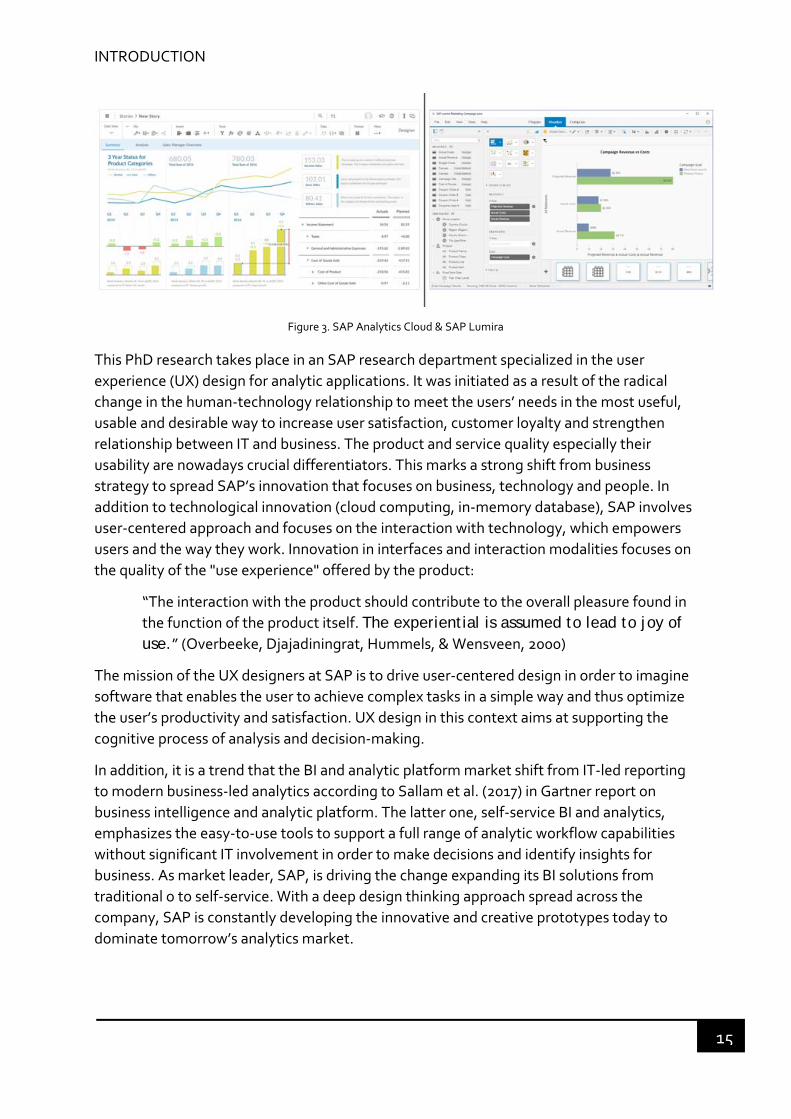
Figure 3. SAP Analytics Cloud & SAP Lumira ...................................................................... 15
Figure 4. Sensory‐motor coupling schema (Lenay et al., 2007) .......................................... 26
Figure 5. Sensory‐motor coupling schema and two modes of an object (upper: in hand
mode; lower: put down mode). (C. Lenay et al, 2007) ......................................................... 27
Figure 6. Illustration of Multi‐store model of memory (Atkinson & Shiffrin, 1968), working
memory replaced STM. .................................................................................................... 29
Figure 7. Complete the traditional model of memory by embodied memory ...................... 33
Figure 8. Illustration of task interruption and resumption process (Modified from E. M.
Altmann & Trafton, 2004) .................................................................................................. 35
Figure 9. Provenance tools with linear representation ........................................................ 41
Figure 10. Provenance tools with node‐link representation ............................................... 42
Figure 11. Memory substitution vs memory supplementation based on sensory‐motor
coupling ............................................................................................................................. 45
Figure 12. The Gulfs of Execution and Evaluation yielded from the Seven Stages of the
Action (adapted from D. A. Norman, 2013) ........................................................................ 46
Figure 13. Perceived affordance of the door: push or pull ................................................... 48
Figure 14. Sequential affordances: one affordance leads to another affordance. ............... 49
Figure 15. Four types of affordances mapped to Norman’s Seven Stages of the Action model
(From Hartson, 2003) ......................................................................................................... 50
Figure 16. The position of Feedforward, Hartson’s four types of affordance and feedback in
Norman's Stages of Action model (From Vermeulen & Luyten, 2013) ................................. 52
Figure 17. Different views of hierarchy of human needs ...................................................... 54
Figure 18. Dimensional approach to emotions (From Russell, 1980) ................................... 56
Figure 19. Basic Model of Emotions (From P Desmet, 2003) ............................................... 59
Figure 20. Example questionnaire about a website design, with answers as a Likert scale and
semantic differential scale (images from Wikipedia) ........................................................... 63
Figure 21. A taxonomy of eye tracking measures for user experience (Bojko, 2013) ............ 67
Figure 22. User‐centered design process (adapted form www.usability.gov) ...................... 74
2
Figure 23. SAP design thinking model ................................................................................ 75
Figure 24. Business Intelligence Schema ............................................................................ 76
Figure 25. Relation between User Types and Personas: A Persona do not necessary map 1:1
with a User Type; Persona may shift User Types. (Image from SAP) ................................... 81
Figure 26. Analytical task flow ........................................................................................... 84
Figure 27. Root cause analysis in the visual data analysis, the dot line represents the return
to a data visualization to start another analysis path. ......................................................... 85
Figure 28. Exploratory study overview ............................................................................... 89
Figure 29. 4 selected website applications (Google Image: https://www.google.com/imghp;
Airbnb: https://www.airbnb.com/; Zero Landfill:
http://www.subaru.com/csr/environment.html; SmartBI: internal project. ........................ 90
Figure 30. Test overview ‐ collected descriptors .................................................................. 91
Figure 31. Preliminary categorization ................................................................................ 92
Figure 32. Final categorization after interviewing the participants ...................................... 93
Figure 33. Tangram games in pre‐test, and test with history path ...................................... 98
Figure 34. Number of participants' reaction to their interactivity to the HP during the Post
test ................................................................................................................................... 99
Figure 35. Example of the gaze plot: A. replayed HP; B. scanned HP; C. No action on HP
(NA) ................................................................................................................................. 100
Figure 36. Example of strategies of three participants ...................................................... 103
Figure 37. Example of history path representation (static history path) ............................. 105
Figure 38. Illustration of dynamics of history path (dynamic history path) ......................... 105
Figure 39. Illustration of static history path ....................................................................... 106
Figure 40. Second Tangram experiment ........................................................................... 107
Figure 41. Screenshot of second Tangram experiment: pre‐test ....................................... 109
Figure 42. Online survey screenshot ................................................................................. 110
Figure 43. Distribution of participants who succeeded or failed in the pre‐test and the
test .................................................................................................................................. 112
Figure 44. Illustration of area of interest (AOI) for extracting eye tracking data ................ 113
Figure 45. HP usage pattern: top for static, and bottom for dynamic; red bars stand for
fixation and blue bars for highlight only for dynamic HP ................................................... 122
Figure 46. SAP Analytics Cloud ‐‐ creating a story that contains a series of charts. ........... 130
Figure 47. Mockup in SAC story – the icon to trigger the HP ............................................. 132

3
Figure 48. Representation of history path: 1) the driven dimension from which the user
starts analysis; 2) common filter ....................................................................................... 133
Figure 49. Highlight the previous path: 3) the chart is semi‐transparent, because the next
chart replaced it in the story ............................................................................................. 134
Figure 50. Experience map for FS (D) ................................................................................ 162
Figure 51. Experience map for FS (S) ................................................................................ 163
Figure 52. Experience map for FF (D) ................................................................................ 164
Figure 53. Experience map for FF (S) ................................................................................ 165

4
5
LIST OF TABLES
Table 1. Examples of user experience definition ................................................................. 55
Table 2. Commonly used subjective evaluation method of UX ............................................ 61
Table 3. Intentions of analytics User Types ......................................................................... 79
Table 4. An overview of the 7 research studies .................................................................... 83
Table 5. Description of the 4 website applications ............................................................. 90
Table 6. Ranking the categories ......................................................................................... 93
Table 7. Emotional descriptors and their connotation ......................................................... 95
Table 8. Gaze data for participants who played (top) and who scanned the HP (bottom) .. 101
Table 9. Fixation duration, number of saccades percentage and resolution time for FS (D)
and FS (S) ......................................................................................................................... 113
Table 10. Fixation duration, number of saccades percentage for FF (D) and FF (S) ............ 113
Table 11. Fixation duration, number of saccades percentage for SS (D) and SF (D) ........... 114
Table 12. Common verbalization by different groups (blue areas are only for dynamic
HP) .................................................................................................................................. 117
Table 13. Semantic evaluation of the history path for FS (D) VS. FS (S) ............................. 123
Table 14. Subjective evaluation of the history path for FF (D) VS. FF (S) ........................... 124
Table 15. Subjective evaluation of the history path for SF (D) ........................................... 125

6

7
GLOSSARY
Analytic provenance Analytic provenance is the research that “focuses on understanding a user’s reasoning process through the study of their interactions with a visualization system”.
Business intelligence (BI)
The set of techniques and tools for the transformation of raw data into meaningful and useful information for business analysis purposes. BI process is about taking data and transforming them into information, which gives the end‐user insight to make a decision that brings value.
Dashboard A dashboard is a single screen in which various critical pieces of information are placed in the form of panels. Some of the information that may be contained on a dashboard including reports, web links, calendar, news, tasks, e‐mail, etc.
Data visualization It’s a more or less a holistic representation of quantifiable information abstracted into a schematic form to assist users in better understanding what the data are telling them. The generation of the Data Visualization elements is basically scientific and are generally handled by software. These usually take the form of graphs, maps or charts.
Dimension A multidimensional structure which represents a side of a multidimensional cube. Each dimension represents a different category, such as region, time, and product type.
Experience map An experience map is a visualization of an entire end‐to‐end experience that a “generic” person goes through in order to accomplish a goal.
Filter A mechanism that includes or excludes specific data from reports based upon what the user decides to filter (e.g., to tightly tailor a report, you may strictly want records of customer.
Key Performance Indicator (KPI)
These indicators are measures that are important to the business, typically relating to the overall health of its operation. The results are reported in the form of a dashboard or a scorecard report that enables executives, managers, and employees to assess performance, and whether a given goal (or metric) is being met, exceeded, or missed. An example would be profit margin. Profit margin can be trended over time. A significant deviation (for the worst) from expected values can alert management to drill into

8
those measures of profit margin to see which the cause of the issue may be, calling for a quick response.
Line of business Line of business often refers to an internal corporate business unit, whereas the term "industry" refers to an external view that includes all competitors competing in a similar market. For example, sales, marketing, finance, HR, supply chain, IT, etc.
Measure Numerical data stored on a fact table is a measure. For instance, regarding sales fact, we might have a measure for cost, gross profit, maybe even order fulfillment time. These measures can then be summarized for each level of analysis.
Persona A persona is a user archetype, a fictional individual derived from real users, needs, preferences, biographical information, and a photo or illustration. It helps a development team to empathize with user (Alan Cooper).
Reporting Reporting means collecting and presenting data so that it can be analyzed.
Retrospective think aloud (RTA) protocol
Retrospective thinking‐aloud (RTA) protocol is a form of think aloud and used in eye tracking test in particular. It is performed after the user testing session activities, instead of during them. Fairly often the retrospective protocol is stimulated by using a visual reminder such as a video replay, called cued RTA.
Self-service BI An approach to data analytics that enables business users to access and work with various information without the information technology (IT) involvement (except, of course, to set up the data warehouse and data marts underpinning the business intelligence system and deploy the self‐service query and reporting tools).
Tangram Tangram is a Chinese puzzle consisting of seven flat shapes, which are put together to form shapes. The objective of this puzzle is to use all the given shapes to build a specific shape without overlapping each other.
Think aloud protocol Think aloud protocol is a dominant method to gather data in usability testing in product design. Think aloud protocol involves participants talking about whatever comes into their mind (looking at, thinking, doing and feeling) as they are performing a set of specific tasks.
Usability The extent to which a system, product or service can be used by specified users to achieve specified goals with

9
effectiveness, efficiency and satisfaction in a specified context of use (ISO 9241‐11, 1998).
User experience (UX) According to ISO 9241‐210, user experience refers to a person's perceptions and responses resulting from the use and/or anticipated use of a product, system or service. User experience includes all the users’ emotions, beliefs, preferences, perceptions, physical and psychological responses, behaviors and accomplishments that occur before, during and after use. Different definitions are presented in chapter 3.

10

11
CHAPTER 1 INTRODUCTION
“Products were once designed for the functions they performed. But when all
companies can make products that perform their functions equally well, the
distinctive advantage goes to those who provide pleasure and enjoyment
while maintaining the power. If functions are equated with cognition,
pleasure is equated with emotion; today we want products that appeal to
both cognition and emotion.”
— Donald A. Norman, American scientist
“Simplicity is about subtracting the obvious and adding the meaningful.”
— John Maeda, American designer, The laws of simplicity
This research is an interdisciplinary work involving cognitive science, human‐computer
interaction (HCI) and analytics. The tremendous growth of data stored in software
applications brings both opportunities and challenges for analyzing large dataset. As a
response to this demand, a growing amount of analytic applications1 propose to help users
with advanced visual analytics capabilities. The interaction between the human and the
computed intelligence has acquired an unprecedented attention than ever, aiming at
improving the user experience. However, as analytic process becomes more and more
complex, business users are still spending a lot of time exploring, analyzing data, creating
storyboard and sharing (explanation) with their peers. Users’ expectation of simple
operation compared to complex data analysis process are the new challenges held by
designers. As the carrier of the interaction between human and information, the user
interface is a key part that influences the systems and human performance. Therefore, we
should consider the context of use, characteristics of the analytical task and the user’
expertise to improve the process of designing this kind of applications. An improper
information and interface design hinders users’ understanding, learning and use of the
interactive systems, causing cognitive barriers, such as memory overload. We are
specifically interested in the user experience as a whole of the consequence of the
interaction, and it is around this theme that our design objective is articulated.
In this chapter, we present the research context that flows between user experience and
analytics, some key elements of the industrial context, which drives the motivation of this
1 Analytic applications are packaged business intelligence (BI) capabilities for a particular domain or business problem – Gartner IT glossary. In the following texts, we use BI applications and analytic applications interchangeably.

Erreur ! Utilisez l'onglet Accueil pour appliquer Heading 2 au texte que vous souhaitez faire apparaître ici.
12
research, from both of which we can outline a first draft of the general problem that we will
address as well as a roadmap of this thesis plan.
1.1 RESEARCH CONTEXT
In recent years, the advances made in computer technology have made human‐computer
interaction (HCI) penetrated into almost all areas of human activities. The technological
context is extremely favorable to the emergence of design and usability researches. The
design focus has been successively transferred from the first effort of functionality‐oriented
(to facilitate the access to information systems for specific users) in the 1970s, to
considerable advances in the areas of usability2 in the 1980s and 1990s, to the consideration
of users’ psychological needs (i.e. emotions) from the 2000s (Brangier, Hammes‐Adelé, &
Bastien, 2010; Mayhew, 2008). Over the years, users have taken an increasingly central
place in the design process.
In traditional design, the product’s function was closely related to the product’s physical
form such as material, structure and so on. It was easy for users to understand its functions
through this physical form. However, in the information age, the digital products are not
constrained to tangible forms and functions but extended to some intangible contents.
More importantly is the way of information communication between human and system
and its formal elements that express the interaction. Therefore, it is not merely a matter of
aesthetic issues, rather it is a combination of user cognitive factors and the logical process
of information systems (Cooper, Reinmann, & Cronin, 2007). Especially in the case of
business software, such as analytic applications, behind which there are sophisticated
logical reasoning.
BI and analytic applications are the tools that enable the transformation of data into
information, which gives the end‐user insights to make a decision and take an action that
brings value. These applications are also called decision support systems (DSS) (Power,
2007). The users may be operational users who consume the results of analysis (called
business users) or analysts from different line of business who conduct the analysis, such as
business experts (i.e. human resources, sales, marketing). In the BI and analytic application,
users need to analyze multi‐dimensional data from multiple perspectives. For example, in a
database model of sales, it consists of dimensions navigation and measures. The measures
are numerical data such as sales revenues, margins, budgets, profits, etc. They are
categorized by dimensions used to group the data, which is roughly similar to the “group
by” operator. Typical dimensions are regions, countries, time (year, quarter, month, etc.),
product (see Figure 1). The two salient features of the BI applications are: integrate the
queries’ output from the database multiple queries and represent it by the means of
visualization supports (charts, reports, storyboard, etc.).
2Usability: the extent to which a system, product or service can be used by specified users to achieve specified
goals with effectiveness, efficiency and satisfaction in a specified context of use (ISO 9241‐11, 1998).

INTRODUCTION
13
Time Geo Product Manager
Year Region Product Line
Quarter Country Product Category
Date City Name
Dimensions
Manager
Measures
Quantity sold Sales Revenue Gross Margin Discount GMRCustomer
Satisfaction
Number of
Issues
reported
Figure 1. Example of the dimension and measure of a dataset for analysis. Time is organized in hierarchy year – quarter – date so as to Geo and Product.
Historically, it was experts (called data analysts) who used the BI and analytic applications
to analyze data and build reports. With the increase of need of data insight to trigger
operational decision in multiple areas (HR, finance, marketing, …) and a better access to
analytic applications, more business users are demanding to autonomous in the data
analysis activities but with less expert knowledge. They often do their data analysis tasks
through interactive visual interfaces combining different data visualization techniques
corresponding to different data analysis process (see Figure 2). Data visualization provides
an easy‐to‐understand way to summarize the main characteristics of a dataset, which
facilitates faster and more focused analytic process (Tufte, 2001).
Figure 2. Data exploration – adding charts to visualize data (image from SAP Analytics Cloud)
The big data revolution has made large amounts of data available to use for discovering
insights for business. However, they are becoming more complex and less structured. This,
on the one hand, increases the complexity of analytic applications, which needs rich
functionalities, and on the other hand, promotes the users’ expectation of intuitive
interaction and access to the appropriate data for analytical tasks. Therefore, there is a big
challenge between the users’ expectation of intuitive interaction and sophisticated analysis
functions.

Erreur ! Utilisez l'onglet Accueil pour appliquer Heading 2 au texte que vous souhaitez faire apparaître ici.
14
Traditionally, the design of interactive systems focuses on the instrumental aspects
(functionality and usability). The design community have been making much effort on the
user interface (UI) design of the software to provide a simple to use product. This approach
remains widely used even in today’s software design. However, people strive for something
more once they get used to having something (Maslow, 1943). Analytics users want more
from a system than simply “ease of use” (Carroll, 2013). Translating from Maslow’s
hierarchy of human needs, Jordan (2000) and Walter (2011) both proposed, for designing
products, to consider the needs of users as functionality, usability and pleasure. This means
that if a product is not usable if it does not meet the functional requirements, and once it
has the appropriate functionality, it is expected to be easy to use. Having had functionality
and usability, people desire more from products, expecting not only instrumental benefits
but also non‐instrumental and emotional ones as “living objects”.
Therefore, in today’s analytic applications, users are not satisfied by just efficient task
completion, but rather call for a full range of user experience (UX) of interaction with
interactive systems (Mahlke, 2008a). The analytic applications serve as a medium, which
enables users to establish their own experience with a world materialized in data. This
research work has been significantly inspired by the design environment of analytics
research and development (R&D) practice at SAP. As a major actor of the radical change in
the human‐technology relationship, SAP, the market leader in enterprise software, initiated
this research to leverage the impact of user experience toward a functional simplification of
big data usage.
1.2 INDUSTRIAL CONTEXT
This thesis is the result of the cooperation between the university of technology of
Compiègne (UTC) and SAP (Systems, Applications and Products for data processing) under
a CIFRE agreement (Conventions Industrielles de Formation par la Recherche). SAP,
founded in 1972, is a world leader in enterprise applications, analytic applications and
software‐related services.
SAP offers an extremely varied range of software, which includes: business process
solutions, and analytic applications. Business process solutions involve a software portfolio
enabling customers to improve their business processes, such as ERP (enterprise resource
planning), which supports the daily operations management (e.g., human resources,
customer relationship management). Analytic applications with business intelligence (BI)
capabilities enable easier access to all enterprise data, supports analysis activities and thus
provides an opportunity to make relevant decisions based on the information describing a
situation. SAP delivers a broad range of BI capabilities for both large IT‐managed enterprise
reporting deployments and business‐user‐driven data discovery deployments (Gartner,
2017). These analytic applications include traditional reporting tools, such as Web
Intelligence, Design Studio, Crystal Reports, etc. and visual‐based data discovery tools, such
as SAP Analytics Cloud, Lumira (See Figure 3).
INTRODUCTION
15
Figure 3. SAP Analytics Cloud & SAP Lumira
This PhD research takes place in an SAP research department specialized in the user
experience (UX) design for analytic applications. It was initiated as a result of the radical
change in the human‐technology relationship to meet the users’ needs in the most useful,
usable and desirable way to increase user satisfaction, customer loyalty and strengthen
relationship between IT and business. The product and service quality especially their
usability are nowadays crucial differentiators. This marks a strong shift from business
strategy to spread SAP’s innovation that focuses on business, technology and people. In
addition to technological innovation (cloud computing, in‐memory database), SAP involves
user‐centered approach and focuses on the interaction with technology, which empowers
users and the way they work. Innovation in interfaces and interaction modalities focuses on
the quality of the "use experience" offered by the product:
“The interaction with the product should contribute to the overall pleasure found in
the function of the product itself. The experiential is assumed to lead to joy of use.” (Overbeeke, Djajadiningrat, Hummels, & Wensveen, 2000)
The mission of the UX designers at SAP is to drive user‐centered design in order to imagine
software that enables the user to achieve complex tasks in a simple way and thus optimize
the user’s productivity and satisfaction. UX design in this context aims at supporting the
cognitive process of analysis and decision‐making.
In addition, it is a trend that the BI and analytic platform market shift from IT‐led reporting
to modern business‐led analytics according to Sallam et al. (2017) in Gartner report on
business intelligence and analytic platform. The latter one, self‐service BI and analytics,
emphasizes the easy‐to‐use tools to support a full range of analytic workflow capabilities
without significant IT involvement in order to make decisions and identify insights for
business. As market leader, SAP, is driving the change expanding its BI solutions from
traditional o to self‐service. With a deep design thinking approach spread across the
company, SAP is constantly developing the innovative and creative prototypes today to
dominate tomorrow’s analytics market.
Erreur ! Utilisez l'onglet Accueil pour appliquer Heading 2 au texte que vous souhaitez faire apparaître ici.
16
1.3 GENERAL PROBLEM
As mentioned above, the designers are facing new challenges. An increasing number of
business users, who do not have technical background, expect to have an easier control on
the report they have to build and manipulate, particularly in the case of data visualization,
to identify the root causes of the phenomena depicted by data or to discover some insights
in order to make a proper decision. Self‐service BI is coming out to meet this new
requirement. However, a traditional BI application has many rich functions, which require
high level skills. Moving from the traditional BI to self‐service BI requires a great amount of
usage simplification. Besides, some of the products target decision makers, who rather
consume the reports without BI background as well as data analysts whose main work is BI.
They have to satisfy different types of users, considering their different expertise and
context of use. However, what an expert can do easily in the system may be difficult to a
novice.
During our research, we observed recurrent problems usually encountered in the usage of
self‐service BI applications from a competitive analysis and a discussion with the designers
in SAP UX team:
Technical issue: in handling, large datasets and depending on the IT infrastructure in
place, analytic tools are relatively slow in performance. The users have to wait
seconds to do an action, which causes frustration.
Usability issue: for novice users, some information is confusing and hard to
understand, some functions are not easily to find (visible), the icon is not clearly
presented, etc. All these usability issues influence users’ task performance and may
cause negative emotions. In addition, users expect more interactions on the data
visualization.
Working memory overload: in visual analytic tasks, the user’s main task is to acquire
the useful information that allows him/her to identify the root causes of a business
question for decision making. It requires a large number of storages of human
working memory to process the information needed for completing an analytical
task. As the working memory is limited in capacity, not all the information can be
stored in once. Our working memory only stores the most recent information for the
current activated task. One consequence is that when the task is interrupted or
suspended, to handle a secondary task (interrupting task), the working memory will
free up some space for processing the information needed for this secondary task.
When the user returns to the primary task (interrupted task), he/she has to recall the
released information. It takes time, overcharges the working memory and consumes
much mental effort from the user. The result is the loss of time, and reduced task
performance. Tracking the history becomes a barrier for exploration and
commitment.
User’s expertise: As more business users are involved in the role of data analyst, their
need to use the BI applications is increasing. However, a lack of data analysis
expertise causes a large gap between the users’ simple interaction and complex BI
INTRODUCTION
17
system. Due to this, the users lack motivation to conduct a complicated analysis,
they use the tools’ functions insufficiently. This calls for taking the user’s roles into
account and their context of use.
Apparently, the above problems are not limited to usability issues in the current usage of
analytic applications but are linked to a wide range of the context of use, cognitive process
of users, memory, emotions, etc. We must start from understanding users including their
goals, tasks, needs, etc. so as to establish user mental model among the above problems.
We are thus interested in the working memory overload issue in the analytical process,
which is a fundamental question related to human cognition and user interaction.
Particularly, we have noticed that there is a great gap between human cognition and user
interface design. It may cause an obstacle for the user to explore and use the tools. It is thus
necessary to take this into account for the design of tools for analytics. There are still
questions that remain to be clarified before we are able to formulate this research problem.
1. How do users use information?
2. How does the memory work, particularly in the task of problem solving?
3. How can we take into account the memory parameters in the design of the
interface?
4. How can we build a lived experience to engage the user in solving the task?
These questions are related to the design of the user interface, as a media between the user
and the analytic task, to provide a positive user experience. In this research, we try to pose a
problem, which may improve considerations in providing a new idea and method to design
analytic applications for resolving the imbalance between user interface and human
cognition. There is a close relationship between human cognition and the design and
evaluation of the user interface. The evaluation of the user interface can reveal the user’s
perception of the system and the result of this evaluation can assist design as well. It is
important to understand human’s cognitive process for improving user experience.
To begin with, we need to conduct a literature review related to these questions, through
which we aim at formulating our research problem for harmonizing human cognition with
user interface.
1.4 OBJECTIVE AND PLAN
1.4.1 OBJECTIVE
This research project is of fundamental interest for the company because of a strong
industrial challenge, but it also addresses academic interests. This work follows a user‐
centered design approach to enhance the user interaction in relation with his or her
emotional experience and address the challenge in the case of analytic applications. We are
mainly interested in the visual data analysis part, which enables users to work in a more self‐
service oriented way with less IT involvement for their every dashboard, report and other
visual artifacts. Our research work is carried out in the theoretical and methodological
Erreur ! Utilisez l'onglet Accueil pour appliquer Heading 2 au texte que vous souhaitez faire apparaître ici.
18
perspectives of Human‐computer Interaction. However, we are interested in the entire user
experience as a potential means to provide answers to these problems. This implies a multi‐
disciplinary vision, such as cognitive mechanism (perception and memory), psychology,
user experience design, etc. The objectives of this project are:
1. identify or reformulate the research problem related to the cognitive process based
on the practical and theoretical method. What is probably the cause of the
imbalance between cognition and user interface.
2. construct a porotype through which the problem is discovered and resolved. This
prototype is aimed at transposing and applying in business applications.
3. improve the considerations in the design process. The results from the experiment
can be useful for designers to create the interactions addressed to the users or
future users and to evaluate an idea or an interactive task through user interface.
1.4.2 PLAN
We have elaborated the motivation of this thesis research in the research and industrial
context and the general problem in this introduction chapter. The remaining part of this
report is structured as follows in three main parts:
First part is about literature review that includes two chapters:
CHAPTER 2. Theoretical framework We first address the question human cognition in
the user interaction with perceptual interfaces. We argue our choice of a
theoretical framework based on the enactive approach and on the
sensorimotor perception. We talk about the limitations of the traditional
model of memory and propose embodied memory as another part to
complete the model. And based on this, we address the research problem in
the context of task interruption and recovering hoping to identify an
opportunity for the design of memory aid tool.
CHAPTER 3. Instrumental framework We address the necessity of designing a memory
aid tool for memory supplementation and its interaction process as a
dynamic cycle of the “in hand” and “put down” mode due to the limitations of
the working memory. We address the challenge that the current solution in
task resumption is facing, including the history of process (analytic
provenance), and task interruption effects. Then, we look at recent work in
HCI and UX design, both in terms of the design methodology and evaluation
method, and which aims at making the interfaces suitable for users. The
positioning of this work in our design framework encouraged us to focus our
research problem on a precise but crucial point for the design of interactive
systems: the need to specify the conditions of technical possibility to give rise
to a particular perceptive experience to users.
Second part is about the elaboration and implementation of the research method:

INTRODUCTION
19
CHAPTER 4. Research problem We are now able to reformulate our research problem
based on the state of the art. We also give an overview of this research’s
methodology following the user‐centered design approach, including an
understanding of self‐service BI, and SAP BI user model, which has been
created based on the user types and users’ intention in the company. Next
follow studies of user interaction with BI and analytic applications, which
were done in the company. It appears that usually, business users have to
remember and recall previous interaction history for continuing an analytical
task, which poses a barrier for task resumption and user engagement. The
setting of a minimalist experiment as an experimental framework to study
the perceptual phenomena is introduced at the end of this chapter.
CHAPTER 5. Exploratory study An exploratory study with different design experts has
been conducted to study the perception of interaction related to emotions
from a professional perspective. The analysis and results are used to evaluate
the setting of a second experiment.
CHAPTER 6. Tangram experiment We investigate the importance of adding history
(provenance) function in the task resolution by a minimalist experiment. We
collect new findings related to the history function. We design and
implement a provenance function called history path that is integrated in a
Tangram game simulating a problem‐solving task. We present a second
control experiment to test if it is possible to design a tool for memory
supplementation. We experiment two different tools based on two history
path representations: static and dynamic. The results help us evaluate to
what extent the history path can help the user for resolving the task.
CHAPTER 7. Apply the history path framework in a professional tool We present the
application of the history path in an SAP analytic application – SAP analytics
cloud (SAC) and the prototype to the BI and analytic application design
experts to evaluate and acquire their feedback in terms of user experience.
Third part is for conclusion and perspectives:
CHAPTER 8. Conclusion and perspectives Finally, as a conclusion, it is an opportunity to summarize this research work and discuss a number of possible perspectives.

Erreur ! Utilisez l'onglet Accueil pour appliquer Heading 2 au texte que vous souhaitez faire apparaître ici.
20

21
First part: literature review
“If I have seen further it is by standing on the shoulders of Giants.”
— Isaac Newton
“Good design is a renaissance attitude that combines technology, cognitive
science, human need, and beauty to produce something that the world didn’t
know it was missing.”
— Paola Antonelli
The first part of this work concerns a literature review that is divided into two
main chapters.
In chapter 2, we present the theoretical framework within which we want to
put our work, in two parts: (1) the positioning of this research along the
enactive approach and perception theory; (2) a brief overview of the role of
memory in the cognitive process. It serves us to understand the limitations of
the memory that will help us to think of the design of user interface. It
appears that we need a tool, which can serve as a memory prosthesis or
support to facilitate users to accomplish a complex task. (2) Some related
works that have been done to study the problems caused by task
interruption and how to recover the task.
In chapter 3, based on the problems that we identified in chapter 2, we
present a state of the art in terms of the design and instrumentation: (1) the
current solutions that have been proposed in the instrumentation for task
recovery in the context of analytics; (2) a proposition of design for memory
supplementation and the related design principles based on Norman’s action
model that explains the psychological process behind an action and three
design principles; (3) User experience, which is beyond usability, provides a
broader scope for design considerations. The study on user experience is
useful for evaluating a design from all aspects of human experience rather
than merely usability.

22

23
CHAPTER 2 THEORETICAL FRAMEWORK
“One has not only an ability to perceive the world but an ability to alter one's
perception of it; more simply, one can change things by the manner in which
one looks at them.”
— Tom Robbins, American author
“When we shift our perception, our experience changes.”
— Lindsay Wagner, American actress
“Rhyme is a mnemonic device, an aid to the memory. And some moms are
themselves mnemonics, that is to say, the whole purpose of the poem is to
enable us to remember some information.”
— James Fenton, British poet
2.1 FROM COGNITIVISM TO ENACTION
Cognitive science is the interdisciplinary scientific study of mind and mental processes,
which involves how we perceive, remember, think, learn, make decisions, etc. A dominant
approach in cognitive science is cognitivism that views human as an analogy of computer. It
consists in the hypothesis that the cognitive system is determined and pre‐defined, which
forms an internal and symbolic representation of the world.
In 1967, the American psychologist Ulric Neisser published the book Cognitive Psychology,
which states that cognitive psychology studies all the perceptual processes. This process
involves the transformation, reduction, elaboration, storage, recovery, and use of various
types of sensory data obtained from the environment (Neisser, 1967). This regards human
mind as an information‐processing system, which focuses on the information processing
process of human cognition to reveal the psychological mechanisms.
In 1983, Card, Newell and Moran proposed the Model Human Processor in their book The
Psychology of Human‐Computer Interaction, which has been a theoretical basis for the study
of human cognition in the field of Human‐Computer Interaction (HCI) for a long time. This
model divides our human processor into three subsystems: the perceptual system, the
cognitive system and the motor, each with its own memories (working memory and long‐
term memory) and processors (Card, Newell, & Moran, 1983). Briefly speaking, humans
acquire the information from their five senses (taste, sight, touch, smell, and sound), store it
Erreur ! Utilisez l'onglet Accueil pour appliquer Heading 2 au texte que vous souhaitez faire apparaître ici.
24
in the working memory, match it with the information previously stored in the long‐term
memory to make a decision, and then translate it into action. This kind of mental process is
comparable to a computer software. This human activity, to some extent, is like an
execution of a predetermined computer program.
An alternative to the cognitive approach, is that humans do not passively receive external
information from their environment that is translated into the internal representations. The
enactive approach, proposed by Varela, Thompson, & Rosch, (1991), views that cognition
arises through a dynamic interaction between human and his/her environment. They stress
that the cognitive activities do not happen without an action to be taken, thus cognition is
embodied in action. Humans are autonomous in that they have the capacity to adapt to the
constantly changing environment. This means that human’s autonomy and its coupling
with the environment bring forth the cognition. Therefore, cognition is not something that
happens in our heads and is then expressed in actions but is something constructed in the
adaptive interaction itself (McGann, 2007).
This enactive view is highly consistent with Lucy Suchman’s view of human action in her
thesis, Plans and Situated Actions: The Problem of Human‐machine Communication. She
conducted several observations of users in using a photocopier machine that is controlled
by a computer‐based system. The photocopier is intended to act as an “expert help system”
that embraces a conception of a planning model of human actions. So, the machine shows
the procedural instructions about the actions that users can take to use the machine. The
observation results show that instead of following the instructions, the user constantly
adapts his/her behavior according to his/her interpretation of the instructions, his/her
perception of the situation and their evolution. The action of the user calls upon the
available resources, not only physical facts, but also social and cultural facts, which build the
situation of action. As these facts of the situation may change at any time (a new instruction
of the photocopier shows up, the user discovers a new operation, etc.), the user takes an ad
hoc action to adapt and adjust to the contingencies of the situation. Therefore, the user
does not have time to plan his/her actions. He/she is engaged in an action and interpretation
loop: the instructions help him/her understand the environment and the environment
allows him/her to understand the instructions.
According to Suchman (1985), the plan is a resource for action that can be evolved rather
than a blueprint of action that is static. In other words, as humans, we continuedly construct
our plans as we go along in the situation, and we modify our next move based on what was
happening. It is the interactions between human and his/her environment that determine
the construction of human cognition. Perception and memory are two important parts in
our cognitive process, we are going to address these two notions from an enaction point of
view.
2.2 PERCEPTION
The enactive approach in cognitive science takes the view that the perception is the active
sense‐making of the interactions with the living environment. A person’s action and his/her

ERREUR ! UTILISEZ L'ONGLET ACCUEIL POUR APPLIQUER HEADING 1 AU TEXTE QUE VOUS SOUHAITEZ FAIRE APPARAITRE ICI.
25
sensory movement patterns determine his/her perception of subjective world, and the
actions eventually change the perceived world. In this process, individuals and the world are
coupled together. F. J. Varela and E. Thompson built the enaction of perception on some
core concepts, such as autonomy, sense‐making, emergence, embodied, experience, and so
on (Thompson & Stapleton, 2008; Varela et al., 1991). The enactive points of view hold the
point that, first, perception is not static, it is linked to our action; second, perception is not a
representation of the environment, but a fruit of structural coupling between the person and
the world. The cognition emerges in the dynamic cycle of perception and action. Third, the
perceiver’s task is to generate a relational process of sense‐making between the system and
its environment.
(Gibson 1979, 2015) proposed the ecological approach to visual perception. According to his
theory, our perception of the environment inevitably leads to some course of action. We do
not passively receive the sensory information from the world, instead, we actively search for
information which allows to act. He also defined the word “affordance” as the possibilities
for action. For example, a chair for sitting down, a button for clicking, etc. Nowadays, the
theory of affordance has contributed a lot for design and the research of design related
area.
2.2.1 “IN HAND” AND “PUT DOWN” MODE OF INTERACTION
Lenay et al. (2007) proposed a scheme of sensory‐motor coupling which illustrates the
interaction between human and world, based on perception (Gibson, 1966) and
phenomenology theory (Merleau‐Ponty, 1945). According to them, perception is based on a
law defining the sensory feedback for a full range of performed action (Figure 4). The
perceptual system is a "coupling device" that modifies the lived body by defining the
repertoires of actions and sensations available to the subject. Through the environment, the
actions give rise to a sensory feedback that will provoke another action, and the action‐
sensation loop continues as the perception manifests itself. Perception depends not only on
the sensory input, but also on the lived body's capacity for action. To give birth to a
perception, a prosthetic device must be a coupling instrument that modifies the lived body
by defining new repertoires of action and sensation. In this case, the perception is the result
of a dynamic coupling between the subject and the object. For example, we use the mouse
to manipulate the computer screen, and we look at the screen by moving and clicking the
mouse with our fingers. Right now, we focus on the screen, but we do not look at the mouse
anymore, because the object disappears into our consciousness. It has become a part of our
hands.

Erreur ! Utilisez l'onglet Accueil pour appliquer Heading 2 au texte que vous souhaitez faire apparaître ici.
26
Figure 4. Sensory‐motor coupling schema (Lenay et al., 2007)
According to the Lenay et al., the object can be alternatively perceived in the environment
or as a coupling device between a subject and the world, thus modifying his /her perception
of the world. These two kinds of perception give rise to the modes of existence of an object:
the “put down” mode, where the tool is perceived in the environment, and the "in hand"
mode where the tool is considered as an organ, which gives extension to the possibilities of
action. An object in the “in hand” mode is used and grasped by a person to extend his or her
capabilities to act and feel. For example, we wear our glasses, and we see the world through
these glasses. However, we cannot perceive our glasses at this moment, which disappear
from our consciousness. In that context, the object is a tool that we use to perceive the
world. On the contrary, an object in the “put down” mode does not transform our
perception, it can be modified, exchanged, etc. In the previous example, when we put down
the glasses to clean and repair them, we can perceive them in the environment. These two
modes alternate with each other in the utilization of the object (Figure 5).

ERREUR ! UTILISEZ L'ONGLET ACCUEIL POUR APPLIQUER HEADING 1 AU TEXTE QUE VOUS SOUHAITEZ FAIRE APPARAITRE ICI.
27
Figure 5. Sensory‐motor coupling schema and two modes of an object (upper: in hand mode; lower: put down mode). (C. Lenay et al, 2007)
These two modes of existence of object give us fundamental notions for understanding the
use of perceptual interfaces. They highlight that the interactive tool is not only an object
that we can interact with, but a part of our coupling that we can interact through to perceive
the task. They also match with two possibilities of design approaches: user interface design
and user experience design which we are investigating in the following sections.
2.2.2 SENSORY SUBSTITUTION AND PERCEPTUAL SUPPLEMENTATION
A “sensory substitution” system can be though as a sensory prosthetic which transforms
information of one perceptual modality (i.e. vision) into another alternative perceptual
modality (i.e. touch). It is usually used to aid people with impaired perceptual modality to
access the information with their unimpaired perceptual modalities.
A very famous device developed by Bach y Rita and his colleagues in 1969 – Tactile Visual
Substitution System (TVSS) makes it possible for blind people to recognize simple targets
by converting the images into a “tactile image”. However, although this device made a
commercial success, it is not widely used among the blind community (Lenay, Gapenne,
Hanneton, Marque, & Genouëlle, 2003). Lenay et al. (2003) discussed the limits of sensory
substitution. By just providing as much the information as possible constituting an object
for discrimination and categorization, the TVSS device is not allowed to establish a
common history between the person and external world in the course of interaction (people
perceive the world through action). It lacks emotional values attached to an object, which
Environment
Erreur ! Utilisez l'onglet Accueil pour appliquer Heading 2 au texte que vous souhaitez faire apparaître ici.
28
ware called qualia (Bach‐y‐Rita, 1997). For example, if a blind person who cannot see from
birth is shown an image of his wife, with the TVSS system, he cannot feel any emotion
(Lenay et al., 2007). Therefore, instead of introducing new perceptual modalities, it is better
to compensate for this deficiency by opening up a new space of human‐world coupling: the
perceptual supplementation.
Perceptual supplementation happens when a tool is grasped in the “in hand” mode. It
transforms our capacities to act and to feel, and this tool becomes a part of our body.
Therefore, when the perceptual interface is in the “in hand” mode, we constitute a lived
experience through the interaction with the world, and emotional values accompany this
lived experience. This means that each type of interaction leads to different perception thus
to a different emotion. Therefore, the interaction can be designed to elicit lived experience.
The research on perceptual supplementation is fundamental for the design of perceptual
interface with interactions. It emphasizes that our perception does not only depend on the
sensory information, but as much on the person’s capacity for action (Lenay et al., 2007).
2.3 MEMORY
We all have had the experience that there is something in the world that we saw just for one
second, and that we could remember, and there are other things we need to see several
times otherwise we will forget it soon. This is a question of memory in our cognitive
processing. There are two main perspectives in the role of memory in cognition: (1)
traditional model of memory that highlight memory as a process of encoding, storing and
retrieving, which exist inside the human brain and independent from sensorimotor
mechanism (Wilson & Foglia, 2017), and (2) embodied experiences that are the basis of
memory formation. Memory is not limited to an internal state of human, but it evolves, and
changes based on the sensorimotor coupling with the artefact in the external world. The
traditional model helps us understand the internal process of memory, while embodied
perspective motivates novel insights about the external memory. We are going to discuss
these two perspectives separately.
2.3.1 TRADITIONAL MODEL OF MEMORY
The traditional view of memory comes primarily from cognitivism, where memory is
regarded as a process of encoding, storing, and retrieving information by human brain.
According to the different ways of encoding, storing and retrieving, we have a sensory
memory (SM), a short‐term memory (STM), a working memory, and a long‐term memory
(LTM). The most popular memory model in this perspective is the Atkinson & Shiffrin's
(1968) memory model. In their model, they talked about three types of memory: sensory
memory, short‐term memory (STM) and long‐term memory (LTM). The STM and the
working memory are often used interchangeably, however, they are slightly different. It is
considered that working memory contains the STM and other information‐processing
systems (Baddeley & Hitch, 1974; Cowan, 2009).

ERREUR ! UTILISEZ L'ONGLET ACCUEIL POUR APPLIQUER HEADING 1 AU TEXTE QUE VOUS SOUHAITEZ FAIRE APPARAITRE ICI.
29
Figure 6. Illustration of Multi‐store model of memory (Atkinson & Shiffrin, 1968), working memory replaced STM.
Briefly, the sensory memory registers input from the external environment, and we pay
attention for it to transfer it to the working memory. Finally, we rehearse it elaborately to
store it in the LTM. Of course, the working memory can also directly retrieve information
from LTM. Some information can bypass the STM (visual in particular) and go directly to the
LTM.
2.3.1.1 The sensory memory
The information that people gained through sensorimotor loop does not disappear
immediately after the stimulus stops functioning. For example, when we see a person in the
street, and we look at the person walking on the road just for one second, we can remember
some details of the appearance of this person, such as the color of the clothes, the height
and so on. That is because our sensory memory stored this sensory information so that we
can remember it. A famous study of the sensory memory is the Sperling’s experiment for
visual memory in 1960. Participants were shown an array of letters for recalling all of them
or a specified row within a short time. The participants reported that they had seen more
than they could remember. The results showed that our sensory buffer stores more
information than that we can recall. It is stored in our sensory memory for just a very brief
period of time (less than one second) before it is transferred to the working memory
(Sperling, 1960). This information could be decayed quickly in our sensory memory and can
be overwritten by further information from the same sensory modality (Neisser, 1967).
Therefore, the sensory memory is considered as a temporary buffer where information can
be accessed shortly in different modalities and after that, the information can be lost due to
the decay or an interference from a new stimuli (Atkinson & Shiffrin, 1968).

Erreur ! Utilisez l'onglet Accueil pour appliquer Heading 2 au texte que vous souhaitez faire apparaître ici.
30
The sensory memory does not participate in higher cognitive functions (information
comparison and memory consolidation), it just captures a snapshot of everything that we
sense (Dick, 1974). However, our attention can control and decide, which information can
be transferred to the short‐term memory to be processed (Craik & Lockhart, 1972). The
sensory memory is the first stage of information storing in the information processing.
2.3.1.2 The working memory
The working memory is the second stage of memory and is considered as a buffer, which
stores information relevant to the current task. The STM and the working memory are often
used interchangeably, however they are quite different and related. The STM was first
proposed by George A. Miller. He thought that before the information enters the long‐term
memory, we need a temporary space to store the received information. Then he proposed
the theoretical concept of “short‐term memory”. Miller (1956) found that the STM can store
information, usually 7±2 chunks of information, for a short amount of time. A chunk is an
information block that unite information through meaning. For example, for people who are
familiar with SAP, they know that that “SAP” stands for a software company, therefore
“SAP” is one chunk. But for others, it may be three chunks (the three letters). Miller’s magic
7 reflects the limitation of the STM.
In their article about the “working memory” Baddeley & Hitch (1974) examine its role in
reasoning, comprehension and learning. It has been widely used not only in cognitive
psychology but also in other areas, and it is considered that the working memory contains
the STM and other information‐processing systems.
In 1974, Baddeley and Hitch proposed a working memory model based on the experiment of
short‐term memory impairment (Baddeley & Hitch, 1974). They conducted a series of
experiments to examine the role of the working memory in reasoning, language
comprehension and learning. The participants were asked to remember 1 to 6 letters while
performing another task. They had to judge the order of two letters presented in the
sentences (the order was shown in advance). The results showed that the additional STM
loads more than two items, which can impact the task performance. The experiments
suggested that the working memory represents a control system with limits on both its
storage and processing capabilities.
Similarly, Cowan (2009) also discussed the difference between the STM, the working
memory and the LTM. In his definition, the working memory includes the STM and other
processing mechanisms that help make use of the STM. However, he thought that the
difference between the STM and the working memory just depends on how people define
them. Nowadays, the working memory is a concept that has been increasingly used in the
scientific research.
The information in the working memory is always active as needed for current work.
Therefore, the working memory plays an important role in information processing. It makes
us aware of our current psychological activities, helps us construct an entire memory image
through processing information in the sensory memory and allows us to make sense of the

ERREUR ! UTILISEZ L'ONGLET ACCUEIL POUR APPLIQUER HEADING 1 AU TEXTE QUE VOUS SOUHAITEZ FAIRE APPARAITRE ICI.
31
world. Although the working memory is limited in capacity, it always saves the latest
information‐processing results until the final goal is achieved.
2.3.1.3 The long-term memory
The third stage of information storage is the long‐term memory (LTM). After the
information in the working memory has been identified, processed and assembled, it is
transformed into permanent information stored in the LTM. Unlike the sensory and working
memory, the LTM has theoretically an infinite capacity, and information can be stored there
for a life time.
The information in the LTM can be referred when we are performing a task. The LTM can be
divided into two categories: explicit and implicit memory:
the explicit memory, also called declarative memory, is about descriptive
knowledge, which requires conscious thought. For example, the knowledge learned
during the class or recalling what you did for vacation last year. The explicit memory
tells us what it is,
the implicit memory is about assembling knowledge, which does not arise from
conscious thought. For example, how to ride a bike, swimming, etc. The implicit
memory tells us how to do it.
Most of the information stored in the long‐term memory is “in hibernation” and it is hard for
people to realize it. It can only be activated and extracted in chunks in the working memory,
when the sensory organs are stimulated by the outside world and need to use their own
knowledge and experience to acquire a new sensory experience. It is worth mentioning that
information can also decay due to interference or the lack of extraction. Therefore, an
effective way to maintain the LTM is continuous information extraction and repetition
(Atkinson & Shiffrin, 1968; Card et al., 1983).
The sensory memory receives information from the environment through visual, auditory
and other sensory channels. The information is kept in the sensory memory for a short
period of time, some of which are selected by attention and processed by the working
memory. Then, some of this selected information in the working memory is transferred to
the LTM, but usually the information in the working memory has been associated with
some other information of the LTM before entering into the LTM. So there is a bidirectional
flow of information between the working memory and the LTM. They are different in
retention time, storage capacity and forgetting mechanism (Atkinson & Shiffrin, 1968; Card
et al., 1983; Cowan, 2009; Craik & Lockhart, 1972).
The traditional model of memory claims that information storage and retrieval are
independent from the sensorimotor mechanisms. However, this point of view ignores the
role of the sensorimotor loop in the formation of memory. We interact with the world at
every moment, which helps us recall our knowledge and make sense of the world. We
propose to complete this model with the embodied memory. The embodied perspective
has motivated novel insights about memory, which highlights the importance of the

Erreur ! Utilisez l'onglet Accueil pour appliquer Heading 2 au texte que vous souhaitez faire apparaître ici.
32
relation between the external environment and the human memory. The external
information presented in front of people is also a type of memory that helps people
recognize and recall the internal memory and build the connections to make sense of the
world.
2.3.2 THE EMBODIED MEMORY
When we remember a thing such as how the toolbar is displayed to edit the text in the Word
software, we do not only remember the semantic relatedness of each tool, such as its name,
its icon, but an image revealing where these tools are located in the toolbar and imagine
actions to take throughout the toolbar. The location itself acts as an external aid to memory
and the imagined embodied actions within the location afford the retrieval of information
that help understand what is available to edit the text (Cole, Hood, & McDermott, 1997). It
could be argued that the memory of how to edit the text is in fact stored in the
environment, rather than in our mind. There are cues which remind us how to format,
change the color, etc. as we see them, stored in our memory. The rest of the information is
stored in the environment.
Studies have shown the role of the body in the articulation of memories. Memories can
reflect different body capabilities. For example, when the speaker makes a speech, he
usually talks accompanied with some gestures. The gestures serve as tool not only for
communication but also to facilitate the maintenance of spatial representations in the
working memory (K. Wesp, Hesse, Keutmann, & Wheaton, 2001). This indicates that motor
information may be a part of the memory trace.
With this respect, the memory is not merely a storing and retrieving storehouse, it is rather
embodied through lived patterns of the interaction between the human and environment
(M.A., 2017). Through the enactive approach, we re‐think the construct of memory and we
are focusing on the embodied experience as the basis of memory formation. Therefore, we
propose to complete the traditional model of memory previously shown in Figure 6 with the
embodied memory in the Figure 7 below.

ERREUR ! UTILISEZ L'ONGLET ACCUEIL POUR APPLIQUER HEADING 1 AU TEXTE QUE VOUS SOUHAITEZ FAIRE APPARAITRE ICI.
33
Figure 7. Complete the traditional model of memory by embodied memory
The embodied memory helps human construct a relation or a complete consciousness of an
object or an event in the present moment (1) through the sensorimotor coupling between
the human and the world; (2) through the sensory memory and the working memory to
store the external information; and (3) through the recall of the long‐term memory to
retrieve the relevant information. In the context of a task resolution, the information we
need to do the task is always active in the present moment. This means that it is stored in
the working memory. The limitations of the working memory builds barriers for users to
accomplish the task, such as low performance, negative emotional effects, etc. The
embodied memory gives us a new perspective to design an appropriate user interface that
serves as an external memory, enabling action‐sensation loop to alleviate the memory load.
As mentioned in the introduction, task interruption is a common phenomenon in daily
working environment, and it has negative effects on the resumption of task. We examined
the related work studied in the task interruption and task recovering, which highlight the
research problem and the necessity to address it from the embodied perspective.
2.4 TASK INTERRUPTION AND TASK RECOVERING
You are working on a financial analysis report that is due next week, when a marketing
campaign analysis report is coming to you that should be done tomorrow. You save the
financial analysis report in the system and put it aside. You are now working on the new
task. The next day, you return to the suspended task. Has it ever happened that you
cannot remember all what you did last time and what you were going to do next? Will
this interruption affect your task performance? If so, are there features or functions that
can be designed into the system to reduce this interruption effects?
Today’s working environment and the rapid development of technology allow people to
work on several projects and tasks at the same period of time. In addition, the popularity of
Erreur ! Utilisez l'onglet Accueil pour appliquer Heading 2 au texte que vous souhaitez faire apparaître ici.
34
instant message, email, meetings challenges people to handle different kinds of
notifications. All this increased the phenomenon of task interruption and suspension and
requires users to resume these tasks later in their everyday human‐computer interaction
(Mark, Gonzalez, & Harris, 2005). Recent research works have demonstrated that the
disruptive effects of interruption on complex decision‐making tasks (E. M. Altmann &
Trafton, 2004; Ratwani, Andrews, McCurry, Trafton, & Peterson, 2007; Speier, Vessey, &
Valacich, 2003). This is followed by the research of task resumption, which has been one of
the key concerns of HCI researchers.
In this section, we reviewed related work in task interruption and resumption, which give us
implications for design and research.
2.4.1 UNDERSTANDING THE EFFECT OF TASK INTERRUPTION
When a primary task is interrupted or suspended, its common effect is the delay and failure
of task resumption. Czerwinski, Horvitz, & Wilhite's (2004) diary study of task interruptions
showed that users have difficulty in reinstating suspended tasks, particularly complex
problem‐solving tasks, because they involve high cognitive load and require attention,
which are vulnerable to interruptions. The effect of interruption has been studied on a user’s
task performance and emotional state in human‐computer interaction (Bailey, Konstan, &
Carlis, 2000). In their review of psychological literature on interruption S. Y. W. Li, Magrabi,
& Coiera (2011) summarized three frameworks to understand interruption effects:
The memory for goals theory (E. Altmann & Trafton, 2002) suggests that our memory
usually processes the goal with the highest activation level. When the primary task is
interrupted, its activation level decays over time. According to this theory, to resume a
suspended task, we should activate the suspended goal by retrieving it from memory or
external cues.
The prospective memory (Dodhia & Dismukes, 2009) refers to the ability to remember
things or tasks to be done at a certain moment in the future (e.g. go to cinema after work).
Studies showed that people tend to forget what they were told to do when a secondary task
is intervened, which leads to prospective memory failures (Edwards & Gronlund, 1998;
Eldridge, Sellen, & Bekerian, 1992).
The multiple resources theory (Wickens, 2002) states that when two tasks compete for
the same processing resource, their task performance will be hindered to a certain extent.
This processing resource includes stages (perceptual/cognitive vs response), codes (visual vs
spatial), sensory modalities (auditory vs visual) and visual channels (focal vs ambient). The
most relevant to interruption are sensory modalities. Based on this hypothesis, when two
tasks are allocated to different modalities (one visual, the other auditory), they can be
executed concurrently. On the other hand, when one task consumes all the processing
resources leaving no resources to another task, the other task has to be suspended, which is
seen as an interruption.

ERREUR ! UTILISEZ L'ONGLET ACCUEIL POUR APPLIQUER HEADING 1 AU TEXTE QUE VOUS SOUHAITEZ FAIRE APPARAITRE ICI.
35
The memory‐based theory explains the memory process of interruption occurrence. The
multiple resources theory explains the task interference and multi‐task performance from
the cognitive resource allocation’s perspective. Since our working memory is limited in
capacity and decays over time, once we are interrupted by a secondary task, we have to free
up some space of our working memory to hold more information for the secondary task.
However, the removed information from our working memory will be still needed to resume
the interrupted task. Therefore, we may often end up working harder and spending longer
to finish the task. These three frameworks are useful for explaining the effect of task
interruption underlying primary task resumption and user experience design for easing our
working memory overload.
2.4.2 TASK RESUMPTION
Since the interruption has distracted users from ongoing tasks and caused problems for
returning to suspended tasks, the study in task resumption and reconstruction has been
paid much attention both in cognitive psychology and HCI domains.
Figure 8. Illustration of task interruption and resumption process (Modified from E. M. Altmann & Trafton, 2004)
The negative effects of complex task interruption led to research grounded in cognitive
psychology aiming at task resumption as a memory‐based process (E. M. Altmann &
Trafton, 2004; Gartenberg, Breslow, McCurry, & Trafton, 2013; Monk & Kidd, 2008; Parnin
& DeLine, 2010; Ratwani et al., 2007; Trafton, Altmann, & Brock, 2005). For example, to
measure the disruptive effect of task interruption, E. M. Altmann & Trafton (2004) proposed
a behavioral measure called resumption lag to examine the disruptive effect of task
interruption and its relation with the external cues (cursor, red arrow pointing to
participant’s last action, etc.) associated with the interrupted task. The resumption lag is
“the time needed to ‘collect one’s thoughts’ and restart a task after an interruption is over”
according to E. M. Altmann & Trafton (2004) (See Figure 8). They found that the availability
of some cue before an interruption can reduce the resumption lag, which facilitate the task
performance. Trafton, Altmann, & Brock (2005) also examined the effect of environmental
Erreur ! Utilisez l'onglet Accueil pour appliquer Heading 2 au texte que vous souhaitez faire apparaître ici.
36
cues in supporting task resumption, which can help users to resume a suspended task faster
than without cues. Apart from memory for specific suspended goal, the memory for spatial
location to task resumption has been also studied. Ratwani et al. (2007) showed that
maintaining a spatial representation of the primary task facilitates task resumption. The
information systems supporting a visual feedback (e.g. progress bar) on task suspension can
help people be aware of the task and its status and motivate an immediate resumption of
the suspended task (Liu, Jia, Pan, & Pfaff, 2014). Leiva, Matthias, Gehring, & Kr (2012)
proposed design implications for designing mobile interaction to reduce the overhead
caused by application interruptions, such as preparation for being interrupted and providing
guides for going back into tasks (replying last N milliseconds of UI interactions, giving a hint
of what was done or a visual on‐screen cue for example).
These works are based on the memory process, which focuses on reducing the resumption
lag for a better task resumption. However, it is more suitable for dealing with the
immediate interruption and resumption of tasks, and cannot easily translate to the applied
domains considered in our work (Salvucci, 2010). As stated, there is a great difference in the
resumption lag between the applied HCI literature (several seconds or more) and memory‐
based account (ten to hundreds of milliseconds to at most one second). The context of
interrupted task is more complex in real‐world problem‐solving tasks than that in a simple
experiment on remembering only one or two items. For example, an analytical task involves
rich mental context about the steps of analysis, one’s strategy and intentions, which also
need to be restored.
2.4.3 RESTORING MENTAL CONTEXT
Salvucci (2010) proposed a theoretical framework for reconstruction of task context after
interruption. This framework provides a way for representing the reasoning task context
(problem state) and specifying the reconstruction process (action, perception and
cognition). It is illustrated by two sample task domains – a route‐planning task and a
document‐editing task, which makes it limited and particularly is not easy to generalize the
reconstruction process. However, it gives us a new way of rethinking the task resumption,
not only to recover a suspended goal (reduce resumption lag) but also restore their task
context and mental context.
The observational study made by Jones, Bruce, & Dumais (2001) showed a diversity of
methods that people use to manage web information for future use. For instance, people
emailed useful web links (URL) to themselves or others; other methods include saving web
pages to hard drive, pasting the web links to a document. The main reason for these
methods is to keep reminding as people check their mail regularly. On the contrary, the
bookmark and history list functions do not have this “reminding” function, which are less
used by users.
Parnin and his colleagues surveyed developers on the nature of their current strategies for
task resumption. They found that developers usually take notes before task suspension and
search for other sources of task context (cue seeking) during task resumption. They

ERREUR ! UTILISEZ L'ONGLET ACCUEIL POUR APPLIQUER HEADING 1 AU TEXTE QUE VOUS SOUHAITEZ FAIRE APPARAITRE ICI.
37
discussed the necessity of memory aids that development tools should provide (Parnin &
DeLine, 2010; Parnin & Rugaber, 2011, 2012).
M. G. Lamming & Newman (1992) conducted an experiment in which participants were
asked to remember what they did on a particular day without and with a video diary. The
study showed that the video diary helped to enhance the memory recall. Lamming et al.
(1994) defined the applications with human memory support as a memory prosthesis when
memory problems happen. It is useful for remembering by recording automatically data
about users’ past activities.
According to the study of Czerwinski & Horvitz (2002), the participants were asked to recall
computing tasks after 24 hours and one month with a video‐based prototype. The video‐
based prototype was a one‐hour segment of desktop computing tasks that participants
realized. The result showed that the users’ memories about important events and events
orders can be augmented significantly with the help of video reminder prototypes.
Some memory aid tools are also developed to study the context recovery, like Morris,
Morris, & Venolia (2008) who introduced a SearchBar tool for organizing a web history that
assists the search context resumption and information re‐finding. They evaluated its
usefulness for users to complete a complex search task. Waldner, Bruckner, & Viola (2014)
presented a node‐link representation of visual history across applications to assist recall of
past operations and recovery details of information foraging tasks.
Ragan & Goodall (2014) proposed a method for evaluating the level of details in visual
history in data analysis task. It proved that visual history helps process recall and even with
reduced data‐resolution, was effective for aiding process memory recall. The visual cues
alone from the final workspace were enough to improve memory of the main themes of
analysis.
Rule, Tabard, & Hollan (2017) made two studies on how users reconstruct their mental
context for resuming suspended tasks. In the first study, they discovered that the use of
thumbnail images to reconstruct detailed mental context of earlier computer work is very
common among users. In a second observation study with web developers, scientific writers
and graphic designers, they found that they are getting used to narrating the cues in their
documents with implicit meanings to reconstruct their mental context. Their work provided
a proof of the usefulness of visual histories in reconstructing mental context.
Prior works on the task interruption and its negative effect that caused human memory
problems from cognitive psychology and HCI’s perspective were conducted for knowledge
workers in different working situations (computing events, programming, route‐planning,
writing and web searching). These studies suggested that it is necessary to design memory
aid tools for recovering users’ mental context and task context form their interrupted and
suspended tasks. They also gave us some design implications for memory aid:
cue selection – what part of the past activities (images or videos) to select for
minimizing the cues size?

Erreur ! Utilisez l'onglet Accueil pour appliquer Heading 2 au texte que vous souhaitez faire apparaître ici.
38
visual representation – how to effectively represent these cues through timeline,
network diagrams?
enabled interaction – what kind of interaction can be available to enhance the review
of visual history and task resumption?
2.5 CHAPTER SUMMARY
This chapter allowed us to position this research work in the theoretical framework adopted
from multi‐disciplinary points of view.
We have positioned our research on the enactive approach and sensorimotor perception,
highlighting the action and sensation loop in the interaction between human and
environment. This has been ignored by cognitivism that considers human mind as a
computer. From this perspective, we also examined the traditional model of memory that
does not consider that memory can also be constructed from the sensorimotor mechanism.
Based on these two observations, we reviewed some of the works, which have been done in
the context of task interruption and task recovery. They put into light some of the key
elements, which lower the efficiency of task resolution achievement when they are
interrupted, and which could improve task recovery, all of which are linked to human
memory limitations. We then focused on the design of memory tools that can make up for
these limitations. In the next chapter, we then present a review of some of the
instrumentation approaches, which have been developed for task recovering aid.

39
CHAPTER 3 INSTRUMENTAL FRAMEWORK
“Reflective reasoning requires the ability to store temporary results, to make
influences from stored knowledge, and to follow chains of reasoning
backward and forward, sometimes backtracking when a promising line of
thought proves to be unfruitful. … the process is slow and laborious”
— Donald A. Norman, American scientist
“Design is not just what it looks like and feels like. Design is how it works.”
— Steve Jobs, American co‐founder of Apple, Inc.
In this chapter, we review the tools that have been realized to solve the problem of task
recovering in the context of analytics. Based on the limitation of the traditional model of
memory which does not take interaction into account, we proposed the memory support
tool which serves as a supplementation of our perceptual system. In order to instrument our
proposition, we also reviewed the design principles in HCI and UX domains. This will help to
build the tool and conduct the following experiment.

Erreur ! Utilisez l'onglet Accueil pour appliquer Heading 2 au texte que vous souhaitez faire apparaître ici.
40
3.1 THE PROBLEM OF ANALYTIC PROVENANCE
The task interruption is a general phenomenon in today’s work environment. The previous
section gave a review of the related work that has been done in a broad domain and implies
some insights for designing history tool for recalling and reinstate the context of the
interrupted or suspended work. In the world of analytics, this is also an inevitable problem
for business users and data analysts.
When doing an exploratory visual data analysis, business users regularly iterate the visual
analysis steps to investigate, review, test hypothesis, and summarize the questions and
findings. In addition, when a project requires multiple analysis sessions, which last for long
periods of time, the task can be interrupted or suspended. Users try to find from “how did I
get here?” to “where have I been” to reinstate their reasoning process. As our working
memory is limited in its capacity and decay (Cowan, 2009), remembering and tracking the
history becomes a barrier for exploration and commitment. Therefore, it is beneficial to
design tools that help people to recall their interaction history, and to live a positive user
experience.
3.1.1 ANALYTIC PROVENANCE
Shneiderman (1996) noted that tools enabling the display of users' interaction history
supporting iterative analysis allow users to review, retrieve and revisit visualization states
during the information visualization process. Since then, there has been more research on
interaction history in analytics, HCI and other fields.
Heer et al. (2008) summarized a range of design decisions in designing interaction history
systems. They include the organization of history analysis using states and actions, its visual
representation such as linear or branching layout; the operations it supports such as
navigation, editing, search, filter and export.
The first workshop on analytic provenance was held in 2011. Analytic provenance has been
introduced to discuss its utilization in assisting users in solving real world problems (North
et al., 2011). It focuses on the history of the analytic process for understanding the
reasoning process through visualization interactions. In this workshop, they proposed
five interrelated stages in the research of analytics provenance: perceive, capture, encode,
recover and reuse:
1. perceive: user's interaction with the visualization can only happen
after perceiving the data visualization,
2. capture: what kind of interactions should be captured, the command "undo" and
"redo" are available in most applications (Heer et al., 2008),
3. encode3: how should the system store the captured user interactions?
3 Encoding refers to the process of describing the captured provenance in predefined formats.

ERREUR ! UTILISEZ L'ONGLET ACCUEIL POUR APPLIQUER HEADING 1 AU TEXTE QUE VOUS SOUHAITEZ FAIRE APPARAITRE ICI.
41
4. recover: how can user's mental context be recovered, making user understand their
sense‐making process?
5. reuse: how can the system apply what it has learned from the user’s reasoning
process to help the user for future analysis? or Can the user’s reasoning process be
applied to other tasks or systems?
In general, the history tools that can capture and represent analysis information, mostly
propose the five elements presented above.
3.1.2 HISTORY TOOLS
Many visualization tools have been realized to help people recall their memory through
analytic provenance, we list some of them based on different representations: linear and
node‐link visualization for example:
1. Linear representation
Figure 9. Provenance tools with linear representation
Tableau (Tableau Software Inc.) has integrated with a history bar which can record
and visualize interaction histories, support data analysis and communication of
findings, and contribute novel mechanisms for presenting, managing, and exporting
histories (Heer et al., 2008). Tableau is an example of linear representation of
thumbnails of analysis visualization. But there is no explicit link between the
thumbnails, which may lead to difficult interpretation after interruption.

Erreur ! Utilisez l'onglet Accueil pour appliquer Heading 2 au texte que vous souhaitez faire apparaître ici.
42
The SAP Analysis Path Framework (APF) is a framework for creating interactive
chart‐oriented analytic drilldown apps. It enables business users to interactively
create and save their own analysis path by combining different analysis steps and
applying filters. It provides business users and managers with an intuitive, easy to
use analytical tool to perform interactive data explorations and drill‐down analysis
for root cause investigations. However, users have to create their own analysis steps
manually.
Analytic Trails of Smart Decision (Lu, Wen, Pan, & Lai, 2011) is a web‐based visual
analytic tool, with the goal of which is to help business users to derive insights from
structured and unstructured data. Smarter Decision automatically captures the trail
of the user actions taken during visual data exploration. Trails can be bookmarked
and restored to replay the actions and can be shared, modified and applied for a new
analysis thus facilitating the reuse and/or sharing of the established method for
analyzing a given data set.
These analytic tools provide history functions through analytic provenance, which
allow users to review their history analysis steps after interruption. However, the
visual analytics process is often complex containing back and forth reviewing. Thus,
the linear representation makes it hard to explain the analysis logic, and then causes
difficulties for users to reinstate their mental context for interrupted or suspended
tasks.
2. Node‐link representation
Figure 10. Provenance tools with node‐link representation
CzSaw (Kadivar et al., 2009) is a visual analytic application for investigative analysis
problems where the data consists of collections of documents containing identified
entities of various types. It consists of a data viewer, which displays lists of
ERREUR ! UTILISEZ L'ONGLET ACCUEIL POUR APPLIQUER HEADING 1 AU TEXTE QUE VOUS SOUHAITEZ FAIRE APPARAITRE ICI.
43
documents and entities, a script of statements generated by user interactions, a
dependency graph of script generated data elements and a history view of all prior
stages of a given analysis. Its history view is represented by a node‐link graph
showing data views that were open at different times throughout an analysis.
Graphic Trail (Dunne, Henry Riche, Lee, Metoyer, & Robertson, 2012) uses the spatial
organization of one’s analysis to explain the past exploration. This tool supports
some interactions such as the visual feedback reacting to mouse event, for zooming
to see more details. However, the user has to create his/her own path by organizing
the charts, and it is not scalable when there are large number of charts for
management.
VisTrails (Bavoil et al., 2005; Callahan et al., 2006) is a scientific workflow and
provenance management system that provides support for data exploration and
visualization4. It automatically keeps track of the provenance of the discovery
process, by maintaining a detailed history information about the steps followed and
data derived in the course of an exploratory task. A vistrail consists of an analysis
pipeline as a node‐link graph where each node corresponds to a user’s command and
an edge represents a set of change actions between the nodes.
WindowTrails (Waldner et al., 2014) is a cross‐applications desktop history tool that
helps users recall their past operations and rediscover the previous information
resources. The history view consists of used desktop resources with nested
snapshots and video sequences through node‐link diagram.
SenseMap (Nguyen et al., 2016) is a browser‐based extension to support sense
making through analytic provenance. It automatically captures users’ browsing
pages links and represented in multi‐linked views using icons and textual
descriptions. It also enables users to curate and communicate their finding in
knowledge map, which improves their understanding of the tasks. However, it needs
users to switch between the different views in the browser to review their history
map and actively organize the information by adding the relevant history into the
knowledge map.
Data analysis and visualization are iterative processes. The linear representation of one’s
provenance of past activities shows what people did last time, but it lacks an explicit
relation between each activity, which causes a barrier between user exploration and
explanation. The node‐link graph represents the interaction history structure and the
relations between the histories, which is more understandable. However, its effect is also
limited to the volume of information: the more information it has, the less meaningful it is.
We should be aware of that when using the node‐link diagram.
In addition, these tools are usually called out in a separate interface. They are supported by
a set of operations on the history such as navigation, editing, sharing, etc. However, there
4 https://www.vistrails.org/index.php/

Erreur ! Utilisez l'onglet Accueil pour appliquer Heading 2 au texte que vous souhaitez faire apparaître ici.
44
are rarely studies on how to engage the user in the interaction to go back to the analytic
province instead of statically representing it in the interface. The latter one is relatively
passive and is designed where the analytic provenance is an objected perceived directly in
the environment. The coupling of user action and provenance function is indirect in terms of
the time and space consistency. The provenance function can provide the information of
“what have I done?” but doesn’t make them aware of “what hasn’t been done?” and “what
should I do next?” using our perceptual system. There is a scarcity on the design of the
provenance tool in a natural coupling with current user action, which could provide users an
experience for returning to the analytic task through their provenance. In the next section,
we present the theoretical work in human‐computer interaction and user experience design
which structures our research work in the design perspective.
3.2 HUMAND-COMPUTER INTERACTION – MEMORY SUPPORT
In the design of interactive information system, users’ working memory could be
overloaded in their working memory depending on the task complexity and the user
interface. This load is mainly the mental effort that users consume for acquiring,
understanding and making decision during the interaction with the system. The working
memory acts as an intermediate converter for sensory memory and the LTM. The source of
information in the working memory comes either from the sensory memory or past
experience, knowledge or skills from the LTM. However, it is limited in capacity and
processing capabilities. When the task is hard and requires much information to be kept for
processing, we need to release information previously stored and process the new
information in our working memory. However, the released information is still needed to
complete the task, and we may spend more time to recover the information or we could
make mistakes. The working memory’s capacity varies from people with different
education, expertise, etc. For example, a novice developer could have less working memory
than an expert, for who the program task is so easy that it does not burden his/her working
memory, while the novice may spend more time completing it because he did not have this
experience before. The novice needs more working memory space to process the new
knowledge. The job of a designer is to design a good user experience for every user,
therefore a general good practice of design to reduce the mental load that puts on users’
working memory is quite beneficial (Budiu, 2018). It is about to make the information
needed for the task accessible for users through user interface and interaction – an external
memory for supporting our working memory that we will address in the following section.
3.2.1 MEMORY SUPPORT IN SENSORY-MOTOR COUPLING
We address the memory problem from the perspective of Charles Lenay's sensory‐motor
coupling as we explained in the previous section. We will consider here the tool for memory
support to reduce users’ mental load in task resolution in two modes: the “put down” where
the tool is perceived in the environment, and the “in hand” where the tool is considered as
an organ, which gives extension to the possibilities of action. As such, if there exists a
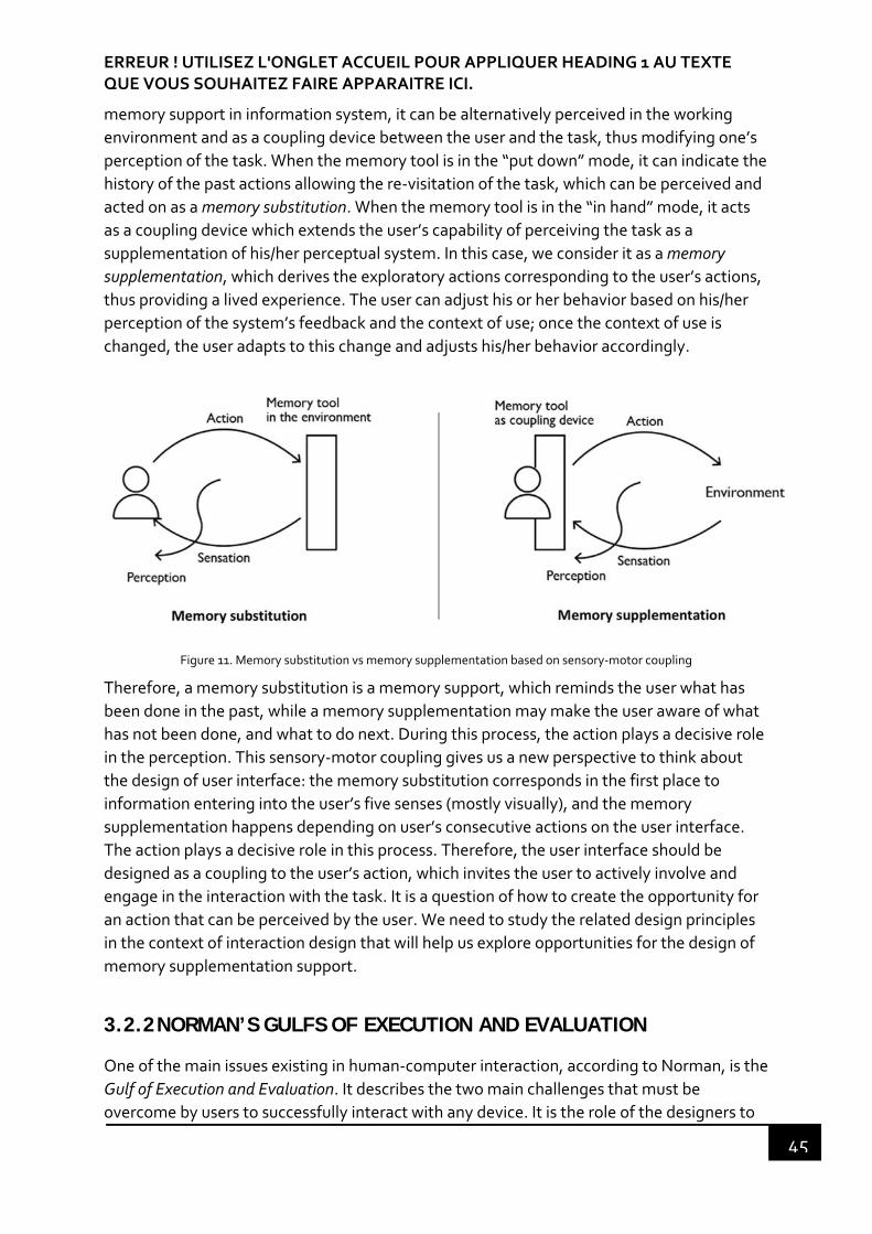
ERREUR ! UTILISEZ L'ONGLET ACCUEIL POUR APPLIQUER HEADING 1 AU TEXTE QUE VOUS SOUHAITEZ FAIRE APPARAITRE ICI.
45
memory support in information system, it can be alternatively perceived in the working
environment and as a coupling device between the user and the task, thus modifying one’s
perception of the task. When the memory tool is in the “put down” mode, it can indicate the
history of the past actions allowing the re‐visitation of the task, which can be perceived and
acted on as a memory substitution. When the memory tool is in the “in hand” mode, it acts
as a coupling device which extends the user’s capability of perceiving the task as a
supplementation of his/her perceptual system. In this case, we consider it as a memory
supplementation, which derives the exploratory actions corresponding to the user’s actions,
thus providing a lived experience. The user can adjust his or her behavior based on his/her
perception of the system’s feedback and the context of use; once the context of use is
changed, the user adapts to this change and adjusts his/her behavior accordingly.
Figure 11. Memory substitution vs memory supplementation based on sensory‐motor coupling
Therefore, a memory substitution is a memory support, which reminds the user what has
been done in the past, while a memory supplementation may make the user aware of what
has not been done, and what to do next. During this process, the action plays a decisive role
in the perception. This sensory‐motor coupling gives us a new perspective to think about
the design of user interface: the memory substitution corresponds in the first place to
information entering into the user’s five senses (mostly visually), and the memory
supplementation happens depending on user’s consecutive actions on the user interface.
The action plays a decisive role in this process. Therefore, the user interface should be
designed as a coupling to the user’s action, which invites the user to actively involve and
engage in the interaction with the task. It is a question of how to create the opportunity for
an action that can be perceived by the user. We need to study the related design principles
in the context of interaction design that will help us explore opportunities for the design of
memory supplementation support.
3.2.2 NORMAN’S GULFS OF EXECUTION AND EVALUATION
One of the main issues existing in human‐computer interaction, according to Norman, is the
Gulf of Execution and Evaluation. It describes the two main challenges that must be
overcome by users to successfully interact with any device. It is the role of the designers to

Erreur ! Utilisez l'onglet Accueil pour appliquer Heading 2 au texte que vous souhaitez faire apparaître ici.
46
bridge these two gulfs by providing the right information in the system. From the Figure 12
below, we can see that users are trapped in an (almost) endless loop, alternating these two
issues: After the execution of the given step of a task, they must evaluate the results, plan
to perform the next step, then evaluate the results, and so on, until they reach the desired
goal and exit.
Figure 12. The Gulfs of Execution and Evaluation yielded from the Seven Stages of the Action (adapted from D. A. Norman, 2013)
The gulf of execution is the gap between the user’s intention and the allowable operations.
One of the ways to measure this operation is to see if the system provides an operation that
matches to the user’s intention and allows the user to do what he/she wants to do easily.
The gulf of evaluation reflects how much efforts must be made to interpret the physical
state of the device and to decide whether or not the expectations and the intentions have
been met. If the user can easily obtain and easily interpret the information provided by the
system about the operational status, and this information is consistent with the user’s view
of the system, then the gulf in the evaluation is very small.
How to bridge the two gulfs? We need to delve into the psychology of human actions (D. A.
Norman, 2013). These two gulfs involve two parts of an action: execution and action (doing)
and evaluation of the results (interpreting). Users are doing something for achieving a goal,
it is the trigger of an action. The goal is followed by a series of actions in the execution and
evaluation phase. They are Goal, Plan (the action), Specify (an action sequence), Perform
(the action sequence), Perceive (the state of the world), Interpret (the perception) and
compare (the outcome with the goal).
For instance, a user signs up for a news website.
ERREUR ! UTILISEZ L'ONGLET ACCUEIL POUR APPLIQUER HEADING 1 AU TEXTE QUE VOUS SOUHAITEZ FAIRE APPARAITRE ICI.
47
1. Goal: the goal determines the context of design.
2. Plan: open the web browser and website and find the sign‐up information.
3. Specify: decide a sequence of actions usually subconsciously, such as open the
webpage, click on the sign‐up button, fill in the form and submit.
4. Perform: execute these actions.
5. Perceive: perceive every consequence after each action, i.e. if it has the correct
feedback.
6. Interpret: explain the perception thus have cognition or emotion.
7. Compare: compare if the outcome is consistent with the goal and evaluate.
Before the discussion of the design solution, it is necessary to grasp the user’s seven stages
of action, and to understand design issues to be solved behind each action through the
decomposition of the actions. The seven stages of action are useful for understanding
human behavior and for guiding design especially in designing interaction. Based on this
model, several design principles to bridge the gulfs of execution and evaluation are studied,
we present two of them in the next sections: affordances, feedforward and feedback.
3.2.3 AFFORDANCE
The concept of affordance was originally coined by the American psychologist James J.
Gibson (Gibson, 1986) to imply the complementarity of the environment and the animal. He
believes that we perceive the environment directly without an excessive amount of internal
processing such as learning. He defined this concept as follows:
“The affordances of the environment are what it offers the animal, what it provides
or furnishes, either for good or ill”.
It can be used to explain our perception to the environment. For example, if a surface is
nearly horizontal, nearly flat and sufficiently extended and rigid, then the surface has an
affordance of support to human and animals. The above properties (horizontal, flat,
extended and rigid) are although physical properties that can be measured, they are also
relative to human and animals. If the surface is higher than my knees, it is supposed to be
seatable for me, however, it is higher than a child’s height, it is supposed to be climbable for
him. This affordance is not constant, it is a relationship between the observer and the
object.
3.2.3.1 Norman’s affordance
Affordance was introduced in the field of design by Norman (1988) in his book The design of
everyday things. He explained the affordance as
“the perceived and actual properties of the thing, primarily those fundamental
properties that determine just how the thing could possibly be used”.

Erreur ! Utilisez l'onglet Accueil pour appliquer Heading 2 au texte que vous souhaitez faire apparaître ici.
48
The most famous example is the door mentioned by Norman, if the door should be pulled or
pushed, the door knob affords two possibilities of action, it could be positive (if the pull is
right) or negative (if the push is wrong) (See Figure 13.).
Figure 13. Perceived affordance of the door: push or pull
Users perceive the affordances of the door knob because its attributes relevant for pushing
or pulling are available for perception. When apparent affordances suggest different actions
for which the object is designed, errors are common, and signs are necessary. What Norman
meant initially is the perceived affordances, which is a relation between the person and the
object. However, in the user interface design, designers have misused this word to illustrate
which part in the interface can be clicked, swiped, or touched. What they really want to
express is a cue for how to operate in the user interface. Norman distinguishes the
affordance from what the designer mean and he introduced the word “signifier” from
semiotics to explain the cued information that can help users to understand the product or
service (D. A. Norman, 2008). In this account, we can ask if this means that the perceived
affordances refer to the information displayed in the user interface which affords an action.
3.2.3.2 Gaver’s technology affordance
Gaver (1991) in his article “Technology affordance” has argued that affordance is not
passively perceived, but actively explored. The perceptual information may suggest
affordances that do not actually exist, while affordances that exist may not be perceived.
For example, the door knob affords pulling if the door is locked. He discussed the two kinds
of affordances: sequential affordances and nested affordances.
Sequential affordances explain that acting on an affordance reveals the information that
indicates another affordance. They are sequential in time. He took the example of the door
knob (See Figure 14. a): in which the door knob affords grasping, but the perceptual
information may not indicate the affordance of turning it. When grasping the door knob, an
exploratory downwards action may reveal a tactile information indicating a new affordance
of turning it. Similarly, in a user interface (See Figure 14. b), a dropdown button suggests an
affordance of clicking which reveals the dropdown list, and this dropdown list affords
another action.

ERREUR ! UTILISEZ L'ONGLET ACCUEIL POUR APPLIQUER HEADING 1 AU TEXTE QUE VOUS SOUHAITEZ FAIRE APPARAITRE ICI.
49
Figure 14. Sequential affordances: one affordance leads to another affordance.
“Nested affordances are grouped in space”. If the door is not nested in a wall, the door alone
does not afford pulling. Similarly, a knob alone and not set on a door, does not afford
pulling neither. Only when the knob is on the door and the door is nested in the wall,
opening the door can be perceived. In this account, the affordance of pulling the knob is
nested within the affordance of pulling the door.
McGrenere & Ho (2000) studied Gaver’s work on affordances and emphasized the
importance in the affordance of the “function invokability” in design with the example of a
button in GUI:
“The button has a clickability affordance, which is specified by a raised‐looking push
button. But users are not interested in clicking on a button for its own sake; they are
interested in invoking some function. It is generally the icon or the label on the
button that specifies the function to be invoked. Therefore, button clickability is
nested within the affordance of function invokability.”
This emphasizes that not each level of the affordance hierarchy maps to the system
functions (i.e. the button itself). They also differentiated the affordance from perceptual
information. They pointed out that the affordances allowing users to take actions, which
matches their goals to accomplish a task, is about the usefulness of a design. And the
design of the perceptual information that specifies these affordances is about the usability
of a design. They made this separation because it can help researchers and designers to
better understand and clearly distinguish these two kinds of design: usefulness and usability
design.
Both Gaver’s and McGrenere & Ho’s works reflect that affordances do not merely suggest
the action possibility, but also imply the purpose of an action. With regard to the purpose of
an action, there is another principle which explains this in detail.

Erreur ! Utilisez l'onglet Accueil pour appliquer Heading 2 au texte que vous souhaitez faire apparaître ici.
50
3.2.3.3 Hartson’s cognitive, physical, sensory and functional affordance
Figure 15. Four types of affordances mapped to Norman’s Seven Stages of the Action model (From Hartson, 2003)
Rex Hartson, considers that Norman’s perceived affordance is unilateral, and the notion of
affordance can be made more specific based on the Norman’s stages of action model
(Norman, 1988). He proposed 4 types of affordance in the context of interaction design and
evaluation (See Figure 15): cognitive, physical, sensory and functional affordance (Hartson,
2003):
Cognitive affordance: refers to Norman’s perceived affordance; a design feature
that helps users with their cognitive actions, such as thinking, learning, etc. For
example, a button label is usually designed representing its function, and the effect
after clicking on it.
Physical affordance: refers to Norman’s real affordance; a design feature that helps
users with their physical actions. For example, designers should consider physical
properties of a button, such as the size, position, the shape, etc. in the user interface.
Sensory affordance: refers to a design feature that helps users with their sensory
actions. Sensory affordance is a path that can help users recognize information and
generate behavior. “For example, a label font size is large enough to be read easily”.
Functional affordance: links to usefulness; a design feature that helps users to accomplish their work. It is consistent with McGrenere & Ho’s idea of affordance
matching goals of users to accomplish a task. Such as, “the internal system ability to
sort a series of numbers (invoked by users by clicking on the Sort button)”.
ERREUR ! UTILISEZ L'ONGLET ACCUEIL POUR APPLIQUER HEADING 1 AU TEXTE QUE VOUS SOUHAITEZ FAIRE APPARAITRE ICI.
51
Hartson’s classification method describes the continuity and logical relationship of
affordance. It also highlights the importance of design intention in the process of
interaction design.
3.2.4 FEEDFORWARD AND FEEDBACK
Feedforward and feedback are often considered together when we are talking about the
information displayed before and after the user’s action. Feedback is one of the most
common used design principles in the design of interaction as well as affordance
(Vermeulen & Luyten, 2013; Wensveen, S., Djajadiningrat, T., and Overbeeke, 2004).
Feedback informs the user that the system is responding to his/her request and returning
the information indicating the result of an activity (D. N. Norman, 1988). However,
feedforward gets less consideration compared with the other two. Feedforward is first
defined by Djajadiningrat, Overbeeke, & Wensveen (2002) to distinguish with affordance.
As they defined, "feedforward informs the user about what the result of his action will be”.
3.2.4.1 Vermeulen & Luyten’s feedforward in action model
Vermeulen & Luyten (2013) reaffirmed the importance of feedforward as a powerful tool in
design. They distinguished feedforward from feedback and affordance based on a literature
review. Feedforward is mostly about communicating the purpose of the action compared to
perceived affordance, which suggests actions. They also positioned feedforward and
feedback in Norman’s stages of action model and indicated the correspondence of
feedforward and feedback with the cognitive affordance based on Hartson’s four types of
affordance (See Figure 16).
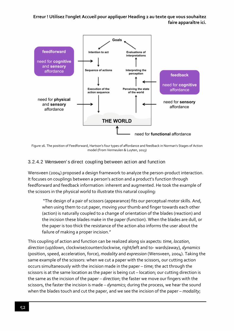
Erreur ! Utilisez l'onglet Accueil pour appliquer Heading 2 au texte que vous souhaitez faire apparaître ici.
52
Figure 16. The position of Feedforward, Hartson’s four types of affordance and feedback in Norman's Stages of Action model (From Vermeulen & Luyten, 2013)
3.2.4.2 Wensveen’s direct coupling between action and function
Wensveen (2004) proposed a design framework to analyze the person‐product interaction.
It focuses on couplings between a person’s action and a product’s function through
feedforward and feedback information: inherent and augmented. He took the example of
the scissors in the physical world to illustrate this natural coupling:
“The design of a pair of scissors (appearance) fits our perceptual motor skills. And,
when using them to cut paper, moving your thumb and finger towards each other
(action) is naturally coupled to a change of orientation of the blades (reaction) and
the incision these blades make in the paper (function). When the blades are dull, or
the paper is too thick the resistance of the action also informs the user about the
failure of making a proper incision.”
This coupling of action and function can be realized along six aspects: time, location,
direction (up/down, clockwise/counterclockwise, right/left and to‐ wards/away), dynamics
(position, speed, acceleration, force), modality and expression (Wensveen, 2004). Taking the
same example of the scissors: when we cut a paper with the scissors, our cutting action
occurs simultaneously with the incision made in the paper – time; the act through the
scissors is at the same location as the paper is being cut – location; our cutting direction is
the same as the incision of the paper – direction; the faster we move our fingers with the
scissors, the faster the incision is made – dynamics; during the process, we hear the sound
when the blades touch and cut the paper, and we see the incision of the paper – modality;
ERREUR ! UTILISEZ L'ONGLET ACCUEIL POUR APPLIQUER HEADING 1 AU TEXTE QUE VOUS SOUHAITEZ FAIRE APPARAITRE ICI.
53
and if we move the scissors in a hurry that might cause impression actions, it is reflected in
the incision of the paper as well – expression.
He argued that a proper unification on the user’s action and the product’s function in these
aspects can make the interaction intuitive. This often happens in mechanical products.
However, in the interactive information system, it is hard to reach a natural coupling
between the action and the function, such as remote control where the location is not
unified; the modality is not unified when clicking on a button in the user interface where
there is neither sound nor visual effect. Therefore, the author suggested the inherent and
augmented feedforward and feedback that guide the user’s actions towards the intended
function (Wensveen, 2004).
For feedforward
Inherent feedforward is about what kind of action is possible and how can it be
carried out. It can be seen as a limited interpretation of Gibson’s affordance.
Augmented feedforward is about the information indicating the purpose of an
action (textual or graphical labels). It helps users understand what is the result of an
action, which can be seen as cognitive affordance (Vermeulen & Luyten, 2013).
For feedback
Inherent feedback is “the information that is returned from acting on the action
possibilities and therefore appeals primarily to the perceptual motor skill of the
user”. For example, when we click on the mouse, we hear a sound from this action.
Augmented feedback is the information not coming from the action (which is
inherent feedback), but from an additional source. For example, if we want to sort a
series of number in excel, we click on the sorting icon, and the icon turns to another
color, which suggests that the action is done. The color is augmented feedback.
As indicated by Wensveen, in the user interface, the information coming from acting on a
physical input device (mouse) is only coupled to the augmented information of graphic user
interface (GUI) on the aspect of time and direction. There is a lack of inherent feedforward
and feedback in the user interface that we can only rely on, such as a direct coupling
between action and function or on couplings through augmented feedforward and
feedback. Therefore, when direct coupling cannot be established, augmented information
can be used to make the interaction intuitive.
Based on the Norman’s stages of action model, the researchers explored the notions of
design: affordance, feedforward and feedback, which provide theoretical support to fill the
cognitive gaps among designers, products and users. Understanding the relationship
among these three design principles is very important for us to design the information,
which guides users’ actions. This means that the users’ actions can be designed to pursuit
better user experience in the interactive process.

Erreur ! Utilisez l'onglet Accueil pour appliquer Heading 2 au texte que vous souhaitez faire apparaître ici.
54
3.3 USER EXPERIENCE (UX)
As social civilization evolves, people’s pursuit of psychological needs has become apparent.
People began to shift their attention from pure technology to more comprehensive
contexts of use and human psychological needs. The American psychologist, Maslow (1943)
proposed a theory of human motivation that states that our human is motivated by the
desire to achieve a certain percentage of their basic needs. His theory views motivation as a
hierarchy of needs that must be satisfied in the following order: physiological, safety, love
and belongingness, esteem and self‐actualization. As soon as people have fulfilled lower
level of the needs in the hierarchy, they will then want to fulfill higher one. Self‐
actualization is the motivation to develop one's full potential as a human being. When
people get used to having something, they then start to look for something more (Jordan,
2000). Taking the idea of Maslow’s hierarchy of needs and applying it to human factors, W.
Jordan (2000) and Aaron Walter (2011) both translated Maslow’s motivation theory to the
needs of users for designing products (see Figure 17).
Figure 17. Different views of hierarchy of human needs
Users’ needs for various functions in the products have been satisfied with advances in
technology. At the same time, the products are becoming more and more complicated to
use. Users are demanding more than just functionalities, they are also expecting the ease of
use as well as psychological and social needs – the user experience. Hence, user experience
determines users’ evaluation of a product.
3.3.1 WHAT IS UX?
The word ‘user experience’ (UX) was introduced and promoted by Donald A. Norman in the
90s. it was invented to take into account all aspects of human experience, which is beyond
usability. It is based on user‐centered design, focusing on understanding users’
characteristics, acquiring user requirement as design decision basis, collecting users’
feedback for design evaluation. As a consequence, the interactive systems are designed for
a good user experience. For now, there is no consensus on the definition of UX (Law, Roto,
Vermeeren, Kort, & Hassenzahl, 200d8), but most of the definitions of UX indicate that it is
more than the usefulness and usability of a product or a service (Alben, 1996; Garret, 2011;
Marc Hassenzahl & Tractinsky, 2006a; Mahlke, 2008b; Don Norman & Nielsen, 2016;
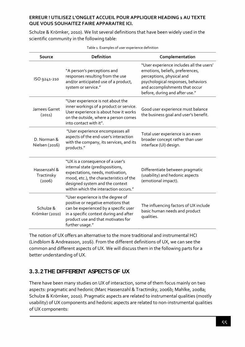
ERREUR ! UTILISEZ L'ONGLET ACCUEIL POUR APPLIQUER HEADING 1 AU TEXTE QUE VOUS SOUHAITEZ FAIRE APPARAITRE ICI.
55
Schulze & Krömker, 2010). We list several definitions that have been widely used in the
scientific community in the following table:
Table 1. Examples of user experience definition
Source Definition Complementation
ISO 9241‐210
“A person's perceptions and responses resulting from the use and/or anticipated use of a product, system or service.”
“User experience includes all the users’ emotions, beliefs, preferences, perceptions, physical and psychological responses, behaviors and accomplishments that occur before, during and after use.”
Jamees Garret (2011)
“User experience is not about the inner workings of a product or service. User experience is about how it works on the outside, where a person comes into contact with it”.
Good user experience must balance the business goal and user’s benefit.
D. Norman & Nielsen (2016)
"User experience encompasses all aspects of the end‐user's interaction with the company, its services, and its products.”
Total user experience is an even broader concept rather than user interface (UI) design.
Hassenzahl & Tractinsky (2006)
“UX is a consequence of a user’s internal state (predispositions, expectations, needs, motivation, mood, etc.), the characteristics of the designed system and the context within which the interaction occurs.”
Differentiate between pragmatic (usability) and hedonic aspects (emotional impact).
Schulze & Krömker (2010)
“User experience is the degree of positive or negative emotions that can be experienced by a specific user in a specific context during and after product use and that motivates for further usage.”
The influencing factors of UX include basic human needs and product qualities.
The notion of UX offers an alternative to the more traditional and instrumental HCI
(Lindblom & Andreasson, 2016). From the different definitions of UX, we can see the
common and different aspects of UX. We will discuss them in the following parts for a
better understanding of UX.
3.3.2 THE DIFFERENT ASPECTS OF UX
There have been many studies on UX of interaction, some of them focus mainly on two
aspects: pragmatic and hedonic (Marc Hassenzahl & Tractinsky, 2006b; Mahlke, 2008a;
Schulze & Krömker, 2010). Pragmatic aspects are related to instrumental qualities (mostly
usability) of UX components and hedonic aspects are related to non‐instrumental qualities
of UX components:

Erreur ! Utilisez l'onglet Accueil pour appliquer Heading 2 au texte que vous souhaitez faire apparaître ici.
56
The Instrumental qualities are the qualities that users perceive as useful and usable in the
interaction with an interactive system. Usability is defined in ISO 9241‐11 as “the extent to
which a system, product or service can be used by specified users to achieve specified goals
with effectiveness, efficiency and satisfaction in a specified context of use”.
The non‐instrumental qualities satisfy users’ personal needs that go beyond the instrumental
value of the product (Mahlke, 2008a), such as aesthetic, autonomy, relatedness,
innovativeness, originality, etc. These two aspects contribute equally to the overall
judgment of product appealingness and thus lead to behavioral and emotional
consequences (Mare Hassenzahl, Platz, Burmester, & Lehner, 2000).
Some research works have been focusing on the emotional aspects of UX, such as pleasure,
fun or flow, etc.(Csikszentmihalyi, 1990; Pieter Desmet, 2010; Jokinen, 2015; Lenay et al.,
2007; Mahlke, 2005; D. A. Norman, 2004). Psychologist have offered a variety of definitions
and the origins of emotions based on different perspectives in the formation of emotions.
There are generally two methods to classify emotions: categorical approaches, which define
asset of basic emotions, and dimensional approaches, which divide emotions into several
dimensions. For example, Ekman (1992) proposed six basic categories of emotions:
surprise, joy, sadness, disgust, fear and angry based on people’s subjective feeling on facial
expression. Russell (1980) proposed a dimensional circumplex model of emotions, which
suggests that all the emotions can be derived from two dimensions: valence (from pleasant
to unpleasant) and arousal (from low activation to high activation) (see Figure 18). For
example, excited is pleasant in high activation; sad is unpleasant in low activation. The
classification helps us understand the different kinds of emotions in human being and gives
us a guide to semantically evaluate the kinds of emotions.
Figure 18. Dimensional approach to emotions (From Russell, 1980)

ERREUR ! UTILISEZ L'ONGLET ACCUEIL POUR APPLIQUER HEADING 1 AU TEXTE QUE VOUS SOUHAITEZ FAIRE APPARAITRE ICI.
57
Jetter & Gerken (2006) included organizational values such as brand identity in their UX
framework in addition to functionality, usability and hedonic quality, because they have an
impact on the trustworthiness of users. Rubinoff (2004) proposed 4 factors of user
experience that are branding, usability, functionality and content. These four factors
together determine the success of a website. Brand aspects can also affect UX, because
they “are related to the marketing and the business communication between the user and
the organization” (Zarour & Alharbi, 2017).
The objective of our research work is to focus not only on the evaluation of functionality or
usability, but also on the entire aspects of UX, which includes all these aspects described
above. Among them, emotion is a particular aspect of UX, which is presented in the
following part.
3.3.3 EMOTION-RELATED DESIGN APPROACHES
3.3.3.1 Donald Norman three levels of emotional design
“Emotional design” was first coined by Donald A. Norman in his book Emotional Design:
Why We Love (or Hate) Everyday Things, and he proposed a model of three levels of design,
which is closely related to emotions: visceral, behavioral, and reflective (Donald Norman,
2004).
The visceral level is quite on the surface, innate and biological. It precedes
consciousness and thinking, which does not need to be interpreted, nor compared. It
only relates to the surface appearance of objects, like physical features: look, feel
and sound. It permits rapid judgements of what is good or bad, etc., which is the
start of affective processing (N. A. Norman & Ortony, 2003).
The behavioral level is all about use and experience with a product. The experience
itself includes three components: function, performance, and usability. A product
that can meet all user’s needs is functional. How well the produce can be used is
performance. Usability is about the ease of use, which doesn’t need a long time for
practicing. A well‐designed application can make the user enjoy and get the work
done quickly. On the contrary, the user will get angry at the application that lets
him/her down and will not use it again. These reactions derive from the behavioral
level, where the application fails to live up to expectations of what his/her routine
interactions with an object ought to be. Moreover, these behavioral routines are
learned. Both visceral level and behavioral level appeal to the subconscious of the
user. This varies with person and culture.
The Reflective level is about message, culture, and meaning of the product or its use.
It incorporates a sense of feeling derived from affective components at the visceral
and behavioral levels along with an interpretation of this feeling (N. A. Norman &
Ortony, 2003). A simple example is Apple computer corp. People like to use apple
products, because they are first attracted by their simple appearances, then satisfied
Erreur ! Utilisez l'onglet Accueil pour appliquer Heading 2 au texte que vous souhaitez faire apparaître ici.
58
with their use, and finally engaged by their good user experience, which makes them
to recommend the Apple products to others. Reflective design is really about long‐
term customer experience. It is influenced by knowledge, learning and culture.
This model proposes that emotions play a role at all three levels of information processing,
and these three levels, from the user’s perspective are where designers should be engaged
in considering correspondingly the different aspects of a product correspondingly.
3.3.3.2 Flow theory
The Hungarian‐American psychologist Mihaly Csikszentmihalyi proposed the conception of
flow in his book Flow: The Psychology of Optimal Experience (Csikszentmihalyi, 1990), which
he defines as:
“The state in which people are so involved in an activity that nothing else seems to
matter; the experience itself is so enjoyable that people will do it even at great cost,
for the sheer sake of doing it.”
He also discussed the 8 major components elements that generate the phenomenology of
enjoyment:
1. We have a great chance (skills) to complete a challenging task.
2. We are highly concentrated on doing one thing so that “we stop being aware of
ourselves as separate from the actions we are performing”5.
3. The task has a clear goal.
4. The task provides an immediate feedback.
5. When we are involved in a task, we can forget effortlessly the worries and
frustrations of everyday life.
6. We have a sense of control over what we are doing.
7. Self‐consciousness disappears.
8. The sense of the duration of time is altered. Our perception of the time is usually
faster than the real one.
These 8 components are concluded from large amount of case studies of the author, which
are not limited to user experience. According to Mihaly, the combination of these elements
(not necessarily all) causes a sense of deep enjoyment. Some of them can be referred to the
evaluation of the UX.
5 This is similar to Lenay’s sensory‐motor coupling. That the tool is a part of our body to do an action, and the
tool disappeared from our consciousness when we are in the “in hand” mode.

ERREUR ! UTILISEZ L'ONGLET ACCUEIL POUR APPLIQUER HEADING 1 AU TEXTE QUE VOUS SOUHAITEZ FAIRE APPARAITRE ICI.
59
3.3.3.3 The appraisal theory
The appraisal theory emphasizes that emotion process starts with an event and ends with
an appraisal. Our appraisal evaluates the goal and value congruency of the event and
establishes how the event meets the goal of a subject. P Desmet & Hekkert (2002) have
established a basic model of product emotions that represents the emotion elicitation
process. This process sets forth four main parameters: appraisal, concern, product and
emotion (See Figure 19). The first three parameters and their interplay determine if a
product evokes an emotion and if so, what is its kind. For example, if a user interface meets
or is higher than the user’s expectation, it leads to a positive emotion. On the contrary, if
the user interface does not meet and is lower than the user’s expectation, it leads to a
negative emotion.
Figure 19. Basic Model of Emotions (From P Desmet, 2003)
The appraisal theory explains the elicitation of various kinds of emotions which is
determined by a concern match or mismatch. The appraisal (assessment) is a consequence
of the interaction between one’s concern and one’s perception of product qualities.
However, this does not address the process of emotion experienced in the interaction. In
other words, how do people experience emotions as they interact with a user interface? I
will introduce next the theory of perception (action‐sensation perception) and affective
interaction design approach derived from the theory.
3.3.3.4 Affective computing and affective interaction
The original vision of affective computing is that people are trying to recognize what are
users experiencing when interacting with the systems and their emotional responses to the
interaction. This notion was first stated by Rosalind Picard in her book called Affective
Computing in 1998. A branch of affective computing studied whether it is possible to
recognize a person's emotions using by analyzing facial expression, bodily gestures, or
putting sensors on the skin to recognize our physical reaction to emotions. They are more
interested in modeling emotions, which reduces emotional experience to some variables for
recognizing and generating emotions.

Erreur ! Utilisez l'onglet Accueil pour appliquer Heading 2 au texte que vous souhaitez faire apparaître ici.
60
Instead of putting more emphasis on the system or computer that knows what people’s
emotion is based on a model that computes the emotion, another branch emphasizes the
importance of the interaction where emotion is constructed, interpreted, and given
meaning in a given dialog between a user and a system or between users through a system
(Höök, 2011). They call it Affective Interaction, which regards emotion as a constructed
process that creates meaning between us. A computer system can support people in
understanding and experiencing their emotions (Boehner, DePaula, Dourish, & Sengers,
2007; Hook, 2009). They offered an interactional approach to emotion and studied its role in
action and interaction.
According to (Boehner, DePaula, Dourish, & Sengers, 2005), affect is often seen as another
kind of information – individual’s internal state, which operates in the context of traditional
cognitive behavior. However, it fails to consider “an understanding of everyday action as
situated in social and cultural contexts that give them meaning”. In contrast, the
interactional approach emphasizes emotions as a social and cultural product experienced
through interactions – emotion as Interaction.
3.3.3.5 Discussion
In the thesis of A. Guénand (2010), she provided a new perspective of reviewing design
methods based on Lenay et al.’s “put down” and “in hand” modes of an object. She stated
that there are numerous design methods orienting in the design of an artefact, which is
perceived as an object in the environment (“put down” mode), while there is a deficit in the
design methods orienting in mastering the attributes of the object as a coupling device.
Therefore,
the appraisal theory evaluates the elicitation of emotions as a congruency between
the user’s concern and product value, which regards the product as an object in the
environment. It is much about the design of an artefact which facilitates the “put
down” mode of object.
perceptual supplementation and affective interaction are talking about emotional
values as a result constructed in the interaction with the world, which treats the
object as a coupling device, an extension of human. This is typical when the object is
in the “in hand” mode.
In this thesis context, we are interested in the design for emotional experience, which is
constructed in the interaction through which we are in the “in hand” mode relationship with
the system. This is fundamental to our design research as we can design for a type of
interaction and invite the user to actively involve and engage in the interaction with an
interactive system.
In this research context, we consider the term UX as an umbrella that covers all aspects of
user interaction with an interactive system, including usefulness, usability and emotional
experience. Then, UX can be measured based on the above aspects, and the measurement
methods are introduced in the next section.
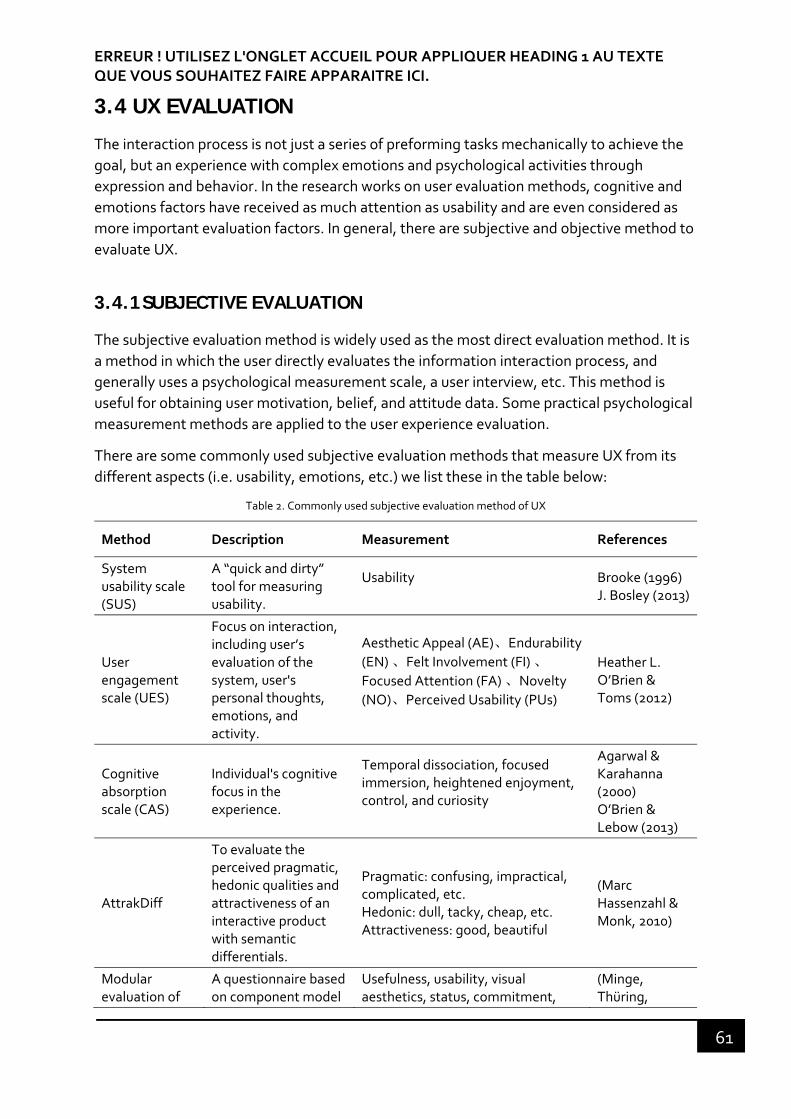
ERREUR ! UTILISEZ L'ONGLET ACCUEIL POUR APPLIQUER HEADING 1 AU TEXTE QUE VOUS SOUHAITEZ FAIRE APPARAITRE ICI.
61
3.4 UX EVALUATION
The interaction process is not just a series of preforming tasks mechanically to achieve the
goal, but an experience with complex emotions and psychological activities through
expression and behavior. In the research works on user evaluation methods, cognitive and
emotions factors have received as much attention as usability and are even considered as
more important evaluation factors. In general, there are subjective and objective method to
evaluate UX.
3.4.1 SUBJECTIVE EVALUATION
The subjective evaluation method is widely used as the most direct evaluation method. It is
a method in which the user directly evaluates the information interaction process, and
generally uses a psychological measurement scale, a user interview, etc. This method is
useful for obtaining user motivation, belief, and attitude data. Some practical psychological
measurement methods are applied to the user experience evaluation.
There are some commonly used subjective evaluation methods that measure UX from its
different aspects (i.e. usability, emotions, etc.) we list these in the table below:
Table 2. Commonly used subjective evaluation method of UX
Method Description Measurement References
System usability scale (SUS)
A “quick and dirty” tool for measuring usability.
Usability
Brooke (1996) J. Bosley (2013)
User engagement scale (UES)
Focus on interaction, including user’s evaluation of the system, user's personal thoughts, emotions, and activity.
Aesthetic Appeal (AE)、Endurability
(EN) 、Felt Involvement (FI) 、
Focused Attention (FA) 、Novelty
(NO)、Perceived Usability (PUs)
Heather L. O’Brien & Toms (2012)
Cognitive absorption scale (CAS)
Individual's cognitive focus in the experience.
Temporal dissociation, focused immersion, heightened enjoyment, control, and curiosity
Agarwal & Karahanna (2000) O’Brien & Lebow (2013)
AttrakDiff
To evaluate the perceived pragmatic, hedonic qualities and attractiveness of an interactive product with semantic differentials.
Pragmatic: confusing, impractical, complicated, etc. Hedonic: dull, tacky, cheap, etc. Attractiveness: good, beautiful
(Marc Hassenzahl & Monk, 2010)
Modular evaluation of
A questionnaire based on component model
Usefulness, usability, visual aesthetics, status, commitment,
(Minge, Thüring,

Erreur ! Utilisez l'onglet Accueil pour appliquer Heading 2 au texte que vous souhaitez faire apparaître ici.
62
key Components of user Experience (meCUE)
of user experience from Mahlke & Thüring (2007)
emotions, product loyalty, intention to use, and overall evaluation.
Wagner, & Kuhr, 2016)
The Positive and Negative Affect Schedule (PANAS)
To evaluate the different emotional responses. Positive and negative emotions each have ten measurements.
Positive: attentive, active, alert, excited, enthusiastic, determined, inspired, proud, interested, strong Negative: hostile, irritable, ashamed, guilty, distressed, upset, scared, afraid, jittery, nervous
Crawford & Henry (2004)
Self‐assessment‐manikin (SAM)
A series of emotional states in three dimensions: valence, arousal and dominance with cartoon characters.
Pleasure: happy, annoyed, unsatisfied, melancholic, despairing, bored Arousal: relaxed, calm, sluggish, dull, sleepy, unaroused Dominance: controlled, influenced, cared for, awed, submissive, guided
Bradley & Lang (1994)
Product Emotion Measurement Tool (PrEmo)
It uses animated cartoon characters with sounds to measure 7 positive and 7 negative emotions.
7 pleasant (desire, pleasant surprise, inspiration, amusement, admiration, satisfaction, and fascination) 7 unpleasant (indignation, contempt, disgust, unpleasant surprise, dissatisfaction, disappointment, and boredom)
(Pieter Desmet, 2003)
Geneva Appraisal Questionnaire (GAQ)
To assess the users’ appraisal process of an emotional episode through recall and verbally report.
Novelty, intrinsic pleasantness, goal significance, coping potential and compatibility with standards.
(Scherer, 2001)
These methods are usually suitable for measuring the UX aspects on which they focus, in a
valid and reliable way. We can use one or several of the above mentioned scales or part of a
scale to investigate the overall experience in a specific situation, such as exploratory search
(Heather L. O’Brien & Toms, 2012), online news interaction (O’Brien & Lebow, 2013), etc.
The subjective evaluation method is usually in the form of a survey, which is simple, easy to
do and can effectively output qualitative evaluation results. Common survey methods
include questionnaire and interview, focus group, and thinking aloud methods (Lewis,
1982), explaining interview6 (Vermersch, 1996). In the specific design evaluation process,
one of the above methods can be used alone, or several methods can be used
simultaneously for assessment.
To increase the ample, and improving the data accuracy, Likert scale and semantic
differential are the two classical rating scales. The Likert scale is usually described by a
survey question with a range of answer options – from one extreme attitude to another, like
6 “Entretien d’explicitation” original in French by Pierre Vermersch

ERREUR ! UTILISEZ L'ONGLET ACCUEIL POUR APPLIQUER HEADING 1 AU TEXTE QUE VOUS SOUHAITEZ FAIRE APPARAITRE ICI.
63
“strongly agree” to “strongly disagree”. The user can give their degrees of opinion on their
perception of a product, such as "the layout of the interface is reasonable and clear." The
semantic differential scale, on the other hand, places a pair of exactly opposite adjectives at
both ends of the scale's minimum and maximum values, which the user can choose. An
example of these two questionnaires are shown below (See Figure 20)
Figure 20. Example questionnaire about a website design, with answers as a Likert scale and semantic differential scale (images from Wikipedia)
The subjective evaluation method is only based on the user’s self‐report that could have
some deviations from the acquisition of data. The results of the investigation may be
subjected to the method, the environment and other effects.
3.4.2 OBJECTIVE EVALUATION
The objective evaluation of UX involves user behavior and physiological reactions. Its
application in the evaluation of UX is less used than the subjective evaluation. These two
methods are briefly introduced here.
3.4.2.1 User behavior
Behavioral tendencies are often related to the performance of completing a task, like the
completion rate, the speed, the time to spend on the task and task performance, etc. It is
proposed by Czerwinski & Horvitz (2002) to measure the task difficulty. The subjects were
asked “how long do you think you spent on the task” and it was compared to the actual time
spent on the task. It has been shown that people tend to overestimate the duration of task if
it is difficult (perceived duration is longer than actual time), and vice versa. In addition, the
development of Internet technology has also made it possible for researchers to acquire

Erreur ! Utilisez l'onglet Accueil pour appliquer Heading 2 au texte que vous souhaitez faire apparaître ici.
64
users’ behavior data such as track length, dwell time, web pages browsed, usage frequency,
log data, etc. (Lehmann, Lalmas, Yom‐tov, & Dupret, n.d.; Singla, Vv, & White, 2010).
The behavior data provides a reference for the design and evaluation of user experience.
These measures are also used to try to study user engagement (Lehmann et al., n.d.) and
emotional experience (Kim et al., 2008). Although it allows to measure user behavior by
acquiring a large number of data, the emotions, motivations, and goals cannot be explained
and evaluated. It is necessary to use a combination of subjective evaluation methods to
interpret the objective data. For example, Picard & Daily (2005) hypothesize that this
indirect measure was related to frustration, which was also influenced by task difficulty and
other factors, such as time pressure and irritating aspects of the task. This kind of
measurement is indirect and cannot fully understand emotions. It can be used and
combined with other methods. For example, subjective questionnaire or people’s
verbalization can help interpret emotional effect related to the task performance.
3.4.2.2 Physiological reaction
Physiological measurement methods have begun to be used as auxiliary methods in human‐
computer interaction to evaluate information system and study users’ emotions
(Lopatovska & Arapakis, 2011). The use of this method can permit to capture the
physiological response data that researchers and subjects cannot objectively observe.
Physiological reactions are often measured with specialized equipment.
There are several physiological methods that can be used for the evaluation of user
experience in interactive systems: electromyography (EMG) to measure spontaneous
muscle activity; blood pressure to measure the relationship between the dilation of blood
vessels and emotions; heart rate (HR/HRV), associated with fear and angry emotions or an
increase in cognitive needs; eye tracking to reveal human behavior behind design issues.
Due to the introduction of wearable and non‐contact physiological assessment devices, the
participants complete a task in the interactive system in a natural state, which does not
have any influence on the main test. Theoretical research and scientific experiments have
confirmed that the data acquired is directly related to user’s interaction strategies and
cognitive mechanisms, such as eye tracking (Lew & Delivered, 2009; Romano Bergstrom,
Schall, & Burridge, 2014; Tzafilkou & Protogeros, 2017; Zagermann, Pfeil, & Reiterer, 2016).
We present in the next section how to use eye tracking method to measure the user
experience, because it will be one of our means for collecting date in our experiments.
3.4.3 EYE TRACKING
Eye tracking is a technique to track individual’s eye movements for researchers to
understand where the user is looking at, how long he or she is fixing at specific area and the
eye path from one location to another (Poole & Ball, 2005). Since self‐reporting tools such
as questionnaires may produce biased or even wrong data, eye tacking is to answer the

ERREUR ! UTILISEZ L'ONGLET ACCUEIL POUR APPLIQUER HEADING 1 AU TEXTE QUE VOUS SOUHAITEZ FAIRE APPARAITRE ICI.
65
questions that the interview and questionnaire are not able to raise. Nowadays, it has been
used for an in‐depth investigation of general problem solving.
Eye tracking is becoming a popular tool for UX and HCI researchers to evaluate and
optimize user interfaces and user experience, because it can provide objective data that
reveals user behavior behind usability issues.
3.4.3.1 Eye tracking experimental design
When designing an experiment using eye tracking device, 6 steps are usually taken to build
a formal experiment (Duchowski, 2007):
1. Hypothesis: one of the first considerations is to formulate a hypothesis. It is
important to think about what are the kind of data that the eye tracker is able to
provide, e.g. fixation, fixation duration, etc. For example, I wonder what would
happen if …; or I bet this result would happen if … It is important to think about what
kind of data that the eye tracker is able to provide, e.g. fixation, fixation duration,
etc.
2. Design: which experimental design is chosen, an experimental or a non‐experimental
design?
3. If it is a non‐experimental observational study, it is performed to formulate an initial
impression of how people may look at some visual stimulus. For example, eye
movements collected over an interface of a prototype may lead the designers to
focus on the layout. Similarly, in the case of a website page, advertisements or other
visually rich media may be evaluated in this manner.
4. While in an experimental design, we should set independent variables (IVs),
dependent variables (DVs) and secondary variable7. How the participants are
grouped should be also considered. The general rule of thumb is to vary one variable
while keeping other variables constant and ensure that all other conditions are equal
except the main effect suggests gaining control of the experiment.
5. How to plan the experiment is an important question. Whether they are conducted
within‐subjects (all the participants do the same task, repetitive) or between‐
subjects (different groups do the same task) depends on the operationalization of
the independent and dependent variables and other constraints of the experiment
(e.g., time and money).
6. Participants: how many participants should be recruited in the study and their
demographic information such as age, gender etc. In terms of the number of
participant needed, it is dictated by desired output (Pernice & Nielsen, 2009). For
7 Secondary Variable can affect the relationship between the DV and other IV of primary interest. It can be controlled during the experiment.

Erreur ! Utilisez l'onglet Accueil pour appliquer Heading 2 au texte que vous souhaitez faire apparaître ici.
66
example, the recommended number of test participants for a heat map is 30 to
ensure a good eye tracking data.
7. Apparatus: the device to use in the experiment, video‐based, combined pupil‐
corneal reflection; the accuracy, the calibration, etc. To make clear the parameters
of the eye tracker device that you are going to use.
8. Procedures: if certain instructions or any training are needed (the script to read),
what type of calibration is used, etc. Always disclose that you will be using
technology that enables you to track the participants’ eyes during the session but
not to highlight eye tracking topic too much as it can have adverse effects. For
example, we would like to test “attentional quality” of a banner advertisement on a
web page.
9. Tasks: the eye movements are known to be task‐dependent. The researchers should
define a protocol of what tasks do participant do.
It is suggested to use retrospective thinking aloud (RTA) method for eye tracking studies
compared with concurrent thinking aloud method used in traditional usability study. As
concurrent thinking aloud (CTA) allows the participants to verbalize what they are thinking
about and doing during task execution, it will distract their concentration and influence their
task performance and response (Andrzejewska & Stolińska, 2013; Røsand, 2012). In
retrospective think aloud (RTA), the participants are asked to verbalize their thought after
task completion. The most used retrospective thinking aloud method is cued RTA, where
the participants are presented a replay of their actions during the task completion and are
asked to talk about what they were thinking at the moment. For example, in the study of
the experience of museum visitors, the authors developed a method called REMIND
(Reviviscence, Experience, Emotions, sEnse MakINg micro Dynamics), which allows visitors
to describe the articulation of their experience in its emotional, perceptual and cognitive
dimensions (Schmitt & Aubert, 2017). The visitors are asked to verbalize their experience
during a stimulated reviviscence interview (or entretien en revisiscence stimulée). This
interview is stimulated by videos recording the traces of their initial visiting activity, the one
of which the authors seek to understand the articulation, then analyze within an
informational structure. This method helps understand how people construct their sense‐
making in decision‐making process. Studies has shown the validity and reliability of RTA in
usability and user experience research (Eger, Ball, Stevens, & Dodd, 2007; Guan, Lee,
Cuddihy, & Ramey, 2006).
3.4.3.2 Eye tracking measures
In usability testing, we can track participants’ eye movement patterns and fixations to
understand how they complete a task. The results obtained from an eye tracker can be both
numerical data and visual data (gaze data, heat map, clusters). When evaluating usability or
user experience, eye tracking data should be combined with other methods, because the
eye movement data only cannot be interpreted correctly without the participants proving
context (Tobii Technology, 2009).
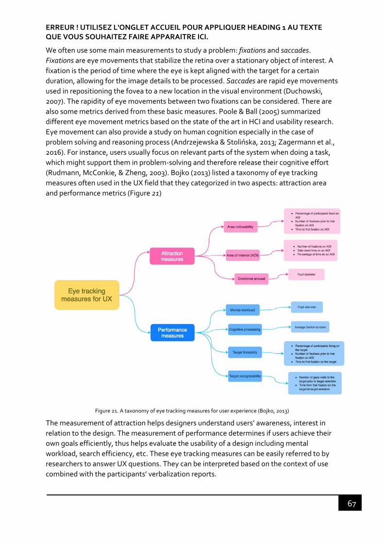
ERREUR ! UTILISEZ L'ONGLET ACCUEIL POUR APPLIQUER HEADING 1 AU TEXTE QUE VOUS SOUHAITEZ FAIRE APPARAITRE ICI.
67
We often use some main measurements to study a problem: fixations and saccades.
Fixations are eye movements that stabilize the retina over a stationary object of interest. A
fixation is the period of time where the eye is kept aligned with the target for a certain duration, allowing for the image details to be processed. Saccades are rapid eye movements
used in repositioning the fovea to a new location in the visual environment (Duchowski,
2007). The rapidity of eye movements between two fixations can be considered. There are
also some metrics derived from these basic measures. Poole & Ball (2005) summarized
different eye movement metrics based on the state of the art in HCI and usability research.
Eye movement can also provide a study on human cognition especially in the case of
problem solving and reasoning process (Andrzejewska & Stolińska, 2013; Zagermann et al.,
2016). For instance, users usually focus on relevant parts of the system when doing a task,
which might support them in problem‐solving and therefore release their cognitive effort
(Rudmann, McConkie, & Zheng, 2003). Bojko (2013) listed a taxonomy of eye tracking
measures often used in the UX field that they categorized in two aspects: attraction area
and performance metrics (Figure 21)
Figure 21. A taxonomy of eye tracking measures for user experience (Bojko, 2013)
The measurement of attraction helps designers understand users’ awareness, interest in
relation to the design. The measurement of performance determines if users achieve their
own goals efficiently, thus helps evaluate the usability of a design including mental
workload, search efficiency, etc. These eye tracking measures can be easily referred to by
researchers to answer UX questions. They can be interpreted based on the context of use
combined with the participants’ verbalization reports.

Erreur ! Utilisez l'onglet Accueil pour appliquer Heading 2 au texte que vous souhaitez faire apparaître ici.
68
The complexity of user experience requires a comprehensive research method to measure
and evaluate. Subjective evaluation investigates users’ motivations, preferences, attitudes,
etc. Objective evaluation demonstrates the user experience responses of “what” but cannot
reach “why”. Therefore, a mix of these two methods is usually used to evaluate the user
experience.
3.5 CHAPTER SUMMARY
In this chapter, we reviewed the instrumentation approaches that have been realized for
task recovering aid including the history of process (analytic provenance). We also
addressed the interaction and user experience design that can be applied for the
instrumentation. We have examined the design principles based on the Norman’s seven
stages of action model: affordance, feedforward and feedback, which we should follow to
design the interactions of natural coupling device. We have also studied from a global
perspective – user experience design that is beyond usability and its evaluation method
from subjective and objective perspectives, which we are going to apply in our experiment
for evaluation.
The literature study will allow us to formulate and explore our research problem in this new
design perspective and construct our own method adapted to our research context (analytic
applications). In the next chapter, we precise our research problem and present the method
that we followed to explore it.

69

70
Second part: elaboration and implementation of the research method
“A plan for arranging elements in such a way as to best accomplish a
particular purpose.”
– Charles Eames, American designer
“I don't think that you can invent on behalf of customers unless you're willing
to think long‐term … If you're going to invent, it means you're going to
experiment, and if you're going to experiment, you're going to fail, and if
you're going to fail, you have to think long term.”
– Jeff Bezos, CEO of Amazon.com, Inc.
The second part includes 3 chapters: chapter 4, 5 and 6. Based on the review
and analysis of the previous theoretical and conceptual work presented in
the previous part, we reformulate our research problem that is about the
possibility of designing a memory supplementation support to aid and
motivate users for recovering a task. We first present the research method
that we followed to build this work. We outline the frame of our field study
including a user model, a user task. Then, we define the elements for testing
the perception of interactive applications from a designer’s point of view. To
begin with, we construct a questionnaire to evaluate the interactive qualities
and the design of a tool taking into account these elements defined above.
These experimental data and results let us state for the necessity of testing
the extent to which, what we call a history path representing the trace of
previous problem resolution steps, can be a candidate for memory
supplementation. We implemented it in an experimental environment to
test the validity of two main hypotheses of history path used as memory
supplementation: static and dynamic. Finally, we applied the history path
tool on a professional analytic application.

ERREUR ! UTILISEZ L'ONGLET ACCUEIL POUR APPLIQUER HEADING 1 AU TEXTE QUE VOUS SOUHAITEZ FAIRE APPARAITRE ICI.
71
72
CHAPTER 4 RESEARCH PROBLEM
“Un problème bien posé est un problème à moitié résolu”
— Henri Poincaré, French mathematician
“Design principle: define what the product will do before you design how the
product will it.”
— Alan Cooper via Spencer Edwards, American software designer and
programmer
"Recognizing the need is the primary condition for design."
— Charles Eames, American designer
This research was initiated to assess the extent to which one can propose an interactive
analytic tool built on user experience design. For that purpose, we had to build an
exploratory prototype to study users’ behavior from the user experience perspective. Our
general problem is therefore facing the question of the design of perceptual user interface
to harmonize with human cognition, particularly with human memory, that we will call
memory supplementation. In the preceding chapter, we have considered the theoretical
aspects related to the notion of cognition (perception, memory) and human‐computer
interaction by positioning ourselves in the enactive approach. This allows us to consider the
design of a perceptual user interface as a sense making process that emerges from a “in
hand” and “put down” mode of the interface. We found the limitations of human’s memory
that the working memory that we use for the current work is limited in capacity and decays
overtime. Besides, the traditional model of memory ignores the embodied view where the
interaction plays an indispensable role in the formation of memory. We proposed to
complete the traditional model by adding the embodied memory that constructs our
connection with the world through the sensorimotor loop. Then, the problem is related to
the design for the memory aid as a supplementation to human’s memory for achieving
complex tasks. This allowed us to investigate the interaction possibilities of two design
approaches: the user interface (UI) design, in which the history tool is considered as “put
down” in the environment; the user experience (UX) design considered as a coupling device
between the user and the world, being the “in hand” mode. We have studied many
researches in the design of a provenance tool in the context of task interruption and
resumption, from which we discovered the scarcity of the design for the tool in the “in
hand” mode that permits a memory supplementation. These current works are generally
linked to the provenance tools indicating the history of past actions, which can be perceived

ERREUR ! UTILISEZ L'ONGLET ACCUEIL POUR APPLIQUER HEADING 1 AU TEXTE QUE VOUS SOUHAITEZ FAIRE APPARAITRE ICI.
73
and acted as in the “put down” mode. In this research, we are aiming at designing the
provenance tool in the “in hand” mode (as a memory supplementation), which provides
users with more possibilities of actions and makes them aware of unexplored areas. It
extends their capability of perceiving the problem‐solving as a supplementation of their
perceptual systems.
Therefore, we can formulate our research problem as follows:
It is indispensable to consider the user interface as a tool in the “in hand” mode in the
design, and as such, that the new perception that this tool gives rise to leads to a new
perceptual experience.
4.1 GENERAL METHOD
4.1.1 USER-CENTERED DESIGN
As we presented previously, in this research what we are caring about is beyond the
usability aspect of design, but rather the entire user journey – user experience. UX design is
still based on user‐centered design, which is an iterative process. Then our research is
organized around this process: understand the context of use, specify user requirements,
design solutions, evaluate the design8 (see Figure 22). It is about articulating the applied
research putting the users’ needs at the center of all design. We focus on the design of the
applications based on the theoretical questions raised by the use of applications and tested
through the experimentation.
8 "User-Centered Design Basics". www.usability.gov. Retrieved 18 June 2017.
Is it possible to design a provenance (history) tool that plays the role of memory supplementation, which encourages users to “re-commit” to their suspended or interrupted tasks?

Erreur ! Utilisez l'onglet Accueil pour appliquer Heading 2 au texte que vous souhaitez faire apparaître ici.
74
Figure 22. User‐centered design process (adapted form www.usability.gov)
Understand the context of use: we should identify who are using the product, why
they use the product, and in which situation they use it. This is a very important step
in the design process as it determines our users and their context of use, which kicks
off the research project. This is going to be presented in the next section.
Specify user requirements: we should also identify users’ goals, matching the business
goals, that can be met to make the product successful. A user study is done to better
understand users’ needs and pain points in the context of use.
Design solutions: this is a large process, which can contain multiple steps from
diverse ideas to end in a high‐fidelity prototype ready for test.
Evaluate the design: to test if the design solution can satisfy users’ need, or to test if
our hypothesis is supported or rejected. We can find in the literature many ways to
evaluate the user experience We chose those which are suitable for our
experimentation, and they will be presented in the experimentation chapter.
4.1.2 DESIGN THINKING
Our research is not to improve a functionality of a product or achieving a goal of a client, but
to explore for new knowledge or new concepts that can bring a value to innovative
solutions. Creating innovative solutions and products that bring value to users depends on
the ability to understand users’ needs and determine what will help them to reach their
goals. Successful products and services appeal to both the rational side and the emotional
side of human intelligence (Mathis, 2011). Design thinking provides an approach for
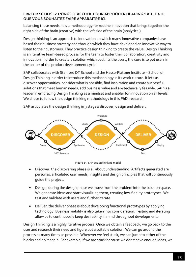
ERREUR ! UTILISEZ L'ONGLET ACCUEIL POUR APPLIQUER HEADING 1 AU TEXTE QUE VOUS SOUHAITEZ FAIRE APPARAITRE ICI.
75
balancing these needs. It is a methodology for routine innovation that brings together the
right side of the brain (creative) with the left side of the brain (analytical).
Design thinking is an approach to innovation on which many innovative companies have
based their business strategy and through which they have developed an innovative way to
listen to their customers. They practice design thinking to create the value. Design Thinking
is an iterative team‐based process for the team to foster their collaboration, creativity and
innovation in order to create a solution which best fits the users, the core is to put users in
the center of the product development cycle.
SAP collaborates with Stanford DT School and the Hasso‐Plattner Institute – School of
Design Thinking in order to introduce this methodology in its work culture. It lets us
discover opportunities, consider what is possible, find inspiration and create successful
solutions that meet human needs, add business value and are technically feasible. SAP is a
leader in embracing Design Thinking as a mindset and enabler for innovation on all levels.
We chose to follow the design thinking methodology in this PhD. research.
SAP articulates the design thinking in 3 stages: discover, design and deliver.
Figure 23. SAP design thinking model
Discover: the discovering phase is all about understanding. Artifacts generated are
personas, articulated user needs, insights and design principles that will continuously
guide the project.
Design: during the design phase we move from the problem into the solution space.
We generate ideas and start visualizing them, creating low‐fidelity prototypes. We
test and validate with users and further iterate.
Deliver: the deliver phase is about developing functional prototypes by applying
technology. Business viability is also taken into consideration. Testing and iterating
allow us to continuously keep desirability in mind throughout development.
Design Thinking is a highly iterative process. Once we obtain a feedback, we go back to the
user and research their need and figure out a suitable solution. We can go around the
process as many times as possible. Wherever we feel stuck, we can jump to either of the
blocks and do it again. For example, if we are stuck because we don’t have enough ideas, we

Erreur ! Utilisez l'onglet Accueil pour appliquer Heading 2 au texte que vous souhaitez faire apparaître ici.
76
can jump to the ideation part and think about more ideas; or if we are stuck because we
misunderstand the needs of users, we can jump to the discover part, etc.
Both user‐centered design and design thinking aim at insuring the real needs from users are
at the center of the tool created. Design thinking is a specific implementation within the
user‐centered design framework. We conducted this research work throughout the design
thinking method.
4.2 UNDERSTAND THE CONTEXT OF USE
As this research is initiated for the design of analytic applications, it is necessary to
understand what they are, in which conditions the application is used, and who are the
intended users. This information helps us determine the salient characteristics of the
application.
4.2.1 BI & ANALYTICS DEFINITION
Figure 24. Business Intelligence Schema
Business intelligence (BI) is a technology‐driven process for transforming raw data from
different data sources, analyzing data and presenting actionable information to help
corporate executives, business managers and other end users make more informed
business decisions (Rouse, 2017).

ERREUR ! UTILISEZ L'ONGLET ACCUEIL POUR APPLIQUER HEADING 1 AU TEXTE QUE VOUS SOUHAITEZ FAIRE APPARAITRE ICI.
77
In simple words, the BI process is about taking data and transforming it into information,
which gives the end‐user insight to make a decision and take an action that brings value (A.
Hansen, 2014).
Because of the wide range of BI, it encompasses a variety of tools, such as tools for ad hoc
analysis and querying, enterprise reporting, designing charts, building dashboards and
visualizations to make the analytical results available to corporate decision makers as well
as operational workers.
The benefits of BI involve the optimization of business process, easy interpretation of large
volume data, improving decision making, identifying new opportunities and implementing
an effective strategy. Thus, it enables the companies to gain a competitive market
advantage and long‐term stability.
Originally, BI tools were primarily addressed to data analysts and IT users who ran analysis
and produced reports for business users. Nowadays, large enterprises extend their strategy
to the business users who want to consume information and do ad‐hoc analysis, monitor
KPIs (key point indicators), and identify root causes for a business questions to facilitate
decision‐making. The more advanced platforms are gradually becoming self‐service BI
platforms, which enable business users to access and work with various information without
IT involvement (except for setting up data warehouse, deploy query, etc.).
4.2.2 THE ANALYTIC USER MODEL
The SAP user researchers have created an analytics user model of 5 user archetypes based
on field researches and expert interviews with customers. The analytics user model is
intended to provide a high‐level product guidance, serve as a foundation for personas9, and
allow us to create a shared language. The 5 types of analytics user models are decision
makers, analysts, data scientists, designers and administrators.
Different from personas, analytics user types are defined based the users’ intention.
Intentions represent a person’s business goal and why they are doing something. There are
7 core intentions of BI users: monitor, explore, explain, enrich, design, govern and plan.
Monitor: to keep track and be notified of the things that matter to the business
Explore: to find answers to questions and discover new areas of interest
Explain: to tell a story with data
Enrich: to add new information and knowledge to existing data
Design: to professionally author custom BI content
9 A persona is a user archetype, a fictional individual derived from real users, needs, preferences, biographical information, and a photo or illustration. It helps a development team to empathize with user (Alan Cooper).

Erreur ! Utilisez l'onglet Accueil pour appliquer Heading 2 au texte que vous souhaitez faire apparaître ici.
78
Govern: to ensure security, consistency and standards across BI systems and
content
Plan: to align users across the organization to common goals and keep track of stuff.
What each user type does is based on his/her intentions (See Table 3).

ERREUR ! UTILISEZ L'ONGLET ACCUEIL POUR APPLIQUER HEADING 1 AU TEXTE QUE VOUS SOUHAITEZ FAIRE APPARAITRE ICI.
79
Table 3. Intentions of analytics User Types
USER TYPE MONITOR EXPLORE EXPLAIN ENRICH DESIGN GOVERN PLAN
DECISION
MAKERS
Stay current on the performance of metrics I care about
Answer a known question I have
Explain to others what I have discovered
Add value to the system through my usage patterns
Securely share information with my colleagues
Set goals for the line of business
ANALYSTS
Ask complex questions and uncover new patterns
Build a case to convince my boss and team
Manipulate data to make it useful to my line of business
Validate information being created or brought into the system
Validate information being created or brought into the system
DATA SCIENTIST
Ask complex questions and uncover new patterns in big data
Present and explain the results to team members
Apply predictive models to get very quick responses to questions
Create predictive models and apply them
to data sets
Decide the iteration frequency to retain the predictive power and validity of the built models
Choose which data to collect and identify areas to invest in
DESIGNERS
Define standard entities and structures for the Enterprise
Create standardized data models, metadata, and BI content
Make content consistent and understandable for the Enterprise
Provide assets to support goal setting and execution of the plan
ADMINISTRATORS
Create user roles
Manage system content and assign user security

Erreur ! Utilisez l'onglet Accueil pour appliquer Heading 2 au texte que vous souhaitez faire apparaître ici.
80
Concerning the 5 analytics user models, we have:
Decision makers: to leverage knowledge for everyday decision‐making on how they
operate and manage their own activities and that of organization. They will only use
BI tools to help them do their job. They rarely do data analysis and just want to see
the result, and occasionally drill down the data if necessary. They cannot afford time
to learn new tools.
For example, a decision maker could be a sales manager, marketing manager, and
truck driver.
Analysts: to activate data by turning information into actionable knowledge to help
organizations better understand their business. Their primary concern is supporting
the current goals of their team and they need to quickly adapt as these goals
change. This kind of users are capable of performing complex analytical tasks, and
they spend the majority of their time in working with numbers.
For example, an analyst could be a business analyst, marketing analyst, director of
operations and chief financial officer.
Data scientist: To address business questions and uncover hidden insights to
business challenges, data scientists look at the data from many different angles to
understand them and eventually translate them into actionable items for decision
makers, thanks to their solid foundation in math, statistics, probability, modeling,
analytics and computer science.
For example, people with a data scientist user type are equipped to analyze big data
using advanced analytics tools and expected to develop new algorithms for specific
problems. The job title is usually “data scientist”.
Designers: to build data assets in a consumable way to enable enterprise‐wide
information initiatives. They create content according to specification for broad
usage across the enterprise, including designing data entities, applications,
templates and reports. They employ professional tools, usually within an integrated
development environment (IDE), so that they can code, test, fix, save and deploy
their solutions.
For example, developer ETL (extract, transform, load) designer, a BI consultant, a
data warehouse architect, a BI architect and an IT analyst.
Administrators: to optimize the BI platform and ensure this system is kept up and run
smoothly. They are responsible and accountable for the setup and operations of the
system, especially user access and security. They are concerned with managing file
versions, and also in charge of the system deployment.
For example, a BI administrator, a platform administrator, a BI architect and an IT analyst.
Note that the analytics user model does not equal to a persona. Different personas can exist
within a particular user type or can span across multiple user type. The user types are
intended to be more like hats someone would wear. Therefore, a persona can be made up
of more than one user type. For example, a marketing analyst often monitors, at that point,
they are wearing a decision maker hat; while when they create a new model to analyze
complex data, and they are wearing an analyst hat.

ERREUR ! UTILISEZ L'ONGLET ACCUEIL POUR APPLIQUER HEADING 1 AU TEXTE QUE VOUS SOUHAITEZ FAIRE APPARAITRE ICI.
81
Figure 25. Relation between User Types and Personas: A Persona do not necessary map 1:1 with a User Type; Persona may shift User Types. (Image from SAP)
In this research, we will consider self‐service BI for the decision maker user type and the
analyst user type. More precisely, we will focus on visual analytics, which is the science of
analytical reasoning facilitated by interactive visual interfaces (Thomas & Cook, 2005).
Business analysts or data analysts regularly iterate the visual analysis steps for investigating
questions and generating hypothesis. To have a better understanding of how people usually
do an analysis task and what are their common problems, we conducted an analysis of the
users of the company.
4.3 USER STUDIES
In the design process, the study of user is a key step to understand user needs, expectations
and paint points in order to generate new ideas. Therefore, 7 research studies were
conducted in the company on its customers and employees working as users of analytic
application. The studies involved several fields of studies (ethnographic, observation,
interview, focus group), and usability studies (questionnaire, usability test). The objective
was to understand Business users’ working context, their needs, expectations and their pain
points when using analytic applications.
We summarized the common analytical task scenario (data preparation, data manipulation,
data analysis based on visualization, report creation, sharing) and discussed the findings
from these user research studies. This study helped us bring out the research problem.

Erreur ! Utilisez l'onglet Accueil pour appliquer Heading 2 au texte que vous souhaitez faire apparaître ici.
82
4.3.1 METHODOLOGY
7 studies were first conducted from 2011 to 2016 in the company, including the field studies
and formative usability studies with the customers and internal employees.
The aim of the strategic phase of the project development, which concerned the field
studies, was to find opportunities, generate ideas for solutions and innovations and identify
problems. For example, “IDDC” research (see Table 2.) in 2011 used ethnographic and
observation studies to identify the barriers of BI software use across a wide spectrum of
business users and generate user clusters in terms of their usage of quantitative
information. The research on “decision maker persona interview” users used the method of
the interview, the observation and focus group to identify the persona(s) of decision maker.
These two studies help the researchers to understand users’ working environment, their
usage of analytical tasks, their attitudes and their pain points.
Formative usability tests are proper to be used during the development of the product. The
participants are given a script to interact with BI prototype so that the researchers can get
specific feedback for optimizing designs in order to reduce risk and improve usability
(Rohrer, 2014).
We categorized them into several aspects, such as the objective of the task, the target user,
the procedure, the analytical effort. Then we identified some common points about the
analytical task flow and users’ expectations about the applications (see Table 2.).
4.3.2 ANALYTICAL TASK FLOW
Among their analytical tasks, except for predictive analytics, the participants all have
conducted data exploration based on the visualization of charts. The more they do actions
of visualizations, the more they have the intention to create a report and share with others.
This was discovered implicitly from the studies summarized in Figure 26.

ERREUR ! UTILISEZ L'ONGLET ACCUEIL POUR APPLIQUER HEADING 1 AU TEXTE QUE VOUS SOUHAITEZ FAIRE APPARAITRE ICI.
83
Table 4. An overview of the 7 research studies
Research Resources IDDC Research
HILO Desktop Formative Usability Test
HILO Desktop Data analyst research via CEI
Lumira Desktop Usability Test
Smart BI: Lumira for Decision Maker Formative Usability Test
Decision Maker Persona Interviews
Predictive Analytics 3.1 Usability Validation
Date 2011 October, 2011 February 2012 June, 2014 November, 2014 2014 2016
Goals
To determine opportunities and barriers to reach “casual” users with solutions that enable a more engaging use of quantitative information in BI area.
1. To validate user scenario of shaping their data; 2. To gather usability and functionality feedback on Hilo design.
1. To learn about business users' working process, task flows, key challenges and major pain points; 2. To gather usability and functionality feedback on Hilo design.
To gather usability and functionality feedback on Lumira design.
1. To see if the displayed information is well understood. 2. To gather feedback about the root cause analysis workflow based on the search pattern.
To create Decision Maker personas and accompanying scenarios.
To get insight into usability issues by user feedback to influence the product development.
Targeted User Casual business users
Data artisan (business analyst)
Data artisan (business analyst)
Decision Maker (DM) and Analyst (User type)
Decision Maker (DM — User type)
Decision Maker (DM — User type)
Data Scientist
Participants
54 users (professional analysts, active users and casual users) across a wide spectrum of users in 8 companies in different industries.
Pre-event: 3 internal participants from Finance and Cross PM organization. Actual event: 10 BI experts, at least 5 years of experience in BI.
Interview: 9 participants in Hungary, Germany and the US Usability Test: 11 participants in the US Experience: at least 1 year in the company.
5 participants: data scientist, BI manager, Senior Manager, Corporate Planning Retail Learning Manager, Supply Chain Analytic Manager.
14 participants: BI consultants, experts and BI managers.
SAP internal employees 4 managers, 6 individual contributors
6 participants with user profile of predictive analytics (PA) from different industries and companies
Software to test
Hilo Desktop (prototype)
Hilo Desktop Lumira Desktop Lumira for Decision Maker (prototype)
Predictive Analytics 3.1
Methodologies
1st phase: more than 50 users 2nd phase: 54 interviews with individual users
• Questionnaire for user profile. • Usability Test
• 9 interviews (guide) and observations • 11 usability validations activities
• Background questions• Usability test • Free exploration of Lumira (“free play”).
• Interview • Test scenario
• Interview • Researchers rotated roles
• Background information • PA concept introduction • Usability test • Post survey
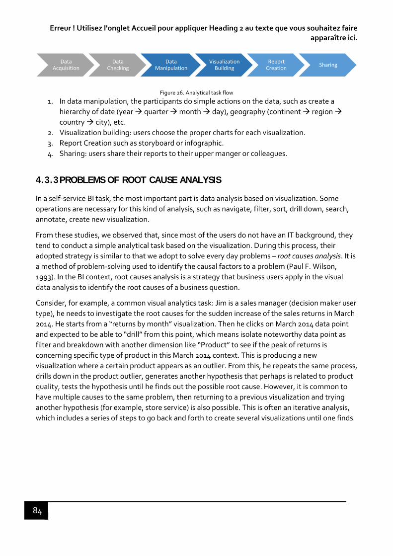
Erreur ! Utilisez l'onglet Accueil pour appliquer Heading 2 au texte que vous souhaitez faire apparaître ici.
84
Figure 26. Analytical task flow
1. In data manipulation, the participants do simple actions on the data, such as create a
hierarchy of date (year quarter month day), geography (continent region country city), etc.
2. Visualization building: users choose the proper charts for each visualization.
3. Report Creation such as storyboard or infographic.
4. Sharing: users share their reports to their upper manger or colleagues.
4.3.3 PROBLEMS OF ROOT CAUSE ANALYSIS
In a self‐service BI task, the most important part is data analysis based on visualization. Some
operations are necessary for this kind of analysis, such as navigate, filter, sort, drill down, search,
annotate, create new visualization.
From these studies, we observed that, since most of the users do not have an IT background, they
tend to conduct a simple analytical task based on the visualization. During this process, their
adopted strategy is similar to that we adopt to solve every day problems – root causes analysis. It is
a method of problem‐solving used to identify the causal factors to a problem (Paul F. Wilson,
1993). In the BI context, root causes analysis is a strategy that business users apply in the visual
data analysis to identify the root causes of a business question.
Consider, for example, a common visual analytics task: Jim is a sales manager (decision maker user
type), he needs to investigate the root causes for the sudden increase of the sales returns in March
2014. He starts from a “returns by month” visualization. Then he clicks on March 2014 data point
and expected to be able to “drill” from this point, which means isolate noteworthy data point as
filter and breakdown with another dimension like “Product” to see if the peak of returns is
concerning specific type of product in this March 2014 context. This is producing a new
visualization where a certain product appears as an outlier. From this, he repeats the same process,
drills down in the product outlier, generates another hypothesis that perhaps is related to product
quality, tests the hypothesis until he finds out the possible root cause. However, it is common to
have multiple causes to the same problem, then returning to a previous visualization and trying
another hypothesis (for example, store service) is also possible. This is often an iterative analysis,
which includes a series of steps to go back and forth to create several visualizations until one finds
Data Acquisition
Data Checking
Data Manipulation
Visualization Building
Report Creation
Sharing

ERREUR ! UTILISEZ L'ONGLET ACCUEIL POUR APPLIQUER HEADING 1 AU TEXTE QUE VOUS SOUHAITEZ FAIRE APPARAITRE ICI.
85
the root causes of this change in sales returns (4.).
Figure 27. Root cause analysis in the visual data analysis, the dot line represents the return to a data visualization to start another analysis path.
According to the participants in several studies, they expressed the need to have a dedicated area
where all previous steps could be stacked, and which enables them to “undrill” to go back to the
previous visualizations for exploring another path or for similar issues
4.3.4 ROOT CAUSE ANALYSIS: DESCRIPTION OF THE PRBOLEM REGARDING USER EXPERIENCE
As shown in the previous section, the users use a root cause analysis strategy to conduct a visual
analysis task. They get used to keep track of what they do for every step for testing a given
hypothesis or generating some results during a visual analytic process. There are three conditions
for which analytic provenance can be applied in the root cause analysis.
The analytic process is complex with large size of datasets and the hypothesis to test. There
could be more than one root cause, which means more than one analysis path (Figure 27.
Blue and orange lines). It can be difficult to remember the steps and rationale. Therefore, it
is necessary for business users to go back to a certain history point to review, form another
hypothesis and restart another analysis path.
When a project requires multiple analysis sessions, which last for long periods of time the
task can be interrupted or suspended. Reviewing the analytic provenance can help the
business user faster and better resume the task.
Provenance function can be also useful between collaboration and communication among
colleagues. For example, an end user wants to explore an analytics reports made by a
specialist. Then to understand what others have done is crucial. Therefore, the provenance
function could help an end user to explain and explore other’s work.
Our user study findings reflect the problems that have been discussed in the usage of the analytic
applications and in the literature review. And we focused on the user experience design for
motivating users to recommit an interrupted or suspended task. Users are getting used to going
back and forth among previous analysis steps to reinstate their reasoning process, as human

Erreur ! Utilisez l'onglet Accueil pour appliquer Heading 2 au texte que vous souhaitez faire apparaître ici.
86
memory is limited and decays (Cowan, 2009), most of the time we cannot remember where we
have left off, and how can I recommit the task And tracking the history becomes a barrier for
exploration and commitment. Therefore, it is beneficial to design tools that help people recall their
interaction history in a suspended and interrupted task, and to get a positive user experience.
4.4 EXPERIMENTAL METHOD
“When psychology seeks to verify the validity of an observation through an experiment, it
becomes experimental psychology” 10(Fraisse, 2005). Experiment is a significant phase in scientific
research to test if a certain hypothesis is supported or refutable in a controlled condition. It is
mainly based on hypothetico‐deductive reasoning: we start from a theoretical hypothesis, infer
consequences (predictions), and try to verify it (experimentally). Experimental methodology is for
the researcher to vary an element or a variable of a situation to provoke a behavior (or to make it
disappear) and to measure its evolution. It is usually to compare different conditions where the
same task is conducted (experimental conditions vs. control condition). The participants are
distributed randomly according to the different conditions, or the same participant does the same
task in both conditions. Our goal is to study scientifically the influence of the determinant factors
on users’ behavior and perception.
Our experimentation is conducted in the company, taking place in the real working environment
rather than a laboratory. The advantage of a field experiment is that the results are observed in a
natural setting, which is close to the real situation. However, compared to a laboratory experiment
which is more controllable, a field experiment has more uncertain factors. So, the experimenters
should take this uncertainty into account for analyzing the results.
4.4.1 MINIMALIST AS A FRAMEWORK FOR EXPERIMENT
The experimental method that is suitable for this work is minimalist experiment, which is
employed in the CRED laboratory to study the perceptual phenomena mediated by tactile
interfaces for the blind. It is about to reduce the sensory inputs to a minimum thus forcing a spatial
and temporal deployment of perceptual activities (Lenay & Stewart, 2012). It is for reducing the
complexity of a situation by neutralizing certain variables. In the experiment, we use an artefact
consisting of the minimal features of human‐environment or human‐instrument coupling for the
purpose of “simplifying to better understand” (Ammar, 2007).
There are two main advantages of minimalist experiment that we decide to use this method as a
framework:
It is an experimental reduction. If the artifact in the experiment can make possible the most basic
forms, then it will be easier to discover human and material characteristics (the actions, the
exploratory strategies, the stimulus, the coupling) determining in the feasibility of the task. The
10 “Lorsque la psychologie cherche à vérifier la validité d'une observation à travers une expérience, elle devient psychologie expérimentale”

ERREUR ! UTILISEZ L'ONGLET ACCUEIL POUR APPLIQUER HEADING 1 AU TEXTE QUE VOUS SOUHAITEZ FAIRE APPARAITRE ICI.
87
minimalist method can be a principle for the design of perceptual interface, since the designer can
concentrate on the possible type of action through the interface and the nature of perceptual
experience that the system evokes from users.
The second advantage that we adopt the minimalism is for the reason of cost, transposability and
ease of use from a technical point of view. In other words, we believe that the design for a
particular perceptual experience in a minimalist situation (if the conditions are satisfied) could be
applicable to another situation. Once the feasibility of the task is acquired, it remains to decide on
the enrichment of the interface according to the specific needs.
4.5 CHAPTER SUMMARY
The research problem in terms of memory supplementation is formulated in this chapter based on
the sensorimotor coupling positioned in the enactive approach. To verify if we are capable to
answer this question and come out the design solution for testing, we follow the user‐centered
design process. We define the notion of BI and analytics, identify the intended users and
understand its related process. We studied user model and previous user research studies in
Business Intelligence (BI) and analytics domain. we discover that the theoretical problem coincides
with the use case in the real working environment. This brings values to apply our research results
to the real world. In order to better understand how people perceive the user interface, we
construct an exploratory study to emerge the perception of interactive system from a professional
perspective, that will be introduced in the next chapter. The insight that we discover from the user
study and the exploratory study help us construct the design proposal for “in hand” mode history
path which can be evaluated in the experiment.
To facilitate the evaluation of the design solutions, we decide to use the minimalist experiment as
our experimental method, and we also introduce its advantages regarding to the feasibility of the
task and the integration to other situations.
88
CHAPTER 5 EXPERIMENT
“No amount of experimentation can ever prove me right; a single experiment
can prove me wrong.”
— Albert Einstein, German physicist
“Users are not always logical, at least not on the surface. To be a great
designer you need to look a little deeper into how people think and act.”
— Paul Boag, UX designer and author
C. Lenay et al.’s sensory‐motor coupling and user study findings allow us to explore the
emergence of emotional experience in the interactive systems. We consider that emotional
experience emerges from the dynamics of user interaction and the perception of the system
through this interaction. In the first place, we focus on the design of interactive applications,
which provides users emotional experience. What are the characteristics for qualifying the
interaction which lets emotions emerge? In the first part of this chapter, we first present a
preliminary experiment to analyze the perception of interactive applications by experienced
designers. In this experience, we are also interested in how people perceive the interface
and interaction of the applications. In the second part of this chapter, we present the
experimental environment based on a Tangram game that we have developed for
evaluating the extent to which of a history path support can help the user for efficient
recovering of an interrupted task. A tangram is a puzzle to construct a geometric shape
using a set unitary geometric given shapes without overlapping each other. We used this
game to simulate a problem‐solving task and generalize our research problem.
5.1 EXPLORATORY STUDY
User experience designers are the final persons who must evaluate and validate the design
of an application, consequently it is necessary to have a set of interaction vocabularies,
which are common to their knowledge. Besides, they have already a good knowledge of
user interface, user interaction principles, such as intuitive, consistent, aesthetics, etc. They
can provide a set of standard semantic words expressing their experience of interaction
such as perceived interaction characters. Therefore, we conducted a test to evaluate the
user interface and interaction semantically referring to the sensory evaluation proposed by
Lefebvre & Bassereau (2003). The objective of this test is to exploit the information to help
evaluate the “in hand” mode interaction from a professional perspective.
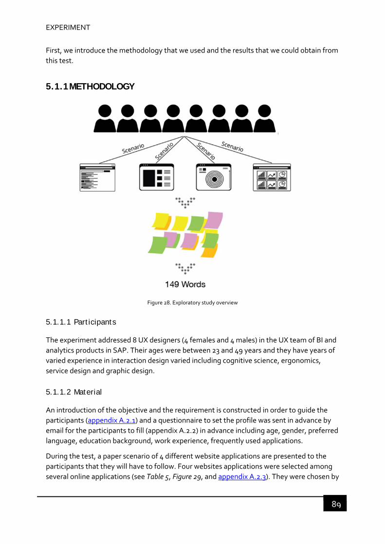
EXPERIMENT
89
First, we introduce the methodology that we used and the results that we could obtain from
this test.
5.1.1 METHODOLOGY
Figure 28. Exploratory study overview
5.1.1.1 Participants
The experiment addressed 8 UX designers (4 females and 4 males) in the UX team of BI and
analytics products in SAP. Their ages were between 23 and 49 years and they have years of
varied experience in interaction design varied including cognitive science, ergonomics,
service design and graphic design.
5.1.1.2 Material
An introduction of the objective and the requirement is constructed in order to guide the
participants (appendix A.2.1) and a questionnaire to set the profile was sent in advance by
email for the participants to fill (appendix A.2.2) in advance including age, gender, preferred
language, education background, work experience, frequently used applications.
During the test, a paper scenario of 4 different website applications are presented to the
participants that they will have to follow. Four websites applications were selected among
several online applications (see Table 5, Figure 29, and appendix A.2.3). They were chosen by
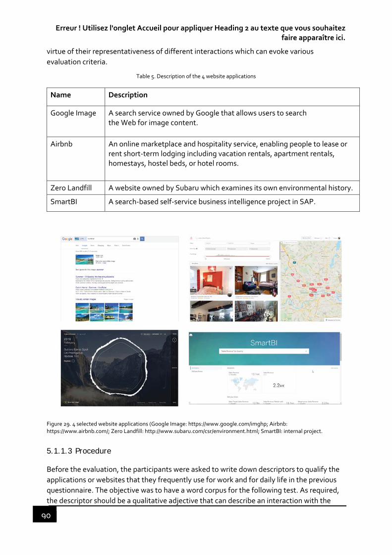
Erreur ! Utilisez l'onglet Accueil pour appliquer Heading 2 au texte que vous souhaitez faire apparaître ici.
90
virtue of their representativeness of different interactions which can evoke various
evaluation criteria.
Table 5. Description of the 4 website applications
Name Description
Google Image A search service owned by Google that allows users to search the Web for image content.
Airbnb An online marketplace and hospitality service, enabling people to lease or rent short‐term lodging including vacation rentals, apartment rentals, homestays, hostel beds, or hotel rooms.
Zero Landfill A website owned by Subaru which examines its own environmental history.
SmartBI A search‐based self‐service business intelligence project in SAP.
Figure 29. 4 selected website applications (Google Image: https://www.google.com/imghp; Airbnb: https://www.airbnb.com/; Zero Landfill: http://www.subaru.com/csr/environment.html; SmartBI: internal project.
5.1.1.3 Procedure
Before the evaluation, the participants were asked to write down descriptors to qualify the
applications or websites that they frequently use for work and for daily life in the previous
questionnaire. The objective was to have a word corpus for the following test. As required,
the descriptor should be a qualitative adjective that can describe an interaction with the

EXPERIMENT
91
application with respect of aesthetics, usability and hedonic quality. Before the test, the
moderator gave a few examples of descriptors, and let the testers to think on their own.
Then, the participants were asked to follow 4 scenarios to interact with the 4 applications
on their own laptop and to write the descriptors on the post‐it notes that expressed their
feeling about the extent to which the 4 interactive tools meet the interactive task
requirements. Then, after one round, the post‐it were stick on the wall.
5.1.2 RESULTS
We have collected 149 descriptors, which were freely proposed by the participants. We had
then several steps for analyzing these descriptors.
Figure 30. Test overview ‐ collected descriptors
1. Preliminary Categorization based on our own interpretation. Because the test exceeded 2 hours, we didn’t have enough time to discuss immediately with the participants why they chose the descriptors and have an agreement with them. We made a preliminary categorization (See Figure 31), which resulted in 21 categories of descriptors.

Erreur ! Utilisez l'onglet Accueil pour appliquer Heading 2 au texte que vous souhaitez faire apparaître ici.
92
Figure 31. Preliminary categorization
2. Secondary Categorization based on one to one interview asking for explanation. We conducted a one to one interview sometime after the experiment to ask them to explain the reason of their choices of descriptors, each one for about 15 minutes. It resulted in 24 categories of descriptors. They are aesthetic, understandable, intuitive, guided, fun, easy, consistent, dynamic, useful, adaptable, fast, innovative, usable, engaging, standard, organized, effective, visible, intelligent, rich, accurate, legible, accessible and flexible.
3. Description of each descriptors in terms of the usage of 4 applications. Based on the explanation of the participants, we gave each category a description. This description was constructed on how they perceived the interaction with the four websites during the task. It is possible for different designers who gave the same descriptors but meant different things and who gave different descriptors but meant the same thing. For example, several people used “simple”, one referred it to “simple to use”, another referred it to “easy to understand”. Then a correct description of each category is necessary.

EXPERIMENT
93
Figure 32. Final categorization after interviewing the participants
5.1.3 ANALYSIS
Based on the 24 categories, we then ranked the categories according to the total numbers
of descriptor selection in each category for the four websites by the maximum numbers of
descriptor selection. We selected the first 10 descriptors, which were the most often chosen
by the designers to qualify the interaction qualities of the applications: understandable,
aesthetic, Intuitive, fun, consistent, guided, adaptable, dynamic, easy and innovative (See
Table 6).
Table 6. Ranking the categories
Descriptors Number of selections Max

Erreur ! Utilisez l'onglet Accueil pour appliquer Heading 2 au texte que vous souhaitez faire apparaître ici.
94
(Expert 1 to 8) Total number of selections
Mean (number of selections/Max)
App1 App2 App3 App44 apps * 8 experts
Understandable 3 7 2 4 16 32 0,500
Aesthetic 0 4 5 3 12 32 0,375
Intuitive 3 3 3 3 12 32 0,375
Fun 3 1 3 2 9 32 0,281
Consistent 3 1 1 3 8 32 0,250
Guided 1 1 3 3 8 32 0,250
Adaptable 0 2 1 3 6 32 0,188
Dynamic 0 0 6 0 6 32 0,188
Easy 1 3 1 1 6 32 0,188
Innovative 0 0 5 1 6 32 0,188
Fast 3 2 0 0 5 32 0,156
Usable 2 1 0 1 4 32 0,125
Useful 1 1 1 1 4 32 0,125
Engaging 1 0 3 0 4 32 0,125
Effective 2 1 0 0 3 32 0,094
Visible 0 1 0 2 3 32 0,094
Organized 0 1 0 1 2 32 0,063
Intelligent 1 0 0 1 2 32 0,063
Rich 0 1 0 1 2 32 0,063
Standard 0 0 1 1 2 32 0,063
Accurate 1 0 0 0 1 32 0,031
Legible 0 0 1 0 1 32 0,031
Accessible 0 0 0 1 1 32 0,031
Flexible 1 0 0 0 1 32 0,031
124 768 0,161
We then recheck of the 149 descriptors with the comments of the experts, from which we
picked the categories in which the 8 experts used the emotional qualificatives to express
their feeling towards the 4 applications. In Table 7, we listed the categories of these
descriptors, the qualifiers the experts used in the test, and the explanations which explain
the meaning of the words. (Wanru, 2015) proposed an experience EPI model and argued
that an experience is composed of expectation, progression and influence. We found that
the cause of these emotional qualifiers was related to these three elements, so we adapted
Global Mean = Total of times / Total of observations = 0,161

EXPERIMENT
95
this model to the HCI context and concluded into three types of cause: expectation,
interaction and impact.
Table 7. Emotional descriptors and their connotation
Category Word Explanation Connotation
Understandable confusing, attempt to interpret
Mapping between action and feedback Interaction – cognitive load
Aesthetic attractive, elegant, fade
Graphic/Visual Expectation – first impression
Intuitive insecure, confusing Uncertainty, not sure about what will happen once the action is done.
Interaction – habit
Fun amusing, fun, playful Appeal to the activity Impact
Consistent11 Consistence between the action and the result or response (feedback)
Interaction
Guided disturbing Lose the context Interaction – positioning
Adaptable empty Whether the interface is adaptive to the screen size.
Interaction ‐ layout
Dynamic living The fluidity, animation and movement Interaction – feedback
Easy annoying, laborious The difficulty to finish an action Interaction – feedback
Innovative original, basic, modern
New way of interaction which is unknown or different from others, very original, otherwise, rudimentary interaction.
Expectation – Habit
Fast Immediate feedback Emphasis on the speed Interaction – feedback
Engaging curious, intriguing Want to know what will happen next Impact
Usable frustrating Cannot satisfy the user’s needs Expectation – needs
1. Expectation: expectation refers to the act of anticipating before or during the
interaction with an object according to one’s past experience and needs. No matter a
good or bad result depends on what we expected at the very beginning. For
example, Aesthetic using attractive, elegant and bland expressed their first
impression of the applications. Usable qualified by frustrating suggested that the
function of certain application failed to meet the expert’s needs.
2. Interaction: during this task, anything related to the interaction between the user
and the system. What kind of expectation the user has can lead to different
interactions? For example, the experts mentioned understandable using confusing
and effort to interpret to express the mapping between action taken and feedback.
In the test, the experts took an action, while the feedback did not reach their
expectation, so they felt confused. Another example, fast, the experts described that
they obtained an immediate feedback after undertaking an action, which met their
expectation, and so their experience was improved.
11 Note that “consistent” were not expressed by the experts using emotional words, however it was ranked
relatively high, we will take it into account.

Erreur ! Utilisez l'onglet Accueil pour appliquer Heading 2 au texte que vous souhaitez faire apparaître ici.
96
3. Impact: after the interaction with the system, what kind of feeling the user can have
in relate to this task. The strength of the interaction determines the profoundness of
the impact. Fun means that the experts found the applications was rewarding and
enjoyable. Engaging, the experts want to know what will happen.
5.1.4 CONCLUSION OF THE EXPLORATORY STUDY
In this section, we have presented the first test that we have experienced with design
experts to define a framework for defining a set of qualifiers for interactive applications. We
defined a scenario that the experts should follow to express their feelings about the extent
to which the 4 interactive tools meet interactive task requirements. From this, we collected
149 qualifiers, which were freely proposed by the expert designers, and classified them into
24 categories such as aesthetics, understandable, intuitive, fun, etc. Then, we analyzed
these categories to exhibit the characteristics that were most frequently used and shared by
the expert designers to evaluate the interaction qualities of the applications. In addition, we
selected the emotional qualifiers used by the experts and then divided them into different
causes – expectation, interaction and impact. This gives us insights to define a
questionnaire scope for the experiment and classes of criteria that can be used to design an
application from which the users can perceive the emotional effects.
This study helps us construct a vocabulary of evaluation of the design for “in hand” mode
history tool and to conduct the Tangram experiment to measure positive experience, which
we will transform into a model for the design interactive BI applications.
As presented in the introduction of this chapter, we built an experimental environment for
evaluating the extent to which a history path support can help the user for efficient
recovering of an interrupted task. We used this game to simulate a problem‐solving task
and generalize our research problem. In our tangram game, the history path (HP) plays the
role of a provenance function. We explored users’ behaviors and their eye movements along
their use of the history path. The analysis of the data collected during a first experiment, let
us find that the users had different and personal strategies of using the history path,
considered as in a “put down” mode in this case. This gave us an insight to rethink about
designing an "in hand" history path mode, which would allow users to go back to the
interaction history to explore the dynamic of their previous attempts of resolution. We
hypothesize that the "in hand" mode of interaction history, which would allow a natural
coupling between a user’s action and the provenance function, may lead to a positive user
experience. A second Tangram experiment was then conducted to verify this hypothesis
and draw a conclusion about how to apply this framework in SAP BI and analytic
applications.

EXPERIMENT
97
5.2 FIRST TANGRAM EXPERIMENT – EXPLORE THE DESIGN SPACE
5.2.1 METHODOLOGY
5.2.1.1 Participants
18 valid participants were invited in the test, there were no constrains on the participants’
profile. Most of the participants were employees in the company between 25 and 54 years
old. The test is composed of two parts: pre‐test and test with the same group of
participants.
5.2.1.2 Material
We developed a web‐based prototype based on the Tangram game. The experimental
protocol was set in two phases. Firstly, a simple Tangram game was used in a pre‐test, the
aim of which was to collect data and information recorded in the form of a video of the
participants’ interaction activities to resolve the task. Secondly, the same Tangram game,
using the same prototype but with the addition of a provenance function corresponding to
the video representing the history path to help the participants to resolve the task.
We provided a laptop for all the participants with the Tangram game prototype. We also
used a Tobii X2‐30 eye tracker to track users’ eye movement in order to observe their
behavior in relation to their eye movement on the history path area.
A questionnaire about their profile was asked to fill by the participants after the test
(Appendix).
5.2.1.3 Procedure and tasks
The test consisted of a pre‐test and a test. The pre‐test was for collecting the interaction
history that was used in the test. A Tobii eye tracker X2‐30 was installed on the laptop to
detect the participants’ eye movements between the history path window and the tangram
game window. The two sessions recorded the eye movements, screen, video and audio.
Note that in this experiment, we were not interested whether the participants succeeded in
resolving the task, but how they possibly adapted their strategies during the problem‐
solving process.
Pre‐test: the participants were introduced to the test objective and confidential issues.
Before the formal test, they were given around 1 minute to be familiar with the prototype,
and then we calibrated the eye tracker. After all setup, participants were given 10 minutes
to try to resolve the problem (See Figure 33: pre‐test). They were also asked to fill a
questionnaire for their profile. Finally, we asked the participants not to search for the
solution in anyway until the next test.
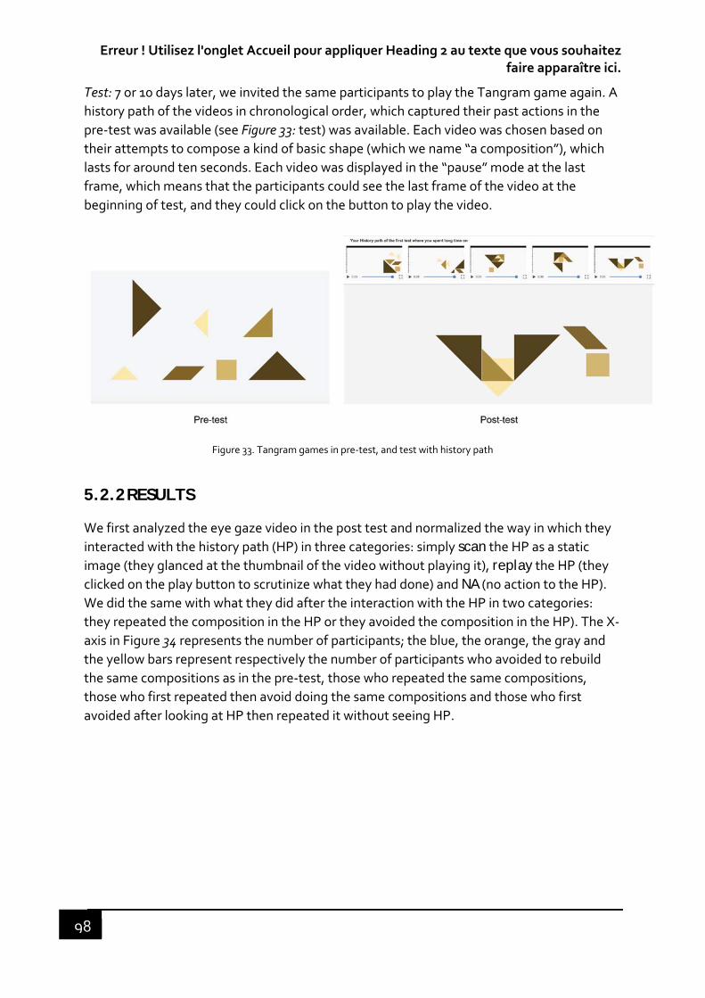
Erreur ! Utilisez l'onglet Accueil pour appliquer Heading 2 au texte que vous souhaitez faire apparaître ici.
98
Test: 7 or 10 days later, we invited the same participants to play the Tangram game again. A
history path of the videos in chronological order, which captured their past actions in the
pre‐test was available (see Figure 33: test) was available. Each video was chosen based on
their attempts to compose a kind of basic shape (which we name “a composition”), which
lasts for around ten seconds. Each video was displayed in the “pause” mode at the last
frame, which means that the participants could see the last frame of the video at the
beginning of test, and they could click on the button to play the video.
Figure 33. Tangram games in pre‐test, and test with history path
5.2.2 RESULTS
We first analyzed the eye gaze video in the post test and normalized the way in which they
interacted with the history path (HP) in three categories: simply scan the HP as a static image (they glanced at the thumbnail of the video without playing it), replay the HP (they clicked on the play button to scrutinize what they had done) and NA (no action to the HP). We did the same with what they did after the interaction with the HP in two categories:
they repeated the composition in the HP or they avoided the composition in the HP). The X‐
axis in Figure 34 represents the number of participants; the blue, the orange, the gray and
the yellow bars represent respectively the number of participants who avoided to rebuild
the same compositions as in the pre‐test, those who repeated the same compositions,
those who first repeated then avoid doing the same compositions and those who first
avoided after looking at HP then repeated it without seeing HP.
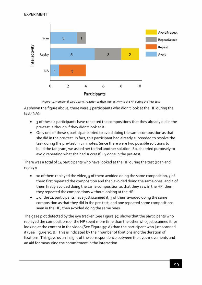
EXPERIMENT
99
Figure 34. Number of participants' reaction to their interactivity to the HP during the Post test
As shown the figure above, there were 4 participants who didn’t look at the HP during the
test (NA):
3 of these 4 participants have repeated the compositions that they already did in the
pre‐test, although if they didn’t look at it.
Only one of these 4 participants tried to avoid doing the same composition as that
she did in the pre‐test. In fact, this participant had already succeeded to resolve the
task during the pre‐test in 2 minutes. Since there were two possible solutions to
build the tangram, we asked her to find another solution. So, she tried purposely to
avoid repeating what she had successfully done in the pre‐test.
There was a total of 14 participants who have looked at the HP during the test (scan and
replay):
10 of them replayed the video, 5 of them avoided doing the same composition, 3 of
them first repeated the composition and then avoided doing the same ones, and 2 of
them firstly avoided doing the same composition as that they saw in the HP, then
they repeated the compositions without looking at the HP.
4 of the 14 participants have just scanned it, 3 of them avoided doing the same
composition as that they did in the pre‐test, and one repeated some compositions
seen in the HP, then avoided doing the same ones.
The gaze plot detected by the eye tracker (See Figure 35) shows that the participants who
replayed the compositions of the HP spent more time than the other who just scanned it for
looking at the content in the video (See Figure 35: A) than the participant who just scanned
it (See Figure 35: B). This is indicated by their number of fixations and the duration of
fixations. This gave us an insight of the correspondence between the eyes movements and
an aid for measuring the commitment in the interaction.
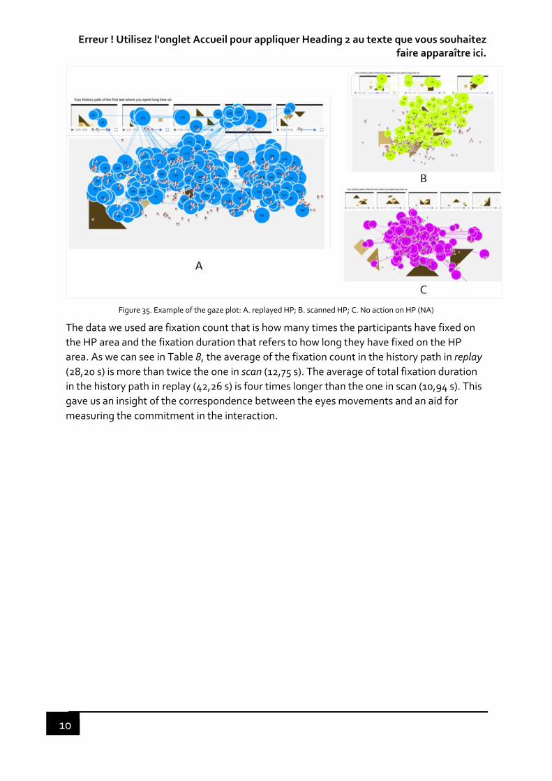
Erreur ! Utilisez l'onglet Accueil pour appliquer Heading 2 au texte que vous souhaitez faire apparaître ici.
10
Figure 35. Example of the gaze plot: A. replayed HP; B. scanned HP; C. No action on HP (NA)
The data we used are fixation count that is how many times the participants have fixed on
the HP area and the fixation duration that refers to how long they have fixed on the HP
area. As we can see in Table 8, the average of the fixation count in the history path in replay
(28,20 s) is more than twice the one in scan (12,75 s). The average of total fixation duration
in the history path in replay (42,26 s) is four times longer than the one in scan (10,94 s). This
gave us an insight of the correspondence between the eyes movements and an aid for
measuring the commitment in the interaction.
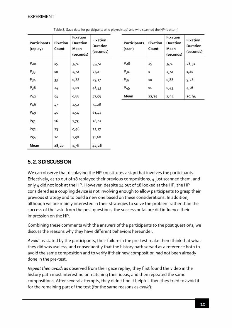
EXPERIMENT
10
Table 8. Gaze data for participants who played (top) and who scanned the HP (bottom)
Participants
(replay)
Fixation
Count
Fixation
Duration
Mean
(seconds)
Fixation
Duration
(seconds)
Participants
(scan)
Fixation
Count
Fixation
Duration
Mean
(seconds)
Fixation
Duration
(seconds)
P20 15 3,71 55,72
P28 29 3,71 28,51
P33 10 2,72 27,2
P31 1 2,72 1,21
P34 33 0,88 29,17
P37 10 0,88 9,28
P36 24 2,01 48,33
P45 11 0,43 4,76
P42 54 0,88 47,59
Mean 12,75 1,94 10,94
P46 47 1,52 71,28
P49 40 1,54 61,42
P51 16 1,75 28,02
P52 23 0,96 22,17
P54 20 1,58 31,68
Mean 28,20 1,76 42,26
5.2.3 DISCUSSION
We can observe that displaying the HP constitutes a sign that involves the participants.
Effectively, as 10 out of 18 replayed their previous compositions, 4 just scanned them, and
only 4 did not look at the HP. However, despite 14 out of 18 looked at the HP, the HP
considered as a coupling device is not involving enough to allow participants to grasp their
previous strategy and to build a new one based on these considerations. In addition,
although we are mainly interested in their strategies to solve the problem rather than the
success of the task, from the post questions, the success or failure did influence their
impression on the HP.
Combining these comments with the answers of the participants to the post questions, we
discuss the reasons why they have different behaviors hereunder.
Avoid: as stated by the participants, their failure in the pre‐test make them think that what
they did was useless, and consequently that the history path served as a reference both to
avoid the same composition and to verify if their new composition had not been already
done in the pre‐test.
Repeat then avoid: as observed from their gaze replay, they first found the video in the
history path most interesting or matching their ideas, and then repeated the same
compositions. After several attempts, they didn’t find it helpful, then they tried to avoid it
for the remaining part of the test (for the same reasons as avoid).

Erreur ! Utilisez l'onglet Accueil pour appliquer Heading 2 au texte que vous souhaitez faire apparaître ici.
10
Note that there was one participant who repeated the same composition found in the HP
without seeing it at first. We considered that this participant belongs to the group of the
participants who did not see the History path.
Avoid then repeat: the same reasons for avoiding that looked at the HP to avoid the same
compositions and to verify if their new composition had not been already done in the pre‐
test. As they still did not find the solution, then they gave up looking at the HP. However,
one interesting thing was that they began to repeat the composition as they had done in
the pre‐test when they stopped looking at the HP. Therefore, we considered that they
belong to the group of the participants who did not see the History path.
For the participants who did not look at the history path, 3 out of 4 participants tended to
repeat what they did in the pre‐test unconsciously, even if they thought the HP was useless
because they didn’t succeed the first time. This is also the reason why they didn’t want to
look at the history path. This repetition is probably because that they were unaware that
they had done it in the pre‐test. As such, with the HP, if they found an interesting
composition, they could reuse it, otherwise, they could avoid repeating the same errors. In
the former case, if they had looked at the history path, they would have rapidly finished
some composition and check if it was right. In the latter case, they could avoid the same
errors and explore the new solution. Therefore, in both cases, they could improve their
efficiency.
However, as said by most of these participants, to look at the history path is a waste of time
and could be also a distraction, which could slow their process, given that they had 10
minutes to finish the task. They also stated that if in the pre‐test, they felt close to the
answer, they would have looked at the history path.
Above all, the participants tried to avoid consciously or repeat unconsciously the same
attempts they had done in the pre‐test. The avoidance behavior indicates that the HP
serves as a support for their reasoning process. In addition, when the participants played the
video, to some extent, they were engaged in the action‐feedback loop. As shown in the eye
movement of Fig. 3 and Table 1, people focused longer in the video when they played than
when they just scanned the static image. We can infer that a direct coupling between action
and function is realized by this kind of demonstration. However, it is not a direct coupling
between the user’s current task and the HP. Besides, the participants had to work a lot to
understand what they had done before and compare it with what they were doing now. In
this case, the HP is still in the “put down” mode, which did not help enough the user to get a
perception of the world they built and to get a positive user experience.
Let’s hypothesize now that the "in hand" mode of the HP will allow a natural coupling with
user action and that the use of a provenance function may lead to a positive user
experience. In the next step, we will focus on the design of the history path in the “in hand”
mode. It is aimed at making users aware of their successive attempts for exploring other
possibilities, and thus improving the task performance consequently.
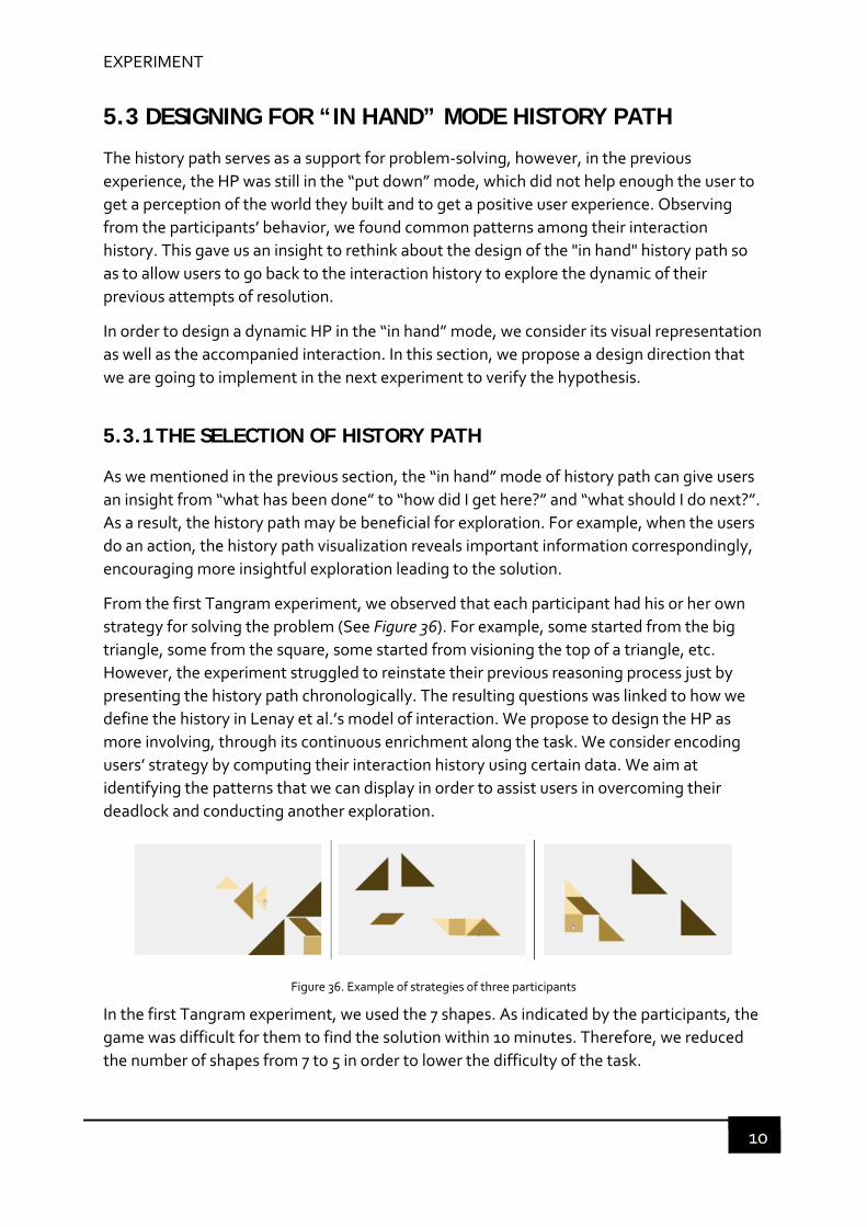
EXPERIMENT
10
5.3 DESIGNING FOR “IN HAND” MODE HISTORY PATH
The history path serves as a support for problem‐solving, however, in the previous
experience, the HP was still in the “put down” mode, which did not help enough the user to
get a perception of the world they built and to get a positive user experience. Observing
from the participants’ behavior, we found common patterns among their interaction
history. This gave us an insight to rethink about the design of the "in hand" history path so
as to allow users to go back to the interaction history to explore the dynamic of their
previous attempts of resolution.
In order to design a dynamic HP in the “in hand” mode, we consider its visual representation
as well as the accompanied interaction. In this section, we propose a design direction that
we are going to implement in the next experiment to verify the hypothesis.
5.3.1 THE SELECTION OF HISTORY PATH
As we mentioned in the previous section, the “in hand” mode of history path can give users
an insight from “what has been done” to “how did I get here?” and “what should I do next?”.
As a result, the history path may be beneficial for exploration. For example, when the users
do an action, the history path visualization reveals important information correspondingly,
encouraging more insightful exploration leading to the solution.
From the first Tangram experiment, we observed that each participant had his or her own
strategy for solving the problem (See Figure 36). For example, some started from the big
triangle, some from the square, some started from visioning the top of a triangle, etc.
However, the experiment struggled to reinstate their previous reasoning process just by
presenting the history path chronologically. The resulting questions was linked to how we
define the history in Lenay et al.’s model of interaction. We propose to design the HP as
more involving, through its continuous enrichment along the task. We consider encoding
users’ strategy by computing their interaction history using certain data. We aim at
identifying the patterns that we can display in order to assist users in overcoming their
deadlock and conducting another exploration.
Figure 36. Example of strategies of three participants
In the first Tangram experiment, we used the 7 shapes. As indicated by the participants, the
game was difficult for them to find the solution within 10 minutes. Therefore, we reduced
the number of shapes from 7 to 5 in order to lower the difficulty of the task.

Erreur ! Utilisez l'onglet Accueil pour appliquer Heading 2 au texte que vous souhaitez faire apparaître ici.
10
Users started from 2 shapes and added other shapes one by one to construct a form which
they think is close to the triangle. The forms of intermediate steps which consisted of at
least two shapes are called a composition. Until they realized that the final form was not the
solution, they decomposed the form, and iterated the previous steps until they found the
solution.
During this process, it was very common that they built the same composition after a while,
and then repeated the same steps unconsciously. Therefore, we computed the position of
the components of a composition to obtain a dynamic trace of how the components were
linked (by edges, vertices, …) and how some were added or removed. We record users’
attempts of composition, and displayed similar previous attempts found in the HP,
dynamically based on the user’s current action. We marked the composition with two
shapes as the starting point of each path and eliminated the same compositions during the
task resolution. Finally, the remaining compositions of all the previous attempts are
presented according to their similarity and the previous steps as the history path.
5.3.2 THE REPRESENATION OF HISTORY PATH
We choose to represent the history path in the form of a tree‐like diagram, where each
branch starts from a composition of at least two shapes. The tree‐like diagram can be
clearly perceived by users to understand the construction path they did before (how did I
got there?). For example, a triangle with a diamond altogether is a composition, which can
be seen as the root of the tree. When the user adds a square, the system displays this
composition as part of this branch. However, when the user removes the square and
replaces it with a triangle or changes its orientation, then another composition is created,
enriching the history path by a common core and several branches (See Figure 37).
The global arrangement of the history path is presented in two dimensions, in a display of
X‐Y coordinate:
The X‐axis: a branch starts with a composition. The distance between the branches
are based on their similarity. for example, a triangle and a diamond. The
composition with the same shapes but different orientation is closer than
composition with different shapes.
The Y‐axis: the number of shapes in a composition (from 2‐5).
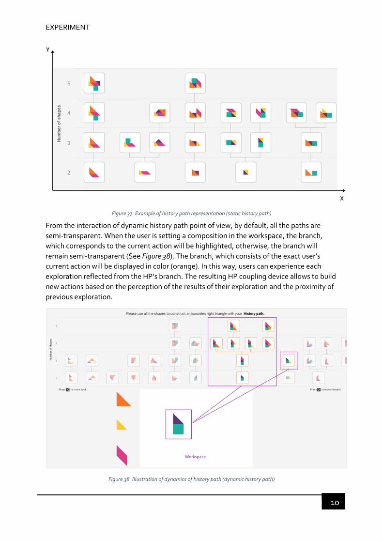
EXPERIMENT
10
Figure 37. Example of history path representation (static history path)
From the interaction of dynamic history path point of view, by default, all the paths are
semi‐transparent. When the user is setting a composition in the workspace, the branch,
which corresponds to the current action will be highlighted, otherwise, the branch will
remain semi‐transparent (See Figure 38). The branch, which consists of the exact user’s
current action will be displayed in color (orange). In this way, users can experience each
exploration reflected from the HP’s branch. The resulting HP coupling device allows to build
new actions based on the perception of the results of their exploration and the proximity of
previous exploration.
Figure 38. Illustration of dynamics of history path (dynamic history path)

Erreur ! Utilisez l'onglet Accueil pour appliquer Heading 2 au texte que vous souhaitez faire apparaître ici.
10
Note that, ideally, we would like to present all the possible path corresponding to the user’s
current composition. For example, in Figure 38, the highlight path is the square plus a purple
triangle. In this game, the purple triangle is the same as the yellow triangle (right to the
highlight in Figure 38.). Then the composition of a square and a yellow triangle should be
highlighted as well. And if the entire composition rotates (e.g. 45°), which is in the history
path, it should be highlighted as well. However, we did not realize this function due to
technique limitation.
Another proposition is to display the complete static history path of the previous
experience, with no interaction during the task resolution (See Figure 39)
Figure 39. Illustration of static history path
Based on these two new design proposals, we conducted our second Tangram experiment,
the objective of which is to verify if dynamic history path or a static history path can help
users for solving tasks and discover new exploration. Based on these works, we introduce
our evaluation protocol and then we present the experiment afterwards.
In the next section, we examine if the design for “in hand” mode history path will allow a
natural coupling with user action and if the use of provenance function leads to a positive
experience. We use “dynamic” to represent the “in hand” mode history path and “static” as
a control group.
In terms of natural coupling with user action, we considered that the use of history path can
help users explore other possibilities of attempts and develop ideas so that they succeed in
the task resolution. There is also a relation between eye tracking measures and the
cognitive process: the more saccades in an area of interest (AOI), the more searching is
intense. The number of fixations and fixation durations can also be a measure for task
performance and attractiveness, according to Bojko's (2013) work.

EXPERIMENT
10
In terms of positive experience, we used subjective measures that we obtained from the
Exploratory study (presented in the previous section) to evaluate the user’s perception of
interaction with the history path. We also conducted qualitative analysis on participants’
retrospective think aloud (RTA) verbalization to evaluate their lived experience during the
task resolution phase.
5.4 SECOND TANGRAM EXPERIMENT – DESIGNING FOR “IN HAND” MODE
Figure 40. Second Tangram experiment
The second experiment is to verify if a dynamic history path compared with a static history
path can help its users with their problem‐solving tasks and discover new reflection
avenues. Based on these works, we introduce our evaluation protocol and then we present
the corresponding experiment.

Erreur ! Utilisez l'onglet Accueil pour appliquer Heading 2 au texte que vous souhaitez faire apparaître ici.
10
5.4.1 METHODOLOGY
5.4.1.1 Participants
We have recruited 34 new participants who volunteered to participate our experiment. As
well as in the first experiment, there were no constrains for the participants’ profile. Most of
the participants were employees in the company, and between 25 and 54 years old. The test
was composed of two parts: pre‐test and test with the same group of participants.
5.4.1.2 Material
We integrated the new design into the prototype as a java application. The prototype was
installed on a specific laptop for the experiment. We also used the Tobii X2‐30 eye tracker to
track users’ eye movement in order to observe their behavior in relation to their eye
movement on the history path area. The screen recording software was installed on the
laptop. The experimenter used a pen and paper to write down notes during the test. The
whole session is recorded for screen, eye tracking, users’ voices.
All the participants had to fill the online user profile questionnaire and an evaluation
questionnaire is available for every participant.
5.4.1.3 Procedure and tasks
The experiment has two sessions in the same way as in the first experiment: pre‐test and
test.
Pre-test
Before the task, the test objective was shortly introduced to each participant. The
procedure was first explained shortly, and the participants were told that they could quit the
test at any time. They were then introduced on how to play the game shortly. A maximum
of 2 minutes was given for practice on the application. All participants were allowed to ask
any questions related to the experiment before the formal test.
They were allowed to begin at any time when they felt ready. All participants were asked to
solve the same tangram puzzle with the same user interface within 10 minutes (SFigure 41). The participants were told that the objective of this research is to understand the
software usage and to verify if the concept facilitates problem‐solving tasks. After the test,
the participants were asked to fill in an online demographic survey about some personal
information (sex, age, educational background, …). All participants were asked not to
search the answer by any means and they were informed that they will have to do the same
task two weeks later.
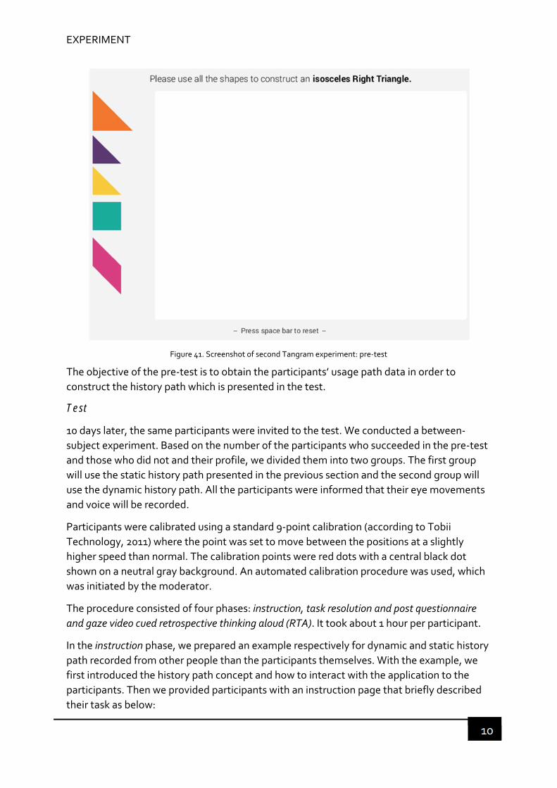
EXPERIMENT
10
Figure 41. Screenshot of second Tangram experiment: pre‐test
The objective of the pre‐test is to obtain the participants’ usage path data in order to
construct the history path which is presented in the test.
Test
10 days later, the same participants were invited to the test. We conducted a between‐
subject experiment. Based on the number of the participants who succeeded in the pre‐test
and those who did not and their profile, we divided them into two groups. The first group
will use the static history path presented in the previous section and the second group will
use the dynamic history path. All the participants were informed that their eye movements
and voice will be recorded.
Participants were calibrated using a standard 9‐point calibration (according to Tobii
Technology, 2011) where the point was set to move between the positions at a slightly
higher speed than normal. The calibration points were red dots with a central black dot
shown on a neutral gray background. An automated calibration procedure was used, which
was initiated by the moderator.
The procedure consisted of four phases: instruction, task resolution and post questionnaire
and gaze video cued retrospective thinking aloud (RTA). It took about 1 hour per participant.
In the instruction phase, we prepared an example respectively for dynamic and static history
path recorded from other people than the participants themselves. With the example, we
first introduced the history path concept and how to interact with the application to the
participants. Then we provided participants with an instruction page that briefly described
their task as below:

Erreur ! Utilisez l'onglet Accueil pour appliquer Heading 2 au texte que vous souhaitez faire apparaître ici.
11
During the task resolution phase, the participants were left alone in the room to complete
the task, we tried not to interfere with them during the experiment. We set the timer for 15
minutes when they were ready, and we left the room. Because there was a new function in
the test, we increased the time to 15 minutes for taking the use of this new function into
account. If the participants succeeded within 15 minutes, the test was stopped, and the
experimenter entered the room. otherwise, the task was interrupted by the experimenter.
The task was ended.
After completing the task, the post questionnaire phase began by answering a questionnaire
survey consisted of 8 items measuring their perception of the history path function. The 8
items are a pair of opposite adjectives, which were the most frequently used and shared by
expert designers to evaluate the interaction qualities of interactive applications the that we
obtained from the exploratory study. They are understandable – confusing, intuitive – non‐
intuitive, boring – amusing, consistent – inconsistent, misleading – guiding, useful – useless,
pleasant – unpleasant, original – classical. The questionnaire was provided to the
participants as an online survey form. We switched the order of each pair of words which
was different from the previous one in order to avoid the participants to thinking too much
about their answers (just check mostly one side or the other). The answers could take one
value among a five‐point Likert‐type scale from 1 to 5 (See Figure 42). For example, in the
case of understandable – confusing, a rate 1 means that the participant evaluates the
history path function as very understandable; a rate 5 means that it is very confusing.
Figure 42. Online survey screenshot
In the gaze video cued RTA phase, participants were shown the video recorded with their eye
movement. They were asked to comment aloud the task they just completed. They could
fast forward, rewind or pause the video if they wanted and could also use the mouse to
point at things on the screen during the interview. The video was shown by default at half
“Thank you for participating the Tangram experiment.
In the next page, you will try to solve the Tangram game as you did last
time to compose an isosceles right triangle using all the five shapes
without overlaying within 15 min. You can refer to your history path
during the test.
After that, you will be asked to fill a questionnaire, and to rate your
perception of the history path function.
When you are ready please click on anywhere of the screen to start ”

EXPERIMENT
11
the speed from the start of the RTA interview, for about 30 minutes. The participant’s
reactions and comments about the task they just completed were screen and audio
recorded.
During the RTA interview, we tried to let the participants talk more about their thoughts,
and we sometimes asked them some questions like “I see you’re looking at … (history path,
the shapes, etc.), what were you thinking about when you looked at it?”.
Regarding the evaluation method, we use both subjective and objective measures.
Subjective measures are based on the semantic analysis such as developed by Osgood,
Suci, & Tannenbaum (1957) to evaluate the subjective impression on the HP. The
participants were asked about their perception about the interaction quality based on a set
of adjective descriptors that we obtained from a previous study (Yang, Morizet‐
mahoudeaux, Guénand, & Mouloudi, 2016). For objective measures, we included the eye
tracking metrics, the time spent to resolve the task, the numbers of success. A comparison
analysis between the static and dynamic history was carried out to test the hypothesis. We
gathered the results to analyze users’ commitment during this second experiment and
compare it to the previous experiment.
5.4.2 RESULTS
Among the 34 participants, there are 11 participants who succeeded in the pre‐test within
10 minutes and 23 participants who failed. In the test, 18 participants were divided into
dynamic history path (HP) group, and 16 participants were divided into the static HP group.
Totally, there were 20 participants who succeeded in the test within 15 minutes, 9 of whom
with dynamic HP and 11 of whom with static HP. There were 14 participants who failed in
the test, 9 of whom with dynamic HP and 5 of whom with static HP. We then categorized
them into 7 groups and 3 stages (the beginning, on‐going and the end) of using the HP
during task resolution for analysis:
SS (D) – the participants who succeeded both in the pre‐test and the test with the
dynamic HP.
SS (S) – the participants who succeeded both in the pre‐test and the test with the
static HP.
SF (D) – the participants who succeeded in the pre‐test and failed in the test (only
the participants with the dynamic HP).
FS (D) – the participants who failed in the pre‐test and succeeded in the test with the
dynamic HP.
FS (S) – the participants who failed in the pre‐test and succeeded in the test with the
dynamic HP.
FF (D) – the participants who failed both in the pre‐test and the test with the
dynamic HP.
FF (S) – the participants who failed both in the pre‐test and the test with the static
HP.
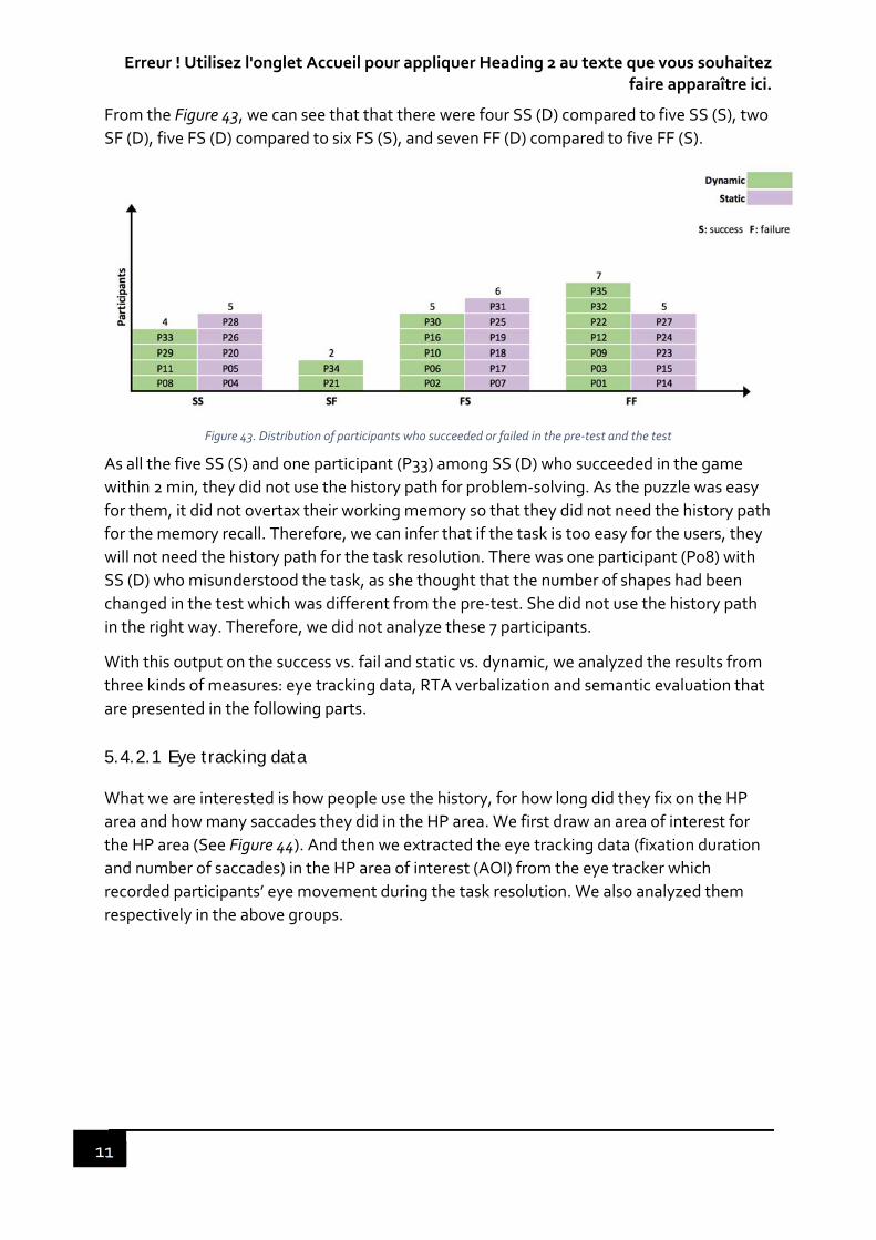
Erreur ! Utilisez l'onglet Accueil pour appliquer Heading 2 au texte que vous souhaitez faire apparaître ici.
11
From the Figure 43, we can see that that there were four SS (D) compared to five SS (S), two
SF (D), five FS (D) compared to six FS (S), and seven FF (D) compared to five FF (S).
Figure 43. Distribution of participants who succeeded or failed in the pre‐test and the test
As all the five SS (S) and one participant (P33) among SS (D) who succeeded in the game
within 2 min, they did not use the history path for problem‐solving. As the puzzle was easy
for them, it did not overtax their working memory so that they did not need the history path
for the memory recall. Therefore, we can infer that if the task is too easy for the users, they
will not need the history path for the task resolution. There was one participant (P08) with
SS (D) who misunderstood the task, as she thought that the number of shapes had been
changed in the test which was different from the pre‐test. She did not use the history path
in the right way. Therefore, we did not analyze these 7 participants.
With this output on the success vs. fail and static vs. dynamic, we analyzed the results from
three kinds of measures: eye tracking data, RTA verbalization and semantic evaluation that
are presented in the following parts.
5.4.2.1 Eye tracking data
What we are interested is how people use the history, for how long did they fix on the HP
area and how many saccades they did in the HP area. We first draw an area of interest for
the HP area (See Figure 44). And then we extracted the eye tracking data (fixation duration
and number of saccades) in the HP area of interest (AOI) from the eye tracker which
recorded participants’ eye movement during the task resolution. We also analyzed them
respectively in the above groups.
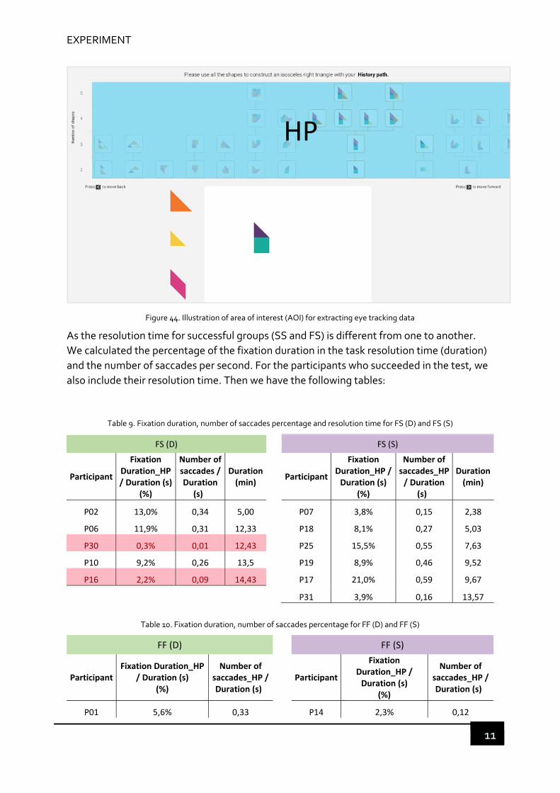
EXPERIMENT
11
Figure 44. Illustration of area of interest (AOI) for extracting eye tracking data
As the resolution time for successful groups (SS and FS) is different from one to another.
We calculated the percentage of the fixation duration in the task resolution time (duration)
and the number of saccades per second. For the participants who succeeded in the test, we
also include their resolution time. Then we have the following tables:
Table 9. Fixation duration, number of saccades percentage and resolution time for FS (D) and FS (S)
FS (D) FS (S)
Participant
Fixation Duration_HP / Duration (s)
(%)
Number of saccades / Duration
(s)
Duration (min)
Participant
Fixation Duration_HP / Duration (s)
(%)
Number of saccades_HP / Duration
(s)
Duration (min)
P02 13,0% 0,34 5,00 P07 3,8% 0,15 2,38
P06 11,9% 0,31 12,33 P18 8,1% 0,27 5,03
P30 0,3% 0,01 12,43 P25 15,5% 0,55 7,63
P10 9,2% 0,26 13,5 P19 8,9% 0,46 9,52
P16 2,2% 0,09 14,43 P17 21,0% 0,59 9,67
P31 3,9% 0,16 13,57
Table 10. Fixation duration, number of saccades percentage for FF (D) and FF (S)
FF (D) FF (S)
Participant Fixation Duration_HP
/ Duration (s) (%)
Number of saccades_HP / Duration (s)
Participant
Fixation Duration_HP / Duration (s)
(%)
Number of saccades_HP / Duration (s)
P01 5,6% 0,33 P14 2,3% 0,12
HP
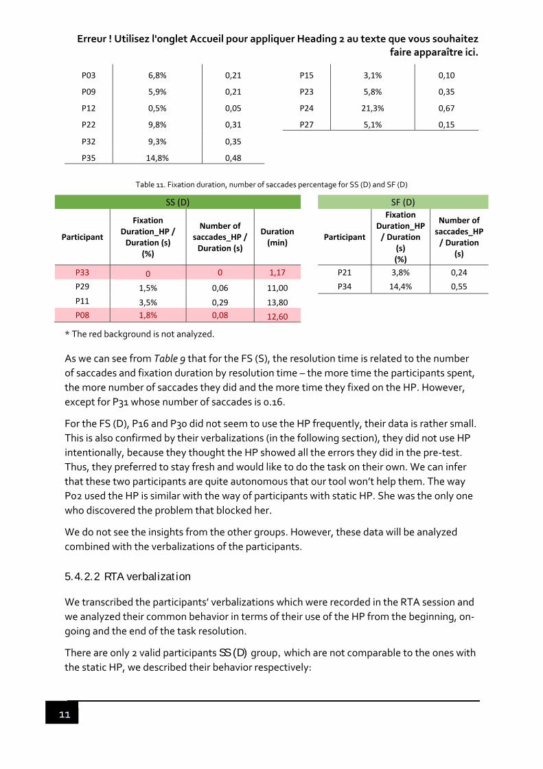
Erreur ! Utilisez l'onglet Accueil pour appliquer Heading 2 au texte que vous souhaitez faire apparaître ici.
11
P03 6,8% 0,21 P15 3,1% 0,10
P09 5,9% 0,21 P23 5,8% 0,35
P12 0,5% 0,05 P24 21,3% 0,67
P22 9,8% 0,31 P27 5,1% 0,15
P32 9,3% 0,35
P35 14,8% 0,48
Table 11. Fixation duration, number of saccades percentage for SS (D) and SF (D)
SS (D) SF (D)
Participant
Fixation Duration_HP / Duration (s)
(%)
Number of saccades_HP / Duration (s)
Duration (min)
Participant
Fixation Duration_HP / Duration
(s) (%)
Number of saccades_HP / Duration
(s)
P33 0 0 1,17 P21 3,8% 0,24
P29 1,5% 0,06 11,00 P34 14,4% 0,55
P11 3,5% 0,29 13,80
P08 1,8% 0,08 12,60
* The red background is not analyzed.
As we can see from Table 9 that for the FS (S), the resolution time is related to the number
of saccades and fixation duration by resolution time – the more time the participants spent,
the more number of saccades they did and the more time they fixed on the HP. However,
except for P31 whose number of saccades is 0.16.
For the FS (D), P16 and P30 did not seem to use the HP frequently, their data is rather small.
This is also confirmed by their verbalizations (in the following section), they did not use HP
intentionally, because they thought the HP showed all the errors they did in the pre‐test.
Thus, they preferred to stay fresh and would like to do the task on their own. We can infer
that these two participants are quite autonomous that our tool won’t help them. The way
P02 used the HP is similar with the way of participants with static HP. She was the only one
who discovered the problem that blocked her.
We do not see the insights from the other groups. However, these data will be analyzed
combined with the verbalizations of the participants.
5.4.2.2 RTA verbalization
We transcribed the participants’ verbalizations which were recorded in the RTA session and
we analyzed their common behavior in terms of their use of the HP from the beginning, on‐
going and the end of the task resolution.
There are only 2 valid participants SS (D) group, which are not comparable to the ones with
the static HP, we described their behavior respectively:

EXPERIMENT
11
P11 had many troubles with the operations of the game, he spent much time in
adapting to the game. At the beginning, he looked at the last column of the HP,
because he thought that it was the last composition he had done in the pre‐test,
which was the closest to the solution. In addition, he expected the HP to be
highlighted. During the test, he tried to compare between the HP and what he
was doing even the HP was not highlighted. He also looked for the way to
highlight the HP. In the end, he was making shapes, and he looked at the
highlighted area in the HP which made him think of the solution he had done in
the pre‐test, and then he succeeded. He was bothered by the operations of the
game and thought that the HP should be highlighted even with one shape in the
canvas. He liked the highlight, because if there was a lot of history, the highlight
could save time for searching. But once he understood it, he made the figure and
picked the last shapes by referring to the HP. The HP helped him recall his
memory.
For P29, she first scanned quickly the HP to see if there were some figures close
to the solution, as she did not find it, she continued to do what she remembered
last time. During the test, she focused on the highlight area of the HP and tried
to refer to it because she thought it was most close to the solution. However, she
tried many times but still did not make it. Then she did it on her own.
For the group SF (D), only the participants using the dynamic HP failed in the test while
they both succeeded in the pre‐test.
P21: the order of the HP bothered her a lot as she stated, “I’m having trouble of
making sense of it.” and “it prevented me from using it to my benefit.”. She thought
that the HP is chronologically displayed from left to the right. Therefore, she focused
long time on the last part of the HP that corresponded to what she did, because she
succeeded at the very end of the game last time. Besides that, the highlight of the
HP for her is to invalidate her ideas (“ah, that won’t work.”).
P34: at the beginning, P34 looked at the last two steps of the HP which were most
possible to arrive at the solution. During the test, when the HP was highlighted, he
avoided doing the same (“j’ai changé, parce que je n’ai que ça me n’apporte rien. Parce
que même si j’étais près, …, aucun n’est bon, j’ai fait autre chose”). When he lost
attention, and did not know what to do, he looked at the HP to get some inspirations
even when it was not highlighted. However, he also had difficulty in understanding
what he had done (“Juste me dire que je ne fais pas pareil, le point négatif. Je ne vois
pas la logique de ce que j’ai fait. Je ne sais pas pourquoi j’ai fait ça”). When he was
close, he was not aware of that. The HP didn’t help him get out of his own thought
(perspective) and see it globally (change to another perspective).
Both P21 and P34 thought that the entire HP was all the errors they had done, so the
highlight for them were to invalidate what they were currently doing. Moreover, they both
have trouble in understanding their HP. This is also consistent with the semantic evaluation
in their perception for “understanding” (see

Erreur ! Utilisez l'onglet Accueil pour appliquer Heading 2 au texte que vous souhaitez faire apparaître ici.
11
Table 15).
For comparable reason, we focus on the groups FS (D), FS (S), FF (D) and FF (S). We
would like to see the common behavior and patterns from the participants using the HP as
well as to see the differences between groups. On this account, we have listed the
sentences most expressed by these 4 groups of participants from the experience maps12
that we drew (see A.2.4 Experience map) to illustrate their common and different behavior
regarding the stages (the beginning, on‐going and the end) during the test (See Table 12).
This can help us see visually and clearly the stages that they experienced and the touch
points.
12 Experience map visually shows the journey that these 4 groups of participants have experienced while using the HP in the task resolution.

EXPERIMENT
117
Table 12. Common verbalization by different groups (blue areas are only for dynamic HP)
I was looking for if
there were some
figures in my HP which
were close to the
solution.
The HP showed me the
errors that I have done
last time and I tried to
avoid reproducing the
same.
Highlight, what else
can I do with the same
base highlighted?
(Refer)
Highlight, I should
do something else.
(Invalidate)
I looked at the HP to
see if I haven't done
before. (Compare
and verify)
I was scanning the HP
to see if there were
some examples that
can help me.
(Inspriation)
I felt like it always
lacked a piece. I
was so close.
I realized that I
always repeat the
same thing as I did in
the HP.
I realized that I
never did this
before.
I realized some shape
or combinations that I
did in the HP did (not)
work.
I felt less lost
with the HP.
It did not
help me, the
history path
The HP did
not allow me
to have an
insight to
explore more.
The HP
(highlight) is a
little
distrubing.
P07 X X X
P18 X X X
P25 X X X
P19 X X X X X X X
P17 X X X X X
P31 X X X X X
P14 X X X X X
P15 X X X X
P23 X X X X X
P24 X X X X
P27 X X X X
P02 X X X X X X
P06 X X X X
P30 X
P10 X X X X
P16 X
P01 X X
P03 X X X X X X
P09 X X X X X X
P12 X X X X X X
P22 X X X X X X X
P32 X X X X X
P35 X X X X
Awareness Feeling
FS (S)
FS (D)
FF (S)
FF (D)
Group Participant
Begin Highlight Gerneral behavior
Erreur ! Utilisez l'onglet Accueil pour appliquer Heading 2 au texte que vous souhaitez faire apparaître ici.
11
FS (S), there are 6 participants: P07, P17, P18, P19, P25 and P31. They are more
actively searching for the information instead of being received passively as in the
dynamic history path. The key difference from the dynamic HP is that they finished
by finding key path in the HP which unblocked their difficulty in the end. o Start: 4 out of 6 (P07, P18, P19 and P25) tried to find if there was something
close to the correct solution in the HP. 5 out of 6 (P07, P17, P18, P19 and P31)
looked at their errors in the HP trying not to do the same.
o On‐going: 3 out of 6 (P17, P19, P25) scanned the HP to see if there were some
examples that can inspire them. From the HP, 3 out of 6 (P17, P19 and P31)
realized that they always repeated the same combinations in this session as
they had done last time but did not work; among them, P19 and P31 realized
that they had never tried some combinations last time.
o End: 4 out of 6 (P07, P17, P18 and P25) realized that they always put some
shape in one position which did not work last time, they were unblocked from
the HP, which led them to the correct solution. P17, P19, P31 felt less lost
with the HP.
FF (S), there are 5 participants: P14, P15, P23, P24 and P27.
o Start: 4 out of 5 (P14, P15, P23 and P24) tried to find if there was something
close to the correct solution in the HP; among them, P14 and P15 did not
know what to do with the HP since they showed all the error that they did
last time. P24 and P27 looked at their errors in the HP trying not to do the
same.
o On‐going: all of them scanned the HP to see if there were some examples
that can inspire them; among them P23 also tries to compare and verify if she
had done the same thing in the HP. P14 and P15 realized that they always
repeated the same combinations in this session as they had done last time in
the HP but did not work. P14 and P24 realized that they had never tried some
combinations last time. P23 realized that some combinations in the HP did
not work. P27 tried to explore other possibilities from HP, but he did not get
inspired.
o End: they were frustrated that they did not find the solution. However, the
static HP made some of them (P14, P15, P23 and P24) aware of some
combinations that they always repeated, some combinations they had done
but did not work and some combinations that they had never done last time.
The HP helped to develop their thinking.
FS (D), there are 5 participants: P02, P06, P10, P16, and P30. P16 and P30 did not
look at the HP so much, particularly for P30, she did look only once because the HP
was highlighted, and she changed what she was doing immediately to turn it off.
P16 did look at the HP for a few times but unconsciously.
EXPERIMENT
11
o Start: they thought that their HP contained the errors that they did last, so
they kept not looking at it to get some new ideas. P02 and P10 looked at their
errors in the HP trying not to do the same; and P06 tried to find if there was
something close to the correct solution in the HP.
o On‐going: P02 tried to make some modification based on the highlight figure
in the HP. 3 out of 5 (P06, P10 and P30) tried to invalidate what they were
doing when the HP was highlighted (see Table 12: dark blue). When the HP
was not highlighted, 3 out of 5 (P02, P06 and P10) tried to compare and verify
if they had done the same thing in the HP (see Table 12: yellow in general
behavior). And they scanned the HP to see if there were some examples that
can inspire them.
o End: except for P02 who found the problem which blocked her in the HP, the
others, they succeeded all by themselves. P02 expressed her preference to
the HP and that she discovered the problem that blocked her from the HP. (“I
mostly looked at the end, I realized that it was the square that was the problem,
and I told myself in which, when, I put the square that was not the weird
thing13.”) P02 also said that with the HP, she was more assured, and she could
spend time analyzing and thinking than the first time.
FF (D), there are 7 participants: P01, P03, P09, P12, P22, P32 and P35.
o Start: 5 out of 7 (P03, P12, P22, P32 and P35) tried to find if there was
something close to the correct solution in the HP.
o On‐going: when the HP was highlighted, 3 out of 7 (P03, P09 and P12) tried to
make some changes based on the highlighted ones (see Table 12: light blue);
5 out of 7 (P03, P09, P22, P32 and P35) tried to invalidate what they were
doing (see Table 12: dark blue);. When the HP was not highlighted, all of them
scanned the HP to see if there were some examples that can inspire them;
P03 also tried to compare and verify if they had done the same thing in the
HP. P22 realized that she always repeated the same things that she had
already done in the HP but did not work. P35 realized where the problem
possibly was from the HP.
o End: they were frustrated that they did not find the solution. Some of them
felt very close to the solution, but still did not come out of their deadlock. P22
felt less lost with the HP no matter if it can really help her or not. It is like a
psychological comfort. P03, P09, P12 thought that the highlight is a little
disturbing, because sometimes it made them think that it could be a solution,
however, it was not. It distracted from what they were doing, it is kind of an
13 Original sentences in French : « J’ai surtout regardé jà la fin, j’ai réalisé que c’était le carrée qui posais le
problème, et je me suis dit dans quel, à quel moment, j’ai mis le carrée qui ne faisait pas le truc bizarre. »

Erreur ! Utilisez l'onglet Accueil pour appliquer Heading 2 au texte que vous souhaitez faire apparaître ici.
12
interruption. What’s more, the highlight restricted their ability to exploit
what they did before, which means to find the elements that could construct
the solution. P12 and P35 clearly stated that the HP did not allow them to
have an insight to explore other possibilities.
We can see that most of the participants they have common behaviors in using the history
path with both dynamic and static feature. FS (S), FF (S) and FF (D) looked at the HP at the
beginning of the test, because they wanted to see if there were some figures that they had
done previously were close to the solution. This is almost a common behavior among
these three groups.
The static HP was used as a representation of all the trials and errors that had been done by
the participants, trying not to reproduce the same. This behavior is evident among the
participants who succeeded in the test (FS (S) and FS (D)).
The dynamic history path during the test, is mostly for them to avoid reproducing the same
errors as they did not succeed last time (3 out of 5 in FS (D) and 5 out of 7 in FF (D)). The
highlight although, saved them time to invalidate some compositions, discouraged them to
search for useful information, as it thought for them. They were controlled by the highlight
which limited their capability of exploration other possibilities to the solution.
Nearly all the participants (18 out of 23) looked at the HP for inspirations, which means that
the participants with the dynamic HP also used their own HP in static way.
What is interesting in the table is the column “Awareness” that FS (S) and FF (S) realize that
HP helps them visualize their mistakes and the inspiring paths. This is more evident in the
static HP than the dynamic HP (only 3 participants). The static HP, during the test, is for
them to both avoid and refer. They are more actively searching for the information instead
of being received passively as in the dynamic history path. The static HP is an active support
to think contrary to the dynamic HP that blocks reflection.
In addition, regarding the feelings, several participants were also expressing that the HP
was helpful for them to solve the puzzle. Some also thought that the highlight, although
attracted their attention, was disturbing and distracting.
5.4.2.3 Usage form in terms of eye movement
In order to visualize their usage of HP during the entire journey more intuitively, we also
draw the usage form with regard to their eye movement towards the HP (See Figure 45).
Note that there were several inaccuracies in several test, we should take this into account.
P01 is the first person to test our prototype history path. At that time, there were some
bugs in the prototype, including the inaccurate highlights. Therefore, P01 lost confidence in
the HP as the highlight was not inaccurate. Eye tracker did not capture enough gaze points
of P29, as the gaze weight is only 20%. This may be due to the user moving too much during
the test so that the eye tracker does not capture eye movements. Therefore, there were
maybe inaccurate fixation.

EXPERIMENT
12

Erreur ! Utilisez l'onglet Accueil pour appliquer Heading 2 au texte que vous souhaitez faire apparaître ici.
12
Figure 45. HP usage pattern: top for static, and bottom for dynamic; red bars stand for fixation and blue bars for highlight only for dynamic HP

EXPERIMENT
12
From the usage form, we identify some common patterns:
The autonomous: P16 and P30 expressed that they did not use the HP and preferred to find the solution on their own, which is also consistent with their fixation data. These two
are so autonomous that the HP won’t help them. This kind of feature is not suitable for
them.
The observers: FS (S) (P18, P25, P19 and P17) and FS (D) (P02, P06, P10) are who
succeeded in the test, looked at the HP intensively as a static image at the beginning. The
HP helps them solve the puzzle.
P31 saw the HP as a support, as she stated “Je me sens moins seule” (I feel less alone) with
the help of the HP.
The failers: FF (S), FF (D) and SF (D) rarely looked at the HP intensively at the beginning (except for P34). On the other, hand, they looked at it very shortly and frequently. This is
more evident for the dynamic HP when it was highlighted, appealing to their attention so
that they had to look at it. The highlight interrupted their continuous reflection. We can
infer that they took long time to make sense of what they had done and explore what to do.
We examined the resolution time for those who succeeded in the test (FS) and their usage
form. It shows that the average resolution time of the task for the participants with static
HP (t_FS (S)) is shorter than those with dynamic HP (t_FS (D)):
t_FS (S) < t_FS (D)
Based on Edmund Husserl in his On the Phenomenology of the Consciousness of Internal
Time (1991), the structures of consciousness that make possible the experience of time.
Then, we can infer that the time of constitution of consciousness of the HP is shorter in the
perception of dynamic than the perception of static. Then it is easier for them to have a
synthesis about what they have done in the past.
5.4.2.4 Semantic evaluation
In terms of the subjective measures, the participants were asked to rate how they perceived
the history path in the resolution of Tangram. We listed their rating based on the 4 above
groups and compare the dynamic HP to the static HP, we first present the ratings between
FS (D) and FS (D) (See Table 13).
Table 13. Semantic evaluation of the history path for FS (D) VS. FS (S)
FS (D)
Participants Understanding Intuitive Fun Consistent Guiding Useful Pleasant Innovative
P02 5 5 3 5 1 4 4 5

Erreur ! Utilisez l'onglet Accueil pour appliquer Heading 2 au texte que vous souhaitez faire apparaître ici.
12
P06 4 5 3 3 4 3 4 5
P10 5 3 3 4 3 4 3 4
P16 5 5 3 3 3 1 3 5
P30 5 5 4 5 3 3 4 2
Mean 4,8 4,6 3,2 4 2,8 3 3,6 4,2
FS (S)
Participants Understanding Intuitive Fun Consistent Guiding Useful Pleasant Innovative
P07 3 3 4 4 4 4 4 5
P17 5 4 5 4 5 5 5 5
P18 4 5 3 5 3 5 3 5
P19 5 3 3 5 3 3 5 5
P25 5 5 4 4 4 5 4 3
P31 5 4 4 5 3 5 5 3
Mean 4,5 4,0 3,8 4,5 3,7 4,5 4,3 4,3
The above table shows the different ratings of the two groups: FS (D) and FS (S). As we can
see from the table, there are some common points in terms of understandable, consistent
and innovative. The participants in FS (D) thought that the dynamic HP was more intuitive
compared to the static HP. This means that the participants in FS (D) understood easily the
highlight but in the wrong way. They perceived the highlight as a way to invalidate their
ideas rather than a way to explore other possibilities. In this case, the perceived
connotations as well as the perceived usage of the dynamic HP serve as a memory
substitution rather than a memory supplementation.
There are differences in terms of guiding, useful and pleasant, the ratings of participants
with the static HP are higher than those with dynamic HP (guiding: 2,8 vs 3,7, useful: 3 vs 4,5
and pleasant: 3,6 vs 4,3). There is a great difference in usefulness between the static HP and
the dynamic HP. The participants with the static HP thought it more useful than those with
the dynamic HP.
Then, we compare the ratings between FF (D) and FF (S) which are shown in the following
table (See Table 14).
Table 14. Subjective evaluation of the history path for FF (D) VS. FF (S)
FF (D)
Participants Understanding Intuitive Fun Consistent Guiding Useful Pleasant Innovative
P01 3 4 3 2 4 2 4 4
P03 4 4 5 5 4 4 5 4
P09 3 5 3 5 2 3 3 3
P12 4 2 4 3 1 5 4 5

EXPERIMENT
12
P22 4 2 4 4 3 4 5 4
P32 5 5 3 4 5 3 5 5
P35 5 4 3 5 3 5 4 4
Mean 4,0 3,7 3,6 4,0 3,1 3,7 4,3 4,1
FF (S)
Participants Understanding Intuitive Fun Consistent Guiding Useful Pleasant Innovative
P14 5 5 3 2 3 2 5 4
P15 3 5 5 5 3 4 5 5
P23 4 4 4 5 3 5 4 4
P24 4 4 3 3 4 4 4 4
P27 5 5 4 4 3 4 4 4
Mean 4,2 4,6 3,8 3,8 3,2 3,8 4,4 4,2
As for FF (D) and FF (S), there is no much difference except for intuitive which is 3,7 for FF
(D) and which is 4,6 for FF (S). This lower rating of FF (D) was because they did not use the
dynamic HP as intensively as the participants in FS (D), which can be confirmed by their
fixation duration in Table 9 – FS (D) and Table 10 – FF (D). The participants in FF (S) thought
the static HP was more intuitive than the dynamic HP. We can infer that the failure in the
test is not the cause of the intuitiveness. On the other hand, FF (S) gave the same note as FS
(D), because they did not blame their failure on the system, but themselves.
Table 15. Subjective evaluation of the history path for SF (D)
SF (D)
Participants Understanding Intuitive Fun Consistent Guiding Useful Pleasant Innovative
P21 3 2 3 1 4 2 2 5
P34 2 3 5 3 4 4 3 3
Mean 2,5 2,5 4 2 4 3 2,5 4
From Table 15, only the participants with the dynamic HP failed in the test. Compared with
the first time when they have succeeded, they failed the second time. They did not perceive
the HP as intuitive and useful as the other groups above.
We will analyze these measures altogether regarding to the static compared to the dynamic
and the success compared to the failure and discuss afterwards.
5.4.3 DISCUSSION
When the task is too easy for users, they do not need a provenance tool to supplement their
memory for problem‐solving, as the participants in SS (S) and P33.

Erreur ! Utilisez l'onglet Accueil pour appliquer Heading 2 au texte que vous souhaitez faire apparaître ici.
12
There are also two people (P16 and P30) who expressed that they did not use the HP, which
is consistent with the eye tracking data (few fixation). They prefer to solve the problem
themselves. Therefore, our HP will not help them. This kind of feature is not suitable for
them.
Then, we compare the results from two dimensions: success vs. fail and static vs. dynamic.
5.4.3.1 Success vs. fail
For whom succeeded (FS) in the test, they had a relative intensive fixation on the HP,
especially at the beginning of the test. And the sooner they focused intensively on the HP,
the less time they spent to solve the puzzle. They looked at the HP first except for P17, and
then they looked less, they found some ideas from the HP, and then they continue to focus
on their task resolution;
For whom failed (FF) in the test, the participants in FF(D) looked at the HP discretely
throughout the session, which is not enough for them to come to a conclusion / constitute a
summary; the participants in FF (S), except for P24 who focused longtime on the HP
throughout the session, mainly focused intensively in the middle or end of the session. They
had a very short interaction with the HP and they looked at the HP very frequently.
Therefore, long fixation particular at the beginning of the session probably leads to the
success, because it may stimulate consciousness which enables analyzing and summarizing
what they have done in the past which may be used for the future. The long fixation could
enhance the working memory.
5.4.3.2 Dynamic vs. static
We are interested to see the extent to which the static or dynamic HP could permit memory
supplementation that opens scope of possibilities and promotes more exploration of the
problem‐solving task. From the results, it seems that the memory supplementation is in
favor of the static rather than the dynamic.
The participants used the dynamic HP (FF & FS (D)) in two ways: looked at it when
highlighted, referred to it when not highlighted (as in static). The participants with the
dynamic HP looked at the HP intermittently and frequently during the test, especially when
highlighted. They are controlled by the HP (highlight), as the highlight appealed to their
attention, so they have to follow it. However, with the static HP, the participants have the whole view of HP displayed in in front of them, and they have the initiative to focus on it
longer or shorter (the fixation duration).
This can be explained by the constitution of consciousness, based on Edmund Husserl in his
On the Phenomenology of the Consciousness of Internal Time (1991) and Bernard Stiegler’s
Technics and Time (Stiegler, 2010):
Firstly, the disposition of the HP both static and dynamic serve as a tertiary memory
according to Bernard Stiegler’s Technics and Time (Stiegler, 2010). Tertiary memory was

EXPERIMENT
12
developed by Stiegler through the primary and secondary retention or memory of Husserl.
The primary retention belongs to the act of perception, secondary retention or memory
belongs to the imagination and the tertiary retention or memory belongs to the
exteriorization of memory (Roberts, 2006).
Take an example of melody that was used by Husserl to study the consciousness. When
listening to music, we use the current perception to form the "first memory." After listening
to the music, we use imagination to form a “second memory”. The key issue here is that
perception and imagination are not completely separated. Each memory has a selection
principle. Any perception has an imaginary component, and the imagination also has a
perceptual component. What Stiegler is concerned with is how to make it possible to listen
to the music repeatedly. This is obviously thanks to the tertiary memory, which is the
various recording techniques. Recording technology makes it possible to repeatedly listen
to the music and watch the movies. In this repetition, not only can new meanings be
obtained, but also deviations from previous memories can be corrected. The history path
records the participants’ past action in the pre‐test, that can modify their perception of the
problem‐solving to some extent. Then to what extent this change of perception can be
made depends on the property (dynamic or static) of the history path.
The phenomenology of consciousness explains how we experience time. An object is
moving in the space, it continues in the time. Our view of time is based on the comparison
with the object moving in the space. Our consciousness is inseparable with the movement
of this object in the space. Stiegler compared consciousness to movies. when We are seeing
a movie, we have to follow its story to make sense of it. Our consciousness of time is
synchronized with the time passed on the movie. Similarly, the temporal object such as the
dynamic HP controls the spatial exploration, which hinders the constitution of
consciousness. Therefore, the dynamic HP limits the scope of possibilities. It serves as a
memory substitution.
On the contrary, the internal time is irrelevant to the movement of an object, the
phenomenon of consciousness is not in the specific space, it comes out one by one. We can
get an experiential consciousness of internal time. As people can play back or fast forward a
recorded movie as they want, it allows more exploratory actions that open up new scope of
possibilities. They are in the lived experience related to the consciousness and exploration
of activity. With the static HP, the participants have the whole view of HP displayed in in
front of them, and they have the initiative to focus on it longer or shorter. When the
participants looked at the HP several times, it is continuous in the internal time, and our
consciousness has indeed experienced this continuation. But at the same time, it is several
phenomena, and these phenomena coexist in their consciousness. In the consciousness of
internal time, people objectify the content of consciousness. This process of objectification
is the process of constructing consciousness through the understanding and the content of
consciousness (P. Li, 1998). The static HP enables the participants to actively search for
useful information that they are autonomous to determine which part of HP to avoid, which
to reuse, etc. It allows more exploration on the static HP than the dynamic. The
Erreur ! Utilisez l'onglet Accueil pour appliquer Heading 2 au texte que vous souhaitez faire apparaître ici.
12
participants have more control on the static HP instead of being controlled by the dynamic HP.
The feature of dynamic history path did not produce the positive effect as we hypothesized.
We initially assumed that the dynamic HP would be a natural coupling through which
provokes a further exploration of action possibilities for solving the Tangram puzzle. On the
contrary, the static HP which stimulates active explorations and constructs the
consciousness of what they have done before. The static HP opens up new scope of
possibilities, which arises memory supplementation.
5.5 CHAPTER SUMMARY
This chapter, we conducted two experiments in integrating the concept of history path as a
memory support for users to re‐commit an interrupted or suspended task. In the framework
of minimalist experiment, we develop a prototype through the Tangram game, hoping to
find the technical conditions of emerging a positive experience.
From the first Tangram experiment, we found that the concept of the history path served as
a cognitive support for problem‐solving process. In addition, we discovered the two ways of
using the history path by users: use it statically and use it dynamically. However, the static
history path chronologically displayed took users a lot of time to search the information and
compare between what they are doing and what they did before. Then, we hypothesized
that a dynamic history path might be a natural coupling with users in resolving the Tangram
puzzle. This experiment gave us an insight for designing the “in hand” mode history path,
which we integrated in the second Tangram experiment.
The second Tangram experiment shows that the static HP can stimulate more exploration
and facilitate the constitution of consciousness than the dynamic one. The experiment
showed us that although the history path did not help users change their perspectives of
seeing the visual shapes, the highlight feature saved time for them to look one by one in the
history path, which indicates that the dynamic history path improves their productivity.
However, the highlight may also produce wrong information that as the participants failed
last time, they treated the highlight as invalidation of hypothesis. However, many
participants expressed their expectation of the highlight as the volume of history increases,
it is better to see the highlight instead of searching.
In visual data analysis, there is no absolute right or wrong answer, the objective is to find the
root causes of a business problems for decision making. Then, it is interesting to have this
dynamic history path to facilitate the analysis process and re‐commit the task. In this
chapter, we apply the history path framework in an analytic product – SAP Analytics Cloud
(SAC).
12
CHAPTER 6 TEST THE HISTORY PATH FRAMEWORK IN AN ANALYTIC APPLICATION
"Design is an opportunity to continue telling the story, not just to sum
everything up."
— Tate Linden American branding and strategy expert
“Design brings content into focus, design makes function visible.”
— Jennifer Morla, president and creative director of Morla Design, Inc.
This research took place in the context of analytic applications design at SAP. In the
previous chapter, we tested the design framework of history path through a minimalist
experiment. In this chapter, we present a proposal to transpose the proposed framework
history path to an analytic application – SAP Analytics Cloud.
SAP Analytics Cloud (SAC) (See Figure 46), developed by SAP, is an all‐in‐one cloud
platform for business intelligence and organizational planning, enhanced with the power of
predictive analytics and machine learning technology. It allows users to have the
capabilities of data manipulation, visualization and analysis, financial planning and
predictive forecasting. Built on SAP cloud technologies, it allows, in just a few clicks, to
create interactive dashboards accessible from any workstation. For more information,
please visit the website: https://www.sapanalytics.cloud/.

Erreur ! Utilisez l'onglet Accueil pour appliquer Heading 2 au texte que vous souhaitez faire apparaître ici.
13
Figure 46. SAP Analytics Cloud ‐‐ creating a story that contains a series of charts.
We are going to propose a mockup of the application of the HP in the context of creating a
story based on SAP Analytics Cloud. This mockup is built only for this research purpose and
is still at the design stage, which means that it is not released in the product.
6.1 LIMIATIONS OF THE TANGRAM EXPERIMENT
The initial idea of using Tangram puzzle in the experiment is that it can simulate a problem‐
solving task such as an analytical task. We hope to understand the user behavior in the
problem‐solving process. In terms of the memory supplementation, the discovery in the
research problem is very rich, and it helps us rethink the design for opening the scope of
possibilities in the interaction and the support tool as media between users and the task.
However, it also has some limitations in terms of the transposition to the analytics context.
Because the participants think that what has been done last time (the HP) are the wrong
trials and errors without so many values. Therefore, the fact of failure in the pre‐test influences their attitude to the HP, no matter it is static or dynamic. However, in the real
case of analytics, different from the puzzle Tangram that allows the player to find an
absolute answer, visual data analysis tasks are usually exploratory without a unique answer.
The goal of the latter one is to identify the root causes of a business question, such as why
the employees leave the company this year, why the sales revenues dropped down this
semester, etc. Therefore, the Tangram game is not completely analogy to a visual data
analysis task.
In this case, the highlight feature, although seemed disturbing (because it provides the
wrong clue in the Tangram), can save time for user looking one by one to find the right path.
This has been indicated by the participants who expected the highlight. They stated that it

TEST THE HISTORY PATH FRAMEWORK IN AN ANALYTIC APPLICATION
13
is better to see the highlight instead of searching one by one, because the history could be
voluminous in reality.
In all, due to these differences, users’ judgement of the HP could be different as well as their
attitude to the highlight. Then, it could be interesting to have this dynamic history path to
facilitate the analysis process and re‐commit the task.
6.2 DEMONSTRATION OF THE HP IN SAP ANALYTICS CLOUD
With the study of user research and the user workflow of a visual data analysis task, we
noticed that users usually use certain dimensions and operations in the same analysis
repeatedly. This is similar with the participants’ strategy solving the Tangram puzzle, such
as always put the square and a parallelogram together. Similar, users focusing on an
analysis of sales revenue are always use the product category as a start of each exploratory
analysis. Then this discovery allows us to extract the commonly used dimensions and
operations (filter, drill down, etc.) as a basis to construct the history path in the analytics
context.
We took a simple user scenario based on the human resource (HR) dataset that is
downloaded in the kaggle, a website, providing a resource for competitive data science and
machine learning.
The user scenario goes as follows:
Joan is asked to find out why do our employees leave the company? (business question)
She then comes to SAP Analytics Cloud to conduct the visual analysis. She made a
story with the different charts she created.
While Joan is working on her task, she receives another task which is more urgent, then
she saved the story in SAP Analytics Cloud before starting with the new task.
Three hours later, Joan comes back to her suspended task, then she goes to the saved
story. However, she couldn’t think of where she left off, and what she was going to do
next. She clicked on an icon to trigger the history path.
We designed in a static mockup a proposal to integrate a history path in SAP Analytics
Cloud. This proposal is only built in the purpose of this research; it is not released in the
product and currently analyzed by SAP regarding its relevance for the product and
eventually test it in the future.

Erreur ! Utilisez l'onglet Accueil pour appliquer Heading 2 au texte que vous souhaitez faire apparaître ici.
13
Figure 47. Mockup in SAC story – the icon to trigger the HP
When the button is clicked, the history path will be presented below the main story, half
and half presented by default, then the user can enlarge the panel as well (see Figure 48).
The HP is presented in the tree diagrams. As we mentioned, users are often used some
common dimensions and operations. In this case, Joan often uses the dimension
“left_or_not” to start her analysis. Based on this dimension, she adds other charts. During
the analysis, she also adds some filters. If the charts are created based on the same filter,
they will be two branches of the same operation. This HP showed a workflow of Joan’s
analysis and the relationships between charts.
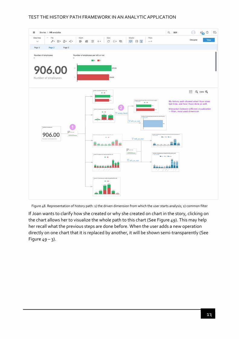
TEST THE HISTORY PATH FRAMEWORK IN AN ANALYTIC APPLICATION
13
Figure 48. Representation of history path: 1) the driven dimension from which the user starts analysis; 2) common filter
If Joan wants to clarify how she created or why she created on chart in the story, clicking on
the chart allows her to visualize the whole path to this chart (See Figure 49). This may help
her recall what the previous steps are done before. When the user adds a new operation
directly on one chart that it is replaced by another, it will be shown semi‐transparently (See
Figure 49 – 3).
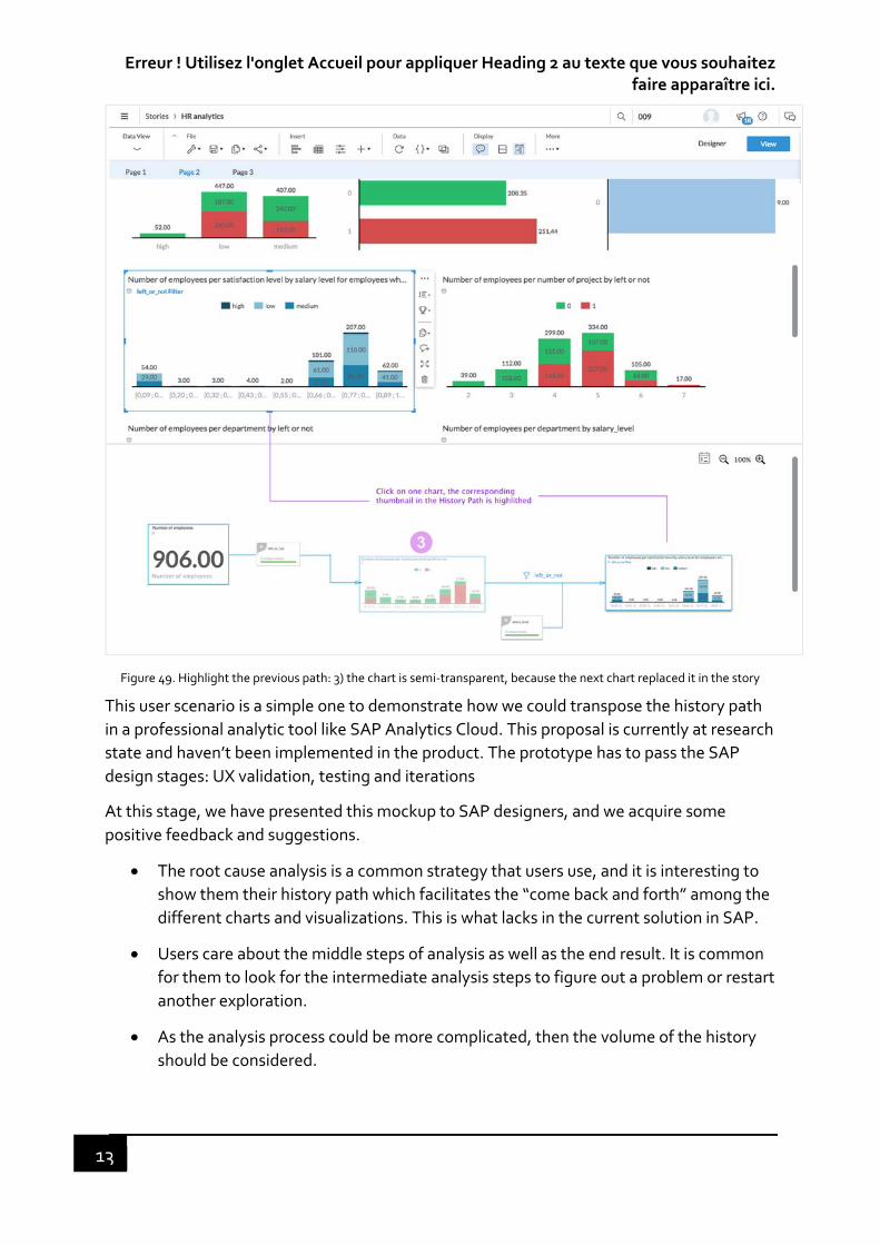
Erreur ! Utilisez l'onglet Accueil pour appliquer Heading 2 au texte que vous souhaitez faire apparaître ici.
13
Figure 49. Highlight the previous path: 3) the chart is semi‐transparent, because the next chart replaced it in the story
This user scenario is a simple one to demonstrate how we could transpose the history path
in a professional analytic tool like SAP Analytics Cloud. This proposal is currently at research
state and haven’t been implemented in the product. The prototype has to pass the SAP
design stages: UX validation, testing and iterations
At this stage, we have presented this mockup to SAP designers, and we acquire some
positive feedback and suggestions.
The root cause analysis is a common strategy that users use, and it is interesting to
show them their history path which facilitates the “come back and forth” among the
different charts and visualizations. This is what lacks in the current solution in SAP.
Users care about the middle steps of analysis as well as the end result. It is common
for them to look for the intermediate analysis steps to figure out a problem or restart
another exploration.
As the analysis process could be more complicated, then the volume of the history
should be considered.

TEST THE HISTORY PATH FRAMEWORK IN AN ANALYTIC APPLICATION
13
In terms of collaborative work, the history path could be used by different users,
such as an analyst who does a report and a consumer who reads the report. The
history path could be useful for the consumer to understand the analyst’s work.
To improve the HP design and consider more complex analytical process would be the
perspective.

Erreur ! Utilisez l'onglet Accueil pour appliquer Heading 2 au texte que vous souhaitez faire apparaître ici.
13

13
CHAPTER 7 CONCLUSION AND PERSPECTIVES
“People do not like to think. If one thinks, one must reach conclusions.
Conclusions are not always pleasant.”
— Helen Keller, American author
In this last part, we give a review of the work presented throughout this manuscript and a
discussion on their impact on the methodology and professional practices. We started from
a new design perspective, which highlights the sensorimotor factor in user experience
design. A design framework was developed to support the design of problem‐solving tools
and its application in BI and analytic domain. Finally, we give some of the limitations of this
work and opportunities for future research.
7.1 CONCLUSION
The rapid growth of the volume of data poses challenges for analyzing data, which leads to
a change in the design of BI and analytic applications. Besides BI experts, more end users
are demanding to conduct visual data analysis. Users’ expectation of simple interaction for
complex analysis process to facilitate their decision making is crucial for designers to
enhance user experience. In addition, from the analysis of user studies and analytics task
flow, we found the complexity of analytics process and the nature of multi‐tasking of most
of business users in their daily work. These two factors lead to memory overload and task
interruption or suspension phenomena that influence the task performance and user
experience. Users are getting used to keeping track or review their previous analysis steps
that serve as a memory aid. It is beneficial to design a history tool to help users better
recommit the interrupted or suspended tasks.
Positioning of our research on the enactive approach and sensorimotor of perception
allowed us to see that interaction histories can be seen as an alternation of the “in hand”
and “put down” modes, constructing a relationship between the user and the task. The
objective was then to design a memory tool as a memory supplementation that can extend
the user’s perceptual capability. To address these challenges, this thesis research focused
on evaluating the extent to which we can enhance user experience by designing a memory
supplementation support in the context of BI and analytic applications. We especially
worked on how to engage users to re‐commit an analysis task which has been interrupted
or suspended.
In the first place, to design the appropriated interaction in the interactive applications, we
have looked at how people perceive the user interface and interaction of interactive

Erreur ! Utilisez l'onglet Accueil pour appliquer Heading 2 au texte que vous souhaitez faire apparaître ici.
13
applications. We conducted a exploratory study that analyzed the perception of interactive
applications by experienced designers. The emerged perceptual qualities allowed us to
construct our own evaluation dedicated to our context and guided us for the design taking
into account these criteria.
In the second place, we conducted two experiments within the framework of a minimalist
experiment to see if it is possible to design a memory supplementation for a problem‐
solving process in the context of task interruption. We proposed a provenance function –
history path that captures users’ action history. With this function, we developed a
prototype integrated in a Tangram game that simulates a problem‐solving task. This tool
allowed us to ask the questions of memory load related to the task interruption. The first
experiment allowed us to continue the work related to memory load in the context of task
interruption by confirming the function of history path. For the second experiment, we
redesigned the history path that captures users’ interaction history and represents it in a
tree‐diagram by extracting their common usage patterns. We evaluated it in two types of
history path, a static one and a dynamic one. We initially hypothesized that the dynamic
history path that automatically responds to the user’s current action will produce a natural
coupling with the task that makes memory supplementation happens. However, the
evaluation results showed us the contrary outcome. The dynamic history path did not help
users greatly for resolving their task but looked like as being another kind of interruption
that hindered the constitution of consciousness of the history steps and the current
reasoning process. Users lost control of their own history path, and were more like being
controlled by the system, which corresponds to a memory substitution. On the other hand,
the static history path produced the expected consequences that made user more aware of
their past actions. The participants took the initiative that it opened up a new field of
possibilities (champs du possible).
Through these experiments, we were able to explore different design involving different
user experience and to understand the technical conditions of a positive experience to task
recovering following an interruption. The results are transposable to similar design issues in
digital environment.
Finally, since the user’ strategy and behavior in visual analysis are similar to those for
Tangram problem‐solving, we tried to apply this history path concept in a professional
analytic application: SAP Analytic Cloud. We designed a mockup with a simple user
scenario. We did not have the time for conducting a complete evaluation with business
users. However, we presented this mockup to the UX designers with whom we did the
exploratory study, and the feedback and suggestions that we obtained from them were
quite positive. This mockup needs to be evaluated further with end users.
7.2 PERSPECTIVES
By conducting research into enhancing user experience for interacting with analytic
applications, this thesis work opens the door to new avenues of investigation; we hope that
it could kick‐off a follow‐up research. There is plenty of future work that can be done. Here

CONCLUSION AND PERSPECTIVES
13
we elaborate on some of the limitations of this thesis and corresponding opportunities for
future work.
Again, as we have discussed in Chapter 6, the use of Tangram experiment has both benefits
and limitations to study the research problem.
We recapitulate the limitations of this experiment in the following:
The limited number of samples. The results from the second Tangram experiment is
not strong enough to have a statistical significance due to the limited number of
samples in each group of participants. To further verify our results, we need to
recruit more participants. The setting of the experiment could be more precise
unless the human variability does not allow to have reliable statistical conclusion.
The use of the Tangram game for simulating a task of problem‐solving does not fully
match an analytics task, in which there is no definitive answer. The attitude towards
the history path could be different from the Tangram game. The success and failure
impact their attitude to the history path in the Tangram game. Then, it is better to
conduct an experiment in the context of analytics with the prototype that we have
introduced in chapter 7.
Due to the difference between the Tangram game and a visual analytical task, the
participants were engaged in the problem‐solving for Tangram, because it is a game.
The context of use is different from that of the visual analytical task. Therefore, their
motivation may change exploration strategies or willingness to engage.
Our study captured the participant’s first experience with the history path and the
results may not be generalizable to long‐term use.
Further study will clarify the impact of the history path in a real context. Techniques like the
history path should be further developed and evaluated to ensure users have as much
cognitive support for an analytical task as possible. We currently lack a precise guideline to
discuss their strategies emerged from the use of the history path.
7.2.1 A GUIDE FOR DESIGNERS
This thesis work is not about the design of user interface and evaluation of the design. It is
more about an opening of design perspective taking the sensorimotor mechanism into
account in the design. We have found that this point of view is scarcely adopted in the
current design of provenance tool with this view. Through the Tangram experiment, we are
able to confirm the possibility of designing a memory supplementation support (“in hand”).
The next step would be to establish a guide for conception and evaluation that can be useful
for designers. Designing for memory supplementation is a new practice and tools need to
be developed to regulate and facilitate the design process. It is thus necessary to allow
designers to create such systems and evaluate their effectiveness. How to propose
guidelines, recommendations or supports that facilitate the design of mediated user

Erreur ! Utilisez l'onglet Accueil pour appliquer Heading 2 au texte que vous souhaitez faire apparaître ici.
14
interfaces and how the effectiveness of such guides could be measured would be the future
work.
7.2.2 THE HISTORY PATH FOR COLLABORATIVE WORK
We have reflected on the enhancement of user experience that emerged from the
interaction between user and the task mediated by user interface. We focused more on task
recovering from the task interruption or suspension by the same user. However, in the
context of analytics, the same story or data report often involve two user roles: a data
analyst and a consumer. A data analyst is a business user who does data analysis and
creates a story or report through data visualization techniques; a consumer is a business
user who reads the story or report by sometimes adding some simple operations (filter,
sorting, etc.) on it. A consumer is usually a decision maker user type in the SAP analytics
user model.
There is a cognitive gap between these two users. A data analyst’s work may not be
understandable for a consumer. Therefore, the history path framework summarizing the
data analyst’s work in a more understandable way may benefit the consumer in interpreting
the report leading to a more fruitful collaborative work.

14
BIBLIOGRAPHY
Agarwal, R., & Karahanna, E. (2000). Time Flies When You’re Having Fun: Cognitive Absorption and Beliefs about Information Technology Usage. MIS Quarterly, 24(4), 665–694. http://doi.org/10.2307/3250951
Alben, L. (1996). Quality of experience. The ACM Interactions Design Awards Criteria, 1113, 6. http://doi.org/10.1145/235008.235010
Altmann, E. M., & Trafton, G. J. (2004). Task interruption: Resumption lag and the role of cues. Proceedings of the 26th Annual Conference of the Cognitive Science Society, 43–48. Retrieved from http://oai.dtic.mil/oai/oai?verb=getRecord&metadataPrefix=html&identifier=ADA480333
Altmann, E., & Trafton, J. G. (2002). Memory for goals: An activation based model. Cognitive Science (Vol. 26). http://doi.org/10.1207/s15516709cog2601_2
Ammar, A. A. (2007). Analyse des explorations haptiques de formes pour la conception d ’ un dispositif de suppléance perceptive dédié aux personnes aveugles.
Andrzejewska, M., & Stolińska, A. (2013). Comparing the Difficulty of Tasks Using Eye Tracking Combined with Subjective and Behavioural Criteria. Journal of Eye Movement Research, 9(3), 1–16. http://doi.org/10.16910/jemr.9.3.3
Atkinson, R. C., & Shiffrin, R. M. (1968). Human Memory: A Proposed System and its Control Processes. Psychology of Learning and Motivation ‐ Advances in Research and Theory, 2(C), 89–195. http://doi.org/10.1016/S0079‐7421(08)60422‐3
Bach‐y‐Rita, P. (1997). Substitution sensorielle et qualia. In Perception et intermodalité (pp. 81–100). Paris cedex 14: Presses Universitaires de France. http://doi.org/10.3917/puf.prous.1997.01.0081
Baddeley, A. D., & Hitch, G. (1974). Working memory. The Psychology of Learning and Motivation, 47–89. http://doi.org/10.1016/s0079‐7421(08)60452‐1
Bailey, B. P., Konstan, J. A., & Carlis, J. V. (2000). The effects of interruptions on task performance, annoyance, and anxiety in the user interface. SMC 2000 Conference Proceedings (2000 IEEE International Conference on Systems, Man and Cybernetics. ’Cybernetics Evolving to Systems, Humans, Organizations, and Their Complex Interactions’) (Cat. No.00CH37166), 2, 757–762. http://doi.org/10.1109/ICSMC.2000.885940
Bavoil, L., Callahan, S. P., Crossno, P. J., Freire, J., Scheidegger, C. E., Silva, C. T., & Vo, H. T. (2005). VisTrails: Enabling interactive multiple‐view visualizations. Proceedings of the IEEE Visualization Conference, (May 2014), 18. http://doi.org/10.1109/VIS.2005.113
Boehner, K., DePaula, R., Dourish, P., & Sengers, P. (2005). Affect: From Information to Interaction. Proceedings of the Fourth Decennial Conference on Critical Commputing, 59–68. http://doi.org/10.1145/1094562.1094570
14
Boehner, K., DePaula, R., Dourish, P., & Sengers, P. (2007). How emotion is made and measured. International Journal of Human Computer Studies, 65(4), 275–291. http://doi.org/10.1016/j.ijhcs.2006.11.016
Bojko, A. (2013). Eye Tracking the User Experience: a practical guide to research.
Bradley, M., & Lang, P. J. (1994). MEASURING EMOTION: THE SELF‐ASSESSMENT MANIKIN AND THE SEMANTIC DIFFERENTIAL, 25(I).
Brangier, É., Hammes‐Adelé, S., & Bastien, J. M. C. (2010). Analyse critique des approches de l’acceptation des technologies : de l’utilisabilité à la symbiose humain‐technologie‐organisation. Revue Europeenne de Psychologie Appliquee, 60(2), 129–146. http://doi.org/10.1016/j.erap.2009.11.002
Brooke, J. (1996). SUS ‐ A quick and dirty usability scale. Usability Evaluation in Industry, 189(194), 4–7.
Budiu, R. (2018). Working Memory and External Memory. Retrieved from https://www.nngroup.com/articles/working‐memory‐external‐memory/
Callahan, S. P., Freire, J., Santos, E., Scheidegger, C. E., Silva, C. T., & Vo, H. T. (2006). VisTrails : Visualization meets data management, (May 2014). http://doi.org/10.1145/1142473.1142574
Card, S. K., Newell, A., & Moran, T. P. (1983). The Psychology of Human‐Computer Interaction.
Carroll, J. M. (2013). Human Computer Interaction (HCI). In The Encyclopedia of Human‐Computer Interaction (pp. 21–62).
Cole, M., Hood, L., & McDermott, R. P. (1997). Concepts of ecological validity: Their differing implications for comparative cognitive research. In Mind, culture, and activity: Seminal papers from the Laboratory of Comparative Human Cognition. (pp. 49–56). New York, NY, US: Cambridge University Press.
Cooper, A., Reinmann, R., & Cronin, D. (2007). About Face 3.0: The essentials of interaction design. Information Visualization (Vol. 3). http://doi.org/10.1057/palgrave.ivs.9500066
Cowan, N. (2009). What are the differences between long‐term, short‐term, and working memory? Nelson. NIH Public Access, 6123(07), 323–338. http://doi.org/10.1016/S0079‐6123(07)00020‐9.What
Craik, F. I. M., & Lockhart, R. S. (1972). Levels of processing: A framework for memory research. Journal of Verbal Learning and Verbal Behavior, 11(6), 671–684. http://doi.org/10.1016/S0022‐5371(72)80001‐X
Crawford, J. R., & Henry, J. D. (2004). The Positive and Negative Affect Schedule ( PANAS ): Construct validity , measurement properties and normative data in a large, 245–265.
Csikszentmihalyi, M. (1990). Flow: The Psychology of Optimal Experience.
Czerwinski, M., & Horvitz, E. (2002). An Investigation of Memory for Daily Computing Events. Proceedings of HCI 2002: Sixteenth British HCI Group Annual Conference, 229–246. http://doi.org/10.1007/978‐1‐4471‐0105‐5_14

BIBLIOGRAPHY
14
Czerwinski, M., Horvitz, E., & Wilhite, S. (2004). A Diary Study of Task Switching and Interruptions. CHI ’04 Proceedings of the SIGCHI Conference on Human Factors in Computing Systems, 6(1), 175–182. http://doi.org/10.1145/985692.985715
Desmet, P. (2003). A Multilayered Model of Product Emotion. The Design Journal, 6, 1–13. Retrieved from http://www.ingentaconnect.com/content/berg/dsgj/2003/00000006/00000002/art00002
Desmet, P. (2003). Measuring emotion: Development and application of an instrument to Measure Emotional Responses to Products. Human‐Computer Interaction Series (Vol. 3).
Desmet, P. (2010). Three levels of product emotion.
Desmet, P., & Hekkert, P. (2002). The Basis of Product Emotions, (1988).
Dick, A. O. (1974). Iconic memory and its relation to perceptual procesasing and other memory mechanisms. Perception & Psychophysics, 16(3), 575–596. http://doi.org/10.3758/BF03198590
Djajadiningrat, T., Overbeeke, K., & Wensveen, S. (2002). But how, Donald, tell us how?: on the creation of meaning in interaction design through feedforward and inherent feedback. Technology, 9, 285–291. Retrieved from http://portal.acm.org/citation.cfm?id=778752
Dodhia, R. M., & Dismukes, R. K. (2009). Interruptions create prospective memory tasks. Applied Cognitive Psychology, 23(1), 73–89. http://doi.org/10.1002/acp.1441
Duchowski, A. T. (2007). Eye tracking methodology ‐ Theory and Practice. Vasa. http://doi.org/10.1145/1117309.1117356
Dunne, C., Henry Riche, N., Lee, B., Metoyer, R., & Robertson, G. (2012). GraphTrail: Analyzing Large Multivariate, Heterogeneous Networks while Supporting Exploration History. Proceedings of the 2012 ACM Annual Conference on Human Factors in Computing Systems ‐ CHI ’12, 1663–1664. http://doi.org/10.1145/2207676.2208293
Edwards, M. B., & Gronlund, S. D. (1998). Task interruption and its effects on memory. Memory (Hove, England), 6(6), 665–687. http://doi.org/10.1080/741943375
Eger, N., Ball, L. J., Stevens, R., & Dodd, J. (2007). Cueing retrospective verbal reports in usability testing through eye‐movement replay. Proceedings of the 21st British CHI Group Annual Conference on HCI 2007: People and Computers XXI: HCI... but Not as We Know It‐Volume 1, 129–137. http://doi.org/10.1145/1540000
Ekman, P. (1992). An argument for basic emotions. Cognition & Emotion. http://doi.org/10.1080/02699939208411068
Eldridge, M., Sellen, A., & Bekerian, D. (1992). Memory Problems at Work: Their Range, Frequency and Severity. EuroPARC Technical Report EPC‐92‐129. http://doi.org/doi:10.1.1.1.6289
Fraisse, P. (2005). La psychologie expérimentale. Que sais‐je ? (Vol. 13<sup>e</). Paris: Presses Universitaires de France. Retrieved from https://www.cairn.info/la‐
14
psychologie‐experimentale‐‐9782130549130.htm
Garret, J. J. (2011). The elements of user experience. (De, Ed.)Interactions. http://doi.org/10.1145/889692.889709
Gartenberg, D., Breslow, L., McCurry, J. M., & Trafton, J. G. (2013). Situation Awareness Recovery. Human Factors: The Journal of the Human Factors and Ergonomics Society, 56(4), 710–727. http://doi.org/10.1177/0018720813506223
Gaver, W. W. (1991). Technology affordances, 79–84.
Gibson, J. J. (1966). The senses considered as perceptual systems. Houghton Mifflin.
Gibson, J. J. (1986). Chapter 8: The theory of affordances Ecological Approach to Visual Perception: Classic Edition, 20, 346. Retrieved from https://books.google.com/books?hl=en&lr=&id=8BSLBQAAQBAJ&pgis=1
Gibson, J. J. (2015). The Ecological Approach to Visual Perception: Classic Edition (Vol. 20). http://doi.org/10.4324/9781315740218
Guan, Z., Lee, S., Cuddihy, E., & Ramey, J. (2006). The validity of the stimulated retrospective think‐aloud method as measured by eye tracking. Proceedings of the SIGCHI Conference on Human Factors in Computing Systems ‐ CHI ’06, 1253. http://doi.org/10.1145/1124772.1124961
Guénand, A. (2010). Contribution à la conception préliminaire intégrant la variabilité des préférences clients. Application au design de produits technologiques à contenus numériques. Ecole Centrale de Nantes.
Hartson, R. (2003). Cognitive, physical, sensory, and functional affordances in interaction design. Behaviour & Information Technology, 22(5), 315–338. http://doi.org/10.1080/01449290310001592587
Hassenzahl, M., & Monk, A. (2010). The inference of perceived usability from beauty. Human‐Computer Interaction, 25(3), 235–260. http://doi.org/10.1080/07370024.2010.500139
Hassenzahl, M., Platz, A., Burmester, M., & Lehner, K. (2000). Hedonic and ergonomic quality aspects determine a software’s appeal. Proceedings of the SIGCHI Conference on Human Factors in Computing Systems ‐ CHI ’00, (October), 201–208. http://doi.org/10.1145/332040.332432
Hassenzahl, M., & Tractinsky, N. (2006a). User experience ‐ a research agenda. Behaviour & Information Technology, 25(2), 91–97. http://doi.org/10.1080/01449290500330331
Hassenzahl, M., & Tractinsky, N. (2006b). User experience ‐ a research agenda. Behaviour & Information Technology, 25(2), 91–97. http://doi.org/10.1080/01449290500330331
Heather L. O’Brien, & Toms, E. G. (2012). Examining the Generalizability of the User Engagement Scale (UES) in Exploratory Search. Information Processing and Management, 1–30. http://doi.org/http://dx.doi.org/10.1016/j.ipm.2012.08.005
Heer, J., Mackinlay, J. D., Stolte, C., & Agrawala, M. (2008). Graphical Histories for Visualization : Supporting Analysis , Communication , and Evaluation, 14(6), 1189–

BIBLIOGRAPHY
14
1196.
Hook, K. (2009). Affective loop experiences: designing for interactional embodiment. Philosophical Transactions of the Royal Society B: Biological Sciences, 364(1535), 3585–3595. http://doi.org/10.1098/rstb.2009.0202
Höök, K. (2011). Affective computing. Retrieved from http://books.google.com/books?hl=en&lr=&id=GaVncRTcb1gC&oi=fnd&pg=PP11&dq=Affective+computing&ots=F1n9vgve85&sig=VIb7mh‐gxr8gLJ2V‐_MFkNygKzg
J. Bosley, J. (2013). Creating a Short Usability Metric for User Experience (UMUX) Scale. Interacting with Computers (Vol. 25). http://doi.org/10.1093/iwc/iwt007
Jetter, H., & Gerken, J. (2006). A Simplified Model of User Experience for Practical Application. 2nd International Open Workshop on COST294‐MAUSE, 106–111. Retrieved from http://www.inf.uni‐konstanz.de/gk/pubsys/publishedFiles/JeGe06.pdf
Jokinen, J. P. P. (2015). User Psychology of Emotional User Experience.
Jones, W., Bruce, H., & Dumais, S. (2001). Keeping found things found on the web. Proceedings of the Tenth International Conference on Information and Knowledge Management ‐ CIKM’01, 119. http://doi.org/10.1145/502606.502607
Jordan, P. W. (2000). Designing Pleasurable Products. CRC Press; 1 edition. http://doi.org/10.1017/CBO9781107415324.004
K. Wesp, R., Hesse, J., Keutmann, D., & Wheaton, K. (2001). Gestures Maintain Spatial Imagery. The American journal of psychology (Vol. 114). http://doi.org/10.2307/1423612
Kadivar, N., Chen, V., Dunsmuir, D., Lee, E., Qian, C., Dill, J., … Woodbury, R. (2009). CzSaw ‐ Capturing and supporting the analysis process. VAST 09 ‐ IEEE Symposium on Visual Analytics Science and Technology, Proceedings, 131–138. http://doi.org/10.1109/VAST.2009.5333020
Kim, J. H., Gunn, D. V, Schuh, E., Phillips, B. C., Pagulayan, R. J., & Wixon, D. (2008). Tracking Real‐Time User Experience ( TRUE ): A comprehensive instrumentation solution for complex systems, (January 2015). http://doi.org/10.1145/1357054.1357126
Lamming, M., Brown, P., Carter, K., Eldridge, M., Flynn, M., Louie, G., … Sellen, A. (1994). The Design of a Human Memory Prosthesis. The Computer Journal, 37(3), 153–163.
Lamming, M. G., & Newman, W. M. (1992). Activity‐based Information Retrieval : Technology in Support of Personal Memory. In Friedrich H. Vogt (Ed.), 12th World Computer Congress on Personal Computers and Intelligent Systems ‐ Information Processing ’92 (pp. 68–81). Amsterdam: North‐Holland Publishing Co. Amsterdam, The Netherlands, The Netherlands ©1992.
Law, E., Roto, V., Vermeeren, A. P. O. S., Kort, J., & Hassenzahl, M. (2008). Towards a shared definition of user experience. Proceeding of the Twenty‐Sixth Annual CHI Conference Extended Abstracts on Human Factors in Computing Systems ‐ CHI ’08, (June 2014), 2395. http://doi.org/10.1145/1358628.1358693
14
Lefebvre, A., & Bassereau, J. (2003). sensorielle, une méthode de mesure au service des acteurs de la conception: ses avantages, ses limites, ses voies d’amélioration. Application aux emballages. Proc. 10ème Séminaire …, 3–11. Retrieved from http://www.guillaumegronier.com/cv_documents/_CDRom_CONFERE/communications/02.Lefebvre.pdf
Lehmann, J., Lalmas, M., Yom‐tov, E., & Dupret, G. (n.d.). Models of User Engagement.
Leiva, L. A., Matthias, B., Gehring, S., & Kr, A. (2012). Back to the App : The Costs of Mobile Application Interruptions, 291–294.
Lenay, C., Gapenne, O., Hanneton, S., Marque, C., & Genouëlle, C. (2003). Sensory Substitution : Limits and Perspectives. Touching for Knowing Cognitive Psychology of Haptic Manual Perception, 19, 275–292. Retrieved from http://books.google.com/books?hl=fr&lr=&id=GSOhMpdyobAC&pgis=1
Lenay, C., & Stewart, J. (2012). Minimalist approach to perceptual interactions. Frontiers in Human Neuroscience, 6(May), 98. http://doi.org/10.3389/fnhum.2012.00098
Lenay, C., Thouvenin, I., Guénand, A., Gapenne, O., Stewart, J., & Maillet, B. (2007). Designing the ground for pleasurable experience. Proceedings of the 2007 Conference on Designing Pleasurable Products and Interfaces ‐ DPPI ’07, (August), 35. http://doi.org/10.1145/1314161.1314165
Lew, G., & Delivered, P. (2009). The Role of Eye Tracking in User Experience Research. Director, (December).
Lewis, C. H. (1982). Using the “Thinking Aloud” Method In Cognitive Interface Design. Retrieved from citeulike‐article‐id:7364126
Li, P. (1998). Husserl biography. Hebei People’s Publishing House. Retrieved from https://books.google.fr/books?id=c29pAAAACAAJ
Li, S. Y. W., Magrabi, F., & Coiera, E. (2011). A systematic review of the psychological literature on interruption and its patient safety implications. Journal of the American Medical Informatics Association : JAMIA, 19(1), 6–12. http://doi.org/10.1136/amiajnl‐2010‐000024
Lindblom, J., & Andreasson, R. (2016). Current challenges for UX evaluation of human‐robot interaction, 490(January). http://doi.org/10.1007/978‐3‐319‐41697‐7
Liu, Y., Jia, Y., Pan, W., & Pfaff, M. S. (2014). Supporting task resumption using visual feedback. Proceedings of the 17th ACM Conference on Computer Supported Cooperative Work & Social Computing ‐ CSCW ’14, (February), 767–777. http://doi.org/10.1145/2531602.2531710
Lopatovska, I., & Arapakis, I. (2011). Theories , Methods and Current Research on Emotions in Library and Information Science , Information Retrieval and Human‐Computer Interaction. http://doi.org/10.1016/j.ipm.2010.09.001
Lu, J., Wen, Z., Pan, S., & Lai, J. (2011). Analytic trails: Supporting provenance, collaboration, and reuse for visual data analysis by business users. Lecture Notes in Computer Science (Including Subseries Lecture Notes in Artificial Intelligence and Lecture
BIBLIOGRAPHY
14
Notes in Bioinformatics), 6949 LNCS(PART 4), 256–273. http://doi.org/10.1007/978‐3‐642‐23768‐3_22
M.A., G. M. (2017). The Incarnation of Lived Time : Embodied Memory and the Enactive Approach to Cognition. World Futures, 73(2), 104–115.
Mahlke, S. (2005). Understanding users’ experience of interaction. Communications of the ACM, 2006(1990), 251–254. http://doi.org/10.1145/1056808.1056885
Mahlke, S. (2008a). User Experience of Interaction with Technical Systems (Vol. Dissertati). Retrieved from http://opus.kobv.de/tuberlin/volltexte/2008/1783/
Mahlke, S. (2008b). Visual aesthetics and the user experience. Human‐Computer Interaction, (2000). Retrieved from http://drops.dagstuhl.de/opus/volltexte/2008/1624
Mahlke, S., & Thüring, M. (2007). Studying antecedents of emotional experiences in interactive contexts. Proceedings of the SIGCHI Conference on Human Factors in Computing Systems ‐ CHI ’07, (January), 915. http://doi.org/10.1145/1240624.1240762
Mark, G., Gonzalez, V. M., & Harris, J. (2005). No task left behind? Examining the Nature of Fragmented Work. Proceedings of the SIGCHI Conference on Human Factors in Computing Systems ‐ CHI ’05, 321. http://doi.org/10.1145/1054972.1055017
Maslow, A. H. (1943). A theory of human motivation. Psychological Review, 50, 370–396. http://doi.org/10.1037/h0054346
Mathis, L. (2011). Designed for Use.
Mayhew, D. (2008). User experience design: The evolution of a multi‐disciplinary approach. Journal of Usability Studies, 3(3), 99–102. Retrieved from http://www.usabilityprofessionals.org/upa_publications/jus/2008may/JUS_Mayhew_May2008.pdf
McGann, M. (2007). Enactive Cognition‐ a cognition briefing. Retrieved from http://www.vernon.eu/euCognition/cognition_briefing_enactive_cognition.htm
McGrenere, J., & Ho, W. (2000). Affordances : Clarifying and Evolving a Concept. Graphics Interface, (May), 1–8. http://doi.org/citeulike‐article‐id:2863397
Merleau‐Ponty, M. (1945). Phenomenology of Perception. (C. Smith, Ed.). Taylor and Francis e‐Library, 2005.
Miller, G. A. (1956). The Magical Number Seven. The Psychological Review. Retrieved from http://www.musanim.com/miller1956/
Minge, M., Thüring, M., Wagner, I., & Kuhr, C. V. (2016). The meCUE Questionnaire: A Modular Tool for Measuring User Experience. In Proceedings of the 7th Applied Human Factors and Ergonomics So‐ ciety Conference 2016. (Vol. 486, pp. 115–128). Switzerland: Springer, Cham. http://doi.org/10.1007/978‐3‐319‐41685‐4
Monk, C. A., & Kidd, D. G. (2008). The Effects of Brief Interruptions on Task Resumption. Proceedings of the Human Factors and Ergonomics Society Annual Meeting, 52(4), 403–407. http://doi.org/10.1177/154193120805200443

14
Morris, D., Morris, M. R., & Venolia, G. (2008). SearchBar: a search‐centric web history for task resumption and information re‐finding. Proceedings of the SIGCHI Conference on Human Factors in Computing Systems ‐ CHI’08, 1207–1216. http://doi.org/10.1145/1357054.1357242
Neisser, U. (1967). Cognitive Psychology. The American Journal of Psychology (Vol. 105). http://doi.org/10.2307/1422917
Nguyen, P. H., Xu, K., Bardill, A., Salman, B., Herd, K., & Wong, B. L. W. (2016). SenseMap: Supporting browser‐based online sensemaking through analytic provenance. 2016 IEEE Conference on Visual Analytics Science and Technology, VAST 2016 ‐ Proceedings, (October), 91–100. http://doi.org/10.1109/VAST.2016.7883515
Norman, D. (2004). Emotional Design: Why We Love (or Hate) Everyday Things. The Journal of American Culture, 27(2), 234–234. http://doi.org/10.1111/j.1537‐4726.2004.133_10.x
Norman, D. A. (2004). Emotional Design ‐ Why we love (or hate) everyday things. Basic Books. http://doi.org/10.1111/j.1537‐4726.2004.133_10.x
Norman, D. A. (2008). Signifiers, not affordances. Interactions, 15(6), 18. http://doi.org/10.1145/1409040.1409044
Norman, D. A. (2013). The Design of Everyday Things. Human Factors and Ergonomics in Manufacturing (Vol. 16). http://doi.org/10.1002/hfm.20127
Norman, D. N. (1988). The design of everythings. New York :Doubleday. Retrieved from http://itu.dk/people/miguel/DesignReadings/Readings/!other readings/The Design of Everyday Things ‐ Don Norman.pdf
Norman, D., & Nielsen, J. (2016). The Definition of User Experience (UX). Retrieved from https://www.nngroup.com/articles/definition‐user‐experience/
Norman, N. A., & Ortony, A. (2003). Designers and users: two perspectives on emotion and design. Contemporary Sociology, 18, 957. http://doi.org/10.2307/2074241
North, C., Chang, R., Endert, A., Dou, W., May, R., Pike, B., & Fink, G. (2011). Analytic Provenance: Process+Interaction+Insight. CHI ’11 Extended Abstracts on Human Factors in Computing Systems, 33–36. http://doi.org/10.1145/1979742.1979570
O’Brien, H., & Lebow, M. (2013). Mixed‐methods approach to measuring user experience in online news interactions. Journal of the American Society for Information Science and Technology (Vol. 64). http://doi.org/10.1002/asi.22871
Osgood, C. E., Suci, G. J., & Tannenbaum, P. H. (1957). The measurement of meaning. In psychology (p. 342). University of Illinois Press, 1957.
Overbeeke, K., Djajadiningrat, T., Hummels, C., & Wensveen, S. (2000). Beauty in Usability: Forget About Ease of Use! In W. S. Green & P. W. Jordan (Eds.), Pleasure with Products, Beyond Usability (pp. 9–18). London: Taylor & Francis. http://doi.org/10.1207/s15327051hci1904_5
Parnin, C., & DeLine, R. (2010). Evaluating cues for resuming interrupted programming tasks. Proceedings of the 28th International Conference on Human Factors in Computing

BIBLIOGRAPHY
14
Systems ‐ CHI ’10, 93. http://doi.org/10.1145/1753326.1753342
Parnin, C., & Rugaber, S. (2011). Resumption strategies for interrupted programming tasks. Software Quality Journal, 19(1), 5–34. http://doi.org/10.1007/s11219‐010‐9104‐9
Parnin, C., & Rugaber, S. (2012). Programmer information needs after memory failure. 2012 20th IEEE International Conference on Program Comprehension (ICPC), 123–132. http://doi.org/10.1109/ICPC.2012.6240479
Paul F. Wilson. (1993). Root Cause Analysis : A Tool for Total Quality Management.
Pernice, K., & Nielsen, J. (2009). How to Conduct Eyetracking Studies, (August), 159. Retrieved from http://media.nngroup.com/media/reports/free/How_to_Conduct_Eyetracking_Studies.pdf
Picard, R., & Daily, S. (2005). Evaluating Affective Interactions: Alternatives to Asking What Users Feel. CHI Workshop on Evaluating Affective …, 1–4. http://doi.org/10.1.1.66.758
Poole, A., & Ball, L. J. (2005). Eye Tracking in Human‐Computer Interaction and Usability Research: Current Status and Future Prospects. Encyclopedia of Human‐Computer Interaction, 211–219. http://doi.org/10.4018/978‐1‐59140‐562‐7
Power, D. J. (2007). A Brief History of Decision Support Systems. DSSResources.COM, (September), version 4.0. Retrieved from http://dssresources.com/history/dsshistory.html
Ragan, E. D., & Goodall, J. R. (2014). Evaluation methodology for comparing memory and communication of analytic processes in visual analytics. Proceedings of the Fifth Workshop on Beyond Time and Errors Novel Evaluation Methods for Visualization ‐ BELIV ’14, 27–34. http://doi.org/10.1145/2669557.2669563
Ratwani, R. M., Andrews, a. E., McCurry, M., Trafton, J. G., & Peterson, M. S. (2007). Using Peripheral Processing and Spatial Memory to Facilitate Task Resumption. Proceedings of the Human Factors and Ergonomics Society Annual Meeting, 51, 244–248. http://doi.org/10.1177/154193120705100421
Roberts, B. (2006). Cinema as mnemotechnics: Bernard Stiegler and the “industrialization of memory.” Angelaki ‐ Journal of the Theoretical Humanities, 11(1), 55–63. http://doi.org/10.1080/09697250600797864
Rohrer, C. (2014). When to use which user experience research methods. Retrieved December, 7. http://doi.org/10.1016/j.mrgentox.2013.06.004
Romano Bergstrom, J., Schall, A. J., & Burridge, L. (2014). Eye Tracking in User Experience Design. Eye Tracking in User Experience Design. http://doi.org/10.1016/B978‐0‐12‐408138‐3.00009‐1
Røsand, T. (2012). Think Aloud Methods with Eye Tracking in Usability Testing, (December).
Rouse, M. (2017). business intelligence (BI). Retrieved from https://searchbusinessanalytics.techtarget.com/definition/business‐intelligence‐BI
Rubinoff, R. (2004). How To Quantif The User Experience. Retrieved from

15
https://www.sitepoint.com/quantify‐user‐experience/
Rudmann, D. S., McConkie, G. W., & Zheng, X. S. (2003). Eyetracking in Cognitive State Detection for HCI. Reading, 159–163. http://doi.org/10.1145/958462.958464
Rule, A., Tabard, A., & Hollan, J. (2017). Using Visual Histories to Reconstruct the Mental Context of Suspended Activities. Human–Computer Interaction, 07370024.2017.1300063. http://doi.org/10.1080/07370024.2017.1300063
Russell, J. A. (1980). A Circumplex Model of Affect, 39, 1161–1178. http://doi.org/10.1037/h0077714
Sallam, R. L., Howson, C., Idoine, C. J., Oestreich, T. W., Laurence, R. J., & Tapadinhas, J. (2017). Magic Quadrant for Business Intelligence and Analytics Platform. Retrieved from https://www.gartner.com/doc/reprints?id=1‐3TYE0CD&ct=170221&st=sb
Salvucci, D. D. (2010). On reconstruction of task context after interruption. Proceedings of the 28th International Conference on Human Factors in Computing Systems ‐ CHI ’10, 89. http://doi.org/10.1145/1753326.1753341
Scherer, K. R. (2001). Appraisals considered as a process of multilevel sequential checking.
Schmitt, D., & Aubert, O. (2017). REMIND : une méthode pour comprendre la micro‐dynamique de l’expérience des visiteurs de musées, (August).
Schulze, K., & Krömker, H. (2010). A Framework to Measure User Experience of Interactive Online Products. Proceedings of Measuring Behavior, 2010, 261–264. http://doi.org/10.1145/1931344.1931358
Shneiderman, B. (1996). The eyes have it: a task by data type taxonomy for information visualizations. Proceedings 1996 IEEE Symposium on Visual Languages, 336–343. http://doi.org/10.1109/VL.1996.545307
Singla, A., Vv, C., & White, R. W. (2010). Sampling High‐Quality Clicks from Noisy Click Data, 1187–1188.
Speier, C., Vessey, I., & Valacich, J. S. (2003). The Effects of Interruptions, Task Complexity, and Information Presentation on Computer‐Supported Decision‐Making Performance. Decision Sciences, 34(4), 771–797. http://doi.org/10.1111/j.1540‐5414.2003.02292.x
Sperling, G. (1960). The information available in brief visual presentations. Psychological Monographs: General and Applied, 74(11), 1–29. http://doi.org/10.1037/h0093759
Stiegler, B. (2010). Technics and Time, 3: Cinematic Time and the Question of Malaise, 18(3), 459–476. http://doi.org/10.1353/con.2010.0011
Suchman, L. A. (1985). PLANS AND SITUATED ACTIONS : The problem of human‐machine communication.
Thomas, J. J., & Cook, K. a. (2005). Illuminating the path: The research and development agenda for visual analytics. IEEE Computer Society, 54(2), 184. http://doi.org/10.3389/fmicb.2011.00006
Thompson, E., & Stapleton, Æ. M. (2008). Making Sense of Sense‐Making : Reflections on

BIBLIOGRAPHY
15
Enactive and Extended Mind Theories. http://doi.org/10.1007/s11245‐008‐9043‐2
Tobii Technology. (2009). Guidelines for using the retrospective think aloud protocol with eye tracking, 10.
Trafton, J. G., Altmann, E. M., & Brock, D. P. (2005). Huh, what was I doing? How people use environmental cues after an interruption. Human Factors and Ergonomics Society Annual Meeting, 468–472. http://doi.org/10.1177/154193120504900354
Tufte, E. R. (2001). The Visual Display of Quantitative Information, second edition. Technometrics, 2nd, 197. http://doi.org/10.1198/tech.2002.s78
Tzafilkou, K., & Protogeros, N. (2017). Diagnosing user perception and acceptance using eye tracking in web‐based end‐user development. Computers in Human Behavior, 72, 23–37. http://doi.org/10.1016/j.chb.2017.02.035
Varela, F. J., Thompson, E., & Rosch, E. (1991). The Embodied Mind: cognitive science and human experience. Philosophical Books. http://doi.org/10.1111/j.1468‐0149.1965.tb01386.x
Vermersch, P. (1996). L’entretien d’explicitation en formation initiale et en formation continue. ESF. Retrieved from https://books.google.fr/books?id=9Z6RnQEACAAJ
Vermeulen, J., & Luyten, K. (2013). Crossing the bridge over Norman’s gulf of execution: revealing feedforward’s true identity. CHI ’13: Proceedings of the SIGCHI Conference on Human Factors in Computing Systems, 1931–1940. http://doi.org/10.1145/2470654.2466255
Waldner, M., Bruckner, S., & Viola, I. (2014). Graphical histories of information foraging. Nordic Conference on Human‐Computer Interaction Fun, Fast, Foundational, 295–304. http://doi.org/10.1145/2639189.2641202
Walter, A. (2011). Designing for emotion. Journal of Chemical Information and Modeling (Vol. 53). http://doi.org/10.1017/CBO9781107415324.004
Wanru, Z. (2015). Research on Attributions of User Experience Based on Internet Products. Jiangnan University.
Wensveen, S., Djajadiningrat, T., and Overbeeke, C. (2004). Interaction Frogger ‐ a Design Framework. Proc. of DIS’04, ACM, 177–184. http://doi.org/10.1145/1013115.1013140
Wensveen, S. (2004). Interaction frogger: a design framework to couple action and function through feedback and feedforward. DIS ’04 Proceedings of the 5th Conference on Designing Interactive Systems: Processes, Practices, Methods, and Techniques, 177–184. http://doi.org/10.1145/1013115.1013140
Wickens, C. D. (2002). Multiple resources and performance prediction, 3(2), 159–177. http://doi.org/10.1080/14639220210123806
Wilson, R. A., & Foglia, L. (2017). Embodied Cognition. Retrieved August 20, 2003, from https://plato.stanford.edu/archives/spr2017/entries/embodied‐cognition/
Yang, L., Morizet‐mahoudeaux, P., Guénand, A., & Mouloudi, A. (2016). First steps towards the emergence of emotions in interaction design (p. 2016).

15
Zagermann, J., Pfeil, U., & Reiterer, H. (2016). Measuring Cognitive Load Using Eye Tracking Technology in Visual Computing. Proceedings of the Sixth Workshop on Beyond Time and Errors on Novel Evaluation Methods for Visualization, 78–85. http://doi.org/10.1145/2993901.2993908
Zarour, M., & Alharbi, M. (2017). User experience framework that combines aspects, dimensions, and measurement methods. Cogent Engineering, 4(1), 1–25. http://doi.org/10.1080/23311916.2017.1421006

15
APPENDIX
A.1 APPENDIX OF EXPLORATORY STUDY
A.1.1 INTRODUCTION
This test is a part of my PhD research. As emotional experience is emerged from the
interaction with the applications (in BI analytics) (Charles et al. 2007). So, it is necessary to
understand under which conditions the applications can provide the interaction which
emerges emotional user experience (positive and negative).
We would like to invite you as expert user experience designer to give us your perception or
evaluation about 4 different interactive applications. The objective is to find the
characteristics of the interaction, which is which is the sensory perception of the interaction
between human and application.
The test will be organized in a meeting room. All the participants will interact with 4
applications following scenario script which will be at hand during the test.
Before the experiment, there are some thing to be prepared.
Please bring your own laptop with your mouse if preferred.
Download two images in the attachment and put them in your desktop.
The URLs of 4 different applications:
o Google Image: https://www.google.com/imghp. o Airbnb: https://www.airbnb.com/. o Zero landfill: http://www.subaru.com/csr/environment.html. o Smart BI : https://nestledemo‐
smartbi.dispatcher.neo.ondemand.com/smartbi/hub/ Other materials will be provided by the test operator.

Erreur ! Utilisez l'onglet Accueil pour appliquer Heading 2 au texte que vous souhaitez faire apparaître ici.
15
A.1.2 QUESTIONNAIRE
This is a questionnaire about your profile. Please fill the form and send me by email.
Name:
Gender:
Age:
Educational background
Current Role: Graphic/Visual design
Interaction design
Work Experience: (How long have you worked in this role?)
Preferred Language
Name 5 applications or website you use most frequently.
Name 10 adjectives to describe human‐computer interaction.
(You can refer to the 5 applications you named before)
To be filled during the test
Laptop type Mac book
Windows
Date:
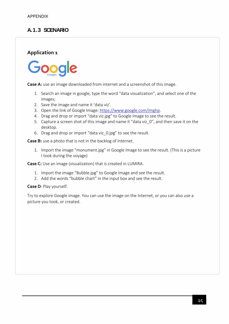
APPENDIX
15
A.1.3 SCENARIO
Application 1
Case A: use an image downloaded from internet and a screenshot of this image.
1. Search an image in google, type the word “data visualization”, and select one of the images;
2. Save the image and name it ‘data viz’. 3. Open the link of Google Image: https://www.google.com/imghp. 4. Drag and drop or import “data viz.jpg” to Google Image to see the result. 5. Capture a screen shot of this image and name it “data viz_0”, and then save it on the
desktop. 6. Drag and drop or import “data viz_0.jpg” to see the result.
Case B: use a photo that is not in the backlog of internet.
1. Import the image “monument.jpg” in Google Image to see the result. (This is a picture I took during the voyage)
Case C: Use an image (visualization) that is created in LUMIRA.
1. Import the image “Bubble.jpg” to Google Image and see the result. 2. Add the words “bubble chart” in the input box and see the result.
Case D: Play yourself.
Try to explore Google image. You can use the image on the Internet, or you can also use a
picture you took, or created.
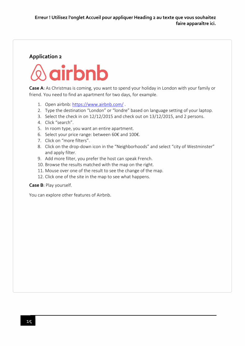
Erreur ! Utilisez l'onglet Accueil pour appliquer Heading 2 au texte que vous souhaitez faire apparaître ici.
15
Application 2
Case A: As Christmas is coming, you want to spend your holiday in London with your family or
friend. You need to find an apartment for two days, for example.
1. Open airbnb: https://www.airbnb.com/ . 2. Type the destination “London” or “londre” based on language setting of your laptop. 3. Select the check in on 12/12/2015 and check out on 13/12/2015, and 2 persons. 4. Click “search”. 5. In room type, you want an entire apartment. 6. Select your price range: between 60€ and 100€. 7. Click on “more filters”. 8. Click on the drop‐down icon in the “Neighborhoods” and select “city of Westminster”
and apply filter. 9. Add more filter, you prefer the host can speak French. 10. Browse the results matched with the map on the right. 11. Mouse over one of the result to see the change of the map. 12. Click one of the site in the map to see what happens.
Case B: Play yourself.
You can explore other features of Airbnb.
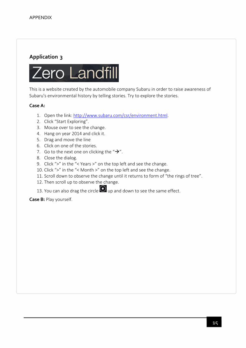
APPENDIX
15
Application 3
This is a website created by the automobile company Subaru in order to raise awareness of
Subaru's environmental history by telling stories. Try to explore the stories.
Case A:
1. Open the link: http://www.subaru.com/csr/environment.html. 2. Click “Start Exploring”. 3. Mouse over to see the change. 4. Hang on year 2014 and click it. 5. Drag and move the line 6. Click on one of the stories. 7. Go to the next one on clicking the “”. 8. Close the dialog. 9. Click “>” in the “< Years >” on the top left and see the change. 10. Click “>” in the “< Month >” on the top left and see the change. 11. Scroll down to observe the change until it returns to form of “the rings of tree”. 12. Then scroll up to observe the change.
13. You can also drag the circle up and down to see the same effect.
Case B: Play yourself.
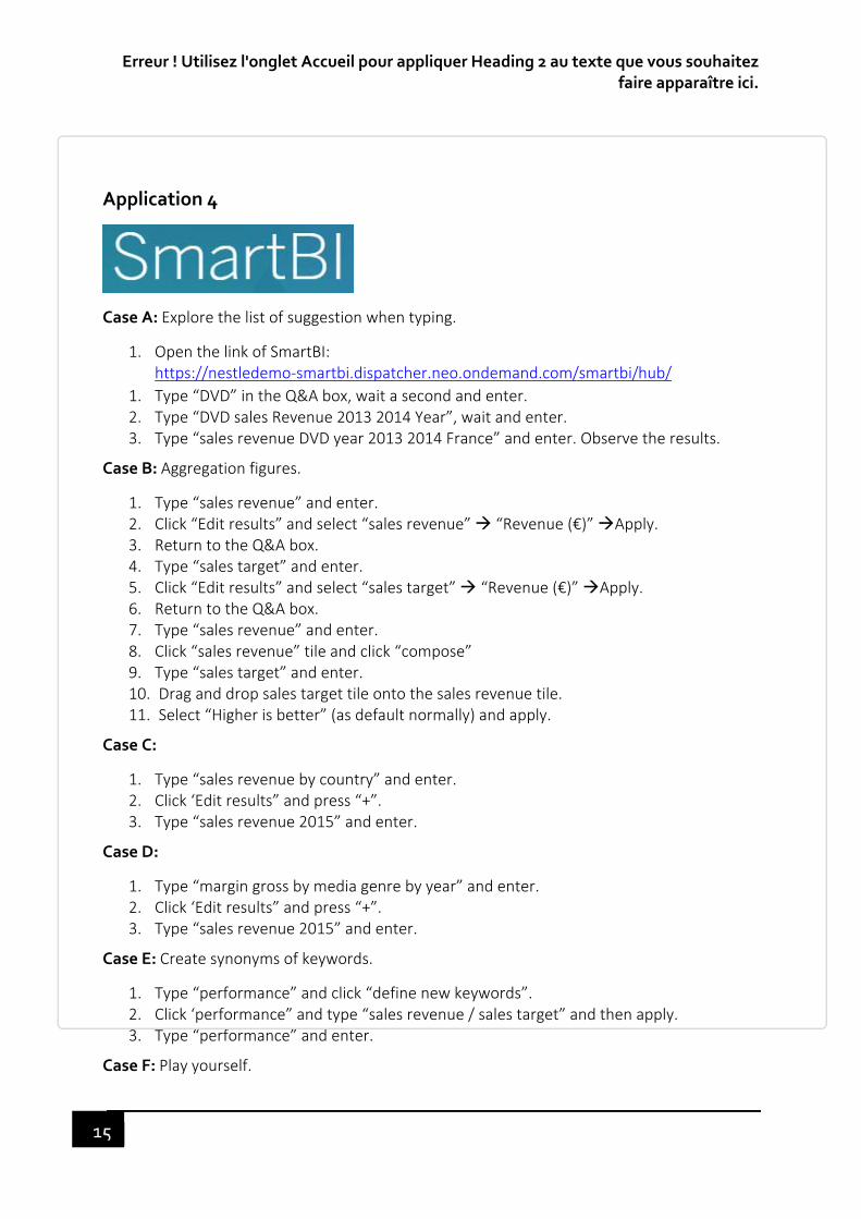
Erreur ! Utilisez l'onglet Accueil pour appliquer Heading 2 au texte que vous souhaitez faire apparaître ici.
15
Application 4
Case A: Explore the list of suggestion when typing.
1. Open the link of SmartBI: https://nestledemo‐smartbi.dispatcher.neo.ondemand.com/smartbi/hub/
1. Type “DVD” in the Q&A box, wait a second and enter. 2. Type “DVD sales Revenue 2013 2014 Year”, wait and enter. 3. Type “sales revenue DVD year 2013 2014 France” and enter. Observe the results.
Case B: Aggregation figures.
1. Type “sales revenue” and enter. 2. Click “Edit results” and select “sales revenue” “Revenue (€)” Apply. 3. Return to the Q&A box. 4. Type “sales target” and enter. 5. Click “Edit results” and select “sales target” “Revenue (€)” Apply. 6. Return to the Q&A box. 7. Type “sales revenue” and enter. 8. Click “sales revenue” tile and click “compose” 9. Type “sales target” and enter. 10. Drag and drop sales target tile onto the sales revenue tile. 11. Select “Higher is better” (as default normally) and apply.
Case C:
1. Type “sales revenue by country” and enter. 2. Click ‘Edit results” and press “+”. 3. Type “sales revenue 2015” and enter.
Case D:
1. Type “margin gross by media genre by year” and enter. 2. Click ‘Edit results” and press “+”. 3. Type “sales revenue 2015” and enter.
Case E: Create synonyms of keywords.
1. Type “performance” and click “define new keywords”. 2. Click ‘performance” and type “sales revenue / sales target” and then apply. 3. Type “performance” and enter.
Case F: Play yourself.

APPENDIX
15
A.2 APPENDIX OF TANGRAM EXPERIMENT
A.2.1 INTRODUCTION
Hello, I’m Lingxue YANG, PhD student at the Compiègne University of Technology in User
Experience Design at SAP. I am currently conducting my research on the design of re‐
engaging a problem‐solving task to qualify a positive emotional experience.
I would like to do an experiment based on a game called Tangram. Your point of view will be
very important for me to better understand these concepts.
This test consists of two sessions: pre‐session and post‐session. In the pre‐session, you will
be asked to play a game which is called Tangram to construct a geometric shape for 10
minutes. You will have 2 minutes to familiarize this game. 2 weeks later, you will play the
same game again with your history recorded in your pre‐session. After the test, you will fill
in a short questionnaire and answer questions by watching the recorded video at the end.
The post‐session will last about 1 hour.
If you agree, both sessions will be recorded via the webcam. During the post‐session, your
eye movement will be recorded by Tobii Eye tracker as well. The recordings will be
anonymous and confidential and be only used for research.
During the test, if you want to take a break, let me know and we'll stop for a moment.

Erreur ! Utilisez l'onglet Accueil pour appliquer Heading 2 au texte que vous souhaitez faire apparaître ici.
16
A.2.2 DEMOGRAPHIC SURVEY
https://lingxueys.typeform.com/to/x5jT3w
A.2.3 SEMANTIC EVALUATION
For both static and dynamic history path
https://lingxueys.typeform.com/to/MlVPed

APPENDIX
16
A.2.4 EXPERIENCE MAP

Erreur ! Utilisez l'onglet Accueil pour appliquer Heading 2 au texte que vous souhaitez faire apparaître ici.
16
Figure 50. Experience map for FS (D)
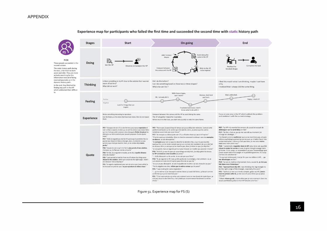
APPENDIX
16
Figure 51. Experience map for FS (S)

Erreur ! Utilisez l'onglet Accueil pour appliquer Heading 2 au texte que vous souhaitez faire apparaître ici.
16
Figure 52. Experience map for FF (D)

APPENDIX
16
Figure 53. Experience map for FF (S)