title plate blending as poetry - ledet.com · mily dickinson, the 19th-century ... rhyme outweighed...
TRANSCRIPT

THE MAKEREADY ARCH IVEColumn 30 of 77
Plate Blending as PoetryTopics: Channel blending, CMYK vs. RGB, fleshtones, greenery, role of unwanted color.
Column first appeared: August, 1998, Electronic Publishing magazine.
Source of this file: Chapter 5 of Professional Photoshop Fourth Edition (2002).
Author’s comment: We call it “channel blending” today, and we realize that it works better as a rule in RGB than in CMYK. But the basics haven’t changed all that much. Today channel blending is part of the arsenal of every serious retoucher. This column, reproduced here in the expanded form of a book chapter, was the first of a three-part series that explored the many uses of this technique in color correction.
This archive, to be released over several years, collects the columns that Dan Margulis wrote under the Makeready title between 1993 and 2006. In some cases the columns appear as written; in others the archive contains revised versions that appeared in later books.
Makeready in principle could cover anything related to graphic arts production, but it is best known for its contributions to Photoshop technique, particularly in the field of color correction. In its final years, the column was appearing in six different magazines worldwide (two in the United States).
Dan Margulis teaches small-group master classes in color correction. Information is available at http://www.ledet.com/margulis, which also has a selection of other articles and chapters from Dan’s books, and hundreds of edited threads from Dan’s Applied Color Theory e-mail list.
Copyright © 1998, 2002, 2011 Dan Margulis. All rights reserved.

mily Dickinson, the 19th-century American poet, was akeen observer of matters of color. She should, in fact, berequired reading for Photoshop theoreticians.
Although not a Photoshop user herself, she was able to put her finger on many an issue that still plagues us. The image at the upperright of this page is a romantic icon, exactly the sort of thing mostprofessionals have to produce over and over again.
Most of the time, that reproduction winds up being—well, I’d betterleave the description to Dickinson.
It tried to be a RoseAnd failed—and all the Summer laughed.
* * *Since our clients may not be so easily amused, it behooves us to dosome technical analysis. I haven’t seen the particular flower that Dick-inson was referring to, of course. But I can tell you what its problemwas. It had a lousy cyan plate, same as the one at the top of this page.Her retoucher should have blended channels to get a better one.
How do I know? Because that’s how it is with red roses, and that’show it is with most brilliant objects. The weak ink is the key to detail.
C H A P T E R 5Plate Blending As PoetryIn strongly colored areas, detail in the weakest ink—theunwanted color—is critical. If you don’t have that detail,there’s only one thing to do: get it from somewhere else.Understanding the observations of an American poet will help.

And to understand why things work thatway, one might start with the following:
Nature rarer uses YellowThan another Hue.Saves she all of that for SunsetsProdigal of Blue.Spending Scarlet, like a WomanYellow she affordsOnly scantly and selectly,Like a Lover’s Words.
* * *This isn’t bad poetry, but as color theory itleaves a lot to be desired. The exigencies ofrhyme outweighed the facts. Understand-ably reluctant to commence hostilities with
Nature rarely ladles YellowOut of a Tureen,
the poet found herself obliged to declareNature prodigal of the wrong color. I can-
not continue the rewrite: the business aboutspending scarlet is far too politically incor-rect for the publisher to permit me to leaveit in. I have thought, instead, about likeningthe way nature is with red to how calibra-tionists expend time and money on colormanagement solutions that don’t work, butI’ve had some difficulty coming up withlines that scan. I would, however, end thepoem thusly:
Chorus’d Nature, chanting Yellow,Sings with more élanThan Progeny of Press atonalMagenta and Cyan.
* * *Before you decide that poets should stick topoetry and Photoshop authors to Photo-shop, let’s cut Emily Dickinson a break. Shedidn’t know her verse was incorrect, because
80 Chapter 5
Figure 5.1 Two cyan plates, one with proper focus, and one that is decidedly second rate.

she thought in the color terms some of uslearned in school under the acronymousname Roy G. Biv: Red, Orange, Yellow,Green, Blue, Indigo, Violet. I don’t knowthat there has been a lot of research done on this point, but my impression is that, of these seven hues, Dickinson is correct:nature uses yellow the least.
Today, we have buried Mr. Biv and thinkin terms of CGYRMB, a perfect color cir-cle. In this model, red falls midway betweenyellow and magenta, magenta is midwaybetween red and blue, and so on.
One might think that there would be noreason that any one of these six colorswould be used more than another, but aquick check of the works of God and mandemonstrates how silly that view is. Red,green, and blue objects are far more com-
mon in nature than the other three. Bananasand other yellow objects exist, but theyaren’t that common. Bubble gum and cactusflowers are magenta, and certain Caribbeanwaters are cyan, but outside of these I amhard put to come up with anything else thatis magenta or cyan. And yet you couldname hundreds of things that are red,green, or blue.
An interesting exercise is to walk downthe street and record the color of clothesthat passersby wear. I’ve tried this and foundratios from four to ten to one in favor ofRGB colors as opposed to CMY.
The point of all this poetry and palaver?Simply this. In the images you work with,you are far more likely to be working withred, green, and blue objects than cyan,magenta, and yellow ones.
Plate Blending as Poetry 81
Figure 5.2 When the two cyans are plugged into the same MYK image, the difference is impressive.

To translate this into prepress language:it is extremely likely that the objects wework with will have two strong inks andone weak one, as opposed to other wayaround. It is that weak one, and how to ex-ploit it, which is the focus of this chapter.
The Cavalry of WoeCMYK, in addition to being a cockeyedcolorspace, is a backwards one. Instead ofchoosing inks based on their positive capa-bilities, they have been selected for whatthey do not do. Magenta does not reflectgreen light; yellow does not reflect blue;cyan does not reflect red.
From this, it is not too much of a stretchto realize that much of the color correctionwe do is topsy-turvy: that to be effective, wehave to think in color terms that are theopposite of what one might expect. Whenwe deal with reds, we should be thinkingcyan; when doing greens, magenta; andwhen portraying blues, yellow.
This is the religion of the unwantedcolor—the color that is the odd man out.
Because the unwanted color is so profi-cient at poisoning what would otherwise bea bright, clean look, it has a special impor-tance in making an image seem lifelike.The unwanted color, even in slight quanti-ties, is what gives an image depth.
The most obvious example of the im-portance of the unwanted color is in flesh-tones. Regardless of a person’s ethnicity,flesh is basically red. That is to say, it is acombination of magenta and yellow. Cyanis, therefore, the unwanted color.
It may be a leap of faith for you to acceptthat cyan is the most important color in aface. So, without further theoretical ado,let’s go straight to an example. The twocyans of Figure 5.1 represent the only dif-
ference between the two versions of Figure5.2. The other three channels are identical.
Note that there is technically nothingwrong with the poor image. The fleshtoneis within proper parameters. But the picturehas gone dead. The other seems to leap intothree dimensions by comparison.
When two inks are clearly dominating,the unwanted color is so potent in neutral-izing them that adding it is almost likeadding black. The unwanted color, however,is not quite as blunt an instrument. Also, amuch bigger range, and thus a better shape,can be engineered into the unwanted colorthan into either the two dominants or theblack. That is just a matter of numbers: inthe better version, the cyan ranges fromaround 5C to 20C. There is thus four timesas much cyan in the darkest area as in thelightest. Try getting that with either one ofthe dominants.
Best of all, the unwanted color is easy toadjust—or, if need be, to create. The twodominant inks must be kept carefully bal-anced; otherwise, areas of the face will startto get too yellow or too magenta. But it willtake an enormous move in the cyan beforethe overall color of the woman goes tosomething other than a shade of red. Muchcan be hidden in the unwanted color, andpart of the normal technique of workingwith faces should be calling up the cyan andseeing what improvements can be made.The picture as a whole cannot be sharp-ened, for example, but sharpening only thecyan is possible, and that will make a smallbut significant improvement.
To sum up, when trying to improve sky, the professional thinks of yellow first.To correct faces, we concentrate on cyan,and for plants and other greenery, we focuson magenta.
82 Chapter 5

Figure 5.3 When the interest area is the greenof a forest rather than the red of a face, the keycolor is magenta rather than cyan. Above, theoriginal image and its magenta plate; at bottom,a version with a better magenta. The two colorversions are identical in the CYK channels.
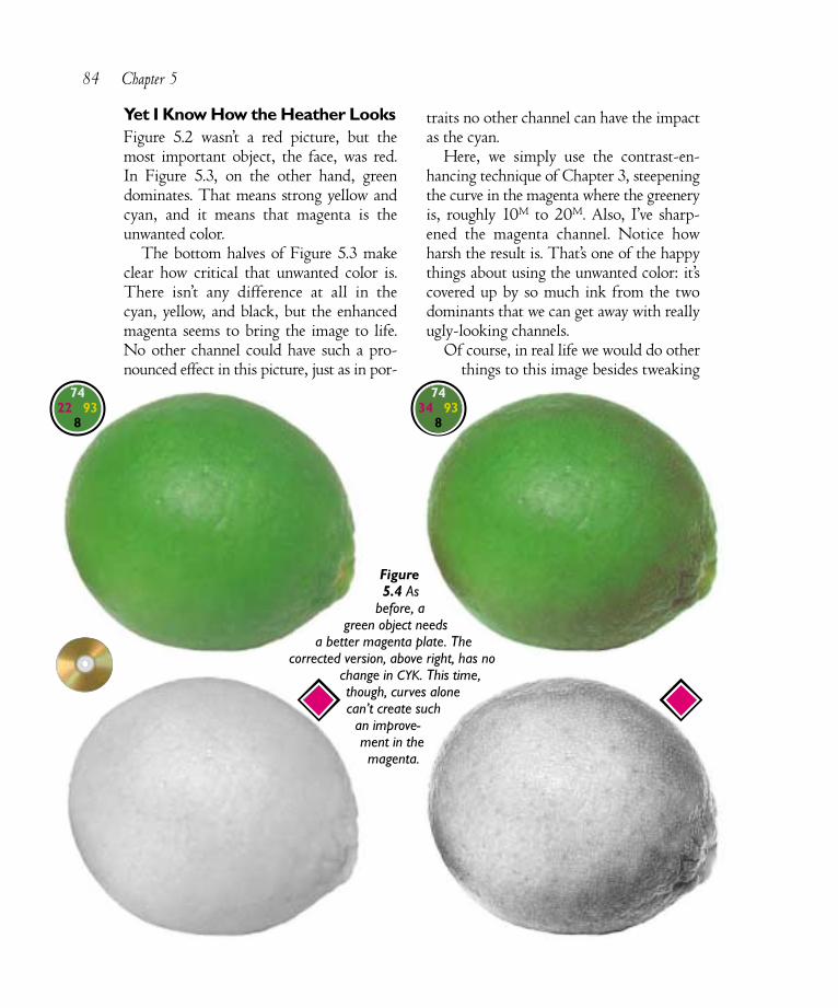
Yet I Know How the Heather LooksFigure 5.2 wasn’t a red picture, but themost important object, the face, was red. In Figure 5.3, on the other hand, greendominates. That means strong yellow andcyan, and it means that magenta is theunwanted color.
The bottom halves of Figure 5.3 makeclear how critical that unwanted color is.There isn’t any difference at all in the cyan, yellow, and black, but the enhancedmagenta seems to bring the image to life.No other channel could have such a pro-nounced effect in this picture, just as in por-
traits no other channel can have the impactas the cyan.
Here, we simply use the contrast-en-hancing technique of Chapter 3, steepeningthe curve in the magenta where the greeneryis, roughly 10M to 20M. Also, I’ve sharp-ened the magenta channel. Notice howharsh the result is. That’s one of the happythings about using the unwanted color: it’scovered up by so much ink from the twodominants that we can get away with reallyugly-looking channels.
Of course, in real life we would do otherthings to this image besides tweaking
84 Chapter 5
Figure5.4 As
before, agreen object needs
a better magenta plate. Thecorrected version, above right, has no
change in CYK. This time,though, curves alonecan’t create such
an improve-ment in themagenta.
7422 93
8
7434 93
8
the unwanted color, but that isn’t the point.The message is, when confronted by such apredominance of one color, you’ll get alousy image if you don’t take special carewith the unwanted color.
In many cases, the need for strong con-trast in the unwanted color is so compellingthat we have to take desperation measures.The normal desperation measure is to finda higher-contrast channel and blend it intothe unwanted color, hoping not to throwoverall color off too much in the process.
This is actually a watershed moment inthis book, at least if you’ve been reading the
chapters in order. Up until this point, theconcepts have been universal. We alwaysneed to create appropriate highlight andshadow values. If we have a choice of theshape of curves, we always choose to havethem emphasize the important areas of the image.
From here on, however, the strategies arespecialized. Plate blending, unsharp mask-ing tricks, unorthodox GCR decisions, theuse of other colorspaces: these are all greatresponses to specific situations. Unfortu-nately, one has to learn what those situa-tions are.
Plate Blending as Poetry 85
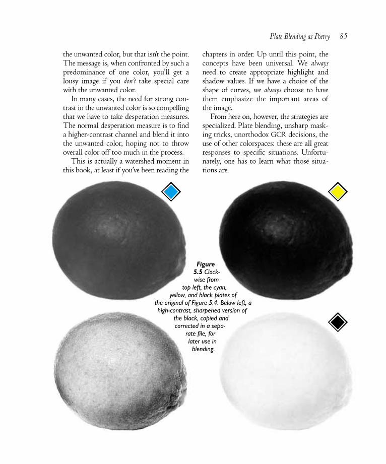
Figure5.5 Clock-wise from
top left, the cyan,yellow, and black plates of
the original of Figure 5.4. Below left, ahigh-contrast, sharpened version of
the black, copied andcorrected in a sepa-
rate file, forlater use inblending.

The Berry’s Cheek Is PlumperWhen everything is brilliant, nothing isbrilliant. Plate blending to enhance contrastin the unwanted color is often needed whenthere are large areas of intense color. Fruits,vegetables, and, of course, flowers are excel-lent examples.
There are two main reasons this maneu-ver is so important. First, the human ob-server always tries to break apart similarcolors, whereas a camera does not; there-fore, humans perceive more variation in thecolor of fruit than is ever captured on film.Since our job is to remind the eventualviewer of the original subject, not what thephotographer captured, we have to try torestore some of this color variation, andapplying curves and sharpening alone maynot do it.
Second, we want our bright objects to
look three-dimensional, not like flat blobs.The right-hand lime in Figure 5.4 is rounderthan the one on the left. That’s because thepurer the color, the closer it seems to us.The more it tends toward gray, the furtheraway it goes.
At the brightest spot in the center, thesetwo limes are almost identical in color. Thedifference is at the edges. There, the right-hand version is grayer, less green. Thosegrayer edges recede, fooling us into think-ing we are seeing rounder fruit.
And, not to beat a dead horse, when wehave a dominant red, green, or blue object,the way to turn parts of it gray is with its enemy, with its opponent, with the inkthat is specifically designed to contami-nate, poison, depurify, confound, distress,and distrain it, to wit, the unwanted color.
Once having concluded that this limeneeds a magenta plate like the one atbottom right of Figure 5.4, the ques-tion is how to get there from the ver-sion at bottom left. The answer is,we don’t. The original is simply tooflat. Curving it won’t help—at leastit won’t help enough.
Accordingly, we need to seek as-sistance elsewhere. We need to find achannel with more detail and blendit into this pathetic magenta. Figure5.5 shows the choices.
The maxed-out yellow is plainlyunsuitable. The cyan is pretty flat aswell, although it does have a well-pronounced hot spot in the middle.And the black? Well, at first blush, itseems as flat as the magenta, but itisn’t. Curving this one can bring outdetail, as we will see.
The first order of business is toget a copy of the aforesaid black
86 Chapter 5
Stumbling Blocks: Poetry and Peril•The deceptive default. Contrast-enhancing blendsneed to be done in Normal, or occasionally Lighten orDarken modes. Photoshop’s default is Multiply. Leavingit at that will mess everything up.
•The Misapply Image command. Apply Image onlyworks when the channel being changed—the target—isthe only channel displayed on the screen, or the onlychannel active in the Channels palette.
•Failing to correct after the blend. Blends cansometimes make the unwanted color channel too heavy,subduing colors. In such cases, don’t forget to apply asubsequent curve that lightens, but remains steep in, thehighlight area. This will retain the added contrast.
•The CMYK shadow imbalance. When blendinganother channel into the cyan, be careful not to lightenits shadow, which normally is 10 points higher than inthe other three. Sometimes, the blend channel needs tobe copied, darkened, and then applied to the cyan.

channel to play with. This is done by dis-playing the channel; Select All (Command-A); Copy (Command-C); New document(Command-N, which automatically opens adocument to the same size as what we havejust copied); Paste (Command-V); dropdown one layer (Command-E.)
The result of all this alphabet soup is agrayscale document that is divorced fromthe original, meaning we can smash it all topieces if we like.
But there is no need for such violence.Instead, what we want to do is increase con-trast in the fruit, and having gone throughChapter 3, we know exactly how to do so.We create a curve that is as steep as possiblein the area occupied by the lime. And forgood measure, we apply heavy unsharpmasking afterwards. The result is at thebottom left of Figure 5.5.
This hot rod of a channel is almost goodenough to replace the original magenta, be-cause the two are practically the same color.The key is understanding that contrastneeds somehow to be added to the magenta.After that, how far to go is a judgment call.
With both the original file and theseparate blending channel open on screen,we display the magenta channel of theoriginal and choose Image: ApplyImage. Up comes the dialog boxshown in Figure 5.6. We now specifythat the source is the other image andpick an opacity, using Normal mode.Understanding that this is an arbi-trary decision and that you areperfectly free to think I should havegone further or not even this far, Iused 75%.
Ordinarily, after a blend like this, afurther correction is necessary. Blendinginto the unwanted color always adds detail,but it frequently changes color as well. Wewant a rounder lime, not a browner one.Most of our perception of color comesfrom the brightest area of the fruit. So wehave to make sure that, after the blend, thatpoint hasn’t changed color too much. If ithas, we need to apply curves to the blendplate to restore color while holding contrast.
Here, we lucked out; the color is closeenough as is, another reason to favor blend-ing with the black plate as a source ratherthan the darker cyan.
If this blend seems too simple, morecomplicated options are readily available.We could have made two separate blendingchannels, one based on the cyan and one onthe black, and then blended those togetherbefore blending the result in the magenta.Or we could have made a copy of theimage, converted it to LAB, and used the Lchannel for blending. Or to RGB, and used
Plate Blending as Poetry 87
Figure 5.6 The blending process, using Photoshop’s Apply Image command.

the green. Or we could have done one ofthese things using Multiply as the blendmode, rather than Normal.
Any of the above is a reasonable choicefor dealing with this image. Giving up andleaving the magenta plate alone is not.
In Just the Dress His Century WoreThe interesting marbled-paper image ofFigures 5.7–5.10 symbolizes a species par-ticularly suited to unwanted-color moves. Ifan object has a pronounced grain, as this
paper does, the unwanted color governs itsintensity. When we want to make the grainmore or less prominent, the unwanted coloris the principal tool.
Although wood might be a more typicalexample of where we might want to controlgrain, the paper image has more possibili-ties. Images like these are sold to be used asbackgrounds, for which they are very useful.Frequently we will want to make somecustom variation of them. Here are a fewsuch ideas.
88 Chapter 5
Figure 5.7 Left, the original. Center, removing all cyan sharply reduces grain. Right, increasing contrast in thecyan makes all patterns more pronounced.
Figure 5.8 When the image is shifted from magenta-red to pure red, the unwanted color becomes even moreprominent. Center and right, adjustments in the cyan drastically change the strength of the grain.

Curve-based contrast boosting of theunwanted color is the best way to bring outthe grain. In Figure 5.7, compare the origi-nal to a version with no cyan at all, and onewith a steep contrast curve that increasescyan quartertones without adding cyanwhere there was none.
Unwanted colors do their work bestagainst purer incarnations of red, green,and blue. The overall feeling of this art isless red than magenta, although the yellowplate is much heavier than the cyan. In
Figure 5.8, we make the image pure red by duplicating the magenta plate into theyellow channel.
Under these circumstances, the impactof moves in the cyan is intensified. Notethat one effect has gone away: a danger inworking with grains is that the grain maytake on the look and feel of the unwantedcolor. This is what is happening in theright third of Figure 5.8. Where the cyan isheavy, the pattern is becoming distinctlyblue. That color shift is not necessarily a
Plate Blending as Poetry 89
Figure 5.9 Neutralization techniques. Left, a single overall reduction in saturation. Right, curves that aim formore neutral colors. Center, swapping the cyan and black plates gives less color variation.
Figure 5.10 Special effects. Left, increasing cyan sharply overall by blending 50 percent of magenta into it.Center, an inversion curve on the cyan. Right, using the entire available colorspace through drastic curves.

problem with this art. If we were workingon a reddish wood, however, a bluish grainwould be just as easily achievable, but farless desirable.
The center image of Figure 5.9 suggestsa way of avoiding this. Earlier, I assertedthat adding the unwanted color is roughlyas powerful as adding black. To test thisproposition, I actually transposed the blackand cyan in the center image. If we wouldlike a strong grain, but don’t want any of itto have a blue tinge, this is the way to go.
This version is flanked by the right and the wrong way to get a less pink andmore neutral effect. On the left, Image:Adjustments>Hue/Saturation reduces sat-uration everywhere. This floods everythingwith unwanted colors, and although it does make the image more neutral, it alsoneutralizes a lot of its appeal.
The blunt instrument of Hue/Satura-tion adjustment should only be used for its ability to isolate a certain color. Whenacting on the image as a whole, curves willalways be more effective, as in the version atthe right of Figure 5.9. This was treated justas we would any other image with a cast. Ifound areas that I wanted to neutralize andforced a gray in them. This retained plentyof interesting color variation throughoutthe image, since places with relatively heavymagenta, yellow, or cyan continued to dis-play it. The only issue was where to set thehighlight and shadow. This is one of therare images that, in the interest of softness,should probably not make use of all avail-able color space. So, I set my highlight at10C10M8Y, intentionally retaining a slightmagenta cast, and the shadow at about50% in all colors.
Figure 5.10 shows three fanciful variants.At left, a new cyan plate that is a 50–50
split with magenta makes for a lavenderimage with a much less pronounced grain.Quick! How would we add more grain?
Yes, of course, this change has given us adifferent unwanted color. The way to adddetailing would be to alter the yellow.
The center version has a flipped cyan.That is, the start of the curve is higher thanthe end, meaning that places that were rel-atively heavy in cyan are now relatively light.This is not a straight negative version of thecyan, which would overwhelm the image,but a softer variation on the negative theme.
Finally, the right-hand version is a re-minder of just how much vitality we canadd to any image through curves. I simplyset the lightest area of each color to zeroand the heaviest to around 90%.
This series of maneuvers illustrates someof the potential offered by manipulatingabstract patterns. They have interest just bythemselves, but they are particularly usefulas backgrounds, especially if they are nottoo assertive.
Give the One in Red CravatOur last demonstration of the contrarianschool of color correction is Figure 5.11. At first glance, it isn’t much like the otherimages in this chapter, which tend towardblazing exhibitions of a single color. Here,90 percent of the image—the door and thewoman’s flesh and hair—is fairly subdued.The dress, however, is brilliant red, andwhen we see brilliant reds, we must instinc-tively look to the cyan plate.
The extra bite in the door comes frommoves in the L channel of LAB. We’ll seehow to do this sort of thing in Chapters 8and 9. But LAB techniques won’t put foldsin the dress. And without those folds, thedress looks like it’s painted on.
90 Chapter 5

This seems like just another version ofthe lime, or of the woman’s face. After theoverall correction is made, we need to thinkabout blending into the weak channel. Butthis one is not as easy. The lime was entirelygreen. While the face wasn’t the only thingred, there wasn’t any other important colorin the picture. But in Figure 5.11, if we startblending into the cyan plate, the door is aptto turn a very weird color.
We’ve avoided the practice for nearly fivechapters, but here there’s nothing for it butto make a selection and blend into that.First, an examination of the channels veri-fies the problem. The cyan is terrible. Themagenta is totally solid. The yellow is ser-viceable and is the obvious blending choice.
I’ve used this image in classes and havebeen astounded to see professional retouch-ers who are insightful enough to realize thatsuch an unorthodox maneuver is necessary,yet so set in their ways that they take half anhour to create the necessary selection mask.
Granted, the ability to make accuratemasks is one of the hallmarks of the pro-fessional. If you don’t have a lot of practiceat this sort of thing, imagine how difficult itwould be to select, for example, the hair ofthe woman in Figure 5.1. In such a case,we’d be looking at individual channels to tryto find the best edge and doing all sorts ofother tricky things.
Here, however, there is no need to spendany time at all. Just look at the magentaplate in Figure 5.12. One can hardly ask fora more decisive distinction between dress
Figure 5.11 The unwanted color at work in aselected object. An overall plate blend won’t work here because it would change color toodrastically in the background. By selecting thedress and blending into that, however, more detailcan be built into the folds.
2099 69
5
3499 69
7

and background. All one has to do is hit thedress with the magic wand tool, and presto,a perfect selection. I feathered it from forceof habit, but this is not really necessary.
Now, with the dress still selected, flip tothe cyan channel, and apply the yellowchannel to it. This will leave the back-ground unaffected. I used 50% opacity.
As it did with the lime, this blend left theunwanted color too dark. Therefore, withthe dress still selected, I brought its mini-
mum cyan value down towhat it was before the blend. Iswept the left endpoint of thecurve to the right rather thanreducing the quartertone, tomaintain steepness and retainthe shape of the folds.
But Graphicker for GraceWhen one color dominates the image, weshould not be dazzled into believing thatthat is the one we must attack. Instead, weshould be more subtle, devoting our ener-gies to courting the color that is prominentby its absence—unwanted, perhaps, butnot unnecessary, not unloved.
Admittedly, this channel blending istricky stuff, more so than the curving ofChapters 2 and 3. The decision-making ismuch less automatic. It’s fairly easy, I think,to know when a channel blend might beappropriate; the hard part is deciding howto execute it..
The language of color is indeed the lan-guage of poetry. The idea that there shouldbe fewer yellow objects in nature than red,green, or blue ones is counterintuitive, but itis nevertheless correct. Many scientificallyfashionable ideas about how color should behandled have failed because their authorsdid not grasp facts about color that wereobvious to, say, Leonardo da Vinci.
Or Emily Dickinson, for that matter. I’veoften been attacked, over the years, for say-ing what I did in Chapter 1, that photostaken in dark conditions generally need to
92 Chapter 5
Figure 5.12 Creating a replace-ment for the original cyanchannel, left. Below, left to right:the original magenta; the originalyellow; a 50–50 blend of theyellow into the dress area only ofthe cyan; and a final cyan versionin which curves have beenapplied to the dress to lighten itand enhance shape.

Plate Blending as Poetry 93
uick & irtyM A N I P U L AT I N G T H E U N WA N T E D C O L O R
✓ Areas that are predominantly red, green, or blue are peculiarly susceptible tomoves involving the opponent process plate, otherwise known, somewhat inaccu-rately, as the unwanted color. In red areas, including fleshtones, the unwanted coloris cyan; in greens, the unwanted color is magenta; and in blues, it is yellow.
✓ Focus-enhancing moves in the unwanted color are very powerful, roughly as effec-tive as moving both dominant inks at once. In adding detail, it’s the most significantchannel. Steepening the weak color’s curve will yield dramatic results.
✓ Many bright areas appear too flat because they lack an unwanted color altogether.In such cases, applying curves will be of little help. It is often necessary to generatea shapelier unwanted color plate by means of blending detail in from anotherchannel.
✓ After a channel blend, restore original color by lowering the minimum value of thenew channel in the affected area to whatever it was before.
✓ When trying to use bright, happy colors, consider reductions in the unwantedcolor rather than trying to beef up the dominants.
✓ In objects with a pronounced grain, such as woods, steepening the unwanted colorwill greatly intensify the graininess, but at the risk of creating an unwelcome hue.In such cases, consider means of transferring some of the role of the unwantedcolor into the black plate. Normally this is done by blending some of theunwanted color into the black.
✓ Zeroing out the unwanted color in the absolutely brightest area is a good way toadd even more contrast to a primary color, even though letting one of the CMYcolors drop to zero is normally considered unacceptable.
✓ Our perception of colors is influenced by what we see near them. To emphasize abright color even more, increase the unwanted color in nearby areas.
✓ Be alive to the possibility that an image may offer more than one opportunity foran unwanted-color maneuver. If an ink is unwanted in one area of the image anddominant elsewhere, generally it will pay to steepen the curve in the unwantedarea even if it penalizes the dominant range.
Q D

be lightenedeven whenthe photog-rapher hasalready tried
to compensate.Match the art!say the scoffers.
What gives you the rightto think that an observer would see itdifferently than the camera?
A voice from 1862 answers them:We grow accustomed to the DarkWhen Light is put away.As when the Neighbor holds the LampTo witness her Goodbye.A moment—we uncertain stepFor newness of the Night,Then fit our Vision to the DarkAnd meet the Road erect.
* * *For all the glorious instincts of the truepoet, certain things come only with experi-ence. Appreciation of the importance ofthe unwanted color is one of them. For now,we should just resolve that all stronglycolored red, green, and blue objects: flow-ers, fruits, faces, whatever—will alwayshave high-contrast and poetically shapelyunwanted-color channels in our work. Inarranging this, we avoid the followingDickinsonian error of inexperience:
The good Will of a FlowerThe Man who would possessMust first presentCertificateOf minted Holiness.
* * *Phooey. The above is a crock. You wantgood flowers, you don’t need any certificate.
You need a good unwanted color. The cer-tificate, plus the other three channels, plus adollar and a half, gets you on the subway.
Long before the age of Photoshop, JohnWiley & Sons, the publishers of this book,brought out a scholarly work on color,which offered the following wisdom:
Confusion about the elementary princi-ples of color is very widespread, the chiefreason being that words dealing with colorare used very loosely in ordinary language.But the difficulty goes deeper than that.Color was an art long before it was a sci-ence, and consequently the language ofcolor is poetic rather than factual. Thewords are not as a rule intended to betaken literally but rather to convey a feelingor an impression….Scientists are often in-furiated by their inability to pin down anartist, or even a layman, to factual state-ments on subjects that might lie within thesacred realm of physics. Or, not recogniz-ing that the artist’s statements are poetic,they point out the departures from literaltruth and expect the artist to retract them.
If you read about “caverns measurelessto man,” nobody supposes that a dedicatedspelunker with modern surveying instru-ments would be unable to map them, ifthey existed. And if a lady with spike heelssays “My feet are killing me” this is easilyrecognized as a poetic statement, on asomewhat lower plane. But if someone says“This color has some red in it,” how are weto take it? This sentence sounds factual andobjective, but probably it merely expressesthat the speaker associates a feeling of red-ness with the color, and it might better beregarded as a poetic statement.
Indeed.