smart visualization of mixed data
TRANSCRIPT

Article
Smart Visualization of Mixed DataAurea Grané 1,* , Giancarlo Manzi 2 and Silvia Salini 2
!"#!$%&'(!!"#$%&'
Citation: Grané, A.; Manzi, G.; Salini,
S. Smart Visualization of Mixed Data.
Stats 2021, 4, 472–485.
https://doi.org/10.3390/stats4020029
Academic Editor: Wei Zhu
Received: 28 April 2021
Accepted: 20 May 2021
Published: 1 June 2021
Publisher’s Note: MDPI stays neutral
with regard to jurisdictional claims in
published maps and institutional affil-
iations.
Copyright: © 2021 by the authors.
Licensee MDPI, Basel, Switzerland.
This article is an open access article
distributed under the terms and
conditions of the Creative Commons
Attribution (CC BY) license (https://
creativecommons.org/licenses/by/
4.0/).
1 Department of Statistics, University Carlos III of Madrid, 28903 Getafe, Spain2 Department of Economics, Management and Quantitative Methods and Data Science Research Center,
University of Milan, 20122 Milan, Italy; [email protected] (G.M.); [email protected] (S.S.)* Correspondence: [email protected]
Abstract: In this work, we propose a new protocol that integrates robust classification and visualiza-tion techniques to analyze mixed data. This protocol is based on the combination of the ForwardSearch Distance-Based (FS-DB) algorithm (Grané, Salini, and Verdolini 2020) and robust clustering.The resulting groups are visualized via MDS maps and characterized through an analysis of severalgraphical outputs. The methodology is illustrated on a real dataset related to European COVID-19numerical health data, as well as the policy and restriction measurements of the 2020–2021 COVID-19pandemic across the EU Member States. The results show similarities among countries in termsof incidence and the management of the emergency across several waves of the disease. With theproposed methodology, new smart visualization tools for analyzing mixed data are provided.
Keywords: clustering; data visualization; MDS; mixed data; robustness; outliers
1. IntroductionThe diversity of data is continuously increasing with the increase of the availability
of massive datasets from multiple sources, making mixed-type-data analysis tools moreimportant than ever. This diversity is not only “objective”, but may become “subjective” asmore and more people enter the world of Big Data analysis. For some working on data incertain areas, it may not be sufficient to only consider the objective nature of the data (forexample, human height can be “objectively” considered as continuous), but, depending onthe context in which the analysis is carried out, transforming the data into another typeand using different data analysis tools could be more strategically effective (human heightcould be considered as simply “small” or “big”). Furthermore, when combining data ofdifferent types, a flexible data analysis, i.e., less specific to a particular data type, couldgive better results [1].
One common issue when dealing with tools applied to mixed data is the choice of thedistance. Different choices of the distance measure might impact the results of dimensionreduction, clustering, classification, and so on, and in the more general context of machinelearning, for example, the concept of distance metric learning when dealing with mixeddata has been widely explored [2,3], leading to the search for more robust and sensitivemetrics with respect to mixed data [4].
In the context of multidimensional scaling (MDS), Grané and Romera [5] comparedmultiple MDS configurations to visualize the intrinsic data profile structure and used a ro-bust joint metric combining different distance matrices through related metric scaling [6,7].They also proposed a novel statistic for outlier detection in mixed data. Grané et al. [8]proposed a method to hierarchically cluster mixed data using an approach based on theForward Search algorithm [9]. Their proposal was to build an algorithm (called ForwardSearch Distance-Based (FS-DB)), which was a combination of the distance function pro-posed by Grané and Romera and a forward search algorithm in order to improve therobustness of the results and to visualize and identify outliers, even if they were masked inthe bulk of the data.
Stats 2021, 4, 472–485. https://doi.org/10.3390/stats4020029 https://www.mdpi.com/journal/stats
Stats 2021, 4 473
The aim of this work was twofold. First, we wanted to complement the FS-DBalgorithm by enlarging the collection of distance functions by adding a robustified versionof Gower’s distance and by adding new graphical tools in order to visualize the complexstructure of mixed data. In particular, we implemented interactive scatter plots to visualizequantitative variables conditioned on categorical ones, we developed cross-correlationheat maps in order to visualize the complex relationship among the original variables andthe MDS axes, and finally, we implemented a robust hierarchical clustering to visualizethe proximities among individuals through a dendrogram representation. To illustratethis methodology, we produced a complex dataset related to the spread of the COVID-19 pandemic in the 27 EU Member States, covering the period from the first day thatCOVID-19 data were published to the last month before the start of vaccination programsin Europe.
This paper is organized as follows. In Section 2, we present an overview of the FS-DBmethod and propose a novel algorithm for the improved FS-DB method, as well as aprotocol to visualize mixed data. In Section 3, we apply the algorithm and the protocol toa dataset related to three waves of the COVID-19 pandemic in the 27 EU Member States.Section 4 concludes the paper.
2. Materials and Methods2.1. FS-DB Algorithm
The FS-DB algorithm was introduced by [8] for the analysis and clustering of mixeddata. In particular, the FS-DB algorithm combines the forward search method [9,10] with adistance-based tool, used in [5], to detect outliers in mixed-type datasets.
The idea behind this algorithm is to help understand the structure of mixed-typedatasets by identifying the subset of the closest units (according to a user-selected distancemeasure), as well as those units that are the most distant from the set(s) of data. When thealgorithm is applied to a dataset some numerical outputs and two interesting graphicaloutputs are produced. The first one, called the forward plot, depicts the trajectories ofthe units and serves to illustrate the units’ performance along the steps of the algorithm.This is an interactive plot, where the user can select a subset of units for further analysis,and it allows identifying outlying observations at glance. The second one is the MDS plot,which contains the final MDS representation of the dataset, where the user-selected subsetsof units are subsequently highlighted.
Two possible distance measures are available in the FS-DB algorithm: a distancemeasure based on Gower’s classical similarity coefficient and a metric obtained via relatedmetric scaling, which satisfies several axioms related to the property of identifying anddiscarding redundant information. See [8] for details.
2.2. A Protocol to Visualize Mixed DataIn this section, we present our new contributions to the FS-DB algorithm. In particular,
we incorporated a smart visualization of mixed data to help understand the complexity ofthe data structure, as well as the relationships among the variables. This was achieved inseveral directions, for example by adding scatter plots of quantitative variables coloredaccording to the categorical variables; these types of plots can be used to represent eitherthe original quantitative variables or the resulting principal coordinates (MDS-maps);we also added a brushing option so that the user could select several sets of units to behighlighted. Another interesting contribution was to enlarge the collection of distancemeasures to be used for mixed data. In this work, we proposed to use a robustified versionof Gower’s distance. The code implemented for the algorithm followed the standardsof the common and flexible framework provided by the FSDA Toolbox of MATLAB [11];the authors’ intention is to submit the code for future releases.
In what follows, we describe the different steps of the protocol.
1. Exploratory step.
Stats 2021, 4 474
• Multiple scatter-plots and box-plots of quantitative variables by categoricalones. Due to the mixture nature of the data, we represent the individuals inthe original variable space and color them according to the categories of thecategorical variables in order to better understand the complexity of the data.
• Spatial data tool. In multiple scatter-plots the user can select which data pointswants to be highlight in a geographical map. The code allows the possibilityto link the data to a shape-file (when available), inspired by the GeoDa userfriendly tool for spatial data analysis (https://geodacenter.github.io, accessedon 1 February 2021).
2. Data analysis step.• Starting point: A data matrix of mixed data n ⇥ p.• Metric construction: Robustification of Gower index. Gower’s similarly coeffi-
cient [12] is one of the most popular similarity measures for mixed data. Thiswell-known similarity coefficient is the Pythagorean sum of three similarity coef-ficients for quantitative, binary and multi-state categorical variables. For quanti-tative variables, the similarity is related to range-standardized city-block distanceand for binary and multi-state categorical ones, respectively, simple matchingand Jaccard’s similarity coefficients are computed. One of the main drawbacksof Gower’s coefficient is its lack of robustness which yields to non-stable MDSconfigurations [5,8]. Inspired by Gower’s idea, we construct a robust distance byadding three distance measures: robust Mahalanobis distance for quantitativevariables, Hamming distance for binary ones and for multi-state categoricalvariables we calculate the distance associated to Jaccard’s similarity coefficient.We denote this new distance measure by d. Note that, first, our robust proposalonly concerns quantitative variables, since distance measures for binary andmulti-sate categorical are left unchanged, and second, by considering (robust)Mahalanobis distance, we also take into account the redundant informationwithin quantitative variables, which is not taken into account by Euclidean orMinkowski distances, since these well-known distances always increase despitethe added statistical information is not relevant. Thus, the choice of the distancemeasure is a key point. Here we are not interested in a general distance measurebut in a statistical distance measure, that is, we want to see close those individ-uals that share the same kind of information and we want to see distant thosewith very different characteristics.
• Data analysis: FS-DB algorithm is applied to the n ⇥ n distance matrix obtainedfrom metric d.
3. Visualization step.• Outliers. We use FS-DB algorithm to visualize the most inner and most outer
observations in the dataset, according to d. The Forward-plot is an interactiveplot, where the user can select a group of individuals to explore.
• Multiple scatter-plots with MDS-maps. We produce MDS maps to visualizethe proximities among individuals, according to d. Groups of user-selectedindividuals are subsequently highlighted with colors.
• Relationship between original mixed-type variables and MDS coordinates. A wayto see the influence of each original variable in the principal coordinates is tocompute a correlation coefficient or a association measure between the originalvariables and the axes. We use Pearson’s correlation coefficient for quantitativevariables, Cramer’s V for nominal ones and Spearman’s correlation coefficientfor ordinal ones. Other measures of association (Kendall’s tB and tC, g, etc.) canbe implemented. We visualize these relationships through a heat map.
• Clustering. We give hierarchical clustering representations of the individualsbased on distance d. We also give cophenetic correlation coefficient as a measureof discrepancy between d and the corresponding ultrametric distance. This

Stats 2021, 4 475
analysis allows to check the coherence with the previous clusterings observed inthe Forward-plot and the MDS-maps.
3. Results3.1. Data Description
We applied the tools described in Section 2.2 to a dataset related to the spread ofthe COVID-19 pandemic in the 27 EU Member States. The data cover the period from24 February 2020 to 30 November 2020, i.e., from the first day when collected COVID-19data were published to the last month before the start of vaccination programs in Europe.
Data sources were general data repositories for COVID-19 data [13,14], data reposito-ries of research projects on COVID-19 [15,16] and institutional repositories (Eurostat, UnitedNations, World Health Organisation, the World Bank). Our data collection procedure is inline with the recent literature on COVID-19 data modeling [17–19].
Figure 1 shows a sketch of the data sources and the way they were structured inour dataset.
Figure 1. Sources and structure of the dataset used for the analysis.
We looked for different data sources regarding three main types of variables: (i) pan-demic variables; (ii) restriction variables; (iii) mobility variables; (iv) public health variables;(v) socioeconomic and demographic variables. Pandemic and restriction/mobility vari-ables are stored on a daily basis, socioeconomic variables have generally a wider timeperiodicity (from monthly to annual). The type of variables is very diverse: there arediscrete quantitative (pandemic variables), percentage (pandemic, mobility and publichealth variables), ordinal (restriction variables), rate variables (in the public health variablesgroup), continuous quantitative and index variables in the socioeconomic variable group.The variable Health_Expenditure_Type is the only binary variable expressing whetherthe national health system is prevalently private or public. Overall the dataset comprises7587 records and amounts to 48 variables divided in 11 ordinal variables, 14 (discrete orcontinuous) quantitative variables, 1 binary variable, 14 percentage or percentage changevariables, 6 rate variables and 2 index variables. As for periodicity we get 27 daily variables,1 monthly variable, 2 quarterly variables and 18 annual variables. For some variables withsimilar meaning (like 2019_Risk_Poverty, which is a percentage, and extreme_poverty,which is ordinal) we considered different types to enrich the mixed nature of our dataset.
Therefore, the formed dataset is rich in variable type variety, can be used for timeseries analysis or for multivariate analysis by using appropriate aggregation functions (as
Stats 2021, 4 476
we will see in the following sections), can be used for outlier and robustness checking inthe context of the 27 EU Member States. It will be freely available together with all theMATLAB code implemented for this work.
Table A1 in Appendix B lists in detail the characteristics of the variables in the datasettogether with their type, group, periodicity and source.
3.2. Visual Exploratory Data AnalysisIn our analysis we divided the epidemiological time series in three periods, the first
one corresponding to the first wave of the pandemic when Western EU countries weremore affected than Eastern EU countries (from the end of February 2020 to mid June 2020),the second one during the Summer of 2020 when the pandemic was less strong almostin every EU country, and the final one corresponding to the third pandemic wave whichaffected almost all the EU Member States (from mid September 2020 to end of November2020). The three periods are referred to as Wave 1, Wave 2 and Wave 3 in the following.
Despite the original data were time series data, the aim this work was to explore theoverall characteristics of the different waves in the EU Member States using visual tools.For this reason we aggregated our data according to: type of variable, wave, country andaggregating statistics. The statistics considered for aggregation were mean, median andmax for quantitative variables, and the mode for qualitative variables (including the onlybinary variable in the dataset, i.e., the country’s health system type).
Our first visualization tool is about displaying in the same multiple scatter-plot thepairwise relationships among several variables together with the box-plots of the chosenvariables on the main diagonal of the multiple scatter-plot. At the same time, individuals(country data points) in the multiple scatter-plot are colored according to the values ofanother variable which can be viewed as a conditional or data point grouping variable.
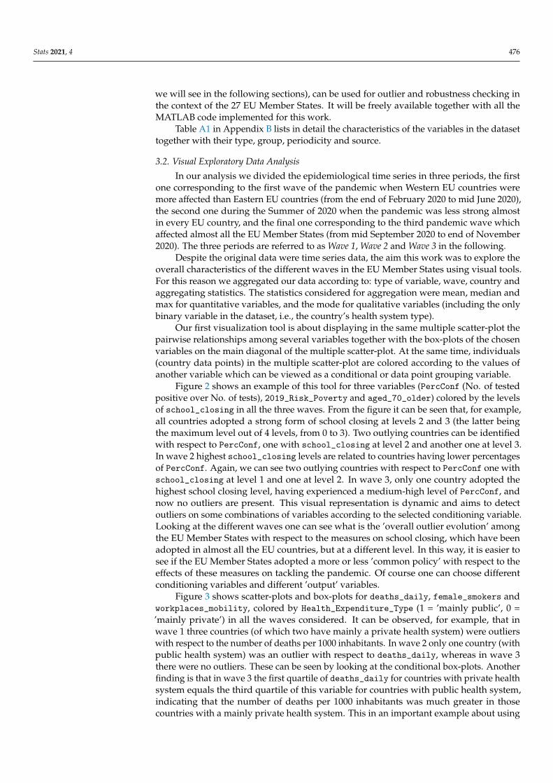
Figure 2 shows an example of this tool for three variables (PercConf (No. of testedpositive over No. of tests), 2019_Risk_Poverty and aged_70_older) colored by the levelsof school_closing in all the three waves. From the figure it can be seen that, for example,all countries adopted a strong form of school closing at levels 2 and 3 (the latter beingthe maximum level out of 4 levels, from 0 to 3). Two outlying countries can be identifiedwith respect to PercConf, one with school_closing at level 2 and another one at level 3.In wave 2 highest school_closing levels are related to countries having lower percentagesof PercConf. Again, we can see two outlying countries with respect to PercConf one withschool_closing at level 1 and one at level 2. In wave 3, only one country adopted thehighest school closing level, having experienced a medium-high level of PercConf, andnow no outliers are present. This visual representation is dynamic and aims to detectoutliers on some combinations of variables according to the selected conditioning variable.Looking at the different waves one can see what is the ’overall outlier evolution’ amongthe EU Member States with respect to the measures on school closing, which have beenadopted in almost all the EU countries, but at a different level. In this way, it is easier tosee if the EU Member States adopted a more or less ’common policy’ with respect to theeffects of these measures on tackling the pandemic. Of course one can choose differentconditioning variables and different ’output’ variables.
Figure 3 shows scatter-plots and box-plots for deaths_daily, female_smokers andworkplaces_mobility, colored by Health_Expenditure_Type (1 = ’mainly public’, 0 =’mainly private’) in all the waves considered. It can be observed, for example, that inwave 1 three countries (of which two have mainly a private health system) were outlierswith respect to the number of deaths per 1000 inhabitants. In wave 2 only one country (withpublic health system) was an outlier with respect to deaths_daily, whereas in wave 3there were no outliers. These can be seen by looking at the conditional box-plots. Anotherfinding is that in wave 3 the first quartile of deaths_daily for countries with private healthsystem equals the third quartile of this variable for countries with public health system,indicating that the number of deaths per 1000 inhabitants was much greater in thosecountries with a mainly private health system. This in an important example about using

Stats 2021, 4 477
this visual tool to immediately check the impact of EU countries’ policies with respect tosome macro-features of the countries, like the type of health system, in this case. Therehas been a long and controversial debate on the effectiveness of private or public healthsystem to tackling the pandemic. The neoliberalism in healthcare has been the prevalenttrend in almost all Western EU countries in recent decades, but the COVID-19 pandemichas re-ignited some recent literature in favor of the public system [20].
(a) Wave 1 (b) Wave 2 (c) Wave 3
Figure 2. Exploratory step: Multiple scatter-plots for PercConf, 2019_Risk_Poverty and aged_70_older) colored byschool_closing.
(a) Wave 1 (b) Wave 2 (c) Wave 3
Figure 3. Exploratory step: Multiple scatter-plot for deaths_daily, female_smokers and workplaces_mobility, coloredby Health_Expenditure_Type.
Our second exploratory visualization tool is about brushing a multiple scatter-plot,similar to those in Figures 2 and 3, with the purpose of highlighting some data points ofinterest, for example the outliers. The visual effect is the appearance of the acronyms orname of the countries and the corresponding map regions highlighted in colors. This couldbe done dynamically, i.e., the brushing can be done consecutively, and new countries willbe added in the map as a result of consecutive selections. some examples are shown inFigures 4–6, where we display a multiple scatter-plot for PercConf, 2019_Risk_Povertyand aged_70_older for waves 1, 2 and 3, respectively. In wave 1, Austria and Lithuaniaare outlying countries with respect to PercConf, in wave, 2 Italy, Germany and Portugalare outlying points for aged_70_older and, in wave 3, the same happens for Bulgaria,Romania, Greece and Latvia regarding 2019_Risk_Poverty.

Stats 2021, 4 478
(a) Scatter-plot (b) Geographic map
Figure 4. Exploratory step: Data brushing on multiple scatter-plot and box-plots to highlightcountries on a map: points highlighted on scatter-plots are colored in red on the map. Wave 1.
(a) Scatter-plot (b) Geographic map
Figure 5. Exploratory step: Data brushing on multiple scatter-plot and box-plots to highlightcountries on a map: points highlighted on scatter-plots are colored in red on the map. Wave 2.
(a) Scatter-plot (b) Geographic map
Figure 6. Exploratory step: Data brushing on multiple scatter-plot and box-plots to highlightcountries on a map: points highlighted on scatter-plots are colored in red on the map. Wave 3.
Figure 7 contains the graphical output of the FS-DB algorithm for outlier detection indatasets of mixed data. Left panels show the Forward-plots and right panels contain theMDS-plots. To produce these plots, all the variables in the dataset were used, and distancebetween countries was measured using our proposal for robust Gower index.

Stats 2021, 4 479
(a) Forward-plot for wave 1 (b) MDS-plot for wave 1
(c) Forward-plot for wave 2 (d) MDS-plot for wave 2
(e) Forward-plot for wave 3 (f) MDS-plot for wave 3
Figure 7. Visualization step: Graphical output of the FS-DB algorithm for waves 1 to 3.
The Forward-plots monitor the trajectories of the units in order to illustrate theirperformance along the steps of the FS-DB algorithm. In the first step of the algorithm thesubset of closest units is identified (according to a proximity function based on distance d).In the subsequent steps, units are added one-by-one to this subset until there are no moreunits to add. In each iteration, units are allowed to enter and exit the subset, since in eachiteration the current subset is formed by those units with lowest distance measure. Thus,the Forward-plots are useful to understand how the metric unfolds rather than providingonly a final picture of the outcome, like the final MDS-plot. For example, trajectories whichend close to one another represent units which are similar among themselves, but differentfrom others. Moreover, those units that enter in the final steps of the algorithm can be seenas multivariate outliers according to the monitored distance.
The Forward-plot is an interactive graph, which allows the user to select a trajectory orgroup of trajectories, which are immediately highlighted and, at the same time, new MDS-maps are produced with the corresponding highlighted units. To illustrate this, in panels(a), (c) and (e) of Figure 7, we highlighted those countries that enter at the end of the search,so the most distant from the bulk of the data. These countries are also highlighted in the

Stats 2021, 4 480
corresponding MDS-plots on the right hand side panels of Figure 7. They are Italy, Ireland,Portugal, Sweden, and Denmark for wave 1; Italy, Spain, Portugal, Sweden, Denmark,and Finland for wave 2; Spain, Portugal, Greece, Ireland, Sweden, and Denmark for wave 3.So, there are three countries which show a similar pattern along the three waves (Portugal,Sweden and Denmark), while others like Italy, Spain or Ireland maintain consistency alongtwo of the three waves.
Clearly, results substantially differ when we consider Gower’s index instead of itsrobustified version. As expected, there are more countries that can be considered asmultivariate outliers. For example, in Figure A1 in Appendix A we can see that for wave 1,Italy, Sweden, Denmark and Finland still appear as outlying countries, but also Austria,Czech Republic, Latvia, Lithuania, Slovenia, Romania and Bulgaria. Regarding wave 2,the outlier set formed by Ireland, Portugal, Sweden, Spain and Greece has enlarged withPoland, Lithuania, Slovenia, Romania and Bulgaria. These four latter countries appear asoutliers along the three waves regarding Gower’s distance.
A way to interpret the influence of the original variables in the MDS-plots is tocompute a coefficient of correlation or a measure of association between the originalvariables and MDS coordinates. Figure 8 provides an overview of the cross-correlationsbetween the original variables and the three MDS coordinates in the three waves. In wave1 Health_Expenditure_Type was the variable with highest positive correlation with PC1,whereas hospital_beds showed the highest negative correlation with PC1. Health_Ex-penditure_Type was also highly positively correlated with PC2 together with workplaces_
mobility and parks_mobility, whereas workplace_closing showed a highly negativecorrelation with PC2. As for PC3, testing_policy had a high positive correlation andinternational_movement_restrictions had a high negative correlation with PC3.
For wave 2, a similar pattern of correlation can be observed for PC1, with Health_Ex-
penditure_Type having the highest positive correlation and hospital_beds the high-est negative one. Regarding PC2, there is a less clear correlation pattern, since all vari-ables are weakly or moderately correlated with PC2. For PC3 Health_Expenditure_Type
and life_expectancy were highly positively correlated, whereas school_closing andtransport_closing showed high negative correlations with PC3.
In wave 3, Health_Expenditure_Type was again highly positively correlated withPC1, but this time hospital_beds showed high positive correlation (not negative correla-tion as in wave 1) with PC1. High negative correlation is present for transport_closing.cancel_events is highly negatively correlated with PC2 whereas for PC3 there are neitherpositive nor negative patterns of strong correlation.
(a) Wave 1 (b) Wave 2 (c) Wave 3
Figure 8. Visualization step: Heat map cross-correlations for original variables and MDS coordinates,for waves 1 to 3.
In Figure 9, we give the hierarchical clustering representations obtained from therobust distance measure, for the three waves. Cophenetic correlation coefficient is alsoprovided as a measure of distortion between original distance and the ultrametric distance.This coefficient took a minimum value of 0.75 (attained in the first wave) and a maxi-

Stats 2021, 4 481
mum of 0.78 (in second wave), meaning that there is a high degree of coherence betweenboth metrics.
(a) Wave 1 (b) Wave 2 (c) Wave 3
Figure 9. Visualization step: Hierarchical clustering for waves 1–3.
Similar clusterings can be observed at level 2.4. For the first and second wave twoclusters are clearly defined, whereas for the third wave one of the previous clusters seemsto split in two or three groups. In particular, countries like Portugal, Malta, Italy, Ireland,Spain, Latvia, Sweden, Finland, and Denmark are in the same cluster during the first andsecond waves. Note that all the countries identified as outliers with the FS-DB algorithmare in this group. If we look at those variables most correlated with the MDS axes, wesee that all these countries share common characteristics: they all have a mainly publichealth system, with a rather low number of hospital beds per 1000 inhabitants (below 4.5),a median life expectation of 81.9, a medium record of confinement to home during thefirst wave that reduced to low levels in the second wave, and medium-high values ofschool-closing during the first wave that reduced to medium values during the secondwave. On the other hand, the rest of EU State Members have a mainly private healthsystem, with a high number of hospital beds per 1000 inhabitants (from 3 to 8), a medianlife expectation of 81.3, a varying record of confinement to home during the first wave(0–3 values), that reduced to none/low levels in the second wave, and medium-highvalues of school-closing during the first wave that reduce to low values during the secondwave. In the third wave, the smallest cluster is split in three groups, Spain, Malta, Finland,and Denmark; Sweden, Portugal and Italy; Ireland and Greece. All these countries have thehighest level of bans on private gatherings, low values of school-closing and they differ instay-home restrictions. On the other hand, the EU State Members in the biggest cluster havein common wide ranges on the level of bans on private gatherings and on school-closing.
Concerning Gower’s distance, cophenetic correlation coefficient took lower values(from a minimum of 0.64 in the first wave to a maximum of 0.73 in the third wave),indicating that the degree of coherence between Gower’s and ultrametric distance islower than between robust Gower’s and the ultrametric one. Regarding the dendrograms,in Figure A2 in the Appendix A we observe a very different pattern in the three waves.Moreover, those countries identified as multivariate outliers by the FS-DB algorithm areno longer in the same cluster. This may indicate that a non-robust distance can producemisleading results.
4. DiscussionA new protocol that integrates robust classification and visualization techniques for
mixed data was proposed. The protocol was based on the combination of the FS-DBalgorithm and robust hierarchical clustering.
The methodological contributions of this paper are several: First, the collection ofdistance functions to be used in FS-DB algorithm was enlarged by adding a robustifiedversion of Gower’s distance. Second, new interactive plots were implemented in the
Stats 2021, 4 482
exploratory step, such as multiple-scatter plot to visualize the relationship between severalnumerical variables conditioned to a categorical one. The code also allowed the possibilityto link these plots to geographical maps, so that user-selected points in the scatter-plotappeared as highlighted countries in the map. Third, in the visualization step, a heatmap was added to help the user visualize the complex relationship between the originalvariables and the MDS coordinates. Finally, a dendrogram based on robust hierarchicalclustering was provided.
The methodology was illustrated on a rather complex dataset, produced by theauthors, related to the spread of the COVID-19 pandemic in the 27 EU 27 Member States,covering the period from the first day when collected COVID-19 data were publishedto the last month before the start of vaccination programs in Europe. Data sources weregeneral data repositories for COVID-19 data [13,14], data repositories of research projectson COVID-19 [15,16] and institutional repositories (Eurostat, United Nations, World HealthOrganisation, the World Bank).
As a result, the FS-DB algorithm identified several multivariate outliers, that is, coun-tries that could be considered less similar to the others. This was the case for Portugal,Sweden and Denmark, which showed a similar pattern along the three waves, but differentform the other Member States. The same happened to Italy, Spain and Ireland in two of thethree waves.
Regarding the influence of the original variables in the MDS-coordinates, we found acommon pattern along the three waves in the first coordinate, being Health_Expenditure_
Type and hospital_beds the highest correlated variables with PC1. The second and thirdcoordinates presented more heterogeneity, although variables such as Health_Expenditure_Type, gathering_restrictions, stay_home_restrictions or life_expectancy showedmoderate correlations with PC2 in two of the three waves.
Finally, with the dendrogram representation based on a robust metric, several groupsof countries were identified at different levels. For instance, two clusters were observedat level 2.4 in waves 1 and 2, which could be interpreted in terms of health resources andmanagement of the emergency.
We left for further research other implementations in the FS-DB algorithm, like ak-means clustering algorithm based on metric d or the extension of the algorithm for largedatasets, by applying the fast-MDS proposal in Grané and Sow-Barry [21].
Author Contributions: Conceptualization, S.S. and A.G.; methodology, S.S., A.G., G.M.; software,S.S., A.G.; validation, S.S., A.G., G.M.; formal analysis, S.S., A.G., G.M.; investigation, S.S., A.G.,G.M.; resources, G.M.; data curation, S.S., G.M.; writing—original draft preparation, S.S., A.G., G.M.;writing—review and editing, S.S., A.G., G.M.; visualization, S.S., A.G., G.M.; supervision, S.S.; projectadministration, A.G.; funding acquisition, S.S. All authors have read and agreed to the publishedversion of the manuscript.
Funding: This research received no external funding.
Institutional Review Board Statement: Not applicable.
Informed Consent Statement: Not applicable.
Data Availability Statement: Dataset and codes will be made available with open access. Both couldbe included in the FSDA MATLAB toolbox in the future.
Conflicts of Interest: The authors declare no conflict of interest.

Stats 2021, 4 483
Appendix A. Results Concerning Gowers’ Distance
(a) Forward-plot for wave 1 (b) MDS-plot for wave 1
(c) Forward-plot for wave 2 (d) MDS-plot for wave 2
(e) Forward-plot for wave 3 (f) MDS-plot for wave 3
Figure A1. Visualization step: Graphical output of the FS-DB algorithm for waves 1 to 3. Gower’s distance.
(a) Wave 1 (b) Wave 2 (c) Wave 3
Figure A2. Visualization step: Hierarchical clustering for waves 1 to 3. Gower’s distance.

Stats2021,4484
Appendix
B.V
ariableD
escriptionand
Sources
TableA
1.Variabledescription
andsources—
Variablevalues
arereferred
tothe
period24
February2020–30
Novem
ber2020,unless
statedotherw
ise.
Variable
Nam
eV
ariableG
roupV
ariableType
Description
PeriodicitySource;A
ccessedon
1January
2021
Tests
Pandemic
Discrete
quantitativeC
umul.no.ofSA
RS-C
oV-2
testsD
ailygithub.com
/owid
confirmed
Pandemic
Discrete
quantitativeC
umul.no.ofnew
CO
VID
-19cases
Daily
github.com/ow
idrecovered
Pandemic
Discrete
quantitativeC
umul.no.ofrecovered
Daily
github.com/covid19datahub/C
OV
ID19
peoplefrom
CO
VID
-19deaths_accumulated
Pandemic
Discrete
quantitativeC
umul.no.ofC
OV
ID-19
deathsD
ailygithub.com
/owid
deaths_daily
Pandemic
Discrete
quantitativeN
o.ofdailyC
OV
ID-19
deathsper
1000inhab.
Daily
github.com/ow
idPercConf
Pandemic
%rate
No.oftested
positiveover
No.oftests
(⇥100)
Daily
github.com/ow
idhosp
Pandemic
Discrete
quantitativeN
o.ofpeoplecurrently
Daily
github.com/ow
id;github.com/covid19datahub
hospitalizedfor
CO
VID
-19icu
Pandemic
Discrete
quantitativeN
o.ofpeoplecurrently
inD
ailygithub.com
/owid;github.com
/covid19datahubintensive
carefor
CO
VID
-19school_closing
Restriction
Ordinal
Record
closingsofschools
anduniversities
Daily
ww
w.bsg.ox.ac.uk
workplace_closing
Restriction
Ordinal
Record
closingsofw
orkingplaces
Daily
ww
w.bsg.ox.ac.uk
cancel_events
Restriction
Ordinal
Record
cancelingpublic
eventsD
ailyw
ww
.bsg.ox.ac.ukgatherings_restrictions
Restriction
Ordinal
Record
banson
privategatherings
Daily
ww
w.bsg.ox.ac.uk
transport_closing
Restriction
Ordinal
Record
closingofpublic
transportD
ailyw
ww
.bsg.ox.ac.ukstay_home_restrictions
Restriction
Ordinal
Record
confinementto
home.
Daily
ww
w.bsg.ox.ac.uk
internal_movement_restrictions
Restriction
Ordinal
Record
restrictionson
internalmovem
entD
ailyw
ww
.bsg.ox.ac.ukinternational_movement_restrictions
Restriction
Ordinal
Record
restrictionson
internationaltravelD
ailyw
ww
.bsg.ox.ac.ukinformation_campaigns
Restriction
Ordinal
Record
presenceofpublic
infocam
paignsD
ailyw
ww
.bsg.ox.ac.uktesting_policy
Restriction
Ordinal
Record
testingpolicy
Daily
ww
w.bsg.ox.ac.uk
contact_tracing
Restriction
Ordinal
Record
governmentcontacttracing
Daily
ww
w.bsg.ox.ac.uk
stringency_index
Restriction
IndexW
eightedaverage
ofclosuresvariables
(⇥100)
Daily
ww
w.bsg.ox.ac.uk
retail_and_recreation_mobility
Mobility
%change
%change
inm
obilityfor
retailandrecreation
Daily
ww
w.google.com
/covid19/mobility
grocery_and_pharmacy_mobility
Mobility
%change
%change
inm
obilityfor
groceryand
pharmacy
Daily
ww
w.google.com
/covid19/mobility
parks_mobility
Mobility
%change
%change
inm
obilityfor
parksD
ailyw
ww
.google.com/covid19/m
obilitytransit_stations_mobility
Mobility
%change
%change
inm
obilityin
stationsD
ailyw
ww
.google.com/covid19/m
obilityworkplaces_mobility
Mobility
%change
%change
inm
obilityfor
workplaces
Daily
ww
w.google.com
/covid19/mobility
residential_mobility
Mobility
%change
%change
inm
obilityfor
residentialplacesD
ailyw
ww
.google.com/covid19/m
obility2019_Risk_Poverty
Socioeconomic
%rate
%ofpopulation
atriskofpoverty
Annual(2019)
ww
w.ec.europe.eu
Population
Socioeconomic
Discrete
quantitativeEstim
atedcountry’s
populationQ
uarterlyec.europa.eu/eurostat/data/database
excess_mortality
Socioeconomic
%change
Estimated
country’sexcess
mortality
Monthly
ec.europa.eu/eurostat/data/databaseper_capita_gdp
Socioeconomic
Discrete
quantitativeQ
uarterlyper-capita
GD
PQ
uarterlyec.europa.eu/eurostat/data/database
gdp_per_capita
Socioeconomic
Discrete
quantitativeA
nnualper-capitaG
DP
Annual
ec.europa.eu/eurostat/data/databasepopulation_density
Socioeconomic
Rate
Populationdensity
Annual
ww
w.ec.europe.eu
median_age
Socioeconomic
Quantitative
Populationm
edianage
Annual
ww
w.ec.europe.eu
median_age
Socioeconomic
Quantitative
Populationm
edianage
Annual
ww
w.ec.europe.eu
aged_65_older
Socioeconomic
%%
ofpopulationaged
65or
olderA
nnualw
ww
.ec.europe.euaged_70_older
Socioeconomic
Quantitative
Populationm
edianage
Annual
ww
w.ec.europe.eu
extreme_poverty
Socioeconomic
%%
ofpeopleliving
inextrem
epoverty
Annual
data.worldbank.org
cardiovasc_death_rate
Publichealth
Rate
Death
ratefrom
cardiovasculardisease
Annual(2017)
ww
w.thelancet.com
/gbddiabetes_prevalence
Publichealth
%%
ofpeopleaged
20–79diagnosed
with
diabetesA
nnual(2017)idf.org
female_smokers
Publichealth
%%
ofwom
enw
hosm
okeA
nnualapps.w
ho.int/ghomale_smokers
Publichealth
%%
ofmen
who
smoke
Annual
apps.who.int/gho
hospital_beds
Publichealth
Rate
No.ofhosp.beds
per1
Kinhabitants
Annual
ww
w.ec.europe.eu
life_expectancy
Publichealth
Quantitative
Lifeexpectancy
atbirthA
nnual(2019)population.un.org/w
pphuman_development_index
Socioeconomic
IndexC
omposite
indexm
easuringbasic
develop.A
nnual(2019)hdr.undp.org
joblessness
Socioeconomic
%%
ofpeopleliving
injobless
householdsA
nnualw
ww
.ec.europe.eugps_per_100k_inhab
Socioeconomic
Rate
No.ofG
Psper
100K
inhabitantsA
nnual(2018)gatew
ay.euro.who.int/en/indicators
Health_Expenditure_Type
Publichealth
BinaryPrevalenthealth
system(private
orpublic)
Annual
ww
w.ec.europe.eu

Stats 2021, 4 485
References1. van Rijmenam, M.; Erekhinskaya, T.; Schweitzer, J.; Williams, M.-A. Avoid being the Turkey: How big data analytics changes the
game of strategy in times of ambiguity and uncertainty. Long Range Plan. 2019, 52, 1–21. [CrossRef]2. Bar-Hillel, A.; Hertz, T.; Shental, N.; Weinshall, D. Learning a mahalanobis metric from equivalence constraints. J. Mach. Learn.
Res. 2005, 6, 937–965.3. Jian, S.; Hu, L.; Cao, L.; Lu, K. Metric-Based Auto-Instructor for Learning Mixed Data Representation. In Proceedings of the
AAAI Conference on Artificial Intelligence, New York Hilton Midtown, New York, NY, USA, 7–12 February 2020.4. Wang, D.; Tan, X. Robust Distance Metric Learning via Bayesian Inference. IEEE Trans. Image Process. 2018, 27, 1542–1553.
[CrossRef] [PubMed]5. Grané, A.; Romera, R. On visualizing mixed-type data: A joint metric approach to profile construction and outlier detection.
Sociol. Methods Res. 2018, 47, 207–239. [CrossRef]6. Cuadras, C.M. Multidimensional dependencies in classification and ordination. In Analyses Multidimensionelles des Données;
CISIA-CERESTA: Saint-Mandé, France, 1998; pp. 15–25.7. Cuadras, C.M.; Fortiana, J. Visualizing categorical data with related metric scaling. In Visualization of Categorical Data; Elsevier:
Amsterdam, The Netherlands, 1998; pp. 365–376.8. Grané, A.; Salini, S.; Verdolini, E. Robust multivariate analysis for mixed-type data: Novel algorithm and its practical application
in socio-economic research. Socio Econ. Plan. Sci. 2020, 73, 100907. [CrossRef]9. Atkinson, A.; Riani, M. The forward search and data visualization. Comput. Stat. 2004, 19, 29–54. [CrossRef]10. Atkinson, A.C.; Riani, M.; Cerioli, A. The forward search: Theory and data analysis. J. Korean Stat. Soc. 2010, 39, 117–134.
[CrossRef]11. Riani, M.; Perrotta, D.; Torti, F. FSDA: A matlab toolbox for robust analysis and interactive data exploration. Chemom. Intell. Lab.
Syst. 2012, 116, 17–32. [CrossRef]12. Gower, J.C. A General Coefficient of Similarity and Some of its Properties. Biometrics 1971, 27, 857–74. [CrossRef]13. Guidotti, E.; Ardia, D. COVID-19 Data Hub. J. Open Source Softw. 2020, 5, 2376. [CrossRef]14. Roser, M.; Ritchie, H.; Ortiz-Ospina, E.; Hasell, J. Coronavirus Pandemic (COVID-19). 2020. Available online: OurWorldInData.org
(accessed on 1 December 2020).15. Hale, T.; Angrist, N.; Goldszmidt, R.; Kira, B.; Petherick, A.; Phillips, T.; Webster, S.; Cameron-Blake, E.; Hallas, L.; Majumdar, S.;
et al. A global panel database of pandemic policies (Oxford COVID-19 Government Response Tracker). Nat. Hum. Behav. 2021, 5,529–538. [CrossRef] [PubMed]
16. The Lancet Global Burden Desease Editorial. Global health: Time for radical change? Lancet 2020, 396, 1129. [CrossRef]17. Chang, S.; Pierson, E.; Koh, P.W.; Gerardin, J.; Redbird, B.; Grusky, D.; Leskovec, J. Mobility network models of COVID-19 explain
inequities and inform reopening. Nature 2021, 589, 82–87. [CrossRef] [PubMed]18. Nouvellet, P.; Bhatia, S.; Cori, A.; Ainslie, K.E.; Baguelin, M.; Bhatt, S.; Boonyasiri, A.; Brazeau, N.F.; Cattarino, L.; Cooper, L.V.;
et al. Reduction in mobility and COVID-19 transmission. Nat. Commun. 2021, 12, 1090. [CrossRef] [PubMed]19. Savaris, R.F.; Pumi, G.; Dalzochio, J.; Kunst, R. Stay-at-home policy is a case of exception fallacy: An internet-based ecological
study. Sci. Rep. 2021, 11, 5313. [CrossRef] [PubMed]20. Williams, D.W.; Yung, K.C.; Grépin, K.A. The failure of private health services: COVID-19 induced crises in low- and middle-
income country (LMIC) health systems. Glob. Public Health 2021.: 1–14. [CrossRef] [PubMed]21. Grané, A.; Sow-Barry, A.A. Visualizing profiles of large datasets of weighted and mixed data. Mathematics 2021, 9, 891. [CrossRef]