smart intersection visualization update
TRANSCRIPT

Smart Intersection Visualization Update Author: Huancheng Yang ([email protected])
Nikhil Prakash([email protected])
Introduction
Traffic congestion, delays, as well as long and sometimes burdensome commutes are an inherent
and accepted part of daily life in the majority of urban centers and cities across the globe today.
The problem has only increased over the years since the inception of the automobile, and has
continued its dramatic progression on urban roads as the world becomes increasingly modernized
and the automobile within the reach of many more individuals and households. Despite the
exponential increase of automobiles on the road in the past decades – recent investigations have
on average predicted a further doubling of automoblies worldwide by 2035-2040[a][b]. New
methods of alleviating the increased number of vehicles and resultant strain in dense urban
roadways are necessary to sustain the functionality of these networks into the future. A
significant step in discovering new ways of dealing with the increased traffic magnitude and
resultant incidences and congestion is to instrument the existing roadways to enable exploratory
and investigative analysis as well as live monitoring for them. Specifically, it would be beneficial
to be able to conduct and visualize scenarios for entire geographic regions (cities, municipalities,
highways, and high-collision regions) with cost effective, and 5G-enabled sensors such as
LiDARs and cameras.
One of the countermeasures to the problem is Traffic Monitoring and Management using
intelligent transportation such as GPSs, cameras and LiDARs. The previous two methods receive
their fair share of criticism due to accuracy, deployment cost and privacy concerns. Compared
with the other two devices mentioned above, LiDARs are accurate and collect no private or
potentially sensitive data. However, the application of LiDARs has been limited due to the cost
of the sensor and deployment until recently. With the 5G telecommunication revolution, using
LiDAR to monitor traffic conditions becomes a promising solution for many major cities -
allowing them to draw insights from traffic flows to develop infrastructure or other more
immediate countermeasures and observe potential hazards anomalies in real-time. The benefits
are evident when using LiDAR sensors coupled with 5G infrastructure for Traffic Monitoring
and Management purposes.
The City of Kelowna, together with Rogers and the UBC Radio Science Lab, plans to install
LiDARs on intersections better to understand pedestrians, cyclists, and vehicles’ movements.
This information can help improve road safety, enable near-miss and conflict analysis. In
summer 2020, they installed two LiDARs on two intersections to assess the merits of 5G-enabled
LiDAR sensors for traffic monitoring. The current problem that we attempt to solve for our
project partners is the visualization of the LiDAR data and traffic flows in a way that is intuitive,
interactive and comparable across many different parameters (time of day, certain days of the
week, select intersections, evening rush hours on Thursdays and Fridays in the downtown core,
intersections along a specific street scheduled for an additional lane). The clients would like to
visualize the data so that they can monitor the traffic conditions based on the LiDAR sensors

data and make short term traffic regulations or long term traffic construction decisions. Some
visualization will also be open to public so they can enjoy the benefit of 5G technology as well.
Related Work
Using sensors at intersections for traffic analysis has been prevalent due to technological
advances. Although using LiDAR sensor to monitor intersection traffic is a new application,
there have been other traffic monitor applications that uses other sensors.
Traffic Flow Monitoring using Sensors
Banerjee [2] uses fish cameras and high-resolution signal data to show trajectory patterns by
drawing them directly onto the intersections and crosswalks. This method is straightforward at
showing an object’s movement but not efficient for aggregate data count and analysis.
In Wang’s Paper [3], he presents a visualization on traffic jam analysis based on trajectory data
and creates several visualization designs, including the spatial view showing the traffic jam
density on each road of the city by color, an embedded road speed views show the speed patterns
of four roads, a graph list view shows a list of sorted traffic jam propagation graphs. His visual
design is based on the vehicle fleet’s GPS data including speed and position information, which
enables a much-detailed traffic information visualization.
Figure 1 Wang’s proposed vis design for traffic jam analysis. (a) represents the spatial view of
traffic jam, (b) represents the pixel-based road speed view, (c) represents the sorted propagation
graph of traffic jam inside the green rectangle, (d) represents the filter view for (c).

Traffic Condition Visualization Design
Song [4] proposed a visualization for intersection traffic flow data using a radial layout. He uses
circles to represent the number of vehicles, and different colours represent vehicles from
different directions. He also creatively uses a radical layout to present the vehicle flow in 24
hours for seven days. However, using rings inside the circle makes the data near the center of the
circle hard to read. We will see if we have any chance to improve this visualization method.
The current traffic visualization we see in Google Map or other software can only show traffic in
each direction. In Box’s paper [5], he designed a 3D method to visualize the traffic down to lane
level by overlaying traffic-light color encoded cuboid on each lane to show how fast the traffic
flows on each lane. This visualization is easy to understand, but does not convey much
information in the vis, and is good for traffic users, not traffic monitors.
Roberg-Orenstein's paper [6] studies how to use traffic regulation to break the deadlock in traffic
jams in incident-induced traffic jams. What is interesting is that the author uses a grind view to
show the traffic jam’s impact on the overall traffic network, but it lacks the interactivity that
enables the user to zoom to a specific area.
General Visualization Choices
The idea of the necklace map [7] is placing a necklace around the map region to present
statistical data instead of presenting it directly on the map. This method saves precious space
inside the map for other visualizations, and the symbols on the necklace are customizable. We
utilized the necklace idea in our proposed solution to potentially show other information around
the intersection.
Ocupado [8] is a tool for visualizing location-based count over time across buildings. It provides
a comprehensive set of tools to compare data under different scenarios, including the zoomable
binned time series chart, which helps compare intersection data under different time intervals and
show trends. The spatial heat map is useful in locating high-volume intersections for users
quickly.
Data and Task Abstraction
Data
A Co-op Team has been working on the data acquisition task and creates an API to fetch the
output data of aggregate counts for pedestrians and vehicles. Currently, we have access to
aggregate vehicle count for 12 directions and pedestrian count for eight directions in every 15
min interval. The scale of our dataset is roughly 24*4=96 items every day. Ideally, we will store
the data for five years. Then it comes to 95*365*5=175200 items. Each item should have 21
attributes.

The dataset we have is a static tabular dataset with time-varying semantics. Table 1 will contain
the list of attributes and derived attributes from the dataset:
Attribute Name Attribute Type Levels/Range Description
Date Sequential/Ordered Later than 2020-09-
01
Dates on which the
traffic data is
collected
Time Sequential/Ordered 00:00:00 – 23:45:00
(15 min interval)
End Time of the 15-
minute interval when
the traffic data is
collected
Vehicle Travel
Direction
Categorical 12 categories
(nw,ne,ns,
sw,se,sn,
en,ew,es,
wn,we,ws)
First character
represents enter
direction; second
character represents
exit direction.
Pedestrian Travel
Direction
Categorical 8 directions
(nrl, nlr,
srl,slr,
elr,erl,
wrl,wlr
Example: nrl
represents as north
cross walk, cross
from right to left)
Number of Traffic Quantitative >=0 Vehicle/Pedestrian
Count in each
direction
Table 1. Data Attributes from the LiDAR Dataset
Task
At a high level, the scope of this tool are as follows:
• Visualize the traffic flow at an individual section to explore the traffic data
• Query and interact with the diagram to analyze the data and find comparision features
• Presenting the data for users to monitor the traffic flow data in the city so that the user
can make traffic regulation decisions.

In detail, the user is able to perform the following tasks:
• Look at the overall traffic condition in the city to show the overall traffic trend
• Zoom to a specific intersection to monitor the traffic condition
• Compare history traffic data based on user’s input criteria. The user is able to compare
traffic flow in one or more intersections across the given time interval. It helps the user to
study the behavior of road users.
• Find the date, time and location where unusual traffic volume occurs so that the user can
be notified of road incidents and examine the reasoning behind it.
• Provide the traffic flow map online so citizens can access and play with it as well
The interpreted abstracted tasks are as follows:
• Explore traffic data to find outliners
• Browse history data from specific location
• Identify the extreme values and Locate it in the data
• Compare traffic data based on different criteria
• Summarize the data based on user’s input
• Present the all data to the public so they can enjoy it
• Our targets includes: Trends and Outliers in all data and Distribution and Extremes in
attributes
Solution
The initial solution conceived was a Sankey diagram to visualize the proportional flow of each of
the 4 inputs to an intersection [footnote to appendix where we can archive the previous solution]
(normally the ordinal coordinates of North (N), South (S), West (W), and East (E) but
generalizable to any coordinate system or number input directions to a given intersection). This
was proposed as a stitching and overlaying of 4 individual Sankey diagrams – each comprised of
a single input as the count of vehicles or pedestrians incoming to that intersection in that
particular direction and an output composed of the different potential directions a vehicle or
pedestrian may take at the intersection (N = 3 with the case study analyzed in this work, but
generalizable for any value of N). This concept is scalable to many intersections and via inter-
locking jigsaw puzzle-inspired piecing together of these intersections it is possible to form a
larger birds eye-view to visualize larger regions or portions of a map - that the Sankey diagram
flows would then be overlayed on. This initially conceived solution is depicted in Figure 2.

Figure 2. Initially Proposed Sankey Diagram
Due to the interdisciplinary nature of this research project and the multiple parties having a stake
in the overall project - we proceeded to confirm this initial proposed solution with the other
members of the research project. The consensus was that the overlaying and integration of a
Sankey diagram for each intersection input was sufficiently clear to visualize multiple flows for
the multiple sides of an intersection (especially with the common case of N=4 inputs to an
intersection). Furthermore, the ability to query and interact with the diagrams (for weekdays,
peak or rush hours, or a customizable time segment that could reflect time intervals for the
highest incidence of accidents of conflicts) was also discussed and agreed upon as key feature
that would be compatible with proposed visualization idiom of interconnected Sankey diagrams.
Lastly, the proposed visualization was largely agreed upon to be an effective choice for the
future scalability needs to extend to multiple intersections across a segment of a city for the
intended exploration, analysis and monitoring use of the tool.
The agreed upon, proposed Sankey diagram-based solution ran into significant implementation
and realization problems when attempting to find a suitable open-source library for the
construction of the needed 4- and extensible to n-way Sankey diagrams (or alternatively 2

bidirectional input Sankey diagrams for a 4-way intersection) that can be effectively overlayed,
yet alone stitched in any manner. The libraries considered include Plotly, d3-sankey, and yfiles.
This is primarily because Sankeys are often used in a different manner than what was proposed –
giving clarity and emphasis to one or two main directions of flow. Open-source tools are
available but to the required modification of library code or the large and unacceptable
compromises that would need to be taken with the current capability was deemed unfeasible in
terms of producing a clear and scalable visualization for the goals of this project.
Thus, we investigated alternatives and settled on interactive chord diagrams, as shown in Figure
Y. The most pressing limitation of this approach with respect to the visualization goals is the
mismatch of geometric shapes; square or rectangular intersections and strictly circular chord
diagrams removing clarity and intuitiveness from the visualization. Not having the ability to set
evenly divided segments of the circle to represent a direction was seen as potential point of
confusion or additional computational burden on the tool’s users (i.e. 90 degrees per direction is
ideal but scenarios can arise where a direction can take up 50% of the chord diagram and shifting
all the other directions out of place). This however can also be seen as a tradeoff in gaining
another visual indicator, via proportion or arc of the circle taken up per intersection direction to
depict proportion of total traffic flow travelling in and out of a particular intersection direction.
Furthermore, the outputs of one intersection direction are generally not directed to itself (i.e. u-
turns are relatively rare) thus lending itself to some natural balance and tendency away from the
extremes; impact of and remedies of this effect on intersections with one dominant path, or other
edge cases will need to explored further.
The libraries and open-source tools available to build the chord diagrams did not suffer from the
implementation limitations as was the case with the Sankey diagram concept. The libraries
explored include Plotly, PyPi, and Bokeh. A divided chord diagram was explored but the
maximum number of divisions provided by the libraries is limited to two– and the custom
implementation or source code modification was once again deemed unfeasible but a potential
future direction of this project. Furthermore, the libraries did not support redundant chords, and
two flows are bundled into a single chord like the example in Figure 3 below (black to brown,
and brown to black). This would be case of unintended and data aggregation with negative
consequences. The solution to this problem is to split each direction into incoming and outgoing
arcs for each intersection direction.
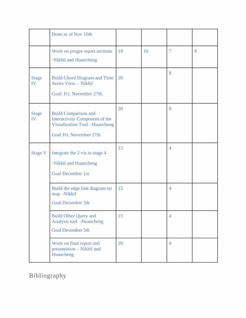
The final limitation addressed is the multi-view and stitching of individual diagrams needed for
the multi-intersection and potential overlay on the map view. This was a natural for the Sankey
diagram but is infeasible with the chord diagrams due to the geometry. The solution is thus a
small multiples view as shown in Figure 4, with an adjacent map that shows the areas being
observed. Overlaying the chord diagrams on the map is an optional view that we will consider
implementing – however a pressing priority to visualize is the flow between the intersections
observed. The proposed solution to this is to have an adjacent an arc diagram to display the flow
between intersections as show in Figure 4 and Figure 5. The tools provided by the Plotly library
are sufficient to effectively visualize the arc diagram in the manner we have proposed.
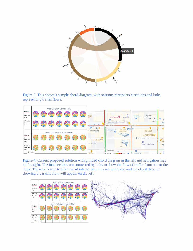
Figure 3. This shows a sample chord diagram, with sections represents directions and links
representing traffic flows.
Figure 4. Current proposed solution with grinded chord diagram in the left and navigation map
on the right. The intersections are connected by links to show the flow of traffic from one to the
other. The user is able to select what intersection they are interested and the chord diagram
showing the traffic flow will appear on the left.

Figure 5. Current proposed solution with grinded chord diagram in the left and arc diagram on
the right.
Milestone
Stage Task Name Estimated
Number of
Hours
Actual
Number of
Hours
Estimated
Number of
Days
Actual
Number of
Days
Stage I Meet with the Rest of the
Research Team, Understand
Their Goals and Acquire a
Complete Dataset.
Done as of October 18th
5
5
2
2
Stage II Integrate the Rest of Team’s
Goals and Update Initial
Visualization Proposal and
Solution Appropriately.
Done as of October 22nd.
10
15
4
4
Find feasibility of proposed
solution – Nikhil
Done as of Nov 1st
5 8 4 8
Stage
III Explore the related work-
Huancheng
Done as of Nov 1st
5 8 4 8
Analysis the tasks and come up
with a new solution idea,
including feasibility search
-Nikhil and Huancheng
10 20 7 10
Done as of Nov 10th
Work on progre report sections
-Nikhil and Huancheng
10 16 7 8
Stage
IV
Build Chord Diagram and Time
Series View. - Nikhil
Goal: Fri. November 27th.
20 8
Stage
IV
Build Comparison and
Interactivity Component of the
Visualization Tool. -Huancheng
Goal Fri. November 27th
20 8
Stage V Integrate the 2 vis in stage 4
-Nikhil and Huancheng
Goal December 1st
15 4
Build the edge link diagram on
map –Nikhil
Goal December 5th
15 4
Build Other Query and
Analysis tool -Huancheng
Goal December 5th
15 4
Work on final report and
presentation – Nikhil and
Huancheng
20 4
Bibliography

[1] D. Schrank, "2019 Urban Mobility Report - Texas A&M University," 2019 Urban Mobility
Report, 2019. [Online]. Available:
https://static.tti.tamu.edu/tti.tamu.edu/documents/mobility-report-2019.pdf. [Accessed: 23-
Oct-2020].
[2] T. Banerjee, K. Chen, X. Huang, A. Rangarajan, and S. Ranka, “A Multi-sensor System for
Traffic Analysis at Smart Intersections,” 2019 Twelfth International Conference on
Contemporary Computing (IC3), Aug. 2019.
[3] Z. Wang, M. Lu, X. Yuan, J. Zhang, and H. V. D. Wetering, “Visual Traffic Jam Analysis
Based on Trajectory Data,” IEEE Transactions on Visualization and Computer Graphics,
vol. 19, no. 12, pp. 2159–2168, 2013.
[4] W. Song, C. Huang, and B. Jiang, “Visual methods for time-varying intersection traffic flow
data,” 2017 4th International Conference on Systems and Informatics (ICSAI), 2017.
[5] S. Box, X. Chen, S. Blainey, and S. Munro, “Fine-grained traffic state estimation and
visualisation,” Proceedings of the Institution of Civil Engineers - Civil Engineering, vol.
167, no. 5, pp. 9–16, 2014.
[6] P. Roberg-Orenstein, C. Abbess, and C. Wright, “Traffic Jam Simulation,” Journal of Maps,
pp. 107–121, 2007.
[7] B. Speckmann and K. Verbeek, “Necklace Maps,” IEEE Transactions on Visualization and
Computer Graphics, vol. 16, no. 6, pp. 881–889, 2010.
[8] M. Oppermann and T. Munzner, “Ocupado: Visualizing Location‐Based Counts Over Time
Across Buildings,” Computer Graphics Forum, vol. 39, (3), pp. 127-138, 2020.
[9] T. Munzner, Visualization analysis and design. Boca Raton: CRC Press, 2015.
[a] https://www.greencarreports.com/news/1093560_1-2-billion-vehicles-on-worlds-roads-now-
2-billion-by-2035-report => academic sources are preferred if can be replaced.
[b] https://www.weforum.org/agenda/2016/04/the-number-of-cars-worldwide-is-set-to-double-
by-2040 => academic sources are preferred if can be replaced.
Appendix:
Note: We will still use the colour and necklace map portions from the discarded previous
solution section below:
Previous Solution Section:
A Sankey diagram will be used as the base visualization with 12 arrows per intersection; 4
directions per intersection with three smaller arrows of (i) ‘From Left Turn,’ (ii) ‘From Right
Turn’ and (iii) ‘From Straight Away’ for each combining to form one arrow as the output of that
direction. The arrows show vehicle count with four hues representing each direction of the
intersection and the arrow width representing the vehicle’s magnitude and pedestrian count.
Therefore, the main mark of the visualization is a single output arrow composed of 3 input
arrows, (i) - (iii) from above. The channel for representing the intersection direction is hue. The
design decision of using four fully saturated hues of red, blue, green, and yellow to represent the
intersection’s four directions is based on chapter 10 of the ‘Visualization, Analysis and Design’
textbook. More specifically, “a good set of initial choices are the fully saturated and easily
nameable colours, which are also the opponent colour axes: red, blue, green, and yellow” and
“colormaps for small regions such as lines should be highly saturated, but large regions such as
areas should have low saturation [9]”. The arrows are sufficiently small to be considered ‘small
regions’ when compared to a multiple -intersection visualization view, but it is noted that in a
zoomed-in view of a single intersection, a less saturated version of the hue may have to be used
to compensate for the larger area of the arrow in this view.
Figure 6.6. Figure 10.7 from VAD Ch.10 on “Saturation and Area.”
The other channel used in this Sankey diagram of an intersection is the arrow; it is used to
encode or represent the vehicle’s magnitude or pedestrian counts. It is to be noted that the
comparison of widths of these arrows (explicitly without magnitudes labelled on them, and
especially at scale with multiple intersections that are not adjacent to each other) can be a

limitation of this visualization approach. We address this limitation with proportional bubbles in
the form of Necklace Maps.
One overlay selected in our proposed visualization tool will be proportional bubbles with
numerical values of passenger or vehicle count magnitudes in the form of a necklace map.
Necklace maps are used in this context to discern information more efficiently and intuitively
with contrast to arrow thickness in the Sankey Diagram; especially concerning anomalies like a
very high count that would now be represented as a sizeable proportional bubble visible to the
end-user - even at a scaled view of the visualization with many intersections being observed
simultaneously on a single map. Necklace maps were chosen for three primary reasons: (i)
Clearer, intuitive visualizations of the actual magnitude of vehicle and passenger count via
proportional necklace symbol sizes and magnitude values displayed within the symbol, as
opposed to on or beside a smaller and more crowded arrow, as “necklace maps appear clear and
uncluttered and allow for comparatively large symbol sizes [7]”. (ii) We have sufficient design
and development space for additional data variables to visualize that may result from the other
research team’s data processing effort, e.g. if speed can be extracted, then the necklace map can
show the vehicle count with the size of the symbol and be broken down as pie-chart to show the
speed distribution of these vehicles. (iii) The simple and clean geometry of the intersection lends
itself to be not be intruded upon or by necklace symbols, or have a weaker region to symbol
association if there are 12 distinct symbols placed evenly around a necklace that would surround
and intersection, as “the advantages of necklace maps come at a price: the association between a
symbol and its region is weaker than with other types of maps.”