sims 213: user interface design & development marti hearst tues feb 6, 2001
Post on 21-Dec-2015
219 views
TRANSCRIPT

SIMS 213: User Interface Design &
Development
Marti Hearst
Tues Feb 6, 2001

Based on slide by Saul Greenberg
Guidelines for Design
Provide a good conceptual model– allows users to predict consequences of actions– communicated thorugh the image of the system
Make things visible– relations between user’s intentions, required actions, and
results should be sensible consistent meaningful (non-arbitrary)
– make use of visible affordances, mappings, and constraints– remind person of what can be done and how to do it

Project TimelineJa
nuar
y 23
Mar
ch 1
5
Apr
il 12
May
7
Proj
ect I
dea
Pers
onas
, Int
ervi
ews,
Task
s Ana
lysis
Low
-fi U
ser T
est
UI P
roto
type
#1
Heu
ristic
Eva
luat
ion
UI P
roto
type
#2
Use
r Tes
ting
UI P
roto
type
#3
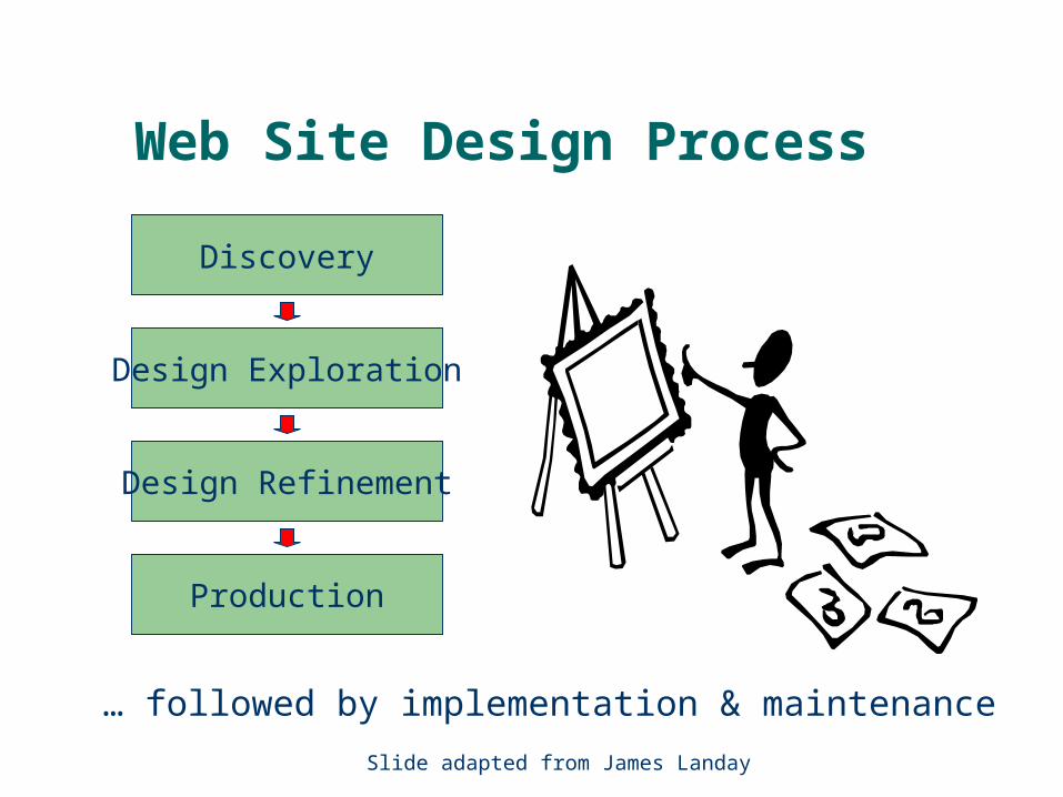
Web Site Design Process
Production
Design Refinement
Design Exploration
Discovery
… followed by implementation & maintenance
Slide adapted from James Landay

Design Process: Discovery
Assess needs– understand client’s
expectations– determine scope of
project– characteristics of
users– evaluate existing site
and/or competitionProduction
Design Refinement
Design Exploration
Discovery
Slide adapted from James Landay

Design Process: Design Exploration
Production
Design Refinement
Design Exploration
Discovery Generate multiple designs
* visualize solutions to discovered issues
* information & navigation design
* early graphic design
* select one design for development
Slide adapted from James Landay

Design Process: Design Refinement
Production
Design Refinement
Design Exploration
Discovery Develop the design
* increasing level of detail
* heavy emphasis on graphic design
* iterate on design
Slide adapted from James Landay

Prepare design for handoff
* create final deliverable
* specifications, guidelines, and prototypes
* as much detail as possible
Design Process: Production
Production
Design Refinement
Design Exploration
Discovery
Slide adapted from James Landay

Web Design Process
Slide adapted from James Landay
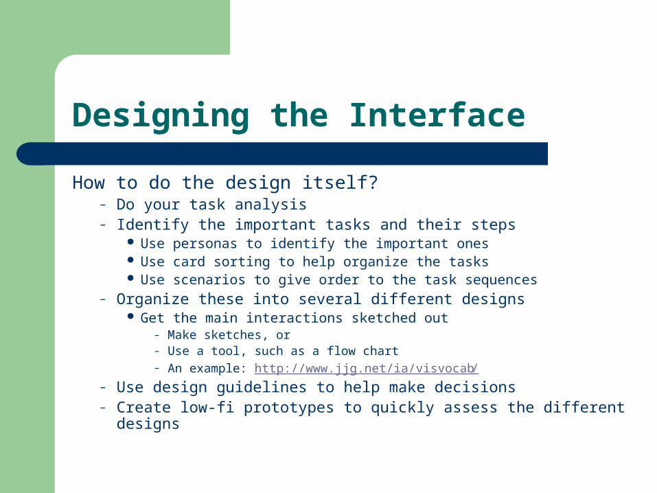
Designing the Interface
How to do the design itself?– Do your task analysis– Identify the important tasks and their steps
Use personas to identify the important ones Use card sorting to help organize the tasks Use scenarios to give order to the task sequences
– Organize these into several different designs Get the main interactions sketched out
– Make sketches, or– Use a tool, such as a flow chart– An example: http://www.jjg.net/ia/visvocab/
– Use design guidelines to help make decisions– Create low-fi prototypes to quickly assess the different designs

Design Guidelines
There are LOTS of them– Based on common sense and experience
Not necessarily proven– Often conflict with one another– Often don’t say HOW to implement them
What do to:– Focus on those guidelines most applicable to the kind of interface under
development– Focus on those emphasized in our readings
Bloopers, chapter 1 Usability Engineering, chapter 5 Raskin, chapter 3 All of Don Norman’s concerns
– Use common sense

All-Star Usability Design Guidelines
An edited selection

Slide adapted from Saul Greenberg
1 Simple and natural dialogue
Use the user’s conceptual model Match the users’ task in as natural a way as
possible– minimize mapping between interface and task
semantics

Slide adapted from Saul Greenberg
1 Simple and natural dialogue
Present exactly the information the user needs– less is more
less to learn, to get wrong, to distract...
– information should appear in natural order related information is graphically clustered order of accessing information matches user’s expectations
– remove or hide irrelevant or rarely needed information competes with important information on screen
– use windows frugally don’t make navigation and window management excessively complex

Slide adapted from Saul Greenberg

Slide adapted from Saul Greenberg
2 Speak the users’ language

Slide adapted from Saul Greenberg
3 Minimize user’s memory load
Computers good at remembering things, people aren’t!
Promote recognition over recall– menus, icons, choice dialog boxes vs command
lines, field formats– relies on visibility of objects to the user (but less is
more!)

Slide adapted from Saul Greenberg
3 Minimize user’s memory load

Slide adapted from Saul Greenberg
3: Minimize user’s memory load
Describe required input format and example, and default
Small number of rules applied universally– generic commands
same command can be applied to all interface objects– interpreted in context of interface object
copy, cut, paste, drag ’n drop, ... for characters, words, paragraphs, circles, files

Slide adapted from Saul Greenberg
3: Minimize user’s memory load

Slide adapted from Saul Greenberg
4: Be consistent
Consistency of effects– same words, commands, actions will always have the same effect in
equivalent situations predictability
Consistency of language and graphics– same information/controls in same location on all screens / dialog boxes
– same visual appearance across the system (e.g. widgets) e.g. different scroll bars in a single window system!
Consistency of input– consistent syntax across complete system

Slide adapted from Saul Greenberg
4. Be ConsistentThese are labels with a raised appearance.
Is it any surprise that people try and click on them?

Slide adapted from Saul Greenberg
5: Provide feedback
Continuously inform the user about – what it is doing– how it is interpreting the user’s input– user should always be aware of what is going on
> Doit
What’s it doing?
> DoitThis will take5 minutes...
Time for coffee.

Slide adapted from Saul Greenberg
5. Provide feedback
Should be as specific as possible, based on user’s input
Best within the context of the action

Slide adapted from Saul Greenberg
5. Provide feedback
What did I select?
What mode am I in now?
How is the system
interpreting my actions?

Slide adapted from Saul Greenberg
Provide feedback
Drawing Board LT
Multiple files being copied, but feedback is file by file.

Slide adapted from Saul Greenberg
5. Provide feedback
Response time– how users perceive delays
0.1 second max: perceived as “instantaneous”
1 seconds max: user’s flow of thought stays uninterrupted, but delay noticed
10 seconds: limit for keeping user’s attention focused on the dialog
> 10 seconds: user will want to perform other tasks while waiting

Slide adapted from Saul Greenberg
How do I get
out of this?
6. Provide clearly marked exits

Slide adapted from Saul Greenberg
6. Provide clearly marked exits
Users don’t like to feel trapped by the computer!– should offer an easy way out of as many situations as possible
Strategies:– Cancel button (for dialogs waiting for user input)– Universal Undo (can get back to previous state)– Interrupt (especially for lengthy operations)– Quit (for leaving the program at any time) – Defaults (for restoring a property sheet)

Slide adapted from Saul Greenberg
7. Provide shortcuts
Experienced users should be able to perform frequently used operations quickly
Strategies:– keyboard and mouse accelerators
abbreviations command completion menu shortcuts function keys double clicking vs menu selection
– type-ahead (entering input before the system is ready for it) navigation jumps
e.g., going to window/location directly, and avoiding intermediate nodes
– history systems WWW: ~60% of pages are revisits

Keyboard accelerators for
menus
Customizable toolbars andpalettes for
frequent actions
Split menu, with recently used fonts on top
Scrolling controls for page-sized
increments
Double-click raises object-specific menu
Double-click raises toolbar
dialog box

Slide adapted from Saul Greenberg
8: Deal with errors in a positive and helpful manner
People will make errors!
Errors we make– Mistakes
arise from conscious deliberations that lead to an error instead of the correct solution
– Slips unconscious behaviour that gets misdirected en route to satisfying goal
– e.g. drive to store, end up in the office
shows up frequently in skilled behaviour– usually due to inattention
often arises from similarities of actions
Slide adapted from Saul Greenberg
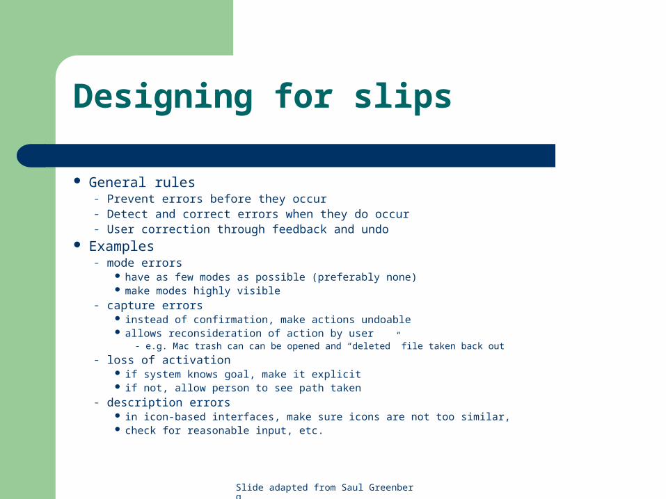
Designing for slips
General rules– Prevent errors before they occur– Detect and correct errors when they do occur– User correction through feedback and undo
Examples– mode errors
have as few modes as possible (preferably none) make modes highly visible
– capture errors instead of confirmation, make actions undoable allows reconsideration of action by user
– e.g. Mac trash can can be opened and “deleted” file taken back out
– loss of activation if system knows goal, make it explicit if not, allow person to see path taken
– description errors in icon-based interfaces, make sure icons are not too similar, check for reasonable input, etc.

Slide adapted from Saul Greenberg
8 Deal with errors in a positive and helpful manner
Prevent errors– try to make errors impossible– modern widgets: only “legal commands” selected, or “legal data” entered
Provide reasonableness checks on input data– on entering order for office supplies
5000 pencils is an unusually large order. Do you really want to order that many?

Slide adapted from Saul Greenberg
9. Provide help
Help is not a replacement for bad design!
Simple systems:– walk up and use; minimal instructions
Most other systems:– feature rich– some users will want to become “experts” rather than “casual”
users– intermediate users need reminding, plus a learning path
Volume 37: A user's guide to...

Slide adapted from Saul Greenberg
Types of help
Tutorial and/or getting started manuals– short guides that people are likely to read when first
obtaining their systems encourages exploration and getting to know the system tries to get conceptual material across and essential syntax
– on-line “tours”, exercises, and demos demonstrates very basic principles through working
examples

Slide adapted from Saul Greenberg
Types of help
Reference manuals– used mostly for detailed lookup by experts– on-line hypertext
search / find table of contents index cross-index
Slide adapted from Saul Greenberg
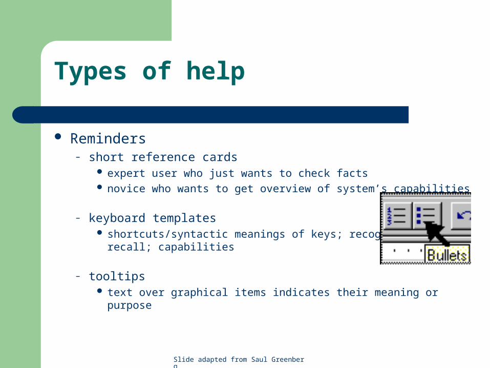
Types of help
Reminders– short reference cards
expert user who just wants to check facts novice who wants to get overview of system’s capabilities
– keyboard templates shortcuts/syntactic meanings of keys; recognition vs. recall;
capabilities
– tooltips text over graphical items indicates their meaning or purpose

Slide adapted from Saul Greenberg
Types of help
Context-sensitive help– system provides help on the interface component
the user is currently working with Tool tips Macintosh “balloon help” Microsoft “What’s this” help
– brief help explaining whatever the user is pointing at on the screen

Slide adapted from Saul Greenberg
Types of help
Wizards– walks user through typical tasks– but problematic if user gets stuck

Slide adapted from Saul Greenberg
Types of help
Tips– migration path to learning system features– also context-specific tips on being more efficient– must be “smart”, otherwise boring and tedious

Summary
Design is a creative process, with many options
Your design should reflect– The results of the interviews, task analysis– Existing conventions when applicable– Design guidelines when applicable
Usability testing helps you decide which of several options to pursue