sign redesign - university of pittsburgh
TRANSCRIPT
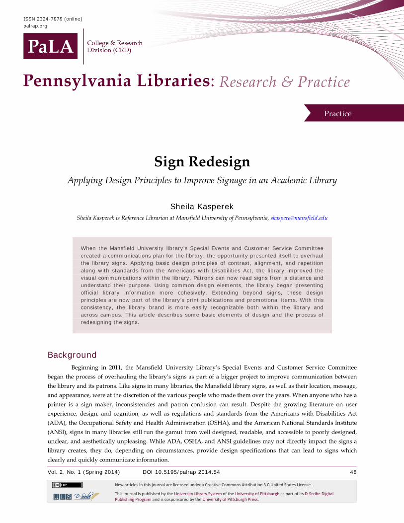
Vol. 2, No. 1 (Spring 2014) DOI 10.5195/palrap.2014.54 48
New articles in this journal are licensed under a Creative Commons Attribution 3.0 United States License.
This journal is published by the University Library System of the University of Pittsburgh as part of its D-Scribe Digital Publishing Program and is cosponsored by the University of Pittsburgh Press.
Practice
Sign Redesign Applying Design Principles to Improve Signage in an Academic Library
Sheila Kasperek Sheila Kasperek is Reference Librarian at Mansfield University of Pennsylvania, [email protected]
When the Mansfield University library’s Special Events and Customer Service Committee created a communications plan for the library, the opportunity presented itself to overhaul the library signs. Applying basic design principles of contrast, alignment, and repetition along with standards from the Americans with Disabilities Act, the library improved the visual communications within the library. Patrons can now read signs from a distance and understand their purpose. Using common design elements, the library began presenting official library information more cohesively. Extending beyond signs, these design principles are now part of the library’s print publications and promotional items. With this consistency, the library brand is more easily recognizable both within the library and across campus. This article describes some basic elements of design and the process of redesigning the signs.
Background Beginning in 2011, the Mansfield University Library’s Special Events and Customer Service Committee
began the process of overhauling the library’s signs as part of a bigger project to improve communication between the library and its patrons. Like signs in many libraries, the Mansfield library signs, as well as their location, message, and appearance, were at the discretion of the various people who made them over the years. When anyone who has a printer is a sign maker, inconsistencies and patron confusion can result. Despite the growing literature on user experience, design, and cognition, as well as regulations and standards from the Americans with Disabilities Act (ADA), the Occupational Safety and Health Administration (OSHA), and the American National Standards Institute (ANSI), signs in many libraries still run the gamut from well designed, readable, and accessible to poorly designed, unclear, and aesthetically unpleasing. While ADA, OSHA, and ANSI guidelines may not directly impact the signs a library creates, they do, depending on circumstances, provide design specifications that can lead to signs which clearly and quickly communicate information.
Pennsylvania Libraries: Research & Practice Sign Redesign
Vol. 2, No. 1 (Spring 2014) DOI 10.5195/palrap.2014.54 49
palrap.org
The Mansfield library redesign project began after the Special Events and Customer Service Committee created a comprehensive communication plan that focused on all the ways the library conveys information to patrons. The committee had reviewed communication plans from other organizations and libraries, as well as information from Mansfield University’s public relations office, to learn what a communications plan looks like and what areas it addresses.
The committee reviewed the library’s current communications pathways and determined that there were problems in several crucial areas. None of the library’s materials, including signs, handouts, promotional items, or the website, looked the same. The materials’ styles varied widely from item to item, ranging from Word Art explosions of color to signs packed with so much information that it was difficult to tell their purpose. Because of the variety of designs, it was often hard to distinguish library flyers from non-library flyers in the building or from papers left lying around by patrons. Many signs could not be read from a suitable distance, and some did not meet ADA standards.
Mansfield's sign redesign project focused only on the temporary and semi-permanent signs in the library. These signs are either taped directly to walls, carrels, or equipment, or are housed in moveable sign holders. The committee did not work on any of the permanent safety signs, exit signs, or elevator signs in this project.
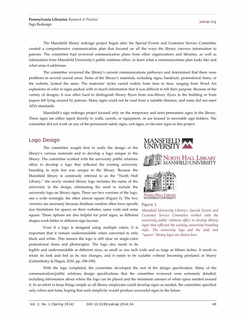
Logo Design The committee sought first to unify the design of the
library’s various materials and to develop a logo unique to the library. The committee worked with the university public relations office to develop a logo that reflected the existing university branding in style but was unique to the library. Because the Mansfield library is commonly referred to as the “North Hall Library,” the newly created library logo includes the name of the university in the design, eliminating the need to include the university logo on library signs. There are two versions of the logo, one a wide rectangle, the other almost square (Figure 1). The two versions are necessary because database vendors often have specific size limitations for spaces on their websites, some wide and some square. These options are also helpful for print signs, as different shapes work better in different sign layouts.
Even if a logo is designed using multiple colors, it is important that it remain understandable when converted to only black and white. This insures the logo is still clear on single-color promotional items and photocopies. The logo also needs to be legible and understandable at different sizes, as small as one inch wide and as large as fifteen inches. It needs to retain its look and feel as its size changes, and it needs to be scalable without becoming pixelated or blurry (Golombisky & Hagen, 2010, pp. 108-109).
With the logo completed, the committee developed the rest of the design specification. Many of the communication/public relations design specifications that the committee reviewed were extremely detailed, including information about where the logo can be placed and the minimum amount of white space needed around it. In an effort to keep things simple so all library employees could develop signs as needed, the committee specified only colors and fonts, hoping that such simplicity would produce successful signs in the future.
Figure 1 Mansfield University Library’s Special Events and Customer Service Committee worked with the university public relations office to develop library logos that reflected the existing university branding style. The university logo and the wide and “square” library logos are shown here.
Pennsylvania Libraries: Research & Practice Sign Redesign
Vol. 2, No. 1 (Spring 2014) DOI 10.5195/palrap.2014.54 50
palrap.org
Color Selection The Mansfield University colors, red and black on a white background, worked well for the library. They
helped tie the library to the university’s branding. Both main colors are visible against a white background. Organizations with lighter colors (e.g., light blue or yellow) or no existing color palette may need to do additional work to determine the best colors to use. Because of issues relating to the emotional impact and cultural meanings of colors, as well as color compatibility and a need for contrast, it is best to work with someone with an art or design background to select a color palette.
Colors need to be attractive, visible, and ADA-compliant. ADA requires that adjacent colors be significantly different so that the type and logo are easily distinguishable from the background.1 The ADA recommends that there be at least a 70% light reflectance value difference between adjacent objects and that local lighting conditions be considered (Humrickhouse, 2012; U.S. Department of Justice, 2010). Low lighting levels require more contrast, and online contrast calculators can aid in color selection.2
The Mansfield University library has several areas with lower lighting levels, so the committee tested the color combination in several locations by creating test signs and posting them in such areas to see if they were understandable. It concluded that in the lower light areas, the main headline needed to be black for greater visibility. In areas with brighter lights, red was a sufficient headline color.
With the large number of fonts available today, it is important to choose the fonts used for signs across an organization. When selecting these fonts, consider these few simple rules:
• Select no more than one serif font, one sans serif font, and one decorative font for all signs. This includes the logo (Krause, 2004, p. 262).
• Select a font that is easy to read from a distance. • Avoid a font that is ALL UPPERCASE because all caps are more difficult to read than mixed case
(Albers, 1971, p. 4; Krause, 2004, p. 242).
Additionally, fonts have a voice. Just as all caps text is interpreted as yelling, the style of a font creates a tone or voice when read. For example, fonts like Brush Script, Jokerman, Chiller, or Broadway are internalized differently and may affect the way a library patron responds to message.
Because the Mansfield University library logo uses the serif font Goudy Old Style, the committee needed to select a sans serif font for the main sign content. The committee sought a well-balanced font with clean lines for the signs. After several potential fonts were identified, the committee printed out the same sign in different fonts and taped them to the wall, studying them from the other side of the room. Segoe UI was selected during the process for its modern look, readability, and overall design fit. The committee did not choose a decorative font because there was no need for one.
The ADA now requires that new signs use bold, mixed-case type in signs and offer options for tactile readers. The law also recommends low glare and high contrast signs (Humrickhouse, 2012; U.S. Department of Justice, 2010). Additionally, ADA section 703 specifies no script, decorative, or italic type. It also specifies minimum type height, proportion, character and line spacing, and location on the wall (U.S. Department of Justice, 2010). The Mansfield University library signs employ many, but not all of these new standards. Should the library choose to make signs permanent fixtures, rather than temporary displays in stands or computer carrels, a closer reading of the ADA requirements would be necessary.

Pennsylvania Libraries: Research & Practice Sign Redesign
Vol. 2, No. 1 (Spring 2014) DOI 10.5195/palrap.2014.54 51
palrap.org
Democratizing Sign Creation, Part 1: Sharing the Design Specification The committee sought to avoid an official sign-approval process that would add a layer of bureaucracy for
library employees to deal with. Instead, it shared the design specification with everyone working in the library, giving them the tools to create signs that matched others already in place. The logos, colors, and font names reached the library staff through an internal-use website. The specification, in anticipation of different applications, identified the HTML color code, the RGB values, the Pantone Matching System (PMS) color number, and the Microsoft Office common color name.
Once this information became available, library employees immediately started using the logo in their e-mail signatures and on new promotional items. Since no part of the specification identified or limited possible uses of the logo, the rapid adoption of it at the initiative of individual staff members demonstrated buy-in from the library employees. The logo was also incorporated into the library website header and the library computer wallpaper.
Design There are numerous books, magazines, blogs, and courses on design, design principles, and aesthetics, and
there are a growing number of research studies about how people ingest and process visual information. The committee was aware of numerous strategies for organizing and categorizing design principles, some suited only to design experts with others geared toward beginners. The concepts are not startlingly different, but the focus and depth of explanation make some more understandable and accessible to novices. With so many approaches and considerations to choose from, the committee used the sign redesign portion of the library communication plan as a test of design instructor Robin Williams’s (2008) approach detailed in The Non-Designer’s Design Book. This book is a beginner-friendly text on basic design, containing numerous examples and explaining Williams’s four-part approach. The committee chose to focus on three of these four parts: contrast, alignment, and repetition. Williams’s fourth part, proximity, being so closely related to alignment, was less important for the simple signs the library wanted to create.
The committee also looked for information relating specifically to library signs. The library sign assessment done at Cornell University (Agarwa et al., n.d.) proved extremely helpful in understanding the requirements for contrast, size, and placement. The Cornell assessment included both information about the current library signs and the relevant standards and specifications from ANSI and the ADA. While the Mansfield library did not do a formal sign assessment, the information about the standards and specifications from the Cornell document informed the designs created as part of Mansfield's redesign project. The document was particularly helpful because it focused on information relevant to libraries rather than the entire ADA specification.
Contrast The human mind, flooded with massive amounts of input from everything around a person, does what it
can to make sense of the world, in part by creating shortcuts. The brain tries to identify and pay attention to only the “important” things, so it focuses on differences, the unusual, things that stand out, things that contrast (White, 2011, p. 7). Applying contrast in a design involves making different items on a page noticeably different and similar items on a page appear uniform. To use contrast effectively, make things that are different very different (Williams, 2008, p.
13): Bold or italic versus regular text. Large size font versus a small size. Red versus black. Left versus right.
Contrast draws attention to a sign and gets a message noticed. Contrast helps readers focus on the important areas of a sign. It adds interest to a design and can help organize information (Williams, 2008, p. 80). In all cases, contrast needs to be bold or it may never be noticed.
Pennsylvania Libraries: Research & Practice Sign Redesign
Vol. 2, No. 1 (Spring 2014) DOI 10.5195/palrap.2014.54 52
palrap.org
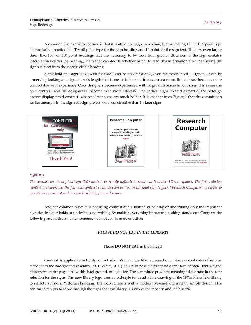
A common mistake with contrast is that it is often not aggressive enough. Contrasting 12- and 14-point type is practically unnoticeable. Try 60-point type for the sign heading and 14-point for the sign text. Then try even larger sizes, like 100- or 200-point headings that are necessary to be seen from greater distances. If the sign contains information besides the heading, the reader can decide whether or not to read this information after identifying the sign's subject from the clearly visible heading.
Being bold and aggressive with font sizes can be uncomfortable, even for experienced designers. It can be unnerving looking at a sign at arm's length that is meant to be read from across a room. But contrast becomes more comfortable with experience. Once designers become experienced with larger differences in font sizes, it is easier use bold contrast, and the designs will become even more effective. The earliest signs created as part of the redesign project display timid contrast, whereas later signs are much bolder. It is evident from Figure 2 that the committee’s earlier attempts in the sign redesign project were less effective than its later signs.
Figure 2
The contrast on the original sign (left) made it extremely difficult to read, and it is not ADA-compliant. The first redesign (center) is clearer, but the font size contrast could be even bolder. In the final sign (right), “Research Computer” is bigger to provide more contrast and increased visibility from a distance.
Another common mistake is not using contrast at all. Instead of bolding or underlining only the important text, the designer bolds or underlines everything. By making everything important, nothing stands out. Compare the following and notice in which sentence “do not eat” is more effective:
PLEASE DO NOT EAT IN THE LIBRARY!
Please DO NOT EAT in the library!
Contrast is applicable not only to font size. Warm colors like red stand out; whereas cool colors like blue recede into the background (Kadavy, 2011; White, 2011). It is also possible to contrast font face or style, font weight, placement on the page, line width, background, or logo size. The committee provided meaningful contrast in the font selection for the signs. The new library logo uses an old-style font and a line drawing of the 1870s Mansfield library to reflect its historic Victorian building. The logo contrasts with a modern typeface and a clean, simple design. This contrast attempts to show through the signs that the library is a mix of the modern and the historic.

Pennsylvania Libraries: Research & Practice Sign Redesign
Vol. 2, No. 1 (Spring 2014) DOI 10.5195/palrap.2014.54 53
palrap.org
White or negative space, the areas of a sign that contain no information, is a powerful design tool. The contrast between blank areas and the content of a sign helps to draw attention to important parts. White space can provide a sense of calm to a design and impart elegance. As with font-size contrast, white space use comes more naturally with experience. An experienced designer understands that every void does not need to be filled. It is important to give the message the room it needs to stand out.
Alignment Alignment concerns placing individual items on the page to create unity and to provide organization for the
information (Williams, 2008, p. 50). Users of word processing software are familiar with center, right, and left alignments for text, but alignment is also concerned with the spatial relationships between all items on the page: how the logo aligns with the text, how the text aligns with the edges of the sign, etc.
Alignment involves attention to detail. Everything on a sign needs to be aligned with something else. Everything needs to be placed purposefully, to connect visually with other design elements. Nothing should be placed arbitrarily (Williams, 2008, p. 33).
Alignment can make a design look serious, fun, formal, or sophisticated. It can also suggest importance or hierarchy (Williams, 2008, p. 50). A common alignment choice is to center everything, but that does not help a reader to understand what information is important. Bulleted lists and indented text communicate hierarchy more effectively. Contrasting alignment—left and right, top and bottom—can be effective in directing the reader’s attention. Non-centered alignments can help direct a patron’s visual path through a page and can appear more professional than an all-centered alignment (Figure 3).
Figure 3
The original sign (left) was small, all centered, and all bold. The first redesign (center) uses an all-centered alignment. The contrast and repetition improve this sign, but it does not look professional. The final sign (right) has non-centered alignment. It is easier to understand the hierarchy of the information in the sign. It is also looks more professional.
Once everything is aligned on the page, it is important to consider the design as a whole. Sometimes aligning two items in a specific way unbalances the design or makes another alignment look wrong. For example, a logo in the bottom right corner of a sign aligned with the page margin may come too close to words elsewhere on the page. Looking at the whole page reveals needed adjustments to the size of the logo, the size of the type, or the white space around the logo.

Pennsylvania Libraries: Research & Practice Sign Redesign
Vol. 2, No. 1 (Spring 2014) DOI 10.5195/palrap.2014.54 54
palrap.org
Getting user feedback is an important part of the design process. User comments will show how a sign is understood by the reader. This feedback is focused on the overall effectiveness of the sign and can provide valuable information, even if comments are a vague “Something is not right” or “That's hard to understand.”
Repetition Repetition is the use of the same elements throughout the different pieces of a project, connecting
information to each other and to the library. Repetition strengthens recognition. It helps to build and reinforce a brand. This consistency looks professional, and looking professional adds an air of authority to a message. Fonts or colors can repeat, as can alignment, logos, or other design elements. A repetition warning: do not repeat a logo on the same sign. It is unnecessary clutter that distracts from the content of the sign. Similarly, do not repeat a graphic element, like clip art, in all four corners of the sign or as a background. This type of repetition, as well as clip art in general, should be avoided (Golombisky & Hagen, 2010, pp. 37-38).
The committee had already begun the process of repetition with the development of the logo and the selection of fonts and colors. The repeated clean, modern design throughout the library’s signs is valuable in strengthening recognition. Items clearly match, and such consistency makes them easy to identify as official library information. Library patrons will more quickly know when a sign is relevant to library users and can then focus on the sign's message.
Distance Test Signs are meant to be understood from a distance, so at least part of the sign’s content needs to be readable
from afar. The title or header of a sign should be visible at a distance so that people who see it know if they need to read further. For example, a sign that says “Copier Info” in large bold letters will let library patrons know if they need to read the details on the sign (Figure 4). Without this larger header, patrons may pass the sign not knowing its purpose.
Figure 4
The original sign (left) is in all caps, and there is little contrast between the title and the text. It is difficult to see at a distance what this sign is about. The redesigned sign (right) uses a much larger title to draw attention to its purpose. It also uses slightly larger and bolder section headers for the detailed information. The logo makes it recognizable as an official library communication.

Pennsylvania Libraries: Research & Practice Sign Redesign
Vol. 2, No. 1 (Spring 2014) DOI 10.5195/palrap.2014.54 55
palrap.org
The readability of signs is important. Guidelines exist that quantify the size of type in relation to the viewing distance and take into consideration ambient lighting conditions. ANSI Standard Z535.2, which addresses font size, notes that under less-than-ideal lighting conditions, type should be 1 inch high for every 12.5 feet of viewing distance (Agarwal et al., n.d.; “Safety Sign and Marking Requirements,” 2012). This ratio can help determine the correct size for the text although it assumes an easily readable font.
Beyond the guidelines set forth by ANSI and other organizations, it is important that a sign is understandable from a distance. During the design process, place the sign at the intended viewing distance and evaluate it. Can it be read it in three seconds (Duarte, 2008)? Is it readable at all? Is it clear and understandable? Do the important parts draw people’s attention? Is there anything distracting in the sign? What do other people think about its visibility?
Democratizing Sign Creation, Part 2: Creating Signs in the Future With all the existing signs in the library updated, the committee addressed the creation of future signs. All
library employees can create ad hoc signs. The library’s internal-use website includes several completed signs, which use the logo and design specification, for library employees to edit or use as templates. The shared reference desk computer also contains a folder with a copy of most of the library’s signs.
Although the committee was happy to see the early adoption of the library logo in a variety of places, not all employees used the new sign design specification. A minority of new ad hoc signs were made from scratch with no reliance on the design specification. Other new signs showed great variety in the application of the contrast and alignment principles. Most signs opted for the common center alignment and were not bold enough in their contrast, but they were improvements over previous signs. The only times the committee intervened to further improve these ad hoc signs were when signs failed ADA compliance for color contrast.
For an experienced designer, it can be a struggle not to take down every less-than-perfect sign and replace it. That is a reactive approach to sign management and could lead to hurt feelings or strained relationships in an organization. Holding a sign design workshop and demonstrating the distance test for judging and improving signs might be useful in helping everyone in the library understand the application and purpose of the design specification and design principles. A workshop would also offer an excellent opportunity to get library patrons, especially university students, involved.
Outcomes The library did not do a formal outcome assessment of the sign redesign process. However, there are a few
noticeable behavior changes that can be attributed partially to the new signs. One good example is the “Designated Quiet Area” signs (Figure 5).
Previously, the signs in those areas were 8.5” x 11” and featured a picture of someone studying with “Designated Quiet Area” set in a decorative font. The new sign is twice that size and uses the new design specification. Employing contrast, the words “Quiet Area” nearly doubled in size. The signs are now much more visible from stairwells and elevators even in the low light of the library atrium. In these areas, the library staff has seen increased compliance with the quiet area designation.

Pennsylvania Libraries: Research & Practice Sign Redesign
Vol. 2, No. 1 (Spring 2014) DOI 10.5195/palrap.2014.54 56
palrap.org
Figure 5
The original Quiet Area sign (left). The redesigned Quiet Area sign (right) contains larger type for increased visibility.
Another noticeable improvement is in the community computer area, the computers designated for non-university users. Previously, there was one sign that, while full of useful information, was not especially clear that the computers had a special purpose. A major task of the assistants in that area was to explain to students seated at those computers that they could not use them. With the creation of two signs to replace one, information became clearer (Figure 6). The library first posted both signs near the computer, which resulted in a noticeable reduction in confusion. One of the signs is now blocking the monitor and has almost completely eliminated the problem, much to the relief of those staffing the area.
Figure 6
The original sign (left). The sign that is now affixed to the monitor (center) contains a bold heading. Additional information needed by the non-university users is located next to the computers (right).
It is more difficult to assess whether other signs in the library have changed student behavior or have been more effective in communicating information. The before and after examples in Figures 7 through 17 show how the consistency of the design and application of contrast and alignment make these signs easier to understand and to recognize as official library signs. Additionally, the signs overall look more professional and more visually appealing.

Pennsylvania Libraries: Research & Practice Sign Redesign
Vol. 2, No. 1 (Spring 2014) DOI 10.5195/palrap.2014.54 57
palrap.org
Figure 7
The original main entrance sign (left). The new main entrance sign (right) is more welcoming. It sets the tone for the library with the wording, and it is the first use of the library logo and design specification.
Figure 8
The original sign (left) pointing to the reference desk has limitations because of the all-caps font, the decorative font, the color choice, the small font size, and the lack of contrast. The new sign (right) is twice the size and uses contrast to draw attention to the purpose of the sign. Non-centered alignment creates more visual interest and movement, helping to keep the patrons’ attention and point them in the proper direction.
Figure 9
The old sign (left) uses a complex and colored background that does not offer sufficient contrast to be seen from a distance. Some of the text is underlined, but the contrast is not sufficient to draw attention to the name of the room. For the new sign (right), removing the colored background, enlarging the size of the sign, and using font size contrast make it easier to read the sign from a distance. The sign is now visible even from across the open library atrium and one floor up.

Pennsylvania Libraries: Research & Practice Sign Redesign
Vol. 2, No. 1 (Spring 2014) DOI 10.5195/palrap.2014.54 58
palrap.org
Figure 10
The boldest and largest words on the old sign (left) are “Please Note.” It is difficult to determine what the purpose of the sign is without reading its entire text. In the new sign (right) the bold, large font at the top quickly and directly expresses the message.
Figure 11
The original sign (left) uses a font that can be difficult to read at a distance, a photo that is distracting, and contrast that is not effective. The new version (right) is clearer because of better contrast. It could benefit from an even larger heading.

Pennsylvania Libraries: Research & Practice Sign Redesign
Vol. 2, No. 1 (Spring 2014) DOI 10.5195/palrap.2014.54 59
palrap.org
Figure 12
The original sign (left) uses Word Art, a difficult-to-read font, and text shadows. It is hard to read even from up close. The new simplified design (right) is easy to read from a distance. The non-traditional alignment is an attempt to break away from centering everything.
Figure 13
The library had a variety of “Out-of-Order” signs (left) for copiers, computers, printers, etc. A single out-of-order sign (right) that is useful in all situations offers a more professional look. The large font is easy to read. The library logo makes this sign appear official.
Pennsylvania Libraries: Research & Practice Sign Redesign
Vol. 2, No. 1 (Spring 2014) DOI 10.5195/palrap.2014.54 60
palrap.org
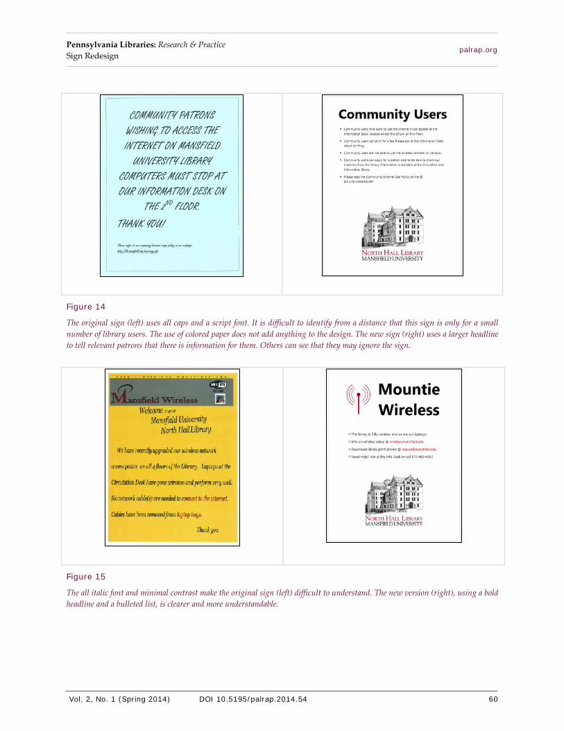
Figure 14
The original sign (left) uses all caps and a script font. It is difficult to identify from a distance that this sign is only for a small number of library users. The use of colored paper does not add anything to the design. The new sign (right) uses a larger headline to tell relevant patrons that there is information for them. Others can see that they may ignore the sign.
Figure 15
The all italic font and minimal contrast make the original sign (left) difficult to understand. The new version (right), using a bold headline and a bulleted list, is clearer and more understandable.
Pennsylvania Libraries: Research & Practice Sign Redesign
Vol. 2, No. 1 (Spring 2014) DOI 10.5195/palrap.2014.54 61
palrap.org
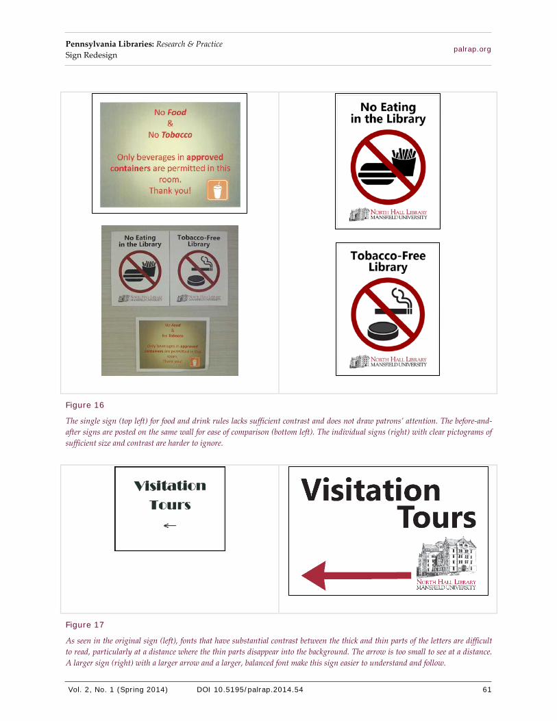
Figure 16
The single sign (top left) for food and drink rules lacks sufficient contrast and does not draw patrons’ attention. The before-and-after signs are posted on the same wall for ease of comparison (bottom left). The individual signs (right) with clear pictograms of sufficient size and contrast are harder to ignore.
Figure 17
As seen in the original sign (left), fonts that have substantial contrast between the thick and thin parts of the letters are difficult to read, particularly at a distance where the thin parts disappear into the background. The arrow is too small to see at a distance. A larger sign (right) with a larger arrow and a larger, balanced font make this sign easier to understand and follow.

Pennsylvania Libraries: Research & Practice Sign Redesign
Vol. 2, No. 1 (Spring 2014) DOI 10.5195/palrap.2014.54 62
palrap.org
Beyond Signs With the sign redesign complete, the committee extended the logo and design specification to other
mediums, helping tie together the library’s promotional, instructional, and directive information. The library rack cards now reflect the new design, as do the library's computer desktop backgrounds (Figure 18). New promotional materials include the logo as well (Figure 19).
Figure 18
Library rack cards (left and center) and computer desktop wallpaper (right) use the library logo and design specification.
Lessons Learned The Mansfield University's library Special Events and Customer Service Committee is happy to have kept
the original signs because their existence makes it easy to justify the time invested in the project. It also lets everyone see just how far the library has come in improving its signs, publications, and branding using only a computer, a printer, and a handful of basic design skills.
Some of the earliest signs the committee produced could use even more contrast. More aggressive contrast and fewer all center-aligned signs could prove more effective. Outside opinions could be more beneficial if they were sought earlier in the process and more frequently. Even informal feedback is extremely valuable. Asking patrons walking past the reference desk to identify which sign is easier to read can be an enlightening part of the process.

Pennsylvania Libraries: Research & Practice Sign Redesign
Vol. 2, No. 1 (Spring 2014) DOI 10.5195/palrap.2014.54 63
palrap.org
The biggest problem with this project was the lack of training the committee provided to others in the library. At least one workshop setting out the design principles would have been a great opportunity to fully explain the project. It would have encouraged autonomy while still retaining consistency in the library’s signs. Having all library employees exposed to the design concepts would make them more aware of the design process and how they could improve the visibility and understandability of their creations, which ultimately help the library serve its patrons better.
Notes 1 See U.S. Department of Justice (2010), specifically chapter 3, for information on communication elements and features.
2 There are many helpful online calculators available, such as ASI’s online light reflectance value contrast calculator: http://asisignage.com/resources/lrv-calculator
References Agarwal, A., Boothroyd, K., Burns, K., Burrows, J., Jagdeo, J., Moe, C., Nirenberg, L., & Rockey-Harris, K. (n.d.). Cornell University
library signage [PowerPoint slides]. Retrieved from http://ergo.human.cornell.edu/AHProjects/Library/librarysigns.pdf
Albers, J. (1971). Interaction of color. New Haven, CT: Yale University Press.
Duarte, N. (2008). Slide:ology: The art and science of creating great presentations. Sebastopol, CA: O’Reilly Media.
Golombisky, K., & Hagen, R. (2010). White space is not your enemy: A beginner’s guide to communicating visually through graphic,
web & multimedia design. Amsterdam: Focal Press.
Humrickhouse, L. (2012). New ADA rules take effect. American Libraries, 43(5/6), 24.
Kadavy, D. (2011). Design for hackers: Reverse-engineering beauty. West Sussex, UK: John Wiley & Sons.
Krause, J. (2004). Design basics index: A graphic designer’s guide to designing effective compositions, selecting dynamic
components & developing creative concepts. Cincinnati, OH: How Design Books.
Safety sign and marking requirements. (2012). Retrieved from http://www.grainger.com/content/qt-safety-sign-marking-
requirements-201
U.S. Department of Justice. (2010). 2010 ADA standards for accessible design. Retrieved from
http://www.ada.gov/regs2010/2010ADAStandards/2010ADAStandards_prt.pdf
White, A. W. (2011). The elements of graphic design: Space, unity, page architecture, and type (2nd ed.). New York: Allworth
Press.
Williams, R. (2008). The non-designer’s design book: Design and typographic principles for the visual novice (3rd ed.). Berkeley,
CA: Peachpit Press.
Figure 19
Library promotional items use the library logo.