section 2.2 graphical displays of data hawkes learning systems math courseware specialists copyright...
TRANSCRIPT

Section 2.2
Graphical Displays of Data
HAWKES LEARNING SYSTEMS
math courseware specialists
Copyright © 2008 by Hawkes Learning
Systems/Quant Systems, Inc.
All rights reserved.

Graphical Descriptions of Data
2.2 Graphical Displays of Data
HAWKES LEARNING SYSTEMS
math courseware specialists
• Should be able to stand alone without the original data.
• Must have a title and labels for both axes.
• When appropriate, a legend, a source, and a date should be included.
Graphs:

Graphical Descriptions of Data
2.2 Graphical Displays of Data
HAWKES LEARNING SYSTEMS
math courseware specialists
Shows how large each category is in relation to the whole.
Pie Chart:
Create a pie chart from the following information:
Types of Housing
Types of Housing Number of Students
Apartment 20
Dorm 15
House 9
Sorority/Fraternity House 5
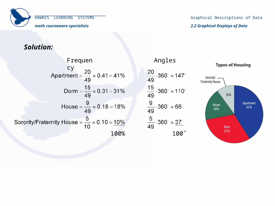
Solution:
Graphical Descriptions of Data
2.2 Graphical Displays of Data
HAWKES LEARNING SYSTEMS
math courseware specialists
100% 100˚
AnglesFrequency
Graphical Descriptions of Data
2.2 Graphical Displays of Data
HAWKES LEARNING SYSTEMS
math courseware specialists
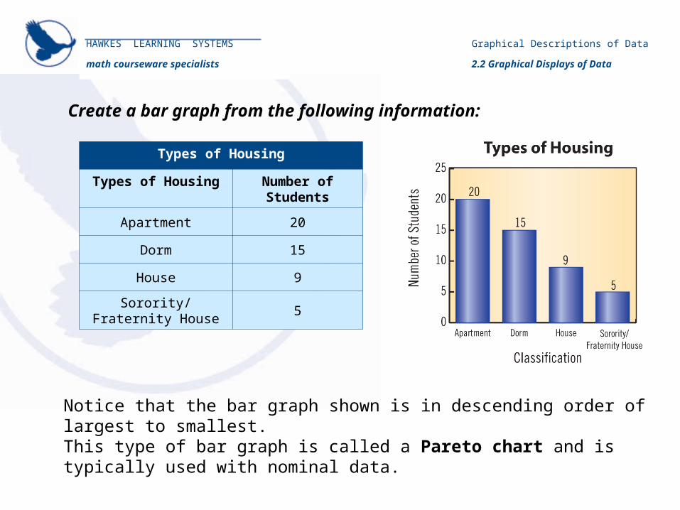
Create a bar graph from the following information:
Types of Housing
Types of Housing Number of Students
Apartment 20
Dorm 15
House 9
Sorority/Fraternity House 5
Notice that the bar graph shown is in descending order of largest to smallest.This type of bar graph is called a Pareto chart and is typically used with nominal data.

Graphical Descriptions of Data
2.2 Graphical Displays of Data
HAWKES LEARNING SYSTEMS
math courseware specialists
Create a side-by-side bar graph from the following information:
Types of Housing
Types of Housing
Number of Students
from Class A
Number of Students
from Class B
Apartment 20 13
Dorm 15 24
House 9 6
Sorority/Fraternity House
5 7

Graphical Descriptions of Data
2.2 Graphical Displays of Data
HAWKES LEARNING SYSTEMS
math courseware specialists
Create a stacked bar graph from the following information:
Types of Housing
Types of Housing
Number of Students
from Class A
Number of Students
from Class B
Apartment 20 13
Dorm 15 24
House 9 6
Sorority/Fraternity House
5 7
With the stacked bar graph, it is easier to see that more students live in the dorms than in apartments.

Graphical Descriptions of Data
2.2 Graphical Displays of Data
HAWKES LEARNING SYSTEMS
math courseware specialists
• A bar graph of a frequency distribution.
• The horizontal axis is a real number line.
• The width of the bars represent the class width from the frequency table and should be uniform.
• The bars should touch.
• The height of each bar represents the frequency of the class it represents.
Histograms:
Graphical Descriptions of Data
2.2 Graphical Displays of Data
HAWKES LEARNING SYSTEMS
math courseware specialists
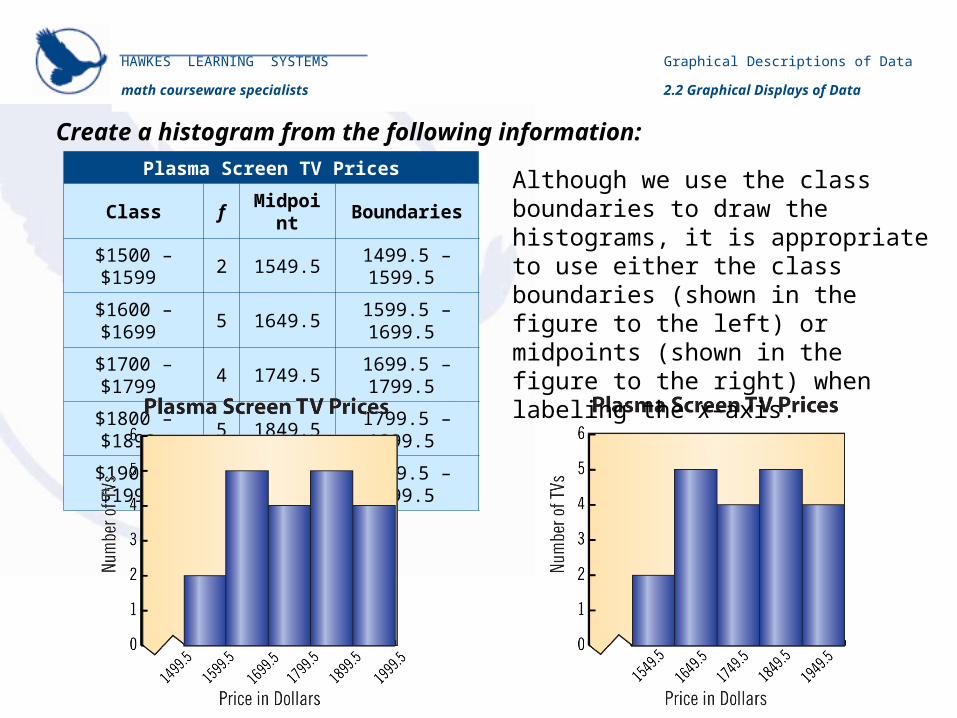
Create a histogram from the following information:
Plasma Screen TV Prices
Class f Midpoint Boundaries
$1500 – $1599 2 1549.5 1499.5 – 1599.5
$1600 – $1699 5 1649.5 1599.5 – 1699.5
$1700 – $1799 4 1749.5 1699.5 – 1799.5
$1800 – $1899 5 1849.5 1799.5 – 1899.5
$1900 – $1999 4 1949.5 1899.5 – 1999.5
Although we use the class boundaries to draw the histograms, it is appropriate to use either the class boundaries (shown in the figure to the left) or midpoints (shown in the figure to the right) when labeling the x-axis.
Graphical Descriptions of Data
2.2 Graphical Displays of Data
HAWKES LEARNING SYSTEMS
math courseware specialists
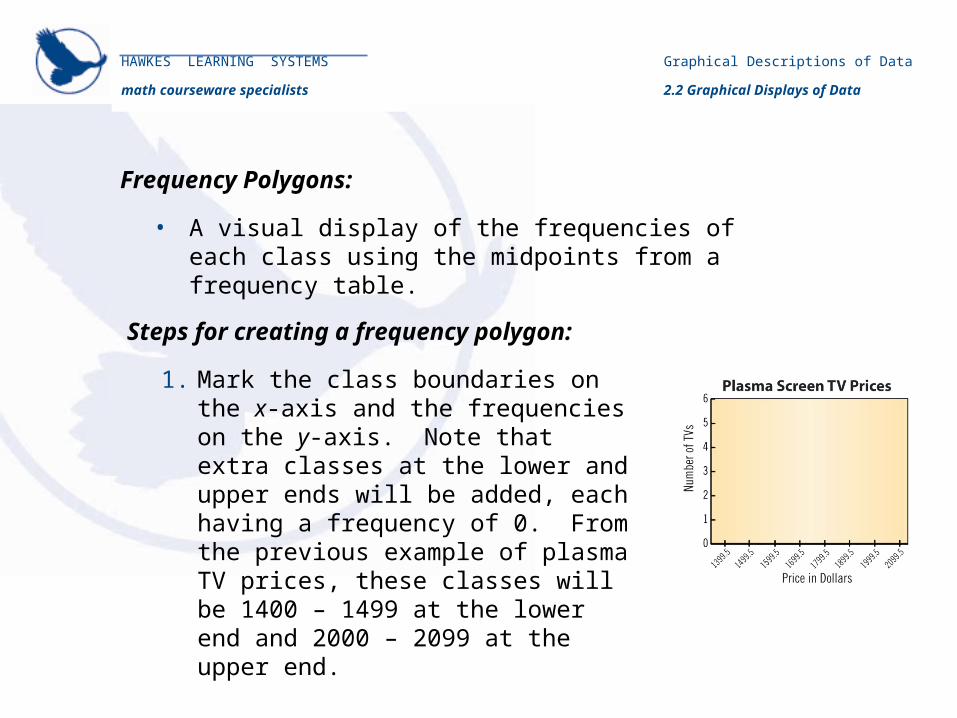
• A visual display of the frequencies of each class using the midpoints from a frequency table.
Frequency Polygons:
1. Mark the class boundaries on the x-axis and the frequencies on the y-axis. Note that extra classes at the lower and upper ends will be added, each having a frequency of 0. From the previous example of plasma TV prices, these classes will be 1400 – 1499 at the lower end and 2000 – 2099 at the upper end.
Steps for creating a frequency polygon:
Graphical Descriptions of Data
2.2 Graphical Displays of Data
HAWKES LEARNING SYSTEMS
math courseware specialists
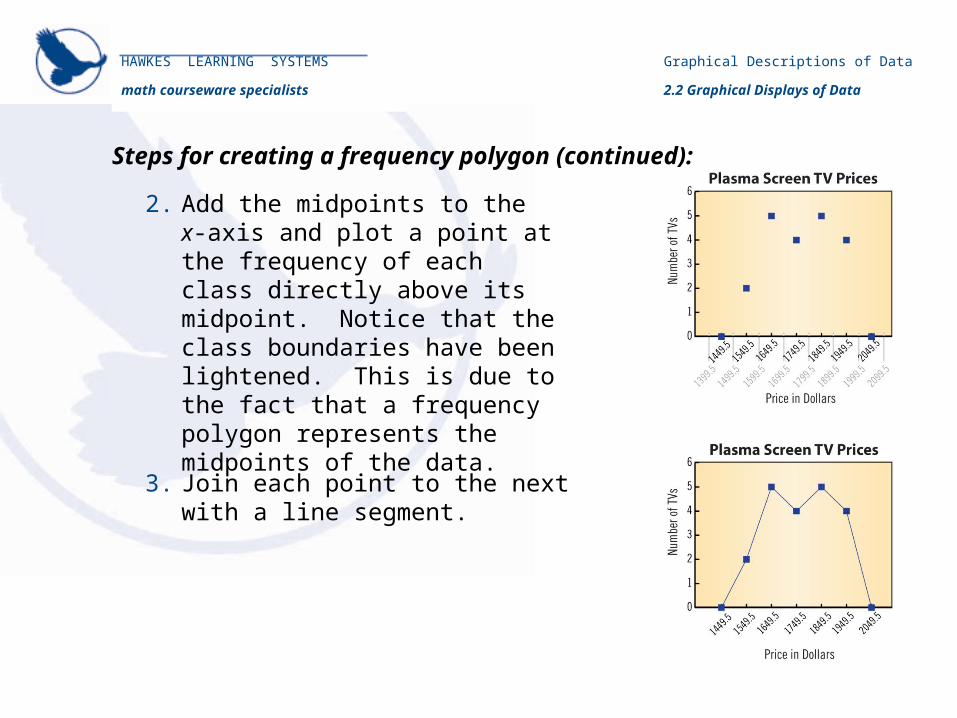
2. Add the midpoints to the x-axis and plot a point at the frequency of each class directly above its midpoint. Notice that the class boundaries have been lightened. This is due to the fact that a frequency polygon represents the midpoints of the data.
Steps for creating a frequency polygon (continued):
3. Join each point to the next with a line segment.

Graphical Descriptions of Data
2.2 Graphical Displays of Data
HAWKES LEARNING SYSTEMS
math courseware specialists
• A line graph which depicts the cumulative frequency of each class from a frequency table.
Ogives:
1. Begin by tabulating the cumulative frequencies for each class.
Steps for creating an ogive:
Plasma Screen TV Prices
Class fCumulative Frequencies
Boundaries
$1500 – $1599 2 2 1499.5 – 1599.5
$1600 – $1699 5 7 1599.5 – 1699.5
$1700 – $1799 4 11 1699.5 – 1799.5
$1800 – $1899 5 16 1799.5 – 1899.5
$1900 – $1999 4 20 1899.5 – 1999.5

Graphical Descriptions of Data
2.2 Graphical Displays of Data
HAWKES LEARNING SYSTEMS
math courseware specialists
2. Unlike a frequency polygon where two classes are added, we only include an extra class at the lower end for this graph, giving it a frequency of 0.
3. Next, plot a point at the cumulative frequency for each class directly above its upper class boundary.
Steps for creating an ogive (continued):
4. Finally, join the points together with
line segments.

Graphical Descriptions of Data
2.2 Graphical Displays of Data
HAWKES LEARNING SYSTEMS
math courseware specialists
• Retain the original data.• The leaves are usually the last digit in each data
value and the stems are the remaining digits.
Stem and Leaf Plots:
1. Create two columns, one on the left for stems and one on the right for leaves.
2. List each of the stems that occur in the data set in numerical order.
3. List each leaf next to its stem.
4. Create a key to guide interpretation of the stem and leaf plot.
5. The leaves may then be put in order, if desired, to create an ordered stem and leaf plot.
Steps for creating a stem and leaf plot:

Graphical Descriptions of Data
2.2 Graphical Displays of Data
HAWKES LEARNING SYSTEMS
math courseware specialists
Create a steam and leaf plot from the following information:
ACT Scores
18 23 24 31 19
27 26 22 32 18
35 27 29 24 20
18 17 21 25 26
Key: 1|8 = 18
ACT ScoresLeavesStem
123
831
942
875
86
72 7 9 4 0 1 65
Key: 1|8 = 18Ordered Array
ACT ScoresLeavesStem
123
701
812
825
83
94 4 5 6 6 7 97