production development
TRANSCRIPT

Production DevelopmentTransphobia & Gender Discrimination

Logo Draft. 1
For my first draft I wanted to create a logo that meant something symbolically.Due to my subject, I decided to use the ‘Trans pride’ symbol at the center of the world. I included the earth to show that my intentions are global change.Finally, I included the paper chains to represent another intention, To create unity amongst people.

Draft Evaluation
To see what type of logo I liked the most I decided to add a brighter colour for the background which may be one I would use during production, yellow (Gender neutral colour).I liked the idea of having the land part of the world visible as with the blue it was too much but by itself it is quite subtle.But we noticed that at that particular opacity it drew too much attention away from the trans symbol in the middle, so we turned the opacity down and we were left with this.
We also experimented with the idea of having the world inside the circle of the trans symbol as I can keep the bright
colour and it still won’t drive too much attention from the actual subject.

PNG

Logo Draft. 2

Bookmark
3 inch wide and 8 inch long (average sized bookmark)
Enough space to fit a good number of images with text and to have the detail on them to be visible. (4-6)

Bookmark: Templates

Bookmark: layout draft
I like these designs for the bookmark best as the images/text swap sides after each one, giving it more creativity.One problem is with the six boxed template, the text portion is too big for the statistics I intend to fill it with. Therefore, I would have to make the text larger to fit the space but I feel that it would drive to much attention away from the images.The second template on the other hand, I feel that I should resize the boxes so that I have more room for text and also a title at the top.

Bookmark: Layout for final design
I have decided to use this as my bookmark layout as although it is simple it fits the design well and has enough room for a title.


Campaign Products

BookmarkFront Back

Leaflet
For my leaflet, I took my final bookmark design and manipulated it so that when folded it would resemble a business card-shaped leaflet.(The blue lines shown on the image were placed there on Photoshop to show where the fold would be)

Leaflet: finished product

Leaflet: Development

Merchandise: Interchangeable
sweatband

Posters: Design 1

Posters: Design 2

Posters: Design 2.5

Posters: Design 3
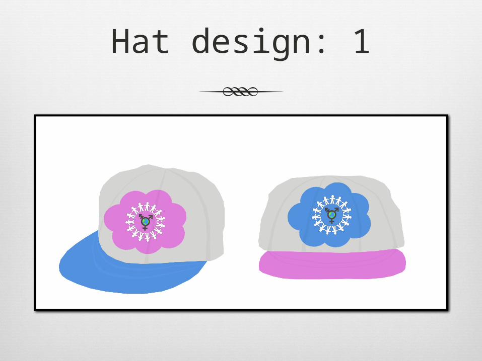
Hat design: 1

Hat design: 2

Merchandise ideas