overview introduction
TRANSCRIPT


Introduction & Overview
Moodle’s 4.0 release kicks-off!
We’re very excited to be kicking off on Moodle’s 4.0 release.This is a long-term support release that will see a significant shift towards user-centered design with a commitment to improve the Moodle LMS user experience for all our users.To do this, we asked for your help and got fantastic feedback about your experience with your Moodle products.

Our objective
Our key objective is to find out and understand what problems our users are currently facing when using their Moodle product/s.
This research is aimed at identifying and improving the user experience within key Moodle products:• Moodle LMS• Moodle apps• Moodle.org
“... I think the step to 4.0 is the most important you ever made! ”
Moodle administrator / Teacher who creates courses.

Key Moodle products
1. Moodle LMSMoodle LMS is an open source learning platform that allows educators, trainers and community groups to easily build courses with flexible software tools for collaborative online learning.
2. Moodle Mobile and Desktop appsThe Moodle Apps provides students online and offline access to courses when they are on the move or living remotely with limited internet access.
3. Moodle.org Our community hub, Moodle.org holds all our documentation on Moodle products, community forums, our Moodle Tracker where Moodle HQ and community members record, comment and provide feedback on product-related issues.

Research Methodology

Research methodology
A questionnaire was used to gather user feedback as this allowedus to:
• Find out what the key problems our users are currently facing
• Set a benchmark that we can measure future improvements against
• Clearly demonstrate we are meeting our users’ needs over time
• Directly engage with all our different types of users globally
To gain a statistically reliable set of data with a confidence level of 80-90% we aimed to reach a minimum of 700 respondents.
700 respondents

Our audience groups
We identified the following groups as our principle Moodle users based on their level of engagement with and investment in the product/s.
The audience was grouped in order to understand any nuances that may be specific to each group so that we are better able to meet their needs.
Our audience groups:
Educators
Students
Content / instructional designers
Developers (software)
Developers (content)
Administrators
Support staff
Partners

Survey Monkey
We trialled Survey Monkey, an online survey tool, as this allowed us to:
• Easily reach out to our global community of principle users
• Provide the survey in both English and Spanish
• Analyse and share the results
• Integrate with other applications
• Launch the survey globally via multiple channels

4. Interest in future UX research
Q7. Want to tell us more? Register your interest if you’d like to be a part of future user research with us.
Our focus on user-centered design makes including our users on the improvement journey all the more important. Not only for finding out the current issues they are facing, but also as a method to build users’ trust and confidence in the product, as well as, the organisation.
It becomes a platform representing our users’ voice which fosters transparency and collaboration. We need to ensure that, not only are users issues important to us, but that we are actively working towards improving their experience by addressing their needs.

Survey design
To find out more about our users, the survey was separated into 4 sections:
1. Demographic information
2. Open response question
3. Overall satisfaction rating
4. Interest in future UX research

Survey launch
The survey was launched on the 24 April 2020 until 14 May 2020 to allow our global community adequate time to respond.
We reached out to contributors, collaborators, students, educators, designers, developers and Moodle partners via Moodle.org, social media channels and the Moodle Universities Association (MUA).
Students were targeted via Universities through the MUA and also via social media channels.

1. Demographic information
Q1. What role/s describes you best? Different roles will dictate the type of tasks and areas that users interact with. We need to understand these differences in order to cater to all our different types of Moodlers.
Q2. How would you describe your skill level using Moodle? This helps us understand the differences and similarities between how beginners and power-users might use Moodle. This information is used to inform the different user journeys.
Q3. If known, what version of Moodle are you using?We need to understand as much as possible about our users technological environment to help us understand the issues they are facing and resolve them more accurately.
When designing an onboarding experience for beginners, or a system administration interface for expert users, we need to understand both their internal and external environments they are dealing with to reach the right solution.

2. Open response question
Q4. What is the one thing that challenges you the most on a day-to-day basis about your use of Moodle?[Including web, mobile and moodle.org]
• The open response question was used to encourage users to tell us in their own words what their experience of Moodle is.
• Open-ended responses are also helpful in indicating the users’ underlying mood and sentiment.
The open response question is a great tool to provide a voice for our community.
The use of their own words is a powerful way to understand the emotions behind the words which helps us understand the severity of the issues.

3. Overall satisfaction rating
Q6. Overall, how would you rate your Moodle experience?
‘In a continuous process improvement program, benchmarking is the regular, systematic measuring of an organization’s own products, services or processes against those of the recognized best practitioners in the world.’ [www.isixsigma.com]
By setting a benchmark we will be able to:
• Define the critical success measures for the product/s
• Repeat the survey and compare data over time as well as identify any recurring or potentially new problem areas
• Measure product improvements over time
• Demonstrate if we are meeting users’ needs over time
Measurement is the first step that leads to control and eventually to improvement.
If you can’t measure something, you can’t understand it.
If you can’t understand it, you can’t control it.
If you can’t control it, you can’t improve it.
H. James HarringtonAuthor of Quality Magazine

Results

Number of respondents
We had a great result of 771 responses resulting in a confidence level of 95%. All results were collected and securely managed by the online survey tool, Survey Monkey.
Moodle Senior UX designer, Hina Khan - analysed all respondent data and put together this report to present the results and overarching themes that emerged from the user feedback.
A simple severity ranking model was used to highlight areas of potential work as part of the recommendations section.
685 participants responded to the English language survey, while the Spanish survey had 86 responses.

Q1 .What role/s describe you best?
The largest group of respondents groups are also the most advanced users and who, potentially, would be more invested in the outcomes of the survey and therefore more likely to respond.

Given the large percentage of Moodle administrators and support staff, it was not surprising to see a high percentage of respondents described as expert and advanced users.
Despite this, the results indicate that the types of issues faced are consistent across groups regardless of level of experience.
Q2 .How would you describe your skill level using Moodle?

Most respondents are using more recent versions, 3.6-3.8.This indicates that, despite the many changes and improvements made in the more recent versions, users are still experiencing issues.
This could potentially be due to previous user feedback not having a particular focus on the user experience, resulting in responses with a wider range of less focussed issues.
Q3. If known, what version of Moodle are you using?

Q4. What is the one thing that challenges you the most on a day-to-day basis about your use of Moodle?
In order to analyse the answers to the above open verbatim question, similar issues expressed by the respondents were counted and grouped into broad categories. The frequency of mentions is indicated by the level of each category bar. Further to this, two severity rankings were assigned to each category
1. Usability
2. Sentiment
The severity rankings were also measured and verified against Nielsen's and Hess’s principles for interaction design that were used as a framework and as a best practice benchmark.
The open verbatim response allows respondents to use their own words. This is a powerful way to understand the emotions behind the words which helps us understand the sentiment behind the issue indicating the value the user places on the issues.
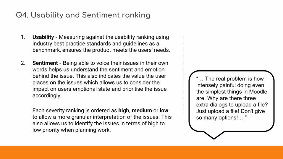
Q4. Usability and Sentiment ranking
1. Usability - Measuring against the usability ranking using industry best practice standards and guidelines as a benchmark, ensures the product meets the users’ needs.
2. Sentiment - Being able to voice their issues in their own words helps us understand the sentiment and emotion behind the issue. This also indicates the value the user places on the issues which allows us to consider the impact on users emotional state and prioritise the issue accordingly.
Each severity ranking is ordered as high, medium or low to allow a more granular interpretation of the issues. This also allows us to identify the issues in terms of high to low priority when planning work.
“… The real problem is how intensely painful doing even the simplest things in Moodle are. Why are there three extra dialogs to upload a file? Just upload a file! Don't give so many options! …”

Q4. Broad categories based on user mentions of challenging issues
The number of mentions of issues that presented challenges to users were counted and sorted into broad categories
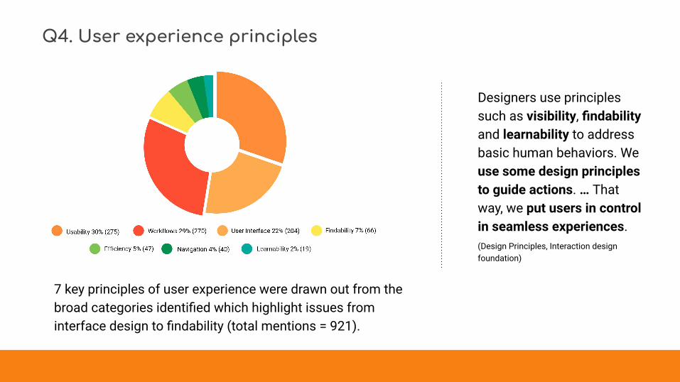
Q4. User experience principles
7 key principles of user experience were drawn out from the broad categories identified which highlight issues from interface design to findability (total mentions = 921).
Designers use principles such as visibility, findability and learnability to address basic human behaviors. We use some design principles to guide actions. … That way, we put users in control in seamless experiences.(Design Principles, Interaction design foundation)

Q4. Showing top 10 categories
1. Courses2. Student experience3. Technology Issues4. Mobile App5. Activites (Quiz)6. Components (Gradebook)7. Site administration8. Help Documentation9. Performance
10. Reports
In the next section, the top 10 categories recorded will be explained in more detail.

1. Courses USABILITY HIGH
SENTIMENT HIGH
Problem statement: Busy educators and course creators need an easy, time-efficient way to add, reuse and reorder aspects of course content across their multiple courses.
Key insight: Out of a total of 567 mentions, courses/course pages received 21% (121) mentions describing difficulties creating, reusing and moving course content.
Currently, we know that users can duplicate or reuse only activities and resources. The only way to duplicate a course is by using the course backup and restore function which will back up the entire course and then restore it after much finagling with the numerous settings. There is currently no way to easily duplicate entire sections or topics.
While Moodle’s flexibility is its strength, it is also makes it difficult to use. This is potentially due to the way in which flexibility is perceived and implemented - it is not used to make tasks easier, but to ‘turbo-charge’ a component that only more advanced users will ever use. In this instance, flexibility is needed to make the everyday tasks of course creators to be successfully completed as easily as possible.
Heuristic principle: Make systems flexible so novices and experts can choose to do more or less on them.
User feedback: “The inability to add multiple files at the same time, inability to store a preferred "format", e.g., for quizzes or blocks that I can reuse all the time while allowing the possibility to add other features. The difficulty in moving blocks up and down the page, if the page is long, often I see all the text in labels which I do not need to see while deciding where to move content. “ - Teacher (course creator), Content developer

2. Student experienceProblem statement: The cluttered interface and settings that create unnecessary noise, makes it difficult for students to
find what they need to successfully complete their tasks.Key insight: Of the 921 mentions around user experience issues specifically, 22% (204) felt the interface was confusing saying it had too many
options and made completing their tasks more difficult. 10% (72) of mentions also linked the poor student experience to the cluttered and confusing interface.
Educators have identified that students struggling to engage with their Moodle courses, finding the interface confusing and knowing where to start, having difficulties finding what they need quickly and being forced to go through convoluted workflows in order to complete everyday tasks. Students who are used to apps like Facebook, Uber, Whatsapp do not have the patience to spend time learning how to 'do' Moodle. It should just work!
The overall sentiment expressed by students was one of neglect - that Moodle has not thought nor care about them. For educators, we get a sense that they are not meeting their students’ requirements and are constrained by the product which leads to anxiety, disappointment and a sense of letting their students down.
Heuristic principle: Aesthetic and minimalist designDialogues should not contain information which is irrelevant or rarely needed. Every extra unit of information in a dialogue competes with the relevant units of information and diminishes their relative visibility.
User feedback:
"It is challenging to find a course through the search engine, mainly because of the way the interface is designed. The whole interface design should be simpler and more minimalist, so that the user is able to know what they are supposed to do without clicking on every button to find out. The structure of the content of the courses (slides, chat, tasks etc.) could also be simpler" - Student
"Moodle is a pretty solid system - the only problem in my opinion is to get fluent with it - there is no introduction on the web interface - its just there - no one tells you on how to get into a course, how to submit a submission, no one tells you anything about moodle " - Student
"What challenges the most is that I need to use others applications like Zoom, Skype to have a full experience during my classes, so moodle is just a platform to sign the class attending and upload my homework" - Student
USABILITY SEVERITY HIGH
SENTIMENT HIGH

3. Mobile apps USABILITY SEVERITY HIGH
SENTIMENT HIGH
Problem statement: Students, as well as, educators need to be able to access their courses and classes so that they can complete their tasks both online and offline in a time efficient manner.
Key insight: Out of a total of 567 mentions, the mobile app received 9% (39) mentions describing a poor user experience for students, difficulties with the sign in process and overall usability.
Currently, we know that the mobile experience is not meeting best practice standards. Content is not optimised for viewing on small screens; various technology related issues and connectivity issues. The app also caters solely to students, failing to cater to educators despite the high value it would provide for this audience who would see many benefits from being able to complete their tasks whilst on the move.
The very first step of signing into the mobile apps presents the user with too many barriers:
• The site must be registered to appear in the search list - registering a site is at the discretion of the institution.• It has to be enabled for mobile access by the institution administrator - resulting in an error if it is not enabled.
Currently the reasons for institutions choosing not to enable their site for mobile access are not known and can potentially range from a lack of awareness; poor documentation and security concerns.
Heuristic principle: Don’t interrupt or give users obstacles – make obvious pathways which offer an easy ride.
User feedback: “The responsiveness of the webpage, and the ability to use the interface on mobile” - Administrator, Student, Software developer
“It's difficult to design tasks that are practical in the app - simply because there is too much content.” - Administrator
“… Still too many options visible in activities, should hide more options under "see more" links - Too many content and UI elements aligned to center by default (videos, embeds etc.) makes UI looks messy in larger displays - Course page content is indented vertically to multiple levels, looks ugly and takes too much space in small screens (mobiles)” - Course designer, Administrator, Support, Software developer

4. Components USABILITY SEVERITY HIGH
SENTIMENT HIGH
Problem statement: Users need workflows that are logical, easily understandable and enable them to successfully complete their tasks in a timely manner.
Key insight: We saw a total of 567 mentions, across the broadly categorised areas (slide 25), with components making up 7% (41) of the overall mentions.
Gradebook made up a large proportion of this with 5% (37) with a high severity and sentiment ranking.. Currently we know that gradebook suffers from broken workflows indicating that not enough attention is paid to the complete life-cycle within each component including how they interact with other related components.
This can be seen currently with:• some activities not linking with gradebook resulting in an extra burden of work for educators and support staff as they have to enter the
grades manually;• competencies and the process of linking them to activities is convoluted and difficult to follow;• student enrolment and how students move in and out of the system and how all associated information is handled which has flow-on
effects impacting admins, support staff and educators alike.
Heuristic principle: Maintain consistent standards so users know what to do next without having to learn new toolsets.
User feedback: “In general formulas for grading and setting up grading which is such a critical function in delivering a course.” - Course creating teacher
“Grading options - there are so many options and it is difficult to figure out what each option means. At the end of the semester, I typically have to contact the help desk for support.” - Course creating teacher
“Gradebook setup is difficult. This is the #1 thing I have to do for faculty because they can't figure out how to organize it themselves, and it takes longer to teach (repeatedly) then to design for them.” - Course designer, support

5. Activities USABILITY SEVERITY HIGH
SENTIMENT HIGH
Problem statement: Users need a consistent user experience across different activities and related components within their Moodle site.
Key insight: From the 567 mentions across the broad categories from all 771 participants, activities received 10% (58) mentions.
One of the challenges of community created activities means that our help and documentation need to provide very clear guidelines not only on best practices within programming and coding, but also for user experience (UX), including aspects of user interface (UI) design to ensure all our components and products are built with the users’ needs in mind.
Each activity needs to reflect industry best practices outlined clearly in Moodle help and documentation to ensure that the user experience is the best it can be and developers are looking at their activity as part of the entire Moodle ecosystem rather than a stand alone piece.
This currently can be seen with the Quiz activity which received a high number of mentions 7% (46) with a high severity and sentiment ranking. We know that quiz currently has workflow issues that make it very time consuming and difficult to set up and simple changes present many challenges.
‘Upholding the second usability heuristic in writing, visual, and interaction design demonstrates that the site knows its users and cares about them. It shows empathy and acknowledges them as important. In an age where users read less and less but are inundated with more and more online options, prioritizing and applying the second usability heuristic is a dependable way to differentiate while staying relevant, building trust, and instilling feelings of familiarity, which will lead to loyal users.’ (Kaley)
Heuristic principle:Match between system and the real worldThe system should speak the users' language, with words, phrases and concepts familiar to the user, rather than system-oriented terms. Follow real-world conventions, making information appear in a natural and logical order.
User feedback: “Making quizzes is just hard and time consuming. So many options. Creating algorithmic quizzes is mind bending. There just has to be an easier way. I'd say this part of moodle is basically broken.” - Teacher (course creator)
“It is challenging the way the users interact with the activities and the navigation to return. Because differs in the experience between them, by example, forums post, quiz, assignments. ...” - Teacher, Course creator/designer), Content/software developer, Administrator, Support
“The question and quiz database structure. It's too complicated or cumbersome.” - Administrator, Software developer
“Speaking as an administrator, explaining to faculty how to create a quiz is my answer to this question. ....Moodle is too "techy" for most teachers (higher ed) in this area. ” - Teacher (course creator), Administrator, Support

6. Site administration USABILITY SEVERITY MED
SENTIMENT HIGH
Problem statement: Administrators and support staff need a product that makes onboarding of new non-technical staff a good first experience.
Key insight: 5% (29) of respondents described difficulties with the overall user experience of the site administration site. Within this group, 6 key areas of user experience were highlighted. The low number could suggest that this group, which largely consists of expert and advanced users, has potentially become used to issues and may have found workarounds and/or have come to believe that this is the best the product is capable of and has no expectations that it will improve and are just getting on with things. Of those respondents who did respond, usability severity is medium with a high sentiment as it impacts new users, teachers, administrators.
Despite many improvements over more recent releases, site administration remains a problem area, largely due to improvements not focusing on the average non-technical user. Site administration currently suffers from a cluttered interface and a case of too much help becoming unhelpful by getting in the way of the user. Combined with too many settings for each component and/or activity makes daily tasks unnecessarily time-consuming and error-prone, leading to frustrations.
Importantly, these issues create significant barriers when support staff are tasked with training new staff to use the product and are finding it difficult to explain how the product works because of the poor overall user experience. An onboarding experience fraught with issues will not inspire trust or help build a new users’ confidence when using the product. This also has a social value where the support staff don’t want to look incompetent while training newcomers.
Heuristic principle: Be consistent with navigational mechanisms, organizational structure, etc., to make a stable, reliable and predictable design.
User feedback: “Teaching others how to use it is time consuming.” - Administrator
“the website-admin area is complex, sometimes slow and remembering where the functions are is difficult. best examples is the role management with capabilities ..” - Administrator, support, course creator
“Working my way through the Site Administration pages. Clicking back brings you to pages that are fairly useless, as do the breadcrumbs menu. Working in other LMS's like Canvas, this is not an issue. This can be very frustrating when you need to get something done fairly quickly and can't move around as you should be able to.” - Administrator, support

7. Help & documentation (Moodle.org) USABILITY SEVERITY HIGH
SENTIMENT MED
Problem statement: It is difficult for users to find information that is easy to understand so that they can progress their tasks as efficiently as possible, without resorting to contacting administrators.
Key insight: In a complex product environment such as Moodle, help and documentation are an essential tool for all our audiences:• It is particularly important for the onboarding process to ease beginners into the product and assist them on their learning journey;• For expert users, it is useful in revealing the power behind each of the features and functions;• For administrators, it is crucial in setting up the install correctly so that the end user is able to take advantage of its features;;• For developers it provides a best practice guide on how to develop and submit software around Moodle;• For the Moodle community it provides a code of conduct, forums and groups where they can interact and learn about Moodle.
Moodle.org is the goto site for everything from help documentation to community forums. It houses a vast amount of information and over the years is buckling under the weight of outdated articles and a search function that can't cope, resulting in users not finding the help very useful or not finding it at all.
What this can potentially lead to is a scenario where systems are being set up and implemented incorrectly or incompletely because the documentation does not make it clear or omits information relating to requirements to make them available to their end-users.
Without clear documentation, it then becomes the administrator's' decision which may be negatively influenced by how busy they are; how familiar they are with the system, how much they know and/or care about the end-users' experience, etc.
Heuristic principle: Help and documentationEven though it is better if the system can be used without documentation, it may be necessary to provide help and documentation. Any such information should be easy to search, focused on the user's task, list concrete steps to be carried out, and not be too large.
Users' feedback “Trying to follow all the instructions when I'm having to go from focus for one thing to another. VERY FRUSTRATING! Can't you have an instruction book that takes you in sequence instead of having to jump all around? ...” - Teacher (course creator), Course designer, Administrator
"The developer documentation is very poor making difficult to create or troubleshoot plugins " - Admin, Support, Software developer, Student

8-9. Technology & performance USABILITY SEVERITY HIGH
SENTIMENT HIGH
Problem statement: Users need to be able to rely and trust their product will do what they expect, so they can focus on task completion as efficiently as possible.
Key insight: While only 11% (64) of respondents mentioned issues around the underlying technology and 4% (20) around performance issues, this was the third-highest category. It is also a critical area with a high severity ranking for both usability and severity given it affects the underlying functionality of the entire product.
Technology underpins the entire product and we have found that it is often the very reason for the poor userflows and significantly contributes to the unnecessary complexities within the product. We currently know that due to old technology the product is prone to errors, with common tasks working unreliably - sometimes things work and sometimes they don't.
For example, backing up your data is unreliable and results in lost time and potentially lost data, as well as, affecting users' trust. Can users trust the system if the technology is outdated and prone to errors?
In trying to be everything to everyone, Moodle is spreading too itself too thin and falls short in a lot of areas and we are facing a large amount of technical debt in the core code. Currently the technology is old and inconsistent leading to errors and unreliable performance. Creating robust code and APIs based on industry best practices can potentially make everyday tasks easier for the end user and eliminates error-prone conditions to a large extent within Moodle.
Heuristic principle: Error preventionEven better than good error messages is a careful design which prevents a problem from occurring in the first place. Either eliminate error-prone conditions or check for them and present users with a confirmation option before they commit to the action.
User feedback: “We offer online courses. Our worst nightmare with moodle is the fact that we can't know if our students share their passwords, allowing friends to access to the contents of our courses. So tracking students, is a huge effort on our daily basis.” - Teacher (course creator), Administrator, Content developer, Support
"...No modern software should need to be upgraded in the clunky process we use with Moodle..." - Course designer, Administrator, Content developer, Support
" When I access the platform from my mobile phone (not the app) it seems that it's too heavy and takes a while to load the various contents and when I want to edit some files I'm always afraid to make a mistake because the graphics don't look very good.." - Teacher (course creator), Student

10. Reports USABILITY SEVERITY LOW
SENTIMENT LOW
Problem statement: Users find reports omit critical pieces of information and are not addressing their both educators’ or students’ needs.
Key insight: A small number of mentions, with a low usability severity and sentiment ranking, were made describing difficulties with reports 3% (17) in Moodle.
We found that users were having difficulties with:• Getting to the reports (too many clicks); • When a course is hidden, student grades were not visible in the grade reports;• Students who have completed their course fall out of the system prematurely, causing incomplete completion reports;• Educators don’t have one interactive report that provides an overview of all students’ submissions;• Admins and management staff find they cannot generate a custom report and are collating information from multiple reports instead.
The above issues indicate inconsistencies in workflows, a lack of understanding of an educators’ needs and tasks, and what’s needed when a student moves through their study life-cycle..
Heuristic principle: Flexibility and efficiency of useAccelerators — unseen by the novice user — may often speed up the interaction for the expert user such that the system can cater to both inexperienced and experienced users. Allow users to tailor frequent actions.
User feedback: “Navigation from reports in courses back to the course admin menu and other reports. It's rather tedious needing to return to the course and getting back to the menu from the cog menu.” - Teacher (Course creator/designer), Content developer, Administrator, Support
“Reporting is difficult to access and share in a meaningful manner with clients. I find myself having to generate multiple reports and manually consolidate them in excel to present to clients.” - Content developer
“Reporting: 1. A proper dashboard for feedback (Teacher and Students). ...A proper dashboard to view current students/courses/completion ...A proper dashboard to view past students courses attended/grades/reports by Trainers” - Administrator

Q5. Overall how would you rate your Moodle experience? 71% of advanced and expert
users - users who know the product well and are confident using it - were more likely to have higher rates of satisfaction, potentially due to the higher level of familiarity with the product.
Beginners and novices, on the other hand, were more likely to have higher rates of dissatisfaction and a neutral rating, potentially related to difficulties in the general onboarding process.

Key Insights Summary

The following themes stood out in the data:1. The interface is unnecessarily complicated
Complicated interfaces are causing frustration.
2. It’s hard for new users to enjoy MoodleWe have found our workflows are cumbersome.
3. Everyday tasks should be easy for educatorsEducators are relying heavily on admin support staff
4. Everything takes too long in MoodleOur technical documentation is hard to understand and sometimes incomplete.
“Moodle is a very powerful LMS that support effective teaching. ... I Love Moodle. … Many users don't use Moodle because it looks complicated.Teacher, Course designer, Admin/Support, Content developer

It is clear that the inconsistent and cluttered user interface creates too much unnecessary ‘noise’ for users.
The interface is packed with features for beginners and power-users alike with no clear hierarchy based on tasks. This makes it difficult for users to easily find their way around the site, resulting in more time spent on task completion. This could also potentially affect task success rate and increase error rates.
While Moodle’s flexibility is its strength, it also makes it difficult to use. This is potentially due to the way in which flexibility is perceived and implemented - it is not used to make tasks easier, but to ‘turbo-charge’ a feature that will often only benefit more advanced users.
Flexibility is needed to make the everyday tasks to be successfully and easily completed for all course creators, beginners and experts alike.
“Transferring a student out of one course and into another is convoluted and required many steps. This results in our staff struggling to complete all steps, or avoiding doing it entirely because they "don't have time”Course designer, Administrator, Support, Software developer
1. The interface is unnecessarily complicatedComplicated interfaces are causing frustration.

921 mentions from all 771 participants described difficulties with the overall user experience of the product.
Within this group, 7 key areas of user experience were highlighted: Usability 30% (275); Workflows 29% (270); User interface 22% (204); Findability 7% (66); Efficiency 5% (46); Navigation 4% (40); Learnability 2% (19).
This suggests that, overall, the product suffers from broken workflows, indicating that not enough attention is paid to the complete life-cycle within each component and how they relate to other components.
For example, the student enrolment user journey does not take into account how students move in and out of the system nor how all associated information is handled. This potentially results in loss of student data, makes it hard for admins to manage multiple systems and has flow-on effects that adversely impact educators’ time.
2. It’s hard for new users to enjoy MoodleWe have found our workflows are cumbersome.
Similar products mentioned based on:
• Ease of use• Contemporary look and feel• Better workflows• Student interaction• Educator and student interaction• Assessment and grading• Integrations with other products

We found that daily tasks are taking too long and users feel they are wasting a lot of time setting up courses and depend heavily on busy admin staff for help.
This causes a lot of frustration and leaves educators feeling powerless and ‘locked out’ of most settings.
When Educators do not have the skills they need to use the product and are also hamstrung by the product’s limitations, they will lack the confidence to build well constructed and designed courses that are engaging for their students.
3. Everyday tasks should be easy for all usersEducators are relying heavily on admin support staff.
“Teachers are very busy and want moodle to do the heavy lifting of creating a course layout quickly. So they can focus on linking pedagogy to tools.”Support

Beginners and novices who had lower rates of satisfaction with the product could potentially be struggling with a very basic onboarding experience that does not have clearly defined steps and tell the users what to do next.
For new users who rely on help documentation we learned that they are having trouble finding the right documentation and sometimes finding it unhelpful and incomplete.
We also found that the lack of proper technical documentation potentially leads to incorrect or incomplete installs, resulting in educators and students missing out on features at best, and causing errors the user cannot fix, at worst.
“The development of code for the platform and its existing code makes it quite difficult to extend and/or modify.”Software developer
4. Everything takes too long in MoodleOur technical documentation is hard to understand and sometimes incomplete.

Recommendations

1. The interface is unnecessarily complicated • Competitor analysis
• Improving usability, findability and learnability.
• Component audit.
• Mobile and desktop app UX/UI review.
• Catering to beginners, as well as power users.
“... It's like every workflow is made to maximize the number of clicks it takes to complete. Users don't care about specificity or choosing from one of seventeen file repositories, they just want to do things quickly and intuitively.”Moodle Administrator

2. It’s hard for new users to enjoy Moodle
• Exploring the course experience for students in depth to understand how they are engaging/not engaging with the content.
• Looking at components and related components holistically to ensure they are capturing the complete life-cycle of the users’ journey with logical workflows.
“Getting myself and my kids to the right course. Finding the right link I need to do something like extend a quiz for another day. Takes a lot of scrolling and clicks.”
Teacher (course creator), Administrator

3. Everyday tasks should be easy for educators
• Performance & technology stack review.• Mobile and desktop app technology review• Improve reliability and performance and optimise for
scalability to foster trust and confidence in the product.“It is too complex ... which is its strength but often makes it confusing for students and staff. We need a version of Moodle that keeps it simple with a minimal design”Moodle Administrator/Support

4. Everything takes too long in Moodle
• Moodle.org site review to make information address user needs better.
• Improve the onboarding experience for new users.
“It seems out of date. After using Google Classroom it is much easier to assign material and have the students work right in there.”Teacher (non-course creating)
“Most challenging is the old outdated UX within courses. For example, it takes 3 clicks to submit an quiz…”Moodle Support

What’s next?

We had a great response, however, we also learned a few things and hope we can improve the survey the next time around.
A large percentage of the respondents were administrators and support staff who were also expert/advanced users. These users are clearly more engaged and more satisfied overall and provided a lot of great feedback.
We would have also liked to attract more students responses, as well as, beginners and novices from other roles to learn more about their experience in terms of engagement and the onboarding process. At the moment, Moodle is focused
on the course as opposed to the learner. This has to change.Administrator

1. More usability testing with:• Students• Beginners and novices• Community developers
2. Defining process for the community
3. Identifying areas of work
Created by John Brooke, The System Usability Scale (SUS) is commonly used to measure usability and provides quick results that are easily measurable.

And finally ...

We had a great response and appreciate the time you took out of your busy schedules to provide us with such great feedback!
We look forward to hearing your thoughts again and will be working hard with everyone to improve your experience with Moodle.
Thank you!! UX Team - Moodle LMS
Barbara Candice Hina

Featured quotes: Tell us what you think! UX Survey 2020
Slide 9: Creative Research Systems, Confidence levels and sample sizes:https://www.surveysystem.com/sscalce.htm
Slides 23-36: Jakob Nielson, Ten Usability Heuristicshttps://www.nngroup.com/articles/ten-usability-heuristics/
Whitney Hess: from Design Principles, Interaction Design Foundationhttps://www.interaction-design.org/literature/topics/design-principles
Anna Kayley, Match Between the System and the Real World: The 2nd Usability Heuristic Explainedhttps://www.nngroup.com/articles/match-system-real-world/
Slide 39: Measuring system usability scale example:https://uiuxtrend.com/measuring-system-usability-scale-sus/
Icons from the Noun Project: Icon Fair, Mountain; Talking & Felix Westphal, Party