mensch-maschine-interaktion 2 hci and the web€¦ · mensch-maschine-interaktion 2 hci and the web...
TRANSCRIPT
LMU München — Medieninformatik — Andreas Butz — !Mensch-Maschine-Interaktion II — WS2013/14 Slide
Mensch-Maschine-Interaktion 2
HCI and the Web
Prof. Dr. Andreas Butz, Dr. Julie Wagner
1
LMU München — Medieninformatik — Andreas Butz — !Mensch-Maschine-Interaktion II — WS2013/14 Slide
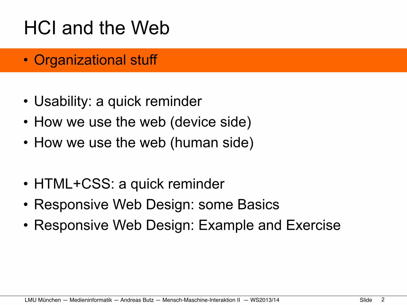
HCI and the Web• Organizational stuff
• Usability: a quick reminder• How we use the web (device side)• How we use the web (human side)
• HTML+CSS: a quick reminder• Responsive Web Design: some Basics• Responsive Web Design: Example and Exercise
2
LMU München — Medieninformatik — Andreas Butz — !Mensch-Maschine-Interaktion II — WS2013/14 Slide
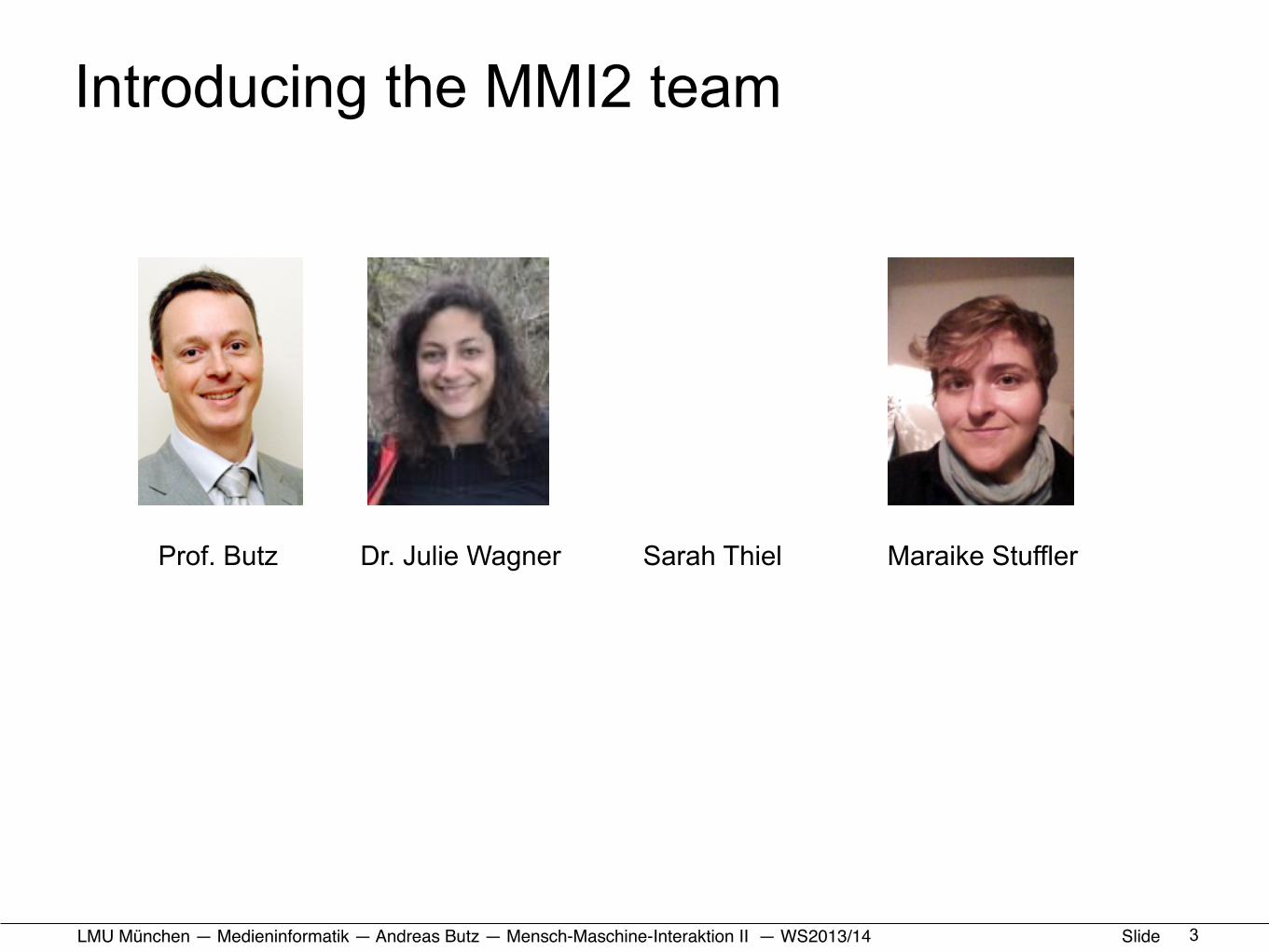
Introducing the MMI2 team
3
Prof. Butz Dr. Julie Wagner Sarah Thiel Maraike Stuffler
LMU München — Medieninformatik — Andreas Butz — !Mensch-Maschine-Interaktion II — WS2013/14 Slide
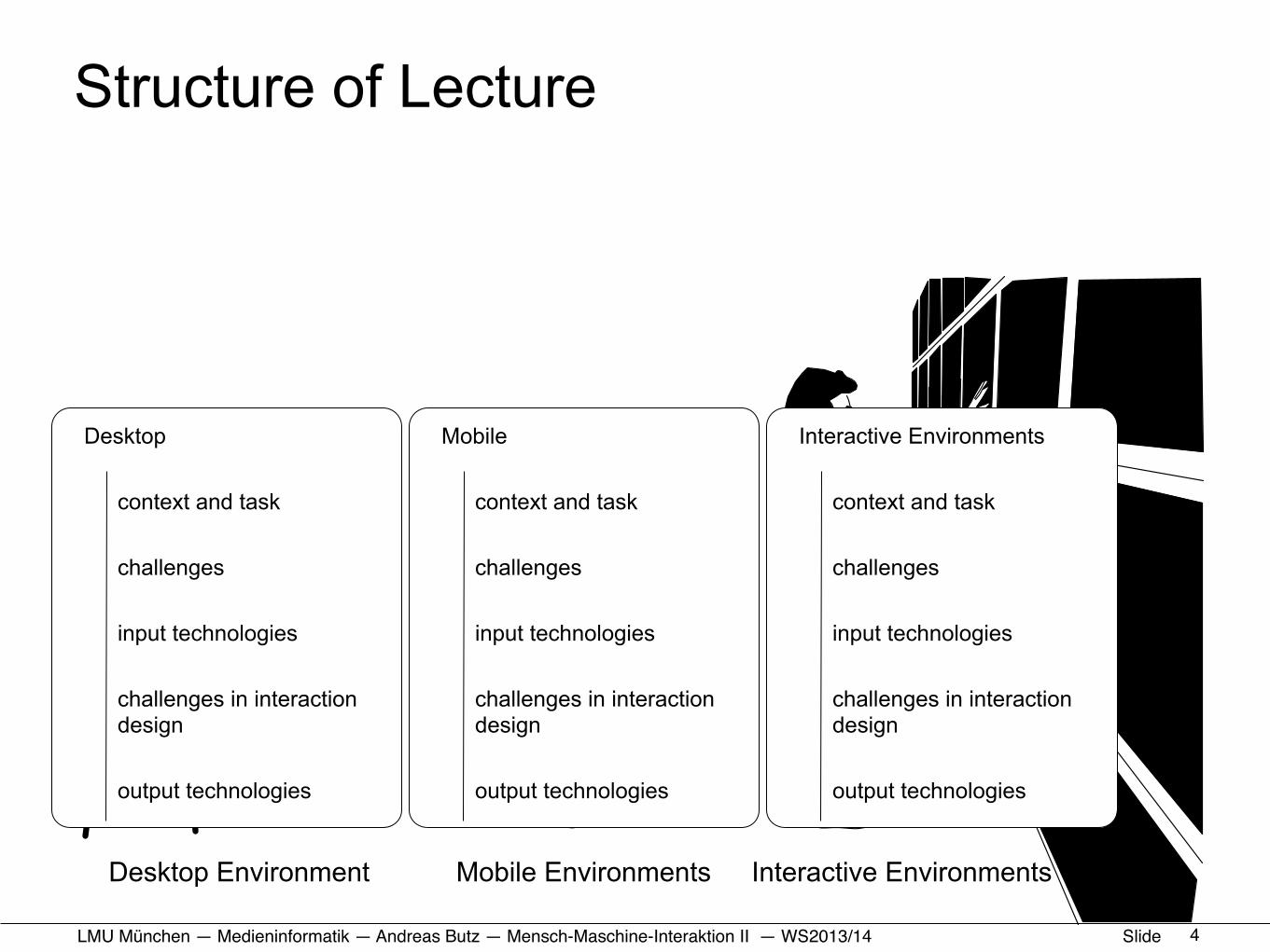
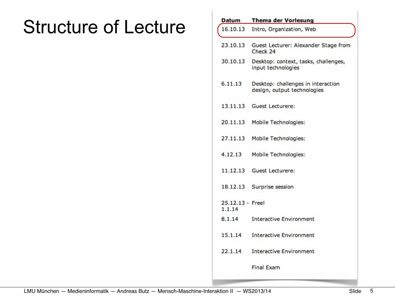
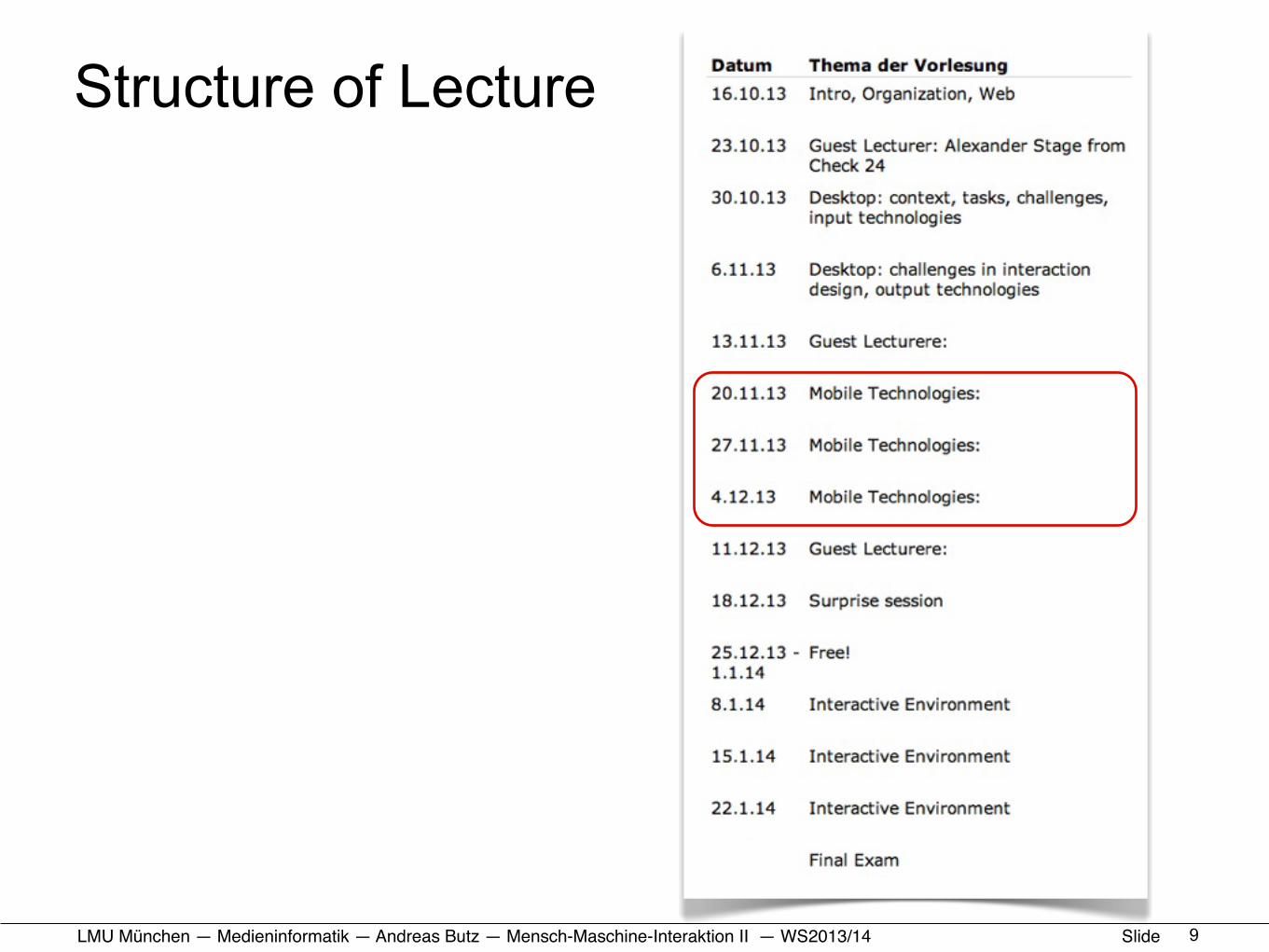
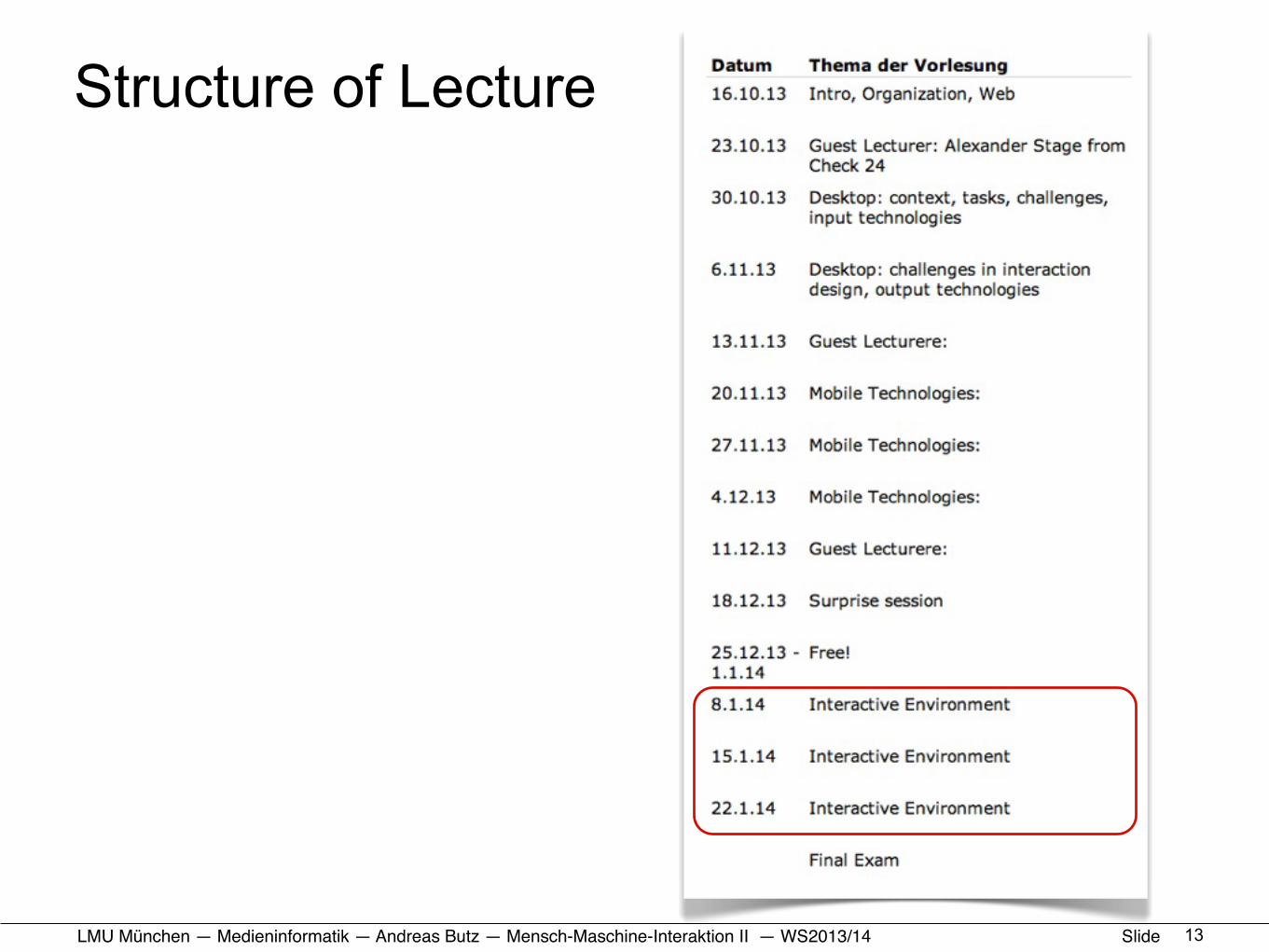
Structure of Lecture
4
Desktop
context and task
challenges
input technologies
challenges in interaction design
output technologies
Mobile
context and task
challenges
input technologies
challenges in interaction design
output technologies
Interactive Environments
context and task
challenges
input technologies
challenges in interaction design
output technologies
Desktop Environment Mobile Environments Interactive Environments
LMU München — Medieninformatik — Andreas Butz — !Mensch-Maschine-Interaktion II — WS2013/14 Slide
Structure of Lecture
5
LMU München — Medieninformatik — Andreas Butz — !Mensch-Maschine-Interaktion II — WS2013/14 Slide
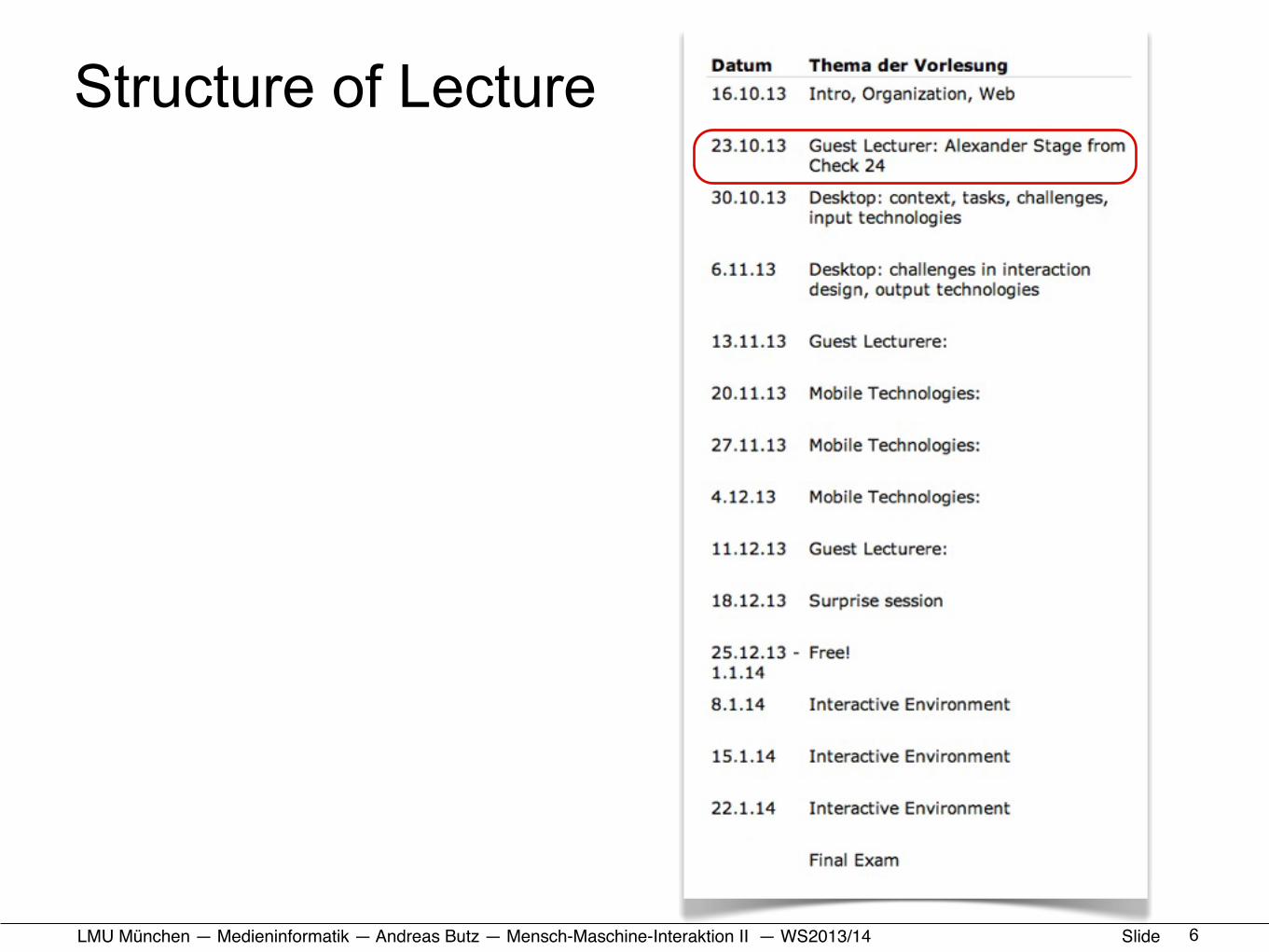
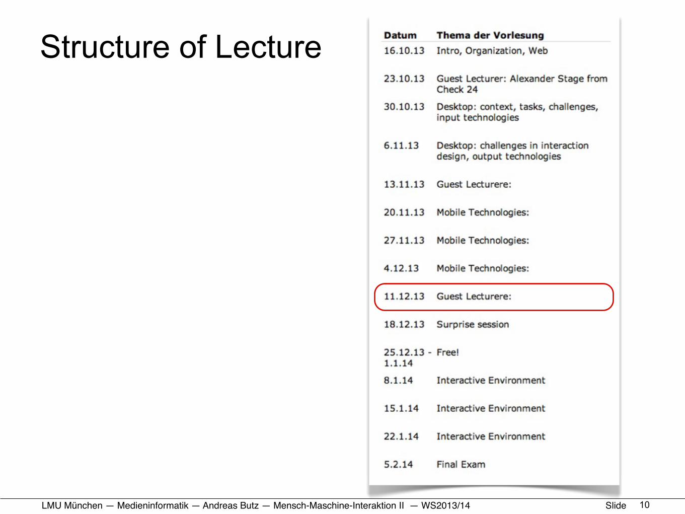
Structure of Lecture
6
LMU München — Medieninformatik — Andreas Butz — !Mensch-Maschine-Interaktion II — WS2013/14 Slide
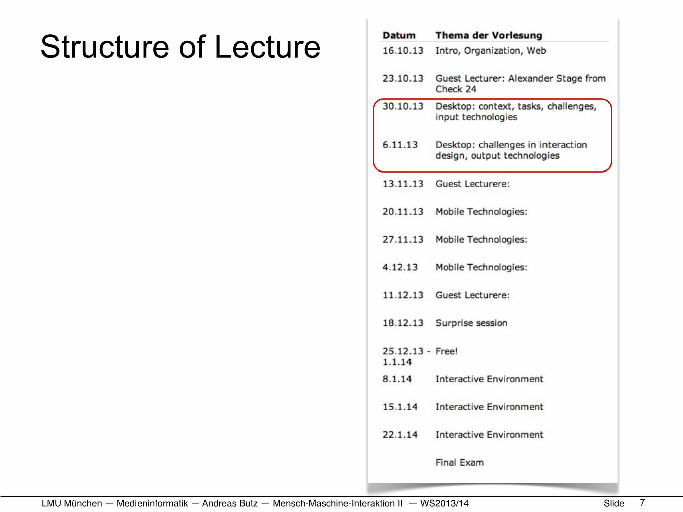
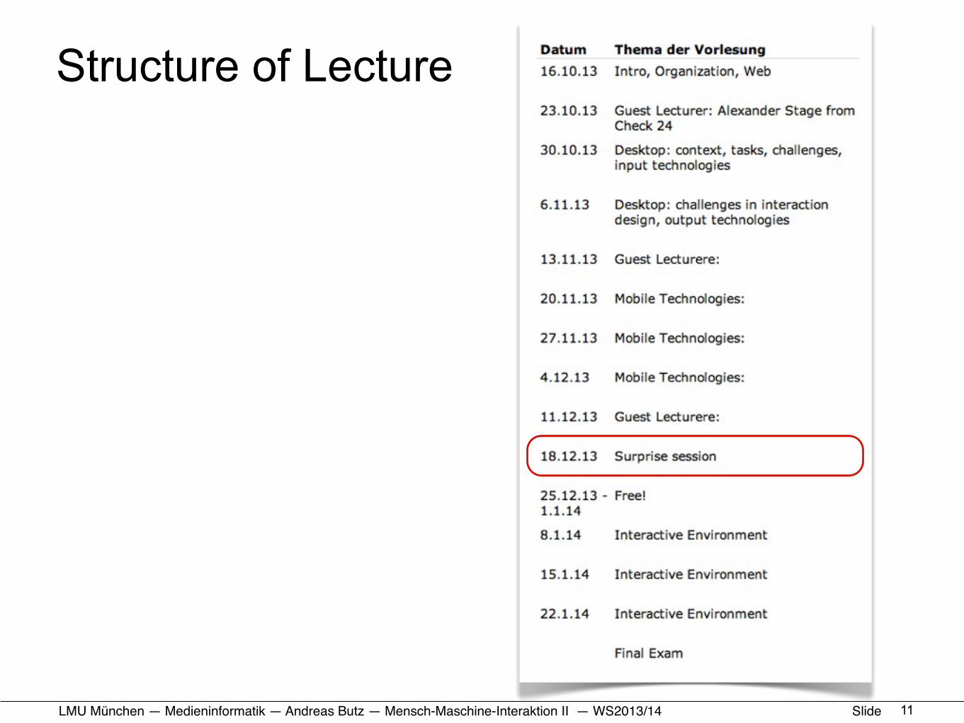
Structure of Lecture
7
LMU München — Medieninformatik — Andreas Butz — !Mensch-Maschine-Interaktion II — WS2013/14 Slide
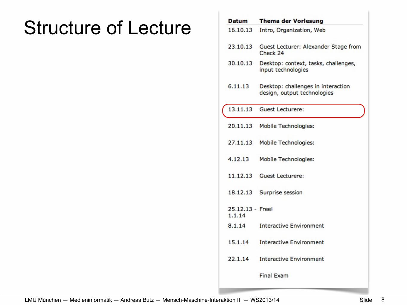
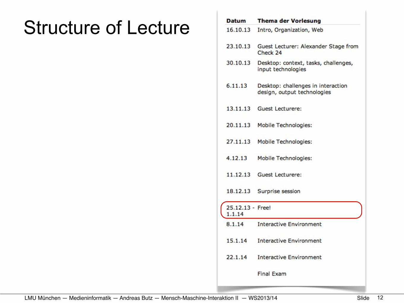
Structure of Lecture
8
LMU München — Medieninformatik — Andreas Butz — !Mensch-Maschine-Interaktion II — WS2013/14 Slide
Structure of Lecture
9
LMU München — Medieninformatik — Andreas Butz — !Mensch-Maschine-Interaktion II — WS2013/14 Slide
Structure of Lecture
10
LMU München — Medieninformatik — Andreas Butz — !Mensch-Maschine-Interaktion II — WS2013/14 Slide
Structure of Lecture
11
LMU München — Medieninformatik — Andreas Butz — !Mensch-Maschine-Interaktion II — WS2013/14 Slide
Structure of Lecture
12
LMU München — Medieninformatik — Andreas Butz — !Mensch-Maschine-Interaktion II — WS2013/14 Slide
Structure of Lecture
13
LMU München — Medieninformatik — Andreas Butz — !Mensch-Maschine-Interaktion II — WS2013/14 Slide
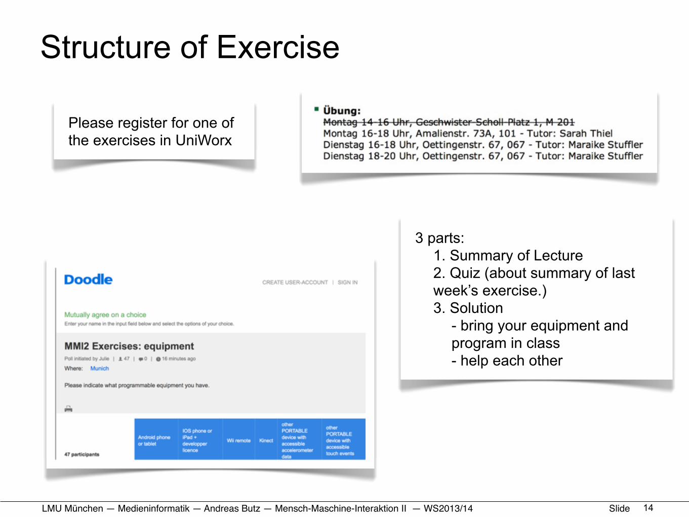
Structure of Exercise
14
3 parts:1. Summary of Lecture2. Quiz (about summary of last week’s exercise.)3. Solution
- bring your equipment and program in class- help each other
Please register for one of the exercises in UniWorx
LMU München — Medieninformatik — Andreas Butz — !Mensch-Maschine-Interaktion II — WS2013/14 Slide
Rules for Plagiarism• one trial leads to non-admission to the final exam
– tools to check similarities of solutions– invitation to oral exam to determine if you are the true
originator.
• think about your reputation if you plan to write master/bachelor thesis at our chair.
• check for plagiarism can occur any time during the semester.
15

LMU München — Medieninformatik — Andreas Butz — !Mensch-Maschine-Interaktion II — WS2013/14 Slide
Exercise 1 (2 weeks time)• design a responsive web design for the Olyphonics
choir webpage (details later and in the exercise sheet)• reward for best solution
– Prof. Butz will call your phone to give his personal congratulations ;-)
– Solution will be used on the web– Acknowledgement on the Olyphonics page
16
LMU München — Medieninformatik — Andreas Butz — !Mensch-Maschine-Interaktion II — WS2013/14 Slide
HCI and the Web• Organizational stuff
• Usability: a quick reminder• How we use the web (device side)• How we use the web (human side)
• HTML+CSS: a quick reminder• Responsive Web Design: some Basics• Responsive Web Design: Example and Exercise
17
LMU München — Medieninformatik — Andreas Butz — !Mensch-Maschine-Interaktion II — WS2013/14 Slide
What is Usability?
• “Usability is a quality attribute that assesses how easy user interfaces are to use. The word ‘usability’ also refers to methods for improving ease-of-use during the design process.” (Jakob Nielsen)
• “Scientific discipline using observation, measurement and design principles to enhance a site visitor’s ability to perform specific tasks” (Kathy Gill)
• “… the effectiveness, efficiency and satisfaction with which a specified set of users can achieve a specified set of tasks …” (ISO)
18
LMU München — Medieninformatik — Andreas Butz — !Mensch-Maschine-Interaktion II — WS2013/14 Slide
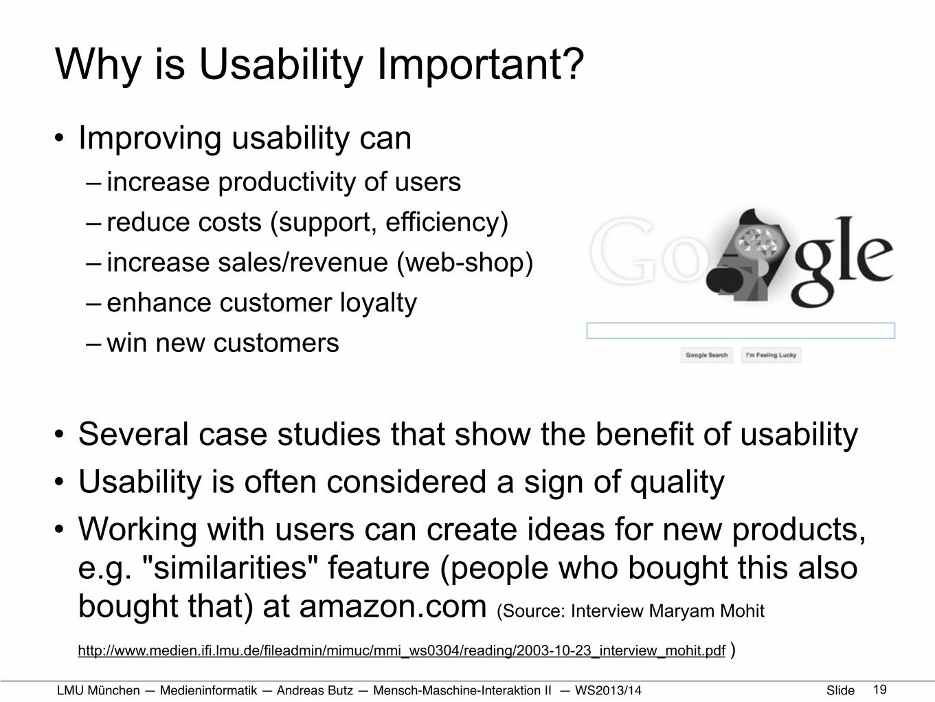
Why is Usability Important?• Improving usability can
– increase productivity of users– reduce costs (support, efficiency)– increase sales/revenue (web-shop)– enhance customer loyalty – win new customers
• Several case studies that show the benefit of usability• Usability is often considered a sign of quality• Working with users can create ideas for new products,
e.g. "similarities" feature (people who bought this also bought that) at amazon.com (Source: Interview Maryam Mohit
http://www.medien.ifi.lmu.de/fileadmin/mimuc/mmi_ws0304/reading/2003-10-23_interview_mohit.pdf )
19
LMU München — Medieninformatik — Andreas Butz — !Mensch-Maschine-Interaktion II — WS2013/14 Slide
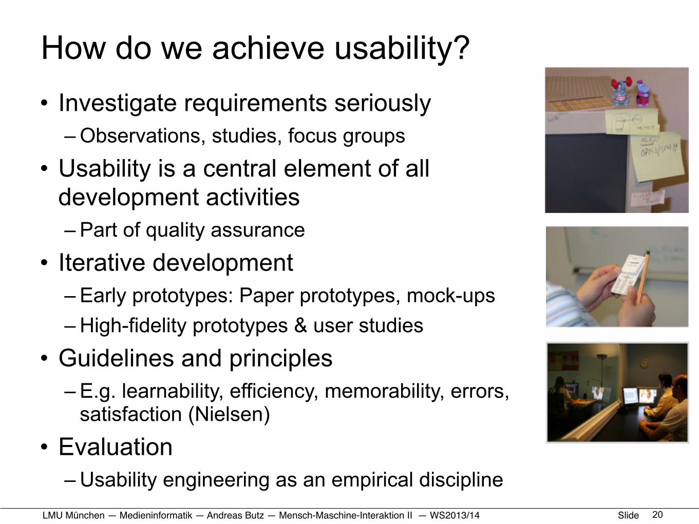
How do we achieve usability?• Investigate requirements seriously
– Observations, studies, focus groups
• Usability is a central element of all development activities– Part of quality assurance
• Iterative development– Early prototypes: Paper prototypes, mock-ups– High-fidelity prototypes & user studies
• Guidelines and principles– E.g. learnability, efficiency, memorability, errors,
satisfaction (Nielsen)
• Evaluation– Usability engineering as an empirical discipline
20
LMU München — Medieninformatik — Andreas Butz — !Mensch-Maschine-Interaktion II — WS2013/14 Slide
Web Usability• Usability of Web sites and Web applications
– delivered over the WWW
• Dependent on several issues related to– Web technology– Web design– Project Management– Usability evaluation
• Web usability is not about “adding some fancy graphics, color, and cool styles at the end of the project”
• Web usability can be measured!
21
LMU München — Medieninformatik — Andreas Butz — !Mensch-Maschine-Interaktion II — WS2013/14 Slide
HCI and the Web• Organizational stuff
• Usability: a quick reminder• How we use the web (device side)• How we use the web (human side)
• HTML+CSS: a quick reminder• Responsive Web Design: some Basics• Responsive Web Design: Example and Exercise
22

LMU München — Medieninformatik — Andreas Butz — !Mensch-Maschine-Interaktion II — WS2013/14 Slide
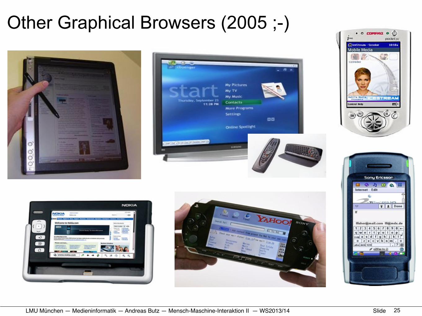
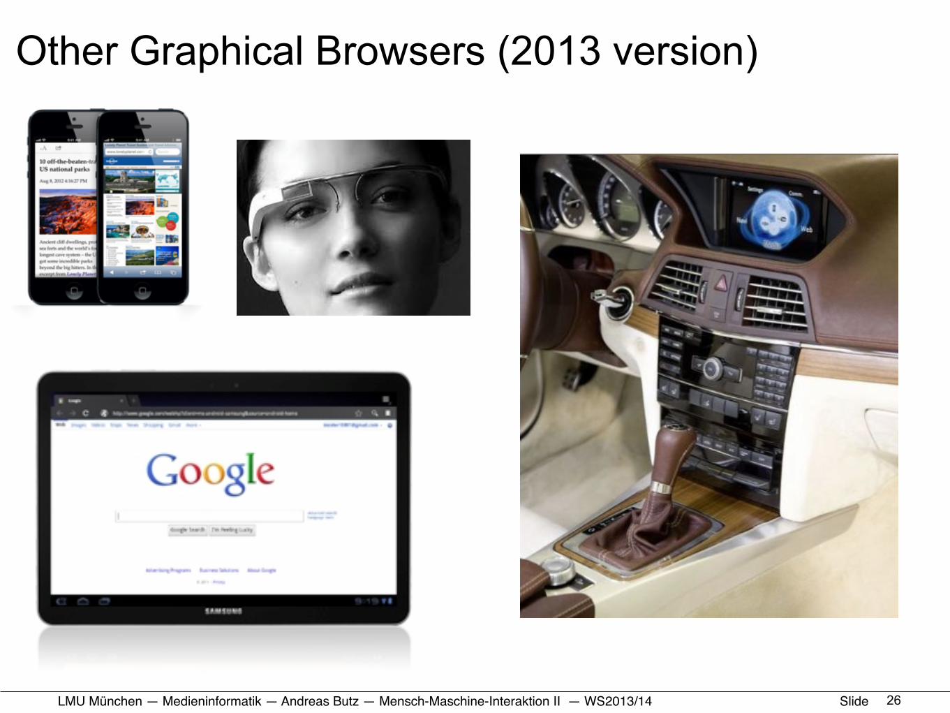
The Web Means Heterogeneity of Platforms• Processing power
– Processor, co-processors, cache– RAM
• I/O-performance– Hard drive speed– Network
• Input and Output– Displays– Keyboard layout
• Additional Hardware and Periphery– Video and audio (in/out)– Card reader, printer, scanner
• Software – Browser– Operating System
23

LMU München — Medieninformatik — Andreas Butz — !Mensch-Maschine-Interaktion II — WS2013/14 Slide 24
LMU München — Medieninformatik — Andreas Butz — !Mensch-Maschine-Interaktion II — WS2013/14 Slide
Other Graphical Browsers (2005 ;-)
25
LMU München — Medieninformatik — Andreas Butz — !Mensch-Maschine-Interaktion II — WS2013/14 Slide
Other Graphical Browsers (2013 version)
26
LMU München — Medieninformatik — Andreas Butz — !Mensch-Maschine-Interaktion II — WS2013/14 Slide
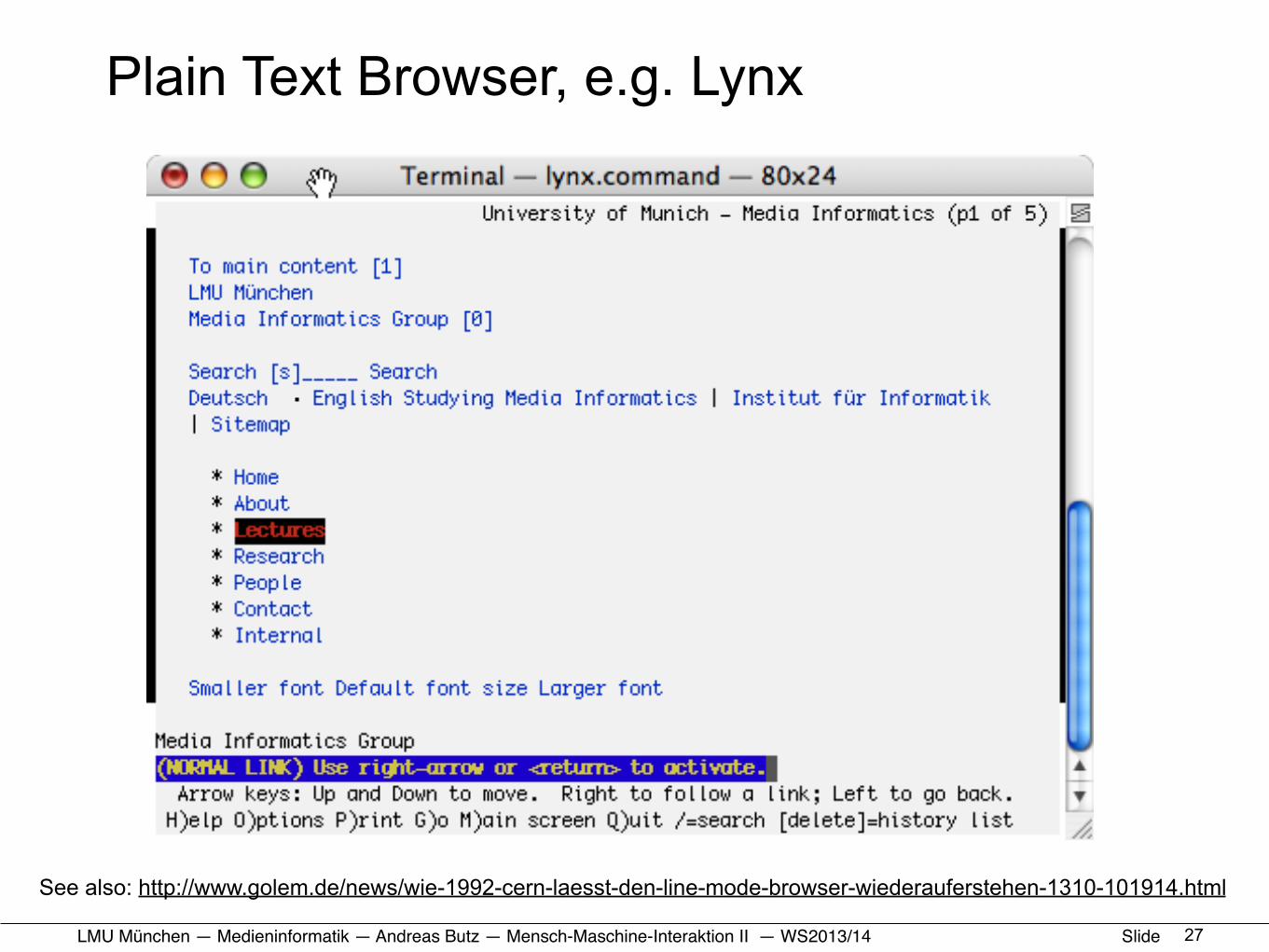
Plain Text Browser, e.g. Lynx
27
See also: http://www.golem.de/news/wie-1992-cern-laesst-den-line-mode-browser-wiederauferstehen-1310-101914.html
LMU München — Medieninformatik — Andreas Butz — !Mensch-Maschine-Interaktion II — WS2013/14 Slide
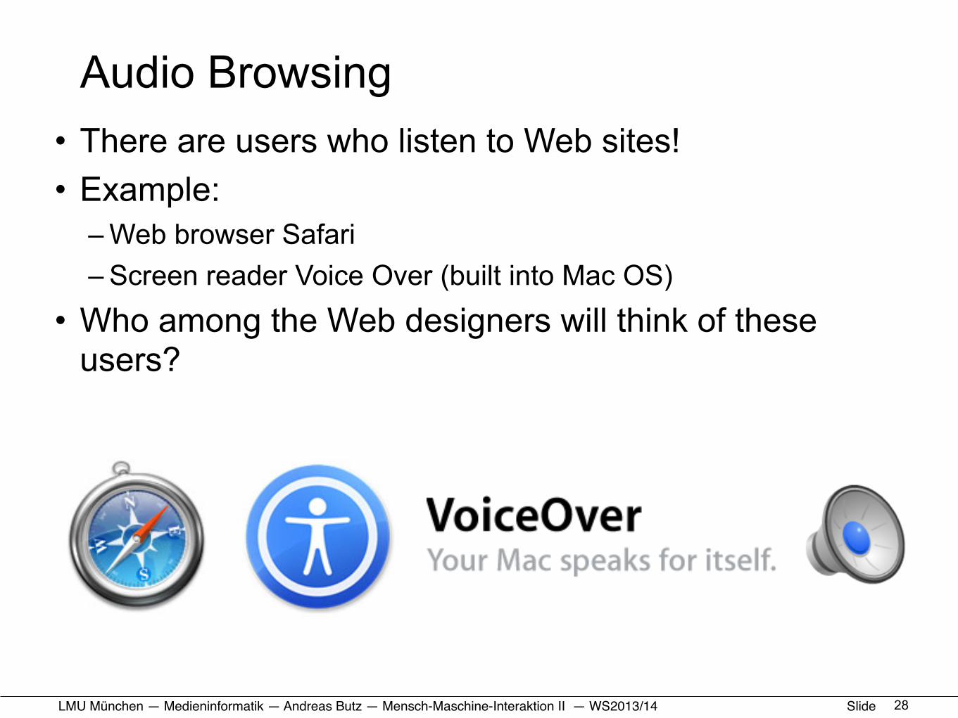
Audio Browsing• There are users who listen to Web sites!• Example:
– Web browser Safari– Screen reader Voice Over (built into Mac OS)
• Who among the Web designers will think of these users?
28
LMU München — Medieninformatik — Andreas Butz — !Mensch-Maschine-Interaktion II — WS2013/14 Slide
HCI and the Web• Organizational stuff
• Usability: a quick reminder• How we use the web (device side)• How we use the web (human side)
• HTML+CSS: a quick reminder• Responsive Web Design: some Basics• Responsive Web Design: Example and Exercise
29
LMU München — Medieninformatik — Andreas Butz — !Mensch-Maschine-Interaktion II — WS2013/14 Slide
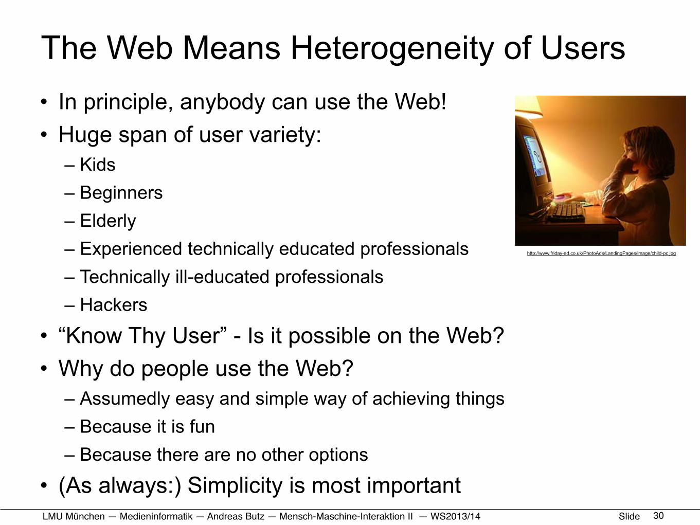
The Web Means Heterogeneity of Users• In principle, anybody can use the Web!• Huge span of user variety:
– Kids– Beginners– Elderly– Experienced technically educated professionals– Technically ill-educated professionals– Hackers
• “Know Thy User” - Is it possible on the Web?• Why do people use the Web?
– Assumedly easy and simple way of achieving things– Because it is fun– Because there are no other options
• (As always:) Simplicity is most important30
http://www.friday-ad.co.uk/PhotoAds/LandingPages/image/child-pc.jpg
LMU München — Medieninformatik — Andreas Butz — !Mensch-Maschine-Interaktion II — WS2013/14 Slide
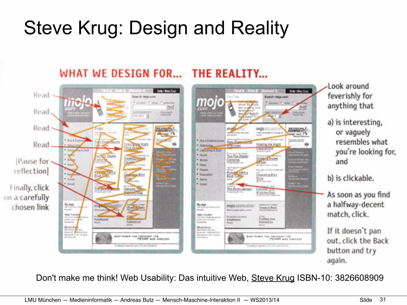
Steve Krug: Design and Reality
31
Don't make me think! Web Usability: Das intuitive Web, Steve Krug ISBN-10: 3826608909
LMU München — Medieninformatik — Andreas Butz — !Mensch-Maschine-Interaktion II — WS2013/14 Slide
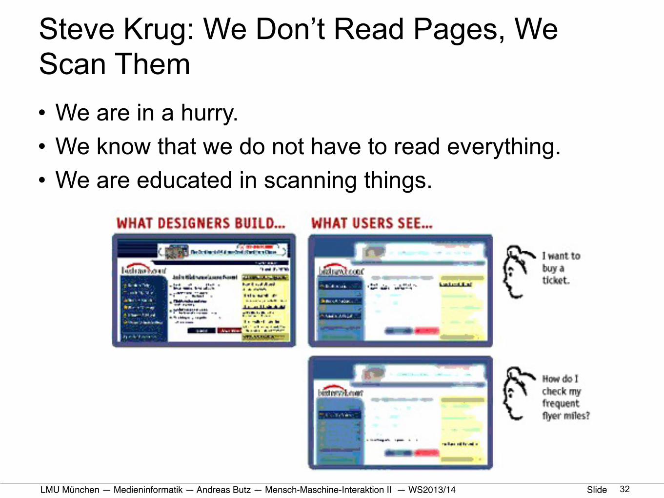
Steve Krug: We Don’t Read Pages, We Scan Them • We are in a hurry.• We know that we do not have to read everything.• We are educated in scanning things.
32
LMU München — Medieninformatik — Andreas Butz — !Mensch-Maschine-Interaktion II — WS2013/14 Slide
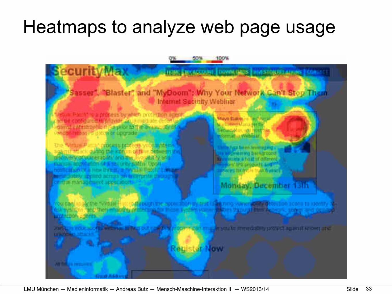
Heatmaps to analyze web page usage
33
LMU München — Medieninformatik — Andreas Butz — !Mensch-Maschine-Interaktion II — WS2013/14 Slide
Steve Krug: We Satisfice (satisfying & sufficing)
• We do not make optimal choices– We are in a hurry.– There is not much penalty for guessing wrong.– Weighing options does not guarantee success.– Guessing is more fun.
• Gary Klein: Sources of Power - How People Make Decisions– Example: Fire commanders do rarely compare options!
• Find a reasonable plan• Check it for obvious problems• Try it!
• see also: Daniel Kahneman: Thinking, Fast and Slow34

LMU München — Medieninformatik — Andreas Butz — !Mensch-Maschine-Interaktion II — WS2013/14 Slide
Steve Krug: We Muddle Through• Users in general do not care how and why things work
– Any working solution is accepted– We do not have the time to analyze the details– There is no incentive for
having it understood better
• Example:– Use a search box for
navigating to a site
35
LMU München — Medieninformatik — Andreas Butz — !Mensch-Maschine-Interaktion II — WS2013/14 Slide
HCI and the Web• Organizational stuff
• Usability: a quick reminder• How we use the web (device side)• How we use the web (human side)
• HTML+CSS: a very (!!) quick reminder• Responsive Web Design: some Basics• Responsive Web Design: Example and Exercise
36
LMU München — Medieninformatik — Andreas Butz — !Mensch-Maschine-Interaktion II — WS2013/14 Slide
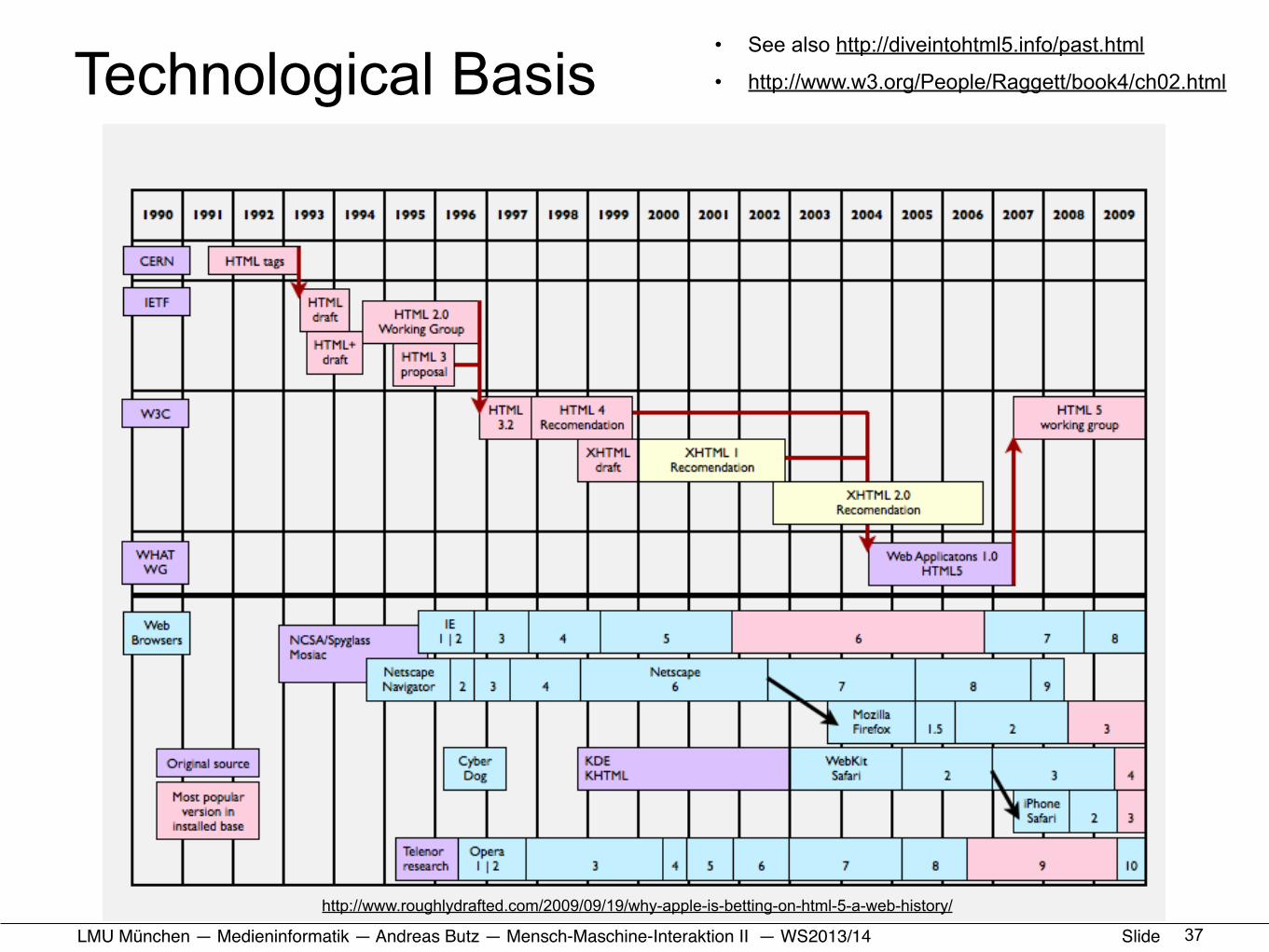
Technological Basis• See also http://diveintohtml5.info/past.html
• http://www.w3.org/People/Raggett/book4/ch02.html
37
http://www.roughlydrafted.com/2009/09/19/why-apple-is-betting-on-html-5-a-web-history/
LMU München — Medieninformatik — Andreas Butz — !Mensch-Maschine-Interaktion II — WS2013/14 Slide
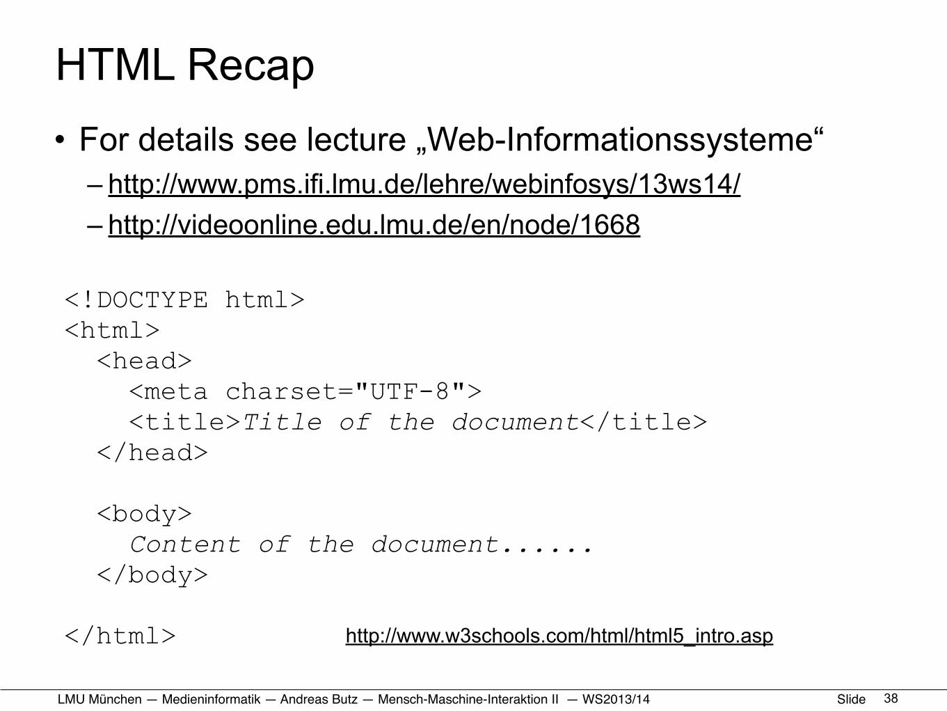
HTML Recap • For details see lecture „Web-Informationssysteme“
– http://www.pms.ifi.lmu.de/lehre/webinfosys/13ws14/ – http://videoonline.edu.lmu.de/en/node/1668
38
<!DOCTYPE html><html> <head> <meta charset="UTF-8"> <title>Title of the document</title> </head>
<body> Content of the document...... </body>
</html> http://www.w3schools.com/html/html5_intro.asp
LMU München — Medieninformatik — Andreas Butz — !Mensch-Maschine-Interaktion II — WS2013/14 Slide
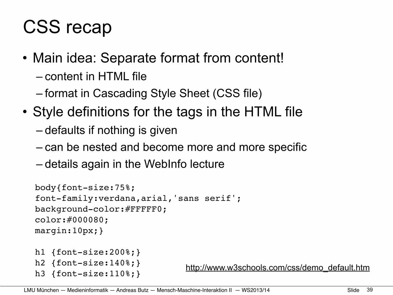
CSS recap• Main idea: Separate format from content!
– content in HTML file– format in Cascading Style Sheet (CSS file)
• Style definitions for the tags in the HTML file– defaults if nothing is given– can be nested and become more and more specific– details again in the WebInfo lecture
39
body{font-size:75%;font-family:verdana,arial,'sans serif';background-color:#FFFFF0;color:#000080;margin:10px;}
h1 {font-size:200%;}h2 {font-size:140%;}h3 {font-size:110%;}
http://www.w3schools.com/css/demo_default.htm
LMU München — Medieninformatik — Andreas Butz — !Mensch-Maschine-Interaktion II — WS2013/14 Slide
HCI and the Web• Organizational stuff
• Usability: a quick reminder• How we use the web (device side)• How we use the web (human side)
• HTML+CSS: a quick reminder• Responsive Web Design: some Basics• Responsive Web Design: Example and Exercise
40
LMU München — Medieninformatik — Andreas Butz — !Mensch-Maschine-Interaktion II — WS2013/14 Slide
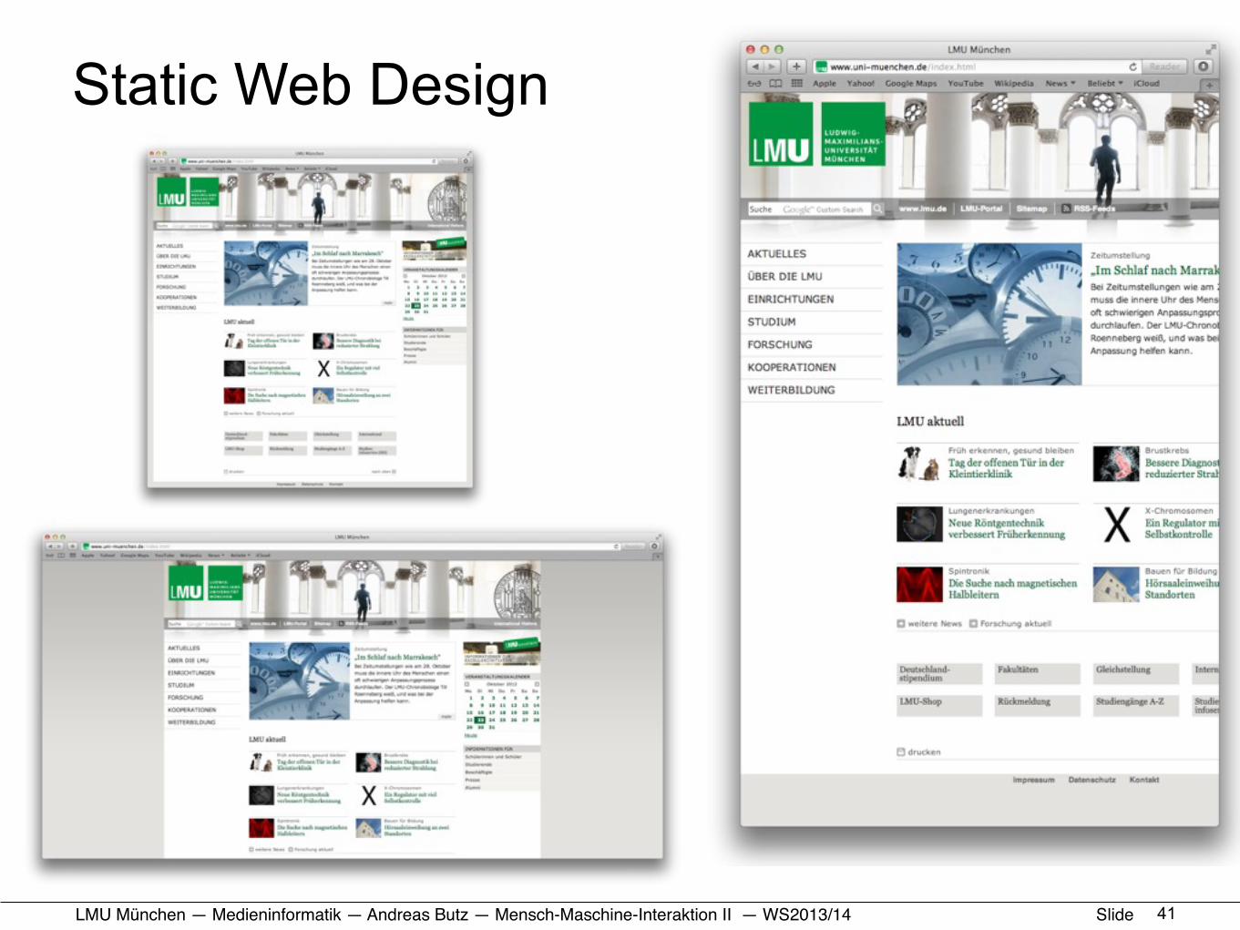
Static Web Design
41

LMU München — Medieninformatik — Andreas Butz — !Mensch-Maschine-Interaktion II — WS2013/14 Slide
Fluid Web Design
42
LMU München — Medieninformatik — Andreas Butz — !Mensch-Maschine-Interaktion II — WS2013/14 Slide
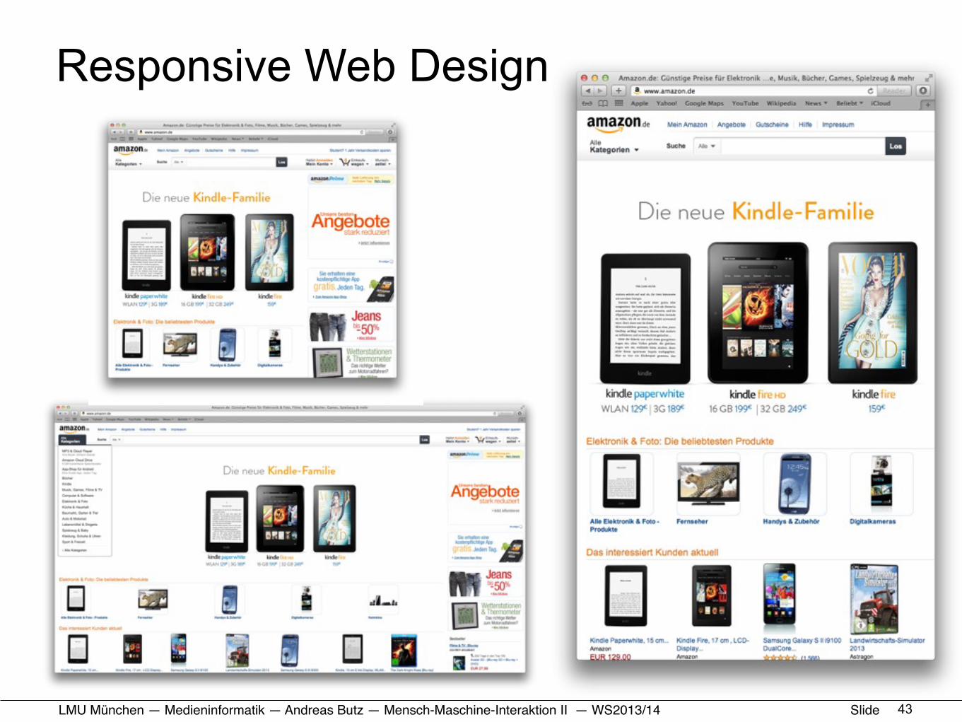
Responsive Web Design
43
LMU München — Medieninformatik — Andreas Butz — !Mensch-Maschine-Interaktion II — WS2013/14 Slide
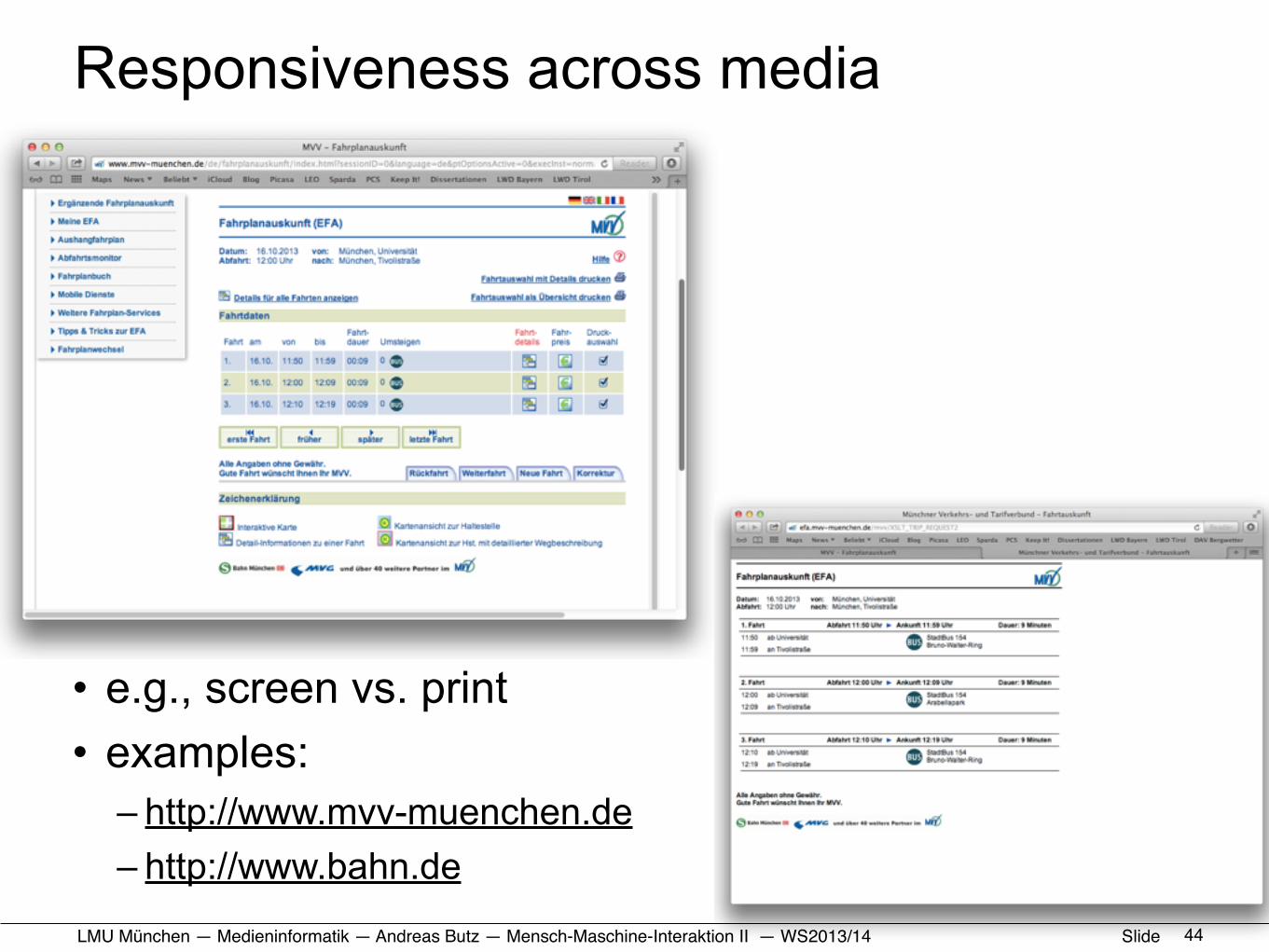
Responsiveness across media
• e.g., screen vs. print• examples:
– http://www.mvv-muenchen.de – http://www.bahn.de
44

LMU München — Medieninformatik — Andreas Butz — !Mensch-Maschine-Interaktion II — WS2013/14 Slide
Basic Elements of Responsive Design
• Source: presentation by Nicolas Leyking– http://de.slideshare.net/ERGOSIGN/vortrag-responsives-design-upa-2013
4510
Flexible Grid Layout Media Queries Flexible Images + Media
@media (min width:400px){...}
% , em
+ +
Aus was setzt sich ein responsives Design zusammen ?
LMU München — Medieninformatik — Andreas Butz — !Mensch-Maschine-Interaktion II — WS2013/14 Slide
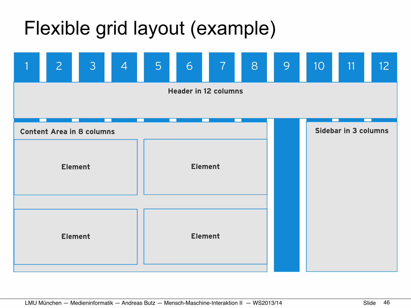
Flexible grid layout (example)
4611
1 2 3 4 5 6 7 8 9 10 11 12
Header in 12 columns
Content Area in 8 columns Sidebar in 3 columns
Element
Element
Element
Element
LMU München — Medieninformatik — Andreas Butz — !Mensch-Maschine-Interaktion II — WS2013/14 Slide
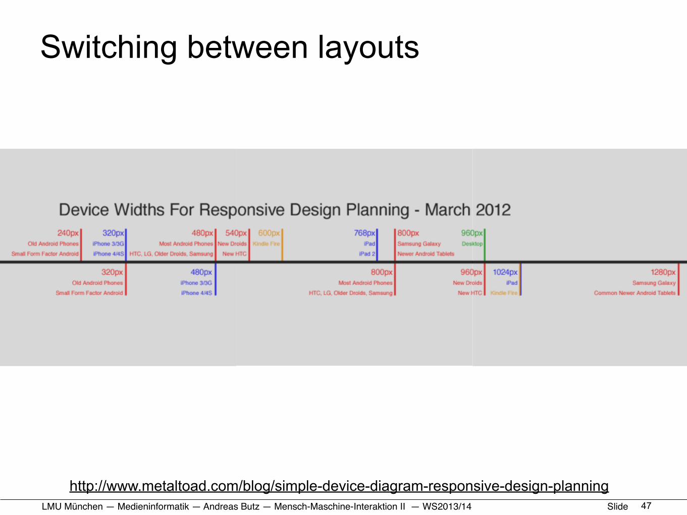
Switching between layouts
47
http://www.metaltoad.com/blog/simple-device-diagram-responsive-design-planning
LMU München — Medieninformatik — Andreas Butz — !Mensch-Maschine-Interaktion II — WS2013/14 Slide
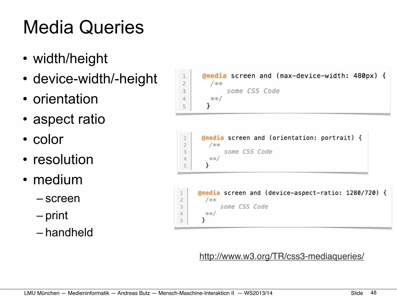
Media Queries• width/height• device-width/-height• orientation• aspect ratio• color• resolution• medium
– screen– print– handheld
48
Media Queries - Features
13
width / height
device-width / device-height
orientation
aspect-ratio
device aspect ratio
color / color-index
monochrome
resolution
grid
scanhttp://www.w3.org/TR/css3-mediaqueries/
http://www.w3.org/TR/css3-mediaqueries/
LMU München — Medieninformatik — Andreas Butz — !Mensch-Maschine-Interaktion II — WS2013/14 Slide
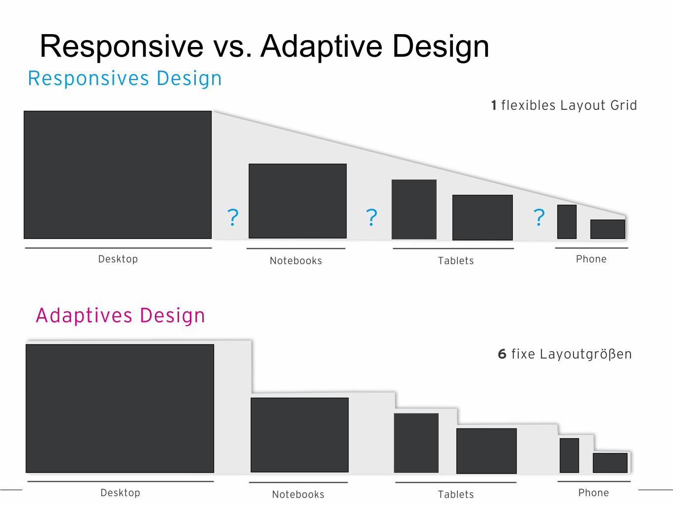
Responsive vs. Adaptive Design
49
Desktop PhoneNotebooks Tablets
15
Responsives Design
Adaptives Design
6 fixe Layoutgrößen
Desktop PhoneNotebooks Tablets
1 flexibles Layout Grid
?? ?
LMU München — Medieninformatik — Andreas Butz — !Mensch-Maschine-Interaktion II — WS2013/14 Slide
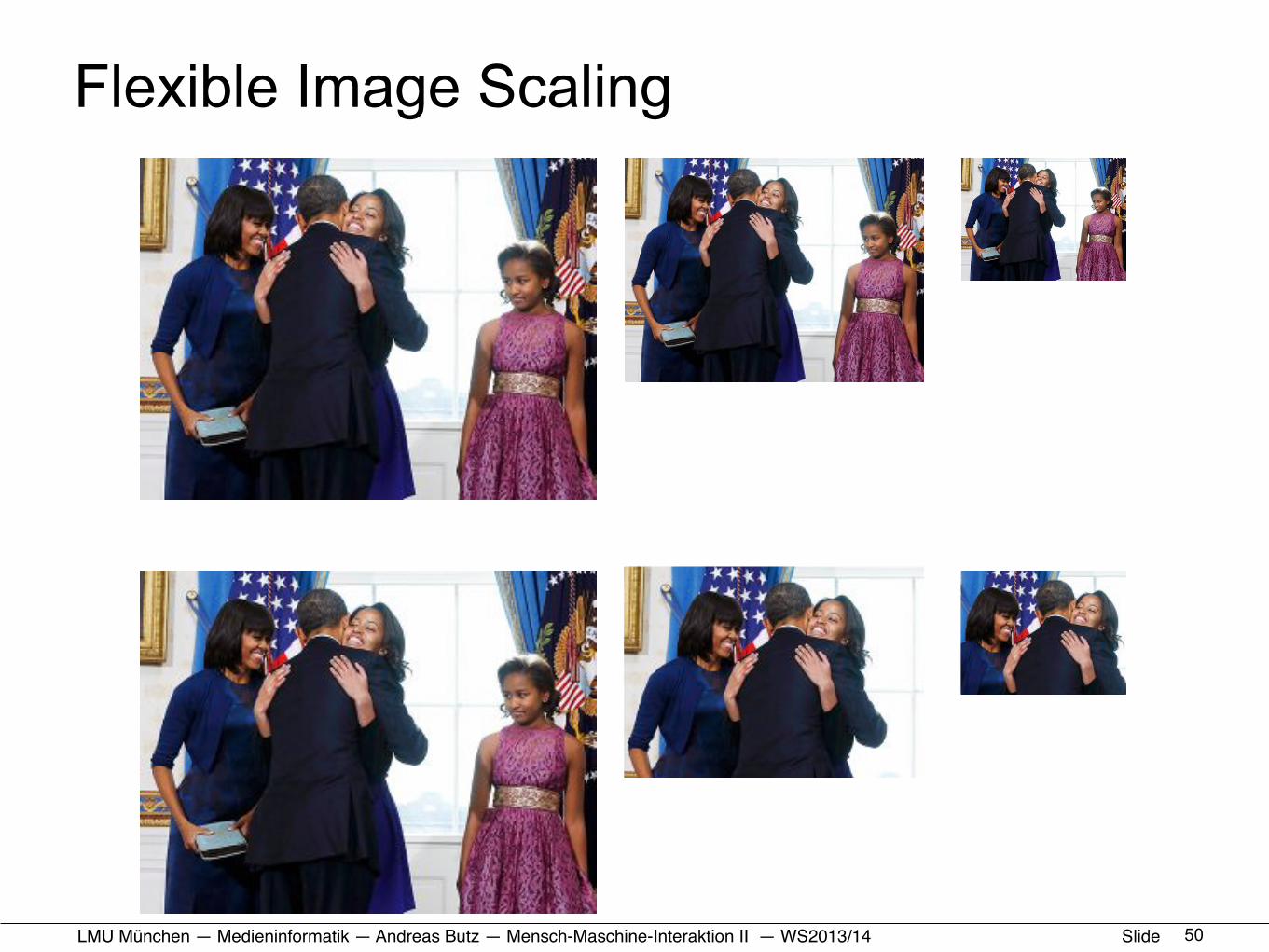
Flexible Image Scaling
50
Skalierung von Bildern
14
EinfacheSkalierung
Skalierungauf einenBildausschnitt

LMU München — Medieninformatik — Andreas Butz — !Mensch-Maschine-Interaktion II — WS2013/14 Slide
Some design patterns for RWD• Not a comprehensive list, just examples• Layout patterns
– column drop– off canvas
• Navigation patterns– navigation drawer– Toggle
• Accommodating touch across different screen sizes
• Sources: – presentation by Nicolas Leyking (http://de.slideshare.net/
ERGOSIGN/vortrag-responsives-design-upa-2013 )– http://www.lukew.com/ff/entry.asp?1649
51
LMU München — Medieninformatik — Andreas Butz — !Mensch-Maschine-Interaktion II — WS2013/14 Slide
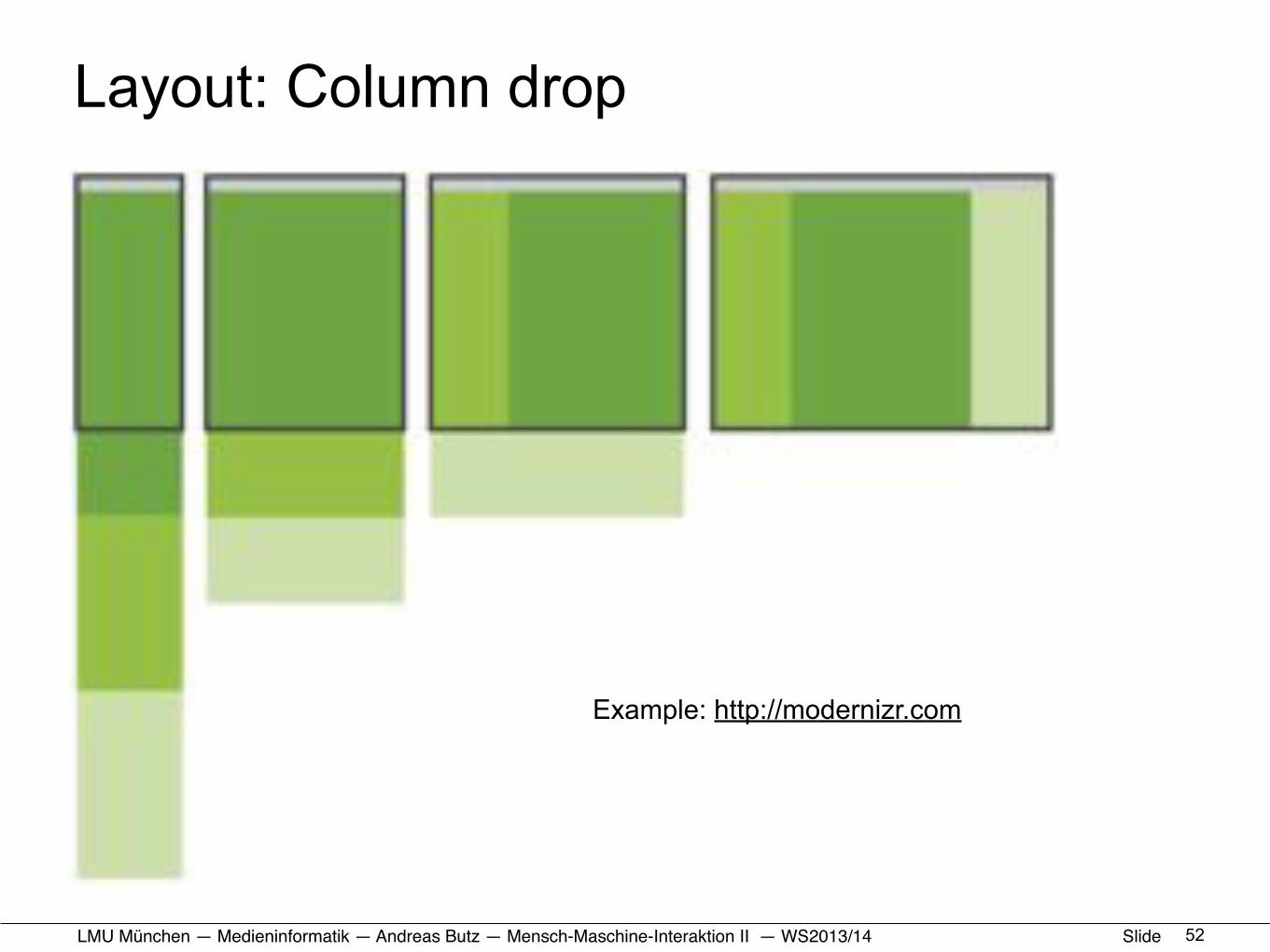
Layout: Column drop
52
Column Drop
23
3 Spalten
Sukszessives untereinander anordnen
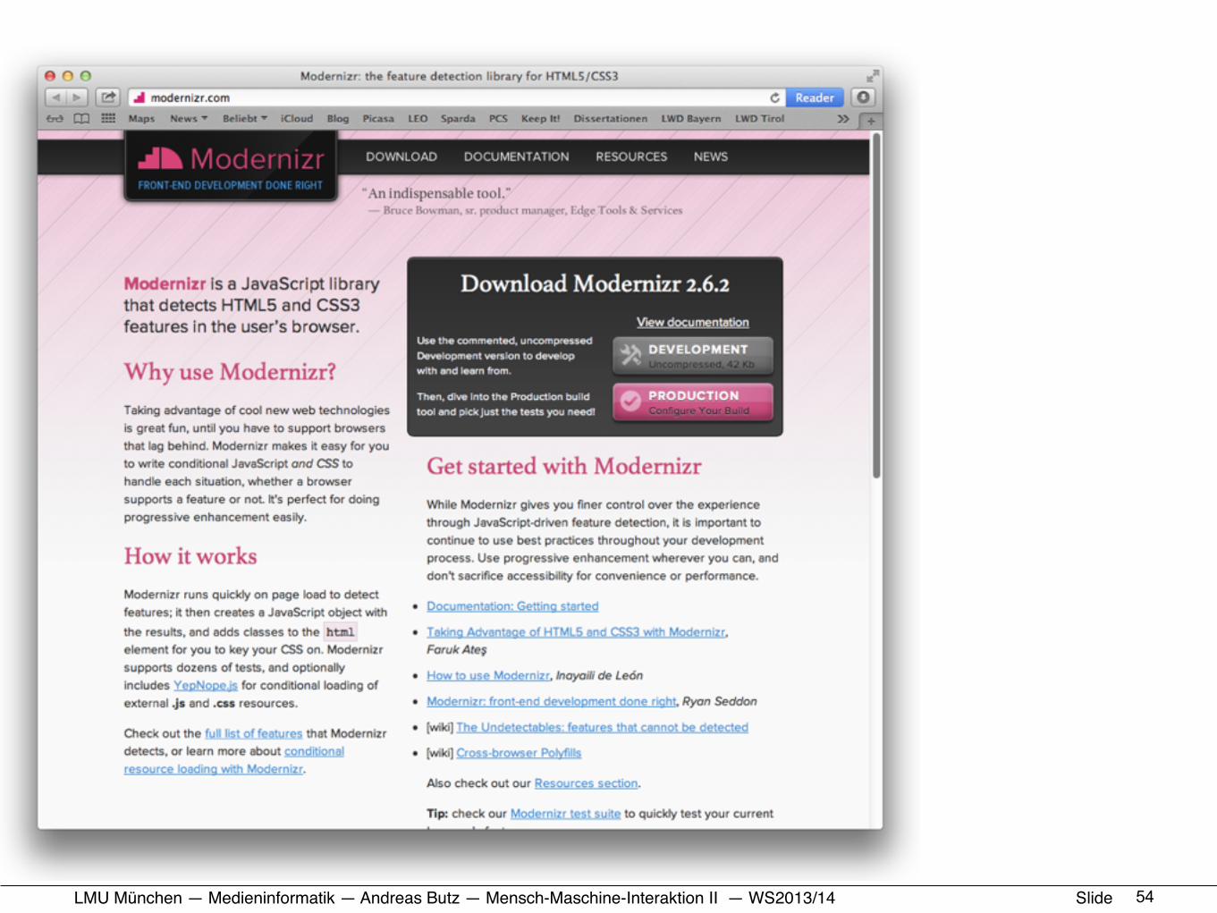
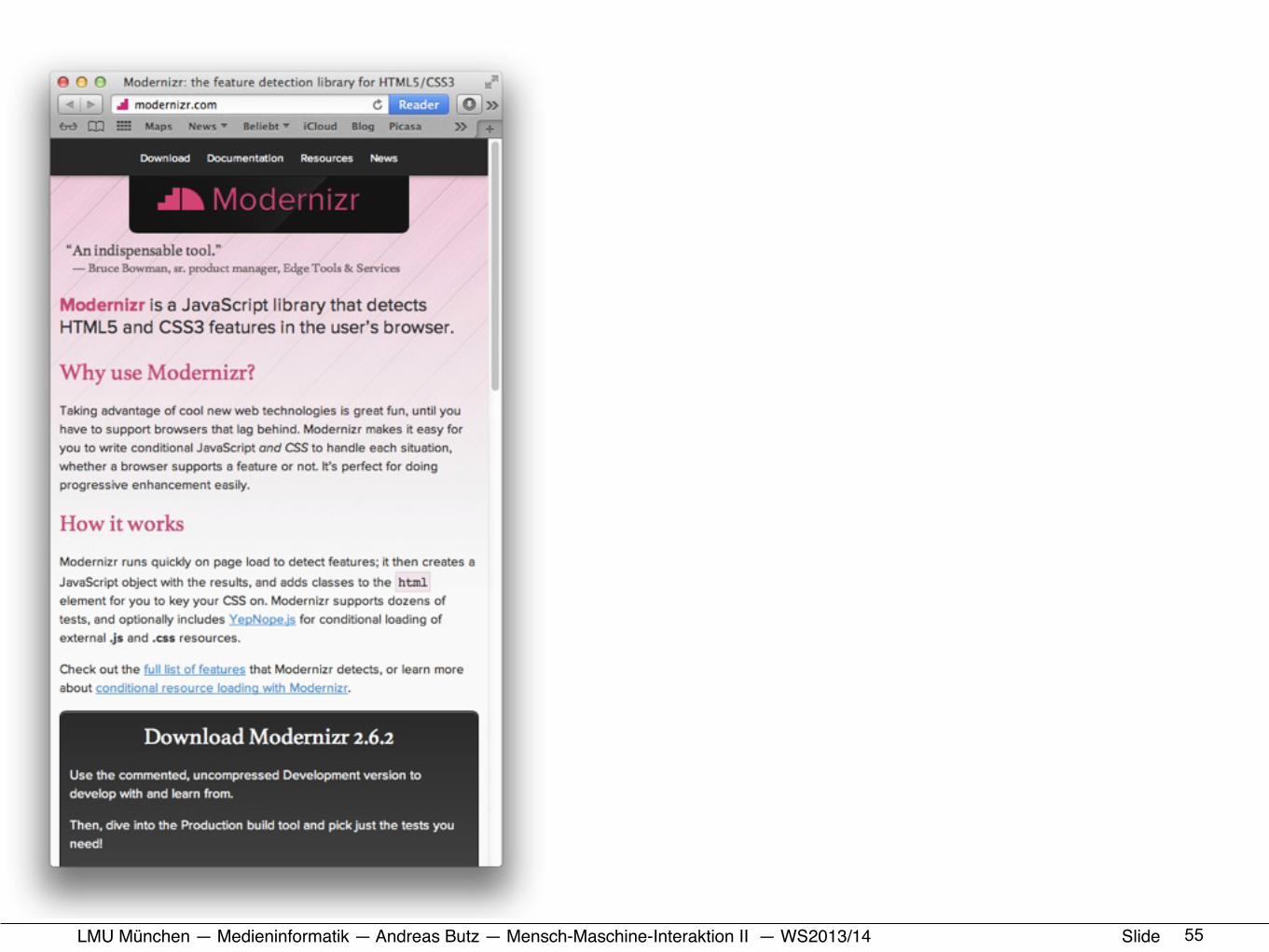
Example: http://modernizr.com

LMU München — Medieninformatik — Andreas Butz — !Mensch-Maschine-Interaktion II — WS2013/14 Slide 53
LMU München — Medieninformatik — Andreas Butz — !Mensch-Maschine-Interaktion II — WS2013/14 Slide 54
LMU München — Medieninformatik — Andreas Butz — !Mensch-Maschine-Interaktion II — WS2013/14 Slide 55

LMU München — Medieninformatik — Andreas Butz — !Mensch-Maschine-Interaktion II — WS2013/14 Slide
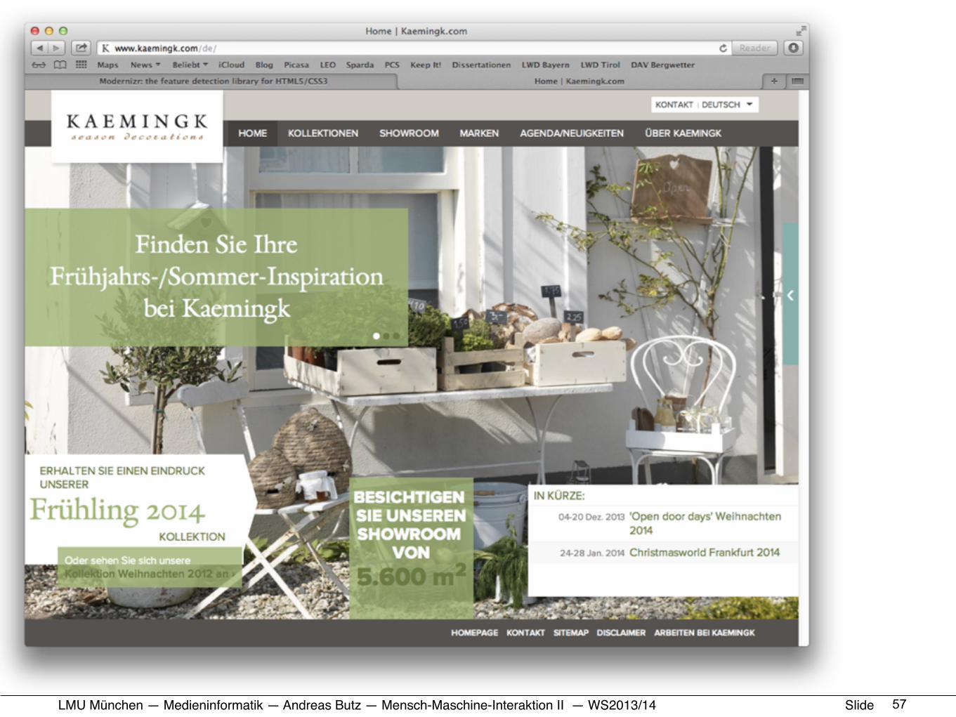
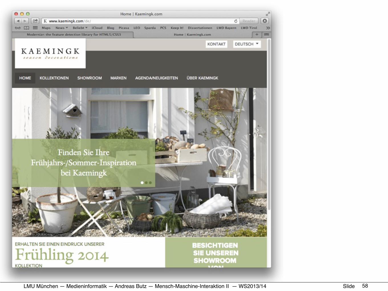
Layout: Off Canvas
56
Example: http://www.kaemingk.com/de/
LMU München — Medieninformatik — Andreas Butz — !Mensch-Maschine-Interaktion II — WS2013/14 Slide 57
LMU München — Medieninformatik — Andreas Butz — !Mensch-Maschine-Interaktion II — WS2013/14 Slide 58
LMU München — Medieninformatik — Andreas Butz — !Mensch-Maschine-Interaktion II — WS2013/14 Slide 59

LMU München — Medieninformatik — Andreas Butz — !Mensch-Maschine-Interaktion II — WS2013/14 Slide
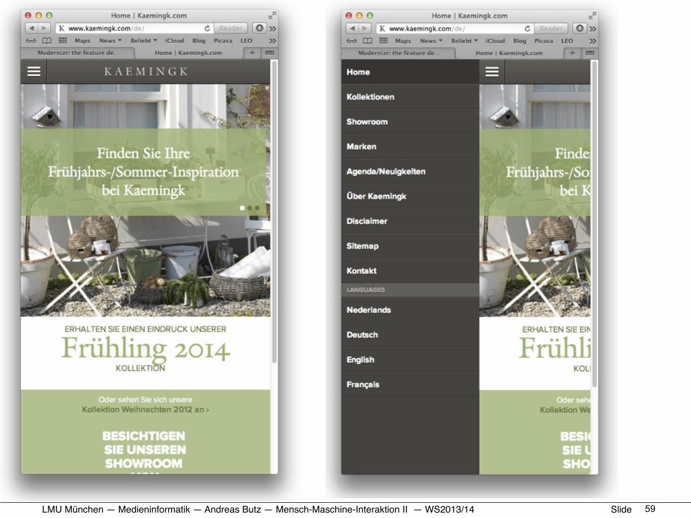
Navigation Drawer
60
Example: http://www.kaemingk.com/de/

LMU München — Medieninformatik — Andreas Butz — !Mensch-Maschine-Interaktion II — WS2013/14 Slide 61
LMU München — Medieninformatik — Andreas Butz — !Mensch-Maschine-Interaktion II — WS2013/14 Slide
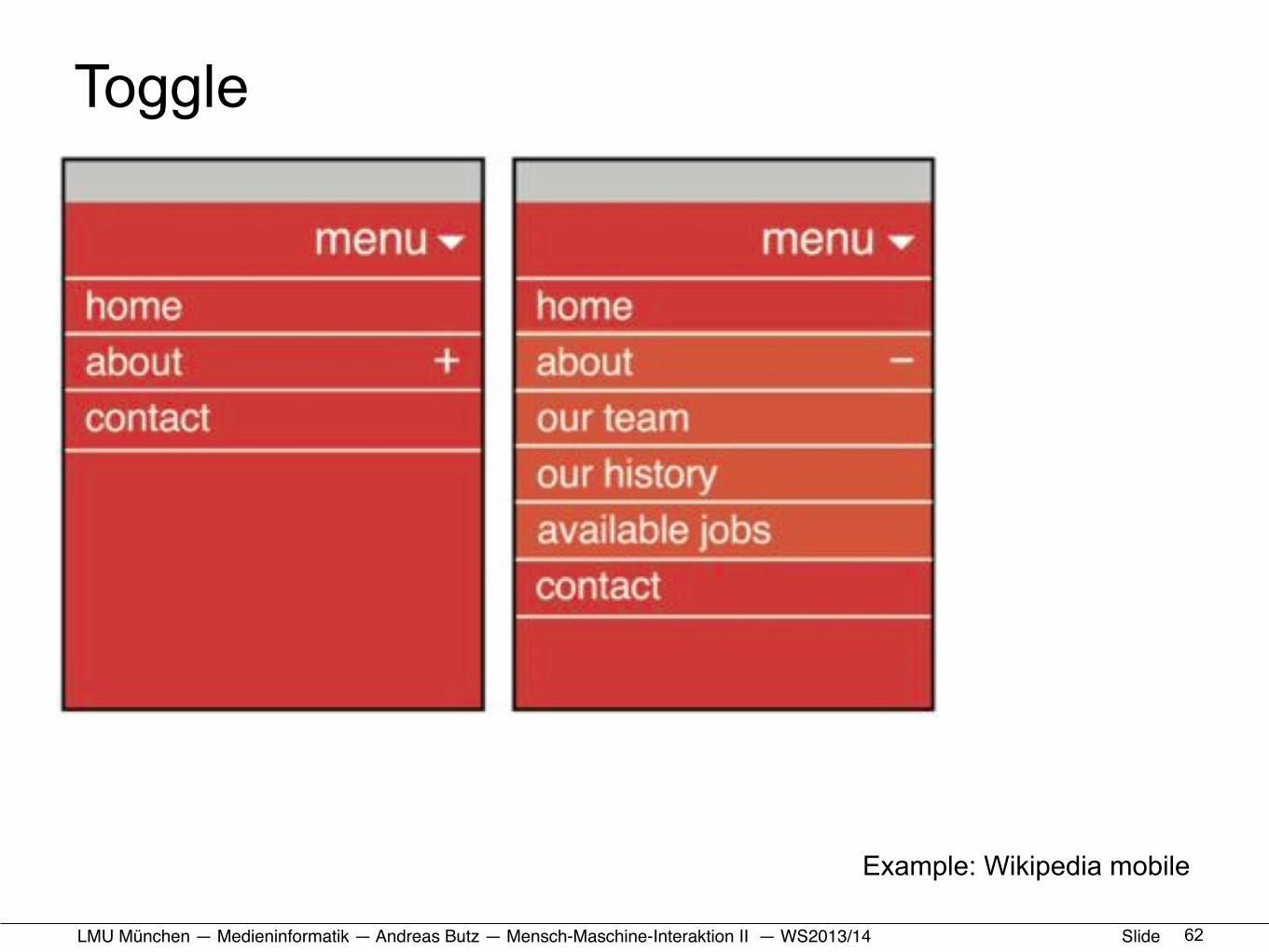
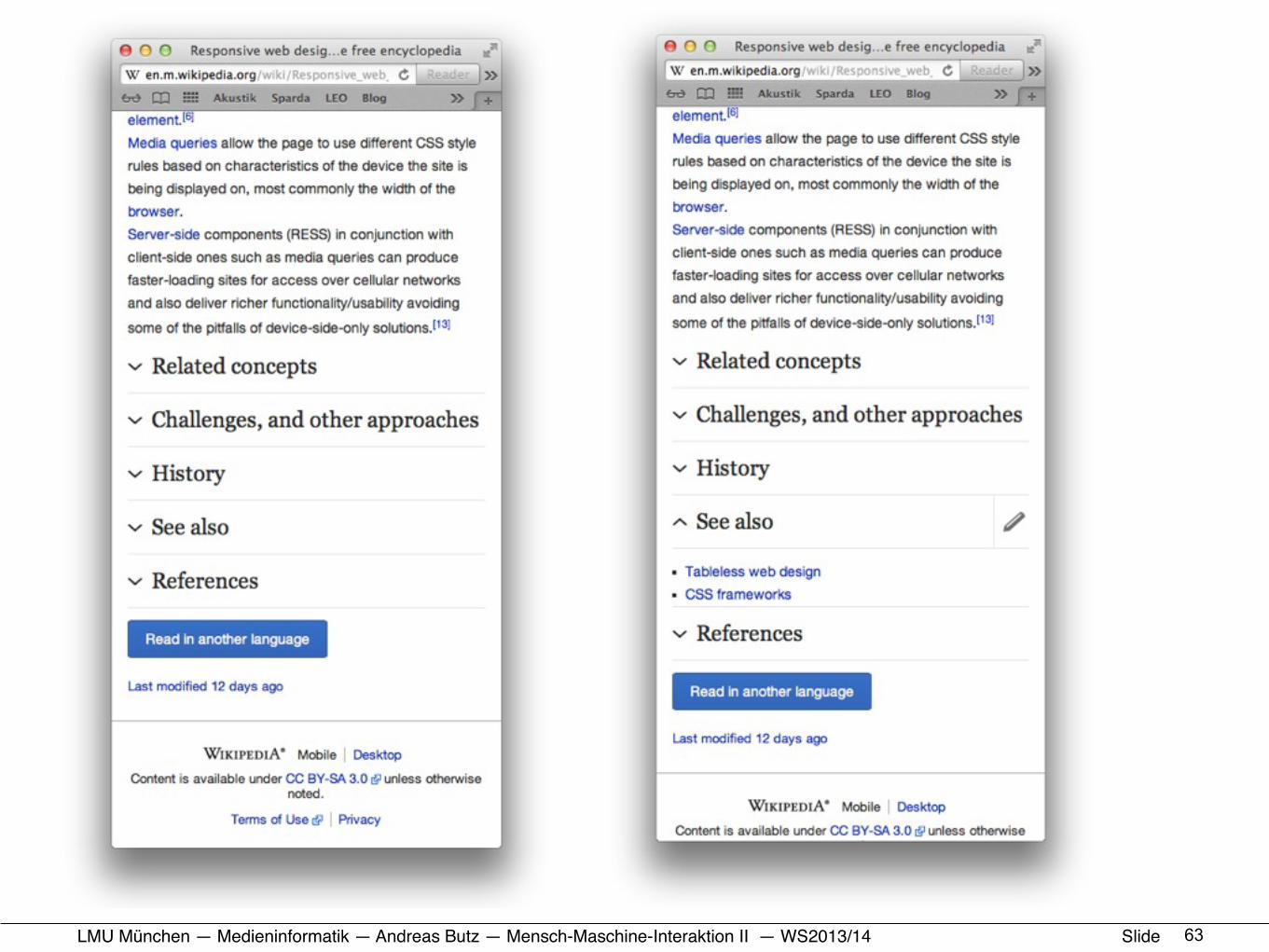
Toggle
62
Example: Wikipedia mobile
LMU München — Medieninformatik — Andreas Butz — !Mensch-Maschine-Interaktion II — WS2013/14 Slide 63
LMU München — Medieninformatik — Andreas Butz — !Mensch-Maschine-Interaktion II — WS2013/14 Slide
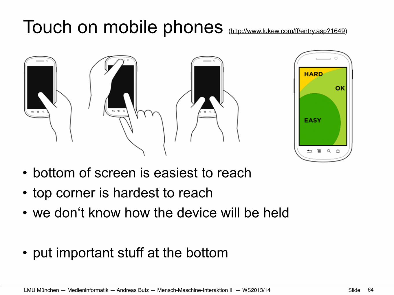
Touch on mobile phones (http://www.lukew.com/ff/entry.asp?1649)
• bottom of screen is easiest to reach• top corner is hardest to reach• we don‘t know how the device will be held
• put important stuff at the bottom
64
LMU München — Medieninformatik — Andreas Butz — !Mensch-Maschine-Interaktion II — WS2013/14 Slide
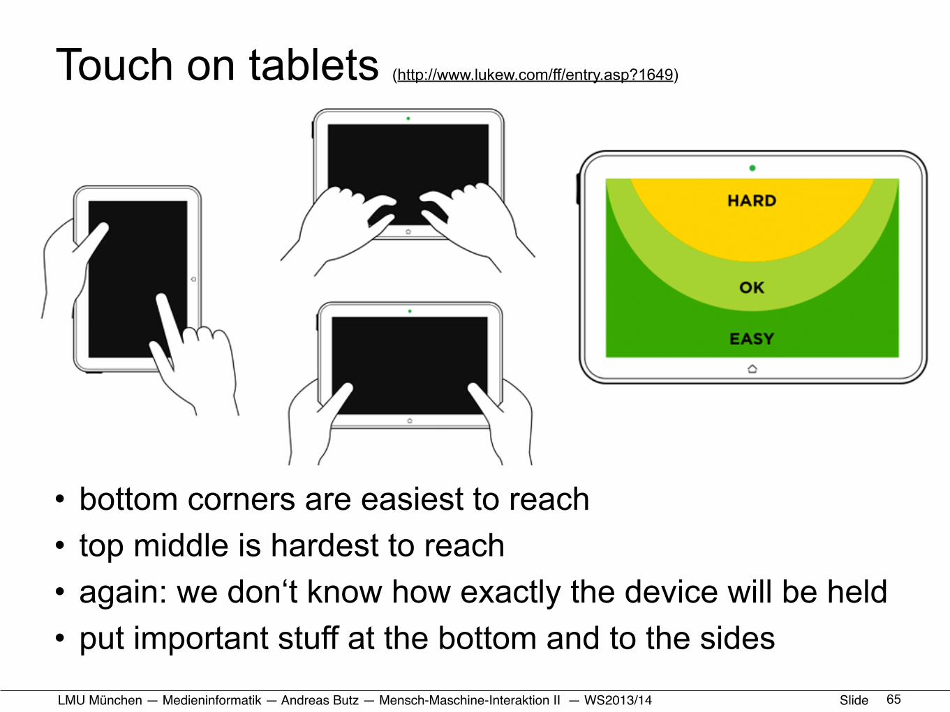
Touch on tablets (http://www.lukew.com/ff/entry.asp?1649)
• bottom corners are easiest to reach• top middle is hardest to reach• again: we don‘t know how exactly the device will be held• put important stuff at the bottom and to the sides
65
LMU München — Medieninformatik — Andreas Butz — !Mensch-Maschine-Interaktion II — WS2013/14 Slide
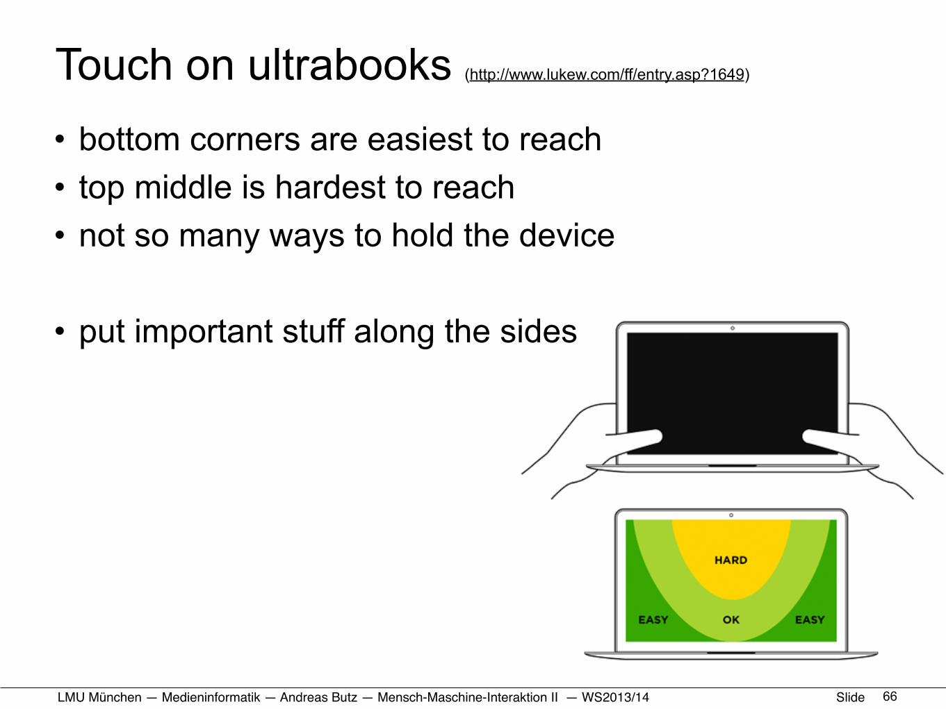
Touch on ultrabooks (http://www.lukew.com/ff/entry.asp?1649)
• bottom corners are easiest to reach• top middle is hardest to reach• not so many ways to hold the device
• put important stuff along the sides
66

LMU München — Medieninformatik — Andreas Butz — !Mensch-Maschine-Interaktion II — WS2013/14 Slide
Adaptive Layout patterns (http://www.lukew.com/ff/entry.asp?1649)
• Mobile: usually OK• Larger layouts:
– designed for mouse– wrong areas for touch– discriminate between desktop and handheld!– adapt touch areas to tablet usage if possible!
67
LMU München — Medieninformatik — Andreas Butz — !Mensch-Maschine-Interaktion II — WS2013/14 Slide
HCI and the Web• Organizational stuff
• Usability: a quick reminder• How we use the web (device side)• How we use the web (human side)
• HTML+CSS: a quick reminder• Responsive Web Design: some Basics• Responsive Web Design: Example and Exercise
68

LMU München — Medieninformatik — Andreas Butz — !Mensch-Maschine-Interaktion II — WS2013/14 Slide
Resources for self-teaching and reference• http://www.w3.org • http://www.selfhtml.org
• http://www.csszengarden.com • http://css-tricks.com
• http://coding.smashingmagazine.com/2011/01/12/guidelines-for-responsive-web-design/
• http://www.lukew.com/ff/entry.asp?1649
• http://getbootstrap.com/ • http://www.mobilephoneemulator.com
69
LMU München — Medieninformatik — Andreas Butz — !Mensch-Maschine-Interaktion II — WS2013/14 Slide
Task for the exercise• Build a responsive website for the Olyphonics Choir
– web site should work on desktop, tablet, phone + print– should be easily maintainable (i.e. without complicated tools)
• Structure is given as a result of initial discussions • Text is given in a .doc file (right from the texter ;-)• Photo currently is just a placeholder
– better photo will be shot on Oct. 26th – provide room for a gallery of future photos– provide room for future announcements
• Best solution will actually be used– author will be acknowledged on the web page
70
LMU München — Medieninformatik — Andreas Butz — !Mensch-Maschine-Interaktion II — WS2013/14 Slide
Just the end of the process• Requirements
– Web site structure from group discussions– existing logo should be used– domain http://olyphonics.de is already blocked
• Initial design– Infos collected and text formulated– technology decision: HTML5 + CSS3– decision for a responsive design (potentially single page?)
• Initial functional prototype• Design iterations
– defining visual and functional design– tests on different platforms
71
LMU München — Medieninformatik — Andreas Butz — !Mensch-Maschine-Interaktion II — WS2013/14 Slide
Base material for the exercise• http://www.cip.ifi.lmu.de/~butz/olyphonics/website/ • http://www.cip.ifi.lmu.de/~butz/olyphonics/website/Homepage.docx • http://www.cip.ifi.lmu.de/~butz/olyphonics/website/olylogo-big.jpg • http://www.cip.ifi.lmu.de/~butz/olyphonics/website/D2X_2357_small.jpg
72

LMU München — Medieninformatik — Andreas Butz — !Mensch-Maschine-Interaktion II — WS2013/14 Slide
Appendix: Potential Problems on the Web• Downright errors• Annoying or inaccessible page design• Search engine problems• Information architecture problems• E-commerce problems
• From http://www.siteusability.com/mistakes.html (now offline)-:
73
LMU München — Medieninformatik — Andreas Butz — !Mensch-Maschine-Interaktion II — WS2013/14 Slide
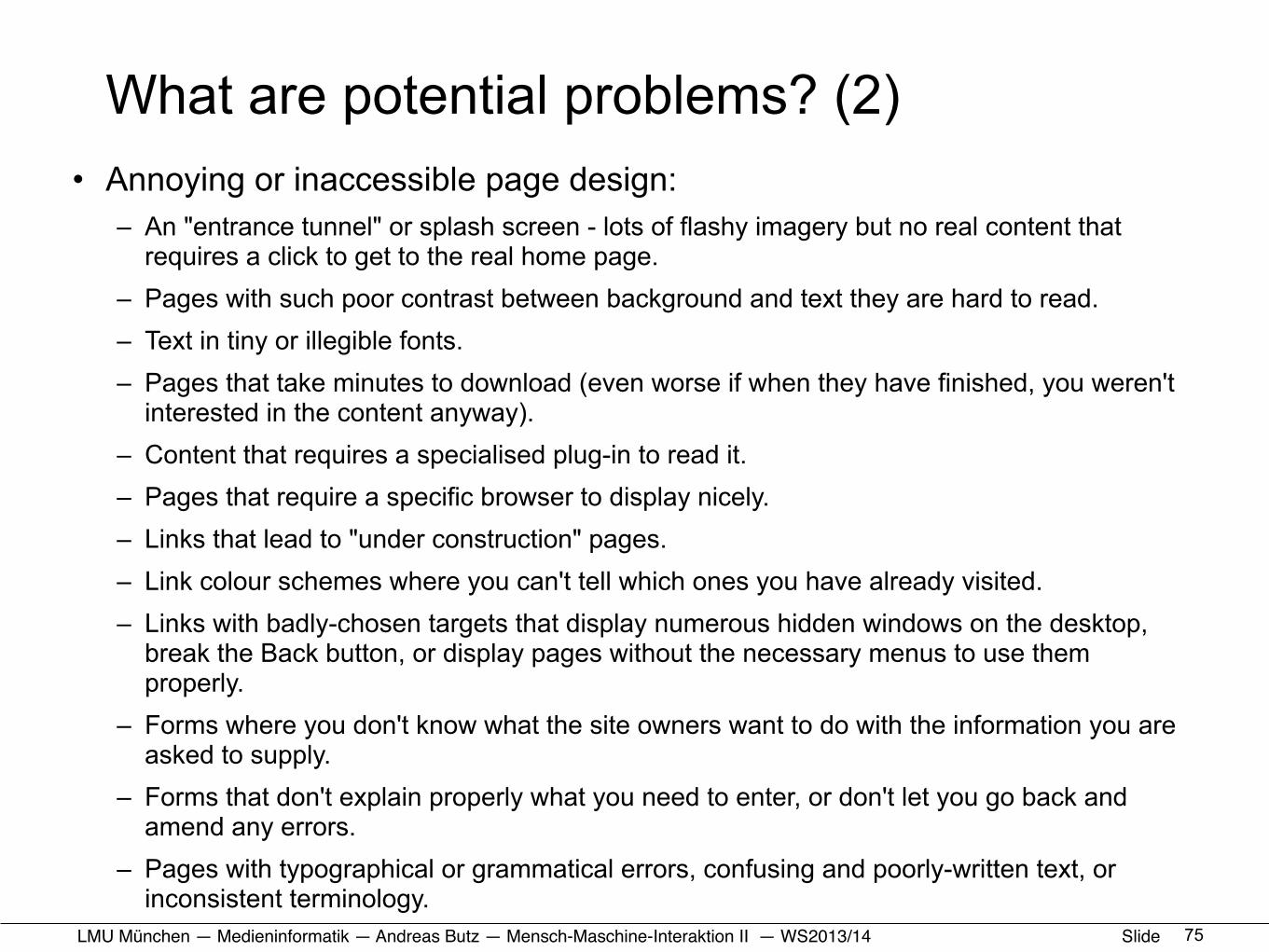
What are potential problems? (1)
• Downright errors:–Broken links or missing images. –Firewall errors, server cannot be contacted,
directory browsing not allowed (or allowed?). –Scripting errors that pop up an error message,
make the page unusable, or write strings of gibberish amongst the text.
–HTML coding errors that mean the page doesn't display properly, or at all.
74
LMU München — Medieninformatik — Andreas Butz — !Mensch-Maschine-Interaktion II — WS2013/14 Slide
What are potential problems? (2) • Annoying or inaccessible page design:
– An "entrance tunnel" or splash screen - lots of flashy imagery but no real content that requires a click to get to the real home page.
– Pages with such poor contrast between background and text they are hard to read. – Text in tiny or illegible fonts. – Pages that take minutes to download (even worse if when they have finished, you weren't
interested in the content anyway). – Content that requires a specialised plug-in to read it. – Pages that require a specific browser to display nicely. – Links that lead to "under construction" pages. – Link colour schemes where you can't tell which ones you have already visited. – Links with badly-chosen targets that display numerous hidden windows on the desktop,
break the Back button, or display pages without the necessary menus to use them properly.
– Forms where you don't know what the site owners want to do with the information you are asked to supply.
– Forms that don't explain properly what you need to enter, or don't let you go back and amend any errors.
– Pages with typographical or grammatical errors, confusing and poorly-written text, or inconsistent terminology.
75
LMU München — Medieninformatik — Andreas Butz — !Mensch-Maschine-Interaktion II — WS2013/14 Slide
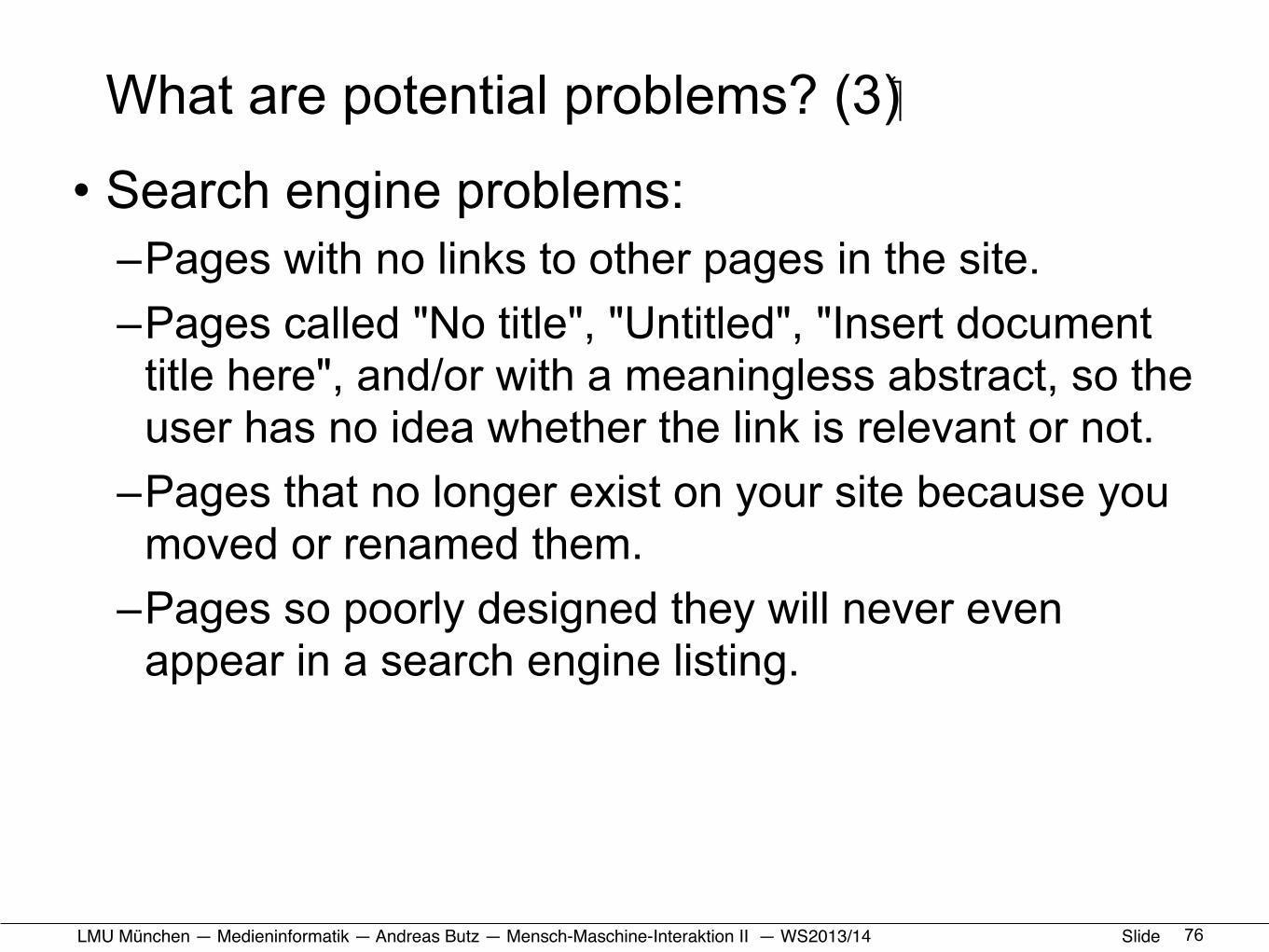
What are potential problems? (3)
• Search engine problems:–Pages with no links to other pages in the site. –Pages called "No title", "Untitled", "Insert document
title here", and/or with a meaningless abstract, so the user has no idea whether the link is relevant or not.
–Pages that no longer exist on your site because you moved or renamed them.
–Pages so poorly designed they will never even appear in a search engine listing.
76
LMU München — Medieninformatik — Andreas Butz — !Mensch-Maschine-Interaktion II — WS2013/14 Slide
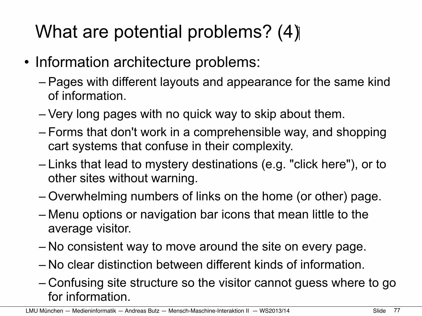
What are potential problems? (4)• Information architecture problems:
– Pages with different layouts and appearance for the same kind of information.
– Very long pages with no quick way to skip about them. – Forms that don't work in a comprehensible way, and shopping
cart systems that confuse in their complexity. – Links that lead to mystery destinations (e.g. "click here"), or to
other sites without warning. – Overwhelming numbers of links on the home (or other) page. – Menu options or navigation bar icons that mean little to the
average visitor. – No consistent way to move around the site on every page. – No clear distinction between different kinds of information. – Confusing site structure so the visitor cannot guess where to go
for information. 77
LMU München — Medieninformatik — Andreas Butz — !Mensch-Maschine-Interaktion II — WS2013/14 Slide
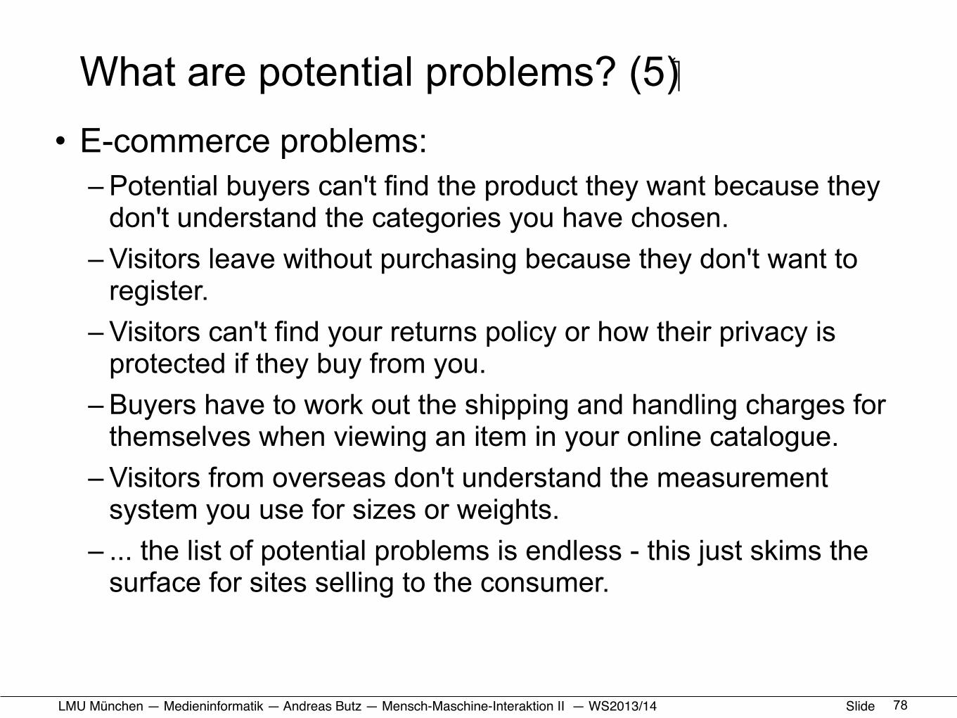
What are potential problems? (5)• E-commerce problems:
– Potential buyers can't find the product they want because they don't understand the categories you have chosen.
– Visitors leave without purchasing because they don't want to register.
– Visitors can't find your returns policy or how their privacy is protected if they buy from you.
– Buyers have to work out the shipping and handling charges for themselves when viewing an item in your online catalogue.
– Visitors from overseas don't understand the measurement system you use for sizes or weights.
– ... the list of potential problems is endless - this just skims the surface for sites selling to the consumer.
78
LMU München — Medieninformatik — Andreas Butz — !Mensch-Maschine-Interaktion II — WS2013/14 Slide
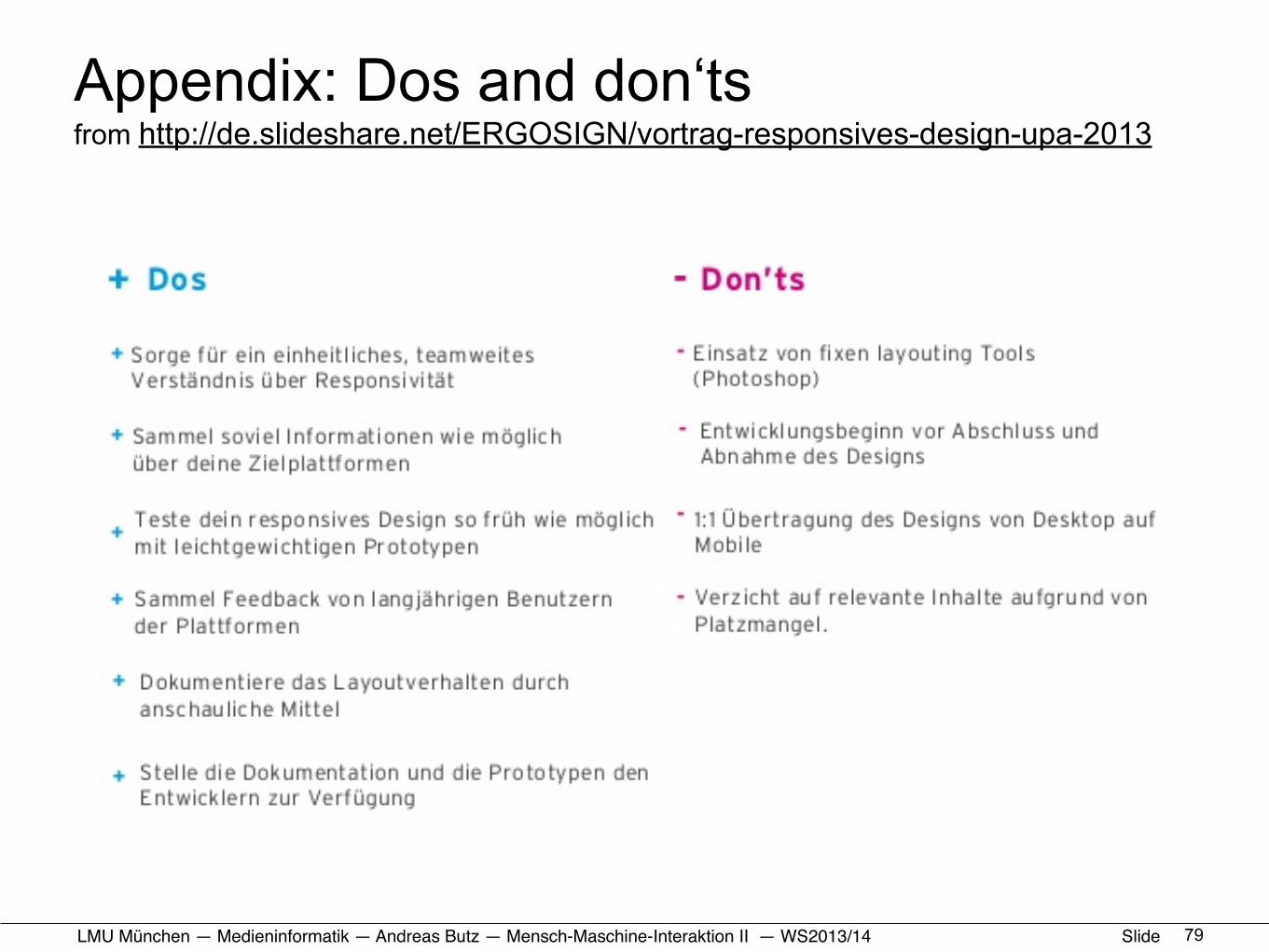
Appendix: Dos and don‘tsfrom http://de.slideshare.net/ERGOSIGN/vortrag-responsives-design-upa-2013
79