improving the customer experience on a council website the journey from 1 star to 4 star
TRANSCRIPT

Improving the customer experience on a council website
The journey from 1 star to 4 star

Where we were• Originally two separate websites• Dated designs and information overload

Interim progress - 2007 to 2010
• Partnership working of the two councils made increasing sense to join the websites up
• Content of the two websites was duplicated, similar but different
• Some information appeared on one website but not the other
• Growing number of links between the two websites to avoid duplication
• Lack of joined up feel and appearance

Separate recycling & waste website
• Recycling & waste was split out to create a separate website in 2007
• This was linked to from the two council websites
• Subsequently pulled back into the main website when the new joint site was launched

Interim partnership joint website
• A few services were initially launched on a basic joint website:– Benefits calculator– Jobs– Maps– Planning Public Access
• Linked back to existing websites for all other content
• Ran for about 18 months - 2011 to 2012

Getting user feedback
• Ran surveys (public and staff) asking:– What people liked and disliked about sites– What they might like to see on a new joint site
• Very little ‘useful’ feedback – Comments about colours– Don't change it, don’t merge them, I like it as it is … !!!
• We did get some useful feedback though– Reduce clicks, quick links to content– Reduce clutter and weight on pages– Make it mobile/tablet friendly
• Other feedback taken on board (eg via e-mail)

Design of site decided…
• Started with a ‘blank sheet of paper’ • Decided on a design look and feel• Came up with navigation structure– Use of: pull down menus, tiles, icons, photos
• Worked with the departments to come up with a content skeleton/framework for their information– This allowed us to come up with a better
understanding of services’ needs and problems– Eg housing application form not on-line as they need
to talk to applicant before they fill the form out

How to approach the new site …
• Decided to base key sections on user stats:– most popular pages easiest to find– pages and content deleted if not used
• Subject driven, not arranged departmentally• ‘Top task’ lead (SOCITM Better Connected)• Top level categories:
Residents – Businesses – The Councils – A to Z• Referred to other websites for:– best practice– design and navigation ideas

Homepage

Menus with top tasks and main links

Section page – use of icons & text

… or use of photos

Information page

Comprehensive A to Z section
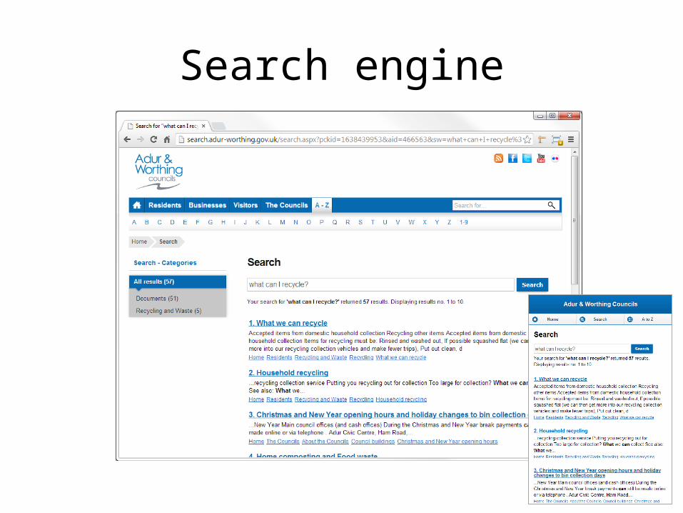
Search engine

Coming up with the content…
• Old websites’ information was similar but localised to the separate council areas
• Content completely rewritten to provide clear information for customers – not cut & paste
• Plain English promoted throughout – avoid jargon and legalese

Coming up with the content…
• Keep information as short as possible• Bite size chunks• Avoid information overload• Links to other sites if info provided there, eg:– Environmental Health – how to cook burgers
links to Food Standards Agency website– Health advice – food poisoning
links to NHS websites– Planning & Building Control
links to Planning Portal

Looking to the future
• Fully responsive design• E-form usability, design and integration• Design of external sites (planning applications)• Monitor web stats to maintain top tasks• Refine and optimise search engine results• Content ownership by departments to be
formalised (review dates and updates)