graphic design concepts spring 2010
DESCRIPTION
City College of New York Final Class projectTRANSCRIPT

City College of New YorkFinal ProjectProfessor Partyka
Graphic Design Concepts
Spring 2010

Katherine McCoyKatherine McCoyLA
2Katherine McCoyLayer
2By Jane Tsang
Katherine McCoy

Katherine McCoyKatherine McCoy
3Katherine McCoyLayer
3Figure 1 Katherine McCoy
Katherine McCoy (born Kather-ine Jane Braden in Decatur, Illinois, October 12, 1945) is an American graphic designer and educator, best known for her work as the co-chair of the graduate Design program for Cranbrook Academy of Art.
McCoy’s first interest about design was on a family trip, while visiting the Museum of Modern Art in New York. As a student, she then studied Industrial Design at Michigan State University, where she graduated in 1967.Shortly after graduation in 1967, McCoy joined Unimark Inter-national; a design firm which em-ployed many key figures in Ameri-can Modernist graphic design, such as Massimo Vignelli, Ralph Ecker-strom and Herbert Bayer. At the Uni-mark offices, McCoy was exposed to the strict Swiss typographic and design approaches which came to permeate much of American corpo-rate communications through the late 1960s and 70s.

4Katherine McCoyLayer
Following Unimark, McCoy worked for a year in the in-house corporate identity offices of the Chrysler Corporation, and then joined the Boston design firm Omnigraphics, where she worked on several projects for the MIT Press with Muriel Cooper.
In 1971 McCoy began her career in design education when she was appointed co-chair of the Cranbrook Academy of Art graduate design program with her husband Michael McCoy. While McCoy led the graphic design program, and Michael McCoy led the industrial design program, the studios were regularly convened, and explored interdisciplinary approaches towards designing. Particularly influential on the Cranbrook design approach was Robert Venturi’s book Learning from Las Vegas, and McCoy’s own interest in social design. Reinvented by the McCoys, the program had no requirements, deadlines or assignments other than a final thesis show, and the students’ work was a broad mix of radical experiments and practical projects, sometimes in collaboration with McCoy. While McCoy’s program was at times labeled controversial, the graduates of the McCoys’ 20-year tenure at the Cranbrook program have included many notable figures in American design and design
Figure 2 the Cranbrook Company
4
Figure 3 Mocoy’s Cranbrook logo
education including Lorraine Wild, Louise Sandhaus, P. Scott Makela, Andrew Blauvelt. After McCoy left Cranbrook in 1995, she held several other teaching positions, most notably with IIT Institute of Design, from 1995–2003 and the Royal College of Art in London.
Katherine and Michael McCoy have had a profound influence on American design. As co-chairs of the graduate program in design at Cranbrook Academy of Art in Bloomfield Hills, Michigan, for 23 years, the experimentalism and openness

5Katherine McCoyLayer
Figure 4 Katherine McCoyCranbrook Graduate Design
Program posterPublished by Cranbrook Academy
of Art, Bloomfield Hills, MI 1989
4 to theory they encouraged at Cranbrook continues to bear fruit. In 1995 the McCoys left Cranbrook to form High Ground Design, where they continued in their role as educators with studio-based programs for designers administered in the firm’s Boulder, Colorado, setting. In addition to teaching, both McCoys still design: Katherine’s projects include the design of the book Graphic Radicals/ Radical Graphics,
5

6Katherine McCoyLayer
6Figure 5 Katherine McCoy with design assistance by Erin Smith and Janice Page

7Katherine McCoyLayer
Figure 7 Choice (1992)
Figure 6 Fluxus Exhibition Poster (1988)
7
For Chronicle books, as well as the signage for the headquarters of the NFL’s Chicago Bears. Michael, along with partner Dale Fahnstrom of Fahnstrom/McCoy Design Consultants in Chicago, has designed such favorites as the Knoll Bulldog Chair, office products for Steelcase, and electronic products for NEC.
The McCoys have been the recipients of many design awards, including the American Center for Design Educators Award, The AIGA Medal (for Katherine), IDSA’s IDEA Award (for Michael), as well as awards from I.D. Magazine, Interiors, Print, and the Japanese Design Foundation. Their work has been collected by numerous museums, including the Cooper-Hewitt National Design Museum in New York, the British Design Museum, and the San Francisco Museum of Modern Art.

http://images.google.com/imgres?imgurl=http://jetstre-amprojector.files.wordpress.com/2009/09/3300696905_512c9fc25f_b.jpg&imgrefurl=http://jetstreamprojector.wordpress.com/2009/09/11/dont-try-to-be-original-just-try-to-be-good/i_rand1/&usg=__IbnmgnGFvnIE7Vl2GCx3XwdtnSQ=&h=768&w=1024&sz=294&hl=en&start=11&um=1&itbs=1&tbnid=VoARBUcDvr-_

Paul Rand better known for design-ing the IBM, UPS, ABC logos had a unique way of using color. Although he was open to use any color he wanted he seem to use black and white on a lot of his logos. In his book Black in the Vi-sual Arts he explains the usage of black and how important it is when it comes to making other colors pop out. He men-tioned that black works as a great back-ground and makes colors like green be emphasized. He used black and white on mostly all of the logos he designed. Even when he used other colors he made sure to include either black or white to balance things out.

Blue also seem to be a color in which he used a lot. In some of his designs he actually substitutes the black with blue and it works pretty well. For exam-ple he did this with the IBM logo and it looks pretty good. I think the change isn’t so drastic because blue can have the same effect as black in some cases. Blue is a cool color which can also work well as background for other colors to pop out. Warm colors like red and yel-low stand out when put next blue.
Paul Rand believes that a good re-


gardless of the color will always be a good logo. I believe that this is he made most his logos in black. Rand became looser with his use of color when it came to children’s books. The reason for this might be is that children are more excit-ed by bright colors than just the use of black and white. He used bright red and yellow when make the children’s book titled Listen! Listen! He used colors de-pending on the audience in which was intended to his work.
Paul Rand was very successful when it came to his designs and made very smart decision when it came to pick-ing a color for his projects. Although his work consist of a lot of black he made it work for each separate logo making sure there was and even amount of form and counter form.

SAULBASS
byZhaoHuang
T
I M
E
MOTION
14TIME & MOTION
North by Northwest (1959)
Alfred Hitchcock
15
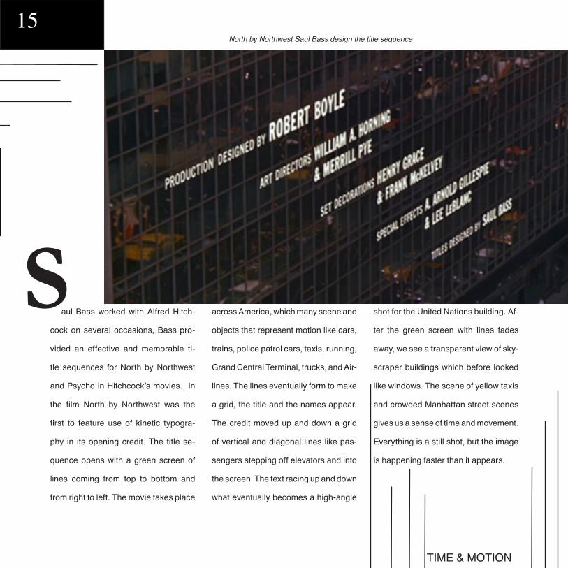
aul Bass worked with Alfred Hitch-
cock on several occasions, Bass pro-
vided an effective and memorable ti-
tle sequences for North by Northwest
and Psycho in Hitchcock’s movies. In
the film North by Northwest was the
first to feature use of kinetic typogra-
phy in its opening credit. The title se-
quence opens with a green screen of
lines coming from top to bottom and
from right to left. The movie takes place
across America, which many scene and
objects that represent motion like cars,
trains, police patrol cars, taxis, running,
Grand Central Terminal, trucks, and Air-
lines. The lines eventually form to make
a grid, the title and the names appear.
The credit moved up and down a grid
of vertical and diagonal lines like pas-
sengers stepping off elevators and into
the screen. The text racing up and down
what eventually becomes a high-angle
shot for the United Nations building. Af-
ter the green screen with lines fades
away, we see a transparent view of sky-
scraper buildings which before looked
like windows. The scene of yellow taxis
and crowded Manhattan street scenes
gives us a sense of time and movement.
Everything is a still shot, but the image
is happening faster than it appears.
S
TIME & MOTION
Alfred Hitchcock
North by Northwest Saul Bass design the title sequence

TIME & MOTION
16he movie Psycho was another Saul
Bass and Alfred Hitchcock collabora-
tions, a year after North by Northwest.
They worked in three movies total to-
gether, this would be the last. The ti-
tle credit for Psycho starts with a char-
coal screen, and black lines from vari-
ous directions come in the screen. The
names appears between the lines, it
becomes distorted and will form later
T
Psycho (1960 film)
Psycho is a thriller film directed by Alfred Hitchcock.
TIME & MOTION
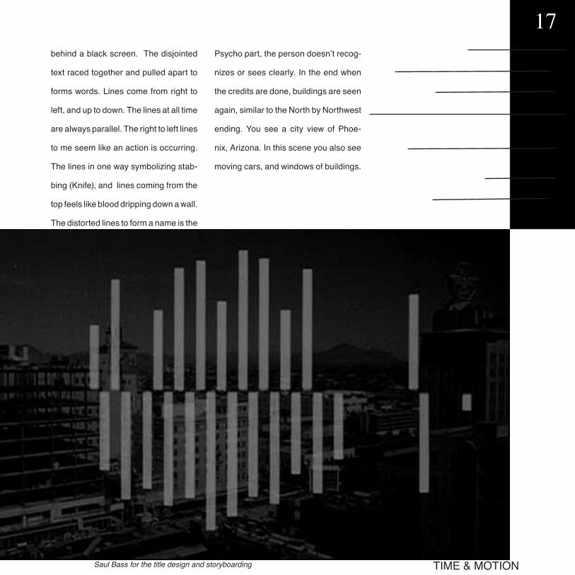
17behind a black screen. The disjointed
text raced together and pulled apart to
forms words. Lines come from right to
left, and up to down. The lines at all time
are always parallel. The right to left lines
to me seem like an action is occurring.
The lines in one way symbolizing stab-
bing (Knife), and lines coming from the
top feels like blood dripping down a wall.
The distorted lines to form a name is the
Psycho part, the person doesn’t recog-
nizes or sees clearly. In the end when
the credits are done, buildings are seen
again, similar to the North by Northwest
ending. You see a city view of Phoe-
nix, Arizona. In this scene you also see
moving cars, and windows of buildings.
Saul Bass for the title design and storyboarding

TIME & MOTION
here are six famous logos that Saul
Bass designed that include strips of
lines. Lines show movement without
humanly figure controlling them. The
Minolta logo is a camera brand; cam-
eras are used to capture a specific im-
age in time with movement or not. Bass
designed the Bell logo prior to the AT&T
logo; the bell logo at on one hand has
movement. His version of a silhouette
outline version. The AT&T “globe” logo
on the other land is a phone compa-
ny, similar is style and color. They both
have lines over a circle. The AT&T logo
gives a feeling of traveling around the
world through talking on the phone. The
Continental Airline 1968 “jetstream”
logo also has line in a circle, the only
difference is that the lines is spreading
away. Airplanes travel and move from
one location to another showing speed.
18
T

TIME & MOTION19

Rhythm and balance, much like cha-os and harmony, seem to be total oppo-sites, however in some ways they cre-ate something quite beautiful and differ-ent. Another way to look at is rhythm is to harmony as balance can be to cha-os. For the term, balance is our take on a sort of visual equilibrium, and it re-lates to our sense of stability. While the term, rhythm depends largely upon the element of movement and it creates a sort of flow that isn’t necessarily sta-ble. These same ideas about Rhythm and balance can be applied to different forms of art, be it in music, photography or design. This meshing of rhythm and balance can be seen in many works of the great Alexey Brodovitch.
Alexey Brodovitch’s life is one that has gone from order to a life of topsy-turvy, yet he always manages to land on his feet. This Russian born aristocrat went from the Czars white army’s first lieutenant to a poor somber man turned artist to becoming Harper’s Bazaar magazines art director. Through and through, Brodovitch was recognized for his passion and gift of incorporat-ing photography and typography along with his usage of rhythm and balance. Brodovitch rethought the mainstream
approach to editorial design, by incor-porating his own passion of black and white space and his love for open page typography that leaves a piercing feel-ing. Brodovitch pursued a flowing mu-sical sentiment in the form of pictures and words.
al ex eyitch
brodovrhythm
andbalance
20rhythm & balance

the
consensusof
opinion
21rhythm & balance

“if you don’t like full skirts”
22rhythm & balance

One example of this is in Harper’s editorial layout titled, “The Consensus of Opinion”, in which Brodovitch uses rhythm and balance through the rela-tionship between the woman and the type used and the surfeit amount of white space between them. As anyone can see, the composition of the photo-graph is reflected in Brodovitch type ar-rangement, which in part creates this approximate symmetrical balance. While rhythm comes into play with the way the type and image are connect-ed and how the two being put side by side creates this path in which our eyes can follow. Similarly, Brodovitch uses this same ideal in another spread titled, “If You Don’t like Full Skirts…,” howev-er the balance in this spread is asym-metrical.
Besides the usage of symmetry to create balance with the rhythm of the text, Brodovitch invented newer ways to incorporate rhythm and balance in his work. Often Brodovitch used amalga-mation of different elements pertaining to graphic design. For example, in an ar-ticle spread again for Harper’s Bazaar that was Titled, Ramon and Renita, he uses repetition upon both a horizontal and vertical stress which in par creates this flow upon movement. He also con-nects the dancing stripes of this page with the page beside it, in which the dancing pair Ramon and Renita have danced out of their square shells and on to a bigger white space.
Another work of Alexey Brodovitch’s, which was created way before he and Harper’s Bazaar had ever crossed paths was called, “Le Bal Banal”. “Le Bal Banal” created an asymmetrical balance between black and white forms or rather color with in the poster design; without this asymmetrical balance be-tween black and white forms the object being the masks is more like to tip over or rather not have the same effect on the viewer.
rh yt hmce
ba lan&alexey brodovitch on
by albina rahman
23rhythm & balance
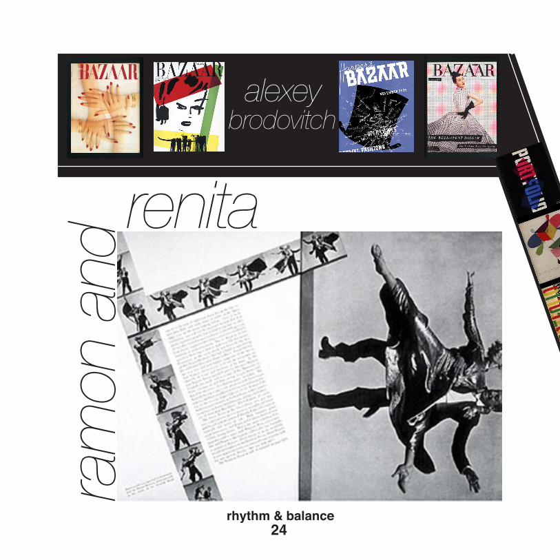
ram
on a
nd
renita
alexeybrodovitch
24rhythm & balance

le bal banal
harper’sbazaar
25rhythm & balance

Figure and ground are one of the most important aspects of design. They are always together, you can not have figure without ground and vice versa. Lance Wyman incorporates fig-ure/ground into many of his works, best shown in his wayfinding designs.
Figure
-34-
Ground
Figure/Ground: Lance Wyman
Lance Wyman

Ground
You can see the relationship betwwen figure and ground nicely in the work he created for a zoo. He created icons for the National Zoological Park in Washington, DC as a wayfinding system. He would create a sym-bol for the animal exhibits by showing that particular animal’s head.
In many cases like for the tiger or zebra, he relied on the ground as much as the figure to build the picture. The tiger is composed of positive stripes that create the figure. The gaps left between each stripe form the ground, which helps shape the image of a tiger.
-35-

Similar to his zoo icons is the work he did for the Mexican Metro Sta-tion. The metro was constructed in 1969, at which time illiteracy was very high. In order to make transpor-tation easy for passengers, Wyman developed symbols for each station. He took into consideration the sur-roundings and history of the area in which the stations were located in.
-36-Figure/Ground: Lance Wyman
Sign post for the Mexican Metro Station Entrance

-37-
He would take something as com-plex as the intricate architecture of a building, and create a symbol for it using basic shapes. These symbols stood out easily as figure because we would see an image of actual objects.
Station Symbols created by Lance Wyman for the Mexican Metro Station

-38-Figure/Ground: Lance Wyman
Wyman also did some appealing work for Rockefeller Family Fund. He created icons by using small white circles to create an image. For ex-ample, he had an icon of a book, where he lined up the circles to make the shape of an open book. So although it was not a solid silhou-ette of a book, we are still able to grasp what it is because of the clues we get from the figure and ground.

-39-
Time line of Lance Wymans Designs taken from his website.Lance Wyman’s simple shapes
and silhouettes have created a career for him. They combine figure and ground to create a pleasing composition for the eye.
By Victoria Fuks

Pi n
el e
sCO
NT
EN
TC i p e
Cipe Pineles CONTENT / CONCEPT42

Pi n
el e
s
Ciporah Pineles was the first woman in the world of graphic design. She was the first who
as a woman become a art director in that perfectly dominate field by men.
Self portrait Cipe Peneles
Cover and spreads from the 1974 trade paperback edition of the Parsons Bread Book, originally a student yearbook.
C ipe (which was her nick name) in school loved to paint and make illustration. In these
days she showed how great of sense of concept she has. In the most famous her work from the past she used watercolor to make a illustration of cactus. The skill of using that kind
C i p e
CO
NC
EP
T
Cipe PinelesCONTENT / CONCEPT 43
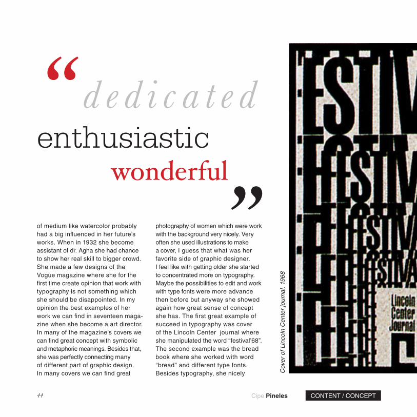
of medium like watercolor probably had a big influenced in her future’s works. When in 1932 she become assistant of dr. Agha she had chance to show her real skill to bigger crowd. She made a few designs of the Vogue magazine where she for the first time create opinion that work with typography is not something which she should be disappointed. In my opinion the best examples of her work we can find in seventeen maga-zine when she become a art director. In many of the magazine’s covers we can find great concept with symbolic and metaphoric meanings. Besides that, she was perfectly connecting many of different part of graphic design. In many covers we can find great
photography of women which were work with the background very nicely. Very often she used illustrations to make a cover, I guess that what was her favorite side of graphic designer. I feel like with getting older she started to concentrated more on typography. Maybe the possibilities to edit and work with type fonts were more advance then before but anyway she showed again how great sense of concept she has. The first great example of succeed in typography was cover of the Lincoln Center journal where she manipulated the word “festival’68”. The second example was the bread book where she worked with word “bread” and different type fonts. Besides typography, she nicely
‘‘ ‘‘d e d i c a t e denthusiastic
Cov
er o
f Lin
coln
Cen
ter
jour
nal,
1968
wonderful
Cipe Pineles CONTENT / CONCEPT44

Award-winning Potatoes illustration by Cipe Pineles, from Seventeen, February 1948 issue, pages 90-91.
Editorial spread from Charm, January 1954 issue, pages 128-129, photographed by William Helburn
Cipe PinelesCONTENT / CONCEPT 45
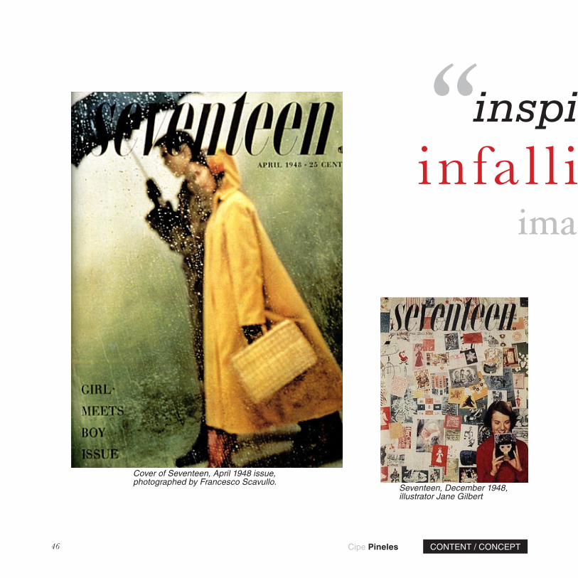
Cover of Seventeen, April 1948 issue, photographed by Francesco Scavullo.
Seventeen, December 1948, illustrator Jane Gilbert
‘‘ ‘‘infa l l ibleinspirational
imag inative
Cipe Pineles CONTENT / CONCEPT46

used connection of photography and illustrations of breads showing her great sense of content. It’s is very easy to use many different medium of art but use it so good like Cipe it’s something very unusual. She had also very nice collection of illustrations about fruits very well done and nice to see. The last example of her work witch I want to write about it is herself portrait where she in amazing way used typography to make a dress.
John Russo described Cipe in the best way he could. She was “dedicated, inspirational,
dependable, imaginative, persuasive, perceptive, enthusiastic, intuitive, pertinacious, indefatigable, 99% infallible, durable and wonderful, wonderful Cipe”. Wonderful Cipe who likes no one on earth had a great sense of concept and amazing skill to use it.
by Grzegorz LewkowiczSeventeen, February 1950,
photography by Dan Wynn
Cov
er o
f Sev
ente
en, J
uly
1948
issu
e, p
hoto
grap
hed
by B
en
Som
orof
f. C
harm
cov
ers,
May
195
3 an
d Ja
nuar
y 19
52 is
sues
.
‘‘ ‘‘infa l l ibleinspirational
imag inative
Cipe PinelesCONTENT / CONCEPT 47

I van Chermayeff was born in London, England in1932. He is still alive and he currently is 78 years old. he studied at the Harvard University, the institute of design, Illinois institute of technology and the Yale school of design. He is a committee member of the painting and sculpture, film and design department of the museum of visual arts. He also is a vice president of the Yale arts association, a member of the committee of arts and archi-tecture and he is a member of the committee for visual and environmental art at Harvard university.
FIGURE AND GROUND 48
Ivan Chermayeff Figure and Ground
Chase Manhat tan Bank (1961)
BY SOJAILYN JIMENEZ
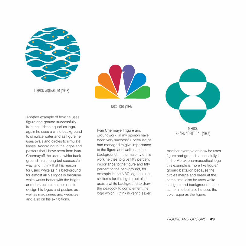
Ivan Chermayeff figure and groundwork, in my opinion have been very successful because he had managed to give importance to the figure and well as to the background. In the majority of his work he tries to give fifty percent importance to the figure and fifty percent to the background, for example in the NBC logo he uses six items for the figure but also uses a white background to draw the peacock to complement the logo which, I think is very cleaver.
NBC LOGO(1985)
FIGURE AND GROUND 49
LISBON AQUARIUM (1998)
Another example of how he uses figure and ground successfully is in the Lisbon aquarium logo, again he uses a white background to simulate water and as figure he uses ovals and circles to simulate fishes. According to the logos and posters that I have seen from Ivan Chermayeff, he uses a white back-ground in a strong but successful way, and I think that his reason for using white as his background for almost all his logos is because white works better with the bright and dark colors that he uses to design his logos and posters as well as magazines and websites and also on his exhibitions.
MERCK PHARMACEUTICAL (1987)
Another example on how he uses figure and ground successfully is in the Merck pharmaceutical logo this example is more like figure/ground battalion because the circles merge and break at the same time, also he uses white as figure and background at the same time but also he uses the color aqua as the figure.

American Museum of Natural History
In this poster Chermayeff did something different from what he usually does which is, using a black background to enhance the green dinosaurs that are the figure but he did it successfully because either the figure or background takes more attention than the other, they are equally balance.
FIGURE AND GROUND 50

FIGURE AND GROUND 51
This poster that is for jazz masters he uses a black background to enhance the bright colors that he uses as figures without distracting the attention from the poster.
NEA Jazz Masters

FIGURE AND GROUND 52
Spir i tual ly Moving (1998) Ivan Chermayeff have also design magazine covers like the one we are seen above. here, he uses a blue background to enhance the Silhouette of a woman’s sculpture.
Claes OldenburgMuseum of Modern Ar t catalog
He design th is book cover by s imulat ing Oldenburg’s “sof t ” sculptures featured in the book.
Peace (A Fragile World)
Here is another example in which he uses a black background wi thout tak ing away the at tent ion f rom the f igure, which in th is case is a broken plate that simulates the wor ld.

M. ButterflyPoster for the Tony Award-winning
Broadway play
here he simulates the person’s last name with and actual picture
of a butterfly.
New York T imes Magazine(2009)
ivan Chermayeff brought his trademark illustration style to
The New York Times Magazine July,12,2009coverstory on en-counters between whales and humans.
Statue of L iber ty
this is one of his exhibitions. here is replica of the face of the Statue liberty “Liberty Museum, Liberty
Island, New York”
FIGURE AND GROUND 53

aulaScherisaworld-
renownedartistandoneof
theworld’sleadinggraphicdesigner.
SheisWapartneratPentagram
Design,Inc.Scherhasdeveloped
identityandbrandingsystems,
promotionalmaterials,environmental
graphics,packagingandpublication
designsforabroadrangeofclients.
Asanartistsheisknownforher
large-scalepaintingsofmaps,
coveredwithdensehand-painted
labellingandinformation.Scher’s
mapsarepaintedonmonumental
canvases.Eachgeographiclocation
isuniquelyrenderedinitsowncolor-
palatereflectingbothculturaland
personalassociationswithplace.
Besidesherpaitings,Scherhas
receivedthegreatestrecognition
forheruseoftypography.She
creatednumerousworkswith
strongtypographicdesignsand
herapproachtotypographyhas
SCALE PAULA SCHER
P
54

55
SCALE PAULA SCHER
alwaysbeenusingbig,bold,
loudtypefaces.Schersaidshe
alwaysthought‘biggerwas
better’andtriedtogethertype
asbigaspossiblewithinthe
design.Shealsouseslotof
dynamicscalechanges.She
contrastthescaleoftheeach
lettersandjuxtaposethem
sothatitcreatesverystrong
images.Sheplayswithvertical
andhorizontalscalesofthe
typesfordynamicandrhythmic
composition.
LivinginNewYorkCityhas

56
SEASON CAMPAIGN FOR THE PUBLIC THEATER POST
ER
1995 - 1996

POST
ER
DESIGN1995 -
1996
57

inspiredSher’swork.Inlotof
herworkssheusesverylong
andtalltypography,alwaysin
capsinatightlypackedgrid.
Theyresembledbuildings
andgridsofNewYork.Her
enormousprintingsarealso
influencedbyNewYorkCity.It
hasmadeherwanttomake
thingsthatareenormousto
respondtothescaleofcity.
NewYorkCityisenormousand
tobeseeninsuchabigcityit
hastobigandloud.Scher’s
useofscaleasadesignelement
canalsobeseeninherlogo
designs.Forherlogodesign
forPublictheatre,Scherplayed
withkerning,tracking,the
horizontalscaleandsizethat
gavetheloudnessandvisibility.
Shehasalsodonenumberof
environmentaldesignwhereshe
usedobjectsandthespaces
asthecanvasestoplayher
typographyouton.
58

Environmental Graphics
42nd Street Studios / The Duke Theater.
59

In the aftermath of the abject hor-ror of World War I, people world-wide were struggling to come to terms with the changes wrought by mass industrialization and the raw brutality of the most violent and destructive conflict thus far in world history. For many artists, the solution was to turn to modernism, a movement that had been gain-ing momentum since the late-19th Century. At a young age Jan Tsch-ichold became a standard-bearer for a new paradigm of typographic design, symbolizing in many ways the schism between the traditional
methods of design and the Bau-haus-inspired forms of the 1920s. At the age of 26 Jan Tschichold, already well known in German ty-pography and design circles, pub-lished the book Die neue Typog-raphie (The New Typography). Conceived as a shot against the outdated and bourgeois styles of the past, Die neue Typographie condemned elements such as serif-typefaces and symmetrical, centered page layouts in favor of sleek, in-dustrially-inspired design. “The en-gineer shapes our age,” Tschichold wrote in Die neue Typographie.
Jan
Typography
60typography
TschicholdText and layout
by Nicholas Widzowski

Fig. 1: Jan Tschichold, Advertisement for a Lecture, 1927
61typography

Fig. 2: Poster, 1926
62typography
For Tschichold, the zeitgeist de-manded that extraneous motifs and aspects of design be discarded, and that typographic design correspond-ed to the frenetic realities of the modern world. “Typography is com-munication through print,” Hungar-ian artist and Tschichold contem-porary László Moholy-Nagy said. After the Nazis came to power, Tschichold emigrated to Switzer-land, as he had been accused of “cul-tural Bolshevism.” It was around this time that his preferences began to moderate. Eventually he would disavow much of Die neue Typog-raphie and drift back towards a more traditional typographic style, as a combination of increased age and the reality of the Nazis had changed his worldview. Whereas the New Typography brashly insisted that, in shades of Marxist thought, it was part of the ultimate progres-sion of humanity and thus supe-rior to all else, Tschichold began to feel that the philosophy behind the New Typography could not ad-equately convey all the ideas and communication needs of human-ity. “Its intolerant attitude certainly corresponds to the German incli-nation to the absolute,” he wrote.

Fig. 3: (above)Film Poster, 1927
Fig. 4: (left)Film Poster, 1927
63typography

Fig. 5: (above)Advertisement, 1928
In the 1940s he helped Penguin Books subtly redesign their cover scheme, setting everything on the cover in Gill Sans and in a layout much more keeping in propor-tion to the dimensions of the page. While there, he also produced a four-page manual detailing his de-sign principles for Penguin. By the 1960s he had completely turned his back on the original principles of the New Typography, creat-ing Sabon, based on the designs of Claude Garamond, in 1967. Jan Tschichold’s work redefin-ing the scope of typography in the 1920s was immensely influential on the design world. While his book was not originally published out-side of Germany, his modernist philosophies would live on, eventu-ally finding a new expression in the Swiss typographic circles, particu-larly in now-ubiquitous Swiss-de-signed typefaces such as Helvetica. Tschichold wished to start a “typo-graphic revolution,” and it is safe to say that his re-evaluation and evolu-tion of traditional typographic design principles will remain one of the ma-jor legacies of 20th Century design.
64typography

Fig. 6: Stationery, 1926
65typography

and
Time andMotion66

Pablo Ferro is a significant man in the universe of design. As a
high school student he taught him-self different animation techniques that appear in his work from a book by Preston Blair, “A frequent col-laborator with celebrated animation director Tex Avery at MGM.” Pablo had also become more involved working within the film industry. He designed the following movie titles such as; Dr. Dolittle, Men in Black, Philadelphia, and Beetle Juice as well as others. Later, on in his career Ferro became highly involved in motion pictures work.
Motion67
Ferro’s creativity in design also drew a connection to my topic
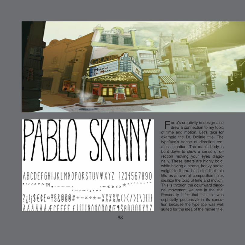
of time and motion. Let’s take for example the Dr. Dolittle title. The typeface’s sense of direction cre-ates a motion. The man’s body is bent down to show a sense of di-rection moving your eyes diago-nally. These letters are highly bold, while having a strong, heavy stroke weight to them. I also felt that this title as an overall composition helps idealize the topic of time and motion. This is through the downward diago-nal movement we see in the title. Personally I felt that this title was especially persuasive in its execu-tion because the typeface was well suited for the idea of the movie title.
68
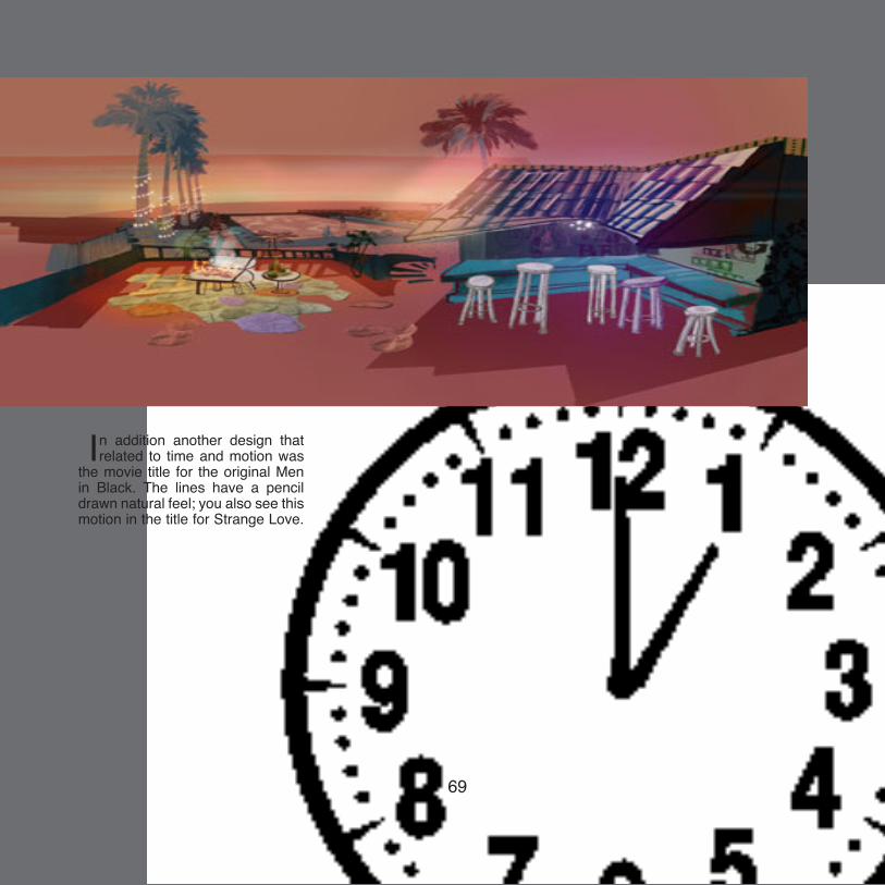
In addition another design that related to time and motion was
the movie title for the original Men in Black. The lines have a pencil drawn natural feel; you also see this motion in the title for Strange Love.
69

Although the letters are bold, heavier in stroke weight
it gives the typeface a sense of motion that moves the eyes from left to right along the title. Although I have also realized that his work is not well recognized by many people. Ferro had his own style which creates this time and motion theme. His designs have a walking feel which is what results in this time and motion idea. Due to the execution of his work, his titles are visually persuasive. Af-ter observing his designs it allows my mind to feel that the visual has to read as a simple image leaving the design to be highly successful.
70
71

Massimo Vignelli is a very important designer in terms of Hierarchy. His most famous and recognizable example of Hierarchy is the information posted throughout the New York City Subway system. He used the typeface Helvetica because it is easy to read. His work in designing the displays for the New York City Subway system uses hierarchy by making the most important information for riders as the biggest size. He made sure that the direction such as Down-town or Uptown and the Subway Sta-tion was the important information dis-
played. The next important line Vignel-li displayed was the Subway line and then made smaller was the information about the line. The choices he made for most important information was vi-tal because if he chose the wrong thing to make biggest, it would not function as it needs to, to direct where people want to go.
Another example of Massimo Vi-gnelli’s work with use of Hierarchy is the brochures for the furniture company Knoll. In the brochures, Vignelli made the company name the most important
Massimo Vignelli Hierarchy
72
by Michelle Ortiz

Massimo Vignelli Hierarchy
73
New York City Subway System Signage

Furniture company Knoll’s brochures designed by Massimo Vignelli
74

information and then put the less impor-tant information in smaller sizes.
Another example of Massimo Vi-gnelli using Hierarchy in his work is in the example of Skyline Magazine. He uses the title of the magazine as the key point in the cover. The smaller stories contained within are then put in smaller point sizes since they are the less im-portant information that readers need to know. Although directly underneath the title, information such as the date of the issue and price are the second smallest bits of information because they do not hold as much weight as the magazine’s name and stories.
A fourth example of Hierarchy in
Massimo Vignelli’s work is the work he did for Fassati Wines. For the packag-ing of the bottles, it again made sure that it contained the most important in-formation as the largest point size. Hier-archy in this instance is needed to em-phasize the brand and attract the cus-tomer.
Massimo Vignelli also used Hierar-chy for the signage in International De-sign Center New York. An example of such is in a sign that alerts people to what floor they are on and what busi-nesses are on each floor. The most im-portant information displayed are the
75
Skyline Magazine

floor level and the area labeled “Center Two”. These are clearly made to be im-portant because in order for someone to find what floor they need to be on it needs to be the most visible. A sixth and final example of Massimo Vignelli’s use of Hierarchy is in Fodor’s Travel Guides. In these guides the hierarchy of infor-mation is clearly visible. The name of the guide is the most important as dis-played by the point size, followed by the
Knoll Furniture companyAn example of hierarchy in the packaging for Fassati Wines
country in which the guide is for, and underneath other information. This sys-tem of hierarchy is successful because it alerts the viewer of the brand and then afterwards let’s them know which guide they need for the area they want. Hav-ing information that is not as vital to the reader as the smallest size helps the person viewing the guide quickly de-cide which one they need.
76

International Design Center New York
77
Fodor’s Travel Guides

Transparency78
TransparencyTransparency
1911 - 1995
BradburyBradburyThompsonThompson

Bradbury Thompson was born in 1911 in Topeka Kansas, Where he attented Washburn College. After graduating in the year 1934 Thompson moved to New York in 1938. In the next sixty plus years, Thompson worked for magazines such as Mademoiselle Magazine, Artnews Magazine and for Westvaco Inspirations. He respect-fully worked for these magazines as an art director for numerous years. For example Thompson got is break in Westvaco: Inspirations, where he was able to make eye catching covers. He worked under Westvaco from 1939-1961. Simultaneously he was working as design director for Artnews Maga-zine, which lasted 27 years 1945-1972. Alongside Artnews, Thompson was working for Mademoiselle Maga-zine from 1945-1959. For Working nearly 60 years in the graphic design industry Thompson was recognized by
his colleges as one of the greatest in the fields. In those sixty years Thomp-son earned the 3 major design awards the National Society of Art Director of the year 1950; AIGA Gold Medal in 1975; and the Art Directors Hall of Fame in 1977, a feat that has been done only by a few handfuls.
Transparency79
Transparency80
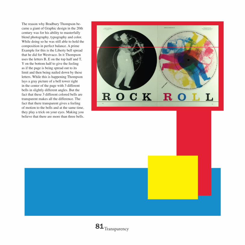
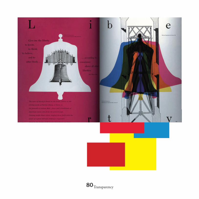
The reason why Bradbury Thompson be-came a giant of Graphic design in the 20th century was for his ability to masterfully blend photography, typography and color. While doing so he was still able to hold the composition in perfect balance. A prime Example for this is the Liberty bell spread that he did for Westvaco. In it Thompson uses the letters B, E on the top half and T, Y on the bottom half to give the feeling as if the page is being spread out to its limit and then being nailed down by these letters. While this is happening Thompson lays a gray picture of a bell tower right in the center of the page with 3 different bells in slightly different angles. But the fact that these 3 different colored bells are transparent makes all the difference. The fact that there transparent gives a feeling of motion to the bells and at the same time, they play a trick on your eyes. Making you believe that there are more than three bells.
Transparency81

Another example of great use of transpar-ency is Thompson’s Rock and Roll Spread for Westvaco: Inspirations. In the Spread there are two vinyl records. On the left side is a negative of a man playing a saxophone on a black vinyl. To the right of him is the same image repeated with different colors on top of a white vinyl. The fact that they are transparent creates very dark colors in the middle of the image but as you move outside they get lighter, also the transpar-ency gives a sense of motion to the images.
Transparency82

Transparency83
Thompson even went on to use trans-parency in the stamps that he great for the united states over the years. These are just a few examples of what Brad-bury Thompson did so successfully over a career that spans six decades.

uzana Licko:
84Citizen, 1986, Zuzanna Licko
ypography

Zuzana Licko was born in Bratislavia, Czechoslovakia, in 1961. She moved to the United States at the age of seven. Her father who was a Biomathematician provided her access to her first computer. She designed her first typeface, a Greek alphabet for her father’s personal use. She entered the University of California at Berkeley originally intending to study architecture but later changed her major to visual studies and pursued a graphic communications degree. Today Licko is known for her wide range of typeface designs as well as co-founding the critically acclaimed Emigré Journal and design team with her husband Rudy VanderLans.
uzana Licko:
85
ypographyModula, 1985
Whirligig, 1994
Essay By: Nataniel Serrano

86
Typography
The first issue of Emigré Journal was put together in 1984 by VanderLans and two other Dutch immigrants (Identifont). Working together with the technological availability, and lack of financial resources the text for the first issue was mostly typewriter type that had been resized on a photocopier. With the invention of the Apple Macintosh computer, Licko began creating fonts for the magazine using a bitmap font tool. Her first typeface designs were Emperor, Emigré, and Oakland which appeared on the second issue of the magazine and were soon for sale due to their demand. She transformed the pixel from low-resolution imitation to high-style original (Eye magazine, 2002). Also, Emigré’s development reflected
Totatally Gothic, 1990
Senator, 1988

87
Typography
the evolution of digital technology while questioning conventional ideas of legibility and layout (Eye magazine, 2002). As technology evolved she evolved with it. She was continuously finding inspiration with the technological availability of her time. In 1986 she created Citizen, which approximated the smoother bitmap printing of the new laser printers. Base-9 and Base-12 originated as screen fonts for Emigré’s website in 1995, and then evolved with a companion printer font (Eye magazine, 2002). Licko continued to construct more fonts with bold, simple geometry, such as Matrix and Modula. Their cold, rational appearance served to anchor VanderLan’s free-spirited layouts (AIGA, 1998). When their work began
Base 9, 1995
Soda Script, 1995
88
Typography
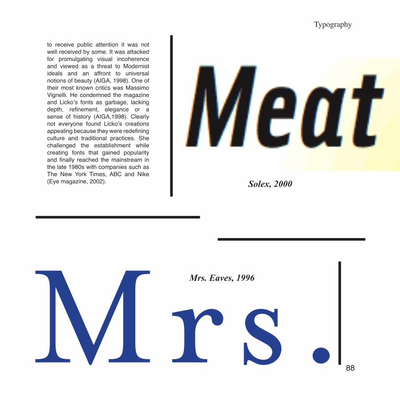
to receive public attention it was not well received by some. It was attacked for promulgating visual incoherence and viewed as a threat to Modernist ideals and an affront to universal notions of beauty (AIGA, 1998). One of their most known critics was Massimo Vignelli. He condemned the magazine and Licko’s fonts as garbage, lacking depth, refinement, elegance or a sense of history (AIGA,1998). Clearly not everyone found Licko’s creations appealing because they were redefining culture and traditional practices. She challenged the establishment while creating fonts that gained popularity and finally reached the mainstream in the late 1980s with companies such as The New York Times, ABC and Nike (Eye magazine, 2002).
Mrs. Eaves, 1996
Solex, 2000

89
Typography
As Emigré began publishing more design theory, Licko developed more “classical” fonts; her designs Mrs. Eaves and Filosofia were based on Baskerville and Bodoni (Eye magazine, 2002). After being attacked for defying traditional typography and style, Licko said, “ It’s funny: when I look back on my work over the last twelve years, I realize that at first I had trouble getting people to take my work seriously, while now I have trouble getting them to stop copying my work” (AIGA,1998). Licko is a clear example of an innovator that challenged traditions and norms and set out to create type for a specific group of people. In the process she used the technological availability of her times to re-defy type as well as create her own reinterpretations of the “classics”.
Filosofia, 1996
Tarzana, 1998