fedra serif pro™ fedra serif std™ - typothequefedra serif pro™ fedra serif std™ typotheque...
TRANSCRIPT
ewjduhizrtvnsgfq123456789
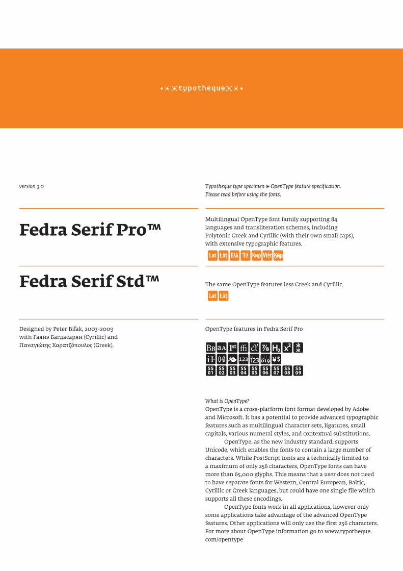
Fedra Serif Pro™
Fedra Serif Std™
Typotheque type specimen & OpenType feature specification. Please read before using the fonts.
Multilingual OpenType font family supporting 84 languages and transliteration schemes, including Polytonic Greek and Cyrillic (with their own small caps), with extensive typographic features.
The same OpenType features less Greek and Cyrillic.
What is OpenType?OpenType is a cross-platform font format developed by Adobe and Microsoft. It has a potential to provide advanced typographic features such as multilingual character sets, ligatures, small capitals, various numeral styles, and contextual substitutions. OpenType, as the new industry standard, supports Unicode, which enables the fonts to contain a large number of characters. While PostScript fonts are a technically limited to a maximum of only 256 characters, OpenType fonts can have more than 65,000 glyphs. This means that a user does not need to have separate fonts for Western, Central European, Baltic, Cyrillic or Greek languages, but could have one single file which supports all these encodings. OpenType fonts work in all applications, however only some applications take advantage of the advanced OpenType features. Other applications will only use the first 256 characters. For more about OpenType information go to www.typotheque.com/opentype
ABCDEGH
AB
OpenType features in Fedra Serif ProDesigned by Peter Biľak, 2003-2009 with Гаянэ Багдасарян (Cyrillic) and Παναγιώτης Χαρατζόπουλος (Greek).
version 3.0
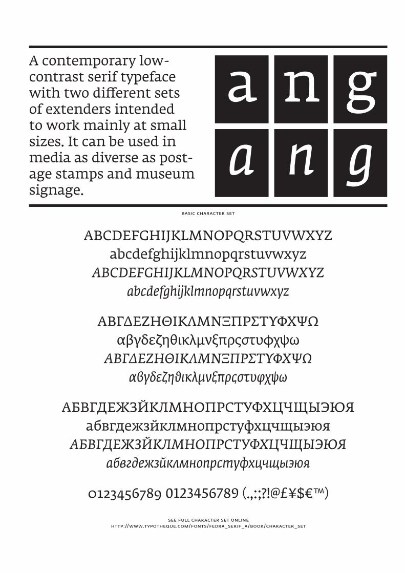
A contemporary low- contrast serif typeface with two different sets of extenders intended to work mainly at small sizes. It can be used in media as diverse as post-age stamps and museum signage.
basic character set
see full character set online http://www.typotheque.com/fonts/fedra_serif_a/book/character_set
aa
nn
gg
www.typotheque.com/fonts/fedra_serif_a
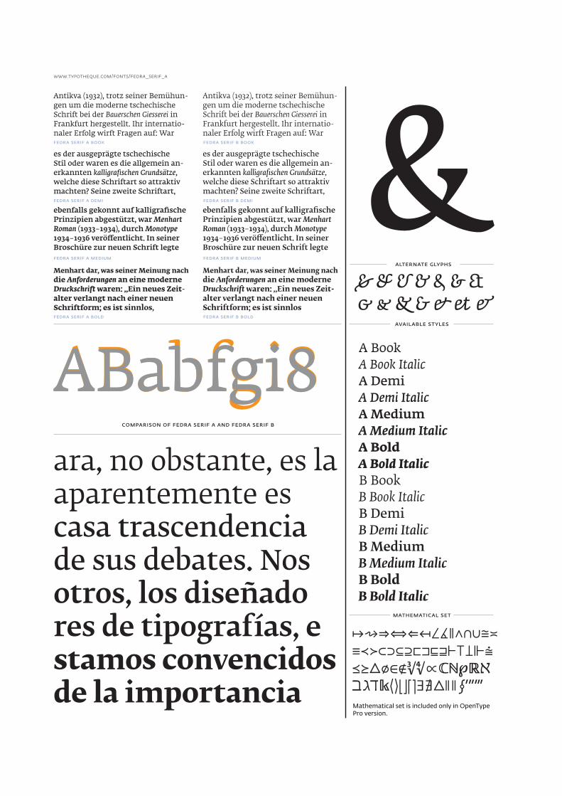
Antikva (1932), trotz seiner Bemühun-gen um die moderne tschechische Schrift bei der Bauerschen Giesserei in Frankfurt hergestellt. Ihr internatio-naler Erfolg wirft Fragen auf: War
Antikva (1932), trotz seiner Bemühun-gen um die moderne tschechische Schrift bei der Bauerschen Giesserei in Frankfurt hergestellt. Ihr internatio-naler Erfolg wirft Fragen auf: War
es der ausgeprägte tschechische Stil oder waren es die allgemein an-erkannten kalligrafischen Grundsätze, welche diese Schriftart so attraktiv machten? Seine zweite Schriftart,
es der ausgeprägte tschechische Stil oder waren es die allgemein an-erkannten kalligrafischen Grundsätze, welche diese Schriftart so attraktiv machten? Seine zweite Schriftart,
ebenfalls gekonnt auf kalligrafische Prinzipien abgestützt, war Menhart Roman (1933–1934), durch Monotype 1934–1936 veröffentlicht. In seiner Broschüre zur neuen Schrift legte
ebenfalls gekonnt auf kalligrafische Prinzipien abgestützt, war Menhart Roman (1933–1934), durch Monotype 1934–1936 veröffentlicht. In seiner Broschüre zur neuen Schrift legte
Menhart dar, was seiner Meinung nach die Anforderungen an eine moderne Druckschrift waren: „Ein neues Zeit-alter verlangt nach einer neuen Schriftform; es ist sinnlos,
Menhart dar, was seiner Meinung nach die Anforderungen an eine moderne Druckschrift waren: „Ein neues Zeit-alter verlangt nach einer neuen Schriftform; es ist sinnlos
comparison of fedra serif a and fedra serif b
A Book A Book Italic A Demi A Demi Italic A Medium A Medium Italic A Bold A Bold Italic B Book B Book Italic B Demi B Demi Italic B Medium B Medium Italic B Bold B Bold Italic
ABabfgi8ara, no obstante, es la aparentemente escasa trascendencia de sus debates. Nosotros, los diseñadores de tipografías, estamos convencidos de la importancia
Mathematical set is included only in OpenType Pro version.
& & & & & & && & & & & & &
↦⇝⇒⇔⇐↤∠∡∥∧∩∪≅≍≡≺≻⊂⊃⊆⊇⊏⊐⊑⊒⊢⊤⊥⊩⩭⪯⪰△∅∈∉∛∜∝ℂ�℘ℝℵℶℷℸ𝔨⟨⟩⌈⌉⌊⌋∃∄△� ∮′″‴
alternate glyphs
available styles
mathematical set
fedra serif a book
fedra serif a demi
fedra serif a medium
fedra serif a bold
fedra serif b book
fedra serif b demi
fedra serif b medium
fedra serif b bold
ABabfgi8
&
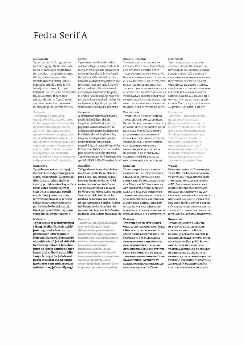
LithuanianTypotheque - šriftų gamybos įmonė Hagoje, Nyderlanduose, kuria ir parduoda originalius fontus Mac ir PC platformoms. Mūsų tikslas yra puoselėti nepriklausomų šriftų kūrėjų tradiciją, prisidėti prie šrifto istorijos t stinumo kuriant kokybiškus šriftus, kurie atspindi mūsų laikmetį ir tarnauja mūsų reikmėms. Typotheque specializuojasi kurti įvairius klientų pageidaujamus šriftus,
SloveneTypotheque je oblikovalski atelje s sedežem v Hagu na Nizozemskem, ki razvija in trži originalne tipografije za osebne računalnike PC in Macintosh. Naš cilj je nadaljevati tradicijo ob-likovanja neodvisnih tipografij; želimo si prispevati tudi svoj delež k razvoju tekom zgodovine. To želimo doseći z ustvarjanjem kakovostnih tipografij, ki izražajo naš čas in služijo njegovim potrebam. Razen razvijanja maloproda-jne knjižnice je Typotheque special-izirana tudi v oblikovanju namenskih
Rhaeto-RomanicTypotheque è in atelier da letras a Den Haag, Pajais Bass, che sviluppa e venda scrit-tiras originalas per Mac e PC. Nossa finamira è da cuntinuar cun la tradiziun dals ateliers da letras independents, con-tribuind ina pitschna part a la cuntinuitad da l’istorgia da la tipografia e creond scrittiras da qualitad che reflecteschan noss temp e servan als basegns da quel. Sper il svilup da ques-
NorwegianTypotheque er eit fonthus som ligg i Haag, Nederland. Vi utviklar og sel original fontar for Mac og PC. Vår visjon er å føre vidare tradisjonane til dei uavhengige fonthusa og å gje vårt bidrag til denne historia ved å skape kvalitetsfontar som reflekterer vår tid og møter samtida sine krav. I tillegg til å utvikle fontbiblioteket, spesia-liserer Typotheque seg i skaping av spesiallaga fontar til eit
BulgarianTypotheque е фирма за шрифтове в Хага, Холандия, която разработва и продава оригинални шрифтове за Mac и PC. Нашата цел е да продължаваме традициите на независимите фирми за шрифтове, като даваме своя скромен принос в историче-ското развитие на печата и създаваме качествени шрифтове в духа на нашето съвремие и неговите нужди.
HungarianA Typotheque betűtervező műhely, amely Hollandiában alakult, Hágában, ahol betűket fejleszt és forgalmaz Macintoshra és PC-re. Elkötelezettek vagyunk a független betűöntőműhelyek tradíciói iránt, napjaink szükségleteihez igazodó kiváló minőségű fontjainkkal magunk is hozzá szeretnénk járulni a betűtörténet fejlődéséhez. A standard font-készletek készítése mellett a Typotheque egyedi betű-fejlesztésekre specializálódik különféle nyelvekhez és
PortugueseTypotheque é uma fundição tipográfica situada em Haia, Países Baixos, desenvolvendo e comercializando fontes origi-nais para Mac e PC. O nosso compromisso é continuar com a tradição das fundições tipográficas independentes, contribuindo um pouco para a sequência contínua da história da tipografia; criando tipos de letra de qualidade que reflectem os
UkrainianТипотек — шрифтова фірма, що знаходиться у Гаазі (Нідерланди), розробляє та реалізує ориґінальні шрифти для платформ Macintosh та PC. Наше завдання полягає у продовженні традицій незалежних шрифтових фірм, які вкладають свій невеличкий внесок в історію шрифтів, створюючи якісні ґарнітури, що відбивають запити сьогодення. Крім
EsperantoTypotheque estas litertipaj fandejo kies sidejo troviĝas en Hago, Nederlando. Ĝi kreas kaj distribuas originalajn liter-tiparoj por Makintoŝ kaj PK. Nia tasko estas daŭrigi la tradi-cion de la memstaraj preslit-eraj fandejoj donante nian kontribuadeton al la senĉesa sekvo de la tipografihistorio per la kreado de altkvalitaj litertiparoj reflektantaj niajn tempojn kaj respondantaj al
Hawaiian‘O Typotheque he wahi ho‘ohehe‘e hua kēpau ma Ka Haka, Hōlani, a hana a kū‘ai aku mākou i nā hua kumu no ka Mac me ka PC. ‘O kā mākou ho‘ohiki ‘ana ka ho‘omau i ka mo‘olelo lō‘ihi loa o nā wahi ho‘ohehe‘e hua kū‘oko‘a, a ka mālama ‘ana i ia mo‘olelo ‘oki ‘ole me ka ha‘aha‘a, ‘oiai e hana ana mākou i nā hua kēpau pono a maika‘i no kēia wā. Eia a‘e, koe ka hana ‘ana i ka waihona hua kēpau no ke kū‘ai aku kū‘ai mai, ‘o ka ‘oihana mākaukau loa
SwedishTypotheque är ett neder-ländskt stilgjuteri med bas i Haag, som utvecklar och marknadsför originalfonter för Mac och PC. Vårt mål är att fortsätta bidra med vår lilla bit till den fortsatta typhistoriens, skapa typsnitt som reflekterar vår tid och möter dess behov. Förutom utvecklingen av vårt kom-mersiella typsnittsbibliotek, specialiserar sig Typotheque
WelshFfowndri deip ydy Typotheque yn yr Hâg, yr Iseldiroedd sydd yn datblygu a marchnata ffon-tiau gwreiddiol ar gyfer Mac a PC. Ein hymrwymiad ni yw i barhau traddodiadau ffown-drïoedd teip annibynnol, gan gyfrannu ein rhan fechan ni i’r dilyniant parhaol o hanes teip, gan greu teipiau wyneb o safon sy’n adlewyrchu a gwasanaethu yr oes sydd ohoni. Yn ogystal â datblygu’r llyfrgell adwerthol
IcelandicTypotheque er leturfyrirtæki í Haag í Hollandi. Fyrirtækið þróar og markaðssetur up-prunalegar leturtegundir fyrir Makka og PC. Fyrirtækið einbeitir sér að því að viðhalda hefðum sjálfstæðra leturhön-nuða og leggja þannig að mör-kum til að viðhalda samfellu í sögu leturgerða. Jafnframt þessu er leitast við að hanna gæðaletur sem endurspeglar nútímann og þjónar tilgangi
BelarusianТыпатэка, шрыфтавая фірма, якая знаходзіцца у Гаазе (Нідэрланды), распрацоўвае і распаўсюджвае арыгінальныя шрыфты для платформ Macin-tosh і PC. Нашае прызначэнне, працягваць традыцыі незалежных славалітняў, робячы свой невялічкі ўклад у гісторыю шрыфту, ствараючы якасные гарнітуры, якія адлюстроўваюць сёняшні дзень і служаць сучасным патрэбам.
FaroeseTypotheque er eitt skrift virkið, við høvuðssæti í Haag í Hollandi, ið tilevnar og selur skriftsnið til Mac- og PCteldur. Vit vilja halda áfram siðirnar hjá óheftu skriftsniðavirkjunum, og geva okkara lítla ískoyti til skrift søguna, við at skapa tíðarhóskandi góðskugóðar stavamyndir. Afturat at menna og økja um okkara at skriftsavn, hevur Typo-
RomanianTypotheque este o agenţie de creaţie de caractere de litere cu sediul la Haga, Olanda şi dezvoltă precum şi comercializează fonturi origi-nale pentru Mac şi PC. Scopul nostru este de a continua tradiţia agenţiilor de creaţie de caractere de litere inde-pendente, contribuind aşa cum putem la succesiunea continuă a istoriei în domeniu, creînd fonturi reprezentative care
Fedra Serif A
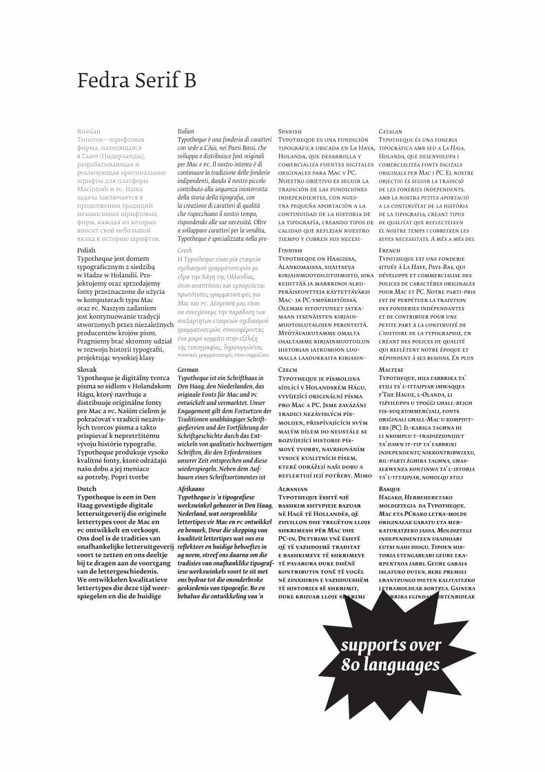
RussianТипотек—шрифтовая фирма, находящаяся в Гааге (Нидерланды), разрабатывающая и реализующая оригинальные шрифты для платформ Macintosh и PC. Наша задача заключается в продолжении традиций независимых шрифтовых фирм, каждая из которых вносит свой небольшой вклад в историю шрифтов,
ItalianTypotheque è una fonderia di caratteri con sede a L’Aia, nei Paesi Bassi, che sviluppa e distribuisce font originali per Mac e PC. Il nostro intento è di continuare la tradizione delle fonderie indipendenti, dando il nostro piccolo contributo alla sequenza ininterrotta della storia della tipografia, con la creazione di caratteri di qualità che rispecchiano il nostro tempo, rispondendo alle sue necessità. Oltre a sviluppare caratteri per la vendita, Typotheque è specializzata nella pro-
SpanishTypotheque es una fundición tipográfica ubicada en La Haya, Holanda, que desarrolla y comercializa fuentes digitales originales para Mac y PC. Nuestro objetivo es seguir la tradición de las fundiciones independientes, con nues-tra pequeña aportación a la continuidad de la historia de la tipografía, creando tipos de calidad que reflejan nuestro tiempo y cubren sus necesi-
CatalanTypotheque és una foneria tipogràfica amb seu a La Haia, Holanda, que desenvolupa i comercialitza fonts digitals originals per Mac i PC. El nostre objectiu és seguir la tradició de les foneries independents, amb la nostra petita aportació a la continuïtat de la història de la tipografia, creant tipus de qualitat que reflecteixen el nostre temps i cobreixen les seves necessitats. A més a més del
PolishTypotheque jest domem typograficznym z siedzibą w Hadze w Holandii. Pro-jektujemy oraz sprzedajemy fonty przeznaczone do użycia w komputerach typu Mac oraz PC. Naszym zadaniem jest kontynuowanie tradycji stworzonych przez niezależnych producentów krojów pism. Pragniemy brać skromny udział w rozwoju historii typografii, projektując wysokiej klasy
GreekΗ Typotheque είναι μία εταιρεία σχεδιασμού γραμματοσειρών με έδρα την Χάγη της Ολλανδίας, όπου αναπτύσσει και εμπορεύεται πρωτότυπες γραμματοσειρές για Mac και PC. Δέσμευσή μας είναι να συνεχίσουμε την παράδοση των ανεξάρτητων εταιρειών σχεδιασμού γραμματοσειρών, συνεισφέροντας ένα μικρό κομμάτι στην εξέλιξη της τυπογραφίας, δημιουργώντας ποιοτικές γραμματοσειρές όπου εκφράζουν
FinnishTypotheque on Haagissa, Alankomaissa, sijaitseva kirjainmuotoilutoimisto, joka kehittää ja markkinoi alku-peräisfontteja käytettäväksi Mac- ja PC-ympäristöissä. Olemme sitoutuneet jatka-maan itsenäisten kirjain-muotoilutalojen perinteitä. Myötävaikutamme omalta osaltamme kirjainmuotoilun historian jatkumoon luo-malla laadukkaita kirjasin-
FrenchTypotheque est une fonderie située à La Haye, Pays-Bas, qui développe et commercialise des polices de caractères originales pour Mac et PC. Notre parti-pris est de perpétuer la tradition des fonderies indépendantes et de contribuer pour une petite part à la continuité de l‘histoire de la typographie, en créant des polices de qualité qui reflètent notre époque et répondent à ses besoins. En plus
SlovakTypotheque je digitálny tvorca písma so sídlom v Holandskom Hágu, ktorý navrhuje a distribuuje originálne fonty pre Mac a PC. Naším cieľom je pokračovať v tradícii nezávis-lých tvorcov písma a takto prispievať k nepretržitému vývoju histórie typografie. Typotheque produkuje vysoko kvalitné fonty, ktoré odrážajú našu dobu a jej meniace sa potreby. Popri tvorbe
GermanTypotheque ist ein Schrifthaus in Den Haag, den Niederlanden, das originale Fonts für Mac und PC entwickelt und vermarktet. Unser Engagement gilt dem Fortsetzen der Traditionen unabhängiger Schrift-gießereien und der Fortführung der Schriftgeschichte durch das Ent-wickeln von qualitativ hochwertigen Schriften, die den Erfordernissen unserer Zeit entsprechen und diese wiederspiegeln. Neben dem Auf-bauen eines Schriftsortimentes ist
CzechTypotheque je písmolijna sídlící v Holandském Hágu, vyvíjející originální písma pro Mac a PC. Jsme zavázáni tradici nezávislých pís-molijen, přispívajících svým malým dílem do neustále se rozvíjející historie pís-mové tvorby, navrhováním vysoce kvalitních písem, které odrážejí naši dobu a reflektují její potřeby. Mimo
MalteseTypotheque, hija fabbrika ta’ stili ta’ l-ittajpjar imwaqqfa f’The Hague, l-Olanda, li tiżviluppa u tpoġġi għall-bejgħ fis-suq kummerċjali, fonts oriġinali għall-Mac u kompjut-ers (PC). Il-kariga tagħna hi li nkomplu t-tradizzjonijiet ta’ dawn it-tip ta’ fabbriki independenti; nikkontribwixxu, bil-parti żgħira tagħna, għas-sekwenza kontinwa ta’ l-istorja ta’ l-ittajpjar, noħolqu stili
DutchTypotheque is een in Den Haag gevestigde digitale letteruitgeverij die originele lettertypes voor de Mac en PC ontwikkelt en verkoopt. Ons doel is de tradities van onafhankelijke letteruitgeverij voort te zetten en ons deeltje bij te dragen aan de voortgang van de lettergeschiedenis. We ontwikkelen kwalitatieve lettertypes die deze tijd weer-spiegelen en die de huidige
AfrikaansTypotheque is ’n tipografiese werkswinkel gebaseer in Den Haag, Nederland, wat oorspronklike lettertipes vir Mac en PC ontwikkel en bemark. Deur die skepping van kwaliteit lettertipes wat ons era reflekteer en huidige behoeftes in ag neem, streef ons daarna om die tradisies van onafhanklike tipograf-iese werkswinkels voort te sit met ons bydrae tot die ononderbroke geskiedenis van tipografie. Bo en behalwe die ontwikkeling van ’n
AlbanianTypotheque është një bashkim shtypjeje bazuar në Hagë të Hollandës, që zhvillon dhe tregëton lloje shkrimesh për Mac dhe PC-in. Detyrimi ynë është që të vazhdojmë traditat e bashkimeve të shkrimeve të pavarura duke dhënë kontributin tonë të vogël në zinxhirin e vazhdueshëm të histories së shkrimit, duke krijuar lloje shkrimi
BasqueHagako, Herbeheretako moldiztegia da Typotheque. Mac eta PCrako letra-molde originalak garatu eta mer-katuratzeko jaioa. Moldiztegi independienteen usadioari eutsi nahi diogu. Tipoen his-toria etengabeari geure eka-rpentxoa jarri. Geure garaia islatuko duten, bere premiei erantzungo dieten kalitatezko letramoldeak sortzea. Gainera neurrira egindako irtenbideak
supports over 80 languages
Fedra Serif B
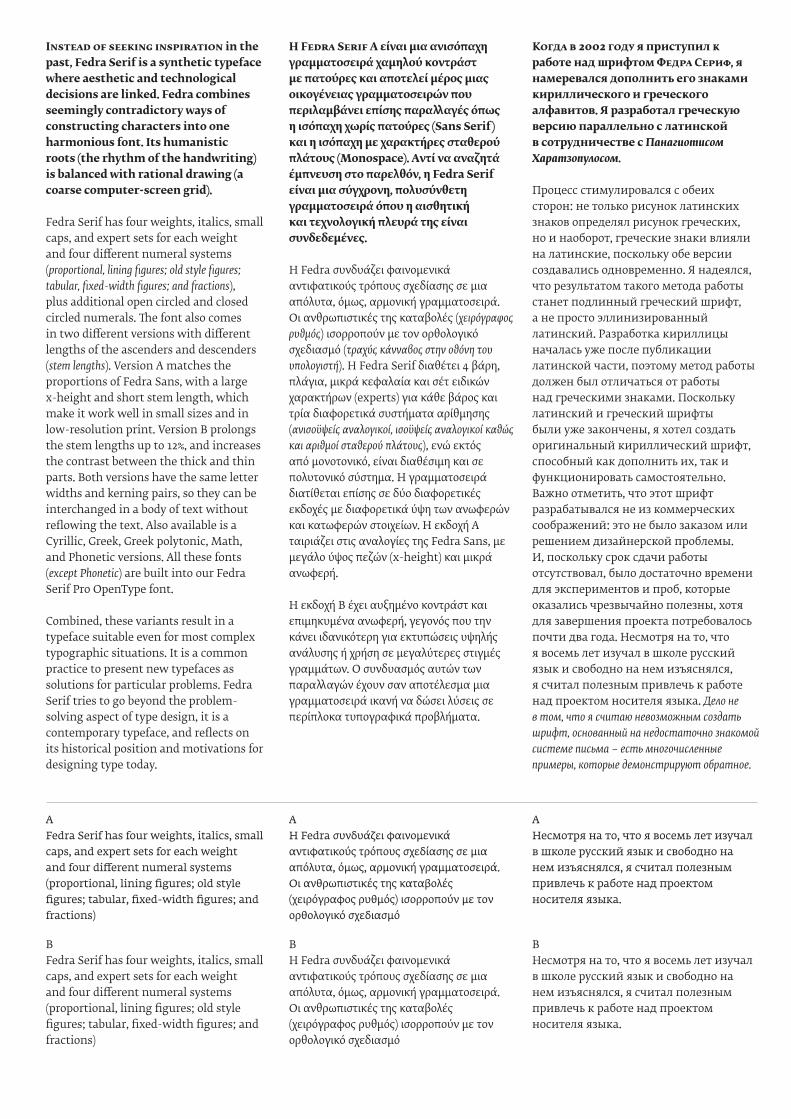
Instead of seeking inspiration in the past, Fedra Serif is a synthetic typeface where aesthetic and technological decisions are linked. Fedra combines seemingly contradictory ways of constructing characters into one harmonious font. Its humanistic roots (the rhythm of the handwriting) is balanced with rational drawing (a coarse computer-screen grid).
Fedra Serif has four weights, italics, small caps, and expert sets for each weight and four different numeral systems (proportional, lining figures; old style figures; tabular, fixed-width figures; and fractions), plus additional open circled and closed circled numerals. The font also comes in two different versions with different lengths of the ascenders and descenders (stem lengths). Version A matches the proportions of Fedra Sans, with a large x-height and short stem length, which make it work well in small sizes and in low-resolution print. Version B prolongs the stem lengths up to 12%, and increases the contrast between the thick and thin parts. Both versions have the same letter widths and kerning pairs, so they can be interchanged in a body of text without reflowing the text. Also available is a Cyrillic, Greek, Greek polytonic, Math, and Phonetic versions. All these fonts (except Phonetic) are built into our Fedra Serif Pro OpenType font.
Combined, these variants result in a typeface suitable even for most complex typographic situations. It is a common practice to present new typefaces as solutions for particular problems. Fedra Serif tries to go beyond the problem-solving aspect of type design, it is a contemporary typeface, and reflects on its historical position and motivations for designing type today.
H Fedra Serif A είναι μια ανισόπαχη γραμματοσειρά χαμηλού κοντράστ με πατούρες και αποτελεί μέρος μιας οικογένειας γραμματοσειρών που περιλαμβάνει επίσης παραλλαγές όπως η ισόπαχη χωρίς πατούρες (Sans Serif) και η ισόπαχη με χαρακτήρες σταθερού πλάτους (Monospace). Aντί να αναζητά έμπνευση στο παρελθόν, η Fedra Serif είναι μια σύγχρονη, πολυσύνθετη γραμματοσειρά όπου η αισθητική και τεχνολογική πλευρά της είναι συνδεδεμένες.
H Fedra συνδυάζει φαινομενικά αντιφατικούς τρόπους σχεδίασης σε μια απόλυτα, όμως, αρμονική γραμματοσειρά. Oι ανθρωπιστικές της καταβολές (χειρόγραφος ρυθμός) ισορροπούν με τον ορθολογικό σχεδιασμό (τραχύς κάνναβος στην οθόνη του υπολογιστή). H Fedra Serif διαθέτει 4 βάρη, πλάγια, μικρά κεφαλαία και σέτ ειδικών χαρακτήρων (experts) για κάθε βάρος και τρία διαφορετικά συστήματα αρίθμησης (ανισοϋψείς αναλογικοί, ισοϋψείς αναλογικοί καθώς και αριθμοί σταθερού πλάτους), ενώ εκτός από μονοτονικό, είναι διαθέσιμη και σε πολυτονικό σύστημα. H γραμματοσειρά διατίθεται επίσης σε δύο διαφορετικές εκδοχές με διαφορετικά ύψη των ανωφερών και κατωφερών στοιχείων. H εκδοχή A ταιριάζει στις αναλογίες της Fedra Sans, με μεγάλο ύψος πεζών (x-height) και μικρά ανωφερή.
H εκδοχή B έχει αυξημένο κοντράστ και επιμηκυμένα ανωφερή, γεγονός που την κάνει ιδανικότερη για εκτυπώσεις υψηλής ανάλυσης ή χρήση σε μεγαλύτερες στιγμές γραμμάτων. O συνδυασμός αυτών των παραλλαγών έχουν σαν αποτέλεσμα μια γραμματοσειρά ικανή να δώσει λύσεις σε περίπλοκα τυπογραφικά προβλήματα.
Когда в 2002 году я приступил к работе над шрифтом Федра Сериф, я намеревался дополнить его знаками кириллического и греческого алфавитов. Я разработал греческую версию параллельно с латинской в сотрудничестве с Панагиотисом Харатзопулосом.
Процесс стимулировался с обеих сторон: не только рисунок латинских знаков определял рисунок греческих, но и наоборот, греческие знаки влияли на латинские, поскольку обе версии создавались одновременно. Я надеялся, что результатом такого метода работы станет подлинный греческий шрифт, а не просто эллинизированный латинский. Разработка кириллицы началась уже после публикации латинской части, поэтому метод работы должен был отличаться от работы над греческими знаками. Поскольку латинский и греческий шрифты были уже закончены, я хотел создать оригинальный кириллический шрифт, способный как дополнить их, так и функционировать самостоятельно. Важно отметить, что этот шрифт разрабатывался не из коммерческих соображений: это не было заказом или решением дизайнерской проблемы. И, поскольку срок сдачи работы отсутствовал, было достаточно времени для экспериментов и проб, которые оказались чрезвычайно полезны, хотя для завершения проекта потребовалось почти два года. Несмотря на то, что я восемь лет изучал в школе русский язык и свободно на нем изъяснялся, я считал полезным привлечь к работе над проектом носителя языка. Дело не в том, что я считаю невозможным создать шрифт, основанный на недостаточно знакомой системе письма – есть многочисленные примеры, которые демонстрируют обратное.
AFedra Serif has four weights, italics, small caps, and expert sets for each weight and four different numeral systems (proportional, lining figures; old style figures; tabular, fixed-width figures; and fractions)
AH Fedra συνδυάζει φαινομενικά αντιφατικούς τρόπους σχεδίασης σε μια απόλυτα, όμως, αρμονική γραμματοσειρά. Oι ανθρωπιστικές της καταβολές (χειρόγραφος ρυθμός) ισορροπούν με τον ορθολογικό σχεδιασμό
AНесмотря на то, что я восемь лет изучал в школе русский язык и свободно на нем изъяснялся, я считал полезным привлечь к работе над проектом носителя языка.
BFedra Serif has four weights, italics, small caps, and expert sets for each weight and four different numeral systems (proportional, lining figures; old style figures; tabular, fixed-width figures; and fractions)
BH Fedra συνδυάζει φαινομενικά αντιφατικούς τρόπους σχεδίασης σε μια απόλυτα, όμως, αρμονική γραμματοσειρά. Oι ανθρωπιστικές της καταβολές (χειρόγραφος ρυθμός) ισορροπούν με τον ορθολογικό σχεδιασμό
BНесмотря на то, что я восемь лет изучал в школе русский язык и свободно на нем изъяснялся, я считал полезным привлечь к работе над проектом носителя языка.
¡¿abc?! (d-e) [€1–2$]▶¡¿ABC?! (D-E) [€1–2$]
‘ABCD’ ‘Abc/defg’?! ‘ABCD’ ‘Abc/defg’?▶ ▶ ‘ABCD’ ‘Abc/defg’? ‘ABCD’ ‘abc/defg’?
012345 012345▶012345 012345
fiflffifflfhffjfkąj▶fiflffifflfhffjfkąj
21/2 31/10 41.25/5,100▶21/2 31/10 41.25/5,100
(1) (12) (123) [4] [567890]▶(1) (12) (123) [4] [567890]
st ct -->, ->, <--, -^, ^-▶st ct ‒→,→,←‒,↑,↓
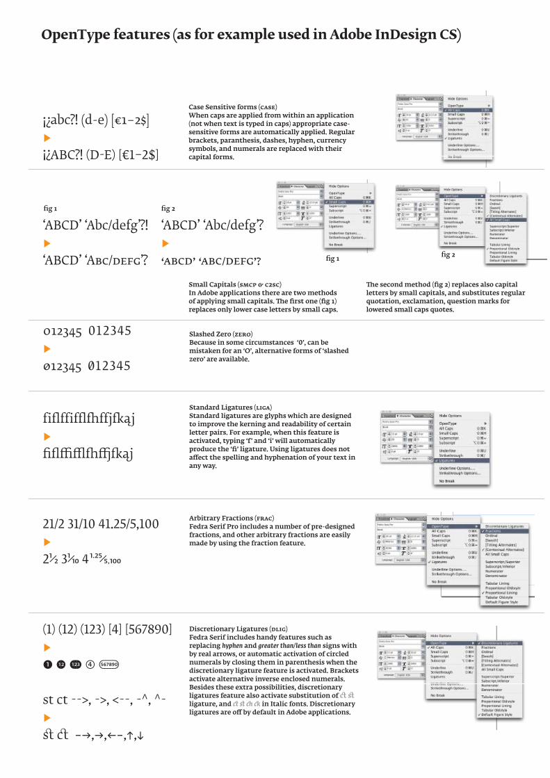
Case Sensitive forms (case)When caps are applied from within an application (not when text is typed in caps) appropriate case-sensitive forms are automatically applied. Regular brackets, paranthesis, dashes, hyphen, currency symbols, and numerals are replaced with their capital forms.
Small Capitals (smcp & c2sc)In Adobe applications there are two methods of applying small capitals. The first one (fig 1) replaces only lower case letters by small caps.
The second method (fig 2) replaces also capital letters by small capitals, and substitutes regular quotation, exclamation, question marks for lowered small caps quotes.
Slashed Zero (zero)Because in some circumstances ‘0’, can be mistaken for an ‘O’, alternative forms of ‘slashed zero’ are available.
Standard Ligatures (liga)Standard ligatures are glyphs which are designed to improve the kerning and readability of certain letter pairs. For example, when this feature is activated, typing ‘f’ and ‘i’ will automatically produce the ‘fi’ ligature. Using ligatures does not affect the spelling and hyphenation of your text in any way.
Arbitrary Fractions (frac)Fedra Serif Pro includes a number of pre-designed fractions, and other arbitrary fractions are easily made by using the fraction feature.
Discretionary Ligatures (dlig)Fedra Serif includes handy features such as replacing hyphen and greater than/less than signs with by real arrows, or automatic activation of circled numerals by closing them in parenthesis when the discretionary ligature feature is activated. Brackets activate alternative inverse enclosed numerals. Besides these extra possibilities, discretionary ligatures feature also activate substitution of ct st ligature, and � st � � in Italic fonts. Discretionary ligatures are off by default in Adobe applications.
fig 1 fig 2
fig 1 fig 2
OpenType features (as for example used in Adobe InDesign CS)
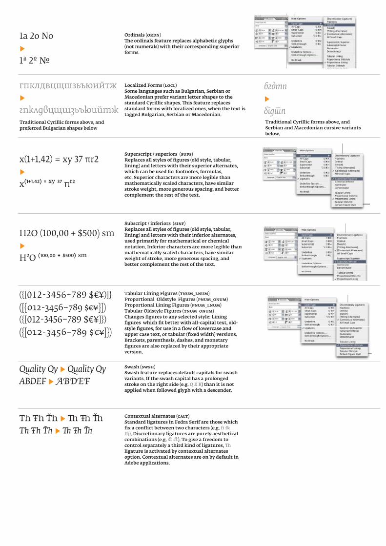
1a 2o No▶1a 2o №
гпклдвцщшзьъюийтж▶гпклдвцщшзьъюийтж
x(1+1.42) = xy 37 πr2▶x(1+1.42) = xy 37 πr2
H2O (100,00 + $500) sm▶H2O (100,00 + $500) sm
({[012-3456–789 $€¥)]}([{012-3456–789 $€¥}])({[012-3456–789 $€¥]})({[012-3456–789 $€¥]})
Quality Qy ▶ Quality QyABDEF ▶ ABDEF
Th Ŧh Ťh ▶ Th Ŧh Ťh Th Ŧh Ťh ▶ Th Ŧh Ťh
Ordinals (ordn)The ordinals feature replaces alphabetic glyphs (not numerals) with their corresponding superior forms.
Localized Forms (locl)Some languages such as Bulgarian, Serbian or Macedonian prefer variant letter shapes to the standard Cyrillic shapes. This feature replaces standard forms with localized ones, when the text is tagged Bulgarian, Serbian or Macedonian.
Traditional Cyrillic forms above, and preferred Bulgarian shapes below
Traditional Cyrillic forms above, and Serbian and Macedonian cursive variants below.
Superscript / superiors (sups)Replaces all styles of figures (old style, tabular, lining) and letters with their superior alternates, which can be used for footnotes, formulas, etc. Superior characters are more legible than mathematically scaled characters, have similar stroke weight, more generous spacing, and better complement the rest of the text.
Subscript / inferiors (sinf)Replaces all styles of figures (old style, tabular, lining) and letters with their inferior alternates, used primarily for mathematical or chemical notation. Inferior characters are more legible than mathematically scaled characters, have similar weight of stroke, more generous spacing, and better complement the rest of the text.
Tabular Lining Figures (tnum_lnum)Proportional Oldstyle Figures (pnum_onum)Proportional Lining Figures (pnum_lnum)Tabular Oldstyle Figures (tnum_onum)Changes figures to any selected style: Lining figures which fit better with all-capital text, old-style figures, for use in a flow of lowercase and upper case text, or tabular (fixed width) versions. Brackets, parenthesis, dashes, and monetary figures are also replaced by their appropriate version.
бгдтn▶бгдтn
Swash (swsh)Swash feature replaces default capitals for swash variants. If the swash capital has a prolonged stroke on the right side (e.g. Q K R) than it is not applied when followed glyph with a descender.
Contextual alternates (calt)Standard ligatures in Fedra Serif are those which fix a conflict between two characters (e.g. fi fk ffj). Discretionary ligatures are purely aesthetical combinations (e.g. st ct). To give a freedom to control separately a third kind of ligatures, Th ligature is activated by contextual alternates option. Contextual alternates are on by default in Adobe applications.
Qq ▶ Qq• ▶ •
Qq ▶ Qq• ▶ •
Qq ▶ Qq
Qq ▶ Qq
βθφ ▶ ϐθφ
гбдпт ▶ гбдпт
вгджзийклптцшщъью ▶ вгджзийклптцшщъью
[[(())]] ▶ 〚(())〛
αάζ ▶ αάζ
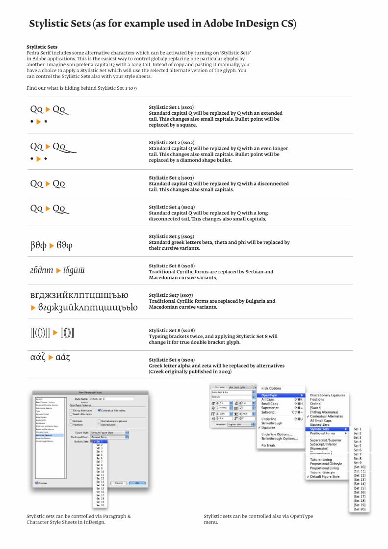
Stylistic Set 1 (ss01)Standard capital Q will be replaced by Q with an extended tail. This changes also small capitals. Bullet point will be replaced by a square.
Stylistic Set 2 (ss02)Standard capital Q will be replaced by Q with an even longer tail. This changes also small capitals. Bullet point will be replaced by a diamond shape bullet.
Stylistic Set 3 (ss03)Standard capital Q will be replaced by Q with a disconnected tail. This changes also small capitals.
Stylistic Set 4 (ss04)Standard capital Q will be replaced by Q with a long disconnected tail. This changes also small capitals.
Stylistic Set 5 (ss05)Standard greek letters beta, theta and phi will be replaced by their cursive variants.
Stylistic Set 6 (ss06)Traditional Cyrillic forms are replaced by Serbian and Macedonian cursive variants.
Stylistic Set7 (ss07)Traditional Cyrillic forms are replaced by Bulgaria and Macedonian cursive variants.
Stylistic Set 8 (ss08)Typeing brackets twice, and applying Stylistic Set 8 will change it for true double bracket glyph.
Stylistic Set 9 (ss09)Greek letter alpha and zeta will be replaced by alternatives (Greek originally published in 2003)
Stylistic SetsFedra Serif includes some alternative characters which can be activated by turning on ‘Stylistic Sets’ in Adobe applications. This is the easiest way to control globaly replacing one particular glyphs by another. Imagine you prefer a capital Q with a long tail. Intead of copy and pasting it manually, you have a choice to apply a Stylistic Set which will use the selected alternate version of the glyph. You can control the Stylistic Sets also with your style sheets.
Find our what is hiding behind Stylistic Set 1 to 9
Stylistic Sets (as for example used in Adobe InDesign CS)
Stylistic sets can be controlled via Paragraph & Character Style Sheets in InDesign.
Stylistic sets can be controlled also via OpenType menu.
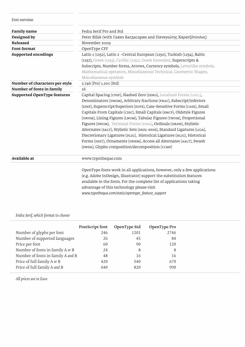
Font overview
Family name Fedra Serif Pro and StdDesigned by Peter Biľak (with Гаянэ Багдасарян and Παναγιώτης Χαρατζόπουλος)Released November 2009Font format OpenType CFFSupported encodings Latin 1 (1252), Latin 2 –Central European (1250), Turkish (1254), Baltic
(1257), Greek (1253), Cyrillic (1251), Greek Extended, Superscripts & Subscripts, Number forms, Arrows, Currency symbols, Letterlike symbols, Mathematical operators, Miscellaneous Technical, Geometric Shapes, Miscellaneous symbols
Number of characters per style 2.746 (Pro) 1.201 (Std)Number of fonts in family 16Supported OpenType features Capital Spacing (CPSP), Slashed Zero (ZERO), Localized Forms (locl),
Denominators (DNOM), Arbitrary fractions (FRAC), Subscript/inferiors (SINF), Superscript/Superiors (SUPS), Case-Sensitive Forms (CASE), Small Capitals From Capitals (C2SC), Small Capitals (SMCP), Oldstyle Figures (ONUM), Lining Figures (LNUM), Tabular Figures (TNUM), Proportional Figures (PNUM), Terminal Forms (FINA), Ordinals (ORDN), Stylistic Alternates (SALT), Stylistic Sets (ss01-ss06), Standard Ligatures (LIGA), Discretionary Ligatures (DLIG), Historical Ligatures (hlig), Historical Forms (hist), Ornaments (ORNM), Access all Alternates (aalt), Swash (swsh), Glyphs composition/decomposition (ccmp)
Available at www.typotheque.com
OpenType fonts work in all applications, however, only a few applications (e.g. Adobe InDesign, Illustrator) support the substitution features available in the fonts. For the complete list of applications taking advantage of this technology please visit www.typotheque.com/static/opentype_feature_support
Fedra Serif, which format to choose
PostScript font OpenType Std OpenType ProNumber of glyphs per font 246 1201 2746 Number of supported languages 26 45 84Price per font 60 90 120Number of fonts in family A or B 24 8 8Number of fonts in family A and B 48 16 16Price of full family A or B 420 540 670Price of full family A and B 640 820 990
All prices are in Euro