existing examples of 3 magazines - rule of thirds
TRANSCRIPT

RESEARCH EXISTING EXAMPLESResearching and analysing 3 different magazines related to music, applying the rule of thirds, likes and dislikes about each advert.

MAGAZINE COVERFOO FIGHTERS
In this magazine about Foo Fighters, the main centre of attraction is the main artist himself, but the main centre of attraction in the middle is his mouth wide open, almost looking like he is screaming. In his mouth we see the full band with some cool effects to make them stand out.
Its very clear who the artist is, shown at the bottom along with a subtitle that will hopefully grab the attention of a viewer ‘this will kill me’. I like the colour scheme a lot as Foo Fighters tend to use the colour red a lot. That and the colour scheme also matches the colour of the magazine producer shown on the left. I am quite sceptical however about how the main image overlaps to logo at the top left so that you can only see two thirds of the logo.
They have used all the space available to them though on the magazine so I don’t fully disagree about the main artist overlapping the logo. If the magazine company is well known, then there is no problem as people will spot the logo straight away. In the top right, it is advertising that if you purchase the magazine, you will get extras which no one else has heard before, relating to the artist.
Around the left and right edges of the magazine, are different topics which are discussed within the magazine which might grab peoples attention. However, I do not like how the barcode is also at the front of the magazine. Also, there are some fonts which are very small and cannot be read on the right on side of the magazine.

MAGAZINE ADVERTWRETCH 32
In this release for Wretch 32’s new album, WRETCHROSPECTIVE, down between the 2 vertical lines is the artist looking off into the distance. The title of the album is located between the 2 horizontal lines, applying the rule of thirds to their advert to make a great aesthetic design. What I like about the artist is that he has been edited to match the colour scheme, such as his hands and arms. The spray paint used on the artist matches their genre rap along with urban city behind him in the background and baggy clothing.
Most of the corners of the advert are used effectively. The right corner shows the name of the artist, using a respectable sized font and a theme matching spray paint font, along with the colour to match with the genre and the theme of the magazine advert.
The left corner of the magazine is used to advertise what their album will look like in store. I feel this is a great idea to have on the front of the magazine to show the viewers what their album will look like when it is out in store. He also has copyright below the album and a link to one of his social medias (MySpace).
And finally, the bottom right corner shows music companies and brands which will be releasing the album, including HMV and iTunes, showing their noticeable logos so that the viewer of the magazine knows where to purchase the album digitally.
They have used all of the space available but I feel that they could use slightly more space such as ratings. I feel that this is a great advert and tells both what the genre and the target audience is straight away (16-28 male).
MAGAZINE ADVERTSTEREOPHONICS
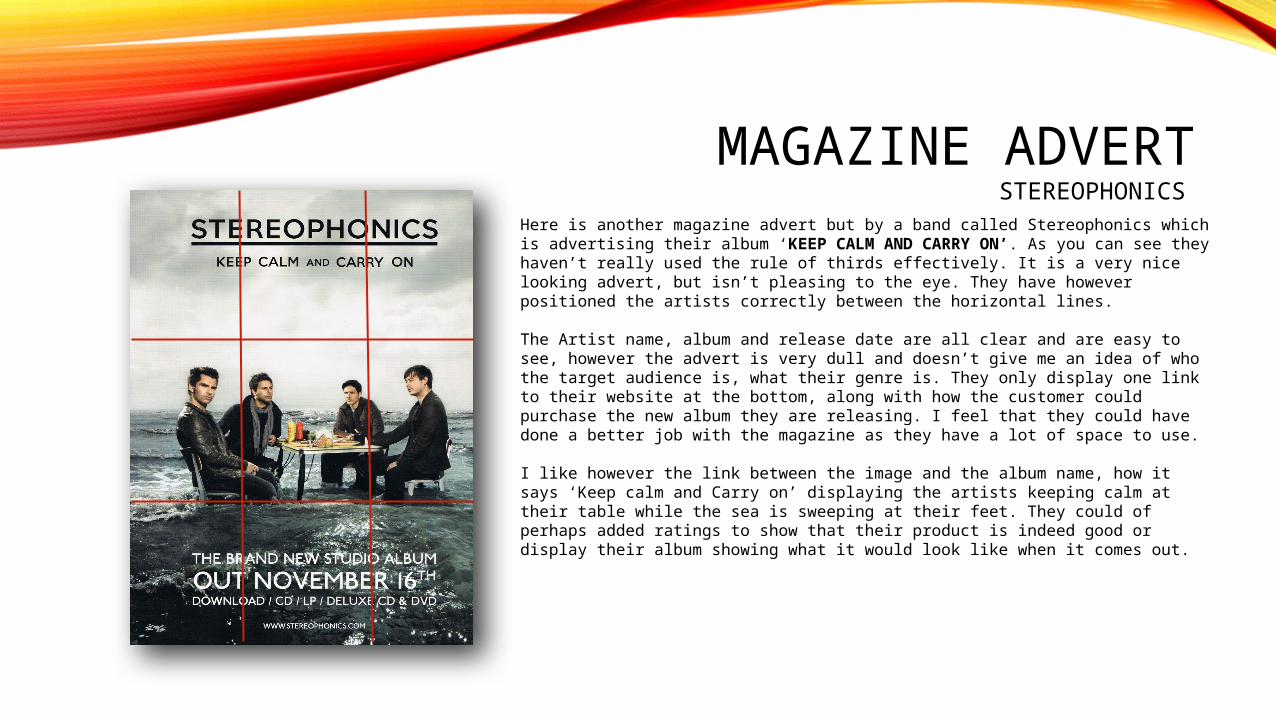
Here is another magazine advert but by a band called Stereophonics which is advertising their album ‘KEEP CALM AND CARRY ON’. As you can see they haven’t really used the rule of thirds effectively. It is a very nice looking advert, but isn’t pleasing to the eye. They have however positioned the artists correctly between the horizontal lines.
The Artist name, album and release date are all clear and are easy to see, however the advert is very dull and doesn’t give me an idea of who the target audience is, what their genre is. They only display one link to their website at the bottom, along with how the customer could purchase the new album they are releasing. I feel that they could have done a better job with the magazine as they have a lot of space to use.
I like however the link between the image and the album name, how it says ‘Keep calm and Carry on’ displaying the artists keeping calm at their table while the sea is sweeping at their feet. They could of perhaps added ratings to show that their product is indeed good or display their album showing what it would look like when it comes out.