divvy (sean reynolds & dan nguyen, slalom)
TRANSCRIPT

Chicago Tableau User GroupDan Nguyen & Sean ReynoldsInformation Management & Analytics, Slalom

Divvy Data Challenge!Dan Nguyen & Sean ReynoldsInformation Management & Analytics, Slalom
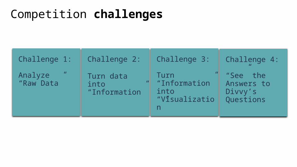
Challenge 1:
Analyze “Raw Data”
Challenge 2:
Turn data into “Information”
Challenge 3:
Turn “Information” into “Visualization”
Challenge 4:
“See” the Answers to Divvy’s Questions
Competition challenges

4
Where are riders going?
When are they going there?
How far do they ride?
What are the top stations?
What interesting usage patterns emerge?
What can the data reveal about how Chicago gets around on Divvy?
What we wanted to see

5
Some background…
Redeye inspired the newspaper header
We chose tabs over story board
~40 hours of work
Aggregated data for Tableau public
Same data as last year’s challenge
We submitted an entry last year but...
Then we saw the light and switched to Tableau!

Viz # 1 – Calendar Heat map

7
The Viz
Calendar heat maps comparing Subscribers vs Customers
Alternative way of showing time series data
Weekend and holiday events are more obvious
Interactive enhanced with weather data

8
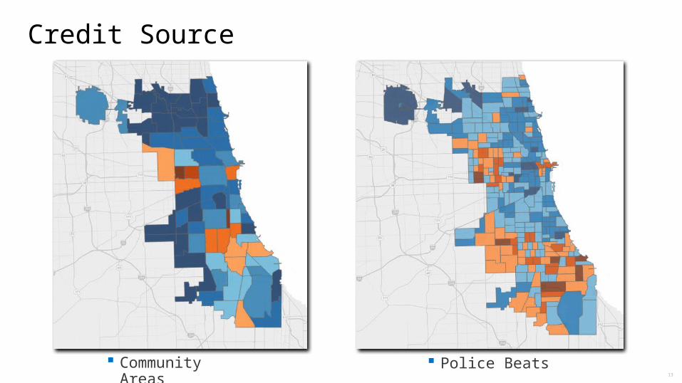
Credit Source

9
How we built it
Columns: Weekday
Rows: Month (calculated), Week (hidden)
Color: Number of Trips

10
How we built it
+ =
the (not really) secret sauce

Viz # 2 – Chicago Neighborhood Map

12
The Viz
Geo-political heat map showing most popular origin stations
Neighborhoods correspond to Chicago’s 77 designated community areas
13
Credit Source
Community Areas Police Beats

14
Credit Source

15
How we built it
Step 1 - Download and install 3rd party software tools (tabgeohack & GDAL)
Step 2 - Download spatial files
Step 3 - Coding fun!

16
How we built it
Step 4 - Import Custom Geocoding
Step 5 - Prep Data
Step 6 - Assign Geographic Role

Viz # 3 – Divvy Station Sankey Diagram

18
The Viz
Sankey Diagram showing flow of trips from origin to destination neighborhoods
Size of flow is proportional to quantity of trips
Fun way to visualize the trip data

19
Credit Source
http://www.dataplusscience.com/SankeyinTableau82.html

20
How we built it
Data Prep
Create calculated fields

21
How we built it

Viz # 4 – Bike Pattern Analysis

23
The Viz
Map trellis shows different biking pattern trends based on time of day and user type
Easy comparative analysis
Trip paths for a single day
Interactive with heat map calendar

24
Credit Inspiration
Bay Area Bike Share Data Challenge:http://www.bayareabikeshare.com/assets/pdf/Bjorn.pdf

25
How we built it
Transform data to build in paths
Maps with pattern analysis
Trellis layout
Filters on User Type & Hour

Other Vizzes

27
The Viz
Compares trip distance vs duration for different demographics
Credit Inspiration: KK

28
The Viz
Identify areas for Divvy to expand their infrastructure
Profiles stations into customer vs subscriber stations

29
“Every time I see an adult on a bicycle, I
no longer despair for the future of the
human race.”H.G. Wells
“Bicycling is a big part of the future. It
has to be. There’s something wrong
with a society that drives a car to work
out in a gym.”Bill Nye

Conclusion: Divvy Everywhere
Even here!

31
Sean ReynoldsInformation Management & Analytics, Consultant
Contact us
Dan NguyenInformation Management & Analytics, Consultant
c 630-234-4232
e [email protected] 630-660-7118
c XXX-XXX-XXX
t XXX-XXX-XXX
f XXX-XXX-XXX

© 2015 Slalom, LLC. All rights reserved. The information herein is for informational purposes only and represents the current view of Slalom, LLC. as of the date of this presentation.SLALOM MAKES NO WARRANTIES, EXPRESS, IMPLIED, OR STATUTORY, AS TO THE INFORMATION IN THIS PRESENTATION.
slalom.com
32