data visualization for development
TRANSCRIPT
Data Visualisation for Beginners
Sara-Jayne Terp 2nd October 2014


Not Talking About
• Algorithm details
• Machine learning
• Big data techniques
• Koalas
Cogs image from Worradmu on freedigitalphotos.net; Koala from koalastothemax.com
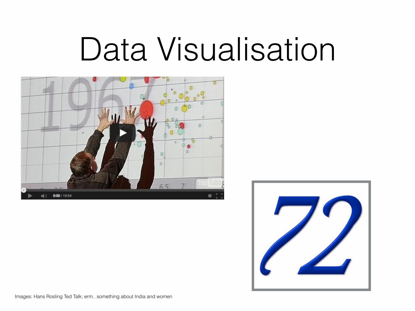
Data Visualisation
Images: Hans Rosling Ted Talk; erm.. something about India and women

Data Science

The Process

Storytelling
Ask Good Questions“Data science is all about asking questions. You
engage in it whenever you interactively and iteratively search for deep, hidden patterns.” –
James Kobielus
• Do people have more phones than toilets?
• How is Ebola spreading?
• Is using wood fires sustainable here?
• Can we feed 9 billion people?
(Simple, Actionable,Incremental)

Get the data

An Aside: Big Data

Volume
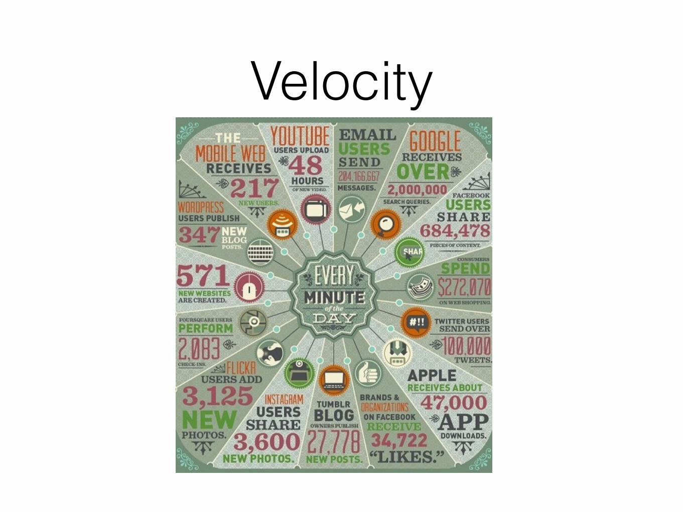
Velocity

VarietyCSV, json, xml, excel, pdf, text, webpages, rss, scanned pages, images, videos, audiofiles, maps, proprietary formats etc.

Veracity
The “3 other Vs” are Viability, Validation, Verification. !Validation, checking that inputs are real, is a big deal for development data.

Getting more data

Explore your Data• Spend time with your dataset:
• Understand where it came from - can you live with the assumptions the data collectors made?
• Look at it
• Plot it
• Where are there holes? Inconsistencies? Anomalies?
• Clean your data, find better datasets, get more data

Data is Often Inconvenient
(plus often sitting on someone’s laptop)

Data is (almost) Always DirtyDR Congo in data.UN.org: “Congo, Democratic Republic of the”, “Congo Democratic”, “Democratic Republic of the Congo”, “Congo (Democratic Republic of the)”, “Congo, Dem. Rep.”, “Congo Dem. Rep.”, “Congo, Democratic Republic of”, “Dem. Rep. of Congo”, “Dem. Rep. of the Congo” !
DR Congo in common standards: “Democratic Republic of the Congo” (UN Stats), “Congo, The Democratic Republic of the” (ISO3166), “Congo, Democratic Republic of the” (FIPS10, Stanag), “180” (UN Stats), “COD” (ISO3166, Stanag), “CG” (FIPS10)

Use multiple datasets
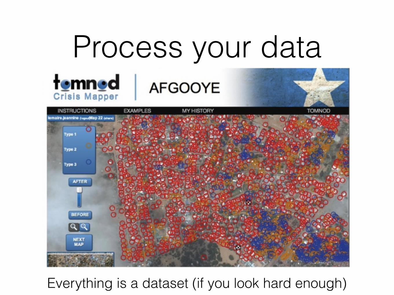
Process your data
Everything is a dataset (if you look hard enough)

Process your data
(The relationships between things are interesting - these are my Facebook ‘friends’, on Gephi)

Process your data
(machine learning can be useful too, e.g. if you’re working in a language with no stopword lists)

Model your data
• You’re persuading people with ‘truths’: do your best to make sure they’re truthful
• Always cross-check
• Statistics is your friend

Explain your results• You’re trying to persuade people to change:
• Their opinions
• Their actions
• Visuals are (often) more persuasive:
• ”I already knew that increased incarceration didn’t lower crime, but I wasn’t sure of the statistics. To see it on the graphs is really eye opening.” *
*: Pandey et al, The Persuasive Power of Data Visualisation


Tools: Excel
http://peltiertech.com/clustered-stacked-column-bar-charts/

Tools: QGIS
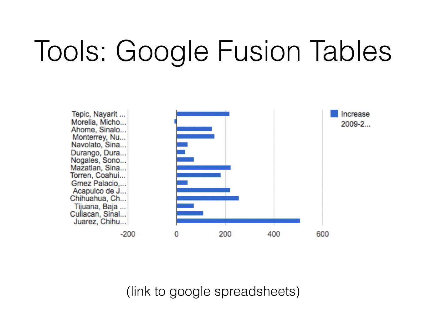
Tools: Google Fusion Tables
(link to google spreadsheets)
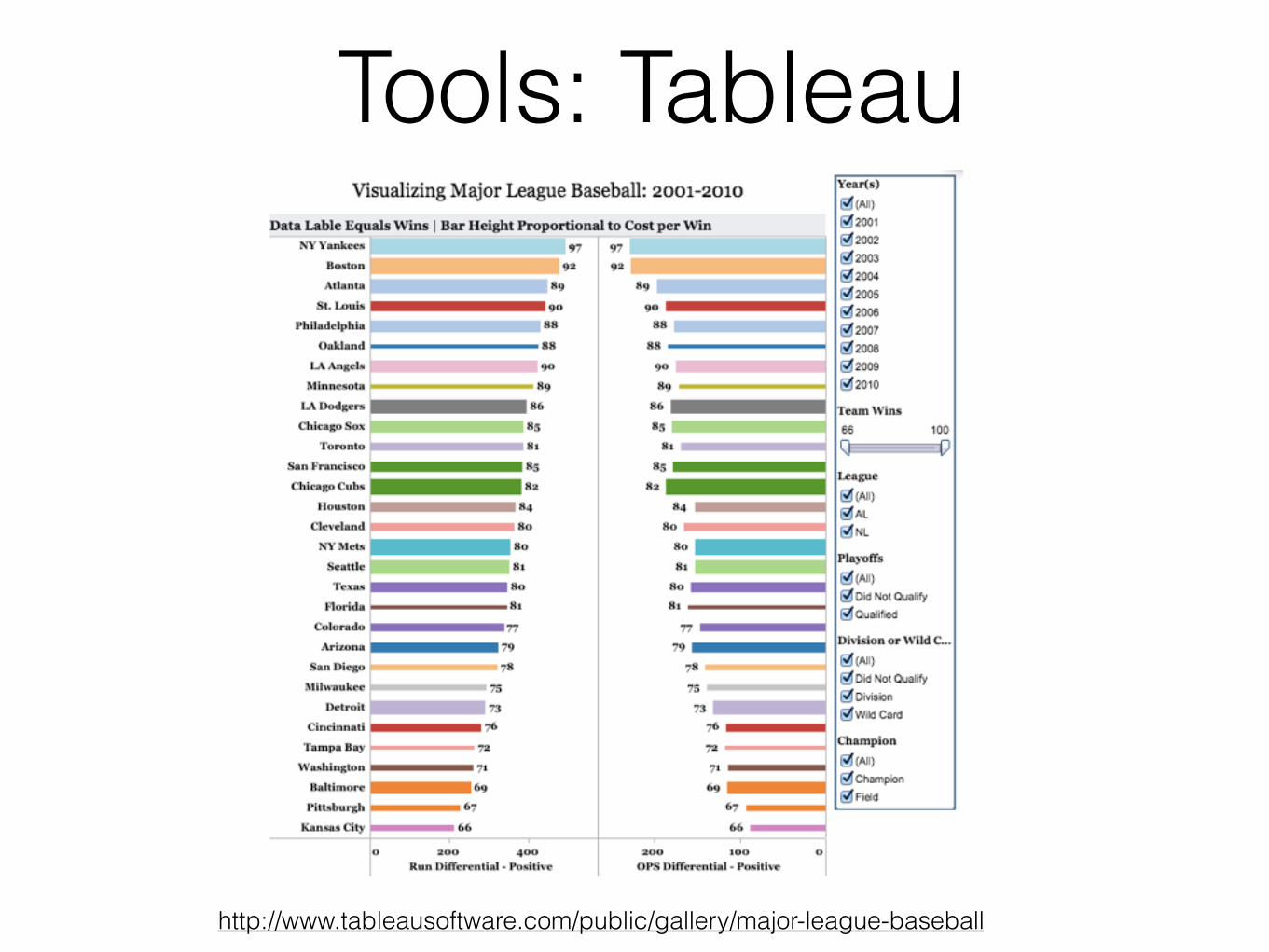
Tools: Tableau
http://www.tableausoftware.com/public/gallery/major-league-baseball

Tools: Tableau
(this is a choropleth)

Tools: Python, R
(AFINN sentiment analysis: sometimes you have to code)
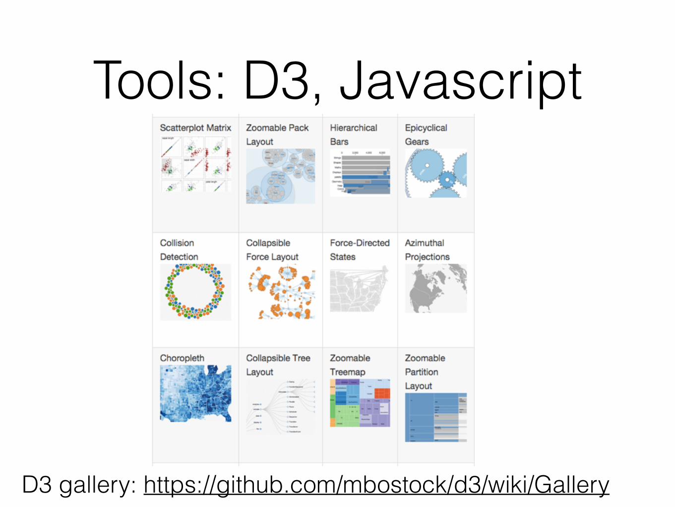
Tools: D3, Javascript
D3 gallery: https://github.com/mbostock/d3/wiki/Gallery

D3: Interactive Play
auremoser.github.io/VitalSigns-water

What's that visualisation?
http://www.visual-literacy.org/periodic_table/periodic_table.html
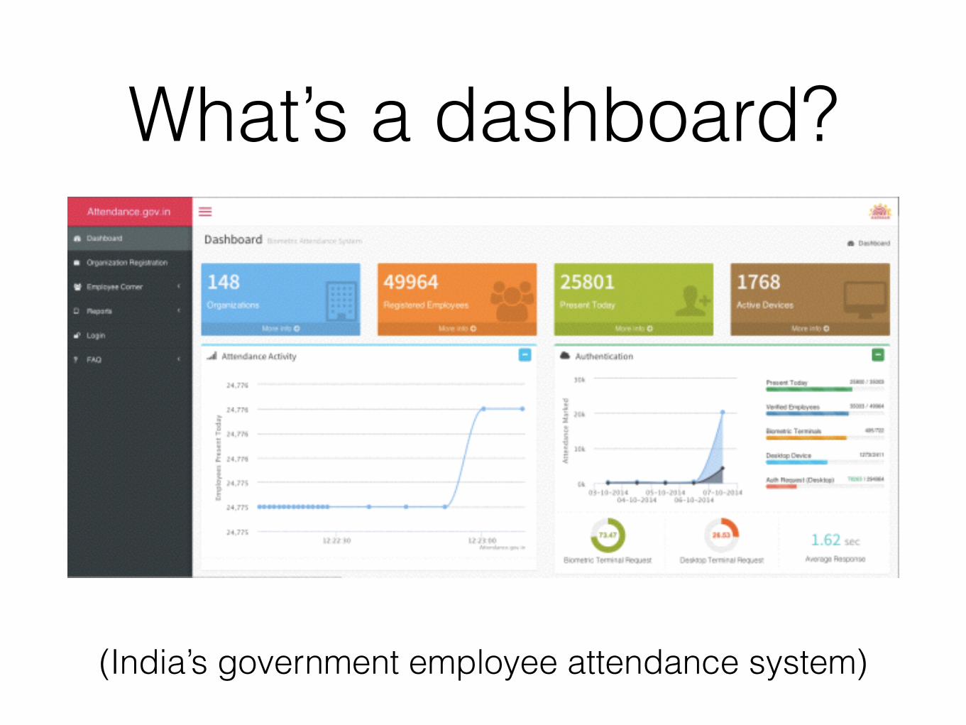
What’s a dashboard?
(India’s government employee attendance system)

Psychology checklist• What’s your important message (and what are you trying to
hide?)
• Medium matters (laptop, phone, sms?)
• Colours matter
• As do angles and relative lengths.
• And think about your audience, e.g. what local effects do you need to be aware of, how do you compensate for colorblindness etc etc.
• New visualization type? Check the Gestalt principleshttp://www.creativebloq.com/how-design-better-data-visualisations-8134175.

Please don’t do this…

Tools checklist• Who’s your audience?
• What’s the medium: paper, static webpage, tablet, phone?
• Which languages do you need to display?
• And are they right-to-left?
• Is this a one-off visualisation or will you need to update it as new data comes in?
• Are your audience viewing this online or offline?
• What resources do you have for updating the visualisation?

Where to go from here• Websites, e.g. Information is Beautiful, DataScience
Central, flowing data, ILoveCharts, Chart Porn, junk charts, visual.ly blog, fivethirtyeight.com
• Meetups and events, e.g. DataKind, NYC Data Skeptics
• Books e.g. Nathan Yao “Visualise this!”, anything by Tufte
• Spring course on data science

Ask good questions; Tell good stories