data visualization data visualization. business analytics (ba) overview
TRANSCRIPT
Data VisualizationData Visualization
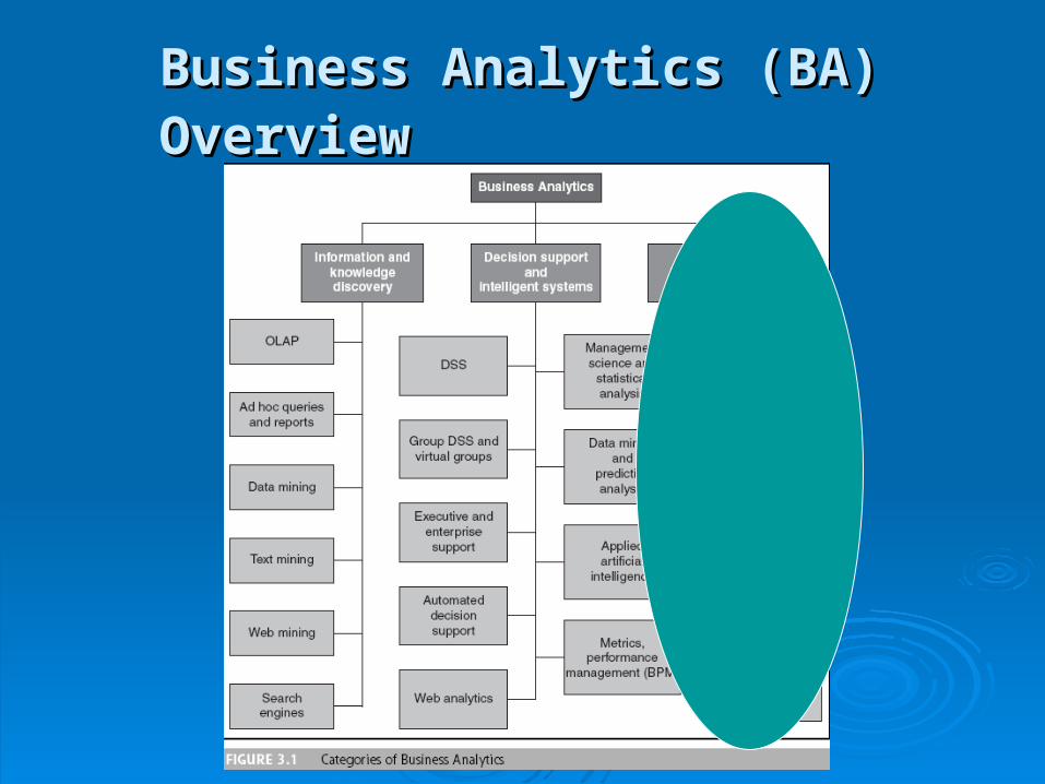
Business Analytics (BA) OverviewBusiness Analytics (BA) Overview
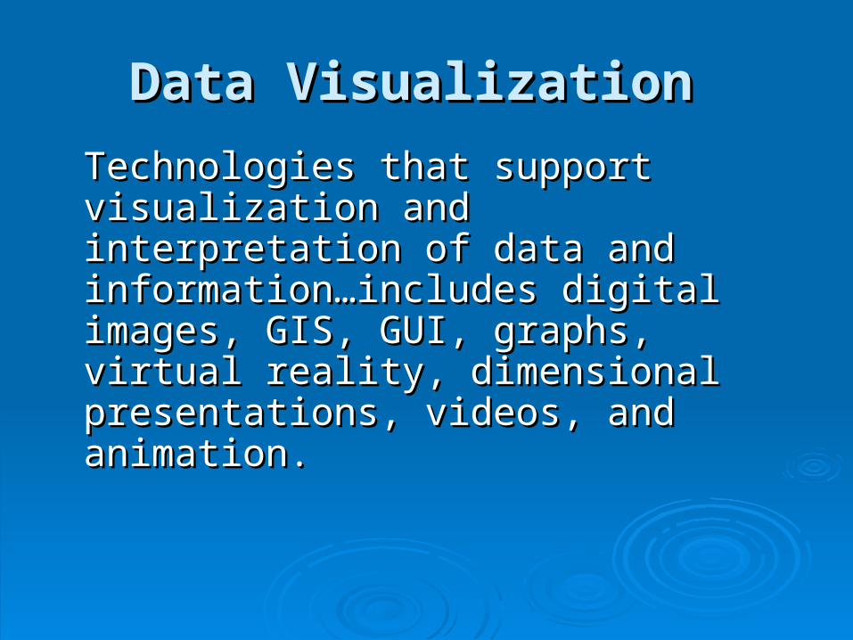
Data VisualizationData Visualization
Technologies that support visualization Technologies that support visualization and interpretation of data and and interpretation of data and information…includes digital images, GIS, information…includes digital images, GIS, GUI, graphs, virtual reality, dimensional GUI, graphs, virtual reality, dimensional presentations, videos, and animation.presentations, videos, and animation.
Basic Statistical Charts/GraphsBasic Statistical Charts/Graphs Bar chartsBar charts
To display changes over time, comparisons, To display changes over time, comparisons, deviations, parts of the whole, rankings, time deviations, parts of the whole, rankings, time series.series.
Line GraphsLine Graphs To display changes over time, comparisons, To display changes over time, comparisons,
deviations, parts of the whole, rankings, time deviations, parts of the whole, rankings, time series.series.
Pie ChartsPie Charts To display part of the whole or proportions.To display part of the whole or proportions.
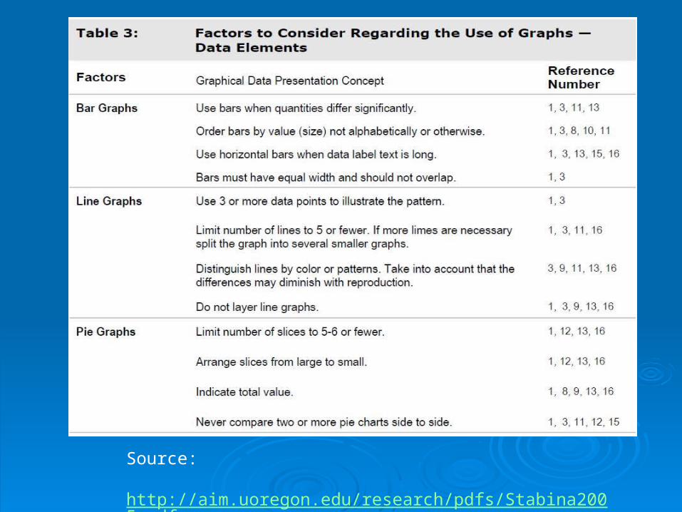
Source: http://aim.uoregon.edu/research/pdfs/Stabina2005.pdf
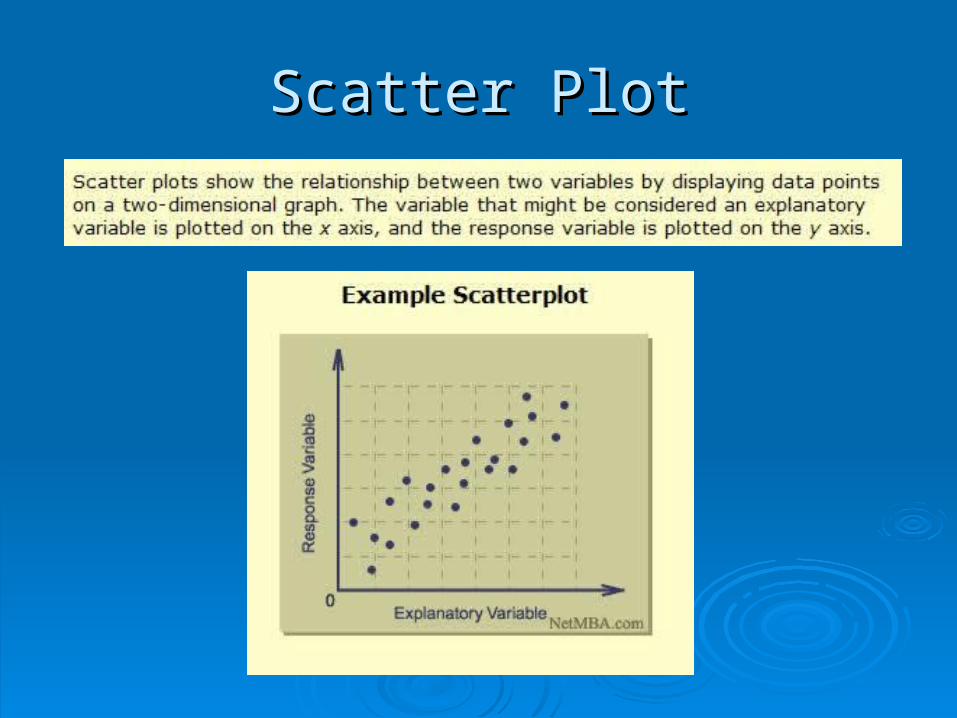
Scatter PlotScatter Plot
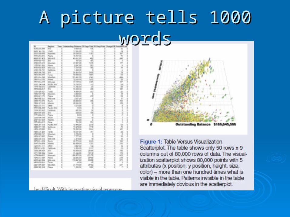
A picture tells 1000 wordsA picture tells 1000 words
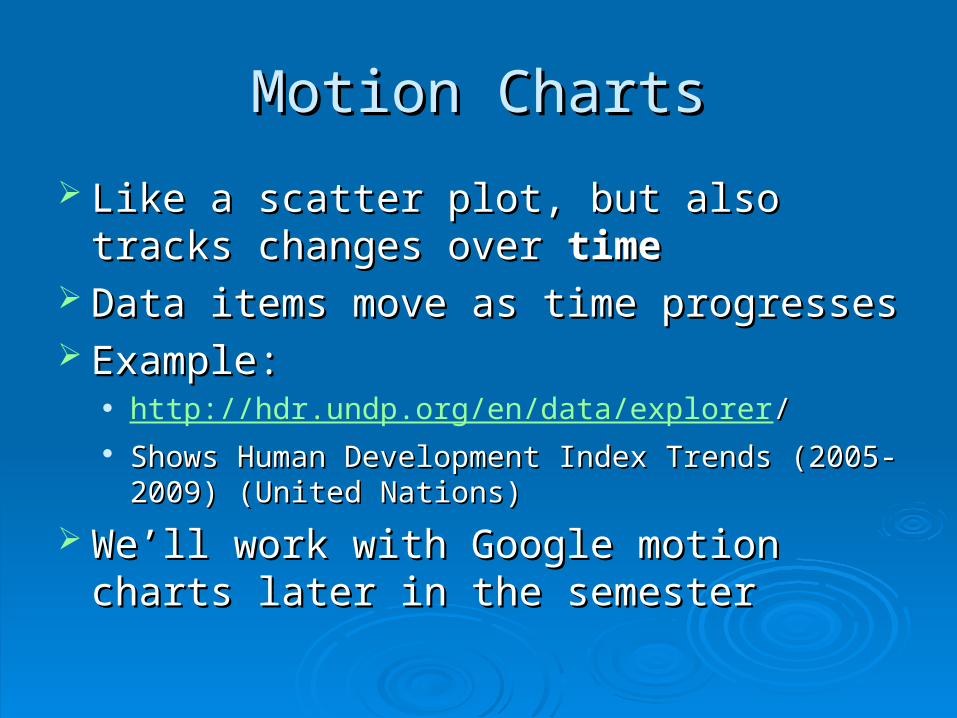
Motion ChartsMotion Charts
Like a scatter plot, but also tracks changes Like a scatter plot, but also tracks changes over over timetime
Data items move as time progressesData items move as time progresses Example:Example:
http://hdr.undp.org/en/data/explorer// Shows Human Development Index Trends (2005-Shows Human Development Index Trends (2005-
2009) (United Nations)2009) (United Nations)
We’ll work with Google motion charts later We’ll work with Google motion charts later in the semesterin the semester
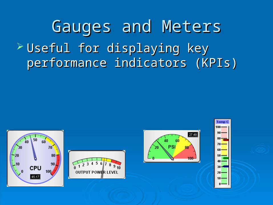
Gauges and MetersGauges and Meters Useful for displaying key performance Useful for displaying key performance
indicators (KPIs)indicators (KPIs)
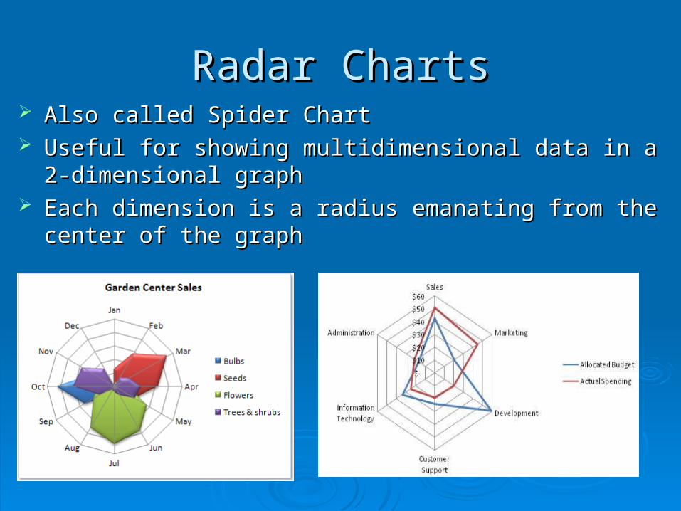
Radar ChartsRadar Charts Also called Spider ChartAlso called Spider Chart Useful for showing multidimensional data in a 2-dimensional Useful for showing multidimensional data in a 2-dimensional
graphgraph Each dimension is a radius emanating from the center of the Each dimension is a radius emanating from the center of the
graphgraph
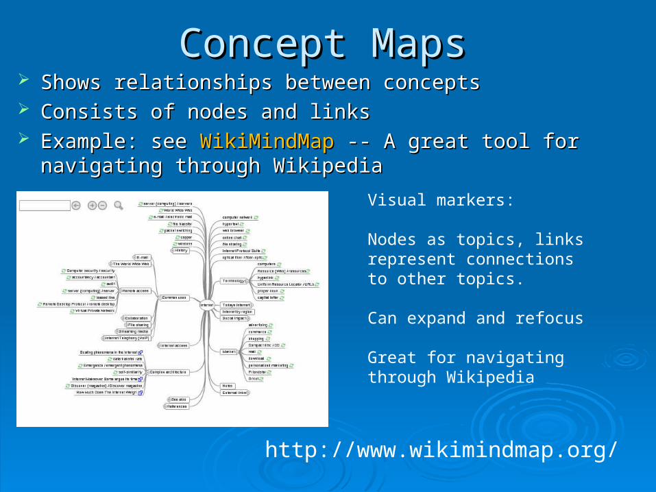
Concept MapsConcept Maps Shows relationships between conceptsShows relationships between concepts Consists of nodes and linksConsists of nodes and links Example: see Example: see WikiMindMapWikiMindMap -- A great tool for navigating -- A great tool for navigating
through Wikipediathrough WikipediaVisual markers:
Nodes as topics, links represent connections to other topics.
Can expand and refocus
Great for navigating through Wikipedia
http://www.wikimindmap.org/
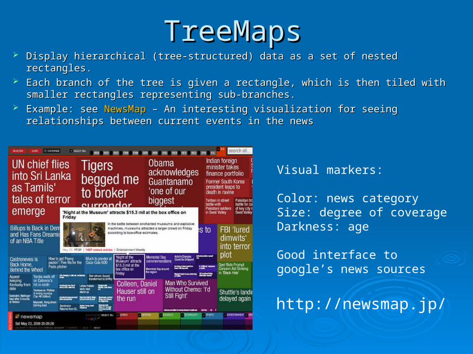
TreeMapsTreeMaps Display hierarchical (tree-structured) data as a set of nested rectangles. Display hierarchical (tree-structured) data as a set of nested rectangles. Each branch of the tree is given a rectangle, which is then tiled with smaller Each branch of the tree is given a rectangle, which is then tiled with smaller
rectangles representing sub-branches. rectangles representing sub-branches. Example: see Example: see NewsMapNewsMap – An interesting visualization for seeing relationships – An interesting visualization for seeing relationships
between current events in the newsbetween current events in the news
Visual markers:
Color: news categorySize: degree of coverageDarkness: age
Good interface to google’s news sources
http://newsmap.jp/
Working with Google Image Working with Google Image
ChartsCharts
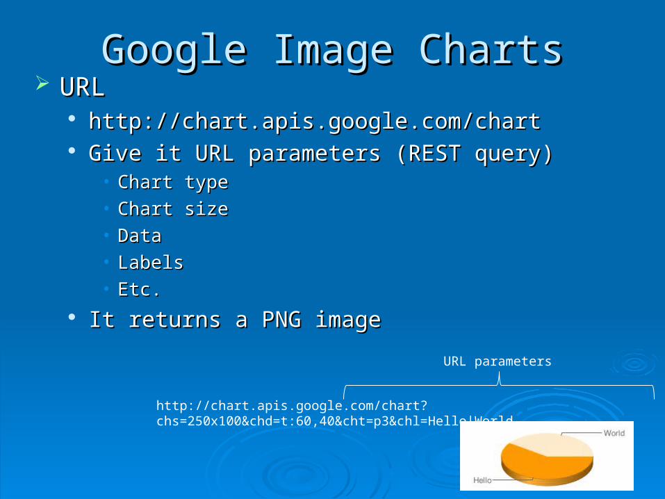
Google Image ChartsGoogle Image Charts URLURL
http://chart.apis.google.com/charthttp://chart.apis.google.com/chart Give it URL parameters (REST query)Give it URL parameters (REST query)
• Chart typeChart type• Chart sizeChart size• DataData• LabelsLabels• Etc.Etc.
It returns a PNG imageIt returns a PNG image
http://chart.apis.google.com/chart?chs=250x100&chd=t:60,40&cht=p3&chl=Hello|World
URL parameters
Types of Google Image ChartsTypes of Google Image Charts
BarBar Horizontal/verticalHorizontal/vertical Stacked/groupedStacked/grouped
LineLine Regular, sparkline, Regular, sparkline,
PiePie 2D, 3D, concentric2D, 3D, concentric
ScatterScatter
RadarRadar May or may not have May or may not have
filled areasfilled areas
Venn diagramVenn diagram MapMap
Various geographical Various geographical areasareas
Colors specify valuesColors specify values
Meter/GaugeMeter/Gauge ““Google-o-meter”Google-o-meter”
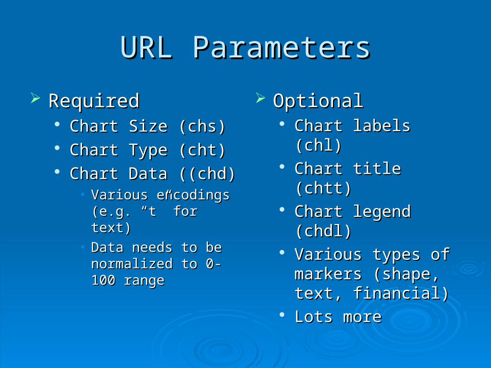
URL ParametersURL Parameters
RequiredRequired Chart Size (chs)Chart Size (chs) Chart Type (cht)Chart Type (cht) Chart Data ((chd)Chart Data ((chd)
• Various encodings (e.g. Various encodings (e.g. “t” for text)“t” for text)
• Data needs to be Data needs to be normalized to 0-100 normalized to 0-100 rangerange
OptionalOptional Chart labels (chl)Chart labels (chl) Chart title (chtt)Chart title (chtt) Chart legend (chdl)Chart legend (chdl) Various types of Various types of
markers (shape, text, markers (shape, text, financial)financial)
Lots moreLots more
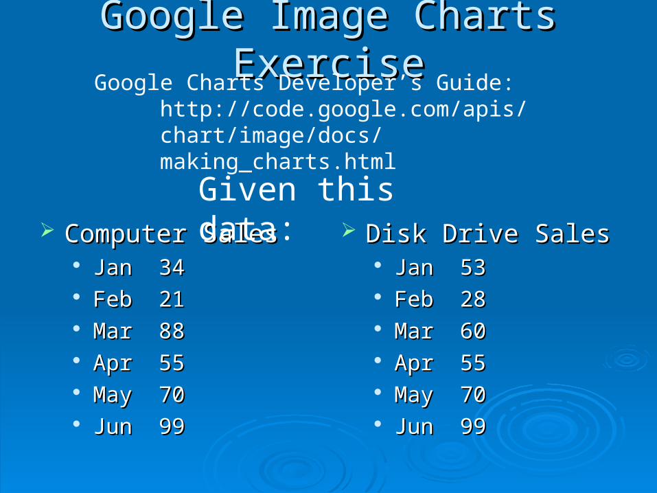
Google Image Charts ExerciseGoogle Image Charts Exercise
Computer SalesComputer Sales JanJan 3434 FebFeb 2121 MarMar 8888 AprApr 5555 MayMay 7070 JunJun 9999
Disk Drive SalesDisk Drive Sales JanJan 5353 FebFeb 2828 MarMar 6060 AprApr 5555 MayMay 7070 JunJun 9999
Given this data:
Google Charts Developer’s Guide:http://code.google.com/apis/chart/image/docs/making_charts.html
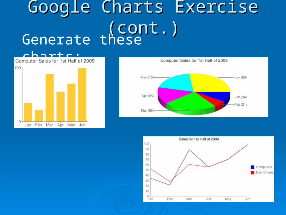
Google Charts Exercise (cont.)Google Charts Exercise (cont.)Generate these charts: