alaysis of albums
TRANSCRIPT

Album Analysis

Basic band logo in a bold and clear font type, it is also in black to coordinate with the album cover theme. It gives the album a simple theme and makes the center focus on the images
The three images are in coordination one is facing left center right. This
shows a clear indication of the
band and their personalities. The images have no
colour and it makes all the band as one
rather than one standing out from
the rest. They also conform to their
stereotype of ‘indie’ (Tessa Perkins) as
you can see the costumes which are
shirts and leather jackets.
The album name looks hand written, this may be in reference to the album and how the songs themselves are all written by the band. It is in black to keep in with the theme of the album. Overall it is a simple but affective album.

Using dafont.com I have found a font which is similar to the HAIM basic logo, within this website there is many other font types. I need to consider the type of font I use and whether or not size wise you can read it if it is in a smaller font size.
I have looked at fonts and using similar contrast to HAIM album, I have used the word ‘falling’ (my song choice) as a basic guide for fonts. These are the two that stood out, they are simple and easy to read for the audience.
The script font gives a unique and simple feel to the album itself, I like the look of the font and they are a range of hand scripted font.

Same as the front of the album, the list of songs are also in the similar font as the band name and continuity is transferred across
The barcode is in the top right hand side of the
album which is unusual as it tends to be in the bottom
right hand corner.
SpineSpine
It again has a simple theme and is only white and black, I like this concept as it makes the album simple to read
Name of the music
production/ management
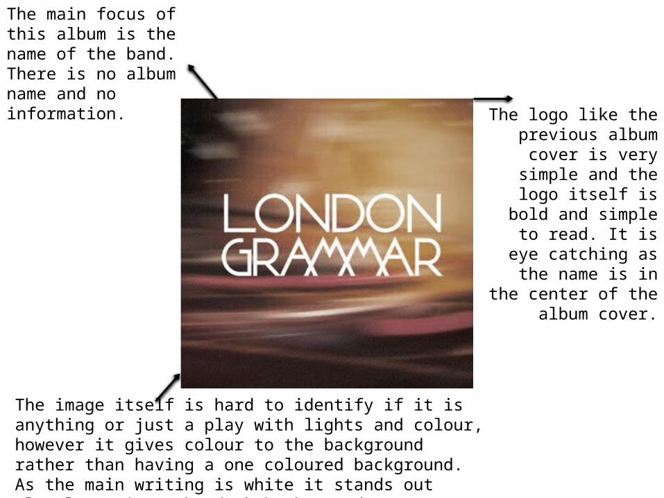
The main focus of this album is the name of the band. There is no album name and no information.
The logo like the previous album
cover is very simple and the logo itself is
bold and simple to read. It is eye
catching as the name is in the center
of the album cover.
The image itself is hard to identify if it is anything or just a play with lights and colour, however it gives colour to the background rather than having a one coloured background. As the main writing is white it stands out clearly against the dark background

The listing of the album songs are centered and white like the writing on the front which corresponds with the theme, it is also in the same font as the band name but not in bold.
The barcode in the right hand corner
Name of the music
production/ management
The image is similar as the front cover but is different in terms of colour as it is much darker colouring
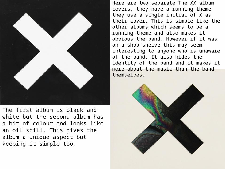
Here are two separate The XX album covers, they have a running theme they use a single initial of X as their cover. This is simple like the other albums which seems to be a running theme and also makes it obvious the band. However if it was on a shop shelve this may seem interesting to anyone who is unaware of the band. It also hides the identity of the band and it makes it more about the music than the band themselves.
The first album is black and white but the second album has a bit of colour and looks like an oil spill. This gives the album a unique aspect but keeping it simple too.

Like the front both of the album backs are plain and simple, the listing of the songs are too the left and more into the corner rather than the middle. Simply the colours are correlated to the front of the album.
The barcode is in the left hand corner of the bottom and has the record label next to it. The back has a lot of empty space.

Conclusion: Overall it seems albums of the indie genre are plain and simple, they get the message and concept across without extensive information or images. I like the concept of a plain album as it makes buying an album more about the music rather than how the band members look like.

Analysis of Advertisements

Forms of media text
website
Release dateSongs within the album
Name of the album
Production company
Artists name
Artist is center frame and at eye levelImage corresponds
with the album name.

Band name
Album main image , also on the advert
Record label
Album name and the release date
Simple colour scheme of two colours, the advert gets straight to the point. However it may be simple as Arctic Monkeys are well known and therefore don’t need to have their faces on the advert to sell the album

Record label
Band logo
Main image promoting the
album, shows the genre by the
costume i.e. indie genre (Tessa
Perkins) by the use of polo shirts and
tattoos with the long hair.
Date of releaseInformation on what you can get when you buy the album and the songs which or within the album
The colours are dark but on the faces on the band are bright which makes them stand out and also the logo stands out form the background