analysis of albums and album adverts
TRANSCRIPT
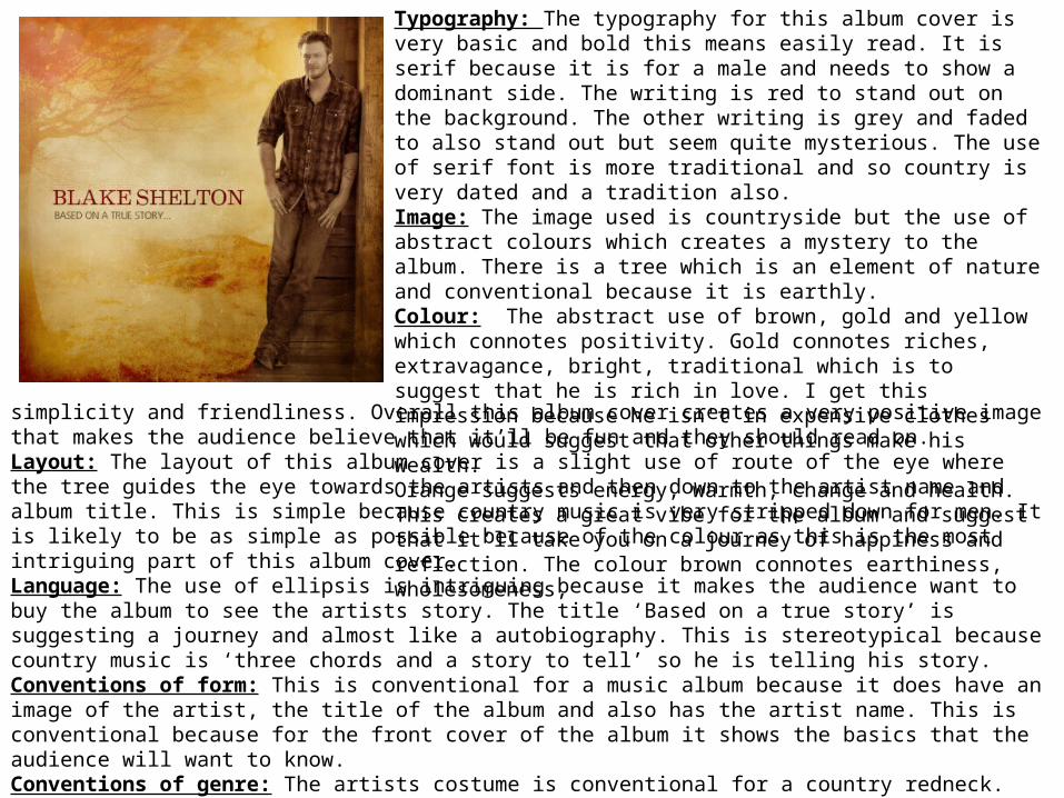
Typography: The typography for this album cover is very basic and bold this means easily read. It is serif because it is for a male and needs to show a dominant side. The writing is red to stand out on the background. The other writing is grey and faded to also stand out but seem quite mysterious. The use of serif font is more traditional and so country is very dated and a tradition also. Image: The image used is countryside but the use of abstract colours which creates a mystery to the album. There is a tree which is an element of nature and conventional because it is earthly. Colour: The abstract use of brown, gold and yellow which connotes positivity. Gold connotes riches, extravagance, bright, traditional which is to suggest that he is rich in love. I get this impression because he isn't in expensive clothes which would suggest that other things make his wealth. Orange suggests energy, warmth, change and health. This creates a great vibe for the album and suggest that it’ll take you on a journey of happiness and reflection. The colour brown connotes earthiness, wholesomeness,
simplicity and friendliness. Overall this album cover creates a very positive image that makes the audience believe that it’ll be fun and they should read on. Layout: The layout of this album cover is a slight use of route of the eye where the tree guides the eye towards the artists and then down to the artist name and album title. This is simple because country music is very stripped down for men. It is likely to be as simple as possible because of the colour as this is the most intriguing part of this album cover. Language: The use of ellipsis is intriguing because it makes the audience want to buy the album to see the artists story. The title ‘Based on a true story’ is suggesting a journey and almost like a autobiography. This is stereotypical because country music is ‘three chords and a story to tell’ so he is telling his story.Conventions of form: This is conventional for a music album because it does have an image of the artist, the title of the album and also has the artist name. This is conventional because for the front cover of the album it shows the basics that the audience will want to know. Conventions of genre: The artists costume is conventional for a country redneck. The cowboy boots for one are very stereotypical for a country man, along with the denim and shirt. The chequered shirt is stereotypical for a cowboy because of the image painted by individuals as to what a stereotypical cowboy is. The setting shows a landscape which is countryside and earthly so will create a country image for the audience. The barn like post that the artist is leaning on is conventional because barnyards are conventional for countryside's.
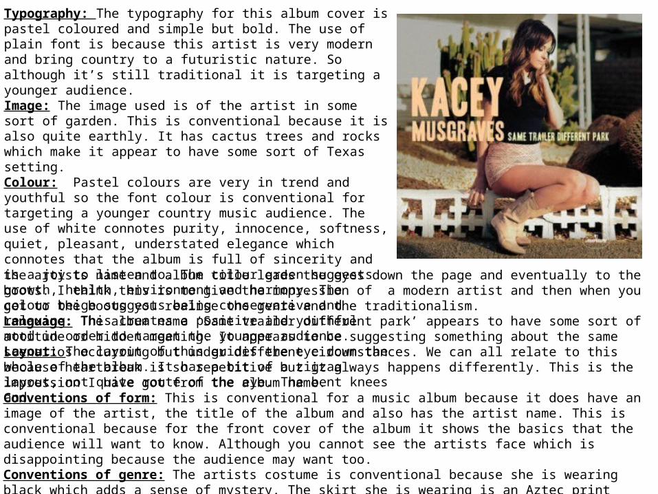
Typography: The typography for this album cover is pastel coloured and simple but bold. The use of plain font is because this artist is very modern and bring country to a futuristic nature. So although it’s still traditional it is targeting a younger audience. Image: The image used is of the artist in some sort of garden. This is conventional because it is also quite earthly. It has cactus trees and rocks which make it appear to have some sort of Texas setting. Colour: Pastel colours are very in trend and youthful so the font colour is conventional for targeting a younger country music audience. The use of white connotes purity, innocence, softness, quiet, pleasant, understated elegance which connotes that the album is full of sincerity and is a joy to listen to. The colour green suggests growth, health, environment and harmony. The colour beige suggests being conservative and relaxing. This creates a positive and youthful mood in order to target the younger audience. Layout: The layout of this guides the eye down the whole of the album. It has a bit of a zigzag layout, not quite route of the eye. The bent knees andthe artists name and album title leads the eyes down the page and eventually to the boots. I think this is to give the impression of a modern artist and then when you get to the boots you realise the genre and the traditionalism.Language: The album name ‘Same trailer different park’ appears to have some sort of attitude or hidden meaning. It appears to be suggesting something about the same scenarios occurring but under different circumstances. We can all relate to this because heartbreak is so repetitive but it always happens differently. This is the impression I have got from the album name.Conventions of form: This is conventional for a music album because it does have an image of the artist, the title of the album and also has the artist name. This is conventional because for the front cover of the album it shows the basics that the audience will want to know. Although you cannot see the artists face which is disappointing because the audience may want too.Conventions of genre: The artists costume is conventional because she is wearing black which adds a sense of mystery. The skirt she is wearing is an Aztec print which is very Texas and it is pale which shows that her personality is quite shy. The cowboy boots are conventional for country music and thy are light ones to show she is different from most commonly brown boots. The artist is new and has a different outlook on country music.
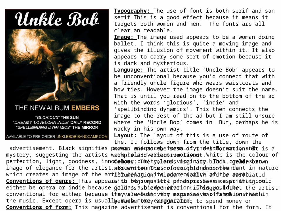
Typography: The use of font is both serif and san serif This is a good effect because it means it targets both women and men. The fonts are all clear an readable.Image: The image used appears to be a woman doing ballet. I think this is quite a moving image and gives the illusion of movement within it. It also appears to carry some sort of emotion because it is dark and mysterious.Language: The artist title ‘Uncle Bob’ appears to be unconventional because you’d connect that with a friendly uncle figure who wears waistcoats and bow ties. However the image doesn’t suit the name. That is until you read on to the bottom of the ad with the words ‘glorious’, ‘indie’ and ‘spellbinding dynamics’. This then connects the image to the rest of the ad but I am still unsure where the ‘Uncle Bob’ comes in. But, perhaps he is wacky in his own way.Layout: The layout of this is a use of route of the. It follows down from the title, down the woman and to the rest of the information. It is a simple and effective layout.Colour: The colours used are black, gold, brown and white. The colour gold connotes is illumination, wisdom, wealth and is associated with high quality products because printing or gold is so expensive. This suggest that the artist is valued and the magazine has faith in them because they are willing to spend money on
advertisement. Black signifies power, elegance, formality, death, evil, and mystery, suggesting the artists work holds various emotions. White is the colour of perfection, light, goodness, innocence, purity, and virginity. This creates an image of elegance for the artist. Brown connotes of earth and is abundant in nature which creates an image of the artist being quite appreciative of the earth. Conventions of genre: This appears to be some sort of expressive music that could either be opera or indie because it has a hidden emotion. This would be conventional for either because they are both very expressive of emotions within the music. Except opera is usually much more exaggerated.Conventions of form: This magazine advertisement is conventional for the form. It has the correct information and an image. Includes the artist information, some quotes from other newspapers, album title and the website to order it from.
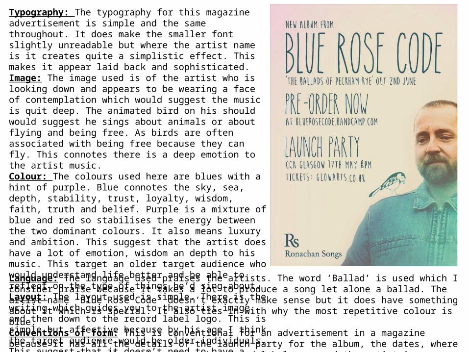
Language: The language used praises the artists. The word ‘Ballad’ is used which I consider praise because it takes a lot to produce a song let alone a ballad. The artist name ‘Blue Rose Code’ doesn’t exactly make sense but it does have something about it which is special. It also ties in with why the most repetitive colour is blue. Conventions of form: This is conventional for an advertisement in a magazine because it has all the details of the launch party for the album, the dates, where to order it from, the artist name, the record label name and the artist image. Conventions of genre: The artists costume is actually conventional for country music because he is wearing denim and this is a stereotype. The bird is also conventional as country music often refers to symbols like birds to give them hope.
Typography: The typography for this magazine advertisement is simple and the same throughout. It does make the smaller font slightly unreadable but where the artist name is it creates quite a simplistic effect. This makes it appear laid back and sophisticated.Image: The image used is of the artist who is looking down and appears to be wearing a face of contemplation which would suggest the music is quit deep. The animated bird on his should would suggest he sings about animals or about flying and being free. As birds are often associated with being free because they can fly. This connotes there is a deep emotion to the artist music. Colour: The colours used here are blues with a hint of purple. Blue connotes the sky, sea, depth, stability, trust, loyalty, wisdom, faith, truth and belief. Purple is a mixture of blue and red so stabilises the energy between the two dominant colours. It also means luxury and ambition. This suggest that the artist does have a lot of emotion, wisdom an depth to his music. This target an older target audience who would understand life better and be able to reflect on the type of things he’d sing about. Layout: The layout used is simple. There is the writing which guides you to the artist image and then down to the record label logo. This is simple but affective because by his age I think the target audience would be older individuals. This suggest that it doesn’t need to have a massive amount of colour in order to draw the target audience attention.