adobe indesign - somersetacademy.enschool.org · adobe indesign is one of several tools available...
TRANSCRIPT

ACADEMIC TECHNOLOGY SUPPORT
Adobe InDesign: Introduction
[email protected] | 439-8611 www.etsu.edu/ats

Table of Contents:
Chapter 1 Introduction ............................................................................................ 2
Chapter 2 Creating New Documents .................................................................... 3
Chapter 3 Exploring the Interface ......................................................................... 8
Chapter 4 Working with Text ............................................................................... 18
Chapter 5 Exercise 1: The Weekly Ampersand Cover ...................................... 20
Chapter 6 Exercise 2: The Weekly Ampersand Page 2 ..................................... 27
Chapter 7 Exercise 3: The Weekly Ampersand Page 3 ..................................... 36
Chapter 8 Exercise 4: Back Cover and Finishing Touches .............................. 38
Chapter 9 Additional Resources ........................................................................... 45

Chapter 1 Introduction Adobe InDesign is one of several tools available within the Adobe Creative Suite of applications. It is one of the most used and recognized tools in the print industry for creating and laying out periodical publications, posters, and a variety of other print media. It also supports exporting to EPUB, SWF, and FOLIO file formats to create digital publications and content suitable for viewing on computers and tablet computer devices.
This guide is meant to provide readers with a brief introduction to using Adobe InDesign, and includes several hands-on exercises as well as links to additional resources should you desire to have a more comprehensive understanding of the application.
Objectives
• Become familiar with the Adobe InDesign interface • Understand the basic principles of creating and working with documents inside Adobe InDesign • Add text to a page and control text flow and appearance • Add images and incorporate them into the design of your document • Create and manipulate custom shapes • Prepare a document for printing
Prerequisites
This guide assumes that you have at least basic knowledge and experience with personal computers and are comfortable working with a computer using the Windows or Mac OS X operating system.
At the time of this document's publication, the latest version of InDesign is CS5.5; this version will be directly referred to in this guide. If you are using an earlier version you can still take advantage of this information, but you may notice slight variants between the screenshots in this document and your version of the application. All features of the application used in this guide should be nearly identical in CS3, CS4, CS5, and CS5.5.
Exercise Files
The end of this guide contains several exercises which will require that you have a set of corresponding files (images, text, examples, etc.). Use the link below to download all of the exercise files.
Exercise Files: http://www.etsu.edu/academicaffairs/elearning/ats/training/library/Adobe/Adobe_InDesign_Guide_Exercise_Files.zip
2

Chapter 2 Creating New Documents Before you can even begin working with InDesign you have to have a document to work with. This section will show you how to create new documents, as well as introduce some terms that may be foreign to users that are new to world of desktop publishing.
Step 1: Open Adobe InDesign
Start > All Programs > Adobe [Your Creative Suite Bundle] > Adobe InDesign [Your InDesign Version
As soon as you open the application, you will be greeted by the Welcome Screen (Figure 2.1). This displays common commands such as Open and create New file, as well as links to Adobe community and learning websites.
Turning Off The Welcome Screen
The Welcome Screen will open every time you start the application. However, some prefer not to see this screen, and turn it off. If you would like to turn off the Welcome Screen, you can simply check the box in the bottom left where it says "Don't show again". If you would like to see it later, you can go to Help > Welcome Screen from the application's menu bar.
Step 2: Create a New Document
Select Document in the "Create New" section of the Welcome Screen. Or choose File > New > Document from the Menu Bar.
Figure 2.1
Support Contact: Daniel Gibson, Technology Development Coordinator ([email protected]; 439-8244) 3

Step 3: Choose your desired settings inside the New Document dialog box
If you are following along with the exercises at the end of this guide, copy your document settings from Figure 2.2 (shown below). Once finished, click OK.
The New Document Dialog Box
From the New Document dialog box you will find several different document property options. You may be able to figure out what many of these options mean, but there are some printing terms that you may not recognize if you are new to desktop publishing. Take a look at the terms and definitions in the table below to find out what some of these things mean.
Printing Terms
Bleed Most printers cannot print information all the way to the edge of a sheet of paper. In order to allow a design to extend all the way to the edge of a page, larger pieces of paper are printed on and then cut down to a final size. In printing terms, bleed refers to elements of the document that extend past the edge of the final printed and trimmed page. Allowing your design to continue into the bleed area ensures that no minor trimming accidents ruin your final design. For most printers a bleed between 1/8 of an inch (0p9) and 1/4 of an inch (1p6) is adequate.
Gutter In printing, a gutter refers to the amount of space between columns. If you set your document to more than one column then InDesign will automatically create column guides with the desired amount of gutter space between them.
Margins The margin area of the document refers to the outer edge of the page. A margin is often declared as a guide for the designer so that they may arrange page elements in a way that creates room for negative space and improves readability and overall appearance.
Points A point is a typographic unit of measure (commonly abbreviated to pt.) which is often used in desktop publishing. A single point is 1/72 of an inch. You have likely seen this unit of measurement elsewhere if you have modified type using a word processing application (e.g. changing text size to 12pt).
Picas A pica (pronounced /ˈpaɪkə/) is another typographic unit of measure that is 1/6 of an inch, and 1/72 of a foot. (A pica is 12 points in length)
51p0 (Units of measure)
By default, InDesign uses points and picas as its primary unit of measure when defining a document's size. The statement 51p0 stands for 51 picas and 0 points. 12 points is equivalent to 1 pica, so you wouldn't see a statement like 50p12, but rather 51p0. Also remember that 1 pica is 1/6 of an inch, so if you divide 51 by 6 then the result would be 8.5 in.
4

Slug The slug area exists outside the bleed area, and is generally used to hold printing information, customized color bar information, or other instructions for the printer. Objects (including text frames) positioned in the slug area are printed but will be removed when the document is trimmed to its final page size.
Planning for the Finished Product
Before you create your document, you will want to know what the dimensions of the end product are going to be. You can make changes to document settings at any time, but changing the dimensions of a document often affects your design and forces you to make adjustments. Save time later by planning ahead and getting it right the first time.
For the purpose of this guide, we are going to be creating a newsletter to be printed and trimmed down from a single sheet of 11"x17" paper. We will intend to fold the paper in half, creating 4 separate pages (the cover, 2 inside pages forming a spread, and a back). To setup the document, observe the settings in the image below and copy them to your own New Document window inside InDesign.
Note: The Bleed and Slug areas are included under "More Options". Click the "More Options" button in the top right underneath the "Save Preset..." button in order to view these options.
Figure 2.2
Support Contact: Daniel Gibson, Technology Development Coordinator ([email protected]; 439-8244) 5

Can I Not Just Use a Template?
After looking around at the File menu you may notice that, unlike some other common desktop applications, Adobe applications do not have pre-built template menus and files to choose from. When you create a new document you have to know in advance what it is you want to create. This may mean that you have to do a little bit of research before getting started on your own with a brand new kind of document. Often, information on common document dimensions can be found through online search engines.
Creative blogs will release the occasional free InDesign file with a tutorial article, but you can also find some templates available, often for purchase, on a variety of websites such as:
http://graphicriver.net/ http://www.stocklayouts.com/ http://inkd.com http://www.designfreebies.org/category/design-templates/indesign-templates/
Note: These websites offer a number of file types in their templates; make sure that the template you want uses an InDesign file (.indd).
Do I Have To Translate Everything to Picas and Points?
Don't like the idea of having to take out a calculator every time you need to determine how something translates to points and picas? Well you don't have to! InDesign is smart enough to make these calculations for you. If you type "8.5 in" (meaning 8.5 inches) into one of the input fields then it will automatically convert that to "51p0". You can also use centimeters (cm), millimeters (mm), pixels (px), ciceros (c), or agates (a).
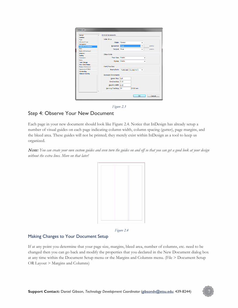
Changing The Default Unit of Measure
You can change the default unit of measure in InDesign by going to Edit > Preferences > Units & Increments. This will open the preferences menu in the Units & Increments category (Figure 2.3). From here, you can change the default unit from picas to your desired unit of measure.
6
Step 4: Observe Your New Document
Each page in your new document should look like Figure 2.4. Notice that InDesign has already setup a number of visual guides on each page indicating column width, column spacing (gutter), page margins, and the bleed area. These guides will not be printed; they merely exist within InDesign as a tool to keep us organized.
Note: You can create your own custom guides and even turn the guides on and off so that you can get a good look at your design without the extra lines. More on that later!
Making Changes to Your Document Setup
If at any point you determine that your page size, margins, bleed area, number of columns, etc. need to be changed then you can go back and modify the properties that you declared in the New Document dialog box at any time within the Document Setup menu or the Margins and Columns menu. (File > Document Setup OR Layout > Margins and Columns)
Figure 2.3
Figure 2.4
Support Contact: Daniel Gibson, Technology Development Coordinator ([email protected]; 439-8244) 7

Chapter 3 Exploring the Interface Now that you've successfully setup a working document, you can begin to work with the application interface.
Becoming comfortable in a new application is often a source of frustration for new users. This is especially true considering that many desktop applications are becoming more and more complex as computing evolves and users are expected to know and do more. This section will break down the major elements of the Adobe InDesign interface in order to help you become familiar with them, as well as teach you to navigate through a document. You are encouraged to experiment with the interface as topics are mentioned, as this section does not present any step-by-step exercises.
Note: If you are using a version of InDesign older than CS5.5, you may notice variants between your screen and the screenshots in this guide. Many of the interface's basic concepts have remained the same over the course of many years. Your interface may look different, but you should be able to follow along as this guide will be covering the major elements that make up the Adobe InDesign interface, and many of these have not changed.
The Basics
In Figure 3.1 (above), the major regions of the InDesign interface are identified and labelled. Various colors have been overlaid on top of each major region in order that you may be able to identify them more clearly. These colors are not present in the actual application.
Figure 3.1
8
Note: If your application window is wide enough then you may see the Application Bar and Menu Bar condensed into a single bar. This is actually helpful because it saves you space. If your window looks like the one above, that's fine too!
Let's explore each of these areas in a little more detail...
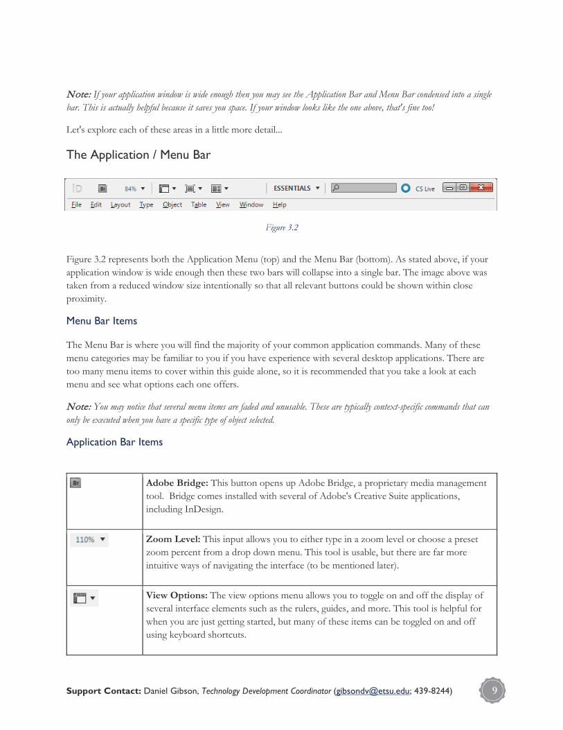
The Application / Menu Bar
Figure 3.2 represents both the Application Menu (top) and the Menu Bar (bottom). As stated above, if your application window is wide enough then these two bars will collapse into a single bar. The image above was taken from a reduced window size intentionally so that all relevant buttons could be shown within close proximity.
Menu Bar Items
The Menu Bar is where you will find the majority of your common application commands. Many of these menu categories may be familiar to you if you have experience with several desktop applications. There are too many menu items to cover within this guide alone, so it is recommended that you take a look at each menu and see what options each one offers.
Note: You may notice that several menu items are faded and unusable. These are typically context-specific commands that can only be executed when you have a specific type of object selected.
Application Bar Items
Adobe Bridge: This button opens up Adobe Bridge, a proprietary media management tool. Bridge comes installed with several of Adobe's Creative Suite applications, including InDesign.
Zoom Level: This input allows you to either type in a zoom level or choose a preset zoom percent from a drop down menu. This tool is usable, but there are far more intuitive ways of navigating the interface (to be mentioned later).
View Options: The view options menu allows you to toggle on and off the display of several interface elements such as the rulers, guides, and more. This tool is helpful for when you are just getting started, but many of these items can be toggled on and off using keyboard shortcuts.
Figure 3.2
Support Contact: Daniel Gibson, Technology Development Coordinator ([email protected]; 439-8244) 9

Screen Mode: There are several different screen modes available when working with your document. These different modes allow you to focus on certain elements of the design, and even enter into a presentation mode should you want to preview your design for someone else from your monitor. Many of these options are mapped to keyboard shortcuts as well.
Arrange Documents: If you have several open documents, you can use the arrange documents drop down menu to display them all simultaneously within your Adobe InDesign application window. Simply choose one of the options from the drop down.
Workspace: There are several different ways to configure the application interface-you can even create custom workspaces-and this drop down menu allows you to switch between the preset workspaces available within InDesign.
CS Live: Adobe CS Live is an online service that allows you to test, collaborate, and share your documents with others. Clicking this button will open up a menu with a variety of options related to these services. You will require an Adobe ID to use this service.
The Document Window
The majority of screen real estate within InDesign is occupied by the document window, which is actually made up of a handful of different elements. This area is where you will work to create your design. Let's break the document window down:
The Title Bar
Figure 3.3 shows the default title bar at the top of the document window (assuming you did not give your document a name in the New Document dialog box or save your document with a name). There are several things worth noting within the title bar:
Asterisk
If there is an asterisk present next to the document title, then unsaved changes have been made to the document.
Document Name
Figure 3.3
10

This is the name that you have assigned to the document either from the New Document dialog box or from the Save As...dialog box.
XX%
This is your current zoom level. This number will fluctuate as you zoom in and out to look at and work with the document.
X (Close Button)
Clicking this button will close out of the document. You will be asked to save your document if there are any unsaved changes.
Navigating and Modifying Tabbed Title Bars
By default, any document you open or create will be added as a tab to the title bar. This allows you to identify and switch between open documents quickly and easily just by clicking on each tab. You can also click and drag a tab do either re-order the documents in the title bar or separate them into their own separate document window.
Note: If you are working with an version of InDesign earlier than CS4 then you will not have tabbed title bars. CS3 and earlier versions operate with each open document in their own separate document window rather than use tabs. The same document information is present, but switching between document windows can be a little more cumbersome.
Rulers
By default, rulers are turned on when you open InDesign. You can toggle the rulers on and off by either using the keyboard shortcut CTRL+R or going to View > Hide/Show Rulers.
The default units for these rulers are picas, but you may prefer using another unit of measure. You can quickly change the units by right-clicking on the ruler and choosing another unit. You can also go to the preferences menu Edit > Preferences > Units & Increment and change it from there.
The Pasteboard
The pasteboard refers to the white area outside the boundaries of your actual document. As you develop your design, you can use this area just as you would the document area, but none of the information in the pasteboard will be included in the final printed page. An idea for using the pasteboard is to keep visual references and re-usable resources in the pasteboard as you develop a design.
The Document Area
This is where you will develop your design, and what will appear in the final output. The boundary for this area may vary depending on whether or not you have included bleed and slug areas in your document setup. Here are the different guides you may encounter inside the document area:
Support Contact: Daniel Gibson, Technology Development Coordinator ([email protected]; 439-8244) 11
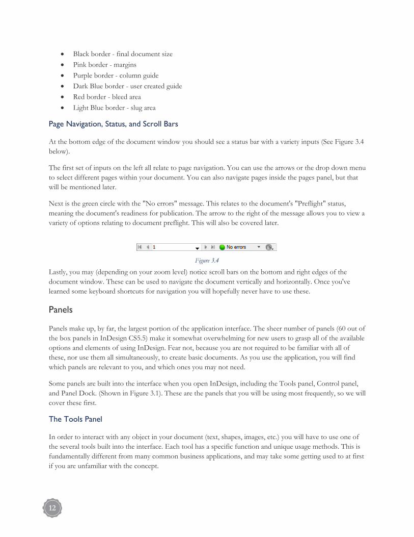
• Black border - final document size • Pink border - margins • Purple border - column guide • Dark Blue border - user created guide • Red border - bleed area • Light Blue border - slug area
Page Navigation, Status, and Scroll Bars
At the bottom edge of the document window you should see a status bar with a variety inputs (See Figure 3.4 below).
The first set of inputs on the left all relate to page navigation. You can use the arrows or the drop down menu to select different pages within your document. You can also navigate pages inside the pages panel, but that will be mentioned later.
Next is the green circle with the "No errors" message. This relates to the document's "Preflight" status, meaning the document's readiness for publication. The arrow to the right of the message allows you to view a variety of options relating to document preflight. This will also be covered later.
Lastly, you may (depending on your zoom level) notice scroll bars on the bottom and right edges of the document window. These can be used to navigate the document vertically and horizontally. Once you've learned some keyboard shortcuts for navigation you will hopefully never have to use these.
Panels
Panels make up, by far, the largest portion of the application interface. The sheer number of panels (60 out of the box panels in InDesign CS5.5) make it somewhat overwhelming for new users to grasp all of the available options and elements of using InDesign. Fear not, because you are not required to be familiar with all of these, nor use them all simultaneously, to create basic documents. As you use the application, you will find which panels are relevant to you, and which ones you may not need.
Some panels are built into the interface when you open InDesign, including the Tools panel, Control panel, and Panel Dock. (Shown in Figure 3.1). These are the panels that you will be using most frequently, so we will cover these first.
The Tools Panel
In order to interact with any object in your document (text, shapes, images, etc.) you will have to use one of the several tools built into the interface. Each tool has a specific function and unique usage methods. This is fundamentally different from many common business applications, and may take some getting used to at first if you are unfamiliar with the concept.
Figure 3.4
12

The basic tools that you will need to use in this guide are the Selection, Line, Frame, Rectangle, Ellipse, Eye Dropper, Hand, and Zoom tools. The others are helpful, and you should certainly learn them if you want to become proficient with the application, but they will be avoided in this guide for the sake of brevity.
The Control Panel
The control panel is a context-sensitive menu that gives you a variety of tool-specific options to choose from depending on which tool you currently have selected. For example, Figure 3.6 (below) is the control panel as it appears when you have the Type Tool selected. As you can see, there are several different options for modifying type; much more than with your typical word processing application.
Figure 3.5
Figure 3.6
Support Contact: Daniel Gibson, Technology Development Coordinator ([email protected]; 439-8244) 13

The Control Panel, like other panels, can be moved and customized, and in the case of a tool like the Type Tool, it actually offers more options than can fit on the panel. These extra options can be found under the More Options menu. (See Figure 3.7 for a visual of the More Options button).
The Panel Dock
The Panel Dock is a place to organize all of your open panels and save space. Once you begin working with several panels you will quickly notice that no matter how high your monitor's resolution is, you need more space to work with your design. The Panel Dock allows you to put panels into groups, minimize them, and display them similarly to the way that your tools are displayed in the Tools Panel. From the Panel Dock, you can open up individual panels, and then minimize them back to the dock when you are finished.
To add or remove panels to the dock, simply drag them in and out of the dock area.
Panel Customization
The Adobe InDesign interface is incredibly flexible and customizable. Panels can be opened, closed, moved, re-sized, and customized in addition to simply using the commands and options available within any given panel (See Figure 3.7). You can also save your panel configurations as a personal Workspace for everyday use or specific kinds of tasks, as different jobs will require the use of different panels.
Floating Panels
The panel shown in Figure 3.7 is a floating panel, meaning that it can be moved independently of other panels, and even outside of the application window and onto other monitors (if you have that option).
Docking Panels
Figure 3.7
14

You can snap panels into a variety of locations within the application window simply by dragging the panel into that location. If you select a panel by its title tab or the gray bar at the top of the panel and drag it to the edge of the application window, it will snap into place (kind of like a magnet). You can also dock panels into these locations if you drag them all the way to the edge of the application window, or into the panel dock. (See Figures 3.8 and 3.9) When docking, you will notice a blue highlight appear. This indicates that you are about to dock the panel into place. You can just as easily move the panel back out of its docked position, if you wish, by dragging the panel away from the dock area.
Opening Panels
You can open or close any of the 60 panels in InDesign inside the Window menu from the Menu Bar (e.g. Window > Color > Gradient).
Navigation
Being able to navigate through a document is very important for any user. The ability to move through a document fluidly, and in a number of different ways, will make you much more capable and efficient in your use of the application. Thankfully, the options available within InDesign make it very easy to do this.
A few of the menus inside the Application Bar were mentioned earlier, such as the Zoom Level, View Options, and Screen Mode menus. In addition to these, you also have the View menu inside the Menu Bar, the Zoom and Hand tools, and the scroll bars. These are all used to adjust your view of the document and your view of the interface. While accessing these options through menus is certainly helpful, it is not always the fastest way to get around. This is one area where you will most definitely want to use...
Keyboard Shortcuts (!)
Whether or not you have used keyboard shortcuts (hotkeys) in other desktop applications to perform commands, you would absolutely benefit by using them inside of InDesign, and specifically with regard to navigation. Using keyboard shortcuts makes you much faster at using an application because you don't have to manually navigate through multiple menus to find a button to click; you simply perform the desired command by pressing a key (or keys) on the keyboard. A little practice in this area can go a long way.
Figure 3.8
Figure 3.9
Support Contact: Daniel Gibson, Technology Development Coordinator ([email protected]; 439-8244) 15

Most users that have been using InDesign for a long time keep one hand on the mouse and one hand on the keyboard in order to quickly access keyboard
shortcuts while selecting objects with the mouse. Using hotkeys, you can do everything from select a tool from the Tools Panel, zoom in and out, switch views and screen modes, turn view options on and off, perform basic file commands, transform objects, and more. You can even customize existing keyboard shortcuts, or create you own, through the Edit > Keyboard Shortcuts... menu.
The table below provides you with a list of keyboard shortcuts that will help you get around in InDesign. Take a few minutes to try these out. You will find that several of these will become essential in your use of the application.
Navigational Keyboard Shortcuts
Hand Tool SPACEBAR + MOUSE
Zoom Tool Z
Go from page to page SHIFT + PAGE UP / SHIFT + PAGE DOWN
Go from spread to spread ALT + PAGE UP / ALT + PAGE DOWN
Jump to a specific page CTRL + J
Jump to the last page you visited CTRL + PAGE UP / CTRL + PAGE DOWN
Jump to first page HOME
Jump to last page END
Zoom In CTRL +
Zoom Out CTRL -
View entire page CTRL + 0 (Zero)
View entire spread CTRL + ALT + 0 (Zero)
Presentation Mode SHIFT + W
Preview Mode W
Toggle Rulers On and Off CTRL + R
Toggle Guides On and Off CTRL + ;
The Pages Panel
The pages panel has many uses, but one of them can be to simply get you around your document. The panel is already open and available when you open InDesign for the first time. If you closed it or changed your workspace, go to Window > Workspace > Essentials and then Window > Workspace > Reset Essentials. This should put you back where you started.
Figure 2.3.10
16

To view the Pages Panel, click on it from the top of the Panel Dock (See Figure 3.11).
Using the Pages Panel, you can double click on any of the pages in the list to be taken to that page. Note: Remember that we also talked about the page navigation tools at the bottom of the Document Window. Try these out and see if they work well for you. Everyone has their own preferences with regard to getting around. Using keyboard shortcuts in conjunction with tools and the occasional panel and menu drop down, you should start to feel pretty comfortable with getting around. Developing these skills will begin to come naturally the more you work with the application.
Figure 3.11
Support Contact: Daniel Gibson, Technology Development Coordinator ([email protected]; 439-8244) 17

Chapter 4 Working with Text Now that we have our document ready and know a little bit about how to navigate the interface, we will look at adding and modifying text inside our document.
Most publications exist to deliver content, and the majority of that content is communicated through written language. This makes type and typography vitally important to producing documents in InDesign. This has been acknowledged by the developers, as you will find more tools for working with type in InDesign than the vast majority of other desktop applications.
InDesign exists as an application for creating page layouts (as opposed to Photoshop or Illustrator which are primarily concerned with creating and modifying graphic images). When you use text, it will most often be in conjunction with images that serve to reinforce your content or improve the appearance of your layout. Sometimes you may even create documents that are simply text with no images. Regardless of your specific intent, you will need to know how to insert, arrange, scale, and modify type to produce readable content and a pleasant aesthetic.
Typefaces: Use, Distribution, and Procurement
One of the challenges you may begin to face when using type creatively is typeface licensing. Believe it or not, there are individuals that make a living creating the fonts that you use on a daily basis. That statement is not meant to demean those that design type, but to inform those that are otherwise unaware. Most individuals that simply use word processors don't give much thought to the typefaces that they use, but when you desire to create a well-designed publication, you will start looking for type that has character and style to match your intent.
Herein lies the problem: the typeface you use (or want to use) for your design is likely copyrighted and has licensing restrictions. A font that you want to use may require that you purchase the right to use it before you can publish it in your design. Unless you are told otherwise by the font's designer/publisher, you do not have the right to take or distribute fonts; it would be no less unlawful than any other method of copyright infringement.
Luckily, several of the products that you purchase for your computer come packaged with their own font families (a.k.a. typefaces), and these packaged fonts are often intended for your use and distribution. For example, Windows, Mac OS X, Microsoft Office, and, yes, InDesign all come with their own packaged fonts. All of the fonts that come with these applications and operating systems are safe for you to use, but since readers of this guide will have different operating systems and/or applications installed, this guide will be using the default set of fonts that are packaged with InDesign CS3. They are as follows:
• Adobe Caslon • Adobe Garamond • Arno • Bell Gothic • Bickham Script • Birch • Blackoak • Brush Script • Chaparral • Charlemagne • Cooper Black • Eccentric • Garamond Premier Pro • Giddyup
18

• Hobo • Kozuka Gothic • Kozuka Mincho • Letter Gothic • Lithos • Mesquite • Minion • Myriad • Nueva • OCR-A • Orator • Poplar • Prestige Elite • Rosewood • Stencil • Tekton • Trajan
You likely have many more fonts than just those in this list, but these will be considered safe for the purpose of this guide. This will ensure that you have access to these fonts and are able to distribute them should you wish. You can find many, many more fonts online (both for free and for purchase) by simply looking, but here are some sites that may interest you:
http://www.myfonts.com http://www.dafont.com http://www.fontsquirrel.com/ http://www.veer.com/fonts/ http://www.fonts.com/
Note: When you purchase a font, you are almost always buying the right to use and distribute materials that use said font, but be sure to check the license agreement. You ought to especially see what rights you are allowed when downloading "free" fonts.
Can I Share InDesign Files That Use Licensed Fonts?
Fonts are not, by default, embedded in Adobe working files. So you actually can't share fonts just by sharing an InDesign file. Fonts are opened on a file-by-file basis from the fonts folder, which is a part of your computer's operating system files. This means that typefaces that you have installed on your computer may not be installed on another person's computer, and they may not be able to see or use those typefaces. When a user opens an InDesign file that uses a font that the user does not have installed on their computer, a replacement font is used.
There may be times when you need to share design files with a desired font intact; this is possible to a certain degree. Select the font you want to use and then go to Type > Create Outlines. This will convert the type to a group of shapes. You can edit the type as though it were a normal shape at that point, but you cannot edit individual letters using normal type editing methods. By doing this, you will ensure that even someone without that font will be able to view it.
Support Contact: Daniel Gibson, Technology Development Coordinator ([email protected]; 439-8244) 19

Chapter 5 Exercise 1: The Weekly Ampersand Cover Exercise Files: http://www.etsu.edu/academicaffairs/elearning/ats/training/library/Adobe/Adobe_InDesign_Guide_Exercise_Files.zip
Be sure that your document is using the setup options provided in Figure 2.2 of this guide under the "Creating New Documents" section.
With an application like InDesign, the best way to learn is by doing. Through this section you will be guided through the process of creating a fictional, multi-page publication entitled "The Weekly Ampersand". (See Figure 5.1)
One Step at a Time This step-by-step guide will lead you through the process of creating "The Weekly Ampersand" in phases. We will first work with type to insert our content, then we will insert our graphics and images to enhance the content, and finally we will add custom shapes to finalize our design. This is not meant to be an example of how you ought to create your own documents, though it is generally best to first develop your written content as it will determine your layout needs.
Figure 5.1
20

1. Create the Document Title
Go to page 1 of your document and use the type tool to add the text "The Weekly Ampersand". A: First, you will need to have the type tool selected (Keyboard shortcut: T). Click and drag to create a text frame on page one of your document. Once you create your text frame, the text cursor will automatically become active within the frame. Type out the works "The Weekly Ampersand"
The end goal is for this type to look like the type in Figure 5.2. To accomplish this you will have to employ the control panel (Figure 3.1, 3.6) and the color picker from the tools panel (Figure 3.5)
B: Create a line break between the words "Weekly" and "Ampersand", then center align the text from the control panel (the icons for aligning the text will be similar to any other word processing application you've used, so you should recognize them). C: Next we will choose the fonts. There are two different fonts being used in the title. Select the words "The Weekly" and then choose the font "Kozuka Gothic Pr6N" from the control panel. Set the font size to 38pt, and the color to 80% black. Next, select the word "Ampersand" and then choose the font "Kozuka Mincho Pr6N". Set the font size to 50pt, and the color to 95% black. Once you are done with everything in step C, press ESC on your keyboard. This will exit type editing and select the entire text frame. D: Finally, scale and position the text frame on the page. This can be done from the control panel. Set the following values (in order): W: 4.15 in H: 1.8 in X: 2.05 Y: 6.9983
2. Add the Publication Logo
Figure 5.2
Support Contact: Daniel Gibson, Technology Development Coordinator ([email protected]; 439-8244) 21

From the menu bar, select File > Place. Choose the "logo.png" file from the exercise folder. Place and position the image on the page. (See Figure 5.3) A: Go to the menu bar and choose File > Place. Navigate to the exercise files folder and choose the "logo.png" file (if you are viewing by icons, you should see it as a circular icon with a rainbow of colors). Click Open. B: Your cursor will change and expect you to either click somewhere to place the image or draw a frame for it. Just click anywhere in the blank area of the page. C: The size of the image is just what we need it to be, but the position needs to be set. With the image selected, go to the control panel and set the following values: X: 2.9744 in Y: 4.5 in Your document should now look something like Figure 5.3 Note: This logo can actually be created using Adobe InDesign, or other applications like Photoshop or Illustrator. It was saved as an image to make thing a little easier.
3. Add the "Ampersand Parade"
From the menu bar, select File > Place. Choose the "ampersandParade.png" file from the exercise folder. Place and position the image on the page.
A: Go to the menu bar and choose File > Place. Navigate to the exercise files folder and choose the "ampersandParade.png" file. Click Open.
B: Your cursor will change to the place cursor. Click anywhere on the page.
Figure 5.3
22

C: Position the image in the control panel using the following values:
X: 0.4317 in Y: 9.7815 in
Note: The ampersand parade can be created just using the type tool and control panel. It was saved as an image, but you can create something similar on your own just by playing around with different fonts and font syles.
Your document should now look something like Figure 5.4
4. Create the Page Background
Create a rectangle that fills the entire background and apply a white-to-gray radial gradient.
A: Choose the Rectangle Tool (Keyboard Shortcut: M) from the tools panel. Your cursor will change to a cross-hair. Click and drag a rectangle that fills the entire area of the document, including the slug area (it doesn't have to be perfect, we will adjust the settings in the control panel).
B: Set the rectangle to the following size and position:
W: 8.5 in H: 11 in X: -0.125 Y: -0.125
C: Open the swatches panel (Window > Swatches OR Window > Color > Swatches). From the swatches panel, click on the panel options menu and choose "New Gradient Swatch". This will open up the "New Gradient Swatch" dialog box.
Figure 5.4
Support Contact: Daniel Gibson, Technology Development Coordinator ([email protected]; 439-8244) 23

D: Follow each of the following steps to fill out the dialog box:
• Give the swatch the name "PageBG" • Switch the type to "Radial" • You will notice at the bottom of the dialog box that there are two colors along a bar. Click on the
black box. This will open up color options for that portion of the gradient. • Switch the stop color to "CMYK" and set the values to Cyan 0%, Magenta 0%, Yellow 0%, and
Black 15%. • Finally, click on the diamond shape above the gradient bar. This will activate the location text box.
Type "85" into the location text box. • Click OK
E: Your gradient is now saved in the swatches panel. Click on the rectangle you created, and then click on your gradient swatch from the panel. F: Your rectangle is on top of all the other content in the page. We need to move it down. With the rectangle selected, select Object > Arrange > Send to Back (Keyboard Shortcut: CTRL + SHIFT + [ )
Your document should now look similar to Figure 5.5
5. Create the Issue Number Graphic
Juxtapose the letters "No 57" over a circle and choose "Subtract" from the Pathfinder Panel.
A: Choose the ellipse tool (Keyboard Shortcut: L) from the tools panel. Draw an ellipse and use the control panel to set it to a 2 in. diameter (Height and Width):
Figure 5.5
24

B: Set the ellipse to a color of 85% black.
C: Choose the type tool and create type with the letters "57". Set the following type properties:
Font: Baskerville Old Face Style: Regular Color: White Size: 150pt
D: Press ESC on your keyboard to select the entire text frame. From the menu bar, select Type > Create Outlines (Keyboard Shortcut: CTRL + SHIFT + O).
E: Place the text frame over the ellipse and open the pathfinder panel (Window > Object & Layout > Pathfinder). Select both the ellipse and the text frame and click on the "Subtract" icon. This will cut out the type shape from the ellipse (like a die cut).
F: Place the final shape in the top right corner of the document.
Your shape should now look similar to Figure 5.6
6. Create the Horizontal Lines Around the Ampersand Parade
Use the line tool to draw two horizontal lines around the ampersand parade.
A: Choose the line tool (Keyboard Shortcut: \ ) from the tools panel. Click and drag a line above the ampersand parade from the left to the right. Set the color to 40% black.
B: Copy the first line by clicking and dragging with the mouse while holding ALT on your keyboard. This will duplicate the shape.
C: Place the lines above and below the ampersand parade.
Figure 5.6
Support Contact: Daniel Gibson, Technology Development Coordinator ([email protected]; 439-8244) 25

You ampersand parade should now look similar to Figure 5.7
7. Relax
Good job on your first layout!
Figure 5.7
26

Chapter 6 Exercise 2: The Weekly Ampersand Page 2
1. Add the Page 2 Article Text
Use the type tool to create text frames in each of the page columns. Thread the provided article text through each text frame.
A: Navigate to page 2 of the newsletter.
B: Select the type tool (Keyboard Shortcut: T) from the tools panel and click and drag with the mouse to create a type frame that fits (approximately) within the left column guides of the page (See Figure 6.1). Allow this type frame to occupy at least half of the page (vertically).
C: We are going to put the article text in all 3 columns of this page. To do that, we will need 3 different type frames - one for each column. In order to get three different type frames, you could 1) use the type tool to draw two more frames, 2) copy the first type frame and paste it into the document twice and then position each frame with the selection tool, or 3) duplicate the type frame into each column. I personally prefer the third option, as I find it the easiest (with practice) and quickest method. See the note, "Duplicating Objects", below.
Duplicating Objects
Figure 6.1
Support Contact: Daniel Gibson, Technology Development Coordinator ([email protected]; 439-8244) 27

You will often run into situations where duplicating an existing object is easier than attempting to create a new object that has the same properties. Here is an easy way to duplicate objects quickly:
1. Make sure that you are using the selection tool from the tools panel.
2. Select the object that you would like to duplicate
3. Click and drag the selected object with your mouse
4. While dragging the object, hold down ALT on your keyboard
5. Release the object.
If performed correctly, you should now see a duplicate object in your document.
This method works with just about anything inside of InDesign - images, shapes, type, frames, etc.
Pro Tip: If you also hold down SHIFT while duplicating your object, then you will be able to easily position your duplicate object based on your original object's location, allowing you to perfectly align the duplicated object with the original. This is great(!) for quickly aligning multiple objects in your layout.To stop sharing your screen, you can either 1) go back to your meeting window and click ‘Stop Sharing’ from the Share Pod, or 2) you can click on the Adobe Connect icon from your system tray and select ‘Stop Sharing’.
D: Once you have created 3 type frames on page 2 (one in each column) you are ready to put in your article text. Using the selection tool from the tools panel, click on the left-most type frame. You could insert your article text using a number of methods, but since our text has been prepared for us, the easiest way to insert it
28

into our document is to place it. Placing is equivalent to the insert command that you see in several other desktop applications, but we can use place to insert several different types of content.
To place the article text, go to File > Place... from the menu bar. This will open an explorer window (Finder for Mac) with which we will find our text document. Go to your exercise files folder and select HistoryOfTheAmpersand.docx - this is a Microsoft Word 2007 document, but InDesign is able to get the text content from it. After you have selected the document, click Open. You should now see the article text in the left type frame. (See Figure 6.2)
E: Now, we've got our article text, but you may notice a little red icon at the bottom right of the type frame - it looks like a box with a plus inside of it. This means that there is additional text content that was placed into the type frame that is not being shown. InDesign automatically restricted the amount of text shown to the dimensions of our type frame.
We want to display the entire article. To do this, we could just re-size the type frame, making it bigger, and thus allowing more room for the type, but we also want our text to be displayed in three columns. This will improve the document's readability and appearance. To achieve this, we will need to use threading.
Threading simply means to create continuity between multiple type frames - to link them. Since we've already got our other type frames created, this should be easy. Click on the red icon in the first type frame, this will change your cursor to look like a block of text. Next, hover over the second type frame in column two, you should see your cursor change slightly to display a couple of chain links. Click on the second column while your cursor displays these chain links.
Repeat this step to thread (or link) the type frame in the second column to the type frame in the third column.
If you thread all three columns and you are still getting a red icon in the third column, then you will need to increase the size of your type frames to make room for all of the article text. The easiest way to do this is to
Figure 6.2
Support Contact: Daniel Gibson, Technology Development Coordinator ([email protected]; 439-8244) 29

re-size your type frames all at once so that they have the same dimensions. You will have different options for doing this depending on your version of InDesign.
CS4 or newer: Select all three type frames using the selection tool, either by SHIFT-clicking each frame or by dragging a selection box covering each frame. InDesign will now allow you to edit the text frames as one object (since they are threaded). Use the re-size handles to make the frames larger or smaller, adjusting the flow of the text.
CS3 or older: InDesign CS3 would have you adjust each text frame individually, which might result in frames of varying heights, and thus negatively effect our page layout. To edit all the frames simultaneously you will want to first group them together. See the note below on "Grouping Objects."
Grouping Objects
Occasionally you will want to group objects, either to move or edit them simultaneously. To group objects, you first need to select all of the objects that you want to be in the group. Using the selection tool, either use the mouse to click and drag a selection box over all the desired objects, or hold down SHIFT on your keyboard and then click on all of the individual objects you want to be in the group.
Once all of your objects are selected, you can either go to Object > Group from the menu bar or you can use the keyboard shortcut CTRL + G.
Once all of your objects are grouped, you will be able to move and transform them as one object.
Ungrouping
To ungroup a set of objects, select them and then go to Object > Ungroup or use keyboard shortcut CTRL + SHIFT + G.
30

Once finished, your type frames should look similar to those in Figure 6.3 (below)
2. Format the Article Text
Format the type using the options panel and the paragraph panel. A: Once your article text is fully displayed across each column on the page, you may want to change the formatting of the type to improve its readability and appearance. To do this, you will need to use the control panel, but first you will have to select the text you want to edit. You can either use the type tool to select the text inside the text frame, or you can double-click on the text frame with the selection tool. Either of these methods will take you into text editing mode. With you keyboard, hold CTRL + A to select all of the text across the three columns B: Now that you have text selected, you should see several type-related options in the control panel (See
Set the following type options using the control panel (See Figure 6.5 - Relevant options highlighted in red): Font Family: Minion Pro Font Size: 12pt Alignment: Justify with last line aligned left First Line Left Indent: 0.25
Figure 6.3
Figure 6.4
Support Contact: Daniel Gibson, Technology Development Coordinator ([email protected]; 439-8244) 31

Space After Paragraph: 0.0 in Hyphenate: Unchecked
Now for the first paragraph we're going to do something a little different. Deselect all the article text and then select just the first paragraph of the article. Set the first line left indent to 0.0 in and set the drop cap to 3 lines. (See Figure 6.6)
Once you have completed all the text formatting, your article text should look similar to Figure 6.7 (below).
3. Create the Page 2 Article Headline
Use the type tool to create a text frame and then format the font using the control panel.
A: Select the type tool (Keyboard shortcut: T ) from the tools panel and click and drag to create a text frame on page two of your document. Type the words "History of the Ampersand" into the text frame.
Figure 6.5
Figure 6.6
Figure 6.7
32
B: Select the entire text and use the options panel and the color picker to get the type to look like the image in Figure 6.8.
Font Family: Chaparral Pro Font Style: Bold Size: 43pt Color: C:64, M:21, Y:0, K:0 Alignment: Left-aligned, line break after "the"
C: Hit the "Esc" key on your keyboard to escape type editing mode. The type frame will still be selected (you should see a blue line around the object and resize handles). Switch to the selection tool (Keyboard Shortcut: V) and use your mouse to align the type frame to the top left margins of the page. Use the margin guides (pink lines) to help you position the type frame.
D: Select the type tool from the tools panel once more (Keyboard shortcut: T) and create a new type frame to the right of the heading you just created. Once the type frame is created and the type cursor is active, type an ampersand ("&") into the type frame. Select the ampersand and then use the control panel and color picker to set the following values:
Font Family: Chaparral Pro Font Style: Bold Color: C:0, M:0, Y:0, K:90
Changing Type to a Shape
Sometimes you may want to edit type as a shape, especially when you are using type in a decorative fashion. You can do this easily by converting type to outlines. We will do this with the ampersand symbol.
Preserving Document Appearance
Creating type outlines is a method often used when you wish to share your document with collaborators. As mentioned in the "Working with Text" section earlier, not everyone has legal access to every typeface ever created.
E: Hit "Esc" to escape type editing mode. Select Type > Create Outlines from the menu bar.
Support Contact: Daniel Gibson, Technology Development Coordinator ([email protected]; 439-8244) 33

F: Use the resize handles to scale the ampersand shape to be roughly the same height as the combined to lines of the header text (Approx. 1.11in). Position the ampersand shape at the top of the page, roughly in the center of the third column (Figure 6.8)
4. Add the "Ampersand Evolution" Image to Page 2
Place the ampersand_evolution.png image into the page 2 layout.
Now that you have the text content of your article in place, let's add some visual elements.
A: Go to File > Place... and select the ampersand_evolution.png image from your exercise files folder. Click Open.
B: Your cursor should now display a black rectangular object representing the image. Unlike in Exercise 1 (the cover), we are going to draw out our image frame so that it fits in our layout. Click and drag to create a frame that stretches across all three columns and fits within the page margins. (See Figure 6.9). Depending on your version, what happens next will vary.
If you have CS5 or newer, then the image will be sized to fit entirely inside the new frame. If you have CS3 or older then the image will be placed inside the frame, but it won't be sized to fit the frame. If your image needs
Figure 6.8
Figure 6.9
34

to be re-sized to fit the frame, or if you just aren't sure, then click on the Fit Content Proportionally button from the control panel. (See Figure 6.11). This will re-size the image to fit inside the frame you drew, but it will also maintain its original proportions so that it's not distorted.
Figure 6.11
Figure 6.10
Support Contact: Daniel Gibson, Technology Development Coordinator ([email protected]; 439-8244) 35

Chapter 7 Exercise 3: The Weekly Ampersand Page 3
1. On Your Own...
Attempt to replicate the page layout shown in Figure 5.0 (below)
Many of the steps involved in creating page 3 of the newsletter repeat the same processes that we have already covered in this guide. Using Figure 7.1 (below) as a reference, create the layout for page 3 of "The Weekly Ampersand". The next exercise will cover the final steps involved in creating the newsletter.
IMPORTANT:
You will need to place the following files inside of this page:
Article Text: GuideToUsage.docx
Image: CallToAction.jpg
Refer below to the formatting details for the text on page 3.
Article Text (Same as Page 2 of the newsletter)
Font Family: Minion Pro Font Size: 12pt Drop Cap: 3 (first paragraph only) Hyphenation: Unchecked First Line Left Indent: 0.25in
Headline Text
Font Family: Chaparral Pro Font Style: Bold Font Size: 43pt Color: C:46, M:11, Y:93, K:0
36

Figure 7.1
Support Contact: Daniel Gibson, Technology Development Coordinator ([email protected]; 439-8244) 37

Chapter 8 Exercise 4: Back Cover and Finishing Touches
1. Create the Back Cover
Copy and paste the background from the front cover onto page 4 of the document.
A: Copy the rectangle shape with the gradient background from the front cover of the newsletter and paste it onto page 4. Position it to fit perfectly within the bleed area of the document, covering the entire page.
B: Place (File > Place...) the logo_b&w.png image in the center of the page (image found in the exercise files folder). Position the image using Align Panel or Control Panel if necessary.
2. Create the Band of Colors on the Spread
Use the Rectangle and Eyedropper tools to create a band of colors across the top of the spread on pages 2-3.
If you decide that the spread is looking just a tad dull, you can jazz it up with some color borrowed from the logo on the front cover.
A: First, select the eyedropper tool from the tools panel. Go to the first page of the document and click on one of the several colors in the logo. You should now see that your color picker in the tools panel has changed to the color you selected. (See Figure 8.1)
B: Now that you have a color taken from the logo, use the rectangle tool from the tools panel (Keyboard Shortcut: M) to create a rectangle that is approximately 0.24 inches in height and 1.7 inches in width. You can
Figure 8.1
38

use the control panel to set the exact dimensions or just create something by hand that is close. Your new rectangle's fill color should be the same as the color you copied using the eyedropper tool. (See Figure 8.2)
C: Repeat steps A and B above to create several rectangles of many different colors. Once you are done, arrange them across the top of pages 2-3 to create a multicolored "ribbon" that stretches across the spread.
Allow the rectangles to extend into the bleed area so that they go all the way to the edge of the page. (See Figure 8.3)
3. Add the Final Image
Place the ampersand-love.jpg wallpaper image inside of an ellipse frame and add a stroke and drop shadow.
A: Select the Ellipse Frame Tool from the tools panel. Hold SHIFT on your keyboard while drawing out the frame; this will constrain the proportions of the shape to create a perfect circle. Draw a circle that is approximately 5.7 inches in diameter.
B: Position the ellipse frame to occupy the top right area of page 3. Let it extend past the bleed area. It is okay if it covers up some of your article text, as we will fix that later. (See figure 8.4)
C: With the ellipse frame selected, choose File > Place... from the menu bar. Select the ampersand-love.jpg file from the exercise files folder. This will add the ampersand-love.jpg image to the ellipse frame.
D: Switch to the direct selection tool from the tools panel (Keyboard Shortcut: A) and use it to scale down and move the ampersand-love.jpg image within the ellipse frame until it looks similar to Figure 8.4 (Seen below)
Figure 8.2
Figure 8.3
Support Contact: Daniel Gibson, Technology Development Coordinator ([email protected]; 439-8244) 39

The Direct Selection Tool
The direct selection tool allows you to select frame content and object elements, as opposedto the selection tool which selects entire objects
E: Now that you have positioned the image within the frame, you need to apply a text wrap to the ellipse frame in order to get the underlying text to avoid the area occupied by the image.
Switch to the selection tool (Keyboard Shortcut: V) and select the ellipse frame. From the control panel, ALT+CLICK on the Wrap around object shape option in the text wrap section (See Figure 8.5). This will open the text wrap panel.
Figure 8.4
Figure 8.5
40

F: In the text wrap panel, select the same options that you see in Figure 8.6 (below).
The text should now wrap around the ellipse object.
G: With the ellipse frame selected, go to the control panel and add a 7 point thick white stroke. (See Figure 8.7). You will select the color in the lower of the two boxes shown in Figure 8.7. You can then use the width drop down menu to select 7pt.
H: Finally, apply a drop shadow to the ellipse frame. Open the effects panel from either the panel dock or by going to Window > Effects from the menu bar. Make sure that you still have the ellipse frame selected. Click
Figure 8.6
Figure 8.7
Support Contact: Daniel Gibson, Technology Development Coordinator ([email protected]; 439-8244) 41

on the "fx" icon at the bottom of the panel and choose "Drop Shadow..." from the fly-out menu. (See Figure 8.8). This will open up the effects dialogue box.
Set the "Opacity" to 75%, the angle of the shadow to 180°, and the "Size" to 0.0694 in (See Figure 8.9)
Figure 8.8
42

Click OK.
Your image/ellipse frame should now look similar to Figure 8.10.
4. Congratulations!
Figure 8.9
Figure 8.10
Support Contact: Daniel Gibson, Technology Development Coordinator ([email protected]; 439-8244) 43

If you made it through all 4 exercises in this guide then you are a champ! I would encourage you to go back and play with the menus and options that you may not have experimented with along the way while using this guide. The best way to learn to use an application like InDesign is to experiment.
Just in case you are wondering... Here is what my final document looks like:
Figure 8.11
44

Chapter 9 Additional Resources
"The Non-Designer's Design Book: Design and Typographic Principles for the Visual Novice" Robin Williams Available at the Sherrod Library (1st Edition) Available on Amazon (3rd Edition)
Support Contact: Daniel Gibson, Technology Development Coordinator ([email protected]; 439-8244) 45