3.1 corporate logotype primary vertical version - ces.tech · pdf file3.1 corporate logotype...
TRANSCRIPT
Corporate and Event Brand Identity Guidelines
© 2016 Consumer Technology Association
BASIC IDENTITY ELEMENTS
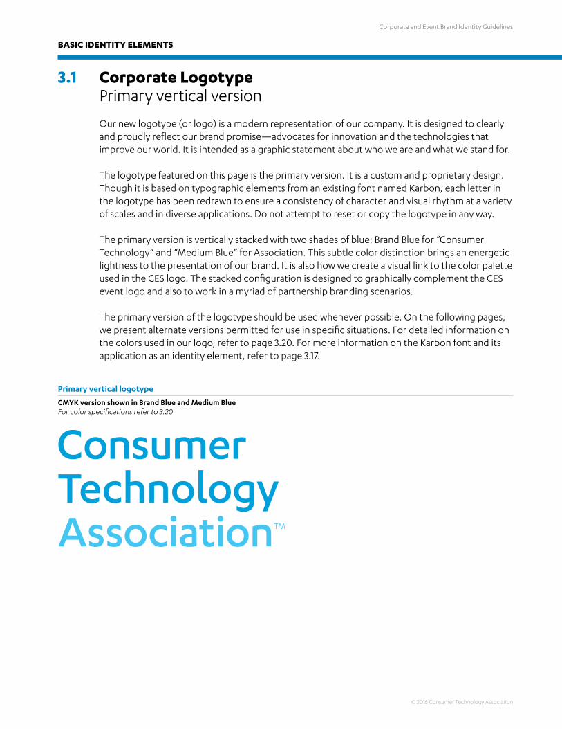
3.1 Corporate Logotype Primary vertical version
Our new logotype (or logo) is a modern representation of our company. It is designed to clearly and proudly reflect our brand promise—advocates for innovation and the technologies that improve our world. It is intended as a graphic statement about who we are and what we stand for. The logotype featured on this page is the primary version. It is a custom and proprietary design. Though it is based on typographic elements from an existing font named Karbon, each letter in the logotype has been redrawn to ensure a consistency of character and visual rhythm at a variety of scales and in diverse applications. Do not attempt to reset or copy the logotype in any way.
The primary version is vertically stacked with two shades of blue: Brand Blue for “Consumer Technology” and “Medium Blue” for Association. This subtle color distinction brings an energetic lightness to the presentation of our brand. It is also how we create a visual link to the color palette used in the CES logo. The stacked configuration is designed to graphically complement the CES event logo and also to work in a myriad of partnership branding scenarios.
The primary version of the logotype should be used whenever possible. On the following pages, we present alternate versions permitted for use in specific situations. For detailed information on the colors used in our logo, refer to page 3.20. For more information on the Karbon font and its application as an identity element, refer to page 3.17.
Primary vertical logotype
CMYK version shown in Brand Blue and Medium BlueFor color specifications refer to 3.20
Corporate and Event Brand Identity Guidelines
© 2016 Consumer Technology Association
BASIC IDENTITY ELEMENTS
3.2 Corporate Logotype Alternate vertical versions and background application
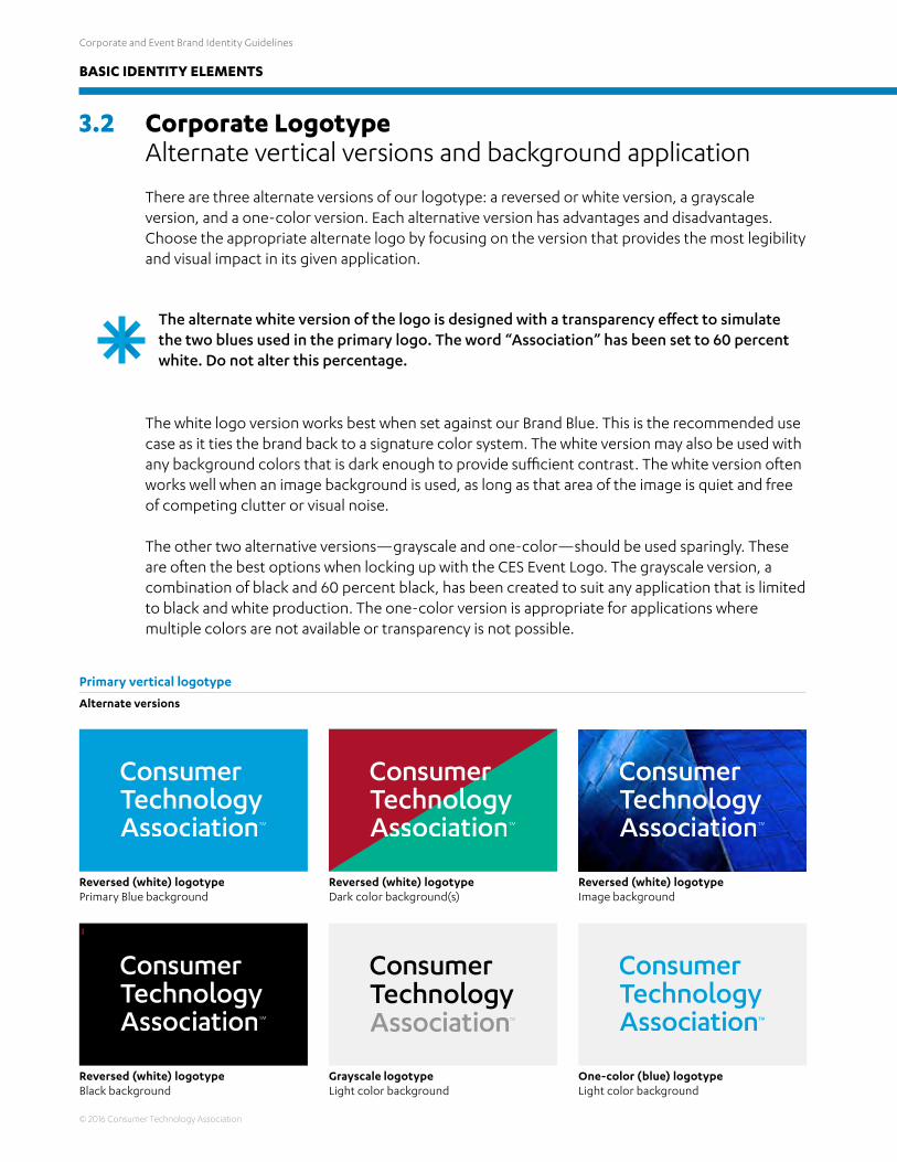
There are three alternate versions of our logotype: a reversed or white version, a grayscale version, and a one-color version. Each alternative version has advantages and disadvantages. Choose the appropriate alternate logo by focusing on the version that provides the most legibility and visual impact in its given application.
The white logo version works best when set against our Brand Blue. This is the recommended use case as it ties the brand back to a signature color system. The white version may also be used with any background colors that is dark enough to provide sufficient contrast. The white version often works well when an image background is used, as long as that area of the image is quiet and free of competing clutter or visual noise.
The other two alternative versions—grayscale and one-color—should be used sparingly. These are often the best options when locking up with the CES Event Logo. The grayscale version, a combination of black and 60 percent black, has been created to suit any application that is limited to black and white production. The one-color version is appropriate for applications where multiple colors are not available or transparency is not possible.
Primary vertical logotype
Alternate versions
Reversed (white) logotypePrimary Blue background
Reversed (white) logotypeBlack background
Reversed (white) logotypeDark color background(s)
Grayscale logotypeLight color background
Reversed (white) logotypeImage background
One-color (blue) logotypeLight color background
The alternate white version of the logo is designed with a transparency effect to simulate the two blues used in the primary logo. The word “Association” has been set to 60 percent white. Do not alter this percentage.

Corporate and Event Brand Identity Guidelines
© 2016 Consumer Technology Association
BASIC IDENTITY ELEMENTS
3.3 Corporate Logotype Secondary horizontal version
For those instances and applications where vertical space is limited, we have created a horizontal version of our logo. This secondary version may be used in certain instances illustrated in later pages of this section.
Secondary horizontal logotype
CMYK version shown in Brand Blue and Medium BlueFor color specifications refer to 3.20
3.4 Corporate Logotype Alternate horizontal versions and background application
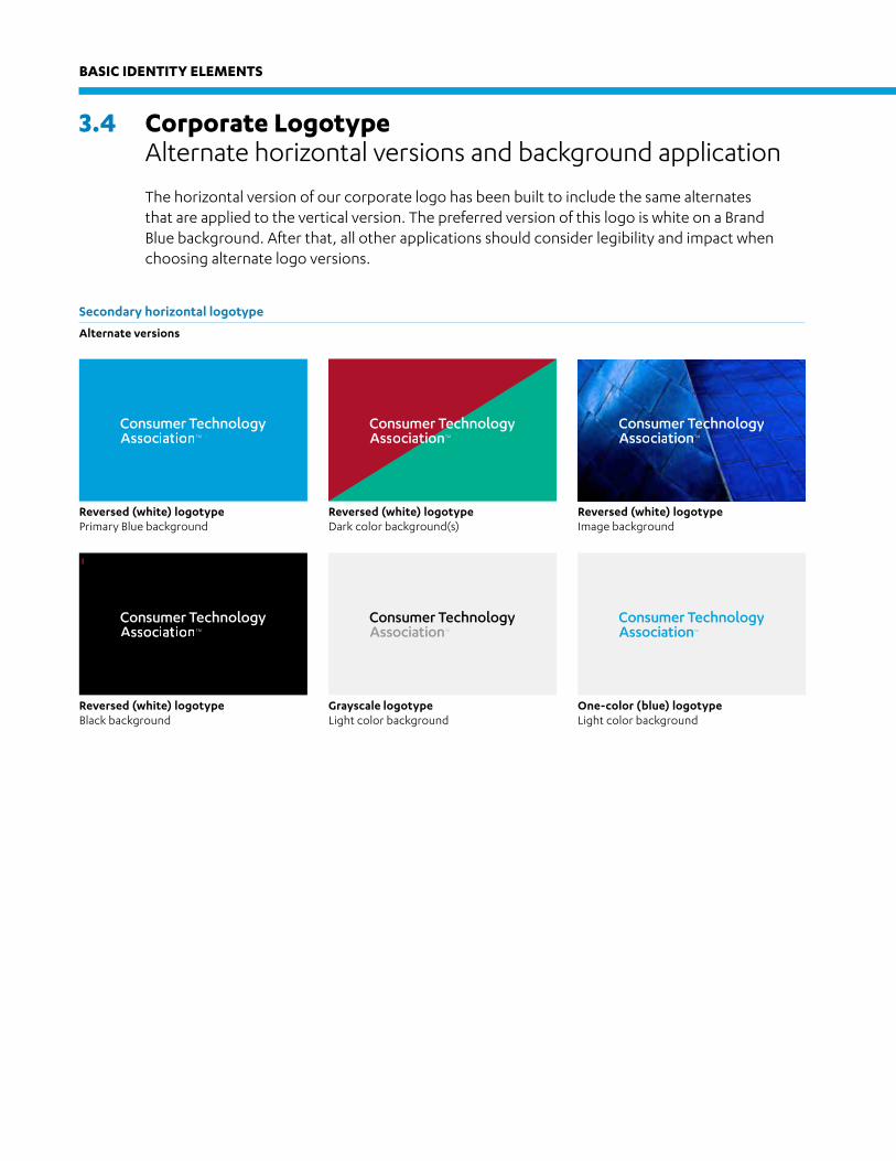
The horizontal version of our corporate logo has been built to include the same alternates that are applied to the vertical version. The preferred version of this logo is white on a Brand Blue background. After that, all other applications should consider legibility and impact when choosing alternate logo versions.
Secondary horizontal logotype
Alternate versions
Reversed (white) logotypePrimary Blue background
Reversed (white) logotypeBlack background
Reversed (white) logotypeDark color background(s)
Grayscale logotypeLight color background
Reversed (white) logotypeImage background
One-color (blue) logotypeLight color background
BASIC IDENTITY ELEMENTS
Corporate and Event Brand Identity Guidelines
© 2016 Consumer Technology Association
3.5 Corporate Logotype Clear space and minimum size
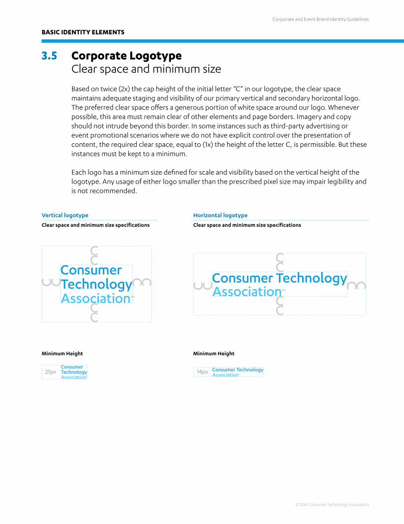
Based on twice (2x) the cap height of the initial letter “C” in our logotype, the clear space maintains adequate staging and visibility of our primary vertical and secondary horizontal logo. The preferred clear space offers a generous portion of white space around our logo. Whenever possible, this area must remain clear of other elements and page borders. Imagery and copy should not intrude beyond this border. In some instances such as third-party advertising or event promotional scenarios where we do not have explicit control over the presentation of content, the required clear space, equal to (1x) the height of the letter C, is permissible. But these instances must be kept to a minimum.
Each logo has a minimum size defined for scale and visibility based on the vertical height of the logotype. Any usage of either logo smaller than the prescribed pixel size may impair legibility and is not recommended.
Vertical logotype
Clear space and minimum size specifications
Horizontal logotype
Clear space and minimum size specifications
BASIC IDENTITY ELEMENTS
Minimum Height Minimum Height
Corporate and Event Brand Identity Guidelines
© 2016 Consumer Technology Association
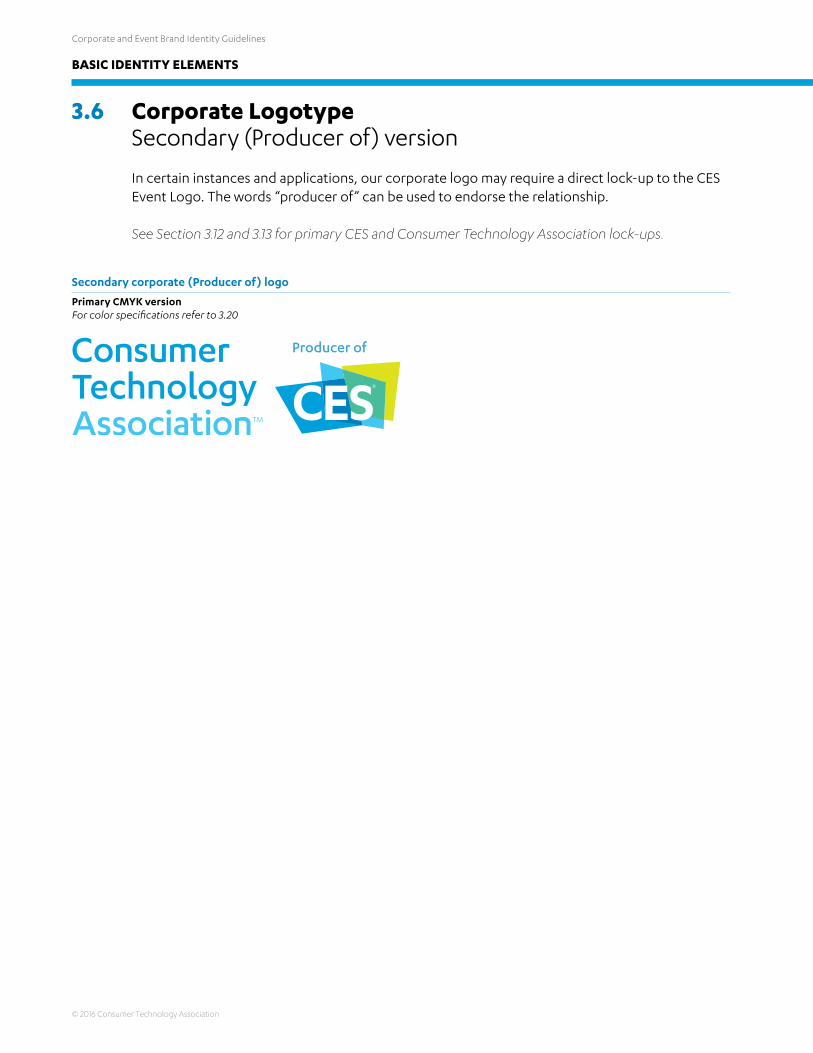
3.6 Corporate Logotype Secondary (Producer of) version
In certain instances and applications, our corporate logo may require a direct lock-up to the CES Event Logo. The words “producer of” can be used to endorse the relationship.
See Section 3.12 and 3.13 for primary CES and Consumer Technology Association lock-ups.
Secondary corporate (Producer of) logo
Primary CMYK versionFor color specifications refer to 3.20
BASIC IDENTITY ELEMENTS
Corporate and Event Brand Identity Guidelines
© 2016 Consumer Technology Association
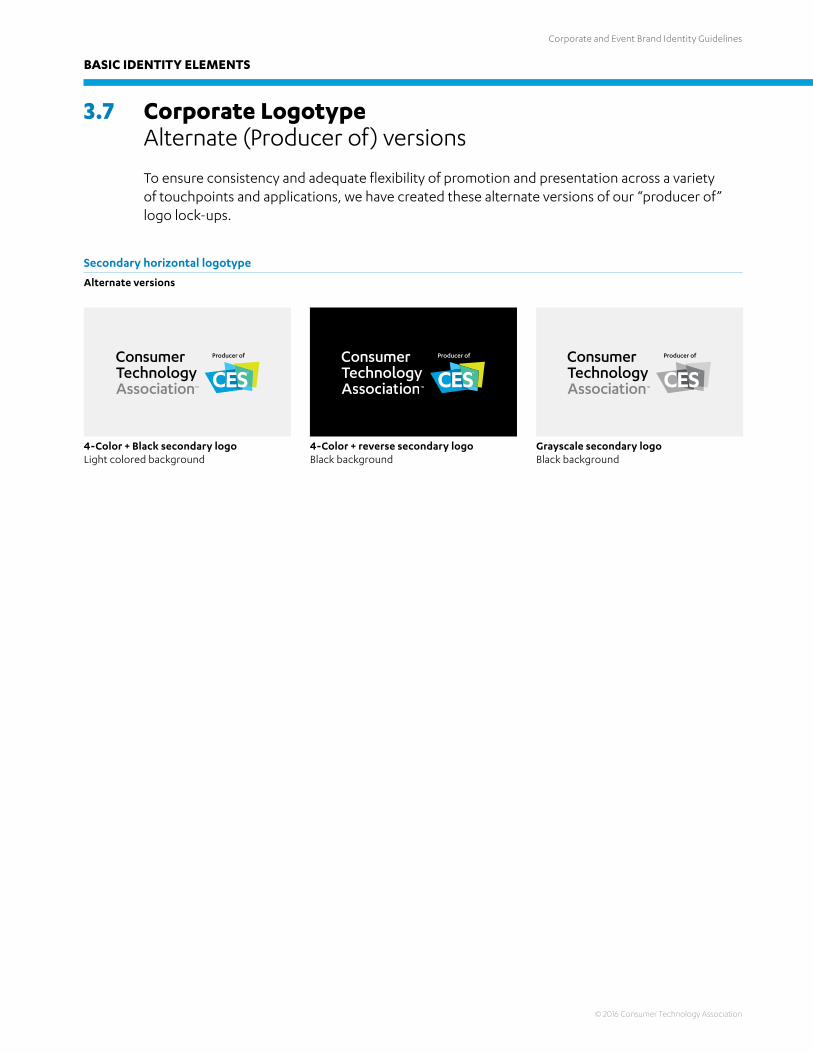
3.7 Corporate Logotype Alternate (Producer of) versions
To ensure consistency and adequate flexibility of promotion and presentation across a variety of touchpoints and applications, we have created these alternate versions of our “producer of” logo lock-ups.
4-Color + Black secondary logoLight colored background
4-Color + reverse secondary logoBlack background
Grayscale secondary logoBlack background
Secondary horizontal logotype
Alternate versions
BASIC IDENTITY ELEMENTS
Corporate and Event Brand Identity Guidelines
© 2016 Consumer Technology Association
BASIC IDENTITY ELEMENTS
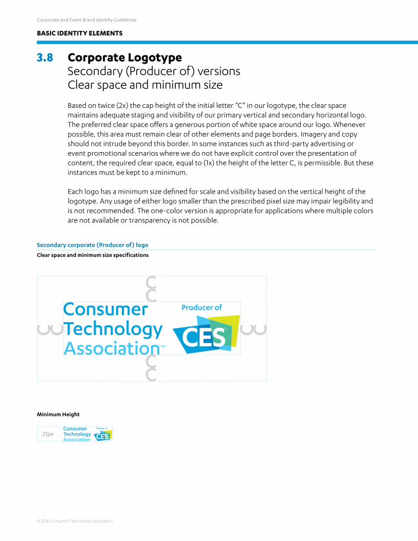
3.8 Corporate Logotype Secondary (Producer of) versions Clear space and minimum size
Based on twice (2x) the cap height of the initial letter “C” in our logotype, the clear space maintains adequate staging and visibility of our primary vertical and secondary horizontal logo. The preferred clear space offers a generous portion of white space around our logo. Whenever possible, this area must remain clear of other elements and page borders. Imagery and copy should not intrude beyond this border. In some instances such as third-party advertising or event promotional scenarios where we do not have explicit control over the presentation of content, the required clear space, equal to (1x) the height of the letter C, is permissible. But these instances must be kept to a minimum.
Each logo has a minimum size defined for scale and visibility based on the vertical height of the logotype. Any usage of either logo smaller than the prescribed pixel size may impair legibility and is not recommended. The one-color version is appropriate for applications where multiple colors are not available or transparency is not possible.
Secondary corporate (Producer of) logo
Clear space and minimum size specifications
Minimum Height

Corporate and Event Brand Identity Guidelines
© 2016 Consumer Technology Association
BASIC IDENTITY ELEMENTS
3.9 Event Logo Primary version
Our CES event logo has been designed to share the same bright colors as those used in our corporate logotype. It also uses Karbon for the CES Name. No other colors or typefaces should be used for the CES event logo. The logo is presented here in its preferred application: full color on a white background.
Primary logo
CMYK version shownFor color specifications refer to 3.20
Whenever possible, the CES logo should be placed on a white background as this will ensure the brightness of the colors and the energy of its design. It may not be placed on CTA Brand Blue as this will cause parts of the logo to disappear.

Corporate and Event Brand Identity Guidelines
© 2016 Consumer Technology Association
BASIC IDENTITY ELEMENTS
3.10 Event Logo Alternate version and background application
Due to the relationship of the letters to the holding shape background, as well as the integration of the sails within the CES logo, we have only created one alternate version. A grayscale logo may be used whenever printing limitations dictate. The background application of the CES logo follows the same rules as the corporate logo: always seek to provide adequate contrast and legibility. This means that mostly dark colors will be the best alternative to the preferred white background as suggested above.
Alternate logo
For color specifications refer to 3.20
Full-color logoBlack color background
Grayscale logoBlack background
Full-color logoImage background
Full-color logoImage background
Grayscale logoLight colored background

Corporate and Event Brand Identity Guidelines
© 2016 Consumer Technology Association
BASIC IDENTITY ELEMENTS
3.11 Event Logo Clear space and minimum size
Similar to the corporate logotype, the CES event logo has a clear space area that is based on the cap height of its initial letter. However, only one “C” is needed. The clear space maintains adequate staging and visibility of our CES logo, offering a generous portion of white space, and whenever possible, this area must remain clear of other elements and page borders. Imagery and copy should not intrude beyond this border. In some instances such as third-party advertising or event promotional scenarios where we do not have explicit control over the presentation of content, the required clear space, equal to one half (.5x) the height of the letter C, is permissible. But these instances must be kept to a minimum.
The CES event logo has a minimum size defined for scale and visibility based on the vertical height of the sails. Any use of the logo smaller than the prescribed pixel size may impair legibility and is not recommended.
Primary logo
Clear space and minimum size specifications
Minimum Height

Corporate and Event Brand Identity Guidelines
© 2016 Consumer Technology Association
BASIC IDENTITY ELEMENTS
3.12 Corporate and Event Logos Primary relationship lock-up
For those instances and touchpoints where both the corporate and event brand logos must be shown together, presenting an equal and integrated relationship between the association and the event, we have created the following relationship lock-ups. These logos illustrate the best version of graphic partnership between the two logos, and should never be altered. Built in proportion to their shared height, the two logos are seprated by a gray “pipe” in order to guarantee clarity and organziational understanding.
Primary corporate and event relationship lock-up
CMYK version shownFor color specifications refer to 3.20
Primary event and corporate relationship lock-up
CMYK version shownFor color specifications refer to 3.20
Corporate and Event Brand Identity Guidelines
© 2016 Consumer Technology Association
BASIC IDENTITY ELEMENTS
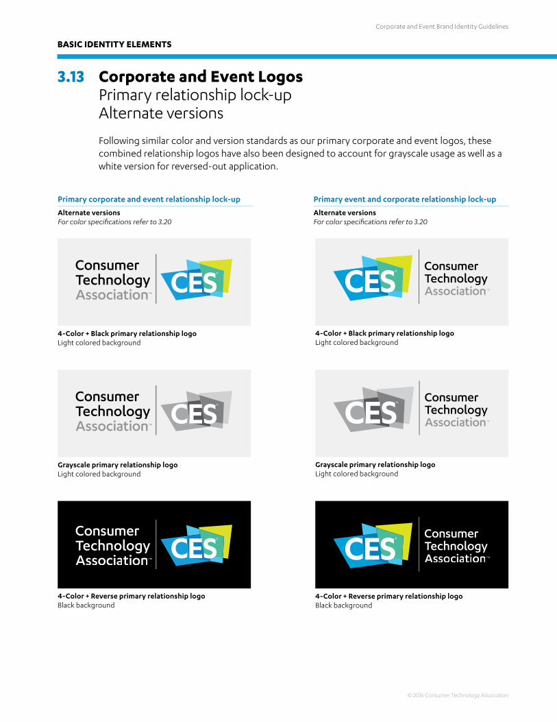
3.13 Corporate and Event Logos Primary relationship lock-up Alternate versions
Following similar color and version standards as our primary corporate and event logos, these combined relationship logos have also been designed to account for grayscale usage as well as a white version for reversed-out application.
Primary corporate and event relationship lock-up
Alternate versionsFor color specifications refer to 3.20
Primary event and corporate relationship lock-up
Alternate versionsFor color specifications refer to 3.20
Grayscale primary relationship logoLight colored background
4-Color + Black primary relationship logoLight colored background
4-Color + Reverse primary relationship logoBlack background
4-Color + Black primary relationship logoLight colored background
Grayscale primary relationship logoLight colored background
4-Color + Reverse primary relationship logoBlack background
Corporate and Event Brand Identity Guidelines
© 2016 Consumer Technology Association
BASIC IDENTITY ELEMENTS
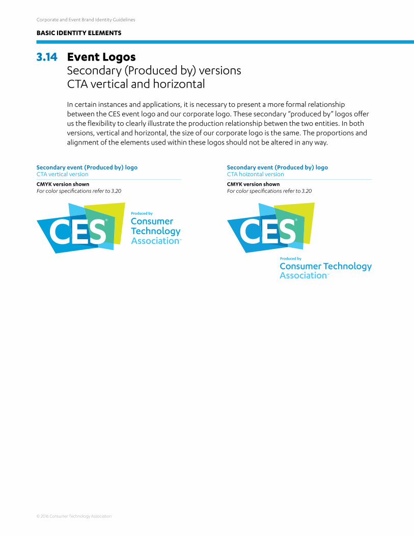
3.14 Event Logos Secondary (Produced by) versions CTA vertical and horizontal
In certain instances and applications, it is necessary to present a more formal relationship between the CES event logo and our corporate logo. These secondary “produced by” logos offer us the flexibility to clearly illustrate the production relationship betwen the two entities. In both versions, vertical and horizontal, the size of our corporate logo is the same. The proportions and alignment of the elements used within these logos should not be altered in any way.
Secondary event (Produced by) logo CTA vertical version
CMYK version shownFor color specifications refer to 3.20
Secondary event (Produced by) logo CTA hoizontal version
CMYK version shownFor color specifications refer to 3.20

Corporate and Event Brand Identity Guidelines
© 2016 Consumer Technology Association
BASIC IDENTITY ELEMENTS
3.15 Event Logos Alternate (Produced by) versions CTA vertical and horizontal
To ensure consistency and adequate flexibility of promotion and presentation across a variety of touchpoints and applications, we have created these alternate versions of our “produced by” logos.
Secondary event (Produced by) logo CTA vertical version
For color specifications refer to 3.20
Secondary event (Produced by) logo CTA hoizontal version
For color specifications refer to 3.20
4-Color + Black alternate event logoCTA horizontal on light colored background
4-Color + Black alternate event logoCTA vertical on light colored background
4-Color + Reverse alternate event logoCTA horizontal on black background
4-Color + Reverse alternate event logoCTA vertical on black background

Corporate and Event Brand Identity Guidelines
© 2016 Consumer Technology Association
BASIC IDENTITY ELEMENTS
3.16 Event Logos Secondary (Produced by) versions CTA vertical and horizontal
In certain instances and applications, it is necessary to present a more formal relationship between the CES event logo and our corporate logo. These secondary “produced by” logos offer us the flexibility to clearly illustrate the production relationship betwen the two entities. In both versions, vertical and horizontal, the size of our corporate logo is the same. The proportions and alignment of the elements used within these logos should not be altered in any way.
Secondary event (Produced by) logo CTA vertical version
CMYK version shownFor color specifications refer to 3.20
Secondary event (Produced by) logo CTA hoizontal version
CMYK version shownFor color specifications refer to 3.20

Corporate and Event Brand Identity Guidelines
© 2016 Consumer Technology Association
BASIC IDENTITY ELEMENTS
3.17 Typographic Overview Primary and secondary fonts
Our corporate logo and CES event logo, as well as our basic visual identity system, is anchored by the font known as Karbon. Karbon is an open, geometric sans serif with a contemporary tech-savvy finish. It is an exploration of Paul Renner’s Futura, and so represents an intelligent evolution from our previous CES visual identity system. But where Futura left off with a slightly cold and rigid personality, Karbon brings a fresh perspective with irregular curves and open, humanist figures. As a consequence, it is both warm and cold, analytical as well as creative. Contemporary with a subtle nod to history and the birth of modernity.
As an element within our identity system, Karbon acts as the dominant signifier for our brand. Used for both headlines and body copy, over time, we will become recognized through the repeated use of its various typefaces.
Like Myriad for Apple or Corporate Condensed for Mercedes-Benz, careful and considerate use of Karbon will drive brand awareness and equity in our visual identity.
For the breadth and depth of our touchpoints and the applications found within the CES event, we have anchored Karbon with two complementary typefaces: Helvetica Neue for those few instances where a Condensed Sans Serif may be required, and Archer as an alternative font for dense body copy where a serif may ease reading and overall legibility.
The following pages will illustrate a few examples of our typographic palette in application. However, they do not represent the breadth and depth of our visual identity system.
Corporate type family
Archer Bold Headlines / Captions
Archer Medium Call-outs
Archer BookBody Copy
Archer Light Alternative Headline
And this is Archer.Our secondary serif font. It also has a lot of weights.
HELLO.This is Karbon,our brand font that has a variety of great weights.
Karbon Bold (CAPS) Primary headlines / Captions Karbon Semi-Bold Secondary headlines
Karbon Medium Captions / Call-outs
Karbon Regular Body Copy
Karbon Light Alternative headlines
THIS IS HELVETICANEUE CONDENSED.It is also great.
Helvetica Neue Condensed Bold (CAPS) Headlines
Helvetica Neue Condensed (CAPS) Captions / Call-outs
Helvetica Neue Condensed LightBody Copy

Corporate and Event Brand Identity Guidelines
© 2016 Consumer Technology Association
BASIC IDENTITY ELEMENTS
3.18 Typographic Overview Illustrative applications cover
Illustrated here are a few examples which present the primary headline style for our corporate typeface, Karbon. Primary cover headlines are set in all-caps with a weight difference between Bold and Light to aid emphasis and information hierarchy. Karbon book is used for body copy or captions.
Logo and typographic usage examples
Consumer Technology Association member IBM is creating technology to help doctors better identify medical conditions in order to provide the necessary treatment and be able to treat more patients Unveiling a first-of-its-kind
set of voluntary guidelines for private sector organizations that handle personal wellness data
IBM TECH —REVOLUTIONIZINGMEDICAL CARE IN AFRICA
Kelsey Pommer
THE DESIRE FOR
MORE PRIVACY
G O V E R N M E N T A F F A I R S
G O V E R N M E N T A F F A I R S | Public Policy Issues
| Public Policy Issues
MORE COLORIN OUR BOOKSfrom Disney
November 2015
November 2015
November 2015
Karbon Bold (CAPS) Primary headlines / Call-out Karbon Light Alternative headlines
Karbon Regular Caption Body Copy
Karbon Bold (CAPS) Primary headlines / Call-out Karbon Light Alternative headlines
Karbon Regular Caption Body Copy
Karbon Bold (CAPS) Primary headlines / Call-out Karbon Light Alternative headlines
Karbon Regular Body Copy

Corporate and Event Brand Identity Guidelines
© 2016 Consumer Technology Association
BASIC IDENTITY ELEMENTS
3.19 Typographic Overview Illustrative applications interior
Illustrated here are a few examples that present the primary headline style for our corporate typeface, Karbon. Primary interior headlines are set in bold. Karbon book is used for body copy or captions. Archer and Helvetica Neue Condensed have been added as an example for additional types of information and the needs for a more robust hierarchy in some applications.
Typographic usage examples
Karbon Bold (CAPS) Primary interior headlines
Karbon Regular Body Copy
Helvetica Neue Condensed (CAPS) Captions Titles
Archer BookSecondary Body Copy
Kelsey Pommer
Disney uses augmented reality to see coloring books in 3D
Augmented reality is changing the way we experience video games, movies and more. Now, Disney has revolutionized one of our favorite childhood activities with augmented reality technology – coloring.
Disney Research Hub has developed an app that allows children to color a character on paper and then see it come to life through the app on a mobile device. Check out the video below to see how it works:
Discover where digital information and the real world connect to create a unique and all-inclusive experience. Through specially designed hardware and software full of cameras, sensors, algorithms and more, your perception of reality can be instantly altered in context with your environment: sports scores on TV during a match, path of trajectory overlaid on an image, gaming, construction plans and more.
F I N D I T A T T H E S H O W
A U G M E N T E D R E A L I T Y

Corporate and Event Brand Identity Guidelines
© 2016 Consumer Technology Association
BASIC IDENTITY ELEMENTS
3.20 Typographic Overview Illustrative applications alternate cover
Illustrated here are a few examples which present the primary headline style for our corporate typefaces Karbon and Helvetica Neue Condensed. In those instances where Helvetica might be used, such as event signage or similar.
Logo and typographic usage examples
ROBOTICSAND THE CLOUD
3D PRINTINGSANDS HOTEL, LEVEL 2Presented by TCT Magazine + Personalize
Karbon Bold (CAPS) Primary headlines / Captions
Karbon Light (CAPS) Secondary headlines
Karbon Light (CAPS) Blog title
Helvetica Neue Condensed Bold (CAPS) Primary Headline / Call-out
Helvetica Neue Condensed Bold (CAPS) Secondary Headline
Corporate and Event Brand Identity Guidelines
© 2016 Consumer Technology Association
BASIC IDENTITY ELEMENTS
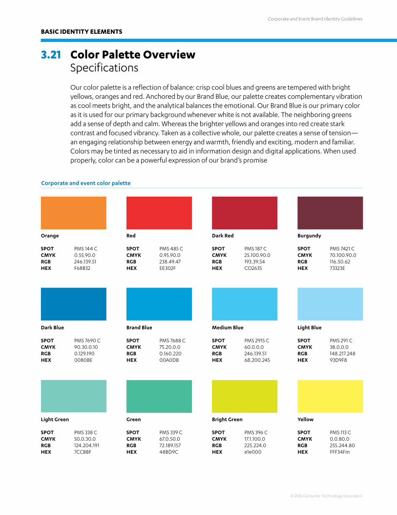
3.21 Color Palette Overview Specifications
Our color palette is a reflection of balance: crisp cool blues and greens are tempered with bright yellows, oranges and red. Anchored by our Brand Blue, our palette creates complementary vibration as cool meets bright, and the analytical balances the emotional. Our Brand Blue is our primary color as it is used for our primary background whenever white is not available. The neighboring greens add a sense of depth and calm. Whereas the brighter yellows and oranges into red create stark contrast and focused vibrancy. Taken as a collective whole, our palette creates a sense of tension—an engaging relationship between energy and warmth, friendly and exciting, modern and familiar. Colors may be tinted as necessary to aid in information design and digital applications. When used properly, color can be a powerful expression of our brand’s promise
Corporate and event color palette
Orange
SPOTCMYKRGBHEX
Dark Red
SPOTCMYKRGBHEX
Red
SPOTCMYKRGBHEX
Burgundy
SPOTCMYKRGBHEX
PMS 144 C0.55.90.0246.139.51F68B32
PMS 187 C25.100.90.0193.39.54CO2635
PMS 485 C0.95.90.0238.49.47EE302F
PMS 7421 C70.100.90.0116.50.6273323E
Dark Blue
SPOTCMYKRGBHEX
Brand Blue
SPOTCMYKRGBHEX
PMS 7690 C90.30.0.100.129.1900080BE
PMS 7688 C75.20.0.00.160.22000A0DB
Medium Blue
SPOTCMYKRGBHEX
Light Blue
SPOTCMYKRGBHEX
PMS 2915 C60.0.0.0246.139.5168.200.245
PMS 291 C38.0.0.0148.217.24893D9F8
Light Green
SPOTCMYKRGBHEX
Green
SPOTCMYKRGBHEX
Bright Green
SPOTCMYKRGBHEX
Yellow
SPOTCMYKRGBHEX
PMS 338 C50.0.30.0124.204.1917CCBBF
PMS 339 C67.0.50.072.189.15748BD9C
PMS 396 C17.1.100.0225.224.0e1e000
PMS 113 C0.0.80.0255.244.80FFF34Fm
Corporate and Event Brand Identity Guidelines
© 2016 Consumer Technology Association
BASIC IDENTITY ELEMENTS
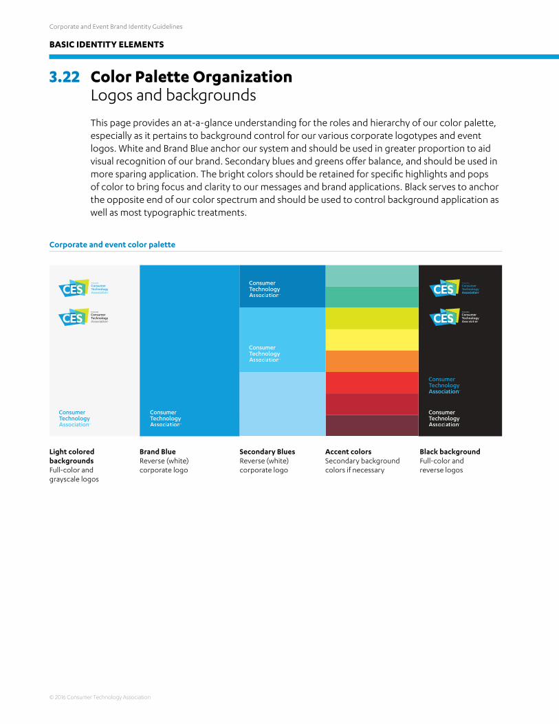
3.22 Color Palette Organization Logos and backgrounds
This page provides an at-a-glance understanding for the roles and hierarchy of our color palette, especially as it pertains to background control for our various corporate logotypes and event logos. White and Brand Blue anchor our system and should be used in greater proportion to aid visual recognition of our brand. Secondary blues and greens offer balance, and should be used in more sparing application. The bright colors should be retained for specific highlights and pops of color to bring focus and clarity to our messages and brand applications. Black serves to anchor the opposite end of our color spectrum and should be used to control background application as well as most typographic treatments.
Corporate and event color palette
Light colored backgrounds Full-color and grayscale logos
Black backgroundFull-color and reverse logos
Brand Blue Reverse (white) corporate logo
Secondary BluesReverse (white) corporate logo
Accent colorsSecondary background colors if necessary
Corporate and Event Brand Identity Guidelines
© 2016 Consumer Technology Association
BASIC IDENTITY ELEMENTS
3.23 CES® Trademarks
The Consumer Technology Association™ (CTA) is the owner of the CES name, trademarks and logos (collectively, the “CES Marks”). The CES Marks are valuable assets that CTA needs to protect.
Current CES exhibitors and press covering the show may use the mark under the terms outlined below. The CES logo and name can be used in your communications about the show, however, you must properly use and credit the CES Marks in accordance with our guidelines.
Guidelines for Third Party Usage of CES Trademarks
Terms of use: Thank you for being a CES exhibitor, media. CTA grants you non-transferable, limited, non-exclusive, royalty-free, revocable permission to use the CES Marks solely in connection with the current CES show, at which you are exhibiting or covering via a recognized press outlet. You agree to use the CES Marks in accordance with these guidelines.
Trademark Symbols: You must use the ® symbol with any written appearance of the “CES” mark on advertisements, promotional materials and webpages. Include acknowledgment of CTA’s ownership of the CES Marks in the credit notice section of your document or advertisement. Example – “CES® is a registered trademark of the Consumer Technology Association.”
Proper Brand Use: Since CES is recognized as a global event, CTA no longer uses “International” in the event name or logo. The official name of the global technology event is “CES®. Please do not use “Consumer Electronics Show” to refer to CES. If you choose to reference the year when referring to CES, it should come after the event. Example – “CES 2017.” For information about proper use of CES logos and logotypes, please review the CES Brand Book.
Permissible Use: You may generally use CES Marks to refer to your participation (official exhibitors) or media coverage in CES. For instance, a current exhibitor can promote in advertisements that they are participating officially in CES.
Relationship of Products or Services: On advertising and other collateral, you may not imply that your product, service or event is produced or endorsed by CES unless you in engage in a specific contract with CTA that allows you to do so.
Prohibited Use: • Do not modify or alter the CES Marks. • You may not use the CES Marks in a way that confuses CES with another brand, or in a way that
indicates an endorsement, sponsorship or association with or by CES. • Do not use CES Marks or potentially confusing variations in your Internet domain name or
social media accounts.• You must be a current CES exhibitor contracted with CTA for event space or services.
Quality Control: If CTA determines that you are not using the CES Marks in compliance with these guidelines, CTA may notify you and provide you an opportunity to fix any non-conformity. CTA reserves the right to disallow any exhibitor from using the CES Marks.
Corporate and Event Brand Identity Guidelines
© 2016 Consumer Technology Association
BASIC IDENTITY ELEMENTS
3.24 Contact us
For futher information on the correct usage of these guidelines, or to obtain any of the assets presented herein, please contact:
Michael Brown Sr. Director, Marketing 703-907-7628 [email protected]