winter wonders · winter wonders by cindy mann vitale ... framed sign board #62319 ... permanent...
TRANSCRIPT

Winter Wondersby Cindy Mann Vitale
Winter WondersBy Cindy Mann Vitale
Palette: DecoArt Americana AcrylicsAlizarin Crimson #13179 Antique Green #13147Antique Teal #13158 Arbor Green #13209Avocado #13052 Avocado Dip #13248Burnt Umber #13064 Country Blue #13041Cranberry Wine #13112 Fawn #13242Grey Sky #13111 Hauser Dark Green #13133Hauser Light Green #13131 Lamp Black #13067Leaf Green #13051 Lemonade #13246Light Avocado #13106 Mustard Seed #13254Plantation Pine #13113 Poodleskirt Pink #13257Prussian Blue #13138 Razzle Berry #13266Rookwood Red #13097 Spa Blue #13267Taffy Cream #13005 Tangerine #13012Warm White #13239
Surface: Framed Sign Board #62319
Misc. Supplies:DecoArt DuraClear Varnish – Matte #87395DecoArt Acrylic Sealer/Finisher – Matte #70836Permanent Ink Pen, size .005 – BlackSpatter Tool
Brushes: Papillon by the Artist’s ClubRound, size 2 #20158; size 5 #20162; size 8 #20164Liner, size 1 #20147Glaze Wash, size 1” #20103
Gauge the brush size to be in proportion for the area in which you are working. Using a brush that is too small, or too big for the area you are working with, will provide a poor result with my shad-ing technique. I use round brushes for almost all of my painting, basing, and shading. The only time I use a fl at or wash brush is for very large areas of base coating, antiquing, and varnishing.
Preparation:Order of Steps:PrepTransferBase
1
ShadeTransfer Interior DetailsAdd Additional Shading and DetailsVarnishAntiqueAdd Snowfl akesInkSpatterFinal Finish: Optional
General Prep Steps:Fill in holes, if needed, lightly sand, and wipe away dust.I seal the entire surface with a 50- 50 ratio mixture of Matte Dura Clear brush-on varnish and water. This will raise the grain, so when the surface is dry, sand lightly with a very fi ne grit sand paper, or emery cloth. I prefer the emery cloth.
Tips from CindyTips for Basing: I use diluted applications of paint for base coating, approximately 50-50 water to paint as a start point.I gauge this according to the thickness of the paint, and the color I am using. Diluting too much gives a poor base coat, and yet, the paint should glide smoothly over the surface with no drag. Using diluted applications of paint is how I achieve a soft watercolor effect. It’s necessary to create a strong base coat to maintain the color and to support the shading appli-cation. To duplicate my results you need to create a balance of base color and shading. Otherwise, the base color is weak, and can be distorted, giving an undesirable result for the entire design.If you choose to use antiquing as an option for fi nishing, then a weak base coat will affect those results as well.
You may need to increase the ratio of paint to water, or apply more than one application, to build up the basecoat color to be strong enough to support the shading applications. If you are unsure of the base coat test a small area with a shading application. If the color looks weak, then quickly remove by washing off the area with a clean brush fi lled with water, and allow to dry. Apply another application of base color to deepen, allow to dry. Don’t be concerned if the shading area is slightly stained. The next application of shading will conceal that area. Never apply another coat of basing or shading until the previous application has thoroughly dried.Each step or application must be thoroughly dry before moving on to the next step.This is also true for varnishing and antiquing.
Tips for Shading: I use diluted applications of paint for my shading, just as I do for basing. Begin with approximately a 50-50 ratio of water to paint for most colors, with the exception of deep colors like black or dark blue. Then a higher ratio of water would be needed, such as 95 % water to 5 % paint, to start. Once you become more familiar with the technique, the ratio of water will become second nature for correct results. Trial and error is the best teacher, with consistent practice. Shading is not completed in a one-step application, but requires several applications of the paint/
2
water mixture to build to the desired fi nished effect. For some of the darker results, I apply up to 4 or 5 shading layers.I use a liner brush for basing in very small areas, and rounds for the remainder of the shading pro-cess. I fi ll only the tip of a damp, round brush with the paint/water mixture, and rub it into the wood by moving the brush back and forth over the surface. Moving from the edges of the area being shaded outward, allows for the brush to empty out as you move toward the center, and the shading color fades into the base color.
Using the sides of the brush is what creates the soft washes of color, with no harsh edges.Using only the tip of the brush will create stripes or streaks, and harsh lines.
Shading with this method will cause the brush to become frayed out at the end, but that is exactly what I want, because that gives me more brush surface to create the soft watercolor effect. My brushes have lasted for many years despite the rough treatment. I keep a set of rounds in original condition for painting fi ne points and details.The liners are for the fi ne detailing, and the glaze/wash brush for varnishing and antiquing.
Do not sand the surface to be perfectly smooth. I want a slightly roughened surface, which pro-vides the “tooth” that allows the base coat and the shading mixture to grab into the wood. If the surface is completely smooth the painting applications are almost impossible to control; the paint, and the shading mixture, both slide over the surface preventing a good result. See instructions below in the Shading
Depending on the palette I’ve selected, and the construction of the design, I either transfer all the large design elements onto the surface, or break the transfer process down into steps building to create fi nal detailing, as base coat applications are completed. If I transfer all of the larger design elements initially, then I base coat around the design to lay in the back ground color. Admittedly, this can be a tedious process. Usually I take this as an option when working with a dark background color, as opposed to a white background. I feel that painting base coat colors onto a dark background adversely affects the results of my colors. When painting over a dark background, it becomes necessary to apply a white undercoating be-fore applying the base coat, to lift the color back up. I want to avoid applying a white under coating, if possible. In the long run, I feel my process saves me from additional base coating steps and ultimately time. However, I do often apply a white un-dercoating for some of the small design elements, ( berries would be an example ) and will provide info for these steps in my instructions.
General Design Transfer and Background Info:Since the background color for this design a basic white, it works well to transfer only the Snow Lady design, and then base coat the rest of the board, adding the pine branches, berries, lettering and snowfl akes later.See instructions below for detailed instruction for transfer steps.
Design Transfer and Order of Steps:Transfer the following details onto the board when prep steps are completed, as given above.Snow Lady Design: The face shape and the nose.3

The hat and the stripe design on the hat, the triangular trim design, the rose at the end of the hat, and the muff around the neck. The rose and the three leaves.The Bird: Transfer the entire bird design, for face, wing and tail, to indicate where the blue areas will be based in and where the white areas will be placed. Base coat the rest of the board surface with Warm White. To ensure good coverage, apply two or three coats as needed.
Painting Instructions:The Frame:Base coat the entire frame with Avocado Dip. Shade around the corners, with Antique Green to deepen and give more contrast. Tip: I suggest either completing the frame, then varnishing, before completing the board design, or vice versa. In that way, any paint smears that would be mistakenly placed on the frame, or board design, are more easily wiped away from the varnished surface. The Snow Lady:The Face: Base in with Warm White. Shade around the outside edges of the face, and under the nose with Country Blue. When the eyes and hair are completed, add more shading with Country Blue.The Nose: Base with Tangerine. Shade the nose with Rookwood Red along the bottom, and add a very light shading application along the top, as well, to give a contoured appearance. Pull small amounts of shading up into the center areas at random intervals, to give the effect of ridges, being conservative so as not to create a “striped” effect.The Snow Drip: Defi ne the snow drip at the end of the nose, by either free-handing the shape, transferring, or outlining freehanded, with a thin line of highly diluted Country Blue using a small liner brush. Begin shading around the area to create a dimensional effect, so the shading is darker on one side. I suggest darkening the right side, which is the area that will be closest to the snow-fl ake for better contrast. Remember, that the snowfl ake will be added later. The Hair: Base in with Fawn. Shade with diluted Burnt Umber. Apply shading at the areas by the hat, and at the ends, keeping the center areas lighter. This gives the appearance of shiny strands of hair. The Eyes: Base in with Grey Sky. Use Lamp Black to shade and darken, leaving some of the grey base coat to show through as a highlight. Use Warm White to add more highlighting to give the appearance of contour to the eyes. Use a small liner brush to pull out a few lashes and to give the eyes a softer effect. You can also use the pen later on, to pull out very small and thin lashes, as an option. The eyebrows are created later with the pen. The Lips: Base coat with Poodleskirt Pink. Shade with Razzle Berry, and follow with a light shading application of Alizarin Crimson to deepen at the corner. Shade one side of the mouth darker than the other. Transfer or freehand the center. Use a liner brush, and Lamp Black to create the small opening of the lips. The Hat and the Scarf:The Stripes: Base coat the aqua areas with Spa Blue. Shade with Antique Teal. Base coat the white areas with Warm White. Shade over some of the areas with Spa Blue, and when dry, follow with another wash of highly diluted Antique Teal.Base coat the aqua area of the hat and scarf with Spa Blue, and shade with Antique Teal as with the striped area.When all applications are dry, free hand or transfer the polka dots. Base in with Warm White. Float a thin wash of Antique Teal over some of the dots, to blend into the background and to soften.
4
5
The Rose:Base coat with Poodleskirt Pink. Shade around the inside areas of the petals with Razzle Berry, and add a shading layer of Alizarin Crimson to some of the petals to provide deeper dimension. Be sure to leave the outer edges of the petals lighter for contrast. To add even more dimension, use a shading application of Cranberry Wine to the inner areas of only a few of the petals. Freehand or transfer the inner spiral design at the center of the rose. Using a thin liner brush and diluted Razzle Berry, paint in the spiral. The Leaves:Base with Lemonade. Shade with Arbor Green. Add Plantation Pine to some areas of the leaves to provide contrast, and to emphasize the leaf separations. Use a shading application of Hauser Dark Green on some areas to give more interest to the leaves, and fi nish with a very light application of highly diluted Alizarin Crimson, on a couple of the leaves to bring in the red tones of the design. Freehand or transfer the leaf veining, and then paint on with diluted Plantation Pine, using a liner brush.The Bird:Base the blue areas ( area around the face, wings and tail ) with a mixture of Country Blue: 25% to Warm White :75% to create a lighter shade. Base in the face and breast area with Warm White.Shade the blue areas with Prussian Blue, and also to shade under the face area to defi ne.Transfer or freehand the eyes and beak.Paint in the beak with Taffy Cream. Shade with Mustard Seed.Paint on the eyes with Lamp Black. Try to avoid painting them perfectly round, to give more ex-pression to the face.Curls, eyebrows and feet will be drawn on later with pen.The Lettering:Once the board is base coated with the Warm White, and has completely dried, transfer the letter-ing. Base in with Spa Blue. Shade with highly diluted Antique Teal. I chose to keep the lettering light with very little contrast; so I used very light applications of highly diluted Antique Teal. Note: As you paint the design, you will be pulling out light washes of some of the shading colors onto the background to co-ordinate with the adjacent areas, such as the lettering, hat, muff, pine branches, and the rose at the end of the scarf.Also, shade around the inside edge of the frame with Antique Teal. Keep these washes very soft, with no harsh edges. They are intended to be an enhancement to the design elements, and should not overwhelm the focal points. The Pine Branches and Sprigs by the Rose:The pine branches and sprigs should not be painted until all the other designs elements are com-pleted, since they will overlap in some areas.Transfer the design, or if you feel confi dent to create your own confi guration, then work freehand. I create mine as I go, rather stepping out on faith, with the intention of creating a very “free form” design. Then, when the design is fi nished, I trace over the painted piece to share the result on the pattern.The beauty of this process is that there is no right, or wrong way for the berry branch to turn out! Any confi guration will look good as long as you stick with some basic guidelines, such as maintain-ing a slight curve, create varying lengths and to over-lap some of the “needles”. I have included a lot of green colors from which to choose concerning the berry branches, and sprigs. These are suggestions, and not all are required, or of course, you may use what you have on hand.The intention is to use colors that will contrast and yet, enhance each other. So, I have offered the yellow green shades to coordinate with the frame, such as Avocado Dip, Avocado, Hauser Light Green, Leaf Green, Light Avodaco and shades of blue green, such as Arbor
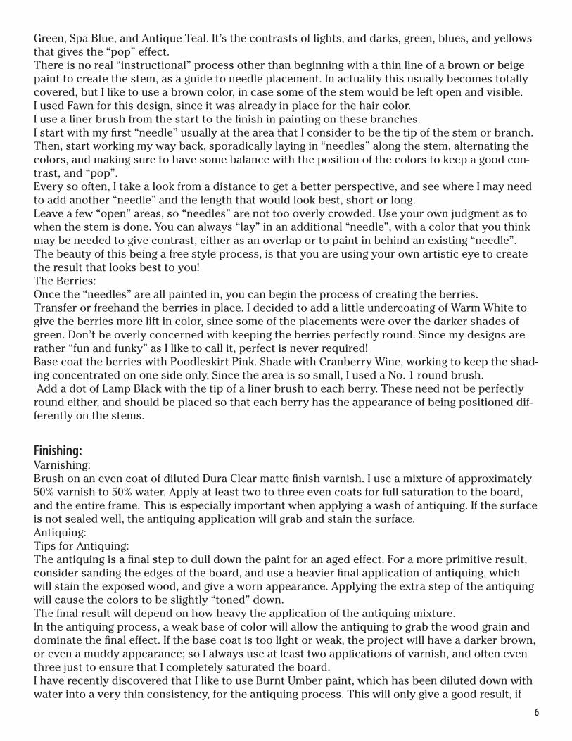
6
Green, Spa Blue, and Antique Teal. It’s the contrasts of lights, and darks, green, blues, and yellows that gives the “pop” effect. There is no real “instructional” process other than beginning with a thin line of a brown or beige paint to create the stem, as a guide to needle placement. In actuality this usually becomes totally covered, but I like to use a brown color, in case some of the stem would be left open and visible. I used Fawn for this design, since it was already in place for the hair color.I use a liner brush from the start to the fi nish in painting on these branches. I start with my fi rst “needle” usually at the area that I consider to be the tip of the stem or branch. Then, start working my way back, sporadically laying in “needles” along the stem, alternating the colors, and making sure to have some balance with the position of the colors to keep a good con-trast, and “pop”. Every so often, I take a look from a distance to get a better perspective, and see where I may need to add another “needle” and the length that would look best, short or long. Leave a few “open” areas, so “needles” are not too overly crowded. Use your own judgment as to when the stem is done. You can always “lay” in an additional “needle”, with a color that you think may be needed to give contrast, either as an overlap or to paint in behind an existing “needle”. The beauty of this being a free style process, is that you are using your own artistic eye to create the result that looks best to you!The Berries:Once the “needles” are all painted in, you can begin the process of creating the berries.Transfer or freehand the berries in place. I decided to add a little undercoating of Warm White to give the berries more lift in color, since some of the placements were over the darker shades of green. Don’t be overly concerned with keeping the berries perfectly round. Since my designs are rather “fun and funky” as I like to call it, perfect is never required!Base coat the berries with Poodleskirt Pink. Shade with Cranberry Wine, working to keep the shad-ing concentrated on one side only. Since the area is so small, I used a No. 1 round brush. Add a dot of Lamp Black with the tip of a liner brush to each berry. These need not be perfectly round either, and should be placed so that each berry has the appearance of being positioned dif-ferently on the stems.
Finishing:Varnishing:Brush on an even coat of diluted Dura Clear matte fi nish varnish. I use a mixture of approximately 50% varnish to 50% water. Apply at least two to three even coats for full saturation to the board, and the entire frame. This is especially important when applying a wash of antiquing. If the surface is not sealed well, the antiquing application will grab and stain the surface. Antiquing:Tips for Antiquing:The antiquing is a fi nal step to dull down the paint for an aged effect. For a more primitive result, consider sanding the edges of the board, and use a heavier fi nal application of antiquing, which will stain the exposed wood, and give a worn appearance. Applying the extra step of the antiquing will cause the colors to be slightly “toned” down. The fi nal result will depend on how heavy the application of the antiquing mixture. In the antiquing process, a weak base of color will allow the antiquing to grab the wood grain and dominate the fi nal effect. If the base coat is too light or weak, the project will have a darker brown, or even a muddy appearance; so I always use at least two applications of varnish, and often even three just to ensure that I completely saturated the board. I have recently discovered that I like to use Burnt Umber paint, which has been diluted down with water into a very thin consistency, for the antiquing process. This will only give a good result, if
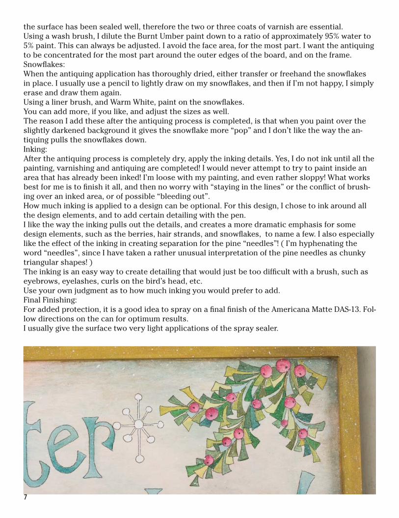
the surface has been sealed well, therefore the two or three coats of varnish are essential. Using a wash brush, I dilute the Burnt Umber paint down to a ratio of approximately 95% water to 5% paint. This can always be adjusted. I avoid the face area, for the most part. I want the antiquing to be concentrated for the most part around the outer edges of the board, and on the frame.Snowfl akes:When the antiquing application has thoroughly dried, either transfer or freehand the snowfl akes in place. I usually use a pencil to lightly draw on my snowfl akes, and then if I’m not happy, I simply erase and draw them again. Using a liner brush, and Warm White, paint on the snowfl akes.You can add more, if you like, and adjust the sizes as well.The reason I add these after the antiquing process is completed, is that when you paint over the slightly darkened background it gives the snowfl ake more “pop” and I don’t like the way the an-tiquing pulls the snowfl akes down. Inking:After the antiquing process is completely dry, apply the inking details. Yes, I do not ink until all the painting, varnishing and antiquing are completed! I would never attempt to try to paint inside an area that has already been inked! I’m loose with my painting, and even rather sloppy! What works best for me is to fi nish it all, and then no worry with “staying in the lines” or the confl ict of brush-ing over an inked area, or of possible “bleeding out”. How much inking is applied to a design can be optional. For this design, I chose to ink around all the design elements, and to add certain detailing with the pen.I like the way the inking pulls out the details, and creates a more dramatic emphasis for some design elements, such as the berries, hair strands, and snowfl akes, to name a few. I also especially like the effect of the inking in creating separation for the pine “needles”! ( I’m hyphenating the word “needles”, since I have taken a rather unusual interpretation of the pine needles as chunky triangular shapes! )The inking is an easy way to create detailing that would just be too diffi cult with a brush, such as eyebrows, eyelashes, curls on the bird’s head, etc. Use your own judgment as to how much inking you would prefer to add.Final Finishing:For added protection, it is a good idea to spray on a fi nal fi nish of the Americana Matte DAS-13. Fol-low directions on the can for optimum results. I usually give the surface two very light applications of the spray sealer.
7

Pattern at 100%
8
9

Pattern at 100%1” x 1”
To ensure your pattern is at 100%, this box should measure 1” x 1” when printed.
10
Copyright 2011 Cindy Mann Vitale and Crafts Americana Group, Inc. All Rights Reserved. #331604
No. *A331604*© Artist’s Club ®. All rights reserved. For private, non-commercial use only. Please see our web site for terms of use.