welcome to math 6 statistics: use graphs to show data box plots
TRANSCRIPT

Welcome to Math 6
Statistics:Use Graphs to Show Data
Box Plots.

Objectives
1. Interpret graphs that show the shape of a distribution of data.
2. Discuss the center, spread and overall shape with dot plots, histograms and box plots.
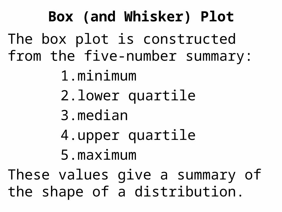
Box (and Whisker) Plot
The box plot is constructed from the five-number summary:
1. minimum
2. lower quartile
3. median
4. upper quartile
5. maximum
These values give a summary of the shape of a distribution.
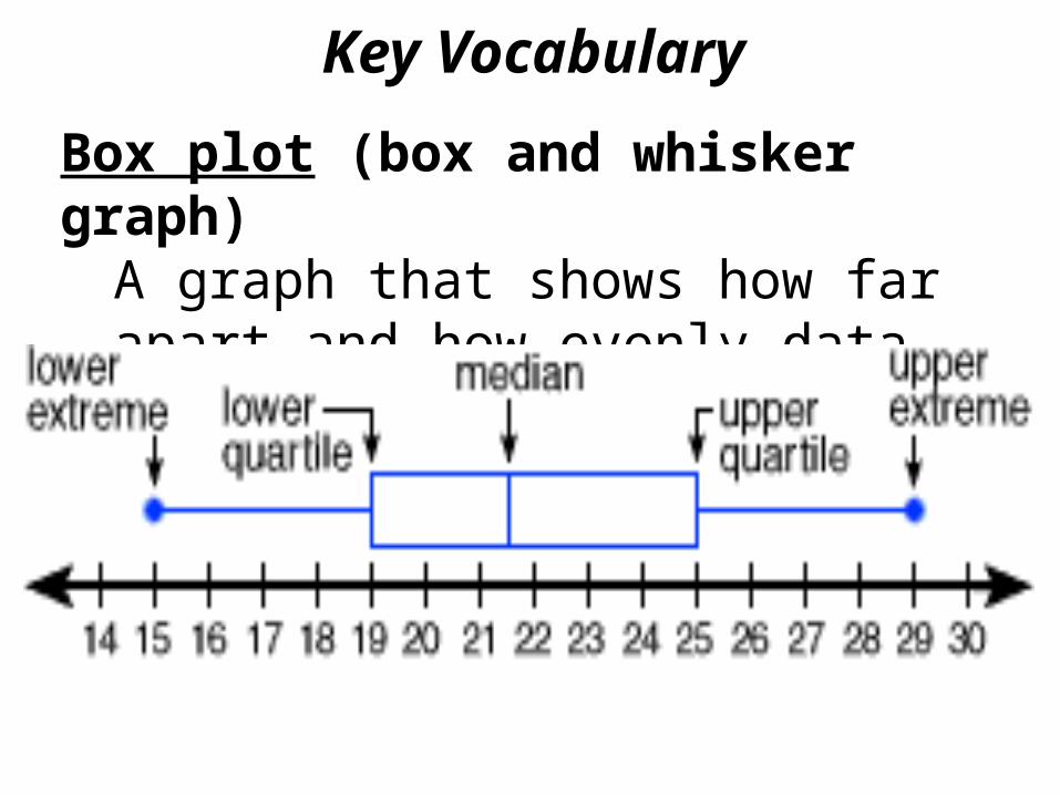
Box plot (box and whisker graph) A graph that shows how far apart and how evenly data are distributed.
Key Vocabulary

Advantages:1. This graph can be used for very large
data sets because it gives a general idea of how the data is clustered together. Exact values of each data point are not given in a box plot.
Box (and Whisker) Plot

A further advantage is that additional box plots can be drawn above (or below) the same number line to compare two or more data sets.
Box (and Whisker) Plot

Box (and Whisker) Plot
Box plot visually displays a distribution of data values by using the median, quartiles, and extremes of the data set.
The box shows the middle 50% of the data and the extended “whiskers” show the remaining 50% of the data.

Variability- is another characteristic of a data set. It also known as the ‘spread’ of the values.
http://www.mathebook.net/dict/sdict/spread.htm
Key Vocabulary


Upper Extreme
Key Vocabulary
The largest number in a set of data.

Lower Extreme
Key Vocabulary
The smallest number in a set of data.

Upper Quartile (Third Quartile)
Key Vocabulary
The number that three quarters of the data in the list are below.

Lower Quartile (First Quartile)
Key Vocabulary
is a number that one quarter of the data in the list are below it.

Key Vocabulary
The number that divides the data into a lower and an upper half. The second quartile is the same as the median.
Second Quartile (Median)

Interquartile range- Difference between the first and third quartiles in a data set.

Creating a Box Plot (Box and Whisker Plot)
1) Write the data in order from least to greatest.
2) Draw a horizontal number line that can show the data in equal intervals.
3) Find the median of the data set and mark it on the number line.

Creating a Box Plot (Box and Whisker Plot)
4) Find the median of the upper half of the data. This is called the upper quartile. Mark it on the number line.
5) Find the median of the lower half of the data. This is called the lower quartile. Mark it on the number line.
6) Mark the lower extreme (minimum) on the number line.

Creating a Box Plot (Box and Whisker Plot)
7) Mark the upper extreme (maximum) on the number line.
8) Draw a box between the lower quartile and the upper quartile. Draw a vertical line through the median to split the box.

9) Draw a “whisker” from the lower quartile to the lower extreme.10) Draw a “whisker” from the upper quartile to the upper extreme

Guided Practice
Draw a box-and-whisker plot for the set of data below.
Baseball Games Won by Teams
in National League, 2002
95 94 79 67 65 95 85 73
72 69 65 97 86 85 82 76

Guided Practice
2. Describe the data values that are located in the box of a
Box-and-Whisker plot.

CONCLUSION
To make a Box-and-Whisker Plot , draw a box around the quartile values, and lines or whiskers to
represent the values in the lower fourth of the data and the upper fourth
of the data.

box plots, dot plots, histograms, frequency tables, cluster, peak, gap, mean, median, interquartile range, measures of center, measures of variability, data, Mean Absolute Deviation (M.A.D.), quartiles, lower quartile (1st quartile or Q1), upper quartile (3rd quartile or Q3), symmetrical, skewed, summary statistics, outlier

Assignments
Try some extra practice making and interpreting Box Plots on the attached homework assignment.