web design made simple with these 4 tips
TRANSCRIPT
Better
Do you need a
Look
On the web &
Stand Out?
BEGIN?
But don’t know where to
4 Tips
Improve Your Web Design With These
Take my advice and

Tip No. 1
Know your brand’s color scheme
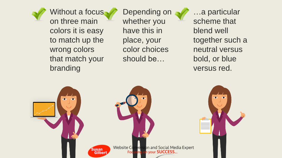
Without a focus
on three main
colors it is easy
to match up the
wrong colors
that match your
branding
…a particular
scheme that
blend well
together such a
neutral versus
bold, or blue
versus red.
Depending on
whether you
have this in
place, your
color choices
should be…

Tip No. 2
Go beyond Helvetica
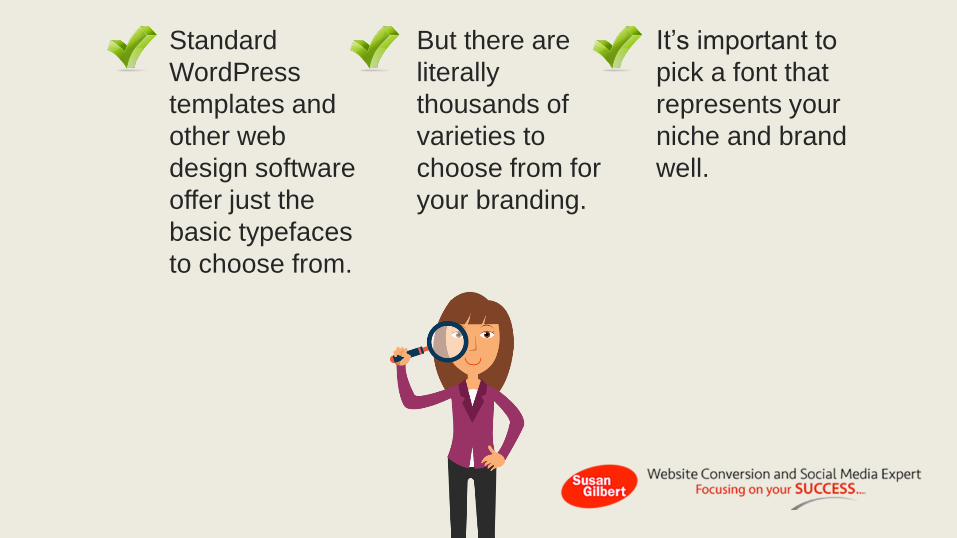
Standard
WordPress
templates and
other web
design software
offer just the
basic typefaces
to choose from.
It’s important to
pick a font that
represents your
niche and brand
well.
But there are
literally
thousands of
varieties to
choose from for
your branding.
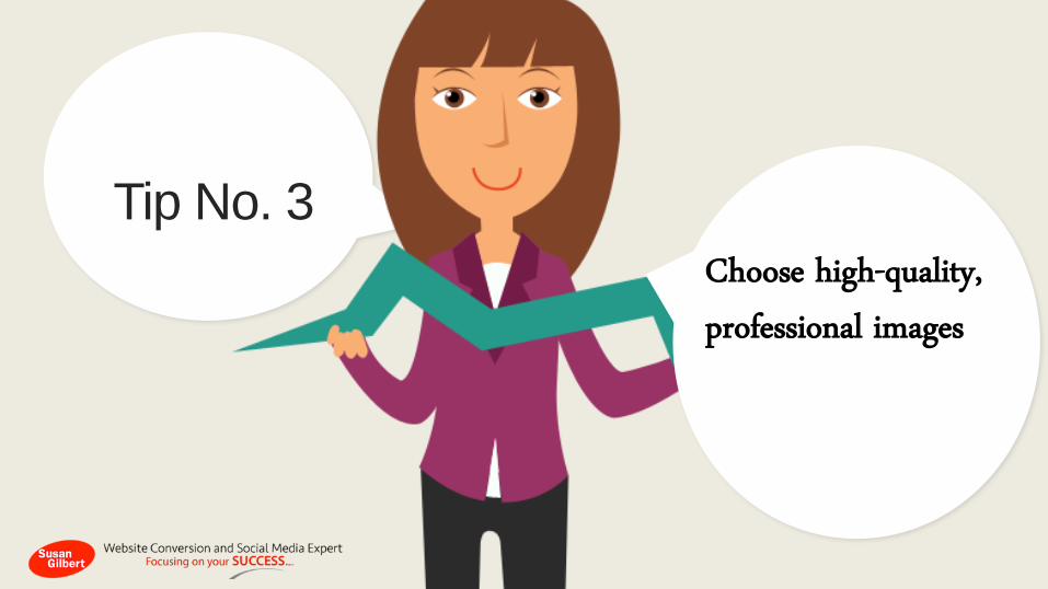
Tip No. 3
Choose high-quality, professional images
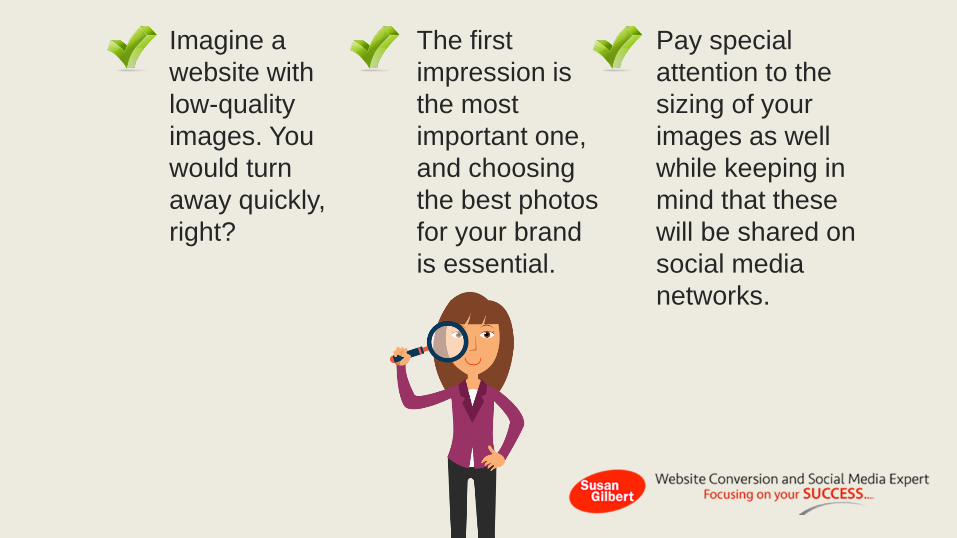
Imagine a
website with
low-quality
images. You
would turn
away quickly,
right?
Pay special
attention to the
sizing of your
images as well
while keeping in
mind that these
will be shared on
social media
networks.
The first
impression is
the most
important one,
and choosing
the best photos
for your brand
is essential.

Tip No. 4
Remove the clutter
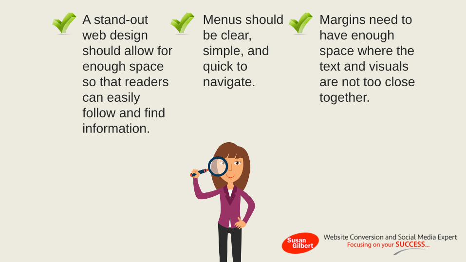
A stand-out
web design
should allow for
enough space
so that readers
can easily
follow and find
information.
Margins need to
have enough
space where the
text and visuals
are not too close
together.
Menus should
be clear,
simple, and
quick to
navigate.
A successful website design does not have to be rocket science when you learn how to focus the right elements for your landing page.
A well planned color
scheme, style of
typeface, and
theme will bring
your brand’s image
to the next level!
Document Presented by SusanGilbert.com
Read the full article here or watch the video here.