watts with the wind - wind turbine syndrome | k …...... 5 wind power in ontario.....7 rationale...
TRANSCRIPT

Watts with the Wind
Wind Power In Ontario 2010
March 1, 2010, Revised June 18, 2010
By D. Robinson, B.Sc.Email: windpower2010 AT rogers.com
Copyright NoticeThis Document is Copyright D. Robinson and may not be distributed without permission of the author.
Permission to copy is hereby granted for non-commercial use by community organizations.
Other requests may be granted by emailing the author for permission to use the document.
Page 1
Our Don Quixote

Blank page
Page 2

Table of ContentsAbstract......................................................................................................................................................5Wind Power In Ontario..............................................................................................................................7
Rationale for Wind Power.....................................................................................................................7Facts, Figures and Sources....................................................................................................................7How Much Power do we use?...............................................................................................................7On to the analysis..................................................................................................................................8Monthly Network Energy Draw and Supply.........................................................................................9
According to IESO.........................................................................................................................10Current State of the Wind Power Effort..............................................................................................10Correction to The Current State...........................................................................................................11Network Components..........................................................................................................................11Counting the Hours.............................................................................................................................13Stacking the Hours..............................................................................................................................14Another View of the Hours..................................................................................................................15Wind Power Tracker............................................................................................................................18Can Wind Power replace Coal – or anything else?.............................................................................19The Samsung Deal...............................................................................................................................21Conclusions.........................................................................................................................................22
Were expectations met?..................................................................................................................22Can new technology improve performance?..................................................................................22Can new Technology give us reliable Wind Power? .....................................................................22Is Wind Power worth the money?...................................................................................................22Can you prove that Wind Power is not worth the money?.............................................................22Is Wind Power Green Technology that will help save the planet?.................................................23Other People Have Succeeded With Wind Power -- Why Can't We?.............................................23The German Experience.................................................................................................................24Blame..............................................................................................................................................24
Appendices...............................................................................................................................................25Appendix A..........................................................................................................................................26
Global Warming..............................................................................................................................26Appendix B..........................................................................................................................................27Ontario Wind Potential........................................................................................................................27Appendix C..........................................................................................................................................28Mathematical Techniques Used...........................................................................................................28Technology used..................................................................................................................................28Data.....................................................................................................................................................28
Illustration IndexGraph 1: Power by Month 2002 – 2009 – Note that Scale starts at Zero..................................................8Graph 2: Monthly Power Production 2009 – Versus Net Capacity...........................................................9Graph 3: Wind Power Production Mega Watt Hours 2006-2009.............................................................10
Page 3

Graph 4: Monthly Power Summary – 2009 with Wind Power Contribution shown...............................11Graph 5: Power Bands -- Wind Power.....................................................................................................13Graph 6: Stacking the Hours....................................................................................................................14Graph 7: Fast or Slow?.............................................................................................................................15Graph 8: Fast or Slow in 2010?...............................................................................................................15Graph 9: Hourly Analysis for 2009 -- by Hour, Showing: Min, Max, Average.......................................16
Index of TablesTable 1: Wind Power -- Monthly Average...............................................................................................16Table 2: Wind Power Generator and Land requirement...........................................................................17
FiguresFigure 1: Annual Power Consumption.......................................................................................................7Figure 2: Fuel Breakdown........................................................................................................................10Figure 3: Wind Farm Location Map.........................................................................................................12Figure 4: Power Curve: Vesta NM82.......................................................................................................19Figure 5: Power Curve: GE 1.5 Series -- sle and xle models..................................................................19
Illustration IndexIllustration 1: Wind Power Tracker..........................................................................................................18Illustration 2: Rural Temperature Stations -- USA ..................................................................................26
Page 4

AbstractMuch has been written about Wind Power in Ontario, but I could find no studies of actual production figures anywhere. The Independent Electricity System Operator (IESO) figures are easily available and easily imported into a modern database – making these numbers easy to study. The original purpose of this study was to see if I could verify any of the claims I heard about Wind Power Generation. Many of these claims said that we could replace coal power in Ontario, others said it was uneconomic, others said it was unreliable.
Now rather than making statements like “wind power is unreliable”, we can state clearly how much power is produced and when it is produced. We can also clearly see the “drop-outs” when the power grid receives little or no wind power.
The graphs produced within clearly show that Wind Power cannot replace Hydro, Nuclear, Coal or Gas Turbine Power. These arguments can easily be extended to solar power by analogy. Further, it becomes clear that for every Watt of Green Power of installed capacity – we must supply a corresponding Watt from traditional sources. This power must be up and running at the time the power is required – a cold start of a coal plant or a nuclear plant could take several hours. Gas fired plants start up more quickly – but they are not instantaneous. Green Power, as provided by Wind Generation, can replace nothing – it becomes an additional burden on the system and the tax-payer.
I have attempted to prepare the information for a general audience so I have assumed that no special knowledge of statistics and error analysis is available to any reader. To make the information accessible to as many people as possible, the analysis has been written and organized so that a minimal level of science and mathematical education should be sufficient. A high school graduate who studied maths and science should find that sufficient. There is nothing more sophisticated than an “average” presented in this paper.
Page 5

1,100MW Capacity
9 MW Available
Page 6

Wind Power In OntarioRationale for Wind PowerThe rationale for developing Wind Power for Ontario Power consumers is that we can produce power that is clean, or pollution free if you will, and that it will be “free”, that is no cost or low cost since there is no price for the wind. It is an attractive and compelling concept. All we need do is erect the wind powered generators and the winds will come and will light Ontario homes. All we need do is capture the power and distribute it on our transmission network which is already in place – mostly.
Facts, Figures and SourcesMuch of the Information came from the Web Site of the Independent Electricity System Operator, (IESO). Other information was derived from the website of the Ontario Power Authority (OPA) and Ontario Power Generation (OPG). For this reason I want people who read this document to understand that this document should not be read in any way that is critical to these organizations or any of the people who work for them unless expressly stated to be so. The mathematics, analysis techniques and sources of data are discussed in Appendix C. However, to summarize the mathematical techniques use: if you can add columns of numbers, take simple averages and take counts of the number of times an event occurred you should be able to duplicate the work in this short summary.
How Much Power do we use?For our electricity use we can turn to the IESO web site and extract a simple graph which tells us a lot about the last decade.
The first figure shows us the annual demand in Mega Watt Hours on an annual basis. We can see that until 2005 we had a relatively steady climb in power usage. However a closer look shows a peak in 2005, on top of a plateau from 2002 to 2007. In 2008 we had a slight decline, then in 2009 we dropped to about 139,000,000 MW hours of use from the 157,000,000 MW Hours plateau of the last decade. The world wide financial crises of 2008 is the most likely the cause of a reduction in power consumption thereafter and not any particular conservation efforts.
Page 7
Figure 1: Annual Power Consumption

On to the analysis...In the following figure, where I replicated the above chart from the 2002-2009 historical data we can see that I get roughly the same results. From year to year we draw a low of about 137,000,000 MWH of power to a high of about 157,000,000 MWH of power in 2005. We are currently drawing at a reduced rate of 17,806,566 MWH less than 2005. This graph provides a check on the program I created to extract the information – as it should replicate the preceding graph as it should be the same data.
The numbers are all taken from the IESO web site – but are only available from May 2002 onwards. They confirm the IESO graph – although the time period is shorter. These two graphs raise the same question: Why the recent reductions in power usage?
One explanation is the recent shift of population towards other provinces. See Ontario Population Demographics for further information. The Quarterly Summary for 2009, third quarter tells us that we had a population of 13 million as of July 2009. Also see the StatsCan census summaries for further information. In 2002 we had a population of about 11,410,000 people, the 2010 population was estimated to reach about 13 Million people, so a loss of population does not likely explain the drop in power consumption. You can see from the power figures that actual power usage has declined considerably from the peak in 2005 to 1998 levels. The question, as noted above is simply: Why? Did we lose manufacturing capability? Are we conserving more? I suspect that IESO could supply the
Page 8
Graph 1: Power by Month 2002 – 2009 – Note that Scale starts at Zero
Yearly PowerNote that 2002 begins in May
Yearly Pow er -- Ontario Pow er - Export Net Capacity
2002 2003 2004 2005 2006 2007 2008 2009
2002 2003 2004 2005 2006 2007 2008 2009
Meg
a W
att H
ours
250,000,000240,000,000230,000,000220,000,000210,000,000200,000,000190,000,000180,000,000170,000,000160,000,000150,000,000140,000,000130,000,000120,000,000110,000,000100,000,00090,000,00080,000,00070,000,00060,000,00050,000,00040,000,00030,000,00020,000,00010,000,000
0
102,972,868
151,719,470 153,436,970 156,971,620151,054,281 152,205,637 148,675,912
139,165,604
1,800,739
6,262,6429,488,368 10,181,531
11,388,198 12,285,76322,200,631
15,134,894
figures of industrial versus residential use then we might know. Despite the out-migration we do have a net population growth of two million people. We should be drawing considerably more power for residential use. We are not exporting less power. See the yellow portions of the bars. Indeed we are exporting more power. However, I have no explanatory data, and hence no answers. If the additional figures were provided by category of power draw we could do further analysis.
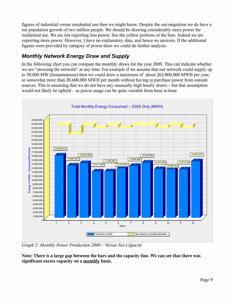
Monthly Network Energy Draw and SupplyIn the following chart you can compare the monthly draws for the year 2009. This can indicate whether we are “stressing the network” at any time. For example if we assume that our network could supply up to 30,000 MW (Instantaneous) then we could draw a maximum of about 262,800,000 MWH per year, or somewhat more than 20,600,000 MWH per month without having to purchase power from outside sources. This is assuming that we do not have any unusually high hourly draws – but that assumption would not likely be upheld – as power usage can be quite variable from hour to hour.
Note: There is a large gap between the bars and the capacity line. We can see that there was significant excess capacity on a monthly basis.
Page 9
Graph 2: Monthly Power Production 2009 – Versus Net Capacity
Total Monthly Energy Consumed -- 2009 Only (MWH)
Total Pow er 2009 Net Capacity (Installed Estimate)
Month1 2 3 4 5 6 7 8 9 10 11 12
Ene
rgy
in M
WH
- C
onsu
med
/Pro
vide
d
25,000,000
24,000,000
23,000,000
22,000,000
21,000,000
20,000,000
19,000,000
18,000,000
17,000,000
16,000,000
15,000,000
14,000,000
13,000,000
12,000,000
11,000,000
10,000,000
9,000,000
8,000,000
7,000,000
6,000,000
5,000,000
4,000,000
3,000,000
2,000,000
1,000,000
0
15,497,573
12,984,09113,600,086
11,511,19911,525,497
12,313,941
12,890,98613,724,655
12,107,29012,089,784
12,012,366
14,043,031

HydroOne transmits a mix of power sources (from various suppliers) including Hydro Power, Nuclear generators, Coal Generation units and now Gas Power turbines, so the availability of power depends on the mix of on-line generators and also depends on whether is a unit is being serviced.
At best I have given you a rough approximation of the available capacity as the maximum power available could be an instantaneous value of anywhere between 28 Million to 35 Million MW – perhaps a little more – perhaps a little less. This fluctuation in availability is caused when units are removed from service for planned maintenance or occasionally for equipment breakdowns.
According to IESO....Ontario's existing installed generation capacity includes nuclear, coal, oil, gas, hydroelectric, wood and waste-fueled generation, which results in a total installed capacity of approximately 35,465 MW.
Their statement left out Wind Power! However, I would not put too much faith in the “Wind 3%” in their pie graph as you will see shortly.
Current State of the Wind Power EffortWind Power first became “reliable” in 2009 so I analyze only 2009 data or make detailed comparisons only to to 2009 summary data. First it is worth looking at one graph which compares the first three years of Wind Power production 2006-2009. As of 2009 the nameplate capacity of the installed wind turbines was 1,100 MW of electrical power, or about 800,000 MWH on a monthly basis. Note the blue line on the following graph. If we were receiving the full power output of the Wind Power Turbines, then the bars would reach to approximately the dark blue line every month, less any capacity off-line for repair.
Note that the power output averages less than 40% of available capacity. Often the output can fall to less than 50MWH or even less than 1%.
It is unpredictable as to when the grid will produce. In this sense the data speaks for itself.
Page 10
Graph 3: Wind Power Production Mega Watt Hours 2006-2009
Figure 2: Fuel Breakdown
Monthly Wind Power Production in Mega Watt Hours -- Ontario 2007 - 2009Month by Month Basis
Months 1 through 12 (January through December)
2006 2007 2008 2009 WP Net Capacity
1 2 3 4 5 6 7 8 9 10 11 12
1 2 3 4 5 6 7 8 9 10 11 12
MW
Hou
rs (E
nerg
y P
rodu
ctio
n)
850,000
800,000
750,000
700,000
650,000
600,000
550,000
500,000
450,000
400,000
350,000
300,000
250,000
200,000
150,000
100,000
50,000
0
189,371207,549 209,204
263,439
210,569
89,671119,189
152,042 135,980
251,586215,898
284,103

Correction to The Current StateDuring communications with Tom Adams who produces the Web Site of his own company “Tom Adams Energy” he graciously pointed out some errors in the document. He pointed out that the Underwood (Enbridge) Bruce County wind farm did not start producing until February 19th, of 2010. He also reminded me that Wolfe Island (Township of Frontenac Islands) did not produce until June 26th
2010.
Tom Adams analyzes Wind Turbines by Service Year as he argues that it is easier to analyze the data to see the performance of the particular wind farm over time. My analysis is over the calendar years and is subject to the effects of wind farms coming on-stream, and may show over-production due to testing during the commissioning. I admit that I am more interested in seasonal performance so analyzing the Calendar Years makes more sense. So that may make the results harder to interpret for some purposes. Conversely, looking at the service year of individual wind farms can make it somewhat harder to interpret geographic dispersal and aggregate seasonal effects. In other words neither technique gives you all the information and you do have to look at the information both ways. Rather than duplicate his efforts I refer you to his web site for the information and further commentary on energy matters of a diverse nature.
Network ComponentsIt is also worthwhile to see and compare the amount of wind power generated as compared to the entire network. The next graph (Graph 4) is the same as graph 2 with the wind power contribution shown separately. The graph now gives us a month by month comparison for 2009 – a year when the Wind Power network was capable of producing 1,100 Mega Watts.
Page 11
Graph 4: Monthly Power Summary – 2009 with Wind Power Contribution shown
Total Monthly Energy Consumed -- 2009 Only (MWH)
Total Pow er 2009 WP 2009 Net Capacity (Installed Estimate)
Month1 2 3 4 5 6 7 8 9 10 11 12
Ener
gy in
MW
H - C
onsu
med
/Pro
vide
d
25,000,000
24,000,000
23,000,000
22,000,000
21,000,000
20,000,000
19,000,000
18,000,000
17,000,000
16,000,000
15,000,000
14,000,000
13,000,000
12,000,000
11,000,000
10,000,000
9,000,000
8,000,000
7,000,000
6,000,000
5,000,000
4,000,000
3,000,000
2,000,000
1,000,000
0
15,497,573
12,984,09113,600,086
11,511,19911,525,497
12,313,941
12,890,98613,724,655
12,107,29012,089,784
12,012,366
14,043,031
189,371 207,549 209,204 263,439 210,569 89,671 119,189 152,042 135,980 251,586 215,898 284,103

The yellow line in the Total Monthly Power graph shows us available capacity. The blue bars show us what we consumed. We can also see that the wind power contribution (brown Bars) was negligible. Power consumption was typically more than 12,000,000 Megawatt Hours. Wind power contribution was about 195,000 Mega Watt Hours per month.
By now it should be clear that wind power generation is not significant, however much worse, is that it is not predictable.
What do we mean by “unpredictable”? Graph 5 which shows us the total hours available each month via the blue line should make this more clear. Please note that only 2009 was used. As of 2009 according to the OPA 625 wind power turbines were available to draw on for power.
Note: There is considerable material to explore on the OPA web site, where the down-loadable siting map in PDF format is available -- then you can then compare it to their published studies of the best wind locations. Reading (or skimming) of the studies will show you that a reasonable job has been done in siting the current wind farm locations. So we cannot blame poor siting for the lack of wind power – at least in the sense that the wind farm designers negotiated the best sites available.
Page 12
Figure 3: Wind Farm Location Map

Counting the Hours
This graph is simply about Counting The Hours. It looks complicated at first but we can break it down quite simply. The power output of the wind power grid is broken into bands of 0-25%, 25-50% etc. – except for one important addition – the “less than 5%” band – the left hand bars.
The above graph reveals the nature of wind power. Every month has a number of hours when the grid produced at a rate below Five (5) % of capacity – the left hand bars. During those hours there was little or no power available – whether you want it or not. During most hours of the month the grid produces between 5 and 25% of its capacity. Only in September through December did the grid produce, for a few hours only, more than 825MW of power – the 75% capacity or better mark – the right hand bars. Recall that there are 625 turbines available. With 625 widely separated turbines, operating in some of the best sites available we cannot produce sufficient capacity on a reliable basis to make the investment worthwhile. I conclude this because it cannot supply what we paid for – regardless of the price!
This parallels the Spanish experience referenced in the conclusions. Spain has 15,000 MW of Wind Power installed this is almost half the capacity of our entire grid. It has the same problem as our grid!
Page 13
Graph 5: Power Bands -- Wind Power
WP Production Hour Count Year 2009Production By Power Produced -- Labels show hours at rate in Legend
2009 by Month -- Note that the 75% Power level is reached only in last four months
0-5% Count 5-25% Count 25-50% Count 50-75% Count 75%-100% Count Hours in Month
Months 1-12 (Jan-Dec)1 2 3 4 5 6 7 8 9 10 11 12
Hour
s O
f Pro
duct
ion
(at e
ach
rate
)
800
750
700
650
600
550
500
450
400
350
300
250
200
150
100
50
0
74101
81
32
79
215
143165
188
4767
44
341
241
361
245
367
427
484
348374
334303 308
287
192 189
277
177
76
111
205
119
213
273
192
42
138113
166
121
2 626 26
10070
126
0 0 0 0 0 0 0 0 13
50
7
74

Stacking the HoursLet's take a look at this again as it is an important view of the power system.
Here we have a stacked bar graph which shows how the hours “stack up” in the months of 2009. There is a line at the top which indicates how many hours are in the month.
The month of January has, for example, 744 hours. There were 341 hours during which the Wind power grid produced somewhere between 5% and 25% of the grid capacity. In other words it produced power at a rate of 55MW to 275MW.
I could have a finer analysis such as 8 or 10 groupings, but at the high end it would have been mostly zeros or very small numbers. To stay within the design parameters of most of the turbines we would like the grid to produce mostly in the 50% - 60% of full power band. It is enough to show that we do not do this, and unless wind patterns change we will not produce in this region. Producing in the 75% - 100% power region would shorten the life of the turbines, so that is not desirable.
Page 14
Graph 6: Stacking the Hours
WP Production Hour Count Year 2009Production By Power Produced -- Labels show hours at rate in Legend
2009 by Month -- Note that the 75% Power level is reached only in last four months
0-5% Count 5-25% Count 25-50% Count 50-75% Count 75%-100% Count Hours in Month
Months 1-12 (Jan-Dec)1 2 3 4 5 6 7 8 9 10 11 12
Hou
rs O
f Pro
duct
ion
(at e
ach
rate
)
800
750
700
650
600
550
500
450
400
350
300
250
200
150
100
50
0
74101
81
32
79
215
143165
188
4767
44
341
241
361
245
367
427484
348
374
334 303308
287
192
189
277
177
76111
205
119
213
273
192
42
138
113166
1212
6 26
26 10070
126
0
0
00
00
0 013
507
74

Another View of the HoursA little later on this document I introduce you to the load graph used by engineers to estimate wind turbine performance. One of the things you learn as you investigate win turbines is that most of them are designed to operate at a little better than half their “Name Plate Capacity” as the “normal operating point”. There is nothing wrong or insidious about this. It's just the way it is. If you always operate a machine at the full output you tend to wear it out, besides in the case of wind we know that the wind is quite variable and we do not need to go to the expense of creating a machine that can run constantly at say 12 to 20 meters per second of wind when most typically it is in the 6 m/s to 9m/s range. The turbine must be designed to turn itself off when the wind is too high, or too low. These are safety and economics issues. The design of “Offshore Turbines” can be approached differently as the wind is likely to be stronger and more constant in nature. They will typically have shorter vanes, and can support higher capacity turbines and must be designed for marine environments and even salt exposure for salt water ocean siting.
So, after looking at the various load graphs, the Ontario Wind Maps and thinking about the various sites I have formed a Working Hypothesis (otherwise known as a best guess) that most power production should be in the 15% to 35% range of face plate capacity if I assume all 1.5MW turbines – since I believe that the wind is most often in the 4 to 6 m/sec range. However, if the wind really is typically in the 8 m/sec range the wind capacity should be 35% to 70% of face plate capacity. So what is it based on 2009 figures?
This is all assuming that you can correlate directly between wind speed and power output – and the truth is that maybe you can and maybe you can't – but it's a good first guess and it gives us a “falsifiable” proposition to test. At least in 2009 low-power beats high-power most months. Again, the wind pattern of summer versus winter is clear. The taller red bars clearly show that we mostly produce less than 35% of face plate power (assuming 1.5MW turbines).
What about 2010? Are we doing better? Hard to say for certain at this point, but the random nature of wind seems to be holding. We are still mostly in the “Low-Power” bracket.
Page 15
Graph 7: Fast or Slow?
WP Production Hour Count Year 2009Production By Power Produced -- Labels show hours at rate in Legend
2009 by Month -- Note that the 75% Power level is reached only in last four months
15-35% Count 35-70% Count
Months 1-12 (Jan-Dec)1 2 3 4 5 6 7 8 9 10 11 12
Hou
rs O
f Pro
duct
ion
(at e
ach
rate
)
800
750
700
650
600
550
500
450
400
350
300
250
200
150
100
50
0
330
219 220
338
210
116
167
241
191
238
313
222
52
148130
185
143
5 838 42
169
104
223
Graph 8: Fast or Slow in 2010?
WP Production Hour Count Year 2010Production By Power Produced -- Labels show hours at rate in Legend
2009 by Month -- Note that the 75% Power level is reached only in last four months
15-35% Count 35-70% Count
Months 1-12 (Jan-Dec)1 2 3 4 5
Ho
urs
Of
Pro
du
cti
on
(a
t e
ac
h r
ate
)
800
750
700
650
600
550
500
450
400
350
300
250
200
150
100
50
0
229
276303
284
98
206
60
135
190
36

One more Graph should drive this point completely home. In this graph we look at the hours, but on a yearly basis. Here we see the minimum, maximum and average outputs on an hourly basis taken over the 2009 year. The red bars (minimums) are the problem bars. We want to see if the grid is reliable at a particular time of day – it is not.
The blue ribbon is read against the left hand vertical scale. It shows that for any given hour during the day your best bet for the grid is that it will produce, over one year, a total of 100,375 MW Hours of power for any given hour of the day. This is about 25% of the wind power grid potential. The rest of the graph is read against the right hand scale – all the vertical bars. Note that for any given hour of the day it is possible that you will get close to zero output, the red bars, or maybe some hours where close to the maximum possible is produced and available. The power comes and goes with the wind. No joke intended. The dark blue bars are the average hourly output. The right hand scale shows that the Wind Power production potential has a maximum of 1,100 MW. If we were using coal, oil, gas hydro or nuclear generation we could be producing near the maximum permitted power draw. The wind power comes and goes with the wind. Again, it is not reliable.
Do you recall the pie chart? The one that said that wind power can produce 3% of the potential grid power? Let's examine that 3% (1100/35000) figure for Wind Energy. If we use the 1100MW capacity figure for the wind grid the 3% figure is confirmed. However if we
Page 16
Graph 9: Hourly Analysis for 2009 -- by Hour, Showing: Min, Max, Average.
Wind Power Power Output 2009 by Hour Showing Total, Max, Min and Average
Hour of Production
Total Power is on Left Scale -- All other bars are read on RH Scale
Minimums Average (MW) Maximums Total Hourly Pow er
1 2 3 4 5 6 7 8 9 10 11 12 13 14 15 16 17 18 19 20 21 22 23 24
MW
H Y
early
Tot
al (B
y H
our)
400,000
380,000
360,000
340,000
320,000
300,000
280,000
260,000
240,000
220,000
200,000
180,000
160,000
140,000
120,000
100,000
80,000
60,000
40,000
20,000
0
MW
H (H
ourly Breakdow
n)
1,1001,050
1,000950
900850800
750700
650600550
500450
400350
300250200
150100
500
277 272 267 263 259 257 255 248 244 244 247 255 267 274 276 275 273 268 265 271 278 286 285 282
MW
H (H
ourly Breakdow
n)
1,1001,050
1,000950
900850800
750700
650600550
500450
400350
300250200
150100
500
Year Average MW/Month
2006 362052007 865332008 1192642009 1940502010 138569
Table 1: Wind Power -- Monthly Average

simply look at the above table we can see that 2009 produced an average 194,050 MWH of Wind Power on a monthly basis. Let's say Wind Power formed 1.5% of the actual production – (194,050 MWH / 12,858,374 MHW) {where 154,300,498 MWH is the IESO figure for the grid power production for 2009, so the monthly average is 12,858,374MWH – their figures, not mine}. Compared to total net capacity though this figure is 0.75% (194,050/26,040,000) when you calculate what could be delivered if the grid ran at the full Power Output of 35,000MW. This fudging of the production capacity number would be my only significant criticism of the material produced by OPA or IESO. However they could argue that they simply quoted the capacity of the installed system and that they can no more control the wind than I can. Perhaps the Ministry of Energy (MOE) suggested the number (3%) as that number is quoted in a number of brochures produced by wind power producers and advocacy organizations and is attributed to the MOE. They can also reasonably say that there are at least some hours during the year when close to Wind Grid capacity is produced, if not many. See the previous graph.
The above argument is a small comfort if you are awaiting surgery in a hospital and the power system quits. You could argue that standby generators will fill the gap. However, standby generators are likely much dirtier than coal fired stations which can be tuned to produce power while emitting low values of pollution, as long as they are under constant load. So instead of producing less pollution, wind energy could easily lead to producing increased pollution if we take our so-called dirty power generation off-line. Hospital Emergency Standby generators are chosen for their ability to react in seconds, according to a local hospital, not their “clean power” capability, which they do not comment on. They have no idea regarding the generator cleanliness. The required function is to provide emergency power.
The issue with wind power is that for every Watt of power you install you must also install a Watt of of reliable power. In other words, you pay twice and you can't rely on delivery of what you purchased!
Let's ignore the worst case and assume that we can “persuade” the wind to blow in average manner, or we can assume that we can locate new wind power generators designed such that they will always deliver at least average performance. So if we have 625 wind generators currently spread throughout Ontario – then...
Power Mega Watts Required Generators required Land RequirementPeak Power 35000 (35000/195)*625 = 112,179 897 - 1790 km2 Average Power 18000 (18000/195)*625 = 57,692 461 – 923 km2
Table 2: Wind Power Generator and Land requirement
Put this in perspective: the Metropolitan area of The City of Hamilton Ontario occupies about 1,370 Km2 whereas the City of London Ontario occupies about 457 Km2. Ontario has lots of room, but there are only specific areas that are acceptable sites. These sites are typically along the lake shore areas: namely Lakes Huron, Erie and Ontario, or the shores of Hudson Bay and James Bay. You can scale the numbers above depending on the power level you wish to achieve.
Locating generator placement is site specific. Some locations may require a lot of separation, others not so much. That is why the variance in the land requirements. Some of the manufacturers specify a land requirement of 0.8 to 1.6 Ha per generator, (100Ha equals 1 square Km) and further specify minimum
Page 17

separations which may have to be up to a kilometer in some cases. In all cases environmental studies and wind studies are carried out covering many aspects of development including noise and vibration issues, bird impacts and general appearance. The Brookfield Power site give examples of fact sheets and studies. They also have specific information about recent projects, such as the Gosfield and Comber developments which is available and is worth reviewing. The various operators have produced the environmental studies and worked with communities to mitigate any environmental effects, often at significant cost. There are of course various law suits related to noise, land use and sharing of the wealth. I encourage you to research the installations and form your own opinions.
Entrepreneurs are taking advantage of offered programs and subsidies (our Tax Dollars) provided by our politicians at all levels. Governments have responded to environmental advocacy groups that demand the use of Green Energy as an alternative to coal (assumed dirty) and nuclear (assumed dangerous) power. To address the Nuclear safety question you can start your research with the official federal Government web site. Suffice to say that in the Canadian experience the risks are low. If you wish to examine the risks of coal power I refer you to the Environment Canada Web Site regarding fossil power. An article by Ross McKitrick may be of particular interest – a current study of the risks regarding air pollution and health. He focuses on particulate matter and lung health issues.
Wind Power TrackerAs I write today (March 2, 2010, 10:49 AM) the power output from all 625 turbines has varied from 15MW to 33MW. Note that there is a one hour lag in the reporting when you view the site.
No Explanation necessary beyond this: The capacity of 625 turbines is 1,100MW. (Touted as 3%, but actually 1.6 % of installed capacity)
We are approaching noon – when power draw is especially high – every day!
Note that IESO reports the Wind Power – they do not provide or create it!
Discuss this with your local Ontario MPP – not IESO!
Screen Capture taken March 2, 2010 at 11:15 approximately.
Fort Frances indeed! (See Illustration 1)
For the current Wind Power output click on the illustration to visit the wind tracker site.
Page 18
Illustration 1: Wind Power Tracker

Can Wind Power replace Coal – or anything else?The answer is: Not likely! In a document provided by Vesta, the V82 Specification document, the largest manufacturer of wind turbines in the world, you can see why wind power is relatively inefficient - at least in Ontario. The Vesta is capable of generating 1,500KW (1.5MW) of instantaneous power. However, typically the wind in Ontario is 8-9 m/sec at the best sites. The Power Curve graph shows us how that will produce about 850KW of power (0.850MW) or about 50% efficiency. If you read the specification document you will discover two more interesting issues on page 10, section 31. The turbine is designed to run at a wind speed of about about 8.5 m/sec (31 Km/h), and it has a life of about 20 years.
A document provided by the Erie Shores development (66 turbines) indicates that they provided 253,926MWh into the Ontario power grid with GE 1.5sle turbines. Compare that to the maximum possible MWH that could be generated – 867,240 – about 29.3% efficiency. In fairness though you should look at what Vesta claims are the maximum reasonable expectations where the wind averages 8.5m/sec . Using 8.5m/sec (assuming sea level installation as per the included graph) then we see that the maximum expected power per year, based on 850KW instantaneous power should be: (850KW * 66 * 24hours * 365days) 491,436MWH. So our efficiency based on realistic expectations is: (253927 / 491436) 51%. You have to keep in mind that we were all “sold” on the idea that the turbine would produce 1.5MW (1500KW) peak power. It will, just not in Ontario, and presumably, even then, full output would mean a reduced lifetime. Although these specifications are not quoted for the GE turbines perhaps the performance is similar. The numbers indicate that it's a reasonable assumption. Also the GE 1.5xle would now appear to be a better choice for Ontario.
I want to clarify something. The 850KW rating is the correct “design capacity” to use – at least for the Vesta Turbines and I suspect for others. This is roughly the 50% production point and it represents the expected “average” wind velocity of 8-9m/sec. and appears to be the design capacity for a “full” lifetime. Also note that halving the wind velocity gives 1/8 the power. (Cube of wind speed rule.)
Page 19
Figure 4: Power Curve: Vesta NM82
Figure 5: Power Curve: GE 1.5 Series -- sle and xle models

The claim in Figure 2 was that wind represented 3% of the grid power. Let's be generous and say that 850/1500 would be a good de-rating factor. That is the designed operating range of the Vesta versus the Maximum output. Then we can de-rate the whole wind power grid to 56% of the stated capacity, or, (0.56 X 1100) 623MW capacity. This would be a realistic expectation – it would make some figures look worse – but it would make the “efficiency” appear to be much better. However, 1.78% (625/35000) does not look as good as 3% especially if we are paying $1.7M per MW based on the maximum figures. The $1.7M per MW is widely quoted – but rarely (never?) substantiated so I offer no proof either.
Quoting the full power output capacity is hopeful at best and dishonest at worst. It would represent the turbines running at a speed which would degrade their expected lifetime. If you have any doubts on this point – read the specifications, then query the manufacturer.
Another issue that is raised occasionally is that larger (3MW or 5MW) turbines will produce “more power”. This is unlikely as they typically are built for a maritime environment which guarantees two things: higher wind speed; and the desired air density. In the right conditions – yes – in Ontario conditions – probably no!
A greater “sail” area will produce more power at lower speeds. This is the fundamental design trade-off of the two GE turbines depicted in the previous two figures. The Ge 1.5xle has larger “sails” or “vanes” and produces more power at 8-9m/sec however, the loading curve is steeper. This means a lower safety factor in high winds, but would be a reasonable trade-off in many circumstances.
The turbine must be matched to the environment! This should be no surprise to an engineer asked to evaluate the various products.
Now would be a good time to recap the issue of the number of wind turbines required to achieve a “reliable” output of a given percentage of the required power. I can't. If you examine the numbers provided by IESO you will find that far too many days we have hourly outputs of 4MWH and similar. Pretending that I can derive a number from performance like this is pointless. You can't overcome the fact that man does not control nature.
The preceding point is the one insurmountable issue with wind power. No amount of engineering, calculation, siting wizardry, statistics, or pontificating can overcome this issue. After all we often draw in excess of 25,000 MW of power during peak air conditioning or heating season. Adding wind power of 4MW (The output of 625 turbines) means that we get 25,000.4 MW at these low output times. Further, the low output times are typically in summer at the hottest time of the day, or in the coldest days of the winter.
To add insult to injury we consumers have to deal with the Feed-In-Tariff Rate (FIT Rate). Put simply, Wind Power receives preferential access to the grid and we must pay the $0.145 KW/H rate – even if $0.025 KW/H power is available from Niagara Falls or another supplier that has excess spot power to sell. This will add about $1B per year to consumers power invoices based on the difference in wholesale rates. It will also increase any taxes paid. The subsidy is paid by you, the consumer.
Page 20

The Samsung DealInitially I was not going to comment on the Ontario Energy Deal with Samsung, but the opportunity presented itself as I looked for specifications on the Samsung Wind Turbines so that I could compare features and design parameters with the world leaders like Vesta, GE and Gamesa.
Samsung Heavy to Manufacture Turbines – is the title of an article appearing in The Taiwan News. That's right, Samsung does not manufacture turbines, but they will, right here in Ontario. According to the article they will deliver the first three to Cielo Wind Power LP in Texas in 2010 or 2011, The agreement was struck in 2009 and announced May 8, 2009. The project will begin construction in 2010 and is scheduled to finish in 2011.
Samsung does not manufacture wind turbines. They will – or rather hope to – as soon as they build a plant, hire engineers, design a turbine and tower and... well you get the idea.
Articles confirming the deal have appeared in Renewable Energy World, The Globe and Mail and The Toronto Star, (Toronto Star Article) as well as The National Post, Terrence Corcoran.
I have provided this information elsewhere, but it's worth repeating a statement made by Lawrence Solomon, of Energy Probe International, and columnist in the National Post.
McGuinty estimates the Samsung deal will create 16,000 jobs, part of the 50,000 estimated jobs that his Green Energy Act aims to create. Here’s a better estimate, based on a study last year of Spain’s experience: For every green job that governments make happen, two jobs get lost elsewhere in the economy. By this reckoning, the Samsung deal will be costing the province 32,000 jobs while creating 16,000 jobs, for a net loss of 16,000 and the Green Energy Act will be costing 100,000 jobs while creating 50,000, a net loss of 50,000.
There is a link to the Spanish Experience in the conclusions.
If anything in my research disturbs me it is that all of the information in this document was available or could be calculated before Ontario Politicians signed a deal with Samsung.
You have access to two things now. Documentation showing that our wind turbines provide the same (lack of) reliability as the Spanish Turbines, and you have access to documentation showing the job loss and economic devastation caused by following “Green Policies”. Perhaps they should be called “Black Policies”.
Page 21

Conclusions
Were expectations met?The Ontario Ministry of Energy has stated that the Turbines currently installed in Ontario, that have a capacity of 1,100 MW (or thereabouts) can power 325,000 homes. If we are achieving about 30% efficiency a more accurate figure might be 30% of that number, based on the Erie Shores performance Say (275/1100), or 25%, based on the IESO provided power figures. So maybe 81,000 homes would be a better figure – assuming that they can tolerate a situation where there is no reliable power. Perhaps 18% is an even better number since the average power is 195MW and therefore a bit less than 58,000 homes. Recall that at any time the Wind Power Grid production could drop to 5% of the installed capacity (perhaps even zero per cent) with no warning. Perhaps some of the renowned climate scientists could turn their hand to modeling the wind and give us a 20 minute warning. Then we can have (relatively clean) emergency gas fired generators on short-notice standby.
I conclude that the expectations were not met, or perhaps that the specifications were misunderstood, or, that someone knowingly provided inaccurate information. Perhaps all the foregoing conclusions are correct.
Can new technology improve performance?The answer to that is, almost always: Yes. For example: If I understand the technology of the GE turbines they are likely to evolve into the technology leaders. This assessment is based on their stated ability to change rotational speed due to gearing, and the SCADA systems they are developing. But all of this is to no avail if the wind does not blow! Perhaps technical advances could give us an average 30% efficiency – except for when there is no wind.
Can new Technology give us reliable Wind Power? No. Not unless the new technology can find a way to make the turbines rotate, and produce usable power, when there is no wind.
Is Wind Power worth the money?No. We pay twice for every Watt of capacity. Or alternatively, we bought and paid for 1,100 MW of capacity. The design documents show that the real capacity is about half the maximum available, about 850MW, worse, we get only half the real capacity – or about ¼ to 1/3 the maximum – since the wind does not blow according to our needs. Of course we pay four times the current rate for the power – when it is available. If this was any other product would you buy it?
Can you prove that Wind Power is not worth the money?Yes – remove the subsidies. I predict that nobody will remain in the Wind Power Supply market. If you do not wish to try that immediately, then read on to The Spanish Experience. However, you should find the numbers provided here sufficient proof – they are after all the production numbers for our own turbines, they are readily available and can be checked. There is no need for “belief” or “disbelief” you can check the data for yourself.
Page 22

Is Wind Power Green Technology that will help save the planet?I don't believe so and the reasoning is simple, we have to provide an additional watt of conventional power for every watt of Wind Power. Where conventional means the standard supply sources: hydro, gas coal etc. Further the predicted life of the Wind Generator is 20 years. I have seen no study showing that there will be a “net gain” over the life of the turbine economically or environmentally. In addition we still have to build the Feed-In systems and transmissions lines. Ontario Voters routinely reject additional power lines based on environmental concerns. The low “power density” of the wind grid will require considerably more transmission lines than high density power generating stations.
Other People Have Succeeded With Wind Power -- Why Can't We?Arguably the experience in Spain is the most significant and it has been referred to as a success. However, the Spanish Success Story has been an economic disaster for Spain. There have been no successful Wind Power installations, at least, if you want reliable power. If occasional, expensive, job destroying power is desired, then Wind Power and Solar Power are outstanding successes.
I refer you to what I call The Spanish Experience... The American Thinker Published an article on Wind Power. Among other references, they referred to a May Lecture by Dr. Calzada (Busting the Myth of Green Jobs, http://www.heritage.org/Press/Events/ev050409c.cfm ) given on May 4, 2009 at the Heritage Foundation.
A quote from the American Thinker Article, “Wind Energy's Ghosts, by Andrew Walden, Feb 15, 2010” (http://www.americanthinker.com/2010/02/wind_energys_ghosts_1.html ) – which further quotes Dr. Calzada, is as follows:
From the American Thinker...But addressing a Heritage Foundation seminar last May, Dr. Gabriel Calzada, Professor of King Juan Carlos University in Madrid explained what Feed In Tariffs and other wind subsidies did to Spain (as well as Portugal and Greece) got into debt:
"The feed-in tariff... would make (utility) companies go bankrupt eventually. So...the government guarantees...to give back the money in the future -- when (they) are not going to be in the office any more. Slowly the market does not want to have these securities that they are selling. Right now there is a debt related to these renewable energies that nobody knows how it is going to be paid -- of 16 Billion Euros."
In early 2009 the Socialist government of Spain reduced alternative energy subsidies by 30%. Calzada continues:
"At that point the whole pyramid collapsed. They are firing thousands of people. BP closed down the two largest solar production plants in Europe. They are firing between 25,000 and 40,000 people...."
"What do we do with all this industry that we have been creating with subsidies that now is
Page 23

collapsing? The bubble is too big. We cannot continue pumping enough money. ...The President of the Renewable Industry in Spain (wrote a column arguing that) ...the only way is finding other countries that will give taxpayers' money away to our industry to take it and continue maintaining these jobs."
That "other country" is the United States of America.
I further refer you to slide 15 in his Power-point Presentation Spain's New Energy Economy:
The softening of the renewable support in 2007 brought about 10,000 job losses
This year´s softening threatens to result in 40,000 new green un-employees
15,000 in the solar industry
What happened? They decreased the subsidies by 30% – not eliminated, but simply decreased them. This is the link for the presentation in case you have only a paper copy: http://www.heartland.org/bin/media/newyork09/PowerPoint/Gabriel_Calzada.ppt
My conclusion is that we are duplicating The Spanish Experience. That's what our numbers show.But people still quote the Spanish Experience as a success! Why?
What do the numbers show? Do the numbers show a compelling reason to continue the experiment?????
The German ExperienceAnother study by a German Group called Economic Impacts is available as well on the Internet. It confirms The Spanish Experience. I leave it to you to pursue it.
BlameIf you believe that bad decisions were made and want to determine who to complain to, then I suggest you think about the politicians involved whether they belong to the ruling party or otherwise. If they checked the facts and went ahead with the Samsung deal for example then that is one issue. If they did not check the facts and bought into a sales pitch then that is another issue. I am not sure which is worse.
If they had research people that missed these points, that is another issue entirely and I do not know what to say. I would like to believe that anyone with a degree in engineering or mathematics would have seen the same things that I did. Perhaps this issue was researched by policy analysts with a non-technical background. I believe that would have been a fundamental error and that technology experts or engineers should have had more input.
Page 24

Appendices
Page 25
Appendix A
Global Warming
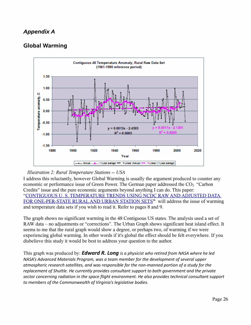
I address this reluctantly, however Global Warming is usually the argument produced to counter any economic or performance issue of Green Power. The German paper addressed the CO2 “Carbon Credits” issue and the pure economic arguments beyond anything I can do. This paper: “CONTIGUOUS U. S. TEMPERATURE TRENDS USING NCDC RAW AND ADJUSTED DATA FOR ONE-PER-STATE RURAL AND URBAN STATION SETS” will address the issue of warming and temperature data sets if you wish to read it. Refer to pages 8 and 9.
The graph shows no significant warming in the 48 Contiguous US states. The analysis used a set of RAW data – no adjustments or “corrections”. The Urban Graph shows significant heat island effect. It seems to me that the rural graph would show a degree, or perhaps two, of warming if we were experiencing global warming. In other words if it's global the effect should be felt everywhere. If you disbelieve this study it would be best to address your question to the author.
This graph was produced by: Edward R. Long is a physicist who retired from NASA where he led NASA’s Advanced Materials Program, was a team member for the development of several upper atmospheric research satellites, and was responsible for the non-manned portion of a study for the replacement of Shuttle. He currently provides consultant support to both government and the private sector concerning radiation in the space flight environment. He also provides technical consultant support to members of the Commonwealth of Virginia’s legislative bodies.
Page 26
Illustration 2: Rural Temperature Stations -- USA

Appendix B
Ontario Wind Potential
In case you believe that the wind power generators were badly sited, the above map should help you to see that the operators did the best they could manage. From the previously published map, comparing siting to the wind map indicates reasonable values. However, I thought the Niagara Escarpment would show more prominently than a faint yellow trail – a good demonstration of the principal that observation beats theorizing any day.
Page 27

Appendix C
Mathematical Techniques UsedIf you are wondering whether or not you can understand the material in this document be assured that most of it can be understood with a High School background in Mathematics. It uses arithmetic for the most part. The “Math” consists of counting occurrences of an event, counting hours that something was produced, totaling the production of an amount. In a couple of cases I use simple averages. If you obtain the data used in this document you should be able to duplicate results with a spreadsheet such as Open Office or Excel. I used database technology because of the number of data points, but that just makes it faster to obtain results when you wish to examine different aspects. It does not change the results obtained. You could duplicate the results manually with pencil and paper and perhaps a calculator – I don't recommend it. You could even duplicate the results with a word processor and clever use of tables and built in math – again it is too tedious for most.
Technology usedI used Interbase SMP2009 from Codegear/Embarcadero running on Slackware Linux and Suse 11, depending on availability. I also used Delphi 2007 (RAD Studio Architect) and specifically made heavy use of the included TChart function/widget to draw the graphs. The Interbase Database program is provided in a freely available developer version available to anyone, the Delphi Compiler is also available in a trial version. Should anyone wish to receive a copy of the program and data file and a copy of my very simple Delphi project, the tools are available to verify the results obtained .
DataThe data was obtained in CSV (Comma Separated Values) from the IESO Website on the Market Data Page. See http://www.ieso.ca/imoweb/marketData/marketData.asp – See the chart at: Download Historical Data Files (in XLS or CSV) ) I obtained the summary figures. These figures are updated at the end of every week and may be obtained as a contiguous file with the newest data at the end of the file. These files are easily imported into spreadsheets and databases. I use the Hourly Demands , The HOEP figures (Hourly Ontario Energy Price) and the Hourly Ontario Wind Generator Output. I have also reviewed the Hourly Import Export Schedules . I have retained a copy of all the data tables examined.
If I have any criticism of the data provided it is only that it would be helpful to see a Commercial and Industrial versus Residential usage breakdown perhaps along with “meters in use”. Those figures would (might?) assist in determining if conservation efforts are effective. Those analyses would likely require sophisticated statistical techniques and would be for an academic audience initially as it is required to have the work and the methodology checked.
I emphasize again that if there is an issue with wind power it has nothing to do with IESO, OPA or OPG.
Page 28

A Note about the author:
D Robinson, B. Sc. Is a graduate of an Ontario University and has worked in various fields including design of industrial systems and computer hardware. He has held various positions such as research manager or project manager.
A note about Qualifications and Specifications:
Except for understanding what a load graph (page 17) is and why it should be presented (that requires some engineering knowledge or background) there is nothing in this paper that requires any great degree of education to understand. Those graphs once explained are easy to understand and you can extend that knowledge easily to evaluating other equipment as long as you read all the specifications and look for the duty cycles, maximum and minimum operating speeds and predicted design life. Keep in mind that engineering types are a generally conservative group and like to understate the specifications of the machines they design.
If you struggle with technical material remember that reading technical specifications is simply a learned skill. If you have trouble understanding some portions of the paper find a college technology or technical graduate or a university science graduate, or engineer they should be able to help you or they should know who can.
Suggestions for Improvement:
You can reach the author at:
Email: windpower2010 AT rogers DOT com
End of Document
Page 29

Watts With The Wind
Wind Power in OntarioRevised June 18, 2010
1,100 MW Capacity
and only 4 MW Available
Copyright 2010D. Robinson
Page 30