walk
DESCRIPTION
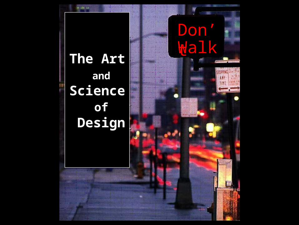
The Art and Science of Design. Don’t. Walk. What is Visual Design?. Design is a process of purposeful visual creation Unlike artwork, which are realizations of the artist's personal visions and dreams, design fills practical needs - PowerPoint PPT PresentationTRANSCRIPT
WalkDon’t
The Art and
Science of
Design

Design is a process of purposeful visual creation
Unlike artwork, which are realizations of the artist's personal visions and dreams, design fills practical needs
A design has to be placed before the eye of the problemand convey a predetermined message
Training product has to meet the learner's requirement
What is Visual Design?

Role of Design Attention Interest Desire Action
Parts of a LayoutHeader Sub-header Body Caption Margin Columns Illustration Space Graphic elements Lines Logos Texture Arrows

What is Visual Design?
• It is the art of sending a message that can be understood by the intended receiver
• Visual information is everywhere. Television, computer screens, signs, symbols, books, magazines, movies, and even body language provide visual messages.

If you saw this posterin a gym locker room what would you give thought to doing?

BALANCE:
UNITY:
EMPHASIS:
HARMONY:
ORGANIZATION:
CLARITY:
SIMPLICITY:
Principals of Visual DesignThe following are good design principals to follow in the design of instructional visuals, whether they be a billboard, poster, page in a magazine,website, or multimedia production.
= 7 Elements of Design

7 Principals of Visual Design1. Clarity- is the topic of the site immediately apparent?
2. Simplicity- Is the layout and content to the point and not “over the
top”?
3. Harmony- is the layout, content, navigation and treatment
consistent?
4. Emphasis- Are the key elements of the site emphasized?
5. Organization- Is the content “chunked” and is the content
placement within the site intuitive?
6. Unity- Are the design elements visually tied together, is there a
consistent type of graphic or media type?
7. Balance- Is the site visually balanced, does it draw the eye to the
key points/ areas?

Balance is a psychological sense of equilibrium
Balance
As a design principle, balance places the parts of a visual in an aesthetically pleasing arrangement.

When a design can be centered or evenly divided both vertically and horizontally it has the most complete symmetry possible. Symmetrical balance generally lends itself to more formal, orderly layouts. They often convey a sense of tranquility or familiarity or elegance.
Symmetrical Balance

Symmetrical Design Example

Balance is informal when sides are not exactly symmetrical, but the resulting image is still balanced. Asymmetrical design is typically off-center or created with an odd or mismatched number of disparate elements. Uneven elements present us with more possibilities for arranging the page and creating interesting designs than perfectly symmetrical objects. Asymmetrical layouts are generally more dynamic and by intentionally ignoring balance the designer can create tension, express movement, or convey a mood such as anger, excitement, joy, or casual amusement
Asymmetrical Balance

Asymmetrical Design Example

Unity is the relationship among the elements of a visual that helps all the elements function together. Unity gives a sense of oneness to a visual image. In other words, the words and the images work together to create meaning.
Unity

Unity can be achieved
through the use of similar shapes

Unity can be achieved through the use of a common pattern

Unity can be achieved through the use of a common background.

Unity can be achieved through the use of space.

Unity In this example the viewer’s eye has to make an uncomfortable jump to link the two groups of buildings.
By including a road the link is more comfortable. The picture has better unity.

Harmony - the blending of elements to create a more pleasing and integrated appearance. For example, in a slide presentation harmony is created by the repetition of the same elements, such as repeating the same font, color, or the same bullets, using the same background on each linked page.
HARMONY

Emphasis is the most important element of the layout
emphasized? Emphasis gives a layout interest, counteracting confusion and monotony.
• changing the of key words
• changing the • using a different color• Underlining or italicizingor by using an asterisk or check
mark beside key phrases or words.
enlarging the image
typeface
font size
What message is stressed here?

Emphasis This condition exists when an element or elements within a visual format contain a hierarchy of visual importance.

Emphasis Change in size and boarder color adds interest.
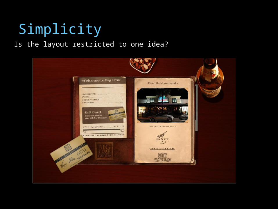
SimplicityIs the layout restricted to one idea?

Emphasis

Balance

Harmony Do all the elements of the layout fit together or are some elements contradictory?
Home Page Product Page

OrganizationThe elements of the layout must be arranged in a pattern which is easy for the viewer to comprehend.

ClarityIs the purpose of the layout obvious to the audience for whom the message is intended?

Unity

Creating a Dramatic Homepage• Fast Loading- <8-10 sec. (<20 for all other pages)• Purpose- Define your purpose. • Purpose drives content. Content drives design.• Careful use of images
– Pictures, Flash, movies, etc.- must have a reason to be there!– Good Flash is transparent- integrated into design not added in– K.I.S.S.- Keep it simple st….
• Navigation Design– 3 Click rule- user finds what they need in 3 clicks or less– No more than 7-10 links on homepage (drop downs don’t count)
• Proper use of color• No left to right scrolling- 2 ½ -3 screens vertical okay• Do not dictate a necessary browser

Some Things to Remember•Less is more-keep the first page, card, slide, video title to a minimum
•Pay attention to the elements and principles of art and design.
•Text must contrast against a background for easy reading.
•Text should be laid out in columns or blocks of space like a magazine, not horizontally like a novel.
•Content is most important-no errors in grammar or spelling allowed.
•The heading or title should grab a visitor's attention.
•Include similar headings throughout for consistency.
•Repeat basic formats-same background, same icons, same color combinations, and same layout.

Some Things to Remember cont.
•Provide visitor with enough information and menus in the beginning to
make wise choices.
•Do not include links to the outside world on the first page of a web site.
You will lose your audience.
•Post a month, day, and year of the publishing. On a web page the
footer should contain a date, person to contact, navigational tools, and
author of the page.
•Treat web pages like slides or hyper cards, they need categories to
link to and should not have endless scrolling.
•Too much of a good thing like color or texture spells disaster.
•An image or animated gif that is too big will diminish the content.

Ways to Represent Objects
There are three major ways to represent objects:
pictorial symbols, graphic symbols, or text/verbal symbols
Elements of Design

Being Creative
• Being creative... Designing visual images for instruction requires the ability to think visually coupled with the ability to relate verbal symbols (words) with corresponding visual symbols (pictures or graphical images) in a meaningful and creative way.
Elements of Design
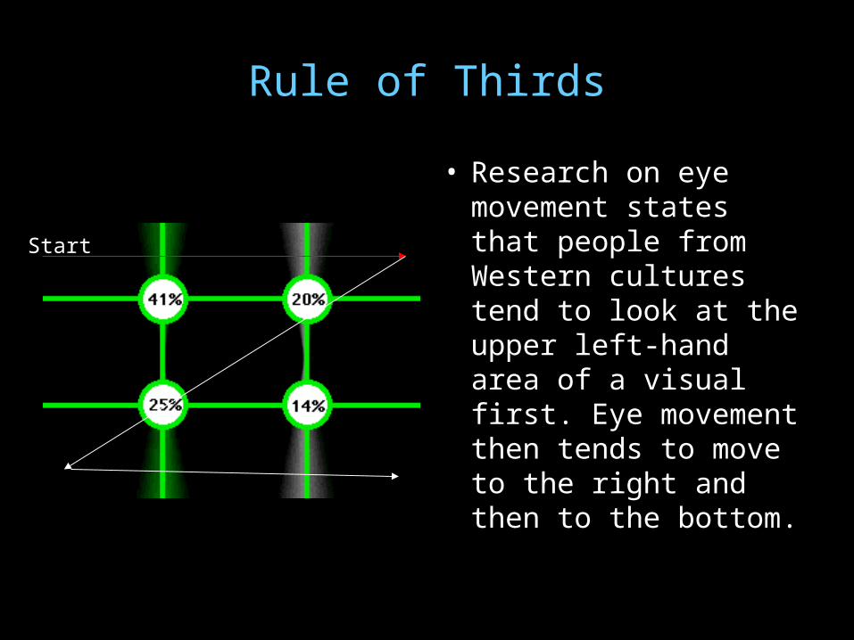
Rule of Thirds
• Research on eye movement states that people from Western cultures tend to look at the upper left-hand area of a visual first. Eye movement then tends to move to the right and then to the bottom.
Start

Rule of Thirds
• The 'rule-of-thirds' is a principle of photographic and graphic composition in which an area is divided into thirds both vertically and horizontally and the centers of interest are located near the intersections of the lines.
Center of Interest – most peoplelook here first
Elements of Design

Variety of VisualsVariety of Visuals
Changes in a visual image Changes in a visual image help keep attention help keep attention directed on the visual. directed on the visual.
Too much detail in a visual Too much detail in a visual image can detract from image can detract from instruction. The age and instruction. The age and developmental level of developmental level of people viewing the visual people viewing the visual determine the amount of determine the amount of detail to include in a visual detail to include in a visual image. Younger children image. Younger children need more detail than need more detail than older children. older children.
Elements of Design

Amount of Detail Elements of Design

Layout
• The layout of a visual needs to be clear and focus attention to the appropriate places in the image.
• The shapes of several letters are useful to guide layout patterns. The letters C, O, S, Z, L, T, and U can be used as basic guidelines for layout.
Elements of Design

Do you see the letter Z and how your eye follows the angle of the hotdog to the bottom text?
Elements of Design

Letters styles are either serif or sans serif.
Serif style fonts have finishing lines at the ends of the letters.
Sans serif fonts are more block-like.
Elements of Design

Text Placement• When words are added to
label parts of a visual image, be sure it is clear to the viewer of the image which words go with which objects.
• Move labels close to the objects they refer to.
Poor
Good
Elements of Design

Use of Contrast
• To make your visuals easy to read, be sure to have a good amount of contrast between the color of the letters and the color of the background.
• These examples do not have good contrast between the color of the letters and the color of the background making them difficult to read.
•
Elements of Design

Use of Contrast
• These examples have good contrast between the color of the letters and the color of the background making them easy to read.
•
good contrast good contrast

Contrast
•You can use the color wheel to determine which colors contrast best.•Analogous colors are adjacent to each other on the color wheel.•Complementary colors are opposite each other on the color wheel.

Using Fonts for Effect
. • To make your visuals easy to read, be sure to have a good amount of contrast between the color of the letters and the color of the background. Text should be in lower case. Use capitals only where normally required. ALL CAPITAL LETTERS ARE HARD TO READ, ESPECIALLY FOR MORE THAN ONE LINE.
The arrangement of words in a visual image should help clarify the message or information to be conveyed
To make your visuals easy to read, be sure to have a good amount of contrast between the color of the letters and the color of the background. Text should be in lower case. Use capitals only where normally required.
All capital letters are hard to read, especially for one line.
The arrangement of words in a visual image should help clarify the message or information to be conveyed
Elements of Design

Using Fonts as Message
• Typography has to do with the size, shape, and placement of words. Text should be in lower case. Use capitals only where normally required.
• ALL CAPITAL LETTERS ARE HARD TO READ, ESPECIALLY FOR MORE THAN ONE LINE .
• The arrangement of words in a visual image should help clarify the message or information to be conveyed.
W
O
r
D
s
W
o
r
d
s
Elements of Design

Size of Font
• The size of letters used depends on the purpose of the visual.
• Posters need letters large enough to be read at a distance, approximately 1/4² for every eight feet of viewer distance from the visual.

Color and the Emotions
Hue is another word for color.Chroma is the intensity or purity of color.Tint is a color mixed with white.Tone is a color mixed with gray.Shade is a color mixed with black.

Color and the Emotions
• RED - Red sets the pituitary gland going at a rapid pace. Any design in red takes on a persona that is exciting, passionate, provocative, and dynamic. Aggressive in nature, it commands attention and demands action. Seen as the sexiest of all colors, red is equally seductive in the marketplace. Deepen the red tones to shades of burgundy and they still maintain the inherent excitement of the "mother" color but are more subdued. Consumers respond well to wine tones. They see them as rich, refined, expensive as well as more authoritative, mature, lush, opulent, and elegant than a vibrant red. The result: burgundy is an excellent choice for expensive products.

Color and the Emotions
• PINK - Depending on its value or intensity, pink has various mood swings being either romantic, youthful, happy, or sweet. If you are looking for the same high energy as red, then vivid, shocking or hot pinks create a feeling of movement and wild abandon. Although these colors are fun and exciting, they are riskier to use than red because they are often thought of as faddish and do not age well. These colors are used for less expensive items such as toys or plastic novelty goods. Bubble-gum pinks are immature, artificial, and seen as tacky on items that are more expensive. The cosmetic industry favors dazzling, voluptuous pinks because they create attention at the point of purchase when a sultry, upscale, and sophisticated look is the goal. Do you want a more "grown up" look? Then magenta or fuchsia give the impression of sensual and theatrical. Less saturated pinks watered down to the point that red is almost gone give a romantic mood whereas dusty pinks and mauves are soft, subtle, and sentimental. Seen as sweet and healthy (pink cheeks), pinks are excellent choices for the food and beverage industry, cosmetics, perfumes, bath products, facial salons, and health care products.

Color and the Emotions• ORANGE - The hottest temperature of all colors, orange is glowing, vital,
and high arousal that is associated with autumn's shimmering foliage or radiant shadings of sunset. In its most vivid intensity, it is a color not taken seriously because it then becomes playful, expressive, happy, and childlike. Bright orange is an excellent choice for toys, games, inexpensive plastics, and any novelty products that appeal to children or the young-at-heart. When used in graphic applications, it becomes comedic and cartoon-like so it is not a good choice if you want to convey a serious message. Quite a few people view bright, fluorescent orange as loud and many dislike the neon intensities. However, vivid or neon orange are highly visible and excellent point of purchase colors. More subtle tones of orange radiate warmth and vitality. These shades lend themselves well to "ethnic" Mexican or Indian themes or products. Peach, apricot, coral, and melon are pleasing to the eye and are outstanding choices for the upscale, affluent markets. These colors are nurturing, approachable, tactile colors that people want to reach out to touch or taste making them first-rate choices for healthcare products, dining areas, food services, or food packaging. Other first-class uses of these colors are makeup salons, beauty spas, and in beauty products and/or packaging.

Color and the Emotions• YELLOW - Warm, sunny, luminous yellow equals splendor and the heat of the sun in
every society. It is optimistic, creative, encouraging, imaginative, has an aura of enlightenment, and gives a feeling of well-being. However, if a person is emotionally fragile with low-self esteem yellow can upset them. Yellow is the most visible and luminous color of the spectrum plus is the first color the eye process. In lighter shades, consumers see yellow as cheerful, mellow, and soft to touch. The more saturated yellow is the brighter it becomes unlike other colors that deepen with saturation. Various shades of yellow are associated with delicious foods such as banana cream or custard. Lemon yellow is happy with a sweet, citrus taste although less sophisticated than cream yellow. Most Americans prefer cream or sun-baked yellows while green-yellow is not popular. Asian cultures accept all shades of yellow, especially the green-based hues. Green-yellow is often associated with tart, acidic tastes such as the lime. Proceed with caution. In nature yellow and black is the most unignorable color. They are a predatory and dangerous color combination seen in stinging insects such as the wasps, killer honeybees, and other exotic creatures. Mix black with yellow and the result is various shades of green, which expands a color palette with just two colors. Think of yellow and black road signs. An industrial strength color combination for signage, it is the "pow" in powerful and commands attention on store shelves, signage, or in design

Color and the Emotions
• BROWN - Rustic, sheltering, rich brown is associated with hearth and home, substance and stability, and earth. More than any other color, think of brown in terms of usage and context. Connected to the earth, various tones of brick, brown, tan, clay, and terra cotta are rooted, protective, and secure combinations. Earthy colors generally give a positive response. However, browns can also give the impression of something dirty, which is not a pleasant thought and is a challenge to the fashion industry. Browns have earned greater visibility and respect due to designer coffees and brown leathers in the fashions and interiors industries. In the food industry, browns have been successful for many years. Think of brown breads, rice, grains, and cereals, healthy, wholesome, and organic. On the other side is chocolate mouthwatering, delicious, and a comfort food. Whether related to wholesome and healthy or satisfying your sweet tooth, brown relates to good taste and is appropriate to foodstuffs or food service environments.

Color and the Emotions• BLUE - Constant, quiet, serene, dependable, reliable, trustworthy,
committed, cool blue is the most popular color and is strongly associated with sky and water. On the positive side, depending on the intensity, blue is constant, encourages intellectual activity, calms the mind, or stimulates thought. On the reverse, it may appear cold or unfriendly. Inspiring confidence, blue is an ideal color for corporate identities, web sites, packaging, and products where these messages are important. Restful and calm, humans are soothed and replenished when viewing blue. Darkening any color moves it closer to black and gives the color power. Deep navy blue is very serious and is the most powerful of all the blues giving instant authority and credibility to any business. However, concentrated and over-abundant black can look ominous. Therefore, navy blue is a more friendly and approachable color. Do you want to add a completely new dimension to your color scheme? Brilliant, electric blue is dynamic and dramatic, expressing exhilaration. Periwinkles are warm and playful, carrying undertones of purple that bring in some of the energy of red. Teal blue is rich, unique, and definitely an up-scale hue, pleasing to the eye and combining well with many other colors. If you are looking for a color appropriate to both men and women, teal is it as it is equally appealing to both genders.

Color and the Emotions
• GREEN - Soothing, nature, refreshing, fresh, healing green is at the center of the spectrum and offers the widest range of choices and is the most restful to the eye. "Mother" blue green always elicits pleasant responses representing the best qualities. Combined with white, blue-green is cool and clean with an underlying element of warmth as if you are floating in warm, tropical waters with the sun shining down so you can see the ocean floor below. Blue-greens and aquas are first-rate choices for packaging or the colors for personal hygiene products or beauty products as they are flattering to every skin color. Associated with nature, consumers respond to mint greens (refreshing and fresh), bright greens (grass, first buds of spring, and renewal), emerald greens (elegant), and deep greens (stately tall pines, refreshing scents, and the silence of the forest, money, prestige, security, feeling safe). Trustworthy deep green is an excellent choice for promoting banks, lending institutions, and other businesses where prestige and/or security are considerations. Yellow-greens relate well to gardening/floral motifs. However, vivid yellow-green is associated with nausea and illness. Kids and adolescents love bright yellow-green simply because adults hate it making it a good selection for kid or adolescent related products or services. Although chartreuse is trendy, it does get people's attention and works very well in capturing the eye. Olive green is a color that does not rate well unless combined in an interesting, complex way and then only appeals to upscale buyers. If yours is a food industry, use typical vegetable colors; spinach, lettuce, broccoli, etc. Because we are accustomed to those colors, they are not offensive unless you happen to dislike a specific vegetable. Use vegetable greens for food service, dining areas, or packaging "healthy" foods. Seafoam greens are non-invasive, cooling, and calming to consumers.
Color and the Emotions
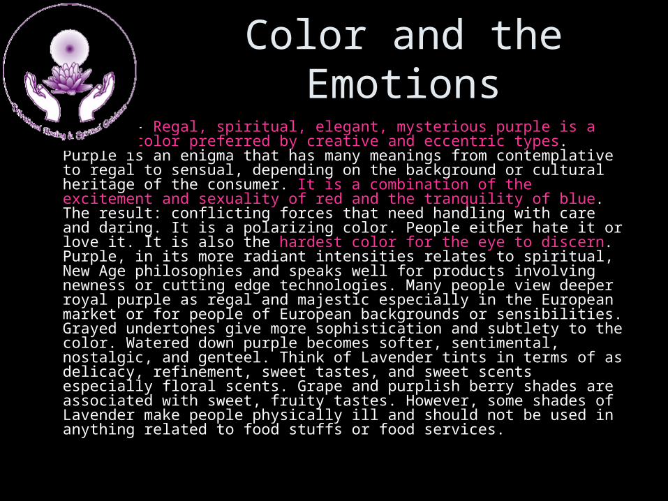
• PURPLE - Regal, spiritual, elegant, mysterious purple is a complex color preferred by creative and eccentric types. Purple is an enigma that has many meanings from contemplative to regal to sensual, depending on the background or cultural heritage of the consumer. It is a combination of the excitement and sexuality of red and the tranquility of blue. The result: conflicting forces that need handling with care and daring. It is a polarizing color. People either hate it or love it. It is also the hardest color for the eye to discern. Purple, in its more radiant intensities relates to spiritual, New Age philosophies and speaks well for products involving newness or cutting edge technologies. Many people view deeper royal purple as regal and majestic especially in the European market or for people of European backgrounds or sensibilities. Grayed undertones give more sophistication and subtlety to the color. Watered down purple becomes softer, sentimental, nostalgic, and genteel. Think of Lavender tints in terms of as delicacy, refinement, sweet tastes, and sweet scents especially floral scents. Grape and purplish berry shades are associated with sweet, fruity tastes. However, some shades of Lavender make people physically ill and should not be used in anything related to food stuffs or food services.

Color and the Emotions
• NEUTRALS - Timeless, natural, classic, quality, quiet neutrals or monotones are achromatics literally without color. Beige, gray, and taupe impart the psychological message of dependability. Identified with durability, time, and antiquity neutrals are solid, enduring, timeless, and classic. Think in terms of the Rock of Gibraltar or ancient monuments or the sands of time. Neutrals lend these qualities to products and environments. Use these colors whenever the message is one of durability, permanence, or dependable performance whether it is for interiors, packaging, clothing or other products or services. Regarded as "safe" and non-offensive, they do not date a product or service because they will always be in style. However, there are many nuances to neutrals due to their undertones, which can radically shift the temperature and change the psychological impact. Warm gray is never serious but cool gray is calm and collected. Warm sandy beige is friendlier than cool white. The most non-committal of all colors is light to medium grays. These grays are the most neutral of all neutrals and are highly recommended for work surfaces where color matching is taking place as they are non-competitive with other colors and highly recommended as buffers between bright colors to reduce intensity of brilliance. Deepen grays with more black and they take on the black's power and presence. However, charcoal grays are never threatening or overpowering as total black sometimes is, especially in living environments, clothing, or packaging. Silver gray is a futuristic, techno color connected to minimal, spare, and sleek imagery.

Color and the Emotions• WHITE - Lightweight, pristine, pure, bright, innocent white implies purity
and simplicity. The human eye sees white as a brilliant color so it works well for contrast, in signage, in point of purchase, in packaging, or any other usage that catches the eye. However, pure white can cause glare and optical fatigue. When a message needs to give a sense of clarity and cleanliness, white is the obvious choice. White is often used in infant products, and products involving hygiene and health. White is the absence of color in terms of dyes and pigments. However, Sir Isaac Newton discovered in his experiments with prisms that white light contains all the colors of the spectrum while black had none. Unrelieved white can create starkness without any sense of warmth or welcome. Symbolically, pure white is absolute minimalism, the clean paper against which all other colors may contrast. It is the ultimate contrast to black. However, in print, packaging or product design white can give a generic non-descript impression unless enhanced with smart graphics and/or a bit of another color. Warm off-whites are friendly especially when the undertone is from the warmer colors. Creamy whites are delicious and vanilla white suggests light, pleasant scents and tastes.

Color and the Emotions• BLACK - Powerful, mysterious, strong, classic, elegant black is associated
with magical mysteries of the night. The opaque, powerful, after-dark soul of black is seen in every product category as sophistication and style. Consumers perceive black as powerful, dramatic, elegant, and expensive. In food packaging, consumers will pay more for a black "gourmet image." Too much black, however, sometimes gives the feeling of something ominous as in some cultures it is associated with mourning or the Mafia or the occult. All black interiors can look foreboding without other colors to relieve it. Packaging, signage, and advertising should never be completely black as the message would be somewhat lost to the consumer. Appearing a heavy color, black gives the message of strength, power, potency, and longevity. The weight of the color makes it a good choice for appliances or equipment or any product that needs to tell consumers it is solid and durable. Black and white is the classic combination of strength, clarity, power, and purity. Although black is powerful and classic, it is not necessarily trustworthy. It is important to identify the message of your business in relation to your targeted market demographics and choose your color scheme accordingly. Do no make the mistake of choosing based on your personal preference.

Color and the Emotions
• http://www.carnrightdesign.com/color4business/color_awareness.htm

Examples

Key Points to Remember• Always refer back to the 7 principles of design when planning a web site or visual message
•Keep in mind your target audience when choosing a design and color scheme
•Make sure you consider typography when choosing fonts, especially for content.
•Remember to consider how your eye moves through a design when planning your layout.