viewon - graphical components
TRANSCRIPT
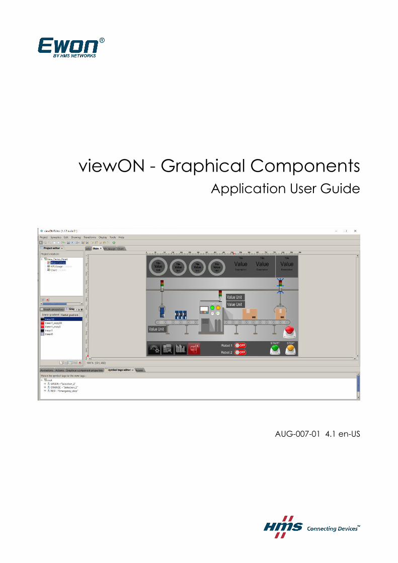
viewON - Graphical ComponentsApplication User Guide
AUG-007-01 4.1 en-US
2 (53)________________________________________________________________________________________________________________________________________________________________
Important User InformationDisclaimerThe information in this document is for informational purposes only. Please inform HMS Industrial Networks of any inaccuracies or omissions found in this document. HMS Industrial Networks disclaimsany responsibility or liability for any errors that may appear in this document.
HMS Industrial Networks reserves the right to modify its products in line with its policy of continuous product development. The information in this document shall therefore not be construed as a commitment on the part of HMS Industrial Networks and is subject to change without notice. HMS Industrial Networks makes no commitment to update or keep current the information in this document.
The data, examples and illustrations found in this document are included for illustrative purposes and are only intended to help improve understanding of the functionality and handling of the product. In view of the wide range of possible applications of the product, and because of the many variables and requirements associated with any particular implementation, HMS Industrial Networks cannot assume responsibility or liability for actual use based on the data, examples or illustrations included in this document nor for any damages incurred during installation of the product. Those responsible for the use of the product must acquire sufficient knowledge in order to ensure that the product is used correctly in their specific application and that the application meets all performance and safety requirements including any applicable laws, regulations, codes and standards. Further, HMS Industrial Networks will under no circumstances assume liability or responsibility for any problems that may arise as a result from the use of undocumented features or functional side effects found outside the documented scope of the product. The effects caused byany direct or indirect use of such aspects of the product are undefined and may include e.g. Compatibility issues and stability issues.
viewON - Graphical Components - Application User Guide AUG-007-01 4.1 en-US
3 (53)________________________________________________________________________________________________________________________________________________________________
Table of Contents
1.Hardware and software requirements..........................................................................................4 1.1.Hardware requirements.........................................................................................................................4 1.2.Software requirements..........................................................................................................................4 1.3.Ewon firmware version.........................................................................................................................4
2.Graphical Component....................................................................................................................5 2.1.Button...................................................................................................................................................6 2.2.Check Box..........................................................................................................................................10 2.3.Toggle Button.....................................................................................................................................12 2.4.Combo Box.........................................................................................................................................15 2.5.List......................................................................................................................................................19 2.6.Text field.............................................................................................................................................23 2.7.Number Editor....................................................................................................................................25 2.8.Slider..................................................................................................................................................27 2.9.Alarm Summary.................................................................................................................................29 2.10.Alarm History...................................................................................................................................31 2.11.Menu Bar..........................................................................................................................................33 2.12.Trends ..............................................................................................................................................36 2.13.Data Table.........................................................................................................................................46 2.14.Bar graph..........................................................................................................................................48
3.Document History and Trademark Information.......................................................................53 3.1.Document History...............................................................................................................................53 3.2.Trademark Information.......................................................................................................................53
viewON - Graphical Components - Application User Guide AUG-007-01 4.1 en-US
Hardware and software requirements 4 (53)________________________________________________________________________________________________________________________________________________________________
1. Hardware and software requirements
1.1.Hardware requirementsIn order to follow this guide you need:
• 1 Ewon device with viewON capabilities (for example: Ewon Flexy)• 1 PC with an Internet access and an up-to-date web browser
1.2.Software requirementsEwon configuration software:
The Ewon device is configured through its embedded web server. So all you need is a standard web browser software like Firefox or Chrome.
Additionally we suggest to download the eBuddy utility on our support website:https://resources.ewon.biz/download/ebuddy
The eBuddy utility lists all the Ewon devices available on your network and changesthe default IP address of an Ewon to match your LAN IP address range.With eBuddy you can also easily backup/restore your configuration or upgrade the firmware of your Ewon.
viewON software:
To create a viewON project, the viewON Editor is needed on your PC.
To visualize the exported viewON application on the Ewon you simply need an up- to-date web browser (Mozilla FireFox, Google Chrome,...). This makes the viewON project visualization compatible with any kind of platform (computer, tablet, smartphone) and any kind of OS (Windows, Linux, MacOS, iOS, Android).
The viewON editor software can be downloaded on the Ewon web site:
https://resources.ewon.biz/download/viewon
1.3.Ewon firmware versionTo be able to follow this guide, your Ewon device needs a firmware version 14.4s0 or higher.A simple way to upgrade the Ewon firmware is to use eBuddy, the Ewon software companion. We recommend upgrading your Ewon to the latest available firmware version before starting a new viewON project.
viewON - Graphical Components - Application User Guide AUG-007-01 4.1 en-US
Graphical Component 5 (53)________________________________________________________________________________________________________________________________________________________________
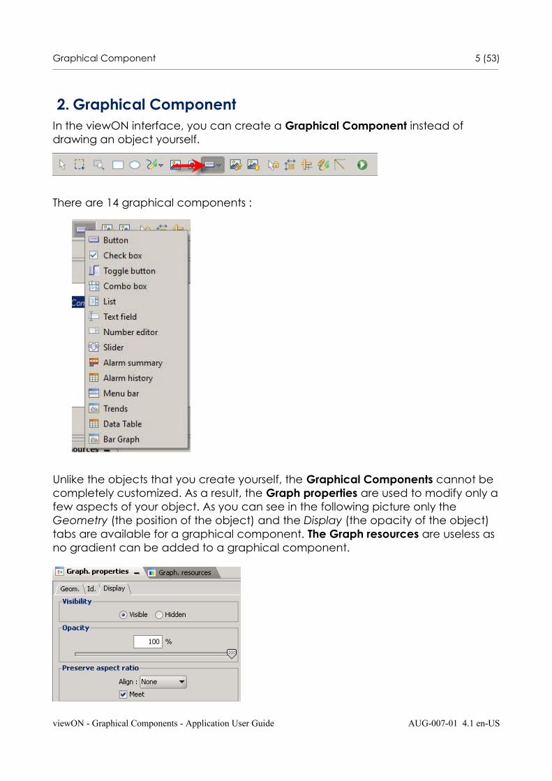
2. Graphical ComponentIn the viewON interface, you can create a Graphical Component instead of drawing an object yourself.
There are 14 graphical components :
Unlike the objects that you create yourself, the Graphical Components cannot be completely customized. As a result, the Graph properties are used to modify only afew aspects of your object. As you can see in the following picture only the Geometry (the position of the object) and the Display (the opacity of the object) tabs are available for a graphical component. The Graph resources are useless as no gradient can be added to a graphical component.
viewON - Graphical Components - Application User Guide AUG-007-01 4.1 en-US

Graphical Component 6 (53)________________________________________________________________________________________________________________________________________________________________
We will see later that some aspects are configurable in the Graphical Component properties section.
2.1.Button
The Button allows you to send a value to your Tag. Select Button, the context box will close.
With the mouse, click on your View and do a click and drag movement to make the Button appear.
viewON - Graphical Components - Application User Guide AUG-007-01 4.1 en-US
Graphical Component 7 (53)________________________________________________________________________________________________________________________________________________________________
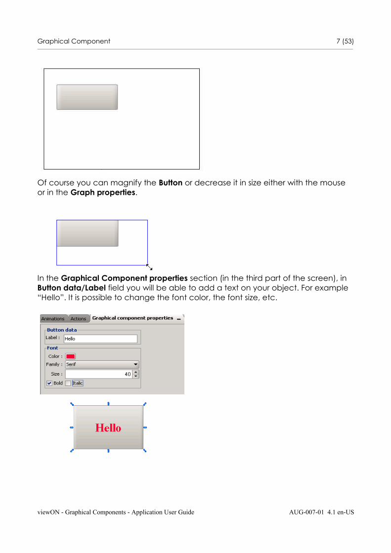
Of course you can magnify the Button or decrease it in size either with the mouse or in the Graph properties.
In the Graphical Component properties section (in the third part of the screen), in Button data/Label field you will be able to add a text on your object. For example “Hello”. It is possible to change the font color, the font size, etc.
viewON - Graphical Components - Application User Guide AUG-007-01 4.1 en-US
Graphical Component 8 (53)________________________________________________________________________________________________________________________________________________________________
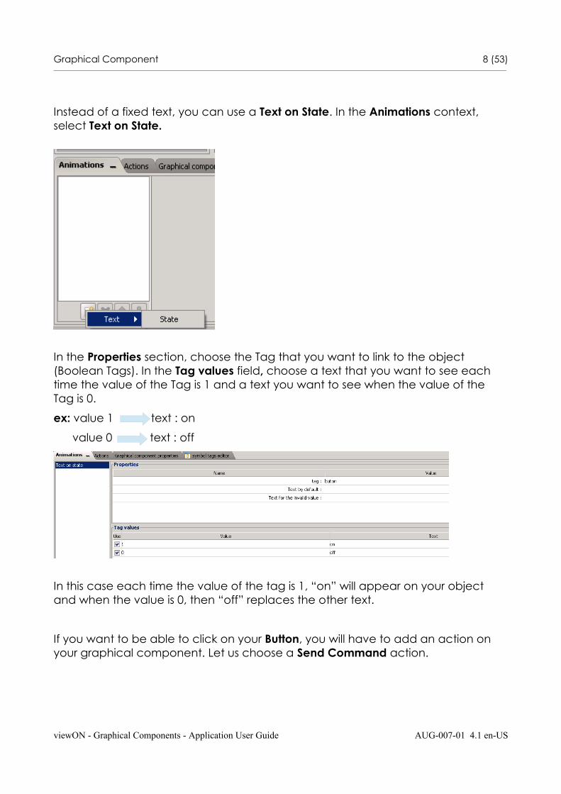
Instead of a fixed text, you can use a Text on State. In the Animations context, select Text on State.
In the Properties section, choose the Tag that you want to link to the object (Boolean Tags). In the Tag values field, choose a text that you want to see each time the value of the Tag is 1 and a text you want to see when the value of the Tag is 0.
ex: value 1 text : on
value 0 text : off
In this case each time the value of the tag is 1, “on” will appear on your object and when the value is 0, then “off” replaces the other text.
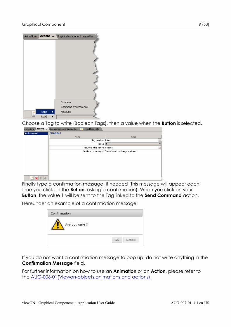
If you want to be able to click on your Button, you will have to add an action on your graphical component. Let us choose a Send Command action.
viewON - Graphical Components - Application User Guide AUG-007-01 4.1 en-US
Graphical Component 9 (53)________________________________________________________________________________________________________________________________________________________________
Choose a Tag to write (Boolean Tags), then a value when the Button is selected.
Finally type a confirmation message, if needed (this message will appear each time you click on the Button, asking a confirmation). When you click on your Button, the value 1 will be sent to the Tag linked to the Send Command action.
Hereunder an example of a confirmation message:
If you do not want a confirmation message to pop up, do not write anything in theConfirmation Message field.
For further information on how to use an Animation or an Action, please refer to the AUG-006-01(Viewon-objects,animations and actions).
viewON - Graphical Components - Application User Guide AUG-007-01 4.1 en-US
Graphical Component 10 (53)________________________________________________________________________________________________________________________________________________________________
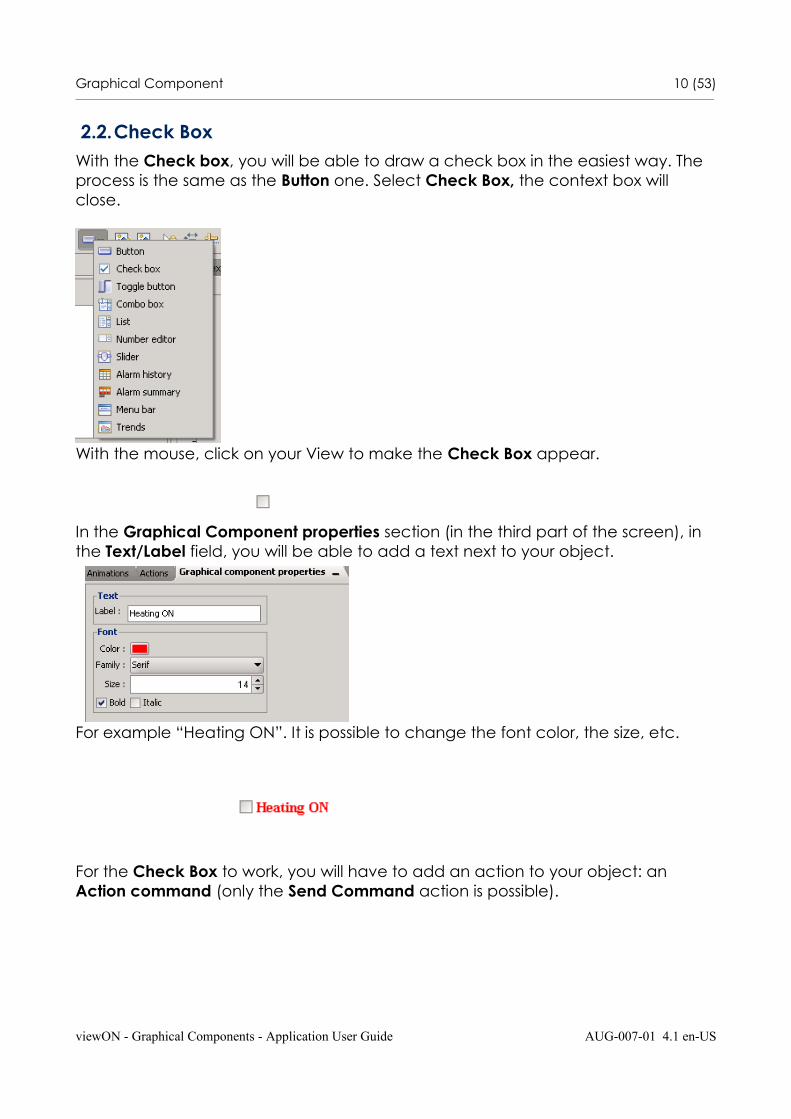
2.2.Check BoxWith the Check box, you will be able to draw a check box in the easiest way. The process is the same as the Button one. Select Check Box, the context box will close.
With the mouse, click on your View to make the Check Box appear.
In the Graphical Component properties section (in the third part of the screen), in the Text/Label field, you will be able to add a text next to your object.
For example “Heating ON”. It is possible to change the font color, the size, etc.
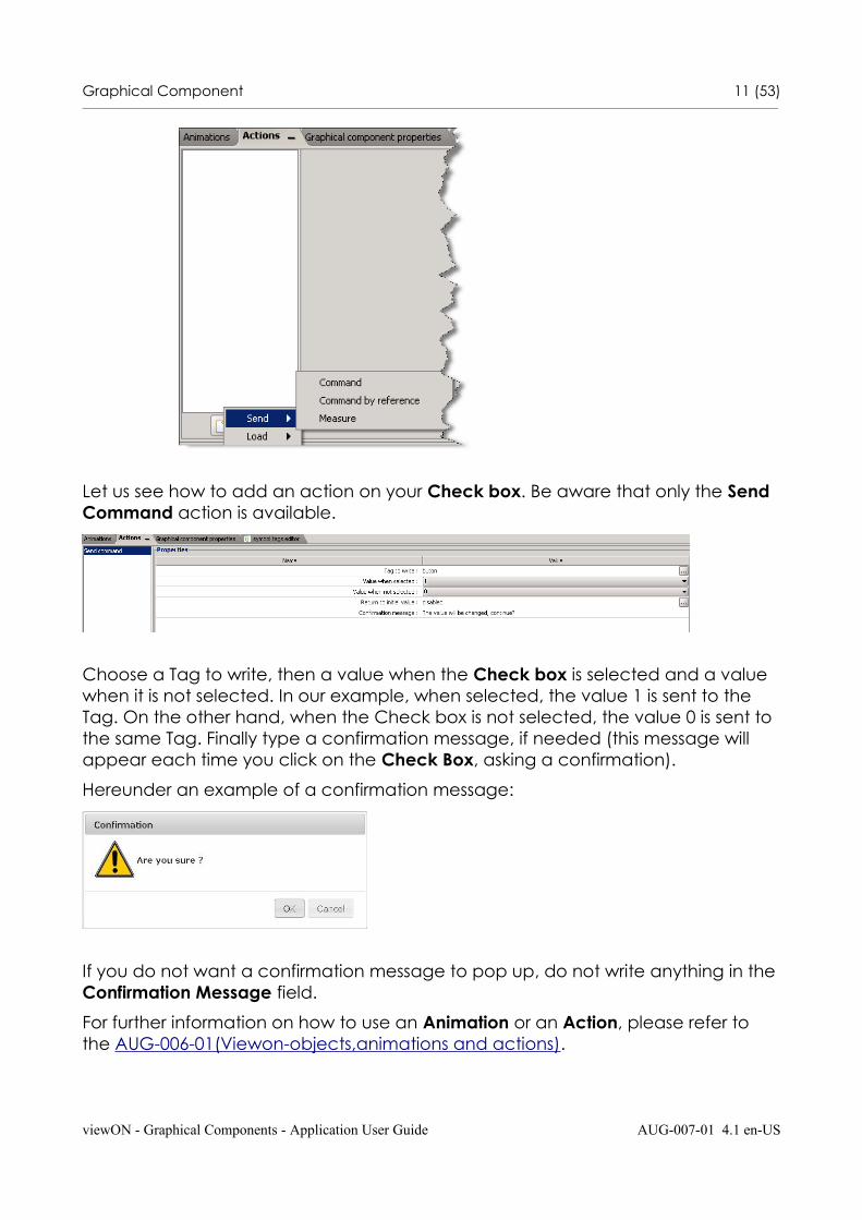
For the Check Box to work, you will have to add an action to your object: an Action command (only the Send Command action is possible).
viewON - Graphical Components - Application User Guide AUG-007-01 4.1 en-US
Graphical Component 11 (53)________________________________________________________________________________________________________________________________________________________________
Let us see how to add an action on your Check box. Be aware that only the Send Command action is available.
Choose a Tag to write, then a value when the Check box is selected and a value when it is not selected. In our example, when selected, the value 1 is sent to the Tag. On the other hand, when the Check box is not selected, the value 0 is sent to the same Tag. Finally type a confirmation message, if needed (this message will appear each time you click on the Check Box, asking a confirmation).
Hereunder an example of a confirmation message:
If you do not want a confirmation message to pop up, do not write anything in theConfirmation Message field.
For further information on how to use an Animation or an Action, please refer to the AUG-006-01(Viewon-objects,animations and actions).
viewON - Graphical Components - Application User Guide AUG-007-01 4.1 en-US

Graphical Component 12 (53)________________________________________________________________________________________________________________________________________________________________
2.3.Toggle ButtonThe Toggle button allows you to send a value to your Tag. Select Toggle button, the context box will close.
With the mouse, click on your View to make the Toggle Button appear. Just like theButton, you will be able to add a text on this object. Be aware that for the graphical components, the Graph resources do not work as you cannot change the color of the object. In the Graphical Component properties section (in the thirdpart of the screen), in the Text/Label field, you can add text to your object.
For example “Heating”. It is possible to change the font color, the size, etc.
As for most of the graphical components, you can only apply a Send Command
viewON - Graphical Components - Application User Guide AUG-007-01 4.1 en-US
Graphical Component 13 (53)________________________________________________________________________________________________________________________________________________________________
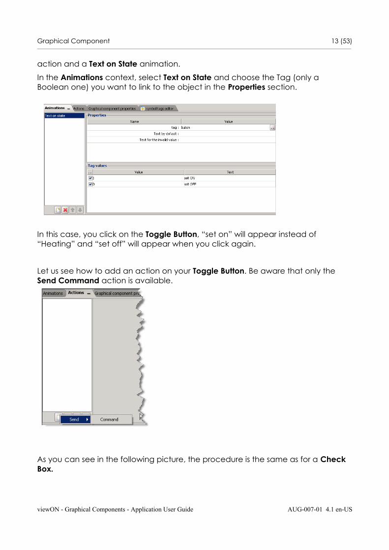
action and a Text on State animation.
In the Animations context, select Text on State and choose the Tag (only a Boolean one) you want to link to the object in the Properties section.
In this case, you click on the Toggle Button, “set on” will appear instead of “Heating” and “set off” will appear when you click again.
Let us see how to add an action on your Toggle Button. Be aware that only the Send Command action is available.
As you can see in the following picture, the procedure is the same as for a Check Box.
viewON - Graphical Components - Application User Guide AUG-007-01 4.1 en-US
Graphical Component 14 (53)________________________________________________________________________________________________________________________________________________________________
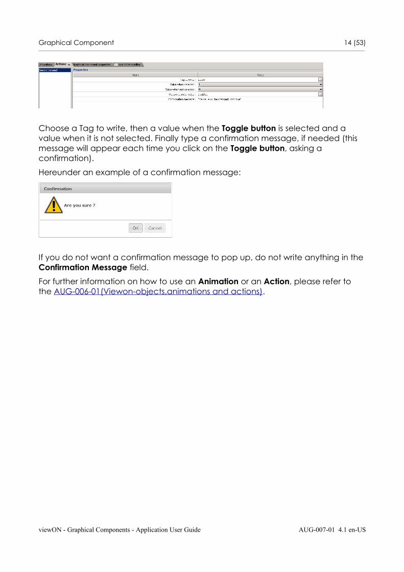
Choose a Tag to write, then a value when the Toggle button is selected and a value when it is not selected. Finally type a confirmation message, if needed (this message will appear each time you click on the Toggle button, asking a confirmation).
Hereunder an example of a confirmation message:
If you do not want a confirmation message to pop up, do not write anything in theConfirmation Message field.
For further information on how to use an Animation or an Action, please refer to the AUG-006-01(Viewon-objects,animations and actions).
viewON - Graphical Components - Application User Guide AUG-007-01 4.1 en-US
Graphical Component 15 (53)________________________________________________________________________________________________________________________________________________________________
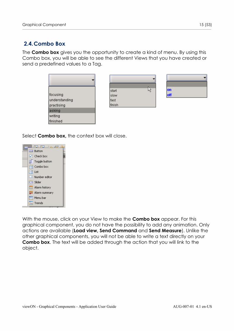
2.4.Combo BoxThe Combo box gives you the opportunity to create a kind of menu. By using this Combo box, you will be able to see the different Views that you have created or send a predefined values to a Tag.
Select Combo box, the context box will close.
With the mouse, click on your View to make the Combo box appear. For this graphical component, you do not have the possibility to add any animation. Only actions are available (Load view, Send Command and Send Measure). Unlike the other graphical components, you will not be able to write a text directly on your Combo box. The text will be added through the action that you will link to the object.
viewON - Graphical Components - Application User Guide AUG-007-01 4.1 en-US
Graphical Component 16 (53)________________________________________________________________________________________________________________________________________________________________
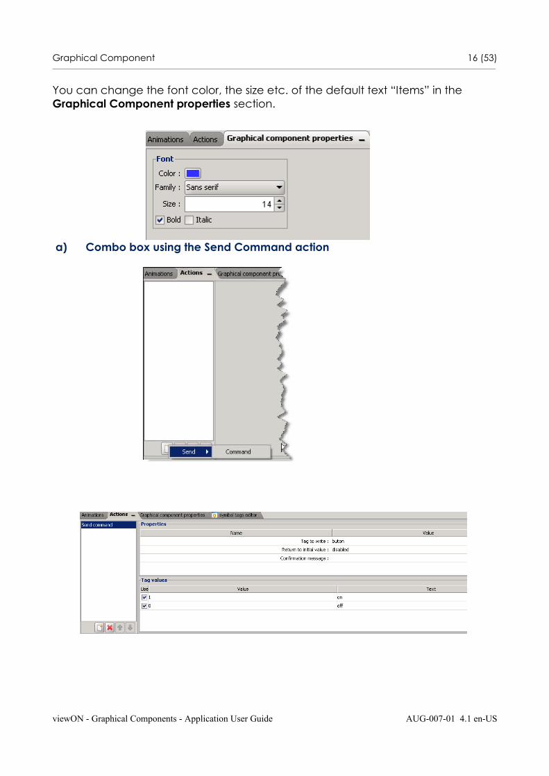
You can change the font color, the size etc. of the default text “Items” in the Graphical Component properties section.
a) Combo box using the Send Command action
viewON - Graphical Components - Application User Guide AUG-007-01 4.1 en-US
Graphical Component 17 (53)________________________________________________________________________________________________________________________________________________________________
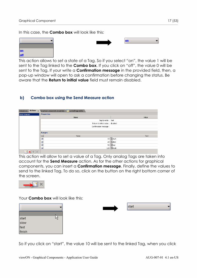
In this case, the Combo box will look like this:
This action allows to set a state of a Tag. So if you select “on”, the value 1 will be sent to the Tag linked to the Combo box. If you click on “off”, the value 0 will be sent to the Tag. If your write a Confirmation message in the provided field, then, a pop-up window will open to ask a confirmation before changing the status. Be aware that the Return to initial value field must remain disabled.
b) Combo box using the Send Measure action
This action will allow to set a value of a Tag. Only analog Tags are taken into account for the Send Measure action. As for the other actions for graphical components, you can insert a Confirmation message. Finally, define the values to send to the linked Tag. To do so, click on the button on the right bottom corner of the screen.
Your Combo box will look like this:
So if you click on “start”, the value 10 will be sent to the linked Tag, when you click
viewON - Graphical Components - Application User Guide AUG-007-01 4.1 en-US
Graphical Component 18 (53)________________________________________________________________________________________________________________________________________________________________
on “slow”, the value 20 will be sent to the Tag and so on.
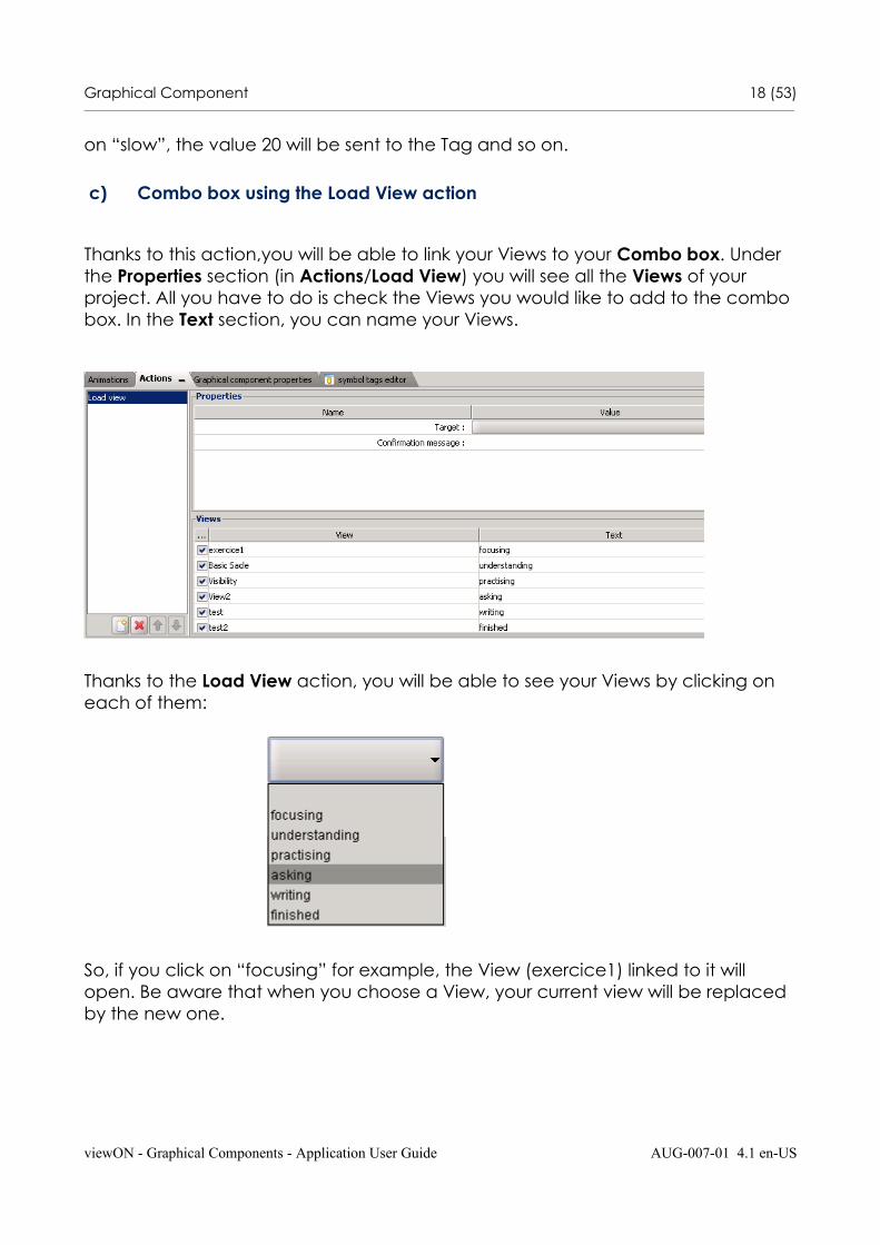
c) Combo box using the Load View action
Thanks to this action,you will be able to link your Views to your Combo box. Under the Properties section (in Actions/Load View) you will see all the Views of your project. All you have to do is check the Views you would like to add to the combo box. In the Text section, you can name your Views.
Thanks to the Load View action, you will be able to see your Views by clicking on each of them:
So, if you click on “focusing” for example, the View (exercice1) linked to it will open. Be aware that when you choose a View, your current view will be replaced by the new one.
viewON - Graphical Components - Application User Guide AUG-007-01 4.1 en-US
Graphical Component 19 (53)________________________________________________________________________________________________________________________________________________________________
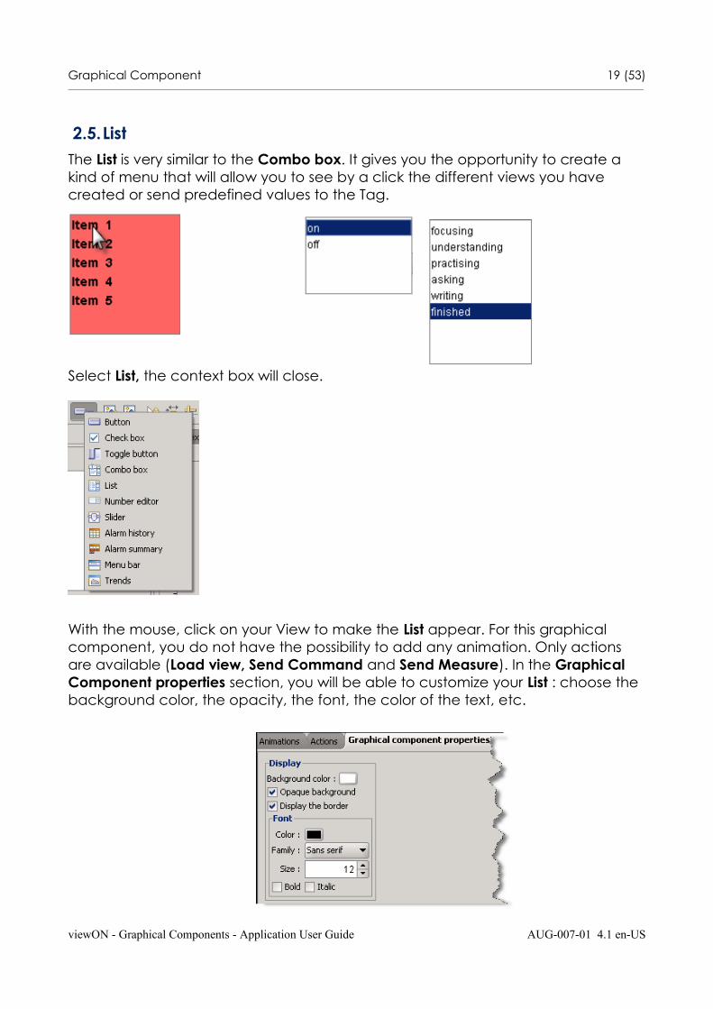
2.5.ListThe List is very similar to the Combo box. It gives you the opportunity to create a kind of menu that will allow you to see by a click the different views you have created or send predefined values to the Tag.
Select List, the context box will close.
With the mouse, click on your View to make the List appear. For this graphical component, you do not have the possibility to add any animation. Only actions are available (Load view, Send Command and Send Measure). In the Graphical Component properties section, you will be able to customize your List : choose the background color, the opacity, the font, the color of the text, etc.
viewON - Graphical Components - Application User Guide AUG-007-01 4.1 en-US
Graphical Component 20 (53)________________________________________________________________________________________________________________________________________________________________
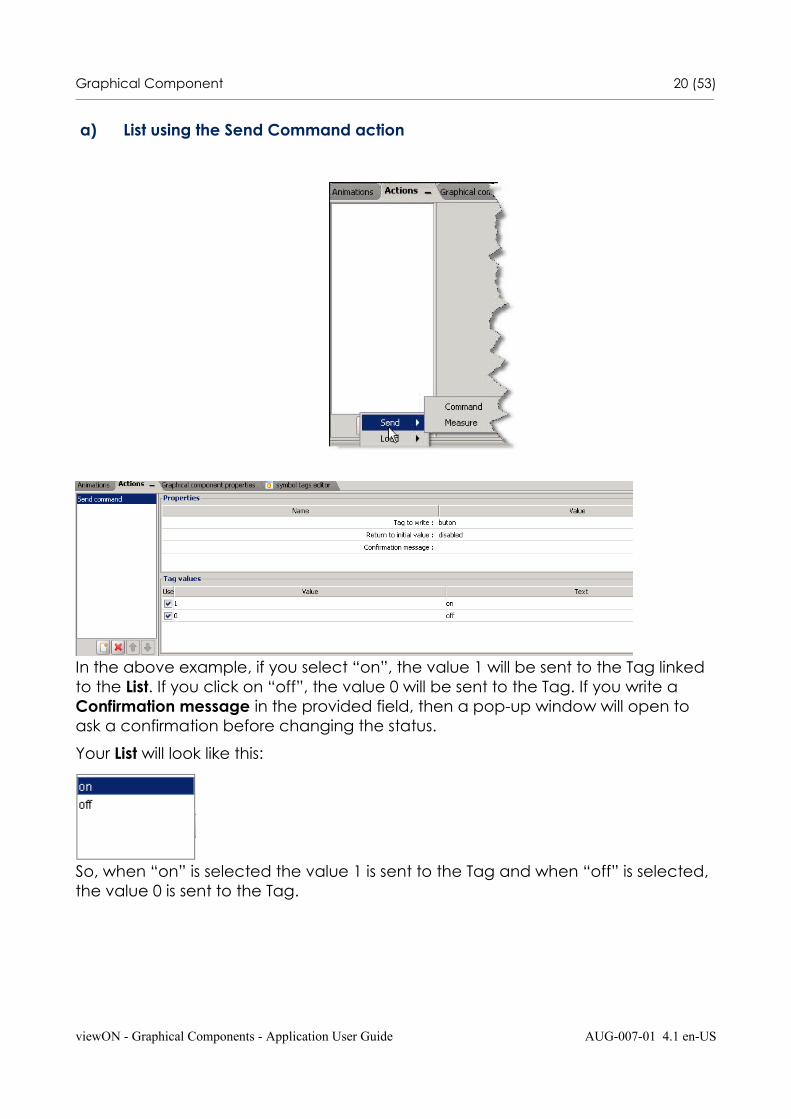
a) List using the Send Command action
In the above example, if you select “on”, the value 1 will be sent to the Tag linked to the List. If you click on “off”, the value 0 will be sent to the Tag. If you write a Confirmation message in the provided field, then a pop-up window will open to ask a confirmation before changing the status.
Your List will look like this:
So, when “on” is selected the value 1 is sent to the Tag and when “off” is selected, the value 0 is sent to the Tag.
viewON - Graphical Components - Application User Guide AUG-007-01 4.1 en-US
Graphical Component 21 (53)________________________________________________________________________________________________________________________________________________________________
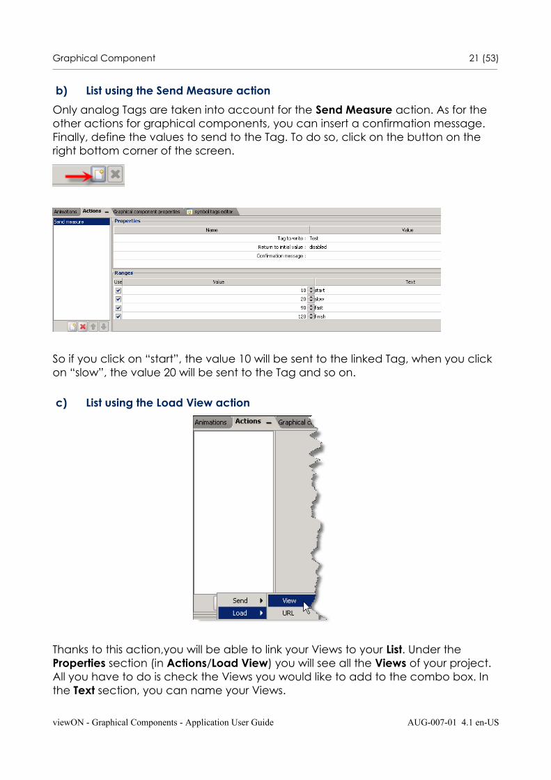
b) List using the Send Measure action
Only analog Tags are taken into account for the Send Measure action. As for the other actions for graphical components, you can insert a confirmation message. Finally, define the values to send to the Tag. To do so, click on the button on the right bottom corner of the screen.
So if you click on “start”, the value 10 will be sent to the linked Tag, when you click on “slow”, the value 20 will be sent to the Tag and so on.
c) List using the Load View action
Thanks to this action,you will be able to link your Views to your List. Under the Properties section (in Actions/Load View) you will see all the Views of your project. All you have to do is check the Views you would like to add to the combo box. In the Text section, you can name your Views.
viewON - Graphical Components - Application User Guide AUG-007-01 4.1 en-US
Graphical Component 22 (53)________________________________________________________________________________________________________________________________________________________________
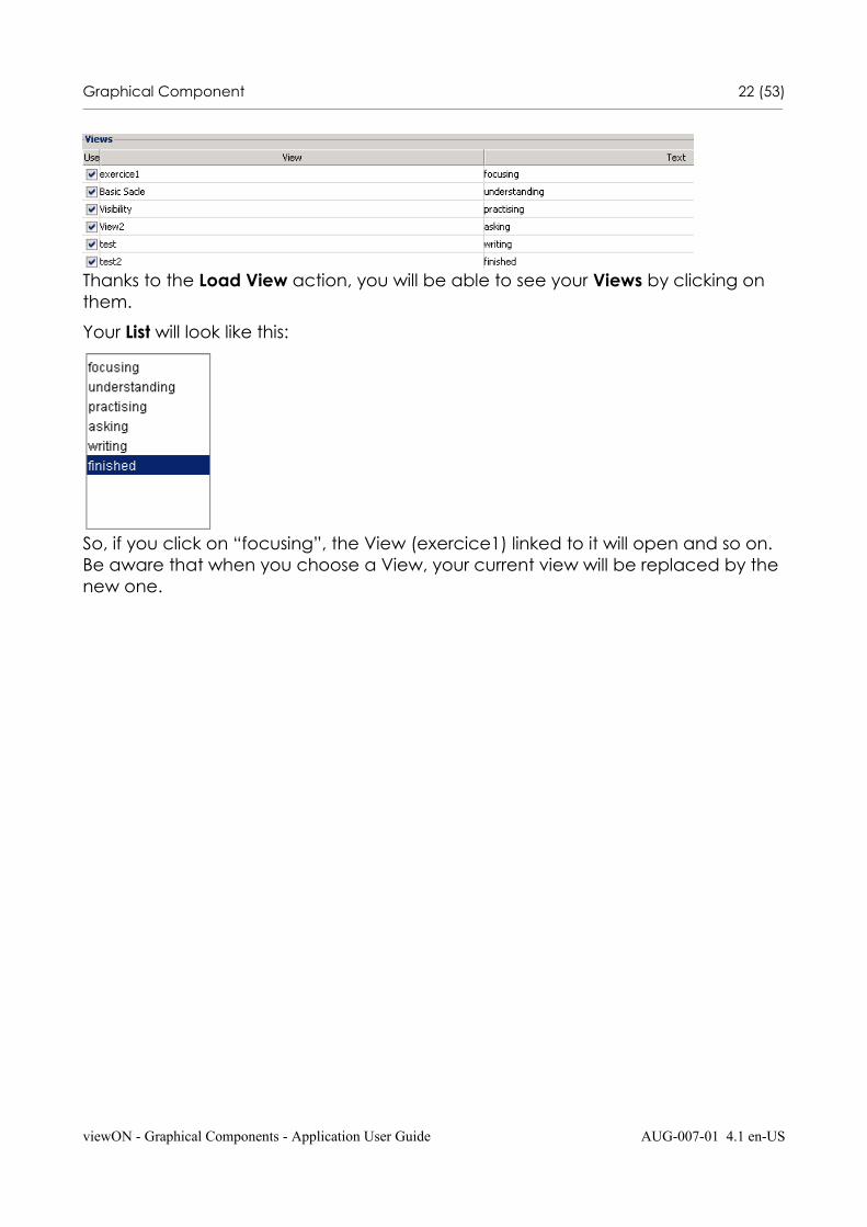
Thanks to the Load View action, you will be able to see your Views by clicking on them.
Your List will look like this:
So, if you click on “focusing”, the View (exercice1) linked to it will open and so on. Be aware that when you choose a View, your current view will be replaced by the new one.
viewON - Graphical Components - Application User Guide AUG-007-01 4.1 en-US
Graphical Component 23 (53)________________________________________________________________________________________________________________________________________________________________
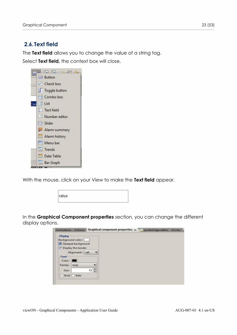
2.6.Text fieldThe Text field allows you to change the value of a string tag.
Select Text field, the context box will close.
With the mouse, click on your View to make the Text field appear.
In the Graphical Component properties section, you can change the different display options.
viewON - Graphical Components - Application User Guide AUG-007-01 4.1 en-US
Graphical Component 24 (53)________________________________________________________________________________________________________________________________________________________________
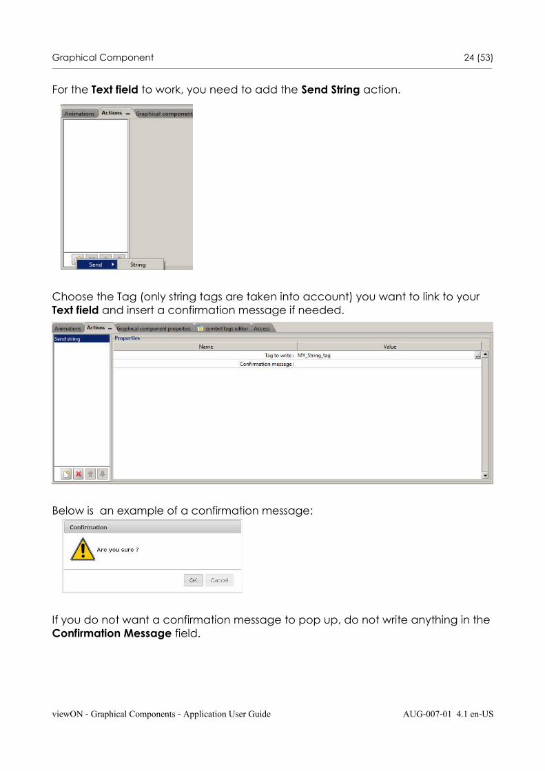
For the Text field to work, you need to add the Send String action.
Choose the Tag (only string tags are taken into account) you want to link to your Text field and insert a confirmation message if needed.
Below is an example of a confirmation message:
If you do not want a confirmation message to pop up, do not write anything in theConfirmation Message field.
viewON - Graphical Components - Application User Guide AUG-007-01 4.1 en-US
Graphical Component 25 (53)________________________________________________________________________________________________________________________________________________________________
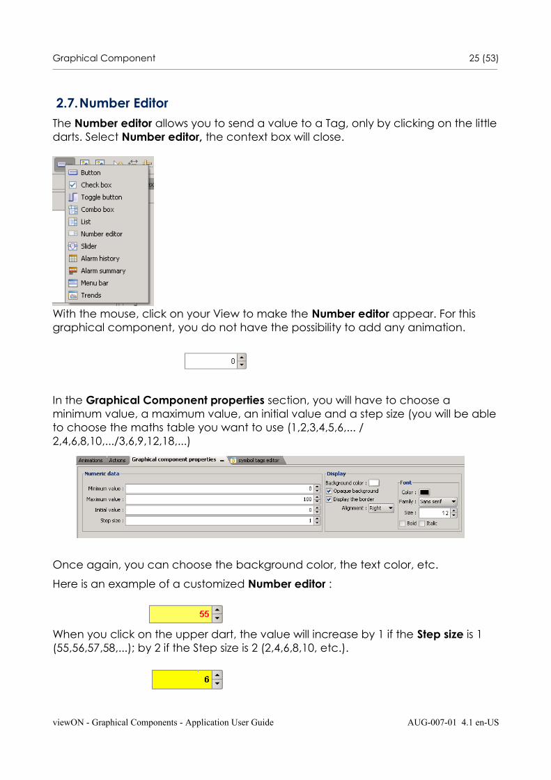
2.7.Number EditorThe Number editor allows you to send a value to a Tag, only by clicking on the littledarts. Select Number editor, the context box will close.
With the mouse, click on your View to make the Number editor appear. For this graphical component, you do not have the possibility to add any animation.
In the Graphical Component properties section, you will have to choose a minimum value, a maximum value, an initial value and a step size (you will be ableto choose the maths table you want to use (1,2,3,4,5,6,... /2,4,6,8,10,.../3,6,9,12,18,...)
Once again, you can choose the background color, the text color, etc.
Here is an example of a customized Number editor :
When you click on the upper dart, the value will increase by 1 if the Step size is 1 (55,56,57,58,...); by 2 if the Step size is 2 (2,4,6,8,10, etc.).
viewON - Graphical Components - Application User Guide AUG-007-01 4.1 en-US
Graphical Component 26 (53)________________________________________________________________________________________________________________________________________________________________
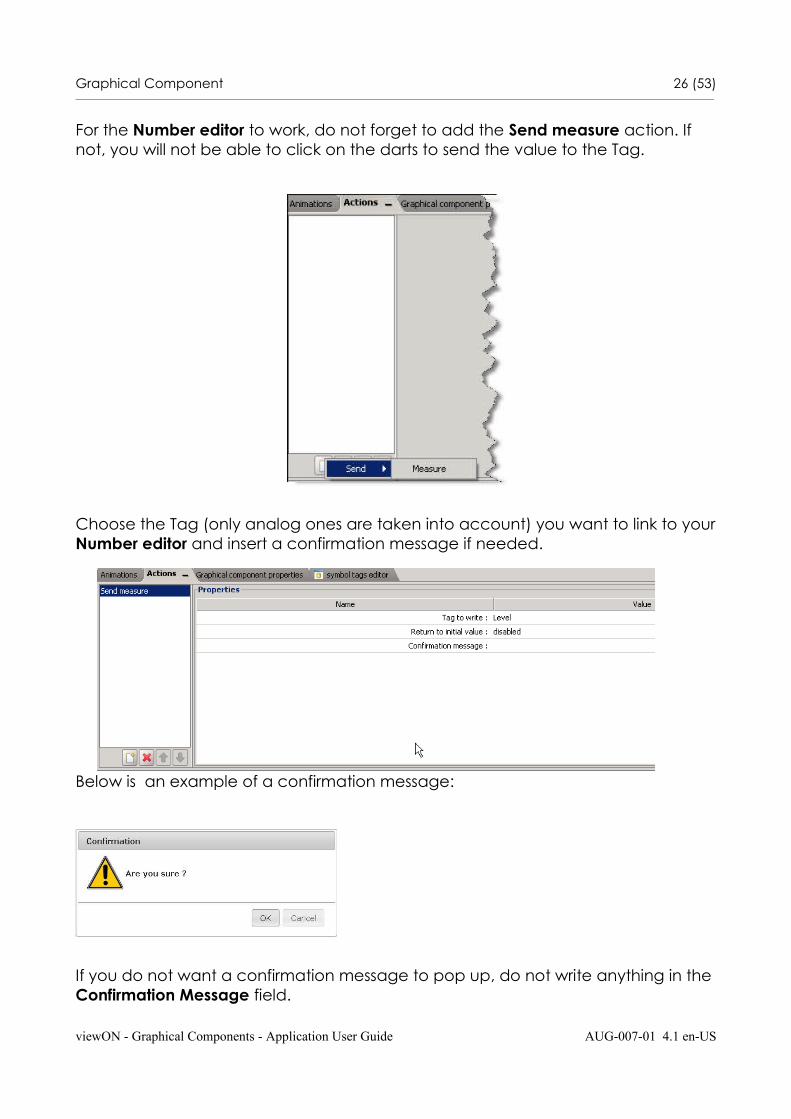
For the Number editor to work, do not forget to add the Send measure action. If not, you will not be able to click on the darts to send the value to the Tag.
Choose the Tag (only analog ones are taken into account) you want to link to yourNumber editor and insert a confirmation message if needed.
Below is an example of a confirmation message:
If you do not want a confirmation message to pop up, do not write anything in theConfirmation Message field.
viewON - Graphical Components - Application User Guide AUG-007-01 4.1 en-US
Graphical Component 27 (53)________________________________________________________________________________________________________________________________________________________________
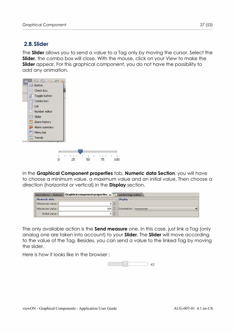
2.8.SliderThe Slider allows you to send a value to a Tag only by moving the cursor. Select theSlider, the combo box will close. With the mouse, click on your View to make the Slider appear. For this graphical component, you do not have the possibility to add any animation.
In the Graphical Component properties tab, Numeric data Section, you will have to choose a minimum value, a maximum value and an initial value. Then choose adirection (horizontal or vertical) in the Display section.
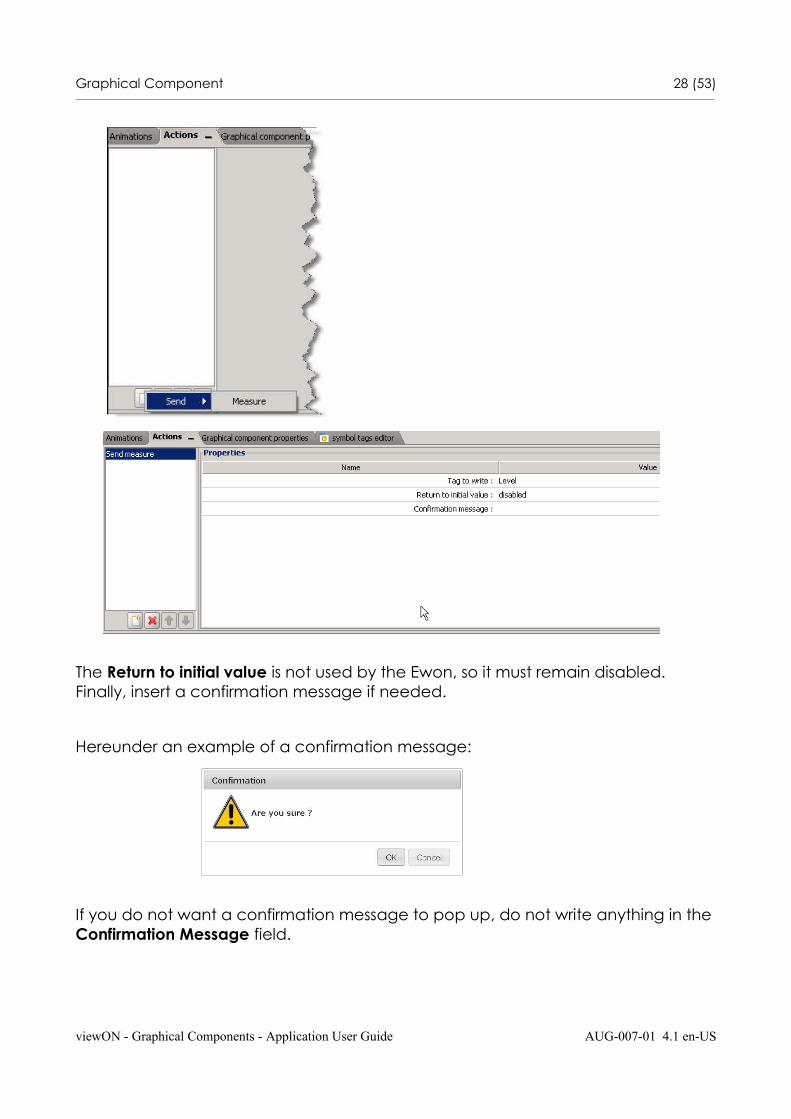
The only available action is the Send measure one. In this case, just link a Tag (only analog one are taken into account) to your Slider. The Slider will move according to the value of the Tag. Besides, you can send a value to the linked Tag by movingthe slider.
Here is how it looks like in the browser :
viewON - Graphical Components - Application User Guide AUG-007-01 4.1 en-US
Graphical Component 28 (53)________________________________________________________________________________________________________________________________________________________________
The Return to initial value is not used by the Ewon, so it must remain disabled. Finally, insert a confirmation message if needed.
Hereunder an example of a confirmation message:
If you do not want a confirmation message to pop up, do not write anything in theConfirmation Message field.
viewON - Graphical Components - Application User Guide AUG-007-01 4.1 en-US
Graphical Component 29 (53)________________________________________________________________________________________________________________________________________________________________
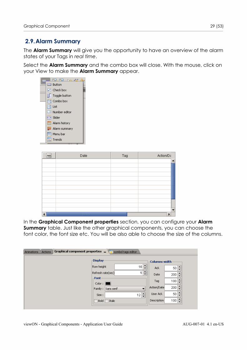
2.9.Alarm SummaryThe Alarm Summary will give you the opportunity to have an overview of the alarmstates of your Tags in real time.
Select the Alarm Summary and the combo box will close. With the mouse, click on your View to make the Alarm Summary appear.
In the Graphical Component properties section, you can configure your Alarm Summary table. Just like the other graphical components, you can choose the font color, the font size etc. You will be also able to choose the size of the columns.
viewON - Graphical Components - Application User Guide AUG-007-01 4.1 en-US
Graphical Component 30 (53)________________________________________________________________________________________________________________________________________________________________
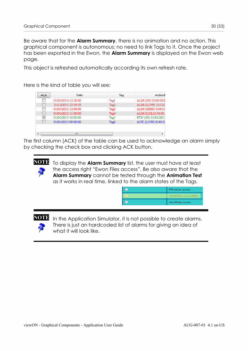
Be aware that for the Alarm Summary, there is no animation and no action. This graphical component is autonomous; no need to link Tags to it. Once the project has been exported in the Ewon, the Alarm Summary is displayed on the Ewon webpage.
This object is refreshed automatically according its own refresh rate.
Here is the kind of table you will see:
The first column (ACK) of the table can be used to acknowledge an alarm simply by checking the check box and clicking ACK button.
viewON - Graphical Components - Application User Guide AUG-007-01 4.1 en-US
NOTE To display the Alarm Summary list, the user must have at least the access right “Ewon Files access”. Be also aware that the Alarm Summary cannot be tested through the Animation Test as it works in real time, linked to the alarm states of the Tags.
NOTE In the Application Simulator, it is not possible to create alarms. There is just an hardcoded list of alarms for giving an idea of what it will look like.

Graphical Component 31 (53)________________________________________________________________________________________________________________________________________________________________
2.10. Alarm History
The Alarm History will give you the opportunity to have an overview of the alarm states of your Tags for a certain period of time that you can define.
Select the Alarm History and the combo box will close. With the mouse, click on your View to make the Alarm History appear.
In the Graphical Component properties section, you can configure your Alarm History table.
Just like the other graphical components, you can choose the font color, its size etc. You will be able to choose the size of the columns as well. Do not forget to select the time range you want to see on your table.
viewON - Graphical Components - Application User Guide AUG-007-01 4.1 en-US

Graphical Component 32 (53)________________________________________________________________________________________________________________________________________________________________
Be aware that for the Alarm History, there is no animation and no action. This graphical component is autonomous; no need to link Tags to it. Once the project has been exported to the Ewon, the Alarm History is displayed on the Ewon web page. This object is not refreshed automatically. It is only refreshed when you load the page or when you click the “Refresh” button.
Here is the kind of table you will see:
viewON - Graphical Components - Application User Guide AUG-007-01 4.1 en-US
NOTE 1. If, while configuring your Alarm History, you asked to display the last 24 hours and later you would like to see the last hour only, then this last hour will be simply added to the 24 hours already displayed. The already displayed alarms will not be deleted from the screen.
2. To display the Alarm History list, the user must have special access rights in your Ewon (FTP server access and Ewon Files access). Be also aware that the Alarm History cannot be tested through the Animation Test as it works in real time, linked to the alarm states of the Tags.
3. In the Application Simulator, it is not possible to create alarms.There is just an hardcoded list of alarms for giving an idea of what it will look like.
IMPORTANT Be aware that if you select a long range of time (7 days,for instance), the page may take a lot of time to download (depending on the frequency of alarm changes).
Graphical Component 33 (53)________________________________________________________________________________________________________________________________________________________________
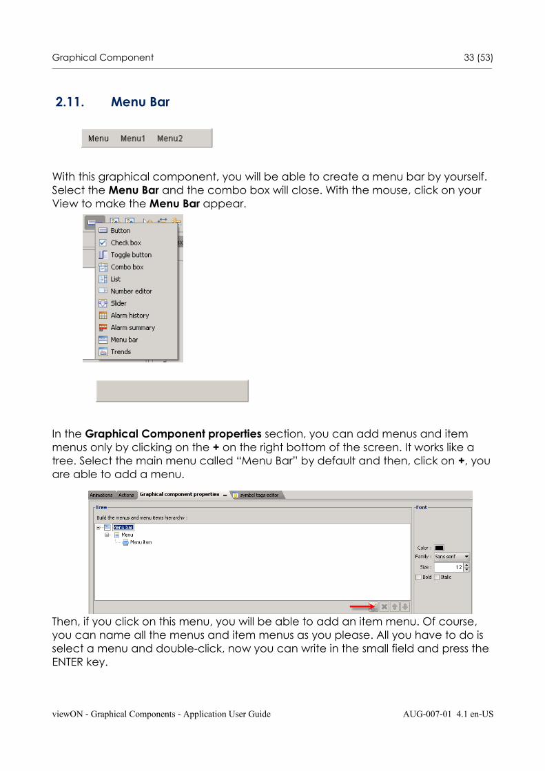
2.11. Menu Bar
With this graphical component, you will be able to create a menu bar by yourself. Select the Menu Bar and the combo box will close. With the mouse, click on your View to make the Menu Bar appear.
In the Graphical Component properties section, you can add menus and item menus only by clicking on the + on the right bottom of the screen. It works like a tree. Select the main menu called “Menu Bar” by default and then, click on +, youare able to add a menu.
Then, if you click on this menu, you will be able to add an item menu. Of course, you can name all the menus and item menus as you please. All you have to do is select a menu and double-click, now you can write in the small field and press the ENTER key.
viewON - Graphical Components - Application User Guide AUG-007-01 4.1 en-US
Graphical Component 34 (53)________________________________________________________________________________________________________________________________________________________________
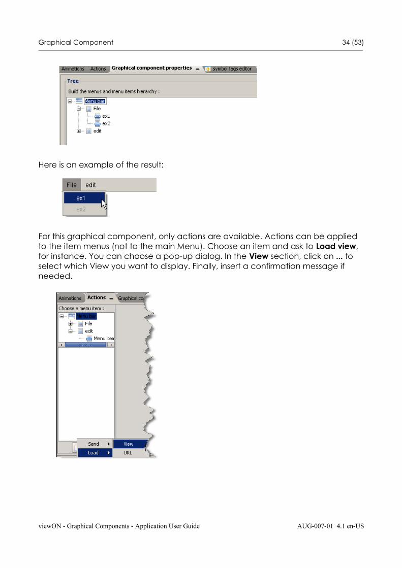
Here is an example of the result:
For this graphical component, only actions are available. Actions can be applied to the item menus (not to the main Menu). Choose an item and ask to Load view, for instance. You can choose a pop-up dialog. In the View section, click on ... to select which View you want to display. Finally, insert a confirmation message if needed.
viewON - Graphical Components - Application User Guide AUG-007-01 4.1 en-US
Graphical Component 35 (53)________________________________________________________________________________________________________________________________________________________________
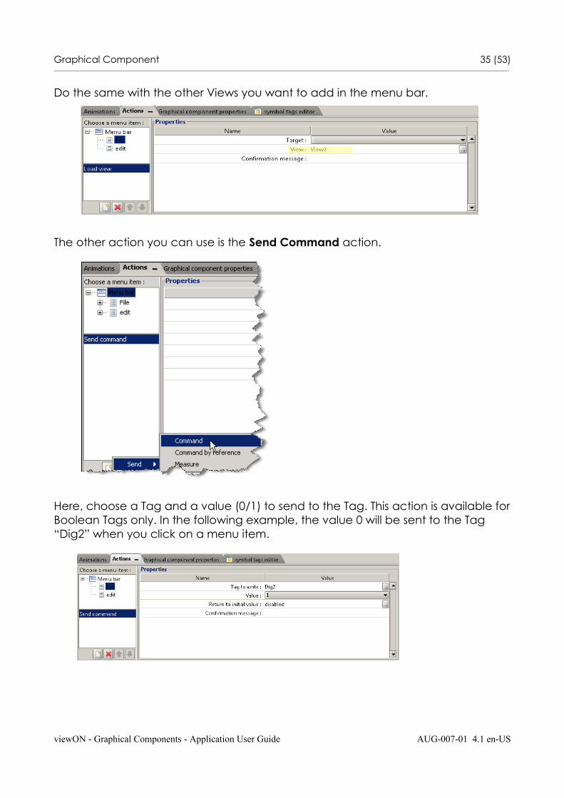
Do the same with the other Views you want to add in the menu bar.
The other action you can use is the Send Command action.
Here, choose a Tag and a value (0/1) to send to the Tag. This action is available forBoolean Tags only. In the following example, the value 0 will be sent to the Tag “Dig2” when you click on a menu item.
viewON - Graphical Components - Application User Guide AUG-007-01 4.1 en-US
Graphical Component 36 (53)________________________________________________________________________________________________________________________________________________________________
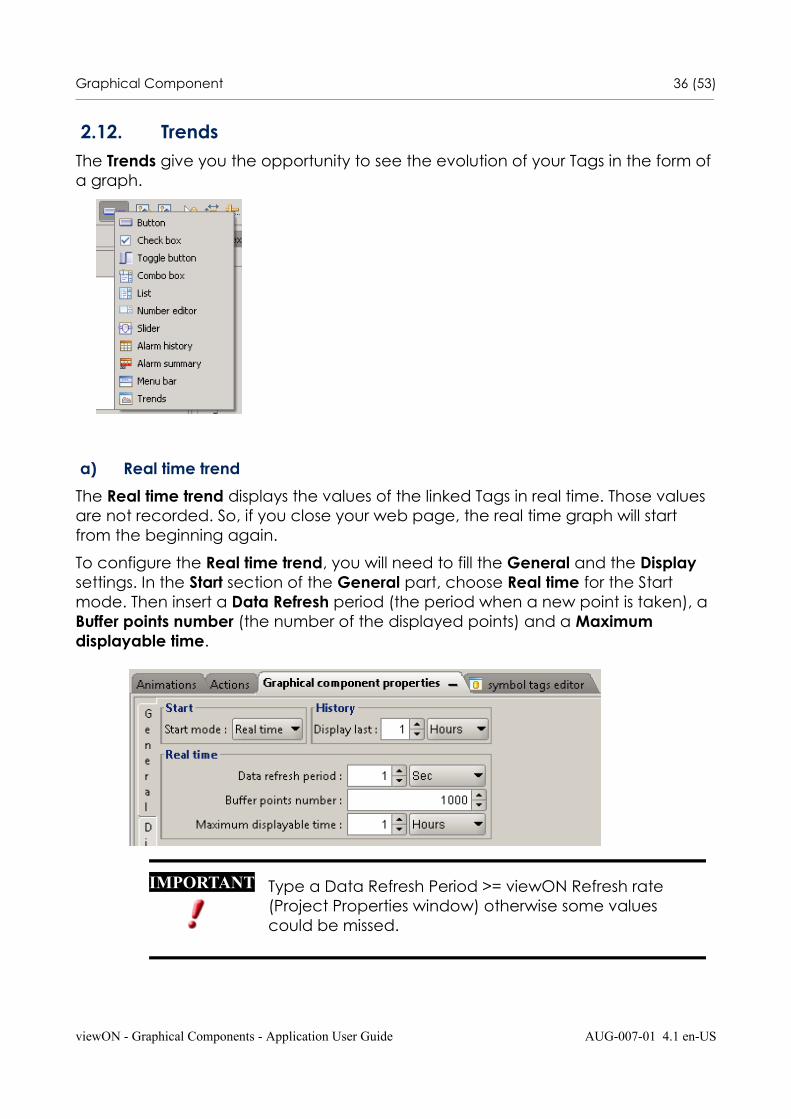
2.12. Trends The Trends give you the opportunity to see the evolution of your Tags in the form of a graph.
a) Real time trend
The Real time trend displays the values of the linked Tags in real time. Those values are not recorded. So, if you close your web page, the real time graph will start from the beginning again.
To configure the Real time trend, you will need to fill the General and the Display settings. In the Start section of the General part, choose Real time for the Start mode. Then insert a Data Refresh period (the period when a new point is taken), a Buffer points number (the number of the displayed points) and a Maximum displayable time.
viewON - Graphical Components - Application User Guide AUG-007-01 4.1 en-US
IMPORTANT Type a Data Refresh Period >= viewON Refresh rate (Project Properties window) otherwise some values could be missed.
Graphical Component 37 (53)________________________________________________________________________________________________________________________________________________________________
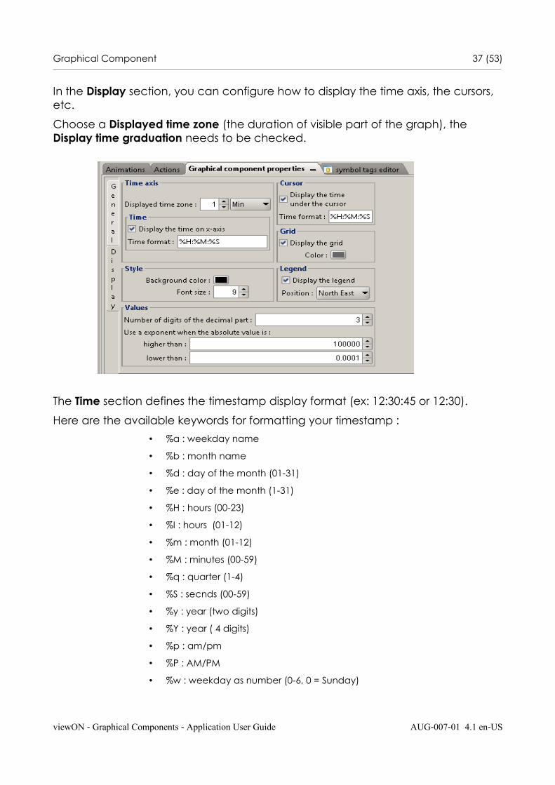
In the Display section, you can configure how to display the time axis, the cursors, etc.
Choose a Displayed time zone (the duration of visible part of the graph), the Display time graduation needs to be checked.
The Time section defines the timestamp display format (ex: 12:30:45 or 12:30).
Here are the available keywords for formatting your timestamp :
• %a : weekday name
• %b : month name
• %d : day of the month (01-31)
• %e : day of the month (1-31)
• %H : hours (00-23)
• %I : hours (01-12)
• %m : month (01-12)
• %M : minutes (00-59)
• %q : quarter (1-4)
• %S : secnds (00-59)
• %y : year (two digits)
• %Y : year ( 4 digits)
• %p : am/pm
• %P : AM/PM
• %w : weekday as number (0-6, 0 = Sunday)
viewON - Graphical Components - Application User Guide AUG-007-01 4.1 en-US
Graphical Component 38 (53)________________________________________________________________________________________________________________________________________________________________
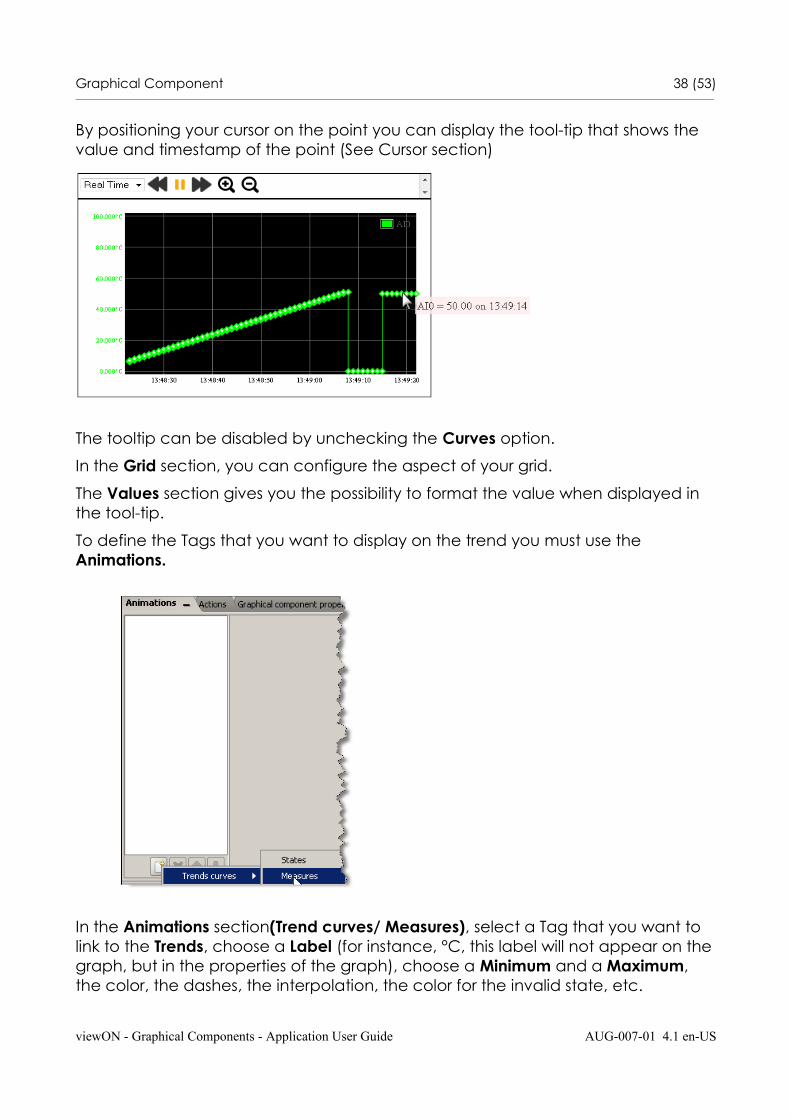
By positioning your cursor on the point you can display the tool-tip that shows the value and timestamp of the point (See Cursor section)
The tooltip can be disabled by unchecking the Curves option.
In the Grid section, you can configure the aspect of your grid.
The Values section gives you the possibility to format the value when displayed in the tool-tip.
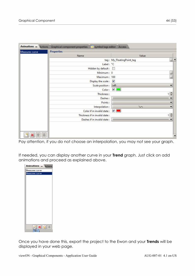
To define the Tags that you want to display on the trend you must use the Animations.
In the Animations section(Trend curves/ Measures), select a Tag that you want to link to the Trends, choose a Label (for instance, °C, this label will not appear on thegraph, but in the properties of the graph), choose a Minimum and a Maximum, the color, the dashes, the interpolation, the color for the invalid state, etc.
viewON - Graphical Components - Application User Guide AUG-007-01 4.1 en-US

Graphical Component 39 (53)________________________________________________________________________________________________________________________________________________________________
Pay attention, if you do not choose an interpolation, you may not see your graph.
If needed, you can display another curve in your Trend graph. Just click on add animations and proceed as explained above.
Once you have done this, export the project to the Ewon and your Trends will be displayed in your web page.
viewON - Graphical Components - Application User Guide AUG-007-01 4.1 en-US
Graphical Component 40 (53)________________________________________________________________________________________________________________________________________________________________
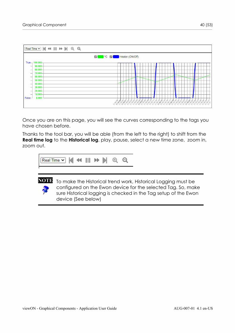
Once you are on this page, you will see the curves corresponding to the tags you have chosen before.
Thanks to the tool bar, you will be able (from the left to the right) to shift from the Real time log to the Historical log, play, pause, select a new time zone, zoom in, zoom out.
viewON - Graphical Components - Application User Guide AUG-007-01 4.1 en-US
NOTE To make the Historical trend work, Historical Logging must be configured on the Ewon device for the selected Tag. So, make sure Historical logging is checked in the Tag setup of the Ewon device (See below)
Graphical Component 41 (53)________________________________________________________________________________________________________________________________________________________________
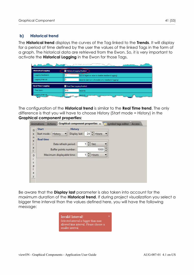
b) Historical trend
The Historical trend displays the curves of the Tag linked to the Trends. It will display for a period of time defined by the user the values of the linked Tags in the form of a graph. The historical data are retrieved from the Ewon. So, it is very important to activate the Historical Logging in the Ewon for those Tags.
The configuration of the Historical trend is similar to the Real Time trend. The only difference is that you will have to choose History (Start mode = History) in the Graphical component properties:
Be aware that the Display last parameter is also taken into account for the maximum duration of the Historical trend. If during project visualization you select abigger time interval than the values defined here, you will have the following message:
viewON - Graphical Components - Application User Guide AUG-007-01 4.1 en-US
Graphical Component 42 (53)________________________________________________________________________________________________________________________________________________________________
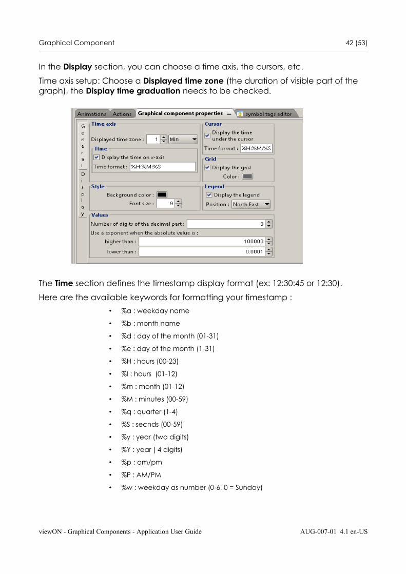
In the Display section, you can choose a time axis, the cursors, etc.
Time axis setup: Choose a Displayed time zone (the duration of visible part of the graph), the Display time graduation needs to be checked.
The Time section defines the timestamp display format (ex: 12:30:45 or 12:30).
Here are the available keywords for formatting your timestamp :
• %a : weekday name
• %b : month name
• %d : day of the month (01-31)
• %e : day of the month (1-31)
• %H : hours (00-23)
• %I : hours (01-12)
• %m : month (01-12)
• %M : minutes (00-59)
• %q : quarter (1-4)
• %S : secnds (00-59)
• %y : year (two digits)
• %Y : year ( 4 digits)
• %p : am/pm
• %P : AM/PM
• %w : weekday as number (0-6, 0 = Sunday)
viewON - Graphical Components - Application User Guide AUG-007-01 4.1 en-US

Graphical Component 43 (53)________________________________________________________________________________________________________________________________________________________________
By positioning your cursor on the point you can display the tool-tip that shows the value and timestamp of the point (See Cursor section)
The tooltip can be disabled by unchecking the Curves option.
In the Grid section, you can configure the aspect of your grid.
The Values section gives you the possibility to format the value when displayed in the tool-tip.
To define the Tags that you want to display on the trend you must use the Animations.
In the Animations section(Trend curves/ Measures), select a Tag that you want to link to the Trends, choose a Label (for instance, °C, this label will not appear on thegraph, but in the properties of the graph), choose a Minimum and a Maximum, the color, the dashes, the interpolation, the color for the invalid state, etc.
viewON - Graphical Components - Application User Guide AUG-007-01 4.1 en-US
Graphical Component 44 (53)________________________________________________________________________________________________________________________________________________________________
Pay attention, if you do not choose an interpolation, you may not see your graph.
If needed, you can display another curve in your Trend graph. Just click on add animations and proceed as explained above.
Once you have done this, export the project to the Ewon and your Trends will be displayed in your web page.
viewON - Graphical Components - Application User Guide AUG-007-01 4.1 en-US
Graphical Component 45 (53)________________________________________________________________________________________________________________________________________________________________
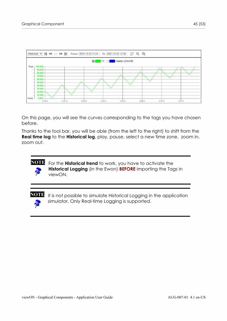
On this page, you will see the curves corresponding to the tags you have chosen before.
Thanks to the tool bar, you will be able (from the left to the right) to shift from the Real time log to the Historical log, play, pause, select a new time zone, zoom in, zoom out.
viewON - Graphical Components - Application User Guide AUG-007-01 4.1 en-US
NOTE For the Historical trend to work, you have to activate the Historical Logging (in the Ewon) BEFORE importing the Tags in viewON.
NOTE It is not possible to simulate Historical Logging in the application simulator. Only Real-time Logging is supported.
Graphical Component 46 (53)________________________________________________________________________________________________________________________________________________________________
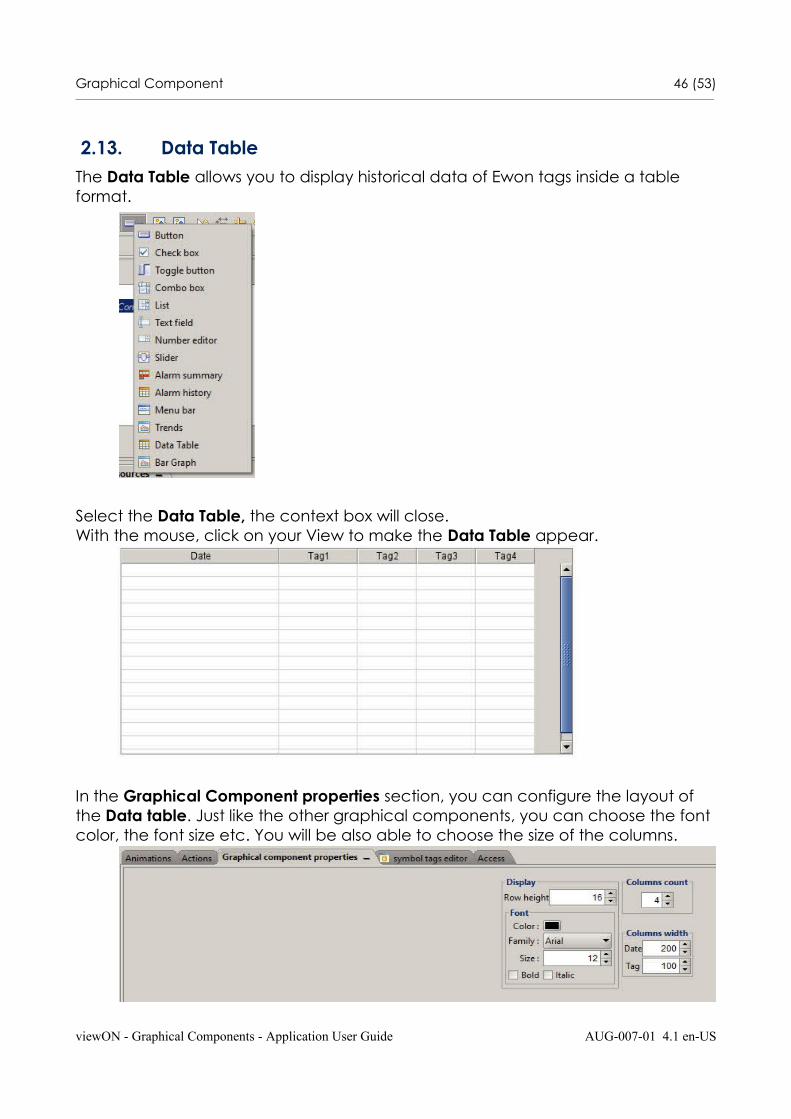
2.13. Data TableThe Data Table allows you to display historical data of Ewon tags inside a table format.
Select the Data Table, the context box will close. With the mouse, click on your View to make the Data Table appear.
In the Graphical Component properties section, you can configure the layout of the Data table. Just like the other graphical components, you can choose the font color, the font size etc. You will be also able to choose the size of the columns.
viewON - Graphical Components - Application User Guide AUG-007-01 4.1 en-US
Graphical Component 47 (53)________________________________________________________________________________________________________________________________________________________________
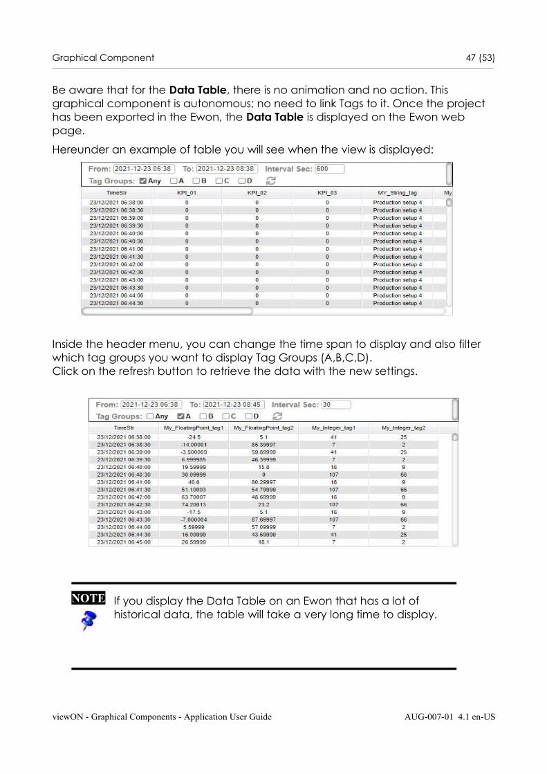
Be aware that for the Data Table, there is no animation and no action. This graphical component is autonomous; no need to link Tags to it. Once the project has been exported in the Ewon, the Data Table is displayed on the Ewon web page.
Hereunder an example of table you will see when the view is displayed:
Inside the header menu, you can change the time span to display and also filter which tag groups you want to display Tag Groups (A,B,C,D). Click on the refresh button to retrieve the data with the new settings.
viewON - Graphical Components - Application User Guide AUG-007-01 4.1 en-US
NOTE If you display the Data Table on an Ewon that has a lot of historical data, the table will take a very long time to display.
Graphical Component 48 (53)________________________________________________________________________________________________________________________________________________________________
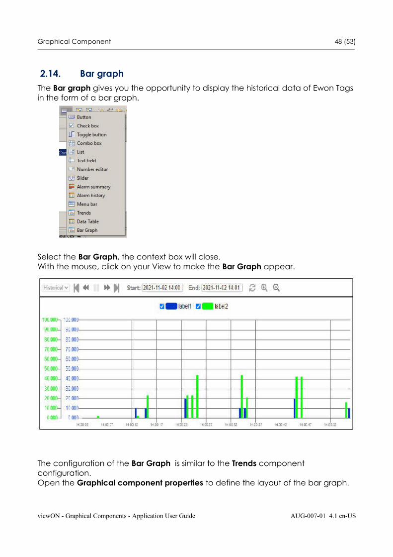
2.14. Bar graphThe Bar graph gives you the opportunity to display the historical data of Ewon Tags in the form of a bar graph.
Select the Bar Graph, the context box will close. With the mouse, click on your View to make the Bar Graph appear.
The configuration of the Bar Graph is similar to the Trends component configuration. Open the Graphical component properties to define the layout of the bar graph.
viewON - Graphical Components - Application User Guide AUG-007-01 4.1 en-US
Graphical Component 49 (53)________________________________________________________________________________________________________________________________________________________________
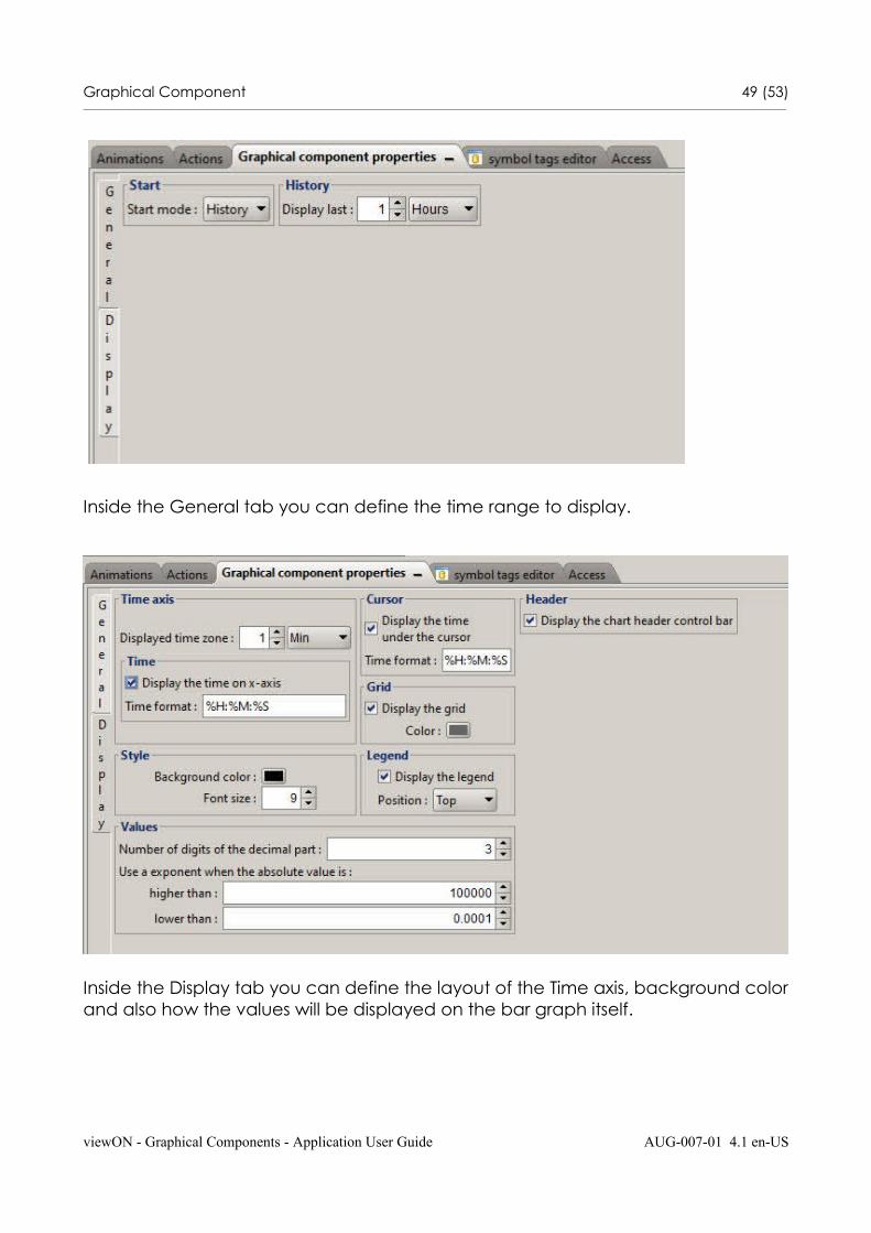
Inside the General tab you can define the time range to display.
Inside the Display tab you can define the layout of the Time axis, background colorand also how the values will be displayed on the bar graph itself.
viewON - Graphical Components - Application User Guide AUG-007-01 4.1 en-US

Graphical Component 50 (53)________________________________________________________________________________________________________________________________________________________________
The Time section defines the timestamp display format (ex: 12:30:45 or 12:30).
Here are the available keywords for formatting your timestamp :
• %a : weekday name
• %b : month name
• %d : day of the month (01-31)
• %e : day of the month (1-31)
• %H : hours (00-23)
• %I : hours (01-12)
• %m : month (01-12)
• %M : minutes (00-59)
• %q : quarter (1-4)
• %S : secnds (00-59)
• %y : year (two digits)
• %Y : year ( 4 digits)
• %p : am/pm
• %P : AM/PM
• %w : weekday as number (0-6, 0 = Sunday)
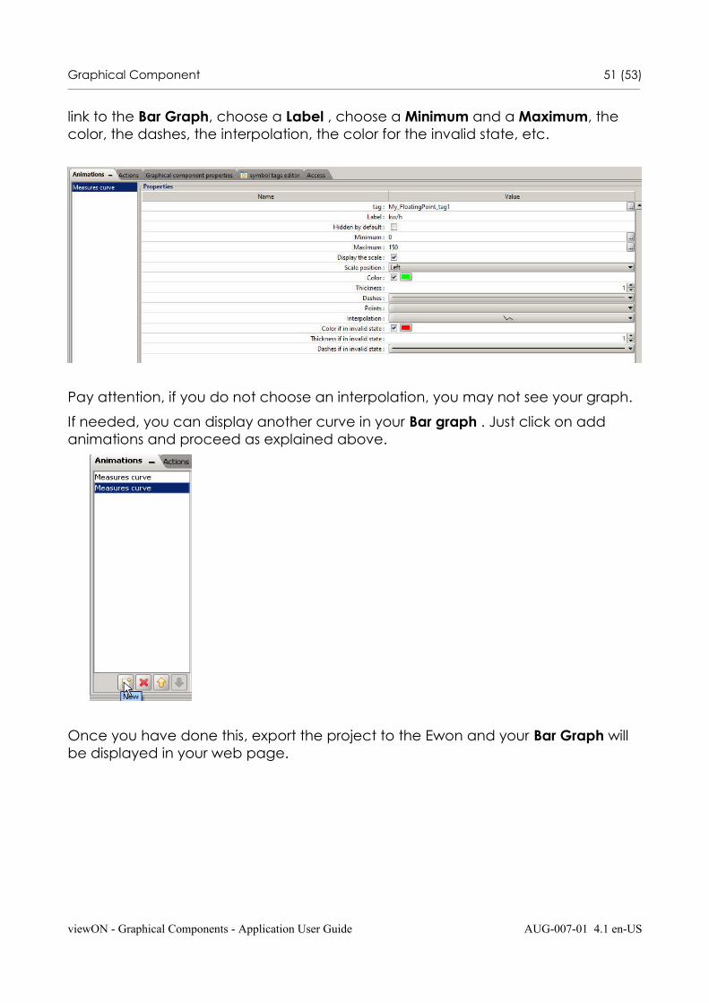
To define the Tags that you want to display on the bar graph you must use the Animations.
In the Animations section(Trend curves/ Measures), select a Tag that you want to
viewON - Graphical Components - Application User Guide AUG-007-01 4.1 en-US
Graphical Component 51 (53)________________________________________________________________________________________________________________________________________________________________
link to the Bar Graph, choose a Label , choose a Minimum and a Maximum, the color, the dashes, the interpolation, the color for the invalid state, etc.
Pay attention, if you do not choose an interpolation, you may not see your graph.
If needed, you can display another curve in your Bar graph . Just click on add animations and proceed as explained above.
Once you have done this, export the project to the Ewon and your Bar Graph will be displayed in your web page.
viewON - Graphical Components - Application User Guide AUG-007-01 4.1 en-US
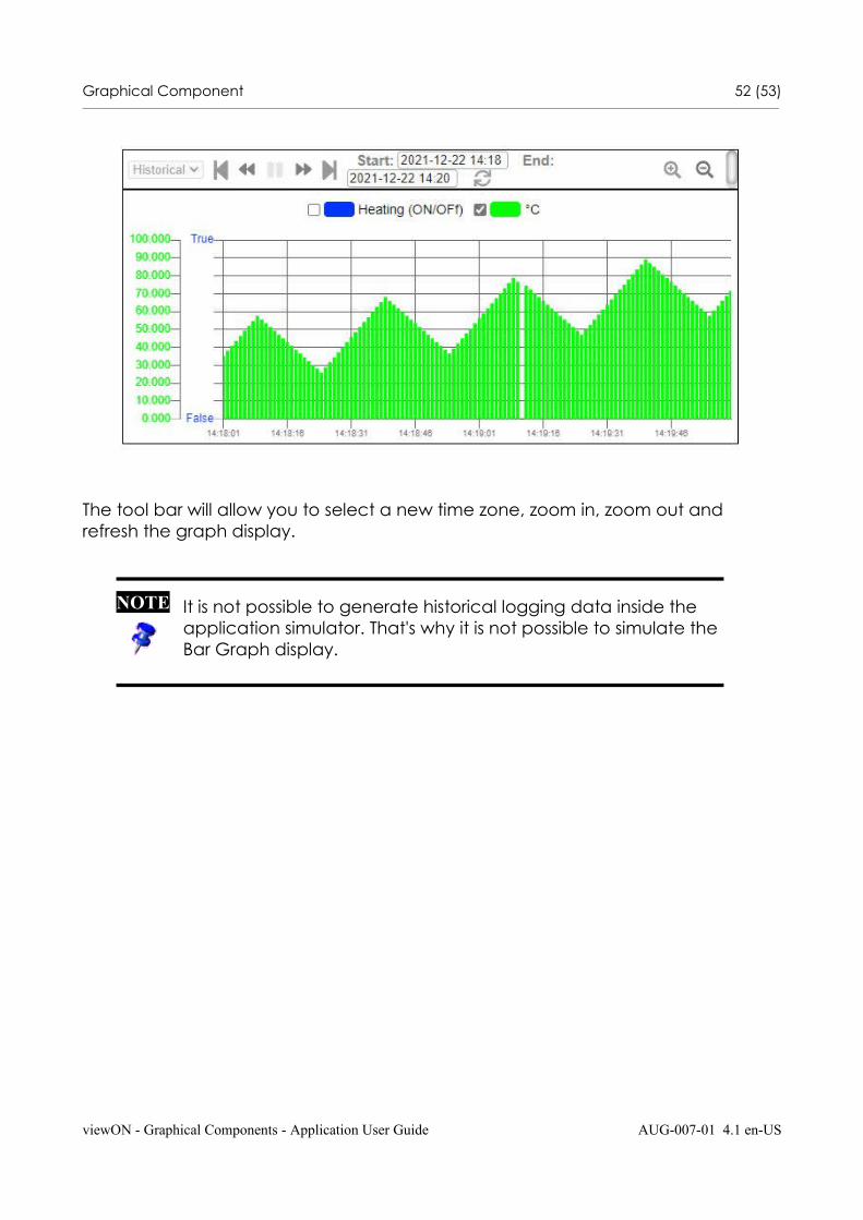
Graphical Component 52 (53)________________________________________________________________________________________________________________________________________________________________
The tool bar will allow you to select a new time zone, zoom in, zoom out and refresh the graph display.
viewON - Graphical Components - Application User Guide AUG-007-01 4.1 en-US
NOTE It is not possible to generate historical logging data inside the application simulator. That's why it is not possible to simulate the Bar Graph display.
Graphical Component 53 (53)________________________________________________________________________________________________________________________________________________________________
3. Document History and Trademark Information
3.1.Document History
Version Date Description
1.1 2014-09-05 First release
1.1 2014-10-15 Historical trend behavior updated
4.0 2020-06-30 Global update for viewON version 4
4.1 2021-12-23 Global update for viewON version 4.5
3.2.Trademark InformationEwon® is a registered trademark of HMS Industrial Networks SA. All other trademarks mentioned in this document are the property of their respective holders.
viewON - Graphical Components - Application User Guide AUG-007-01 4.1 en-US