user experience portfolio - iiitdm...
TRANSCRIPT

USER EXPERIENCE PORTFOLIO

Bachelor of Engineering in Computers ( B.E ) (2005-09)
Vidya Pratishthan’s College of Engineering,BaramatiPune University
PRASAD R PADASEUser Experience Designer
Master’s in Design ( M.Des ) (2012-14) IIITDM JabalpurDeemed to be University under Ministry of HRD, India
+91 94 7 94 22 385
EDUCATION CONTACT ME

Web and UI DesignerKonnect Technologies Pvt. Ltd. Pune.
From May 2011 to May 2012
UI/UX Designer ( Android apps ) Intern at InoxApps Pvt. Ltd. Noida
From 17th May 2013 to 28th July 2013
Audio, Video and Graphics content processing for mobile
Playerx Mobile Entertainment Pvt. Ltd. Pune.
Zed Group of Companies.
From August 2010 to Nov 2010
Content Production Specialist
SKILLSWORK EXPERIENCE
XHTML & CSS
JAVASCRIPT & JQUERY
ADOBE PHOTOSHOP
ADOBE ILLUSTRATOR
ADOBE FLASH
ADOBE DREAMWEAVER
ADOBE PREMIERE PRO
HUMAN FACTORS
USER RESEARCH & ETHNOGRAPHY
AXURE & BALSAMIQ
PAPER PROTOTYPING
ECLIPSE & SVN
FamiliarComfortableCon�dent

User Interface Design

Likeythis a web-based product of Konnect technologies is an online assessment and
survey software that helps to assess employees, students and conduct online surveys.
www.likelythis.com

www.likelythis.com
Designed and developed admin dashboard
considering requirements and tasks to be ac-
complish by admin.
Stepwise creation of survey or assessment
with ease.
Used various UI patterns like implementing
tab view in design of settings page.
Modal dialogs for alerts and feedbacks.
Used javascript and Jquery UI library to im-
plement UI patterns.
Constantly conversing with developer to
solve any technical or browser compatibilty
problems.

Promotional website for “DailyHrz - e manage your resources” product of Konnect technologies is a J2EE based Web application
to cater needs of human resource management. ( Note: This is a previous design. The current design is changed ) www.dailyhrz.com

www.dailyhrz.com
DailyHrz web application screenshots
Designed and developed user interface for various users dashboards.
UI included data visualisation using Jquery for eg.Bar chart, sortable data tables, jquery organisation tree,
drag and drop functionality.
Also worked on creating graphic content for Android app.
Used adobe photoshop, adobe dreamweaver, eclipse and SVN. Delivered XHTML CSS templates.

Website designed for Design discipline , IIITDM Jabalpur.
Informative site designed and developed for institute. Provides information about the design
discipline, courses offered and people associated with it.
Design Team :
Ranjith R
Prasad R Padase http://design.iiitdmj.ac.in/

Dashboard Template Design

Mobile App Design

Decided the �ow for the game.
Created wireframes.
Designed User Interface.
Designed logo for the app.
Created marketing assets like banner, app icons for google play market.
Used only �nger swipe gesture to set aim and strike.
“Carrom” on android a game for Android platform is a
mobile version of famous board game carrom. Its avail-
able on google play market and received fair download.
This is a 2D game with easy to strike gesture like �nger
swipe. You can easily set aim of striker by double tapping
on striker and moving it along line, setting the direction
and then swiping the �nger across screen to strike. More
faster you swipe the �nger more the striker gains speed.
Game is played in landscape mode.

Worked collaboratively with the developer to meet technical challenges regarding graphics in the game. Porting was the prominent technique used to create graphics.
Created graphics in hdpi, mdpi and ldpi resolutions as required for the android platform.
Sofwares Used:
Adobe Photoshop
Adobe lllustrator

Internship Projects
From 17th May 2013 to 28th July 2013
at InoxApps Pvt. Ltd. during internship I was
responsible for designing engaging, visually
rich mobile apps for android devices.
Categories of apps:
Social, Brain & Puzzle Games, Music & Video
The targeted user’s or persona’s for apps are
majorly teenage and young girls and boys.
Software Used:
Photoshop, Illustrator

Design Process:
To understand the given design brief or an app idea and do the benchmarking considering
existing apps in the market of that category / genre.
Design the �ow and its functioning based on user study and what it is intended to do.
Prepare wireframes on paper considering the inputs from core team and developer.
Discuss the wireframes with the developer team and the core team to review whether it can
appeal to user and meet buiseness goals.
Re�ne according feedback related to feasibility, android UI patterns to be used and time
required to design & develop the app.
Finalize wireframes and provide copies of it to both designer and developer team.
Design the user interface according to wireframes under guidance of design team lead.
Create & provide deliverables for developers such as app icon, cropped graphical assets, icon
sets, colour codes, type of pattern used and fontface used.

High �delity prototype based on the wireframes �xed for the �rst review.
Screen �ow of the app to visualise and ensure the smooth interaction
App Name: AnswerThat

Final Detailed UI Design of the AppWith attention to colors, iconography, typography and textures alongwith tapped, selected events state changes of links.
App Name: AnswerThat
Category of app: Social
Deliverables:
Screens, Graphic assets cropped ( in mdpi,ldpi,hdpi & xhdpi),
Fontface, Color codes along with grid measurements in dp’s.

Light Me is a social app for youth on android devices.
It’s a diffrent and fun way to interact and
collect opinoins about our daily small decisions or
questions we have by sharing it with our friends and
members. Friends answers the questions we asked
and we can be aware of their opinions for whom we
ask for.
For eg. from “ How am I looking today?
( picture attached ) ” to
“whats best place to eat - option1 or option2?”.
We can have real opinions from real people.
App Name: Light Me
Category of app: Social

The app needed an very easy and minimal way to
create a question by a user. Since the mobile user is
expected to use this app at any leisure time or can be
at a hurrying moment too.
So question making and posting it should be a simple,
fast and clear alongwith minimum step process.
The more user asks questions and answers others the
engagement level increases contributing to success of
the app.
Hereby screens describes the asking question steps
and below is answering steps.
Interaction Designed considering effective UI patterns
which would minimise steps to complete the task.

App Name: Slideshow Maker
Category of app: Music & Video
Slideshow Maker is an simple and easy app to make memorable videos/presentations from photos.
Challenging part in designing this app was to choose suitable android UI pattern and de�ning easy plus fast �ow
also keeping app lightweight.
Thus video creation �ow was kept directly discoverable with tab menu’s. It also helped user to guide to do next
probable action. User was also free to use his prefereble �ow.

Academic Work

Information GraphicsProblem ( Hypothetical ) :
Sunil a photocopy machine operator who is semi literate studied till 4th standard
capable of recognising numbers has tough time calculating the cost of multiple
photocopies. Each photocopy costed 0.75 paisa.There was delay and also some-
times mistake in calculating the cost to which customers and the owner of the
shop was unhappy.
Owner didn’t provided calculator since sunil’s hands are busy in counting the
photocopies and also to calculate in mind is faster. Now Sunil’s job is at stake as
owner is searching for a new person.
How to save Sunil’s job?
Solution: - Preparing a “Price chart” was convenient and cost effective. - Retrieving cost from chart should be faster without any confusion is the main constraint.- Applied chunking theory, Gestalt laws to organize content and typograpy for better readabilty.
Columnwise
Categorisation.
Alternating row colors for easy glance through the values.
Prominent entry points with circles.
Selecting appropiate type-face so that numbers are readable.

Objective:
To Identify issues in current pesticide packet related visual ergonomics like
- inforamtion hierarchy,
- use of typography,
- use appropiate of iconography,
- colors and symbols to convey relevant information and redesign to improve its usability.
Approach:
1. Understanding the product journey : Packaging -> Transport -> Storage -> Sell -> Usage ->
Disposal.
2. Studying comprehension of information on the packaging by various users from
new users to frequent users with current design.
3. Evaluating current design on basis of visual ergonomics criteria’s such as visibility,
readability, legibility and comprehension related to imagery and icons, warning signs, symbols
used on package.
4. Understanding information to be conveyed by the design
5. Based on the observations and feedback of the users, information is to chunk according to
its importance, relevance and conveying a message.
6. Considering design directions from above approach initiate redesign / improvement.
Redesigned Packaging
Previous Packaging
Bad contrast
Composition name written very small font size
More prominience can begiven to warning
Information not chunkedeffectively
More use od text and dif�cult to comprehend ¬ legible
Readability issues
Redesign of Pesticide Packaging from Visual Ergonomics Perspective

Designing Typeface
Exported font �le as .otf
Objective: To design a new, unique typeface inspired from one’s signature style.
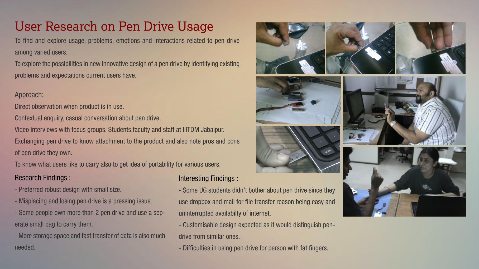
To �nd and explore usage, problems, emotions and interactions related to pen drive
among varied users.
To explore the possibilities in new innovative design of a pen drive by identifying existing
problems and expectations current users have.
Approach:
Direct observation when product is in use.
Contextual enquiry, casual conversation about pen drive.
Video interviews with focus groups. Students,faculty and staff at IIITDM Jabalpur.
Exchanging pen drive to know attachment to the product and also note pros and cons
of pen drive they own.
To know what users like to carry also to get idea of portability for various users.
User Research on Pen Drive Usage
Research Findings :
- Preferred robust design with small size.
- Misplacing and losing pen drive is a pressing issue.
- Some people own more than 2 pen drive and use a sep-
erate small bag to carry them.
- More storage space and fast transfer of data is also much
needed.
Interesting Findings :
- Some UG students didn’t bother about pen drive since they
use dropbox and mail for �le transfer reason being easy and
uninterrupted availabilty of internet.
- Customisable design expected as it would distinguish pen-
drive from similar ones.
- Dif�culties in using pen drive for person with fat �ngers.

RECORDS for Life : A design contest that can save livesDesign Challenge -Bill & Melinda Gates foundation hosted a design competition to address the problems related to tracking child health records and vaccinations.
The Objective -To increase accuracy of child health records, make them easy to interpret and use, and create value for health workers and families. Also to facilitate digital transition of records which appear on health card.
Problem Identi�cation-Research revealed the following issues that need to be addressed are
1. Incomprehension
2. Legibility
3. Improper Information Hierarchy / Chunking
4. Intutiveness
5. Improve its Sense Attachment
6. Increase its Sense of Importance
7. Scalability
8. Provision to ease the conversion to digital record
The Process
Interviews -> Study of existing health cards -> Brainstorming -> Information Hierarchy -> Design Directions -> Design -> Prototype

The Solution
A tri-fold brochure which is handy, clean and useful design with child related information on outer side and relevant, important information related to
vaccination on the inner side.
Concept of time-line and chunking according to
dosage period.
Star shapes to give parents a feel of achievement
OMR concept added to easily transfer data into
computer
Comprehension of dosage types made
easier with use of relevant icons
Also used Color Coding to categorise
the vaccine type.
Use of barcode to serve as a unique identi�er
and easy to digitize the information
Space dedicated for remarks
or to add any information related
to new vaccination & medicationGraphically illustrated information
Design Team:
Prasad, Vipin & Bipratim

iInnovate : Designing Better Commuter Experience
The Scenario : The Challenge : The Approach / Design Directions :
Indian cities have become synonymous with conges-
tion, noise, and air pollution. The continuing urban
boom will stress an already-pressured urban infra-
structure system, especially around transportation and
traf�c.
Tier 1 cities being the most impacted, more so with the
planned rapid transit systems and metro rail projects.
The commuter experience is still the major problem
that needs to be addressed.
To improve commuter experience given the constraint
that no new construction or infrastructure is expected,
no new �yovers, or railway lines, or skywalks, or such
built forms which would disrupt the daily lives further-
more.
- Identifying current commuter
scenario’s.
- Focussing on experience of directly
impacted commuter
- Identifying special issues like with
emergency vehicles and critical situ-
ations like accidents.
- Making transport information easily
available to facilitate smart decisions
organised by Usability Matters www.umo.org

Visual representation of traf�c intensity on the way you would take.
Providing information of the congestion on preceeding road.
Representation in gradation depending upon intensity of the traf�c.
Less Orange depicts normal/light traf�c, Moderate Orange being the Considerable or
moderate tra�ic, Red being almost longested/Heavy traf�c.
The LED mounts gets input from the smart systems mounted at next traf�c signal or
intersection sensing the intensity of traf�c.
The Concept 1:
The Concept 2:
In case of emergency vehicles like Ambulance, signals are
supposed to detect the ambulance’s approching using sensors
and the signal will notify other vehicle’s which are obstructing its
way to clear,
Also signal can also remain green or turn green since the
emergency situation is detected to clear the way for it.

Visual Design

App Icons designed for android apps and games.
Light Me IQ Test
Cruise Control Slideshow Maker

Logo Identity Designed for a Eco Resort
Personal Identity for an Indivisual
www.betterhacker.com

Desktop wallpaper’s
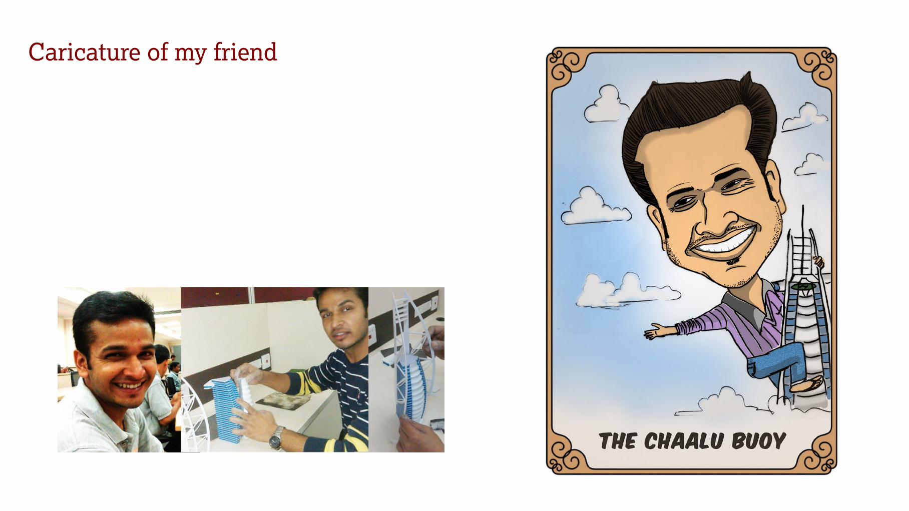
Caricature of my friend

Thank You
PRASAD R PADASEUser Experience Designer
Master’s in Design ( M.Des ) ( 2012-14 )
IIITDM Jabalpur
for your time & consideration
+91 94 7 94 22 385