u.s. airline business models 2006-2015: trends and key
TRANSCRIPT
U.S. Airline Business Models 2006-2015:
Trends and Key Impacts
by
Alexander R. BachwichB.S., Mechanical Engineering
South Dakota School of Mines & Technology, 2015
Submitted to the Department of Civil and Environmental Engineeringin partial fulfillment of the requirements for the degree of
Master of Science in Transportationat the
MASSACHUSETTS INSTITUTE OF TECHNOLOGYJune 2017
c©Massachusetts Institute of Technology 2017. All rights reserved.
Author..............................................................................................................Department of Civil and Environmental Engineering
May 12, 2017
Certified by........................................................................................................Peter P. Belobaba
Principal Research Scientist of Aeronautics and AstronauticsThesis Supervisor
Accepted by.......................................................................................................Jesse Kroll
Professor of Civil and Environmental EngineeringChair, Graduate Program Committee
1

2

U.S. Airline Business Models 2006-2015: Trends and Key Impacts
by Alexander R. Bachwich
Submitted to the Department of Civil and Environmental Engineering onMay 12, 2017 in partial fulfillment of the requirements for the degree of
Master of Science in Transportation.
Abstract
This thesis focuses on the evolution of U.S. airline business models from 2006-2015, and the impacts of these changes on other stakeholders in the U.S. air trans-portation system. The U.S. airline industry has been affected by increasingly volatileprofit cycles since its deregulation in 1978. This volatility has led to major changesin the industry, including cost convergence between traditional Low Cost Carriers(LCCs) and Network Legacy Carriers (NLCs), multiple rounds of consolidation, andmost recently a period of “Capacity Discipline” where high fuel prices and a reducednumber of competitors led to slower-than-average capacity growth.
The combined effects of these changes led to the emergence of a new businessmodel: the “Ultra Low Cost Carrier” (ULCC). In this thesis, we conduct an analysisof ULCCs in the U.S. and demonstrate how these carriers’ business models, costs,and effects on air transportation markets differ from those of the traditional LCCs.We also explore how the network and fleet strategies of airlines using all threebusiness models have changed, highlighting key trends such as the decline in 50 seatjet use by NLCs and the varying network strategies of ULCCs.
In the second half of the thesis, we examine how these changes in airline businessmodels have affected other stakeholders in the U.S. transportation system. Wedescribe how average fares have changed from 2006-2015 in the top U.S. markets.Then, using econometric models, we examine the effects of ULCC and LCC presence,entry, and exit on base airfares, and how these effects have changed over time.
We also explore how evolving airline business models have impacted communitiesand their local airports. We find that seat capacity has grown at large hub airportsfrom 2006-2015, whereas smaller airports have all seen declines in service levelsto varying degrees. In particular, we examine how secondary airports in majormetro areas have been affected by changing LCC strategies, and how the smallestairports have experienced significant declines in NLC service, yet some gains inULCC service. Finally, we discuss the public policy implications of these servicechanges, and what policy options airports and communities have at both a localand national level to improve their level of commercial air service.
Thesis Supervisor: Peter Belobaba
Title: Principal Research Scientist of Aeronautics and Astronautics
3

4

Acknowledgements
First and foremost, I would like to thank my advisor Dr. Peter Belobaba.From the very first time I met with him, two years before I even entered theM.S.T. program, Peter has been willing to share his extensive knowledge ofand passion for the airline industry with me. His insight into the researchproblems I faced, his continuous support of my research and academic goals,and most of all his unfailing patience with me as a student and researcher haveall been invaluable during my time at MIT. I can’t thank him enough.
I would also like to thank Mike Wittman for being an amazing mentor,colleague, and friend. Thanks for always listening to my thoughts about theaviation industry and sharing your stories from the field. Without your col-laboration on ULCC research, this thesis wouldn’t be possible.
This thesis was also made possible in part by all my colleagues at HawaiianAirlines, especially those on the Network Strategy team: Chris Keen, AngelaTseng, and Ken Lieber. During my time in HNL this past summer, I learnedhow airline analysis works in practice, and cemented my passion for this fasci-nating and dynamic industry. I’d be remiss not to also thank William Swelbar,who not only inspired me to begin work on ULCCs, but provided excellent ca-reer and life advice, and connected me with the team at Hawaiian.
I’m extremely grateful for the personal friendship and professional supportof all my ICAT colleagues, including Adam, Ben, German, JP, Matt, Oren,and Tamas. All of the airline geek banter exchanged at our lunches has beenone of my favorite aspects of the MIT experience.
I’d also like to thank all of my other MIT and Boston friends, includingAlex, Andrea B, Andrea S, Caralyn, Eli, Eytan, Henry, Jack, Joanna, John,Katie, Kim, Nate, Nick, Sid, Taylor, and numerous others (including all myTSG and Asymptones friends!) Without you, my experience at MIT would beincomplete, and I certainly wouldn’t have been able to grow as a person and aresearcher nearly as much as I did. I’m equally grateful to my South Dakotafriends for years of support, including Patrick, Scott, Beth, Paul, and Reed.
Finally, I owe much gratitude to my wonderful family, especially my sisterEmily and my parents Dale and Vera. Thank you for supporting my loveof aviation throughout life, for always sharing your wisdom and love, andespecially for always trusting me to make our family travel plans.
5

6
Contents
1 Introduction 151.1 Background . . . . . . . . . . . . . . . . . . . . . . . . . . . . 151.2 Motivation for Research . . . . . . . . . . . . . . . . . . . . . 161.3 Outline of Thesis . . . . . . . . . . . . . . . . . . . . . . . . . 17
2 Evolution of U.S. Airline Business Models 212.1 A Cyclic Industry . . . . . . . . . . . . . . . . . . . . . . . . . 222.2 Cost Convergence . . . . . . . . . . . . . . . . . . . . . . . . . 242.3 Consolidation . . . . . . . . . . . . . . . . . . . . . . . . . . . 282.4 Capacity Discipline . . . . . . . . . . . . . . . . . . . . . . . . 322.5 The Emerging ULCC . . . . . . . . . . . . . . . . . . . . . . . 34
2.5.1 Characteristics of the ULCC model . . . . . . . . . . . 37
3 Evolution of U.S. Airline Network and Fleet Structures 433.1 Background and Methods . . . . . . . . . . . . . . . . . . . . 43
3.1.1 Connectivity Model . . . . . . . . . . . . . . . . . . . . 453.2 Aggregate Fleet and Capacity Statistics . . . . . . . . . . . . . 473.3 Network Legacy Carriers (NLCs) . . . . . . . . . . . . . . . . 543.4 Hybrid Low Cost Carriers (LCCs) . . . . . . . . . . . . . . . . 613.5 Ultra Low Cost Carriers (ULCCs) . . . . . . . . . . . . . . . . 67
4 Key Impacts on Traffic and Fares 754.1 Capacity and Traffic Trends . . . . . . . . . . . . . . . . . . . 754.2 Unit Revenue and Fare Trends . . . . . . . . . . . . . . . . . . 784.3 Impact of the Emerging ULCC on Fares . . . . . . . . . . . . 83
4.3.1 Models . . . . . . . . . . . . . . . . . . . . . . . . . . . 844.3.2 Data Sources and Processing . . . . . . . . . . . . . . . 854.3.3 Descriptive Statistics . . . . . . . . . . . . . . . . . . . 874.3.4 Results: Market Presence . . . . . . . . . . . . . . . . 894.3.5 Results: Entry/Exit . . . . . . . . . . . . . . . . . . . 91
7

5 Key Impacts on Airports, Communities, and Public Policy 955.1 Overview of Seat Capacity Trends by
Airport Type . . . . . . . . . . . . . . . . . . . . . . . . . . . 955.2 LCCs and Secondary Airports . . . . . . . . . . . . . . . . . . 1005.3 Impacts on Smaller Airports . . . . . . . . . . . . . . . . . . . 105
5.3.1 NLCs and Decline of the 50 Seat Jet . . . . . . . . . . 1055.3.2 ULCCs and Growth in Service to Small Airports . . . 108
6 Conclusions 1136.1 Evolution of U.S. Airline Business Models . . . . . . . . . . . 1136.2 Impacts on Fares and Communities . . . . . . . . . . . . . . . 1166.3 Future Work . . . . . . . . . . . . . . . . . . . . . . . . . . . . 119
8

List of Figures
2.1 Classification of select major U.S. carriers in 2006 . . . . . . . 212.2 U.S. Airline Industry Net Income Since 1978 - Source: Airlines
for America . . . . . . . . . . . . . . . . . . . . . . . . . . . . 222.3 Cost per equivalent available seat mile, excl. transport-related
expenses, by carrier type, 2006-2015 . . . . . . . . . . . . . . . 252.4 Labor cost per equivalent seat mile by carrier type, 2000-2015 262.5 Year-over-year change in available domestic seat miles by carrier
type . . . . . . . . . . . . . . . . . . . . . . . . . . . . . . . . 272.6 Types of partnerships between airlines organized by level of in-
tegration and profitability improvement . . . . . . . . . . . . . 292.7 Comparison between changes in GDP and changes in U.S. do-
mestic capacity (ASMs) 2006-2016 . . . . . . . . . . . . . . . . 332.8 Changes in U.S. domestic capacity by carrier type 2010-2015,
indexed to 2010 . . . . . . . . . . . . . . . . . . . . . . . . . . 342.9 Allegiant and Spirit traffic and capacity, in billions of RPMs
and ASMs, 2005-2015 . . . . . . . . . . . . . . . . . . . . . . . 362.10 System CASM ex transport-related expenses & fuel vs. mean
stage length (2014) . . . . . . . . . . . . . . . . . . . . . . . . 382.11 Average cost per enplaned passenger among select ULCCs and
LCCs, 3Q15 . . . . . . . . . . . . . . . . . . . . . . . . . . . . 392.12 Ticket vs. ancillary revenue per passenger segment for Spirit
and Allegiant, 2014 . . . . . . . . . . . . . . . . . . . . . . . . 402.13 Total system RASM ex transport-related revenues vs. mean
stage length (2014) . . . . . . . . . . . . . . . . . . . . . . . . 40
3.1 Key network and fleet questions with associated metrics . . . 433.2 Example schematic of Airport Connectivity Quality Index (1) 463.3 Example schematic of Airport Connectivity Quality Index (2) 463.4 Fleet size and composition of Major U.S. airlines, 2006 . . . . 483.5 Fleet size and composition of Major U.S. airlines, 2015 . . . . 49
9

3.6 Average daily narrowbody block hour utilization by airline type,2006-2015 . . . . . . . . . . . . . . . . . . . . . . . . . . . . . 50
3.7 Average domestic stage length by airline type, 2006-2015 . . . 523.8 Evolution of the combined fleet of NLCs by equipment type . 543.9 Average narrowbody block hour utilization of NLC-operated
flights, 2006-2015 . . . . . . . . . . . . . . . . . . . . . . . . . 553.10 Average stage length of NLC-marketed domestic flights, 2006-
2015 . . . . . . . . . . . . . . . . . . . . . . . . . . . . . . . . 563.11 Seat departures at top 10 AA/US/HP stations by seats, 2006 . 573.12 Seat departures at top 10 DL/NW stations by seats, 2006 . . . 583.13 Seat departures at top 10 UA/CO stations by seats, 2006 . . . 593.14 Share of flights at major U.S. NLC hubs by mainline and re-
gional aircraft, 2006 vs. 2015 . . . . . . . . . . . . . . . . . . . 603.15 Percentage of total connectivity lost without NLCs by airport
hub type, 2015 . . . . . . . . . . . . . . . . . . . . . . . . . . 613.16 Evolution of LCC narrowbody fleets 2006-2015 by carrier . . . 623.17 Average narrowbody block hour utilization of LCC-operated
flights, 2006-2015 . . . . . . . . . . . . . . . . . . . . . . . . . 633.18 Average stage length of LCC-marketed domestic flights, 2006-2015 643.19 Seat departures at top 10 WN/FL stations by seats, 2006 . . . 643.20 Seat departures at top 10 B6 stations by seats, 2006 . . . . . . 653.21 Seat departures at top 10 AS stations by seats, 2006 . . . . . . 663.22 Percentage of total connectivity lost without LCCs by airport
hub type, 2015 . . . . . . . . . . . . . . . . . . . . . . . . . . 673.23 Evolution of ULCC narrowbody fleets 2006-2015 by carrier . . 673.24 Average narrowbody block hour utilization of ULCC-operated
flights, 2006-2015 . . . . . . . . . . . . . . . . . . . . . . . . . 683.25 Average stage length of ULCC-marketed domestic flights, 2006-
2015 . . . . . . . . . . . . . . . . . . . . . . . . . . . . . . . . 693.26 Seat departures at top 10 F9 stations by seats, 2006 and 2015 703.27 Seat departures at top 10 G4 stations by seats, 2006 and 2015 713.28 Seat departures at top 10 NK stations by seats, 2006 and 2015 723.29 Number of destinations by carrier among ULCCs by daily fre-
quency of service, 2015 . . . . . . . . . . . . . . . . . . . . . . 733.30 Percentage of total connectivity lost without ULCCs by airport
hub type, 2015 . . . . . . . . . . . . . . . . . . . . . . . . . . 73
4.1 Percentage of total U.S. domestic capacity by carrier type, 2006-2015 . . . . . . . . . . . . . . . . . . . . . . . . . . . . . . . . 76
10

4.2 Share of traffic and revenue in largest 100 O&Ds by carrier type,2006-2015 . . . . . . . . . . . . . . . . . . . . . . . . . . . . . 77
4.3 Inflation adjusted PRESM among traditional LCCs and NLCs,2006-2015 . . . . . . . . . . . . . . . . . . . . . . . . . . . . . 78
4.4 Number of top 1000 O&D markets that saw changes in fares,2006-2010 (current dollars) . . . . . . . . . . . . . . . . . . . . 80
4.5 Number of top 1000 O&D markets that saw changes in inflation-adjusted fares, 2006-2010 . . . . . . . . . . . . . . . . . . . . . 81
4.6 Average current fare by quintile over study period . . . . . . . 814.7 Average inflation-adjusted fare (in 2006 dollars) by quintile over
study period . . . . . . . . . . . . . . . . . . . . . . . . . . . . 824.8 Percentage of new markets abandoned within 1 or 2 years of
start, by carrier type . . . . . . . . . . . . . . . . . . . . . . . 88
5.1 Capacity trends by carrier type among different size airports . 975.2 Seat share trends by carrier type among different size airports 985.3 Seats per departure trends at Large and Medium Hubs . . . . 995.4 Seats per departure trends at Small and Non Hubs . . . . . . 995.5 Scheduled Southwest/AirTran seat departures by airport type,
2006-2015 . . . . . . . . . . . . . . . . . . . . . . . . . . . . . 1025.6 Scheduled Virgin America/JetBlue seat departures by airport
type, 2006-2015 . . . . . . . . . . . . . . . . . . . . . . . . . . 1035.7 Primary small (red) and non hub (blue) airports in contiguous
U.S. with more than 50,000 annual enplanements, 2014 . . . . 1065.8 Average daily departures per airport served by carrier type,
2006-2015 . . . . . . . . . . . . . . . . . . . . . . . . . . . . . 1075.9 Frontier seat capacity at PHL-area airports, 2011-2015 . . . . 109
11

12

List of Tables
2.1 Chapter 11 bankruptcy filings by major U.S. carriers 2002-2005 232.2 Direct costs of A320-200 block hour costs by carrier, 2015 . . . 262.3 Costs and productivity of A320-200 block hour costs by carrier,
2015 . . . . . . . . . . . . . . . . . . . . . . . . . . . . . . . . 272.4 Mergers and acquisitions among U.S. passenger airlines since 2006 292.5 Largest U.S. airlines in 2006 including regional partners . . . . 302.6 Largest U.S. airlines in 2015 including regional partners . . . . 312.7 Selected Major US Airlines by Category . . . . . . . . . . . . 41
3.1 Input parameters to ACQI model . . . . . . . . . . . . . . . . 473.2 Domestic/International capacity by marketing carrier type in
billions of ASMs, 2006-2015 . . . . . . . . . . . . . . . . . . . 53
4.1 Domestic RPMs (billions) by carrier type, 2006-2015 . . . . . 774.2 Descriptive statistics for markets included in fare study . . . . 794.3 Number of markets by year and type of carrier presence included
in study . . . . . . . . . . . . . . . . . . . . . . . . . . . . . . 874.4 Descriptive statistics for markets with ULCC and LCC entry
and exit events included in study . . . . . . . . . . . . . . . . 884.5 Effects of U.S. LCC and ULCC market presence on log of aver-
age one-way market fares, 2010-2015 . . . . . . . . . . . . . . 894.6 Average effect of ULCC or LCC presence on average one-way
market fares . . . . . . . . . . . . . . . . . . . . . . . . . . . . 904.7 Effects of U.S. LCC and ULCC entry and exit on log of average
one-way market fares, 2011-2015 . . . . . . . . . . . . . . . . . 914.8 Effects of U.S. carrier entry and exit on log of average one-way
market fares, 2011-2015 . . . . . . . . . . . . . . . . . . . . . . 93
5.1 FAA Airport Hub Types - Descriptive Statistics . . . . . . . . 965.2 Service breakdown in major metro areas among U.S. carriers,
2015 . . . . . . . . . . . . . . . . . . . . . . . . . . . . . . . . 104
13

5.3 NLC changes in flights and seats, 2006 vs. 2015 . . . . . . . . 106
A1 Metro Areas Included in Entry/Exit Study . . . . . . . . . . . 126
14
Chapter 1
Introduction
1.1 Background
Since the deregulation of the U.S. airline industry in 1978, U.S. airlines havebeen competing with each other for passenger traffic on the basis of price andfrequency. As the industry has experienced a number of boom-and-bust busi-ness cycles, management strategies of airlines have been changing to competein the continuously evolving U.S. marketplace. These changes have impactedall facets of the airline business, including fare structure, network structure,labor costs, fleet composition, and fuel hedging strategies. In order to un-derstand the dynamics of U.S. airline industry, it is important to study theevolution of business models in the industry, as well as the macro-level trendsthat led to the development of these models.
The business models of today’s Network Legacy Carriers (NLCs) - Ameri-can, Delta, and United - can be traced back to the immediate post-deregulationera. Before 1978, these carriers were operating interstate flights under the au-thority of the Civil Aeronautics Board (CAB). After deregulation, with pricingand network decisions no longer subject to extensive regulation by the CAB,NLCs introduced some key features of their business model that they retainto this day (Gillen and Morrison, 2003). Namely, NLCs developed 1) huband spoke networks that enabled them to offer service on a large number oforigin and destination (O&D) markets; 2) global alliances and partnershipswith regional carriers that enabled further expansion of NLCs’ effective mar-ket reach; and 3) increasingly advanced revenue management and distributioncapabilities that allowed them to more carefully segment their market.
In addition to affecting change in the strategies of established NLCs, dereg-ulation also prompted the rapid growth of a new type of business model: the
15

Low Cost Carrier (LCC). A few LCCs began as intrastate carriers prior toderegulation that expanded their operations after 1978 (most famously South-west in Texas and Pacific Southwest in California), but the majority werefounded in the newly liberalized market environment in the late 1970s andearly 80s. The freedom to compete on price and frequency without involve-ment from the CAB was a major contributing factor to the well-documentedrise of the LCC business model in the United States, starting with SouthwestAirlines’ expansion in the 1980s (Francis et al., 2006; ben Abda et al., 2008;Gross and Luck, 2013).
By streamlining operations (e.g. operating a single fleet type, developingpoint-to-point networks), LCCs were able to achieve lower unit costs thanNLCs. This enabled the LCCs to offer lower fares while, in most cases, stillmaintaining profitability. Some LCCs developed innovative policies to increaserevenue by charging for services that were provided free of charge by net-work carriers. For example, People Express, founded in 1981, introduced a $3checked baggage fee and charged for onboard snack/meal service (Gross andLuck, 2013).
More recently, a third business model has emerged: the Ultra Low CostCarrier (ULCC). In the mid 2000s, as the gap between the unit costs of LCCsand NLCs in the U.S. narrowed (Tsoukalas et al., 2008), a market opportunityemerged for a new type of carrier with a focus on low costs to undercut eventhe LCCs’ cost structure.
The U.S. airline industry is a major component of the national economy- some estimates suggest 4-6% of the U.S. Gross Domestic Product can beattributed in some fashion to the industry (U.S. Federal Aviation Administra-tion, 2014; Airlines for America, 2017). Thus, understanding the state of theindustry and identifying key trends in air service are of great public interest.As the U.S. airline industry has trifurcated into the business models introducedabove, studying the industry through the lens of this three-model structurecan help provide insight into this major economic engine. Specifically, analysesof the evolution of airline business models can help inform thoughts on futuredevelopments and resulting impacts on all stakeholders of the U.S. air trans-portation system: the traveling public, airports, communities, governmentalentities, and air carriers alike.
1.2 Motivation for Research
The interplay between the NLC and LCC business models has been the focusof much recent academic literature, e.g. (Gillen and Morrison, 2003; Gross
16
and Luck, 2013). Many of these studies have focused on the characteristics ofLCCs, and whether a given airline should be considered an LCC or an NLC.The effects of NLC vs. LCC competition on other stakeholders in the U.S. airtransportation system have also been examined. For instance, the so-called“Southwest Effect” has been examined, where fares drop in communities whereSouthwest enters a given market (Windle and Dresner, 1995; Morrison, 2001).
However, this thesis will present evidence that the U.S. industry has di-verged into three separate business models: the NLC, the “hybrid” LCC, andthe Ultra-Low-Cost Carrier (ULCC). Thus it is a useful exercise to consider thestate of the industry under this paradigm with three dominant business mod-els. As each type of carrier has a unique structure, each business model canresult in different impacts on passengers, airports, and the industry landscapeat large.
The purpose of this thesis is to investigate the evolution of these businessmodels from 2006 to the present, focusing on some key changes in the industrythat occurred over this period, such as consolidation, capacity discipline, costconvergence between the NLCs and LCCs, and the emergence of the ULCCmodel. The evolution in airline networks and fleets over the past decade is alsocovered, including an examination of hub structures, aircraft utilization, stagelength, and connectivity. Additionally, this thesis will provide an analysis ofkey impacts of these trends on the broader U.S. air transportation system. Thisincludes an investigation into any changes base fares and pricing structuresamong U.S. carriers, as well as some broader impacts on airports, communities,and public policy.
This thesis addresses two main gaps in the current literature. First, itupdates previous literature about the NLC and LCC airline business models byupdating the evolution narrative through the present day (2016), incorporatingnew data. This thesis also addresses the emergence of the ULCC model andprovides an analysis of the industry taking into account this emerging businessmodel. The result is a comprehensive overview of recent developments in theU.S. airline industry relating to the business models adopted by U.S carriers.
1.3 Outline of Thesis
In Chapter 2, a more detailed history on the evolution of these business modelsis presented, and the types of business models are defined through a seriesof qualitative and quantitative analyses. After a brief overview of the U.S.airline industry prior to 2005, a detailed chronology of the industry from 2006to 2016 is presented. Key trends such as cost convergence between LCCs and
17

NLCs, consolidation of various carriers, and capacity discipline are reviewed.Important macro-level industry metrics such as capacity, unit costs, and otherfinancial data are studied to identify the driving forces behind these trends.Using this analysis as a basis, the U.S. carriers are then classified into one ofthe three categories of business models, focusing on cost, network, fleet, andrevenue structure.
Chapter 3 focuses on the development of network and fleet structures ofcarriers. It first examines the fleet development of U.S. airlines by reviewingtrends in key metrics such as average stage length and utilization (block hoursper day) and how these metrics differ between carrier types. Additionally,key developments such as the shift among NLC regional partners towards 76seat aircraft in favor of 50 seat regional jets are examined. Next, an analysisof evolution in carrier networks is presented. Following a general review ofthe types of network strategies associated with each business model, the keydevelopments in carriers’ networks are highlighted. Some of the general trendscovered include the consolidation of hubs among NLCs, the encroachmentof LCCs into major primary airports (such as Boston Logan and ChicagoO’Hare), and the diversity of network strategies pursued by ULCCs.
Chapters 4 and 5 present more detailed analyses of key impacts of trendsthat were observed in Chapters 2 and 3. In Chapter 4, general trends in faresand traffic are explored, focusing on how trends such as cost convergence haveaffected average fares and carriers’ unit revenue. Furthermore, the changingimpacts of the ULCC and LCC business models on market fares are stud-ied. Using data on ULCC, LCC, and NLC market presence, entry, and exitoutcomes over a six-year period, and market airfares from 2010-2015, we showthat ULCC presence has a significantly greater effect on reducing average basefares in U.S. domestic airline markets than presence by the more mature LCCs.
Chapter 5 covers the impacts of industry trends on U.S. airports andthe communities they serve. First, trends in carriers’ distribution of capac-ity among various categories of airports are analyzed. Then, we present anoverview covering the tendency of ULCCs and LCCs to serve secondary ”re-liever” airports and how this has changed over time. We also examine recenttrends in air service at smaller airports, exploring how the decline of 50-seatjet service by NLCs and additional capacity provided by ULCCs have affectedthese smaller communities. This chapter also contains an overview of recentpublic policy initiatives related to the domestic U.S. airline industry, includ-ing an overview of air carrier subsidies in the U.S., such as the Essential AirService (EAS) program.
Chapter 6 briefly concludes the thesis, highlighting key developments men-tioned above, and presents suggestions for future research.
18

Note: A modified version of Chapter 4 and selections from Chapter 2 havepreviously been published as “The Emergence and Effects of the Ultra LowCost Carrier (ULCC) in the U.S. Airline Indsutry” in the July 2017 issue ofthe Journal of Air Transport Management.
19

20

Chapter 2
Evolution of U.S. AirlineBusiness Models
In this chapter, an overview of some key recent trends in the U.S. airlineindustry will be presented. There will be a focus on how these trends affectedthe two traditional airline business models, Network Legacy Carriers (NLCs)and traditional Low Cost Carriers (LCCs). Furthermore, this covers how thesetrends helped to precipitate a new business model while causing significantchanges to the LCCs and NLCs, including how “cost convergence” led to ashift in LCC structure such that modern LCCs use a hybrid model borrowingaspects from both traditional LCCs and NLCs. Finally, an overview of thethree evolved business models present by 2015 in the U.S. airline industry isgiven, which highlights some of the notable differences between the businessmodel types. The section then concludes by classifying major airlines (in 2015)as a Network Legacy Carrier (NLC), a hybrid Low Cost Carrier (LCC), or anUltra Low Cost Carrier (ULCC).
Figure 2.1: Classification of select major U.S. carriers in 2006
21

To provide some context for the reader, the classification of selected majorU.S. carriers in 2006 is shown in Figure 2.1. In this classification, traditionalLCCs generally include many similar and well-established cost-saving prac-tices in their business models, such as using common and modern aircrafttypes with high block hour utilization, a simplified fare structure, and reduceddependence on Global Distribution Systems (GDSs) for ticket sales (Gross andLuck, 2013, p. 11). Meanwhile, as mentioned in the introduction, NLCs havehigher cost but offer comprehensive hub and spoke networks with increasedoptions through alliances and codeshares.
2.1 A Cyclic Industry
Since deregulation, the U.S. airline industry has been through many busi-ness cycles of increasing amplitude. The advent of deregulation introducedincreased volatility in the U.S. airline industry, and the economic realities ofa less regulated marketplace began to set in. The sinusoidal nature of theU.S. airline industry’s business cycles, expressed as total net income, as wellas their increasing amplitude, are clear in Figure 2.2.
Figure 2.2: U.S. Airline Industry Net Income Since 1978 - Source: Airlines forAmerica
22

This volatility has been a key factor in the evolution of both the NLC andLCC business models. Through each business cycle, the upstart LCCs thatwere not able to successfully achieve or maintain low costs eventually declaredbankruptcy or were merged into other carriers (e.g. People Express, mergedinto Continental). Additionally, NLCs that didn’t possess a strong enoughnetwork or suffered high costs themselves also were often forced into Chapter 11proceedings. Since deregulation, there have been over 100 bankruptcy filingsamong Part 121 carriers in the U.S. (Airlines for American, 2016a).
One of the reasons that this volatility exists is that passenger demand iscorrelated with the general economic conditions. However, due to the largeinvestments necessary to acquire aircraft and staff the airline appropriately,it is expensive for airlines to respond to poor economic conditions by cuttingsupply quickly (Belobaba et al., 2009, p. 154, 158, 287).
Furthermore, airlines have historically tended to over-order aircraft whenfinancing was available to do so (at the top of the business cycle) leaving themwith excess capacity during the next downturn, as new planes are not gener-ally delivered until a few years after purchase. For instance, in 2007 Boeingand Airbus booked upwards of 1,200 worldwide net orders each, presumablywith some aircraft scheduled for delivery during the 2009-2011 period. Thiscompares to 400 or fewer net orders each year during 2001-2004, with manyof these aircraft presumably being delivered in time to take advantage of the2006-2007 economic boom.
Table 2.1: Chapter 11 bankruptcy filings by major U.S. carriers 2002-2005 -Source: Airlines for American (2016a)
Carrier Date of Bankruptcy
US Airways 8/11/2002United Airlines 12/9/2002
Hawaiian Airlines 3/21/2003US Airways 9/12/2004
ATA Airlines 10/26/2004Aloha Airlines 12/30/2004
Northwest Airlines 9/14/2005Delta Air Lines 9/14/2005
Throughout the late 1980s and early 90s, the industry underwent a turbu-lent period defined by a series of mergers and bankruptcies among both NLCsand LCCs. The industry then saw a period of relative stability and growth
23

during the remainder of the 90s, much like the economy at large, only to besent into a crisis caused by the downturn in travel in the post-9/11 period.During 2002-2005, the majority of U.S. NLCs declared bankruptcy, while mostLCCs such as Southwest, and the fledgling JetBlue survived. Table 2.1 showsthe major bankruptcy filings by U.S. carriers during this period. Notablyabsent is American Airlines, which suffered from higher labor costs than itscompetitor NLCs until its own bankruptcy in 2011.
Helped by the ability to discharge pensions and labor contracts through theU.S. Chapter 11 bankruptcy process, NLCs were on the road to recovery whenfuel prices spiked in early 2008. By slashing labor costs through bankruptcy,NLCs were able to narrow the gap between their costs and the costs of LCCs(see Section 2.2). However, when fuel prices increased from $2.20 per gallonin July 2007 to $4.16 per gallon a year later (EIA, 2016), many airlines couldnot cope and set off the next round of bankruptcies and mergers (see Section2.3).
2.2 Cost Convergence
A key recent trend in the airline industry has been the cost convergence be-tween traditional LCCs and NLCs. This refers to the gradually narrowinggap in unit costs between NLCs and LCCs, which has been caused by both arelative increase in LCC unit costs and a relative decrease in NLC unit costs.Although this effect was most pronounced in the early-to-mid 2000s, there isstill some ongoing convergence between NLCs and LCCs as shown in Figure2.3.
As mentioned previously, a large portion of LCC success resulted from laborcost savings over traditional NLCs. After the rapid period of LCC expansionin the early 2000s, the legacy carriers went through a period of restructuringas part of the bankruptcy process. As a result of Chapter 11 bankruptcylaws in the U.S., the legacy carriers were able to significantly restructure laborcontracts to reduce overall cost of operation significantly.
As shown in Figure 2.4, the labor contracts negotiated in bankruptcycaused the gap between LCC and NLC costs to be reduced significantly. Thegap in labor cost per equivalent seat mile (LCESM) between NLCs and tra-ditional LCCs decreased from 2.36 cents in 2002 to 0.97 cents by 2006, whichis greater than the 0.62 reduction in the overall CESM gap between the twocarrier types over the same period. However, this does not account for thesubsequent rise in both NLC and LCC unit cost.
Tsoukalas et al. (2008) found that two of the key drivers of labor cost
24
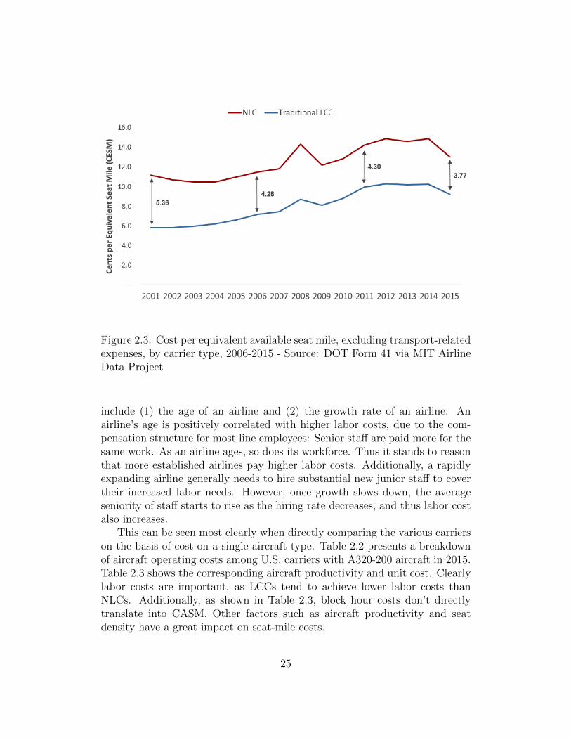
Figure 2.3: Cost per equivalent available seat mile, excluding transport-relatedexpenses, by carrier type, 2006-2015 - Source: DOT Form 41 via MIT AirlineData Project
include (1) the age of an airline and (2) the growth rate of an airline. Anairline’s age is positively correlated with higher labor costs, due to the com-pensation structure for most line employees: Senior staff are paid more for thesame work. As an airline ages, so does its workforce. Thus it stands to reasonthat more established airlines pay higher labor costs. Additionally, a rapidlyexpanding airline generally needs to hire substantial new junior staff to covertheir increased labor needs. However, once growth slows down, the averageseniority of staff starts to rise as the hiring rate decreases, and thus labor costalso increases.
This can be seen most clearly when directly comparing the various carrierson the basis of cost on a single aircraft type. Table 2.2 presents a breakdownof aircraft operating costs among U.S. carriers with A320-200 aircraft in 2015.Table 2.3 shows the corresponding aircraft productivity and unit cost. Clearlylabor costs are important, as LCCs tend to achieve lower labor costs thanNLCs. Additionally, as shown in Table 2.3, block hour costs don’t directlytranslate into CASM. Other factors such as aircraft productivity and seatdensity have a great impact on seat-mile costs.
25

Figure 2.4: Labor cost per equivalent seat mile by carrier type, 2000-2015 -Source: DOT Form 41 via MIT Airline Data Project
Table 2.2: Direct costs of A320-200 block hour costs by carrier (U.S. units),2015 - Source: MIT Airline Data Project and US DOT Form 41
Total Aircraft Op- # inAirline Crew Fuel/Oil Maintenance Ownership erating Cost (AOC) Fleet
Delta $ 1001 $ 1629 $ 783 $ 556 $ 3969 69Frontier $ 846 $ 1657 $ 412 $ 1000 $ 3915 25United $ 927 $ 1493 $ 727 $ 551 $ 3697 97JetBlue $ 819 $ 1510 $ 762 $ 414 $ 3506 130American $ 844 $ 1220 $ 853 $ 414 $ 3331 51Virgin $ 582 $ 1314 $ 443 $ 906 $ 3246 53Spirit $ 562 $ 1258 $ 354 $ 845 $ 3019 45Allegiant $ 435 $ 1378 $ 392 $ 448 $ 2653 16
26

Table 2.3: Costs and productivity of A320-200 block hour costs by carrier(U.S. units), 2015 - Source: MIT Airline Data Project and US DOT Form 41
AirlineAOC per Average Seats per Aircraft Day
CASMBlock Hr Stage Length per A/C Departures Block Hrs ASMs
Delta $3969 924 151 3.9 8.2 544,588 0.0595Frontier $3915 1141 180 4.3 10.7 861,131 0.0488United $3697 1081 150 3.4 8.1 548,482 0.0543JetBlue $3506 1308 150 3.9 11.2 762,742 0.0513American $3331 952 150 4.3 9.6 639,418 0.0501Virgin $3246 1546 148 2.9 9.8 671,675 0.0473Spirit $3019 994 178 5.0 11.2 893,076 0.0377Allegiant $2653 907 177 4.4 9.1 706,282 0.0343
Both airline age and growth rate are partly responsible for the steady risein LCC labor unit cost observed since 2006, and is shown in Figure 2.4. Theannual systemwide year-over-year change in ASMs at NLCs and LCCs overthis period is found in Figure 2.5. That chart clearly illustrates the slowingof LCC growth around the 2006-2008 period, and subsequent annual growthrates much lower than the historical average. This is a driving factor behindthe rise in LCC labor unit costs.
Figure 2.5: Year-over-year change in available domestic seat miles by carriertype, 2000-2015 - Source: DOT Form 41 via MIT Airline Data Project
27

More broadly, the phenomenon of cost convergence between LCCs andNLCs has prompted somewhat of an evolution in both business models. Dueto the smaller differences in unit costs, LCCs are no longer able to undercutNLCs in terms of fare quite as much as they did in the past. As will beshown later in this thesis, LCCs have changed their network strategy to tryand compete more directly with NLCs for higher-yield domestic traffic.
2.3 Consolidation
Since deregulation, mergers and acquisitions have played a significant role inshaping the landscape of the U.S. airline industry. According to the nationaltrade association Airlines for America (A4A), 34 mergers and acquisitionsamong major passenger carriers in the industry have been completed since1978 (Airlines for America, 2016b). Some of the more notable instances ofmerger and acquisition (M&A) activity have included the Texas Air Corpo-ration takeover of Continental in 1982, the mergers of Delta/Western, North-west/Republic, and TWA/Ozark in 1986, Southwest’s takeover of Morris Airin 1993, and American’s acquisition of TWA in 2001.
Consolidation is especially attractive to firms in the airline industry, ashorizontal mergers in the industry have been shown to significantly increasemarket power, in addition to generating cost efficiencies (Knapp, 1990). Thisis especially true for Network Legacy Carriers (NLCs), as part of their valueproposition is offering a comprehensive network to their passengers. However,airlines have many levels of cooperation that do not necessarily incur the samecomplexity of a merger or acquisition. Code sharing, where partner airlinessell inventory on each other’s flights, or anti-trust immune joint ventures (ATI-JVs), where partner airlines coordinate schedules and pricing (and often sharerevenues/costs) are two forms of partnership short of a merger - see Figure 2.6.Some recent examples of such partnerships in the U.S. include Alaska’s codeshare agreements with Delta and American, or Hawaiian’s code shares withVirgin America and JetBlue. ATI-JVs are generally only used in situationswhere a merger is not possible, usually with a foreign partner airline (such asUnited and Lufthansa).
While these partnerships provide some benefits, they do not achieve the ef-ficiencies of a full merger or acquisition (e.g. cross-fleeting and cross-crewing).Thus, there are synergies that could not necessarily be reached by lesser formsof cooperation such as code sharing or interlining alone. This is why bothNLCs and LCCs in the U.S. have experienced another recent spike in M&Aactivity.
28

Figure 2.6: Types of partnerships between airlines organized by level of inte-gration and profitability improvement (Swelbar, 2015)
Table 2.4: Mergers and acquisitions among U.S. passenger airlines since 2006- Source: Airlines for America (2016b)
Carriers Initiated Closed Combined Carrier
Pinnacle / Colgan 1/18/2007 1/18/2007 Pinnacle / ColganSouthwest / ATA 11/19/2008 Southwest AirlinesRepublic / Midwest 6/23/2009 7/31/2009 Republic AirwaysRepublic / Frontier 8/14/2009 10/1/2009 Republic AirwaysDelta / Northwest 4/14/2008 12/31/2009 Delta Air LinesPinnacle / Mesaba 7/1/2010 7/1/2010 Pinnacle / MesabaUnited / Continental 5/3/2010 10/1/2010 United AirlinesSkyWest / ASA / ExpressJet 8/4/2010 11/15/2010 SkyWest AirlinesSouthwest / AirTran 9/27/2010 5/2/2011 Southwest AirlinesUS Airways/AMR/American 2/14/2013 12/9/2013 American AirlinesAlaska / Virgin America 4/4/2016 12/14/2016 Alaska Airlines
Notably, two of the three ”mega-mergers” in the past decade were initiated
29

in the depths of the financial crisis. The Delta-Northwest merger was initiatedon April 14, 2008, after a slew of airline bankruptcies due to a spike in fuel:Aloha, ATA, Skybus, and Frontier all declared bankruptcy (with all but thelatter ceasing operations) in the two weeks preceding the Delta-Northwestmerger announcement. The United-Continental merger was initiated in spring2010, after both carriers had report net losses the year prior. This suggeststhat these carriers merged for the increased market power which enabled theindustry to reduce overall capacity, as explored in Section 2.4.
As shown in Tables 2.5 and 2.6, after these mega-mergers the largest fourcarriers remained the same in 2006 as in 2015 (American, Southwest, Delta,and United), albeit in a slightly different order. The most notable differenceis in market concentration metrics at the bottom of each table: These fourcarriers went from carrying 56.9% of domestic traffic (as measured by share oftotal domestic O&D passengers) to 78.7%.
Table 2.5: Largest U.S. Airlines in 2006 including regional partners - Sources:US DOT T-100 & DB1B data, annual reports
2006 U.S. Summary1 American Southwest Delta UnitedRanking by seats 1 2 3 4Seat departures (millions) 154.2 148.0 139.5 119.9ASMs (millions) 186,095 92,222 145,920 153,910RPMs (millions) 148,390 67,383 114,523 125,980Load factor 79.7% 73.1% 78.5% 81.9%Fleet size (mainline/regional) 697/306 481/0 440/516 460/290Share of U.S. onboard pax 14.6% 12.6% 13.0% 11.5%Share of domestic O&D pax 13.8% 18.5% 12.9% 11.7%Total top 4 enplanement share 51.7%Total top 4 domestic O&D share 56.9%
1Data excludes flights not originating or arriving in the U.S.
30
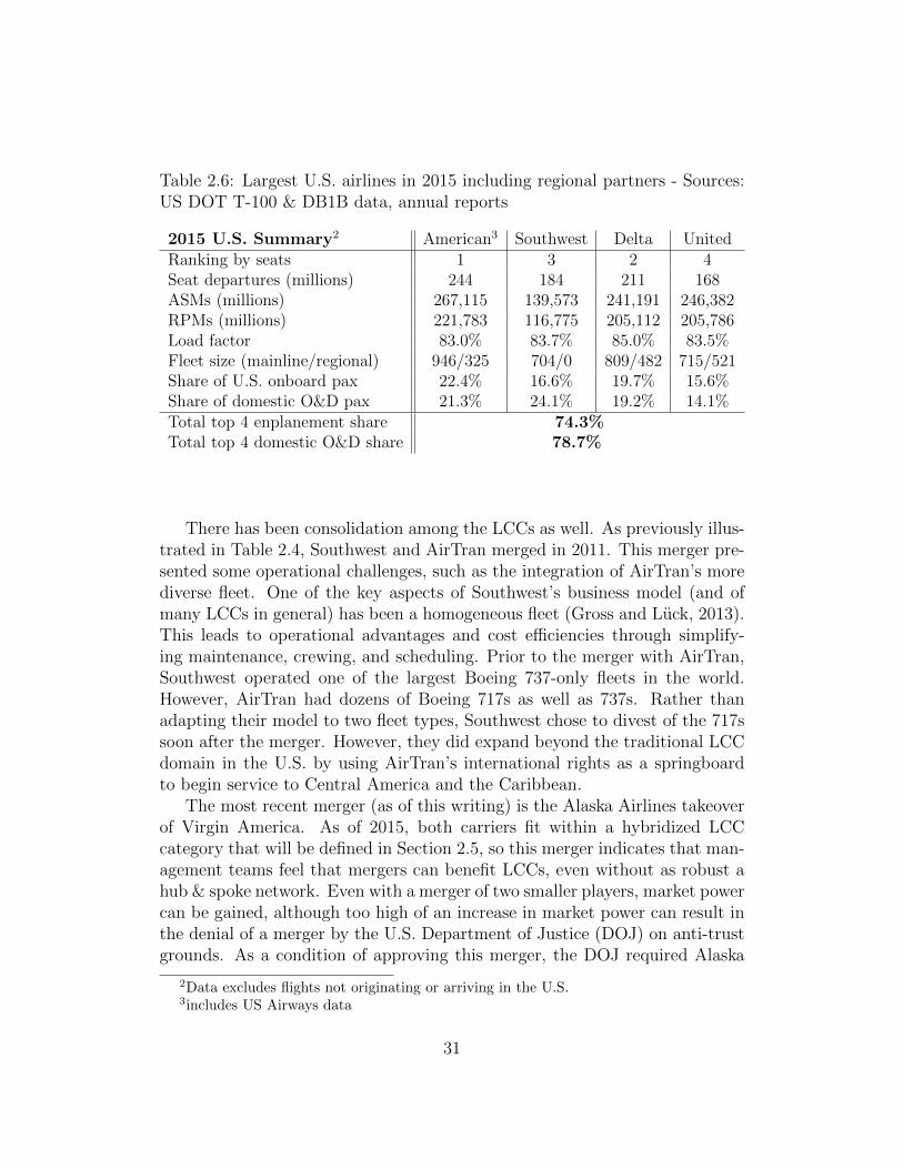
Table 2.6: Largest U.S. airlines in 2015 including regional partners - Sources:US DOT T-100 & DB1B data, annual reports
2015 U.S. Summary2 American3 Southwest Delta UnitedRanking by seats 1 3 2 4Seat departures (millions) 244 184 211 168ASMs (millions) 267,115 139,573 241,191 246,382RPMs (millions) 221,783 116,775 205,112 205,786Load factor 83.0% 83.7% 85.0% 83.5%Fleet size (mainline/regional) 946/325 704/0 809/482 715/521Share of U.S. onboard pax 22.4% 16.6% 19.7% 15.6%Share of domestic O&D pax 21.3% 24.1% 19.2% 14.1%Total top 4 enplanement share 74.3%Total top 4 domestic O&D share 78.7%
There has been consolidation among the LCCs as well. As previously illus-trated in Table 2.4, Southwest and AirTran merged in 2011. This merger pre-sented some operational challenges, such as the integration of AirTran’s morediverse fleet. One of the key aspects of Southwest’s business model (and ofmany LCCs in general) has been a homogeneous fleet (Gross and Luck, 2013).This leads to operational advantages and cost efficiencies through simplify-ing maintenance, crewing, and scheduling. Prior to the merger with AirTran,Southwest operated one of the largest Boeing 737-only fleets in the world.However, AirTran had dozens of Boeing 717s as well as 737s. Rather thanadapting their model to two fleet types, Southwest chose to divest of the 717ssoon after the merger. However, they did expand beyond the traditional LCCdomain in the U.S. by using AirTran’s international rights as a springboardto begin service to Central America and the Caribbean.
The most recent merger (as of this writing) is the Alaska Airlines takeoverof Virgin America. As of 2015, both carriers fit within a hybridized LCCcategory that will be defined in Section 2.5, so this merger indicates that man-agement teams feel that mergers can benefit LCCs, even without as robust ahub & spoke network. Even with a merger of two smaller players, market powercan be gained, although too high of an increase in market power can result inthe denial of a merger by the U.S. Department of Justice (DOJ) on anti-trustgrounds. As a condition of approving this merger, the DOJ required Alaska
2Data excludes flights not originating or arriving in the U.S.3includes US Airways data
31

to drop its codeshare agreement with American Airlines on select routes, toensure the two carriers would compete on routes where external competitionwould be limited.
One of the most noticeable impacts of these recent “mega-mergers” hasbeen the overall effect on U.S. market concentration and carriers’ ability tofocus on profitability rather than chasing market share. This partially enabledthe emergence of another trend, known as capacity discipline.
2.4 Capacity Discipline
As mentioned in Section 2.1, due to long lead times in aircraft production,there is often a multi-year lag in phase between when new aircraft orders areplaced and delivered. Since orders for new aircraft tend to be placed nearthe top of the business cycle (when capital is available and forecasts are oftensunny), and as a result that airlines do not necessarily receive new aircraft atthe ideal economic time for expansion.
Historically, this meant that there was often a mismatch of capacity anddemand in the U.S. air travel industry, especially in periods where demandmay be slow. However, since 2006 this has not been the case. In 2008, airlinesbegan “rationalizing” their schedules: Even after a relatively slow period ofexpansion after the mid-2000s bankruptcies, airlines believed that there wasstill too much capacity in the market, especially given the occurrence of theGreat Recession and a fuel price spike (Wittman, 2014a). Thus, airlines pulledeven more capacity out of the market than changes in demand would suggest.
Figure 2.7 compares year-over-year changes in U.S. gross domestic product(GDP) – a proxy for overall changes in demand – and U.S. domestic capac-ity (in ASMs). In the period from 2008 to early 2011, the YOY reductionin capacity outpaced the decrease in GDP, clearly illustrating this period ofschedule rationalization.
After capacity had been “rationalized”, and the economy resumed grow-ing at a moderate pace, one might expect airlines to return to the previousparadigm of growing slightly faster than GDP. After all, since deregulation,airlines in the U.S. had averaged 4-6% annual capacity growth (compared toapproximately 2% GDP growth rate) (Franke, 2004). The additional capacityresulted in a slow decline in yields, which were historically somewhat offset bycost efficiencies developed over time.
However, airlines reacted differently after the economy began improvingin 2011, as shown in Figure 2.7. Higher fuel prices plus a different compet-itive environment (considering the mega-mergers mentioned in the previous
32

Figure 2.7: Comparison between changes in GDP and changes in U.S. domesticcapacity (ASMs) 2006-2016
section) allowed airlines to carefully control their capacity growth and insteadfocus more intently on increasing profitability. This resulted in a period of“Capacity Discipline” where carriers “restricted seat capacity growth, even asthe economy started to recover ... locking in capacity at lower rationalizedlevels” (Wittman, 2014a).
Although most carriers practiced some form of schedule rationalizationduring the 2007-2010 time period, capacity discipline was not evenly practicedamong the different carrier types. Figure 2.8 shows the changes in domesticcapacity by carrier type, indexed to 2010. Over the 6 year period from 2010-2015, NLCs only increased total domestic ASMs by 2.9%, whereas increasingly“hybridized” LCCs (including Alaska Airlines) and the emergent Ultra LowCost Carriers (ULCCs) grew 22.6% and 77.0%, respectively, albeit from amuch smaller base. Since NLCs generally had the lowest profit margins, werethe dominant carriers by size, and generally carried higher-yield traffic theyhad more incentive (and room) to reduce capacity, pushing yields higher. Ac-cording to data compiled by the MIT Airline Data Project, system passengeryields at NLCs increased from 12.90 cents per mile in 2010 to 14.59 cents permile in 2015 - a 13.2% increase, compared to a 10.8% increase at traditionalLCCs over the same period.
33

Figure 2.8: Changes in U.S. domestic capacity by carrier type 2010-2015,indexed to 2010
2.5 The Emerging ULCC
The trends discussed previously in this chapter, such as cost convergence, con-solidation, and capacity discipline, have affected the business models of bothtraditional LCCs and NLCs. LCCs have been moving steadily “upmarket”as they lose their cost advantages (becoming somewhat of a hybrid between“traditional” LCCs and NLCs), while NLCs have been consolidating whilecontrolling capacity somewhat to greatly increase profitability. However, thesetrends and the subsequent evolution of hybridized LCCs and NLCs have lefta gap in the marketplace for a new business model to emerge.
The term “Ultra-Low-Cost Carrier” has become increasingly commonplacein the U.S. airline industry since being popularized by Spirit Airlines’ formerCEO Ben Baldanza in 2010. U.S. carriers such as Frontier Airlines, SpiritAirlines, and Allegiant Air have been referred to as ULCCs by media outletssuch as the Wall Street Journal and Forbes (Nicas, 2012; Martin, 2016). Ina 2014 report, the U.S. Government Accountability Office (GAO) noted thatSpirit and Allegiant are often referred to as ULCCs, in part due to their lowerbase fares and their high fees for ancillary services. (GAO, 2014).
Other attempts to define ULCCs have relied on qualitative characteristicssuch as a strategic focus on price (vs. passenger experience), or lack of interlineagreements (Thomas and Catlin, 2014). However, these qualitative character-istics do not allow us to distinctly define ULCCs. For instance, Southwestdoes not maintain interline agreements, much like ULCCs, but Southwest’s
34

business model is different in other ways from ULCCs such as Spirit.In this section, we provide a brief outline of the evolution of the ULCC
business model, from its beginnings with Ryanair in the early 1990s. Wealso propose a comprehensive definition of the ULCC model, wherein: (1)ULCCs achieve significantly lower costs than LCCs or other network carriers;(2) ULCCs agressively collect ancillary revenue for unbundled services; and(3) ULCCs lag LCCs in total system unit revenue, despite their collection ofancillary revenue. Through an analysis of U.S. carriers, we find that in 2015three carriers meet these criteria: Allegiant, Frontier, and Spirit.
There is limited literature on ULCCs, and only a small subset of this workfocuses on carriers in the United States. In a study of European airlines,(Klophaus et al., 2012) recognize that there exists significant heterogeneity ofbusiness models within the LCC segment. They define a quantitative consoli-dated LCC index that can be used to classify carriers based on their adherenceto core facets of the LCC business model, e.g. fleet homogeneity, checked bag-gage fees, and simplified fare structures. The highest scoring airlines on theindex, including Ryanair and Wizz Air, were referred to as “pure LCCs,” whichwould be similar to the ULCC model in the U.S.
In the United States, one of the few papers focusing on a ULCC specif-ically is (Rosenstein, 2013), who argues in a case study that Spirit Airlineshas diverged from traditional LCCs such as Southwest Airlines on the basisof Spirit’s extremely low “unbundled” fares and their aggressive collection ofancillary revenues. (Jiang, 2014) highlights ULCCs as a separate category inan analysis of airline productivity and cost performance, but does not providea framework for the classification of carriers into the three types studied: UL-CCs, LCCs, and Network Legacy Carriers (NLCs). Only a basic qualitativeanalysis is used to classify airlines into these categories, similar to the methodsused in the GAO report (GAO, 2014).
Allegiant Air, which commenced operations in 1998, was initially focusedon the Las Vegas, Nevada and Lake Tahoe casino charter markets. Afterdeclaring bankruptcy and reorganizing in 2001, Allegiant began its transitionto the ULCC model. As part of this transition, a key priority was growingancillary revenue collection. In 2003, Allegiant collected $3.40 in ancillaryrevenue per scheduled passenger according to filings with the U.S. Securitiesand Exchange Commission (SEC). By 2007, Allegiant’s ancillary revenue hadgrown to $21.53 per passenger segment. Around this time, in late 2006, SpiritAirlines (previously a small LCC based in Detroit) also began its transitionto the ULCC model. By introducing checked baggage fees and charging foronboard food and beverage, Spirit collected $10.96 in ancillary revenue perpassenger segment in 2007. By charging for more ancillary services, these car-
35

riers could maintain passenger revenue while offering lower base fares, thusensuring their itineraries would be among the first listed on internet distribu-tion sites (e.g. Expedia), attracting more traffic (Belobaba et al., 2009, p. 458,461).
Figure 2.9: Allegiant and Spirit traffic and capacity, in billions of RPMs andASMs, 2005-2015 (Source: Innovata SRS schedule data via Diio Mi)
The first ULCC start-up in the U.S. was also founded in 2007: Skybus,based in Columbus, was explicitly founded to take advantage of the narrowingcost gap between LCCs and NLCs (Rose, 2007). The Skybus management,which had experience at Ryanair, set out to emulate that European carrier’sstyle of service in the United States. From its inception, Skybus offered fully-unbundled fares in which no optional services were included with the price ofthe ticket. While Skybus charged low base fares, with 10 seats available at $10on every flight, checked bag fees ranged from $5 for the first bag to $50 forthe third bag, and charges for onboard food and beverage items ranged from$2-$10. Skybus also lowered cost through a performance-based wage structure:for instance, Skybus’ flight attendants were only paid a base wage of $11 perhour, but also received commissions from onboard sales (Rose, 2007). Whenthe price of oil nearly doubled from late 2007 to early 2008, Skybus quicklyexhausted its initial capital of $160 million and declared bankruptcy, ceasingoperations in April 2008.
Unlike Skybus, Allegiant and Spirit were both able to survive during thistumultuous period for the U.S. airline industry. As shown in Figure 2.9, Alle-
36

giant Air continued to grow capacity and traffic every year 2005-2015, includingduring the 2008-2009 period which represented a global recession and a timeof contraction for most U.S. carriers. Allegiant also remained profitable ev-ery year over the 2005-2015 timeframe. Spirit Airlines, although experiencinga temporary cut in capacity and traffic during the recession, quickly begangrowing capacity and filed an initial public offering in 2010. The airline hassince been profitably growing traffic (exceeding 10% annual traffic growth ev-ery year since 2010) and capacity through 2015 at rates exceeding the NLCsand LCCs.
The third present-day ULCC in the U.S. is Frontier Airlines. The modernFrontier Airlines was founded in 1994 as an LCC based in Denver. Mostof its flights were oriented around its Denver hub until the carrier declaredbankruptcy in April 2008. While in bankruptcy, Frontier was acquired byRepublic Airways, a regional carrier that primarily operated feeder flights forthe NLCs. Frontier went through an extended period of restructuring byRepublic, and was eventually acquired by a private equity firm. Frontier thenbegan its transformation into a ULCC, much like Spirit five years earlier. By2014, Allegiant, Frontier, and Spirit had the lowest unit costs of the major UScarriers, as we show in Section 2.5.1, while also offering fully unbundled faresand aggressively collecting ancillary revenue (including charging for carry-onbaggage and all seat assignments).
2.5.1 Characteristics of the ULCC model
As noted in Klophaus et al. (2012), previous efforts to classify LCCs involvedevaluating carriers on the basis of a variety of mostly qualitative characteris-tics. Despite the similarities between the development of LCCs and ULCCs,qualitative characteristics alone are not sufficient to define the ULCC businessmodel. Thus, a more data-driven definition of the ULCC model is needed. Wepropose that an airline is a ULCC if:
1. It has significantly lower costs than even other “low-cost” carriers;
2. It generates a significant portion of its operating revenue through thesale of unbundled, ancillary services; and
3. As a result of lower base fares, it realizes lower unit revenues than othercarriers, even when ancillary revenues are taken into account.
A key feature of the ULCC business model is the ability to achieve lowercosts than their LCC and NLC competitors. Figure 2.10 shows a comparison
37

of the major US carriers on the basis of their unit costs, excluding fuel andtransport-related expenses.4
Figure 2.10: System CASM ex transport-related expenses & fuel vs. meanstage length (2014) Sources: (US DOT Form 41 via MIT Airline Data Project)
When considering the expected negative relationship between stage lengthand unit cost (Tsoukalas et al., 2008), the carriers can be separated into threedistinct categories: ULCCs, hybrid LCCs, and NLCs. In 2014, the ULCCs onaverage achieved 18% lower unit costs than LCCs, and 31% lower unit coststhan traditional NLCs, even without adjusting for differences in stage length.As noted by Jiang (2014), much of the cost differential between LCCs andULCCs can be attributed to differences in unit labor costs. We found that thelabor cost differences between ULCCs and LCCs described by Jiang (2014)remain, as shown in Figure 2.11. Even when considering differences in meanstage length, Spirit and Allegiant achieved substantially lower labor costs perenplanement than LCCs. Whether the ULCCs can maintain this labor costadvantage remains an open question; airlines with low labor costs have his-torically struggled to maintain this competitive advantage, as their workforceinevitably grows more senior and average pay rises accordingly (Tsoukalas etal., 2008).
4Like Tsoukalas et al. (2008), we use this adjusted measure of unit cost in order to moredirectly compare airlines’ internal cost structures, as fuel- and transport-related expensescan include inconsistent costs (e.g. NLC capacity purchase payments to regional carriers)
38

Figure 2.11: Average cost per enplaned passenger among select ULCCs andLCCs, 3Q15 (Source: ALGT investor presentations)
Another key component of the ULCC model is the collection of ancillaryrevenues after “unbundling” their fares (Rosenstein, 2013). Unbundled faresonly include a seat from origin to destination in the base ticket price; servicessuch as checked baggage, in-flight entertainment, and food & beverage are alloffered for an extra charge (Vinod and Moore, 2009). In a fully unbundledfare environment, airlines attempt to collect fees for an even wider variety ofancillary services, such as printing boarding passes at the airport and stowinga bag in the overhead compartment.
As shown in Figure 2.12, we found ancillary revenue at ULCCs Allegiantand Spirit accounted for 33% and 41% of total passenger revenue in 2014,respectively.5 A similar analysis in 2010 by the German Society of TourismResearch, as cited in Gross and Luck (2013, p. 13), found that ancillary revenueat traditional LCCs such as JetBlue and Southwest generally accounts forbetween 5-15% of total passenger revenue, a significant difference.
Despite the additional ancillary revenue generated by ULCCs, these carri-ers still lag LCCs and NLCs in total system unit revenue. Figure 2.13 showsthat the carriers fall into three groups based on their total system unit revenue(excluding transport-related revenues). We found ULCCs on average collected
that could skew the results.5No detailed data on Frontier ancillary revenue is available, as the company was taken
private in 2013 by Indigo Partners as it underwent its transition to a ULCC.
39
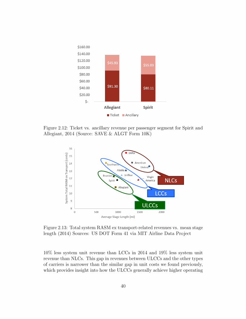
Figure 2.12: Ticket vs. ancillary revenue per passenger segment for Spirit andAllegiant, 2014 (Source: SAVE & ALGT Form 10K)
Figure 2.13: Total system RASM ex transport-related revenues vs. mean stagelength (2014) Sources: US DOT Form 41 via MIT Airline Data Project
10% less system unit revenue than LCCs in 2014 and 19% less system unitrevenue than NLCs. This gap in revenues between ULCCs and the other typesof carriers is narrower than the similar gap in unit costs we found previously,which provides insight into how the ULCCs generally achieve higher operating
40

margins than other carriers. That is, the cost advantages that the ULCCscurrently hold over LCCs and NLCs outweigh the revenue disadvantages asso-ciated with these carriers’ strategies. However, this suggests that the continuedprofitability of ULCCs depends in part on their ability to maintain their costadvantages over LCCs.
After evaluating US carriers, we found that on the basis of unit cost, unitrevenue, and ancillary generation, airlines consistently fall into one of the threecategories of carriers. As such (and based on the analyses we conducted earlierin this section), we classify the major US carriers as shown in Table 2.7 below.Throughout the remainder of this thesis, this classification scheme is used todetermine pricing effects of ULCC presence and market entry on airfares.6
Table 2.7: Selected Major US Airlines by Category
ULCCs LCCs NLCsAllegiant Alaska7 AmericanFrontier JetBlue DeltaSpirit Southwest United
Virgin America
6Carriers that have since merged over the 2010-2015 interval are considered to be in thesame category as the current, merged carrier
7Throughout this thesis, we categorize Alaska as an LCC based on its unit costs and unitrevenues as evaluated in Section 2, although its effects on market fares are more similar toNLCs, as shown in Section 3
41

42

Chapter 3
Evolution of U.S. AirlineNetwork and Fleet Structures
3.1 Background and Methods
In the previous chapter, the recent evolution of U.S. airline business modelswas discussed. At the core of every airline’s operations are its network andfleet structure. This chapter aims to provide an overview of changes in carriernetworks and fleets over the past decade, within the NLC/LCC/ULCC busi-ness model framework introduced in Chapter 2, in order to further explore thedifferences between airline business models and provide context for the rest ofthe thesis.
Figure 3.1: Key network and fleet questions with associated metrics
Figure 3.1 summarizes the two key research questions that we seek toanswer in this section:
43

1. How are airlines providing capacity? In order to understand thestructure of airline networks, it is important to understand how they gen-erate capacity. The first step is to evaluate an airline’s fleet compositionand size, as their fleet determines how much and what kinds of capacitythey can provide. Another component of this analysis is evaluating somemacro-level fleet and network trends, such as average stage length andaircraft utilization rates, as these give an overall picture of an airline’sability to provide capacity. These metrics also enable relevant time seriesanalyses that provide context for an airline’s network evolution.
2. Where are airlines allocating capacity? This is a key question inthe analysis of airline network structure. Understanding where an air-line allocates capacity provides insight into its strategic decisions, andhelps us understand what impacts those decisions may have on otherstakeholders in the U.S. air transportation system (e.g. passengers, air-ports/communities, competitor airlines). To answer this question, wewill use schedule data to show how each airline distributes its capacity(in terms of seat departures) by station, and also how airlines contributeto “connectivity” at each airport. Conducting this analysis will enabletime series comparisons to see how individual airlines’ networks and air-line business models have evolved since 2006. Furthermore, it will allowcomparison of network structures between different business models andbetween different carriers operating under similar business models.
Throughout this chapter, in an endeavor to make more relevant time-seriescomparisons, data for all carriers includes merged entities as of December2015. For example, data on American (AA) includes all legacy American,US Airways (US), and America West (HP) data for the 2006-2015 period.Additionally, the constituent entities of each carrier category (NLC, LCC,ULCC) are defined in Table 2.7. Finally, most statistics are calculated on thebasis of primary marketing carrier, as including regional operations in analysescan be of practical relevance when considering network structure. However,analyses that depend on Form 41 data (such as block hour utilization) arecalculated on the basis of operating carrier, as that is how the data is reported,and there is no way to separate Form 41 equipment statistics for regionalcarriers that operate for multiple mainline carriers. This is also noted in eachanalysis, but it is helpful to point out here.
44

3.1.1 Connectivity Model
Across all disciplines, one key metric used to evaluate a given network’s re-silience is the concept of “connectivity.” Additionally, a fundamental aspect ofan airline is the connection of airports (nodes) in a network. Thus, an investi-gation into airline networks would be remiss in excluding some quantificationof airport connectivity. In this application to airline networks, we’ll use theAirport Connectivity Quality Index (ACQI) as a proxy for true network con-nectivity. The ACQI is one of the two connectivity models for airline networksdeveloped at MIT, and is described in full in (Wittman, 2014a). The goal ofthe ACQI model is to capture the relative levels of service provided by airlinesat each node (airport) in the U.S. airline network based on the quality andquantity of non-stop and one-stop destinations served, as well as the frequencyof that service.
ACQIa = Σh∈Hfa,hda,hwh + αΣh∈Hd′
a,hwh (3.1)
Equation 3.1 describes the model, where the ACQI score of airport a isbased on the sum of the connectivity provided by nonstop flights (the firstsummation term) and the connectivity provided by one-stop flights (the secondsummation term), weighted by a desirability factor α ≤ 1, representing thepreference for nonstop service over one-stop service. In the nonstop term,for each hub type h, fa,h represents the average number of daily flights fromairport a to airports of hub type h, and da,h represents the number of airportsof hub type h with nonstop service to airport a. In the one-stop term, d′a,hrefers to the number of destinations that can be reached from airport a viaone-stop on-line or same-alliance connections. In both terms, wh representsthe relative importance of each hub type - this is used to help quantify thefact that one daily frequency to Los Angeles (LAX) is likely more conduciveto connectivity than one daily frequency to Fargo, ND (FAR), for example.
To illustrate how this model works, consider the schematic presented inFigure 3.2. In this case, airport A has two nonstop daily frequencies each toone large (L) hub H and small (S) hub G, and additionally has access to 4incremental one-stop small hubs via H. For the sake of this example, alsoassume α = 0.125, and the weights of large hubs and small hubs are wL = 1and wS = 0.05. Thus, the ACQI score of airport A can be computed as follows:
ACQIA = fA,LdA,LwL + fA,SdA,SwS + αd′A,SwS
= 2× 1× 1 + 2× 1× 0.05 + 0.125× 4× 0.05 = 2.125
Another important aspect of the ACQI model is that it does not double-
45

Figure 3.2: Example schematic of Airport Connectivity Quality Index (1)(Wittman, 2014a)
count duplicative connectivity. For example, if Des Moines (DSM) has non-stop service to Chicago (ORD), then the one-stop connectivity to Chicago(ORD) via Minneapolis (MSP) will not also be included. Furthermore, if DesMoines (DSM) doesn’t have non-stop service to San Francisco (SFO), but hasone-stop service via both Chicago (ORD) and Denver (DEN), the one-stopconnectivity to San Francisco will only be counted once. This is illustratedin a generic example in Figure 3.3. In this example, airport A has non-stopservice to an additional large hub K, as well as increased frequency of serviceto large hub H.
Figure 3.3: Example schematic of Airport Connectivity Quality Index (2)(Wittman, 2014a)
Under the same assumptions from the previous example, the ACQI scorein this case would be computed as follows:
46
ACQIA = fA,LdA,LwL + fA,SdA,SwS + αd′A,SwS
= 3× 2× 1 + 2× 1× 0.05 + 0.125× 5× 0.05 = 6.131
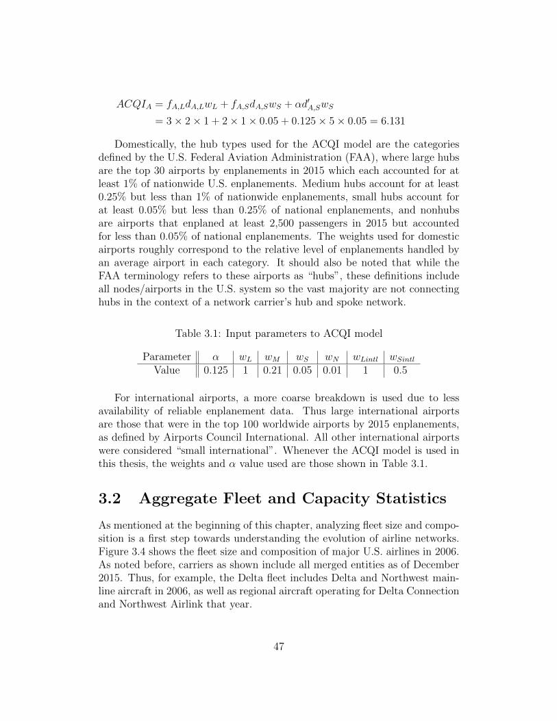
Domestically, the hub types used for the ACQI model are the categoriesdefined by the U.S. Federal Aviation Administration (FAA), where large hubsare the top 30 airports by enplanements in 2015 which each accounted for atleast 1% of nationwide U.S. enplanements. Medium hubs account for at least0.25% but less than 1% of nationwide enplanements, small hubs account forat least 0.05% but less than 0.25% of national enplanements, and nonhubsare airports that enplaned at least 2,500 passengers in 2015 but accountedfor less than 0.05% of national enplanements. The weights used for domesticairports roughly correspond to the relative level of enplanements handled byan average airport in each category. It should also be noted that while theFAA terminology refers to these airports as “hubs”, these definitions includeall nodes/airports in the U.S. system so the vast majority are not connectinghubs in the context of a network carrier’s hub and spoke network.
Table 3.1: Input parameters to ACQI model
Parameter α wL wM wS wN wLintl wSintlValue 0.125 1 0.21 0.05 0.01 1 0.5
For international airports, a more coarse breakdown is used due to lessavailability of reliable enplanement data. Thus large international airportsare those that were in the top 100 worldwide airports by 2015 enplanements,as defined by Airports Council International. All other international airportswere considered “small international”. Whenever the ACQI model is used inthis thesis, the weights and α value used are those shown in Table 3.1.
3.2 Aggregate Fleet and Capacity Statistics
As mentioned at the beginning of this chapter, analyzing fleet size and compo-sition is a first step towards understanding the evolution of airline networks.Figure 3.4 shows the fleet size and composition of major U.S. airlines in 2006.As noted before, carriers as shown include all merged entities as of December2015. Thus, for example, the Delta fleet includes Delta and Northwest main-line aircraft in 2006, as well as regional aircraft operating for Delta Connectionand Northwest Airlink that year.
47

Figure 3.4: Fleet size and composition of Major U.S. airlines, 2006
In this analysis, the widebody category includes any aircraft with two aislesin standard configuration, in line with standard industry nomenclature. Simi-larly, the narrowbody category includes aircraft operated by mainline carriersthat have one aisle, generally seating 100 or more passengers. Large regionalsinclude any aircraft operated by a regional carrier (on behalf of a mainlinepartner) with strictly greater than 50 seats. Small regionals are aircraft like-wise operated by regional partners but with 50 or fewer seats.
In the case of Delta and US Airways, some of the specific equipment typesof these airlines’ regional fleets are not publicly reported in their 10-Ks, andthus we are unable to determine whether these aircraft fall into the smallor large regional aircraft category. Regional aircraft reported as being part ofthese airlines’ fleets but for which seating capacity is unknown are contained inuncategorized regional aircraft. Additionally, due to the nature of the respec-tive data sources for mainline (Form 41 data via MIT Airline Data Project)and regional (10-K reports filed with the SEC) aircraft, numbers for mainlineaircraft represent a full-year average of operational aircraft based on quarterlyreports, whereas regional aircraft totals are based on a static count on Dec 31of the stated year, which might result in slight discrepancies between regional
48

and mainline fleet counts at any given time. This holds for all of the fleetanalyses throughout this chapter.
In 2006, around 5,100 aircraft were in scheduled service among the prede-cessors of today’s ten major carriers (including their regional partners). Sometrends clearly emerge: “Traditional” LCCs’ fleets were exclusively composedof mainline-operated narrowbody aircraft. Meanwhile, mainline narrowbodieswere the largest component of legacy fleets, representing 53%, 41%, and 46%of the total fleet operating under the American, Delta, and United banners,respectively.
Another notable data point is the presence of at least 1,000 small regionalaircraft in the fleets of NLCs. Use of small regional jets peaked in the mid-2000s, as airlines used these aircraft on increasingly large markets to offerhigher frequencies. However, as seen in the 2015 data (Figure 3.5), the rela-tively poor unit cost performance of these small aircraft, especially in a high-priced fuel environment, caused airlines to affect a drastic shift away from thisequipment.
Figure 3.5: Fleet size and composition of Major U.S. airlines, 2015
These small regional aircraft were mostly replaced (whether directly orindirectly) through the addition of large regional aircraft to legacy airlinefleets. The number of large regional jets in service under the legacy carriers’
49

code more than tripled from 206 aircraft (along with some number of theuncategorized regional aircraft) in 2006 to 673 aircraft in 2015 (again, notincluding uncategorized aircraft).
The 2015 fleet stats shown in Figure 3.5 also shows the relative growthof fleets in the now-“hybrid” LCC and the ULCC sectors. As might be ex-pected, percentage growth was highest among the newest airlines over thepast decade: Allegiant’s fleet grew by 64 aircraft (585%), Spirit by 38 air-craft (122%), and JetBlue by 101 aircraft (95%). Whereas the other “hybridLCCs” also all grew their fleets, but their larger base fleet results in a lowerpercentage growth. LCC Southwest grew its fleet by 97 aircraft (17%), whilelegacy-turned-hybrid Alaska increased its fleet by 14 aircraft (8%) and alsomade upward adjustments in gauge. Traditional LCC-turned-ULCC Frontiersaw the smallest absolute growth of 7 aircraft over the 2006-2015 period, fora fleet growth rate of 13%.
Given that airlines have these fleets available to operate, another key metricinvolves block hour utilization. Since strategic flight scheduling to maximizeutilization (and thus lower unit ownership cost) is a “classic LCC hallmark”(Gross and Luck, 2013), evaluating how this metric has changed for LCCs andULCCs and comparing them to NLCs can provide insight into the evolutionof all three business models. Answering these questions requires operationaldata, so the data source used for this analysis is the formatted DOT Form 41data accessed via the MIT Airline Data Project.
Figure 3.6: Average daily narrowbody block hour utilization by airline type,2006-2015
50

Thus, the analysis is based on operating carrier, not marketing carrier.Furthermore, in order to more directly compare the different business models,we will only evaluate mainline narrowbody utilization (excluding widebodystatistics for NLCs that can skew results) to get an idea of relative utilizationof the same class of equipment. Figure 3.6 shows the results of this analysis.
Some key trends that are interesting to note: First, all types of carriers sawa reduction in utilization from 2006-2009. This resulted from fewer scheduledflights, which was itself a response to increasing unit costs due to high fuelprices and later decreased demand during the recession. While airlines sched-uled fewer flights, they weren’t able to reduce their fleet size accordingly, thusutilization slipped 6.3%, 7.8%, and 8.7% between 2006-2009 among NLCs,LCCs, and ULCCs respectively.
After 2009, the trends in utilization vary by carrier type. As a result ofcapacity discipline, NLCs saw limited ASM growth over the 2010-2014 pe-riod, and as most of their new-build aircraft were replacing older models inthe fleet, block hour utilization correspondingly remained low but has grownslowly from its 2009 trough until 2015. As a group, LCCs tended to increaseutilization from the 2009 low until 2013 as fuel prices remained relatively highyet demand was rebounding. However, utilization slipped a bit after 2015,possibly as a result of lower fuel prices which meant that aircraft could beused less frequently while still maintaining a lower unit cost. More details onLCC utilization are covered in Section 3.4. Utilization at ULCCs continued tofall from 2010-2012, partially driven by Frontier’s transition to a full ULCCand Allegiant’s continued pursuit of low-capital-cost aircraft, before rebound-ing from 2013-2015 (driven by Frontier and Spirit). Airline specific utilizationstatistics providing more insight into this trend are found in Section 3.5.
One major result from this analysis is that in all years studied, block hourutilization at LCCs exceeded utilization at NLCs by at least 9%, and by asmuch as 19.6% in 2012. This result lends support to the notion that “efficientscheduling” methods traditionally practiced by LCCs to reduce unit costs, asstated in (Gross and Luck, 2013), are still very much in use today. As aninteresting corollary, this behavior (utilization strictly greater than NLCs) isnot exhibited by the ULCC category. As will be explored in Section 3.5, this isdue to the presence of two vastly different ultra-low-cost fleet/network strate-gies, with one seeking to minimize capital/ownership cost and one seeking tominimize operating cost (much like LCCs, but to a greater degree).
Another macro-level metric that provides insight into airline networks isaverage stage length. Since stage length, along with utilization and fleet size,drives overall capacity levels and unit cost trends, evaluating changes in aver-age stage length is a useful exercise. Since this analysis is based on Innovata
51

schedule data (accessed via Diio Mi), we will use marketing carrier as theprimary basis for analysis. Additionally, we’ll limit our analysis to domes-tic markets, and in the case of NLCs calculate the results with and withoutregional-operated flights included (and limit the ex-regional results to mainlinenarrowbodies).
Figure 3.7: Average domestic stage length by airline type, 2006-2015
The results of this analysis are shown in Figure 3.7. Unlike utilization, theabsolute differences in stage length between the categories are less important,as different networks even among airlines operating under the same businessmodel can result in vastly different stage lengths. However, a notable resultof this time-series analysis is that all three carrier types have seen significantand fairly steady increases in stage length over the past decade. Although notalways correlated, higher stage length puts downward pressure on unit costs,as short-haul flying is (generally) more expensive on a unit cost basis (Swelbar,2015).
The trends discussed so far in this section are all related to how airlinesgenerate capacity. Thus, it is natural to follow this with a broad analysis oftrends in capacity over the same time period, to see how the fleet measuresdiscussed earlier affect capacity growth. One interesting trend is the splitbetween domestic and international capacity by carrier type, which is shownin Table 3.2.
52

Table 3.2: Domestic/International capacity by marketing carrier type in bil-lions of ASMs, 2006-2015
NLCs LCCs ULCCsDom. Intl. % Intl. Dom. Intl. % Intl. Dom. Intl. % Intl.
2006 525 275 34.3% 163 4.6 2.8% 24 1.5 5.9%2007 517 290 35.9% 179 5.6 3.0% 29 2.8 8.8%2008 486 304 38.5% 187 5.9 3.1% 28 2.6 8.5%2009 449 285 38.8% 181 7.0 3.8% 25 2.2 8.0%2010 453 293 39.3% 185 8.8 4.5% 27 2.2 7.6%2011 448 302 40.3% 196 10 5.0% 28 2.3 7.5%2012 442 299 40.3% 201 12 5.5% 29 2.7 8.4%2013 446 299 40.2% 207 13 6.0% 30 2.9 8.9%2014 452 309 40.6% 211 15 6.7% 34 3.1 8.4%2015 462 313 40.4% 227 17 6.9% 43 3.6 7.6%
Clearly, NLCs provide the vast majority of international capacity - in 2015,93.7% of all international capacity provided by U.S. airlines was from NLCsand their regional partners. Of all carrier types, NLC networks were alsothe most skewed towards international destinations, with 40.4% of all NLCcapacity being dedicated to international service in 2015. The data shown inTable 3.2 also indicates that international service grew in significance amongNLCs’ networks from 2006 until 2011, with the proportion of NLC ASMsdedicated to international service growing from 34.3% in 2006 to 40.3% in2011. The international share of NLC capacity remained roughly the samefrom 2011 until 2015, only growing by ten basis points.
The growth in LCC international service is also notable. In 2015, LCCsprovided more than three times the international capacity as they did in 2006,however international capacity accounted for just 7.0% of all LCC capacity in2015. This is an increase from 2006, when international services accounted forjust 3.0% of all LCC capacity. Similarly, ULCCs have also seen an increasein international service, more than doubling international capacity from 1.5billion ASMs in 2006 to 3.6 billion ASMs in 2015.
To further explore the question of where airlines are allocating capacity,we will take a look at individual airline network and fleet structures to observesome granular trends. The remainder of this chapter is broken into threesections, by carrier type, where the networks and fleets of individual carriersare reviewed in more detail.
53

3.3 Network Legacy Carriers (NLCs)
The largest U.S. airlines, Network Legacy Carriers (NLCs) have developedrelatively complex fleet and network structures to serve a wide variety of mar-kets. As covered in Chapter 2, some of the most significant trends affecting thedevelopment of NLCs have been capacity discipline, cost convergence betweenLCCs and NLCs, and consolidation among these carriers.
As mentioned in the previous section, a major fleet development amongall NLCs over the past decade has been the shift from small to larger regionalaircraft. Figure 3.8 illustrates the evolution of the combined NLC fleets over2006-2015. As shown in the figure, small regional aircraft have dwindled fromat least 22% of all NLC-branded aircraft in 2006 to around 16% of the totalfleet by 2015. This has been paralleled by the rise of large regional jets,from at least 206 aircraft operating in 2006 for the seven carriers that nowform AA/DL/UA, to at least 673 large regional aircraft operating on behalfof American, Delta, and United today. Despite significant growth in the largeregional aircraft fleet, the pace of this growth has often been slower thanmanagement at the NLCs have desired, due to restrictive pilot scope clausesin mainline pilot labor agreements (Compart, 2013).
Figure 3.8: Evolution of the combined fleet of NLCs by equipment type
In Section 3.2 the utilization trends among NLCs as a group were discussed.Figure 3.9 breaks down trends in narrowbody block hour utilization among the
54
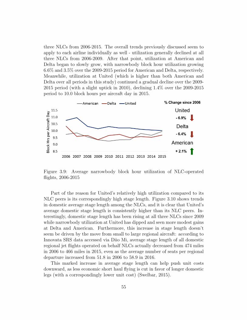
three NLCs from 2006-2015. The overall trends previously discussed seem toapply to each airline individually as well - utilization generally declined at allthree NLCs from 2006-2009. After that point, utilization at American andDelta began to slowly grow, with narrowbody block hour utilization growing6.6% and 3.5% over the 2009-2015 period for American and Delta, respectively.Meanwhile, utilization at United (which is higher than both American andDelta over all periods in this study) continued a gradual decline over the 2009-2015 period (with a slight uptick in 2010), declining 1.4% over the 2009-2015period to 10.0 block hours per aircraft day in 2015.
Figure 3.9: Average narrowbody block hour utilization of NLC-operatedflights, 2006-2015
Part of the reason for United’s relatively high utilization compared to itsNLC peers is its correspondingly high stage length. Figure 3.10 shows trendsin domestic average stage length among the NLCs, and it is clear that United’saverage domestic stage length is consistently higher than its NLC peers. In-terestingly, domestic stage length has been rising at all three NLCs since 2009while narrowbody utilization at United has dipped and seen more modest gainsat Delta and American. Furthermore, this increase in stage length doesn’tseem be driven by the move from small to large regional aircraft: according toInnovata SRS data accessed via Diio Mi, average stage length of all domesticregional jet flights operated on behalf NLCs actually decreased from 474 milesin 2006 to 466 miles in 2015, even as the average number of seats per regionaldeparture increased from 51.8 in 2006 to 58.9 in 2016.
This marked increase in average stage length can help push unit costsdownward, as less economic short haul flying is cut in favor of longer domesticlegs (with a correspondingly lower unit cost) (Swelbar, 2015).
55
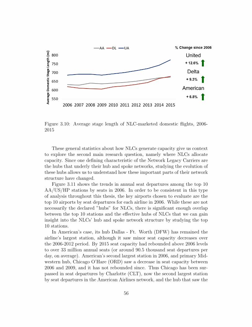
Figure 3.10: Average stage length of NLC-marketed domestic flights, 2006-2015
These general statistics about how NLCs generate capacity give us contextto explore the second main research question, namely where NLCs allocatecapacity. Since one defining characteristic of the Network Legacy Carriers arethe hubs that underly their hub and spoke networks, studying the evolution ofthese hubs allows us to understand how these important parts of their networkstructure have changed.
Figure 3.11 shows the trends in annual seat departures among the top 10AA/US/HP stations by seats in 2006. In order to be consistent in this typeof analysis throughout this thesis, the key airports chosen to evaluate are thetop 10 airports by seat departures for each airline in 2006. While these are notnecessarily the declared ”hubs” for NLCs, there is significant enough overlapbetween the top 10 stations and the effective hubs of NLCs that we can gaininsight into the NLCs’ hub and spoke network structure by studying the top10 stations.
In American’s case, its hub Dallas - Ft. Worth (DFW) has remained theairline’s largest station, although it saw minor seat capacity decreases overthe 2006-2012 period. By 2015 seat capacity had rebounded above 2006 levelsto over 33 million annual seats (or around 90.5 thousand seat departures perday, on average). American’s second largest station in 2006, and primary Mid-western hub, Chicago O’Hare (ORD) saw a decrease in seat capacity between2006 and 2009, and it has not rebounded since. Thus Chicago has been sur-passed in seat departures by Charlotte (CLT), now the second largest stationby seat departures in the American Airlines network, and the hub that saw the
56

greatest absolute seat growth over the past decade to 24 million annual seats,or 66 thousand daily seat departures on average. Other than more moderategrowth at American’s Miami and Phoenix hubs since the recession in 2009,the other notable trend in American’s network structure over the past decadeis the severe draw down of service by U.S. Airways at America West’s formerLas Vegas (LAS) focus city.
Figure 3.11: Seat departures at top 10 AA/US/HP stations by seats, 2006
The evolution of the Delta/Northwest network structure is shown in Figure3.12. The Atlanta (ATL) hub clearly dominates the Delta network in termsof seat departures, with 46.5 million seat departures in 2015, over three timesthat of the next-largest hub - Minneapolis-St. Paul (MSP). In fact, Atlantaaccounted for 21.1% of Delta’s systemwide seat departures in 2016, thus around42% of Delta’s systemwide seats arrive or depart at its Atlanta hub. Thegrowth of Atlanta has occurred as Detroit (DTW) and Minneapolis (MSP) sawreductions in capacity from their pre-merger peak when they were Northwesthubs in 2006. Salt Lake City, a pre-merger Delta hub also saw minor post-merger decreases in seat capacity.
However, another major result of this analysis is that we can see how the de-hubbing of Memphis and the significant capacity reductions at the Cincinnatihub have affected both airports’ role in Delta’s network drastically. From 2006to 2015, Cincinnati and Memphis fell from the 4th and 6th largest stations inthe merged-Delta network by seat departures to 13th and 47th, respectively.
57

Figure 3.12: Seat departures at top 10 DL/NW stations by seats, 2006
In the case of United, Cleveland has seen a similar fall in capacity United’ssystem since its 2014 dehubbing, but only moved down three places in termsof system ranking. Cleveland, the 8th largest station in the combined UA/COnetwork in 2006 by seat departures fell to 11th largest in 2015. Figure 3.13shows the trends in seat capacity from the largest stations in the combinedUnited/Continental system as of 2006. United’s network differs from bothDelta and American in that its largest hubs are fairly close in size, with noneof United’s hubs having over 20 million annual seat departures in 2015 (whereasDFW and ATL are both much larger than the next largest hub in the Americanand Delta networks, respectively).
Since the United-Continental merger, Chicago and Houston have growncloser to each other in seat departures, with United scheduling between 19and 20 million annual seat departures at both for 2015. Other notable trendsin seat capacity among United hubs includes the decline in seat departures atDenver from 2006-2012, although this trend has reversed in recent years, andthe gradual draw down of service at Dulles (IAD) and Los Angeles (LAX) overthe past decade.
Among all three NLCs, some common network trends emerge:
• In general, large hubs like ATL, DFW, and CLT grew even larger overthe past decade ...
58
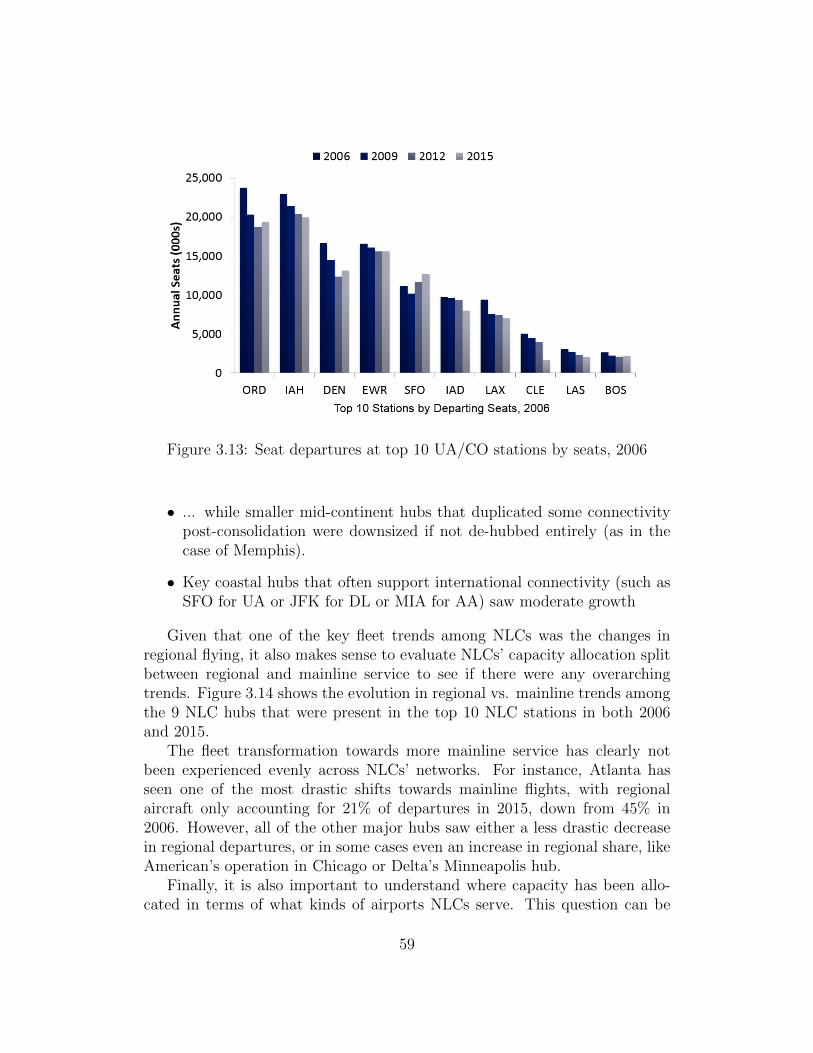
Figure 3.13: Seat departures at top 10 UA/CO stations by seats, 2006
• ... while smaller mid-continent hubs that duplicated some connectivitypost-consolidation were downsized if not de-hubbed entirely (as in thecase of Memphis).
• Key coastal hubs that often support international connectivity (such asSFO for UA or JFK for DL or MIA for AA) saw moderate growth
Given that one of the key fleet trends among NLCs was the changes inregional flying, it also makes sense to evaluate NLCs’ capacity allocation splitbetween regional and mainline service to see if there were any overarchingtrends. Figure 3.14 shows the evolution in regional vs. mainline trends amongthe 9 NLC hubs that were present in the top 10 NLC stations in both 2006and 2015.
The fleet transformation towards more mainline service has clearly notbeen experienced evenly across NLCs’ networks. For instance, Atlanta hasseen one of the most drastic shifts towards mainline flights, with regionalaircraft only accounting for 21% of departures in 2015, down from 45% in2006. However, all of the other major hubs saw either a less drastic decreasein regional departures, or in some cases even an increase in regional share, likeAmerican’s operation in Chicago or Delta’s Minneapolis hub.
Finally, it is also important to understand where capacity has been allo-cated in terms of what kinds of airports NLCs serve. This question can be
59

Figure 3.14: Share of flights at major U.S. NLC hubs by mainline and regionalaircraft, 2006 vs. 2015
analyzed on a connectivity basis, which lets us gain an understanding of ex-actly how important NLC service is to various types of airports. This analysiswas conducted by using the ACQI connectivity model described earlier in thischapter to calculate a baseline connectivity score for all airports in the U.S.given the actual 2015 schedule. Then, all NLC-marketed flights were removedfrom the schedule data and an adjusted connectivity score (in this case withoutNLC connectivity) for each airport was calculated. Then, both the baselineand adjusted connectivity scores were summed over each FAA airport type asdefined earlier in the chapter.
The results shown in Figure 3.15 is the difference in the summed connec-tivity scores for each airport type, representing the loss in connectivity for
60

Figure 3.15: Percentage of total connectivity lost without NLCs by airporthub type, 2015
each airport type without NLCs. As a result of this analysis, we found thatNLCs provide the majority of connectivity at every airport type in the U.S.,from providing a low of 55% of connectivity at medium hubs to a very signif-icant 85% of connectivity at non hub airports. Given NLCs carry 54.6% ofall domestic O&D traffic as of 2015, it is expected that they also provide asignificant proportion of connectivity as well.
3.4 Hybrid Low Cost Carriers (LCCs)
One of the key trends among Low Cost Carriers over the past decade has beenthe cost convergence between LCCs and NLCs, since costs are rising at LCCsas they reduce their rate of capacity growth, while staff and aircraft continueto age. This trend has led some LCCs to stray from some of the previous corecharacteristics of the LCC business model, such as unreserved seating anddirect sales only (Gross and Luck, 2013). Two of these characteristics involvefleet and network structure: “Traditional LCCs” operated using a single fleettype while avoiding direct competition with NLCs and other LCCs on mostroutes.
By studying the network and fleet evolution of LCCs, we can see how farthese carriers have moved away from the traditional model to a new “hybrid”LCC model, where the carriers still retain lower unit costs than NLCs tosome degree, but also introduce some higher cost (and also higher revenue)
61

Figure 3.16: Evolution of LCC narrowbody fleets 2006-2015 by carrier
strategies. Additionally, as noted in Chapter 2, Alaska (very much a networkcarrier in 2006) has reduced its unit costs to the point where we classified itas a hybrid LCC later in that chapter.
Figure 3.16 shows the growth of LCC fleets over the 2006-2015 period.Some key trends include the high growth of the newest carriers in this seg-ment, JetBlue and Virgin America, with JetBlue nearly doubling its fleet from2006 to 2015 and Virgin America growing to 54 aircraft by 2015 (after it be-gan service in 2007). A more mature carrier, Alaska saw more moderategrowth. Meanwhile, Southwest’s fleet was significantly affected by its mergerwith AirTran, as the combined Southwest entity shrunk its overall fleet sizeas management wanted to quickly rid itself of the Boeing 717 fleet inheritedfrom AirTran to return to an all-737 fleet.
In addition to growing their fleets in general, LCCs have also been shiftingtowards larger narrowbodies with lower unit costs. As an example JetBlue,previously operating only A320 and smaller E190 aircraft has introduced thelarger A321 variant into its fleet, and placed a further order in July 2016bringing the airline’s combined in-service and on-order fleet of A321s to 121aircraft, according to the manufacturer. This aircraft has allowed JetBlue tostray further from the “traditional” LCC model with its introduction of Mint -a flatbed premium class of service. Southwest has also recently introduced thelarger 737-800 into its fleet, after operating exclusively smaller variants of the737, although Southwest has opted to stick with its traditional all-economylayout in these aircraft. This shift towards larger aircraft (often in the same
62
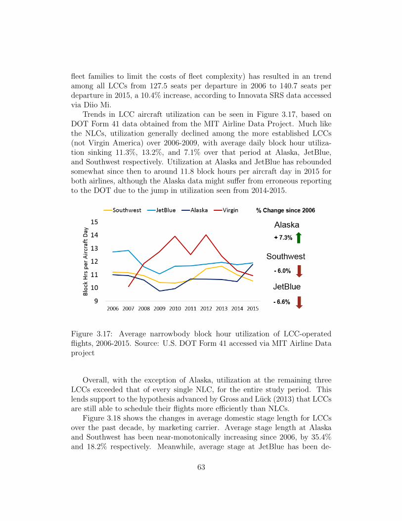
fleet families to limit the costs of fleet complexity) has resulted in an trendamong all LCCs from 127.5 seats per departure in 2006 to 140.7 seats perdeparture in 2015, a 10.4% increase, according to Innovata SRS data accessedvia Diio Mi.
Trends in LCC aircraft utilization can be seen in Figure 3.17, based onDOT Form 41 data obtained from the MIT Airline Data Project. Much likethe NLCs, utilization generally declined among the more established LCCs(not Virgin America) over 2006-2009, with average daily block hour utiliza-tion sinking 11.3%, 13.2%, and 7.1% over that period at Alaska, JetBlue,and Southwest respectively. Utilization at Alaska and JetBlue has reboundedsomewhat since then to around 11.8 block hours per aircraft day in 2015 forboth airlines, although the Alaska data might suffer from erroneous reportingto the DOT due to the jump in utilization seen from 2014-2015.
Figure 3.17: Average narrowbody block hour utilization of LCC-operatedflights, 2006-2015. Source: U.S. DOT Form 41 accessed via MIT Airline Dataproject
Overall, with the exception of Alaska, utilization at the remaining threeLCCs exceeded that of every single NLC, for the entire study period. Thislends support to the hypothesis advanced by Gross and Luck (2013) that LCCsare still able to schedule their flights more efficiently than NLCs.
Figure 3.18 shows the changes in average domestic stage length for LCCsover the past decade, by marketing carrier. Average stage length at Alaskaand Southwest has been near-monotonically increasing since 2006, by 35.4%and 18.2% respectively. Meanwhile, average stage at JetBlue has been de-
63

Figure 3.18: Average stage length of LCC-marketed domestic flights, 2006-2015. Source: Innovata SRS accessed via Diio Mi.
Figure 3.19: Seat departures at top 10 WN/FL stations by seats, 2006
creasing, from a high of 1,184 mi per segment in 2006 to 1,062 miles persegment in 2015. Virgin, due to its network focus on transcontinental routes,has consistently maintained the highest domestic average stage length among
64

all carriers studied. On an absolute basis, there was much variance in aver-age stage length. JetBlue and Virgin, with their coastal hubs, tended to havehigher stage lengths, while Alaska (with regional aircraft) and Southwest hada relatively lower average domestic stage length.
Figure 3.20: Seat departures at top 10 B6 stations by seats, 2006
Much like the analysis performed with the NLCs in the previous section,it is also informative to evaluate how the focus cities of LCCs have evolvedover the past decade. Figure 3.19 shows the evolution in seat departures at itstop ten stations/focus cities by departing seats in 2006. Some key trends thatemerge include the draw down of Atlanta between 2012-2015 after the AirTranmerger (as Atlanta was a pre-merger AirTran hub). The significant growth atDallas Love after the remaining Wright Amendment restrictions relating tonetwork were lifted in 2014 is also notable, with Dallas growing to becomeSouthwest’s 6th largest station by 2015. Also interesting is the developmentof Southwest’s Denver focus city (not shown), growing from only 1.4 millionannual seat departures in 2006 to 9.2 million annual seat departures in 2015to become Southwest’s 5th largest station by seat capacity.
Figure 3.20 shows a similar analysis of JetBlue’s network. While the car-rier’s first focus city at JFK saw modest growth after its initial 2001-2006growth, it has only seen modest increases in overall seat capacity over thepast decade. However, the carrier has continued to grow its Boston and FortLauderdale focus cities. Decreases in Oakland (OAK) and Washington Dulles
65

(IAD) are the result of airport shift, as the carrier has seen significant growthat San Francisco (SFO) and Washington National (DCA), with the two lat-ter airports growing from no service in 2006 to 830 thousand and 1.2 millionannual seat departures by 2015, respectively.
Alaska Airlines’ network development is illustrated in Figure 3.21. Itskey hub of Seattle has seen significant growth in the absolute number of seatdepartures in the past three years, likely partially in response to Delta’s wellpublicized push into the Seattle market.
Figure 3.21: Seat departures at top 10 AS stations by seats, 2006
Figure 3.22 overviews the connectivity lost at each type of airport if LCCswere removed from the U.S. air transportation system. Clearly, LCCs aremost important to medium hubs, solely responsible for 30% of the connectivityavailable to these airports, which include places such as Providence, RI (PVD)or Nashville, TN (BNA). It is also interesting to note, however, that overallLCCs account for much less connectivity nationwide than NLCs, as even thecategory of airports most reliant upon LCCs (medium hubs) get the majorityof their connectivity from NLCs, as we saw in the previous section.
66

Figure 3.22: Percentage of total connectivity lost without LCCs by airporthub type, 2015
3.5 Ultra Low Cost Carriers (ULCCs)
As shown earlier in this chapter, the newly-emerged ULCC segment is growingmore quickly than both NLCs and LCCs. As such, airlines that now fall inthe ULCC category have experienced many changes in their network and fleetstrategies over the past decade, as will be seen in this section.
Figure 3.23: Evolution of ULCC narrowbody fleets 2006-2015 by carrier.Source: MIT Airline Data Project
Much like LCCs, the fleets of ULCCs consist exclusively of mainline narrow-body aircraft. Frontier, which was an LCC in 2006 (and has since transitionedto ULCC beginning around 2013), has remained most-stable fleetwise as it has
67

renewed its fleet of Airbus A320 family aircraft. The airline has been receivingnewer specimens of the largest A321 variant, while eliminating from its fleetthe small A318 “babybus” and significantly reducing the size of its A319 fleet.Spirit has followed a similar path to Frontier, adding factory-fresh A320s andA321s to its fleet that have low seat-mile costs, growing from a total fleet of28 aircraft in 2009 to 70 by 2015. Both these airlines have aimed for a fleetmodel that employs new aircraft with low direct operating cost, but higherownership cost (as noted in Table 2.2).
On the other hand, Allegiant has opted for a model with higher variablecosts but lower ownership costs, relying mainly on older MD-80 aircraft, withan increasing number of used first-generation A319 and A320 aircraft joiningthe fleet. As demonstrated in Chapter 2, these strategies result in remarkablysimilar overall unit costs. However, the Spirit/Frontier and Allegiant strategieslead to vastly different fleet and network structures.
As a corollary, Allegiant only tends to fly its aircraft at peak demand timeswhen it can recover the higher direct costs of operating the flight. Frontierand Spirit tend to utilize their aircraft much more heavily (even schedulingmedium-haul red-eye flights, such as Spirit’s 2am departure from Plattsburgh,NY to Fort Lauderdale) as their variable cost per flight is lower, and they canspread ownership costs over many more block hours.
Figure 3.24: Average narrowbody block hour utilization of ULCC-operatedflights, 2006-2015. Source: U.S. DOT Form 41 accessed via MIT Airline Dataproject
Figure 3.24 shows one result of these strategies, where Spirit and Frontierhave extremely high daily narrowbody utilization, averaging 13.1 and 12.3
68

block hours per aircraft day in 2015, respectively. Both these airlines achievedhigher narrowbody utilization in 2015 than any other carriers studied, in eitherthe LCC or NLC category. However, Allegiant’s strategy of using older aircraftless frequently results in low overall utilization. At only 5.8 block hours pernarrowbody aircraft day in 2015, Allegiant had the lowest utilization of anyairline studied in this thesis.
Figure 3.25: Average stage length of ULCC-marketed domestic flights, 2006-2015. Source: Innovata SRS accessed via Diio Mi.
Although the two vastly different fleet strategies employed by ULCCs resultin differing utilization statistics, the average stage length among domesticroutes marketed by ULCCs does not appear to vary as starkly between thesetwo strategies. Over the past decade, as shown in Figure 3.25, Spirit has seenrecent moderate gains in stage length, especially since 2012. After an initial dipfrom 2006-2008, stage length saw some growth but by 2015, average domesticstage length was still 9.0% lower than in 2006. On the other hand, as Frontierhas transitioned towards becoming a ULCC and away from its old businessmodel that was very centered around a Denver hub (and even included selectregional operations with some short flights on Bombardier Q400 turbopropaircraft), it has seen average domestic stage length grow 38.3% since 2006.
One of the characteristics of ULCC networks is the inherent volatilitycaused by (1) the networks’ small size (incremental growth affects the net-work structure more) and (2) the volatility of new routes that will be exploredfurther in Chapter 4. As a result, the top 10 stations by seat departures in2006 often have little relation to the top 10 stations in 2015. Thus, unlike
69

Figure 3.26: Seat departures at top 10 F9 stations by seats, 2006 and 2015.Source: Innovata SRS accessed via Diio Mi
the previous sections, the ULCC network analysis will include the evolution ofthe top stations from 2006, but also a backward look at the evolution of thecurrent top 10 stations from 2015.
In Frontier’s case, shown in Figure 3.26, the airline’s network is evolvingincredibly quickly: Only 2 of their top 10 stations (DEN & LAS) in 2006remain in the top 10 in 2015. Furthermore, half of Frontier’s largest stationsin 2015 weren’t even part of the network in 2006 - additions to Chicago O’Hare(ORD), Cleveland (CLE), Trenton, NJ (TTN), Miami (MIA), and WashingtonDulles (IAD) have been quite notable results of Frontier’s ULCC networkstrategy as none of these cities were present in Frontier’s 2006 network. Whenexamining the evolution of the 2006-era network, we find Denver has lost abouthalf of its peak hub capacity (although it remains Frontier’s largest station in2015) and Milwaukee & Kansas City, both remnants inherited from MidwestAirlines, lost over 90% of their Frontier/Midwest seat departures in the pastdecade.
When examining Allegiant’s network, we find that in 2006 it was almostcompletely centered around two operational hubs in Las Vegas (LAS) andOrlando Sanford (SFB), with a hub and spoke network that served small com-munities from these hubs. However, these hubs are operational in nature only,
70
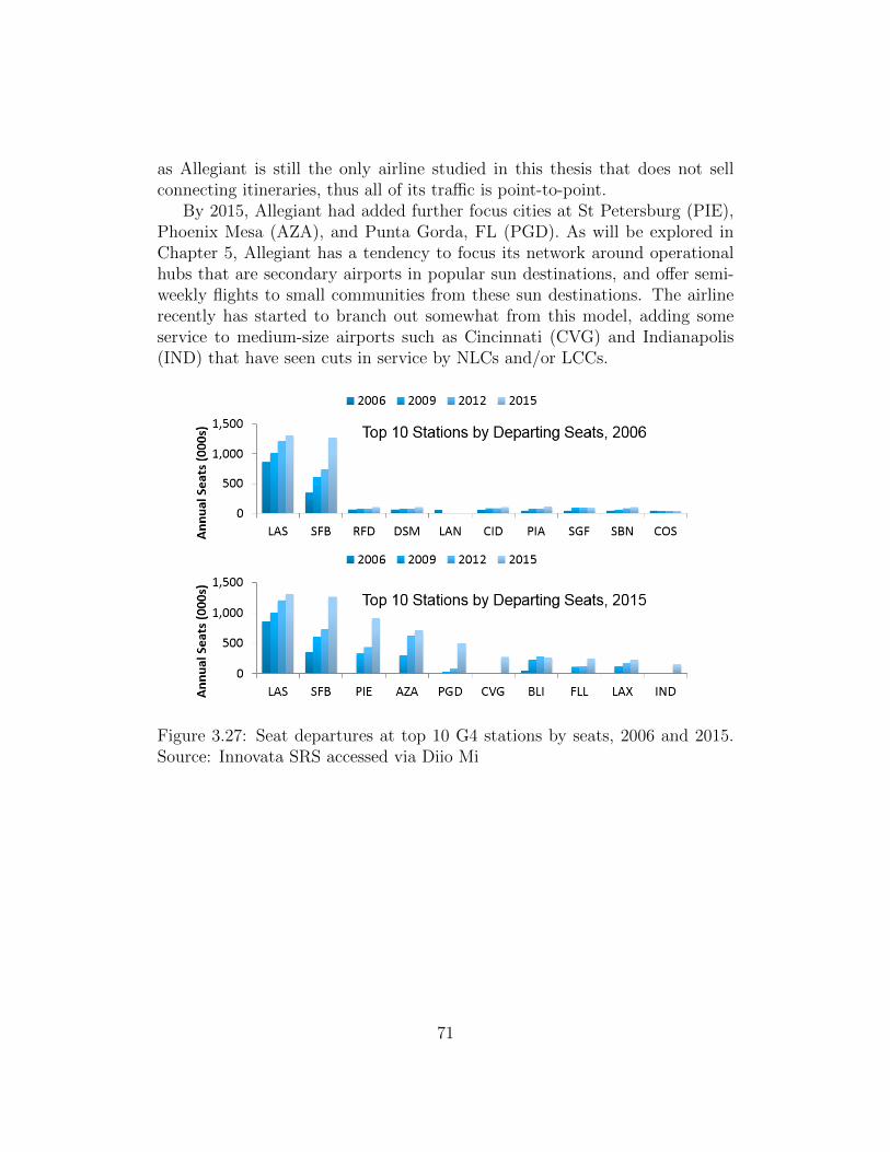
as Allegiant is still the only airline studied in this thesis that does not sellconnecting itineraries, thus all of its traffic is point-to-point.
By 2015, Allegiant had added further focus cities at St Petersburg (PIE),Phoenix Mesa (AZA), and Punta Gorda, FL (PGD). As will be explored inChapter 5, Allegiant has a tendency to focus its network around operationalhubs that are secondary airports in popular sun destinations, and offer semi-weekly flights to small communities from these sun destinations. The airlinerecently has started to branch out somewhat from this model, adding someservice to medium-size airports such as Cincinnati (CVG) and Indianapolis(IND) that have seen cuts in service by NLCs and/or LCCs.
Figure 3.27: Seat departures at top 10 G4 stations by seats, 2006 and 2015.Source: Innovata SRS accessed via Diio Mi
71

Figure 3.28: Seat departures at top 10 NK stations by seats, 2006 and 2015.Source: Innovata SRS accessed via Diio Mi
Much like Frontier, Spirit’s network has significantly evolved from 2006-2015, as only four of Spirit’s top 10 stations (DEN & LAS) in 2006 remain inthe top 10 in 2015, as shown in Figure 3.28. However, unlike Spirit, the reasonthat some stations dropped in importance from 2006 to 2015 was mostly tohigh growth in new stations, rather than cutting old parts of the network.For instance, Spirit’s annual seat departures at Atlantic City (ACY) stationactually grew from 450 thousand annual seat departures in 2006 to 654 thou-sand annual seat departures in 2015. Since so many other Spirit stations weregrowing even faster, ACY dropped from Spirit’s 5th largest station by seatdepartures in 2006 to the airline’s 12th largest station by 2015.
Notably, Spirit’s newly introduced stations that saw the highest rates ofgrowth in seat departures over the past decade often happen to be at NLChubs, like ORD, DFW, IAH, and ATL. This seeming pursuit of direct com-petition on NLC routes has been part of the catalyst for new NLC productsdesigned to compete against ULCCs, such as Basic Economy. The new BasicEconomy product at NLCs adds restrictions such as disallowing all changesas well as limiting amenities or elite benefits, and was introduced by Delta in2015 (as of this writing, United and American have announced plans to follow
72

suit by YE 2017).
Figure 3.29: Number of destinations by carrier among ULCCs by daily fre-quency of service, 2015. Source: Innovata SRS via Diio Mi
One artifact of ULCCs’ differing network development strategies is thesimilar difference in frequency of service on routes offered. As shown in Figure3.29, in 2015, Allegiant offered less than 5 daily frequencies at all of its stations,not including its operational hubs, with 61% of its destinations seeing less-than-daily service. Frontier also had a fair number of less-than-daily markets,but less than Allegiant.
Figure 3.30: Percentage of total connectivity lost without ULCCs by airporthub type, 2015
Finally, despite being the largest ULCC by seat departures in 2015, Spiritserved the fewest destinations - fifty-seven - of all ULCCs. However, Spirit
73

operates a much denser network, with 35% of its destinations receiving atleast 6 daily frequencies from the carrier.
This tendency of ULCCs to serve destinations less frequently than LCCsor NLCs, combined with the small overall portion of U.S. capacity generatedby ULCCs, means that ULCCs generate the least unique connectivity of anyof the business models studied. Figure 3.30 shows the connectivity impacts onthe U.S. air transportation system when ULCCs are removed. Even amonglarge hubs, where ULCCs generate the most connectivity (relatively), only 4%of the connectivity can be attributed solely to ULCCs.
In summary, the changes in U.S. airline network and fleet structures overthe past decade serve as further evidence that the business models of U.S.carriers have evolved. Stage lengths at NLCs have increased, and operationshave shifted towards larger regional jets, providing downward pressure on unitcosts. Utilization at LCCs remains higher than NLCs, helping them maintainsomewhat of a cost advantage, and a variety of network structures (point-to-point and hub & spoke) also persist among different LCCs. ULCCs havewidely varying fleet and network strategies to achieve their ultra-low costs,but high growth in the sector continues.
Now that we have explored some of the key evolutionary trends amongthese carriers, a natural question is how do these changes in network and fleetstructures along with fundamental changes in airline business models impactfares and airports? Chapter 4 will cover impacts of these changes on faresand traffic, while Chapter 5 will cover some key impacts of these changes onairports, communities, and public policy.
74

Chapter 4
Key Impacts on Traffic andFares
In the first half of this thesis, we observed how industry trends such as costconvergence and capacity discipline led to the evolution of the LCC and NLCbusiness models, as well as the emergence of the ULCC business model. Fur-thermore, we explored how capacity among these types of carriers evolved dueto changes in their fleet and network strategies.
The remainder of this thesis will focus on how changes in airline busi-ness models and fleet/network structures have affected other aspects of theindustry. In this chapter, we examine some key impacts of these changes ontraffic, average fares, and yields from 2006-2015. Additionally, we developand present econometric models to quantify the changing impacts of LCC andULCC presence, entry, and exit on market base fares.
4.1 Capacity and Traffic Trends
In order to discuss impacts of evolving airline business models on traffic/RPMs,we first review trends in total domestic seat supply, by carrier type, measuredin ASMs. Figure 4.1 shows overall capacity trends by carrier type from 2006-2015. Carriers in the “Other” category include smaller niche and commutercarriers that were not categorized in Chapter 2. Overall, the trends discussedin that chapter on capacity are quite clear: After a mid-recession low in 2009,there was slow market growth (due in part to capacity discipline) until 2014-2015. At that point the U.S. domestic capacity growth rate increased, witha 5.1% YOY change in overall domestic ASMs in 2015. Another importanttrend is that LCCs and ULCCs are providing a growing share of U.S. domestic
75
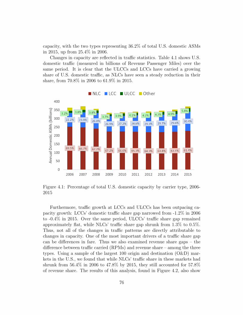
capacity, with the two types representing 36.2% of total U.S. domestic ASMsin 2015, up from 25.4% in 2006.
Changes in capacity are reflected in traffic statistics. Table 4.1 shows U.S.domestic traffic (measured in billions of Revenue Passenger Miles) over thesame period. It is clear that the ULCCs and LCCs have carried a growingshare of U.S. domestic traffic, as NLCs have seen a steady reduction in theirshare, from 70.8% in 2006 to 61.9% in 2015.
Figure 4.1: Percentage of total U.S. domestic capacity by carrier type, 2006-2015
Furthermore, traffic growth at LCCs and ULCCs has been outpacing ca-pacity growth: LCCs’ domestic traffic share gap narrowed from -1.2% in 2006to -0.4% in 2015. Over the same period, ULCCs’ traffic share gap remainedapproximately flat, while NLCs’ traffic share gap shrunk from 1.3% to 0.5%.Thus, not all of the changes in traffic patterns are directly attributable tochanges in capacity. One of the most important drivers of a traffic share gapcan be differences in fare. Thus we also examined revenue share gaps – thedifference between traffic carried (RPMs) and revenue share – among the threetypes. Using a sample of the largest 100 origin and destination (O&D) mar-kets in the U.S., we found that while NLCs’ traffic share in these markets hadshrunk from 56.4% in 2006 to 47.8% by 2015, they still accounted for 57.8%of revenue share. The results of this analysis, found in Figure 4.2, also show
76
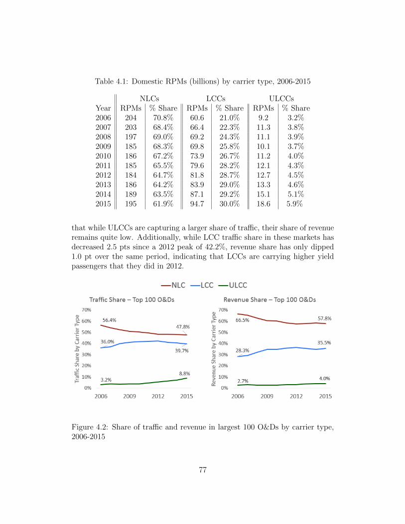
Table 4.1: Domestic RPMs (billions) by carrier type, 2006-2015
NLCs LCCs ULCCsYear RPMs % Share RPMs % Share RPMs % Share2006 204 70.8% 60.6 21.0% 9.2 3.2%2007 203 68.4% 66.4 22.3% 11.3 3.8%2008 197 69.0% 69.2 24.3% 11.1 3.9%2009 185 68.3% 69.8 25.8% 10.1 3.7%2010 186 67.2% 73.9 26.7% 11.2 4.0%2011 185 65.5% 79.6 28.2% 12.1 4.3%2012 184 64.7% 81.8 28.7% 12.7 4.5%2013 186 64.2% 83.9 29.0% 13.3 4.6%2014 189 63.5% 87.1 29.2% 15.1 5.1%2015 195 61.9% 94.7 30.0% 18.6 5.9%
that while ULCCs are capturing a larger share of traffic, their share of revenueremains quite low. Additionally, while LCC traffic share in these markets hasdecreased 2.5 pts since a 2012 peak of 42.2%, revenue share has only dipped1.0 pt over the same period, indicating that LCCs are carrying higher yieldpassengers that they did in 2012.
Figure 4.2: Share of traffic and revenue in largest 100 O&Ds by carrier type,2006-2015
77

In the next section, we will examine trends in unit revenues to understandhow much of the increasing traffic share captured by lower-cost carriers isdriven by systemwide changes in fares. We will also explore trends in averageO&D fares in select markets, providing insight into how the aggregate effectsof all industry trends we have discussed have affected fares.
4.2 Unit Revenue and Fare Trends
In Chapter 2, we demonstrated that from 2000-2014 LCCs’ costs have beenincreasing overall and converging with NLCs’ costs, as LCCs grew older andslowed their growth rates. Accordingly, unit revenue at traditional LCCs hasalso increased significantly. Figure 4.3 details trends in stage-length adjustedpassenger unit revenue (PRESM) from 2006-2015, showing both the absolutePRESM and YOY change.
Figure 4.3: Inflation adjusted PRESM among traditional LCCs and NLCs,2006-2015
From 2006-2010, PRESM at NLCs increased by 1.2%, while PRESM attraditional LCCs increased by 9.8%. The gap in growth rates was relativelyminimal in 2010-2012, as both NLCs and traditional LCCs’ revenues recoveredfrom the recession, but NLCs’ PRESM growth rate lagged that of LCCs 2013-2015. By 2015, PRESM at traditional LCCs had increased 21.6% from the2006 base, while PRESM at NLCs had only increased 5.8%. We found thatPRESM growth at LCCs was higher than NLCs in six of eight years since
78

2008. This corresponds to the period of slowing LCC growth we explored inChapter 2, indicating that increasing costs might have prompted an increasein PRESM, and thus fares.
Examining trends in PRESM and traffic/revenue share provide insight intothe impacts of trends such as cost convergence (higher costs at LCCs forcingthem to pursue higher yielding passengers) on airlines, but it is also importantto consider the aggregate impact of these trends on consumers. We can accom-plish this through an analysis of average fares in a variety of O&D markets.
For this analysis, a cross-sectional database of average fares was compiled,containing average one-way fare and traffic data from the top 1,000 domesticO&D airport-level markets by traffic in 2006, 2010, and 2015. This databasewas compiled using data from the U.S. Department of Transportation’s (DOT)Ticket Origin and Destination survey (DB1B), as accessed via the Diio MarketIntelligence tool. The DB1B survey contains a 10% sample of all tickets sold onall U.S. domestic O&D pairs. Table 4.2 illustrates some descriptive statisticsabout this market database. For the purposes of this study, the 1st Quintilecontains the largest 200 markets by traffic in 2006, the 2nd Quintile containsmarkets 201-400 by traffic, etc. Thus the quintile categories remain static overthe entire period, and enable us to investigate whether larger markets sawdifferent fare behavior than medium-sized markets. Furthermore, the fareswere evaluated on both a current and an inflation-adjusted basis, the latteraccomplished via the Consumer Price Index compiled by the U.S. Bureau ofLabor Statistics, and all inflation-adjusted fares are reported in 2006 dollars.
Table 4.2: Descriptive statistics for markets included in fare study
QuintileMetric Year 1st 2nd 3rd 4th 5th
Average traffic (PDEW)2006 982 464 300 212 1622010 834 412 277 193 1482015 983 449 313 220 166
Average great circle distance (mi) 985 1070 1103 1056 1221
As shown in Table 4.2, markets in the first quintile averaged 982 passen-gers per day each way in 2006, while markets in the fifth quintile average 162passengers per day in each direction in the same year. All five quintiles expe-rienced a similar dip in traffic in 2010 vs. 2006, before rebounding by 2015.There were some differences in average distance - markets in the first quintile
79

were the shortest (by direct great circle distance), at 985 mi, while markets inthe 5th quintile averaged 1221 miles apart. Because there is some difference inmean trip length, the average fares are not directly comparable between thedifferent quintiles. However, it is a useful and valid exercise to evaluate therelative changes in fares among the different groups.
One of the simplest questions of interest to the flying public is: Did faresgo up or down? Figure 4.4 illustrates the relative number of markets thatsaw an increase/decrease in fare from 2006-2010 – in current dollars – foreach quintile. On this unadjusted basis, we found that fares in most marketsindeed did increase. Across all 1,000 markets included in this study, 76%experienced an increase in fare. This result was relatively consistent amongall five quintiles, with the fourth quintile containing the fewest number ofmarkets that experienced an increase in fare – 70.5%.
Figure 4.4: Number of top 1000 O&D markets that saw changes in fares,2006-2010 (current dollars)
Once accounting for inflation, however, the impacts of any fare increasesappear to be far less widespread. For example, 122 markets in the first quin-tile saw an increase in inflation-adjusted fare from 2006-2010, vs 157 marketswhen not accounting for inflation. From these results, we find that amongeach quintile, there were nearly as many markets (or in the case of the fifthquintile, exactly as many) that saw decreases in inflation-adjusted average fareas increases. However, this analysis does not cover the relative magnitude ofchanges in fare among markets where fares increased vs. markets where faresdecreased.
It is also helpful to examine the absolute values and changes in both current
80

Figure 4.5: Number of top 1000 O&D markets that saw changes in inflation-adjusted fares, 2006-2010
Figure 4.6: Average current fare by quintile over study period
and inflation adjusted fares by quintile. Figure 4.6 presents the average currentfare by quintile in 2006, 2010, and 2015. We can draw a few key conclusionsfrom this analysis. First, it is clear that smaller markets have a higher fare (ingeneral), although some of this difference can be attributed to the trip lengthdifferences mentioned previously. Secondly, current fares have generally beenincreasing from 2006-2015, with markets experiencing anywhere from a lowof a 19% increase in the first quintile (from $126 to $151), to a 26% increase
81

($151 to $189) in the fifth quintile.Again, however, once accounting for inflation, we found only very small
changes in average fares. The relative stability in fares was especially evidentbetween 2006-2010, where only the first and second quintiles experienced anyincrease in fare whatsoever. Even when considering the entire study periodfrom 2006-2015, the largest inflation-adjusted increase among any quintile wasthe 6.6% increase in average fare – from $151 to $161, in 2006 dollars – ex-perienced by markets in the fifth quintile. This suggests that in the largest1,000 O&D markets, a majority of the increase in fares from 2006-2015 wassolely driven by inflation, not increases in base fare due to changes in airlinebusiness models or the competitive equilibrium of the industry.
Figure 4.7: Average inflation-adjusted fare (in 2006 dollars) by quintile overstudy period
This analysis only explored changes in fares in some of the largest domesticO&D markets. These aggregate analyses are not able to fully ascribe theseobserved changes to the trends discussed earlier in this thesis. It would bebeneficial to understand the impacts that LCC and ULCC business modelshave on fares, through market presence, entry, or exit, and whether the evo-lution of the LCC model and the emergence of the ULCC model have causedchanges to these impacts over time. Thus, the next section will describe arigorous econometric approach to investigating changes in fares, focusing on2010-2015 when the ULCC model was emerging.
82

4.3 Impact of the Emerging ULCC on Fares
As established in Chapter 2, ULCCs have emerged as a separate and distinctbusiness model from LCCs in the U.S. Earlier in this chapter, we looked atsome overall trends in fares and traffic. However, given the emergence of theULCC model, a more detailed study on market fares (and response to ULCCpresence or entry) is necessary to understand the impact of ULCCs on fares.This section aims to determine the effects of ULCC and LCC presence, entry,and exit on base market airfares.1 Furthermore, a comparison is made betweenthe pricing effects of ULCCs and LCCs to determine whether the inherent dif-ferences in their internal cost structure lead to differences in external impactson the U.S. air transportation system.
Many papers have examined the effects of the presence of different types ofairlines on market airfares in the United States. (Brueckner et al., 2013; binSalam and McMullen, 2013; Wittman and Swelbar, 2013); and (Kwoka et al.,2016) have all found that LCC presence in a market tends to lower averagefares in that market. However, (Wittman and Swelbar, 2013) and (bin Salamand McMullen, 2013) both found that the effects of certain LCCs on averagefares has diminished over time. In these types of papers, ULCCs like Allegiantand Frontier are typically omitted (Daraban and Fournier, 2008; Tan, 2016) ortreated alongside other LCCs (Brueckner et al., 2013; Kwoka et al., 2016). Inthis section, we also consider the effects of airline presence on average marketairfares, but address this gap in the literature by considering the ULCCs as aseparate category.
The other component of our analysis on ULCC pricing effects involvesmeasuring the impact of carrier exit/entry on airfares. Past work on LCCmarket entry has mainly focused on the well-documented “Southwest effect,”in which market airfares decrease and traffic increases as a result of SouthwestAirlines entry (Windle and Dresner, 1995; Morrison, 2001). In a later analysis,(Goolsbee and Syverson, 2008) found that the Southwest effect could extendto adjacent markets prior to entry by Southwest. (Morrison and Winston,1995) also examined exit by LCCs, and found that market fares tended to risewhen an LCC discontinued service in the market.
More recently, (Daraban and Fournier, 2008) studied entry and exit ofmultiple LCCs and found, contra (Morrison and Winston, 1995), that faresremained lower after Southwest Airlines exited. Other recent studies, including
1We cannot consider total fares with ancillary fees included because they are not reportedby the DOT on a market level. However, a comparison of base airfares is useful as itrepresents the cost to the consumer for the core product of air transportation.
83
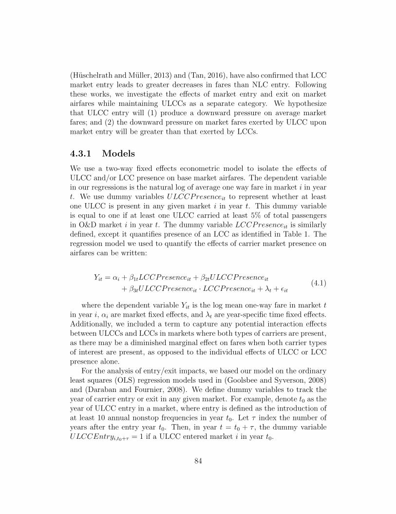
(Huschelrath and Muller, 2013) and (Tan, 2016), have also confirmed that LCCmarket entry leads to greater decreases in fares than NLC entry. Followingthese works, we investigate the effects of market entry and exit on marketairfares while maintaining ULCCs as a separate category. We hypothesizethat ULCC entry will (1) produce a downward pressure on average marketfares; and (2) the downward pressure on market fares exerted by ULCC uponmarket entry will be greater than that exerted by LCCs.
4.3.1 Models
We use a two-way fixed effects econometric model to isolate the effects ofULCC and/or LCC presence on base market airfares. The dependent variablein our regressions is the natural log of average one way fare in market i in yeart. We use dummy variables ULCCPresenceit to represent whether at leastone ULCC is present in any given market i in year t. This dummy variableis equal to one if at least one ULCC carried at least 5% of total passengersin O&D market i in year t. The dummy variable LCCPresenceit is similarlydefined, except it quantifies presence of an LCC as identified in Table 1. Theregression model we used to quantify the effects of carrier market presence onairfares can be written:
Yit = αi + β1tLCCPresenceit + β2tULCCPresenceit
+ β3tULCCPresenceit · LCCPresenceit + λt + εit(4.1)
where the dependent variable Yit is the log mean one-way fare in market tin year i, αi are market fixed effects, and λt are year-specific time fixed effects.Additionally, we included a term to capture any potential interaction effectsbetween ULCCs and LCCs in markets where both types of carriers are present,as there may be a diminished marginal effect on fares when both carrier typesof interest are present, as opposed to the individual effects of ULCC or LCCpresence alone.
For the analysis of entry/exit impacts, we based our model on the ordinaryleast squares (OLS) regression models used in (Goolsbee and Syverson, 2008)and (Daraban and Fournier, 2008). We define dummy variables to track theyear of carrier entry or exit in any given market. For example, denote t0 as theyear of ULCC entry in a market, where entry is defined as the introduction ofat least 10 annual nonstop frequencies in year t0. Let τ index the number ofyears after the entry year t0. Then, in year t = t0 + τ , the dummy variableULCCEntryi,t0+τ = 1 if a ULCC entered market i in year t0.
84

For example, if a ULCC entered a market A–B in t0 = 2011, the dummyvariable for estimating the fare of market A–B in year t = 2013 would beULCCEntryA−B,2011+2 = 1. In this case, τ = 2 and the other entry dummies(with τ 6= 2) are set equal to zero. Therefore, the coefficient β2,τ associatedwith τ = 2 would represent the effects of ULCC entry in a market two yearsbefore each year t. The LCC entry variables are calculated in a similar fashionusing LCC entry data. The exit dummy variables are similar, with an exitdefined if a ULCC/LCC that had previously served market i with ≥ 10 annualfrequencies exited the market (i.e. provided zero scheduled frequencies) inthat year. Then, with a slight abuse of summation notation, we can write theentry/exit model as follows:
Yit = αi +2∑
τ=0
β1,τLCCEntryi,t0+τ +2∑
τ=0
β2,τULCCEntryi,t0+τ
+2∑
τ=1
β3,τLCCExiti,t0+τ +2∑
τ=1
β4,τULCCExiti,t0+τ
+ β4AApresi,t + β5DLpresi,t + β6UApresi,t + λt + εit
(4.2)
where the dependent variable Yit is again the log mean one-way fare inmarket t in year i, αi are market fixed effects, and λt are year-specific timefixed effects. We also created incumbent NLC presence dummy variables, tocontrol for potential differences in competitive response based on which NLCis incumbent on any given route.
For both the market presence and entry/exit studies, we also examinedindividual carriers to gain insight into the variation in average fares within thetwo categories. For these models, we simply replaced the carrier type dummyvariables with individual dummy variables for each carrier.
4.3.2 Data Sources and Processing
In order to determine the effects of carrier presence, entry, exit on marketbase fares, a time-series database of fares was constructed for the years 2010through 2015, using data from the U.S. Department of Transportation’s (DOT)Ticket Origin and Destination survey (DB1B), as accessed via the Diio MarketIntelligence tool. The DB1B survey contains a 10% sample of all tickets soldon all U.S. domestic O&D pairs.
To determine when and where carrier exit/entry events occurred, airlineschedules were accessed from the Innovata Schedule Reference Service via the
85

Diio Market Intelligence tool. Included in this dataset are the complete sched-ules of all US domestic flights operated by U.S. carriers for the six years 2010-2015.
In the DB1B survey, the DOT collects and reports estimated O&D trafficon an airport-pair basis. However, for many travelers, their demand to flyis not tied to a specific airport, but rather to a general metropolitan area(Belobaba et al., 2009). Thus, there can be interaction between so called“parallel markets,” such as San Jose - Chicago Midway and Oakland - ChicagoO’Hare. These interaction effects can make it difficult to isolate the effects ofcarrier presence in any given O&D market.
Thus, in order to better account for passenger choice (and reduce spatialcorrelation between origin-destination markets in the study), a region-pair def-inition of origin-destination markets was used, as opposed to the airport-pairdefinition reported by the DOT (e.g. both the San Jose - Midway and Oakland- O’Hare airport-pair markets would be part of the Chicago Area - San Fran-cisco Bay Area region-pair market). The metropolitan region groupings weredefined using the multi-airport system framework developed in (Bonnefoy andHansman, 2005). Additionally, an airport was also included in its respectivemetro region if: (1) it was part of an IATA multi-airport code region or (2) ifit met the distance criterion as established in (Bonnefoy and Hansman, 2005)and handled any ULCC or LCC traffic, even if it handled too little total traf-fic to be included in (Bonnefoy and Hansman, 2005)’s original study. A fulltable of metro regions and included airports can be found in the Appendix.A traffic-weighted average fare was then calculated using DB1B data for eachregion-pair O&D market, and the log of this value is used as the dependentvariable for each region-pair market-year in the regression models.
Also, as mentioned in Section 4.3.2, the DB1B data is itself extrapolatedfrom a random 10% sample of all tickets sold. As a result, the mean airfaresfor very small markets with only a few observations in the DB1B data could beskewed as a result of sampling bias. Therefore, for the purposes of this study,we included region-pair market i in our market presence sample if estimatedtraffic in market i averaged at least than 20 passengers daily each way (PDEW)in that year, resulting in Npres = 16, 127 market-year observations for themarket presence analysis. For the exit-entry analysis, we included all O&Dmarkets with 20 or more PDEW in at least one of the years in the five-yearstudy in our dataset, to allow us to compare fares before and after entry insmaller markets that saw stimulation as a result of new service. This resultsin Nent = 14, 539 market-year observations for the exit-entry study, spanningfive years and 3,004 unique markets.
Finally, using the Innovata schedule data, a market entry/exit database
86

was built to determine which markets experienced carrier entry/exit in anygiven year, both on an aggregate (e.g. ULCC or LCC entry) and an individualcarrier basis. The market entry/exit dummy variables described in Section4.3.1 were then calculated using this database.
4.3.3 Descriptive Statistics
Tables 2 and 3 present some descriptive statistics regarding the data sample.Table 4.3 shows that in total LCCs provide non-stop service on 3-4x the num-ber of O&D markets as ULCCs, while approximately half of ULCC marketsare not served by LCCs. Also noteworthy are the general trends visible inthe number of markets served by both carrier categories. As a group, LCCswere present in an increasing number of markets every year over the 2010-2015period, while the number of non-stop markets served by ULCCs experienceda net decrease from 2010 to 2015. This is partially due to the fact that somemarkets served by ULCCs were too small to be included in the presence study.
Table 4.3: Number of markets by year and type of carrier presence includedin study
YearPresence of LCC or ULCC 2010 2011 2012 2013 2014 2015
LCC Only 1,418 1,413 1,424 1,467 1,461 1,479ULCC Only 222 267 260 244 273 245
Both LCC and ULCC 261 322 315 290 310 308Neither 795 707 694 677 638 637Total 2,696 2,709 2,693 2,678 2,682 2,669
Total market-year observations: Npres = 16,127
The trends observed in Table 4.3 also motivate the study of exit/entry data,as there seem to be some category-specific trends in the number of marketsserved over the study period. Table 4.4 presents a similar descriptive analysisof the exit and entry events included in that model. Even though ULCCs aremuch smaller than LCCs in terms of capacity, they entered many new markets:three of the five years in the study saw greater than 100 ULCC market entryevents. However, in most years the ULCCs also exit relatively more marketsthan the LCCs.
Indeed, Figure 4.8 shows that ULCCs are more aggressive in leaving newly-entered markets - 26% of new markets where ULCCs introduced service over
87

Table 4.4: Descriptive statistics for markets with ULCC and LCC entry andexit events included in study
YearExit/Entry events by year 2011 2012 2013 2014 2015
ULCC Entry 52 75 63 75 78LCC Entry 32 39 56 38 50ULCC Exit 6 27 52 21 44LCC Exit 16 20 32 27 25
Total market-year observations: Nent = 14,539
the period 2011-2013 were abandoned by the entering ULCC within 2 yearsof entry, compared to the equivalent average of 16% for NLCs and a 8% ofmarkets for LCCs. Although we will show that ULCC presence in a market isassociated with lower fares than LCC presence, ULCCs are over three timesmore likely than LCCs to abandon a new market within two years.
Figure 4.8: Percentage of new markets abandoned within 1 or 2 years of start,by carrier type
88

4.3.4 Results: Market Presence
Table 4.5 presents a summary of the market presence regression model asdescribed in Equation 1. The values shown Table 4.5 are the β1,t (LCC) andβ2,t (ULCC) coefficients of the model, as well as the coefficients on the timefixed effect variables.
Table 4.5: Effects of U.S. LCC and ULCC market presence on log of averageone-way market fares, 2010-2015
Year2010 2011 2012 2013 2014 2015
ULCC Presence-0.118*** -0.089*** -0.122*** -0.174*** -0.164*** -0.231***(0.015) (0.013) (0.013) (0.014) (0.015) (0.018)
LCC Presence-0.092*** -0.072*** -0.054*** -0.052*** -0.061*** -0.082***(0.010) (0.009) (0.009) (0.009) (0.009) (0.010)
Both ULCC & LCC0.067*** 0.027*** 0.049*** 0.100*** 0.086*** 0.089***(0.016) (0.014) (0.013) (0.014) (0.015) (0.019)
Year Fixed Effects0.080*** 0.110*** 0.133*** 0.167*** 0.182***(0.004) (0.005) (0.006) (0.007) (0.007)
Observations: N = 16,127, Adjusted R2 = 0.320Robust standard errors presented in parentheses*** = 1% significance, ** = 5% significance, * = 10% significance
Since this is a log-level regression, the coefficients for ULCC presence aloneand LCC presence alone can be related to the average one-way market fare ytin year t by %∆yt = 100 · (exp(βi,t)− 1). For instance, a market with ULCCpresence alone in 2012 is associated with a (exp(−0.122)− 1) = −11.3% lowerfare than a comparable market in 2012 without ULCC or LCC presence.
In markets with both ULCC and LCC presence, both the individual pres-ence terms and the interaction term are required to capture the full effect ofboth carrier types’ presence. Thus the coefficients can be related to the aver-age one-way market fare yt in year t by %∆yt = 100 · (exp(
∑3i=1 βi,t)− 1). For
example, a market in 2014 with both ULCC and LCC presence is associatedwith a 100 · (exp(−0.164 − 0.061 + 0.086) − 1) = −12.5% lower fare than acomparable market in 2014 with neither ULCC nor LCC presence.
Over time, the increasing coefficients of the time fixed effects indicates thataverage one-way fares have been increasing in our sample of markets since2010. Table 4.6 presents a summary of the average effects of carrier presenceon average one-way market fare, summarizing the interpreted results derived
89

from the coefficients found in Table 4.5.The results in recent years (as shown in Table 4.6) support the hypothesis
that ULCCs have a greater downward impact on fares than LCCs or NLCs.Namely, we find that ULCC presence alone is associated with an averagemarket fare 20.5% lower than the 2015 baseline, whereas LCC presence alonein the same year was associated with an average fare 7.7% lower than thebaseline. Markets with both LCC and ULCC presence had average fares ofabout 20% lower than markets in which neither type of carrier was present.
Table 4.6: Average effect of ULCC or LCC presence on average one-way marketfares
YearCarrier Presence 2010 2011 2012 2013 2014 2015
ULCC Only -10.4% -7.7% -11.3% -15.6% -14.8% -20.5%LCC Only -8.6% -6.8% -4.9% -4.9% -5.8% -7.7%
Both LCC & ULCC -12.5% -11.6% -11.4% -11.3% -12.5% -19.8%Note: Compared to average same-year market fare without LCC or ULCC presence
However, we find that this difference did not exist in 2010, as the gapbetween the ULCC and LCC presence coefficients in 2010 was not significantlydifferent. This could be a result of the further divergence between the ULCCand LCC models since 2010, and Frontier’s transition to a ULCC over the2013-2014 period.
Our results show that both ULCC and LCC presence are associated withlower average market fares with a high level of significance (p < 0.01). Fur-thermore, there is a trend in recent years towards a increasingly significantdifference between LCC and ULCC presence, i.e. the gap has widened to apoint where ULCC presence provides twice the pricing pressure in a marketas LCC presence.
Additionally, we find that in 2010 in markets with both ULCC and LCCpresence, although somewhat dampened, there was an additive effect to havingboth types of carriers present. That is, a market served by both LCCs andULCCs had a lower fare than a market served by an LCC or ULCC alone.However, in recent years, this additive effect has diminished to the point itis not discernable. In 2015, markets served by both ULCCs and LCCs sawapproximately the same reduction in fares as markets served by ULCCs alone.This further highlights the growing convergence of LCCs to a NLC model of
90

cost and pricing (ben Abda et al., 2008).
4.3.5 Results: Entry/Exit
The summary results from the exit/entry fixed effects regression, based uponthe model presented in Equation 2, are presented in Table 4.7.
Table 4.7: Effects of U.S. LCC and ULCC entry and exit on log of averageone-way market fares, 2011-2015
Carrier Entry Carrier ExitSame Year Previous Year Two Years Prior Previous Year Two Years Prior
ULCC-0.087*** -0.160*** -0.145*** 0.083*** 0.096***(0.011) (0.014) (0.015) (0.017) (0.018)
LCC-0.068*** -0.153*** -0.134*** 0.124*** 0.135***(0.010) (0.015) (0.015) (0.018) (0.020)
AA Presence-0.041***(0.014)
DL Presence-0.017*(0.009)
UA Presence0.032***(0.010)
Year 20120.042***(0.002)
Year 20130.065***(0.003)
Year 20140.097***(0.003)
Year 20150.088***(0.003)
Observations: N = 14,539, Adjusted R2: 0.168Robust standard errors presented in parentheses*** = 1% significance, ** = 5% significance, * = 10% significance
91

Much like the presence model, the exit-entry model is a log-level regression.Thus the coefficients found in Table 4.7 can be related to the average one-waymarket fare yτ in τ years since the event of interest by %∆yτ = 100·(exp(βi,τ )−1). For instance, we find that in market-years where a ULCC had entered in theprevious year, the average fare was 100 · (exp(−0.160)−1) = 14.5% lower thana comparable market in the same year without any ULCC or LCC exit or entryevents. Also, as in the presence regression, the year fixed effects coefficients canbe interpreted using the same exponential relation, and the interpreted resultsrepresent the percentage change in overall fares over time, holding all elseconstant. The incumbent NLC fixed effects variables can also be interpretedin this way, and are additive to the other interpretive coefficients.
While this model confirms that both LCCs and ULCCs exert significantdownward pressure on average market fares, there was little statistically signif-icant difference between LCC and ULCC entry events over our study period.Considering the results from the presence model fit, this would indicate thatULCCs have a significantly greater impact than LCCs on fares in marketswhere they are already well-established, as opposed to new markets. Con-versely, ULCCs and LCCs provide approximately the same downward pressureon market fares after entry in a new market.
Although this result is contrary to our initial hypothesis, we propose twopossible explanations for this result. First, the ULCCs’ presence in the marketsthey enter may be too small to result in significant changes to the average mar-ket airfare, even if the ULCCs’ prices are much lower than those of incumbentNLCs or LCCs. ULCCs are still relatively small players in terms of overall ca-pacity; in 2014, according to DOT T-100 data, ULCCs represented only 4.9%of domestic ASMs, while LCCs provided approximately 29% of U.S. domesticASMs. Additionally, ULCCs provide relatively low frequency on routes theyserve - only 15% of ULCC stations were served by more than four daily flightsfrom any given ULCC, and 53% saw less-than-daily service. This suggests thatULCC traffic makes up a small percentage of total traffic in entered markets,minimizing the effects of low ULCC base fares on the average market fare.
Second, the NLCs and LCCs may not respond aggressively to the ULCCentry. In this situation, even though a ULCC may enter a market with lowbase fares on their flights, the presence of other carriers in the market that donot price match the ULCCs leads to the same net effect on the market basefares as an LCC entry.2 In many markets, these two factors work in tandemto reduce the impact of ULCC entry on average market base fare, leading to
2This effect may diminish in the future, as American Airlines and other NLCs are be-ginning to respond ULCCs by matching fares on some routes (CAPA, 2015).
92

the results observed in Table 4.7.
Table 4.8: Effects of U.S. carrier entry and exit on log of average one-waymarket fares, 2011-2015
Carrier Entry Carrier ExitSame Year Previous Year Two Years Prior Previous Year Two Years Prior
Spirit-0.070∗∗∗ -0.112∗∗∗ -0.102∗∗∗ -0.029 -0.001(0.016) (0.018) (0.020) (0.060) (0.071)
Frontier-0.069∗∗∗ -0.157∗∗∗ -0.143∗∗∗ 0.026∗∗ 0.047∗∗∗
(0.012) (0.019) (0.025) (0.015) (0.014)
Allegiant-0.137∗∗∗ -0.167∗∗∗ -0.156∗∗∗ 0.149∗∗∗ 0.095∗∗∗
(0.023) (0.026) (0.026) (0.0478) (0.045)
Southwest-0.071∗∗∗ -0.166∗∗∗ -0.133∗∗∗ 0.113∗∗∗ 0.121∗∗∗
(0.011) (0.019) (0.018) (0.017) (0.020)
JetBlue-0.069∗∗∗ -0.150∗∗∗ -0.110∗∗∗ 0.036 0.021(0.025) (0.025) (0.029) (0.035) (0.043)
Alaska-0.037∗∗ -0.099∗∗∗ -0.100∗∗∗ 0.037 0.068*(0.013) (0.017) (0.018) (0.044) (0.045)
AA Presence-0.040∗∗∗
(0.014)
DL Presence-0.018∗∗
(0.009)
UA Presence0.030∗∗∗
(0.010)
Year 20120.043∗∗∗
(0.002)
Year 20130.066∗∗∗
(0.003)
Year 20140.098∗∗∗
(0.003)
Year 20150.092∗∗∗
(0.003)Observations: N = 14,539, Adjusted R2: 0.168Robust standard errors presented in parentheses*** = 1% significance, ** = 5% significance, * = 10% significance
The coefficients of the individual carrier model fit, presented in Table 4.8also provide some insight into the entry/exit effects. The same general trendsobserved in the aggregate categorical model are present, with four out of sixLCC and ULCC carriers providing approximately the same pricing pressure.
However, Allegiant is a clear outlier, providing nearly twice the pricingpressure as the nearest carrier in the year of entry. Allegiant’s network strategyskews towards serving small-to-midsize markets, such as Las Vegas, Nevada, to
93
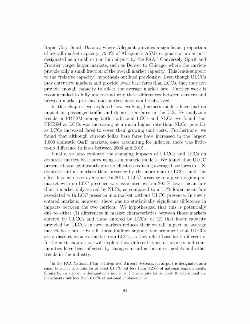
Rapid City, South Dakota, where Allegiant provides a significant proportionof overall market capacity. 72.4% of Allegiant’s ASMs originate at an airportdesignated as a small or non hub airport by the FAA.3 Conversely, Spirit andFrontier target larger markets, such as Denver to Chicago, where the carriersprovide only a small fraction of the overall market capacity. This lends supportto the “relative capacity” hypothesis outlined previously: Even though ULCCsmay enter new markets and provide lower base fares than LCCs, they may notprovide enough capacity to affect the average market fare. Further work isrecommended to fully understand why these differences between carriers andbetween market presence and market entry can be observed.
In this chapter, we explored how evolving business models have had animpact on passenger traffic and domestic airfares in the U.S. By analyzingtrends in PRESM among both traditional LCCs and NLCs, we found thatPRESM at LCCs was increasing at a much higher rate than NLCs, possiblyas LCCs increased fares to cover their growing unit costs. Furthermore, wefound that although current-dollar base fares have increased in the largest1,000 domestic O&D markets, once accounting for inflation there was little-to-no difference in fares between 2006 and 2015.
Finally, we also explored the changing impacts of ULCCs and LCCs ondomestic market base fares using econometric models. We found that ULCCpresence has a significantly greater effect on reducing average base fares in U.S.domestic airline markets than presence by the more mature LCCs, and thiseffect has increased over time. In 2015, ULCC presence in a given region-pairmarket with no LCC presence was associated with a 20.5% lower mean farethan a market only served by NLCs, as compared to a 7.7% lower mean fareassociated with LCC presence in a market without ULCC presence. In newlyentered markets, however, there was no statistically significant difference inimpacts between the two carriers. We hypothesized that this is potentiallydue to either (1) differences in market characteristics between those marketsentered by ULCCs and those entered by LCCs; or (2) that lower capacityprovided by ULCCs in new markets reduces their overall impact on averagemarket base fare. Overall, these findings support our argument that ULCCsare a distinct business model from LCCs, as they affect base fares differently.In the next chapter, we will explore how different types of airports and com-munities have been affected by changes in airline business models and othertrends in the industry.
3In the FAA National Plan of Integrated Airport Systems, an airport is designated as asmall hub if it accounts for at least 0.05% but less than 0.25% of national enplanements.Similarly, an airport is designated a non hub if it accounts for at least 10,000 annual en-planements but less than 0.05% of national enplanements.
94

Chapter 5
Key Impacts on Airports,Communities, and Public Policy
In the last chapter, we examined the overall impact of changes in airline busi-ness models on fares and traffic by analyzing a large sample of origin anddestination (O&D) market data from many U.S. routes. However, the net-work and fleet changes described in Chapter 3 affected markets in differentways. As we will discuss in this chapter, trends discussed earlier in this thesis,such as the emerging ULCC model, have affected capacity unevenly betweendifferent sized airports and communities. For instance, fleet trends at NLCsaway from 50 seat jets have left a gap for ULCCs to fill, but with a vastlydifferent pattern of service.
5.1 Overview of Seat Capacity Trends by
Airport Type
First, in order to discuss changes in capacity by size of airport, we need somecategorization of airport size. For the purposes of this analysis, and the re-mainder of the chapter, we will use the definitions specified the FAA NationalPlan of Integrated Airport Systems, as defined earlier in Section 3.1.1. Forconsistency, we will use the categorization determined by 2015 enplanementsthroughout the study. Table 5.1 provides some background statistics aboutand examples of the airport types that will be used in this analysis. As statedin the connectivity section, it is also important to note that these airports arenot necessarily “hubs”, in the airline network sense, this is just the terminologythat the FAA uses to identify airports with commercial service.
95

Table 5.1: FAA Airport Hub Types - Descriptive Statistics
Type # of Airports ExamplesLarge Hub 30 Los Angeles (LAX), Atlanta (ATL)
Medium Hub 31 Cincinnati (CVG), Omaha (OMA)Small Hub 69 Des Moines (DSM), Reno (RNO)Non Hub1 647 Lansing, MI (LAN); Gillette, WY (GCC)
Given these definitions, we first explore how seat capacity has changedat each of these airport types from 2006-2015, in total and by carrier type.Seat capacity by airport type was calculated using the Innovata SRS scheduledatabase (accessed via Diio Mi). Figure 5.1 shows some results of this analysis,specifically annual seat departures in 2006, 2009, 2012, and 2015. The absolutevalues reported in these charts also provide insight to the difference in sizebetween these airport categories. For instance, the total number of scheduledseat departures at large hubs is nearly an order of magnitude greater than thetotal number of seat departures at small hubs, even considering there are morethan twice as many small hubs as large hubs (30 vs. 69).
Overall, capacity declined over the past decade at every airport type exceptlarge hubs. At the 30 largest airports, seat departures had recovered from 550million in 2009 to 591 million by 2015, representing a 0.43% net increasein annual seat departures in 2015 vs. 2006. At medium hubs, annual seatdepartures had declined to 148 million in 2012 and have since slightly recoveredto 156 million seats by 2015. However, even with the recent uptick in service,total seat departures at medium hubs decreased 13.9% from 2006 to 2015.Unlike larger airport categories, small and non hubs have not seen a reversalin the declining trend in seat departures. Annual seat departures at small andnon hub airports decreased 18.6% and 13.4% respectively from 2006 to 2015,both monotonically decreasing from 2008 onwards.
Additionally, as shown in Figure 5.1, these overall trends are not necessar-ily mirrored within each carrier type. For instance, ULCCs increased capacityover the decade at every type of airport except medium hubs, while NLCsdecreased seat capacity across all hub types. LCCs grew scheduled seat de-partures at large and medium hubs 22.3% and 11.4%, respectively, from 2006-
1Our definition of non-hub airports encompasses both primary-service and non-primaryservice non-hub airports at the FAA, namely any airport that processed more than 2,500enplanements but less than 0.05% of national enplanements in 2015.
96

2015, while decreasing scheduled annual seat departures at small and non hubsby 24.9% and 22.6%, respectively, over the same period.
Figure 5.1: Capacity trends by carrier type among different size airports
Absolute changes in seat departures provide insight into overall capacitychanges at different size airports. However, in order to understand how theevolution of a carriers’ business model might affect each type of airport, itis a useful exercise to consider what share of capacity is provided by eachcarrier type at each hub type. Figure 5.2 illustrates the changes in share ofseat departures by each carrier type at each hub type. Note that the valuesdo not add to 100% as niche carriers that were not classified into one of thethree main business models (such as Sun Country, Great Lakes, or Hawaiian)
97

and are not shown in this figure also contribute to the total number of seatdepartures provided.
There are some common trends that can be observed. For instance, NLCs’share of seat departures has generally been decreasing, due in part to rigorouscapacity discipline and even some effects of consolidation. Due to their rapidgrowth, ULCCs have significantly increased their share of seat departures atall airport types except medium hubs, where LCCs dominate (having evenovertaken NLCs for most seat departures.) At non-hubs, LCCs and the (muchsmaller) ULCCs provide roughly the same proportion of seats, while NLCsstill provide the majority of service.
Figure 5.2: Seat share trends by carrier type among different size airports
In addition to providing different amounts of capacity to each airport type,the types and sizes of equipment used to provide said capacity varies amongthe different business models. Figures 5.3 and 5.4 show the average number of
98

seats per departure among each of the different carrier types from 2006-2015.In general, the average number of seats per departure has been increasing overthis period among all business models and airport types.
Figure 5.3: Seats per departure trends at Large and Medium Hubs
Figure 5.4: Seats per departure trends at Small and Non Hubs
Due to their relatively high number of regional aircraft departures, NLCshave the lowest average seats per departure of the three business models amongall aircraft types. However, one can clearly see the effects of the NLC fleettrend towards larger regional aircraft: Over the decade studied, seats per NLCdeparture increased from 66.2 to 75.9 at small hubs (14.7% growth), and from46.0 to 56.9 at non hubs (36.7% growth).
99

Furthermore, since Frontier converted to the ULCC model around 2012-2013, the lowest cost options provide the greatest number of seats per depar-ture, with ULCCs providing around 160 seats per departure among all airporttypes, and NLCs providing the fewest seats per departure of the three typesat all airport types. The relative difference in fleet diversity of the variousbusiness models can also be seen in these figures. As discussed in Chapter 3,ULCCs generally operate a streamlined fleet of all-economy mid-sized narrow-body aircraft to achieve the lowest unit costs. As a result, they have limitedchoices in their fleet assignment process, and the average number of seats perdeparture does not vary with respect to the size of airport served.
Conversely, with a diverse fleet available to them, NLCs are able to matchthe right size of equipment to each route, which leads to larger aircraft servinglarger airports and vice versa. For example, in 2015, NLCs provided an averageof 56.9 seats per departure at non hub airports, and 112.7 seats per departureat large hub airports. LCCs fall in between, with a wider range in seats perdeparture than ULCCs, but still less fleet diversity than NLCs.
Overall, this means that while travelers at many airports may have ad-ditional lower-cost air travel options available to them than in the past, onaverage both frequency of service and seat capacity have decreased. The in-crease in LCC and/or ULCC service may be welcome news to cost-consciousleisure travelers, however business travelers will likely feel the negative im-pacts of frequency reduction the most. Furthermore, as we will explore inthe following sections of this chapter, not all airports experienced these trendsuniformly: Many secondary airports that already had high levels of LCC ser-vice have experienced reductions in capacity from NLCs that has not beenbackfilled by LCCs, and the smallest non-hub airports that cannot supportdaily ULCC service have been greatly affected by the change in NLC fleets.
5.2 LCCs and Secondary Airports
One of the more notable trends examined in the last section is the large in-crease in LCC share at medium hub airports, as shown in Figure 5.2. Mediumhubs are the only airport category where NLCs do not provide the majorityof scheduled seat departures: NLC reductions in service at medium hubs out-paced LCC reductions by a large margin from 2006-2009, so as a result LCCsprovided 1.8% more seat departures than NLCs at medium hubs in 2009. By2012, LCCs were responsible for the majority of seat departures at mediumhubs, and their seat share had increased to 52.9% by 2015. This pattern is notpresent at any other airport type, so it invites the question: Why do LCCs
100

provide a disproportionately high level of service at medium hub airports? Inorder to answer this question, we should review some relevant LCC strategies.
The impacts of LCCs on airports have been thoroughly documented inrecent academic literature (Perez, 2014; de Neufville, 2008; Gillen and Lall,2004). Two common traits of LCCs related to their impacts on airports in-clude:
• Use of lower-cost secondary airports in major metropolitan areas.Oftentimes, primary airports are unattractive to LCCs since they havehigher costs to the airline (due to being established, premier facilitiesoften designed for connecting hubs) and they may be congested or havelimited slot availability, restricting the LCC’s ability to expand. Thus,LCCs often choose secondary airports that are often further afield fromthe metro area and possess cheaper, more spartan facilities.
• Point-to-point parallel network structure. In addition to having aparallel network structure at secondary airports (e.g. Oakland to Mid-way rather than San Francisco to Chicago), LCCs historically tendedto focus on local origin traffic and ignore opportunities to connect pas-sengers Allegiant still does not even sell single-ticket connections. Thismeans LCC airports needed less infrastructure targeted towards transit-ing passengers.
As it turns out, many medium hub airports (such as Santa Ana/OrangeCounty, Dallas Love, Chicago Midway) happen to be secondary airports ina larger metropolitan area. In the U.S., Southwest in particular has had along tradition of eschewing primary airports (such as Boston Logan) in favorof secondary airports such as Providence and Manchester (Gillen and Lall,2004). However, over the past decade, as Southwest has reached its limits ofexpansion in secondary markets, they have begun adding service to primaryairports. Figure 5.5 shows the distribution of Southwest’s seat capacity byairport type, with and without AirTran data included.
In 2006, 40.8% of Southwest’s scheduled seat departures (excluding Air-Tran) were at medium hub airports, with only slightly more of their systemwideseats (46.6%) dedicated to large hubs. However, most of Southwest’s growthsince then has been at large airports, leading to a widening gap in servicebetween large and medium hub airports. Excluding AirTran service, South-west added 29.8 million annual seat departures at large hub airports in 2015vs. 2006. Over the same period, the airline only added 8.5 million seats tomedium hub airports, and even reduced service at small and non hub airportsby 3.6 million annual seats. If one includes pre-merger AirTran service, the
101

Figure 5.5: Scheduled Southwest/AirTran seat departures by airport type,2006-2015
growth at large hubs is much less dramatic at 4.9 million annual seats (pri-marily due to Southwest’s post-acquisition cuts at AirTran’s ATL hub), butsome medium hub growth is still evident, with net growth of 5.2 million seatdepartures between combined AirTran and Southwest networks at mediumhubs from 2006 to 2015.
The LCC upstarts JetBlue and Virgin sometimes use secondary airportssuch as Long Beach (in JetBlue’s case) and Dallas-Love (in Virgin’s case) intheir outstations. However, they both have their key hubs at primary airports:Boston Logan and New York JFK for JetBlue, and San Francisco and Los An-geles International for Virgin. As shown in Figure 5.6, although both JetBlueand Virgin have grown seat departures at medium hubs, the vast majorityof their capacity is dedicated to large hubs: 71.3% of JetBlue’s and 96.8% ofVirgin’s annual seat departures in 2015 were at large hubs. Thus, even thoughSouthwest has de-prioritized growth at small airports, it accounts for the vastmajority of LCC service to medium hubs.
As mentioned previously, LCCs have tended to serve secondary airportsdue to their lower costs (and less competition from NLCs). Intuitively, it
102
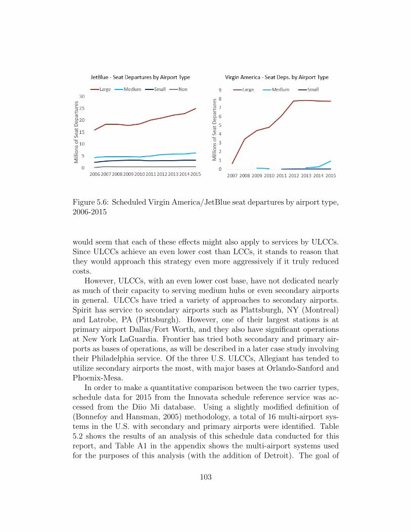
Figure 5.6: Scheduled Virgin America/JetBlue seat departures by airport type,2006-2015
would seem that each of these effects might also apply to services by ULCCs.Since ULCCs achieve an even lower cost than LCCs, it stands to reason thatthey would approach this strategy even more aggressively if it truly reducedcosts.
However, ULCCs, with an even lower cost base, have not dedicated nearlyas much of their capacity to serving medium hubs or even secondary airportsin general. ULCCs have tried a variety of approaches to secondary airports.Spirit has service to secondary airports such as Plattsburgh, NY (Montreal)and Latrobe, PA (Pittsburgh). However, one of their largest stations is atprimary airport Dallas/Fort Worth, and they also have significant operationsat New York LaGuardia. Frontier has tried both secondary and primary air-ports as bases of operations, as will be described in a later case study involvingtheir Philadelphia service. Of the three U.S. ULCCs, Allegiant has tended toutilize secondary airports the most, with major bases at Orlando-Sanford andPhoenix-Mesa.
In order to make a quantitative comparison between the two carrier types,schedule data for 2015 from the Innovata schedule reference service was ac-cessed from the Diio Mi database. Using a slightly modified definition of(Bonnefoy and Hansman, 2005) methodology, a total of 16 multi-airport sys-tems in the U.S. with secondary and primary airports were identified. Table5.2 shows the results of an analysis of this schedule data conducted for thisreport, and Table A1 in the appendix shows the multi-airport systems usedfor the purposes of this analysis (with the addition of Detroit). The goal of
103

Table 5.2: Service breakdown in major metro areas among U.S. carriers, 2015
this analysis was to (1) determine to what extent LCCs still utilize secondaryairports; and (2) examine whether ULCCs also avoid primary airports, and ifso to what degree.
First, it is clear that the NLCs generally allocate the majority of theirservice to primary airports, with all three major NLCs scheduling over 90%of their seat departures in these metro areas to primary airports. This alignswith their network structure since they depend on connecting traffic at majorhubs (usually primary airports).
Compared to NLCs, it does appear that LCCs still operate somewhat ofa parallel network, especially in Southwest’s case, where nearly 46% of theirseats in these major markets are at secondary airports. Perhaps for the reasonsmentioned earlier, Virgin looks the most like an NLC, due to its major hubsat SFO and LAX. Meanwhile, ULCCs’ networks are highly variable in thesemetrics Frontier heavily skews towards primary airports, Spirit somewhat lessso (though much of Spirit’s traffic to secondary airports is due to its focus cityin Fort Lauderdale). Meanwhile, Allegiant still uses secondary airports almostexclusively, when it even serves a metro area.
Thus, the secondary airport strategy is not uniformly used by LCCs andULCCs in the U.S., and in fact there is quite a bit of variance in airportchoice within these categories. This indicates that medium hub airports, andsecondary airports in general, cannot continue to solely rely on growing LCCssuch as Southwest to add new service, as these airlines are now viewing the“competing” large hub airports in the same metro are as viable (and perhapseven more desirable) options. Instead, these airports may need to invest in
104

new air service development strategies if they want to stem the leakage oflower-cost traffic and/or replace the traffic that had been lost to nearby largehubs.
5.3 Impacts on Smaller Airports
In recent years, as airlines in the U.S. have consolidated service at large air-ports, the topic of small community air service has seen renewed interest.Although the thirty large hub airports accounted for 68.3% of seat departuresin 2015, there are many more small and non hub airports (716 included inthis study) that affect almost every part of the country. Figure 5.7 shows196 of these smaller airports that enplaned at least 50,000 passengers in 2014,representing 46 of the lower 48 states. These airports serve as economic devel-opment engines for their communities, providing access to the U.S. Air Trans-portation System, and according to trade group Airlines for America: “Airlinesstimulate business through direct and indirect commerce, support economiesthrough taxes and infrastructure investments and provide job opportunities inaviation and other industries.” (Airlines for America, 2017). Thus, one canargue that the health of commercial air service at each of these airports is keyto the local economy and understanding the trends in small community airservice helps provide insight into policy and economic development issues thatthese communities face.
5.3.1 NLCs and Decline of the 50 Seat Jet
As discussed in Chapter 3, one of the most notable trends in small communityair service has been the rise and fall of the 50 seat jet. After the introductionof the 50 seat regional jet by Bombardier in the 1990s, NLCs rapidly movedtowards these aircraft to replace turboprops on commuter service. However,in a widely studied phenomenon these aircraft became much less economicalto operate as fuel prices rose in 2008-2010, and thus NLCs began reducingservice operated by these 50 seat jets (Swelbar, 2015).
As documented in (Wittman and Swelbar, 2013), this phenomenon hassignificant implications for small community air service. In mid-size markets,as an example, replacing six daily 50 seat RJ frequencies with four daily 76seat RJ flights does not substantially reduce the level of service provided, whileallowing the airline to reduce its unit costs. However, in a small communitythat receives two daily 50 seat flights, an airline runs into a discretizationissue, where if an airline wants to retire 50 seat aircraft they are either forced
105
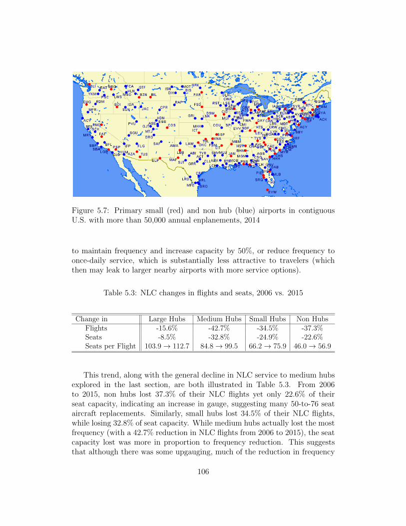
Figure 5.7: Primary small (red) and non hub (blue) airports in contiguousU.S. with more than 50,000 annual enplanements, 2014
to maintain frequency and increase capacity by 50%, or reduce frequency toonce-daily service, which is substantially less attractive to travelers (whichthen may leak to larger nearby airports with more service options).
Table 5.3: NLC changes in flights and seats, 2006 vs. 2015
Change in Large Hubs Medium Hubs Small Hubs Non HubsFlights -15.6% -42.7% -34.5% -37.3%Seats -8.5% -32.8% -24.9% -22.6%Seats per Flight 103.9→ 112.7 84.8→ 99.5 66.2→ 75.9 46.0→ 56.9
This trend, along with the general decline in NLC service to medium hubsexplored in the last section, are both illustrated in Table 5.3. From 2006to 2015, non hubs lost 37.3% of their NLC flights yet only 22.6% of theirseat capacity, indicating an increase in gauge, suggesting many 50-to-76 seataircraft replacements. Similarly, small hubs lost 34.5% of their NLC flights,while losing 32.8% of seat capacity. While medium hubs actually lost the mostfrequency (with a 42.7% reduction in NLC flights from 2006 to 2015), the seatcapacity lost was more in proportion to frequency reduction. This suggeststhat although there was some upgauging, much of the reduction in frequency
106

was driven by a desire to reduce capacity, possibly due to some of the trendsdiscussed in the previous section. For example, NLCs might have decreasedcapacity in some smaller stations due to increasing volatility in fuel prices anddecreasing competitive pressure.
Although NLCs have been reducing the average frequency of routes ingeneral (due to upgauging of their fleet), they still provide the most frequencyof any carrier type at airports they serve. Figure 5.8 shows the results of ananalysis that calculated the number of average daily departures at small andnon hubs provided by each carrier type, given that said carrier type offersservice at a given airport. For the purposes of this analysis, if United andDelta both serve small hub SSS, their combined total of scheduled flights atairport SSS for 2015 was used to determine a daily average NLC frequency.Additionally, like other analyses in this chapter, the definition of small and nonhubs remains the same, categorizing airports based on their 2015 statistics.
Figure 5.8: Average daily departures per airport served by carrier type, 2006-2015
In total, the decrease in frequencies offered by NLCs at airports they servehas been quite drastic, especially among small hub airports - average NLCdaily departures per airport served decreased from 39.8 in 2006 to 26.1. Someof this frequency reduction can be attributed to larger airports shrinking intothe small hub category by 2015 (such as Memphis). However, this pattern isalso visible among non hub airports, where there is relatively less inter-category
107

mobility, with average daily NLC departures per airport served declining from7.9 in 2006 to 6.5 by 2015.
As NLCs have been reducing both capacity and seats to non and small hubairports, they have left a gap in service. In recent years, ULCCs have beentaking advantage of this unserved demand, more than doubling the numberof their annual scheduled seat departures at small hubs, and quadrupling thesame at non hubs since 2006. However, as will be explored in the next section,this added service often does not serve as a direct replacement to former NLCservices, as the differing characteristics of the ULCC business model result indiffering levels of service.
5.3.2 ULCCs and Growth in Service to Small Airports
One of the main differences between ULCC and NLC service at small airportsis the level of frequency provided. As mentioned in Section 5.1, ULCCs donot have a large variety of fleet types, in order to reduce costs. This leadsto a greater average number of seats per departure, as previously shown inFigure 5.4, and consequently a lower average frequency per airport served,as shown in Figure 5.8. Low frequency, especially at the levels ULCCs wereproviding (1.2 departures per day in 2015 among non hub airports served), isless desirable for business travelers and can reduce the economic developmentpotential of small airports.
Not all ULCCs are equal in this regard however, as shown previously inFigure 3.29. Frontier and Spirit tend to provide more daily frequencies, al-though Allegiant offers more destinations (and more service to small non hubairports). Thus, small communities should keep the average frequency of ser-vice in mind when recruiting these carriers - although a ULCC might be willingto provide service, seemingly replacing some lost NLC capacity, it will likelybe targeted towards leisure travelers and is unlikely to be terribly attractiveto forming new business links.
Another characteristic of ULCCs discovered in the exit/entry study inChapter 4 and illustrated in Figure 4.8 is that ULCCs tend to abandon newmarkets at a markedly higher rate than NLCs and LCCs. In the search for ever-lower costs and higher profitability, ULCCs tend to be particularly ruthless interminating routes that do not meet their profitability standards immediately.
An interesting case study illustrating this effect can be seen with Frontier’sPhiladelphia area operations. Before 2013, Frontier had a minor presence atPhiladelphia International Airport (PHL) as shown in Figure 5.9. As theyconverted to the ULCC model, they switched their PHL-area service to twosecondary airports in the area Trenton-Mercer NJ (TTN), and Wilmington
108

DE (ILG). As shown in Figure 5.9, Trenton service has grown, but all servicesat Wilmington DE were cut within 2 years of opening.
Figure 5.9: Frontier seat capacity at PHL-area airports, 2011-2015
Since the arrival of Frontier, Trenton has already spent $7 million on park-ing and post-security infrastructure enhancements, and are currently in theprocess of approving a brand new passenger terminal with an annual capac-ity of 950k pax at a cost of $50 million (Levin, 2016). Given the historicalvolatility of Frontier service in the region, and ULCC service on average, onequestions whether this is a wise investment when until recently, Frontier wasthe airport’s sole commercial airline tenant (Allegiant has now begun limitedoperations to its Florida bases from Trenton). Given that a relatively similarairport saw a rapid cut in service, the Trenton airport’s investment in a newterminal to serve Frontier seems relatively risky.
The volatility and lack of frequency offered by ULCCs have broader rami-fications, especially for small communities. For instance, many small commu-nities - in the U.S. in particular - rely on government assistance to supporttheir air service development efforts. In 2012, the U.S. DOT spent nearly $230million on their Essential Air Service (EAS) and Small Community Air ServiceDevelopment (SCASD) programs (Wittman, 2014a). As seen in the SCASDselection criteria below, three of the four schedule priority factors that theDOT considers when awarding SCASD grants do not apply to ULCCs - onlythe lower fare portion does.
“ ... include service that would offer new or additional access to aconnecting hub airport, service that would provide convenient traveltimes for both business and leisure travelers that would help obviate
109

the need to drive long distances, and service that would offer lowerfares.” (U.S. Department of Transportation, 2014)
In turn, this could encourage airports that want to recruit ULCCs to putmore of their own resources on the line, since they are less eligible for federalassistance, which is a risky proposition as evidenced earlier in this section. Assuch, small airports should consider all of the trends identified in this chap-ter when making air service development decisions, as the evolving businessmodels of U.S. carriers greatly affect the fortunes of small airports nationwide.
While large hub airports certainly face challenges of their own (congestion,aging infrastructure, etc.,) the greatest effects of evolving airline business mod-els have been felt by medium, small, and non-hub airports, as we have shownin this chapter. These airports have all experienced declines in frequency ofservice and daily seat capacity since 2006. The bulk of this lost capacity hasbeen due to NLC reductions in service, potentially influenced by recent consol-idation among those carriers. In some cases LCCs and especially ULCCs havebackfilled part of this lost seat capacity. However, due to fundamental differ-ences in their business models, the type of service provided by these carriersis likely less attractive to business travelers that help drive the local economy.
It is therefore generally in a community’s best interest to attract and main-tain commercial air service at their airport, with as much frequency of serviceas possible. Since deregulation, airlines have been able to enter and leavemost domestic markets as business needs dictate. However, deregulation hasalso meant that communities which are now on the verge of losing service (orseeing a substantial reduction in quality of service) are left with few levers toinfluence the air service provided at their local airport. With airlines rightfullyfocused on flight profitability, some level of subsidy or other financial incentivefrom the community with a struggling route is usually required to maintain orgrow airline service.
To this end, federal programs such as EAS and SCASD provide some as-sistance to communities by making federal funds available for these financialincentives. However, these programs are currently in jeopardy. SCASD fund-ing decreased 73% from 2005 to 2016, and a recent federal budget proposalincludes cutting the EAS program entirely (Zanona, 2017). Even if theseprograms survive in some form, they are not necessarily the best tools forcommunities to develop air service: In every year 2006-2011, fewer than halfof SCASD grant recipients achieved their stated goals within 28 months ofreceiving the grant funding (Wittman, 2014b).
If economic development in small-to-midsize communities in the U.S. isa priority, national policymakers should consider whether these communities
110

have the tools necessary to attract and maintain an acceptable level of air ser-vice at their local airports. Furthermore, if the current levers such as SCASDand EAS are ineffective, future policy research should be directed towards un-derstanding how to best help these communities retain their links to the U.S.air transportation system.
111

112

Chapter 6
Conclusions
This chapter will summarize the research questions and results presented inthis thesis, beginning with the history of U.S. airline business models. Some ofthe key industry trends from 2006-2015 will be highlighted, as well as the majorimpacts of evolving U.S. airline business models on fares and communities.Finally, we will suggest areas of future work that would provide additionalinsight into the U.S. airline industry.
6.1 Evolution of U.S. Airline Business Models
In Chapter 2, we explored various trends in the airline industry that haveaffected the development of U.S. airline business models. Since deregulationin 1978, the industry has been affected by volatile business cycles resultingin alternating profits/losses of increasing amplitude. The losses accrued weresuch that the U.S. industry only recently became cumulatively profitable (sincederegulation), for the first time since the early 2000s. This volatility has ledto many bankruptcies, but has also recently spurred some carriers towardsgreater cost efficiency.
Thus one key recent trend has been the cost convergence between tradi-tional Low Cost Carriers (LCCs) and Network Legacy Carriers (NLCs). Thisrefers to the gradually narrowing gap in unit costs between NLCs and LCCs,which has been caused by both a relative increase in LCC unit costs and arelative decrease in NLC unit costs. The decrease in NLC costs came largelyfrom a decrease in unit labor costs after union contracts were modified duringthe slew of bankruptcies in 2002-2006. Conversely, LCC labor costs increasedas these carriers matured and slowed their growth rate.
The additional volatility created by a fuel price spike in 2008, when com-
113
bined with the aftermath of the bankruptcies from 2003-2005, created an en-vironment ripe for consolidation. In 2006, the largest four airlines in the U.S.controlled 56.9% of domestic O&D passenger traffic. By 2015, after a seriesof mergers, that share had grown to 78.7%. With fuel prices high and fewercompetitors, the post-merger environment was not conducive to significant ca-pacity growth. In fact, the industry entered a period of “Capacity Discipline”in 2010, as airlines - especially NLCs - began to focus on revenue performance.From 2010-2015, NLCs increased domestic ASMs by only 2.9%, far below thehistoric growth rate (at or above GDP growth rate).
The combined effects of these trends have led to a fundamental change inthe industry’s competitive equilibrium. As costs have increased at traditionalLCCs, they have been forced to adapt by increasing fares and pursuing thehigher-yielding market segments historically targeted by NLCs. This createdroom for new entrants in the low-yield market segment, and ultimately led tothe emergence and rapid growth of the Ultra-Low-Cost Carrier (ULCC).
In recent years, the emergence of the ULCC model in the U.S. airlineindustry has created a new competitive landscape. As part of their businessmodel, ULCCs achieve lower costs than LCCs while collecting ancillary revenuefrom aggressive unbundling of fares, yet still lag LCCs and NLCs in totalsytem unit revenue. Previous works have examined ULCCs such as Spirit andAllegiant with the underlying assumption that all major carriers fit into theNLC or LCC category. In this thesis, we presented the first comprehensiveanalysis demonstrating that ULCCs are a unique type of carrier, distinct fromLCCs in both internal structure and effects on air travel markets.
We proposed a new categorical definition for ULCCs as airlines which (1)have significantly lower unit costs than LCCs; (2) derive a significantly higherproportion of revenue from ancillary revenue than LCCs; and (3) despite in-creased ancillary revenue generation, lag LCCs in total unit revenue. Thesefundamental differences suggest that the ULCC model is distinct and sepa-rate from the LCC model, and thus that ULCCs can potentially affect the airtransportation system in different ways than LCCs.
These changes in carrier business models were accompanied by changesin the various network and fleet strategies they use. Chapter 3 focused onproviding an overview of these network and fleet changes, answering two keyquestions: (1) How are airlines providing capacity; and (2) Where are airlinesallocating capacity?
In 2006, around 5,100 aircraft were in scheduled service among the tenmajor carriers included in this study (and their predecessors). TraditionalLCCs operated mainline narrowbody aircraft almost exclusively, while NLCshad a diverse fleet that included ≥ 1, 000 small regional aircraft. By 2015, the
114
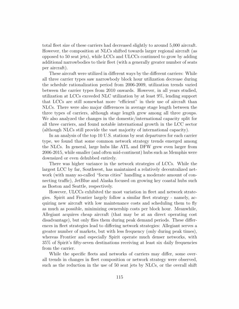
total fleet size of these carriers had decreased slightly to around 5,000 aircraft.However, the composition at NLCs shifted towards larger regional aircraft (asopposed to 50 seat jets), while LCCs and ULCCs continued to grow by addingadditional narrowbodies to their fleet (with a generally greater number of seatsper aircraft).
These aircraft were utilized in different ways by the different carriers: Whileall three carrier types saw narrowbody block hour utilization decrease duringthe schedule rationalization period from 2006-2009, utilization trends variedbetween the carrier types from 2010 onwards. However, in all years studied,utilization at LCCs exceeded NLC utilization by at least 9%, lending supportthat LCCs are still somewhat more “efficient” in their use of aircraft thanNLCs. There were also major differences in average stage length between thethree types of carriers, although stage length grew among all three groups.We also analyzed the changes in the domestic/international capacity split forall three carriers, and found notable international growth in the LCC sector(although NLCs still provide the vast majority of international capacity).
In an analysis of the top 10 U.S. stations by seat departures for each carriertype, we found that some common network strategy trends emerged amongthe NLCs. In general, large hubs like ATL and DFW grew even larger from2006-2015, while smaller (and often mid-continent) hubs such as Memphis weredownsized or even dehubbed entirely.
There was higher variance in the network strategies of LCCs. While thelargest LCC by far, Southwest, has maintained a relatively decentralized net-work (with many so-called “focus cities” handling a moderate amount of con-necting traffic), JetBlue and Alaska focused on growing key coastal hubs suchas Boston and Seattle, respectively.
However, ULCCs exhibited the most variation in fleet and network strate-gies. Spirit and Frontier largely follow a similar fleet strategy - namely, ac-quiring new aircraft with low maintenance costs and scheduling them to flyas much as possible, minimizing ownership costs per block hour. Meanwhile,Allegiant acquires cheap aircraft (that may be at an direct operating costdisadvantage), but only flies them during peak demand periods. These differ-ences in fleet strategies lead to differing network strategies: Allegiant serves agreater number of markets, but with less frequency (only during peak times),whereas Frontier and especially Spirit operate much denser networks, with35% of Spirit’s fifty-seven destinations receiving at least six daily frequenciesfrom the carrier.
While the specific fleets and networks of carriers may differ, some over-all trends in changes in fleet composition or network strategy were observed,such as the reduction in the use of 50 seat jets by NLCs, or the overall shift
115

among all carriers towards international flying. The second half of the thesiswas dedicated to examining some key impacts of these changes on fares andcommunities.
6.2 Impacts on Fares and Communities
In Chapter 4, we analyzed how evolving airline business models have affectedpassenger traffic and domestic airfares in the U.S. After a brief review of ca-pacity trends, we explored trends in inflation-adjusted passenger revenue perequivalent seat mile (PRESM) by carrier type. Earlier, we had hypothesizedthat LCCs were having to increase fares as their cost base grew, and the ob-served trends in PRESM validated this hypothesis. From 2006-2010, PRESMat NLCs increased by 1.2%, while it increased by 9.8% at traditional LCCs/By 2015, PRESM at traditional LCCs had increased 21.6% from the 2006base, while PRESM at NLCs had only increased 5.8%
While it is useful to explore revenue trends from the airline perspective,it is just as important to understand how fares have been changing to under-stand impacts on the consumer. Thus we also explored changes in averagefares among the top 1,000 O&D markets in the U.S, both using raw data andinflation-adjusted values. In order to test if there was any correlation betweenfares and market size, we split our sample into five quintiles, with the largest200 markets being contained in 1st Quintile, the 200 smallest markets beingcontained in the 5th Quintile, etc.
We found that on average, between 2006 and 2015, unadjusted fares hadincreased from 19.8% among markets in the 1st Quintile to 25.2% amongairports in the 5th Quintile. We also found that most of this increase occurredbetween 2010 and 2015 among smaller markets, while the fare increase wasmore evenly distributed at the largest 200 markets in our sample. Once wetook inflation into account, there was less than a 1% adjusted fare increasefrom 2006-2010 in every quintile among included markets. However, from2010-2015, while there was no fare increase among markets in the 1st Quintile,we observed up to 6.6% increase in inflation adjusted fare among the smallermarkets in our study. However, there was a wide-tailed distribution in farechanges among these markets, with 100 of the 200 markets in the 5th Quintilerealizing decreases in inflation adjusted fare over the same period.
While studying average fares in key markets provided some insight intooverall fare trends, the design of the aggregate analysis did not enable usto adequately evaluate exactly how changes in business models were affectingfares. Furthermore, with the limited sample of markets, it was possible that we
116

were missing a larger trend. Thus, we developed multiple econometric modelsto evaluate ULCC and LCC market presence, entry, and exit fare outcomesover a six-year period. After a brief literature review justifying our choiceof model, we show that from 2010-2015, ULCC presence has a significantlygreater effect on reducing average base fares in U.S. domestic airline marketsthan presence by the more mature LCCs.
Additionally, the impact of ULCC presence on average market fares hasovertaken that of the LCCs, and has increased over time. In 2015, ULCC pres-ence in a given region-pair market with no LCC presence was associated witha 20.5% lower mean fare than a market only served by NLCs, as comparedto a 7.7% lower mean fare associated with LCC presence in a market withoutULCC presence. However, in newly-entered markets, although both ULCCsand LCCs contribute to lower average fares upon market entry by approxi-mately 8% in the year of entry, the differences in impact between carrier typeswere not statistically significant. As part of the entry-exit study, we foundthat ULCCs abandon 26% of new markets within two years of entry, a marketattrition rate three times higher than that of LCCs.
Fares are important to passengers, but changes in fares are only applicableto a given traveler if an airline provides service from the passenger’s point oforigin to their destination. Thus, in Chapter 5, we explored the impact ofschedule changes and changing business models on airports and communities.First, we provided an overview of the FAA airport classification scheme thatplaces airports of different size into one of four categories (large, medium,small, and non hub) based on their number of annual enplanements. We foundthat domestic capacity (measured as number of annual seat departures) haddecreased since 2006 among all airport types except large hubs. However, thisdecrease was not uniform across carrier types: ULCCs increased seat capacityover the decade across all hub types, while NLCs decreased capacity acrossall hub types. LCCs grew at the largest airports, while shrinking capacity atsmall and non hubs.
We then examined changes in seat share and seats per departure (a proxyfor equipment size) among the different carrier and hub types. We found thatdespite their reductions in capacity, NLCs still provided the majority of seatdepartures at all airports except medium hubs, where LCC share overtookNLC share in 2009. Over the decade, ULCC share grew at all airport typesexcept medium hubs, and by 2015 ULCC seat share was greatest among nonhub airports, where ULCCs provided 12.0% of seat departures in that year.We also found that the size of equipment has generally been increasing, espe-cially among ULCCs, and that the relative increase in the number of seats perdeparture was greatest at non hub airports. Furthermore, by 2015, ULCCs
117

provided the most seats per departure, while NLCs provided the fewest. How-ever, given that NLCs still provide significant capacity, we can infer that thefrequency provided by NLCs is much higher than LCCs and especially ULCCs.
In the process of analyzing these overall trends in service by airport type,we discovered two key trends that merited more in-depth study. First, weexamined the changing relationship between LCCs and secondary airports,many of which are medium hubs. While LCCs traditionally operated a point-to-point network out of these secondary airports, they have recently begunshifting more capacity to primary airports in multi-airport metro areas. Fur-thermore, the newer LCCs JetBlue and Virgin America have tended to eschewsecondary airports in favor of larger primary airports serving the same catch-ment area, allocating 71.3% and 96.8% of their respective 2015 seat departuresto large hubs. Also, the emerging ULCCs have different strategies regardingsecondary airports - the point-to-point focused Allegiant still allocated 92.5%of its 2015 seat capacity in major metro areas to secondary airports, whileSpirit and Frontier allocated only 24.6% and 7.0%, respectively.
The other key trend we examined in depth is the overall impact of evolvingbusiness models on the smallest airports - small and non hubs. Since thesesmall airports serve a diverse range of small communities distributed overthe entire country, and airports serve as major economic engines for theircommunities, understanding trends in service among these airports can provideinsight into the economic health of these smaller communities. The majortrend affecting these airports is the decline of the 50 seat jet - we found that asNLCs replace 50 seat regional aircraft with larger planes, non hubs lost 37.3%of their flights between 2006 and 2015 (yet only lost 22.6% of seat departures).Similarly, small hubs lost 34.5% of their NLC flights, while losing 32.8% ofseat capacity. As we discovered, some of this capacity is being replaced bynew ULCC service.
However, since NLCs provide anywhere from 5-12 times as many averagedaily frequencies as ULCCs at airports that they serve, ULCC service is muchless useful to business travelers that desire high levels of frequency. Further-more, we found that ULCC service is more volatile than LCC or NLC service,as described earlier in Chapter 4, with ULCCs being three times more likelythan LCCs to abandon a new market within the first two years of service. Thismakes it more risky for these small airports to make long-term investments insecuring and maintaining air service.
Finally, we discussed the public policy implications of these network andschedule changes. As airports are economic engines for their local communi-ties, it is in policymakers’ interest to understand how changes in the airlineindustry are affecting airports. Furthermore, policymakers need to understand
118

what types of policies - on both a local and national level - may help smallerairports that are experiencing a decline in the level of service. Although federalprograms such as EAS and SCASD currently exist to help smaller communi-ties retain air service, these programs are in jeopardy, and some literature hasquestioned the overall efficacy of these programs. As we will discuss in Sec-tion 6.3, much work remains to be done on understanding the full impacts ofcurrent public policy on small airports, and developing new and more effectivepolicies to stem the loss of air service in these communities.
6.3 Future Work
One of the key findings in this thesis was the definition of the Ultra LowCost Carrier business model, and classification of current U.S. airlines intothe NLC, LCC, or ULCC models. As ULCCs emerge as a distinct businessmodel in the US airline industry, they merit closer study and attention. AsULCCs continue to grow their domestic capacity, their actions are likely tohave an increasingly significant impact on the industry. Much like the earlierdevelopment of the LCC model, the emergence of ULCCs will affect policydecisions and the competitive landscape in the industry.
It will be key for policy makers and industry leaders to gain an understand-ing of how NLCs and LCCs might react to the growth of ULCCs, whether theULCC model is a sustainable in its current state, and whether any commu-nities are negatively impacted by these changes. Thus, it is important tounderstand the ULCC business model and the impact ULCCs have on theair transportation system at large, and future work should aim to investigatemore fully the effects of ULCCs on various industry stakeholders at a market,airport, and national level.
Furthermore, as demonstrated in Chapter 5, declining service overall hasbeen a problem at many small and midsize airports. Since these communities’economic health is dependent in part on the level of service available at theirlocal airports, addressing the decline in service is a policy challenge on both thenational and local levels. Further work on (1) understanding how declines in airservice affect small communities and (2) developing more effective policies tocounteract any negative effects of reduced air service would be very beneficialto these communities.
Finally, this thesis only focuses on the events of 2006-2015. The U.S.airline industry is constantly evolving, and with it the business models ofair carriers. As new developments emerge, and as airline business modelscontinue to evolve, it would be very useful to revisit many of the fundamental
119

questions posed in this thesis, in order to gain a broader and more completeunderstanding of this fascinating and dynamic industry.
120

Bibliography
Airlines for America. 2016. U.S. Bankruptcies and Services Cessations.Accessed 1/4/2017 from http://airlines.org/data/u-s-bankruptcies-and-services-cessations/
Airlines for America. 2016. U.S. Airline Mergers and Acquisitions. Ac-cessed 12/19/2016 from http://airlines.org/data/u-s-airline-mergers-and-acquisitions/
Airlines for America 2017. U.S. Airline Industry and Economic Activity. Ac-cessed 2/8/2017 from http://airlines.org/industry/
ben Abda, M., P.P. Belobaba, and W.S. Swelbar. 2008. Impacts of LCC growthon domestic traffic and fares at largest US airports. Journal of Air TransportManagement 18(1): 21-25.
bin Salam, S. and B. McMullen. 2013. Is there still a Southwest effect? Trans-portation Research Record: Journal of the Transportation Research Board2325: 1-8.
Belobaba, P.P., A. Odoni, and C. Barnhart, (Eds.). 2009. The global airlineindustry. Wiley, Chichester UK.
Bonnefoy, P.A. and R.J. Hansman. 2005. Emergence of secondary airports anddynamics of regional airport systems in the United States. MassachusettsInstitute of Technology International Center for Air Transportation WhitePaper No. ICAT-2005-02.
Brueckner, J.K., D. Lee, and E. S. Singer. 2013. Airline competition and do-mestic US airfares: A comprehensive reappraisal. Economics of Transporta-tion 2: 1-17.
CAPA Centre for Aviation. 2015. US major airlines recognize the ULCCthreat; marketplace dynamics will change; but beware cost creep. CAPAAviation Analysis Report 4 Nov 2015.
121

Chang, Y.-C. and M.-M. Yu. 2014. Measuring production and consumptionefficiencies using the slack-based measure network data envelopment analysisapproach: the case of low-cost carriers. Journal of Advanced Transportation48(1): 15-31.
Compart, A. 2013. Scope Clauses May Affect Use Of New RJs. Aviation Week,1 Jul 2013.
Daraban, B. and G.M. Fournier. 2008. Incumbent responses to low-cost airlineentry and exit: A spatial autoregressive panel data analysis. Research inTransportation Economics 24(2008): 15-24.
Order Soliciting Small Community Grant Proposals, DOT-OST-2014-0113.June 30, 2014.
de Neufville, R. D., 2008. Low-Cost Airports for Low-Cost Airlines: FlexibleDesign to Manage the Risks. Transportation Planning and Technology, pp.(31) 35-68.
de Wit, J.G. and J. Zuidberg. 2012. The growth limits of the low-cost carriermodel. Journal of Air Transport Management 21: 17-23.
U.S. Federal Aviation Administration. 2014. The Economic Impactof Civil Aviation on the U.S. Economy. Accessed 2/8/2017 athttp://www.faa.gov/air traffic/publications/media/2014-economic-impact-report.pdf
Francis, G., I. Humphreys, S. Ison, M. Aicken. 2006. Where next for low costairlines? A spatial and temporal comparative study. Journal of TransportGeography 14(2): 83-94.
Competition between network carriers and low-cost carriers: Retreat battleor breakthrough to a new level of efficiency? Journal of Air TransportManagement 10: 15-21.
Gillen, D. and Lall, A., 2004. Competitive advantage of low-cost carriers: someimplications for airports. Journal of Air Transport Management, pp. (10)41-50.
Gillen, D. and W. Morrison. 2003. Building, integration, and the deliveredprice of air travel: Are low cost carriers full service competitors? Journal ofAir Transport Management 9: 15-23.
122

Gillen, D. 2005. Airline business models and networks: Regulation, competi-tion and evolution in aviation markets. Review of Network Economics 5(4):366-385.
Goolsbee, A. and C. Syverson. 2008. How do incumbents respond to the threatof entry? Evidence from the major airlines. Quarterly Journal of Economics,11/2008.
Gross, S., and M. Luck. (Eds.). 2013. The low cost carrier worldwide. Ashgate,Farnham UK.
Hofer, C., R.J. Windle, and M. Dresner. 2008. Competitive responses to lowcost carrier entry. Transportation Research Part E 44(5): 864-882.
Huschelrath, K. and K. Muller. 2013. Patterns and Effects of Entry in U.S.Airline Markets. Journal of International Competition and Trade 13: 221-253.
Jiang, Q. 2014. The evolution of U.S. airlines’ productivity and cost perfor-mance from 2004 to 2012. Unpublished master’s thesis, Massachusetts In-stitute of Technology.
Klophaus, R., R. Conrady, and Fichert, F. 2012. Low cost carriers going hy-brid: Evidence from Europe. Journal of Air Transport Management 23:54-58.
Knapp, W. 1990. Event analysis of air carrier mergers and acquisitions. TheReview of Economics and Statistics. 72(4): 703-707.
Kwoka, J., K. Hearle, and P. Alepin. 2016. From the Fringe to the Forefront:Low Cost Carriers and Airline Price Determination. Review of IndustrialOrganization 48(3): 247-268.
Levin, A., 2016. New Passenger Terminal Planned for the Trenton-MercerAirport. Town Topics, Jan 27 2016. Princeton (NJ).
Martin, G. 2016. Customer complaints surge as passengers resist airline merg-ers and ultra low cost carriers. Forbes, 24 Feb 2016.
Morrison, S. and C. Winston. 1995. The Evolution of the Airline Industry, TheBrookings Institution, Washington, DC.
123

Morrison, S.A. 2001. Actual, adjacent, and potential competition: Estimatingthe full effect of Southwest Airlines. Journal of Transport Economics andPolicy 35(2): 239-256.
Nicas, J. 2012. A stingy Spirit lifts airline’s profit. Wall Street Journal, 11 May2012.
Nicas, J. 2013. Allegiant Air: The tardy, gas-guzzling, most profitable airlinein America. Wall Street Journal, 4 June 2013.
Perez, E. R. J., 2014. Airport strategic planning in the context of low-costcarriers’ ascendency: insights from the European experience. PhD Disserta-tion. Porto, PT: Faculdade de Engenharia da Universidade do Porto/MIT-Portugal Program.
Rose, M. 2007. Skybus’ planned Tuesday start shows promise. Columbus Dis-patch, 5 November 2007.
Rosenstein, D. E. 2013. The changing low-cost airline model model: An anal-ysis of Spirit Airlines. Purdue Aviation Technology Graduate Student Pub-lications. Paper 19.
Swelbar, W.S. 2015. Airline network evolution and strategies. Presentation toMIT 16.71 course, 10/21/2015.
Thomas, J. and B. Catlin. 2014. Aviation insights review: The future of air-line business models, which will win? L.E.K. Consulting Executive Insights16(34).
Tretheway, M. 2004. Distortions of airline revenues: why the network airlinebusiness model is broken. Journal of Air Transport Management 10(1): 3-14.
Tsoukalas, G., P.P. Belobaba, and W.S. Swelbar. 2008. Cost convergance inthe US airline industry: An analsysis of unit costs 1995-2006. Journal of AirTransport Management 14(4): 179-187.
Tan, K.M. Incumbent Response to Entry by Low-Cost Carriers in the U.S.Airline Industry. Southern Economic Journal 82(3): 874-892.
U.S. Government Accountability Office. 2014. Airline competition: The aver-age number of competitors in markets serving the majority of passengershas changed little in recent years, but stakeholders voice concerns aboutcompetition. GAO Report 14-515.
124

U.S. Energy Information Administration. 2016. U.S. Gulf CoastKerosene-Type Jet Fuel Spot Price FOB. Accessed 1/4/2017 fromhttps://www.eia.gov/petroleum/data.cfm
Vinod, R. and K. Moore. 2009. Promoting branded fare families and ancillaryservices: Merchandising and its impacts on the travel value chain. Journalof Revenue and Pricing Management 8(2): 174-186.
Windle, R. and M. Dresner. 1995. The short and long run effects of entry onUS domestic air routes. Transportation Journal 35(2): 14-25.
Windle, R. and M. Dresner. 1999. Competitive responses to low cost carrierentry. Transportation Research Part E 35(1): 59-75.
Wittman, M.D. 2014a. The effects of capacity discipline on smallerU.S. airports: Trends in service, connectivity, and fares. Mas-ter’s Thesis. Massachusetts Institute of Technology. Available atdspace.mit.edu/handle/1721.1/90076
Wittman, M.D. 2014b. Public funding of airport incentives: The efficacy ofthe Small Community Air Service Development Grant (SCASDG) program.Massachusetts Institute of Technology International Center for Air Trans-portation White Paper No. ICAT-2014-01.
Wittman, M.D. and W.S. Swelbar. 2013. Evolving trends of US domestic air-fares: The impacts of competition, consolidation, and low-cost carriers. Mas-sachusetts Institute of Technology International Center for Air Transporta-tion White Paper No. ICAT-2013-05.
Zanona, M. 2017. Trump budget cuts air service in rural communities. TheHill, 17 March 2017.
125

Table A1: Metro Areas Included in Entry/Exit Study
Metro Areas Airports Included
New York MetroKennedy (JFK), LaGuardia (LGA), Newark (EWR)
Islip (ISP), Westchester County (HPN)
Southern CaliforniaLos Angeles (LAX), Ontario (ONT), Long Beach (LGB)
Orange County (SNA), Burbank (BUR)Chicago Metro O’Hare (ORD), Midway (MDW), Rockford (RFD), Gary (GYY)
Northern California San Francisco (SFO), San Jose (SJC), Oakland (OAK)Washington Metro Dulles (IAD), Reagan (DCA), Baltimore (BWI)Philadelphia Metro Philadelphia (PHL), Trenton (TTN), New Castle (ILG)
Boston Metro Logan (BOS), Manchester (MHT), Providence (PVD)Central Florida Orlando (MCO), Sanford (SFB), Melbourne (MLB)
Southeast Florida Miami (MIA), Ft Lauderdale (FLL), West Palm Beach (PBI)Tampa Bay Metro Tampa (TPA), St Petersburg (PIE), Sarasota (SRQ)Texas Metroplex Dallas/Ft Worth (DFW), Dallas Love (DAL)Houston Metro Intercontinental (IAH), Hobby (HOU)Phoenix Metro Sky Harbor (PHX), Mesa (AZA)
Pittsburgh Metro Pittsburgh Int’l (PIT), Latrobe (LBE)St Louis Metro St Louis Int’l (STL), MidAmerica (BLV)
126