understanding the readability of colored text by ... the readability of colored text by crowd- ......
TRANSCRIPT

Keyword(s): Abstract:
©
Understanding the readability of colored text by crowd-sourcing on the Web
Silvia Zuffi, Carla Brambilla, Giordano Beretta, Paolo Scala
HP LaboratoriesHPL-2009-182
color; psychophysics
We present an experiment about the readability of colored text on a colored background that we haveconducted through crowd-sourcing on the Web. Our aim is to contribute to the understanding of the ease ofreading text on displays under generic viewing conditions and, at the same time, we aim at demonstratingthe suitability of performing psychophysical studies on the Web. Indeed, we compare our results withprevious findings in the field obtained by means of visual experiments carried on into laboratories undercontrolled viewing conditions. Our analysis of reading performance and color dimensions suggests that 30units of CIE lightness difference between text and background should be set in the design of textualdisplay. In addition, regarding a pleasant color selection, our study suggests a light muted background.
External Posting Date: August 6, 2009 [Fulltext] Approved for External PublicationInternal Posting Date: August 6, 2009 [Fulltext]
Copyright 2009 Hewlett-Packard Development Company, L.P.

1
Understanding the readability of colored text by crowd-
sourcing on the Web
Silvia Zuffi,1,* Carla Brambilla,2 Giordano Beretta, 3 and Paolo Scala1
1 ITC-CNR, National Research Council, Via Bassini, 15, I-20133 Milano, Italy
2 IMATI-CNR, National Research Council, Via Bassini, 15, I-20133 Milano, Italy
3 HP Labs, Palo Alto, CA 94304, USA
*Corresponding author: [email protected]
We present an experiment about the readability of colored text on a colored background
that we have conducted through crowd-sourcing on the Web. Our aim is to contribute to
the understanding of the ease of reading text on displays under generic viewing conditions
and, at the same time, we aim at demonstrating the suitability of performing
psychophysical studies on the Web. Indeed, we compare our results with previous findings
in the field obtained by means of visual experiments carried on into laboratories under
controlled viewing conditions. Our analysis of reading performance and color dimensions
suggests that 30 units of CIE lightness difference between text and background should be
set in the design of textual display. In addition, regarding a pleasant color selection, our
study suggests a light muted background.
OCIS codes: 330.1690, 330.5510.

2
Introduction
In recent years, the problem of text readability on displays has received considerable attention.
Most information provided on the Web is indeed text, and books and journals in electronic
format are becoming more and more popular. Very often, long text is presented in black
characters against a white background resembling the print on paper condition, but colored text
on a colored background is a frequent design choice to highlight parts of a Web page, or, in
general, to obtain a more attractive design. A proper color selection for textual displays is
therefore mandatory, requiring addressing the issues of accessibility, legibility and readability of
text, as well as user preference.1 Design choices should be guided by rules and recommendations
based on psychophysical experiments. In the past, psychophysical studies on reading from
displays have been performed mainly on calibrated devices, at a fixed viewing distance, with a
fixed ambient illumination, and with previous test of the visual acuity and color vision of the
subjects. Visual experiments are traditionally performed in controlled conditions because it is
considered necessary to evaluate the photometric quantities involved to a high precision. In
recent years, there has been an increasing interest in performing such experiments in
uncontrolled environments, but it was unknown if investigations that require tolerating a certain
degree of uncertainty in the visual stimuli have scientific value. In previous research1 we have
verified the appropriateness of performing our readability studies on the Web by comparing a
Web study with an equivalent experiment performed in the laboratory.
1 In this work we are not interested in comfort and epileptiform activity, visual stress, colored overlays, nor
ophthalmic tinting and filters.

3
In this paper, we address the issue of the ease of reading colored text on colored
background. Differently from the terminology in other languages (i.e. Italian), in English two
terms characterize text with reference to the task of reading. The Merriam-Webster online
dictionary reports these definitions: Readability: suitability to be read easily; Legibility:
suitability to be read or deciphered. In other words, legibility refers to the ease of identification
of text items,2 while readability refers to how comfortable it is to read a text. In general, legibility
is a prerequisite for readability; when text is of low legibility its readability is also low, but, on
the other hand, when a text is not very readable it is still possible that it is legible.
We present an experiment about the readability of colored text on colored background
that we have conducted exploiting crowd-sourcing on the Web. The work aims to provide a
contribution to the understanding of the ease of reading of text on displays under generic viewing
conditions. Previous papers by the authors3, 4 addressed the readability problem focusing on the
effect of luminance and luminance contrast, generally recognized to be the fundamental factor
affecting readability (luminance contrast is indeed the attribute considered by W3C in the most
recent proposal of readability guidelines for the Web).5 Moreover, in color selection for
displaying information it is mandatory to consider color vision deficiencies (CVDs), and a good
strategy, which implicitly takes them into account, is to ensure a sufficient luminance contrast
between foreground and background colors.
This paper is organized as follows. In Section 1 we provide a comprehensive survey of
the most significant findings in the field, specifically with reference to early research conducted
in controlled conditions, and illustrate the proposal for a readability rule that we made in our
previous papers. In Section 2, we describe how studies on readability are performed and in

4
Section 3 we present our experiment. Finally in Section 4 we verify our proposal and compare
with previous studies the results we obtained by crowd-sourcing on the Web.
Main findings of previous studies on readability
The most extensive investigation on readability goes back to the work of Tinker6 on prints, and
Legge on readability of displays for normal and impaired people. Legge dedicated thirty years to
research this topic, illustrating its complexity and posing many questions on the theoretical
interpretation of experimental results. His work is summarized in a book.7 Pioneering research
was conducted with monitors that were less effective in terms of luminance and luminance
contrast compared with the displays we use today, however those results offer a good reference
point and many of the initial findings are confirmed by recent studies conducted on
contemporary color displays, including those involving the Web.4, 8
It is necessary, in our opinion, to update more accurately the findings to contemporary
devices, especially considering that today much textual information is provided on full color
displays. Indeed, readability is a rather subtle effect and as technologies evolve, consecutive
studies can yield opposite results depending on small technological changes or slightly different
experimental design, i.e., what questions are asked. Regarding technology, the early literature is
from a time when raster displays where CRTs with a gray mask and bluish, greenish, or amber
phosphors, and character low-resolution bitmaps of a font like Gacha. This progressed through
bitmapped displays at 70 dpi and specially designed serif fonts, CRTs with digitally controlled
beam forming, grayscale CRTs, color CRTs, various LCD technologies, up to today’s 200 dpi
displays. Naiman9 has studied the font rendering issues in CRTs, pointing out a number of
problems depending on particular display implementations. We present the previous research in
order of relatedness, and the reader should be tolerant of apparent contradictions stemming from

5
different experimental equipment, which is rarely pointed out to sufficient detail in papers, or
small experimental design changes. This apparent wavering of the results is also a motivation for
Web based experiments using crowd-sourcing, because the large number of observers, displays,
and viewing conditions should average out these subtle difference and offer more robust results.
In this sense the reader should consider our survey of previous research as a roadmap for more
detailed readings.
Effect of luminance contrast
As already mentioned, the luminance contrast between text and background is generally
recognized as a fundamental factor affecting readability of colored text. Pioneering research on
this topic supports this conclusion.2, 10-14
Reading is related to the spatio-visual capabilities of observers. Since visual acuity is
higher for luminance than for chromatic contrast, it is the former that predominates when we try
to resolve fine details. Interestingly, Legge observed that the coding of contrast for reading is the
same for rendering by color contrast or luminance contrast, apart from any filtering stage that
determines the overall difference between achromatic and chromatic contrast sensitivity.15 Early
stages of contrast coding seem therefore to provide a plausible basis for contrast limitations in
reading. The majority of studies on readability — among them reference studies from Legge and
Knoblauch13, 14 — have considered as a measure of luminance contrast the Michelson definition,
a measure adopted in the “gratings literature” that combines differentiation and normalization, as
required to code contrast at the early stages of the visual pathways.16 The Michelson contrast is
defined as:
, (1)

6
where Ymax is the largest luminance value among text and background and Ymin the lowest.
Legge14 observed that reading speed in normal vision is nearly unaffected by contrast
reductions down to a critical Michelson contrast of 10% or less. McIntyre17 found in an informal
study that some users require a contrast between 80% and 95% for comfortable reading.
Snyder18, 19 suggested that the luminance ratio should be 3:1, which corresponds to a Michelson
factor of 50%.
Rather than on a representation of the early stages of contrast coding, a different
representation of luminance contrast can be based on psychophysical models, which typically
include a non-linear transformation from stimuli to visual response. Luminance perception is
represented by lightness, defined by the Commission Internationale de l’Éclairage (CIE) as a
correlate of:
, (2)
where Y is the luminance, and Yn is the luminance of the reference white. The CIE lightness
definition can be used to define a contrast measure based on lightness difference, as follows:
. (3)
Because L* is scaled psychophysically and a unit corresponds approximately to a just
noticeable difference (JND), the lightness difference is perceptually linear and does not require
normalization, unlike Michelson contrast.
This expression represents the distance of two achromatic colors in a perceptually
uniform color space, at suprathreshold levels of luminance difference. Beretta20 considered this

7
measure of contrast to characterize the readability of text, and in an informal study suggested a
lightness difference of 27 units between text and background as a threshold for comfortable
reading. Based on his observation, we have performed an experiment that confirmed his
suggestion.3 In previous research1 we evaluated lightness differences of 20, 25, 30 and 35
CIELAB units and concluded that in order to present a readable text one should have at least a
difference of 30 units. These values were a refinement of those considered in our 2006 paper.3
Lightness difference was also used by Sakatani and Itoh21 to adjust the contrast when an HTML
page is printed without the background.
Recently, in the Web Content Accessibility Guidelines (WCAG)5 the W3 consortium has
proposed a measure to select combinations of foreground and background colors for textual
displays that takes the form of a luminance contrast. The measure is defined as:
, (4)
where Ymax and Ymin are the greatest and the smallest luminance values, respectively, between
foreground and background. Luminance values are computed from RGB data according to the
sRGB specification.22 The WCAG guidelines indicate that contrast ratio should be at least 4.5:1,
and that for larger point size text 3:1 is sufficient.
Effect of chromatic contrast
The main finding regarding the chromatic effect is that it does not affect reading performance as
long as a sufficient luminance contrast exists between text and background. In the study of
Knoblauch and Arditi, effects of chromatic contrast were evident when luminance contrast was
sufficiently lowered.13 No advantages of color contrast were found for low-vision reading,15 and

8
relatively few people with normal vision exhibit effects of hue (wavelength) on reading speed
when luminance is matched, that is, when luminance is sufficient for reading. In the study by
Shiel19 an effect of chromatic contrast was observed, but this effect was small compared to the
effect of luminance contrast. Many other authors2, 23, 24 have reported similar observations, viz.
that luminance ratio is more important than chromaticity contrast.
The absence of an effect of color could be imputable to the absence of activation of the
slow-conducting parvocellular pathways responsible for color perception. Indeed, recently Chase
et al.25 have performed experiments with isoluminant color text to selectively activate the
parvocellular pathway, and observed that reading under a red light is faster under these
conditions. This observation, compared with the experimental evidence that at normal luminance
contrast a red light constitutes impairment in reading performance, indicates that the
magnocellular pathway is the dominant visual pathway for text perception. This result supports
the observation that, when a sufficient luminance contrast is ensured, color has no impact on
readability because the response of the fast magnocellular pathway, which is sensible to
luminance differences, predominates. The evidence of two separated mechanisms was noted also
by Legge15; in an analysis conducted only for low values of contrast, he did not found effects of
an additive interaction between luminance contrast and color contrast in reading, like it would be
predicted by a single channel model. However, he also observed that the curves of reading rate
versus luminance and color contrast are superimposed when scaled for a threshold value,
indicating the similarity of the two mechanisms.
Equiluminance colors, i.e., colors having the same luminance level, but high chromatic
contrast, can also generate readable text; the same performance in reading speed for high
luminance contrast combinations can be reached with high color contrast for large characters.13

9
Legge15 observed that the reading performance for equiluminance colors is compatible with the
speed of the parvocellular pathway. However, focusing on color contrast is not a good strategy in
designing visual displays because of the limiting effect on people affected by CVDs, for whom a
color contrast can be reduced by their limited capabilities in seeing colors.20
If color contrast cannot improve reading performance, it may exhibit a limiting effect.
According to Legge26 in the cases in which wavelengths effects are present, reading speed of
colored text on a dark background is more likely to be depressed for blue or red wavelength than
for the medium wavelength green or for broadband wavelengths white and black. In the analysis
of Matthews,27 colors at the extreme of the spectrum (red, blue) were shown to produce poorer
reading performance. In addition, in the analysis of near-equiluminant pairs with chromatic
contrast, Knoblauch et al.13 found that for both their two observers, the ordering of reading
performance from worst to best was magenta, yellow, and blue-green, on an achromatic light
background.
The preponderance of previous studies investigating the role of color contrast on
readability did not consider a measure to quantify its amount; usually colors are indicated by
names or by their chromaticity coordinates.13 Differently, Legge15 described color contrast of his
red or green displays over black background in terms of Michelson contrast applied to the
luminance of the red or green channel, but this strategy applies to his simple case of primary
colors against a black background. In different contexts, a considerable amount of research has
been devoted to the description and quantification of perceived color appearance and difference.
Colors can be described in terms of their perceptual attributes of lightness, hue, saturation, and
chroma, and correlates for the perceptual attributes of hue and chroma can be defined in the
CIELAB color space, where the correlates are hab and respectively C*ab.28 Starting from 1976,
10
the CIE defined several formulæ for characterizing the perceptual difference between two colors,
whereby these equations are used to determine if two colors match perceptually, rather than to
quantify how much they appear different. Indeed, they are applied to couples of similar colors.
Color difference formulæ have the structure of a weighted sum of lightness difference ΔL* and
chromatic difference. However, as we have previously discussed, luminance and chromatic
contrast are not commensurate in the case of reading performance. Therefore, it is not
appropriate to quantify the color difference between foreground and background using color
differences like those defined by the CIE. It is interesting to note that in the past, color difference
formulæ with specific parameters have been proposed to set readability rules.29, 30
Effect of text polarity and background luminance
The sign of the difference between background and foreground luminance defines polarity.
Positive polarity, or negative contrast, is for example black-on-white, while an example of
negative polarity, or reversed contrast, is white-on-black. Normal vision acuity is slightly better
for reversed contrast,31 but the majority of studies on readability found that positive polarity is
more suitable for text.
Previous studies performed on old displays produced different results about the effect of
polarity on reading performance. This was due to the characteristics of the equipment; for the
rapid refresh rate of modern displays, dark characters on light background seem to be better, but
for the common refresh rate of old displays a dark background was preferable.2 Reading
performance was also influenced by lighting conditions that could affect the perceptibility of
flicker.2 Another review of early studies14 found an advantage of black-on-white for reading and
characters recognition, while Legge14 did not find any difference in normal vision, but found that
people with low vision read faster with reversed-contrast text. These were usually people with

11
abnormal light scatter in the eyes. Pastoor32 found no evidence for an influence of luminance
polarity on reading and search performance. According to Shiel19 polarity has a significant effect
on visual performance in the sense that subjects perform better and have greater preference for
dark targets on lighter backgrounds (positive polarity).
Sanders and McCormick33 suggested that a light background might be advantageous
under situations with glare or reflection problems because it may reduce the visibility of reflected
light. Scharff and Ahumada investigated whether the effect of text polarity is due to different
sensitivities in the “on” and “off” retinal pathways, or the result of more experience with dark
text on light background.34 They observed that light backgrounds yield better performance, with
a predominant effect on the polarity of the text. As for the effect of luminance background, Lin
found that in the case of positive polarity, better performance is obtained for a lighter
background at the same luminance contrast but at different background luminance.35
The lessons learned from previous studies that are relevant to our experiment can be
summarized as follows:
1. Luminance contrast is the dominant factor to address readability
2. The luminance polarity affects readability (negative polarity is more difficult)
3. The luminance of the background affects readability (lighter backgrounds are preferable)
4. An additional color contrast does not facilitate reading when a sufficient luminance contrast
exists
5. On achromatic background, wavelengths at the extremes of the spectrum are more difficult
for text.

12
Measures of readability
Readability has been evaluated both in the sense of the ease of reading sequences
irrespective of their meaning36 and in the sense of the ease with which the meaning of the text is
comprehended.2 The ease of reading sentences is correlated to the speed of reading and — as
observed by Legge7 — reading speed is preferable to comprehension as a psychophysical
measure of reading performance, because comprehension is a noisy metric affected by non-
visual cognitive factors. Although readability refers to the speed of reading text, results of
experiments based on word and letter search are an alternative metric for readability,2 as they
involve the scanning of text. Opposed to that, letter identification tasks that are based on the
presentation of single letters on the screen for a small amount of time are related to the concept
of legibility.
In early reading research, Tinker and others demonstrated that reading velocity is
inversely related to the semantic complexity of the text.37 Therefore when looking at a “normal”
text, if the same observer performs more than one test, it is necessary to provide some
homogeneity of the text complexity, as the same text can be used only once. Legge7 designed the
MNREAD procedure, where 170 different sentences are available for presentation, and each
sentence has the same complexity (same length, non-technical words, declarative in nature).
Wu38 considered the time to read a story among a set of stories extracted from a newspaper and
modified it to have the same length and complexity. The reading time was considered valid only
if the participants passed a test on the comprehension of the text. Methods based on reading
words can be influenced by words’ length; to define a metric, Carver39 found the “standard-
length word” to be of six characters.

13
Recently, Buchner and Baumgartner40 have hypothesized that reading performance can
be influenced by the subjects’ increased effort when reading more difficult text, with the effect of
keeping the performance at the same level as for the less difficult situation, and therefore
reducing the correlation between the measures of readability and reading comfort. In order to
provide an answer to this question, they monitored physiological measures of effort and strain
(breathing rate, heart rate, heart rate variability and skin conductance level) of the subjects
performing reading tasks and their conclusion was that the subjects worked equally hard in all
the experiment conditions.
In their experiments, Legge and colleagues adopted as a correlate of text readability the
speed of reading comprehensive text.7 They mostly used the drifting-text method, in which text
is presented on the screen at a drift rate. They corrected the reading speed in order to penalize it
when reading errors were performed; reading speed is computed as the drift rate in words per
minute times the proportions of words read accurately. The drifting text method differs from
everyday reading in the pattern of eye movements, but the retinal images mimic the sequence of
static text. Rapid Serial Visual Presentation (RSVP) is a similar method, where the words are
presented sequentially at the same location on the screen. The drift method was also used by
Knoblauch13; text velocity was incremented until the subject was not able to read without making
errors. An estimate of the reading rate was defined as the minimum reading speed without errors.
In general, text is read aloud to detect reading errors. As observed by Knoblauch et al.,13
silent reading can provide faster reading rates, but the form and relation with the physical stimuli
do not change.
A different strategy used in many studies considers as a measurement of readability some
variation of a task of single word/character search. Scharff et al.41 considered the text extracted

14
from a newspaper and inserted a target word. The target word had to be detected and then
associated with a geometric shape (comprehension). Roufs and Boschman37, 42 used “pseudo-
text”, assembling random characters in strings that approximate the distribution of word lengths
in real text. The visual task was the search of a fixed letter, ‘A’. This approach is suitable for
eliminating the problem of linguistic meaning, especially in experiments where the language of
the participants is not available, like on the Web. In this task, performance was expressed in
terms of search velocity. Detection of errors was not used as an indication of performance
because error rate was found to be a very insensitive measure. When the task of letter search and
that of reading are compared under favorable conditions, the results are similar, but the reading
task has a lower sensitivity.37 The similarity of eye movements in target search tasks and reading
is under debate,7 however, Roufs and Boschman verified that for their experiment of letter search
the oculo-motor behavior is similar to the eye movements that occur during reading.37
A different task was considered by Buchner and Baumgartner.40 Their task required
reading a comprehensive text, but they measured the number of errors detected. Participants had
to read 15 stories of 875 words, each one containing 30 errors of different type — like duplicate
letters or grammatical errors — in order to force the readers to comprehend the text.
Our experiment
In our experiment we analyze the readability of colored text on a uniform colored background
for color combinations at different levels of lightness difference, as defined in Equation (3),
namely 20, 25, 30, and 35 CIELAB units. These values are the same as those taken into account
and evaluated in the initial execution of the experiment we described in an earlier paper.1 The
assumption of our work is that reading performance increases as the lightness difference

15
increases, until a threshold of good readability is reached; a further increase in lightness
difference above this threshold will not affect performances.
We performed the experiment on the Web, where devices and viewing conditions vary
because every Web user has their own equipment and operates in an uncontrolled environment.
The execution in an uncontrolled environment requires to acquire some knowledge or to do some
assumptions on the display and environment settings. In particular, it is necessary to define a
proper color model to convert colors defined in colorimetric terms into device digital counts
(RGB) for rendering. On purpose, we did not deliver a calibration or characterization tool to
make the users adjust their display or to obtain information about its settings; we assumed that
they use the brightness and contrast controls on their monitors to regulate them to achieve a
device contrast typical of the sRGB reference conditions. The sRGB specification defines
reference conditions both for device and environment,22 but in the context of the Web, it is very
difficult to define an average environment encompassing viewing conditions, display device,
operating system, and so on. The Web users’ environment has a great variance with respect to
the sRGB average definitions.
The brightness and contrast settings, as well as the amount of ambient light on the screen
may influence the lightness difference of the color combination. The contrast control affects the
luminance reproduced for the reference white signal, while the brightness control alters the black
level of the display, with the effect of changing the effective display gamma.43 We performed a
simulation to verify the error we incurred when we computed the lightness difference assuming
the sRGB color space when the user’s monitor has a gamma value which is different from the
sRGB specification. We tested real gamma values in the range [1.8, 2.7], and we determined that

16
the average error in ΔL* is 2.4 with standard deviation 1.4. Due to chromatic adaptation, the
difference in display white point is less important compared to gamma.
In our experiment we have considered a task of letter search on pseudo-text similar to
that of Roufs and Boschman.37 Since our experiment is conducted on the Web, we could not
consider tasks based on reading errors or adopting comprehensive text because of the remote
execution and the fact that the participants to the experiment likely have different mother
languages. The users were asked to count the occurrences of a random character in a sequence of
words composed by a random selection of characters, and presented with a colored text on a
colored background. The differences with respect to Roufs and Boschman37 are that, in each
task, the character to be found was randomly selected, and that the lower case letters pseudo-text
was generated fresh for each task (they mostly used the target ‘A’ and they had a fixed set of
pseudo-texts). The font was fixed, and we chose the smallest font size found on very popular
Web pages. This font was Arial with a nominal dimension of 11 pixels, which corresponds to 8
points on a 96 dpi display. The number of characters to be found was random, with average 30.
The main page of the experiment is shown in Fig. 1. We asked the web users who volunteered
for the experiment to perform the test several times. We found that the average number of tests
performed was about 3, and that about the 50% of participants did the test only once. Each time
the colors of foreground and background were chosen at random, but constrained to a given
lightness difference, which was randomly selected among the values 20, 25, 30, and 35 CIELAB
units.
At the beginning of the test, the observers are presented a blank frame without characters;
then, when they starts the test by clicking the “Start” button (see Fig. 1), the character to be
found and the random text appear. The observers have to scan the text and click the “Count(+1)”

17
button each time they read the character. Finally, the observers stop the time counter by clicking
on “Stop.”
Fig. 1. Layout of the Web experiment
The task in our experiment is very similar to that described by Boschman and Roufs in
Section 2.4 of their second paper.42 The counter was only used to filter the records to delete
possible errors, i.e., observers just clicking away without really reading the text.
The colors of text and background were randomly selected from the Munsell Atlas.44 The
Munsell color system, often used for specifying colors,28, 45 is a perceptually uniform color space
consisting of a set of samples, the dimensions of which are Munsell hue, value and chroma.
There are five principal hues, namely red, yellow, green, blue and purple, together with five
more that are mixtures of these. The value is specified by an integer in the range from 1 (black)
to 10 (white). The chroma is the radial distance from the achromatic axis. There is no
mathematical expression for mapping Munsell notations to the corresponding CIE XYZ
tristimulus values; all color transformations must be performed by means of look-up tables.45 In
our case, the 2,745 samples of the Munsell Atlas used have been provided by Travis.23 The

18
random selection of the color combination is performed by a Java applet that randomly looks for
a couple of Munsell chips having a lightness difference close to that requested. As the atlas is a
discrete color space, color lightness is then adjusted to preserve the desired distance between
foreground and background colors by interpolating the Munsell colors while keeping the result
of the interpolation inside the display gamut (sRGB). The conversion between colorimetric data
and RGB was computed applying the sRGB reference conditions.22
Results
We collected experimental data for about three months. In this time, about 1170 tests were
performed. For each test, we recorded the following information: foreground and background
colors, time employed to perform the experiment, character to search, IP address, and screen
resolution. In addition, participants were asked to indicate the type of monitor they used,
selecting between LCD and CRT.
One of the problems in conducting Web experiments is the challenge to detect records
belonging to tests performed incorrectly. To avoid as much as possible the occurrence of
mistakes we kept the experiment as simple as possible and gave clear instructions. To set criteria
for discarding wrong records, we made the assumption that the average character counting
performance of the participants in the traditional controlled experiment described in our earlier
work3 can be taken as a control group for detecting invalid observations on the Web.
Consequently, we discarded Web records meeting the following criteria: records with a null
counter, records with counts much greater than 30, which was the average number of characters
to detect, records with counts lower than 15, which we considered an indication that the observer
stopped reading before the end, and records with completion time greater than 80 sec, which we
defined on the basis of the traditional test results as the maximum time employed to perform the

19
test correctly. After discarding the records classified as invalid, we were left with 1029
observations.
Based on the observations reported in the previous studies on readability summarized in
Section 1, a rule for readability should be based on luminance contrast. Indeed, in the selection
of color combinations, text polarity, hue and saturation may be design choices, but the luminance
contrast is a setting associated with readability constraints, as this is also considered in the most
recent W3C guidelines for accessibility already mentioned.5 Design suggestions can be given in
terms of a preferable text polarity, and in avoiding hue combinations that appear to impair
reading.
As already mentioned, in our previous work1 we concluded that the readability threshold
is 30 CIELAB units. Based on this result, in the present study we subdivided the data into two
groups: a first group comprises the data derived from color combinations with lightness
difference below threshold (BT group), the second group comprises the data derived from color
combinations with lightness difference above threshold (AT group). Inside each group we
studied the effect of text polarity and luminance of the background, and the effect of color in
terms of chromatic contrast and hue of the text against an achromatic background. The effect of
text polarity has been previously studied in a previous paper.4 The data was analyzed with the
Wilcoxon rank sum test, a non-parametric test for comparing locations of two different
populations46 and least square regression.
Text polarity and background luminance
First of all, we investigated the effect of text polarity. Statistics of the time employed to perform
the counting task under negative polarity (light text on a dark background) and positive polarity
20
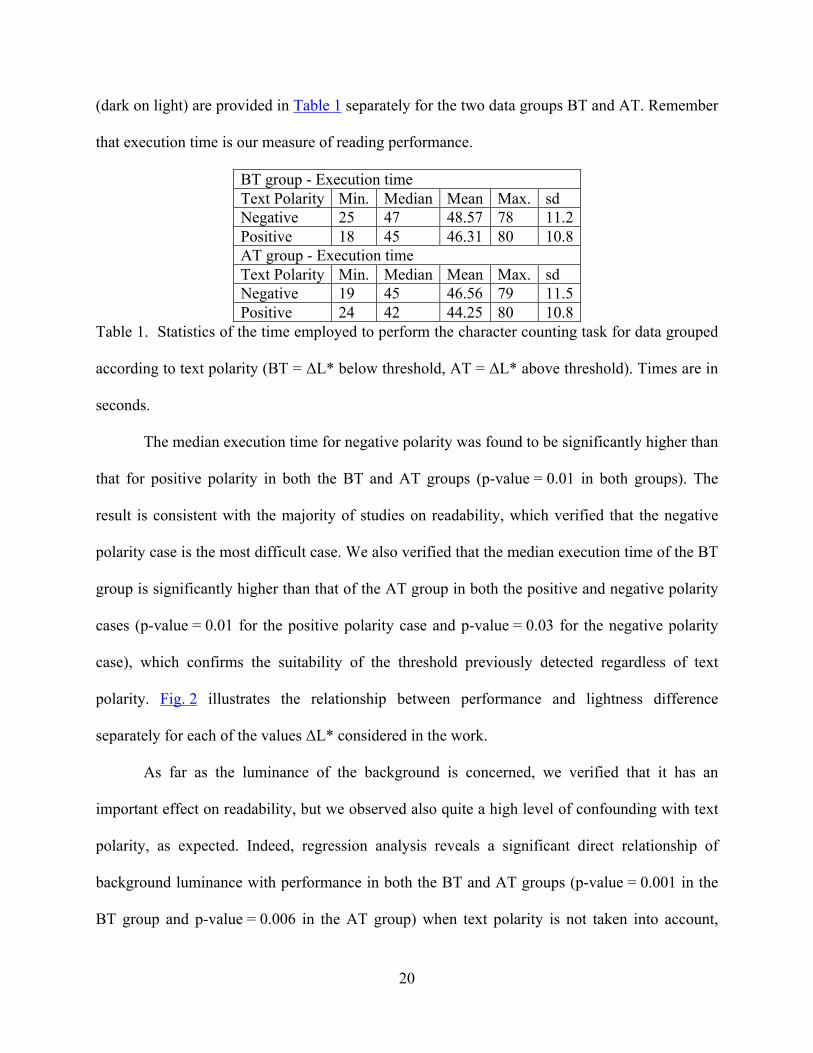
(dark on light) are provided in Table 1 separately for the two data groups BT and AT. Remember
that execution time is our measure of reading performance.
BT group - Execution time Text Polarity Min. Median Mean Max. sd Negative 25 47 48.57 78 11.2 Positive 18 45 46.31 80 10.8 AT group - Execution time Text Polarity Min. Median Mean Max. sd Negative 19 45 46.56 79 11.5 Positive 24 42 44.25 80 10.8
Table 1. Statistics of the time employed to perform the character counting task for data grouped
according to text polarity (BT = ΔL* below threshold, AT = ΔL* above threshold). Times are in
seconds.
The median execution time for negative polarity was found to be significantly higher than
that for positive polarity in both the BT and AT groups (p-value = 0.01 in both groups). The
result is consistent with the majority of studies on readability, which verified that the negative
polarity case is the most difficult case. We also verified that the median execution time of the BT
group is significantly higher than that of the AT group in both the positive and negative polarity
cases (p-value = 0.01 for the positive polarity case and p-value = 0.03 for the negative polarity
case), which confirms the suitability of the threshold previously detected regardless of text
polarity. Fig. 2 illustrates the relationship between performance and lightness difference
separately for each of the values ΔL* considered in the work.
As far as the luminance of the background is concerned, we verified that it has an
important effect on readability, but we observed also quite a high level of confounding with text
polarity, as expected. Indeed, regression analysis reveals a significant direct relationship of
background luminance with performance in both the BT and AT groups (p-value = 0.001 in the
BT group and p-value = 0.006 in the AT group) when text polarity is not taken into account,

21
indicating that a light background facilitates readability, but the statistical significance drops in
both groups when the relationship is studied separately for polarity. The indication that a light
background is preferable still holds in the BT group with negative polarity and AT group with
positive polarity. These results are in agreement with previous studies.34, 35
Fig. 2. Plot of the median times for the execution of the test with color combinations at
different levels of lightness difference.
Chromatic contrast
Let us first note that usually in the studies about the role of color in reading, only a few color
combinations are considered and the observers are asked to perform the reading task for each of
them. To the contrary, in our study each color combination was randomly selected within the
Munsell Atlas and we had therefore a dataset of color combinations that span the entire gamut of
the Munsell Atlas rendered on the sRGB color space. Since we verified that we did not have
duplicate records, only one observer tested each color combination.
In order to quantify the chromatic contrast in our color combinations we use the CIE94
color difference formula, recommended by CIE in 1994 and based on the CIELAB space,
sometimes abbreviated as .47 More recently recommendations exist (i.e. CIEDE2000),
however results indicate that for a set of CRT colors with large differences CIE94 is a good
choice.48 Luminance contrast and chromatic contrast are not additive in reading performance,

22
therefore in the CIE94 equation we always set ΔL* = 0 to evaluate only chromatic contrast. We
indicate this measure with .
When using the CIE formulæ to measure chromatic contrast, the color attributes of
foreground and background are treated without any distinction, as these formulæ have been
defined for the comparison of two equivalent color samples. Since in the case of readability
foreground and background colors should be treated differently, as it is confirmed by the effect
of text polarity, at first we partitioned the data according to chroma polarity, defined as the sign
of the difference between the chroma of the background and the chroma of the foreground, that
is, . Table 2 lists the median execution times for the subsets considered.
Negative Polarity Positive Polarity Median times ΔC*< 0 ΔC* > 0 ΔC* < 0 ΔC* > 0
BT group 45 49.05 44 45 AT group 44.5 46 40 43
Table 2. Median execution times for data grouped according to lightness difference (BT and
AT), text polarity and chroma polarity. Times are in seconds.
The most interesting information provided by Table 2 concerns the two extreme cases. In
the already difficult case of difference in lightness below threshold and negative polarity, the
median execution time for ΔC* > 0 was found to be significantly higher than that for ΔC* < 0 (p-
value = 0.03), suggesting that a background more chromatic than the foreground makes reading
even more difficult. In the easier case of difference in lightness above the threshold and positive
polarity, the median execution time for ΔC* < 0 was found to be significantly lower than that for
ΔC* > 0 (p-value = 0.01), suggesting that a background less chromatic than the foreground
makes reading even more easy. Also in the other two cases there is an indication that a
background less chromatic than the foreground can facilitate reading, but the differences
observed are not statistically significant. To deepen our understanding of the above result, we

23
defined a “Low Chromatic” group (LC), which includes data from color combinations where the
chroma of the background is lower than 16, and a “High Chromatic” group (HC), which includes
data from color combinations where the chroma of the background is greater than 20, and looked
at the execution times based on this further partition of the data. The threshold of 16 and 20 were
derived empirically. Figure 3 shows samples of combinations from the LC and HC groups, and
Table 3 reports the median execution times for the two sets in the case ΔC* < 0. In the case of
ΔC* > 0, for the LC group we had almost no data, due to the low value of the background’s
chroma, and therefore the median times for the HC group were practically the same as shown in
Table 2.
From Table 3 it can be seen that the lowest execution time of Table 2 (40 sec), which refers to
the easy case of difference in lightness above threshold and positive polarity, is mainly due to the
color combinations with a low chroma background.
Negative Polarity Positive Polarity Median times
ΔC* < 0 ΔC* > 0 ΔC* < 0 ΔC* > 0 LC group 45.5 No records 44 No records BT group
HC group 45 49.5 44 45 LC group 45 No records 38 No records AT group
HC group 44 46 42.5 43 Table 3. Median execution times for data grouped according to lightness difference (BT
and AT), text polarity, chroma polarity, and background chroma (LC and HC). Times are in
seconds.
The possible dependence of the reading times from , which, we remind, is our
measure of chromatic contrast, was studied only in the two cases of greater interest above
highlighted, namely the most difficult case of difference in lightness below threshold, negative
polarity and ΔC* > 0 and the easiest case of difference in lightness above threshold, positive

24
polarity and ΔC* < 0. By using regression analysis we verified that in the first case there is a
significant (p-value = 0.003) inverse relationship between reading performance and chromatic
contrast; execution times increase as chromatic contrast increases, indicating a penalizing effect
of this parameter. In the second case, on the contrary, the relationship is not significant, and this
is consistent with the conclusions of other studies, which found that the chromatic contrast does
not improve reading performance when a sufficient luminance contrast is present.
Fig. 3. Examples of color combinations in the LC group (left) and HC group (right).

25
Fig. 4. Median execution times for colored text on low chromatic background. Color
combinations are grouped according to the hue of the text into the five principal hues in the
Munsell Atlas (Red, Yellow, Green, Blue, and Purple). PN and PP denote negative and positive
polarity, respectively. BT and AT denote ΔL* below and above threshold, as before.
Hue of the text
In order to evaluate the effect of the hue we considered the principal hue intervals defined on the
Munsell Atlas: red (R), yellow (Y), green (G), blue (B), and purple (P). Given that we have
verified that a low chromatic background is more suitable for comfortable reading, we consider
only the LC group previously defined. For this analysis, the data is partitioned according to
lightness difference, text polarity and hue. We did not partition also for chroma polarity since,
due to the low value of Cb* in the LC group, almost all color combinations have ΔC* < 0, as
already pointed out. As a result of splitting the data of the LC group into 20 segments, we are left
with groups of very small size compared with those used in the previous analyses and therefore
we did not perform any statistical analysis. However, by observing the reading times (Figure 4)
we may at least note that red and blue text is very difficult with low luminance contrast (BT) and
darker background (NP), whereas yellow text is very difficult with low luminance contrast (BT)
and lighter background (PP). In addition we note that with high luminance contrast (AT) and
lighter background (PP), which is our easiest condition, the hue of the text does not appear to

26
have much influence on readability, apart from green, which seems to facilitate the reading even
more.
Green appears to be the most readable text also below threshold. This finding is
consistent with that of Knoblauch and colleagues,13 which found that at a low luminance contrast
(0.12 units of Michelson contrast) the color indicated with BG (blue-green) is the case with best
reading performance. We have verified that, according to our hue subdivision, that color is green.
Conclusion
In this paper, we have presented a study on the readability of text rendered with luminance and
chromatic contrast on the Web. Our analysis of reading performance and color dimensions
confirms our previous finding that in the design of a textual display one should consider ensuring
a proper luminance contrast between foreground and background that we identified in 30 units of
CIE lightness difference, where lightness is computed from RGB data assuming the sRGB color
space. In addition, to the extent of a pleasant color selection, one should also take into account
that dark text on light background is more readable. In particular, a light low chromatic
background is the choice that results preferable from our study. Often a vivid-colored
background is used to highlight words so they can easily be found; the analysis of the effect of
the chromatic contrast suggests that when it is used to highlight paragraphs, it should instead be
muted so the text is more readable. Our conclusions are coherent with those of previous
reference studies in the field, and we think that this provides an adequate validation of our Web-
based experiment.

27
Reference List
1. S. Zuffi, P. Scala, C. Brambilla, and G. Beretta, "Web-based vs. controlled environment psychophysics experiments - art. no. 649407," Image Quality and System Performance IV 6494, 49407-49407 (2007).
2. C. B. Mills, "Reading text from computer screens," ACM Computer Surveys 19(4), 329-358 (1987).
3. S. Zuffi, G. Beretta, and C. Brambilla, "A color selection tool for the readability of textual information on Web pages - art. no. 606108," Internet Imaging VII 6061, 6108-6108 (2006).
4. S. Zuffi, C. Brambilla, G. Beretta, and P. Scala, "Human computer interaction: Legibility and contrast," 14th International Conference on Image Analysis and Processing, Proceedings, 241-246 (2007).
5. B. Caldwell, M. Cooper, L. Guarino Reid, and G. Vanderheiden, "Web Content Accessibility Guidelines (WCAG) 2.0" (11 December 2008, 2008), retrieved http://www.w3.org/TR/WCAG20/.
6. M. A. Tinker, The Legibility of Print (Iowa State University Press, 1963). 7. G. E. Legge, Psychophysics of Reading (Lawrence Erlbaum Associates, Mahwah, New
Jersey, 2006). 8. R. H. Hall and P. Hanna, "The impact of web page text-background colour combinations
on readability, retention, aesthetics and behavioural intention," Behaviour & Information Technology 23(3), 183-195 (2004).
9. A. C. Naiman, "The Use of Grayscale for Improved Character Presentation," Doctor of Philosophy (University of Toronto, Toronto, 1991).
10. G. W. Radl, "Experimental investigations for optimal presentation-mode and colours of symbols on the CRT-screen," in Ergonomics Aspects of Visual Display Terminals, E. Grandjean and E. Vigliani, eds. (Taylor and Francis, London, 1980), pp. 127-136.
11. H. Bouma, "Visual reading processes and the quality of text displays," in Ergonomic Aspects of Visual Display Terminals, E. Grandjean and E. Vigliani, eds. (Taylor and Francis, London, 1980), pp. 101-114.
12. M. Bruce and J. J. Foster, "The visibility of colored characters on colored backgrounds in Viewdata displays," Visible Lang. 16(4), 382-390 (1982).
13. K. Knoblauch, A. Arditi, and J. Szlyk, "Effects of chromatic and luminance contrast on reading," J Opt Soc Am A 8(2), 428-439 (1991).
14. G. E. Legge, G. S. Rubin, and A. Luebker, "Psychophysics of reading V. The role of contrast in normal vision," Vision Res 27(7), 1165-1177 (1987).
15. G. E. Legge, D. H. Parish, A. Luebker, and L. H. Wurm, "Psychophysics of reading XI. Comparing color contrast and luminance contrast," J Opt Soc Am A 7(10), 2002-2010 (1990).
16. P. Whittle, "Contrast colors," in Colour Perception: From Light To Object, R. Mausfeld and D. Heyer, eds. (Oxford University Press, 2003).
17. B. McIntyre, "A Constraint-based Approach to Dynamic Colour Management for Windowing Interfaces," Master’s Thesis (Univ. of Waterloo, Ontario, 1991).

28
18. H. L. Snyder, "Image quality," in Handbook of Human-Computer Interaction (Elsevier, Amsterdam, 1993).
19. K. K. Shiel and C. C. Lin, "Effects of screen type, ambient illumination, and color combination on VDT visual performance and subjective preference," International Journal of Industrial Ergonomics 26(5), 527-536 (2000).
20. G. Beretta, "Color aspects of variable data proofing," Internet Imaging VI 5670, 175-182 (2005).
21. K. Sakatani and T. Itoh, "Image Processing Apparatus," 6,587,225 B1 (2003). 22. M. Nielsen and M. Stokes, "The Creation of the sRGB ICC Profile," in Sixth Color
Imaging Conference: Color Science. Systems and Applications, (IS&T, Scottsdale, AZ, 1998), pp. 253-257.
23. D. Travis, Effective Color Displays, Theory and Practice (Academic Press, 1991). 24. K. K. Shieh and M. T. Chen, "Effects of screen color combination, work-break schedule,
and workpace on VDT viewing distance," International Journal of Industrial Ergonomics 20(1), 11-18 (1997).
25. C. Chase, A. Ashourzadeh, C. Kelly, S. Monfette, and K. Kinsey, "Can the magnocellular pathway read? Evidence from studies of color," Vision Res 43(10), 1211-1222 (2003).
26. G. E. Legge and G. S. Rubin, "Psychophysics of reading IV. Wavelength effects in normal and low vision," J Opt Soc Am A 3(1), 40-51 (1986).
27. M. L. Matthews, "The influence of colour on CRT reading performance and subjective comfort under operational conditions," Appl Ergon 18(4), 323-328 (1987).
28. G. Wyszecki and G. S. Stiles, Color Science: Concepts and Methods, Quantitative Data and Formulae, 2nd ed. (Wiley, 1982).
29. ANSI, "American National Standard for Human Factors Engineering of Visual Display Terminal Workstations," (The Human Factors Society, Inc., 1988).
30. J. Schanda, "Colour and the Visual Display Unit," in Colour 1993 Conference, (AIC, Budapest, 1993).
31. G. Westheimer, P. Chu, W. Huang, T. Tran, and R. Dister, "Visual acuity with reversed-contrast charts: II. Clinical investigation," Optom Vis Sci 80(11), 749-752 (2003).
32. S. Pastoor, "Legibility and subjective preference for color combinations in text," Hum Factors 32(2), 157-171 (1990).
33. M. S. Sanders and E. J. McCormick, Human Factors in Engineering and Design, 7th Edition (McGraw-Hill, New York, 1993).
34. L. F. V. Scharff and A. J. Ahumada, "Understanding text polarity effects," Perception 34, 133-133 (2005).
35. C. C. Lin, "Effects of screen luminance combination and text color on visual performance with TFT-LCD," International Journal of Industrial Ergonomics 35(3), 229-235 (2005).
36. S. Fukuzumi, T. Yamazaki, K. Kamijo, and Y. Hayashi, "Physiological and psychological evaluation for visual display colour readability: a visual evoked potential study and a subjective evaluation study," Ergonomics 41(1), 89-108 (1998).
37. J. A. J. Roufs and M. C. Boschman, "Text quality metrics for visual display units: II. Methodological aspects," Displays 18(1), 37-43 (1997).
38. J.-H. Wu and Y. Yuan, "Improving searching and reading performance: the effect of highlighting and text color coding," Information and Management 40(7), 617-637 (2003).
39. R. P. Carver, Reading Rate: A review of research and theory (Academic Press, Inc., San Diego, 1990).

29
40. A. Buchner and N. Baumgartner, "Text - background polarity affects performance irrespective of ambient illumination and colour contrast," Ergonomics 50(7), 1036-1063 (2007).
41. L. F. V. Scharff, A. L. Hill, and A. J. Ahumada, "Discriminability measures for predicting readability of text on textured backgrounds," Optics Express 6(4), 81-91 (2000).
42. M. C. Boschman and J. A. J. Roufs, "Text quality metrics for visual display units: II. An experimental survey," Displays 18(1), 45-64 (1997).
43. C. Poynton, Digital Video and HDTV (Morgan Kaufmann Publishers, San Francisco, 2003).
44. G. W. Meyer and D. P. Greenberg, "Perceptual Color Spaces for Computer Graphics," in Color and the Computer (Academic Press, 1987), pp. 83-100.
45. G. A. Agoston, Color theory and its application in art and design, Springer series in optical sciences (Springer-Verlag, Berlin, 1987), Vol. 19.
46. M. Hollander and D. Wolfe, Nonparametric Statistical Methods, 2nd Edition (Wiley, New York, 1999).
47. CIE, "Industrial Colour-Difference Evaluation," (Vienna (A), 1995). 48. K. M. R. Ho, G. Cui, M. R. Luo, and B. Rigg, "Assessing colour differences with
different magnitudes," in Interim Meeting of the International Color Association, (AIC, 2004), pp. 117-120.