understanding and communicating good presentation design · understanding and communicating good...
TRANSCRIPT
Understanding and Communicating Good Presentation Design 1 2018 APMP Bid & Proposal Con
Understanding and Communicating Good Presentation Design Presented by Bruce Farrell APMP Bid and Proposal Con 2018

Understanding and Communicating Good Presentation Design 2 2018 APMP Bid & Proposal Con
Preface This is different I have been giving presentations about presentations for a long time now. I generally talk about best practices and how we can move from slide after slide of bullets. Instead, I encourage people to develop content that frees the presenter to engage and inspire the audience. To do so, I often trot out some horrible slides, compare them to some great slides, and offer a series of tips.
But this presentation is different.
Because this time, I decided to delve into the science of presentations. I already knew what the design experts say—what do scientists have to say about how we process information and learn? What makes something memorable? Why do some presenters connect with an audience and others fail?
I wasn’t actually surprised by what I discovered—design best practices are supported by science. Go figure. But I was surprised by how much science aligned with established design standards and how important good design really was to learning and retention.
So the stakes are big! Death to bullets! Think visually! Choose to connect with your audience rather than bore them.
The Agenda This presentation is broken into three general categories
What’s at Stake Why does any of this matter?
How the Brain Works How does our brain process information?
Presentation Design Tips Using what we’ve learned about how the brain works, we will go over some design tips to help you connect with your audience

Understanding and Communicating Good Presentation Design 3 2018 APMP Bid & Proposal Con
What’s at Stake?
Pretty much every design-related presentation I’ve given starts with the same question: why does design matter? I ask because I think it’s important to get everyone on the same page before we move on. I always get a range of good answers from my audience. Good design supports the brand. Good design is appealing to the eye. Good design helps convey the information. Those are all true and there are many good reasons to design something well.
I like Edward Tufte’s take: “Good design is clear thinking made manifest.” That is, good design is the result of a clear idea, fully realized.
I generally tell my audience that good design is evidence of care. It’s evidence of forethought and effort. When you deliver a well-designed presentation (or a proposal), it speaks volumes to your audience. It says, “I cared enough to give you my best.” That is, you didn’t settle for a brain dump directly into PowerPoint. Real thought and effort went into it.
It says, “I value my audience.” And who doesn’t like to feel valued?
And good design is also supported by science. As I found out researching this topic, design matters because a well-designed presentation will better connect with your audience and they are more likely to remember what you said and remember it favorably.
Understanding and Communicating Good Presentation Design 4 2018 APMP Bid & Proposal Con
How the Brain Works
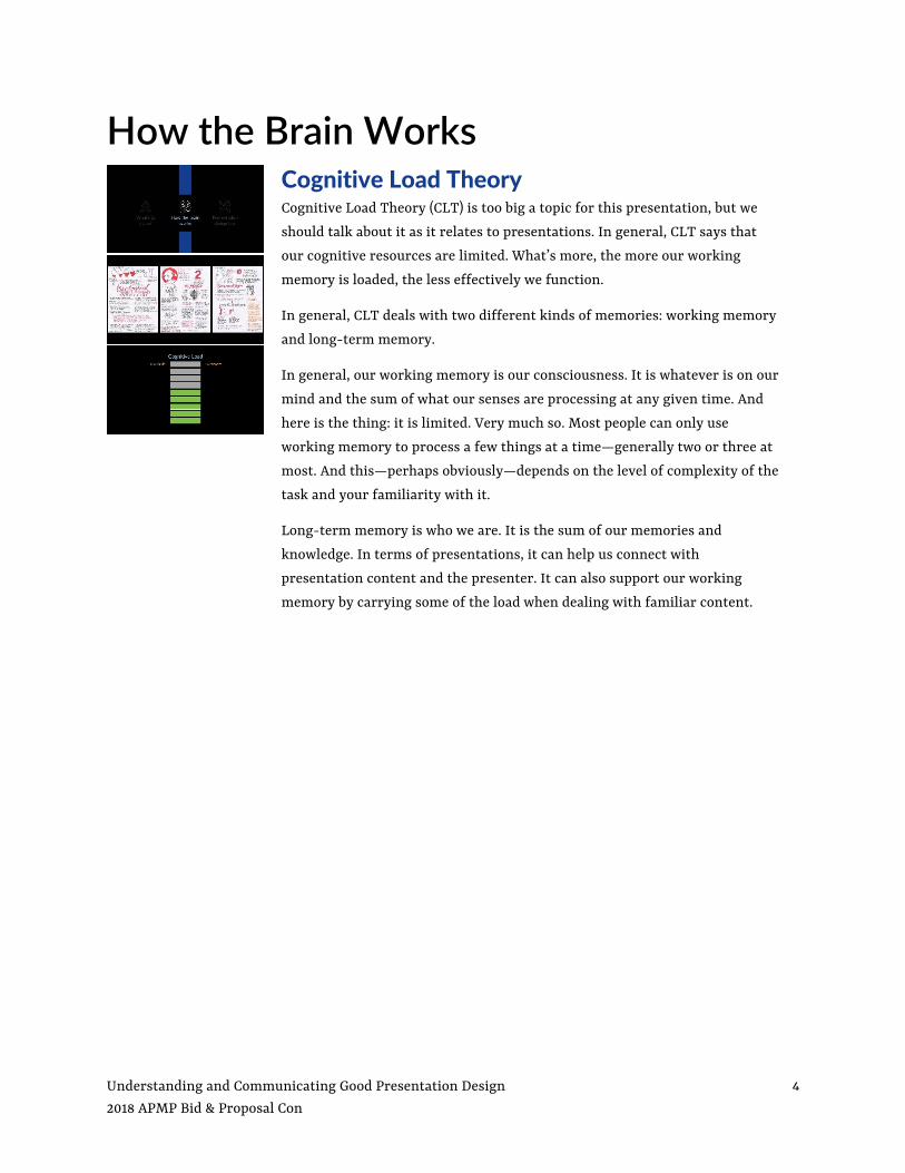
Cognitive Load Theory Cognitive Load Theory (CLT) is too big a topic for this presentation, but we should talk about it as it relates to presentations. In general, CLT says that our cognitive resources are limited. What’s more, the more our working memory is loaded, the less effectively we function.
In general, CLT deals with two different kinds of memories: working memory and long-term memory.
In general, our working memory is our consciousness. It is whatever is on our mind and the sum of what our senses are processing at any given time. And here is the thing: it is limited. Very much so. Most people can only use working memory to process a few things at a time—generally two or three at most. And this—perhaps obviously—depends on the level of complexity of the task and your familiarity with it.
Long-term memory is who we are. It is the sum of our memories and knowledge. In terms of presentations, it can help us connect with presentation content and the presenter. It can also support our working memory by carrying some of the load when dealing with familiar content.

Understanding and Communicating Good Presentation Design 5 2018 APMP Bid & Proposal Con
Working Memory So our working memory is what we’re using to process our world—including presentations. What do we know about working memory?
Limited Capacity Our working memory can only hold a few things together at the same time. If we are tasked with several complex tasks at once, we can generally only concentrate on one thing at a time. If we try to do more, we lose information and details.
Limited Duration Our working memory is fickle and things rarely stay in our head for more than 20 or 30 seconds. Keeping our working memory on a single task for an extended period is difficult.
Easily Distracted We are easily distracted. New sensory input will usually redirect our attention and make it harder for us to concentrate on a single topic.
Likes Familiar Content The more familiar content, the less taxing it is on our working memory. That is because we draw upon our long-term memory to fill in the details. So for most of us, it’s relatively easy to discuss proposal issues, but something like particle physics will tax our memory quickly.
Increases with Interest …or at least it’s less easily distracted. If you are engaged in a topic or connect with a speaker, you are less likely to be distracted and you are better able to concentrate for longer periods of time.

Understanding and Communicating Good Presentation Design 6 2018 APMP Bid & Proposal Con
The Myth of Multitasking Many of us like to think we’re good at multitasking. But we’re not. In fact, when we think we’re multitasking, we’re actually rapidly switching between various tasks rather than concentrating on them concurrently. And all the data says the more you try to multitask, the less efficient you become. If you are always juggling several things at once, you will be less productive and more prone to making errors.
It’s interesting to note that brain scans show that people need to reset between tasks. Our brains literally reset so they can reorient to the new task, the new location, the new page, etc. This reset takes longer as the tasks or sensory input increases in complexity. When we do it too much or abruptly, we are more prone to making mistakes.
Ever wonder why you sometimes forget what you’re looking for in another room? It’s not because you’re stupid. It’s because moving to another room causes our brain to adjust (reset) to the new environment. And that process sometimes causes details—like what you were looking for—to slip away.
So if you want to be more productive—stop trying to do a lot of things at once. And there are some implications when it comes to presentations (#dontreadyourslides).
Vision vs. Hearing This isn’t really a battle because vision is the king of your senses. We are visual creatures first. In fact, Roughly 30 percent of the neurons in the brain's cortex are devoted to vision, compared with 8 percent for touch, and 2 percent for hearing. It should be no surprise (then) that people remember roughly ten percent of what they hear, but that goes up to 65 percent if it is accompanied by a visual.
Also worth noting that we process visuals much faster than text. I’ve read in many places that the brain processes images 60,000 times faster than text—though I’ve not found the specific study citing this number. I’ve heard others say it is only 30,000 times faster. Which is still a pretty significant difference.
Understanding and Communicating Good Presentation Design 7 2018 APMP Bid & Proposal Con
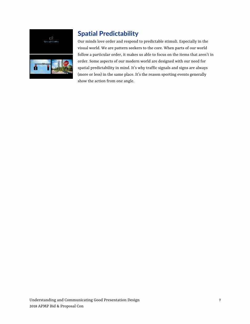
Spatial Predictability Our minds love order and respond to predictable stimuli. Especially in the visual world. We are pattern seekers to the core. When parts of our world follow a particular order, it makes us able to focus on the items that aren’t in order. Some aspects of our modern world are designed with our need for spatial predictability in mind. It’s why traffic signals and signs are always (more or less) in the same place. It’s the reason sporting events generally show the action from one angle.
Understanding and Communicating Good Presentation Design 8 2018 APMP Bid & Proposal Con
Presentation Design Tips
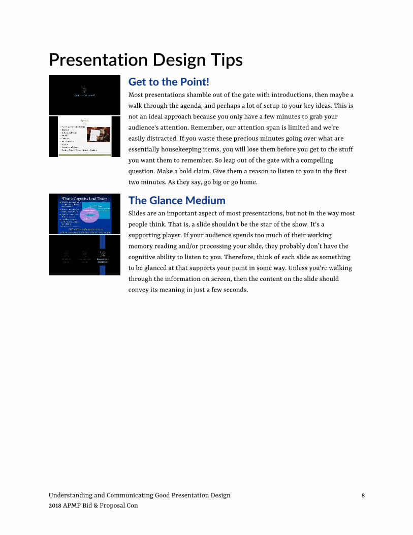
Get to the Point! Most presentations shamble out of the gate with introductions, then maybe a walk through the agenda, and perhaps a lot of setup to your key ideas. This is not an ideal approach because you only have a few minutes to grab your audience's attention. Remember, our attention span is limited and we’re easily distracted. If you waste these precious minutes going over what are essentially housekeeping items, you will lose them before you get to the stuff you want them to remember. So leap out of the gate with a compelling question. Make a bold claim. Give them a reason to listen to you in the first two minutes. As they say, go big or go home.
The Glance Medium Slides are an important aspect of most presentations, but not in the way most people think. That is, a slide shouldn't be the star of the show. It's a supporting player. If your audience spends too much of their working memory reading and/or processing your slide, they probably don’t have the cognitive ability to listen to you. Therefore, think of each slide as something to be glanced at that supports your point in some way. Unless you're walking through the information on screen, then the content on the slide should convey its meaning in just a few seconds.

Understanding and Communicating Good Presentation Design 9 2018 APMP Bid & Proposal Con
Keep it Simple When I talk about slides, I probably talk more about brevity than anything else. The vast majority of slides I see have too much on them. Too many words, too many images, too much clutter. Just too much stuff. So when I’m working on redesigning slides, the first thing I do is remove anything on the slide that isn’t necessary. If it doesn’t help me convey my idea, it doesn’t belong on the slide. If there is more than one idea on a slide, I split the slides until each idea gets its own slide.
What do I usually take off the slide?
Text Most slides have far too much text. Research has shown that people can’t both listen to the presenter and read text simultaneously. At least not very well. If you want your audience’s attention, don’t ask them to read along. If you want to leave them with something to read later, give them a leave behind (like this).
Images Using imagery is generally a trait of strong presentation design, but images are often used to “spruce up” a presentation rather than help convey ideas. If they don’t help translate your idea to your audience, they are clutter. Remove them.
Branding Most presentations are over-branded. There is no presentation that benefits from a logo on every page or templates that get in the way of your ideas. I leave logos on the front and back cover and my slides completely uncluttered.
Page Numbers This is a pet peeve of mine. Slide numbers are essentially useless on the screen and they don’t belong on a slide. They are for the print medium. Let’s keep them there.

Understanding and Communicating Good Presentation Design 10 2018 APMP Bid & Proposal Con
Predictable Layout Remember, our minds love order (spatial predictability). Provide a predictable navigation scheme for your audience. Each time you break that scheme or items hop around from page to page, your brain needs to reorient to the new arrangement.
Breaking the pattern can actually work in your favor if you do so intentionally. Something different draws our attention and when used judiciously you can direct the audience’s attention to a change in direction, a key point, or just break the monotony.
Build Rapport It’s critical for any presenter to build some level of rapport with the audience. If your audience is engaged and interested in you, they are less likely to be distracted and more likely to stay with you throughout the presentation. So start with something compelling, interesting, or (if it’s appropriate) something funny. Tell stories that are relevant to the audience. Make eye contact. Smile.
Have a Plan Most people develop a presentation by opening PowerPoint. They choose a template, throw a title on the first page, then go about populating the other slides with bulleted lists of their ideas, points, and sub points. When they have all the info they want to cover in the deck, they are done. If there is time, some afterthought photos are added to some slides. Or worse <<gulp>> clipart.
Don’t be most people.
If you want to hold your audience’s attention, you need to tell a story. Build a presentation that punctuates your key points. Hold slides for audience participation or questions. Be sure to shake things up every five or ten minutes with a question to the audience, a video, a break in the routine. You are more likely to maintain their attention throughout the presentation if you do these things.
How do you make such a plan? By not starting in PowerPoint. Map your presentation using sticky notes. Put stars on your key points. Move them around to see how they fit best. Once you have the plot to your story arranged, then start building your deck around your key ideas.
Your audience will be grateful.

Understanding and Communicating Good Presentation Design 11 2018 APMP Bid & Proposal Con
Some Extra Items Don’t Print Slides! Most people use their slides as both a presentation and a leave behind document. This is almost always a bad idea, because the design methodology for each is different and a document intending to do both will do neither well. Most really good presentations don’t make a lot of sense without the presenter standing in front of them. And most “leave behind” documents don’t work on screen. The solution? Create two documents. It takes more work, but it’s absolutely best practice and worth your time and energy.
If you do print your slides, don’t hand them out before your presentation. Why? Because your audience will be reading your presentation rather than listening to you. And they are there to see you.
Print Documents As noted, most presentations should come along with a print document. It may be an outline of your presentation, a focused look at your proposal, organizational information, or other collateral material.
For many situations, you should consider foregoing an onscreen presentation and using a printed document as the focus of your presentation. For example, if you are delivering your presentation to a small group, you may walk them through a meeting booklet or even a one page “placemat” document. This can be a more engaging way to present information.
Be a Student If you want to be a good presenter you need to study. Read the best books on the subject. I routinely recommend the works of Nancy Duarte (slide:ology) and Garr Reynolds (Presentation Zen) because I believe they convey the right ideas and principles in an easily digested format. Broadly speaking, I would avoid books that focus on "how to use PowerPoint,” at least until you understand what goes into a good screen presentation. These books tend to focus on what PowerPoint can do and focus very little on design. And a lot of what PowerPoint "can do," should be avoided. Keep it simple.
You should also learn lessons from the best presenters. If you come across a great presentation at a conference, ask yourself what they did to make it such a success. If there are ideas you can incorporate into your own presentations, do so! There are also some great sources on the Internet. For example, I make a point to check out the presentations on Ted Talks (www.tedtalks.com). In addition to thought-provoking content, there are some outstanding presenters. Learn from them.

Understanding and Communicating Good Presentation Design 12 2018 APMP Bid & Proposal Con
Finally… Don’t settle.
The stakes are high.
There is a reason “Death by PowerPoint” is a term we all immediately understand. We’ve been subjected to countless presentations supported by bland, tedious slides. Too often, they are presented from behind a podium and/or read verbatim. And that’s just sad.
Be part of the solution. In doing so, you will separate yourself (and your company) from the competition. When you engage your audience and give them smart, inspiring visuals, you are separating yourself from the pack.
Fair warning – This will take some effort. Good presentations require effort. They take time and require a basic understanding of what goes into a compelling presentation. This presentation is a start, but if you really want to raise your game, keep studying. Be an advocate for good design.
Remember, the stakes are high. Don’t settle.
Be awesome.
Understanding and Communicating Good Presentation Design 13 2018 APMP Bid & Proposal Con
Resources Presentation Design slide:ology, by Nancy Duarte
Resomate, by Nancy Duarte
HBR Guide to Persuasive Presentations, by Nancy Duarte
Presentation Zen, by Garr Reynolds
Presentation Zen Design, by Garr Reynolds
General Design Design Basics Index, by Jim Krause
Design for Non-Designers, by Robin Williams
Storytelling with Data, by Cole Nussbaumer Knaflic
The Brain Brain Rules, by John Medina
Cognitive Load, by John Sweller, Paul Ayres, and Slava Kalyuga
Various Links Garr Reynold’s Top Ten Slide Tips http://www.garrreynolds.com/preso-tips/design/
Think Your Multitasking? Think Again https://www.npr.org/templates/story/story.php?storyId=95256794
The Goldfish Myth https://business.linkedin.com/marketing-solutions/blog/best-practices--content-marketing/2016/the-great-goldfish-attention-span-myth--and-why-its-killing-cont
10 scientific reasons people are wired to respond to your visual marketing https://www.canva.com/learn/visual-marketing/
Pixabay (Free images) https://pixabay.com/
Icons for Everything https://thenounproject.com/
Understanding and Communicating Good Presentation Design 14 2018 APMP Bid & Proposal Con
The Presenter
I am passionate about design. I help people identify and organize their key points, then work with them to translate their "big ideas” into quality documents and presentations. I work with pursuit teams, conference presenters, and keynote speakers to develop business documents that make an impact.
By day, I manage a proposal team for Plante Moran, a professional services firm. It’s a great firm comprised of some of the finest people I know. We do great work. I also conduct proposal and presentation design workshops for organizations. These activities focus on developing best practice habits in non-design staff, enabling them to design and deliver compelling presentations.
By night, I’m a musician who plays all over the Detroit area in various projects.
Bruce Farrell 248.223.3342 [email protected] http://brucefarrellmusic.com/