report writing: communicating data analysis...
TRANSCRIPT

20
Report Writing: Communicating Data AnalysisResults
Chapter Preview. Statistical reports should be accessible to different types of readers. Thesereports inform managers who desire broad overviews in nontechnical language as well as an-alysts who require technical details in order to replicate the study. This chapter summarizesmethods of writing and organizing statistical reports. To illustrate, we will consider a reportof claims from third party automobile insurance.
20.1 Overview
The last relationship has been explored, the last parameter has been estimated, thelast forecast has been made, and now you are ready to share the results of yourstatistical analysis with the world. The medium of communication can come inmany forms: you may simply recommend to a client to “buy low, sell high” or givean oral presentation to your peers. Most likely, however, you will need to summarizeyour findings in a written report.
Communicating technical information is difficult for a variety of reasons. First,in most data analyses there is no one “right” answer that the author is trying tocommunicate to the reader. To establish a “right” answer, one only need positionthe pros and cons of an issue and weigh their relative merits. In statistical reports,the author is trying to communicate data features and the relationship of the datato more general patterns, a much more complex task. Second, most reports writ-ten are directed to a primary client, or audience. In contrast, statistical reportsare often read by many different readers whose knowledge of statistical conceptsvaries extensively; it is important to take into consideration the characteristics ofthis heterogeneous readership when judging the pace and order in which the mate-rial is presented. This is particularly difficult when a writer can only guess whomthe secondary audience may be. Third, authors of statistical reports need to havea broad and deep knowledge base, including a good understanding of underlyingsubstantive issues, knowledge of statistical concepts and language skills. Drawingon these different skill sets can be challenging. Even for a generally effective writer,any confusion in the analysis is inevitably reflected in the report. Provide enough
details of the studyso that the analysiscould beindependentlyreplicated withaccess to theoriginal data.
Communication of data analysis results can be a brief oral recommendation to aclient or a 500-page Ph.D. dissertation. However, a 10- to 20-page report summariz-ing the main conclusions and outlining the details of the analysis suffices for mostbusiness purposes. One key aspect of such a report is to provide the reader with an
465

466 Report Writing: Communicating Data Analysis Results
understanding of the salient features of the data. Enough details of the study shouldbe provided so that the analysis could be independently replicated with access tothe original data.
20.2 Methods for Communicating Data
To allow readers to interpret numerical information effectively, data should be pre-sented using a combination of words, numbers and graphs that reveal its complexity.Thus, the creators of data presentations must draw on background skills from severalareas including:
• an understanding of the underlying substantive area,• a knowledge of the related statistical concepts,• an appreciation of design attributes of data presentations and• an understanding of the characteristics of the intended audience.
This balanced background is vital if the purpose of the data presentation is to inform.If the purpose is to enliven the data (“because data are inherently boring”) or toattract attention, then the design attributes may take on a more prominent role.Conversely, some creators with strong quantitative skills take great pains to simplifydata presentations in order to reach a broad audience. By not using the appropriatedesign attributes, they reveal only part of the numerical information and hide thetrue story of their data. To quote Albert Einstein, “You should make your modelsas simple as possible, but no simpler.”
This section presents the basic elements and rules for constructing successful datapresentations. To this end, we discuss three modes of presenting numerical in-formation: (i) within text data, (ii) tabular data and (iii) data graphics. Thesethree modes are ordered roughly in the complexity of data that they are designedto present; from the within text data mode that is most useful for portraying thesimplest types of data, up to the data graphics mode that is capable of conveyingnumerical information from extremely large sets of data.
Within Text Data
Within text data simply means numerical quantities that are cited within the usualsentence structure. For example:
The price of Vigoro stock today is $36.50 per share, a record high.
When presenting data within text, you will have to decide whether to use figuresor spell out a particular number. There are several guidelines for choosing betweenfigures and words, although generally for business writing you will use words if thischoice results in a concise statement. Some of the important guidelines include:
1. Spell out whole numbers from one to ninety-nine.2. Use figures for fractional numbers.3. Spell out round numbers that are approximations.4. Spell out numbers that begin a sentence.5. Use figures in sentences that contain several numbers.

20.2 Methods for Communicating Data 467
For example:
There are forty-three students in my class.With 0.2267 U.S. dollars, I can buy one Swedish kroner.There are about forty-three thousand students at this university.Three thousand, four hundred and fifty-six people voted for me.Those boys are 3, 4, 6 and 7 years old.
Text flows linearly; this makes it difficult for the reader to make comparisons ofdata within a sentence. When lists of numbers become long or important compar-isons are to be made, a useful device for presenting data is the within text table, alsocalled the semitabular form. For example:
For 2005, net premiums by major line of business written by property andcasualty insurers in billions of US dollars, were:
Private passenger auto — 159.57Homeowners multiple peril — 53.01Workers’ compensation — 39.73Other lines — 175.09.
(Source: The Insurance Information Institute Fact Book 2007.)
Tables
When the list of numbers is longer, the tabular form, or table, is the preferred choicefor presenting data. The basic elements of a table are identified surrounding Table20.1.
Title -
Column Headings -
Stub -
Body¾
Rule -
Table 20.1. Summary Statistics of Stock Liquidity Variables
StandardMean Median deviation Minimum Maximum
VOLUME 13.423 11.556 10.632 0.658 64.572AVGT 5.441 4.284 3.853 0.590 20.772NTRAN 6436 5071 5310 999 36420PRICE 38.80 34.37 21.37 9.12 122.37SHARE 94.7 53.8 115.1 6.7 783.1VALUE 4.116 2.065 8.157 0.115 75.437DEB EQ 2.697 1.105 6.509 0.185 53.628
Source: Francis Emory Fitch, Inc., Standard & Poor’s Compustat,and University of Chicago’s Center for Research on Security Prices.
These are:
1. Title. A short description of the data, placed above or to the side of the table.For longer documents, provide a table number for easy reference within the mainbody of the text. The title may be supplemented by additional remarks, thusforming a caption.
2. Column Headings. Brief indications of the material in the columns.3. Stub. The left hand vertical column. It often provides identifying information for
individual row items.

468 Report Writing: Communicating Data Analysis Results
4. Body. The other vertical columns of the table.5. Rules. Lines that separate the table into its various components.6. Source. Provides the origin of the data.
As with the semitabular form, tables can be designed to enhance comparisons be-tween numbers. Unlike the semitabular form, tables are separate from the mainbody of the text. Because they are separate, tables should be self-contained so thatthe reader can draw information from the table with little reference to the text.The title should draw attention to the important features of the table. The layoutshould guide the reader’s eye and facilitate comparisons. Table 20.1 illustrates theapplication of some basic rules for constructing “user friendly” tables. These rulesinclude:
1. For titles and other headers, STRINGS OF CAPITALS ARE DIFFICULT TOREAD, keep these to a minimum.
2. Reduce the physical size of a table so that the eye does not have to travel as faras it might otherwise; use single spacing and reduce the type size.
3. Use columns for figures to be compared rather than rows; columns are easier tocompare, although this makes documents longer.
4. Use row and column averages and totals to provide focus. This allows readers tomake comparisons.
5. When possible, order rows and/or columns by size in order to facilitate com-parisons. Generally, ordering by alphabetical listing of categories does little forunderstanding complex data sets.
6. Use combinations of spacing and horizontal and vertical rules to facilitate com-parisons. Horizontal rules are useful for separating major categories; verticalrules should be used sparingly. White space between columns serves to separatecategories; closely spaced pairs of columns encourage comparison.
7. Use tinting and different type size and attributes to draw attention to figures.Use of tint is also effective for breaking up the monotonous appearance of a largetable.
8. The first time that the data are displayed, provide the source.
Graphs
For portraying large, complex data sets, or data where the actual numerical valuesare less important than the relations to be established, graphical representations ofdata are useful. Figure 20.1 describes some of the basic elements of a graph, alsoknown as a chart, illustration or figure. These include:
1. Title and Caption. As with a table, these provide short descriptions of the mainfeatures of the figure. Long captions may be used to describe everything that isbeing graphed, draw attention to the important features and describe the con-clusions to be drawn from the data. Include the source of the data here or on aseparate line immediately below the graph.
2. Scale Lines (Axes) and Scale Labels. Choose the scales so that the data fill up asmuch of the data region as possible. Do not insist that zero be included; assumethat the viewer will look at the range of the scales and understand them.
3. Tick Marks and Tick Mark Labels. Choose the range of the tick marks to include

20.2 Methods for Communicating Data 469
Year
1986 1987 1988 1989 1990 1991
−0.3
−0.2
−0.1
0.0
0.1
0.2
0.3
Monthly Return
Legend Plotting Symbols
Axes, Scale Lines
LINCOLNMARKET
Tick Mark
Tick Mark Label
Fig. 20.1. Time series plot of returns from the Lincoln National Corporation and the market.There are 60 monthly returns over the period January, 1986 through December, 1990.
Title HHHHj
almost all of the data. Three to ten tick marks are generally sufficient. Whenpossible put the tick outside of the data region, so that they do not interfere withthe data.
4. Plotting Symbols. Use different plotting symbols to encode different levels of avariable. Plotting symbols should be chosen so that they are easy to identify, forexample, “O” for one and “T” for two. However, be sure that plotting symbolsare easy to distinguish; for example, it can be difficult to distinguish “F” and“E”.
5. Legend (Keys). These are small textual displays that help to identify certainaspects of the data. Do not let these displays interfere with the data or clutterthe graph.
As with tables, graphs are separate from the main body of the text and thusshould be self-contained. Especially with long documents, tables and graphs maycontain a separate story line, providing a look at the main message of the documentin a different way than the main body of the text. Cleveland (1994) and Tufte (1990)provide several tips to make graphs more “user-friendly.”
1. Make lines as thin as possible. Thin lines distract the eye less from the datawhen compared to thicker lines. However, make the lines thick enough so thatthe image will not degrade under reproduction.
2. Try to use as few lines as possible. Again, several lines distract the eye from thedata, which carries the information. Try to avoid “grid” lines, if possible. If youmust use grid lines, a light ink, such as a gray or half tone, is the preferred choice.
3. Spell out words and avoid abbreviations. Rarely is the space saved worth thepotential confusion that the shortened version may cause the viewer.

470 Report Writing: Communicating Data Analysis Results
4. Use a type that includes both capital and small letters.5. Place graphs on the same page as the text that discusses the graph.6. Make words run from left to right, not vertically.7. Use the substance of the data to suggest the shape and size of the graph. For
time series graphs, make the graph twice as wide as tall. For scatter plots, makethe graph equally wide as tall. If a graph displays an important message, makethe graph large.
Of course, for most graphs it will be impossible to follow all these pieces of advicesimultaneously. To illustrate, if we spell out the scale label on a left hand verticalaxis and make it run from left to right, then we cut into the vertical scale. Thisforces us to reduce the size of the graph, perhaps at the expense of reducing themessage.
A graph is a powerful tool for summarizing and presenting numerical information.Graphs can be used to break up long documents; they can provoke and maintainreader interest. Further, graphs can reveal aspects of the data that other methodscannot.
20.3 How to Organize
Writing experts agree that results should be reported in an organized fashion withsome logical flow, although there is no consensus as to how this goal should beachieved. Every story has a beginning and an end, usually with an interestingpath connecting the two endpoints. There are many types of paths, or methodsof development, that connect the beginning and the end. For general technicalwriting, the method of development may be organized chronologically, spatially, byorder of importance, general-to-specific or specific-to-general, by cause-and-effect orany other logical development of the issues. This section presents one method oforganization for statistical report writing that has achieved desirable results in anumber of different circumstances, including the 10- to 20-page report describedpreviously. This format, although not appropriate for all situations, serves as aworkable framework on which to base your first statistical report.
The broad outline of the recommended format is:
1. Title and Abstract2. Introduction3. Data Characteristics4. Model Selection and Interpretation5. Summary and Concluding Remarks6. References and Appendix
Sections (1) and (2) serve as the preparatory material, designed to orient thereader. Sections (3) and (4) form the main body of the report while Sections (5)and (6) are parts of the ending.
Title and Abstract
If your report is disseminated widely (as you hope), here is some disappointingnews. A vast majority of your intended audience gets no further than the title andthe abstract. Even for readers who carefully read your report, they will usually

20.3 How to Organize 471
carry in their memory the impressions left by the title and abstract unless they areexperts in the subject that you are reporting on (which most readers will not be).Choose the title of your report carefully. It should be concise and to the point. Donot include deadwood (phrases like The Study of, An Analysis of ) but do not betoo brief, for example, by using only one word titles. In addition to being concise,the title should be comprehensible, complete and correct. The language of
the abstract shouldbe nontechnical.The abstract is a one- to two-paragraph summary of your investigation; 75 to 200
words are reasonable rules of thumb. The language should be nontechnical as youare trying to reach as broad an audience as possible. This section should summarizethe main findings of your report. Be sure to respond to such questions as: Whatproblem was studied? How was it studied? What were the findings? Because youare summarizing not only your results but also your report, it is generally mostefficient to write this section last.
Introduction
As with the general report, the introduction should be partitioned into three sections:orientation material, key aspects of the report and a plan of the paper.
To begin the orientation material, re-introduce the problem at the level of techni-cality that you wish to use in the report. It may or may not be more technical thanthe statement of the problem in the abstract. The introduction sets the pace, orthe speed at which new ideas are introduced, in the report. Throughout the report,be consistent in the pace. To clearly identify the nature of the problem, in someinstances a short literature review is appropriate. The literature review cites otherreports that provide insights on related aspects of the same problem. This helps tocrystallize the new features of your report.
As part of the key aspects of the report, identify the source and nature of thedata used in your study. Make sure that the manner in which your data set canaddress the stated problem is apparent. Give an indication of the class of modelingtechniques that you intend to use. Is the purpose behind this model selection clear(for example, understanding versus forecasting)?
At this point, things can get a bit complex for many readers. It is a good idea toprovide an outline of the remainder of the report at the close of the introduction.This provides a map to guide the reader through the complex arguments of thereport. Further, many readers will be interested only in specific aspects of thereport and, with the outline, will be able to “fast-forward” to the sections thatinterest them most.
Data Characteristics It is also useful todescribe the datawithout referenceto a specific model.
In a data analysis project, the job is to summarize the data and use this summaryinformation to make inferences about the state of the world. Much of this sum-marization is done through statistics that are used to estimate model parameters.However, it is also useful to describe the data without reference to a specific modelfor at least two reasons. First, by using basic summary measures of the data, youcan appeal to a larger audience than if you had restricted your considerations to aspecific statistical model. Indeed, with a carefully constructed graphical summarydevice, you should be able to reach virtually any reader who is interested in the

472 Report Writing: Communicating Data Analysis Results
subject material. Conversely, familiarity with statistical models requires a certainamount of mathematical sophistication and you may or may not wish to restrictyour audience at this stage of the report. Second, constructing statistics that areimmediately connected to specific models leaves you open to the criticism that yourmodel selection is incorrect. For most reports, the selection of a model is an un-avoidable juncture in the process of inference but you need not do it at this relativelyearly stage of your report.
In the data characteristics section, identify the nature of data. For example, besure to identify the component variables, and state whether the data are longitudinalversus cross-sectional, observational versus experimental and so forth. Present anybasic summary statistics that would help the reader develop an overall understandingof the data. It is a good idea to include about two graphs. Use scatter plotsto emphasize primary relationships in cross-sectional data and time series plots toindicate the most important longitudinal trends. The graphs, and concomitantsummary statistics, should not only underscore the most important relationships butmay also serve to identify unusual points that are worthy of special consideration.Carefully choose the statistics and graphical summaries that you present in thissection. Do not overwhelm the reader at this point with a plethora of numbers. Thedetails presented in this section should foreshadow the development of the modelin the subsequent section. Other salient features of the data may appear in theappendix.
Model Selection and Interpretation
This is the heart and soul of your report. The results reported in this sectiongenerally took the longest to achieve. However, the length of the section need notbe in proportion to the time it took you to accomplish the analysis. Remember,you are trying to spare readers the anguish that you went through in arriving atyour conclusions. However, at the same time you want to convince readers of thethoughtfulness of your recommendations. Here is an outline for the Model Selectionand Interpretation Section that incorporates the key elements that should appear:
1. An outline of the section2. A statement of the recommended model3. An interpretation of the model, parameter estimates and any broad implications
of the model4. The basic justifications of the model5. An outline of a thought process that would lead up to this model6. A discussion of alternative models.
In this section, develop your ideas by discussing the general issues first and specificdetails later. Use subsections (1)-(3) to address the broad, general concerns that anontechnical manager or client may have. Additional details can be provided insubsections (4)-(6) to address the concerns of the technically inclined reader. In thisway, the outline is designed to accommodate the needs of these two types of readers.More details of each subsection are described in the following.
You are again confronted with the conflicting goals of wanting as large an audienceas possible and yet needing to address the concerns of technical reviewers. Startthis all-important section with an outline of things to come. That will enable the

20.3 How to Organize 473
reader to pick and choose. Indeed, many readers will wish only to examine yourrecommended model and the corresponding interpretations and will assume thatyour justifications are reliable. So, after providing the outline, immediately providea statement of the recommended model in no uncertain terms. Now, it may not beclear at all from the data set that your recommended model is superior to alternativemodels and, if that is the case, just say so. However, be sure to state, withoutambiguity, what you considered the best. Do not let the confusion that arises fromseveral competing models representing the data equally well drift over into yourstatement of a model.
The statement of a model is often in statistical terminology, a language used toexpress model ideas precisely. Immediately follow the statement of the recommendedmodel with the concomitant interpretations. The interpretations should be done us-ing nontechnical language. In addition to discussing the overall form of the model,the parameter estimates may provide an indication of the strength of any relation-ships that you have discovered. Often a model is easily digested by the reader whendiscussed in terms of the resulting implications of a model, such as a confidence orprediction interval. Although only one aspect of the model, a single implication maybe important to many readers.
It is a good idea to discuss briefly some of the technical justifications of the modelin the main body of the report. This is to convince the reader that you knowwhat you are doing. Thus, to defend your selection of a model, cite some of thebasic justifications such as t-statistics, coefficient of determination, residual standarddeviation, and so forth in the main body and include more detailed arguments in theappendix. To further convince the reader that you have seriously thought about theproblem, include a brief description of a thought process that would lead one fromthe data to your proposed model. Do not describe to the reader all the pitfalls thatyou encountered on the way. Describe instead a clean process that ties the modelto the data, with as little fuss as possible.
As mentioned, in data analysis there is rarely if ever a “right” answer. To convincethe reader that you have thought about the problem deeply, it is a good idea to men-tion alternative models. This will show that you considered the problem from morethan one perspective and are aware that careful, thoughtful individuals may arrive atdifferent conclusions. However, in the end, you still need to give your recommendedmodel and stand by your recommendation. You will sharpen your arguments bydiscussing a close competitor and comparing it with your recommended model.
Summary and Concluding RemarksThis final sectionmay may serve asa springboard forquestions andsuggestions aboutfutureinvestigations.
This section should rehash the results of the report in a concise fashion, in differentwords than the abstract. The language may or may not be more technical than theabstract, depending on the tone that you set in the introduction. Refer to the keyquestions posed when you began the study and tie these to the results. This sectionmay look back over the analysis and may serve as a springboard for questions andsuggestions about future investigations. Include ideas that you have about futureinvestigations, keeping in mind costs and other considerations that may be involvedin collecting further information.

474 Report Writing: Communicating Data Analysis Results
References and Appendix
The appendix may contain many auxiliary figures and analyses. The reader willnot give the appendix the same level of attention as the main body of the report.However, the appendix is a useful place to include many crucial details for thetechnically inclined reader and important features that are not critical to the mainrecommendations of your report. Because the level of technical content here isgenerally higher than in the main body of the report, it is important that eachportion of the appendix be clearly identified, especially with respect to its relationto the main body of the report.
20.4 Further Suggestions for Report Writing
1. Be as brief as you can although still include all important details. On one hand,the key aspects of several regression outputs can often be summarized in onetable. Often a number of graphs can be summarized in one sentence. On theother hand, recognize the value of a well-constructed graph or table for conveyingimportant information.
2. Keep your readership in mind when writing your report. Explain what you nowunderstand about the problem, with little emphasis on how you happened toget there. Give practical interpretations of results, in language the client will becomfortable with.
3. Outline, outline. Develop your ideas in a logical, step-by-step fashion. It is vitalthat there be a logical flow to the report. Start with a broad outline that specifiesthe basic layout of the report. Then make a more detailed outline, listing eachissue that you wish to discuss in each section. You only retain literary freedomby imposing structure on your reporting.
4. Simplicity, simplicity, simplicity. Emphasize your primary ideas through simplelanguage. Replace complex words by simpler words if the meaning remains thesame. Avoid the use of cliches and trite language. Although technical languagemay be used, avoid the use of technical jargon or slang. Statistical jargon, suchas “Let x1, x2, . . . be i.i.d. random variables ...” is rarely necessary. Limit theuse of Latin phrases (e.g., i.e.) if an English phrase will suffice (such as, that is).
5. Include important summary tables and graphs in the body of the report. Labelall figures and tables so each is understandable when viewed alone.
6. Use one or more appendices to provide supporting details. Graphs of secondaryimportance, such as residuals plots, and statistical software output, such as re-gression fits, can be included in an appendix. Include enough detail so thatanother analyst, with access to the data, could replicate your work. Provide astrong link between the primary ideas that are described in the main body of thereport and the supporting material in the appendix.
20.5 Case Study: Swedish Automobile Claims 475
20.5 Case Study: Swedish Automobile Claims
r EmpiricalFilename is“SwedishMotorInsurance”
Determinants of Swedish Automobile Claims
AbstractAutomobile ratemaking depends on an actuary’s ability to estimate the probabilityof a claim and, in the event of a claim, the likely amount. This study examines a clas-sic Swedish data set of third party automobile insurance claims. Poisson and gammaregression models were fit to the frequency and severity portions, respectively. Dis-tance driven by a vehicle, geographic area, recent driver claims experience and thetype of automobile are shown to be important determinants of claim frequency. Only What problem was
studied? How wasit studied? Whatwere the findings?
geographic area and automobile type turn out to be important determinants of claimseverity. Although the experience is dated, the techniques used and the importanceof these determinants give helpful insights into current experience.
Section 1. IntroductionActuaries seek to establish premiums that are fair to consumers in the sense thateach policyholder pays according to his or her own expected claims. These expectedclaims are based on policyholder characteristics that may include age, gender anddriving experience. Motivation for this rating principle is not entirely altruistic;an actuary understands that rate mispricing can lead to serious adverse financialconsequences for the insuring company. For example, if rates are too high relativeto the marketplace, then the company is unlikely to gain sufficient market share.Conversely, if rates are too low relative to actual experience, then premiums receivedwill be unlikely to cover claims and related expenses. Begin with some
orientationmaterial.Setting appropriate rates is important in automobile insurance that indemnifies
policyholders and other parties in the event of an automobile accident. For a shortterm coverage like automobile insurance, claims resulting from policies are quicklyrealized and the actuary can calibrate the rating formula to actual experience.
For many analysts, data on insurance claims can be difficult to access. Insurerswish to protect the privacy of their customers and so do not wish to share data.For some insurers, data are not stored in an electronic format that is convenient forstatistical analyses; it can be expensive to access data even though it is available tothe insurer. Perhaps most important, insurers are reluctant to release data to thepublic because they fear disseminating proprietary information that will help theircompetitors in keen pricing wars. When describing
the key aspects ofthe report, includesources of data.
Because of this lack of up to date automobile data, this study examines a classicSwedish data set of third party automobile insurance claims that occurred in 1977.Third party claims involve payments to someone other than the policyholder andthe insurance company, typically someone injured as a result of an automobile acci-dent. Although the experience is dated, the regression techniques used in this reportwork equally well with current experience. Further, the determinants of claims in-vestigated, such as vehicle use and driver experience, are likely to be important intotoday’s driving world. Provide a plan for
the remainder ofthe paper.The outline of the remainder of this report is as follows. In Section 2, I present
the most important characteristics of the data. To summarize these characteristics,in Section 3 is the discussion of a model to represent the data. Concluding remarkscan be found in Section 4 and many of the details of the analysis are in the appendix.

476 Report Writing: Communicating Data Analysis Results
Section 2. Data CharacteristicsThese data were compiled by the Swedish Committee on the Analysis of Risk Pre-mium in Motor Insurance, summarized in Hallin and Ingenbleek (1983) and Andrewsand Herzberg (1985). The data are cross-sectional, describing third party automobileinsurance claims for the year 1977.Identify the nature
of the data. The outcomes of interest are the number of claims (the frequency) and sum ofpayments (the severity), in Swedish kroners. Outcomes are based on 5 categoriesof distance driven by a vehicle, broken down by 7 geographic zones, 7 categoriesof recent driver claims experience (captured by the “bonus”) and 9 types of auto-mobile. Even though there are 2,205 potential distance, zone, experience and typecombinations (5× 7× 7× 9 = 2, 205), only n = 2, 182 were realized in the 1977 dataset. For each combination, in addition to outcomes of interest, we have available thenumber of policyholder years as a measure of exposure. A “policyholder year” is thefraction of the year that the policyholder has a contract with the issuing company.More detailed explanations of these variables are available in Appendix A2.Use selected plots
and statistics toemphasize theprimary trends.Do not refer to astatistical model inthis section.
In this data, there were 113,171 claims from 2,383,170 policyholder years, for a4.75% claims rate. From these claims, a total of 560,790,681 kroners were paid, foran average of 4,955 per claim. For reference, in June of 1977, a Swedish kroner couldbe exchanged for 0.2267 U.S. dollars.
Table 20.2 provides more details on the outcomes of interest. This table is or-ganized by the n = 2, 182 distance, zone, experience and type combinations. Forexample, the combination with the largest exposure (127,687.27 policyholder years)comes from those driving a minimal amount in rural areas of southern Sweden, hav-ing at least six accident free years and driving a car that is not one of the basic eighttypes (Kilometres=1, Zone=4, Bonus=7 and Make=9, see Appendix A2). This com-bination had 2,894 claims with payments of 15,540,162 kroners. Further, I note thatthere were 385 combinations that had zero claims.
Table 20.2. Swedish Automobile Summary Statistics
StandardVariable Mean Median Deviation Minimum Maximum
Policyholder Years 1,092.20 81.53 5,661.16 0.01 127,687.27Claims 51.87 5.00 201.71 0.00 3,338.00Payments 257,008 27,404 1,017,283 0 18,245,026Average Claim Number 0.069 0.051 0.086 0.000 1.667
(per Policyholder Year)Average Payment 5,206.05 4,375.00 4,524.56 72.00 31,442.00
(per Claim)
Note: Distributions are based on n = 2, 182 distance, zone, experienceand type combinations.
Source: Hallin and Ingenbleek (1983)
Table 20.2 also shows the distribution of the average claim number per insured.Not surprisingly, the largest average claim number occurred in a combination wherethere was only a single claim with a small number (0.6) of policyholder years. Be-cause we will be using policyholder years as a weight in our Section 3 analysis, thistype of aberrant behavior will be automatically down-weighted and so no specialtechniques are required to deal with it. For the largest average payment, it turns

20.5 Case Study: Swedish Automobile Claims 477
out that there are 27 combinations with a single claim of 31,442 (and one combi-nation with two claims of 31,442). This apparently represents some type of policylimit imposed that we do not have documentation on. I will ignore this feature inthe analysis.
Figure 20.2 shows the relationships between the outcomes of interest and exposurebases. For the number of claims, we use policyholder years as the exposure basis. Itis clear that the number of insurance claims increases with exposure. Further, thepayment amounts increase with the claims number in a very linear fashion.
0 40000 80000 120000
010
0020
0030
00
Policyholder Years
Cla
ims
0 500 1500 2500
0.0e
+00
1.0e
+07
Claims
Pay
men
t
Fig. 20.2. Scatter Plots of Claims versus Policyholder Years and Payments versus Claims.
To understand the explanatory variable effects on frequency, Figure 20.3 presentsbox plots of the average claim number per insured versus each rating variable. Tovisualize the relationships, three combinations where the average claim exceeds 1.0have been omitted. This figure shows lower frequencies associated with lower driv-ing distances, non-urban locations and higher number of accident free years. Theautomobile type also appears to have a strong impact on claim frequency.
For severity, Figure 20.4 presents box plots of the average payment per claimversus each rating variable. Here, effects of the explanatory variables are not aspronounced as with frequency. The upper right hand panel shows that the averageseverity is much smaller for Zone=7. This corresponds to Gotland, a county andmunicipality of Sweden that occupies the largest island in the Baltic Sea. Figure20.4 also suggests some variation based on the type of automobile.

478 Report Writing: Communicating Data Analysis Results
1 2 3 4 5
0.0
0.2
0.4
0.6
Distance Driven
Ave
rage
Cla
im N
umbe
r
1 2 3 4 5 6 7
0.0
0.2
0.4
0.6
Geographic Zone
Ave
rage
Cla
im N
umbe
r
0 1 2 3 4 5 6
0.0
0.2
0.4
0.6
Accident Free Years
Ave
rage
Cla
im N
umbe
r
1 2 3 4 5 6 7 8 9
0.0
0.2
0.4
0.6
Auto Make
Ave
rage
Cla
im N
umbe
r
Fig. 20.3. Box Plots of Frequency by Distance Driven, Geographic Zone, Accident Free Yearsand Make of Automobile.
Section 3. Model Selection and InterpretationSection 2 established that there are real patterns between claims frequency andseverity and the rating variables, despite the great variability in these variables.This section summarizes these patterns using regression modeling. Following thestatement of the model and its interpretation, this section describes features of thedata that drove the selection of the recommended model.Start with a
statement of yourrecommendedmodel.
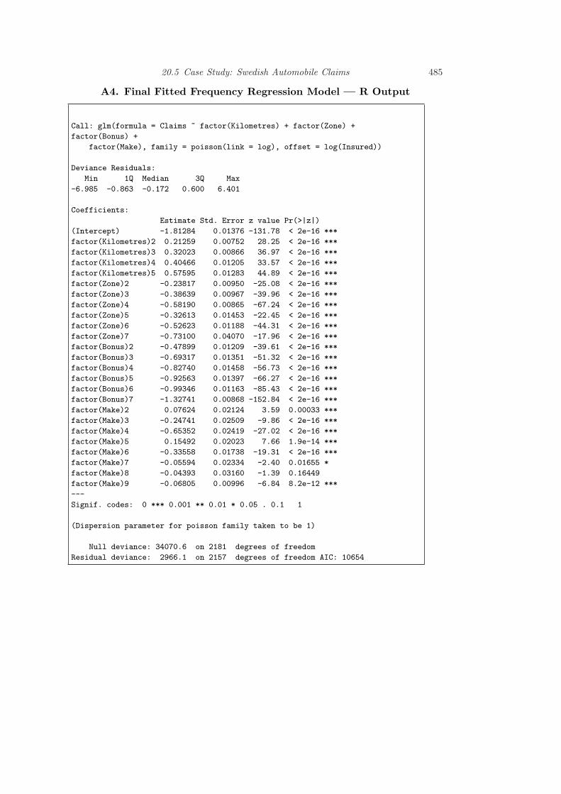
As a result of this study, I recommend a Poisson regression model using a logarith-mic link function for the frequency portion. The systematic component includes therating factors distance, zone, experience and type as additive categorical variablesas well as an offset term in logarithmic number of insureds.Interpret the
model; discussvariables,coefficients andbroad implicationsof the model
This model was fit using maximum likelihood, with the coefficients appearingin Table 20.3; more details appear in Appendix A4. Here, the base categoriescorrespond to the first level of each factor. To illustrate, consider a driver livingin Stockholm (Zone=1) who drives between one and fifteen thousand kilometersper year (Kilometres=2), has had an accident within the last year (Bonus=1) and

20.5 Case Study: Swedish Automobile Claims 479
1 2 3 4 5
010
000
2000
0
Distance Driven
Ave
rage
Cla
im A
mou
nt
1 2 3 4 5 6 7
010
000
2000
0
Geographic ZoneA
vera
ge C
laim
Am
ount
0 1 2 3 4 5 6
010
000
2000
0
Accident Free Years
Ave
rage
Cla
im A
mou
nt
1 2 3 4 5 6 7 8 9
010
000
2000
0
Auto Make
Ave
rage
Cla
im A
mou
nt
Fig. 20.4. Box Plots of Severity by Distance Driven, Geographic Zone, Accident Free Yearsand Make of Automobile.
driving car type “Make=6”. Then, from Table 20.3, the systematic component is−1.813 + 0.213 − 0.336 = −1.936. For a typical policy from this combination, wewould estimate a Poisson number of claims with mean exp(−1.936) = 0.144. Forexample, the probability of no claims within a year is exp(−0.144) = 0.866. In 1977,there were 354.4 policyholder years in this combination, for an expected number ofclaims of 354.4× 0.144 = 51.03. It turned out that there were only 48 claims in thiscombination in 1977.
For the severity portion, I recommend a gamma regression model using a logarith-mic link function. The systematic component consists of the rating factors zone andtype as additive categorical variables as well as an offset term in logarithmic numberof claims. Further, the square root of the claims number was used as a weightingvariable to give larger weight to those combinations with greater number of claims.
This model was fit using maximum likelihood, with the coefficients appearingin Table 20.4; more details appear in Appendix A6. Consider again our illustra-tive driver living in Stockholm (Zone=1) who drives between one and fifteen thou-

480 Report Writing: Communicating Data Analysis Results
Table 20.3. Poisson Regression Model Fit
Variable Coefficient t-ratio Variable Coefficient t-ratio
Intercept -1.813 -131.78 Bonus=2 -0.479 -39.61Kilometres=2 0.213 28.25 Bonus=3 -0.693 -51.32Kilometres=3 0.320 36.97 Bonus=4 -0.827 -56.73Kilometres=4 0.405 33.57 Bonus=5 -0.926 -66.27Kilometres=5 0.576 44.89 Bonus=6 -0.993 -85.43Zone=2 -0.238 -25.08 Bonus=7 -1.327 -152.84Zone=3 -0.386 -39.96 Make=2 0.076 3.59Zone=4 -0.582 -67.24 Make=3 -0.247 -9.86Zone=5 -0.326 -22.45 Make=4 -0.654 -27.02Zone=6 -0.526 -44.31 Make=5 0.155 7.66Zone=7 -0.731 -17.96 Make=6 -0.336 -19.31
Make=7 -0.056 -2.40Make=8 -0.044 -1.39Make=9 -0.068 -6.84
sand kilometers per year (Kilometres=2), has had an accident within the last year(Bonus=1) and driving car type “Make=6”. For this person, the systematic com-ponent is 8.388 + 0.108 = 8.496. Thus, the expected claims under the model areexp(8.496) = 4, 895. For comparison, the average 1977 payment was 3,467 for thiscombination and 4,955 per claim for all combinations.
Table 20.4. Gamma Regression Model Fit
Variable Coefficient t-ratio Variable Coefficient t-ratio
Intercept 8.388 76.72 Make=2 -0.050 -0.44Zone=2 -0.061 -0.64 Make=3 0.253 2.22Zone=3 0.153 1.60 Make=4 0.049 0.43Zone=4 0.092 0.94 Make=5 0.097 0.85Zone=5 0.197 2.12 Make=6 0.108 0.92Zone=6 0.242 2.58 Make=7 -0.020 -0.18Zone=7 0.106 0.98 Make=8 0.326 2.90
Make=9 -0.064 -0.42Dispersion 0.483
Discussion of the Frequency ModelWhat are some ofthe basicjustifications of themodel?
Both models provided a reasonable fit to the available data. For the frequencyportion, the t-ratios in Table 20.3 associated with each coefficient exceed three inabsolute value, indicating strong statistical significance. Moreover, Appendix A5demonstrates that each categorical factor is strongly statistically significant.Provide strong
links between themain body of thereport and theappendix.
There were no other major patterns between the residuals from the final fittedmodel and the explanatory variables. Figure A1 displays a histogram of the devianceresiduals, indicating approximate normality, a sign that the data are in congruencewith model assumptions.
A number of competing frequency models were considered. Table 20.5 lists twoothers, a Poisson model without covariates and a negative binomial model with thesame covariates as the recommended Poisson model. This table shows that therecommended model is best among these three alternatives, based on the Pearson

20.5 Case Study: Swedish Automobile Claims 481
goodness of fit statistic and a version weighted by exposure. Recall that the Pearsonfit statistic is of the form
∑(O −E)2/E, comparing observed (O) to data expected
under the model fit (E). The weighted version summarizes∑
w(O−E)2/E, whereour weights are policyholder years in units of 100,000. In each case, we prefer modelswith smaller statistics. Table 20.5 shows that the recommended model is the clearchoice among the three competitors.
Table 20.5. Pearson Goodness of Fit for Three Frequency Models
Model Pearson Weighted Pearson
Poisson without Covariates 44,639 653.49Final Poisson Model 3,003 6.41Negative Binomial Model 3,077 9.03
Is there a thoughtprocess that leadsus to conclude themodel is a usefulone?
In developing the final model, the first decision made was to use the Poissondistribution for counts. This is in accord with accepted practice and because ahistogram of claims numbers (not displayed here) showed a skewed Poisson-likedistribution.
Covariates displayed important features that could affect the frequency, as shownin Section 2 and Appendix A3. A good way to
justify yourrecommendedmodel is tocompare it to oneor morealternatives.
In addition to the Poisson and negative binomial models, I also fit a quasi-Poissonmodel with an extra parameter for dispersion. Although this seemed to be useful,ultimately I chose not to recommend this variation because the ratemaking goalis to fit expected values. All rating factors were very statistically significant withand without the extra dispersion factor and so the extra parameter added onlycomplexity to the model. Hence, I elected not to include this term.
Discussion of the Severity Model
For the severity model, the categorical factors zone and make are statisticallysignificant, as shown in Appendix A7. Although not displayed here, residuals fromthis model were well-behaved. Deviance residuals were approximately normally dis-tributed. Residuals, when rescaled by the square root of the claims number wereapproximately homoscedastic. There were no apparent relations with explanatoryvariables.
This complex model was specified after a long examination of the data. Based onthe evident relations between payments and number of claims in Figure 20.2, thefirst step was to examine the distribution of payments per claim. This distributionwas skewed and so an attempt to fit logarithmic payments per claim was made.After fitting explanatory variables to this dependent variable, residuals from themodel fitting were heteroscedastic. These were weighted by the square root of theclaims number and achieved approximate homoscedasticity. Unfortunately, as seenin Appendix Figure A2, the fit is still poor in the lower tails of the distribution.
A similar process was then undertaken using the gamma distribution with a log-link function, with payments as the response and logarithmic claims number as theoffset. Again, I established the need for the square root of the claims number as aweighting factor. The process began with all four explanatory variables but distanceand accident free years were dropped due to their lack of statistical significance. I also

482 Report Writing: Communicating Data Analysis Results
created a binary variable “Safe” to indicate that a driver had six or more accidentfree years (based on my examination of Figure 20.4). However, this turned out to benot statistically significant and so was not included in the final model specification.
Section 4. Summary and Concluding RemarksAlthough insurance claims vary significantly, we have seen that it is possible to es-tablish important determinants of claims number and payments. The recommendedregression models conclude that insurance outcomes can be explained in terms of thedistance driven by a vehicle, geographic area, recent driver claims experience andtype of automobile. Separate models were developed for the frequency and severityof claims. It part, this was motivated by the evidence that fewer variables seem toinfluence payment amounts compared to claims number.Rehash the results
in a concisefashion. Discussshortcomings andpotentialextensions of thework.
This study was based on 113,171 claims from 2,383,170 policyholder years, fora total of 560,790,681 kroners. This is a large data set that allows us to developcomplex statistical models. The grouped form of the data allows us to work withonly n = 2, 182 cells, relatively small by today’s standards. Ungrouped data wouldhave the advantage of allowing us to consider additional explanatory variables. Onemight conjecture about any number of additional variables that could be included;age, gender and good student discount are some good candidates. I note that thearticle by Hallin and Ingenbleek (1983) considered vehicle age - this variable wasnot included in my database because analysts responsible for the data publicationconsidered to be an insignificant determinant of insurance claims.
Further, my analysis of data is based on 1977 experience of Swedish drivers. Thelessons learned from this report may or may not transfer to modern drivers that arecloser. Nonetheless, the techniques explored in this report should be immediatelyapplicable with the appropriate set of modern experience.

20.5 Case Study: Swedish Automobile Claims 483
Appendix
Appendix Table of ContentsA table ofcontents, oroutline, is usefulfor longappendices.
A1. ReferencesA2. Variable DefinitionsA3. Basic Summary Statistics for FrequencyA4. Final Fitted Frequency Regression Model—R OutputA5. Checking Significance of Factors in the Final Fitted Frequency Regression Model
— R OutputA6. Final Fitted Severity Regression Model—R OutputA7. Checking Significance of Factors in the Final Fitted Severity Regression Model
— R Output
A1. ReferencesInclude references,detailed dataanalysis and othermaterials of lesserimportance in theappendices.
Andrews, D. F. and A. M. Herzberg (1985). Chapter 68 in: A Collection from ManyFields for the Student and Research Worker, pp. 413-421. Springer, New York.
Hallin, Marc and Jean-Francois Ingenbleek (1983). The Swedish automobile portfolio in1977: A statistical study. Scandinavian Actuarial Journal 1983: 49-64.
A2. Variable Definitions
TABLE A.1 Variable Definitions
Name Description
Kilometres Kilometers traveled per year1: <1,0002: 1,000-15,0003: 15,000-20,0004: 20,000-25,0005: > 25,000
Zone Geographic zone1: Stockholm, Goteborg, Malmo with surroundings2: Other large cities with surroundings3: Smaller cities with surroundings in southern Sweden4: Rural areas in southern Sweden5: Smaller cities with surroundings in northern Sweden6: Rural areas in northern Sweden7: Gotland
Bonus No claims bonus.Equal to the number of years, plus one, since the last claim.
Make 1-8 represent eight different common car models.All other models are combined in class 9.
Exposure Amount of policyholder yearsClaims Number of claimsPayment Total value of payments in Swedish kroner

484 Report Writing: Communicating Data Analysis Results
A3. Basic Summary Statistics for Frequency
TABLE A.2. Averages of Claims per Insured by Rating Factor
Kilometre
1 2 3 4 5
0.0561 0.0651 0.0718 0.0705 0.0827
Zone
1 2 3 4 5 6 7
0.1036 0.0795 0.0722 0.0575 0.0626 0.0569 0.0504
Bonus
1 2 3 4 5 6 7
0.1291 0.0792 0.0676 0.0659 0.0550 0.0524 0.0364
Make
1 2 3 4 5 6 7 8 9
0.0761 0.0802 0.0576 0.0333 0.0919 0.0543 0.0838 0.0729 0.0712
20.5 Case Study: Swedish Automobile Claims 485
A4. Final Fitted Frequency Regression Model — R Output
Call: glm(formula = Claims ~ factor(Kilometres) + factor(Zone) +
factor(Bonus) +
factor(Make), family = poisson(link = log), offset = log(Insured))
Deviance Residuals:
Min 1Q Median 3Q Max
-6.985 -0.863 -0.172 0.600 6.401
Coefficients:
Estimate Std. Error z value Pr(>|z|)
(Intercept) -1.81284 0.01376 -131.78 < 2e-16 ***
factor(Kilometres)2 0.21259 0.00752 28.25 < 2e-16 ***
factor(Kilometres)3 0.32023 0.00866 36.97 < 2e-16 ***
factor(Kilometres)4 0.40466 0.01205 33.57 < 2e-16 ***
factor(Kilometres)5 0.57595 0.01283 44.89 < 2e-16 ***
factor(Zone)2 -0.23817 0.00950 -25.08 < 2e-16 ***
factor(Zone)3 -0.38639 0.00967 -39.96 < 2e-16 ***
factor(Zone)4 -0.58190 0.00865 -67.24 < 2e-16 ***
factor(Zone)5 -0.32613 0.01453 -22.45 < 2e-16 ***
factor(Zone)6 -0.52623 0.01188 -44.31 < 2e-16 ***
factor(Zone)7 -0.73100 0.04070 -17.96 < 2e-16 ***
factor(Bonus)2 -0.47899 0.01209 -39.61 < 2e-16 ***
factor(Bonus)3 -0.69317 0.01351 -51.32 < 2e-16 ***
factor(Bonus)4 -0.82740 0.01458 -56.73 < 2e-16 ***
factor(Bonus)5 -0.92563 0.01397 -66.27 < 2e-16 ***
factor(Bonus)6 -0.99346 0.01163 -85.43 < 2e-16 ***
factor(Bonus)7 -1.32741 0.00868 -152.84 < 2e-16 ***
factor(Make)2 0.07624 0.02124 3.59 0.00033 ***
factor(Make)3 -0.24741 0.02509 -9.86 < 2e-16 ***
factor(Make)4 -0.65352 0.02419 -27.02 < 2e-16 ***
factor(Make)5 0.15492 0.02023 7.66 1.9e-14 ***
factor(Make)6 -0.33558 0.01738 -19.31 < 2e-16 ***
factor(Make)7 -0.05594 0.02334 -2.40 0.01655 *
factor(Make)8 -0.04393 0.03160 -1.39 0.16449
factor(Make)9 -0.06805 0.00996 -6.84 8.2e-12 ***
---
Signif. codes: 0 *** 0.001 ** 0.01 * 0.05 . 0.1 1
(Dispersion parameter for poisson family taken to be 1)
Null deviance: 34070.6 on 2181 degrees of freedom
Residual deviance: 2966.1 on 2157 degrees of freedom AIC: 10654

486 Report Writing: Communicating Data Analysis Results
A5. Checking Significance of Factors in the Final Fitted FrequencyRegression Model — R Output
Analysis of Deviance Table
Terms added sequentially (first to last)
Df Deviance Resid. Df Resid. Dev P(>|Chi|)
NULL 2181 34071
factor(Kilometres) 4 1476 2177 32594 2.0e-318
factor(Zone) 6 6097 2171 26498 0
factor(Bonus) 6 22041 2165 4457 0
factor(Make) 8 1491 2157 2966 1.4e-316
Deviance Residuals
Fre
quen
cy
−6 −4 −2 0 2 4 6
020
040
060
080
0
Figure A1. Histogram of deviance residuals from the final frequency model

20.5 Case Study: Swedish Automobile Claims 487
A6. Final Fitted Severity Regression Model — R Output
Call:
glm(formula = Payment ~ factor(Zone) + factor(Make), family = Gamma(link = log),
weights = Weight, offset = log(Claims))
Deviance Residuals:
Min 1Q Median 3Q Max
-2.56968 -0.39928 -0.06305 0.07179 2.81822
Coefficients:
Estimate Std. Error t value Pr(>|t|)
(Intercept) 8.38767 0.10933 76.722 < 2e-16 ***
factor(Zone)2 -0.06099 0.09515 -0.641 0.52156
factor(Zone)3 0.15290 0.09573 1.597 0.11041
factor(Zone)4 0.09223 0.09781 0.943 0.34583
factor(Zone)5 0.19729 0.09313 2.119 0.03427 *
factor(Zone)6 0.24205 0.09377 2.581 0.00992 **
factor(Zone)7 0.10566 0.10804 0.978 0.32825
factor(Make)2 -0.04963 0.11306 -0.439 0.66071
factor(Make)3 0.25309 0.11404 2.219 0.02660 *
factor(Make)4 0.04948 0.11634 0.425 0.67067
factor(Make)5 0.09725 0.11419 0.852 0.39454
factor(Make)6 0.10781 0.11658 0.925 0.35517
factor(Make)7 -0.02040 0.11313 -0.180 0.85692
factor(Make)8 0.32623 0.11247 2.900 0.00377 **
factor(Make)9 -0.06377 0.15061 -0.423 0.67205
---
Signif. codes: 0 *** 0.001 ** 0.01 * 0.05 . 0.1 1
(Dispersion parameter for Gamma family taken to be 0.4830309)
Null deviance: 617.32 on 1796 degrees of freedom
Residual deviance: 596.79 on 1782 degrees of freedom
AIC: 16082
A7. Checking Significance of Factors in the Final Fitted SeverityRegression Model — R Output
Analysis of Deviance Table
Terms added sequentially (first to last)
Df Deviance Resid. Df Resid. Dev P(>|Chi|)
NULL 1796 617.32
factor(Zone) 6 8.06 1790 609.26 0.01
factor(Make) 8 12.47 1782 596.79 0.001130

488 Report Writing: Communicating Data Analysis Results
−3 −2 −1 0 1 2 3
−15
−10
−5
05
Theoretical Quantiles
Sam
ple
Qua
ntile
s
Fig. 20.5. Figure A2. qq Plot of Weighted Residuals from a Lognormal Model. The depen-dent variable is average severity per claim. Weights are the square root of the number ofclaims. The poor fit in the tails suggests using an alternative to the lognormal model.
20.6 Further Reading and References
You can find further discussion of guidelines for presenting within text data in TheChicago Manual of Style, a well-known reference for preparing and editing writtencopy.
You can find further discussion of guidelines for presenting tabular data in Ehren-berg (1977) and Tufte (1983).
Miller (2005) is a book length introduction to writing statistical reports with anemphasis on regression methods.
Chapter References
The Chicago Manual of Style (1993).The University of Chicago Press, 14th ed.Chicago, Ill.
Cleveland, William S. (1994). The Ele-ments of Graphing Data. Monterey, Calif.:Wadsworth.
Ehrenberg, A.S.C. (1977). Rudiments ofnumeracy. Journal of the Royal StatisticalSociety A 140:27797.
Miller, Jane E. (2005). The Chicago Guideto Writing about Multivariate Analysis. TheUniversity of Chicago Press, Chicago, Ill.
Tufte, Edward R. (1983). The Visual Dis-play of Quantitative Information. GraphicsPress, Cheshire, Connecticut.
Tufte, Edward R. (1990). Envisioning In-formation. Graphics Press, Cheshire, Con-necticut.
20.7 Exercises
Exercises
r EmpiricalFilename is“CeoCompensation”
20.1 Determinants of CEO Compensation. Chief executive officer (CEO) compensationvaries significantly from firm to firm. For this exercise, you will report on a sampleof firms from a survey by Forbes Magazine to establish important patterns in the

Exercises 489
compensation of CEOs. Specifically, introduce a regression model that explains CEOsalaries in terms of the firm’s sales and the CEO’s length of experience, educationlevel and ownership stake in the firm. Among other things, this model should showthat larger firms tend to pay CEOs more and, somewhat surprisingly, that CEOswith a higher educational levels earn less than otherwise comparable CEOs. Inaddition to establishing important influences on CEO compensation, this modelshould be used to predict CEO compensation for salary negotiation purposes.