trust to political infographics: what makes people trust ... · infographics, so the participants...
TRANSCRIPT

Trust to Political Infographics: What Makes People
Trust Visual Information? Case of Russia
By
Lika Mchedlidze
Submitted to
Central European University
Department of Political Science
In partial fulfillment of the requirements for the degree of Master of Arts
Supervisor: Inna Melnykovska
Budapest, Hungary
2019
CE
UeT
DC
olle
ctio
n

i
Abstract
Why are the political infographics trusted or distrusted? The study investigates the
effects of political partisanship of the individual and complexity of the infographic’s layout on
the propensity to trust political infographics. It combines the methods of focus groups and
survey. The case for research is Russia due to its fairly sharply divided political arena that
allows to effectively capture variations in political partisanship. Four infographics presenting a
non-salient topic of healthcare system funding are designed and firstly tested on the focus
groups. Infographics changed accordingly with the focus groups insights are used in the online
survey. Sample of 731 university students is analyzed with logistic regression and classification
tree model to test the hypotheses. Neither individual’s political partisanship, nor the complexity
of the layout have an effect on trust to infographics. However, general trust in information is
statistically significant in most of the models. While the research contributes to the
understanding of the factors driving trust to infographics, further studies based on the findings
discussed here are able to clarify revealed inconsistencies.
CE
UeT
DC
olle
ctio
n

ii
Acknowledgments
First, I would like to thank my supervisor Inna Melnykovska. I am very lucky to have
such a knowledgeable and understanding supervisor like you. I value Central European
University for these two amazing years, and an opportunity to rediscover myself.
Most of all I am thankful to my sister Sofiko and my parents, who are unconditionally
supportive. Never guiding me directly, you helped me to get through the most frustrating stages
of my life, and I cannot be more grateful than I am now.
I would not be able to stay happy and positive without my closest friends Liza Potapova
and Vika Poltoratskaya. You are always with me even when I am the most difficult person on
the planet. Our long conversations on all possible topics helped me realize an inconceivable
number of things about myself. And yes, I do believe that triangulation of our names is not
coincidental.
My friends who are not CEU students anymore but who are still a big part of my life
deserve a special place in my heart. Livia Popp, you always have an answer for me when I am
struggling, you are one of the most incredible people I know. Kanye West should be proud to
be born the same day as you are. Kindness of Mirella Suga and Claire Goddard’s patience with
my very long voice messages save my mental health from being corrupted by discouraging
results of the job search. Girls, each one of you contributed to me successfully getting to the
thesis submission as a healthy human being.
Also, I have to mention a place where I spend numerous hours every day while writing
my thesis. The CEU library becomes very depressing during the deadline periods, therefore I
work from Starbucks next to the Danube. I am grateful to all the students around me here who
create a studious environment that keeps me going. I hope you meet all of your deadlines.
And I certainly thank myself. You are the most hardworking person I know. Do not
forget that and please, do not be harsh on yourself.
CE
UeT
DC
olle
ctio
n
iii
Table of Content
Abstract ....................................................................................................................................... i
Acknowledgments ...................................................................................................................... ii
Table of Content ....................................................................................................................... iii
List of Tables ............................................................................................................................. v
List of Figures .......................................................................................................................... vi
Introduction ............................................................................................................................... 1
Chapter 1 – Background of the topic, expectations, and case ................................................. 6
1.1 Literature review .................................................................................................................. 6 1.1.1 Literature on trust ............................................................................................................................. 6 1.1.2 Literature on infographics ................................................................................................................ 7 1.1.3 Literature on political partisanship ................................................................................................. 10 1.1.4 Literature on visual perception ....................................................................................................... 11
1.2 Research design ................................................................................................................... 14 1.2.1 Hypotheses ..................................................................................................................................... 14 1.2.2 Case ................................................................................................................................................ 15 1.2.3 Infographics’ design ....................................................................................................................... 16
Chapter 2 – Data collection..................................................................................................... 18
2.1 Focus groups ....................................................................................................................... 18 2.1.1 Why focus groups? ......................................................................................................................... 18 2.1.2 Design of the focus groups ............................................................................................................. 19 2.1.3 Results derived from conducted focus groups ................................................................................ 21
2.2 Online survey ...................................................................................................................... 26 2.2.1 Why survey? ................................................................................................................................... 26 2.2.2 Design of the survey ....................................................................................................................... 27 2.2.3 Results derived from the survey ..................................................................................................... 28
Chapter 3 – Analysis of the data ............................................................................................. 32
3.1 Regression analysis ............................................................................................................. 32 3.1.1 Why logistic regression? ................................................................................................................ 32 3.1.2 First regression models ................................................................................................................... 32
3.2 Hypothesis testing ............................................................................................................... 36 3.2.1 Hypothesis 1 ................................................................................................................................... 37 3.2.2 Hypothesis 2 ................................................................................................................................... 39
3.3 Tree-based methods ............................................................................................................ 43
3.4 Limitations .......................................................................................................................... 46
Chapter 4 – Interpretation of the results ................................................................................ 49
4.1 Results of the hypotheses test ............................................................................................ 49 4.1.1 Hypothesis 1 ................................................................................................................................... 49 4.1.2 Hypothesis 2 ................................................................................................................................... 51
4.2 Trust in information as a decisive factor .......................................................................... 52
CE
UeT
DC
olle
ctio
n

iv
4.3 Possible explanatory variables .......................................................................................... 54
4.4 Future research ................................................................................................................... 55
Conclusion ............................................................................................................................... 56
Appendices ............................................................................................................................... 58
Appendix A. Infographics used with focus groups ....................................................................... 58 Simple infographics ...................................................................................................................................... 58 Complex infographics ................................................................................................................................... 59
Appendix B. Infographics used in the survey ............................................................................... 60 Simple infographics ...................................................................................................................................... 60 Complex infographics ................................................................................................................................... 61
References ................................................................................................................................ 62
CE
UeT
DC
olle
ctio
n

v
List of Tables
Table 1. Distribution of the participants among the surveys.................................................... 29
Table 2. Distribution of the participants among the surveys after the data cleaning ............... 31
Table 3. Regression results and odds for statistically significant variables (all data points) ... 33
Table 4. Regression results for each infographic ..................................................................... 35
Table 5. Odds for each statistically significant variable .......................................................... 35
Table 6. Percentage of students of different majors who trusted the infographics .................. 38
Table 7. Percentage distribution of politically neutrals and the rest of the sample.................. 40
Table 8. Regression results for combined by complexity datasets .......................................... 41
Table 9. Odds for each statistically significant variable presented in Table 8 ......................... 42
Table 10. Prediction accuracy of the classification trees ......................................................... 46
CE
UeT
DC
olle
ctio
n

vi
List of Figures
Figure 1. Geography of the participants ................................................................................... 30
Figure 2. Classification trees for simple infographics.............................................................. 44
Figure 3. Classification trees for complex infographics .......................................................... 45
CE
UeT
DC
olle
ctio
n

1
Introduction
The information is getting more and more complex with time. People obtain more data,
and they develop sophisticated techniques to work with this data. However, if the information
is not trusted by the audience, then it is basically useless and lost in a vast amount of data. That
is why the trust in information is a crucial parameter the information should strive for.
Trust in information can be facilitated by various factors coming from the environment
around the material itself (Van de Velde et al. 2011; Sillence et al. 2017; Gualda and Rúas
2019), or because of the correctly chosen audience (Kelton, Fleischmann, and Wallace 2008;
Ye 2011). Moreover, influencing parameters can depend on the form of the information
representation too (Enikolopov, Petrova, and Zhuravskaya 2011; Kuosis 2001).
To convey a message, one might want to speak with the audience via visual
representation, since visuals are easier to process (Cleveland and McGill 1984; Siricharoen
2013; Otten, Cheng, and Drewnowski 2015). One of the most popular ways to depict the
information graphically is to create an infographic. Defined by Harrison, Reinecke, and Chang
(2015, 1187) as a collection of one or more visualizations that have been manually modified to
highlight specific points about the data, infographics are becoming more and more powerful
than traditional texts (Attneave 1954). Infographics have a capacity to influence the people’s
attitudes more effectively than other means of information delivery (Lee and Kim 2016, 1579;
Flanagin, Winter, and Metzer 2018, 2), what makes them especially prominent to study.
As many newly developing fields, infographics have many features that are not yet
described and properly researched. One of such features is the trustworthiness of the
infographics. The credibility of the information and its ability to convince people with
established beliefs are capable to shift one’s attitudes (Feldman 2011, 176), and it might be the
most important for the material to be able to have such a power. While generally speaking the
CE
UeT
DC
olle
ctio
n

2
information can be whether trusted or not trusted, there are numerous factors that can influence
this conscious or unconscious decision.
Narrowing down the topic of trust, and in particular trust to infographics, one can turn
to political infographics. Increasing popularity of the infographics leads to its more often usage
to present political agenda that can be seen as too complicated and boring to the ordinary
citizens (Graber 1988).
These observations on a topic of trust create a puzzle, where it is unclear what are the
factors that lead people to trust visually presented information. It was already discovered by
Dur that infographics can invoke unpredictable behavior of the audience as well as different
patterns of their perception (2012, 280-281). There is a ground to assume that trust is expressed
differently too. Thus, the research question is Why are the political infographics trusted or
distrusted? Possible explanations should represent various combinations of both topics of trust
and political infographics.
First major assumption relies on political partisanship of the people who see the
infographics. Processing of the data is done differently by the people with polarized views, and
political partisanship tends to push the audience to a perceptual bias (Jerit and Barabas 2012,
672). Additionally, various studies confirm that being politically partisan leads to a bias towards
political information (Jerit and Barabas 2012; Kim 2016; Perryman 2019). The effect of visual
depiction of the information can be even stronger, due to the enhanced effects of age and
education (Herrera-Guzmán et al. 2004).
Political partisanship is a type of individual’s initial standing, and having a certain
position is important for the outcome of information processing. When the information is not
demanding in terms of the perceptual costs, people tend to believe it, especially when their prior
beliefs are fairly neutral (Lee et al. 1999, 79, Lee and Kim 2016, 1596). Furthermore, faster
CE
UeT
DC
olle
ctio
n

3
processing of the information leads to a higher chance that the message is well-perceived
(Siricharoen 2013, 169).
The second assumption is connected to the individuals’ main occupation and its relation
to partisanship. Since the sample of the study consists of university students, their major activity
is education. Therefore, an academic track they are enrolled at can contribute to their propensity
to trust political information (Campbell 2005; Claes and Hooghe 2017).
The third and final assumption focuses on one of the most important features of the
infographics, which is their simplicity of the layout. Not every infographic is designed in an
easy for processing way, and it is unclear how badly designed, complex infographics would
work, and whether simplicity is such an important factor for the trust to the infographics. Some
pieces of evidence suggest that it is more likely that the individual skips complex infographic
with no attempt to comprehend it (Few 2013).
The answer to this question contributes to both political, and social aspects of people’s
lives. Politically, the infographics can be used more effectively in the future, since their
strongest effect for different societal groups is known. The social aspect is related to the
application of the obtained results in further studies that concern people’s trust in general. In
addition, innovative part of the research is also reflected in the absence of the sources on the
infographics, so the participants cannot relate to the political body that is responsible for the
data and to decide to trust or not on the basis of trust to the widely mentioned political
institution.
The dependent variable is a reaction to the infographics, which is measured
dichotomously as trust or distrust. Control variables are a stage of education, age, gender, trust
in information, and trust to people. Political partisanship is a continuous independent variable,
and academic major is a conditional categorical parameter. Complexity of the infographic is a
CE
UeT
DC
olle
ctio
n

4
third explanatory parameter, and it is not measured during the study, but randomly assigned to
the individual in the sample.
Additionally, participants are asked the questions that involve the evaluation of trust to
the news sources, information on the Internet, and change in the political views recently. These
questions can be helpful for the operationalization of general trust and political partisanship.
There are two hypotheses to be tested. Each of them addresses different variables that
are expected to have an effect on trust to the infographics. First, strong political partisanship in
general is supposed to lead participants to express trust to the infographics in line with their
political standing. Moreover, it is assumed that majoring in social sciences contributes to higher
consistency between political partisanship and trust to the infographics of different political
affiliations. Thus, an academic major is a condition that is able to enhance the power of political
partisanship.
The second hypothesis states that politically neutral people are expected to trust
complex infographics more, and simple ones less due to higher propensity to trust the
information that is presented in a complex manner if one does not have any expertise in a topic.
Elaboration on the hypotheses takes place in the following parts of the work.
The case for the research is Russia. This case can be considered as a most-likely case
among countries lacking in freedom of media (Freedom House 2017). Substantially speaking,
the choice Russia is justified by political circumstances of the country that create a quite
dichotomous division of the political actors (Gel’man 2015). Therefore, the citizens are mostly
distinct in their attitude to the government, and they whether support it or not. Absence of
political parties presenting various sides of the political spectrum contributes to the more
effective catchment of one’s political preferences by the message of the infographic.
Several steps are implemented to answer the research question. Four infographics are
varying in the complexity of the layout and their political affiliation are designed: two with
CE
UeT
DC
olle
ctio
n

5
simple layouts, and two with complex layouts. One infographic of which layout type favors the
government, whereas the other stands against the incumbent.
The first methodological step is conducting pilot research, in particular focus groups.
This gives an overview of how the infographics are perceived, and whether their design is
perceived as intended. Next each infographic is assigned to the separate questionnaire, where
give their replies to what further becomes control and independent variables. After that
respondents see randomly assigned infographic, and then they reply whether they trust the
infographic or not.
Gathered data is analyzed with logistic regression models. For additional insights
classification trees are built and examined. The hypotheses are discussed using the results
derived from these methods.
The research starts with the review of the literature to overview already done studies in
the field of trust, infographics, visual perception, and political partisanship. It is followed up
with an explanation of the research design, where hypotheses, case, and infographics’ layouts
are elaborated on. Finally, detailed empirical part presents the findings, tests the hypotheses,
and outlines the limitations and directions for future research.
CE
UeT
DC
olle
ctio
n
6
Chapter 1 – Background of the topic, expectations, and case
1.1 Literature review
1.1.1 Literature on trust
The literature related to the topic is fairly diverse and can be arbitrarily divided into the
group that studies exogenous facilitators of trust, and endogenous ones. The former is supposed
to come from the information, whereas the latter should be related to the audience and its
inherent features.
Starting with the literature on exogenous factors influencing trust, the studies highlight
different ways how the information representation can change trustworthiness of the
information. Gualda and Rúas (2019) investigate how the trust to the information on the Internet
is affected by the conspiracy theory. From the survey conducted on Andalusians, the authors
find that 68% of the respondents distrust the information they receive from the Internet,
assuming that this information is purposefully withheld from them.
Van de Velde et al. (2011) focus on Belgians and their trust in information about
biofuels, attempting to identify the most trustworthy channels and source of information. The
scholars distinguish four clusters of consumers, varying in their preferences from where and
whom to obtain information. Generally speaking, newspapers and brochures with references to
scientist, environmental and consumer organizations are considered the most credible sources
of information about biofuels.
Another group of exogenous factors influencing trust in information is specific to online
sources. Sillence et al. (2007) analyze how women processed the health advice posted on the
Internet, and whether they trusted them or not. Web site design and content related factors were
found the most important. In particular, clear layout, navigation aids, interactive features
combined, informative content, impartially presented information, and simple language were
decisive for a woman to trust online advice.
CE
UeT
DC
olle
ctio
n
7
Moving to endogenous facilitators of trust, Kelton, Fleischmann, and Wallace (2008)
examine trust to digital information and how levels of trust can impact propensity to trust. The
authors findings reveal that both quality and possible usage of the information are the crucial
factors that define one’s decision to trust. Additionally, the scholars specify that positive
emotions and experiences with information, a propensity to trust in general, and reputation of
information increase a change that individual trusts the information.
From a demographic perspective, Ye (2011) found that age is a key parameter for
understanding whether one would trust health information posted on the Internet or not. Groups
of people of 35-49 and 50-64 years showed the highest propensity to trust health-related
materials in the Web. The scholar also finds that income, education, and health status are not
correlated with one’s trust to the information. Even though control for age is a crucial
parameter, it is not highly relevant for the study conducted on the same age cohort as university
students.
The studies in the field of trust do not address the trust in the visually presented
information, which is widely used in different digital media sources. Hence, it is not evident
whether the tendency to trust or mistrust will work distinctively in the case of the infographics.
It is indeed essential to control for the trust in information since infographic is one of the ways
to present the information in the first place. However, the current study neither addresses
trustworthiness of the source, nor the reasons behind not trusting the infographics. These topics
are big enough to be covered by a separate study, designed specifically to answer related
questions.
1.1.2 Literature on infographics
Studies on the infographics are divided into several streams that are connected to the
various fields. One of the most obvious presents the infographics as the special part of the
media. Therefore, informational graphics are studied together with the texts and the focus is on
CE
UeT
DC
olle
ctio
n

8
the benefits of the former over the latter (Howells and Matson 2009; Lee and Kim 2016). This
approach is useful when scrutinizing the general advantages and peculiarities of the
infographics. However, the studies of this stream disregard the mechanisms of the infographics’
influence, equalizing them with other ways of information acquisition.
Another group of scholars focuses on the unique features of the visual information. The
studies of this field examine the graphic aspects of the infographics, considering the technical
peculiarities and the mechanism of the visual perception (Griffin and Stevenson 1992; Otten et
al. 2015; Borkin et al. 2016). This stream distinguishes the causal mechanisms of how exactly
infographics work. Nonetheless, the studies are majorly written in the field of cognitive
psychology, ignoring the implications for political science or any other field.
The infographics are usually considered as a particular part of the media and
information sources (Howells and Matson 2009; Lee and Kim 2016; Lyra et al. 2016). These
studies focus on how the infographics differ from the textually presented information, and
whether they have the outstanding features inherent in themselves, or only when they are
embedded in the text. Well-studied field of infographics in various media channels contributes
to the better understanding of the features of the infographics, although it leaves infographics
as an independent source of information aside.
Considering some of the papers on infographics in media, Lee and Kim (2016) research
how the individuals process different types of the information representation and what are the
features of every way to present the news. They suggest six experiments where they use the
text and graphics solely and in combination, additionally duplicating this design by adding
hyperlinks in the text. Treating infographics as an additional material that has an effect on the
one’s news elaboration, acquisition, and evaluation, Lee and Kim assume that due to their
nature devoted to the enhancement of the already existing understanding, the inclusion of the
graphics will lead to a wider gap between those who have a prior knowledge on the issue, and
CE
UeT
DC
olle
ctio
n
9
those who do not. The authors find that the graphics contribute to a more favorable evaluation
of the news by the readers, although do not make them learn more from the article as the
audience relies on their motivation to process the news. In other words, the infographics engage
those, who are not interested in a substance of the news, and the graphics do not lead them to a
better news acquisition.
The opposite argument that the infographics have the capacities to educate well is
presented in the work of Lyra et al. (2016). They test whether the infographics have an effect
on the learning, and how individual preferences as the learning style and students’ satisfaction
have a capacity to contribute to learning via infographics. Unlike the former work that has a
sample size of 360 web-based participants recruited by the email invitations, this study includes
offline-based experiment involving 27 undergraduate students. Even though the latter case can
look easier to conduct, it required the post-test in order to analyze how well the information is
remembered by the participants, so the study is more time-consuming than the Lee and Kim’s.
However, the contrast between these two works represents different impacts of the infographics
and the way they can be measured and assessed. Nevertheless, none of the works includes the
trust to the infographics as the variable that has to be incorporated into the scope of the study.
The results of the study reveal that there is no considerable difference in the learning
style between those who learned the information using only infographics and those who studied
with the graphics combined with a text. Moreover, the infographics have the propensity to be
remembered better and longer, as well as to contribute to the enjoyment of the students.
These studies present the polarity of the views on the infographics being useful when
speaking about the education and information acquisition-related benefits. The findings
contribute to understanding how the infographics are different from the conventional means to
deliver the information; however, it does not represent how specifically any type of information
processing is able to vary.
CE
UeT
DC
olle
ctio
n

10
The only stream that works with the reasons of the difference in the perception focuses
on the features the infographics should have in order to be effective in terms of understanding
and memorability (Borkin et al. 2011; Cairo 2012; Siricharoen 2013; Borkin et al. 2016). For
instance, Borkin et al. (2016) study how the style, positioning, shapes, and the colors of the
infographics can affect perception of the individuals. The findings reveal that more colorful
images, as well as high visual densities, enhance the memorability, while the common graphs
as circles, bars, and lines contribute to lower memorability scores than diagrams, trees, and
networks. The knowledge about the most successful attributes of the infographics contributes
to the creation of the design that achieves its goal with a higher chance. However, the research
design does not suggest a control for any of the participants' characteristics, hence it is not
evident whether the perception of the infographics varies within the certain groups differently
than within the others. Neither this stream, nor the former one considers the intrinsic motives
to remember, evaluate, or trust the infographics.
Studies on the infographics create a solid basis for the research of infographics
separately from any additional channel of information. Evidence on the beneficial infographic
layout is especially useful since they contribute to the better targeted visual representation
regardless of the purposes of the study. Controlling for endogenous factors such as demographic
and background data about the audience and conducting research that is focused on trust to
infographics rather than memorability and interpretation can certainly contribute to the growing
field of infographics related studies.
1.1.3 Literature on political partisanship
Political partisanship is one of the issues that divide people depending on their
standings. The perceptual bias that is induced by the person’s initial political affiliation is
relatively well researched (Bartels 2002; Iyengar and Hahn 2009; Jerit and Barabas 2012; Prior
2013). The study of Bartels (2002) is centered on the long-term partisans and how they process
CE
UeT
DC
olle
ctio
n

11
the information regarding both the party of their choice and the opposite one. Applying the
panel data to the Bayesian model of opinion change, the scholar detects the partisan bias. The
evidence shows that constantly being loyal to the party shapes the perception of the political
world of these people, therefore they tend to have similar views on every topic as the party they
prefer does.
These findings represent that the political partisanship influences information
perception as well as defines the further standings. However, from the study of Bartels, it is not
evident whether people simply do not believe the information and share the party’s views, or
they choose not to expose themselves to the sources contradicting their beliefs. Conversely,
Jerit and Barabas (2012) study the perceptual bias in the USA in the 1990s and 2000s, while
being interested in whether the information environment moves the partisans to expose
themselves to the information incongruent with their own beliefs, and more importantly, to
remember this information. According to the conclusion the authors arrive at, being partisan to
any party leads to the individual’s lack of knowledge about the opposite party and to the
extensive knowledge about the one they like, even though the media coverage was
approximately the same for each party.
Therefore, political partisanship is a parameter that represents one of the topics
individuals usually have an opinion on. Moreover, a certain level of existing media bias among
the partisans possibly influences trust in information presented by the infographic as in case of
other information sources.
1.1.4 Literature on visual perception
The stream in the literature that researches the processes of the visual perception is able
to advance the understanding of how the infographics contribute to the substantive difference
between the stated standing and the actual trust to the depicted information. The literature
related to this issue is mostly concentrated on the very process of the visual perception,
CE
UeT
DC
olle
ctio
n

12
elaborating on how the image or graph processing goes (Cleveland and McGill 1984; Cleveland
and McGill 1985; Tsal and Nilli 1988; Lohse 1993; Herrera-Guzmán et al. 2004).
Since the infographics are the images containing informative and graphical parts, the
graph comprehension is the crucial parameter. Cleveland and McGill (1985) study the decoding
of the quantitative and qualitative information encrypted on the graphs. They focus on the
features of the graphical perception, analyzing how people process various types of information
depicted on the dot charts, turkey box plots, graphing on a log base 2 scale, and two-tiered error
bars. The authors order the tasks that the graphs should perform accurately to be perceived
correctly – position of the graphs needs to be the most accurate, while the colors can vary with
no loss in the quality of the perceived message.
While concentrating on the benefits of different graphs’ types, the scholars mention the
importance of the clear understanding of the task before the individuals processing the graphs,
and in case they do not get the assignment they need to complete, the evaluation of the graph is
unreliable. The design of the experiment supposes the Cleveland and McGill consider only the
information extraction, however, they do not control for the personal characteristics, which can
become a decisive factor for the visual perception.
The work of Herrera-Guzmán et al. (2004) test whether education, gender, and age
influence visual perception. They study the probable effect of these parameters on the normal
elderly Spanish population using The Visual Object and Space Perception Battery (VOSP) – 8
subsets consisting of the object and space perception measurements. The findings reveal that
even though sex does not affect visual perception, whereas education and age contribute are
consistent with certain outcomes. The scholars claim that the greater age and poorer education
contribute to the worse visual processing, albeit the results largely depend on the backgrounds
of the individuals.
CE
UeT
DC
olle
ctio
n

13
Finally, there are studies that work exclusively with the complexity of the information.
For example, Ionescu (2016) researches the optical capacities to consciously process the
information obtained from the slideshows with the complex images changing each other with
different speed. The findings reveal that there is a certain threshold for the visual cognition that
contributes to the proper comprehension of the image. Even though the change of the images
and its speed is not included in the scope of the current study, the findings regarding the special
circumstances around the complex images prove that there are peculiarities that should be
considered. However, there is no literature on the effect of the infographics’ complexity on the
trust to these infographics.
As a result, the literature covers a variety of the topics, although missing the ones that
are located on the intersection of the studies on the partisan bias with the works on the
infographics’ mechanisms of influence. Combining the findings from the different streams and
disciplines, the research on the political infographics’ perception will fill the gap contributing
to the better understanding of how the infographics impact the instantly forming political
opinions and reactions.
Summing up, there is a lack of studies conducted in the narrow field of trust in
information presented in the political infographics. A gap in the studies on the trust to visual
information leaves the factors driving trust to increasing in popularity infographics unclear.
Building on the findings from the research on political partisan media bias and infographics’
fast processing, the current study attempts to identify whether political partisanship and
infographics’ complexity have an effect as they do in different channels of information. Even
though the source of the information and elaborated reasons why one does not trust particular
infographic are not examined here, the studies on these topics could be based on the evidence
found here.
CE
UeT
DC
olle
ctio
n

14
1.2 Research design
1.2.1 Hypotheses
Substantively speaking, political partisanship is assumed to have an impact on the
perception of the infographics. Hypothesis 1 concerns the political partisanship and its
relationship with the trust in the informational graphics. It supposes that being in an opposition
to the incumbents leads the person to believe only oppositional infographics. Accordingly, this
hypothesis also predicts that being partisan to the ruling political figures contributes to the one’s
stability in the views and perception of the graphical data.
Taking into consideration a specific case and demographic variables, it is assumed that
education has a considerable effect that occurs naturally regardless of the political attitudes.
Students that are studying related to the political science subjects are supposed to be more
interested in politics itself, so their political views are clearer than of those who do not discuss
the political issues on a regular basis (Claes and Hooghe 2017, 10). Hypothesis 1 also forecasts
that students majoring in social sciences trust only those infographics that reflect their political
views. To test this part of the hypothesis, the experiment suggests having academic discipline
one studies as a conditioning factor.
Hypothesis 2 is related to the complexity of the infographic’s layout. It states that
visually simple infographics cause less trust, especially among those who are politically neutral.
In turn, complex infographics are supposed to be trusted more, and the same as previously,
politically neutral individuals are assumed to trust more than the partisans.
In order to check the hypotheses, two steps of data gathering are needed: focus groups
and a survey. While the first part is needed to affirm that the infographics achieve the intended
perception of complexity, the analysis of the survey’s results has a goal to discuss the
hypotheses.
CE
UeT
DC
olle
ctio
n

15
1.2.2 Case
The study is conducted on the case of Russia, which is considered a most-likely case for
autocracies. One of the reasons for that is related to the high level of political absenteeism
among the population. According to Levada-Center, 52% of citizens are not interested in
participation in politics (2017). This evidence is able to reinforce a tendency to be neutral in
terms of political partisanship and to believe the information more easily. The disinterest of the
people in politics makes them more susceptible to the fluctuations in the decision-making due
to the lack of confidence in their position (Eysenck and Keane 2010, 541).
Another reason is connected to the regime type and its continuity. For 18 years the
power is concentrated in the hands of the president, who is the same person, Vladimir Putin. In
2008 he became a prime minister, still significantly influencing main political decisions of the
state (Hale and Colton 2010, 3). It leads to people’s acquaintance with political actors to at least
a minimum extent, which increases the chance that from a relatively small sample the number
of random responders is minimal (Meade and Craig 2012).
In addition to these factors, characteristics of the Russian political regime are
important for the political partisanship in the state. The political system has become
dichotomous, dividing the political partisans into two groups – supporting, or opposing the
government (Gel’man 2015). This dichotomy makes the decision whether the information is
trustful or not easier for the people due to the relative parsimony of the political choices. Even
though the infographics’ effect is not well-studied yet, it can be assumed that it is not the same,
but similar to the visual media effect in general (Howells and Matson 2009, 4).
The sample consists of students of different Russian universities. The reason
why only students are eligible to participate in the research is related to the relatively narrow
distribution of their age and education. Since the survey platforms are not popular among
Russians, and the most usable website in the Russian segment of the Internet is VKontakte, the
survey is conducted there. Thus, due to the limitations of the social network’s size and the
CE
UeT
DC
olle
ctio
n

16
passiveness of the users to participate in the unpaid surveys, the sample size is not expected to
be more than 700-800 participants, which is the minimum number of the participants needed
for the current research design. Consequently, due to these limitations, a wide range of age and
jobs is not recommended, because the amount of the obtained data is not going to large enough
to scrutinize it properly. Instead, students represent one age cohort, and their active student
status unites them in terms of their daily activities.
1.2.3 Infographics’ design
For the purposes of the study, complex and simple layouts of the infographics are
designed with only difference in the political affiliation. While one presents the facts that speak
in favor of the government, another is encoded with the same information, but against the
government. The visual part remains the same, thus the effect of the difference in design is
anticipated. Substantially the images contain the statistical information on the political issue
that is not salient by the time the survey is conducted. The usage of the nonreal information
allows creating the infographics that are almost identical.
Condition about non-salience is crucial. The salience has a capacity to undermine the
credibility of the results obtained in the frame of the current research since it does not pursue
the goal to consider the issue salience anyhow (Bélanger and Meguid 2008, 479). An additional
variable that evaluates salience of the issue is meaningless as it leads to higher complexity and
possibly lower quality of the research design.
For the current study financing of medical care in Russia is chosen as the non-salient
issue. By the time the focus groups are conducted, there was no mentioning of the medicine
related topics in the news. The only issue that was salient in Russia in a month prior to the pilot
research and which can be connected to medical care is the pension reform. However, the
discussion of the pension reform is connected solely to the life expectance that is not covered
by the infographics (Meduza 2018a).
CE
UeT
DC
olle
ctio
n
17
The infographics mention the amount of money and relative growth in spending by the
government on medical care. The data is fictional, and the only real part about it is the
approximate values that are mentioned. There is no discretization of the sources, since they are
not cited in order not to influence the participants by the authorities’ affiliation.
The complexity of the infographics is regulated by the visual depiction of the
information. In particular, the simple infographics involve more descriptions, understandable
icons, and clear picture with only two main colors. In turn, complex infographics show a
compound network that is purposely designed for being difficult to understand. The complex
layout of the infographics does not provide elaborated comments on the data and its direction.
Thus, the only way to extract the information from the graph is to examine it very carefully,
what is rarely done by ordinary people who are not much interested in a random infographic
seen on the Internet (Sülflow et al. 2018, 16).
Finally, each infographic contains a description of the graph. The description is identical
for oppositional and pro-governmental infographics regardless of their complexity. It contains
the short paragraph explaining the idea of the infographic, so it looks more real. The description
is fairly partisan, and it additionally confirms the tone of the infographics.
CE
UeT
DC
olle
ctio
n

18
Chapter 2 – Data collection
2.1 Focus groups
2.1.1 Why focus groups?
Powell et al. define focus groups as “a group of individuals selected and assembled by
researchers to discuss and comment on, from personal experience, the topic that is the subject
of the research” (Powell et al. 1996, 499). Focus groups are an efficient method to generate data
by both extracting it from the conversation with the participants, and from the interactions
between the participants.
Kitzinger highlights the importance of focus groups for engaging those, who tend to say
that they “have nothing to say” (Kitzinger 1995, 299). It is indeed common reply among
respondents when they are asked very specific questions, whereas during the focus groups such
participants can feel more relaxed and less pressured by necessity to talk, hence more freely
contributing to the discussion. Focus group is also a great source of data for preliminary
research, providing just enough insights that can reveal the strongest and the weakest sides of
the research design before the major amount of data for the study is gathered (Morgan 1996,
3).
Apart from the benefits, focus groups have drawbacks too. One of the major ones is
examined by Morgan (1996, 32), and it addresses the issue of privacy of the participants. While
one-on-one interviews guarantee a high level of privacy, it cannot be assured in the group of
many people. This can lead to being reluctant to participate in a discussion, or even lie instead
of sharing true views and ideas. It is especially crucial in authoritarian regimes, where one can
be uncomfortable to share their opinion on political matters (Roller 2013, 52; Shih 2015, 20).
Such an obstacle can be overcome by designing a friendly environment, where participants trust
each other and feel unthreatened to express their political views.
CE
UeT
DC
olle
ctio
n

19
2.1.2 Design of the focus groups
The data collection is done in two stages. The first one is conducted in a form of the
focus groups, and the second is in the form of a survey, where the respondents are supposed to
answer the questions regarding their age, gender, the region they are initially from, and
academic major.
Focus groups serve as pilot research. Their goal is to hear the views on the infographics,
and how they are perceived and why exactly so. The interactions within the groups are able to
uncover the range of the opinions that could be relevant for the actual participants of the survey.
More than that, different views can show some parts that the research might miss or
misinterpret. Finally, the group dynamic tends to calm down extreme views if they are rare, or
to encourage them if such views are relevant for all of the participants. In both cases, the
community norms can be identified and taken into account during the experimental parts, and
in the latter case, the commonality of radicalization signifies that some parts are not perceived
properly.
Conducted focus groups have 5-7 participants and 2 focus groups. This size of the
groups is optimal, since the discussion is easy to sustain, while everyone has a possibility to
speak up. One focus group discusses one randomly chosen simple infographic, and another –
complex one. Each of the relevant discussions is followed up by the comparison of just seen
infographic with one that is different in terms of complexity, and after that, the participants
have to discuss the opposite in terms of the political affiliation infographic. For example, if one
group gets simple infographic reflecting the pro-governmental views on the medical care’
financing, then after its discussion the participations are distributed with the pro-governmental
complex infographic, and in the end, they get the infographic that is simple and reflects the
views of the opposition. Each infographic is followed up with a question whether the
participants trust or distrust the depicted information and why so.
CE
UeT
DC
olle
ctio
n

20
These three steps are devoted to uncovering of the perception of the different types of
graphics both in terms of complexity and political affiliation. Comparison between different
types reveals whether the infographic is perceived as complex or simple only in comparison
with the opposing type or as such. Regarding the political affiliation of the graphs, it is
important to trace the sustainability of the views when the participants are exposed to
completely opposite numbers on the charts. This would capture both participants’ seeking for
the sources, and their propensity to change the view once the opposite information is faced.
This approach of conducting the focus groups is beneficial for two reasons. First, the
information obtained after the first step has no effect on the trust or distrust to the first
distributed infographic, so the exposure is similar to the one that the survey participants will
experience. Second, even though various configurations do not give a clear picture of the
exposure to the infographic because every graphic is compared to the previous one, the results
are able to give new insights into the research design.
Design of the focus groups suggests that focus groups should take not more than 30-45
minutes in a quiet place that is not crowded with people and located conveniently for the
participants. There is a possible constraint that due to the regime’s lack of freedom the
respondents are not completely honest about their trust to the information on the graphs (Roller
2013, 52; Shih 2015, 20). This limitation can be mitigated by the involvement of the people
whom the researcher already knows. Despite the fact that it is not advisable to have somehow
acquainted participants in the focus groups due to the various reasons (Henrink et al. 2011, 149-
152), the familiarity of the participants with the researcher, and possibly among themselves is
not a negative side in the current research’s settings. On the one hand, people would feel more
comfortable speaking on political matters, on the other hand, the perception of the infographics
is not a sensitive topic, and opinions can be expressed freely, regardless of the internal
dynamics.
CE
UeT
DC
olle
ctio
n

21
The structure of the focus groups’ discussion follows the structure suggested by
Hennink et al. (2011, 142-148). According to their guide, the design of the discussion should
start from the broad questions, proceeding to the narrow discussion of a certain topic. The
starting point is the introduction, where the moderator, who is the researcher, provides some
basic information about the study, although in this case not explaining the research question in
order to not undermine the impartiality of the results. Proceeding with the broad opening and
introductory questions, it give the participants the taste of the groups’ dynamics, the moderator
can engage everyone into the discussion. After that, the transition question starts the process of
narrowing down the scope of the conversation. During this stage, the infographics are
distributed, and the participants are asked to look at it for one minute. Finally, key questions as
“Do you believe this infographic? Why? What makes you think so?” are asked, and the process
repeats from transition to the key questions to work with two more infographics. In the end, the
participants are asked closing questions that are related to the concluding notes and impressions.
2.1.3 Results derived from conducted focus groups
Two focus groups consisting of 5 people each are conducted at the beginning of
September in Tyumen, Russia. Tyumen is a fairly average Russian city, where the universities
are not anyhow outstanding. Additionally, as it was stated before, it is more likely to get a real
opinion of the people living in the authoritarian regimes when the politics related discussion is
held among acquainted people, and Tyumen is the original city of the researcher.
The focus groups take place in Starbucks at the city center – the easiest point to get to
in Tyumen. The place is quiet, with few people, but the music is loud enough so people around
cannot hear the conversation going among the group, sitting at one square table.
The participants were found via the researcher’s post on VKontakte – Russian social
network very similar to Facebook. The arrangement of the focus groups was made with the
usage of doodle.com – online calendar tool allowing people to choose the day and time when
CE
UeT
DC
olle
ctio
n

22
they are comfortable to come and spend their time on a certain event. Hence, the participants
chose the time slot suitable for them, not seeing what other participants have chosen to not
make them try to choose the same time as the people they are friends with. People with the
same time slots are invited to the same focus group, so its composition is not fully randomized.
One of the focus groups takes 45 minutes, while the other – 33. The time difference
does not reflect any quality variance, but it rather depicts the variety in perception and
discussion of the simple and complex infographics respectively. The perception of the
infographic as simple set more optimistic tone of the discussion due to the fact that the
participants could understand the infographic effortlessly, and they felt more confident talking
about it, while the opposite trend is set by the complex infographic.
The participants represent different levels of interest to politics: starting with those who
are convinced political partisan and ending with some who do not care about politics at all.
Each of the focus groups contained participants with various political interests. The participants
represent different majors, with no prevalence of any. In fact, each of the groups happens to
have one design student, so the participants do not leave visual part undiscussed, while the
moderator does not need to intentionally bring this topic.
The design of the discussion follows the principle taken from Hennink et al. and
elaborated on above. The introduction briefly explains the researchers’ academic interests and
the reasons why the focus groups are organized, albeit there is no mentioning of the research
questions and the hypotheses of the study, so the participants are not able to guess favorable
answers. Additionally, the researcher sets the rules for the participants that they do not use their
personal acquaintances to give frivolous answers. The rules are simple: participants are asked
not to intentionally use the personal information that can be understood by only a part of the
participants, as well as they are asked to actively participate in the discussion, and that I can
CE
UeT
DC
olle
ctio
n

23
interfere and direct the discussion in case it is not aligned with the main topic. These rules are
needed mostly due to the different level of familiarity of the participants between each other.
The broad questions are directed to the participants’ background and interests. Everyone
is asked to introduce themselves, so those who might be not acquainted feel more connected
than if they are complete strangers. The introductory questions attempt to refer the participants
to their regular exposure to the political issues that are not controlled by them directly.
After that, the moderator asks whether anyone faces the political infographics anywhere
in their lives, how, why, and how often. Once the participants’ mind is set on the infographics
and they are fully comfortable to talk, everyone is distributed with the randomly assigned to the
group type of the infographics. In the case of the first focus group it is a pro-governmental
complex infographic, and for the second group – a pro-governmental simple one.
The participants have one minute to get familiar with the infographic, and then they are
asked whether they find it complex or not and why. During the discussion several questions
become irrelevant to ask since they are covered by the participants themselves, however, the
main questions are asked in both groups. Those are What is easy to understand and what is not?
How do you think the complexity/simplicity of this graph contributes to the understanding of
the depicted information? What do you think about the informative aspect? Do you believe this
information? Can you highlight the strengths and weaknesses of this infographic?
When the participants do not have anything else to add, they get the second infographic
that has the same political affiliation, but different complexity. The same questions are asked
again, and the comments that somehow compare the infographics are noted separately.
Finally, everyone receives the infographic with the same complexity as it was the first
time, but political partisanship is different – it happens to be that these infographics are both
oppositional. Certainly, the participants cannot delete the memory about the first graph, so what
is important here is how easily they deny the previous information and tend to believe the last
CE
UeT
DC
olle
ctio
n
24
infographic or vice versa. Unfortunately, none of the groups receive the infographic favoring
political opposition in the first instance, but since the assignment of the infographics is
completely random within different infographics’ complexities, the interaction undermines the
validity, hence not possible.
As expected, during the focus groups some of the participants lead the discussion. Focus
group that considers the simple infographic in the first place is mostly led by the design student,
while the group that discusses complex infographic is fairly even in terms of the leading figures.
In the cases when the leading person takes over the discussion, the researcher interferes and
asks the questions that involve other participants too. Luckily, no participants feel out of sorts,
contributing proportionally in both discussions of the political and visual parts, explaining their
reasoning behind the trust or distrust.
The findings derived from the focus groups are highly useful for following survey. First,
even though the ideas for the infographics’ design are taken from different popular
infographics, combined with the studies related to the best infographic compositions, political
information is not perceived well from them. Specifically, the simple infographics are named
as complex ones, even after the comparison with the one that is designed to be complex in the
first place. Additionally, the complex infographics are too complex for some of the participants,
so they tend to quit the discussion or to move to a different aspect faster. These observations
mean that the infographics have to be changed and become simpler. As a result, the simple
infographic is now considered as complex, while for the simple one a brand-new infographic is
created. This infographic includes only very simple graphs and one color.
Second, political partisanship influences the respondents’ views as expected. Those who
are not certain about their standings due to the lack of interest tend to believe the information
on the graphs. More interestingly, none of the participants believe the pro-governmental
infographics, even though some of them are politically neutral or even stand in favor of the
CE
UeT
DC
olle
ctio
n

25
state’s policies. However, the reasoning for that can be related to the focus group’s discussions
and prevailing political views that are closer to the political opposition than to the government.
Fortunately, this is anticipated by the anonymous survey.
Third, when some of the participants bring the necessity of the sources to believe the
information on the graph, the rest become concerned about it too, and the level of trust decreases
significantly. Remarkably, the people who mention the sources are only those who study social
sciences. Nonetheless, from the focus groups, it is not purely clear how the individuals’ mind
works when they are exposed to the graphs on their own. In case the survey has the respondents
that mention the same in the comment section, it is promising to study their background
information more closely.
Considering the second and third parts of the focus groups’ discussion, some of the facts
can be additionally derived and discussed further on the basis of the survey’s results. In the case
of the first group, exposure to the simple infographic after the participants have already
discussed the complexity and trust to the first leads to the easier and more confident discussion
in the latter case, followed by the same level of trust. The last complex oppositional infographic
is trusted by some of the participants due to “higher credibility due to the complexity of the
graph”. It is not yet clear whether it is a result of the discussion or comparison between the
infographics, but it is not what was searched for initially.
The second group receives the complex pro-governmental infographic after the first one,
and they process the information rather poorly – both infographics are perceived as complex
ones, and they are not well trusted. It could undermine Hypothesis 2 that assumes the higher
level of trust to the complex infographics, but the sample is very small, and no result can be
derived, and hypothesis cannot be rejected with certainty. Eventually, the participants are
distributed with the simple oppositional infographic. Regardless of their political partisanship,
CE
UeT
DC
olle
ctio
n
26
the participants tend to believe the information more, although still stressing that it is difficult
to trust since the infographic is not simple enough.
All in all, the focus groups contribute to the study with valuable comments and changes,
starting from the check of the comments about the sources in the survey, ending with the visual
adjustments in the infographics.
2.2 Online survey
2.2.1 Why survey?
Online data collection has several significant advantages over the offline methods:
decreased response time, lowered cost, bigger geographic and demographic catchment,
flexibility of the survey format, and guaranteed anonymity (Granello 2004, 387). While online
methods have various options, a survey is the one that captures the biggest number of people,
especially if conducted via social networks or similar platforms.
A survey distributed in the social networks certainly reaches its targeted audience, and
it is not perceived as a junk message as it can happen with sent via email links to the survey
(Lefever, Dal, and Matthiasdottir 2007, 576). Since the participants do not get any benefit for
completing the survey, they are more likely to be genuine.
The major limitations of the online survey might include weak sample
representativeness, low response rate, technological difficulties, and careless respondents
(Granello 2004, 388; Meade and Craig 2012, 439-440). Low response rate can be addressed by
the bigger size of the targeted audience and by extension of the time when the link to the survey
is posted. Careless respondents should be indeed dealt with separately by additional means.
Representativeness does not significantly affect the current survey, because the survey is
conducted on students who tend to use social networks more often than other age groups.
Additionally, at least 76% of Russians use the Internet (World Bank 2017), and the rate of the
students who are present the Web is probably even higher.
CE
UeT
DC
olle
ctio
n

27
Perhaps the most serious limitation is possible technical problems that can happen to
the participants of the survey, or to the survey blank itself. The former can be damaging to the
sample size, in case the participants for some reason cannot access the survey, hosting platform
is able to notify about such an obstacle. However, in case the error happens to the survey
questions and some of them disappear or are shown incorrectly, then the design of the study
should be changed if not entirely, then significantly. One can run a test launch in order to
eliminate the technological problems.
2.2.2 Design of the survey
The survey is conducted for the main data gathering purposes. The first block of the
questions obtains the information on the control and independent variables. Taking into account
the particularity of the Russian political regime, namely the fact that left-right political spectrum
is not well-presented in the Russian politics (Gel’man 2008, 919), the questions do not target
the left-right positioning. In turn, the main questions assess to what extent the respondents
support the government and the opposition. The questions ask about the level of political
interest of the respondents, trust to different political news sources, level of support of the
current state’s politics and support of the political opposition, and whether the respondent
experienced a recent change in their political views. All answers are measured on a 1-7
continuous scale.
The next part of the survey includes the treatment that involves exposure of the
respondents to the randomly assigned infographic. After the participants get familiar with the
infographic, they can proceed to the final question regarding their trust or distrust to the
infographics they have just seen. The answers are binary – either the respondent believes the
information derived from the graphs, or they do not. However, in order to more precise results,
the question also has an option to leave an open response instead of binary “yes/no”. The reason
for that is if the participants feel a strong opinion about the infographic, or they cannot decide
CE
UeT
DC
olle
ctio
n
28
certainly whether they trust or distrust it, their point should be captured. Otherwise, the
participant can quit the survey with no submission at all or answer randomly.
2.2.3 Results derived from the survey
The survey is first deployed in a month after the focus groups’ results are obtained, and
again when additional funding is received. Google Forms is chosen as a survey platform due to
their wide range of the options for the adjustments of the survey, as well as the brief overview
of the gathered data is convenient, as all data can be easily exported to a .csv file.
The survey takes place in VKontakte, Russian most popular social network. However,
in order to promote the survey, the system of targeted advertising is used. This approach has
both benefits and drawbacks. The positive side is related to a significantly higher number of
people that can participate in the survey due to the fact that the researcher’s post and reposts
from different people cannot give the range that is accessible by the usage of the ads. The
negative component is tightly connected to the benefit – when the users of the social network
see the word “Advertisement” above the post, they already feel less interested in whatever is
written in the post below. Nevertheless, targeted advertisements are a safe way to increase the
number of participants with no validity sacrifice.
The survey was carried out on January 17 and March 7, 2019. The link to the survey
was shown 62541 times with click-through rate of 2.3%. Clicking on the link does not guarantee
that the person would finish the survey. The one could decide to stop filling in the form at any
point of the time. In fact, 4 different surveys reached 760 respondents cumulatively. That means
that around 53% of those who clicked on the link did not complete the survey.
The underlying principle of the surveys’ mechanics is randomization of their URLs.
Once the user clicks on the link in the advertised post, they are redirected to one of the four
surveys with equal chance to get any of survey versions. Table 1 represents the number of
respondents in each of the surveys.
CE
UeT
DC
olle
ctio
n
29
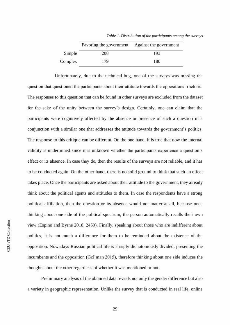
Table 1. Distribution of the participants among the surveys
Favoring the government Against the government
Simple 208 193
Complex 179 180
Unfortunately, due to the technical bug, one of the surveys was missing the
question that questioned the participants about their attitude towards the oppositions’ rhetoric.
The responses to this question that can be found in other surveys are excluded from the dataset
for the sake of the unity between the survey’s design. Certainly, one can claim that the
participants were cognitively affected by the absence or presence of such a question in a
conjunction with a similar one that addresses the attitude towards the government’s politics.
The response to this critique can be different. On the one hand, it is true that now the internal
validity is undermined since it is unknown whether the participants experience a question’s
effect or its absence. In case they do, then the results of the surveys are not reliable, and it has
to be conducted again. On the other hand, there is no solid ground to think that such an effect
takes place. Once the participants are asked about their attitude to the government, they already
think about the political agents and attitudes to them. In case the respondents have a strong
political affiliation, then the question or its absence would not matter at all, because once
thinking about one side of the political spectrum, the person automatically recalls their own
view (Espino and Byrne 2018, 2459). Finally, speaking about those who are indifferent about
politics, it is not much a difference for them to be reminded about the existence of the
opposition. Nowadays Russian political life is sharply dichotomously divided, presenting the
incumbents and the opposition (Gel’man 2015), therefore thinking about one side induces the
thoughts about the other regardless of whether it was mentioned or not.
Preliminary analysis of the obtained data reveals not only the gender difference but also
a variety in geographic representation. Unlike the survey that is conducted in real life, online
CE
UeT
DC
olle
ctio
n

30
form of communication allows to go beyond the geographic boundaries. The map depicted in
Figure 1 shows the geographical distribution of the participants.
As expected, Moscow and Saint Petersburg are the cities with the biggest number of
survey participants – 40% of the respondents come from one of these cities. It can be plausibly
explained by a higher quality of education in bigger cities of Russia, and in particular in Saint
Petersburg and Moscow. Overall the distribution corresponds to the actual location of the
universities in Russia.
Since the survey suggests not only yes or no answer to the question about the trust to
the infographics but also an option to leave a personalized more elaborated answer, such
answers were recoded. Based on the results that were obtained from the focus groups, having
an opportunity to leave a different from yes or no reply to the given final question is crucial.
Otherwise, the participants tend to whether guess the socially favorable answer or just to refuse
to respond. Even though less than 9% of the participants gave a different response, the very fact
of having an option to reply something else except for restricted binary options gives them a
Figure 1. Geography of the participants
CE
UeT
DC
olle
ctio
n
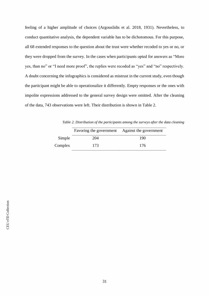
31
feeling of a higher amplitude of choices (Argouslidis et al. 2018, 1931). Nevertheless, to
conduct quantitative analysis, the dependent variable has to be dichotomous. For this purpose,
all 68 extended responses to the question about the trust were whether recoded to yes or no, or
they were dropped from the survey. In the cases when participants opted for answers as “More
yes, than no” or “I need more proof”, the replies were recoded as “yes” and “no” respectively.
A doubt concerning the infographics is considered as mistrust in the current study, even though
the participant might be able to operationalize it differently. Empty responses or the ones with
impolite expressions addressed to the general survey design were omitted. After the cleaning
of the data, 743 observations were left. Their distribution is shown in Table 2.
Table 2. Distribution of the participants among the surveys after the data cleaning
Favoring the government Against the government
Simple 204 190
Complex 173 176
CE
UeT
DC
olle
ctio
n

32
Chapter 3 – Analysis of the data
3.1 Regression analysis
3.1.1 Why logistic regression?
As a method of statistical analysis, logistic regression suits the goal to test the
hypotheses perfectly. Logistic regression allows one to work with the dependent dichotomous
variable, as well as any regression it reveals how a change in independent variables influence
the dependent one in case the former is statistically significant.
Logistic regression does not require assumptions about the distribution of
predictors to be met (Tabachnick, Fidell, and Ullman 2007, 444). However, the absence of the
outlying observations and no multicollinearity in the model itself are able to enhance the power
of the predictors. Based on Cook’s distance, the biggest outliers were dropped from each
survey’s models that are discussed below. Consequently, 731 observations are kept instead of
the initial 743.
3.1.2 First regression models
Prior to the analysis of the data divided by the infographics that were in the surveys the
observations were obtained from, all data points are joint in the same data frame in order to see
what the decisive parameter for the infographics is regardless of their political affiliation and
complexity.
Collected data is used in a regression model. The analysis of such models
consists of several steps assuring that the results are reliable from the perspective of the fit and
statistical significance.
The questions of the survey form 16 variables, only 7 of which are used in the
regression model. Some of the variables, as University, Sources_trusted, Sources_not_trusted,
are collected for the sake of making additional insights when interpreting the results, and they
do not have value for the statistical analysis.
CE
UeT
DC
olle
ctio
n

33
The other not used in the model variables are the ones that whether cause
multicollinearity or those that decrease the overall fit of the model. For instance, Age and
Education stage are highly correlated, hence only one variable should be chosen. Since the
Education stage provides a better fit of the model, it is chosen over the Age. Additionally, and
quite surprisingly, Interest_to_politics and Political_activity lead to a poorer fit, and they are
not statistically significant neither in the regression run on the whole data, nor in the cases of
the further tests. Therefore, these variables are excluded from the analysis, albeit they can be
helpful for descriptive statistics and supplementary analysis.
Table 3 presents regression results and odds values for the statistically significant
variables. Since logistic regression cannot be interpreted with coefficients derived from the
summary of the model, the interpretation should come from the probabilities that are calculated
from the odds or more accurately from the odds ratio.
Table 3. Regression results and odds for statistically significant variables (all data points)
Dependent variable
Trust
Regression coefficients Odds
Gender 0.458
(0.278)
Education stage -0.108
(0.578)
Major 0.004
(0.147)
Trust to people 0.288*
(0.120)
1.721
Trust in information 0.543***
(0.147)
1.335
Attitude to government -0.154
(0.090)
Observations 731
* p<0.05; ** p<0.01, *** p<0.001
CE
UeT
DC
olle
ctio
n

34
The odds represented in the right column of Table 3 are interpreted as probabilities. The
formula for calculating the probabilities is the following (Davies, Crombie, and Tavakoli 1998,
990):
𝑜𝑑𝑑𝑠
𝑜𝑑𝑑𝑠 + 1
Depending on whether the odds are higher or smaller than 1, the interpretation varies.
When the odds are higher or equal 1, the formula is used as it is. In such a case the probability
shows the chance that two variables increase their value together. For instance, if the odds are
1.786, then there is a 64% chance that an increase in the explanatory variable leads to value 1
in a dichotomous response variable.
However, when the odds are smaller than one, then an increase in the independent
variable leads to 0 value of the dependent variable. Moreover, the probability derived from the
odds formula should be extracted from 1 before interpreting. As an example, 0.786 would be
understood as a 56% chance that an increase in explanatory variable results in a 0 value of a
respondent one.
Therefore, regardless of the complexity and political affiliation of the
infographics, there is a 63% and 57% chance that higher trust to people and information
respectively lead to trust in the infographics. However, depending on the features of the
infographics, there could be different factors that influence the one’s propensity to trust the
infographic.
For the sake of convenience, the models that reflect the observation obtained
from each of the surveys have a short name corresponding to the infographics they were
exposed to. Models that work with the simple or complex infographics have “simple” or
“complex” in their name respectively. The political affiliation of the infographics is marked as
“yes” and “no” in the names of the models, implying the infographics in favor and against the
CE
UeT
DC
olle
ctio
n

35
government’s politics respectively. The p-values from each survey’s model are presented in
Table 4.
Table 4. Regression results for each infographic
Dependent variable
Trust
SIMPLE_YES SIMPLE_NO COMPLEX_YES COMPLEX_NO
Gender -0.639
(0.436)
-0.143
(0.354)
0.326
(0.459)
0.700
(0.415)
Education stage -0.169*
(0.083)
-0.107
(0.078)
-0.233*
(0.108)
-0.065
(0.078)
Major 0.732***
(0.218)
-0.082
(0.186)
0.195
(0.242)
-0.083
(0.215)
Trust to people 0.271
(0.180)
0.275
(0.161)
0.288
(0.211)
0.216
(0.177)
Trust in information -0.053
(0.205)
0.580**
(0.205)
0.575*
(0.258)
0.993***
(0.230)
Attitude to government 0.166
(0.126)
-0.218
(0.125)
0.176
(0.150)
-0.447***
(0.128)
Observations 204 190 173 176
* p<0.05; ** p<0.01, *** p<0.001
Table 5. Odds for each statistically significant variable
Dependent variable
Trust
SIMPLE_YES SIMPLE_NO COMPLEX_YES COMPLEX_NO
Gender
Education stage 0.844 0.791
Major 2.080
Trust to people
Trust in information 1.786 1.778 2.701
Attitude to government 0.639
Observations 204 190 173 176
Hence, in the case of SIMPLE_YES model, there is a 68% chance that majoring in
social sciences and humanities leads to the trust in the infographics, as well as later education
stages lead to 54% chance in distrusting. Even though the former was not expected, but the
perception of the simple infographic varied depending on its political affiliation, and major does
not cause any difference in the SIMPLE_NO model. Instead, general trust in the information
CE
UeT
DC
olle
ctio
n
36
on the Internet makes a difference. In particular, there is a 64% chance that higher trust to the
Internet sources leads to the trust in the simple infographic that is politically against the
government.
Complex negative towards the government infographic also shows statistically
significant value for the “trust in information”. The tendency among the participants is the
same, although the chance is slightly higher – 73%. However, in the case of COMPLEX_NO,
there is a 61% chance that those who are close to the government do not trust this infographic.
Interestingly, attitude to the government is not statistically significant for the COMPLEX_YES
model. Additionally, the education stage slightly contributes to the change in the outcome –
56% chance the those who are in the latest stages of obtaining their degree do not trust the
complex positive towards the government infographic. Finally, COMPLEX_YES reveals the
same 64% chance that those who trust the information on the Internet more, trust the
infographic too.
From the first glance, one can say that people tend to reply in accordance with
their propensity to trust the information on the Internet, rather than with anything else.
Therefore, it is unlikely that the design of the infographics or their political affiliation have an
influence on the trust of the audience. However, there are some additional variables that have
in effect in some models and do not have in others. The next section interprets the results in
order to reject or verify the null hypotheses stated in the theoretical part of the work.
3.2 Hypothesis testing
Using the model mentioned earlier, we are able to test hypotheses 1. Test of
hypothesis 2 requires additional analysis that targets the complexity of the infographic. Such
analysis is supposed to compare the models and the datasets between one another, so it is not
included in the first step of data analysis.
CE
UeT
DC
olle
ctio
n

37
3.2.1 Hypothesis 1
One part of the first hypothesis addresses the influence of the academic discipline on
the propensity to trust the infographic. The variable that is important for this hypothesis is
Major – it is a categorical explanatory variable that has value 1 for those who study exact
sciences, 2 for students of humanities, and 3 stands for social science students.
The results of the logistic regression with the chosen setting of the explanatory
variables reveal that there is only one case when the participants’ major made a difference.
Major is statistically significant only in the SIMPLE_YES model. This means, that we cannot
reject the null hypothesis in the case of hypothesis 1, because the effect occurred only in one
model.
However, those who major in social science can have some unusual patterns in
comparison with the rest. Particularly, they could be more likely to be consistent with their
political partisanship, hence trust or distrust the infographics according to their political
standings, and not infographics complexity.
Since Attitude to government is a continuous variable measuring on a 1-7 scale
the proximity of respondents’ political views to the ones that are translated by the government,
it can be a proxy for defining to what political partisanship group one belongs. Relying on one
variable without controlling for Interest to politics or Political activity can keep a data on those
who could be not actual political partisans, but rather randomly, or as Meade and Craig (2012,
439-440) put it, carelessly answering individuals. Therefore, Table 6 provides a percentage of
those who trusted the infographics with both with and without control for interest in politics.
CE
UeT
DC
olle
ctio
n

38
Table 6. Percentage of students of different majors who trusted the infographics
SIMPLE_YES COMPLEX_YES SIMPLE_NO COMPLEX_NO
Without control for interest in politics
E H S E H S E H S E H S
Not supporting
the government
15 21 29 25 10 13 42 20 42 50 57 40
Indifferent
21 41 52 12 9 42 38 35 40 35 40 35
Supporting the
government
0 25 25 50 0 60 38 0 0 18 20 0
With control for interest in politics
E H S E H S E H S E H S
Not supporting
the government
17 21 27 26 8 6 46 27 50 56 64 53
Indifferent
13 40 53 13 0 30 23 30 42 13 40 36
Supporting the
government
0 33 33 50 0 50 29 0 0 13 25 0
In green is percent that is expected to high, and in red – to be low
Majors are denoted as E – exact sciences, H – humanities, S – social sciences
Group “Not supporting the government” consists of those who chose 1 or 2 on a
7-point scale when answering a question about the Attitude to government. “Indifferent” are
those who chose 3 or 4, and “Supporting the government” are those who opted for 5, 6, or 7.
For the second part of the table that controls for the Interest to politics, respondents who chose
1 or 2 on a similar 7-point scale are not considered.
Based on the structure of the responses, rejection of hypothesis 1 holds. All
majors show similar trends in responses, so social science students are not anything special.
One can say that comparison between different majors does not provide meaningful credible
insight, because as can be seen from Table 4, main influencing factor on people’s trust to the
infographics is Trust in information. Hence, different majors can have different shapes of the
distribution of replies to the question about the trust in information, meaning that comparison
on the basis of a statistically irrelevant factor does not make sense. However, frequency
distribution for Trust in information has a similar shape across all three majors.
CE
UeT
DC
olle
ctio
n
39
The other part of hypothesis 1 targets the partisanship’s effect. Attitude to government
is the variable that is responsible for the test of this hypothesis. As it can be seen from the
regression’s results, there is only COMPLEX_NO model that reports the statistical
significance. The effect of this variable is expected by the hypothesis – the respondents were
relying on their partisanship in the process of making a decision to trust or not to trust the
infographic.
Nevertheless, the effect is observed in only one model, hence we are not able to reject
the null hypothesis. It means that there is no universal impact of the political affiliation of the
audience. Instead, there can be confounding factors, which are present in one model and not in
the rest. Also, as it can be seen in Table 6, political partisanship somewhat reflects the
expectations. Those who favor the government tend to trust favoring infographics and vice
versa. Even though the sample size for such a conclusion is very small, consideration of possible
factors made in the following parts of the work provides possible explanations to this
observation.
3.2.2 Hypothesis 2
Hypothesis 2 addresses the complexity of infographics. It is assumed that simple
infographics cause less trust, especially among those who are politically neutral. In turn,
complex infographics are supposed to be trusted more, and the same as previously, politically
neutral individuals are assumed to trust more than the partisans.
To test the part about the neutrality of this hypothesis two datasets for complex and
simple infographics with only politically neutral respondents are formed. It is not yet clear how
to operationalize political neutrality on the basis of the existing data. There are three possible
variables that could stand for political affiliation: Interest in politics + Political activism,
Attitude to government, or a combination of Most and Least trustworthy news sources. Even
though Interest in politics is the most relevant one, the other two are worth considering too.
CE
UeT
DC
olle
ctio
n

40
There are many observations, that have contradicting values of the variables. For instance, some
respondents tend to say that they are not interested in political information (Most and Least
trustworthy news sources), but at the same time they state their high interest in politics (Interest
in politics).
The most parsimonious solution is a preferable one. The neutrality is then measured by
combining Interest in politics, and Attitude to government. The former variable keeps only those
who answered that they are not interested in politics, hence they are fairly indifferent about the
political life of the country. However, since the current level of interest in politics does not
reflect political partisanship of the person. Therefore, the variable that measures the
partisanship should filter for those responses that revealed a neutral attitude towards the
government – 3 or 4 out of 7 on a scale that is used in this variable.
For another part of the hypothesis addressing the rest of the respondents, only merging
dataset of the same infographic complexity is needed. Table 6 shows the percentage distribution
of the votes depending on complexity of the infographics, and political partisanship of the
respondents. It is both visible from the table and proved by a chi-square test that there is no
statistically significant difference between the responses of politically neutral people.
Table 7. Percentage distribution of politically neutrals and the rest of the sample
Infographics’ layout Trust Distrust
Politically neutral Simple 44 % 56 %
Complex 40 % 60 %
The rest Simple 29 % 71 %
Complex 26 % 74 %
For those who are not politically, there is a strong tendency of the respondents to distrust
the infographic regardless of its complexity. In turn, politically neutral respondents do not have
any specific tendency to trust or distrust the infographics, rather the opposite. The distribution
of their answers is almost equal disregarding some insignificant fluctuations.
CE
UeT
DC
olle
ctio
n

41
The observable results lead one to the conclusion that hypothesis 3 should be
rejected. Simple infographics do not cause less trust, while complex ones are not more credible
either. However, the discrepancy in the distribution between these subsets can be explained by
the absence of political interest and consistent opinions of the disinterested group, hence less
predictable results. To uncover the factors that might be influencing the trust to the
infographics, additional logistic regression models are run on the datasets presented in Table 6.
Table 8. Regression results for combined by complexity datasets
Dependent variable
Trust
Politically neutral The rest All
SIMPLE
COMPLEX
SIMPLE
COMPLEX
SIMPLE
COMPLEX
Gender 0.482
(0.755)
-2.393
(1.847)
-0.495
(0.289)
0.713*
(0.303)
-0.412
(0.262)
0.466
(0.281)
Education stage -0.487**
(0.172)
-0.157
(0.203)
-0.104
(0.060)
-0.112
(0.062)
-0.132*
(0.053)
-0.101
(0.057)
Major 0.873
(0.682)
-1.039
(0.765)
0.163
(0.259)
0.260
(0.278)
0.214
(0.230)
0.095
(0.251)
Trust to people 0.479
(0.383)
0.542
(0.343)
0.097
(0.121)
0.323*
(0.137)
0.178
(0.110)
0.254*
(0.119)
Trust in
information
-0.182
(0.397)
0.497
(0.406)
0.403*
(0.158)
0.539**
(0.164)
0.193
(0.133)
0.510***
(0.145)
Attitude to
government
-0.059
(0.092)
-0.152
(0.097)
-0.006
(0.083)
-0.158
(0.090)
Observations 61 44 333 305 397 352
* p<0.05; ** p<0.01, *** p<0.001
Table 7 presents the results of regression analysis. Politically neutral respondents do not
have the Attitude to government included in the model since it was a filtering criterion for the
corresponding subsets. For the sake of comparison, the model is run on the full datasets too.
While it is difficult to draw a conclusion on the basis of the small samples of the models
containing data on politically neutral respondents, the other two subsets can be interpreted more
confidently.
CE
UeT
DC
olle
ctio
n
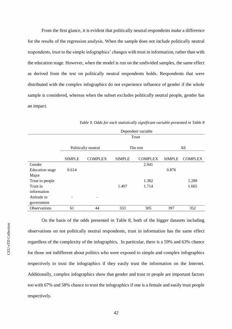
42
From the first glance, it is evident that politically neutral respondents make a difference
for the results of the regression analysis. When the sample does not include politically neutral
respondents, trust to the simple infographics’ changes with trust in information, rather than with
the education stage. However, when the model is run on the undivided samples, the same effect
as derived from the test on politically neutral respondents holds. Respondents that were
distributed with the complex infographics do not experience influence of gender if the whole
sample is considered, whereas when the subset excludes politically neutral people, gender has
an impact.
Table 9. Odds for each statistically significant variable presented in Table 8
Dependent variable
Trust
Politically neutral The rest All
SIMPLE
COMPLEX
SIMPLE
COMPLEX
SIMPLE
COMPLEX
Gender 2.041
Education stage 0.614 0.876
Major
Trust to people 1.382 1.289
Trust in
information
1.497 1.714 1.665
Attitude to
government
- -
Observations 61 44 333 305 397 352
On the basis of the odds presented in Table 8, both of the bigger datasets including
observations on not politically neutral respondents, trust in information has the same effect
regardless of the complexity of the infographics. In particular, there is a 59% and 63% chance
for those not indifferent about politics who were exposed to simple and complex infographics
respectively to trust the infographics if they easily trust the information on the Internet.
Additionally, complex infographics show that gender and trust to people are important factors
too with 67% and 58% chance to trust the infographics if one is a female and easily trust people
respectively.
CE
UeT
DC
olle
ctio
n
43
This can mean that politically neutral people should be targeted by political infographics
separately or depending on the goal probably not targeted at all. In the case of not neutral
respondents, their behavior is more predictable, even though strikingly it is not influenced by
their partisanship.
3.3 Tree-based methods
Tree-based methods are supervised machine learning technique used for regression if
the predicted variable is continuous, or for classification in a case when the dependent variable
is categorical. These methods attempt to segment the space of explanatory variables into several
areas handled with partitioning classifiers (Buntine 1992, 63).
Taking into account that trust to infographics is a dichotomous variable, classification
trees are built. The tree-based method is able to provide deeper insights before introducing
theoretical explanations of the findings. While the mechanism is very similar to logistic
regression, decision tree provides more intuitive interpretation of the most important variables
by placing them on top of the tree, as well as the branches of the tree give better understanding
of the influencing parameters by gradually narrowing down the features of the respondents
(Rudd et al. 5, 2017). Additionally, decision trees mirror the human decision-making process,
hence it is more useful when it comes to recommendations and suggestions (James et al. 2013,
330).
However, according to James et al. (2013, 331), tree-based methods carry two important
disadvantages. First is a relative weakness of predictive accuracy than generalized linear
regressions, such as the logistic one used as the main analysis technique above. Secondly,
decision trees can be highly non-robust, meaning that even small changes in the data used for
training the model are able to cause significant changes in the tree structure.
The former limitation is addressed by using logistic regression and classification tree
together for deeper insights, rather than separately with a goal to choose a better model. The
CE
UeT
DC
olle
ctio
n
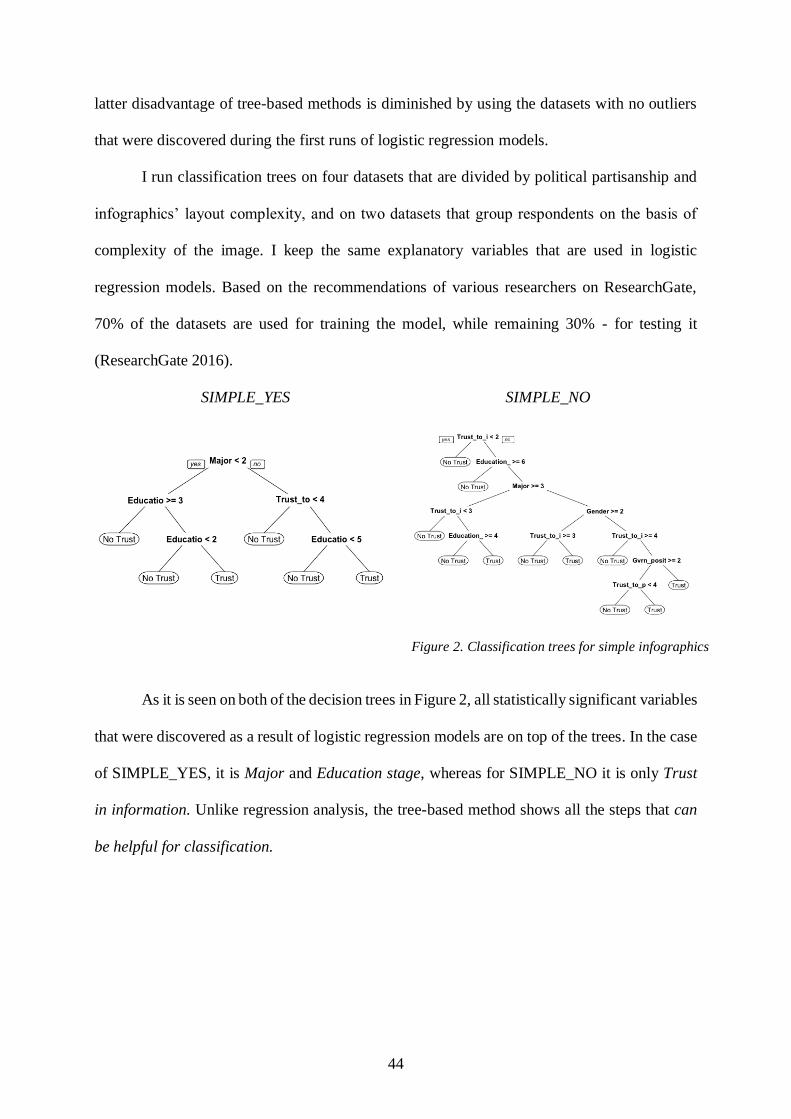
44
latter disadvantage of tree-based methods is diminished by using the datasets with no outliers
that were discovered during the first runs of logistic regression models.
I run classification trees on four datasets that are divided by political partisanship and
infographics’ layout complexity, and on two datasets that group respondents on the basis of
complexity of the image. I keep the same explanatory variables that are used in logistic
regression models. Based on the recommendations of various researchers on ResearchGate,
70% of the datasets are used for training the model, while remaining 30% - for testing it
(ResearchGate 2016).
SIMPLE_YES SIMPLE_NO
As it is seen on both of the decision trees in Figure 2, all statistically significant variables
that were discovered as a result of logistic regression models are on top of the trees. In the case
of SIMPLE_YES, it is Major and Education stage, whereas for SIMPLE_NO it is only Trust
in information. Unlike regression analysis, the tree-based method shows all the steps that can
be helpful for classification.
Figure 2. Classification trees for simple infographics
CE
UeT
DC
olle
ctio
n

45
COMPLEX_YES COMPLEX_NO
Same as in the case with trees for simple infographics, complex ones have statistically
significant variables at their roots: Education stage and Trust in information for
COMPLEX_YES and Trust in information and Attitude to government for COMPLEX_NO.
Interestingly, while models look nothing alike if one compare trees within simple, and complex
infographics group, a juxtaposition of the models with the same political affiliation of the
infographics highlights the similarities. Even though these similarities have different
importance for different trees, the thresholds of their predictions are the same, especially for
infographics presenting information against the government.
For instance, in both SIMPLE_NO and COMPLEX_NO trees Major plays an important
role. In the former model, it is a dividing factor, separating social science students and defining
for them a different list of important criteria with different cutting lines. The latter model uses
the same variable for narrowing down the spectrum of one’s responses.
In the case of favoring the government infographics, most resembling variable is
Education stage that appears more than ones. Having different thresholds, stage of education
might be not the most decisive factor for both models, it is certainly influential enough to
narrow down the choice set for the participants. Certainly, all of the models have their own
Figure 3. Classification trees for complex infographics
CE
UeT
DC
olle
ctio
n

46
preceding parameters that are confounding factors in the real-world situation, albeit such
similarities should be considered separately.
Additional observation on decision trees can be made by looking at the visualizations
of the trees. Evidently, the factors that drive people’s decision to trust or not to trust the
infographics that do not favor the government are much more complex than the ones that are
important for the opposite infographics. It is unclear whether COMPLEX_NO and
SIMPLE_NO classification trees are overfitting models, although they use the same 70/30
proportion for training and testing as the other two models. To better understand the usability
of the models, they are tested on the observations that are not used in the training dataset.
Table 10. Prediction accuracy of the classification trees
SIMPLE_YES
SIMPLE_NO COMPLEX_YES COMPLEX_NO
Prediction
accuracy 72% 63% 77% 70%
Observations 61 57 52 53
Table 10 presents that on average trees have a 70% chance to correctly predict
respondents’ decision to trust or not to trust the infographics. While these models can be further
modified and improved by pruning or running random forest algorithms, their current
performance is satisfactory enough to allow us to move to address the limitations of the analysis
that was already done.
3.4 Limitations
Certainly, no data gathering and analysis are flawless. Each step has its own limitations
that have implications for the whole study. In order to understand the generalizability of the
work better, it is vital to examine and address the limitations with the suggestions for further
improvement.
CE
UeT
DC
olle
ctio
n
47
One of the first fundamental limitations come from the data gathering process. There is
a fairly drastic gender disbalance among the respondents since more than 70% of the
participants are women. This skews the sample a lot, decreasing the external validity of the
study.
However, the web-link to the survey was shown to an equal number of men and women,
but evidently, females participated in the survey more actively. The only thing that could be
done is the change in the settings of the ad, in particular – increased ad demonstration rate for
men. Nonetheless, this would deprive the survey of randomization because we would create a
certain selection procedure that hinders our capacity to generalize to the bigger population.
Since we are not interested in generalization to men only, randomization is kept. More than
that, the evidence that depict women as the group with much higher survey response rate can
tell us something about the audience’s behavior and attention, which can be explored in the
studies with a different research scope.
Another point that can be made about the sample is the size of the subset of politically
neutral respondents. Their cumulative number is 108 and it is even smaller after data cleaning
– 105. When the sample is divided by the infographics’ complexity, subsets have 61 and 44
observations for simplex and complex infographics respectively. Such a small number of
politically neutrally respondents can be overcome by whether defining political neutrality
differently or by continuing data gathering. However, since not more than 15% of the
respondents are politically neutral, it provides a ground for an assumption that Russian students
tend to have an opinion and/or political interest about what is happening in their country,
contradicting the survey’s results conducted on a general population (Levada-Center 2017).
Additionally, due to the features of the advertising in VKontakte, only administrator of
a public page or a group can post an advertisement. The only group that I have access to as an
administrator is named “Educational Emigration”. The naming of this group could lead the
CE
UeT
DC
olle
ctio
n

48
audience to think that the survey looks forward to those who oppose the government. Therefore,
the respondents could opt for as they assume socially preferable options (Meade and Craig
2012, 438). Moreover, it could lead to the skew in political partisanship representation, since
supporters of the government could be repelled by the group’s name that implies emigration
from Russia.
Speaking about the operationalization of trust, this study does not control for what
people think the trust is. When the respondents are asked “Do you trust this infographic?”, they
can think about any variation of trust, which is not necessarily is the same for everyone. Hence,
we might be misinterpreting the results, labeling “trust” in accordance with our perception.
To overcome this limitation, the notion of trust should be explained. However, since the
study addresses rather a reaction than a thoughtful process of thinking, it is excessive to provide
the explanation of what exactly the participants are expected to think about trust. This is a trade-
off, and this study opts for the more parsimonious model of interaction with the participants.
At the end of the day, people’s own operationalization of trust is more crucial than the unified
academic version of it. In the end of the day, own perception of “trust” is the one they refer to
once exposed to the infographic.
Similar operationalization issue could happen with the question about one’s attitudes
towards the government. Yet in this case, the continuous measurement is able to catch the
variation much easier, so the problem is less likely to occur.
Finally, there is no control for how much time the participants spent on the survey and
on the infographic in particular. While some could reply in seconds, nobody was limited in time
and they all were able to spend quite some time on the consideration or even search for the
proofs. Unfortunately, here we can only assume that the respondents were not that much
engaged in the topic and the survey in general, so they did not consider checking the information
in other sources or take a long time to think before their reply.
CE
UeT
DC
olle
ctio
n
49
Chapter 4 – Interpretation of the results
4.1 Results of the hypotheses test
4.1.1 Hypothesis 1
The first hypothesis assumes that political partisanship leads people to be consistent
with their trust in political information and majoring in social sciences leads to an even stronger
relationship.
As derived from the regression results, political partisanship is statistically significant
only in the case of those who were exposed to the complex hostile towards the incumbent
infographic. Hence, the second hypothesis is rejected, and there is no effect of the political
partisanship on one’s propensity to trust.
Nevertheless, it is worth considering the case of COMPLEX_NO, where according to
the odds there is a 61% chance that one does not trust the infographic if they are loyal to the
existing government. However, unlike SIMPLE_YES discussed above, trust to this infographic
also relied on trust in information, meaning the case is not entirely deviant since respondents
were influenced by the same factor that is statistically significant in 3 out of 4 models.
One of the possible explanations is that those who favor the government are more
consistent with their political views when it comes to processing and trusting the information
that is presented on the charts. Distrusting one type of infographics does not automatically lead
to the trust of the opposite ones. In such a case those who favor the government can be perceived
as skeptical and not trusting complex information that goes against their political standings, yet
it does not anyhow address trust to the more politically pleasant information.
The evidence from the literature cannot directly support or refuse such an explanation.
The extent of trust to political information varies depending on the country (Fletcher and Park
2017, 1296), and there is a lack of studies conducted on a Russian case to provide meaningful
insight on the propensity of different partisans to trust the online sources of political
CE
UeT
DC
olle
ctio
n

50
information. Further studies can investigate whether the opposition and government supporters
tend to trust the information differently as in the case of the Republicans and the US media (Lee
2005, 43).
Regarding the academic major, evidence obtained from the data and presented in Table
6 suggests that major does not have an impact on one’s trust to the infographics.
In fact, the survey that exposed its participants to the simple infographic favoring the
government suggests quite unexpected tendency of social science and humanities students to
show a 68% chance to trust the infographics regardless of their political standings. This could
mean, that very simple infographic that obviously favors the government does not “pass” the
education test. While the political message of the infographic is easily delivered by visual
simplicity, the charts themselves could be more critically evaluated by those who major in exact
sciences. Students of hard subjects tend to spend more time studying, reading the learning
materials, and preparing for the classes in general (Statista 2011). Such students could focus on
the evaluate the charts stricter and doubt at their credibility more. However, it is unclear why
such an effect holds only in case of the simple infographic favoring the government and
nowhere else.
Additionally, the reason behind the absence of the effect can be rooted in possible lack
of high-quality education in social sciences and humanities in Russia. According to the QS
University Rankings, only four or nine Russian universities are in top 500 for “Politics and
International Studies” and “Social Sciences” respectively (QS World University Rankings
2019). On the contrary, thirteen universities in “Engineering and Technology” and in “Natural
Science” are in the same range ranking, including regional universities outside of Moscow and
Saint Petersburg. Possibly it could imply that majoring in social sciences provides relatively
weak knowledge, hence diminishing the distinguishing features of this field of studies.
CE
UeT
DC
olle
ctio
n

51
4.1.2 Hypothesis 2
Summarized in Table 7 distribution of those respondents who trusted or distrusted the
infographics depending on whether they are politically neutral reveals that the third hypothesis
cannot be accepted. Indeed, there is a difference between the inclination of politically neutral
respondents to trust or distrust the infographics from those who are not neutral, although such
a difference is distinct from expected.
In particular, politically neutral respondents tend to gravitate around the equal share in
the distribution of those who trust or do not trust the infographics regardless of the complexity
of the image. For those who are not neutral, the proportion is closer to 70/30, where 70% are
those who do not trust the infographics. On the one hand, it confirms that politically neutral
respondents tend to trust the complex layout more. On the other hand, it is possibly connected
to the entirely different reasoning to trust the information rather than the complexity of the
images.
Politically neutral respondents can be more prone to trust the political infographics due
to their lack of skepticism in political information. Since they do not have firm standings,
whether being strongly in favor or in opposition to the government, this group of respondents
believes presented information easier. (Taber and Lodge 2006, 765)
Another possible reason is careless answering when respondents answer almost
randomly (Meade and Craig 2012, 439-440). This can be overcome by interviewing those who
are defined as careless respondents, or more technically with even-odd consistency or
multivariate outlier analysis (Meade and Craig 2012, 453). The current study does not
implement any of the methods that could identify the careless answers, but further research can
be conducted on the same dataset, and hypothesis 3 could be revisited.
CE
UeT
DC
olle
ctio
n

52
4.2 Trust in information as a decisive factor
Individual’s tendency to trust the information in general is the parameter that is
statistically significant in every model except for the SIMPLE_YES, where the behavior of the
participants is influenced by very different factors. Looking at the tree model for the same
infographic, it is clear that trust in information becomes important for those who study
humanities or social sciences, while it is irrelevant for students majoring in exact subjects. Even
though trust in information is not statistically significant in the logistic model, slicing shown
by classification tree highlights that this variable has a certain degree of power. Prediction
accuracy of SIMPLE_YES decision tree is 72%, so trust in information can be considered if
not a decisive factor, but important when one looks closely at the observations and attempts to
accurately forecast respondents’ choice.
It is not surprising that trust in information has predictive power over whether a person
trusts the infographics or not. Infographic is a graphical depiction of the information, and it is
a matter of the strength of the political bias one has. One can be blinded by their political beliefs
and trust the information on the charts without addressing own skepticism to the information in
general. Apparently, it is not the case for university students in Russia. Regardless of the
complexity and political affiliation of the infographics, respondents rely on their personal trust
in information.
However, trust in information is a driving force for those who are neutral to politics and
political actors. Table 8 illustrates that regression models conducted on politically neutral
respondents do not show statistical significance of Trust in information. Capella (2002)
highlights the importance of personal cynicism that underlies the trust to government or
politicians. Possibly, it similar to personal trust in information, which indeed can be the most
important factor to those who are not indifferent towards politics.
CE
UeT
DC
olle
ctio
n

53
Additionally, the decision trees show us that the structure of the models built on the
observation corresponding to the negative towards the government position, SIMPLE_NO and
COMPLEX_NO are much more complex in their structure than SIMPLE_YES and
COMPLEX_YES. Both negative towards the government models start with the trust in
information, meaning that it is the most important parameter for slicing the observation. It is
not the case even for COMPLEX_YES model that has Trust in information statistically
significant in the regression model.
Reliance on trust in information and more nuanced division of the group of those who
trust or distrust the negative towards the incumbent infographics can signify that such
information is evaluated more critically than the other. Similar to the what can be discovered
in the US politics (Watts et al. 1999, Lee 2005, Lee 2010), one side of the political actors can
try to undermine people’s trust to the information sources in Russia too. Pro-governmental
sources consistently discredit people and media that are so-called “anti-Russian” (Federal News
Agency 2019), and opposition leader’s name is not mentioned in news at all, and those who
talk about him on the federal TV channels are punished (Meduza 2018b).
The government’s attempts to undermine the credibility of the oppositional information
sources is not senseless. Evidence from the study of Enikolopov, Petrova, and Zhuravskaya
(2011) suggest that the probability of voting for the independent party in parliamentary
elections of 1999 increased when one watched independent TV channels. Understanding the
importance of being the most attractive source of information, state media mixes truth with
inflated numbers, or conscious disregard of certain facts (Gehlbach 2010, 82). Since the
government media has a much bigger budget and coverage across the country, it is more
feasible for them to address every media channel. Hence, people are more used to pro-
governmental materials, and fewer parameters are needed to identify who would trust such
CE
UeT
DC
olle
ctio
n

54
information. It can be tested in the next studies that would use the information on the most
trusted and distrusted sources collected by already conducted surveys.
4.3 Possible explanatory variables
Finally, there could be other explanatory parameters driving one’s responses. For
instance, control for group membership could reveal a confounding factor clarifying why one
is more skeptical towards the information, and the other is less. According to Gunther
“membership in political, religious, ethnic, or other social groups carries with it attitudes,
beliefs, and a personal stake in group concerns” (1992, 152). Since Russia is a highly
demographically diverse country, group membership can become an identifying factor that
further influences the propensity to trust to the information presented on the Internet (Golan
and Day 2010; Criado et al. 2015).
The most trusted channel of information can be a confounding factor too. Research
conducted by Kiousis (2001) reveals that based on the results of the survey that was hold in
Austin, Texas, television, newspapers, and online news are ranked differently by the consumers
in terms of trustworthiness. In case a person rates offline sources of information significantly
higher than online ones, then it can speak for their political exposure since newspapers and TV
channels are almost entirely controlled by the state (Freedom House 2017).
Economic conditions can be an important explanatory variable too. Lee (2010) finds
that economic performance is important for USA voters when they are asked about trust in the
government. Level of political cynicism is negatively correlated with the economic
development of the country, so it can become a more important parameter than the attitude
towards the government as such.
From the perspective of infographics content, and possibly the most important, the
absence of the sources of information could cause the distortion of the results. While it is not
common for the infographics to omit the source name nowadays, it was important for the
CE
UeT
DC
olle
ctio
n

55
current study to address the perception of the infographics depending on both complexity and
political affiliation, and not just the latter. In case the sources would be included, one could rely
on their credibility, and not consider the complexity of the layout. Besides, the infographics
contain fictional information for the sake of complete symmetry of the message, hence it was
not possible to include the sources without lying to the respondents.
4.4 Future research
Due to the fact that the survey has data that was not used in this study, the data can be
examined in further study. In particular, the variables Most and Least trustworthy news sources
can support analysis of people’s media preference or overview of the Russian media affiliation.
Considering recent report of the Federal News Agency (2019) that radically names certain news
sources “anti-Russian”, it is prominent to identify whether the audience sees “anti-Russian” and
“pro-Russian” media the same way.
Named above possible explanatory variables could be included in future research too.
In case the survey is able to collect more observations, not four but eight infographics could be
used for the testing, where additional four would be the ones with the source of information
mentioned. A bigger sample would make it possible to include different social groups and not
only university students.
Study of the Russian news sources and their affiliation, as well as research conducted
with bigger sample and range of variables can contribute to the field of studies on trust,
infographics, and Russian media environment. Moreover, it will provide a basis for a more
comprehensive interpretation of the current results and allow to revisit refused hypotheses.
CE
UeT
DC
olle
ctio
n

56
Conclusion
The intersection of trust, visual representation of the information, and political
partisanship is a fairly new yet prominent field. Answering the question of why political
infographics are distrusted by some people and trusted by others, one can contribute to the field
with findings on driving trust to infographics factors.
Two hypotheses constructed around the research question reflect the expectations that
are found true in most studies conducted on various media channels. First of them claim that
being politically partisan leads to the trust in the infographics favoring the same positions, while
majoring in social science increases this consistency. The second hypothesis states that a simple
layout of the infographics invokes less trust, especially among politically neutral respondents.
Four infographics that vary in complexity and political affiliation were used during the
focus groups to evaluate how students perceive these infographics, and whether they understand
them as intended by the research design.
Changed in accordance with the focus groups insights infographics were used in the
online survey, where participants answered questions that are further used as a control,
explanatory, and response variable. Then they were exposed to the infographic and asked
whether they trust it or not. Gathered data is analyzed by logistic regression and classification
trees. Analysis of the survey data revealed that none of the null hypotheses can be rejected.
There is no consistent effect of academic major, political partisanship, or complexity of the
infographic’s layout on one’s propensity to trust the infographics. It is possible that trust to
different infographics relies on more general trust in information rather than political
partisanship or the layout of the infographic itself.
Indeed, the evidence highlights the significance of the trust in information in every
model with one exception in case of the model with simple infographic favoring the
government. This requires further investigation, and future research can address that. Together
CE
UeT
DC
olle
ctio
n

57
with a bigger sample size and additional explanatory variables, later studies can overcome the
limitations present here.
Certainly, it is possible that there is simply no effect of the partisanship, academic major,
and infographic’s complexity on the trust in this infographic. Then infographics can be treated
as a completely different type of information source still requiring further research to confirm
their peculiarity.
CE
UeT
DC
olle
ctio
n

58
Appendices
Appendix A. Infographics used with focus groups
Simple infographics
Infographic 1. Political affiliation – against the government
Infographic 2. Political affiliation – in favor of the government
CE
UeT
DC
olle
ctio
n
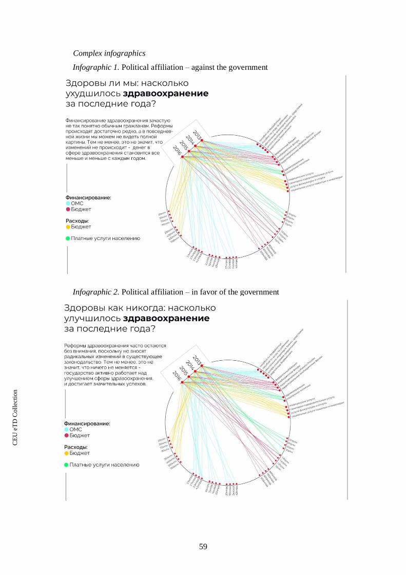
59
Complex infographics
Infographic 1. Political affiliation – against the government
Infographic 2. Political affiliation – in favor of the government
CE
UeT
DC
olle
ctio
n

60
Appendix B. Infographics used in the survey
Simple infographics
Infographic 1. Political affiliation – against the government
Infographic 2. Political affiliation – in favor of the government
CE
UeT
DC
olle
ctio
n
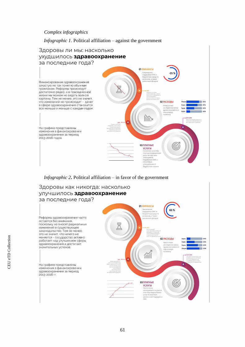
61
Complex infographics
Infographic 1. Political affiliation – against the government
Infographic 2. Political affiliation – in favor of the government
CE
UeT
DC
olle
ctio
n

62
References
Argouslidis, Paraskevas, Dionysis Skarmeas, Antonios Kühn, and Alexis Mavrommatis.
"Consumers’ reactions to variety reduction in grocery stores: a freedom of choice
perspective." European Journal of Marketing 52, no. 9/10 (2018): 1931-1955.
Attneave, Fred. "Some informational aspects of visual perception." Psychological review 61,
no. 3 (1954): 183.
Bartels, Larry M. "Beyond the running tally: Partisan bias in political perceptions." Political
behavior 24, no. 2 (2002): 117-150.
Bélanger, Éric, and Bonnie M. Meguid. “Issue Salience, Issue Ownership, and Issue-Based
Vote Choice.” Electoral Studies 27, no. 3 (2008): 477–91.
Borkin, Michelle A., Zoya Bylinskii, Nam Wook Kim, Constance May Bainbridge, Chelsea S.
Yeh, Daniel Borkin, Hanspeter Pfister, and Aude Oliva. "Beyond memorability:
Visualization recognition and recall." IEEE transactions on visualization and computer
graphics 22, no. 1 (2016): 519-528.
Borkin, Michelle, Krzysztof Gajos, Amanda Peters, Dimitrios Mitsouras, Simone Melchionna,
Frank Rybicki, Charles Feldman, and Hanspeter Pfister. "Evaluation of artery
visualizations for heart disease diagnosis." IEEE transactions on visualization and
computer graphics 17, no. 12 (2011): 2479-2488.
Buntine, Wray. "Learning classification trees." Statistics and computing 2, no. 2 (1992): 63-73.
Cairo, Alberto. The Functional Art: An introduction to information graphics and visualization.
New Riders, 2012.
Campbell, David E. "Voice in the Classroom: How an Open Classroom Environment Facilitates
Adolescents' Civic Development. CIRCLE Working Paper 28." Center for Information
and Research on Civic Learning and Engagement (CIRCLE), University of
Maryland (2005).
Cappella, Joseph N. "Cynicism and social trust in the new media environment." Journal of
Communication 52, no. 1 (2002): 229-241.
Claes, Ellen, and Marc Hooghe. "The Effect of Political Science Education on Political Trust
and Interest: Results from a 5-year Panel Study." Journal of Political Science Education
13, no. 1 (2017): 33-45.
Cleveland, William S., and Robert McGill. "Graphical perception: Theory, experimentation,
and application to the development of graphical methods." Journal of the American
statistical association 79, no. 387 (1984): 531-554.
Cleveland, William S., and Robert McGill. "Graphical perception and graphical methods for
analyzing scientific data." Science 229, no. 4716 (1985): 828-833.
Criado, Henar, Francisco Herreros, Luis Miller, and Paloma Ubeda. "Ethnicity and trust: A
multifactorial experiment." Political Studies 63 (2015): 131-152.
Davies, Huw Talfryn Oakley, Iain Kinloch Crombie, and Manouche Tavakoli. "When can odds
ratios mislead?." Bmj 316, no. 7136 (1998): 989-991.
Dur, Banu Inanc Uyan. "Analysis of data visualizations in daily newspapers in terms of graphic
design." Procedia-Social and Behavioral Sciences 51 (2012): 278-283.
CE
UeT
DC
olle
ctio
n

63
Enikolopov, Ruben, Maria Petrova, and Ekaterina Zhuravskaya. "Media and political
persuasion: Evidence from Russia." American Economic Review 101, no. 7 (2011):
3253-85.
Espino, Orlando, and Ruth MJ Byrne. "Thinking About the Opposite of What Is Said:
Counterfactual Conditionals and Symbolic or Alternate Simulations of
Negation." Cognitive science 42, no. 8 (2018): 2459-2501.
Eysenck, Michael W., and Mark T. Keane. Cognitive psychology: A student's handbook.
Psychology press, 2010.
Federal News Agency. 2019. “Klassificator SMI” (“Mass media classification”). Accessed 27
May, 2019. https://bit.ly/2W3BkMW
Feldman, Lauren. "The opinion factor: The effects of opinionated news on information
processing and attitude change." Political Communication 28, no. 2 (2011): 163-181.
Few, Stephen. "Data visualization for human perception." The Encyclopedia of Human-
Computer Interaction, 2nd Ed. (2013).
Flanagin, Andrew J., Stephan Winter, and Miriam J. Metzger. "Making sense of credibility in
complex information environments: the role of message sidedness, information source,
and thinking styles in credibility evaluation online." Information, Communication &
Society (2018): 1-19.
Fletcher, Richard, and Sora Park. "The impact of trust in the news media on online news
consumption and participation." Digital Journalism 5, no. 10 (2017): 1281-1299.
Freedom House. 2017. “Russia. Freedom of the Press 2017”. Accessed 27 May, 2019.
https://bit.ly/2VS5vBF
Gehlbach, Scott. "Reflections on Putin and the Media." Post-Soviet Affairs 26, no. 1 (2010):
77-87.
Gel'man, Vladimir. "Party politics in Russia: from competition to hierarchy." Europe-Asia
Studies 60, no. 6 (2008): 913-930.
Gel'man, Vladimir. "Political Opposition in Russia: A Troubled Transformation." Europe-Asia
Studies 67, no. 2 (2015): 177-191.
George, Alexander L., and Andrew Bennett. Case studies and theory development in the social
sciences. mit Press, 2005.
Golan, Guy J., and Anita G. Day. "In God we trust: Religiosity as a predictor of perceptions of
media trust, factuality, and privacy invasion." American behavioral scientist 54, no. 2
(2010): 120-136.
Graber, Doris Appel. Processing the news: How people tame the information tide. University
Press of Amer, 1988.
Granello, Darcy Haag, and Joe E. Wheaton. "Online data collection: Strategies for
research." Journal of Counseling & Development 82, no. 4 (2004): 387-393.
Griffin, Jeffrey L., and Robert L. Stevenson. "Influence of text and graphics in increasing
understanding of foreign news context." Newspaper Research Journal 13, no. 1-2
(1992): 84-99.
Gualda, Estrella, and José Rúas. "Conspiracy theories, credibility and trust in information."
Communication & Society 32, no. 1 (2019).
CE
UeT
DC
olle
ctio
n
64
Hale, Henry E., and Timothy J. Colton. "Russians and the Putin-Medvedev" Tandemocracy" A
Survey-Based Portrait of the 2007-2008 Election Season." Problems of Post-
Communism 57, no. 2 (2010): 3-20.
Harrison, Lane, Katharina Reinecke, and Remco Chang. "Infographic aesthetics: Designing for
the first impression." In Proceedings of the 33rd Annual ACM Conference on Human
Factors in Computing Systems, pp. 1187-1190. ACM, 2015.
Hennink, Monique, Inge Hutter, and Ajay Bailey. Qualitative research methods. Sage, 2010.
Herrera-Guzmán, I., Jordi Peña-Casanova, J. P. Lara, E. Gudayol-Ferre, and P. Böhm.
"Influence of age, sex, and education on the Visual Object and Space Perception Battery
(VOSP) in a healthy normal elderly population." The Clinical Neuropsychologist 18,
no. 3 (2004): 385-394.
Howells, Richard, and Robert Matson. Using visual evidence. McGraw-Hill Education (UK),
2009.
Ionescu, Mihai Radu. "Subliminal perception of complex visual stimuli." Romanian journal of
ophthalmology 60, no. 4 (2016): 226.
Iyengar, Shanto, and Kyu S. Hahn. "Red media, blue media: Evidence of ideological selectivity
in media use." Journal of Communication 59, no. 1 (2009): 19-39.
James, Gareth, Daniela Witten, Trevor Hastie, and Robert Tibshirani. An introduction to
statistical learning. Vol. 112. New York: Springer, 2013.
Jerit, Jennifer, and Jason Barabas. “Partisan Perceptual Bias and the Information Environment.”
The Journal of Politics 74, no. 3 (2012): 672–84.
Kelton, Kari, Kenneth R. Fleischmann, and William A. Wallace. "Trust in digital
information." Journal of the American Society for Information Science and
Technology 59, no. 3 (2008): 363-374.
Kim, Mihee. "The Role of Partisan Sources and Audiences' Involvement in Bias Perceptions of
Controversial News." Media Psychology 19, no. 2 (2016): 203-223.
Kiousis, Spiro. "Public trust or mistrust? Perceptions of media credibility in the information
age." Mass Communication & Society 4, no. 4 (2001): 381-403.
Kitzinger, Jenny. "Qualitative research: introducing focus groups." Bmj 311, no. 7000 (1995):
299-302.
Lee, Eun-Ju, and Ye Weon Kim. "Effects of infographics on news elaboration, acquisition, and
evaluation: Prior knowledge and issue involvement as moderators." New media &
society18, no. 8 (2016): 1579-1598.
Lee, Hanjoon, Paul M. Herr, Frank R. Kardes, and Chankon Kim. "Motivated search: Effects
of choice accountability, issue involvement, and prior knowledge on information
acquisition and use." Journal of Business Research 45, no. 1 (1999): 75-88.
Lee, Tien-Tsung. "The liberal media myth revisited: An examination of factors influencing
perceptions of media bias." Journal of Broadcasting & Electronic Media 49, no. 1
(2005): 43-64.
Lee, Tien-Tsung. "Why they don’t trust the media: An examination of factors predicting
trust." American Behavioral Scientist 54, no. 1 (2010): 8-21.
CE
UeT
DC
olle
ctio
n

65
Lefever, Samuel, Michael Dal, and Asrun Matthiasdottir. "Online data collection in academic
research: advantages and limitations." British Journal of Educational Technology 38,
no. 4 (2007): 574-582.
Levada-Center. 2017. “Nepoliticheskaya natsiya” (“Nonpolitical nation”). Accessed 25 April,
2018. https://bit.ly/2HFeQZK
Lohse, Gerald Lee. "A cognitive model for understanding graphical perception." Human-
Computer Interaction 8, no. 4 (1993): 353-388.
Lyra, Kamila T., Seiji Isotani, Rachel CD Reis, Leonardo B. Marques, Laís Z. Pedro, Patrícia
A. Jaques, and Ig Ibert Bitencourt. "Infographics or graphics+ text: which material is
best for robust learning?." In Advanced Learning Technologies (ICALT), 2016 IEEE
16th International Conference on, pp. 366-370. IEEE, 2016.
Meade, Adam W., and S. Bartholomew Craig. "Identifying careless responses in survey
data." Psychological methods17, no. 3 (2012): 437-455.
Meduza. 2018a. “Mozhno rasschitat dozhivu li ya do pensii? Kak otsenit srednyuyu
prodolzhitelnost zhizni?” (“Is it possible to calculate whether I will make it to the
retirement? How to estimate life expectancy?”). Accessed 13 October, 2018.
https://bit.ly/2GZj3Gd
Meduza. 2018b. “Na pervom kanale proiznesli familiyu Navalnyy v samom neozhidannom
meste” (“Navalny last name was mentioned on the TV Channel One in very unexpected
circumstances”). Accessed 27 May, 2019. https://bit.ly/2wqqW2s
Meirick, Patrick C. "Topic-relevant reference groups and dimensions of distance: Political
advertising and first-and third-person effects." Communication Research 31, no. 2
(2004): 234-255.
Miller, Delbert Charles. "Handbook of research design and social measurement." (1991).
Morgan, David L. Focus groups as qualitative research. Vol. 16. Sage publications, 1996.
Otten, Jennifer J., Karen Cheng, and Adam Drewnowski. "Infographics and public policy: using
data visualization to convey complex information." Health Affairs 34, no. 11 (2015):
1901-1907.
Perryman, Mallory R. "Biased Gatekeepers? Partisan Perceptions of Media Attention in the
2016 US Presidential Election." Journalism Studies (2019): 1-18.
Powell, Richard A., and Helen M. Single. "Focus groups." International journal for quality in
health care 8, no. 5 (1996): 499-504.
Prior, Markus. "Media and political polarization." Annual Review of Political Science 16
(2013): 101-127.
Roller, Edeltraud. "Comparing the performance of autocracies: issues in measuring types of
autocratic regimes and performance." Contemporary Politics 19, no. 1 (2013): 35-54.
ResearchGate. 2016. “Is there an ideal ratio between a training set and validation set?”.
Accessed 6 May, 2019. https://bit.ly/2JjAp3p
Rudd, M. P. H., Jessica M. GStat, and Jennifer L. Priestley. "A comparison of decision tree
with logistic regression model for prediction of worst non-financial payment status in
commercial credit." (2017).
CE
UeT
DC
olle
ctio
n

66
Sillence, Elizabeth, Pam Briggs, Peter Richard Harris, and Lesley Fishwick. "How do patients
evaluate and make use of online health information?." Social science & medicine 64,
no. 9 (2007): 1853-1862.
Siricharoen, Waralak V. "Infographics: the new communication tools in digital age." In The
international conference on e-technologies and business on the web (ebw2013), pp.
169-174. The Society of Digital Information and Wireless Communication, 2013.
Shih, Victor. "Research in authoritarian regimes: Transparency tradeoffs and
solutions." Qualitative & Multi-Method Research13, no. 1 (2015): 20-22.
Statista. 2011. "Number of hours college students spent studying per week in the United States,
by major 2011". Accessed 23 May, 2019. https://bit.ly/2HwqlCS
Sülflow, Michael, Svenja Schäfer, and Stephan Winter. "Selective attention in the news feed:
An eye-tracking study on the perception and selection of political news posts on
Facebook." New Media & Society (2018): 1461444818791520.
Tabachnick, Barbara G., Linda S. Fidell, and Jodie B. Ullman. Using multivariate statistics.
Vol. 5. Boston, MA: Pearson, 2007.
Taber, Charles S., and Milton Lodge. "Motivated skepticism in the evaluation of political
beliefs." American Journal of Political Science 50, no. 3 (2006): 755-769.
Tsal, Yehoshua, and Nilli Lavie. "Attending to color and shape: The special role of location in
selective visual processing." Perception & Psychophysics 44, no. 1 (1988): 15-21.
QS World University Rankings. 2019. "QS World University Rankings by Subject 2019".
Accessed 23 May, 2019. https://bit.ly/2ThBKgw
Van de Velde, Liesbeth, Wim Verbeke, Michael Popp, and Guido Van Huylenbroeck. "Trust
and perception related to information about biofuels in Belgium." Public Understanding
of Science 20, no. 5 (2011): 595-608.
Watts, Mark D., David Domke, Dhavan V. Shah, and David P. Fan. "Elite cues and media bias
in presidential campaigns: Explaining public perceptions of a liberal
press." Communication Research 26, no. 2 (1999): 144-175.
World Bank. 2017. “Individuals using the Internet (% of population). Russia”. Accessed 27
May, 2019. https://bit.ly/2J8oAxO
CE
UeT
DC
olle
ctio
n