transportation in transition - u.s. pirg investigate problems, craft solutions, educate the public...
TRANSCRIPT
Transportation in Transition A Look at Changing Travel Patterns in America’s Biggest Cities

Written by:
Benjamin Davis, Frontier Group
Phineas Baxandall, U.S. PIRG Education Fund
December 2013
TRANSPORTATION IN TRANSITION
A Look at Changing Travel Patterns in America’s Biggest Cities

The authors would like to thank the following reviewers for their insightful feedback on drafts of this report: Linda Bailey, Acting Executive Director at the National Association of City Transportation Officials; David Burwell, Director of the Energy and Climate Program at the Carnegie Endowment for International Peace; John Giorgis, Director of the Office of Strategic Planning & Analysis at the Federal Transit Administration; Darnell Grisby, Director of Policy Development and Research at the American Public Transportation Association; Kirstie Pecci, Staff Attorney at MASSPIRG Education Fund; Bruce Speight, Director at WISPIRG Foundation; Adie Tomer, Senior Research Associate and Associate Fellow of the Metropolitan Policy Program at the Brookings Institution; Serena Unrein, Public Interest Advocate at Arizona PIRG Education Fund; and Clark Williams-Derry, Program Director at Sightline Institute. Thanks also to Tony Dutzik and Elizabeth Ridlington at Frontier Group for their editorial assistance.
This report is made possible through the generous support of The Rockefeller Foundation.
The authors bear any responsibility for factual errors. The recommendations are those of U.S. PIRG Education Fund. The views expressed in this report are those of the authors and do not necessarily reflect the views of our funders or those who provided review.
2013 U.S. PIRG Education Fund. Some Rights Reserved. This work is licensed under a Creative Commons Attribution Non-Commercial No Derivatives 3.0 Unported License. To view the terms of this license, visit creativecommons.org/licenses/by-nc-nd/3.0.
With public debate around important issues often dominated by special interests pursuing their own narrow agendas, U.S. PIRG Education Fund offers an independent voice that works on behalf of the public interest. U.S. PIRG Education Fund, a 501(c)(3) organiza-tion, works to protect consumers and promote good government. We investigate problems, craft solutions, educate the public and offer Americans meaningful opportunities for civic participation. For more information, please visit our website at www.uspirg.org/edfund.
Frontier Group conducts research and policy analysis to support a cleaner, healthier and more democratic society. Our mission is to inject accurate information and compelling ideas into public policy debates at the local, state and federal levels. For more information about Frontier Group, please visit our website at www.frontiergroup.org.
Cover photo: reinobjektiv, iStock
Layout: To the Point Publications, www.tothepointpublications.com
The report cover is intended to illustrate relevant concepts, not to provide editorial content or to represent any specific activity.
Acknowledgments

Table of Contents
Executive Summary . . . . . . . . . . . . . . . . . . . . . . . . . . . . . . . . . . . . . . . . . . . . . . . 4
Introduction . . . . . . . . . . . . . . . . . . . . . . . . . . . . . . . . . . . . . . . . . . . . . . . . . . . . 9
Driving Has Declined in Most of America’s Large Urbanized Areas . . . . . . . . . . 11
Decline in Vehicle-Miles Traveled . . . . . . . . . . . . . . . . . . . . . . . . . . . . . . . . . . . . . . . . . . 12
Decline in the Proportion of Workers Traveling to Work by Automobile . . . . . . . . . . . . . 17
Decline in the Proportion of Households with Vehicles . . . . . . . . . . . . . . . . . . . . . . . . . 21
Use of Non-Driving Modes of Transportation Has Increased in Most of America’s Large Urbanized Areas . . . . . . . . . . . . . . . . . . . . . . . . . . . . . 23
Increase in Public Transit Use . . . . . . . . . . . . . . . . . . . . . . . . . . . . . . . . . . . . . . . . . . . . 23
Increase in the Proportion of Commuters Who Bike to Work . . . . . . . . . . . . . . . . . . . . . 25
Driving Is Declining in Urbanized Areas Less Affected by the Recession . . . . . . 27
Policy Recommendations . . . . . . . . . . . . . . . . . . . . . . . . . . . . . . . . . . . . . . . . . 29
Methodology . . . . . . . . . . . . . . . . . . . . . . . . . . . . . . . . . . . . . . . . . . . . . . . . . . . 32
Appendices . . . . . . . . . . . . . . . . . . . . . . . . . . . . . . . . . . . . . . . . . . . . . . . . . . . . 37
Appendix A: Summary Data for Transportation Trends by Urbanized Area . . . . . . . . . . . 37
Appendix B: Vehicle-Miles Traveled . . . . . . . . . . . . . . . . . . . . . . . . . . . . . . . . . . . . . . . . 40
Appendix C: Public Transit . . . . . . . . . . . . . . . . . . . . . . . . . . . . . . . . . . . . . . . . . . . . . . . 42
Appendix D: Transportation to Work . . . . . . . . . . . . . . . . . . . . . . . . . . . . . . . . . . . . . . . 48
Appendix E: Households with Access to Automobiles . . . . . . . . . . . . . . . . . . . . . . . . . . 54
Notes . . . . . . . . . . . . . . . . . . . . . . . . . . . . . . . . . . . . . . . . . . . . . . . . . . . . . . . . 57

4 Transportation in Transition
Executive Summary
Americans’ transportation hab-its have changed. The average American drives 7.6 percent fewer
miles today than when per-capita driving peaked in 2004.
A review of data from the Federal Highway Administration, Federal Transit Administration and Census Bureau for America’s 100 most populous urbanized areas – which are home to over half of the nation’s population – shows that the
60/98
54/74
84/100
85/100
86/100
99/100
100/100
0% 20% 40% 60% 80% 100%Percent of Large Urbanized Areas (with complete and updated data)
Increase in the proportion of workers working at home
Increase in transit passenger-miles traveled per capita
Decrease in vehicle-miles traveled per capita
Increase in percent of car-less households
Increase in the proportion of workers commuting by bicycle
Decrease in percent of households with 2+ cars
Decrease in the proportion of workers commuting by private vehicle
decline in per-capita driving has taken place in a wide variety of regions. From 2006 to 2011, the average number of miles driven per resident fell in almost three-quarters of America’s largest urbanized areas for which up-to-date and accurate data are available. Most ur-banized areas have also seen increases in public transit use and bicycle commuting and decreases in the share of households owning a car. (See Figure ES-1.)
Figure ES-1: Driving Is Declining and Non-Driving Transportation Is Increasing in Urbanized Areas
The first five data bars (“Increase in the proportion of workers working at home” to “Increase in the percent of car-less households”) measure the 100 most populous urbanized areas from 2000 to 2010. The “Decrease in vehicle-miles traveled per capita” measures the 74 (out of the 100) most populous urbanized areas for which comparable data exist from 2006 to 2011. The “Increase in transit passenger-miles traveled per capita” mea-sures the 98 (out of 100) most populous urbanized areas for which comparable data exist from 2005 to 2010.
Executive Summary 5
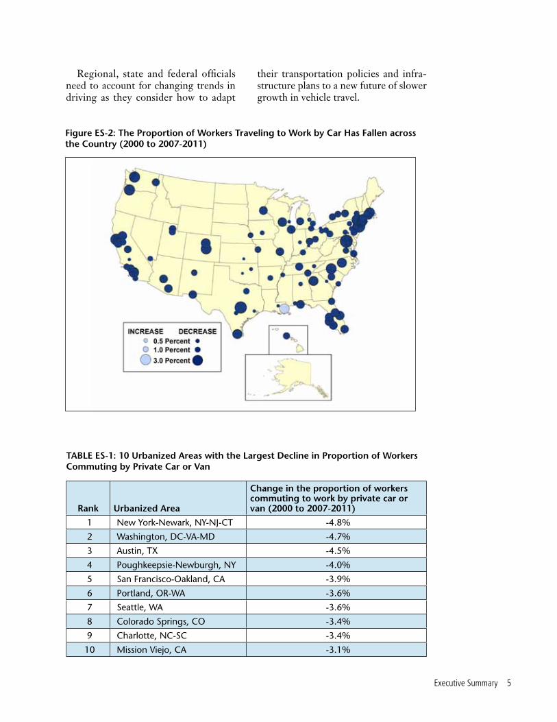
Figure ES-2: The Proportion of Workers Traveling to Work by Car Has Fallen across the Country (2000 to 2007-2011)
Rank Urbanized Area
Change in the proportion of workers commuting to work by private car or van (2000 to 2007-2011)
1 New York-Newark, NY-NJ-CT -4.8%
2 Washington, DC-VA-MD -4.7%
3 Austin, TX -4.5%
4 Poughkeepsie-Newburgh, NY -4.0%
5 San Francisco-Oakland, CA -3.9%
6 Portland, OR-WA -3.6%
7 Seattle, WA -3.6%
8 Colorado Springs, CO -3.4%
9 Charlotte, NC-SC -3.4%
10 Mission Viejo, CA -3.1%
TABLE ES-1: 10 Urbanized Areas with the Largest Decline in Proportion of Workers Commuting by Private Car or Van
Regional, state and federal officials need to account for changing trends in driving as they consider how to adapt
their transportation policies and infra-structure plans to a new future of slower growth in vehicle travel.
6 Transportation in Transition
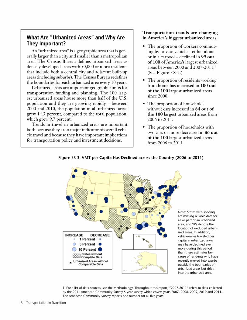
Figure ES-3: VMT per Capita Has Declined across the Country (2006 to 2011)
Note: States with shading are missing reliable data for all or part of an urbanized area, and ‘X’s denote the location of excluded urban-ized areas. In addition, vehicle-miles traveled per capita in urbanized areas may have declined even more during this period than these estimates be-cause of residents who have recently moved into exurbs outside the boundaries of urbanized areas but drive into the urbanized area.
Transportation trends are changing in America’s biggest urbanized areas.
• The proportion of workers commut-ing by private vehicle – either alone or in a carpool – declined in 99 out of 100 of America’s largest urbanized areas between 2000 and 2007-2011.1 (See Figure ES-2.)
• The proportion of residents working from home has increased in 100 out of the 100 largest urbanized areas since 2000.
• The proportion of households without cars increased in 84 out of the 100 largest urbanized areas from 2006 to 2011.
• The proportion of households with two cars or more decreased in 86 out of the 100 largest urbanized areas from 2006 to 2011.
What Are “Urbanized Areas” and Why Are They Important?
An “urbanized area” is a geographic area that is gen-erally larger than a city and smaller than a metropolitan area. The Census Bureau defines urbanized areas as densely developed areas with 50,000 or more residents that include both a central city and adjacent built-up areas (including suburbs). The Census Bureau redefines the boundaries for each urbanized area every 10 years.
Urbanized areas are important geographic units for transportation funding and planning. The 100 larg-est urbanized areas house more than half of the U.S. population and they are growing rapidly – between 2000 and 2010, the population in all urbanized areas grew 14.3 percent, compared to the total population, which grew 9.7 percent.
Trends in travel in urbanized areas are important both because they are a major indicator of overall vehi-cle travel and because they have important implications for transportation policy and investment decisions.
1. For a list of data sources, see the Methodology. Throughout this report, “2007-2011” refers to data collected by the 2011 American Community Survey 5-year survey which covers years 2007, 2008, 2009, 2010 and 2011. The American Community Survey reports one number for all five years.

Executive Summary 7
There is additional evidence of declining driving in those urbanized areas with standardized data on vehicle-miles traveled.
• The average number of vehicle-miles traveled (VMT) per capita declined in 54 out of the 74 large urbanized areas whose trends could be analyzed between 2006 and 2011.2 (See Figure ES-3.)
• New Orleans has seen the largest drop in per-capita VMT – 22 percent – since 2006, possibly a result of Hurricane Katrina. The urbanized areas containing two Wisconsin cities, Milwaukee and Madison, saw the second and third biggest drops in per-capita VMT – 21 percent and 18 percent, respectively. Two Pennsyl-vania urbanized areas, Harrisburg and Pittsburgh, saw the fourth and fifth biggest drops in per-capita VMT – 14 percent and 13 percent, respectively.
The use of non-driving modes of transportation has increased in a majority of the nation’s most populous urbanized areas.
• The proportion of residents bicycling to work increased in 85 out of 100 of America’s largest urbanized areas between 2000 and 2007-2011.
• The number of passenger-miles traveled (PMT) per capita on transit increased in 60 out of 98 of America’s large urbanized areas whose trends could be analyzed between 2005 and 2010.3
Variations in the economy do not appear to be responsible for varia-tions in the trends in driving among urbanized areas. In fact, the economies of urbanized areas with large declines in driving have been less affected by the recession according to unemployment and poverty indicators.
Table ES-2: 10 Urbanized Areas with Largest Declines in VMT per Capita
Rank Urbanized Area
Percent decrease in VMT/capita from 2006 to 2011
Decrease in VMT/capita from 2006 to 2011
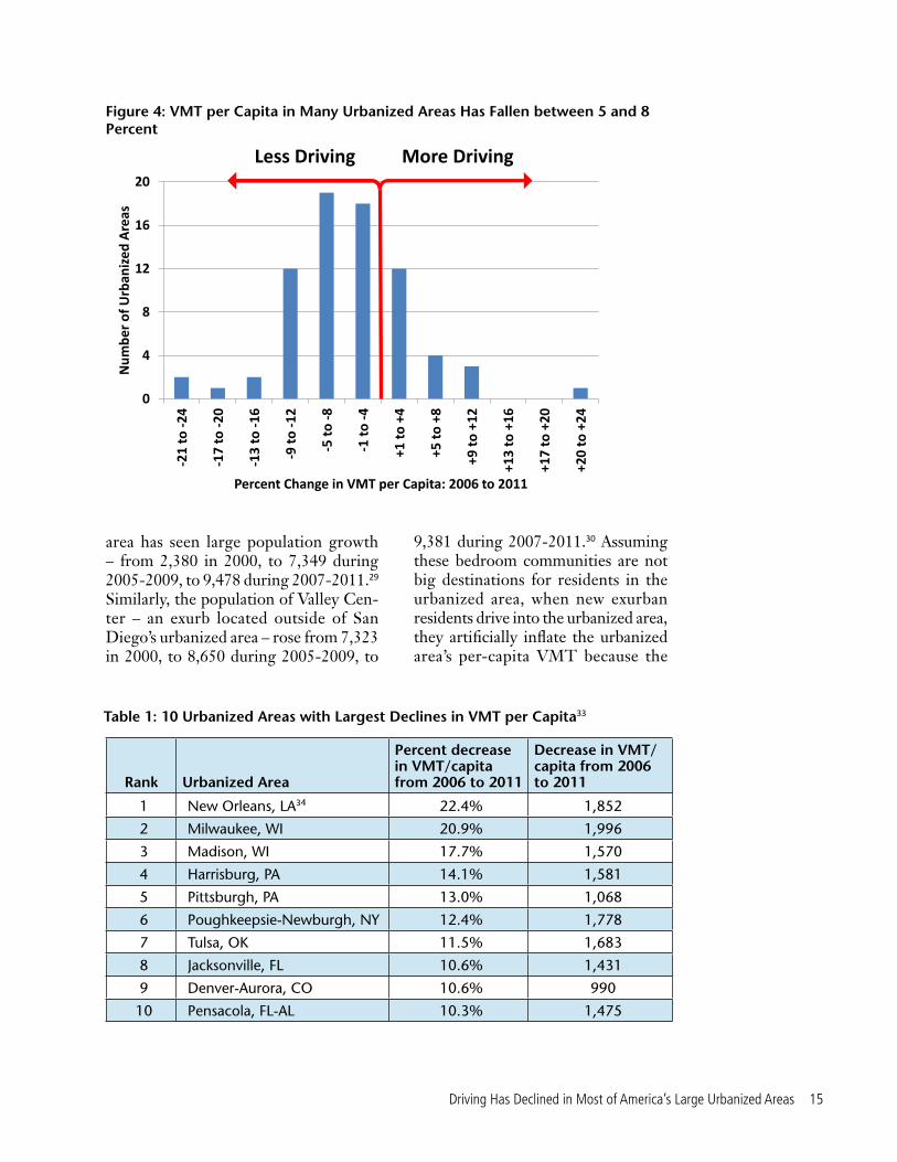
1 New Orleans, LA 22.4% 1,852
2 Milwaukee, WI 20.9% 1,996
3 Madison, WI 17.7% 1,570
4 Harrisburg, PA 14.1% 1,581
5 Pittsburgh, PA 13.0% 1,068
6 Poughkeepsie-Newburgh, NY 12.4% 1,778
7 Tulsa, OK 11.5% 1,683
8 Jacksonville, FL 10.6% 1,431
9 Denver-Aurora, CO 10.6% 990
10 Pensacola, FL-AL 10.3% 1,475
2. While this report focuses on the transportation trends in America’s 100 most populous urbanized areas, 26 urbanized areas are excluded from the VMT analysis. VMT per capita and changes in VMT over time in these 26 urbanized areas could not be accurately determined due to states’ failure to use standardized and up-to-date data collection methods.
3. While this report focuses on the transportation trends in America’s 100 most populous urbanized areas, two urbanized areas were excluded from the public transit analysis. The passenger-miles traveled on public transit in Mission Viejo (CA) and Ogden-Layton (UT) were excluded because no transit agency lists these two urbanized areas as their primary urbanized area, and the passenger miles and trips traveled within urbanized areas in 2005 were derived from transit agency travel information.

8 Transportation in Transition
• Between 2006 and 2011, the average increase in the unemployment rate in the 15 urbanized areas with the highest per-capita declines in VMT was 3.9 percent, while the average increase in all other urbanized areas was 4.6 percent.
• Between 2006 and 2011, the average increase in the poverty rate of the 15 urbanized areas with the highest per-capita declines in VMT was 2.7 percent, while the average increase in all other urbanized areas was 3.6 percent.
The time has come for cities and states to shift their transportation priorities away from investments in expensive, unnecessary new highways, and toward the maintenance and repair of our existing infrastructure and the development of new transportation choices for Americans. To that end, public officials should:
• Revisit transportation plans. Many existing transportation plans continue to reflect outdated assumptions that the number of miles driven will continue to rise steadily over time. Officials at all levels should revisit transportation plans to ensure that they reflect recent declines in driving and new understandings of the future demand for travel.
• Reallocate resources. With driving stagnating in many areas and demand for transit, bicycling and pedestrian infrastructure increasing, officials should reallocate resources away from wasteful highway expansion projects and toward system repair and
programs that expand the range of transportation options available to Americans.
• Remove barriers to non-driving transportation options. In many areas, planning and zoning laws and transportation funding rules limit public officials’ ability to expand access to transportation choices. Officials at all levels should remove these barriers and ensure access to funding for non-driving forms of transportation.
• Use innovative travel tools and services. New technologies and techniques provide transportation officials with new tools to address transportation challenges. Transpor-tation agencies should encourage the use of carsharing, bikesharing and ridesharing and provide real-time travel information for public transit via smartphone.
• Get better data. Transportation agencies should compile and make available to the public more compre-hensive, comparable and timely data to allow for better informed analy-sis of the causes and magnitude of changes in driving trends. Officials at all levels should eliminate inconsis-tencies in the reporting of transpor-tation data, increase the frequency of surveys that shed light on changes in transportation preferences and behaviors, and use emerging new sources of information made possible by new technologies in order to gain a better grasp of how driving trends are changing and why.

Introduction 9
Introduction
Beginning in the mid-1950s, Amer-ica’s leaders embarked on building the national interstate highway
system. When Madison, Wisconsin, was given the opportunity to bring the interstate into the city in the 1960s, local officials decided to keep its down-town highway-free – they believed that a highway running through Madison’s narrow downtown isthmus would make the city less attractive. But without the Interstate, city officials needed to make sure that residents had access to other modes of transportation to travel down-town. So city planners sought to build a multimodal transportation network that promoted bicycling, public transit and walking.1
Support for biking from advocacy groups and students combined with the gasoline price shocks in 1973 further
paved the way for more biking in the city. In 1973, the Wisconsin state legislature passed the three-foot passing law, which called for cars to give bicycles three feet of space while passing them on the road, and in 1975, Madison adopted its first bicycle transportation plan.2
As a result, Madison today has an extensive network of bike lanes and a comprehensive bus system complete with turn lanes exclusively for bikes and buses, diagonal bike crossings, bike lanes that change locations during rush hour, bike boxes (that allow cyclists to ride to the front of cars waiting at a red light), and streets that are two-way for cyclists but one-way for cars.3 When a street must be built or rebuilt, it’s standard practice for city planners to ask how the street can be designed to facilitate biking and other non-driving forms of transportation.4

10 Transportation in Transition
Improvements to bicycle infrastructure and public transit continue today. In re-cent years, city developers reconstructed Odana Road – a large residential artery southwest of downtown – and replaced the often-empty parking spaces with bike lanes, pedestrian islands, and a middle turn lane for vehicles. City developers also reconstructed Sherman Avenue – a large business and residential street northeast of downtown – and replaced the street’s four automobile lanes with three (one lane in each direction plus a middle turn lane) and added two bike lanes.5 The city bus system recently added a line in the Southeast Side after students and teachers there asked the city for transit in their neighborhoods.6
Madison’s investments in transporta-tion options have helped spur a shift away from driving and toward other modes of travel. According to the Federal Highway Administration, the annual miles driven per person across Madison’s entire urban-ized area decreased from 8,900 to 7,300 between 2006 and 2011. Census data show that bike ridership to work in the city has increased 88 percent in the past 11 years.7 From 2004 to 2011, ridership on city buses rose from 11.0 million boardings to 14.6 million boardings.8
Across the country, cities are looking for ways to support their residents in their desire to drive less, much as Madison has done over the last decade. In some cities, those efforts have faced challenges such as transit funding crunches and result-ing fare hikes and service cutbacks. But
in other places, new technologies, new infrastructure for biking and walking, and improved transit service are provid-ing more Americans with the freedom to drive less – delivering big benefits in reduced congestion, cleaner air and im-proved quality of life.
This report looks at travel trends in America’s largest urbanized areas, the Census-defined high-density areas that are the nation’s largest population cen-ters and hold out-sized importance for the nation’s transportation and planning decisions. Growth in urbanized areas is greatly outpacing that of the nation as a whole – increasing 14.3 percent between 2000 and 2010, compared to 9.7 percent for the whole population. Infrastructure plays a crucial role in enabling urban-ized areas to act as “hubs” for the region and economy. Streets and highways in urbanized areas also see the greatest amount of use – in 2011, roads in urban areas (which are made up of urbanized areas and smaller “urban clusters”) saw two-thirds of all traffic.9 The 100 most populous urbanized areas that are the subject of this report housed 53 percent of the entire U.S. population.10
In documenting how Americans are driving less and shifting toward other modes of transportation in these crucial population centers, this report shows that the time has come for state and federal officials to invest in 21st century solutions to our transportation challenges and provide new transportation options for all Americans.

Driving Has Declined in Most of America’s Large Urbanized Areas 11
Figure 1: An “Urbanized Area” Is Larger than a Municipality and Smaller than a Metropolitan Statistical Area11
Driving Has Declined in Most of America’s Large Urbanized Areas
Americans’ driving habits have changed. After decades of in-creased automobile travel, since
2006 the average number of miles driven
What Are “Urbanized Areas”?An “urbanized area” is a geographic area that is generally larger than a city
and smaller than a metropolitan statistical area (which includes the rural area in the same county as the city). The Census Bureau defines urbanized areas as densely developed places with 50,000 or more residents that can include cities and adjacent built-up suburbs. Urbanized areas are defined by their relatively dense city living patterns, not their legal jurisdictional boundaries. To keep current with changing residential trends, the Census Bureau redefines the boundaries for each urbanized area every 10 years. (See Figure 1.)
per resident has fallen in almost three-quarters of America’s largest urbanized areas for which up-to-date and compa-rable data are available.

12 Transportation in Transition
Decline in Vehicle-Miles Traveled
During the second half of the 20th century, the total number of miles driven in America steadily increased. Between 1970 and 2004, the number of vehicle-miles traveled per capita increased by an average of 1.8 percent annually. Even more dramatically, and the total number of vehicle-miles traveled increased by an average of 2.9 percent annually.12 (See Figure 2.)
Then, the trend changed. Since the mid-2000s, the number of miles driven in America – both total and per capita – has fallen. From 2004 to 2012, the average number of vehicle-miles driven per capita decreased by 7.6 percent.13 And from 2007 – when Americans’ total
Figure 2: Total and per Capita Vehicle-Miles Traveled, U.S.
*2012 data from U.S. Department of Transportation’s (U.S. DOT) Traffic Volume Trends series of reports; data from previous years from U.S. DOT’s Highways Statistics series of reports.
vehicle travel peaked – to 2012, the total number of miles driven in America fell by 3.1 percent.14
The economic recession that officially began in December 2007 is responsible for some of the reduction in driving, but only a part of it. Per-capita driving had already begun to decline years before the recession began, and it has continued to decline even during the economic recovery.15 In past recessions, driving either never fell below its pre-recession level or quickly recovered.16 While ris-ing unemployment during the recession surely contributed to declining driving, between 2001 and 2009, the VMT per employed worker fell from 12,900 to 11,800 (8.3 percent). Meanwhile the VMT per non-worker fell from 3,600 to 3,500 (3.6 percent).17

Driving Has Declined in Most of America’s Large Urbanized Areas 13
Reasons behind the Decline in Vehicle-Miles TraveledMany of the trends that long encouraged Americans to drive more have recently
reached their natural limits or have reversed directions.
• Saturated with Driving: In the decades after World War II, rising incomes, the development of new low-density suburbs, increased participation of women in the workforce, and improvements in vehicles and new highways put millions of new commuters on the roads. By the turn of the 21st century, however, these trends had largely played themselves out, and some had shown signs of begin-ning to reverse.
º Vehicle Ownership: After decades of increase, the number of vehicles per licensed driver has declined by 4 percent since 2006, suggesting that Americans may have reached a limit on the number of vehicles they can beneficially use.18
º Driver’s Licensing: After peaking in 1992, the percent of driving-age (16 and older) Americans holding licenses has stagnated and then declined. By 2011, 86 percent of driving age Americans held licenses, the lowest per-centage in 30 years.19
º Time Spent in Travel: Americans may be hitting the limit on the amount of time they are willing to spend in their cars each day, and unless travel speeds increase – which haven’t since the 1990s – they may be hitting the limit of the number of miles they are willing to drive each day.20
º Labor Force Participation: Workers tend to drive more miles than non-work-ers, and after decades of increase, the share of Americans in the labor force has dropped from its 2000 peak of 67.3 percent to 63.2 percent – the lowest level since 1978.21
• Demographics: With people in their prime earning and child-rearing years tending to drive the most, and the baby boomers retiring, a greater share of Americans are entering age groups that have historically driven fewer miles.22
• Cost of Gasoline: For decades, relatively cheap gas helped fuel the Driving Boom, but from 2002 to 2012, the average inflation-adjusted price of a gallon of gasoline doubled and put car ownership out of reach for many families.23 Prices vary up and down with various gluts and shortages, but are not expected to fall significantly over the long-term. With increased driving in places like China, India and Brazil, prices at the pump could instead rise further over time.
• Rising Use of Transit and Other Transportation Modes: Americans are increasingly choosing other modes of transportation – light rail, buses, trains, bicycles or walking – for trips they might once have taken by car. The recent advent of new technologies – from carsharing to real-time transit information – as well as the preference of members of the Millennial generation for walkable places and a wider variety of transportation options – has accelerated the trend toward reduced driving.24

14 Transportation in Transition
The shift in long-term trends toward reduced driving is also reflected in urban-ized areas where approximately 60 per-cent of American’s driving takes place.25
Vehicle Travel per CapitaAccording to the Federal Highway Ad-
ministration, between 2006 and 2011, the average number of vehicle-miles traveled per capita in all urban areas decreased from 8,600 to 8,450 miles.26 This decline in VMT per capita stands in contrast to the decades of steady increase – from 1980 to 2000, the vehicle-miles traveled per capita in all urban areas grew by 48 percent.27
The number of vehicle-miles traveled (VMT) per capita declined in almost three-quarters – or 54 out of 74 – of America’s large urbanized areas for which trends could be analyzed between 2006 and 2011. (See Figures 3, 4 and 5, and box entitled “Why Are the VMT Data Miss-
ing for 26 of the 100 Largest Urbanized Areas?”) The average decline in VMT per capita among these 74 urbanized areas was 4.8 percent.28
These figures may underestimate the decline in per-capita VMT, particularly in areas that have experienced rapid exurban population growth over the last decade. Per-capita VMT is calculated by dividing the number of miles driven within an ur-banized area – regardless of where those drivers reside – by the number of people who live within its boundaries. Thus, the numbers presented here would be artifi-cially inflated in areas that experienced an increase in the number of people living outside the urbanized area but driving a significant number of miles within it – and where that additional driving exceeds the additional driving from new residents in urbanized areas traveling outside the urbanized area to visit the exurbs.
For example, Valencia West, an exurb of Tucson located outside the urbanized
Figure 3: VMT per Capita Has Declined in Almost Three-Quarters of America’s Largest Urbanized Areas (for which trends could be analyzed)
54
20
Urbanized Areas with DECREASES in VMT per CapitaUrbanized Areas with INCREASES in VMT per Capita
Driving Has Declined in Most of America’s Large Urbanized Areas 15
area has seen large population growth – from 2,380 in 2000, to 7,349 during 2005-2009, to 9,478 during 2007-2011.29 Similarly, the population of Valley Cen-ter – an exurb located outside of San Diego’s urbanized area – rose from 7,323 in 2000, to 8,650 during 2005-2009, to
0
4
8
12
16
20-2
1 to
-24
-17
to -2
0
-13
to -1
6
-9 to
-12
-5 to
-8
-1 to
-4
+1 to
+4
+5 to
+8
+9 to
+12
+13
to +
16
+17
to +
20
+20
to +
24
Num
ber o
f Urb
anize
d Ar
eas
Percent Change in VMT per Capita: 2006 to 2011
Less Driving More Driving
Rank Urbanized Area
Percent decrease in VMT/capita from 2006 to 2011
Decrease in VMT/capita from 2006 to 2011
1 New Orleans, LA34 22.4% 1,852
2 Milwaukee, WI 20.9% 1,996
3 Madison, WI 17.7% 1,570
4 Harrisburg, PA 14.1% 1,581
5 Pittsburgh, PA 13.0% 1,068
6 Poughkeepsie-Newburgh, NY 12.4% 1,778
7 Tulsa, OK 11.5% 1,683
8 Jacksonville, FL 10.6% 1,431
9 Denver-Aurora, CO 10.6% 990
10 Pensacola, FL-AL 10.3% 1,475
9,381 during 2007-2011.30 Assuming these bedroom communities are not big destinations for residents in the urbanized area, when new exurban residents drive into the urbanized area, they artificially inflate the urbanized area’s per-capita VMT because the
Figure 4: VMT per Capita in Many Urbanized Areas Has Fallen between 5 and 8 Percent
Table 1: 10 Urbanized Areas with Largest Declines in VMT per Capita33
16 Transportation in Transition
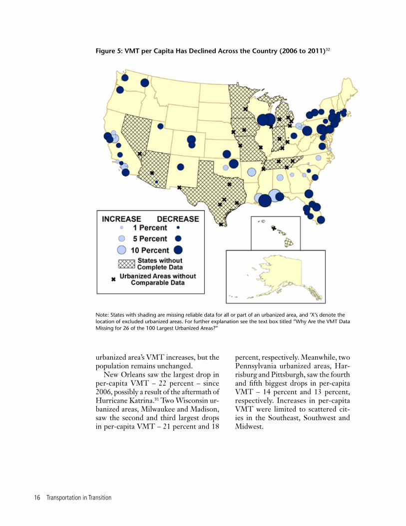
Figure 5: VMT per Capita Has Declined Across the Country (2006 to 2011)32
Note: States with shading are missing reliable data for all or part of an urbanized area, and ‘X’s denote the location of excluded urbanized areas. For further explanation see the text box titled “Why Are the VMT Data Missing for 26 of the 100 Largest Urbanized Areas?”
urbanized area’s VMT increases, but the population remains unchanged.
New Orleans saw the largest drop in per-capita VMT – 22 percent – since 2006, possibly a result of the aftermath of Hurricane Katrina.31 Two Wisconsin ur-banized areas, Milwaukee and Madison, saw the second and third largest drops in per-capita VMT – 21 percent and 18
percent, respectively. Meanwhile, two Pennsylvania urbanized areas, Har-risburg and Pittsburgh, saw the fourth and fifth biggest drops in per-capita VMT – 14 percent and 13 percent, respectively. Increases in per-capita VMT were limited to scattered cit-ies in the Southeast, Southwest and Midwest.

Driving Has Declined in Most of America’s Large Urbanized Areas 17
47
27
Urbanized Areas with DECREASES in VMTUrbanized Areas with INCREASES in VMT
Figure 6: Total VMT Has Declined in Nearly Two-Thirds of America’s Largest Urbanized Areas (for which trends could be analyzed)
Total Vehicle TravelThe total number of vehicles-miles
traveled declined in 47 out of 74 of America’s large urbanized areas for which trends could be analyzed between 2006 and 2011, despite the addition of 2.5 mil-lion new residents in those 74 urbanized areas. (See Figure 6.)
Milwaukee and Madison in Wisconsin saw the largest drops in total VMT – 18 and 16 percent, respectively. The Pough-keepsie-Newburgh (NY) urbanized area saw the third largest drop in VMT – 14 percent. Two Pennsylvania urbanized areas, Pittsburgh and Harrisburg saw the fourth and fifth largest drops in VMT – 13 and 10 percent, respectively.
Decline in the Proportion of Workers Traveling to Work by Automobile
Americans are driving less in many different aspects of their lives – including traveling to work, shopping, and enter-tainment and to visit family.37 There is no consistent source of data, however, that tracks variations in vehicle travel within urbanized areas for purposes other than commuting to work. Though the boundaries of urbanized areas change every decennial Census, journey to work data from the 2007-2011 American Com-munity Survey use boundaries set by the 2000 Census.38

18 Transportation in Transition
Why Are the VMT Data Missing for 26 of the 100 Largest Urbanized Areas?
About one-quarter of the nation’s 100 largest urbanized areas are excluded from the VMT section of this report because VMT per capita and changes in VMT over time in these urbanized areas could not be readily determined with accuracy. The lack of accurate data is a result of states’ failure to use standardized and up-to-date data col-lection methods that would make urbanized area boundaries consistent with those set by the most recent Census. States without standardized and up-to-date data collection methods include: Arizona, Hawaii, Indiana, Iowa, Michigan, Minnesota, Missouri, Nevada, Tennessee and Texas.35
How does the Federal Highway Administration collect data on VMT in urban-ized areas? The Federal Highway Administration, which collects mandated transpor-tation information from the states, uses urbanized area boundaries that are set by the U.S. Census, with occasional modifications from state Departments of Transportation (DOT). Every decade, the boundaries of an urbanized area are updated based on shifting population and development patterns. Some road segments and trips, therefore, that had counted as “rural” prior to these updates may be classified as “urban” after them – meaning that the amount of vehicle travel in an urban area may be shown to increase even if the actual amount of driving remains the same or declines.
Once the Census changes the boundaries, state departments of transportation (DOTs) must update their data collection and reporting methods to include the appropriate roads within the new boundaries and exclude others. When the Census replaced the 1990 definitions of urbanized areas to reflect the results of the 2000 Census, it was left to state DOTs to update their data reporting to reflect the new boundaries. Many state DOTs, however, failed to promptly update their boundaries, while others chose to change the Census Bureau’s urbanized area boundaries (which they are permitted to do).
Our research found that while many states use up-to-date and comparable data, some of the urbanized area data on VMT from 2006 to 2011 collected by the Federal Highway Administration still count the VMT within the boundaries set by the 1990 Census or boundaries set by the state DOTs, rendering comparisons of vehicle travel across time difficult.
What does this mean for this report? By 2006, most states had updated their data reporting methods so that VMT was measured for the urbanized boundaries set by the 2000 Census, not the 1990 Census. For urbanized areas in these states with up-to-date and standardized VMT-reporting, researchers in this report could compare VMT across time (because there were consistent boundaries from 2006 to 2011) and calculate VMT per capita based on population numbers that matched the area used to tabulate VMT (the populations of urbanized areas in 2006 and 2011 are only available within the boundaries set by the 2000 Census).36 These are the74 urbanized areas included in the VMT section of the report.
Continued on page 19

Driving Has Declined in Most of America’s Large Urbanized Areas 19
To preserve the accuracy of the data, this report excludes urbanized areas for which 2006 VMT data were still tabulated within the boundaries set by the 1990 Census or within other boundaries set by the state DOT. For these urbanized areas, accurate population data are not available and thus VMT per capita could not be calculated. In some cases, where an urbanized area spans across two or more state boundaries, the data was up-to-date in part of the urbanized area, but the urbanized area had to be excluded because a portion was within a state that had not performed the required update to its statistical boundaries.
The following urbanized areas were excluded from the VMT section of this report: Chicago (IL-IN), Detroit (MI), Minneapolis-St. Paul (MN), St. Louis (MO-IL), Cincinnati (OH-KY-IN), Kansas City (MO-KS), Las Vegas (NV), Indianapolis (IN), Louisville (KY-IN), Honolulu (HI), Omaha (NE-IA), Grand Rapids (MI), Toledo (OH-MI), Des Moines (IA), Flint (MI), Dallas-Fort Worth-Arlington (TX), Houston (TX), Phoenix-Mesa (AZ), San Antonio (TX), Memphis (TN-MS-AR), Austin (TX), Nashville-Davidson (TN), El Paso (TX-NM), McAllen (TX), Knoxville (TN), and Chattanooga (TN-GA).
What does this mean for transportation policy development? Citizens and decision-makers need accurate data on vehicle travel and the use of other modes of transportation to discern trends in travel and properly allocate funds among various locations and priorities. Without accurate VMT data, decision-makers cannot make fully informed decisions.
To fix the process for collecting and reporting VMT data, the U.S. Department of Transportation should require states to follow the same protocols for measuring and communicating urbanized area VMT. All states should have to use boundaries for ur-banized areas set by the most recent decennial census to report transportation data, and all states should switch from the boundaries set by the old census to the boundaries set by the new census in the same year. Accurate population statistics should accompany VMT data and all data should be made available to the public and decision-makers in a timely manner.
Continued from page 18
The U.S. Census collects and posts information on how commuters travel to work. Commuting represents 28 per-cent of household vehicle miles and is a key generator of traffic congestion in urbanized areas, making it an especially important form of travel to track and measure.39
Census data show that for decades, the percent of Americans who drove to
work steadily increased. From 1960 to 1980, the percent of workers who com-muted by private vehicle – either alone or in a carpool (as opposed to a public bus) – increased from 64.0 percent to 84.1 percent.40 By 2000, the proportion of private vehicle commuters had increased to 87.9 percent. However, since 2000, the proportion of workers commuting by pri-vate vehicle has declined. By 2007-2011,

20 Transportation in Transition
the proportion of workers commuting by private vehicle had fallen to 86.3 percent.
This decline was slightly greater in ur-banized areas. From 2000 to 2007-2011, the proportion of workers commuting by private vehicle in all urbanized areas fell from 86.8 percent to 84.7 percent. Much of this decline has resulted from a fall in carpooling. From 2000 to 2007-2011, the proportion of workers in the 100 biggest urbanized areas who carpooled fell from 11.8 percent to 9.7 percent.
The decline in the proportion of resi-dents commuting by private car has taken place in practically every large urbanized area. The proportion of residents com-muting by private vehicle – either alone or in a carpool – declined in 99 out of 100 of America’s largest urbanized areas between 2000 and 2007-2011. (See Fig-ure 7.) The largest declines were in New York-Newark; Washington, D.C.; Austin;
and Poughkeepsie-Newburgh, each of which experienced at least a 4 percent drop in the percentage of residents com-muting to work by car.
One reason for the decline in traveling by private car to work is that more and more people are working from home, thanks to the increasing use of telecom-muting. The proportion of residents working from home has increased in every one of the 100 largest urbanized ar-eas since 2000. The largest increases oc-curred in Pensacola (FL), Mission Viejo (CA), Columbia (SC) and Austin, which all saw an increase of at least 2.5 percent in the share of residents working from home. The only urbanized area out of the 100 most populous that experienced an increase in the proportion of workers traveling by private car was New Orleans, where people’s transportation habits have been affected by Hurricane Katrina.
TABLE 2: 10 Urbanized Areas with the Largest Decline in Proportion of Workers Commuting by Private Car or Van
Rank Urbanized Area
Change in the proportion of work-ers commuting to work by private car or van (2000 to 2007-2011)
1 New York-Newark, NY-NJ-CT -4.8%
2 Washington, DC-VA-MD -4.7%
3 Austin, TX -4.5%
4 Poughkeepsie-Newburgh, NY -4.0%
5 San Francisco-Oakland, CA -3.9%
6 Portland, OR-WA -3.6%
7 Seattle, WA -3.6%
8 Colorado Springs, CO -3.4%
9 Charlotte, NC-SC -3.4%
10 Mission Viejo, CA -3.1%
Driving Has Declined in Most of America’s Large Urbanized Areas 21
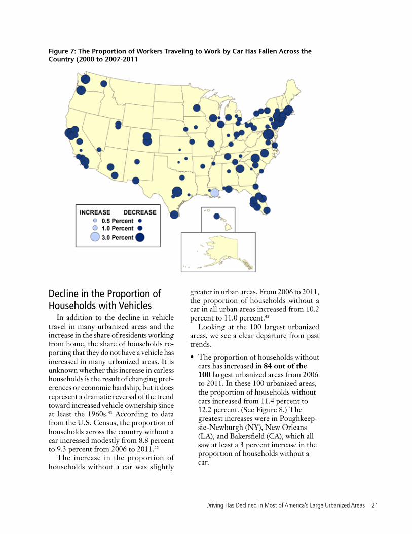
Decline in the Proportion of Households with Vehicles
In addition to the decline in vehicle travel in many urbanized areas and the increase in the share of residents working from home, the share of households re-porting that they do not have a vehicle has increased in many urbanized areas. It is unknown whether this increase in carless households is the result of changing pref-erences or economic hardship, but it does represent a dramatic reversal of the trend toward increased vehicle ownership since at least the 1960s.41 According to data from the U.S. Census, the proportion of households across the country without a car increased modestly from 8.8 percent to 9.3 percent from 2006 to 2011.42
The increase in the proportion of households without a car was slightly
greater in urban areas. From 2006 to 2011, the proportion of households without a car in all urban areas increased from 10.2 percent to 11.0 percent.43
Looking at the 100 largest urbanized areas, we see a clear departure from past trends.
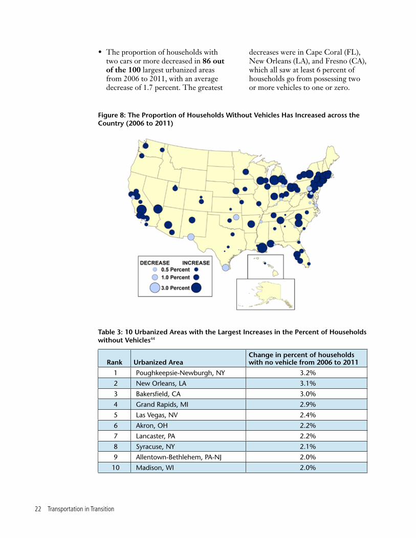
• The proportion of households without cars has increased in 84 out of the 100 largest urbanized areas from 2006 to 2011. In these 100 urbanized areas, the proportion of households without cars increased from 11.4 percent to 12.2 percent. (See Figure 8.) The greatest increases were in Poughkeep-sie-Newburgh (NY), New Orleans (LA), and Bakersfield (CA), which all saw at least a 3 percent increase in the proportion of households without a car.
Figure 7: The Proportion of Workers Traveling to Work by Car Has Fallen Across the Country (2000 to 2007-2011
22 Transportation in Transition
• The proportion of households with two cars or more decreased in 86 out of the 100 largest urbanized areas from 2006 to 2011, with an average decrease of 1.7 percent. The greatest
Figure 8: The Proportion of Households Without Vehicles Has Increased across the Country (2006 to 2011)
Table 3: 10 Urbanized Areas with the Largest Increases in the Percent of Households without Vehicles44
decreases were in Cape Coral (FL), New Orleans (LA), and Fresno (CA), which all saw at least 6 percent of households go from possessing two or more vehicles to one or zero.
Rank Urbanized AreaChange in percent of households with no vehicle from 2006 to 2011
1 Poughkeepsie-Newburgh, NY 3.2%
2 New Orleans, LA 3.1%
3 Bakersfield, CA 3.0%
4 Grand Rapids, MI 2.9%
5 Las Vegas, NV 2.4%
6 Akron, OH 2.2%
7 Lancaster, PA 2.2%
8 Syracuse, NY 2.1%
9 Allentown-Bethlehem, PA-NJ 2.0%
10 Madison, WI 2.0%

Non-Driving Transportation Has Increased in Most of America’s Large Urbanized Areas 23
While residents of America’s urbanized areas have reduced their time behind the wheel,
they have simultaneously increased their use of non-driving modes of transportation.
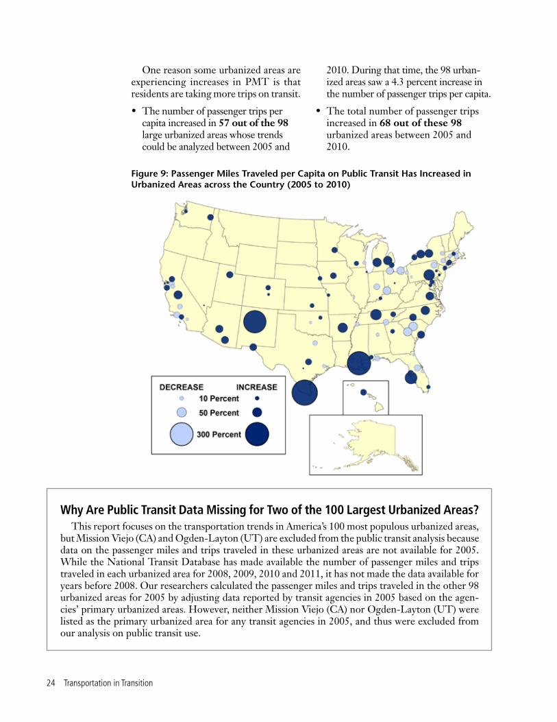
Increase in Public Transit UseOver the past several years, Ameri-
cans have been riding on transit more. According to the Federal Transit Ad-ministration’s National Transit Data-base, the total annual miles traveled on public transit increased from 45.1 bil-lion to 54.3 billion – a 20 percent jump – from 2000 to 2011. This increase in the miles traveled has occurred even while many transit systems have been forced to cut services and increase fares.45
Data from the National Transit Database show that the increased mileage on public transit use is taking place in most urbanized areas.
• The number of passenger-miles traveled (PMT) per capita on transit increased in 60 out of 98 of America’s large urbanized areas whose trends could be analyzed between 2005 and 2010. (See Figure 9 and box entitled “Why Are Public Transit Data Missing for Two of the 100 Largest Urbanized Areas?”) In these 98 areas, the number of passen-ger-miles traveled per capita increased 7.1 percent.46
• The total number of passenger-miles traveled increased in 67 out of these 98 urbanized areas between 2005 and 2010.
Use of Non-Driving Modes of Transportation Has Increased in Most
of America’s Large Urbanized Areas
24 Transportation in Transition
Why Are Public Transit Data Missing for Two of the 100 Largest Urbanized Areas? This report focuses on the transportation trends in America’s 100 most populous urbanized areas,
but Mission Viejo (CA) and Ogden-Layton (UT) are excluded from the public transit analysis because data on the passenger miles and trips traveled in these urbanized areas are not available for 2005. While the National Transit Database has made available the number of passenger miles and trips traveled in each urbanized area for 2008, 2009, 2010 and 2011, it has not made the data available for years before 2008. Our researchers calculated the passenger miles and trips traveled in the other 98 urbanized areas for 2005 by adjusting data reported by transit agencies in 2005 based on the agen-cies’ primary urbanized areas. However, neither Mission Viejo (CA) nor Ogden-Layton (UT) were listed as the primary urbanized area for any transit agencies in 2005, and thus were excluded from our analysis on public transit use.
Figure 9: Passenger Miles Traveled per Capita on Public Transit Has Increased in Urbanized Areas across the Country (2005 to 2010)
One reason some urbanized areas are experiencing increases in PMT is that residents are taking more trips on transit.
• The number of passenger trips per capita increased in 57 out of the 98 large urbanized areas whose trends could be analyzed between 2005 and
2010. During that time, the 98 urban-ized areas saw a 4.3 percent increase in the number of passenger trips per capita.
• The total number of passenger trips increased in 68 out of these 98 urbanized areas between 2005 and 2010.

Non-Driving Transportation Has Increased in Most of America’s Large Urbanized Areas 25
Table 4: 10 Urbanized Areas with the Largest Increases in Passenger-Miles Traveled per Capita on Public Transit47
Rank Urbanized AreaPercent increase or decrease in PMT per capita from 2005 to 2010
1 McAllen, TX 366%48
2 New Orleans, LA 312%49
3 Albuquerque, NM 288%
4 Sarasota-Bradenton, FL 80%
5 Harrisburg, PA 68%
6 Nashville-Davidson, TN 68%
7 Little Rock, AR 53%
8 Flint, MI 45%
9 Grand Rapids, MI 44%
10 Raleigh, NC 43%
Part of the increase in public transit use is due to the opening of new routes and lines. In Albuquerque’s urbanized area, for example, the Rio Metro Regional Transit District opened new commuter rail service between Albuquerque and Santa Fe.50 In the Seattle urbanized area, which had a 7.2 percent increase in the passenger-miles traveled per person, SoundTransit opened a new light rail service from downtown to the airport.51
Increase in the Proportion of Commuters Who Bike to Work
According to the National House-hold Travel Survey, from 2001 to 2009, the number of miles biked on America’s streets and bike paths per person in-creased by one-third.52 In a 2009 survey conducted by the Bureau of Transporta-tion Statistics, 70 percent of respondents believed that having bike paths or lanes
Table 5: 10 Urbanized Areas with the Largest Increases in Percent of Workers Who Biked to Work
Rank Urbanized AreaIncrease in percent of workers who biked to work from 2000 to 2007-2011
1 Portland, OR-WA 1.7%
2 Madison, WI 1.4%
3 San Francisco-Oakland, CA 0.6%
4 Denver-Aurora, CO 0.5%
5 Minneapolis-St. Paul, MN 0.5%
6 Sacramento, CA 0.4%
7 Boston, MA-NH-RI 0.4%
8 Rochester, NY 0.4%
9 Seattle, WA 0.3%
10 New Haven, CT 0.3%

26 Transportation in Transition
to shopping centers, work or school was important.53
While national data on all bicycle travel in urbanized areas are not available, the U.S. Census Bureau provides infor-mation on bicycle travel to and from work. From 2006 to 2011, the proportion of workers biking to work in America’s 100 largest urbanized areas increased from 0.42 percent to 0.61 percent.54 While bike commuters make up a small proportion of total workers, the rate of increase in bike commuting over the past decade has been dramatic and the trend is happening across many different urbanized areas:
• The proportion of commuters bicycling to work increased in 85 out of 100 of America’s largest urbanized
areas between 2000 and 2007-2011. (See Figure 10.) The urbanized areas of Portland (OR-WA) and Madison (WI) saw the largest increases in proportion of commuters bicycling to work – with increases of 1.7 percent (from 0.9 percent to 2.5 percent) and 1.4 percent (from 2.2 percent to 3.7 percent), respectively.55
• The total number of workers who biked to work increased in 91 out of 100 of America’s largest urbanized areas between 2000 and 2007-2011. Portland’s urbanized area spanning between Oregon and Washington saw a threefold increase in the number of commuters bicycling to work – from 6,800 to 21,800 residents.
Figure 10: The Proportion of Workers Who Bike to Work Has Increased across the Country (2000 to 2007-2011)
The proportion of workers who biked to work in the Honolulu urbanized area is not apparent here because it remained comparatively unchanged.

Driving Is Declining in Urbanized Areas Less Affected by the Recession 27
Driving is declining in a wide variety of urbanized areas. According to some indicators, the economies in
urbanized areas that have seen large de-clines in driving are no weaker than the economies of urbanized areas that have seen increases or small declines in driv-ing. In fact, the economies of urbanized areas with large declines in driving appear to have been less affected by the recession according to unemployment, income and poverty indicators.56 (See Figure 11.)
UnemploymentUrbanized areas with the biggest
declines in driving did not experience greater increases in unemployment than those with smaller declines in driving.
Between 2006 and 2011, the average increase in the unemployment rates in the 15 urbanized areas with the highest per-capita declines in VMT was 3.9 per-cent, while average increase in all other urbanized areas was 4.6 percent.
IncomeUrbanized areas with the biggest
declines in driving did not experience greater declines in median household income than those with smaller declines in driving. Between 2006 and 2011, the average decrease in household median in-comes for the 15 urbanized areas with the highest per-capita declines in VMT was 5.8 percent, while the average decrease in all other urbanized areas was 7.1 percent.
Driving Is Declining in Urbanized Areas Less
Affected by the Recession

28 Transportation in Transition
Poverty levelUrbanized areas with bigger declines
in driving did not experience greater in-creases in poverty than those with smaller declines. Between 2006 and 2011, the
3.9% 5.8% 2.7%
4.6% 7.1% 3.6%
Average Increase inUnemployment Rate
Average Decrease inMedian Income
Average Increase inPoverty Level
15 Urbanized Areas with the Highest Per-Capita Declines in VMTAll Other Urbanized Areas
Figure 11: The Economies of Urbanized Areas with Large Declines in Driving Appear to Have Been Less Affected by the Recession than the Economies of Urbanized Areas That Have Seen Small Declines or Increases in Driving
average increase in the poverty rate of the 15 urbanized areas with the highest per-capita declines in VMT was 2.7 percent, while the average increase in all other urbanized areas was 3.6 percent.

Policy Recommendations 29
Policy Recommendations
For decades, federal and local govern-ments have made massive investments in new road and highway capacity on
the assumption that driving will continue to increase at a rapid and steady pace. The recent decline in driving and increase in non-driving transportation in U.S. urban-ized areas from coast to coast show that those assumptions are no longer neces-sarily correct.
Local, state and federal officials need to revisit their current transportation plans and transportation investment priorities in light of the recent changes in driving pat-terns. By doing so, decision-makers will be able to save money that might otherwise be wasted on unnecessary boondoggle highway projects and instead invest in other important priorities such as repair-ing our existing roads and bridges and expanding access to the broader range of
transportation options – including pub-lic transit, bicycling and walking – that Americans increasingly seek. Specifically, public officials should:
Revisit transportation plans – Many metropolitan areas and states continue to set their transportation investment priorities based on Driving Boom-era as-sumptions about future trends in vehicle travel. The 2013 U.S. PIRG Education Fund/Frontier Group report, A New Direction, argues that recent federal fore-casts are likely to dramatically overstate future vehicle travel, leading to inaccurate judgments about the need for investment in highways. Similar, overly aggressive projections of future driving continue to shape public policy at the metropolitan and state level.
With Americans driving fewer miles on average than at any time since the

30 Transportation in Transition
mid-1990s, the time has come to take a fresh look at transportation plans that have roots in Driving Boom-era assump-tions. Local, metropolitan, state and federal transportation agencies should re-examine transportation plans based on new assumptions that reflect the recent decline in driving and new information about how changes in technology, the economy and consumer preferences are likely to affect the demand for driving in the future.
Reallocate resources – A rethink-ing of transportation plans using the best, most current information is likely to reveal that many projects no longer make sense, as well as new priorities that demand increased investment. Short-term and long-term transportation plans are filled with highway projects that were planned under very different expectations of future travel growth. Many of these “legacy projects” were originally pro-posed decades ago, and approved based on assessments of future travel since shown to be incorrect.57
Transportation agencies should reeval-uate the need for new or expanded high-ways, cancelling those projects that are no longer justifiable given new trends in driving. Transportation agencies should reallocate resources to projects that serve the growing demand for public transit, bicycling and walking infrastructure, as well as to the repair of existing roads and bridges, which has often been neglected in the push to add new highway capacity.
Remove barriers to expanded trans-portation options – Over the last cen-tury, the United States has built a policy infrastructure that gives cars top priority in addressing transportation problems. Local planning and zoning rules often prevent compact, mixed-use develop-ment and require developers to provide copious amounts of parking (passing the costs along to customers and workers) without providing similar access to transit
riders, bicyclists and pedestrians. Numer-ous states have constitutional provisions or statutory limitations that prevent the use of gasoline tax revenue for public transit or other, non-driving forms of transportation – even in cases where those investments would reduce congestion for drivers. In addition, the emergence of a variety of new technology-enabled trans-portation options – such as bikesharing, carsharing and ridesharing – has run into roadblocks in some places where local regulations have not yet caught up to the pace of new innovations.
Local, state and federal officials should identify policies that stack the deck in favor of auto-oriented development or stand in the way of non-driving modes of transportation and work to remove those barriers.
In many places, the biggest barrier to non-driving transportation options is a lack of funding. Many cities that were forced to cut back on transit service during the recession experienced dis-couraging declines in ridership – even as transit ridership boomed nationwide.58 Local, state and federal officials should identify stable, long-term funding sources for transit that can withstand economic downturns and enable transit agencies to take advantage of the increased de-mand for non-driving modes of travel. In addition, current inequities in federal transportation policy – such as the higher percentage of local investment typically required for new transit projects as op-posed to new highways – should also be corrected.
Use innovative travel tools and services. New technologies – such as real-time travel information – and new approaches have the potential to address congestion more quickly and often less expensively than highway expansion. Lo-cal, state and federal governments should investigate the potential for new tech-nologies to address urban transportation

Policy Recommendations 31
challenges and lower barriers to the use of non-driving modes of transportation.
In addition to employing new tech-nologies, transportation officials should take innovative approaches to transporta-tion problems that prioritize multimodal connections and break down modal “silos” in transportation funding and ad-ministration.
Get better data. As described in this report, tracking changes in vehicle travel patterns among various urbanized areas in the United States is extremely dif-ficult. Inconsistent transportation data, infrequent travel surveys and other data problems make it hard for local, regional,
state and national decision-makers to understand how driving trends are changing and the factors that may be causing those changes.
Officials at all levels should invest in developing better data to address transportation challenges – eliminating inconsistences in data reporting among various states, conducting national travel surveys on a more frequent or continuous basis, and taking advantage of new information sources, including voluntarily provided real-time infor-mation from vehicle GPS systems and “crowdsourced” data from transporta-tion system users.

32 Transportation in Transition
Defining “Urbanized Areas”Data for this report came from U.S.
Department of Transportation and U.S. Census Bureau, and are reported by “urbanized area.” According to the U.S. Census, an urbanized area is a densely developed area with 50,000 or more residents that includes both a central city and built-up areas (including suburbs) adjacent to it. Urbanized areas are gen-erally larger than a single municipality and smaller than a metropolitan area (the boundaries of which are determined by county lines). (See Figure 12.) The Census redefines the boundaries for each urbanized area every decennial census.
To compile a list of the 100 most popu-lous urbanized areas, researchers used
Methodology
Table P001: Total Population from the U.S. Census (2000 Summary File 1).
SourcesPopulation data for urbanized areas
in 2005, 2006, 2010 and 2011 were used to calculate per-capita figures through-out the report. These data come from table B01003: Total Population of the U.S. Census (American Community Survey 1-Year Estimates). The Ameri-can Community Survey is based on a sample, meaning that the 1-year esti-mates have margins of error larger than the 3-year and 5-year estimates or the 100 percent count of population in the decennial census.

Methodology 33
Figure 12: An “Urbanized Area” Is Larger than a Municipality and Smaller than a Metropolitan Statistical Area59
Below are the sources for other data in the report:
• Vehicle-miles traveled:
º VMT for urbanized areas: table HM-71 (sometimes called “Miles and Daily Vehicle-Miles of Travel”) from the Department of Transportation’s Federal Highway Administra-tion’s Highway Statistics series of reports, available at www.fhwa.dot.gov/policyinformation/sta-tistics.cfm.
º VMT for total U.S. for 2012: U.S. Department of Trans-portation, Federal Highway Administration, December 2012 Traffic Volume Trends, down-loaded from www.fhwa.dot.gov/policyinformation/trav-el_monitoring/12dectvt/page2.cfm, 9 October 2013.
º VMT for total U.S. and urban-ized areas combined: table VM-2 (sometimes called “Functional System Travel – Annual Vehicle Miles”) from the Department of Transportation’s Federal Highway Administration’s Highway Statistics series of reports, available at www.fhwa.dot.gov/policyinformation/statistics.cfm.
• Passenger-miles traveled and passenger-trips traveled on public transportation:
º The 2010 data come from the RY 2010 UZA Allocation table in the Department of Transportation’s Federal Transit Administration’s National Transit Database (NTD). The 2005 data were derived from the NTD’s RY 2008 UZA Alloca-tion table and Data Table 19 (called “Transit Operating Statistics: Services Supplied and Consumed”) of NTD’s 2005 and 2008 data
34 Transportation in Transition
tables. For 2007 and prior years, the NTD does not make data available on passenger-miles traveled and passenger-trips trav-eled within each urbanized area. Rather, the data available are the passenger-miles traveled and passenger-trips traveled by each transit agency and that transit agency’s primary urbanized area. Since many transit agencies serve more than one urbanized area, researchers used the 2008 data to allocate the miles and trips traveled by each transit agency in 2005 to the various urbanized areas and to areas not covered by any urbanized area.
º Passenger-miles traveled and pas-senger trips data for 2011 were not used because, by 2011, some transit agencies had adopted the urbanized area boundaries set by the 2010 Census, making it difficult to determine if increases in the passenger-miles traveled and passenger-trips were due to increases in use or expansions in boundaries to include new routes and lines.
º NTD data are available at www.ntdprogram.gov/ntdprogram/data.htm.
• Journey to work data:
º 2000 data: table P030: Means of Transportation to Work for Workers 16 Years and over from the U.S. Census (2000 Summary File 3).
º 2007-2011 data: tables B08301 and B08101: Means of Transporta-tion to Work (Universe: Workers 16 years and over) of the U.S. Census (2007-2011 American Community Survey 5-Year Esti-mates).
• Households with access to automo-biles: table B25044: Tenure by Vehicles Available (Universe: Occupied housing units) from the U.S. Census (2006 and 2011 American Community Survey 1-Year Estimates).
• 2007 to 2011 unemployment rate: table S2301: Employment Status from the U.S. Census (2007-2011 American Community Survey 5-Year Estimates).The U.S. Census and the Bureau of Labor Statistics use the same unemployment definition.
• 2006 to 2011 change in unemploy-ment rate: table S2301: Employment Status from the U.S. Census (2006 and 2011 American Community Survey 1-Year Estimates).
• 2007 to 2011 median income: table B19049: Median Household Income in the Past 12 Months (In 2011 Inflation-adjusted Dollars) by Age of Householder (Universe: Households) from the U.S. Census (2007-2011 American Community Survey 5-Year Estimates).
• 2006 to 2011 change in median income: 2006 data from table B19049: Median Household Income in the Past 12 Months (In 2006 Inflation-adjusted Dollars) by Age of Householder (Universe: Households) from the U.S. Census (2006 American Commu-nity Survey). 2011 data from table B19049: Median Household Income in the Past 12 Months (In 2011 Inflation-adjusted Dollars) by Age of Householder (Universe: Households) from the U.S. Census (2011 American Community Survey 1-Year Estimates).
• 2007 to 2011 percent of residents in poverty: table S1701: Poverty Status in the Past 12 Months from the U.S. Census (2007-2011 American Community Survey 5-Year Estimates).

Methodology 35
• 2006 to 2011 change in percent of residents in poverty: table S1701: Poverty Status in the Past 12 Months from the U.S. Census (2006 and 2011 American Community Survey 1-Year Estimate).
For all Census sources, the geography was set to “All Urbanized Areas within United States,” “United States – Urban” and “United States,” and tables were downloaded from factfinder2.census.gov.
The sources collect data through dif-ferent methods:
• The American Community Survey (ACS) gives questionnaires to about one in 38 households per year, and participants respond either online or via mail. The Census Bureau will call or visit households that do not respond to the initial survey.60 The ACS’s five-year estimates include the surveys for the five preceding years.
• The Decennial Census counts every resident in the United States. Households that do not return their census forms are counted by Census workers who collect data in neigh-borhoods.61
• The Federal Highway Administra-tion (FHWA) receives driving data submitted by states, which use traffic volume counts to extrapolate the vehicle-miles traveled within an urbanized area.62
• The National Household Travel Survey (NHTS) conducts telephone surveys of households across the United States. In the 2009 survey, the sample size was 150,147.63
• The National Transit Database (NTD) collects data on passen-ger miles and trips from transit agencies, which usually extrapolate these numbers based on samples of riders.64
Exclusion of Urbanized Areas from VMT Analysis
Twenty-six of the 100 most populous urbanized areas were excluded from the VMT analysis because VMT per capita and changes in VMT over time in these urbanized areas could not be accurately determined. (For further explanation see the text box entitled “Why Are the VMT Data Missing for 26 of the 100 Largest Urbanized Areas?” on page 18.)
The following urbanized areas were excluded because the VMT in 2006 were calculated with boundaries from the 1990 Census: Chicago (IL-IN), Detroit (MI), Minneapolis-St. Paul (MN), St. Louis (MO-IL), Cincinnati (OH-KY-IN), Kansas City (MO-KS), Las Vegas (NV), Indianapolis (IN), Louisville (KY-IN), Honolulu (HI), Omaha (NE-IA), Grand Rapids (MI), Toledo (OH-MI), Des Moines (IA), and Flint (MI). The VMT for these urbanized areas in 2004 were calculated within the boundaries set by the 1990 Census, and the square mileage of the urbanized areas did not change between 2004 and 2006. (Table HM-72: Urbanized Area Summaries: Selected Char-acteristics from the Federal Highway Ad-ministration’s Highway Statistics 2004 and 2006 reports, available at www.fhwa.dot.gov/policyinformation/statistics.cfm.) The 2004 data table is the most recent data table that reports which boundaries (those set by the 1990 Census or those set by the 2000 Census) each urbanized area was using to measure VMT.
The following urbanized areas were excluded because the boundaries used to calculate VMT were altered be-tween 2006 and 2008: Dallas-Fort Worth-Arlington (TX), Houston (TX), Phoenix-Mesa (AZ), San Antonio (TX), Memphis (TN-MS-AR), Austin (TX), Nashville-Davidson (TN), El Paso (TX-NM), McAllen (TX), Knoxville (TN), and Chattanooga (TN-GA). The VMT

36 Transportation in Transition
for these urbanized areas were calculated within square mileage that changed be-tween 2006 and 2008 (Table HM-72: Urbanized Area Summaries: Selected Characteristics from the Federal High-way Administration’s Highway Statistics 2006, 2007 and 2008 reports, available at www.fhwa.dot.gov/policyinformation/statistics.cfm). No changes were made to the square mileage used to calculate VMT within urbanized areas from 2009 to 2011.65
The 74 urbanized areas included in the VMT analysis used the boundar-ies set by the 2000 Census to calculate
VMT in 2006. These urbanized areas either used the 2000 boundaries in 2004 to calculate VMT and the square mile-age of the urbanized area did not change between 2004 and 2006 or used the 1990 boundaries in 2004 and the square mileage changed by 2006. Milwaukee (WI), Wichita (KS), Madison (WI), and Charlotte (NC-SC) used boundaries that were slightly altered from those set by the 2000 Census to calculate VMT in 2006, but were included because the boundaries remained unchanged from 2006 onward, maintaining the reliability of the VMT per capita numbers.

Appendices 37
As some data from the ACS one-year estimates can have relatively large margins of error (for example, the 2011 population of Modesto – the least populous urbanized area in this report – has a margin of error of 2.0 percent), the Census only applies the one-year estimates to populations of 65,000 and larger.66 While three- or five-year estimates would have smaller margins of error, this report uses the one-year estimates in some cases because the most recent data that reflect changing transportation habits are from 2011, and a three- or five-year estimate would capture the miles and trips traveled in earlier years. In addition, the least populous urbanized areas in this report have populations that are almost five times larger than the threshold (65,000) used to report one-year estimates.
Appendix A: Summary Data for Transportation Trends by Urbanized Area
Continued on page 38
Urbanized Area
Percent change in vehicle-miles traveled (VMT)/capita from 2006 to 2011
Percent change in passenger miles traveled (PMT) on transit/capita from 2005 to 2010
Change in proportion of workers who commuted by car from 2000 to 2007-2011
Change in proportion of workers who biked to work from 2000 to 2007-2011
Change in proportion of workers who worked from home from 2000 to 2007-2011
Akron, OH 1.2% -2.8% -0.8% 0.1% 0.5%
Albany, NY -4.3% -10.3% -1.0% 0.1% 0.7%
Albuquerque, NM -5.9% 288.3% -1.1% 0.2% 0.6%
Allentown-Bethlehem, PA-NJ -0.1% 4.3% -0.8% 0.0% 1.4%
Atlanta, GA 2.0% 11.5% -2.9% 0.1% 2.0%
Augusta-Richmond County, GA-SC 2.3% -39.7% -0.3% 0.0% 0.7%
Austin, TX N/A 22.9% -4.5% 0.3% 2.6%
Bakersfield, CA -3.8% -13.3% -0.3% -0.1% 0.3%
Baltimore, MD -1.8% 12.1% -1.0% 0.1% 0.5%
Baton Rouge, LA 12.4% -10.3% -0.4% -0.1% 0.3%
Birmingham, AL 5.8% -7.5% -0.5% 0.1% 0.5%
Boston, MA-NH-RI -2.7% -6.4% -3.0% 0.4% 1.0%
Bridgeport-Stamford, CT-NY -5.5% 8.6% -2.9% 0.0% 0.5%
Buffalo, NY -7.5% 16.9% -1.5% 0.2% 0.3%
Cape Coral, FL -5.0% 0.8% -2.2% -0.1% 1.7%
Charleston-North Charleston, SC -5.5% 29.5% -0.9% 0.2% 1.7%
Charlotte, NC-SC 0.5% 28.5% -3.4% 0.0% 2.0%
Chattanooga, TN-GA N/A -19.6% -1.4% 0.1% 0.8%
Chicago, IL-IN N/A 2.6% -2.1% 0.3% 1.3%
Cincinnati, OH-KY-IN N/A -34.8% -0.2% 0.0% 0.9%
Cleveland, OH 5.1% -34.2% -0.4% 0.1% 0.6%
Colorado Springs, CO -6.0% 4.2% -3.4% 0.0% 1.3%
Columbia, SC -2.3% -42.7% -1.7% 0.1% 2.7%
Columbus, OH -5.7% 1.6% -1.2% 0.3% 1.4%
Concord, CA -1.1% 2.8% -2.9% 0.2% 1.6%
Dallas-Fort Worth-Arlington, TX N/A -12.6% -1.2% 0.0% 1.1%
Dayton, OH -0.2% -0.9% -1.5% 0.1% 0.8%
Denver-Aurora, CO -10.6% 13.5% -2.8% 0.5% 1.2%

38 Transportation in Transition
Continued on page 39
Des Moines, IA N/A 20.9% -0.6% 0.1% 0.4%
Detroit, MI N/A 15.8% -1.1% 0.1% 0.9%
El Paso, TX-NM N/A 29.0% -2.0% 0.0% 0.6%
Flint, MI N/A 44.8% -0.5% 0.1% 0.8%
Fresno, CA -3.4% 40.2% -1.7% -0.1% 0.7%
Grand Rapids, MI N/A 43.5% -1.8% 0.3% 1.1%
Harrisburg, PA -14.1% 68.2% -0.8% 0.1% 0.3%
Hartford, CT -2.2% -1.5% -1.9% 0.1% 0.8%
Honolulu, HI N/A 21.5% -1.5% 0.0% 0.7%
Houston, TX N/A -7.6% -0.3% 0.0% 0.7%
Indianapolis, IN N/A -20.7% -0.5% 0.1% 0.5%
Jacksonville, FL -10.6% -3.5% -1.5% 0.1% 1.8%
Kansas City, MO-KS N/A 6.2% -1.3% 0.1% 0.6%
Knoxville, TN N/A 15.0% -0.5% 0.1% 0.9%
Lancaster, PA -9.9% -3.6% -0.1% 0.1% 0.5%
Las Vegas, NV N/A 1.2% -0.8% 0.1% 0.6%
Little Rock, AR 9.6% 53.2% -1.0% -0.1% 0.8%
Los Angeles-Long Beach-Santa Ana, CA -2.3% 13.6% -2.0% 0.2% 1.1%
Louisville, KY-IN N/A 7.0% -1.1% 0.1% 0.4%
Madison, WI -17.7% 12.8% -2.7% 1.4% 0.5%
McAllen, TX N/A 366.4% -3.0% 0.1% 1.8%
Memphis, TN-MS-AR N/A -11.2% -0.6% 0.1% 0.4%
Miami, FL -8.6% 9.2% -2.1% 0.1% 1.2%
Milwaukee, WI -20.9% -6.8% -0.3% 0.3% 0.6%
Minneapolis-St. Paul, MN N/A 19.8% -2.2% 0.5% 1.0%
Mission Viejo, CA 6.9% N/A -3.1% 0.3% 2.8%
Mobile, AL 23.1% 9.1% -0.5% 0.0% 0.9%
Modesto, CA 10.8% -9.0% -1.2% -0.1% 0.9%
Nashville-Davidson, TN N/A 68.2% -1.9% 0.1% 1.4%
New Haven, CT -3.8% 14.2% -2.6% 0.3% 1.0%
New Orleans, LA -22.4% 311.7% 2.7% 0.3% 0.4%
New York-Newark, NY-NJ-CT -8.7% 10.3% -4.8% 0.1% 0.9%
Ogden-Layton, UT -4.8% N/A -1.6% 0.0% 0.6%
Oklahoma City, OK 3.9% -3.7% -0.2% 0.1% 0.4%
Omaha, NE-IA N/A 11.3% -1.0% 0.0% 0.7%
Orlando, FL -6.0% -23.2% -2.2% 0.0% 1.4%
Urbanized Area
Percent change in vehicle-miles traveled (VMT)/capita from 2006 to 2011
Percent change in passenger miles traveled (PMT) on transit/capita from 2005 to 2010
Change in proportion of workers who commuted by car from 2000 to 2007-2011
Change in proportion of workers who biked to work from 2000 to 2007-2011
Change in proportion of workers who worked from home from 2000 to 2007-2011
Summary Data for Transportation Trends continued from page 37

Appendices 39
Oxnard, CA 2.2% -23.5% -1.1% -0.2% 1.1%
Palm Bay-Melbourne, FL -9.3% -6.1% -2.5% 0.0% 1.6%
Pensacola, FL-AL -10.3% -15.1% -2.2% 0.0% 4.6%
Philadelphia, PA-NJ-DE-MD -9.4% 3.6% -1.5% 0.3% 0.7%
Phoenix-Mesa, AZ N/A 33.5% -2.2% 0.0% 1.6%
Pittsburgh, PA -13.0% -2.9% -1.4% 0.2% 1.1%
Portland, OR-WA -7.0% -2.9% -3.6% 1.7% 1.6%
Poughkeepsie-Newburgh, NY -12.4% -12.0% -4.0% 0.1% 2.4%
Providence, RI-MA -3.9% -12.6% -1.3% 0.1% 0.9%
Raleigh, NC 3.9% 43.3% -2.9% 0.1% 2.4%
Richmond, VA -6.5% 39.4% -1.2% 0.2% 1.4%
Riverside-San Bernardino, CA 1.1% -4.8% -0.5% -0.1% 0.7%
Rochester, NY -7.5% 37.4% -1.2% 0.4% 0.7%
Sacramento, CA 2.8% 20.5% -2.4% 0.4% 1.5%
Salt Lake City, UT 0.4% 26.3% -1.3% 0.3% 0.3%
San Antonio, TX N/A 1.5% -0.6% 0.0% 0.9%
San Diego, CA -7.9% -1.4% -0.9% 0.1% 1.6%
San Francisco-Oakland, CA -8.3% 1.6% -3.9% 0.6% 2.0%
San Jose, CA -6.9% 18.4% -2.5% 0.3% 1.4%
Sarasota-Bradenton, FL -4.4% 80.4% -2.7% 0.3% 1.4%
Scranton, PA -3.3% -24.6% -0.8% 0.1% 0.3%
Seattle, WA -6.4% 7.2% -3.6% 0.3% 0.9%
Spokane, WA-ID -9.5% 21.0% -1.8% 0.2% 0.9%
Springfield, MA-CT -2.5% -9.5% -0.2% 0.2% 1.0%
St. Louis, MO-IL N/A -3.2% -2.0% 0.1% 0.9%
Stockton, CA 3.9% -18.5% -0.4% -0.2% 1.3%
Syracuse, NY -4.8% 39.4% -1.9% 0.2% 0.5%
Tampa-St. Petersburg, FL -7.2% 18.9% -2.3% 0.1% 1.8%
Toledo, OH-MI N/A -28.8% -1.0% 0.1% 0.6%
Tucson, AZ -1.0% 31.0% -2.0% 0.1% 0.9%
Tulsa, OK -11.5% 8.5% -0.4% 0.1% 0.4%
Virginia Beach, VA 1.9% 1.1% -1.5% 0.1% 1.9%
Washington, DC-VA-MD -4.9% 7.0% -4.7% 0.3% 0.7%
Wichita, KS -8.9% 10.5% -0.3% 0.1% 0.3%
Worcester, MA-CT -1.6% 9.3% -1.1% 0.1% 1.3%
Youngstown, OH-PA 5.4% -8.3% -1.0% 0.0% 0.6%
Urbanized Area
Percent change in vehicle-miles traveled (VMT)/capita from 2006 to 2011
Percent change in passenger miles traveled (PMT) on transit/capita from 2005 to 2010
Change in proportion of workers who commuted by car from 2000 to 2007-2011
Change in proportion of workers who biked to work from 2000 to 2007-2011
Change in proportion of workers who worked from home from 2000 to 2007-2011
Summary Data for Transportation Trends continued from page 38

40 Transportation in Transition
Appendix B: Vehicle-Miles Traveled
Urbanized Area
Percent change in VMT/capita from 2006 to 2011
Rank of decline in VMT/capita
Percent change in VMT from 2006 to 2011
Rank of decline in VMT
VMT/capita in 2006
VMT/capita in 2011
VMT in 2006 (bil-lions)
VMT in 2011 (bil-lions)
Akron, OH 1.2% 58 -0.1% 45 9,379 9,490 5.3 5.3
Albany, NY -4.3% 38 -1.2% 41 10,268 9,823 5.8 5.8
Albuquerque, NM -5.9% 29 -0.1% 46 8,250 7,760 5.5 5.5
Allentown-Bethlehem, PA-NJ -0.1% 54 0.7% 52 7,935 7,929 4.9 5.0
Atlanta, GA 2.0% 60 1.9% 57 11,463 11,696 46.4 47.3
Augusta-Richmond County, GA-SC 2.3% 62 6.8% 65 9,999 10,224 3.4 3.6
Bakersfield, CA -3.8% 40 -0.5% 43 6,510 6,261 3.0 3.0
Baltimore, MD -1.8% 49 0.5% 50 9,013 8,854 19.2 19.3
Baton Rouge, LA 12.4% 73 14.0% 73 9,600 10,787 4.9 5.5
Birmingham, AL 5.8% 69 4.4% 63 13,764 14,565 9.1 9.5
Boston, MA-NH-RI -2.7% 44 0.0% 47 8,429 8,200 34.2 34.2
Bridgeport-Stamford, CT-NY -5.5% 32 -2.8% 31 8,290 7,836 7.5 7.3
Buffalo, NY -7.5% 20 -8.4% 10 8,719 8,063 8.3 7.6
Cape Coral, FL -5.0% 33 -3.8% 22 12,890 12,242 4.9 4.7
Charleston-North Charleston, SC -5.5% 31 -1.3% 40 9,587 9,055 4.3 4.2
Charlotte, NC-SC 0.5% 56 9.2% 68 12,303 12,362 11.0 12.0
Cleveland, OH 5.1% 67 1.3% 54 8,285 8,705 14.3 14.5
Colorado Springs, CO -6.0% 28 -3.5% 27 8,310 7,813 4.0 3.9
Columbia, SC -2.3% 46 2.2% 59 10,533 10,286 4.7 4.8
Columbus, OH -5.7% 30 0.3% 49 9,956 9,385 11.5 11.5
Concord, CA -1.1% 51 -2.1% 35 9,369 9,264 5.4 5.3
Dayton, OH -0.2% 53 0.6% 51 10,084 10,068 7.0 7.0
Denver-Aurora, CO -10.6% 9 -6.2% 14 9,363 8,373 19.3 18.1
Fresno, CA -3.4% 42 -4.2% 21 7,562 7,303 4.6 4.5
Harrisburg, PA -14.1% 4 -9.6% 5 11,201 9,620 4.2 3.8
Hartford, CT -2.2% 48 -0.8% 42 9,361 9,157 8.2 8.1
Jacksonville, FL -10.6% 8 -9.2% 7 13,511 12,080 12.7 11.5
Lancaster, PA -9.9% 11 -2.3% 33 7,750 6,981 2.6 2.5
Little Rock, AR 9.6% 71 9.7% 69 12,303 13,490 4.5 5.0
Los Angeles-Long Beach-Santa Ana, CA -2.3% 47 -2.8% 30 8,295 8,107 101.7 98.8
Madison, WI -17.7% 3 -15.5% 2 8,855 7,285 3.1 2.6
Miami, FL -8.6% 17 -6.0% 15 9,229 8,433 48.9 46.0
Milwaukee, WI -20.9% 2 -18.2% 1 9,570 7,573 12.4 10.1
Mission Viejo, CA 6.9% 70 5.7% 64 7,812 8,350 4.3 4.6
Mobile, AL 23.1% 74 19.0% 74 10,287 12,662 3.3 4.0
Modesto, CA 10.8% 72 8.7% 67 5,684 6,299 1.9 2.1
New Haven, CT -3.8% 41 -2.2% 34 9,267 8,918 5.0 4.9
Continued on page 41

Appendices 41
New Orleans, LA -22.4% 1 -3.8% 24 8,265 6,413 5.6 5.4
New York-Newark, NY-NJ-CT -8.7% 16 -8.0% 11 6,231 5,686 113.5 104.4
Ogden-Layton, UT -4.8% 36 1.6% 55 8,487 8,081 3.9 4.0
Oklahoma City, OK 3.9% 64 10.9% 71 13,379 13,896 10.4 11.5
Orlando, FL -6.0% 27 0.2% 48 11,908 11,188 15.1 15.1
Oxnard, CA 2.2% 61 10.8% 70 7,474 7,638 2.5 2.8
Palm Bay-Melbourne, FL -9.3% 14 -9.2% 6 12,547 11,375 5.4 4.9
Pensacola, FL-AL -10.3% 10 -9.2% 9 14,387 12,912 4.7 4.3
Philadelphia, PA-NJ-DE-MD -9.4% 13 -7.8% 12 7,538 6,827 39.3 36.2
Pittsburgh, PA -13.0% 5 -13.1% 4 8,221 7,153 13.9 12.1
Portland, OR-WA -7.0% 23 -1.6% 39 7,411 6,889 12.9 12.7
Poughkeepsie-Newburgh, NY -12.4% 6 -14.1% 3 14,393 12,615 5.6 4.8
Providence, RI-MA -3.9% 39 -4.4% 20 8,255 7,931 9.7 9.3
Raleigh, NC 3.9% 66 11.6% 72 13,090 13,606 8.4 9.4
Richmond, VA -6.5% 25 -2.0% 36 11,428 10,688 9.8 9.6
Riverside-San Bernardino, CA 1.1% 57 2.1% 58 8,791 8,888 15.9 16.3
Rochester, NY -7.5% 21 -6.9% 13 9,060 8,383 6.2 5.8
Sacramento, CA 2.8% 63 2.3% 60 8,284 8,516 12.5 12.8
Salt Lake City, UT 0.4% 55 3.4% 62 8,195 8,230 7.7 8.0
San Diego, CA -7.9% 19 -3.5% 28 9,149 8,423 24.9 24.0
San Francisco-Oakland, CA -8.3% 18 -3.7% 25 7,938 7,277 25.4 24.4
San Jose, CA -6.9% 24 -3.1% 29 8,561 7,974 13.6 13.1
Sarasota-Bradenton, FL -4.4% 37 -5.1% 17 10,602 10,140 6.3 6.0
Scranton, PA -3.3% 43 -4.9% 18 7,856 7,596 3.0 2.8
Seattle, WA -6.4% 26 -0.5% 44 9,028 8,448 26.0 25.8
Spokane, WA-ID -9.5% 12 -3.7% 26 8,275 7,486 2.8 2.7
Springfield, MA-CT -2.5% 45 -1.7% 38 9,079 8,852 5.3 5.2
Stockton, CA 3.9% 65 8.1% 66 7,062 7,337 2.4 2.6
Syracuse, NY -4.8% 35 -3.8% 23 9,563 9,104 3.8 3.7
Tampa-St. Petersburg, FL -7.2% 22 -5.8% 16 10,691 9,922 23.6 22.2
Tucson, AZ -1.0% 52 -1.9% 37 8,819 8,728 6.8 6.7
Tulsa, OK -11.5% 7 -9.2% 8 14,659 12,976 8.3 7.5
Virginia Beach, VA 1.9% 59 2.7% 61 8,996 9,164 12.9 13.3
Washington, DC-VA-MD -4.9% 34 1.8% 56 8,384 7,972 35.0 35.7
Wichita, KS -8.9% 15 -4.9% 19 9,991 9,100 4.2 4.0
Worcester, MA-CT -1.6% 50 0.8% 53 10,079 9,922 4.4 4.4
Youngstown, OH-PA 5.4% 68 -2.3% 32 8,806 9,284 3.6 3.5
Vehicle-Miles Traveled continued from page 40
Urbanized Area
Percent change in VMT/capita from 2006 to 2011
Rank of decline in VMT/capita
Percent change in VMT from 2006 to 2011
Rank of decline in VMT
VMT/capita in 2006
VMT/capita in 2011
VMT in 2006 (bil-lions)
VMT in 2011 (billions)

42 Transportation in Transition
Appendix C: Public Transit
Urbanized Area
Percent change in PMT/cap-ita from 2005 to 2010
Rank of percent increase in PMT/capita
Percent change in PMT from 2005 to 2010
Rank of percent increase in PMT
PMT/capita in 2005
PMT/capita in 2010
PMT in 2005 (mil-lions)
PMT in 2010 (mil-lions)
Akron, OH -2.8% 64 -0.3% 68 42.9 41.7 23.4 23.3
Albany, NY -10.3% 80 -2.7% 74 97.3 87.3 52.4 51.0
Albuquerque, NM 288.3% 3 330.2% 2 33.2 129 21.4 92.0
Allentown-Bethlehem, PA-NJ 4.3% 50 9.1% 51 43.0 44.9 25.8 28.1
Atlanta, GA 11.5% 37 15.8% 38 212 236 812 940
Augusta-Richmond County, GA-SC -39.7% 97 -37.2% 98 14.4 8.7 4.9 3.1
Austin, TX 22.9% 21 37.1% 16 118 145 113 155
Bakersfield, CA -13.3% 86 -10.2% 84 64.2 55.6 29.5 26.5
Baltimore, MD 12.1% 36 17.7% 34 212 237 436 514
Baton Rouge, LA -10.3% 81 -2.4% 73 34.3 30.8 16.4 16.0
Birmingham, AL -7.5% 75 -10.0% 83 30.3 28.1 20.0 18.0
Boston, MA-NH-RI -6.4% 73 -0.7% 69 447 418 1,744 1,731
Bridgeport-Stamford, CT-NY 8.6% 44 14.5% 42 178 194 157 179
Buffalo, NY 16.9% 29 19.0% 32 83.5 97.7 76.8 91.4
Cape Coral, FL 0.8% 60 2.0% 65 38.0 38.3 14.3 14.6
Charleston-North Charleston, SC 29.5% 17 41.0% 15 26.6 34.4 11.5 16.3
Charlotte, NC-SC 28.5% 19 47.0% 10 106 137 89.5 132
Chattanooga, TN-GA -19.6% 89 -10.9% 86 33.9 27.2 11.4 10.1
Chicago, IL-IN 2.6% 54 2.8% 62 457 469 3,801 3,909
Cincinnati, OH-KY-IN -34.8% 96 -32.8% 95 110 71.8 163 109
Cleveland, OH -34.2% 95 -35.7% 96 172 113 296 190
Colorado Springs, CO 4.2% 51 10.4% 48 35.8 37.3 16.9 18.7
Columbia, SC -42.7% 98 -36.5% 97 38.8 22.2 16.1 10.2
Columbus, OH 1.6% 56 8.9% 52 52.6 53.4 60.3 65.7
Concord, CA 2.8% 53 3.7% 60 608 624 342 355
Dallas-Fort Worth-Arlington, TX -12.6% 85 -8.4% 80 111 96.9 486 445
Dayton, OH -0.9% 61 0.3% 67 64.7 64.1 43.4 43.6
Denver-Aurora, CO 13.5% 34 19.6% 31 210 238 424 507
Des Moines, IA 20.9% 24 25.3% 24 66.4 80.3 25.4 31.8
Detroit, MI 15.8% 30 11.5% 47 69.5 80.5 265 295
El Paso, TX-NM 29.0% 18 36.2% 18 84.3 109 57.7 78.6
Flint, MI 44.8% 8 36.4% 17 58.2 84.3 20.9 28.5
Fresno, CA 40.2% 11 42.6% 14 53.2 74.5 32.4 46.2
Grand Rapids, MI 43.5% 9 44.4% 12 49.7 71.3 27.0 39.0
Appendix C-1: Transit Passenger-Miles Traveled
Continued on page 43

Appendices 43
Harrisburg, PA 68.2% 5 83.3% 4 38.8 65.3 13.9 25.5
Hartford, CT -1.5% 63 2.7% 63 73.5 72.5 62.6 64.3
Honolulu, HI 21.5% 22 33.0% 20 421 512 302 402
Houston, TX -7.6% 76 0.5% 66 134 124 552 555
Indianapolis, IN -20.7% 90 -17.0% 92 35.5 28.1 44.2 36.7
Jacksonville, FL -3.5% 68 -1.4% 71 72.1 69.6 67.0 66.0
Kansas City, MO-KS 6.2% 49 8.7% 53 43.4 46.1 60.2 65.4
Knoxville, TN 15.0% 31 24.2% 27 26.3 30.3 11.5 14.3
Lancaster, PA -3.6% 69 4.5% 59 102 98.0 33.2 34.7
Las Vegas, NV 1.2% 58 2.3% 64 132 134 195 200
Little Rock, AR 53.2% 7 57.6% 8 23.9 36.7 8.6 13.6
Los Angeles-Long Beach-Santa Ana, CA 13.6% 33 14.0% 43 240 273 2,897 3,302
Louisville, KY-IN 7.0% 47 13.8% 44 66.2 70.8 56.9 64.7
Madison, WI 12.8% 35 21.5% 30 123 139 40.2 48.8
McAllen, TX 366.4% 1 405.0% 1 0.2 0.8 0.1 0.5
Memphis, TN-MS-AR -11.2% 82 -10.8% 85 67.9 60.3 65.0 58.0
Miami, FL 9.2% 42 13.1% 46 155 170 806 911
Milwaukee, WI -6.8% 74 -3.2% 76 124 115 158 153
Minneapolis-St. Paul, MN 19.8% 26 24.3% 26 166 199 393 489
Mobile, AL 9.1% 43 7.5% 55 20.8 22.7 6.6 7.1
Modesto, CA -9.0% 78 -8.5% 81 38.7 35.3 12.8 11.7
Nashville-Davidson, TN 68.2% 6 82.4% 5 44.5 74.8 33.1 60.3
New Haven, CT 14.2% 32 18.7% 33 297 340 156 185
New Orleans, LA 311.7% 2 254.1% 3 18.0 73.9 17.2 60.9
New York-Newark, NY-NJ-CT 10.3% 40 13.5% 45 993 1,095 17,639 20,027
Oklahoma City, OK -3.7% 70 3.7% 61 18.2 17.5 13.8 14.3
Omaha, NE-IA 11.3% 38 16.9% 36 24.5 27.3 15.5 18.1
Orlando, FL -23.2% 91 -16.7% 91 131 101 160 133
Oxnard, CA -23.5% 92 -16.0% 90 93.9 71.9 31.9 26.8
Palm Bay-Melbourne, FL -6.1% 72 -5.2% 78 34.4 32.3 14.7 13.9
Pensacola, FL-AL -15.1% 87 -8.6% 82 20.1 17.1 6.4 5.8
Philadelphia, PA-NJ-DE-MD 3.6% 52 8.4% 54 353 366 1,787 1,936
Phoenix-Mesa, AZ 33.5% 15 30.0% 22 82.2 110 260 338
Pittsburgh, PA -2.9% 66 -1.9% 72 193 187 320 314
Urbanized Area
Percent change in PMT/capita from 2005 to 2010
Rank of percent increase in PMT/capita
Percent change in PMT from 2005 to 2010
Rank of percent increase in PMT
PMT/capita in 2005
PMT/capita in 2010
PMT in 2005 (mil-lions)
PMT in 2010 (mil-lions)
Transit Passenger-Miles Traveled continued from page 42
Continued on page 44

44 Transportation in Transition
Portland, OR-WA -2.9% 65 5.2% 58 277 269 466 490
Poughkeepsie-Newburgh, NY -12.0% 83 -3.6% 77 751 661 258 249
Providence, RI-MA -12.6% 84 -11.7% 87 123 108 143 126
Raleigh, NC 43.3% 10 60.0% 7 43.8 62.8 26.3 42.0
Richmond, VA 39.4% 13 51.4% 9 44.8 62.4 37.0 56.0
Riverside-San Bernardino, CA -4.8% 71 -1.3% 70 78.3 74.6 135 134
Rochester, NY 37.4% 14 43.7% 13 65.7 90.3 43.7 62.8
Sacramento, CA 20.5% 25 22.8% 29 96.7 117 142 174
Salt Lake City, UT 26.3% 20 34.3% 19 138 174 125 167
San Antonio, TX 1.5% 57 10.0% 49 128 130 176 193
San Diego, CA -1.4% 62 5.5% 57 206 203 544 575
San Francisco-Oakland, CA 1.6% 55 9.1% 50 604 614 1,873 2,044
San Jose, CA 18.4% 28 25.1% 25 162 192 249 311
Sarasota-Bradenton, FL 80.4% 4 82.2% 6 22.8 41.1 13.2 24.1
Scranton, PA -24.6% 93 -19.8% 93 51.6 38.9 18.5 14.8
Seattle, WA 7.2% 46 16.5% 37 367 393 1,014 1,181
Spokane, WA-ID 21.0% 23 28.7% 23 121 146 40.9 52.7
Springfield, MA-CT -9.5% 79 -6.2% 79 62.8 56.8 35.0 32.8
St. Louis, MO-IL -3.2% 67 -3.0% 75 137 133 284 276
Stockton, CA -18.5% 88 -13.1% 89 130 106 44.0 38.3
Syracuse, NY 39.4% 12 45.6% 11 69.5 96.9 26.8 39.0
Tampa-St. Petersburg, FL 18.9% 27 23.5% 28 51.7 61.4 111 137
Toledo, OH-MI -28.8% 94 -28.9% 94 51.6 36.7 25.0 17.8
Tucson, AZ 31.0% 16 32.0% 21 81.5 107 61.7 81.5
Tulsa, OK 8.5% 45 14.5% 41 25.3 27.5 14.0 16.0
Virginia Beach, VA 1.1% 59 6.4% 56 79.5 80.4 110 117
Washington, DC-VA-MD 7.0% 48 15.5% 39 594 635 2,422 2,798
Wichita, KS 10.5% 39 15.3% 40 26.4 29.2 11.2 13.0
Worcester, MA-CT 9.3% 41 17.6% 35 67.9 74.2 28.7 33.7
Youngstown, OH-PA -8.3% 77 -11.8% 88 17.3 15.9 6.7 5.9
Urbanized Area
Percent change in PMT/capita from 2005 to 2010
Rank of percent increase in PMT/capita
Percent change in PMT from 2005 to 2010
Rank of percent increase in PMT
PMT/capita in 2005
PMT/capita in 2010
PMT in 2005 (mil-lions)
PMT in 2010 (mil-lions)
Transit Passenger-Miles Traveled continued from page 43

Appendices 45
Urbanized Area
Percent change in passenger trips/capita from 2005 to 2010
Rank of percent increase in trips/capita
Percent change in passenger trips from 2005 to 2010
Rank of percent increase in trips
Passen-ger trips /capita in 2005
Passen-ger trips /capita in 2010
Passen-ger trips in 2005 (millions)
Passen-ger trips in 2010 (millions)
Akron, OH -8.0% 76 -5.5% 77 11.7 10.8 6.4 6.0
Albany, NY 8.5% 32 17.7% 26 21.7 23.5 11.7 13.7
Albuquerque, NM 43.2% 7 58.7% 4 12.2 17.5 7.9 12.5
Allentown-Bethlehem, PA-NJ 15.7% 19 21.0% 21 8.2 9.5 4.9 5.9
Atlanta, GA 0.9% 55 4.8% 59 39.2 39.6 150 158
Augusta-Richmond County, GA-SC -35.2% 96 -32.5% 96 2.8 1.8 0.9 0.6
Austin, TX -3.1% 63 8.1% 49 34.6 33.6 33.2 35.9
Bakersfield, CA 3.1% 49 6.9% 53 15.0 15.5 6.9 7.4
Baltimore, MD -5.3% 70 -0.5% 70 47.3 44.8 97.4 96.9
Baton Rouge, LA -31.5% 94 -25.4% 91 10.1 6.9 4.8 3.6
Birmingham, AL -28.7% 92 -30.7% 95 5.8 4.1 3.8 2.7
Boston, MA-NH-RI -14.7% 85 -9.4% 82 102 87.3 399 362
Bridgeport-Stamford, CT-NY 6.2% 37 11.9% 34 17.5 18.6 15.4 17.2
Buffalo, NY 12.0% 26 14.0% 29 25.6 28.6 23.5 26.8
Cape Coral, FL 4.0% 44 5.2% 56 6.7 7.0 2.5 2.6
Charleston-North Charleston, SC 260.3% 2 292.4% 1 2.5 9.0 1.1 4.3
Charlotte, NC-SC 18.2% 17 35.2% 12 21.2 25.0 17.8 24.1
Chattanooga, TN-GA 9.3% 29 21.1% 20 7.5 8.2 2.5 3.1
Chicago, IL-IN 3.7% 46 4.0% 61 72.3 75.0 601 625
Cincinnati, OH-KY-IN -26.6% 89 -24.2% 90 20.3 14.9 30.0 22.7
Cleveland, OH -33.6% 95 -35.1% 97 39.1 26.0 67.3 43.6
Colorado Springs, CO 7.3% 34 13.7% 30 5.0 5.4 2.4 2.7
Columbia, SC -35.4% 97 -28.5% 94 6.6 4.2 2.7 2.0
Columbus, OH 8.9% 31 16.8% 28 12.9 14.0 14.8 17.3
Concord, CA -4.7% 66 -3.8% 73 55.9 53.3 31.5 30.3
Dallas-Fort Worth-Arlington, TX -21.4% 88 -17.6% 88 18.7 14.7 82.0 67.6
Dayton, OH -27.0% 91 -26.2% 92 18.2 13.3 12.2 9.0
Denver-Aurora, CO 3.5% 48 9.0% 43 40.7 42.2 82.3 89.7
Des Moines, IA 7.0% 35 10.9% 38 11.1 11.8 4.2 4.7
Detroit, MI 12.5% 25 8.3% 47 12.4 13.9 47.2 51.1
El Paso, TX-NM 12.6% 24 18.8% 24 18.4 20.7 12.6 15.0
Flint, MI 31.1% 10 23.6% 18 13.0 17.0 4.7 5.8
Fresno, CA 53.9% 4 56.6% 5 18.8 28.9 11.4 17.9
Grand Rapids, MI 50.3% 6 51.2% 7 11.9 17.9 6.5 9.8
Harrisburg, PA 18.2% 16 28.8% 14 6.3 7.5 2.3 2.9
Hartford, CT 4.6% 43 9.0% 44 15.5 16.2 13.2 14.4
Appendix C-2: Transit Passenger Trips
Continued on page 46
46 Transportation in Transition
Honolulu, HI -0.3% 58 9.1% 42 93.5 93.2 67.0 73.1
Houston, TX -20.9% 87 -13.9% 86 23.0 18.2 94.5 81.4
Indianapolis, IN -4.8% 67 -0.4% 69 7.1 6.7 8.8 8.8
Jacksonville, FL 2.4% 50 4.6% 60 11.9 12.2 11.1 11.6
Kansas City, MO-KS 5.9% 39 8.4% 46 10.5 11.1 14.5 15.7
Knoxville, TN -5.0% 68 2.6% 64 7.1 6.8 3.1 3.2
Lancaster, PA -11.7% 78 -4.2% 75 7.8 6.9 2.6 2.5
Las Vegas, NV 6.0% 38 7.2% 51 36.3 38.5 53.6 57.4
Little Rock, AR 5.6% 42 8.6% 45 6.5 6.9 2.3 2.5
Los Angeles-Long Beach-Santa Ana, CA 0.8% 56 1.1% 66 54.8 55.2 660 667
Louisville, KY-IN -0.9% 60 5.4% 55 17.9 17.8 15.4 16.2
Madison, WI 9.7% 27 18.2% 25 36.0 39.5 11.8 13.9
McAllen, TX 189.8% 3 213.8% 3 0.0 0.1 0.0 0.1
Memphis, TN-MS-AR -5.8% 72 -5.3% 76 12.7 12.0 12.1 11.5
Miami, FL -7.2% 74 -3.9% 74 30.6 28.4 159 153
Milwaukee, WI -18.5% 86 -15.4% 87 41.6 33.9 53.1 44.9
Minneapolis-St. Paul, MN 9.1% 30 13.2% 31 34.2 37.3 81.0 91.7
Mobile, AL 37.9% 8 35.9% 11 2.8 3.8 0.9 1.2
Modesto, CA -12.7% 82 -12.3% 85 11.3 9.9 3.7 3.3
Nashville-Davidson, TN 15.2% 20 24.9% 17 10.1 11.6 7.5 9.3
New Haven, CT 6.8% 36 11.0% 37 25.9 27.7 13.6 15.1
New Orleans, LA 272.5% 1 220.3% 2 6.5 24.3 6.3 20.1
New York-Newark, NY-NJ-CT 14.0% 22 17.3% 27 192 219 3,406 3,996
Oklahoma City, OK -2.5% 62 5.0% 57 3.5 3.4 2.7 2.8
Omaha, NE-IA -12.7% 81 -8.3% 81 7.4 6.4 4.7 4.3
Orlando, FL -12.9% 83 -5.6% 79 20.3 17.7 24.8 23.4
Oxnard, CA 2.2% 52 12.1% 33 11.9 12.2 4.0 4.5
Palm Bay-Melbourne, FL 51.8% 5 53.4% 6 2.9 4.5 1.3 1.9
Pensacola, FL-AL -12.3% 79 -5.6% 78 3.9 3.4 1.2 1.2
Philadelphia, PA-NJ-DE-MD -0.8% 59 3.8% 62 74.6 74.0 377 392
Phoenix-Mesa, AZ 16.1% 18 13.0% 32 19.1 22.2 60.4 68.3
Pittsburgh, PA -4.6% 65 -3.6% 72 42.3 40.4 70.3 67.8
Portland, OR-WA -7.2% 75 0.5% 67 65.8 61.1 111 111
Poughkeepsie-Newburgh, NY -14.4% 84 -6.2% 80 22.7 19.5 7.8 7.3
Providence, RI-MA 3.9% 45 4.9% 58 18.9 19.6 22.0 23.0
Raleigh, NC 28.6% 12 43.6% 8 10.2 13.1 6.1 8.8
Transit Passenger Trips continued from page 45
Urbanized Area
Percent change in passenger trips/capita from 2005 to 2010
Rank of percent increase in trips/capita
Percent change in passenger trips from 2005 to 2010
Rank of percent increase in trips
Passen-ger trips /capita in 2005
Passen-ger trips /capita in 2010
Passen-ger trips in 2005 (millions)
Passen-ger trips in 2010 (millions)
Continued on page 47
Appendices 47
Richmond, VA 2.3% 51 11.1% 36 15.8 16.2 13.1 14.5
Riverside-San Bernardino, CA -6.4% 73 -2.9% 71 11.1 10.4 19.1 18.6
Rochester, NY 25.8% 13 31.6% 13 19.7 24.8 13.1 17.2
Sacramento, CA 8.5% 33 10.6% 39 22.3 24.2 32.7 36.2
Salt Lake City, UT -5.8% 71 0.2% 68 31.6 29.8 28.5 28.6
San Antonio, TX -0.9% 61 7.4% 50 28.8 28.6 39.6 42.5
San Diego, CA 0.0% 57 7.0% 52 34.1 34.1 90.1 96.4
San Francisco-Oakland, CA -5.2% 69 1.7% 65 125 118 386 393
San Jose, CA 5.6% 41 11.6% 35 27.7 29.3 42.5 47.5
Sarasota-Bradenton, FL 23.8% 15 25.1% 16 6.0 7.4 3.5 4.4
Scranton, PA -31.4% 93 -27.0% 93 12.8 8.8 4.6 3.4
Seattle, WA 9.6% 28 19.2% 22 55.6 60.9 153 183
Spokane, WA-ID 29.8% 11 38.1% 10 24.4 31.7 8.3 11.4
Springfield, MA-CT 2.2% 53 5.9% 54 18.2 18.6 10.2 10.8
St. Louis, MO-IL -12.4% 80 -12.2% 84 23.5 20.6 48.7 42.8
Stockton, CA 1.6% 54 8.2% 48 12.5 12.7 4.2 4.6
Syracuse, NY 37.4% 9 43.5% 9 22.5 30.9 8.7 12.4
Tampa-St. Petersburg, FL 14.5% 21 19.0% 23 10.6 12.1 22.8 27.1
Toledo, OH-MI -37.3% 98 -37.3% 98 11.8 7.4 5.7 3.6
Tucson, AZ 24.6% 14 25.6% 15 21.9 27.3 16.6 20.9
Tulsa, OK 3.7% 47 9.5% 41 4.5 4.7 2.5 2.7
Virginia Beach, VA -27.0% 90 -23.1% 89 17.5 12.8 24.1 18.5
Washington, DC-VA-MD -4.4% 64 3.3% 63 115 110 470 485
Wichita, KS 5.8% 40 10.3% 40 5.7 6.0 2.4 2.7
Worcester, MA-CT 13.4% 23 21.9% 19 9.1 10.3 3.8 4.7
Youngstown, OH-PA -8.4% 77 -11.9% 83 4.1 3.8 1.6 1.4
Urbanized Area
Percent change in passenger trips/capita from 2005 to 2010
Rank of percent increase in trips/capita
Percent change in passenger trips from 2005 to 2010
Rank of percent increase in trips
Passen-ger trips /capita in 2005
Passen-ger trips /capita in 2010
Passen-ger trips in 2005 (millions)
Passen-ger trips in 2010 (millions)
Transit Passenger Trips continued from page 46

48 Transportation in Transition
Appendix D: Transportation to WorkAppendix D-1: Travel to Work by Car
Urbanized Area
Change in proportion of workers who commuted by car from 2000 to 2007-2011
Rank of decrease in proportion of workers who commuted by car
Number of workers commuted by car in 2007-2011
Percent of workers who commuted by car in 2007-2011
Akron, OH -0.8% 76 240,221 92.5%
Albany, NY -1.0% 70 248,449 87.0%
Albuquerque, NM -1.1% 62 292,807 89.7%
Allentown-Bethlehem, PA-NJ -0.8% 75 261,368 90.7%
Atlanta, GA -2.9% 13 1,627,173 87.0%
Augusta-Richmond County, GA-SC -0.3% 92 140,010 92.9%
Austin, TX -4.5% 3 471,735 85.0%
Bakersfield, CA -0.3% 91 164,870 92.0%
Baltimore, MD -1.0% 67 889,363 84.5%
Baton Rouge, LA -0.4% 90 231,798 93.0%
Birmingham, AL -0.5% 81 279,489 94.3%
Boston, MA-NH-RI -3.0% 11 1,566,934 75.7%
Bridgeport-Stamford, CT-NY -2.9% 15 352,060 81.2%
Buffalo, NY -1.5% 45 380,858 88.9%
Cape Coral, FL -2.2% 26 138,628 90.5%
Charleston-North Charleston, SC -0.9% 72 202,869 89.4%
Charlotte, NC-SC -3.4% 9 409,831 88.7%
Chattanooga, TN-GA -1.4% 50 156,878 93.1%
Chicago, IL-IN -2.1% 30 3,013,874 78.2%
Cincinnati, OH-KY-IN -0.2% 96 657,411 90.6%
Cleveland, OH -0.4% 88 689,780 89.2%
Colorado Springs, CO -3.4% 8 207,127 86.6%
Columbia, SC -1.7% 42 200,257 88.7%
Columbus, OH -1.2% 55 535,741 89.8%
Concord, CA -2.9% 16 215,936 80.5%
Dallas-Fort Worth-Arlington, TX -1.2% 59 1,978,552 91.3%
Dayton, OH -1.5% 44 279,585 91.4%
Denver-Aurora, CO -2.8% 17 901,151 84.9%
Des Moines, IA -0.6% 78 190,278 91.9%
Detroit, MI -1.1% 63 1,422,293 92.7%
El Paso, TX-NM -2.0% 34 257,646 90.1%
Flint, MI -0.5% 84 118,267 94.0%
Continued on page 49

Appendices 49
Fresno, CA -1.7% 41 211,984 89.8%
Grand Rapids, MI -1.8% 39 234,530 90.9%
Harrisburg, PA -0.8% 74 175,631 91.0%
Hartford, CT -1.9% 37 380,003 89.2%
Honolulu, HI -1.5% 49 305,459 79.0%
Houston, TX -0.3% 94 1,861,202 90.5%
Indianapolis, IN -0.5% 86 566,077 92.7%
Jacksonville, FL -1.5% 48 406,803 91.3%
Kansas City, MO-KS -1.3% 54 639,605 91.8%
Knoxville, TN -0.5% 82 208,722 93.5%
Lancaster, PA -0.1% 99 155,066 89.8%
Las Vegas, NV -0.8% 73 606,856 88.7%
Little Rock, AR -1.0% 68 162,132 93.6%
Los Angeles-Long Beach-Santa Ana, CA -2.0% 35 4,612,482 84.4%
Louisville, KY-IN -1.1% 64 386,171 91.5%
Madison, WI -2.7% 19 151,785 78.7%
McAllen, TX -3.0% 12 212,134 90.0%
Memphis, TN-MS-AR -0.6% 79 395,914 93.1%
Miami, FL -2.1% 31 2,136,976 88.4%
Milwaukee, WI -0.3% 93 558,010 88.5%
Minneapolis-St. Paul, MN -2.2% 28 1,089,237 85.3%
Mission Viejo, CA -3.1% 10 232,910 87.8%
Mobile, AL -0.5% 83 123,156 94.7%
Modesto, CA -1.2% 57 115,710 91.6%
Nashville-Davidson, TN -1.9% 36 355,026 90.5%
New Haven, CT -2.6% 20 229,430 85.9%
New Orleans, LA 2.7% 100 323,189 88.3%
New York-Newark, NY-NJ-CT -4.8% 1 4,740,099 56.4%
Ogden-Layton, UT -1.6% 43 200,131 90.6%
Oklahoma City, OK -0.2% 97 359,530 93.8%
Omaha, NE-IA -1.0% 69 311,084 92.5%
Orlando, FL -2.2% 29 570,768 90.1%
Transportation to Work by Car continued from page 48
Continued on page 50
Urbanized Area
Change in proportion of workers who commuted by car from 2000 to 2007-2011
Rank of decrease in proportion of workers who commuted by car
Number of workers commuted by car in 2007-2011
Percent of workers who commuted by car in 2007-2011

50 Transportation in Transition
Oxnard, CA -1.1% 61 147,221 89.8%
Palm Bay-Melbourne, FL -2.5% 21 171,573 91.4%
Pensacola, FL-AL -2.2% 27 130,118 86.8%
Philadelphia, PA-NJ-DE-MD -1.5% 47 1,975,948 80.8%
Phoenix-Mesa, AZ -2.2% 25 1,208,150 87.7%
Pittsburgh, PA -1.4% 51 667,104 83.7%
Portland, OR-WA -3.6% 6 694,959 80.0%
Poughkeepsie-Newburgh, NY -4.0% 4 141,808 82.8%
Providence, RI-MA -1.3% 52 496,002 89.4%
Raleigh, NC -2.9% 14 298,258 88.9%
Richmond, VA -1.2% 58 388,787 90.7%
Riverside-San Bernardino, CA -0.5% 85 630,691 91.0%
Rochester, NY -1.2% 56 283,526 89.0%
Sacramento, CA -2.4% 23 561,399 87.6%
Salt Lake City, UT -1.3% 53 408,961 88.2%
San Antonio, TX -0.6% 80 596,444 89.8%
San Diego, CA -0.9% 71 1,119,972 86.0%
San Francisco-Oakland, CA -3.9% 5 1,099,323 68.5%
San Jose, CA -2.5% 22 661,411 87.8%
Sarasota-Bradenton, FL -2.7% 18 204,209 89.1%
Scranton, PA -0.8% 77 155,155 91.6%
Seattle, WA -3.6% 7 1,196,263 80.0%
Spokane, WA-ID -1.8% 40 142,400 87.3%
Springfield, MA-CT -0.2% 98 233,291 90.8%
St. Louis, MO-IL -2.0% 33 894,508 90.1%
Stockton, CA -0.4% 89 115,749 91.6%
Syracuse, NY -1.9% 38 162,107 87.8%
Tampa-St. Petersburg, FL -2.3% 24 904,163 89.6%
Toledo, OH-MI -1.0% 65 196,761 93.1%
Tucson, AZ -2.0% 32 289,101 86.1%
Tulsa, OK -0.4% 87 253,343 92.7%
Virginia Beach, VA -1.5% 46 645,442 89.2%
Washington, DC-VA-MD -4.7% 2 1,706,036 73.9%
Wichita, KS -0.3% 95 196,190 94.4%
Worcester, MA-CT -1.1% 60 191,962 90.0%
Youngstown, OH-PA -1.0% 66 146,095 94.4%
Urbanized Area
Change in proportion of workers who commuted by car from 2000 to 2007-2011
Rank of decrease in proportion of workers who commuted by car
Number of workers commuted by car in 2007-2011
Percent of workers who commuted by car in 2007-2011
Transportation to Work by Car continued from page 49

Appendices 51
Appendix D-2: Biking to Work and Working from Home
Urbanized Area
Percent change of workers who biked to work from 2000 to 2007-2011
Rank of increase in percent of workers who biked to work from 2000 to 2007-2011
Percent change of workers who worked from home from 2000 to 2007-2011
Rank of increase in percent of workers who worked from home from 2000 to 2007-2011
Akron, OH 0.1% 39 0.5% 81
Albany, NY 0.1% 46 0.7% 62
Albuquerque, NM 0.2% 30 0.6% 75
Allentown-Bethlehem, PA-NJ 0.0% 83 1.4% 24
Atlanta, GA 0.1% 55 2.0% 7
Augusta-Richmond County, GA-SC 0.0% 79 0.7% 64
Austin, TX 0.3% 16 2.6% 4
Bakersfield, CA -0.1% 98 0.3% 98
Baltimore, MD 0.1% 40 0.5% 80
Baton Rouge, LA -0.1% 97 0.3% 97
Birmingham, AL 0.1% 69 0.5% 82
Boston, MA-NH-RI 0.4% 7 1.0% 41
Bridgeport-Stamford, CT-NY 0.0% 77 0.5% 87
Buffalo, NY 0.2% 28 0.3% 96
Cape Coral, FL -0.1% 93 1.7% 14
Charleston-North Charleston, SC 0.2% 23 1.7% 15
Charlotte, NC-SC 0.0% 87 2.0% 9
Chattanooga, TN-GA 0.1% 51 0.8% 58
Chicago, IL-IN 0.3% 13 1.3% 31
Cincinnati, OH-KY-IN 0.0% 74 0.9% 47
Cleveland, OH 0.1% 38 0.6% 74
Colorado Springs, CO 0.0% 75 1.3% 32
Columbia, SC 0.1% 35 2.7% 3
Columbus, OH 0.3% 15 1.4% 28
Concord, CA 0.2% 26 1.6% 18
Dallas-Fort Worth-Arlington, TX 0.0% 80 1.1% 36
Dayton, OH 0.1% 37 0.8% 56
Denver-Aurora, CO 0.5% 4 1.2% 34
Des Moines, IA 0.1% 64 0.4% 93
Detroit, MI 0.1% 59 0.9% 52
El Paso, TX-NM 0.0% 76 0.6% 76
Flint, MI 0.1% 61 0.8% 57
Continued on page 52
52 Transportation in Transition
Fresno, CA -0.1% 92 0.7% 67
Grand Rapids, MI 0.3% 12 1.1% 35
Harrisburg, PA 0.1% 57 0.3% 99
Hartford, CT 0.1% 43 0.8% 60
Honolulu, HI 0.0% 86 0.7% 68
Houston, TX 0.0% 88 0.7% 63
Indianapolis, IN 0.1% 45 0.5% 83
Jacksonville, FL 0.1% 47 1.8% 12
Kansas City, MO-KS 0.1% 58 0.6% 72
Knoxville, TN 0.1% 56 0.9% 48
Lancaster, PA 0.1% 63 0.5% 85
Las Vegas, NV 0.1% 71 0.6% 78
Little Rock, AR -0.1% 95 0.8% 59
Los Angeles-Long Beach-Santa Ana, CA 0.2% 32 1.1% 39
Louisville, KY-IN 0.1% 42 0.4% 92
Madison, WI 1.4% 2 0.5% 86
McAllen, TX 0.1% 72 1.8% 13
Memphis, TN-MS-AR 0.1% 68 0.4% 88
Miami, FL 0.1% 70 1.2% 33
Milwaukee, WI 0.3% 19 0.6% 71
Minneapolis-St. Paul, MN 0.5% 5 1.0% 42
Mission Viejo, CA 0.3% 18 2.8% 2
Mobile, AL 0.0% 91 0.9% 49
Modesto, CA -0.1% 94 0.9% 53
Nashville-Davidson, TN 0.1% 34 1.4% 22
New Haven, CT 0.3% 10 1.0% 43
New Orleans, LA 0.3% 21 0.4% 89
New York-Newark, NY-NJ-CT 0.1% 33 0.9% 54
Ogden-Layton, UT 0.0% 85 0.6% 79
Oklahoma City, OK 0.1% 60 0.4% 91
Omaha, NE-IA 0.0% 73 0.7% 66
Orlando, FL 0.0% 84 1.4% 23
Oxnard, CA -0.2% 100 1.1% 37
Palm Bay-Melbourne, FL 0.0% 78 1.6% 17
Pensacola, FL-AL 0.0% 90 4.6% 1
Philadelphia, PA-NJ-DE-MD 0.3% 20 0.7% 61
Urbanized Area
Percent change of workers who biked to work from 2000 to 2007-2011
Rank of increase in percent of workers who biked to work from 2000 to 2007-2011
Percent change of workers who worked from home from 2000 to 2007-2011
Rank of increase in percent of workers who worked from home from 2000 to 2007-2011
Biking to Work and Working from Home continued from page 51
Continued on page 53
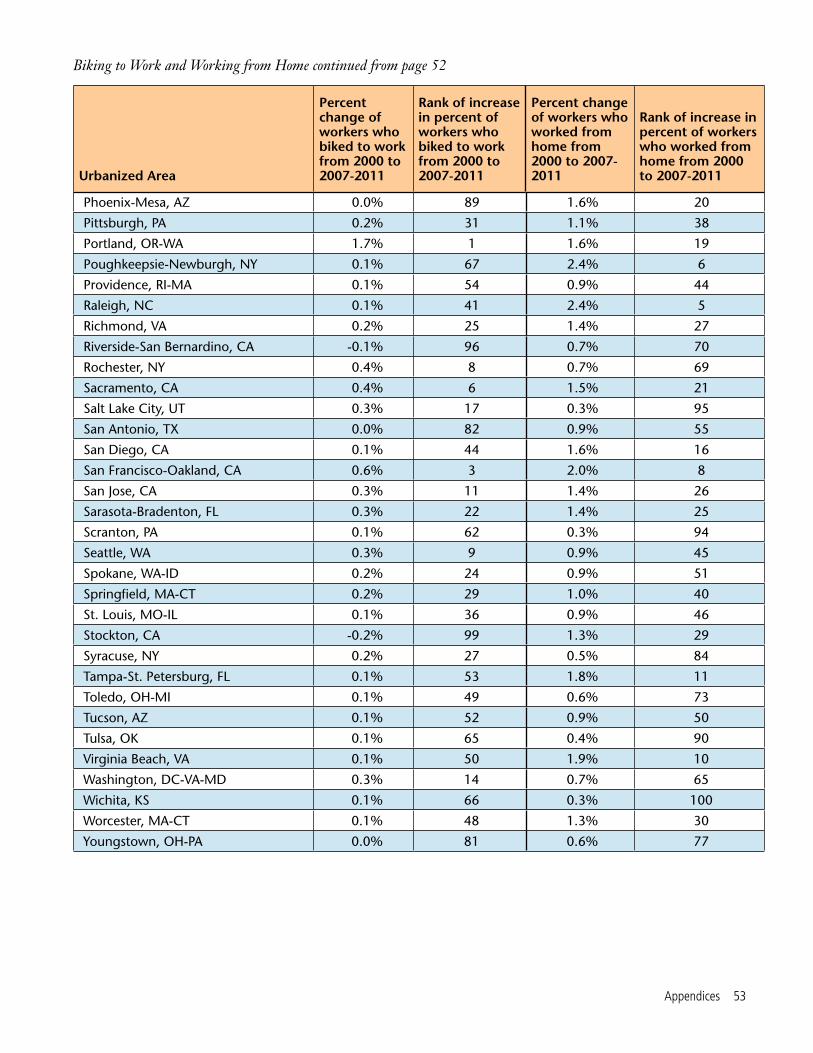
Appendices 53
Phoenix-Mesa, AZ 0.0% 89 1.6% 20
Pittsburgh, PA 0.2% 31 1.1% 38
Portland, OR-WA 1.7% 1 1.6% 19
Poughkeepsie-Newburgh, NY 0.1% 67 2.4% 6
Providence, RI-MA 0.1% 54 0.9% 44
Raleigh, NC 0.1% 41 2.4% 5
Richmond, VA 0.2% 25 1.4% 27
Riverside-San Bernardino, CA -0.1% 96 0.7% 70
Rochester, NY 0.4% 8 0.7% 69
Sacramento, CA 0.4% 6 1.5% 21
Salt Lake City, UT 0.3% 17 0.3% 95
San Antonio, TX 0.0% 82 0.9% 55
San Diego, CA 0.1% 44 1.6% 16
San Francisco-Oakland, CA 0.6% 3 2.0% 8
San Jose, CA 0.3% 11 1.4% 26
Sarasota-Bradenton, FL 0.3% 22 1.4% 25
Scranton, PA 0.1% 62 0.3% 94
Seattle, WA 0.3% 9 0.9% 45
Spokane, WA-ID 0.2% 24 0.9% 51
Springfield, MA-CT 0.2% 29 1.0% 40
St. Louis, MO-IL 0.1% 36 0.9% 46
Stockton, CA -0.2% 99 1.3% 29
Syracuse, NY 0.2% 27 0.5% 84
Tampa-St. Petersburg, FL 0.1% 53 1.8% 11
Toledo, OH-MI 0.1% 49 0.6% 73
Tucson, AZ 0.1% 52 0.9% 50
Tulsa, OK 0.1% 65 0.4% 90
Virginia Beach, VA 0.1% 50 1.9% 10
Washington, DC-VA-MD 0.3% 14 0.7% 65
Wichita, KS 0.1% 66 0.3% 100
Worcester, MA-CT 0.1% 48 1.3% 30
Youngstown, OH-PA 0.0% 81 0.6% 77
Biking to Work and Working from Home continued from page 52
Urbanized Area
Percent change of workers who biked to work from 2000 to 2007-2011
Rank of increase in percent of workers who biked to work from 2000 to 2007-2011
Percent change of workers who worked from home from 2000 to 2007-2011
Rank of increase in percent of workers who worked from home from 2000 to 2007-2011

54 Transportation in Transition
Appendix E: Households with Access to Automobiles
Urbanized Area
Change in percent of households with no vehicle from 2006 to 2011
Change in percent of households with 2+ vehicles from 2006 to 2011
Akron, OH 2.2% -3.6%
Albany, NY 0.8% 0.3%
Albuquerque, NM 1.2% -3.4%
Allentown-Bethlehem, PA-NJ 2.0% -2.6%
Atlanta, GA 0.1% -3.4%
Augusta-Richmond County, GA-SC -0.2% 1.3%
Austin, TX 0.2% -0.7%
Bakersfield, CA 3.0% -2.1%
Baltimore, MD -0.3% -0.9%
Baton Rouge, LA 0.2% 0.1%
Birmingham, AL 0.3% -0.5%
Boston, MA-NH-RI 1.2% -1.8%
Bridgeport-Stamford, CT-NY 0.8% -2.7%
Buffalo, NY 1.0% -1.0%
Cape Coral, FL 0.9% -8.9%
Charleston-North Charleston, SC 0.3% -2.1%
Charlotte, NC-SC 1.6% -3.5%
Chattanooga, TN-GA 1.7% -3.5%
Chicago, IL-IN 1.1% -2.2%
Cincinnati, OH-KY-IN -0.3% -1.1%
Cleveland, OH 0.9% -2.6%
Colorado Springs, CO 0.7% -2.9%
Columbia, SC 1.9% -0.7%
Columbus, OH 0.9% -1.4%
Concord, CA 0.5% -0.8%
Dallas-Fort Worth-Arlington, TX 0.5% 0.3%
Dayton, OH 1.0% -2.8%
Denver-Aurora, CO 0.3% -0.6%
Des Moines, IA 0.7% -2.7%
Detroit, MI 1.2% -4.1%
Continued on page 55

Appendices 55
El Paso, TX-NM -1.3% 1.3%
Flint, MI 1.8% -3.8%
Fresno, CA 0.5% -6.4%
Grand Rapids, MI 2.9% -2.8%
Harrisburg, PA -0.9% -1.2%
Hartford, CT 1.7% -4.2%
Honolulu, HI 0.1% -0.5%
Houston, TX 0.0% 0.0%
Indianapolis, IN 1.6% -1.5%
Jacksonville, FL 0.3% -1.2%
Kansas City, MO-KS 0.6% -1.7%
Knoxville, TN 0.1% -4.8%
Lancaster, PA 2.2% -1.8%
Las Vegas, NV 2.4% -4.7%
Little Rock, AR 1.7% -3.0%
Los Angeles-Long Beach-Santa Ana, CA 0.8% -1.4%
Louisville, KY-IN -0.1% -1.2%
Madison, WI 2.0% -2.8%
McAllen, TX -1.5% 1.4%
Memphis, TN-MS-AR -0.3% -0.1%
Miami, FL 0.3% -2.7%
Milwaukee, WI 1.0% -1.3%
Minneapolis-St. Paul, MN 1.1% -2.8%
Mission Viejo, CA -0.1% -1.5%
Mobile, AL 1.8% -5.9%
Modesto, CA 1.5% -5.3%
Nashville-Davidson, TN 1.0% 0.6%
New Haven, CT 1.9% -3.9%
New Orleans, LA 3.1% -7.9%
New York-Newark, NY-NJ-CT 1.2% -1.4%
Households with Access to Automobiles continued from page 54
Urbanized Area
Change in percent of households with no vehicle from 2006 to 2011
Change in percent of households with 2+ vehicles from 2006 to 2011
Continued on page 56

56 Transportation in Transition
Ogden-Layton, UT 0.1% -1.5%
Oklahoma City, OK 0.6% 0.5%
Omaha, NE-IA 1.3% -2.1%
Orlando, FL 0.6% -2.9%
Oxnard, CA 1.3% -3.1%
Palm Bay-Melbourne, FL 0.0% -5.9%
Pensacola, FL-AL -0.2% -3.0%
Philadelphia, PA-NJ-DE-MD 0.5% -1.3%
Phoenix-Mesa, AZ 1.9% -2.9%
Pittsburgh, PA 1.0% -0.5%
Portland, OR-WA 0.8% -1.2%
Poughkeepsie-Newburgh, NY 3.2% -5.3%
Providence, RI-MA 1.0% -2.1%
Raleigh, NC 0.5% -1.3%
Richmond, VA -0.2% -1.3%
Riverside-San Bernardino, CA 1.1% -0.3%
Rochester, NY 1.4% -3.2%
Sacramento, CA 0.8% -5.2%
Salt Lake City, UT 0.8% -2.0%
San Antonio, TX 0.1% -0.4%
San Diego, CA 0.4% -1.6%
San Francisco-Oakland, CA 1.0% -0.8%
San Jose, CA -0.4% 0.8%
Sarasota-Bradenton, FL 0.8% -2.6%
Scranton, PA 0.6% -3.2%
Seattle, WA 0.9% -0.9%
Spokane, WA-ID 0.6% 2.0%
Springfield, MA-CT 1.6% 0.1%
St. Louis, MO-IL 0.8% -1.1%
Stockton, CA 0.6% -2.7%
Syracuse, NY 2.1% -1.3%
Tampa-St. Petersburg, FL 1.6% -2.7%
Toledo, OH-MI -0.4% -4.2%
Households with Access to Automobiles continued from page 55
Urbanized Area
Change in percent of households with no vehicle from 2006 to 2011
Change in percent of households with 2+ vehicles from 2006 to 2011

Notes 57
1. Arthur Ross, Pedestrian-Bicycle Co-ordinator, Traffic Engineering Division, City of Madison, personal communication, 8 November 2013 and 14 November 2013.
2. Ibid.
3. Streets that are one-way for cars but two-way for bicycles and turn lanes exclu-sively for bikes and buses: Arthur Ross, Pedestrian-Bicycle Coordinator, Traffic Engineering Division, City of Madison, per-sonal communication, 8 November 2013; Di-agonal bike crossings bike lanes that change locations during rush hour and bike boxes: Steve Elbow, “Bike City; Madison’s Efforts to Become a Top Bicycling Community Show No Signs of Slowing,” The Capital Times, 31 July 2013; New bus lines: City of Madison, Metro Transit, Upcoming August Service Changes, downloaded from www.cityofmadi-son.com/metro/augustservicechanges/31.cfm, 8 November 2013.
4. See note 1.
5. Ibid; City of Madison, N. Sherman Ave: Operations and Safety Analysis from Fordem Av-enue to Trailsway, 15 January 2013; Jack Cul-len, “Sherman Avenue Redo Draws Praise, Ire; North Side,” Wisconsin State Journal, 19 August 2013.
6. Dean Mosiman, “Madison Extends Bus Service to Owl Creek, Grandview Commons Neighborhoods,” Wisconsin State Journal, 23 August 2013.
7. 88 percent: Steve Elbow, “Bike City; Madison’s Efforts to Become a Top Bicycling Community Show No Signs of Slowing,” The Capital Times, 31 July 2013.
Notes
8. 11.0 million boardings in 2004: Met-ro Transit, 2011 Record Ridership, down-loaded from www.cityofmadison.com/metro/2011ridership/ridership.cfm, 14 Oc-tober 2013; 14.6 million boardings in 2012: Metro Transit, Metro Transit 2012 Annual Report, no date.
9. Table VM-2: Function System Travel from the Department of Transportation’s Federal Highway Administration’s 2011 Highway Statistics series of reports, available at www.fhwa.dot.gov/policyinformation/statistics.cfm. This report uses “urban areas” in some instances to maintain accurate data. Urban-ized areas have 50,000 people or more while urban clusters have 2,500 to 49,999 people, according to Federal Highway Administra-tion, Census Issues: Census Urbanized Areas and MPO/TMA Designation, downloaded from www.fhwa.dot.gov/planning/census_is-sues/urbanized_areas_and_mpo_tma/faq/page01.cfm, 22 October 2013.
10. These 100 urbanized areas housed 53 percent of the U.S. population in 2000.
11. Federal Highway Administration, Cen-sus Issues: Census Urbanized Areas and MPO/TMA Designation, downloaded from www.fhwa.dot.gov/planning/census_issues/urban-ized_areas_and_mpo_tma/faq/page01.cfm, 22 October 2013.
12. Vehicle-miles traveled: Federal High-way Administration, Historical Monthly VMT Report, 3 May 2011; Population data for 1900-1999: U.S. Census Bureau, Historical Population Estimates: July 1, 1900 to July 1, 1999, 28 June 2000. For population data for 2000-2010 see U.S. Census Bureau, GCT-T1: Population Estimates, downloaded from factfinder2.census.gov, 17 November 2011.
58 Transportation in Transition
13. Total miles driven in America: U.S. Department of Transportation, Federal Highway Administration, December 2012 Traffic Volume Trends, downloaded from www.f hwa.dot.gov/policyinformation/travel_monitoring/12dectvt/page2.cfm, 25 October 2013. Population from 2004 to 2010: U.S. Census, Table 1. Intercensal Estimates of the Resident Population by Sex and Age for the United States: April 1, 2000 to July 1, 2010, downloaded from www.census.gov/popest/data/intercensal/national/nat2010.html, 25 October 2013. Population from 2011 and 2012: U.S. Department of Transportation, Federal Highway Administration, Table 3. Estimates of Resident Population Change for the United States, Regions, States, and Puerto Rico and Region and State Rankings: July 1, 2011 to July 1, 2012, downloaded from www.census.gov/popest/data/national/totals/2012/index.html, 25 October 2013. Population statistics reflect the entire population as opposed to the population of licensed drivers.
14. U.S. Department of Transportation, Federal Highway Administration, December 2012 Traffic Volume Trends, downloaded from www.fhwa.dot.gov/policyinformation/travel_monitoring/12dectvt/page2.cfm, 25 October 2013.
15. Bureau of Labor Statistics, BLS Spot-light on Statistics: The Recession of 2007-2009, February 2012.
16. Clark Williams-Derry citing research by Joe Cortright, Driving Declined During the Recovery (blog), 19 February 2013.
17. U.S. Department of Transportation, Federal Highway Administration, National Household Travel Survey.
18. U.S. Department of Transportation, Federal Highway Administration, Highway Statistics series of reports, downloaded from www.fhwa.dot.gov/policyinformation/sta-tistics.cfm.
19. Licensed drivers: U.S. Department of Transportation, Federal Highway Adminis-tration, Highway Statistics series of reports, downloaded from www.fhwa.dot.gov/poli-cyinformation/statistics.cfm; Driving-age population based on population 16 years and older: U.S. Census Bureau, Historical Popula-tion Estimates, downloaded from www.census.gov/popest/data/historical/index.html, 5 December 2012.
20. Tony Dutzik, Frontier Group, and Phineas Baxandall, U.S. PIRG Education Fund, A New Direction: Our Changing Rela-tionship with Driving and the Implications for America’s Future, Spring 2013.
21. U.S. Bureau of Labor Statistics, Labor Force Statistics from the Current Population Survey, downloaded from www.bls.gov/data, 7 January 2013.
22. “With people in their prime earning and child-rearing years tending to drive the most”: U.S. Department of Transportation, Federal Highway Administration, Summary of Travel Trends: 2009 National Household Travel Survey, June 2011; “A greater share of Americans are entering age groups that have historically driven fewer miles”: (1) U.S. Cen-sus Bureau, Historical Population Estimates, downloaded from www.census.gov/popest/data/historical/index.html, 5 December 2012, and (2) U.S. Census Bureau, 2012 Na-tional Population Projections, downloaded from www.census.gov/population/projections/data/national/2012.html, 5 December 2012.
23. Price of gasoline: U.S. Department of Energy, Energy Information Administration, Monthly Energy Review: Table 9.4 Retail Motor Gasoline and On-Highway Diesel Fuel Prices, September 2013. Inflation calculator: Bureau of Labor Statistics, CPI Inflation Calculator, downloaded from www.bls.gov/data/infla-tion_calculator.htm, 22 October 2013.

Notes 59
24. Zipcar, Millennials & Technology, Feb-ruary 2013. For further discussion see Tony Dutzik and Travis Madsen, Frontier Group, and Phineas Baxandall, U.S. PIRG Education Fund, A New Way to Go: The Transportation Apps and Vehicle-Sharing Tools That Are Giv-ing More Americans the Freedom to Drive Less, Fall 2013.
25. VMT in urbanized areas: Table HM-71 (sometimes called “Miles and Daily Vehicle-Miles of Travel”) from the Depart-ment of Transportation’s Federal Highway Administration’s Highway Statistics series of reports, available at www.fhwa.dot.gov/policyinformation/statistics.cfm; Total VMT: Table VM-2 (sometimes called “An-nual Vehicle-Miles”) from the Depart-ment of Transportation’s Federal Highway Administration’s Highway Statistics series of reports, available at www.fhwa.dot.gov/policyinformation/statistics.cfm.
26. 8,600 to 8,450 miles applies to all urban areas, which includes urbanized areas and urban clusters.
27. VMT in 1980: Table VM-1: Vehicle Miles of Travel in U.S. Department of Trans-portation, Federal Highway Administration, Highway Statistics 1980; VMT in 2000: Table VM-1: Annual Vehicle Distance Traveled in Miles and Related Data, in the U.S. Depart-ment of Transportation, Federal Highway Administration, Highway Statistics 2000; Ur-ban population in 1980: U.S. Census Bureau, Table 4. Population: 1970-1990, downloaded from www.census.gov/geo/reference/urban-rural.html, 18 November 2013; Urban popu-lation in 2000: Table DP-1: Profile of General Demographic Characteristics: 2000 from the U.S. Census (2000 Summary File 1).
28. The average decline in VMT per capita was calculated by dividing the total VMT by the total population for the 74 urbanized areas.
29. 2000 population: Table P001: Total Population from the U.S. Census (2000 Summary File 1); 2005-2009 and 2007-2011 populations: Table B01003: Total Population from the U.S. Census (American Com-munity Survey 5-Year Estimates). 5-year estimates were used because 1-year and 3-year estimates for the population of these cities are not available; Valencia West is an exurb of Tucson outside the urbanized area: U.S. Census Bureau, Geography: Census 2000 Urbanized Area Outline Maps, downloaded from www.census.gov/geo/maps-data/maps/ua2kmaps.html, 13 November 2013.
30. Ibid.
31. Examined more closely, the large decrease in the VMT per capita in the New Orleans urbanized area is the result of a large increase in population from 2006 to 2011, while the annual total VMT remained rela-tively stable. The large increase in population could be due to residents returning to New Orleans after Hurricane Katrina. Possible ex-planations for why the population increased while total VMT remained relatively stable include: (a) people reduced their driving, (b) in 2006, much of the vehicle-miles had been driven by aid workers, or (c) state officials did not fully account for the impact of Hur-ricane Katrina on driving while calculating VMT in 2006.
32. For all maps in this report, the increase in the area of the circles is linear. Therefore, the area of the 10-percent sized circle is twice as big as the area of the 5-percent sized circle.
33. Since some data from the ACS one-year estimates can have relatively large margins of error, the Census only applies the one-year estimates to populations of 65,000 and larger. While three- or five-year estimates would have smaller margins of er-ror, this report uses the one-year estimates in some cases because the most recent data that reflect changing transportation habits are from 2011, and a three- or five-year es-
60 Transportation in Transition
timate would capture transportation habits from earlier years. In addition, the least populous urbanized areas in this report have populations that are almost five times larger than the threshold (65,000) used to report one-year estimates.
34. The large decrease in the VMT per capita in the New Orleans urbanized area is the result of a large increase in popula-tion from 2006 to 2011 while the annual total VMT remained relatively stable. The large increase in population could be due to residents returning to New Orleans after Hurricane Katrina. Despite the population increase, total VMT remained relatively sta-ble because (a) people reduced their driving, (b) in 2006, much of the vehicle-miles were driven by aid workers, or (c) state officials did not fully account for the impact of Hur-ricane Katrina on driving while calculating VMT in 2006.
35. In order to calculate the VMT per capita for the 26 excluded urbanized areas, researchers would need to collect data outside the scope of this report. These data included, but are not limited to, the population in 2006 and 2011 within urbanized area boundaries set by the 1990 Census (which could be avail-able in raw Census data), and the population within boundaries of urbanized areas set by state DOTs (state DOTs could track the population numbers).
36. The VMT in 2011 reported by the FHWA did not use the urbanized area boundaries demarcated by the 2010 Census: Justin Clarke, HPMS/DATA Analysis, High-way System Performance Division, Office of Highway Policy, Federal Highway Adminis-tration, U.S. Department of Transportation, personal communication, 25 October 2013.
37. U.S. Department of Transportation, Federal Highway Administration, National Household Travel Survey. From 2001 to 2009, VMT per capita declined for the following purposes: “Earn a Living,” “Family/Personal Businesses,” and “Social & Recreational.”
38. Throughout this report, “2007-2011” refers to data collected by the 2011 American Community Survey 5-year survey which cov-ers years 2007, 2008, 2009, 2010 and 2011. Thus, data points during 2007-2011 are not reflective of a single year, but the entire five year period.
39. American Association of State High-way and Transportation Officials, Commut-ing in America 2013: The National Report on Commuting Patterns and Trends: Brief 2. The Role of Commuting in Overall Travel, May 2013.
40. “Means of Transportation to Work for the U.S.: 1960-1990” Table available at www.census.gov/hhes/commuting/data/commuting.html.
41. Data on registered vehicles (Bureau of Transportation Statistics, Table 1-11: Number of U.S. Aircraft, Vehicles, Vessels, and Other Conveyances, downloaded from www.rita.dot.gov, 15 October 2013) and data on population (1900-1999: U.S. Census Bureau, Historical Population Estimates: July 1, 1900 to July 1, 1999, 28 June 2000; 2000-2010: U.S. Cen-sus Bureau, GCT-T1: Population Estimates, downloaded from factfinder2.census.gov, 17 November 2011) show that from 1960 to 2007 the number of registered vehicles per capita increased. It is possible that registered vehicles per capita increased before 1960, but the data are not available.
42. This report’s classification of “house-holds without a car” refers to the Census’ classification of “occupied housing units” “with no vehicle available.”
43. Urban areas include urbanized areas and urban clusters.
44. See note 33.
45. American Public Transportation As-sociation, Impacts of the Recession on American Public Transportation Agencies, 2011 Updated, August 2011.

Notes 61
46. While researchers attempted to cal-culate public transit data for the 100 most populous urbanized areas, two urbanized areas – Mission Viejo (CA) and Ogden (UT) – were excluded because the National Transit Database did not provide information on these urbanized areas.
47. See note 33.
48. The passenger-miles traveled per capita in the McAllen (TX) urbanized area increased from 0.17 to 0.79. Thus while the McAllen urbanized area saw a very large percent increase in PMT per capita, it saw a relatively small increase in absolute terms.
49. The percent increase in PMT per capita in the New Orleans (LA) urbanized area could be a result of Hurricane Katrina.
50. Rio Metro Regional Transit District, Project History: Commuter Rail Project De-velopment History, downloaded from www.nmrailrunner.com/component/content/article/19-ct-categories-en/ct-about-en/71-project-history, 16 October 2013. An increase in passenger miles on commuter rail is tracked by Table 19 of the National Transit Database.
51. SoundTransit, Opening Weekend At-tracts More than 92,000 Light Rail Riders (press release), 19 July 2009; Mike Lindblom, “Early Holiday Arrival: Light Rail to Airport,” The Seattle Times, 19 December 2009. An increase in passenger miles on light rail is tracked by Table 19 of the National Transit Database.
52. U.S. Department of Transportation, Federal Highway Administration, National Household Travel Survey.
53. U.S. Department of Transporta-tion, Research and Innovative Technology Administration, Bureau of Transportation Statistics, Special Report; Public Perceptions on Transportation Characteristics of Livable Communities: The 2009 Omnibus Household Survey, July 2011.
54. The proportion of workers who use bikes for a segment of their journey (as op-posed to the majority) could be higher than the numbers purported here because the Census only classifies workers who bike the majority of their trip to work (measured in miles) as bike commuters. Therefore workers who bike to a subway station and then take the subway for the rest of their trip are clas-sified as public transit commuters – not bike commuters – if the distance traveled on the subway is longer than the distance traveled on the bike.
55. Bicycling’s share of total commuting in these areas is much higher when evaluat-ing only the central city as opposed to the broader urbanized area, which includes both cities and their suburbs.
56. For further discussion, see Phineas Baxandall, U.S. PIRG Education Fund, Mov-ing Off the Road: A State-by-State Analysis of the National Decline in Driving, August 2013.
57. Sierra Club’s 2012 list of best and worst transportation projects that were conceived of between the 1940s and 1960s and at least one of which dates to the turn of the 20th century. Source: Sierra Club, Smart Choices, Less Traffic: 50 Best and Worst Transportation Projects in the United States, November 2012.
58. One example of a city that cut back transit service is Cleveland: Greater Cleve-land Regional Transit Authority, Budget Challenges, downloaded from www.riderta.com/budgetchallenges, 6 November 2013.
59. Federal Highway Administration, Census Issues: Census Urbanized Areas and MPO/TMA Designation, downloaded from www.fhwa.dot.gov/planning/census_issues/urbanized_areas_and_mpo_tma/faq/page01.cfm, 22 October 2013.
60. United States Census Bureau, Ameri-can Community Survey: How the American Community Survey Works for Your Community, downloaded from www.census.gov/acs/www/about_the_survey/how_the_acs_works, 5 November 2013.

62 Transportation in Transition
61. United States Census Bureau, What Is the Census, downloaded from www.census.gov/2010census/about, 5 November 2013.
62. United States Department of Trans-portation, Federal Highway Administration, Office of Highway Policy Information, Highway Statistics Series, downloaded from www.fhwa.dot.gov/policyinformation/sta-tistics.cfm, 5 November 2013; United States Department of Transportation, Federal Highway Administration, Office of Highway Policy Information, Traffic Monitoring Guide, September 2013.
63. United States Department of Trans-portation, Federal Highway Administration, 2009 National Household Travel Survey; User’s Guide (Version 2), October 2011.
64. John Giorgis, Director of the Office of Strategic Planning & Analysis at the Federal Transit Administration, personal communi-cation, 11 November 2013.
65. Justin Clarke, HPMS/DATA Analy-sis, Highway System Performance Division, Office of Highway Policy, Federal High-way Administration, U.S. Department of Transportation, personal communication, 25 October 2013.
66. United States Census Bureau, Ameri-can Community Survey; When to Use 1-year, 3-year, or 5-year Estimates, downloaded from www.census.gov/acs/www/guidance_for_data_users/estimates, 6 November 2013.