trading difficult markets - moneymentor
TRANSCRIPT
ORIGINALLY APPEARED IN “ACTIVE TRADER” M AGAZINE
FINDING TRADING STRA TEGIES FOR TOUGH MAR KETS
(AKA TRADING DIFFICU LT MARKETS)
BY SUNNY J. HARRIS
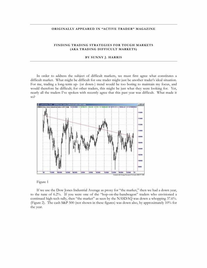
In order to address the subject of difficult markets, we must first agree what constitutes a difficult market. What might be difficult for one trader might just be another trader’s ideal situation. For me, trading a long-term up- (or down-) trend would be too boring to maintain my focus, and would therefore be difficult; for other traders, this might be just what they were looking for. Yet, nearly all the traders I’ve spoken with recently agree that this past year was difficult. What made it so?
Figure 1
If we use the Dow Jones Industrial Average as proxy for “the market,” then we had a down year, to the tune of 6.2%. If you were one of the “hop-on-the-bandwagon” traders who envisioned a continued high-tech rally, then “the market” as seen by the NASDAQ was down a whopping 37.6%. (Figure 2). The cash S&P 500 (not shown in these figures) was down also, by approximately 10% for the year.
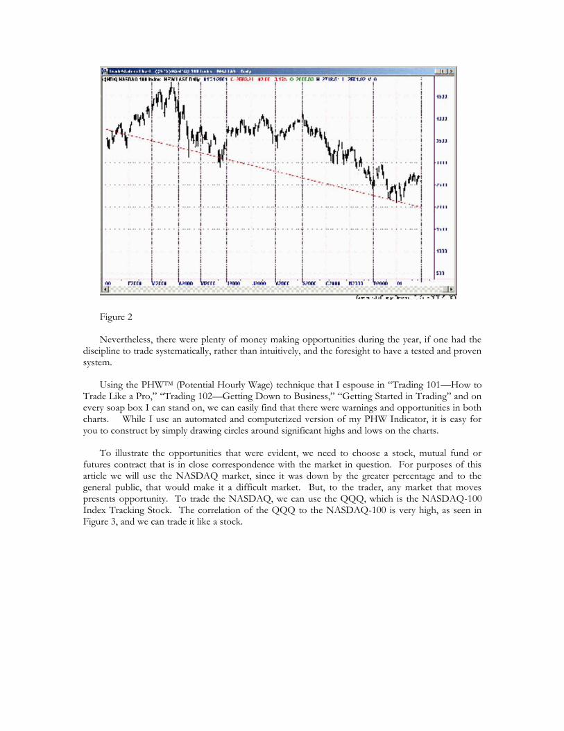
Figure 2
Nevertheless, there were plenty of money making opportunities during the year, if one had the discipline to trade systematically, rather than intuitively, and the foresight to have a tested and proven system.
Using the PHWTM (Potential Hourly Wage) technique that I espouse in “Trading 101—How to Trade Like a Pro,” “Trading 102—Getting Down to Business,” “Getting Started in Trading” and on every soap box I can stand on, we can easily find that there were warnings and opportunities in both charts. While I use an automated and computerized version of my PHW Indicator, it is easy for you to construct by simply drawing circles around significant highs and lows on the charts.
To illustrate the opportunities that were evident, we need to choose a stock, mutual fund or futures contract that is in close correspondence with the market in question. For purposes of this article we will use the NASDAQ market, since it was down by the greater percentage and to the general public, that would make it a difficult market. But, to the trader, any market that moves presents opportunity. To trade the NASDAQ, we can use the QQQ, which is the NASDAQ-100 Index Tracking Stock. The correlation of the QQQ to the NASDAQ-100 is very high, as seen in Figure 3, and we can trade it like a stock.
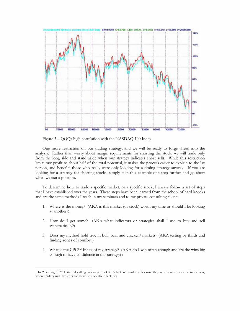
Figure 3 – QQQs high correlation with the NASDAQ 100 Index
One more restriction on our trading strategy, and we will be ready to forge ahead into the analysis. Rather than worry about margin requirements for shorting the stock, we will trade only from the long side and stand aside when our strategy indicates short sells. While this restriction limits our profit to about half of the total potential, it makes the process easier to explain to the lay person, and benefits those who really were only looking for a timing strategy anyway. If you are looking for a strategy for shorting stocks, simply take this example one step further and go short when we exit a position.
To determine how to trade a specific market, or a specific stock, I always follow a set of steps that I have established over the years. These steps have been learned from the school of hard knocks and are the same methods I teach in my seminars and to my private consulting clients.
1. Where is the money? (AKA is this market (or stock) worth my time or should I be looking at another?)
2. How do I get some? (AKA what indicators or strategies shall I use to buy and sell systematically?)
3. Does my method hold true in bull, bear and chicken1 markets? (AKA testing by thirds and finding zones of comfort.)
4. What is the CPCTM Index of my strategy? (AKA do I win often enough and are the wins big enough to have confidence in this strategy?)
1 In “Trading 102” I started calling sideways markets “chicken” markets, because they represent an area of indecision, where traders and investors are afraid to stick their neck out.
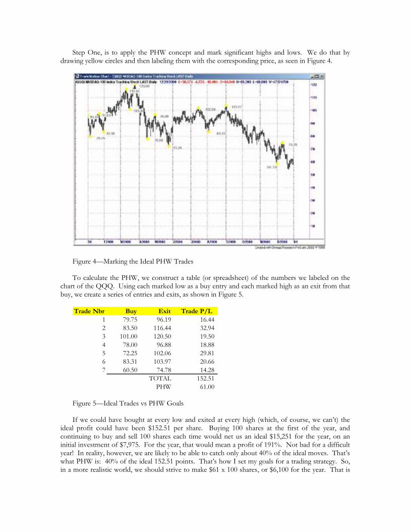
Step One, is to apply the PHW concept and mark significant highs and lows. We do that by drawing yellow circles and then labeling them with the corresponding price, as seen in Figure 4.
Figure 4—Marking the Ideal PHW Trades
To calculate the PHW, we construct a table (or spreadsheet) of the numbers we labeled on the chart of the QQQ. Using each marked low as a buy entry and each marked high as an exit from that buy, we create a series of entries and exits, as shown in Figure 5.
Trade Nbr Buy Exit Trade P/L
1 79.75 96.19 16.44
2 83.50 116.44 32.94
3 101.00 120.50 19.50
4 78.00 96.88 18.88
5 72.25 102.06 29.81
6 83.31 103.97 20.66
7 60.50 74.78 14.28
TOTAL 152.51
PHW 61.00
Figure 5—Ideal Trades vs PHW Goals
If we could have bought at every low and exited at every high (which, of course, we can’t) the ideal profit could have been $152.51 per share. Buying 100 shares at the first of the year, and continuing to buy and sell 100 shares each time would net us an ideal $15,251 for the year, on an initial investment of $7,975. For the year, that would mean a profit of 191%. Not bad for a difficult year! In reality, however, we are likely to be able to catch only about 40% of the ideal moves. That’s what PHW is: 40% of the ideal 152.51 points. That’s how I set my goals for a trading strategy. So, in a more realistic world, we should strive to make $61 x 100 shares, or $6,100 for the year. That is
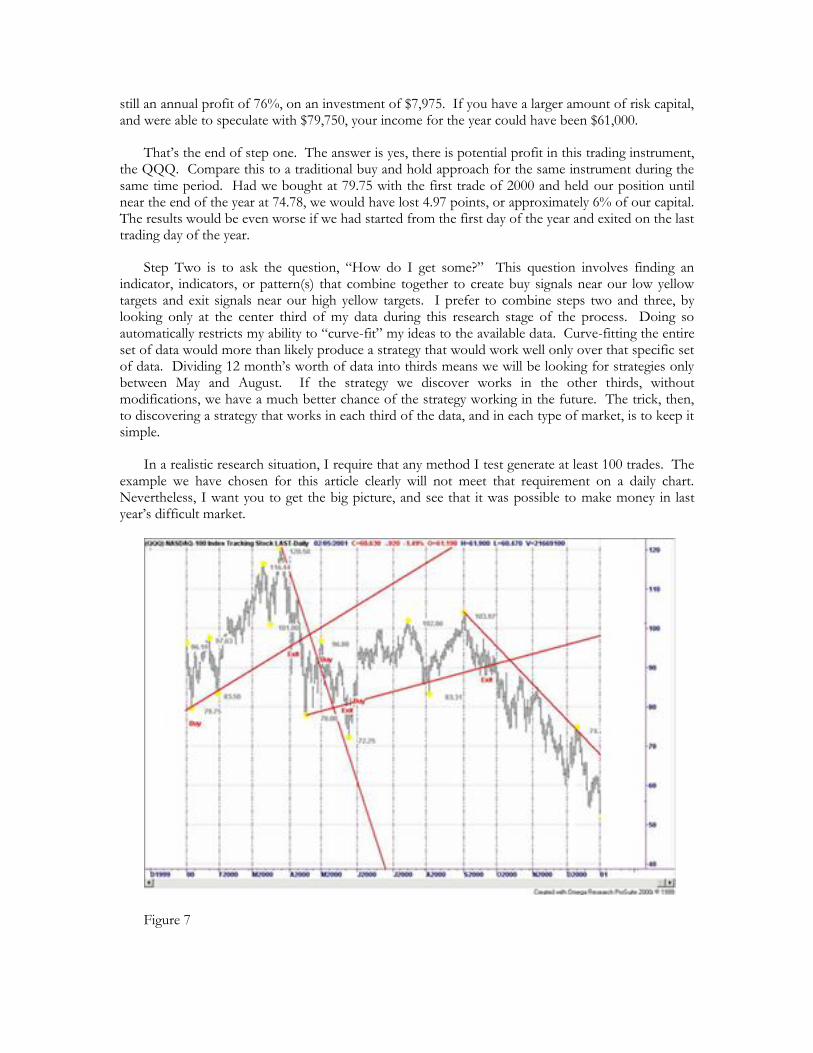
still an annual profit of 76%, on an investment of $7,975. If you have a larger amount of risk capital, and were able to speculate with $79,750, your income for the year could have been $61,000.
That’s the end of step one. The answer is yes, there is potential profit in this trading instrument, the QQQ. Compare this to a traditional buy and hold approach for the same instrument during the same time period. Had we bought at 79.75 with the first trade of 2000 and held our position until near the end of the year at 74.78, we would have lost 4.97 points, or approximately 6% of our capital. The results would be even worse if we had started from the first day of the year and exited on the last trading day of the year.
Step Two is to ask the question, “How do I get some?” This question involves finding an indicator, indicators, or pattern(s) that combine together to create buy signals near our low yellow targets and exit signals near our high yellow targets. I prefer to combine steps two and three, by looking only at the center third of my data during this research stage of the process. Doing so automatically restricts my ability to “curve-fit” my ideas to the available data. Curve-fitting the entire set of data would more than likely produce a strategy that would work well only over that specific set of data. Dividing 12 month’s worth of data into thirds means we will be looking for strategies only between May and August. If the strategy we discover works in the other thirds, without modifications, we have a much better chance of the strategy working in the future. The trick, then, to discovering a strategy that works in each third of the data, and in each type of market, is to keep it simple.
In a realistic research situation, I require that any method I test generate at least 100 trades. The example we have chosen for this article clearly will not meet that requirement on a daily chart. Nevertheless, I want you to get the big picture, and see that it was possible to make money in last year’s difficult market.
Figure 7

Trade Nbr Buy Exit Trade P/L
1 79.75 88.313 8.563
2 92.125 80.937 -11.188
3 81.5 88.25 6.75
TOTAL 4.125
Figure 8 – Calculating Buys and Sells from Trendlines
This trendline reversal method generates only three buys for the year, so to be accurate in our research we would have to test over a much longer time period, or to test a smaller compression like 15-minute charts. Nevertheless, you see that even trading a simple trendline system such as this would beat the buy and hold negative return for the year.
Moving averages are no more than curved trendlines—they are an extension of the concept of following the trend. In the charts that follow you will see three types of moving averages, commonly available in most popular trading software: simple, weighted and exponential. In the fourth chart (Figure 12) you will see the moving average that I use in my own work, an average that adjusts itself to the market.
Figure 9—Simple Moving Average
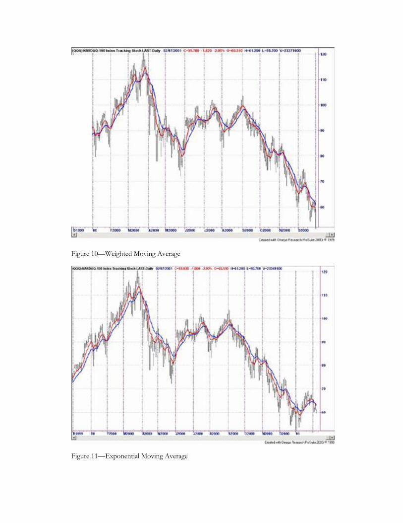
Figure 10—Weighted Moving Average
Figure 11—Exponential Moving Average
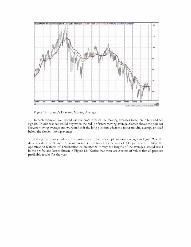
Figure 12—Sunny’s Dynamic Moving Average
In each example, you would use the cross over of the moving averages to generate buy and sell signals. In our case we would buy when the red (or faster) moving average crosses above the blue (or slower) moving average and we would exit the long position when the faster moving average crossed below the slower moving average.
Taking every trade indicated by crossovers of the two simple moving averages in Figure 9, at the default values of 9 and 18 would result in 10 trades for a loss of $41 per share. Using the optimization features of TradeStation or MetaStock to vary the lengths of the averages, would result in the profits and losses shown in Figure 13. Notice that there are clusters of values that all produce profitable results for the year.
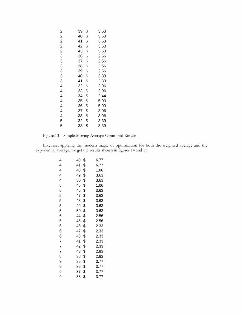
2 39 3.63$
2 40 3.63$
2 41 3.63$
2 42 3.63$
2 43 3.63$
3 36 2.56$
3 37 2.56$
3 38 2.56$
3 39 2.56$
3 40 2.33$
3 41 2.33$
4 32 2.06$
4 33 2.06$
4 34 2.44$
4 35 5.00$
4 36 5.00$
4 37 3.06$
4 38 3.06$
5 32 3.39$
5 33 3.39$
Figure 13—Simple Moving Average Optimized Results
Likewise, applying the modern magic of optimization for both the weighted average and the exponential average, we get the results shown in figures 14 and 15.
4 40 6.77$
4 41 6.77$
4 48 1.06$
4 49 3.63$
4 50 3.63$
5 45 1.06$
5 46 3.63$
5 47 3.63$
5 48 3.63$
5 49 3.63$
5 50 3.63$
6 44 2.56$
6 45 2.56$
6 46 2.33$
6 47 2.33$
6 48 2.33$
7 41 2.33$
7 42 2.33$
7 43 2.83$
8 38 2.83$
9 35 3.77$
9 36 3.77$
9 37 3.77$
9 38 3.77$

Figure 14—Clusters in the Optimization of the Weighted Moving Average
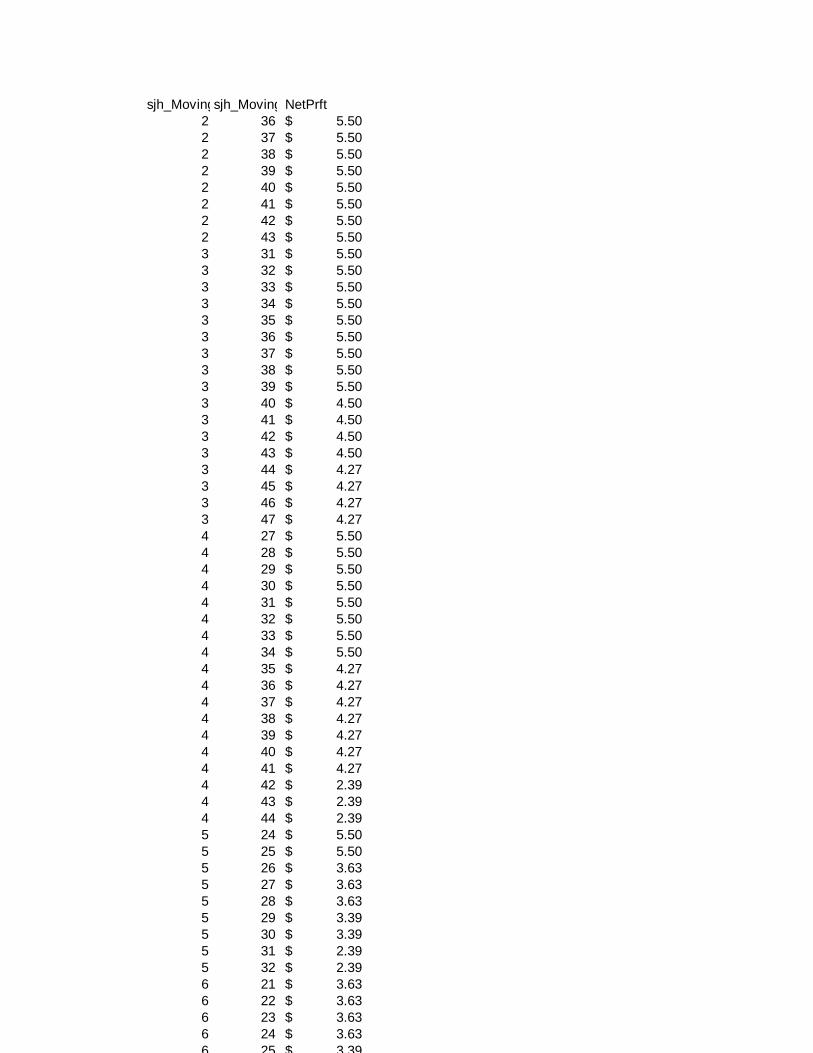
sjh_MovingAvgCrossov_sjh_MovingAvgCrossov_NetPrft
2 36 5.50$
2 37 5.50$
2 38 5.50$
2 39 5.50$
2 40 5.50$
2 41 5.50$
2 42 5.50$
2 43 5.50$
3 31 5.50$
3 32 5.50$
3 33 5.50$
3 34 5.50$
3 35 5.50$
3 36 5.50$
3 37 5.50$
3 38 5.50$
3 39 5.50$
3 40 4.50$
3 41 4.50$
3 42 4.50$
3 43 4.50$
3 44 4.27$
3 45 4.27$
3 46 4.27$
3 47 4.27$
4 27 5.50$
4 28 5.50$
4 29 5.50$
4 30 5.50$
4 31 5.50$
4 32 5.50$
4 33 5.50$
4 34 5.50$
4 35 4.27$
4 36 4.27$
4 37 4.27$
4 38 4.27$
4 39 4.27$
4 40 4.27$
4 41 4.27$
4 42 2.39$
4 43 2.39$
4 44 2.39$
5 24 5.50$
5 25 5.50$
5 26 3.63$
5 27 3.63$
5 28 3.63$
5 29 3.39$
5 30 3.39$
5 31 2.39$
5 32 2.39$
6 21 3.63$
6 22 3.63$
6 23 3.63$
6 24 3.63$
6 25 3.39$
6 26 2.33$
7 19 3.63$
7 20 3.63$
7 21 2.56$
7 22 2.33$
7 23 2.33$
8 18 2.56$
8 19 2.56$
8 20 2.33$
8 21 2.33$
9 16 2.56$
9 17 2.56$
9 18 2.33$
9 19 2.33$
10 15 2.56$
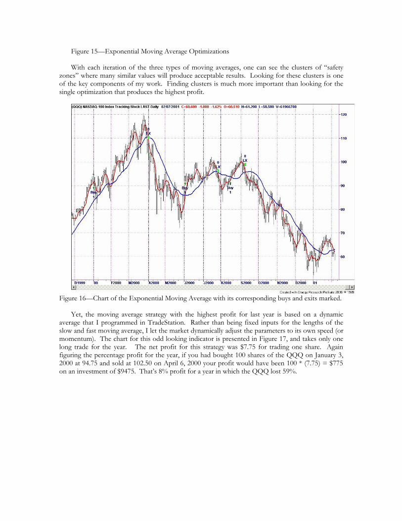
Figure 15—Exponential Moving Average Optimizations
With each iteration of the three types of moving averages, one can see the clusters of “safety zones” where many similar values will produce acceptable results. Looking for these clusters is one of the key components of my work. Finding clusters is much more important than looking for the single optimization that produces the highest profit.
Figure 16—Chart of the Exponential Moving Average with its corresponding buys and exits marked.
Yet, the moving average strategy with the highest profit for last year is based on a dynamic average that I programmed in TradeStation. Rather than being fixed inputs for the lengths of the slow and fast moving average, I let the market dynamically adjust the parameters to its own speed (or momentum). The chart for this odd looking indicator is presented in Figure 17, and takes only one long trade for the year. The net profit for this strategy was $7.75 for trading one share. Again figuring the percentage profit for the year, if you had bought 100 shares of the QQQ on January 3, 2000 at 94.75 and sold at 102.50 on April 6, 2000 your profit would have been 100 * (7.75) = $775 on an investment of $9475. That’s 8% profit for a year in which the QQQ lost 59%.
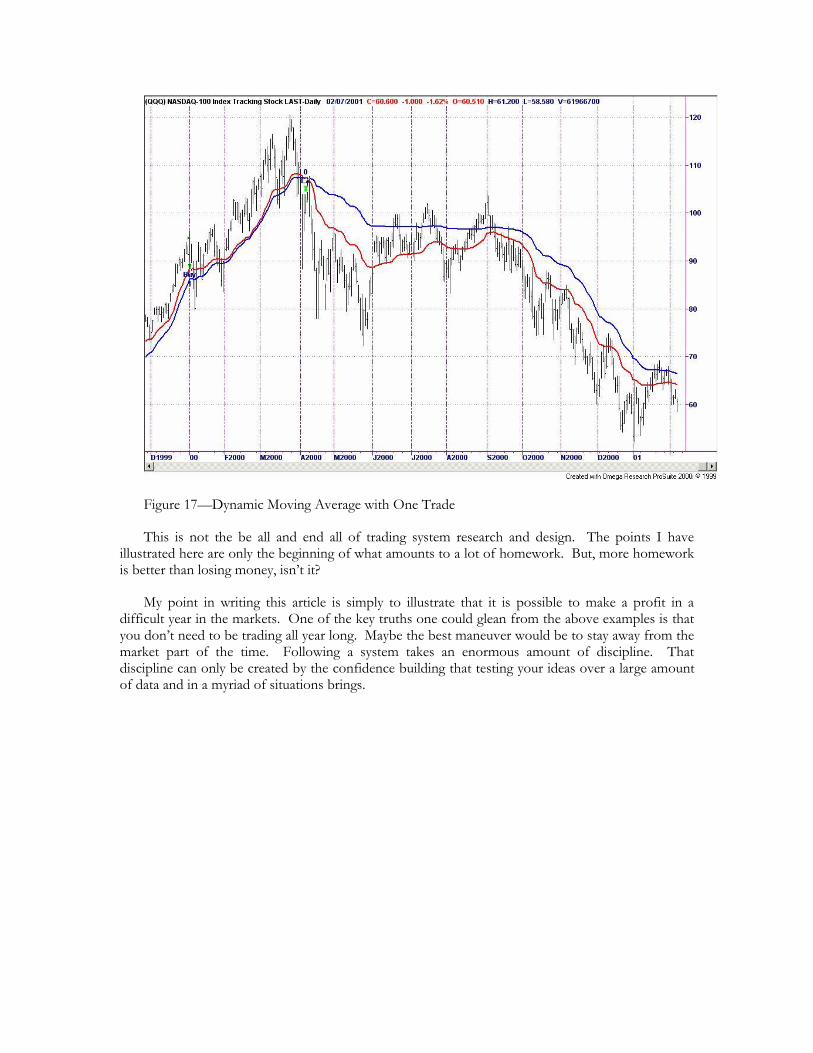
Figure 17—Dynamic Moving Average with One Trade
This is not the be all and end all of trading system research and design. The points I have illustrated here are only the beginning of what amounts to a lot of homework. But, more homework is better than losing money, isn’t it?
My point in writing this article is simply to illustrate that it is possible to make a profit in a difficult year in the markets. One of the key truths one could glean from the above examples is that you don’t need to be trading all year long. Maybe the best maneuver would be to stay away from the market part of the time. Following a system takes an enormous amount of discipline. That discipline can only be created by the confidence building that testing your ideas over a large amount of data and in a myriad of situations brings.