tpk4161 supply chain analytics statistical process control
TRANSCRIPT

Norwegian University of Science and Technology
PhD candidate: Oluyisola, Olumide E. (CSSBB)Supervisors: Prof. Strandhagen, J. O. and Asso. Prof. Semini, M. G.
The Production Management GroupDepartment of Mechanical and Industrial Engineering
NTNU-Trondheim
18.Oct.2017
TPK4161 Supply Chain Analytics
-
Statistical Process Control
Norwegian University of Science and Technology 2
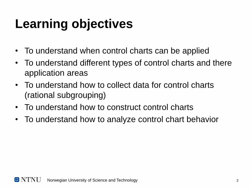
Learning objectives
• To understand when control charts can be applied
• To understand different types of control charts and there
application areas
• To understand how to collect data for control charts
(rational subgrouping)
• To understand how to construct control charts
• To understand how to analyze control chart behavior

Norwegian University of Science and Technology 3
Outline
• Introduction
• Types of variation
• Control charts selection
• Rational subgrouping and control limits
• Xbar– R, Xbar – s, IMR charts with examples
• Attribute charts: p, np, c and u charts with examples
• Short-Run control charts and MAMR chart
• Analyzing control chart behavior with many examples
• Summary

Norwegian University of Science and Technology 4
What is SPC?
• The ‘control’ of processes using statistical principles and tools.
• SPC entails the use of statistical tools to monitor (usually
production) a process for ‘significant’ deviations, that indicate the
likelihood of a rejected product
• Pioneered by W. A. Shewhart in the early 1920s.
• Later applied by W. E. Deming during the 2nd World War to improve
quality in the manufacture of weaponries
• After the war, Deming supported the adoption of SPC by the
Japanese Industry, with remarkable results in product quality.
Norwegian University of Science and Technology 5
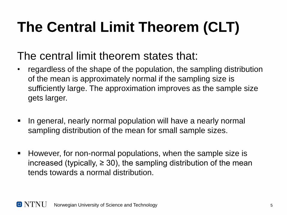
The Central Limit Theorem (CLT)
The central limit theorem states that:• regardless of the shape of the population, the sampling distribution
of the mean is approximately normal if the sampling size is
sufficiently large. The approximation improves as the sample size
gets larger.
▪ In general, nearly normal population will have a nearly normal
sampling distribution of the mean for small sample sizes.
▪ However, for non-normal populations, when the sample size is
increased (typically, ≥ 30), the sampling distribution of the mean
tends towards a normal distribution.

Norwegian University of Science and Technology 6
The Central Limit Theorem (CLT)

Norwegian University of Science and Technology 7
Types of variation
Common-cause Special-cause
Also referred to as natural variation.▪
Inherent to the process▪
Generally not controllable by process ▪
operatorsExamples: ▪
natural variation in raw materials,•
variation in ambient temperature,•
variation in electrical or •
pneumatic sources, etc• .
Also referred to as assignable cause▪
Events that the operator, when ▪
properly alerted, can usually remove or adjustExamples: tool wear, large changes in ▪
raw materials, broken equipment, etc.
Process in control (stable) Process out of control (unstable)

Norwegian University of Science and Technology 8
Selecting a control chart
Norwegian University of Science and Technology 9
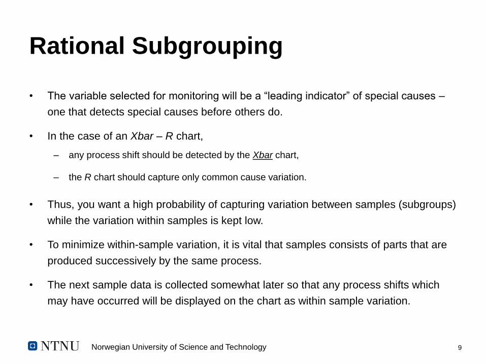
Rational Subgrouping
• The variable selected for monitoring will be a “leading indicator” of special causes –
one that detects special causes before others do.
• In the case of an Xbar – R chart,
– any process shift should be detected by the Xbar chart,
– the R chart should capture only common cause variation.
• Thus, you want a high probability of capturing variation between samples (subgroups)
while the variation within samples is kept low.
• To minimize within-sample variation, it is vital that samples consists of parts that are
produced successively by the same process.
• The next sample data is collected somewhat later so that any process shifts which
may have occurred will be displayed on the chart as within sample variation.
Norwegian University of Science and Technology 10
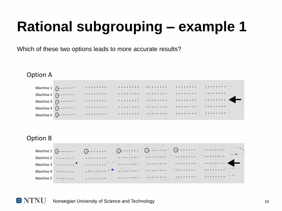
Rational subgrouping – example 1
Which of these two options leads to more accurate results?
Option A
Option B
Machine 1
Machine 2
Machine 3
Machine 4
Machine 5
Machine 1
Machine 2
Machine 3
Machine 4
Machine 5

Norwegian University of Science and Technology 11
Rational subgrouping – example 1
explanation• In this example, in a workstation with five machines or robots performing the same
function and producing the same output, sampling can be tricky.
• Choosing the five products from each machine (option A) would have the five
elements of the sample being produced by five different processes.
– This also skews the measured values in an unpredictable way, dampening or amplifying them.
• A better choice would be to select from the same machine, in five consecutive arrays
(option B).
– This option ensures that the same process is being monitored, and minimizes the ‘within-sample’ variation,
thus allowing the subgroup-to-subgroup variation to become more prominent. However, in this chase there
might be a need for more control charts, for all five machines in an extreme case.
• Ultimately, the choice of sample size depends to some extent on the resources
available to do the measuring, as well as how obstructive or destructive the
measurement activity is. However, the larger the sample size, the more sensitive the
chart.
Norwegian University of Science and Technology 12
Control limits
• Calculated from process data, and represents the ‘voice of the process’
• Set at ±3𝜎; the upper control limit (UCL) at +3𝜎 and the lower control limit
(LCL) at -3𝜎.
• When calculating the control limits, it is better to collect as much data as
practical. Many authors suggest at least 25 subgroups.
– NB: The examples used in this note use fewer examples for simplicity.
# With variable control charts, subgroup sizes are generally held constant, but
may vary with some of the attribute control charts.

Norwegian University of Science and Technology 13
• When variable, continuous data is to be controlled, a carriable chart
is used.
• The ‘property’ to be controlled is continuous (as opposed to being
discrete).
• There are three common types of variable control charts:
– ത𝑋 - s chart (or Xbar – s chart)
– ത𝑋 - R chart (also referred to as Xbar – R chart)
– Individual and moving range chart (IMR)
Variable charts

Norwegian University of Science and Technology 14
Xbar – R Chart
• Typically used when the sample size of each subgroup is
‘approximately’ <10, since the range is a better estimate of
dispersion for smaller sample sizes.
• Control limits are given by the following formulas:
ഥ𝑋𝑖 =
𝑗=1
𝑛
𝑥𝑖𝑗
𝑛= average of the 𝑖𝑡ℎ subgroup; plot points
തത𝑋 =
𝑖=1
𝑘 ത𝑋𝑖
𝑘= center line of the ഥ𝑋 𝑜𝑟 𝑋𝑏𝑎𝑟 chart
𝑘 = number of subgroups 𝑛 = sample size of each subgroup
ത𝑅 =σ𝑖=1
𝑘 𝑅𝑖
𝑘= center line of the 𝑅 chart
𝑅𝑖 = range of the 𝑖𝑡ℎ subgroup
LCL ҧ𝑋= തത𝑋 - A2
ത𝑅
UCL ҧ𝑋= തത𝑋 + A2
ത𝑅
LCL𝑅 = D3ത𝑅
UCL𝑅 = D4ത𝑅

Norwegian University of Science and Technology 15
Example 2
Sample7:00 a.m.
8:00 a.m.
9:00 a.m.
10:00 a.m.
11:00 a.m.
12:00 p.m.
1:00 p.m.
2:00 p.m.
3:00 p.m.
4:00 p.m.
1 7.127 7.125 7.123 7.127 7.128 7.125 7.126 7.126 7.127 7.128
2 7.123 7.126 7.129 7.127 7.125 7.125 7.123 7.126 7.129 7.123
3 7.123 7.121 7.129 7.124 7.126 7.127 7.123 7.127 7.128 7.122
4 7.126 7.122 7.124 7.125 7.127 7.128 7.125 7.128 7.129 7.124
Data are collected in a face-and-plunge operation done on a lathe.
The dimension being measured is the groove inside diameter (ID),
which has a tolerance of 7.125 ± 0.010. Four parts are measured
every hour. Thee values have been entered in the table below:
Norwegian University of Science and Technology 16
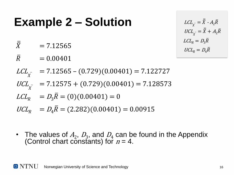
Example 2 – Solution
തത𝑋 = 7.12565
ത𝑅 = 0.00401
LCL ҧ𝑋= 7.12565 – (0.729)(0.00401) = 7.122727
UCL ҧ𝑋= 7.12575 + (0.729)(0.00401) = 7.128573
LCL𝑅 = D3ത𝑅 = (0)(0.00401) = 0
UCL𝑅 = D4ത𝑅 = (2.282)(0.00401) = 0.00915
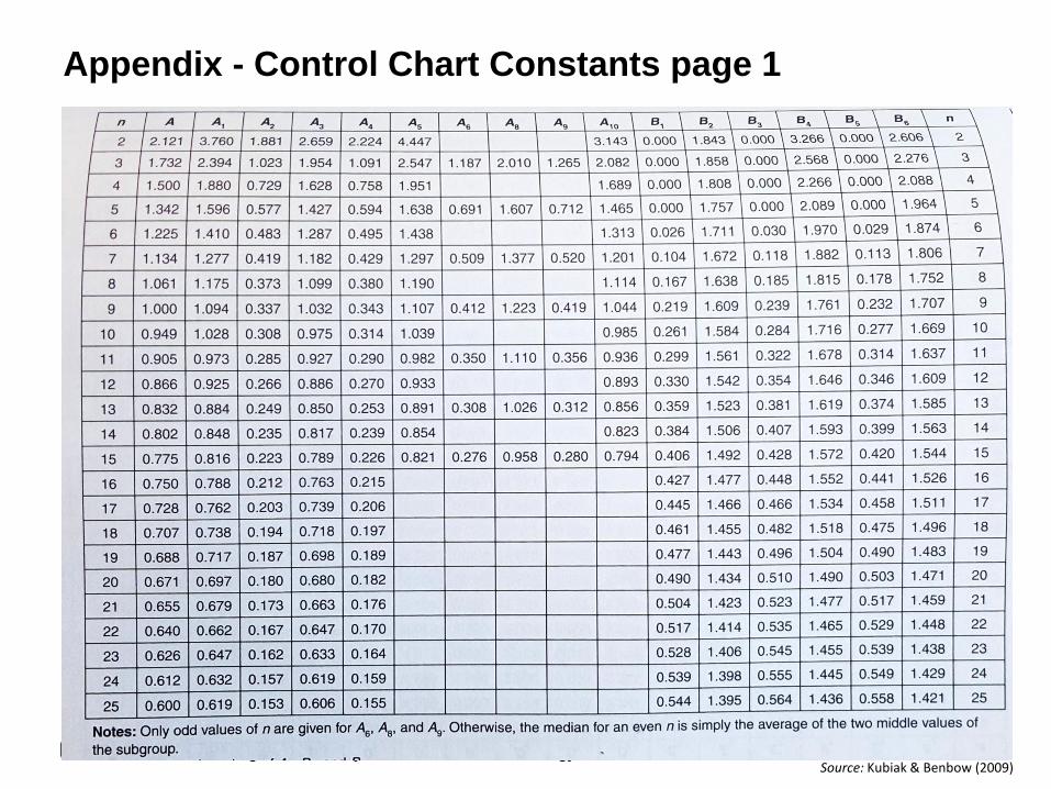
• The values of A2, D3, and D4 can be found in the Appendix (Control chart constants) for n = 4.
LCL ҧ𝑋= തത𝑋 - A2
ത𝑅
UCL ҧ𝑋= തത𝑋 + A2
ത𝑅
LCL𝑅 = D3ത𝑅
UCL𝑅 = D4ത𝑅

Norwegian University of Science and Technology 17
Example 2 – Solution

Norwegian University of Science and Technology 18
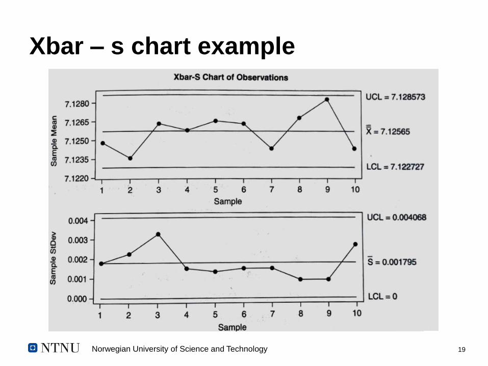
Xbar – s chart
• Typically used when the sample size of each subgroup is
‘approximately’ ≥ 10, since the standard deviation, s, is a better
estimate of dispersion for larger sample sizes.
• Control limits are given by the following formulas:
ഥ𝑋𝑖 =
𝑗=1
𝑛
𝑥𝑖𝑗
𝑛= average of the 𝑖𝑡ℎ subgroup; plot points
തത𝑋 =
𝑖=1
𝑘 ത𝑋𝑖
𝑘= center line of the ത𝑋 chart
𝑘 = number of subgroups 𝑛 = sample size of each subgroup
ҧ𝑠 =σ𝑖=1
𝑘 𝑠𝑖
𝑘= center line of the 𝑠 chart
𝑠𝑖 = standard deviation of the 𝑖𝑡ℎ subgroup
LCL ҧ𝑋= തത𝑋 - A3 ҧ𝑠
UCL ҧ𝑋= തത𝑋 + A3 ҧ𝑠
LCL𝑠 = B3 ҧ𝑠
UCL𝑠 = B4 ҧ𝑠
Norwegian University of Science and Technology 19
Xbar – s chart example

Norwegian University of Science and Technology 20
Individual and Moving Range chart (IMR)
• Although larger sample sizes produces more representative charts,
there are some situations when a sample size of one is the only
feasible option.
• Examples: very slow processes; processes in which the
measurements are very expensive to obtain – for instance with
destructive tests.
• In this cases, the IMR (a.k.a., the XmR) is appropriate.
• The range is calculated as the absolute value of the difference
between each measurement and the previous one.

Norwegian University of Science and Technology 21
Individual and Moving Range chart (IMR)
ത𝑋 =σ𝑖=1
𝑛 𝑥𝑖
𝑛= center line of the X chart
𝑚 ത𝑅 =σ𝑖=1
𝑛−1 𝑚𝑅𝑖
𝑛 − 1= center line of the 𝑚𝑅 chart (moving range)
𝑥𝑖 = individual data measurements; plot points
𝑛 = number of individual data measurements
𝑚𝑅𝑖 = ȁ𝑥𝑖 − ȁ𝑥𝑖 − 1 for i = 2, 3, …, n
LCL ҧ𝑋= ഥ𝑋 - E2𝑚 ത𝑅
UCL ҧ𝑋= ഥ𝑋 + E2𝑚 ത𝑅
LCL𝑚𝑅 = D3𝑚 ത𝑅
UCL𝑚𝑅 = D4𝑚 ത𝑅

Norwegian University of Science and Technology 22
Example 3
• Using the data recorded for a milling process in at a thruster
manufacturer, construct an individual and moving average chart
Reading Individual data element
1 290
2 288
3 285
4 290
5 291
6 287
7 284
8 290
9 290
10 288

Norwegian University of Science and Technology 23
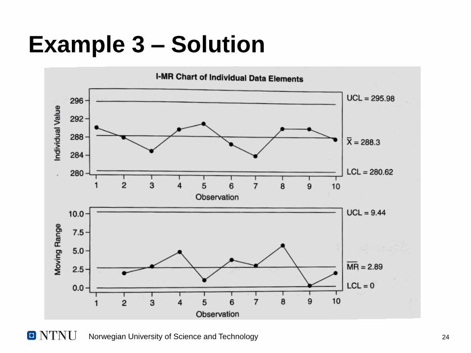
Example 3 – Solution
ത𝑋 = 288.3
𝑚 ത𝑅 = 2.89
LCL ҧ𝑋= 288.3 – (2.660)(2.89) = 280.62
UCL ҧ𝑋= 288.3 + (2.660)(2.89) = 295.98
LCL𝑚𝑅 = (0)(2.89) = 0
UCL𝑚𝑅 = (3.267)(2.89) = 9.44
• The values of E2, D3, and D4 can be found in the Appendix (Control chart constants) for n = 2.
LCL ҧ𝑋= ഥ𝑋 - E2𝑚 ത𝑅
UCL ҧ𝑋= ഥ𝑋 + E2𝑚 ത𝑅
LCL𝑚𝑅 = D3𝑚 ത𝑅
UCL𝑚𝑅 = D4𝑚 ത𝑅
Norwegian University of Science and Technology 24
Example 3 – Solution

Norwegian University of Science and Technology 25
Attribute charts
• Attributes charts are used to control processes where each process output being
monitored can be classified only in binary forms, such as good or bad.
• p and np charts are used to control proportion defective
• c and u charts are used to control counts of defects.
• c and np charts require constant sample sizes.
• A defective is also knows as a “nonconformance.” A defect is also known as a
“nonconformity.”
# When a lower control limit computes to a negative value, it is artificially set to zero. This
is because it is impossible to have a negative proportion defective or defect counts.

Norwegian University of Science and Technology 26
p Chart
• Used when sample size varies
• Used to control the proportion or percentage of defectives.
NB: The control limits on the chart are not straight since it reflects each subgroup’s individual sample
size
𝑝𝑖 =𝐷𝑖
𝑛𝑖
= plot points
ҧ𝑝 =σ𝑖=1
𝑘 𝐷𝑖
σ𝑖=1𝑘 𝑛𝑖
= center line of the 𝑝 chart
𝑛𝑖 = sample size of the 𝑖𝑡ℎ subgroup
𝐷𝑖 = number of defective units nonconforming units in the 𝑖𝑡ℎ subgroup
LCL𝑝 =ഥ𝑝 - 3ҧ𝑝(1− ҧ𝑝)
𝑛𝑖
UCL𝑝 = ҧ𝑝 + 3ҧ𝑝(1− ҧ𝑝)
𝑛𝑖
𝑘 = number of subgroups

Norwegian University of Science and Technology 27
Example 4
• A test was conducted to
determine the presence of
an undesirable bacteria in
samples collected over 13
days from milk supplied by
dairy farms in Sør-
Trondelag.
Date No. of defectives
Sample size
8-Sept 12 115
9-Sept 14 125
10-Sept 18 111
11-Sept 13 133
12-Sept 17 120
13-Sept 15 118
14-Sept 15 137
15-Sept 15 108
16-Sept 16 110
17-Sept 11 124
18-Sept 14 128
19-Sept 13 144
20-Sept 14 141

Norwegian University of Science and Technology 28
Example 4 - Solution LCL𝑝 =ഥ𝑝 - 3ҧ𝑝(1− ҧ𝑝)
𝑛𝑖
UCL𝑝 = ҧ𝑝 + 3ҧ𝑝(1− ҧ𝑝)
𝑛𝑖

Norwegian University of Science and Technology 29
np Chart
• Used when sample size is constant
• Used to control the proportion or percentage of defectives.
𝑛 ҧ𝑝 = 𝑛σ𝑖=1
𝑘 𝐷𝑖
σ𝑖=1𝑘 𝑛𝑖
= center line of the 𝑛𝑝 chart
𝑛𝑖 = sample size of the 𝑖𝑡ℎ subgroup
𝐷𝑖 = number of defective units nonconforming units in the 𝑖𝑡ℎ subgroup; plot points
LCL𝑛𝑝 = 𝑛 ҧ𝑝 - 3 𝑛 ҧ𝑝(1 − ҧ𝑝)
UCL𝑛𝑝 = 𝑛 ҧ𝑝 + 3 𝑛 ҧ𝑝(1 − ҧ𝑝)
𝑘 = number of subgroups
ҧ𝑝 =σ𝑖=1
𝑘 𝐷𝑖
σ𝑖=1𝑘 𝑛𝑖

Norwegian University of Science and Technology 30
Example 5
Packages containing 1000
lightbulbs are randomly
selected, and all 1000 bulbs
are light-tested. The test
results are summarized in
the table:
Date No. of defectives
Sample sizes
8-Sept 9 1000
9-Sept 12 1000
10-Sept 13 1000
11-Sept 12 1000
12-Sept 11 1000
13-Sept 9 1000
14-Sept 7 1000
15-Sept 0 1000
16-Sept 12 1000
17-Sept 8 1000
18-Sept 9 1000
19-Sept 7 1000
20-Sept 11 1000

Norwegian University of Science and Technology 31
Example 5 - Solution LCL𝑛𝑝 = 𝑛 ҧ𝑝 - 3 𝑛 ҧ𝑝(1 − ҧ𝑝)
UCL𝑛𝑝 = 𝑛 ҧ𝑝 + 3 𝑛 ҧ𝑝(1 − ҧ𝑝)
𝑛 ҧ𝑝 = 1000120
13000= 9.23
ҧ𝑝 =120
13000= 0.00923
LCL𝑛𝑝 = 9.23 - 3 1000 0.00923 1 − 0.00923 = 0.16
UCL𝑛𝑝 = 9.23 + 3 1000 0.00923 1 − 0.00923 = 18.30

Norwegian University of Science and Technology 32
Example 5 – Solution

Norwegian University of Science and Technology 33
c Chart
• Used when sample size is constant
• Use to control the number of defects.
𝑛 = sample size of each subgroup
𝐷𝑖 = number of defects nonconformities in the 𝑖𝑡ℎ subgroup; plot points
LCL𝑐 = ҧ𝑐 - 3 ҧ𝑐
UCL𝑐 = ҧ𝑐 + 3 ҧ𝑐
𝑘 = number of subgroups
ҧ𝑐 =σ𝑖=1
𝑘 𝑐𝑖
𝑘
Norwegian University of Science and Technology 34
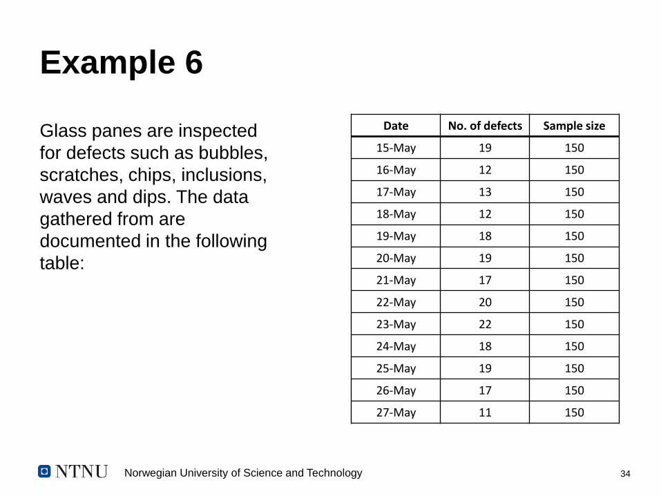
Example 6
Glass panes are inspected
for defects such as bubbles,
scratches, chips, inclusions,
waves and dips. The data
gathered from are
documented in the following
table:
Date No. of defects Sample size
15-May 19 150
16-May 12 150
17-May 13 150
18-May 12 150
19-May 18 150
20-May 19 150
21-May 17 150
22-May 20 150
23-May 22 150
24-May 18 150
25-May 19 150
26-May 17 150
27-May 11 150

Norwegian University of Science and Technology 35
Example 6 – Solution
LCL𝑐 = ҧ𝑐 - 3 ҧ𝑐
= 16.69 - 3 16.69= 4.44
ҧ𝑐 =
𝑖=1
𝑘𝑐𝑖
𝑘=
217
13= 16.69
UCL𝑐 = ҧ𝑐 + 3 ҧ𝑐
= 16.69 + 3 16.69= 28.95

Norwegian University of Science and Technology 36
u Chart
• Used when sample size varies
• Use to control the number of defects per unit
# The control limits in the chart appear ragged because they reflect each subgroup’s individual sample
size
𝑢𝑖 =𝑐𝑖
𝑛𝑖
= number of defects per unit in the 𝑖𝑡ℎ subgroup;
plot points
ത𝑢 =σ𝑖=1
𝑘 𝑐𝑖
σ𝑖=1𝑘 𝑛𝑖
= center line of the 𝑢 chart
𝑛𝑖 = sample size of the 𝑖𝑡ℎ subgroup
𝑐𝑖 = number of defects nonconformities in the 𝑖𝑡ℎ subgroup
LCL𝑢 = ഥ𝑢 - 3ഥ𝑢
𝑛𝑖
UCL𝑢 = ഥ𝑢 + 3ഥ𝑢
𝑛𝑖
𝑘 = number of subgroups

Norwegian University of Science and Technology 37
Example 7
Glass panes are inspected
for defects such as bubbles,
scratches, chips, inclusions,
waves and dips. The data
gathered from are
documented in the following
table:
Date No. of defects Sample size
1-Dec 4 125
2-Dec 8 111
3-Dec 3 133
4-Dec 7 120
5-Dec 5 118
6-Dec 5 137
7-Dec 6 108
8-Dec 10 110
9-Dec 4 124
10-Dec 3 128
11-Dec 4 144
12-Dec 7 138
13-Dec 11 150

Norwegian University of Science and Technology 38
Example 7 – Solution
LCL𝑢 = ഥ𝑢 - 3ഥ𝑢
𝑛𝑖
= 0 (-ve value)
UCL𝑐 = ഥ𝑢 + 3ഥ𝑢
𝑛𝑖
= 0.0998
ത𝑢 =
𝑖=1
𝑘𝑐𝑖
𝑖=1
𝑘𝑛𝑖
=77
1646= 0.0468

Norwegian University of Science and Technology 39
Short-Run Control Charts
• Not commonly used, but suitable when data is collected
infrequently or irregularly
• Can be used with historical target values, attribute and
variable data, and individual or subgroup-ed averages
# Not within the scope of this lecture. If interested, see Griffith (1996) and Oakland (2007)

Norwegian University of Science and Technology 40
Moving Average and Moving Range
Control Charts (MAMR)
• Suitable when
– Data is collected periodically, or when it takes time to produce a single item
– It is desirable to dampen the effects of overcontrol
– It may be necessary to detect even smaller shifts in the process
• Key considerations
– The selected moving average length significantly affects the overall sensitivity of the chart. The longer the length, the less sensitive the chart is.
– The specific selection of the length should depend on the “out-of-control” detection rules being used in each case.
# Not within the scope of this lecture. If interested, see listed references

Norwegian University of Science and Technology 41
Analyzing control charts
• The use of ±3𝜎 in the control limits formulas constitutes an generally accepted
economic trade-off between looking for special causes when it does not exist
and not looking for it when it exists. (This relates to the power of a test of
statistical significance.)
• In addition, the ±3𝜎 limits covers approximately 99.73% of the data.
– Points within the ±3𝜎 control limits are due to common cause variation
– Points outside are attributed to special causes;
• In this case, investigate immediately so that the root cause(s) can be determined
before the process strays to far away from the target, i.e., goes out of control.
NB: Adjusting a process when it is not warranted by out-of-control conditions is
referred to as “process tampering.” This usually results in destabilizing a process,
causing it to go out of control.

Norwegian University of Science and Technology 42
Analyzing control charts – The Minitab
Rules
1. One point more that ±3𝜎 from the center line (either side).
2. Nine points in a row on the same side of the center line
3. Six points in a row, all increasing or all decreasing
4. Fourteen points in a row, alternating up and down
5. Two out of three points more than 2𝜎 from the center line (same side)
6. Four out of five points more than 1𝜎 from the center line (same side)
7. Fifteen point in a row within 1𝜎 of the center line (either side)
8. Eight points in a row more than 1𝜎 from the center line (either side)

Norwegian University of Science and Technology 43
Analyzing control charts – The AIAG
Rules
1. Points beyond the control limits
2. Seven points in a row on one side of the average
3. Seven points in a row that are consistently increasing (equal or greater than the preceding points) or consistently decreasing
4. Over 90% of the plotted points are in the middle of the control limit region (for 25 or more subgroups)
5. Less than 40% of the plotted points are in the middle of the control limit region (for 25 or more subgroups)
6. Non-random patterns such as cycles
# AIAG = Automotive Industry Action Group

Norwegian University of Science and Technology 44
Example 8a
Example 8(a): Out-of-control condition #1 from AIAG. This is the same as Minitab out-of-control
condition #1

Norwegian University of Science and Technology 45
Example 8b
Example 8(b): Out-of-control condition #2 from AIAG.

Norwegian University of Science and Technology 46
Example 8c
Example 8(c): Out-of-control condition #3 from The Minitab Rules
UCL
LCL

Norwegian University of Science and Technology 47
Example 8d
Example 8(d): Out-of-control condition #6 from AIAG

Norwegian University of Science and Technology 48
Example 8e
Example 8(e): Out-of-control condition #4 from The Minitab Rules

Norwegian University of Science and Technology 49
Summary
• A control chart is the equivalent graphical hypothesis test.
– The null hypothesis is that the process has not changed;
– The alternative hypothesis is that it has changed;
• As each point is plotted, the chart is examined to see if there is
sufficient evidence to reject the null hypothesis, and conclude that
the process may have changed.
• Finally, in certain situations, for example, if an increase in values
represent a safety hazard, it would not be necessary to wait for the
specified number of successively increasing data points before
taking action.

Norwegian University of Science and Technology 50
Learning objectives
To understand when control charts can be applied
To understand different types of control charts and there
application areas
To understand how to collect data for control charts
(rational subgrouping)
To understand how to construct control charts
To understand how to analyze control chart behavior

Norwegian University of Science and Technology 51
Further reading
• Griffith, G. 1996. Statistical Process Control Methods for Long and Short Runs. ASQ
Quality Press, Milwaukee
• Kubiak, T. M. and Benbow, D. W. 2009. The certified six sigma black belt handbook.
ASQ Quality Press, Milwaukee
• Oakland, J.S., 2007. Statistical process control. Routledge. (downloadable from
through Oria.no)
• Thompson, J.R., 2002. Statistical process control: The Deming paradigm and beyond.
CRC Press.
• Wheeler, 1990. Advanced Topics in Statistical Process Control: The Power of
Shewhart’s Charts. SPC Press, Knoxville

Norwegian University of Science and Technology 52
Norwegian University of Science and Technology 53
Appendix - Control Chart Constants page 1
Source: Kubiak & Benbow (2009)

Norwegian University of Science and Technology 54
Appendix - Control Chart Constants page 2
Source: Kubiak & Benbow (2009)