title sequence designers: richard morrisson
TRANSCRIPT

TITLE SEQUENCE DESIGNERSRichard Morrison

‘Whatever technical changes are made there is a limitless world of creativity for future generation of designers. They will investigate and explore the moving image in their own way’.-Richard Morrison
INFORMATION
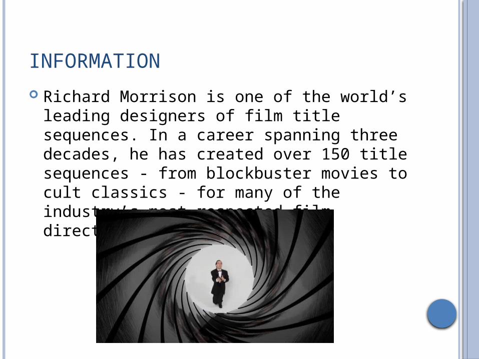
Richard Morrison is one of the world’s leading designers of film title sequences. In a career spanning three decades, he has created over 150 title sequences - from blockbuster movies to cult classics - for many of the industry’s most respected film directors and producers.

EARLY LIFE
Born in September 1953 studied graphics, photography and film Morrison’s initial career began on the James Bond
film series collaborating with an American graphic designer Maurice Binder. He has worked on film openers ever since .
Morrison is now a highly respected author, graphic designer and lecturer. In 2001, he published CUT to critical acclaim.
Since 2002, he has been chairman of Europe’s leading film and animation conference “Pencil to Pixel” and in 2009 he was appointed Honorary Professor of Digital Film School of Media Arts and Imaging at the University of Dundee, Scotland.

TECHNIQUE OF WORKING
‘I look for a nuance, a subliminal energy in a film that I can then work into an idea. A lot of my title sequences don’t give much away, but they give you a flavour. So the viewer thinks - Oh, this is intriguing, show me more…’
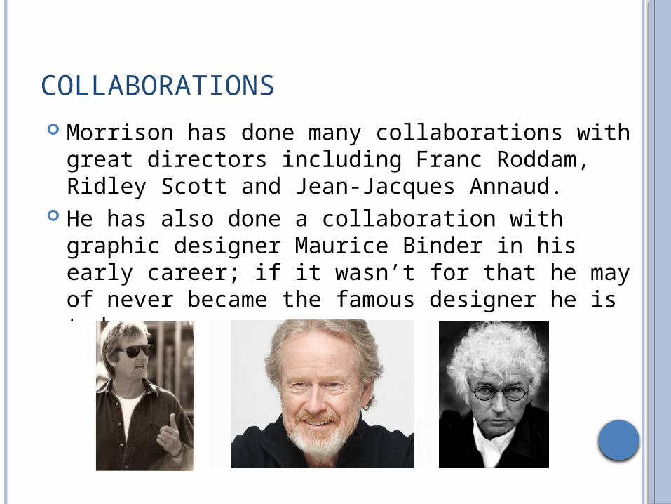
COLLABORATIONS Morrison has done many collaborations with great
directors including Franc Roddam, Ridley Scott and Jean-Jacques Annaud.
He has also done a collaboration with graphic designer Maurice Binder in his early career; if it wasn’t for that he may of never became the famous designer he is today.

FILM INFLUENCES One title sequence which Morrison has done is ‘A Long Way Down’.
This title sequences has similar characteristic to Bass’s work, with the use of lines and shapes; which may suggest that Morrison was influenced by him.
The music is melancholy and acoustic, relating to the theme of the film which is suicide.
The title sequence is animated with a dark background which looks like a sky as it has stars in, which could symbolise heaven.
There are images of skyscrapers which connotes part of the narrative of the film as the characters all end up on top of a building.
The main colours of the images and typography is orange and white. The orange connotes the sun and how the character rise up from their problems and the white represents the light and goodness of each of the characters.
The shapes move up and down as credits move between them. This connotes that stability of the characters state of mind as all of them have psychological issues/problems; thus leading to their attempted suicide.

TAMARA DREW This sequence is of a British country side with shots of the county and a
man cutting wood with text coming up around him. The man in the clip is a supporting character in the film as he is
Tamara’s love interest. This is hinted in the title sequence as the character is sexualised through a female gaze, as there is a mid-shot of him topless.
During the clip, a newspaper add pops up talking about a writer retreat. This is circled in red pen connoting the importance of it, which shows literature is a theme in the film. Also the main character is a writer as well, which links into the film.
The music is upbeat and played with a xylophone. This connotes the genre of a feel good drama.
The editing used in this sequence are fades and is at a slow pace. This creates a relaxed atmosphere as the countryside is usually associated with holidays and calmness.
This follows Morrison’s technique of film sequence as the sequence show little of what the film is about, only the setting.